
Abstract
We examined the relationship between political affiliation, perceptual (percentage, slope) estimates, and subjective judgements of disease prevalence and mortality across three chart types. An online survey (N = 787) exposed separate groups of participants to charts displaying (a) COVID-19 data or (b) COVID-19 data labeled ‘Influenza (Flu)’. Block 1 examined responses to cross-sectional mortality data (bar graphs, treemaps); results revealed that perceptual estimates comparing mortality in two countries were similar across political affiliations and chart types (all ps > .05), while subjective judgements revealed a disease x political party interaction (p < .05). Although Democrats and Republicans provided similar proportion estimates, Democrats interpreted mortality to be higher than Republicans; Democrats also interpreted mortality to be higher for COVID-19 than Influenza. Block 2 examined responses to time series (line graphs); Democrats and Republicans estimated greater slopes for COVID-19 trend lines than Influenza lines (p < .001); subjective judgements revealed a disease x political party interaction (p < .05). Democrats and Republicans indicated similar subjective rates of change for COVID-19 trends, and Democrats indicated lower subjective rates of change for Influenza than in any other condition. Thus, while Democrats and Republicans saw the graphs similarly in terms of percentages and line slopes, their subjective interpretations diverged. While we may see graphs of infectious disease data similarly from a purely mathematical or geometric perspective, our political affiliations may moderate how we subjectively interpret the data.
Introduction
At the beginning of 2020, a global pandemic sparked by a novel coronavirus (SARS-CoV-2) materialized, leading the World Health Organization and international political leadership to launch a campaign to slow the spread of an acute respiratory syndrome (COVID-19) (WHO, 2020). Public health experts recommended best practices to reduce infection spread, including washing hands, wearing face masks, and maintaining social distance (WHO, 2020). Based on these recommendations, public health organizations, governments, policymakers, universities, the media, and individuals have been sharing COVID-19-related data visualizations on an ongoing basis. Despite efforts to share data that accurately communicate the status of the pandemic, public opinion regarding the prevalence and implications of the COVID-19 virus remains divided. This division has been especially evident along political lines, raising the possibility that graphs may be interpreted differently depending on our political affiliations. If interpretations of COVID-19-related data visualizations are inaccurate, public health officials, governments, and other organizations will need to take additional steps to accurately and ethically present COVID-19-related data and ensure that critical messages (e.g. concerning disease prevalence and recommended behaviors such as social distancing) are easily understood by the public. The goal of this study is to examine whether political affiliations moderate how people perceive and interpret COVID-19-related data visualizations. Understanding this relationship could help researchers, policymakers, and public health officials better understand how people perceive and interpret disease-related data visualizations and improve our ability to design visualizations that can help people monitor the status of the pandemic and make appropriate decisions about their health.
We define perceptual estimates as attempts to estimate purely mathematical or geometric properties of an information display (e.g. estimating the slope of a trend line). In contrast, we define subjective judgements as relatively more descriptive interpretations of an information display (e.g. indicating whether a trend line appears to be ‘slightly’ increasing or ‘sharply’ increasing) (see Beattie and Jones, 2002; Simcox, 1983). While the data visualization literature has revealed numerous design best practices based on specific features of visual stimuli that can effectively support accurate perceptual estimates, we know little about the relationship between perceptual estimates and more subjective judgements of data visualizations. In addition, there is a need for empirical research that directly examines the relationship between political affiliations and how people interpret disease-related data visualizations. With respect to the study of data visualization and graphical perception, the primary contribution of this paper is to directly compare perceptual estimates (of percentages and slopes) to subjective judgements of prevalence and mortality data. 1 With respect to the study of big data and public health, the primary contribution of this paper is to empirically examine the relationship between political affiliations and interpretations of disease-related data visualizations. Understanding these relationships can inform best practices for designing visualizations that help people develop an accurate understanding of the status of the pandemic and help them make informed decisions about their health.
Graphical perception
Prior research has found that visual characteristics of graphs influence how data are perceived and interpreted. For example, in a foundational study of graphical perception, Cleveland and McGill (1984) asked participants to provide percentage estimates (i.e. by judging the height of a shorter bar as a percentage of a taller bar) of bars that were adjacent, separated, or stacked. Perceptual estimates were most accurate when the two bars were aligned to a common baseline. Decades later, Heer and Bostock (2010) conducted an online crowdsourced study that partially replicated these results using Amazon's Mechanical Turk (MTurk) and examined a wider range of chart types. They found that proportion estimates were most accurate for bar graphs with adjacent bars and progressively less accurate for other charts including treemaps. To examine a broad range of charts in the present study, we selected two charts from the extreme ends of this accuracy spectrum: bar graphs and treemaps. We also build upon previous visualization research by examining whether subjective judgements might be more exaggerated for chart types that tend to produce less accurate perceptual estimates, such as treemaps.
Although bar graphs are widely used and can be presented simply in principle, they are often embellished in practice, and this can negatively impact the accuracy of perceptual estimates (Diaz et al., 2018; Talbot et al., 2014; Zacks et al., 1998). For example, including gradients and upper grid lines can improve the accuracy of bar graph perception (Diaz et al., 2018), while other visual elements such as distractor bars can interfere with perceptual estimates (Talbot et al., 2014). We sought to control for these potentially distracting elements by aligning bars to a common baseline, including an upper grid line, and omitting potentially distracting chart elements.
Line graphs are often used to plot two variables (e.g. prevalence over time) and aid viewers in understanding trends, such as local or global rates of change in time series data (Heer and Agrawala, 2006). The design of a line graph can influence a viewer's judgements of the underlying data (Cleveland and McGill, 1987; Simcox, 1983). For example, a viewer's perception of the rate of change in a line graph can be influenced by a chart's shape parameter (or aspect ratio: the ratio of a graph's height to its width) (Beattie and Jones, 2002; Simcox, 1983). As a result, some researchers have recommended that designers ‘bank charts to 45°’ (i.e. adjust the aspect ratio until the mean orientation of its positively sloped line segments equals 45°) to support accurate visual discrimination of line graph data (Beattie and Jones, 2002; Cleveland et al., 1988; Heer and Agrawala, 2006). A similar recommendation is to adjust the slope parameter (slope of the regression line) of charts to 45° (Beattie and Jones, 2002; Bertin, 1983; Kosslyn, 1993). Beattie and Jones (2002) varied the slope parameters of financial charts and found that charts with larger slope parameters were interpreted as indicating greater (‘sharply increasing’) financial growth than charts with smaller slope parameters. Based on these findings and to experimentally control the slope ratio, the aspect ratios of line graphs used in the present study were adjusted so that the slopes of the regression lines were 45°. In contrast to prior research, we employed descriptive chart labels (titles, y-axis labels) to assess how these labels impact responses.
As Beattie and Jones (2002) note, ‘in general, we do not store precise quantitative information when reading graphs. Instead, we summarize the essence of the meaning by attaching a linguistic label (such as ‘sharply increasing/decreasing’) to the graphical information which places it into a specific conceptual category’. Thus, it is somewhat unnatural to make purely quantitative perceptual estimates of graphical data (e.g. estimating the slope of a line) unless those estimates are central to a viewer's goals; typically, viewers formulate more conceptual and subjective judgements of the data. For example, Simcox (1983) gathered subjective judgements (N = 24) of line slopes (from 5° to 60° in 5° increments) and found that the phrase ‘sharply increasing’ was more strongly associated with slopes of 50°–60° (all Cs = 1) than with smaller slopes such as 45°. We build upon this work by examining subjective judgements of line graph data related to infectious diseases.
In sum, a large body of prior research on graphical perception has identified elements of data visualizations that impact graphical perception, yet we know little about the relationship between perceptual estimates and subjective interpretations. Moreover, there is little research examining the intersection of graphical perception and crisis informatics (Zhang et al., 2021), especially concerning how the general public perceives and interprets COVID-19 visualizations (Sevi et al., 2020).
COVID-19 data visualizations
The COVID-19 pandemic has precipitated an ‘infodemic’ in which people are confronted with information from organizations like the Centers for Disease Control (CDC), as well as pseudoscientific information (Teovanović et al., 2021), and ‘casual information visualizations’ created by non-experts (Trajkova et al., 2020). Even data-accurate visualizations can sometimes be presented out of context (Campolo, 2020) or fail to follow established best practices in visualization design. For example, the Financial Times used linear and logarithmic graphs to show the number of cases, and the number of deaths due to COVID-19 (Stabe et al., 2020), yet recent research demonstrates that linear scales promote a more accurate understanding of how the pandemic is developing (Romano et al., 2020). Thus, visualizations may be shaping policies and responses to the virus based on inaccurate interpretations of data (Bowe et al., 2020).
As a result, researchers are calling for more critical evaluation of data sources, models, and visualizations (Taylor, 2020). For example, although some visualizations present COVID-19 cases by race, some researchers have questioned the feasibility of reporting COVID-19 cases by race alone when the underlying data are collected at the level of zip codes (Bowe et al., 2020). Critical evaluation can be supported by adding contextual elements or annotations (notes). For example, indicating limitations of the data collection process can help viewers extract a more accurate narrative from the data by shining a light on missing data (Onuoha, 2016). However, narrative elements such as written descriptions of trends or statements about the data's implications can be distracting or misleading (Carpendale et al., 2017), especially if the underlying data are highly politicized (van Baar et al., 2021).
When designing data visualizations that present information on a complex problem such as a global pandemic, there are numerous considerations to take into account. For example, designing visuals that are data-accurate requires that designers carefully consider the position of data, the size of visualizations, and interactivity (Walny et al., 2020). While data mappings (e.g. spatial, temporal, aesthetic) are often inherent characteristics of datasets (Bigelow et al., 2014), charts that employ aesthetic mappings between colors and the data can be distracting (Brockmann, 1991; Few, 2005), especially when strong colors (e.g. red) are used intentionally to draw the viewer's attention to specific information in a chart. The present study addressed these considerations by controlling for the position of the data and size of visualizations presented across experimental groups and by using black and white stimuli to control for the effect of color.
The role of emotion
Emotions play an important role in determining how people respond to crises, yet we know little about how people subjectively interpret crisis information presented in charts and graphs. During crises, such as pandemics, an individual's judgement may be impaired if their way of life is being threatened (Blumenthal-Barby and Burroughs, 2012), which can lead to selfish or panicked behavior (O’Keefe and Reid, 1990), self-isolation (Graeupner and Coman, 2017), prejudices (Kofta et al., 2020), or blaming others for negative outcomes (Douglas et al., 2017). These strong emotions can negatively impact communities. For example, if the public interprets news about the pandemic as indicating increased disease prevalence (Picchi, 2020), this may signal danger (Li et al., 2010) and result in shortages of essential items such as masks and food. Although altruistic and cooperative behaviors may also emerge during crises (Kraft and Goodell, 1993), prior research has indicated that coordinated collective responses require a shared identity and shared experiences (Milkman et al., 2011). And although charts and graphs can help support shared experiences of reality, there is no guarantee that people will respond rationally to graphs. For example, psychological distance, emotions, and attitudes towards media coverage can influence risk perception and responses to information related to infectious diseases such as Ebola (Yang, 2019). To assess and control for the impact of emotional responses associated with the COVID-19 pandemic, we used exit survey items to assess participants’ level of concern about the virus and whether they had tested positive.
The role of political affiliation
Despite the widespread availability of visualizations, public opinion regarding the virus remains divided, especially along political lines. The present study's design is informed by an extensive literature examining cognitive biases in human cognition (Kahneman et al., 1998; Kahneman and Frederick, 2002) and on evidence for a relationship between political orientations and behavior (Strickland et al., 2011). Psychological research has established that human decision-making is generally biased toward salient (easily brought to mind) information rather than comprehensive and rational analyses of all available data (Kahneman and Tversky, 1973; Taylor and Fiske, 1978). For example, when judging the probability of an event (e.g. contracting a disease), humans tend to rely on an ‘availability heuristic’) (Folkes, 1988; Lichtenstein et al., 1978; Tversky and Kahneman, 1973) – a cognitive strategy that disproportionately emphasizes information currently available information. For example, someone might believe they are more likely to contract COVID-19 if they know that a friend or relative recently contracted the virus.
In addition, people may dismiss information that conflicts with their political orientation (Strickland et al., 2011), and political polarization can lead different segments of the public to derive different conclusions about threats (Lelkes et al., 2017). This can occur through partisan news sources (Bakshy et al., 2015) and ‘echo chambers’ (Lelkes et al., 2017) that amplify partisan communication (Brady et al., 2017). Political polarization is also associated with misperceptions of other political parties (Lees and Cikara, 2021), which can decrease trust (Hetherington and Weiler, 2015) in other political parties (Iyengar et al., 2019). Scientific issues can become controversial if there is evidence of political polarization (Sarathchandra et al., 2018). This can have severe consequences when communicating public health messages, particularly when it leads to believing false information (Van Bavel and Pereira, 2018). Individuals are also prone to relying on the availability heuristic when they hear health messages, leading them to overestimate COVID19 mortality risks (Abel et al., 2021). In sum, political affiliations play an important role in how people interpret information in general. Yet we know little regarding whether political affiliations play a role in how people see and interpret COVID-19 graphs.
The present study
While best practices in the visual design of data visualizations are well established, there is a general lack of research on subjective evaluations of data visualizations. In particular, although past research has established a strong link between political affiliation and how information is interpreted (see section ‘The role of political affiliation’), we know little about whether political affiliations influence how COVID-19 graphs are interpreted. The present study investigates the following research questions: First (RQ1), does the chart type (bar graph, treemap, line graph), disease indicated in the chart's title and axis labels (COVID-19, Influenza), or the metric plotted (cases, deaths) influence perceptual or subjective judgements of COVID-19 graphs? Second (RQ2), do political affiliations (Democrat, Republican) moderate perceptual estimates or subjective judgements of COVID-19 graphs? The research questions, associated predictions, and a summary of the results appear in Table 1.
Summary of research questions, predictions, and results.
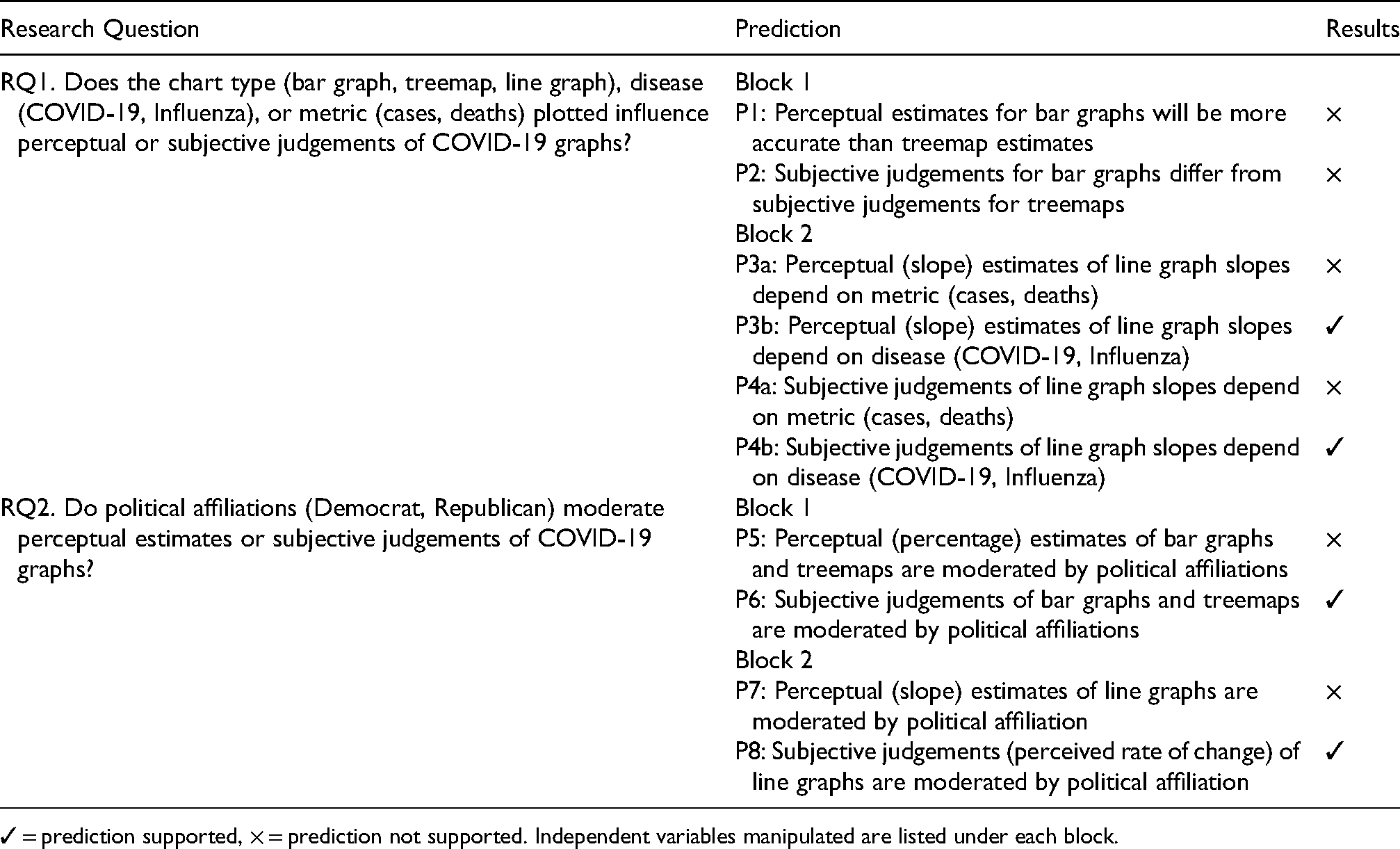
✓ = prediction supported, × = prediction not supported. Independent variables manipulated are listed under each block.
To investigate these research questions, separate groups of participants viewed charts that plotted the same underlying COVID-19 dataset with titles that were either congruent (COVID-19 data with COVID-19 chart labels) or incongruent (COVID-19 data with Influenza chart labels) with the underlying COVID-19 dataset. Because the COVID-19 mortality rate is estimated to be 10 times higher than Influenza mortality rate (Maragakis, 2021), and because the flu is less politicized than COVID-19, the charts labeled ‘Influenza’ served as controls to isolate the effect of including ‘COVID-19’ in a chart's title. Thus, any differences in responses to charts labeled with the two diseases could be due to Influenza being either less politicized or less deadly.
Block 1 examined responses to cross-sectional mortality data plotted in bar graphs and treemaps. Based on graphical perception research (see section ‘Graphical perception’) (Heer and Bostock, 2010), we predicted that perceptual estimates for bar graphs would be more accurate than treemap estimates (P1). Because less is known about subjective judgements of graphical data in general, we also examined a related two-tailed prediction based on Heer and Bostock’s (2010) findings: that subjective judgements for bar graphs differ from subjective judgements for treemaps (P2). Informed by research on the relationship between human cognition, political affiliations, and behavior (see section ‘The role of political affiliation’), we also examined two related predictions: that perceptual (percentage) estimates (P5) or subjective judgements (P6) of bar graphs and treemaps might be moderated by political affiliation.
Block 2 investigated the relationship between political affiliation, disease, metric when viewing time series data (line graphs). Specifically, we examined whether perceptual (slope) estimates of line graph slopes depend on the metric (P3a) or disease (P3b) indicated in the chart, or on political affiliations (P7). Finally, because we know little regarding the relationship between political affiliations and subjective judgements of line graphs, we examined whether subjective judgements of line graph slopes depend on the metric (P4a) or disease (P4b) indicated in the chart, or are moderated by political affiliations (P8).
Material and methods
The experiment was conducted using an online Qualtrics survey distributed via Prolific (a service similar to Amazon's Mechanical Turk) and was available to participants from August 13th–15th, 2020.
Participants
850 US residents participated in the study (375 Republicans, 412 Democrats, 46 Independents, and 17 participants who reported ‘something else’ as their political affiliation). Of these, a 787 (375 Republicans, 412 Democrats; 397F, 376M, 10 non-binary, 1 agender, 1 self-described gender, 2 gender not reported; MAGE = 33.3 years, SDAGE = 12.9 years) met the inclusion criteria (see below) and were included in the analysis. Participants were recruited through Prolific, provided informed consent in accordance with the requirements of Bentley University's Institutional Review Board (IRB), and were paid $0.65 (an amount consistent with incentives for similar studies on Prolific) regardless of whether they completed the study or not. Recent research suggests that Prolific's participant pool is more diverse (Peer et al., 2017), and more naïve (Peer et al., 2017) than Amazon's MTurk participant pool. Other recent research has found higher levels of comprehension and attention (Eyal et al., 2021) and lower levels of dishonesty (Eyal et al., 2021; Peer et al., 2017) among Prolific participants, as well as evidence to suggest that crowdsourcing platforms such as Prolific are suitable for conducting perceptual research (Jonell et al., 2020). The Prolific database was used to target an approximately even mix of Republicans and Democrats. Individuals who identified as politically independent were also permitted to take the survey; however, they were not explicitly targeted using the Prolific database. Only participants who reported being 18 years or older, US residents, fluent in English, having no prior work experience in healthcare, and having normal or corrected vision were eligible to participate and were included in the analysis.
Design
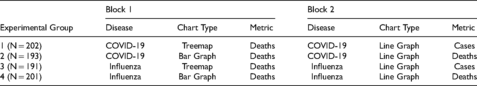
The experimental design and number of participants randomly assigned to each condition is summarized in Table 2. After completing practice trials (Figure 1), participants viewed either a bar graph or treemap that presented cross-sectional mortality data (in Block 1), followed by a line graph that presented either period prevalence (case) or period mortality (death) data (in Block 2). Participants randomly assigned to the COVID-19 Groups (1 and 2) viewed charts that plotted COVID-19 data, and that used ‘COVID-19’ in chart titles and y-axis labels (Figure 2). Participants randomly assigned to the Influenza (Flu) groups (3 and 4) viewed charts that plotted COVID-19 data, but were labelled with ‘Influenza (Flu)’ in chart titles and y-axis labels (Figure 3).
Practice phase questions (PQs). (A) Bar graph practice questions (correct PQ2 response: 61%). (B) Treemap practice questions (correct PQ2 response: 33%). (C) Line graph practice question (correct PQ2 response: 45°). PQ1 and PQ2 were presented on separate, successive screens with the chart visible above each question.

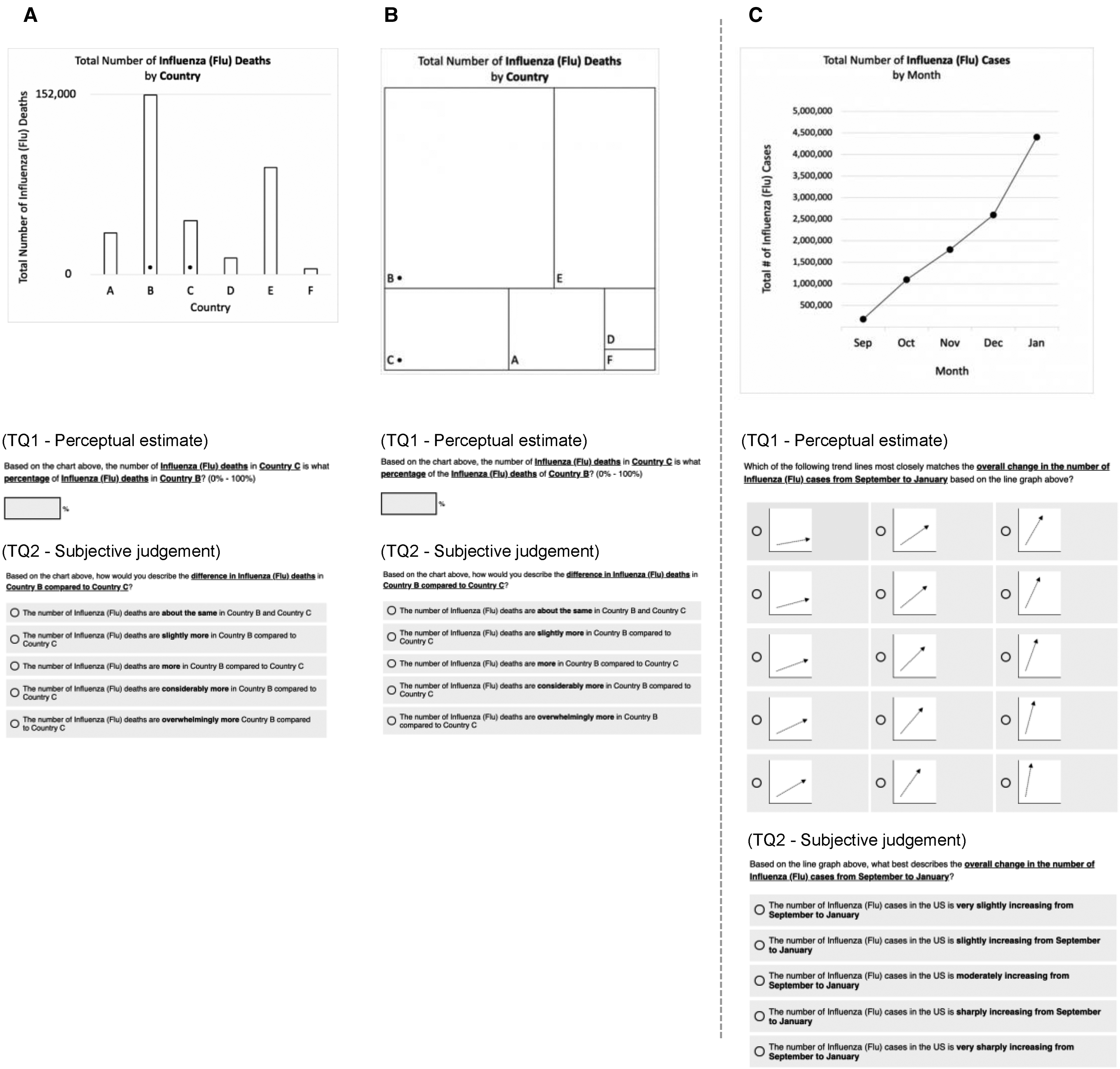
Test phase questions (TQs): COVID-19. (A) Block 1, bar graph. (B) Block 1, treemap. (C) Block 2, line graph. (D) Side-by-side view of COVID-19 and Influenza bar graphs (not shown to participants). TQs were presented on successive screens with charts visible above each question. Correct TQ1 responses: A, 29.9%; B 29.9%; C 45°.
Test phase questions (TQs): influenza. (A) Block 1, bar graph. (B) Block 1, treemap. (C) Block 2, line graph question. Correct TQ1 responses: A, 29.9%; B 29.9%; C 45°.
Study design.
Displays
The underlying data used to create all of the graphs presented during the test phase (see Section ‘Data analysis’ below) were COVID-19 data from the Johns Hopkins Coronavirus Resource Center website (https://coronavirus.jhu.edu/data). Block 1 data were the total number of COVID-19-related deaths by country as of July 30th, 2020. Block 2 data were the total number of COVID-19-related cases and total number of deaths per week from January 24th, 2020 to July 24th, 2020. Participants in the Influenza groups (3 and 4) experienced a minor deception: COVID-19 data were used to set the heights of bars (in bar graphs), areas of rectangles (in treemaps), and points (in line graphs), while the chart titles and y-axis labels indicated that ‘Influenza (Flu)’ data were being presented (see Figures 1–3). This was done to control for the effect of the trend line of the underlying data points, and in order to isolate the effect of the disease indicated in the chart's title and y-axis label. While COVID-19 data were plotted for the summer, Influenza is more prevalent in the winter months; therefore, the months on x-axis of the Influenza charts were adjusted to more closely align with the typical timing of seasonal Influenza outbreaks (September – January) (see Figure 3) so that participants would be less likely to question the validity of the influenza data based on the range of months indicated.
Procedure
Entrance survey
The entrance survey asked a series of questions to confirm that participants met the study's inclusion criteria (see Section ‘Participants’ above).
Practice phase
Prior to the test phase, participants completed a practice phase by responding to chart-specific graphical literacy questions to ensure that they understood how to read the charts and perform the perceptual judgement tasks (Figure 1A and B). We do not have data that would enable us to determine whether the high level of graphical literacy observed in our sample is representative of the general population. For each type of chart, participants answered two questions: the first assessed whether they could accurately judge which of the two countries (country A, and country B) had the greater population (PQ1); the second assessed whether they could provide a reasonable estimate (PQ2) (see section ‘Data analysis’ Data Analysis for inclusion criteria) of the population of the country A as a percentage of country B. Two practice questions assessed their ability to interpret line graphs (Figure 1C) by asking them to accurately judge whether the population was increasing over time (PQ1) and provide a reasonable perceptual (visually-matched slope) estimate (PQ2).
Test phase
The test phase (see Figures 2 and 3) was designed to assess the impact of chart type (bar graph, treemap, line graph), disease (COVID-19, Influenza), and metric (cases, deaths) on perceptual and subjective-judgements. Groups 1 and 2 were presented with charts whose titles and y-axis label indicated that ‘COVID-19’ were plotted in the chart (Figure 2), while Groups 3 and 4 were presented with charts whose titles and y-axis label indicated that ‘Influenza (Flu)’ data were plotted in the chart (Figure 3). In Block 1, participants were asked to make comparisons between two countries (US and Mexico) marked with small dots; this task was chosen in order to parallel the design of visual displays that have been used in prior research on graphical perception (e.g. Cleveland and McGill, 1984; Heer and Bostock, 2010).
The concept of ‘flattening the [COVID-19] curve’ (Herfurth, 2020) was widely discussed around the time when the study was conducted. To examine this, in Block 2, participants estimated and judged the slopes of lines plotting cases and deaths associated with each disease. To provide slope judgements, participants did not indicate exact degree values; instead, they selected one of 15 images depicting trend lines with varying slopes ranging from 10° to 80° in 5° increments (see Panel C in Figures 1–3).
Exit survey
In addition to gathering demographic data (e.g. gender, education, income, political party affiliation, ethnicity, and race), the exit survey (see Supplementary Material) assessed participants’ attitudes toward and experience with COVID-19 by asking them to rate the perceived prevalence of the virus (whether they thought the COVID-19 case numbers and death toll statistics were understated, accurately stated, or overstated), their COVID-19 concern level (‘How worried, if at all, are you that you or someone in your family will become infected and seriously ill from COVID-19?’; 1 = not at all concerned, 5 = very concerned), and whether or not they had received a positive COVID-19 test result (1 = yes, 2 = no, 3 = prefer not to report).
Data analysis
Data were collected using Qualtrics, cleaned using Tableau Prep (Version 2020.2), and analyzed using SPSS (Version 27). The independent variables were chart type (bar graph, treemap), disease (COVID-19, Influenza), and metric (cases, deaths). The dependent variables were perceptual estimates (Block 1, relative number of deaths in two countries indicated as a percentage; Block 2, visually matched slopes of lines plotting cases or deaths) and subjective judgements (pre-determined descriptive characterizations of the data on a Likert scale) of disease-related data visualizations (see Figures 2 and 3).
One-way analyses of covariance (ANCOVAs; α = .05) were used to assess the relationship between independent and dependent variables while controlling for perceived prevalence of COVID-19, level of concern about COVID-19, receiving a positive COVID-19 test result, and demographic characteristics (age, gender, race, ethnicity, education level, and income). ANCOVA results reported in the text include 95% confidence intervals. Post-hoc contrasts were conducted using Tukey's LSD comparisons among estimated marginal means. Graphical results (Figures 4 and 5) display mean responses with error bars indicating ± 1 SEM. Following Piepho (2018), the letters above the bars in Figures 4 and 5 indicate the results of post-hoc Tukey's LSD comparisons among estimated marginal means (means with no letter in common are significantly different).
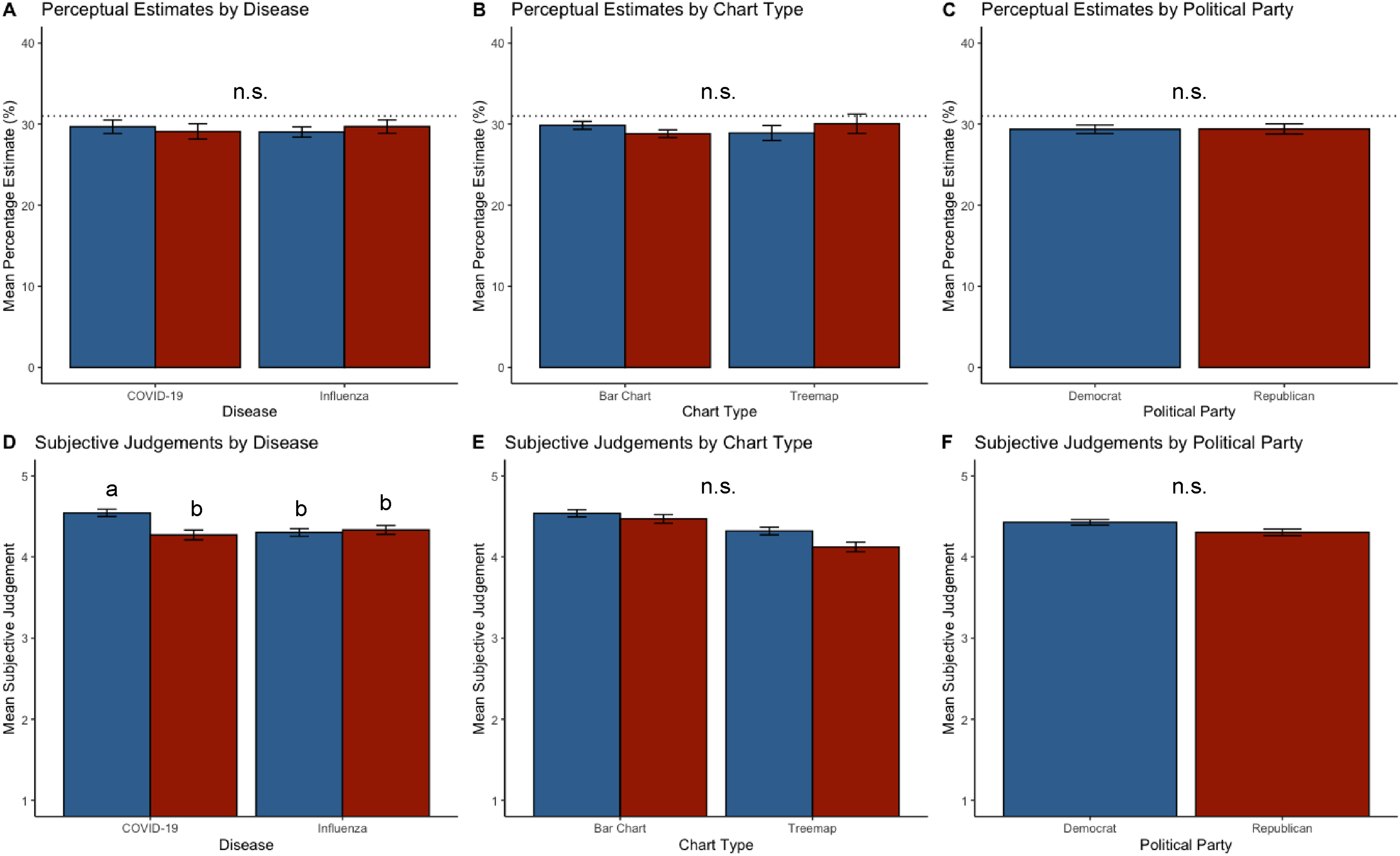
Block 1 results. Panels A-C: Perceptual (percentage) estimates [‘…the number of COVID-19-related deaths in Mexico is what percentage of the COVID-19-related deaths in the United States? (0-100%)’]. Dotted lines indicate correct responses (31%). Panels D-F: Subjective judgements [‘The number of COVID-19 related deaths is…’ (1 = ‘…about the same in the US and Mexico’; 5 = ‘…overwhelmingly more in the US compared to Mexico)]. Blue bars: Democrats. Red bars: Republicans. Letters above bars: Means with no letter in common are significantly different (Tukey's HSD, α = .05). n.s. indicates that no significant effects were found. Error bars indicate ± 1 SEM.

Block 2 results. Panels A–C: Perceptual (slope) estimates. The dotted line indicates the correct response (45°). Note that participants did not indicate exact degree values; rather, they selected one of 15 images depicting trend line slopes ranging from 10° to 80° in 5° increments. Panels D-F: Subjective judgements of trend line slopes (1 = ‘very slightly increasing’, 5 = ‘very sharply’ increasing). Blue bars: Democrats. Red bars: Republicans. Letters above bars: Means with no letter in common are significantly different (Tukey's HSD, α = .05). n.s. indicates that no significant effects were found. Error bars indicate ± 1 SEM.
To ensure that the analysis included responses from only those participants who correctly understood the perceptual estimation tasks, each participant's test trials were included if and only if they responded correctly to the relevant chart-specific practice trial within margins of error pre-determined by the research team. For Block 1, only test trial responses between 30% and 90% (correct response: 60%) were included in the analysis, and 751/787 (95.4%) of participants met this criterion. For Block 2, only test trial responses between 15° and 75° (correct response: 45°) were included; 784/787 (99.6%) of participants met this criterion.
Levene's test indicated unequal variances for perceptual estimates and subjective judgements in Block 1, F(31,692) = 1.8, p < .01. Because Levene's test was still significant after applying commonly used data transformations including a log transform (and log absolute error measure of accuracy; Cleveland and McGill, 1984; Heer and Bostock, 2010), we retained the original distributions for the dependent measures in Block 1 and followed Tabachnick and Fidell’s (2006) recommendation of applying a stricter alpha of.025 to the dependent variables for Block 1 (Cadaret and Bennett, 2019). Levene's test indicated equal variances (p > .05) for both perceptual estimates and subjective judgements in Block 2; therefore, we retained the original distributions for the dependent measures in Block 2, and applied alpha of.05 to the dependent variables for Block 2.
Results
The research questions, associated predictions, and results are summarized in Table 1.
Block 1: Bar graph versus Treemaps
Block 1 was designed to examine the effects of chart type (bar graph, treemap) and disease (COVID-19, Influenza) on perceptual and subjective judgements. Graphical results for Block 1 are shown in Figure 4.
Practice trials
A total of 751/787 (95.4%) of participants met the practice trial criterion and were included in the analysis for Block 1. Thus, nearly all participants surveyed understood the charts and associated tasks.
Perceptual Estimates
For perceptual (percentage) estimates, the ANCOVA did not reveal any significant main effects or interactions (all ps > .05) (see Figure 4, panels A, B, and C). That is, there was no relationship between disease (COVID-19, Influenza) and perceptual (percentage) estimates for bar graphs and treemaps, and Democrats and Republicans provided similar perceptual (percentage) estimates when viewing point mortality data for the two diseases. In sum, contrary to prediction 5, there was no evidence for a relationship between political affiliations and perceptual estimates when viewing point mortality data.
Subjective Judgements
For subjective judgements, the ANCOVA revealed a significant interaction between disease and political affiliation, F(1, 705) = 8.4, p < .01, ηP2 = .012 (see Figure 4D). A post hoc Tukey's LSD test of estimated marginal means revealed a significant main effect of political affiliation: Democrats indicated greater subjective mortality (in the US than in Mexico) when viewing COVID-19 labeled charts (M = 4.42, 95% CI = [4.35, 4.49]) than Republicans (M = 4.30, 95% CI = [4.22, 4.38]) (p < .05). The post hoc contrast also revealed a marginally significant main effect of disease: both Democrats and Republicans indicated greater subjective mortality when viewing COVID-19 labeled charts (M = 4.41, 95% CI = [4.34, 4.48]) than Influenza labeled charts (M = 4.32, 95% CI = [4.25, 4.39]) (p = .08).
Thus, although Democrats and Republicans provided similar perceptual (percentage) estimates when viewing point mortality data for the two diseases, Democrats indicated COVID-19 mortality to be greater than did Republicans. Contrary to Prediction 2, subjective judgements for bar graphs did not differ from subjective judgements for treemaps. Consistent with prediction 6, political affiliations interacted with the disease indicated in chart titles to influence subjective judgements.
Block 2: line graphs
Block 2 was designed to examine the effects of Disease (COVID-19, Influenza) and metric (cases, deaths) when viewing line graphs. Graphical results for Block 2 are shown in Figure 5.
Practice trials
A total of 784/787 (99.6%) of participants met the practice trial criterion (see Section 2.6) and were included in the analysis for Block 2. Thus, a large percentage of participants surveyed understood the chart and associated tasks.
Perceptual Estimates
For perceptual estimates (line slope), the ANCOVA revealed a significant main effect of disease, F(1, 739) = 644, p < .05, ηP2 = .99 (see Figure 5A). Both Democrats and Republicans indicated greater visually matched slope for the COVID-19 trend lines (M = 49.9°, 95% CI = [48.8°, 51.1°]) than Influenza trend lines (M = 46.2°, 95% CI = [45°, 47.3°]). The visually matched slope estimates that both Democrats and Republicans provided for the two diseases were greater than the actual slopes of the Influenza (45°) and COVID-19 (45°) trend lines, a result that is consistent with prior research on slope estimation which has found that humans generally tend to overestimate the slopes of positive angles (Ciccione and Dehaene, 2021; Kammann, 1967). No other significant effects or interactions were found.
In sum, contrary to Prediction 3a, perceptual estimates were similar for line graphs regardless of the metric (cases, deaths) plotted. Consistent with Prediction 3b, perceptual estimates for line graph slopes did depend on the disease indicated in the chart, and perceptual estimates revealed a pattern of overestimation for both diseases with a greater degree of slope overestimation for COVID-19 than Influenza. Contrary to prediction 7, there was no relationship between political affiliations and perceptual estimates of line graph slopes.
Subjective Judgements
For subjective judgements of trend line slopes (1 = ‘very slightly increasing’, 5 = ‘very sharply ‘increasing), the ANCOVA revealed a significant interaction between disease and political affiliation, F(1, 733) = 4.7, p < .05, ηP2 = .009 (see Figure 5D). Post-hoc Tukey's HSD tests revealed that Republicans’ subjective rate of change ratings for the two diseases (COVID-19, M = 4.14, 95% CI = [4.03, 4.25]; Influenza, M = 4.2, 95% CI = [4.12, 4.33]) did not differ from Democrats’ ratings for COVID-19 (M = 4.23, 95% CI = [4.12, 4.34]) (all ps > .05), and Democrats’ ratings for Influenza (M = 4.06, 95% CI = [3.94, 4.17]) were significantly lower than in any other condition (all ps < .05).
In sum, contrary to Prediction 4a, subjective judgements (rate of change) of time series (line graph) data did not depend on the metric (cases, deaths) plotted. Consistent with Predictions 4b and 8, disease interacted with political affiliation to influence subjective judgements of line graphs. Democrats and Republicans indicated similar subjective trends for COVID-19, and Democrats also indicated lower subjective prevalence and mortality for Influenza than in any other condition.
Discussion
We found evidence that political affiliation moderated interpretations of COVID-19 graphs. The results also suggest that – regardless of political affiliation – highly salient diseases, such as COVID-19, can influence not only how we subjectively interpret related line graph data (i.e. whether we describe a prevalence or mortality curve as ‘slightly or ‘sharply increasing’), but how we see the data from a mathematical or geometric perspective (i.e. how steep we perceive that prevalence curve to be when asked to visually match its slope).
Block 1 examined the effect of chart type (bar graph, treemap). The lack of any significant effects or interactions for perceptual estimates (of relative point mortality in Mexico vs. in the US, indicated as a percentage) suggests that disease indicated and the viewer's political affiliation (Democrat, Republican) did not factor into perceptual estimates. The lack of a main effect of chart type is unexpected given that prior research in data visualization has revealed that perceptual estimates of bar graphs and treemaps generally differ substantially (Heer and Bostock, 2010). This may indicate that perceptual estimates of these two chart types are more robust than previously suggested – a possibility that merits further empirical examination. This finding also suggests perceptual estimates of graphs displaying cross-sectional mortality data may not be related to political affiliations. In light of the results for Block 2, it is possible that bar graphs and treemaps (that display cross-sectional or point prevalence data) do not prime risk as strongly as line graphs (that display time series or period prevalence data) – another possibility that merits further research.
In contrast to the results for perceptual estimates, the analysis of subjective judgements in Block 1 revealed that political affiliation moderated the effect of the disease indicated in the chart's title. A post hoc comparison revealed that Democrats indicated greater subjective point mortality (in the US than in Mexico) than Republicans. Thus, although Republicans and Democrats provided similar perceptual estimates for both bar graphs and treemaps, they subjectively described the data differently. In other words, political affiliation moderated the relationship between the disease indicated and subjective interpretations of the charts. The post hoc analysis also revealed a marginally significant main effect of disease such that (regardless of political affiliation) participants indicated greater subjective prevalence when viewing COVID-19 labeled charts than Influenza-labeled charts. Taken together, Block 1 results suggest that while Democrats and Republicans saw COVID-19 and Influenza charts similarly in mathematical terms (i.e. in terms of percentages), their subjective interpretations of those mathematical results diverged.
Block 2 examined the effect of the metric (cases, deaths) plotted when participants viewed line graphs. For the perceptual (visual slope matching) task, both Democrats and Republicans indicated that the slopes of COVID-19 (M = 49.9°) trend lines were greater than the slopes of Influenza (M = 46.2°) trend lines. In addition, Both Democrats and Republicans estimated slopes for the two diseases to be greater than the correct response (M = 45°). Thus, the only perceptual estimation difference we found in the study was based on disease when viewing line graphs. This result suggests that highly salient (i.e. easily brought to mind) infectious diseases such as COVID-19 may influence low-level perceptual evaluations of data related to that disease – for example, due to reliance on an availability heuristic. This result is also generally consistent with research on slope estimation, which has found that humans tend to overestimate the slopes of positive angles (Ciccione and Dehaene, 2021; Kammann, 1967).
Some researchers have argued that banking to 45° may favor discriminability of high frequency oscillations over the discriminability of lower frequency trends in the data (Heer and Agrawala, 2006). Because the slope parameters (slopes of regression lines) in the present study were adjusted to 45°, it is possible that the line graphs may have downplayed lower frequency trends (e.g. global ‘flattening’ or ‘unflattening’) of the curve. It is also possible that the initially steeper slope of the mortality curve (Figure 2C), March-May, may have influenced the results. For example, participants may have based their estimates on a decomposition of the charts into multiple subparts (Ciccione and Dehaene, 2021) consisting of multiple functions (Schulz et al., 2017) or by perceiving the graph in terms of ‘shape skeletons’ (Ayzenberg and Lourenco, 2019).
The pattern of angle overestimation found in the present study is consistent with the possibility that experiences (Epel et al., 1998), biases (Ritov and Baron, 1990), or emotions (Crum et al., 2017) – especially those concerning threats, pandemics, or epidemics (Greyling et al., 2016) – can influence how people perceive disease-related line graph data. Anxiety can influence the perceived slopes of hills in physical environments (Harris and Wilmut, 2020; Riener et al., 2011; Stefanucci et al., 2008); while we are not aware of research examining whether similar effects apply to the perceived slopes of line graphs, it is possible that anxiety about the virus impacted the perceived slope of the line graphs used in the present study – a possibility that represents a valuable area for future research.
Subjective judgements in Block 2 revealed that Democrats and Republicans indicated similar subjective rates of change for COVID-19 trend lines, and Democrats also indicated lower subjective rates of change for Influenza than in any other condition. Thus, despite perceiving cross-sectional mortality data similarly in Block 1, Block 2 results suggest that political affiliations can moderate subjective interpretations of time series data related to highly salient or infectious diseases such as COVID-19. Because we observed a significant effect of disease for perceptual estimates when participants viewed line graphs plotting time series data (in Block 2) but not when they viewed cross-sectional data plotted in bar graphs and treemaps (Block 1), it is possible that perceptual estimates of time series graphs can be influenced by the salience of the disease. It is also possible that the Mexico versus US comparison (as in Block 1) is a less emotionally impactful indicator of disease prevalence than the slope of a curve showing cases or deaths in the US alone (as in Block 2). The salience of ‘flattening the (COVID-19) curve’ (Herfurth, 2020) when the study was conducted may also account for greater salience of time series data in comparison to cross-sectional data plotted in bar graphs and treemaps.
Taken together, the results for Blocks 1 and 2 suggest a person's political affiliation can moderate how they interpret disease-related line graph data. Our findings are also consistent with the possibility that time series (line graphs) showing the prevalence or mortality of a virus over time in the viewer's own country convey more psychologically impactful information about personal risk than the static snapshots of the virus that are presented in cross-sectional graphs (e.g. bar graphs plotting point mortality data). Our finding that participants indicated greater visually matched slope for the COVID-19 trend lines regardless of their political affiliation suggests that highly salient diseases such as COVID-19 can have a powerful impact that can influence not only how people subjectively interpret a trend in the data but also how steep they perceive that trend to be when they are asked to visually estimate its slope.
Limitations and future directions
Although political affiliation was a random factor and although we accounted for several potential confounding factors (e.g. age, gender, ethnicity, education, income level) in our statistical model our results necessarily cannot constitute a ‘full causal identification’ of political affiliation as a moderator (Kam and Trussler, 2017). Potentially relevant factors that we did not measure include core values that might be correlated with political affiliation such as moral traditionalism, egalitarianism, and limited government (Kam and Trussler, 2017). We evaluated a subset of charts that could be used to visualize disease-related data and avoided applying visual treatments that might have unduly influenced participants’ interpretations of the data. Also, vaccination data were unavailable when the study was conducted. Future studies should examine perceptual estimates and subjective judgements across a broader range of charts (e.g. pie charts, bubble charts) and other politicized datasets, and examine whether specific design elements (e.g. use of color, icons) or narrative elements (e.g. annotations) can help support accurate interpretation.
Conclusion
The present study contributes to a nascent body of literature examining subjective interpretations of data visualizations and is – to the best of our knowledge – the first to directly and empirically examine the relationship between political affiliations and both perceptual and subjective evaluations of disease-related data visualizations. Specifically, we examined the relationship between perceptual (percentage and slope) estimates and subjective judgements of disease-related data visualizations focusing on COVID-19 and Influenza. The results suggest that people do not approach public health data with a blank slate – rather, political affiliations may moderate subjective interpretations of COVID-19 graphs. Regardless of a viewer's political affiliation, perceptual estimates of disease-related data may be related to the relative salience of the disease that is indicated in the chart's title and axis labels. In addition, the specific type of chart used (bar graph, treemap, line graph) and the disease indicated in the chart may interact with a viewer's political affiliations to influence their subjective judgements of public health data concerning infectious diseases such as COVID-19. Our results are also consistent with the possibility that a time series visualization (line graph) showing the progression of the virus over time may be a more psychologically meaningful indicator of risk than a cross-sectional visualization that shows the current state of the virus. In sum, interpretations of disease-related public health visualizations can be influenced not only by the designs of the visualizations themselves, but also by individuals’ political affiliations and the salience of the disease in public consciousness.
When designing data visualizations related to infectious diseases, researchers, practitioners, and policymakers should keep in mind that while people might see a graph similarly from a purely mathematical or geometric perspective, subjective interpretations of graphs may be moderated by their political affiliations. Therefore, it is imperative that as data professionals we continually seek to clarify the relationship between how data are presented and how they are subjectively interpreted and continually seek new ways of ethically displaying data that promote shared understanding and minimize our biases.
Supplemental Material
sj-docx-1-bds-10.1177_20539517221080678 - Supplemental material for Political affiliation moderates subjective interpretations of COVID-19 graphs
Supplemental material, sj-docx-1-bds-10.1177_20539517221080678 for Political affiliation moderates subjective interpretations of COVID-19 graphs by Jonathan D Ericson, William S Albert and Ja-Nae Duane in Big Data & Society
Footnotes
Declaration of conflicting interests
The author(s) declared no potential conflicts of interest with respect to the research, authorship, and/or publication of this article.
Funding
The author(s) received no financial support for the research, authorship and/or publication of this article.
Supplemental material
Supplemental material for this article is available online.
Notes
Author biographies
References
Supplementary Material
Please find the following supplemental material available below.
For Open Access articles published under a Creative Commons License, all supplemental material carries the same license as the article it is associated with.
For non-Open Access articles published, all supplemental material carries a non-exclusive license, and permission requests for re-use of supplemental material or any part of supplemental material shall be sent directly to the copyright owner as specified in the copyright notice associated with the article.