
Abstract
It is increasingly common in natural and social sciences to rely on network visualizations to explore relational datasets and illustrate findings. Such practices have been around long enough to prove that scholars find it useful to project networks in a two-dimensional space and to use their visual qualities as proxies for their topological features. Yet these practices remain based on intuition, and the foundations and limits of this type of exploration are still implicit. To fill this lack of formalization, this paper offers explicit documentation for the kind of visual network analysis encouraged by force-directed layouts. Using the example of a network of Jazz performers, band and record labels extracted from Wikipedia, the paper provides guidelines on how to make networks readable and how to interpret their visual features. It discusses how the inherent ambiguity of network visualizations can be exploited for exploratory data analysis. Acknowledging that vagueness is a feature of many relational datasets in the humanities and social sciences, the paper contends that visual ambiguity, if properly interpreted, can be an asset for the analysis. Finally, we propose two attempts to distinguish the ambiguity inherited from the represented phenomenon from the distortions coming from fitting a multidimensional object in a two-dimensional space. We discuss why these attempts are only partially successful, and we propose further steps towards a metric of spatialization quality.
Keywords
Introduction
Networks are not only mathematical but also visual objects. If network computation has existed since the 18th century, the last decades have seen the rise of network visualization as a tool of scientific investigation (Correa and Ma, 2011; Freeman, 2000). This visual renaissance is particularly noticeable in digital humanities and social sciences—where the increasing availability of relational datasets has fueled the interest in graph charts—but it has also touched other disciplines such as ecology, neuroscience, and genetics. In general, it has become common to illustrate social relations, economic fluxes, linguistic co-occurrences, protein interactions, neuronal connections, and many other relational phenomena as points-and-lines charts.
The function of such charts, however, is often unclear. While network visualizations are regularly exhibited as tangible evidence of findings, they are generally left out of the actual demonstration, which relies instead on calculations and metrics. Network charts are embraced for their insights but also distrusted because of their ambiguity. Unlike a bar chart or a scatter plot, a points-and-lines chart is not straightforwardly shaped by its rules of construction. Instead, its form depends on the relationships between its elements in ways that cannot be easily recognized, outside trivially simple networks such as trees, stars, or grids. Graphs are multidimensional mathematical objects and visualization squeezes them in a two-dimensional space, flattening their complexity. No wonder that scientists are wary of graph charts. And no wonder that most literature on network visualization (see, for instance, the works of the community of the Symposium on Graph Drawing and Network Visualization) has been focused on reducing visual ambiguity by tweaking points-and-lines charts (Dunne and Shneiderman, 2009; Shneiderman and Dunne, 2013), transforming the data (Epasto and Perozzi, 2019; Nick et al., 2013), or dismissing this type of visualization altogether (Aris and Shneiderman, 2007; Henry et al., 2012; von Landesberger et al., 2001).
This paper proposes an alternative approach: instead of trying to overcome the ambiguity of points-and-lines charts, it considers it positively. Not as a burden but as an asset. The same ambiguity that makes network charts unfit for hypothesis confirmation, we contend, makes them invaluable for exploratory data analysis. This is particularly true for medium-sized networks—graphs of hundreds or thousands of nodes often found in social and biological phenomena. Alongside the metrics and models typically employed by network science and social network analysis, there exists a practice of visual network analysis (VNA), which allows to explore the richness of relational datasets and exploit their inherent ambiguity (Decuypere, 2020). This practice is widespread but remains mistrusted because of lack of documentation (Jokubauskaite, 2018). The working hypothesis of this paper is that, by making explicit the heuristic bases of VNA and investigating its way of dealing with relational ambiguity, we can build trust in this practice and make it even more useful as a technique for exploratory data analysis.
To address this hypothesis, this paper offers an account of VNA practices and an explicit discussion of its foundations. Because this technique is yet unsettled, we will alternate theoretical and practical considerations and unfold our argument through examples, using the software Gephi (http://gephi.org; Bastian et al., 2009, but see Cherven, 2015 or Khokhar, 2015 for a more how-to introduction to Gephi). (1) We start by reviewing the standards of points-and-lines charts and retracing the history of force-directed layouts. (2) We propose a complete example of visual network analysis. (3) We situate VNA by discussing the kind of information that it delivers and the way in which it preserves ambiguity. (4) We conclude by sketching a formal analysis of force-directed layouts.
Spatialization through force-directed layouts
The heuristic value of network visualizations was first noticed in the second half of the 20th century by the early school of social networks analysis or SNA (Scott, 1991; Wasserman and Faust, 1994). Jacob Moreno, founder of this approach, explicitly affirmed that “the expression of an individual position can be better visualized through a sociogram than through a sociometric equation” (Moreno, 1934: 103).
With sociograms such as those shown in Figure 1, Moreno and his disciples set the standards of network representation (Freeman, 2000, 2009). Their point-and-line approach has been so successful that it has become the de facto standard of network drawing. So much, in fact, that it now feels useless to specify that in these charts the points represent the nodes and the lines represent the relationships connecting them, although this choice is by no means evident. In matrices, for instance, points indicate connections while nodes are rendered as rows and columns. But standardization has gone further. Even within the points-and-lines family, diversity has been progressively reduced and today most networks visualizations abide by three unwritten principles according to which nodes are (1) positioned according to their connectivity; (2) sized proportionally to their importance; and (3) colored or shaped by their category. Together these principles constitute the foundations of VNA, as discussed in the next section. For the moment, let us consider the first one, which is the most specific to this technique but also the most problematic.

Two Sociograms representing friendship among school pupils (Moreno, 1934, p. 37, 38).
The cornerstone of VNA is the use of “force-directed layouts” to draw networks in a two-dimensional space (Di Battista et al., 1999). These algorithms may be implemented according to different recipes but they all rest on the same physical analogy: nodes are charged with a repulsive force driving them apart, while edges introduce an attractive force between the nodes that they connect. Once launched, force-vectors vary the position of nodes trying to balance the repulsion of nodes and the attractions of edges. At equilibrium, force-directed layouts produce a visually meaningful disposition of nodes, where nodes that are more directly or indirectly related tend to be closer.
This technique to visualize graphs has become so common that we often fail to notice its accomplishment. Force-directed layouts do not just project networks in space—they create a space that would not exist without them. This is why this process is better called “spatialization” rather than “visualization.” Spatialization creates a space in which the multidimensionality of networks can be flattened, in a process of “graph embedding” (Yan et al., 2007) that has applications even outside visualization. Spatialization creates a space that retains key properties of a network.
To understand this feat, consider the plan of an underground, rail, or bus system. Strictly speaking, most of these plans are not geographical maps—they are not drawn by setting up a system of axes first and then placing the stations according to their coordinates. In these charts, proximity represents connectivity rather than spatial distance. Figure 2 shows the most famous historical example of this design technique: the 1993 redesign by Harry Beck of the London tube map (Hadlaw, 2003). Compared to geographic maps, this type of representation is more focused on the information needed by users (which lines should I take to go from A to B and where should I change trains) while remaining readable according to the visual conventions of geographic maps—not a little advantage given the huge efforts invested to build and spread the cartographic conventions (Crampton, 2010; Krygier and Wood, 2005; Robinson, 1952; Turnbull, 2000).

London Underground map (a) before and (b) after Harry Beck redesign (The New York Times, 1933).
A similar advantage explains the appeal of force-directed layouts: they allow reading networks as geographical maps, despite the fact that network space is a consequence and not a condition of elements’ positioning. In a force-spatialized visualization there are no axes and no coordinates, and yet the relative positioning of nodes is significant. One can compare distances, gauge centers, and margins, estimate density and often bring home interesting observations.
These insights, however, are not always easy to obtain. The fact that network charts can be read through an intuitive analogy with geographical maps does not mean that their messages are easy to interpret. Point-and-line charts resemble more topographic than cadastral maps: their features are blurred and overlapping as plains and chains of mountains rather than clearly defined as administrative borders. Force-directed visualizations are evocative rather than descriptive and making sense of their uncertain patterns is a matter of craft as much as of science. To observe relational structures, one must know not only where to look, but also how to make such structures visible. This is why the next section discusses combinedly how to read networks and how to make their visual ambiguity readable.
How to read networks and make them legible
To exemplify VNA techniques, we were inspired by a network of jazz musicians created by Gleiser and Danon (2003). As observed by McAndrew et al. (2014), “as a music form, jazz is inherently social” and thus particularly propitious to network analysis (cf. also Sonnett, 2016; Vlegels and Lievens, 2017). Yet, the original jazz network contains only 1473 nodes and is limited to bands performing between 1912 and 1940. We thus produced an updated and expanded jazz network (https://github.com/tommv/ForceDirectedLayouts):
• We used Wikidata.org to extract from English Wikipedia: 1. 6796 “humans” and 976 “bands” with “genre = jazz”, together with their: • “birth year” or “inception” date • “citizenship” or “country of origin” (when multiple, we kept the first one). • “ethnic group” • “gender.” 2. 53 jazz “subgenres” and 396 “record labels” associated with these individuals and bands. • We used the Hyphe web crawler (Jacomy et al., 2016; Ooghe-Tabanou et al., 2018) to visit all the Wikipedia pages and extract the hyperlinks connecting them. • From the resulting graph • We removed all the edges that did not have an individual or a band as one of their vertices. • We kept only the largest connected component, obtaining a network of 6381 nodes (5396 individuals, 589 jazz bands, 346 record labels and 50 subgenres) and 85,826 edges.
In the next sections, we discuss the three main steps of VNA which consist in (a) positioning nodes according to their connections; (b) sizing them and their labels according to their importance; and (c) coloring them according to their categories. For the sake of clarity, we present these steps sequentially but, in the practice of VNA, it is often useful to move back and forth between them. Our objective is not to provide rigid guidelines, but to spell out a series of heuristic techniques that are generally applied intuitively.
Positioning nodes
The first and most crucial step of VNA is always the application of a force-directed layout and the observation of its results. While in spatialized networks closer nodes tend to be more directly or indirectly associated, no strict correlation should be assumed between the geometric distance and the mathematical distance (cf. Exploring the topological ambiguity of networks and Toward a measure of spatialization quality sections). As a consequence, VNA is less concerned with the distance between nodes than with their general grouping. In a continuum that goes from a set of disconnected nodes (a “stable”) to a fully connected clique, the structure of a network is revealed by the lumps and the hollows created by the uneven distribution of relations. Since force-directed layouts represent both stables and cliques as circles filled with nodes equally spaced, everything that departs from this disposition indicates the existence of some relational structure. When analyzing a spatialized network, therefore, we should look for shapes that are not circular—which indicate polarization—and differences in the visual density of nodes—which indicate clustering.
Don’t be too quickly discouraged, however, if your network looks like an amorphous tangle (a “hairball”, Dianati, 2016; Nocaj et al., 2015). Legibility depends crucially on the spatialization algorithm and its settings. Although all force-directed algorithms rely on similar systems of forces, they differ for the way in which they handle computational challenges (e.g., the optimization of calculations) and visual problems (e.g., the balance between compactness and legibility). What appears as a homogenous distribution can sometimes derive from unfortunate layout choices.
Figure 3 shows that the clustering of our jazz network is less discernible when spatialized with Früchterman and Reingold (1991) layout (Figure 3(a)) than with ForceAtlas2 (Figure 3(b)). Clusters are even more visible if the “LinLog mode” 1 of FA2 is activated and “gravity” 2 is set to zero (Figure 3(c)). While there are reasons to believe that this may be a quasi-optimal configuration (see Toward a measure of spatialization quality 4 and Jacomy et al., 2014), some graphs may be more legible when spatialized with different algorithms and settings. More than a “catch-all configuration,” a trial-and-error adjustment of spatialization settings is the key to make relational structures visible.

The “jazz network” spatialized (a) with the algorithm proposed by Fruchterman and Reingold (1991), (b) with ForceAtlas2 (with default parameters) and (c) with ForceAtlas2 with tweaked parameters for LinLog mode and gravity. This and all images created for this paper are available at: https://github.com/tommv/ForceDirectedLayouts.
Sizing nodes and labels
After having positioned the nodes to reveal clustering, we still have to make sense of what we see. To do so, VNA draws on two other visual variables (Bertin, 1967): size and color. The degree (number of edges connected to a node) or the in-degree (number of incoming edges, as in see Figure 4(a)) are classic choices for sizing nodes, as they straightforwardly translate network visibility. Being entirely relational, the degree can be computed for any network. Yet, when available, other variables could be equally interesting. For instance, we can size the nodes of our networks according to the number of views received in 2017 by each Wikipedia page (Figure 4(b)). Notice that in Figure 4, we have varied not only the size of the nodes, but also of their label (and deleted the smallest labels). This foregrounding operation is crucial, as inspecting hundreds or thousands of nodes is clearly not an option.

The “jazz network” with nodes and labels sized according to (a) in-degree of the nodes; (b) number of page views of the related pages in the English Wikipedia. Nodes are spatialized with the same layout as in Figure 3(c) (ForceAtlas2, LinLog mode, gravity = 0).
Observing the labels of the most visible nodes, we can start to make sense of the shape of our network. Comparing the two images in Figure 4, we notice for example that nodes with high in-degrees tend to be on the left, while nodes with high pageviews are on the right. Also, high in-degree nodes are famous jazzmen (the top-five being Dizzy Gillespie, Duke Ellington, Miles Davis, Benny Goodman, and John Coltrane), while high pageviews nodes are pop-culture celebrities (top-five: George Michael, Alicia Keys, Barbara Streisand, Liza Minelli, and Bing Crosby). This suggests the existence of a left-right polarization corresponding to a more or less pure jazz lineage. This left-right separation, however, is not the most important in our network, which appears to stretch vertically more than horizontally.
Coloring nodes
To investigate the vertical polarization, we use a third visual variable: color. Noticing at the bottom names such as Louis Armstrong, Duke Ellington, and Bing Crosby and at the top Chick Corea, Weather Report, and Frank Zappa, we hypothesize that the vertical polarization is connected to time. To investigate this hypothesis, we color the nodes of our networks according to their date of birth for individuals and of inception for bands. While the separation is not complete, 3 Figure 5(a) seems to confirm our hypothesis that the vertical polarization corresponds to time.
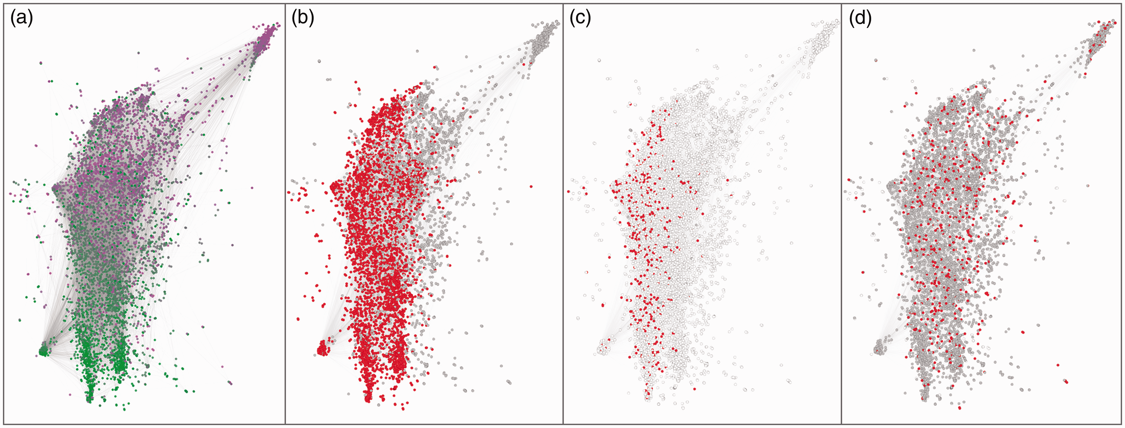
The “jazz network” with nodes colored according to: (a) the year of their birth or inception (from green for earliest dates to magenta for most recent); (b) their nationality (red for US, gray for all other countries, white for not available); (c) their ethnic groups (red for African American, gray for other ethnic groups, white for not available); and (d) their gender (red for women, gray for men, white for not available or others).
Figure 5(b) and (c) is dedicated respectively to nationalities and ethnic groups and confirms that the horizontal polarization is connected to “jazz purity” (non-American actors tend to be on the right, while most African American are on the left). Of course, not all variables will turn out to be connected to visual structures. Figure 5(d), for example, shows how men and women are mixed in our network, producing no relational fracture.
Using a force-directed spatialization to determine the position of nodes and size and color to project variables on the layout, we identified two sources of polarization: primarily time, stretching the network vertically, and secondarily “genre purity,” stretching it horizontally. These, however, are not axes. Force-vector algorithms are not dimensionality reduction techniques like correspondence analysis (de Nooy, 2003; ter Braak, 1986) and polarization may not be coherent across different clusters: the same variable might spread left-to-right in one cluster and top-down in another (Boullier et al., 2016).
Naming poles and clusters
In VNA, clusters are defined as regions where many nodes flock together, surrounded by emptier areas (the “structural holes” of Burt, 1995). In our network, the only easily identifiable cluster is the one at the top right, which contains the Scandinavian musicians of the Trondheim Jazz Orchestra. The other clusters are more difficult to identify and highlighting them requires using two advanced techniques.
The first is performed in a tool called Graph Recipes (

The “jazz network” with (a) the labels of the most salient node of each type (gray for individual, green for bands, blue for subgenres and red for record labels) and (b) the identification on the structure of the network in terms of the evolution of the jazz musical language.
Qualitative interpretation of the position of nodes and clusters
After finalizing our visualization, we can make sense of its overall structure and of the position of its key nodes 5 —it is an advantage of VNA that it allows observing both global patterns and local configurations (Venturini, 2012). In Figure 6(b), we observe (from the bottom to the top) the development of the jazz musical language: from Dixieland and Swing to Bebop, Hard Bop, Post-Bop and finally to Free jazz and Improvisation. From this backbone of Afro-American jazz, deviations (Cool Jazz and West Coast Jazz) and contaminations with other genres (Bossa Nova, Latin Jazz and Jazz Fusion) branch to the right of the chart. Figure 7 zooms on some of the clusters of Figure 6.

Mosaic providing a zoom on the different regions of the “jazz network.” (a) The bottom of the chart corresponds to the '30s and '40s and is marked by Decca and Capitol Records. The region of Dixieland and swing is split in two parallel clusters (also in Gleiser and Danon, 2003): to the right, the “white big bands” around Tommy Dorsey, Glenn Miller and Benny Goodman; to the left the “black big bands” around Louis Armstrong, Count Basie and Duke Ellington. Ella Fitzgerald and Billie Holiday are at the center because of their numerous collaborations. (b) Moving up toward bebop, new labels emerge such as Verve and Columbia. Very close to the node representing Bebop, we find Dizzy Gillespie and Charlie Parker, among the most influential artists of this style, and Sarah Vaughan who collaborated with both. In a bridging position are Woody Herman and Clark Terry, whose long careers spanned between Swing and Bebop. (c) Moving upward, the increasing dispersion of nodes illustrates the diversification of jazz in the '50s. On the left, Bebop evolves into Hard bop, thanks to Blue Note records and musicians such as Charles Mingus, Sonny Rollins, Thelonious Monk and Art Blakey, who is also at the origin of the Jazz Messengers ensemble, which creates a little cape on the left of the map. On the right, West Coast and Cool Jazz flirt with Latin music, originating Bossa Nova and Latin Jazz, popularized by Stan Getz and Quincy Jones. John Coltrane and Miles Davis occupy the center of this region, and of the whole graph, for their crucial role in bridging all these experiences. (d) In the '60s, contaminations turn toward rock and funk music originating Jazz Fusion, with musicians like Chick Corea, Herbie Hancock, John Scofield and Pat Metheny, as the Weather Report. At about the same time, through artists such as Joe Henderson and Michael Brecker, Hard Bop develops into Post-Bop thanks to musicians such as Wayne Shorter and Elvin Jones. (e) In the '70s and '80s, radical improvisation conquers the avant-garde of Free Jazz and Free Improvisation. Initiated by musicians such as Sun Ra, Cecil Taylor, Archie Shepp and Ornette Coleman, this style is developed by Anthony Braxton, John Zorn, Evan Parker and others. This genre seems to be supported particularly by European record labels such as JMT and ECM. This last record label is also the bridge that connects the cluster of the Scandinavian jazz to the rest of the maps.
The exploration above illustrates how to analyze a network by combining three visual operations: (1) the tweaking of a force-directed layout to highlight clusters and structural holes; (2) the sizing of nodes and labels to makes sense of the different regions of the chart; and (3) the coloring of nodes to understand the forces structuring the networks. It also introduces the advanced techniques of density heatmaps and qualifying nodes. For the sake of simplicity, we presented this sequence as linear and orderly, as if we knew from the beginning how to stack its operations and set its parameters. Of course, this was not the case and our actual inquiry entailed many trials and errors, and a lot of backs and forth between different visual variables and their parameterization. This type of iteration is very common in VNA, which cannot be carried out without a continuous switch between data and visualization, selecting and filtering, zooming and panning.
Exploring the topological ambiguity of networks
Beside illustrating the key techniques of VNA, the jazz example has shown the way in which this approach allows addressing, rather than reducing, relational ambiguity. Exploring node density, for example, serves a similar purpose to community detection algorithms: to distinguish highly connected node groups. Yet, the regions highlighted by VNA have vague outlines and large overlaps and are therefore much more like jazz subgenres than the well-defined partitions produced by a community algorithm. Similarly, VNA highlights the key positions of some artists and ensembles, without imposing the kind of strict ranking that would have emerged from a centrality metric.
As most statistical indicators, graph metrics discard much of the complexity of the empirical phenomena and focus on the few dimensions that can be precisely quantified (Desrosières, 1993). This reduction to exactitude can be a drawback in the exploratory stage of investigation, when the definition of the research questions is still underway and the mastery of the research corpus is still tentative. As long as the separation between “information” and “noise” (or “measure” and “errors”, if you prefer) remains unclear, efforts to clean up the picture risk to cut observation along precise but fallacious lines. In early stages, researchers should respect the inherent ambiguity of their subjects rather than imposing a premature and artificial ordering. In the words of John Tukey, the father of exploratory data analysis: “Far better an approximate answer to the right question, which is often vague, than an exact answer to the wrong question, which can always be made precise.” Data analysis must progress by approximate answers, at best, since its knowledge of what the problem really is will at best be approximate. It would be a mistake not to face up to this fact, for by denying it, we would deny ourselves the use of a great body of approximate knowledge. (Tukey, 1962: 14, original emphasis)

A classic statistical chart of gender distribution in different populations (left) and its redesign to retain some of the ambiguity of the original phenomenon (right) (original images and captions from Drucker, 2011).
This is one of the reasons why network visualizations are increasingly popular as ways to explore complex subjects: their visual ambiguity mirrors some of the empirical ambiguity of the phenomena they represent. The community structure of networks is, for instance, notoriously ambiguous. As argued by Calatayud et al. (2019), for some empirical networks, the “solution landscape” of community detection “is degenerate” because “small changes in an algorithm parameter or a network due to noise can drastically change the best solution” (see also Peixoto, 2019, 2020). In other words, for many networks, very different partitions are equally valid. In this situation, an ambiguous visualization may be more correct than a precise mathematical partitioning. Where community-detection algorithms tend to generate clear-cut and (generally) non-overlapping partitions, force-directed layouts reveal zones of different relational density but with blurred and uncertain borders. VNA is capable of preserving the inherent vagueness of concepts such as clusters, centers, fringes, and bridges. Network metrics (and network models) are great tools to test for relational hypotheses, but network maps can be more appropriate when the problem is to explore uncertain phenomena. Not despite their ambiguity, but thanks to it. Because they are problematic, graph visualizations incite researchers to problematize their observations and encourage an enquiring attitude (Dewey, 1938).
The need to preserve some of the inherent ambiguity of relational phenomena, explains why “legibility” is not necessarily the gold standard of network visualizations—at least not in the way legibility has been defined in the early years of “graph drawing.” When graphs were limited to a few dozens of nodes and edges, researchers could read networks as functional diagrams, such as flowcharts or trees (Lima, 2014), that is to say by following the paths connecting their components. This diagrammatic approach, however, becomes untenable for the medium and large networks increasingly made available by digital traceability and the kind of “social big data” that constitutes the object of this journal.
Originally introduced for diagrammatic purposes like “minimizing edge crossings” or “reflecting inherent symmetry” (Früchterman and Reingold, 1991; Purchase, 2002; Purchase et al., 1996), force-directed layouts have outlived their origins. Nowadays, they are no longer used to follow paths in small networks, but rather to explore large relational datasets and eyeball relational structures such as clustering, centrality, or betweenness. We call this second perspective topological as its objective is to provide an overview of topological structures (see Grandjean and Jacomy, 2019).
While diagrammatic and topological perspectives coexist in practice, the two approaches come from different traditions—algorithmics for graph drawing and information design for network visualization—and serve different needs. A diagrammatic stance suits small networks, whose configuration is simple enough to be qualitatively appreciated, while a topological attitude is more appropriate for larger networks, where pattern detection and exploratory data analysis (Behrens and Chong-Ho, 2003; Tukey, 1977) are preferred. This explains why, in the last few years, the attention of scholars has gradually shifted from the diagrammatic to topological approach. Diagrams, favored in the early years of network visualization, are becoming obsolete when confronted with the growing size of relational datasets (Henry et al., 2012). Reviewing an assessment of spatialization algorithms by Purchase et al. (1996), Gibson et al. (2013) note for instance: The type of tasks she [Helen Purchase] asked her users to complete … were finding shortest paths, identifying nodes to remove in order to disconnect the graph and identifying edges to remove in order to disconnect the graph … It is unclear as to if this type of accurate, precise measurements are typical analysis tasks for graphs with hundreds or thousands of nodes … If those kinds of tasks become infeasible due to the volume of nodes and edges then the better layouts should support the user for a different set of tasks … to support users in tasks concerned with overview, structure, exploration, patterns and outliers. (pp. 27, 28)
Although both perspectives coexist in the literature, the topological visualization is underdiscussed. For instance, Dunne and Shneiderman (2009) “Netviz Nirvana” only comprises one topological criterion (the last one): “(1) Every node is visible; (2) For every node you can count its degree; (3) For every edge you can follow it from source to destination; (4) Clusters and outliers are identifiable” (see also Brandes et al., 2006b; Brandes and Wagner, 2004; Hansen et al., 2012). The topological perspective has been mentioned multiple times but has rarely been addressed directly until recently (see for instance Soni et al., 2018).
Toward a measure of spatialization quality
Effective in practice, visual network analysis remains conceptually underdeveloped. As observed by Bernhard Rieder and Theo Röhle: “tools such as Gephi have made network analysis accessible to broad audiences that happily produce network diagrams without having acquired a robust understanding of the concepts and techniques the software mobilizes” (Rieder and Röhle, 2017). To master VNA, it is crucial to appreciate not only its strengths, but also its biases, many of which come from the difficulty to separate the “positive ambiguity” inherited from the represented phenomenon from the distortions coming from fitting a multidimensional mathematical object in the two dimensions of a computer screen (or piece of paper).
Figure 9 illustrates the problem. While a clique of three nodes can be drawn as an equilateral triangle in a way that is directly justifiable by its relational properties, a clique of four cannot. Since in a clique all nodes are equally connected, they should all be at the same distance from each other, which is impossible for more than three nodes (unless, of course, if all nodes are positioned one on the top of the other). In Figure 9(b), A-B and A-D are equally connected but are represented at different distances. Gauging the distortion of force-driven layouts, however, is far from easy, as we will illustrate discussing the failure of two complementary attempts to assess the layout quality and some possible directions for future research.

(a) An exact network spatialization and (b) a necessarily skewed network spatialization.
First attempt: Assessing layout quality without assuming clusters
An obvious solution to assess how a given layout respects network relations would be to compare the Euclidean distance between nodes with their relational distance. Unfortunately, not only in graph mathematics offers several different measures of relational distances exist (making it difficult to choose one for comparison), but our exploration suggests that none of them captures the arrangement of force-directed spatialization.
In Figure 10, we compare the Euclidean distance between pairs of nodes in the jazz network as spatialized by ForceAtlas2 (LinLog and gravity = 0) with two relational distances: the length of the shortest path (geodesic distance) and the mean commuting time. This last quantity is defined as the average number of steps that a random walker, starting from one node, takes to reach the other and then go back to the starting node (Fouss et al., 2007).
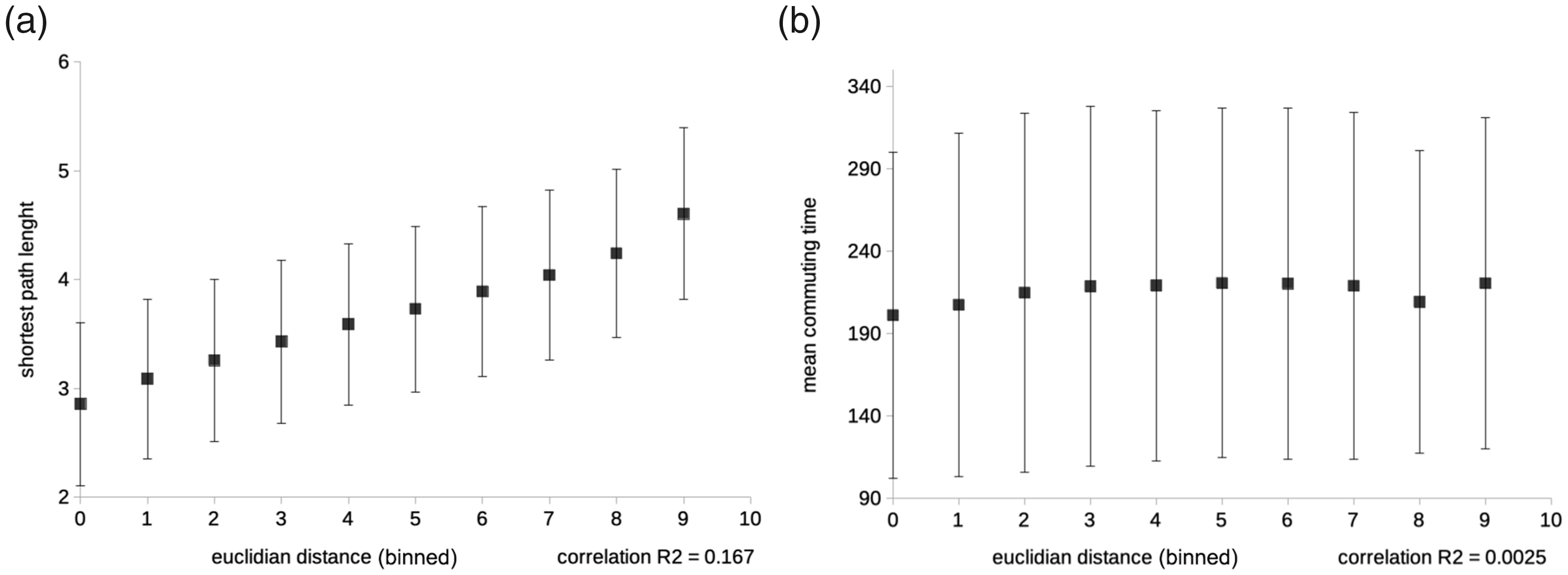
Scatter plots showing the poor correlation between the binned Euclidean distances between pair of nodes (jazz network, spatialized with ForceAtlas2, LinLog, gravity = 0) and both the shortest path and the mean commuting time (respective R2: 0.167 and 0.0025). The dots represent the mean relational distances between pairs of nodes at a given Euclidean distance. The error bars represent the standard deviation.
The Euclidean distance is somewhat correlated with the geodesic one as expected, but the variability is considerable (Figure 10(a)). There is almost no correlation with the mean commuting time (Figure 10(b)), as random walkers can drift far away even from a neighboring node, especially when nodes’ degrees are high. While How to read networks and make them legible section proved the efficacy of ForceAtlas2 in generating a layout that corresponded to notions of jazz history, this efficacy is not captured by the correlation between Euclidean and relational distances. This should not come as a surprise. As discussed above, force-directed layouts are not meant to observe the connections between pairs of nodes (as in a diagrammatic perspective), but to provide a general overview of the topological structures of a network. We will move in this direction in our next attempt at assessing layout quality.
Second attempt: Assessing layout quality through clustering
To move from individual nodes to topological features, our second attempt at assessing layout quality considers the correspondence between structural and visual clustering. In Figure 11, the same two graphs—our jazz network and the Karate club network 6 —are partitioned according to k-means geometric clustering and to Louvain modularity (Blondel et al., 2008) and. The first algorithm is based on proximity in the Euclidean space generated by ForceAtlas2, the second on the relational structure of the network. The comparison reveals some correspondence, but also several discrepancies (for instance, comparing the two figures at the top of Figure 11 reveals that the geometric k-means clustering tend to generate clusters with similar sizes in terms of nodes, while this is not the case for the relational clustering detected by Louvain modularity).

Clusters identified by k-means (left: a and c) and Louvain modularity maximization modularity (right: b and d) on the jazz network (top: a and b) and the karate club network (bottom: c and d).
Figure 12 proposes a more systematic comparison between Louvain modularity and k-means, focusing on the same two networks and four different layouts: ForceAtlas2 linlog mode gravity = 0; default ForceAtlas2; default Früchterman & Reingold; a random layout. For each graph, we compute the Jaccard similarity between the clusters identified by modularity and those identified by k-means in different layouts. 7 A richer comparison is available in the supplementary materials and at: https://github.com/tommv/ForceDirectedLayouts. The random layout is added for control, as similarity is expected to be minimal for it.

Similarity between the clusters identified by Louvain modularity for each network and the clusters identified by k-means in different layouts. Higher bars indicate a greater correspondence between the Euclidean and network clustering.
Again, the results are mixed: the correspondence between modularity and k-means clustering is rather good in highly clustered networks, such as the karate club, but unsatisfactory for networks that are more structurally ambiguous and that exhibit polarization rather than clustering, such as the jazz network. Once more this should not come as a surprise. If, as we argued, the value of force-directed layouts lies in their capacity to conserve ambiguity, then such value can only be poorly captured by a measure that takes for granted the existence of a clear-cut and non-overlapping clustering.
The case for a measure of spatialization quality
The difficulty to find a convincing measure of the spatialization quality should not lead us to conclude that force-directed layouts cannot be used or trusted. In fact, two reasons suggest that these layouts may be very efficient at the job of translating network structures visually. The first is the pervasiveness of spatialization techniques. Not only have they been used for three decades with no major modifications, but they have also extended to other areas. Indeed, dimensionality reduction algorithms in multivariate variable distribution, such as t-SNE (van der Maaten and Hinton, 2008) and UMAP (McInnes et al., 2018), are implicitly building networks and spatializing them. The way they minimize entropy by gradient descent bears a striking resemblance to force-directed layouts. Both are iterative relaxation techniques converging to an approximate equilibrium and both are meant to optimize a function, which is explicit for gradient descent and implicit for force-directed layouts (roughly corresponding to the energy of the system). The increasing success of t-SNE and UMAP suggests that the mathematical community has not found better than these quite similar techniques to produce interpretable visual objects.
The second reason is Andreas Noack’s work on the LinLog algorithm. In his thesis, Noack (2007a, 2007b) proposes a layout quality metric called “normalized atedge length,” corresponding to the total geometric length of the edges in a spatialized graph divided by the total geometric distance between all nodes and by the graph density. The smaller is the value of this metric, the more the layout has succeeded in representing relational communities as compact and separated visual clusters—for the numerator decreases when connected nodes are close (thus shortening the edges), and the denominator increases when disconnected nodes are far (thus increasing the overall distance). While the normalized atedge length does not set an optimum expectation level and does not quantify the amount of bias due to dimensionality reduction, it can be used to compare layouts. This comparison allowed Noack to prove that the best results are obtained by employing a linear force of attraction (i.e., linearly proportional to the distance of nodes) and a logarithmic force of repulsion, as in the “LinLog algorithm,” often considered as the empirical gold standard of spatialization quality.
In a later paper, Noack (2009) also demonstrated, for a very simple network, how the normalized atedge length is mathematically equivalent to the modularity as defined by Newman (2006). This result provides evidence that the LinLog algorithm may be close to the optimum in the task of translating mathematical communities into a visual clustering. It also suggests that the problem of minimizing “normalized atedge length” is probably NP-complete, as is the problem of maximizing modularity (Brandes et al., 2006a). This indicates that it may be hard to outperform the iterative convergence of force-directed layouts by using a deterministic approach.
Searching for a spatialization quality metric is a case of “experimenter’s regress” (Collins, 1975), a situation where we face a dependency loop between theory and empirical evidence. We are not entirely sure that Noack’s “normalized atedge length” is the metric that should be minimized, and we have no definitive proof that the LinLog is the best approach to minimize it. All we know is that the “normalized atedge length” is a reasonable definition of spatialization quality and that, among the existing layouts, LinLog is the one that delivers the best results according to it.
To provide a solid mathematical ground for visual network analysis, we need a quality metric independent of current algorithms. Such a metric would allow evaluating the overall quality of a given algorithm on a given network and, possibly, indicating which individual nodes and edges are visually rendered in the least satisfactory way. Besides quantifying the distortions of two-dimensional fitting, the measure would help understand what a good spatialization is and which type of information is conveyed by force-directed layout.
Conclusion
This paper starts from the empirical observation that scholars in a variety of disciplines in social and natural sciences are increasingly relying on network visualizations to eyeball their relational datasets and to convey their findings. The growing popularity of these charts suggests that, far from being merely decorative, points-and-lines visualizations have a distinctive heuristic force. Their use constitutes a fully-fledged form of network analysis, though one that differs from the metrics and models typically used in social network analysis and network science. This visual analysis, however, has so far remained a sort of “trick of the trade,” whose virtues (but also whose limits) are seldom acknowledged or explicitly discussed. This lack of documentation explains the mistrust that many scholars still maintain against network visualizations.
In this paper, we investigated this evocative power of network visualizations and we tried to make explicit the method behind the practices of visual network analysis. We did so by retracing the history of force-directed layouts and discussing the way in which they produce a space in which the mathematical structures are translated in visual patterns. Balancing the attraction of edges and the repulsion of nodes, force-directed algorithms generate a two-dimensional representation of networks in which clusters tend to appear as denser gatherings of nodes; structural holes tend to look like sparser zones; central nodes move towards middle positions; and bridges are positioned somewhat between different regions. We call this type of visualization topological, as its objective is to turn relational structures into visual patterns.
The value of this topological visualization, we argued, has been disregarded by both network visualization and network analysis. On the one hand, in network visualization, force-directed layouts have been undervalued because their results have been judged from a diagrammatic perspective in which charts are used to identify paths between nodes rather than to grasp more general relational patterns. On the other hand, in network analysis, VNA has been discounted because of its inherent ambiguity and the impossibility to define with precision the meaning of proximity in a spatialized network. In this paper, we argued that this elusiveness is not a good reason to dismiss points-and-lines charts. Instead, the ambiguity of points-and-lines charts should be tamed by separating the distortion coming from the projection of a multidimensional object in a two-dimensional space, from the blurriness inherent to relational phenomena that should not be evacuated, but rather cherished and investigated.
Distinguishing a good ambiguity from a bad one, however, is not an easy task and in the last section we discussed a few mathematical reasons why this is the case. Originally introduced to minimize edge crossing, force-directed layout turned out to have unexpected and not fully understood hermeneutic capacities. In the absence of a clear understanding of the outcome emerging from the iterative interaction of attraction and repulsion forces, it is difficult yet crucial to design precise tests to assess the quality force-directed layout. Waiting for a precise measure of spatialization quality, however, VNA can still be productively used as a tool for exploratory data analysis. In this paper we described and exemplified a series of techniques that we developed to this objective, hoping to help researchers to be more mindful in the use of network charts and to build trust in a form of analysis that is widely used, but insufficiently investigated.
Supplemental Material
sj-pdf-1-bds-10.1177_20539517211018488 - Supplemental material for What do we see when we look at networks: Visual network analysis, relational ambiguity, and force-directed layouts
Supplemental material, sj-pdf-1-bds-10.1177_20539517211018488 for What do we see when we look at networks: Visual network analysis, relational ambiguity, and force-directed layouts by Tommaso Venturini, Mathieu Jacomy and Pablo Jensen in Big Data & Society
Footnotes
Declaration of conflicting interests
The author(s) declared no potential conflicts of interest with respect to the research, authorship, and/or publication of this article.
Funding
The author(s) received no financial support for the research, authorship, and/or publication of this article.
Supplemental material
Supplemental material for this article is available online.
Notes
References
Supplementary Material
Please find the following supplemental material available below.
For Open Access articles published under a Creative Commons License, all supplemental material carries the same license as the article it is associated with.
For non-Open Access articles published, all supplemental material carries a non-exclusive license, and permission requests for re-use of supplemental material or any part of supplemental material shall be sent directly to the copyright owner as specified in the copyright notice associated with the article.