
Abstract
Data produced by humans and machines is more and more heterogeneous, visual, and location based. This availability inspired in the last years a number of reactions from researchers, designers, and artists that, using different visual manipulations techniques, have attempted at repurposing this material to add meaning and design new perspectives with specific intentions. Three different approaches are described here: the design of interfaces for exploring satellite footage in novel ways, the analysis of urban esthetics through the visual manipulation of collections of user-generated contents, and the enrichment of geo-based datasets with the selection and rearrangement of web imagery.
Introduction
The nature of data generated by humans and machines is increasingly more heterogeneous, visual, and geographical. Humans are producing more photos than ever before: from the array of figures that cyclically are used to underpin the increasing visuality of our society, one of the most striking is the one comparing the amount of photographs taken every two minutes by Americans only to those taken in the entire 19th century (Mirzoeff, 2016). Thanks to location-aware technologies embedded in mobile devices, a large part of this massive visual production is building up a corpus of visual material pinned to physical locations. Coverage of panoramic views by Google Street has expanded to reach an unprecedented number of cities, remote areas, historical landmarks, and indoor locations worldwide. Similar technologies have been deployed by open communities with the goal of producing an alternative crowd-sourced photographic mapping of our surroundings. Active satellites constantly generate streams of high-resolution footage of the ground, online communities organize themselves with DIY technologies—such as balloon and kite mapping—to produce alternative photographic footage from above, and private companies sell drones able to capture high-resolution maps and 3D models of the ground.
Pictures taken and shared on social media, overhead imagery, and street-level photographic mapping constitute an incredibly rich corpus of location-based visual material, partly available online. In the last years this availability inspired a number of reactions from researchers, designers, and artists that have attempted at reusing this material with different intentions. Direct visualizations of thousands of photos from social media, superimposition of similar images collected from the web, computer-generated collages of Google Image results, handpicked strips of street view imagery rearranged as catalogs: what seems to be a leading thread of these experiences is the use of location-based visual material found online as raw footage, repurposed to design, through more or less invasive manipulations, alternative views and perspectives on our surroundings.
Telling a story about urban changes using historical Street View panoramas; visualizing the materiality of high frequency trading through location-based user-generated content and Street View imagery; make a point about geographical visual stereotypes using collages of Google Image search results; inviting to reconsider formal repetitions in human-built infrastructures by selecting and rearranging satellite footage: these experiments resonate with the definition of a map as a system of proposition rather than a representation (Wood and Fels, 2008). They are artifacts designed with a specific intention that goes beyond the mere representation of space: they highlight unexpected connections, help to imagine alternative spatial configurations, or expose the way in which geographical landmarks are perceived.
Although using various types of material and applying different techniques, one may identify three (sometimes overlapping) approaches in which footage collected online is repurposed:
Repurposing available satellite imagery with various strategies (from the design of interfaces for accessing the footage in novel ways to the superimposition of data layers); Adding materiality to an array of geo-coordinates through the selection and rearrangement of heterogeneous visual material found online; Extracting visual signature of specific places—or their clichéd representation—by means of selection and visual manipulation of different sized collections of user-generated content.
The view from above: Repurposing available satellite imagery
The view from above, once prerogative of the (military) power, is now a democratized view: with an incredible level of detail, submeter satellite footage covering extensive areas of the globe is now available to anyone. The fruition and exploration of this material is however limited to available services, with predefined exploration patterns and functionalities. Design has proved to be very effective in transforming available raw data sources into actionable knowledge, by structuring and presenting data and information in meaningful ways (Bonsiepe, 2000). Terrapattern represents an effort to design an entry point into the increasing availability of high-resolution photographic mappings of the world (Figure 1). Described by the authors as “similar-image search for satellite photos,” it offers a simple interface for performing “visual query by example” on satellite footage. It allows to search and localize visual features that can reveal undiscovered stories about humanity’s impact into the world (including fracking wells, animal herds, logging roads, and construction sites).
Screenshot of the TerraPattern interface for the city of San Francisco. http://sf.terrapattern.com/ (accessed 1 September 2016).
Terrapattern is not the first and isolated attempt at exploiting satellite imagery to map human and natural activities. Other experiments exploit the same view with different techniques: from visual manipulations of the footage itself to the superimposition of additional data layers, performed through graphical annotation of the material. Examples include the estimation of global oil supply by monitoring and analysis of storage tanks seen from above (Orbital Insight, 2016); a “near real-time deforestation monitoring system” to promote conservation in the Andean Amazon region of South America (Amazon Conservation Association and Conservación Amazónica, 2015); whale population assessment in the Argentinian coast (Fretwell et al., 2014); identification of war signs and documentation of human right violations (The Enough Project and DigitalGlobe, 2010). Although still limited to a few urban areas, what makes Terrapattern different compared to these examples is its exploratory nature and the promise of making the search process of satellite footage available also to nonexpert users.
A different response to the availability of highly accurate photographic rendering of the view from above is the one offered by artist Jenny Odell. In her Satellite Collections (2009–2011), the artist manually selects infrastructural elements (e.g., swimming pools, nuclear cooling towers, stadium, basketball courts) from Google Earth and reorganizes them, decontextualized from their background, into compact aggregates (Figure 2). Selection and decontextualization force to observe those elements anew, reducing background noises. The author describes the project as an invite to exercise observation of—and stimulate curiosity toward—“our own inimitably human landscape” (Odell, 2013). The technique, if applied systematically to footage from different areas, can provide a glimpse into the impact of man-made landscape modifications, by region.
137 Landmarks and 120 Stadiums from the Satellite Collections by Jenny Odell. Courtesy of Jenny Odell. http://www.jennyodell.com/satellite.html (accessed 1 September 2016).
Adding materiality to geo-coordinates through web imagery
Visual elements can provide that material dimension that is somehow lacking in most of (big) data-driven analysis (Cardullo, 2015). Photographs and visual footage may be used to provide context and materiality to a collection of geo-coordinates.
The project Officer Involved (2016), by Josh Begley, uses imagery from the web to add a visual layer to a database on police brutality compiled by The Guardian. The database contains data on people killed by law enforcement agencies in the United States in the last two years (including demographics, location, and date). Officer Involved, featured in the online outlet The Intercept, presents each of those location data as an image extracted either from Google Street View or Google Maps satellite footage, providing what Teju Cole (2015) has defined “an immersion in the environment of someone’s last moments.” The images, captioned with the victim’s name and the city where the killing occurred, compose a large catalog of empty intersections, town sidewalks, and suburban streets. Isolated from the seamless continuum of Google Maps and reorganized as an array of elements, those apparently insignificant places constitute a reminder of the breadth of the phenomenon, providing at the same time the specificity of each single killing (Figure 3). Josh Begley is not new to these kinds of interventions, working with visual footage in order to add context to (location) data. Previous examples include a collection of bird’s-eye views of U.S. prison buildings (Begley, 2012) as well as a catalog of satellite views of reported death locations of migrants trying to cross the U.S. border from Mexico (Begley, 2016).
Landing page of the project Officer Involved by Josh Begley, with the first images of the grid. Courtesy of Josh Begley. https://theintercept.com/2015/06/09/officer-involved/ (accessed 1 September 2016).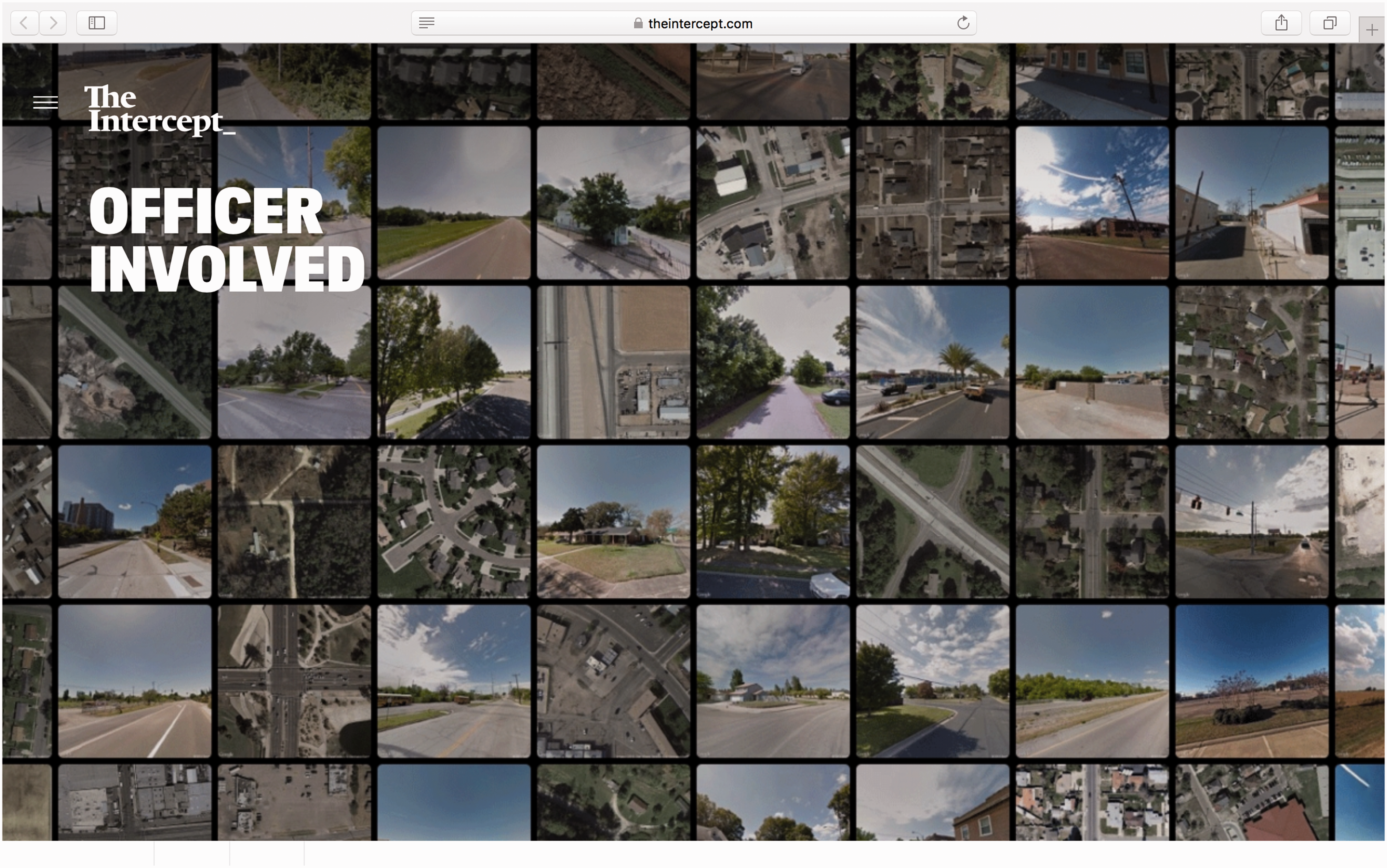
British artist James Bridle (2012) worked in a similar direction with the project Dronestagram. For almost three years, he collected and posted on Instagram (cross-posting on Tumblr and Twitter) satellite images of locations of drone strikes as they occurred. Strike time and location data were provided by The Bureau of Investigative Journalism, which at the time reported on drone wars in Pakistan, Yemen, and Somalia. The account, in the words of the artist, contributed to make drone strikes (and their location) “a little more visible, a little closer. A little more real.”
The project Scandaglio (2016), by Italian collective Offtopic Lab (www.offtopiclab.org) reuses Google Street View imagery to visually enhance a mapping of abandoned areas undertaken by the municipality of Milan. The timeline feature embedded in Google Street View, which allows to see images of a location taken in the past by Google cars, is repurposed here as a visual evidence machine. The project provides an explorable interface of more than 100 locations in the city (empty buildings, abandoned green areas, construction sites) as captured by Google in different years, allowing monitoring urban development overtime (Figure 4).
Screenshots of the timeline view of the project Scandaglio, showing the same location in four different moments. Courtesy of Offtopic lab. http://www.offtopiclab.org/scandaglio/molo/places/ (accessed 1 December 2016).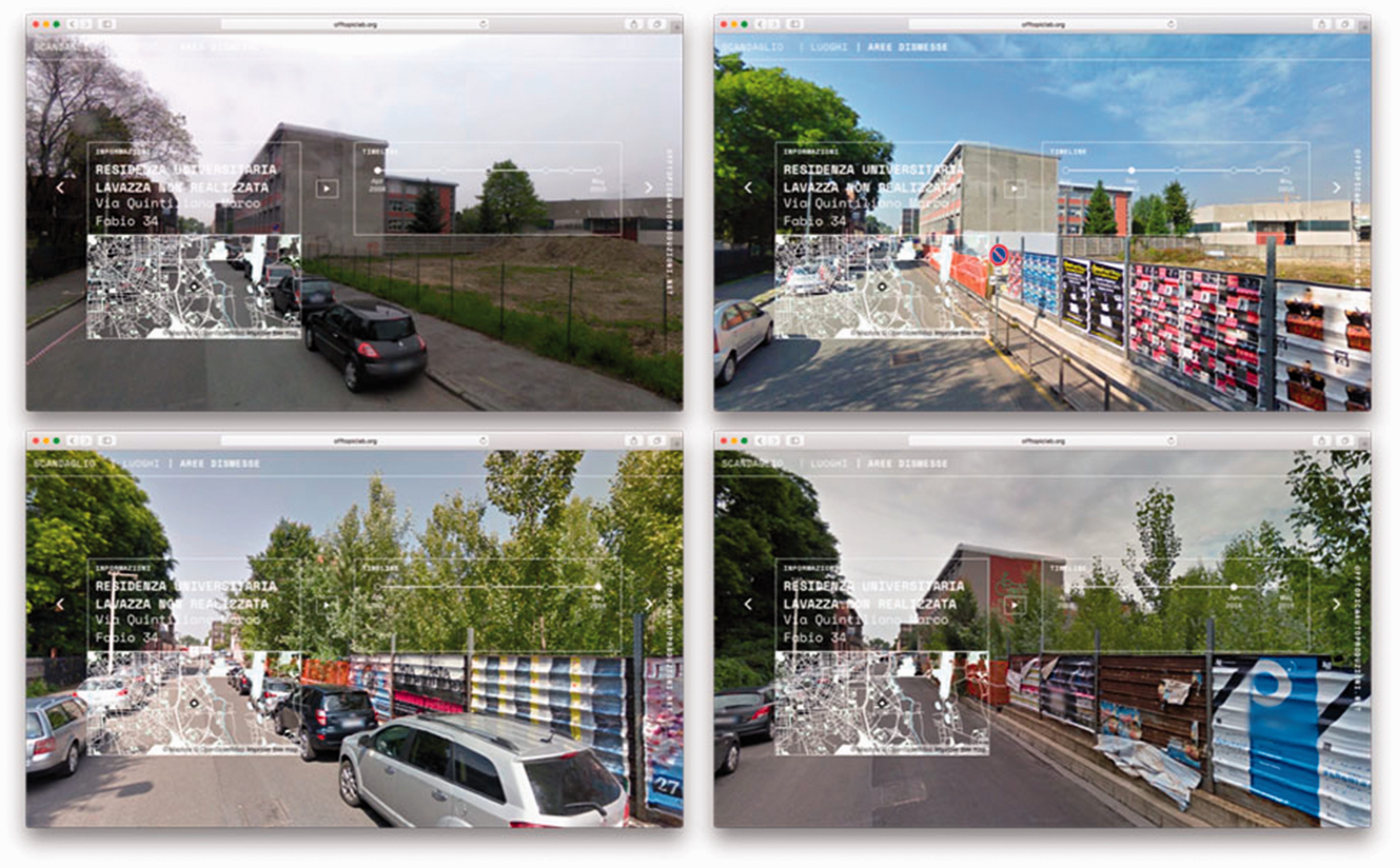
Reconciling geo-coordinates with their surroundings is also the intention of the project “A Network of Fragments/Fragments from Networks” by Benoît Verjat and Donato Ricci. The interactive installation, part of the exhibition Reset Modernity!, “aims to make visible local fragments of various networks used for High Frequency Trading.” For each coordinate of this network, a view of the surroundings is offered by juxtaposing content from different sources (Google’s satellite imagery, Google Street View, and Instagram), assembling together, in one compact space, the location of the network plotted on a map, the satellite view of the antenna, and the ordinary visual landscape of those living around it (Figure 5).
Still from the interactive installation “A Network of Fragments/Fragments from Networks”, by Benoît Verjat and Donato Ricci. Courtesy of the artists. Video documentation is available at https://vimeo.com/156404164 (accessed 1 September 2016).
Composite locations: Extracting places’ visual signature from user-generated contents
The amount of images produced and shared everyday has reached an unprecedented scale. According to Mary Meeker’s 2016 Internet Trends report, every day over three billion images are uploaded and shared on Facebook-owned platforms and Snapchat alone (Meeker, 2016). With geotagging features becoming popular in most social media platforms, such a large corpus of content, as well as the metadata attached to it, are increasingly exploited by researchers to study urban dynamics and structures (Crandall et al., 2009; Hochman and Manovich, 2013; Hollenstein and Purves, 2010). The project Phototrails by Nadav Hochman at al. (2013) uses large collections of geo-tagged Instagram images to compare “global cities’ visual signatures.” The observation of such visual signatures is enabled by a series of transformations (together with specific measurements) applied on the collected material: images are drastically reduced in their size and organized in different layouts, according to measured values or metadata (e.g., median hue, brightness mean, time of upload). The techniques enable the detection of spatial and temporal visual patterns in large collections of geo-referenced images, and the key transformation that makes it possible is the reduction of each element to a smaller size, where details are lost in favor of focusing the attention on formal features (Figure 6).
Phototrails. Radial visualizations of 4 cities (New York, San Francisco, Tokyo, Bangkok), visualizing 50,000 Instagram photos organized by different measured formal features. http://phototrails.net/ (accessed 1 September 2016).
A different technique for distilling a place signature from visual material collected online may be found in the project “CIRCA” by Federica Bardelli (Figure 7). The project aims at repurposing results from local version of Google Image Search to observe how national identities are reciprocally represented and perceived by different countries. In the part of the project dedicated to landscape observation, images of iconic buildings for each country are manually selected from the results (e.g., mosques for Turkey, the coliseum, and the leaning tower of Pisa for Italy) and then aggregated into composite visualizations based on each national image collections. The outcomes function as “comparable representations” enabling the observation of “the metamorphosis of specific cliché,” with the shifting of the point of view.
Circa, by Federica Bardelli. Aggregate composites of iconic buildings images, collected querying [Italy] in different languages in national versions of Google Image Search. Courtesy of the artist. http://cargocollective.com/CIRCA/Sul-Paesaggio-About-Landscape (accessed 1 September 2016).
Photographer Pep Ventosa explores a different process in order to extract places’ visual signature using images culled from the web. In the series titled “The collective snapshot” (2012), he selects similar-looking images of iconic landmarks and then overlays them to create what he defines “an abstraction of the places we have been” (Wilson, 2012). The technique, similarly used by artist Corinne Vionnet in the project Photo Opportunities (2004–2015), exposes repetition in photographic formats and compositions, providing a reflection on the extent to which affordable image capturing technologies have limited rather than expanded our ability to look at our surroundings. The project Le Myope (2016) from Paris-based artist Vincent Sapajou offers a playful response to the same argument. Described as a “short-sighted camera” by the author, Le Myope is a connected camera that doesn’t take any new photograph but instead shows its user an existing picture collected from the web, similar to the framed subject. The camera, built on top of the similar-image feature of Google Search, comes with code and instructions for anyone to build their own.
Conclusions
In 1989 Italian photographer Luigi Ghirri (2010) denounced a lack of representation of our surroundings, resulting in an essential inability to relate with our environment: Television is 99% made of faces. Our surroundings are never represented. I believe that this negation of the space we inhabit is a very relevant fact: the inability to relate with our space and environment is linked to an absence of representation; and somehow, to a negligence about environmental issues. (Translation by the authors)
Our surroundings are now extensively mapped: by users uploading photos on social media and community undertaking visual mapping projects, by Google cars driving through cities and trekkers reaching remote areas, by satellites orbiting overhead and drones flying over fields and construction sites. Nevertheless, this abundant visual footage risks to be lost in the digital stream of visual production that, as argued by Trevor Paglen (2016) in a recent essay, is “fundamentally machine-readable” and “can only be seen by humans in special circumstances and for short periods of time.” The presented projects constitute a positive reaction to put this footage at use: by experimenting with a number of visual manipulation techniques—automatic collage, superimposition of thousands of photos, decontextualization, sampling—they extract this material from the stream of machine-ready visual material available online and, reusing it with new intentions, they produce alternative perspectives on our surroundings.
Footnotes
Declaration of conflicting interests
The author(s) declared no potential conflicts of interest with respect to the research, authorship, and/or publication of this article.
Funding
The author(s) received no financial support for the research, authorship, and/or publication of this article.