
Abstract
Today data art is a full-fledged and maturing artistic practice. Like painting, artists are creating new visuals and representations with data. Like sculpture, artists are recombining bits to build something new out of the commonplace. Like photography, artists are using data to mirror or reflect contemporary society. In my own practice for the last 15 years I have been using data (both sourced and generated) to make works at the intersection of art, design and activism with a recent focus on environmental topics. It is my belief that through improved representation of, access to and public involvement with data we can increase understanding of important issues (such as environmental degradation) and provoke behavioural and systemic change. In this paper, I will examine the evolution of my work using data as my medium as well as outline tactics for data art to promote change.
Data as art
Data art, put most simply, is an artistic practice that uses data as its medium. Artists are both using data from external sources and collecting or creating data as part of their work. The art works cut across many mediums (e.g. digital, sculpture, photography) and genres. This makes the category nebulous. Data art can be conceptual or abstract. Data art is sometimes overtly political, but not always. It can be straightforward and functional or intentionally obscure. In an article about artistic data visualization (a subset of data art), Fernanda B. Viégas and Martin Wattenberg explain the difficulty of defining this art form another way: “Defining what constitutes ‘artistic’ visualization is hard, if only because defining art itself is hard. To sidestep that philosophical question … artistic visualizations are visualizations of data done by artists with the intent of making art” (2007). Despite this vagueness, the category of data art is undeniable. The rise and subsequent maturing of this type of artistic production parallels the rise of personal computing and the explosion of data collection, distribution and analysis in contemporary life.
While data art is a relatively new term, works like Han Haacke’s MoMA Poll, Gordon Matta-Clark’s Fake Estates and On Kawara’s Today series are early examples of pre-digital data art from the 1960s and 70 s. These artists displayed the accumulation of data through polling museum visitors, acquiring real estate deeds of microplots in Queens, New York or, in Kawara’s case, simply painting the date nearly 3,000 times over four decades. More recently, artists like Mark Lombardi, William Powhida, and Ward Shelley have made drawings and paintings out of numerous data points to reveal the shape of a network or a process over time. The power of these works lies in the assemblage of disparate parts into a new, unified whole or statement. Other artists, like sculptor Natalie Miebach, use data available online and/or self-generated data from consumer technologies as a starting point and translate it into forms that are not always legible as information but visually intriguing. Today, however, data art is most commonly perceived as digital, algorithmic, and interactive. Seminal works taking advantage of the free flow of data, real-time computation and the internet are Antoni Muntadas’ File Room (1994), Josh On’s They Rule (2001), and Radical Software Group’s Carnivore (2000).
These examples reveal my preference for data art that grants access to hidden, inaccessible worlds or reconfigures data sets to convey new meaning as a political stance. The following narrative describes my pursuit of data art toward these ends. Such pursuits, however, are not limited to the field of art. The massive quantities of information in our world and the decision-making processes it supports, often referred to simply as Big Data, cause concern and are instigating new fields of inquiry within the humanities and social sciences too. Dana Boyd and Kate Crawford in their paper Six Provocations for Big Data outline the problems and what is at risk, including the definition of knowledge itself (2011). They write: “Social and cultural researchers have a stake in the computational culture of Big Data precisely because many of its central questions are fundamental to our disciplines. [We] believe that it is time to start critically interrogating this phenomenon, its assumptions, and its biases.” Cross-disciplinary interrogations are crucial today as technical expertise, proprietary systems and big business/governments severely limit or obstruct public conversations around Big Data.
Portraits in data form
I was living in Pittsburgh, Pennsylvania during graduate school in the late 1990s and early 2000s when it became apparent the world was spinning around a new gravitational point. There was one moment that starkly revealed this transition to me. A clerk at a liquor store swiped my driver’s license through a card reader rather than visually identifying my date of birth. Over the next couple of days I pieced together what had happened and why. The clerk had permanently secured my information for a centralized database required of state-run liquor stores in Pennsylvania. Liquor stores were amassing personal information from drivers’ licenses acquired at point of purchase to consult in the future if ever deemed necessary for law enforcement. Suddenly the common act of buying a bottle of wine became potential evidence in my file for an incident waiting to happen.
I was already fascinated by the concept of the data body in those early years of surrendering our lives over to the World Wide Web. What did we look like in data form? As we embraced the World Wide Web, we were birthing shadow bodies from the digital traces of our online interactions. Little did we know how massive the reach of online and offline data collection would become and how the merger of the two would create the foundation for a new surveillance superpower. This superpower—a conjoining of business and government—seemed to become frictionless in the post-9/11 climate.
I eventually designed a direct response to these emerging data worlds with Beatriz da Costa (also an artist) and Jamie Schulte (an engineer). This was the first of several collaborations, and we would later call ourselves Preemptive Media. This first project took the form of a performance, installation and online toolkit titled Swipe (2002–2005). The main event was a customised bar that we set up in museums and galleries to serve drinks during receptions. Dressed as bartenders, we would request identification from all our patrons and scan the cards before taking a drink order (Figure 1). Unbeknownst to our audience, we would execute data matching using personal information encoded in the driver’s license against a variety of online databases in the minutes it took to prepare a drink. The drink would be presented along with a “data receipt”. The receipt included the exact information from the license barcode (e.g. name, address, gender, age, eye color) augmented with information accessed from the other databases and our own interpolations (e.g. body mass index). Information fell into several categories, including “Biometric Data”, “Value Assessment”, “Consumer Behavior”, and “Household Statistics”. At the top of the receipt read the drink order (e.g. Pilsner) and the cost, which was always “Free?”.
1
Swipe, Preemptive Media (from left to right: Brooke Singer, Jamie Schulte and Beatriz da Costa), 2004.
The motivation for us was to enable others to experience an “ah ha” moment, similar to the one that I had in the liquor store in Pittsburgh, where a network of operations, triggered by a commonplace activity, came into sharp focus. The tactic here was to recreate, to the best of our abilities, data surveillance techniques that were little recognized and not well understood. We wanted to crack open the black box of data-based operations to shed light and allow for dialogue (where we were finding none) on the topic of personal data collection, analysis, and profiling.
Another artist who took a similar, yet different, tactic is Owen Mundy in his Give Me My Data (2010) project. Mundy helps people export their data from Facebook to reuse in visualizations or other modes of digital storytelling. He himself expresses social network data in atypical and compelling ways as seen in his series I am Unable to Fulfil Your Wish (Figure 2). In this project Mundy uses anonymous social network data and graphing tools to visualize relationships between economic systems and social structures that ultimately are illegible due to their complexity. Social media, not yet a force when we created Swipe, has become one of the major engines for personal data collection today. The urge to engage and “share” on social media is often trailed by the concern for the subsequent (mis)use of the data and corporate profiting from personal interactions. While at face value the use of these platforms is “free”, it is now commonly understood that participation in these spaces is: “no entrance fee, but strings attached”.
2
As Mundy writes: While clearly utilitarian, this project intervenes into online user experiences, provoking users to take a critical look at their interactions within social networking websites. It suggests data is tangible and challenges users to think about ways in which their information is used for purposes outside of their control by government or corporate entities. (Give Me My Data, 2010)
I am Unable to Fulfill Your Wish, Owen Mundy, archival inkjet print, 33 × 33″, 2011.
From confronting to jamming
The next Preemptive Media project, titled Zapped! (2004–2006), examines a specific technology called Radio Frequency Identification (RFID) tags. This is an older technology that was at the time poised for mass implementation after Wal-Mart announced RFID integration across its supply chain. RFID promised to augment barcodes for object tracking (and by extension people-tracking) through use of low-powered, wireless transmitters that are both passive and automatic.
In Zapped!, we made underlying networks visible, while providing tools for adding noise to the system to generate concerted protest. We were visualizing RFID networks through a build-it-yourself RFID detector, which was a key fob (or keyless car device) that we hacked to vibrate in the presence of an RFID reader, indicating that passive and automatic data transmission was active. It was an early warning system for the unfettered expansion of data surveillance into physical space. Preemptive Media led hands-on electronics workshops to instruct people in how to build these devices, while also making the device plans available online.
Another approach involved data noisemaking and was an inter-species collaboration with Madagascar Hissing cockroaches. With broad backs and nocturnal patterns, these roaches, renamed by us Madagascar Hissing and Jam Roaches, made perfect collaborators. We affixed RFID tags to their backs and set them free in Wal-Mart stores to roam through the night undetected (Figure 3). The tags could be programmed with short message to be swept up into a Wal-Mart database. The message could be a straightforward protest slogan (such as, “I am not my data”, as suggested to us in a Zapped! workshop), or replicate an actual product code (baby socks, for instance). With location awareness and time stamping, a product code would appear in the Wal-Mart database unfathomably as baby socks on the move through the aisles after closing hours. We did not see ourselves as Luddites taking a hammer to a machine. Instead we were turning technological sophistication onto itself, inserting outsider voices to address a limited and inside audience (e.g. store managers) via borderline illicit activity.
Zapped!, Preemptive Media, 2005.
This form of political action and risk-taking became more interesting to us than exploring data collection for instructive purposes (although basic data literacy was and is still entirely necessary). Preemptive Media was no longer exclusively in the realm of representation; we had moved toward intervening. We were materializing new, invisible structures for the public to see and speak back to directly. In suggesting there should be a response, we were requiring people to learn the technology, or learn the language, simply to be able to converse. Big Data is not meant to be inclusive in this way. It is amassed for someone else to read and piece together at a distance for undisclosed purposes. Zapped! asks “what would it mean to incorporate the voices of the bodies represented in the data and force a dialogue at the site of the data collection?”
Generating environmental data
In 2005, Preemptive Media was asked by Eyebeam Art + Technology and the Lower Manhattan Cultural Council to make a public art project for Lower Manhattan that involved participation and that was in keeping with artist Joseph Beuys’ concept of “social sculpture” (Cara Jordan, 2013), or art’s potential to transform society. At the time, we did not feel as if we could create a site-specific work in Lower Manhattan without addressing the World Trade Center (WTC) collapse, but we did not want our subject to be terrorism. We settled upon the topic of air quality since officials, both local and federal, largely ignored the environmental impacts of the attack in order to focus on terrorism and remaining resilient. There was a lot of fear, confusion, and wonder about what was termed, “WTC dust”, and its impacts upon human health by those who lived and worked in Lower Manhattan. We wanted to make a project that would support a more informed and nuanced public discussion based on direct experience rather than relying on a government issued statement as fact.
We set out to build a network of portable air quality monitors to distribute to people from a storefront in Lower Manhattan, visualising the results of the air pollution monitoring and data collected via an online interface. We were not testing for the signature contaminants of the WTC dust (that would have been impossible to do on our limited budget and in real-time), but instead we chose to measure common air pollutants. This, we believed, would start the conversation about air quality and provide a platform for discussing some of the larger issues related to extreme toxic release events, such as 9/11.
The resulting project AIR or Area’s Immediate Reading launched in 2006. AIR marked a shift for Preemptive Media in that it was our first attempt at self-generating a dataset for analysis. The project was also our first entry into the topic of environmental health, moving away from thinking exclusively about data surveillance.
The AIR devices were able to detect spikes in carbon monoxide, nitrogen oxides and, later, ground-level ozone (Figure 4). The sensors we used were inexpensive devices designed for in-vehicle monitoring of car exhaust. Preemptive Media custom designed hand-held cases to house the sensor with a small LCD monitor for feedback, along with cell-phone technology to both transmit and receive data. This allowed us to contextualize the sensor readings with environmental data from a government source. We used the Toxic Release Inventory (TRI), a resource for reporting toxic chemical release and pollution information by industrial and federal facilities.
3
Therefore, a participant could see the immediate rise and fall of the compounds sensed by the device coupled with the TRI public data about major polluters and pollutants in the vicinity.
AIR (Area's Immediate Reading), Preemptive Media, 2006.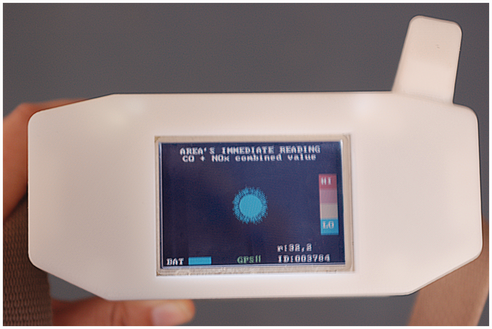
We succeeded in prototyping a functioning device, while demonstrating the possibilities of electronic sensing and mapping of air quality for citizen science. Today several low-cost projects are in active development to monitor air quality, including Speck, AirBeam, Air Quality Egg, and Smart Citizen. These are consumer options for off-the-shelf air monitoring products, which we had hoped for and predicted at the time of AIR’s launch.
After the initial launch of AIR in New York City, the project was exhibited in several cities across the US and abroad. When traveling to other cities, we organized workshops during which time the devices would be explained and discussion would follow about where to go with them and why. In the end, we would set off to the agreed upon locations to test the developing theories. In Belo Horizonte, Brazil, for example, people were very concerned about an indoor market that was situated under a closed carport. The general feeling among participants was that the car exhaust was entering the market and contaminating food. We did not find elevated levels in the market while using the AIR devices (measuring particulate matter may have yielded different results), but we did find higher levels of air pollutants in the carport. In this AIR urban engagement, the conversation turned from worrying about the health implications of eating the market food to precautions necessary for the young woman who worked all day in the garage collecting tickets.
The AIR devices were integral to our workshop, and were the reason we were invited to the museum festival in the first place. However, the storytelling and dialogue they invoked about the peoples’ perceptions of air quality (and subsequently how these perceptions aligned or not with the AIR data) were pivotal and compelling, furthering participants’ engagement with lived environmental problems. Through these workshops, I could see that storytelling integrated with data analysis was a powerful method worthy of exploring further.
Expanding Big Data with small stories
During the research phase for AIR, I was introduced to the former Ombudsman of the U.S. Environmental Protection Agency (EPA), Robert J Martin. I had arranged a meeting to gather information on some of the technical aspects of sensor electrochemistry. During our first conversation in December of 2005, Martin shared his belief that all the qualifiers were there in the days following the WTC collapse for Lower Manhattan to be declared a Superfund site—a designation reserved for the worst toxic sites in the US as determined by the EPA. This statement was so serious and gripping that I set out to understand it fully. 4
Since my introduction to Bob Martin nearly ten years ago, I have built two online projects, Superfund365.org (2007) and ToxicSites.us (2015), visualizing the EPA’s reporting of Superfund data along with other sources, such as the Census Bureau, to make more comprehensible and persuasive the issue of Superfund. My approach has been to build platforms that pool the most relevant information for each site (such as contaminants of concern, human health effects from exposure, site history, responsible parties, local demographics and remediation timeline) and display it in a visual format to engage a broad, non-specialized audience that would likely not visit or respond well to the EPA’s text-based delivery of its data. Also central to the design of both projects was allowing room for user-contributed media. Similar to Zapped!, individuals are invited to respond to the data. This can mean refuting, contextualizing or expanding the official document.
Contributors have included people present at the site of data collection with new perspectives to offer. “Matt d” wrote on the Pearl Harbor Naval Complex Superfund site page on Superfund365: I … have worked on a few of the sites mentioned. I thought the Pearl Harbor description was a little weak. How does a sugar company become PRP [Potentially Responsible Party] for a naval base location?? Sounds like there is more to the story somewhere. (Superfund365, 2007a) In January of 2006 I was diagnosed with breast cancer at the age of 44. I was shocked to receive a diagnosis of breast cancer since no one in my family had ever had it. Within a few weeks after I was diagnosed, I found out about two other relatively young women in my neighborhood that had lived here over 15 years that had also been diagnosed with breast cancer in the past year. All three of us lived about one half of a mile from Tower Chemical. I have found out about other cases of breast and hormonally related cancers that have occurred in my neighborhood since then. Today, over 50% of breast cancer cannot be explained by heredity or lifestyle factors. There is mounting evidence that links DDT and other hormone disrupting chemicals to breast cancer incidence. It is my opinion that I got breast cancer because of exposure to chemicals at the Tower Chemical Superfund site. (Superfund365, 2007b)
Visualizing as advocacy for better data
In 2013, after learning the EPA was developing a new system for reporting Superfund data that might include more types of data than previously available and would provide web services, including an Application Program Interface (API), I set to work grant writing for ToxicSites.us (or a make-over of Superfund365). Web services are a far more preferable system of data delivery than downloading spreadsheets and screen scraping EPA’s sprawling website. With an API, my new project could more easily include the over 1300 Superfund sites on the list and automatically update as the EPA releases new information (instead of being a permanent archive of just 365 Superfund sites). I was eager to see the agency improve its reporting system that through my experience of building Superfund 365 I found to be antiquated in its reliance on static documents (pdfs) and delivery of data in comma separated value files, full of holes and inconsistencies (that we would try to correct by phoning EPA regional offices and manually editing), badly organized and updated rarely.
But now in 2016, after securing funding from the Open Society Foundations and launching ToxicSites.us, the EPA still has not delivered on its promises. Most significantly, there is no web service available for Superfund data and the new system, called SEMS, is not an improvement in terms of data quality, quantity or accessibility. In fact, many communities at Superfund sites have complained that there is less information available to them than before. The Superfund data available is primarily from 2013 with no clear timeline when more recent data sets will be released. My project, ToxicSites.us, is a significant improvement in terms of its new user interface that enables searching across all Superfund sites on the EPA’s National Priorities List based on a range of criteria, yet it is still in essence an archive like before (reliant on data that is at the time of publishing two and a half years old) and does not offer many new details, as I had hoped (Figure 5).
ToxicSites.us, Brooke Singer, 2015.
This begs the question of how open is my government data? To understand what open data means to the US Government you need to visit the Project Open Data website, an initiative of President Obama. It states, “The White House developed Project Open Data—this collection of code, tools, and case studies—to help agencies adopt the Open Data Policy and unlock the potential of government data” (Project Open Data, 2013a). The site further notes, “Data is a valuable national resource and a strategic asset to the U.S. Government, its partners, and the public.” It lists the seven principles of open data as: public, accessible, described, reusable, complete, timely, and managed post-release (Project Open Data, 2013b).
When I asked the EPA if the agency has a federal mandate to make public its Superfund data, an EPA spokeswoman answered: The National Oil and Hazardous Substances Pollution Contingency Plan (NCP), Superfund’s implementing regulation, does not mandate the sharing of programmatic data with the public, although EPA is required to annually update the National Priorities List. EPA accomplishes this through rulemaking actions published in the Federal Register. However, the Agency is committed to releasing data in order to promote transparency and support external parties’ independent research and analysis. This approach is also consistent with federal standards for Open Government and Open Data. (U.S. Environmental Protection Agency Spokeswoman, 2015)
The irony here is that publics complain both about not having enough information and having too much. This is what I call the Goldilocks problem of Big Data. For individuals to make use of Big Data and for it to be a national resource for all (meaning individuals as well as large corporations), then the way data is delivered is just as important as what is delivered. Too much data delivered in raw format without any context (e.g. not including the parts per billion threshold for when a contaminant is considered hazardous to human health along with collected contaminant readings) proves to be overwhelming and nearly useless, especially for individuals or volunteer groups with little to no resources. Not enough data that is several years old and out-dated is underwhelming and also nearly useless since it does not reflect the current situation. So what is just right? Is there a perfect middle ground?
To push the EPA to improve its data reporting to make data its most useful, is no small feat; it would require a constant conversation between the data providers and all its data users (i.e. this is the principle of “managed post-release” as explained by Project Open Data), a process which is now stilted, bureaucratic, and cumbersome. Who would enter that conversation and how would it be organized?
I am unsure of the answer to this question, but I do know that fifty thousand people visited the ToxicSites.us website in its first three months after its launch. This is a large number for an independent art project with no marketing budget. The general interest in Superfund sites is high and while the primary concern is to see toxic sites in the US better addressed by the government, a more immediate concern should be how to push the agency, our government, to release valuable information in a timely manner, with context and in a useable form. Data is never a cure-all but these improvements will help enhance understanding, strengthen community involvement and hasten resolutions.
Therefore, perhaps a main purpose of data visualization platforms like ToxicSites.us should be to make clear the errors, holes, and outdated-ness of the source it reflects. “What is not said” in the data (intentionally or not) should be as important to grasp as what is described. This absence invites engagement, especially for the people who have a stake in expanding the record. Likewise, errors motivate people to respond and responding undermines data’s rhetorical power or authoritarian position. How systems could best encourage this kind of interaction and verify contributors to ensure accountability is in part a design problem. Is there potential for the many eyes on sites like Toxicsites.us to become social actors and eventually a political body? Can data visualization and sharing platforms become powerful agents, through the exchange of data and stories, to pressure agencies like the EPA to deliver on its promises?
This chronology leads from the data body to political body and the realization that public participation cannot be limited solely to the unwitting triggering of data. I advocate for more experiments with connecting our data to personal storytelling as a way forward. Big Data and digital storytelling are popular concepts of the moment—what is possible when they collide? The work that needs to be done puts more emphasis on situating our knowledge and revealing data ecologies. We should return to Donna Haraway “arguing for politics and epistemologies of location, positioning, and situating, where partiality not universality is the condition of being heard” (Haraway, 1988). Our work involves expanding who is collecting the data, piecing it together and making claims based on it. Data does not speak by itself. We must bring attention to a broader, temporal spectrum related to our data: from the circumstances from which data are derived to the consequences of its materialization. This work recognizes the power of aesthetic experience, play and individual experiences to engage diverse audiences with Big Data as the basis for forming new and necessary political bodies.
Footnotes
Declaration of conflicting interests
The author(s) declared no potential conflicts of interest with respect to the research, authorship, and/or publication of this article.
Funding
The author(s) received no financial support for the research, authorship, and/or publication of this article.