
Abstract
Users of continuous glucose monitors (CGMs) experience the product in part through software. Smartphone and watch apps empower people affected by diabetes to make real-time treatment decisions based on glucose readings and aggregate data such as medication, nutrition, and activity information. As CGMs evolve and gain greater market adoption, there’s opportunity for these apps to play a greater role in users’ lives and diabetes management. To do so, designers should follow the best practices established by the broader technology community and apply them to the needs of this community. The process of thorough discovery research, clear problem definition, iterative design, and testing can lower barriers toward broader adoption, and favorably influence the health of users through their mobile apps.
Introduction
Continuous glucose monitors (CGMs) provide in-the-moment and retrospective insights, empowering users to better manage their health through data. CGM systems are impressive feats of engineering in their ability to generate, analyze, and deliver glucose information.
Yet ultimately, the value of CGM technology is in its ability to address human needs. A product that started off as purely cutting-edge science a quarter century ago has evolved to become standard of care in countries, including the United States. Medical device manufacturers now must have a detailed understanding of how their products fit into the lives of their users, both on a day-to-day basis and within the broader context of diagnosis and treatment. This includes consideration and empathy for not just people with diabetes, but also their caregivers, health care providers, and others involved in their health.
A model for understanding the evolution of CGM products is the technology adoption life cycle (Figure 1). Just like personal computers and mobile phones, innovative health care products need to change to be more widely adopted. For much of its existence, CGM users were categorized as “innovators” and “early adopters,” people who highly valued the technology, had the means to acquire it, and were more tolerant of perceived gaps in the overall experience. In recent years CGM adoption among intensive insulin therapy patients “crossed the chasm,” 1 using Geoffrey A. Moore’s term for a product that has reached majority market adoption. With more users comes higher expectations for the entire product experience. Products must be easy to get, set up, and use.
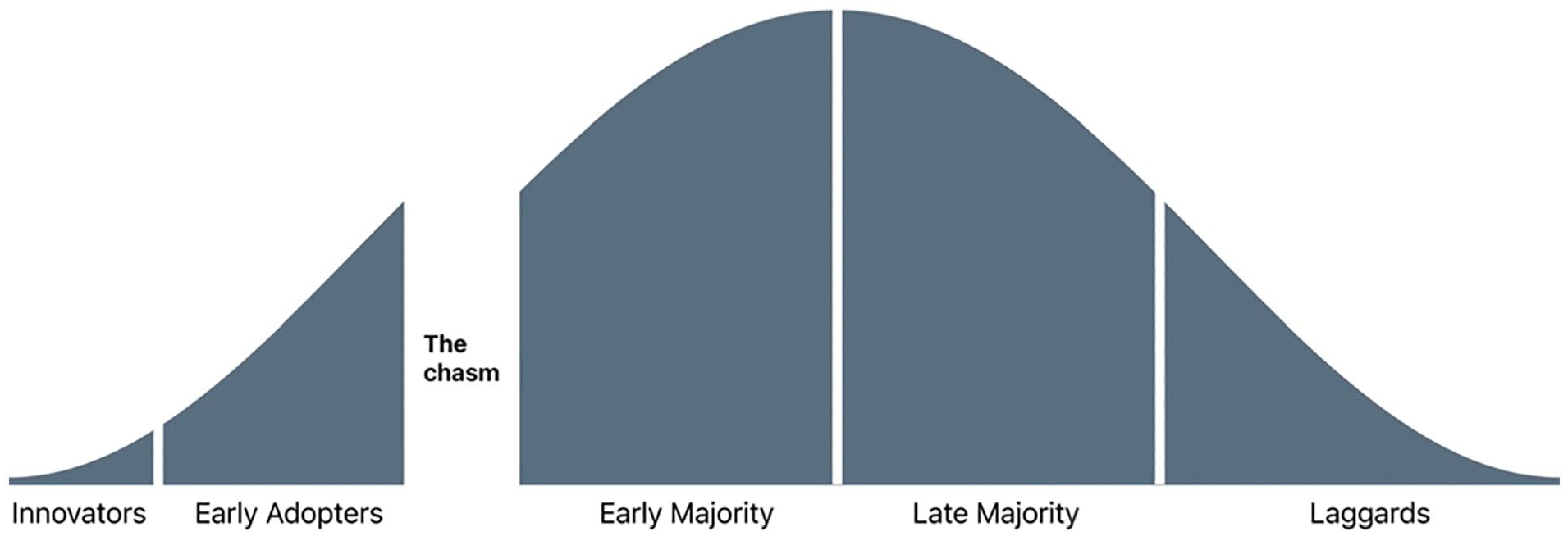
The technology adoption life cycle, including the chasm between early and mainstream adoption. 1
This evolution highlights the value of user-centric design. Dexcom’s Global Product Design team is tasked with understanding and advocating for users throughout product development. Our group consists of industrial designers, instructional designers, user interface designers, and user experience designers. Over the last several years, we’ve worked to shape the experience of our new G7 system.
This article is an overview of how we tackled the challenge of creating smartphone and watch software for this new system that is desirable to our users, technologically feasible, and viable for the business. Our process aligns with the company’s quality management system and other considerations necessary to gain regulatory approval in global markets. In parallel, the design team also worked on a new Dexcom receiver. It serves as a display device with a similar user experience and design considerations as the smartphone app.
Process
The Double Diamond 2 design process (Figure 2) guides our team’s app work. This framework, popularized by the British Design Council nearly two decades ago, also helps us communicate and align with the broader group of stakeholders. The “double” reference in its name is to two phases of work. The first focus is on the problem space, defining clearly what problems we aim to address. Next is the solution space, where we clarify how we can best solve the defined problem. Each “diamond” refers to a divergence, a widening exploration, followed by a convergence, a narrowing of efforts.
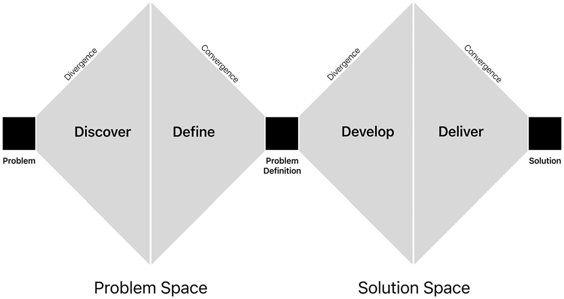
A visual representation of the Double Diamond design process. 2
This synopsis of our app design work is organized by the Double Diamond’s stages. It includes key highlights from our work along the way.
Problem
Project initiation begins with the Problem stage. The design team gathers inputs from all key stakeholders to inform the human, technical, and business requirements. These inputs provide a rough outline of the project goals. Throughout the design work, the team will clarify the underlying needs and propose a solution acceptable to all stakeholders.
At this stage, the team is empowered to rethink our whole systems, including all the hardware and software. It provides an opportunity to build upon the successes of our legacy products and explore areas we want to do more. Not only has our CGM technology evolved in the intervening years, but so too has the broader diabetes and mobile phone ecosystem. We have new partnership opportunities. There are iOS and Android updates to consider. Our business goals have evolved, along with new regulatory considerations from agencies around the globe. Access has also evolved. In the United States, across commercial insurance plans, Medicaid, and Medicare, the vast majority of eligible people with diabetes have coverage for CGM. It is an exciting time for the project, with dozens of ideas flowing among the team.
Discover
The Discover stage is about listening. Working closely with our Market and User Research teams, we gather inputs from a wide variety of sources. These include surveys, customer support feedback, analysis of de-identified user data, and social media posts. We conduct multiple rounds of qualitative research with patients, caregivers, and health care providers. It is critical to hear from a comprehensive and diverse set of voices. Considerations for our recruiting included age, ethnicity, location, time since diagnosis, familiarity with CGM, insulin delivery methods, and accessibility challenges. We also leveraged user personas representative of this diversity that bring these voices to life for our cross-functional team.
Discovery research starts with very broad questions. It provides context on our users, their diabetes treatment (from diagnosis to present), their support network, daily routines, and how technology factors into their daily routines. We explore what users know about CGM, the process for learning about a new product like ours, and how they think it can fit into their life. This informed decisions about our new app’s scope.
After the initial rounds of research, we refine and narrow our questions to dive deeper into specific user needs that could be addressed in the app experience.
Define
After Discovery, the Define phase focuses on distilling the feedback. Our research provides the needed context to map user journeys and clarify the role our product can play in users’ daily life. Analysis of de-identified data from our data science team helps us identify key trends and themes. For example, we explore if, how, and how often users customize their alert settings. The research informs feature prioritization as well. A data-driven process like this also enables the team to communicate the reasoning for product decisions.
One App
One key research theme was the desire for “one app.” People with diabetes talk about needing multiple apps every day to manage their condition. They have one app for their glucose readings, another for their insulin, plus more for their food and activity. Each has its benefits, but none brought together all the features they desired. It takes extra time and effort to enter all this information into separate apps. It makes it challenging to make treatment decisions and spot trends when data points are saved in different places. This is a powerful theme, the potential to empower users through an improved, more connected experience. It is central to our work.
Users want multiple ways to answer the question, “How am I doing?” Their focus is on both their real-time status and reflection on retrospective data. To address this, we integrate features from our Clarity software into the G7 app. Making reports with summary statistics easier to access also nudges users to review them more often.
Problem Definition
Problem Definition is the project midpoint. It is an opportunity for the design team to communicate the key research insights with stakeholders. It is essential to have alignment on what needs the product will address before transitioning to the question of how it will meet those needs.
It is important to include representatives from all the teams involved in the work ahead. The design team’s presentation points the app in a specific direction, backed by the supporting research. Thorough work on discovery and definition pays dividends. It gives stakeholders an opportunity to voice any concerns they had before the start of further design, iteration, and testing.
Develop
At this stage, the designs begin to come to life. The team can leverage aggregated inputs from internal stakeholders and user research, distilled feedback, and the clear problem definition. This foundation enables us to explore a wide range of potential solutions.
App Setup
One area of focus is the app setup process. It explains to users how our system works, covering everything from the display of glucose readings and trend arrows to alerts and sensor insertion. New users are naturally eager to start getting glucose readings. We look to streamline the process as much as possible while ensuring they understand the key elements of the system.
With the G6 app setup as a baseline, we explore multiple ways of organizing the information to best move users along the learning curve. The experience also considers existing users, importing their settings, and highlighting what parts of our system has changed. We work extensively with the Instructional Design and Regulatory teams to communicate all the key safety statements. We work closely with our Human Factors team to iterate and make steady progress. For a robust section like this, it is helpful to create a framework for users to understand their progress. The final design divides setup into three parts covering general product education, enabling app permissions, and their first sensor insertion (Figure 3).
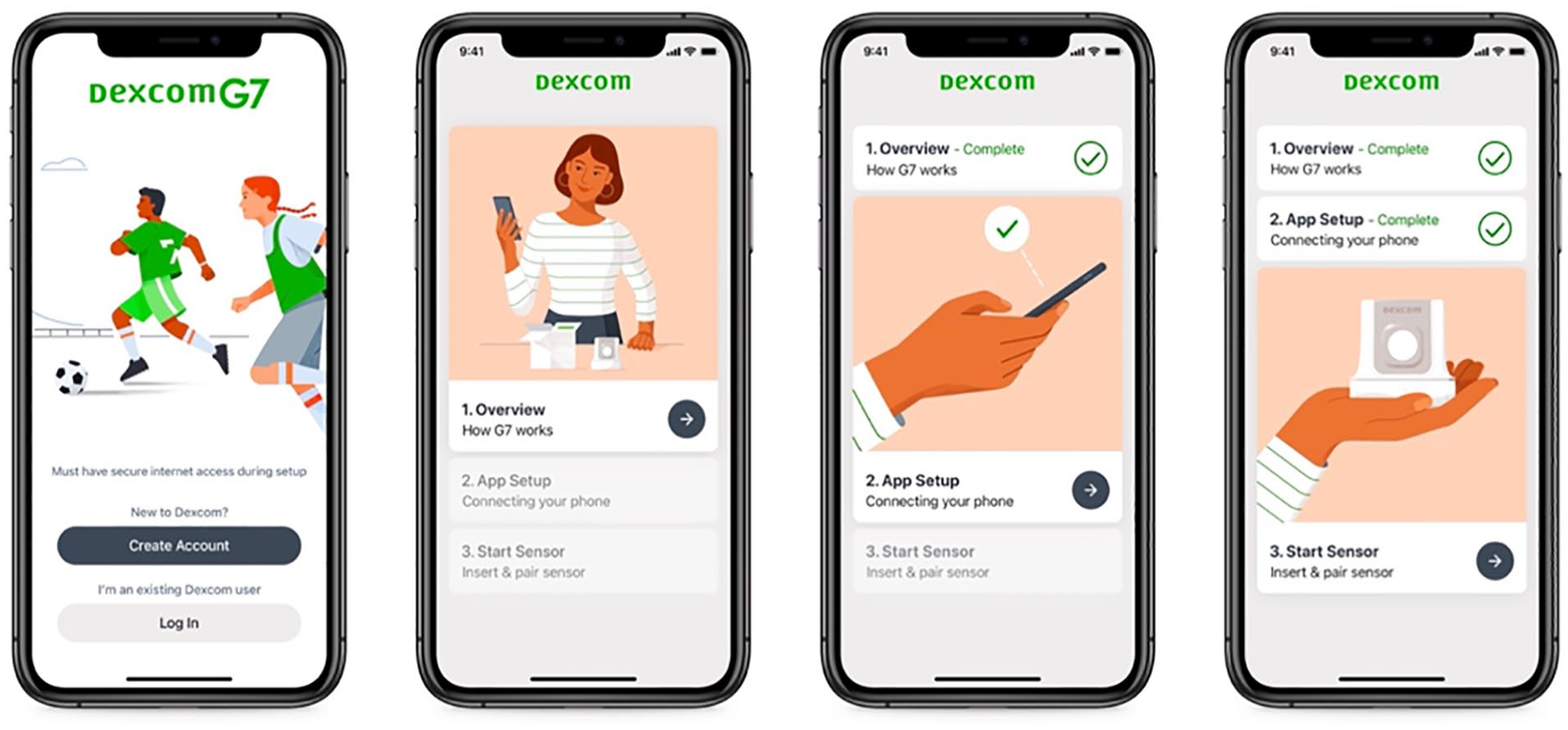
Login and app setup screens. Dividing onboarding into sections helps users understand their progress.
Navigating the App
Every CGM app must decide the role it aims to play in the life of its users. The information architecture reflects that decision, helping users address their daily needs through features on their phone or watch.
CGMs’ core value proposition has traditionally been the display of real-time glucose readings. Yet our new app, building on the themes of empowerment and connectivity, looks to do more. It aims to serve as a complete diabetes management solution, an approach to the “one app” concept that emerged during user research. Critical to this expanded scope is scalability, personalization, and partnerships. The app is designed to support patients across a variety of treatment regimens. Every user wants to make the app their own, turning on or off features to best suit their needs and preferences.
Supporting a diverse set of experiences like this requires a flexible design system. Templates, patterns, and rules must guide users as they discover, activate, and manage all the features the app supports now and in the future. A tab navigation was one of many approaches we explored (and ultimately integrated) to anchor the experience and set expectations for users on where to find specific functionality. Within this structure is a card-based display of information that establishes a clear distinction between sections and allows for a personalized display of content. Additional cards will show or hide based on a user’s feature choices.
Our G7 app uses a 4-tab structure (Figure 4). The first is the Glucose tab. It is where users will spend most of their time, gaining information to inform their daily treatment decisions. The History tab provides information on logged events including meals and activity. The Profile tab houses app settings and support services.
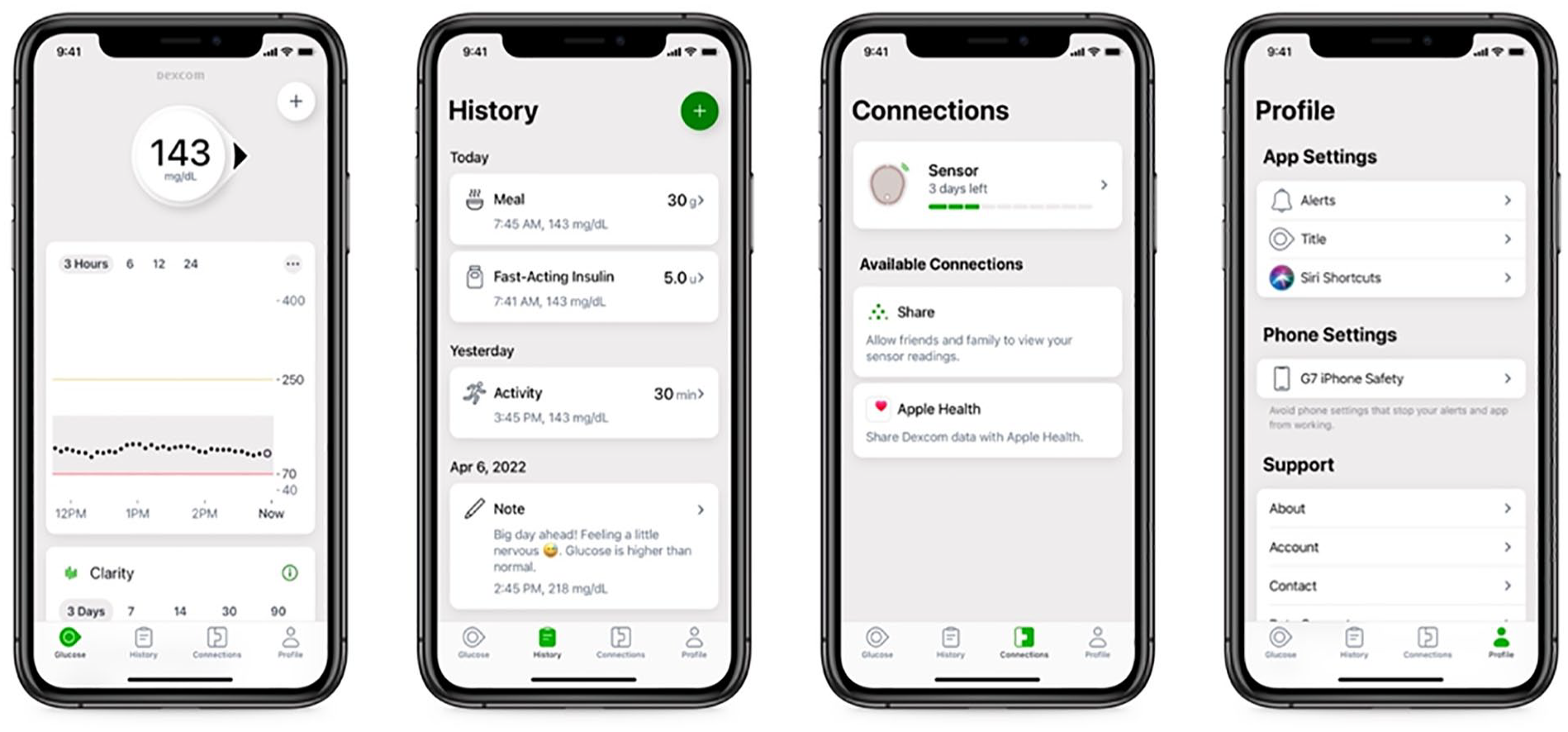
The app experience while in a sensor session. The tab structure grounds the experience, setting an expectation of what a user will find in each section. A card-based layout supports scalability of content as users turn on additional features.
The new Connections tab gives users a way to review, manage, and transition between sensors. It also provides a way to discover and add new features that extend functionality beyond the core experience, including our partner integrations. This section must also provide a standardized way of setting up each new feature, monitoring its system status, and provide guidance on resolving any errors that may arise.
Setting the Tone
Outside of health care, every person has brands that they’re drawn to. We use their products because we feel they understand us, address our needs, match our style.
Medical devices are sometimes perceived as cold, impersonal instruments. But CGMs are very personal devices. Users wear and interact with them daily. There’s an emotional element to using a sensor, as highlighted in user research. Managing a chronic condition takes focus and mental energy. Some people with diabetes have compared it with having an additional job that requires dozens (if not hundreds) of decisions throughout the day.
As health care competition increases and experiences become more personal, it is important for each brand to convey the relationship they aim to have with users. Our team addresses this in part through our new illustration system (Figure 5). Images instruct users on key functionality, a role it has played in the past. This new style also highlights our brand principles of accuracy, guidance, and warmth. Images are diverse and inclusive. It reinforces our central themes of empowerment and connectivity. Together these elements are intended to convey a warm, motivational spirit with images that encourage and inspire.
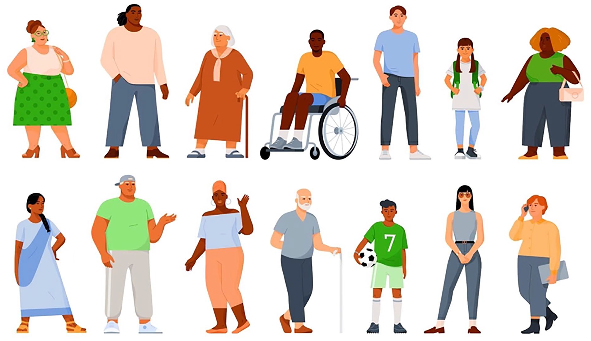
A selection of people from our illustration system.
Deliver
After “going wide” with a creative exploration, user testing helps make clear which design proposals are most effective. At this stage, the team must make decisions about the overall experience and each specific interaction.
Design System
Design systems provide a means of standardizing app elements, interactions, and visual design. They ensure a consistent experience across a brand’s portfolio. It also enables the team to move faster in design, development, and testing by reusing existing design elements. As part of this work, the team must also clarify if and how designs vary across iOS and Android platforms.
In anticipation of continued expansion of our company’s app portfolio, the team developed a new design system. Our User Interface team led this extensive effort. The look and feel are largely similar across mobile devices, with targeted integration of native iOS and Android elements for specific use cases. Decisions about using custom versus standard platform design conventions are made in conjunction with developers, with consideration for impact on timelines and related development efforts including accessibility support.
Alert Refinements
Alerts are a central part of any CGM experience. Users greatly value the safety net that alerts provide. During user research, our legacy alerts system receives positive feedback. It offers a variety of options to configure each alert. Analysis of existing users’ alert settings show that those personalization options are key. Given the data and feedback, most changes to alerts in our first app release are minor modifications to our existing system.
One noteworthy change to the alerts system is centered on alert sounds. A segment of users requested the ability to toggle alerts to a more discreet setting. They spoke of specific scenarios such as going into a theater, a religious service, wedding, funeral, or an important business meeting and wanting to prevent their alert sounds from creating a distraction. Parents and adolescents shared their concern of alerts sounding loudly during class or important exams. For some, their frustration ran so high as to consider removing their sensor or turning off the phone to silence alerts.
Based on these findings, the design team proposed of a new set of features called Quiet Modes. Two options, Vibrate and Silence All, allow users to toggle all their alert sounds to a more discreet setting while continuing to get visual notifications. It provides users a safer alternative to removing the sensor or turning off their phone.
The addition of the Silence All feature in G7 is a noteworthy change for Dexcom. Previous apps were always required to sound for safety critical alerts such as an urgent low glucose reading or sensor failure. The design team drove extensive discussion with the Clinical, Regulatory, and Quality teams. An essential start was comprehensive user research that highlighted the need for a temporary pause to all alert sounds. The feature’s design, which requires multiple steps including passcode/biometrics to activate, was also key to persuading stakeholders. The team also debated the feature’s maximum activation time through consideration of multiple use cases. Extensive testing with our Human Factors team and real-world data analysis from our limited launch also positively contributed to the conversation. Together the team’s work made for a compelling case.
Alerts are an important part of every medical device system. With medical apps now running on personal devices, companies need to design for a balance of customization and safety. Alert fatigue must be factored into each CGM product team’s decisions on alerts system scope.
Retrospective Data
Discovery research noted users’ desire to have easier access to retrospective data in their real-time app. Data show that users who are more engaged with their glucose management reports have better health outcomes. 3 Our integration of retrospective data aims to provide a snapshot of key information. With this approach, we integrated a Glucose Summary card with three key inputs: Average Glucose, Glucose Management Indicator (GMI), and Time in Range. These statistics provide a quick summary of a users’ recent glucose management. It can be accessed by scrolling down the screen past the trend graph, giving users an easy way to reflect on their recent management.
Solution
The handover of final app designs is coordinated with R&D. Throughout the development process, the Regulatory team is preparing for submissions. Meanwhile, the team responsible for localization translates the app into our supported languages.
Once the app launches, feedback comes in through app store reviews, social media, and support calls. We initiate new rounds of quantitative and qualitative research. The team analyzes de-identified user data. This informs prioritization of our backlog, app planning, and the release of new features.
Summary
Integrating CGM into the lives of users highlights the positive impact that designers can have. An unwavering focus on user needs is essential to the continued evolution of these products. With each step, we aim to further ease the burden of managing health and expand access to all those that can benefit from this technology.
As we go to market, our work continues. The design team begins the double diamond process again with a new baseline to improve upon. There remain more user needs to address, more features to integrate, more ways to empower and connect users throughout the world.
Footnotes
Acknowledgements
None.
Abbreviations
CGM, Continuous glucose monitor.
Declaration of Conflicting Interests
The author(s) declared the following potential conflicts of interest with respect to the research, authorship, and/or publication of this article: DK, PH, AJ, and AD are full-time employees of Dexcom, Inc.
Funding
The author(s) disclosed receipt of the following financial support for the research, authorship, and/or publication of this article: This work was funded by Dexcom, Inc.