
Abstract
Qualitative researchers engaged in mixed methods studies need novel approaches for integrating qualitative and quantitative findings during analysis. Joint display visuals have become an integral part of the presentation of the findings of mixed methods studies and can be aptly described as an analytic tool owing to the process involved in building joint displays. In this article, our purpose is to illustrate the iterative process utilized in building joint displays using both bar graphs and observational field notes to understand a specific phenomenon. An explanatory sequential mixed methods study was conducted with Jamaican secondary school teachers that sought to understand how teachers’ beliefs shaped the use of technology. Based on the use of joint display analysis in this study, we illustrate how the insights gleaned and challenges encountered from each iteration of developing successive joint displays helped us to refine our understanding through an assessment of the organizational intent, analytic intent, and effectiveness of the visuals created. By engaging in the process of building successive joint displays, we identified inconsistencies in the findings that would likely not otherwise have been revealed. We learned that the inconsistencies represented two dimensions of the teachers’ beliefs, thus resulting in a more comprehensive understanding of the integrated data. The methodological insights gleaned from each iteration of building joint displays can be used by other researchers engaged in this process and enhance their understanding of the value of joint display as a powerful analytic tool.
Keywords
Qualitative researchers engaged in mixed methods studies need novel approaches for integrating qualitative and quantitative findings during the analysis. Researchers largely associate joint displays with the presentation of the findings in a mixed methods study. However, mixed methods researchers can use joint display as a powerful analytic tool for integrating quantitative and qualitative data (Fetters, 2020; Guetterman et al., 2015; Johnson et al., 2017). In this article we further illustrate how the iterative process of developing joint display is an analytic process. Integration is described as an intentional process by which a mixed method researcher brings together the quantitative and qualitative approaches in such a way that the true benefit of mixing methods is realized (Guetterman et al., 2015).
Stemming from this understanding of integration, we define joint display analysis as an iterative process of developing successive visual presentations of related aspects of the quantitative and qualitative findings to find the most optimal visual representation for conveying the integrated results. As reported by Fetters (2020) the value of joint displays extends beyond representing integration in the reporting phase of research, it represents also a state-of-the-art tool that can be utilized when a) planning a study, b) engaging in the cognitive process of integration as joint display analysis, and c) representing integration. In this article, the process of joint display analysis is illustrated through an explanatory sequential mixed methods study conducted with 248 teachers in Jamaican secondary school classrooms.
Literature Review
Mixed Methods Analysis
Arguably, the power of mixed methods research for providing complete and balanced results lies in the analysis. However, researchers are often uncertain about how to integrate data collected during mixed methods projects (Bryman, 2007; Fetters, 2020; Fetters & Freshwater, 2015; Yin, 2014). Bryman (2007) opined that that the development of mixed methods research was being hindered by the challenges that researchers faced in their attempts to integrate the quantitative and qualitative findings. He further states that a common challenge with integration in mixed methods research is that the data are either not integrated or are only integrated to a limited extent (Bryman, 2007). Researchers struggle with mixed methods analysis because “existing studies do not discuss in-depth replicable techniques for integrating different types of data” (Johnson et al., 2017, p. 3). While there is a dearth of replicable techniques in the extant literature, there are general descriptions of mixed methods analysis suggesting that integration strategies should be linked to the mixed methods design (Fetters et al., 2013). Fetters et al. (2013) explain that “method level integration commonly relates to the type of design used in a study…[and] the design sets parameters for what methodological integration choices can be made” (p. 8).
In addition to relating the mixed methods analytic technique to the mixed methods research design, Creswell (2014) adds that mixed methods analysis is also connected to the overarching purpose of the design chosen. Therefore, choosing a mixed methods strategy requires going beyond considerations of the expected outcomes of the study. The researcher must consider whether mixed methods integration of the two data sets will be merged, connected or embedded (Creswell, 2014). As noted by Fetters et al. (2013) “Connecting follows naturally in sequential designs, while merging can occur in any design. Embedding generally occurs in an interventional design” (p. 8). Connecting is integration by using results from one type of data collection to inform the selection of subjects for the other type of data collection. Building is using the results from one source of data to inform or create the data collection for the other approach, e.g. quantitative data used to inform a qualitative phase, or qualitative data used to inform a quantitative phase. The literature further outlines techniques that are utilized in merging, building, connecting and embedding the data in mixed methods analysis. These techniques are identified by Fetters et al. (2013) as (1) integrating through narrative; (2) integrating through data transformation; and (3) integrating through joint displays.
Coupled with these techniques, Fetters (2020) adds that when approaching the integration process, the data analysis should link back to the study purpose, objective, and aims. Researchers also need to decide on the extent to which the quantitative and qualitative data will interface (Fetters, 2020; Morse & Niehaus, 2009; Morse & Maddox, 2013). Very often “the point of interface occurs following the analysis of data from both (or all) components, and integration of results” (Morse & Maddox, 2013, p. 6). Creswell and Plano-Clark (2018) state that achieving integration requires four key elements: (i) the rationale for data integration, (ii) procedures for data integration and analysis (iii) how the integrated findings will be represented, and (iv) interpretation of integrated results. The first two elements can be addressed by providing an explanation in the methods section, while the presentation and interpretation of the integrated results can be addressed using joint display analysis (Younas et al., 2019).
The use of joint display for mixed methods analysis
Engaging in joint display analysis involves explicitly merging the results from the two data sets through a side-by-side comparison to assess for “fit” of the two types of data. The “fit” of data integration refers to coherence of the quantitative and qualitative findings; this assessment of the fit of integration is likely to have one of three outcomes: confirmation, expansion, or discordance between the datasets (Fetters et al., 2013). Confirmation occurs if the findings from both types of data reinforce the results from the other; expansion occurs if the findings from the two datasets diverge and expand insights of the results (by addressing different or complementary aspects of the phenomenon); and discordance occurs if the quantitative and qualitative findings are inconsistent, contradictory or disagree with each other (Fetters et al., 2013).
Integrating through joint display analysis provides advantages because it forces the researcher to think simultaneously about both types of data for related constructs. Doing so can lead to new insights beyond the information gained from the data gathered separately based on the quantitative and qualitative results (Fetters et al., 2013; Guetterman et al., 2015). Creswell and Plano-Clark (2018) state that effective joint displays include data and inferences from quantitative and qualitative components, and mixed methods interpretations. Building a joint display, demands some commonality in the domains or concepts being examined across the two data types (Guetterman & Fetters, 2020). Similarity in the constructs that will be used to guide the gathering of both qualitative and quantitative data helps to ensure that collected data can be linked in a joint display (Fetters, 2020).
Joint display analysis is iterative in nature. Each display produced reveals insights about the merged findings that prompt the researcher to engage in subsequent iterations. This helps the researcher to gain a more comprehensive understanding of the data and provide more balanced and complete results. Greene (2007) describes the process of building joint displays as a cognitive framework for integration. Johnson et al. (2017) also present a framework for constructing joint displays called the Pillar Integration Process (PIP) which “illustrates how analytical data can be integrated and enables transparency and rigor during data integration and interpretation, and clarity in the presentation of study results” (p. 17). Guetterman and Fetters (2020) explain that the process of building joint displays is flexible and iterative because researchers often go through several cycles of revision and refinement. Owing to the multiple cycles, researchers generally develop a series of displays that were part of the analytic process that are not included in the final publication of the results. The works of these authors support the view that building joint displays is more than a means of presenting the integrated results, rather it is a process that is used to help researchers to engage in more powerful mixed methods integration analysis (Guetterman & Fetters, 2020). However, there remains a relative dearth of information and examples illustrating in detail how researchers can engage the joint display analysis process and how successive iterations can contribute to insights.
Building a joint display
Literature on how to build joint displays is rapidly expanding (Fetters, 2020; Guetterman & Fetters, 2020; Guetterman et al., 2015; Johnson et al., 2017). For example, Guetterman et al. (2015) recommend four best practices for building joint displays: (i) label quantitative and qualitative results, (ii) be consistent with the design, (iii) be consistent with the integration approach, and (iv) identify inferences or insights generated. More recently, Fetters (2020) has written on how to use a joint display for planning, analysis, and interpretation. He outlines seven steps for creating joint displays including creating a title for the joint display, deciding on the order of presenting both the constructs and the quantitative and qualitative data in the display, and completing a data sources table (Fetters, 2020). If these steps are applied, researchers can develop joint display visuals for representing the integrated data. However, while Fetters (2020) provides a description of how to build and interpret joint displays, the guidance is more conceptually focused. The explanation does not include concrete illustrations with actual data to demonstrate fully how the process can unfold with specific types of joint displays. Examples are needed of how the organization, analysis and assessment of the effectiveness interplay with each other to achieve joint display analysis. It is against this background that this article aims to illustrate how joint display analysis was used as the main mixed methods analytic tool employed in the study. An overview of the study methodology is explained in the following section.
Overview of the Study Methodology
The study used an explanatory sequential mixed methods design. Ethical approval was received from the ethical review board of the lead author’s (THB) university. The study was conducted with 248 teachers in secondary schools in Jamaica. The phases, aims, data collection, analytic procedures, and outcomes are outlined in Figure 1.

Procedural diagram: The explanatory sequential mixed methods design note: The diagram shows the procedures and product for each phase horizontally. Adapted from Ivankova, Creswell and Stick (2006).
Phase I Survey
In the first phase of the study a questionnaire was used to collect data to test the propositions undergirding the conceptual framework. The conceptual framework used in this study was considered a tentative theory that was developed conceptually by incorporating both theory and empirical research from the literature (Maxwell, 2004). The study constructs included: i) beliefs (Nespor, 1987; Pajares, 1992; Rokeach, 1968); ii) technology in teaching (Bate, 2010; Ertmer et al., 2012; Judson, 2006); and iii) pedagogic orientation (Grasha & Yangarber-Hicks, 2000; Ravitz et al., 2000; Weimar, 2013). The initial conceptual framework proposed that teachers’ use of technology are shaped by their underlying beliefs about teaching and beliefs about technology. These beliefs account for differences in how teachers use technology in their classrooms.
The data in this quantitative phase were collected to explore whether and to what degree differences in teachers’ beliefs about teaching and beliefs about technology accounted for variance in their use of technology. It also explored the extent that there was alignment among teachers’ belief about teaching, beliefs about technology, and use of technology. The results of this quantitative phase revealed that for 56% of the teachers their scores indicated that their beliefs and use of technology were aligned in either highly teacher-centered or learner-centered ways, while for 44% of the teachers their beliefs and reported use of technology were not aligned. Based on these results, a strategy was developed to inform the sampling frame and the decisions taken about the critical results that were to be followed up on in the second phase of the study based on these results.
Phase II: Case Studies
The second phase utilized multiple case studies in the design (Yin, 2014). Cases were selected from the groups identified in phase one. Case one represented teacher-centered alignment and consisted of three teachers who reported teacher-centered beliefs about teaching and teacher-centered use of technology on the questionnaire. Case two represented learner-centered alignment and consisted of three teachers who reported learner-centered beliefs about teaching and learner-centered use of technology on the questionnaire. Case three represented non-alignment and comprised three teachers who reported learner-centered beliefs and teacher-centered use of technology.
Data collection procedures for the case study phase included a mix of qualitative and quantitative data. The teachers were first interviewed to gain a deeper understanding of their beliefs about teaching and technology. Each teacher was then observed a minimum of three times over a period of 6 months. During the observations, descriptive field notes were taken (Creswell, 2016), and the lessons were video recorded. The Focus on Integrated Technology: Classroom Observation Measurement (FIT: COM) quantitative observation checklist developed by Judson (2006) was used to classify the teachers’ use of technology in terms of learner-centeredness and teacher-centeredness based on the video-recordings. Additionally, the video recordings were given to the teachers to watch before the second interview which was conducted as a video-elicitation interview (Henry & Fetters, 2012). The video-elicitation interviews examined how the teachers rationalized their decisions to use technology in the ways observed and their interpretations of the extent that their use of technology reflected learner-centered and or teacher-centered beliefs.
Phase III: Overall Integration
In the third phase, an intra-method analysis was conducted by merging the quantitative and qualitative findings within the case studies and then the findings across the two phases were integrated to produce the overall study interpretations based on the data from phases one and two. Joint display analysis played a critical role in integrating the qualitative and quantitative data within each case. These completed joint displays also informed the final overarching interpretations. In the following section, we present how the joint display analysis process evolved in analyzing the data within the cases.
Illustration of the Use of Joint Display Analysis
In conducting joint display analysis based on the data collected for the case studies, the organizational intent was to create displays that optimized the visual presentation of the quantitative results alongside the qualitative findings. This meant that considerations for color coordination (Miller & Bustamante, 2016) and organizing and labeling the data to assist readers in interpreting the results presented (Fetters et al., 2013) were important considerations. The analytic intent was to examine the extent that the qualitative data supported the quantitative scores obtained from the FIT: COM classroom observation checklist. The joint displays developed in this study were similar to an example of a joint display selected by Guetterman et al. (2015) to illustrate the use of joint display in an explanatory sequential study. In that exemplar, the authors presented high and low scores from a quantitative instrument along with representative quotes from an interview (Finley et al., 2013 as cited in Guetterman et al., 2015). By doing this, the authors used interview data to support the quantitative data, providing validity evidence for the quantitative data (Guetterman et al., 2015). In a similar manner, by selecting descriptive qualitative exemplars illustrating typical behaviors of the teachers along with quantitative scores based on their classroom behaviors, we were able to use the qualitative field notes to provide validity evidence for the quantitative data. In the displays created we also assessed the organizational effectiveness of the visuals in search of optimal representation of the integrated data.
To distinguish whether the use of technology observed by the researchers reflected teacher-centered versus learner-centered pedagogy, scores based on the FIT: COM observation checklist were used. The FIT: COM checklist included five dimensions of teaching with technology: i) lesson design, ii) lesson dynamics, iii) meaning and purpose, iv) content and knowledge, and v) use of technology as tools. The average scores for each dimension were calculated and used to create bar graphs. Scores greater than ten indicated a more learner-centered orientation to teaching while score below ten reflected a more teacher-centered approach (Judson, 2006). For the qualitative field notes, typical patterns of behavior based on analyzing the field notes from the three lesson observations for each teacher were identified and predominant ones selected. As we extracted the summary of the scores for the cases alongside typical patterns identified from the qualitative data, we engaged in several iterations with each iteration revealing more insight than the previous.
Iteration 1: Developing Joint Displays Using Triple Group Bar Graphs
The process of building the joint displays started with the teacher-centered case. That case consisted of three teachers—Roslyn, Desmond and Richard (all pseudonyms). Our initial plan was to develop one joint display for each of the three teachers belonging to the teacher-centered case. Much of our refinement emerged from building the joint displays for this teacher-centered case. Consequently, the joint display illustrations in this paper are based on the teacher-centered case.
In building the joint display to present the observation findings for Roslyn, we developed triple group bar graphs from the quantitative data for all five dimensions that were captured on FIT: COM observation checklist. Then we selected qualitative data illustrating typical patterns of behavior based on the descriptive field notes from the observation. This would allow us to analyze and present qualitative data that supported the quantitative scores. Inspired by previous work using color in joint displays (Fetters et al., 2013; Miller & Bustamante, 2016), the same colors were used to represent corresponding data on both the quantitative and qualitative sides of the display. Figure 2 provides an example of this display.

Joint display visual with five triple group bar graphs and observational field notes. Note: This display is based on the data for one teacher from the teacher centered case. The color of each bar represents the scores obtained for the lesson for the dimension and the color corresponds with the lesson both quantitatively and qualitatively. The intent of the visual data presentation was to experiment with creating an optimal visual representation of the quantitative and qualitative observation data for Roslyn. The descriptive qualitative field notes selected represented typical patterns observed. These corresponded with the quantitative scores obtained.
Interpretation of the joint display created in iteration 1
As presented in Figure 2, Roslyn’s quantitative scores indicated that her use of technology was predominantly teacher-centered across the three lessons. The scores for all except one dimension were below 10. The exemplars selected from the qualitative field notes showed that Roslyn’s students did not use technology for themselves thereby confirming that she typically used a teacher-centered approach in her lessons. Thus, the qualitative data confirmed the quantitative scores for Roslyn.
Insights gleaned from iteration 1
Our aim in building this joint display was to present quantitative and qualitative data side by side (organizational intent), and to present through the joint display clarity about how Roslyn’s use of technology reflected teacher-centeredness or learner-centeredness and whether the qualitative data confirmed or disconfirmed the scores obtained quantitatively (analytic intent). Although this was accomplished in part since excerpts from the qualitative data were typical of the overall quantitative findings for Roslyn’s three lesson observations, only two of the five dimensions presented in the bar graphs were being represented qualitatively. This signaled to us that the qualitative data were being underrepresented in this first joint display created. We also noted that because the display focused on a single teacher, it did not capture the breadth of the quantitative results for the three teachers belonging to the teacher-centered case. We concluded that, if we were to build three separate joint displays for one case, the case-oriented approach that was important in presenting the data in accordance with the purpose for using the case study design would have been diminished. This would affect the quality of the meta-inferences drawn in the final analysis of the cases. As Fetters (2020) points out, in conducting mixed methods analysis it is important to frame the analysis in accordance with the purpose, and this helped to guide the next iteration. Additionally, we noted that relating to the effectiveness of the visual presentation, a disadvantage of this triple group bar graph was the lack of space for text to label each bar. These insights gleaned from reflecting on the organization of the data, the analytic outcome and effectiveness of the visuals created resulted in the second iteration of our joint display analysis.
Iteration 2: Developing Single Bar Graph Joint Displays
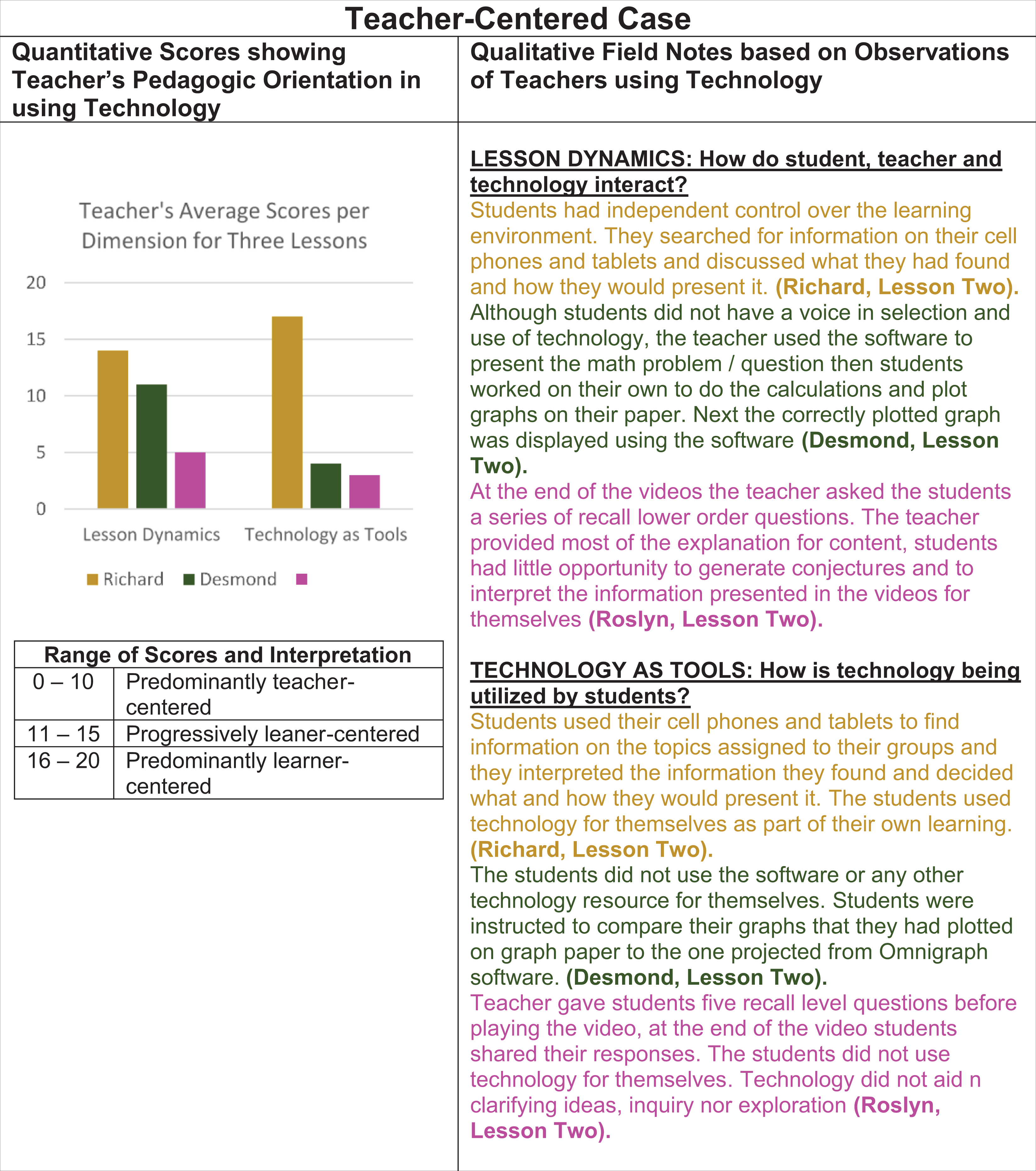
To address the need to present the findings for all three teachers from the teacher-centered case holistically, we decided to present all three teachers in a single display. However, we had learned from our first attempt that the five groups of triple bar graphs needed more space at the foot of the bars for labeling the dimensions, so we opted to use single bar graphs in organizing and presenting the quantitative data. In doing so we had to reduce the quantitative data. This reduction in the quantitative data allowed us to create one display for the teacher-centered case using the data collected from Roslyn, Desmond and Richard. This step also reduced the clutter in the labeling of the bar graphs. We also selected exemplars from the qualitative field notes for all three teachers. Figure 3 provides an example of the single bar graph joint displays constructed for the teacher-centered case.

Joint display visual with bar graphs and more qualitative text. Note: Each bar represents the average score calculated using all three teachers per dimension measured on the FIT:COM checklist. The colors correspond with dimension both quantitatively and qualitatively. This joint display represented more depth and breadth. The analytic intent was to examine the extent that the qualitative data supported the quantitative scores obtained from the FIT:COM classroom observation checklist. This was achieved. However, in assessing the organizational intent the bar graphs were not organized for optimizing reader interpretation.
Interpretation of the joint display created in iteration 2
As Figure 3 shows the quantitative scores reflected the dominance of teacher-centered practices for the teacher-centered case. The average scores for three of the five dimensions—Meaning and Purpose, Lesson Dynamics and Technology as Tools—were below 10 indicating a predominantly teacher-centered style of teaching. The qualitative exemplars for the most part also supported the typical teacher-centered use of technology. For example, Figure 3 shows that for the dimension labeled Meaning and Purpose, Desmond used technology to replace a graphing board/chart. Likewise, Roslyn in her lesson used videos to replace reading about the evolution of automobiles.
Insights gleaned from iteration 2
Although the qualitative data supported the quantitative scores, we felt that the qualitative excerpts still did not represent all three teachers for each dimension. To address this issue, we reasoned that if we included at least two excerpts that were typical from each teacher per dimension qualitatively, then the qualitative data would provide greater depth in understanding the quantitative scores for each dimension. When we reflected on the effectiveness of the joint display visual created, we noted that concern for the reader was lost in the process. If we had not shifted our focus from the analytic outcome to the assessment of the effectiveness of the display created in terms of reader friendliness, it is possible that we would not have realized the need to reorder the bars in descending order to facilitate a better understanding of the findings. As we sought to address these challenges, we engaged in the construction of another iteration of building the joint display for the teacher-centered case.
Iteration 3: Reordering the Single Bar Graph Display by Values
Based on the lessons learned from the second iteration we chose to reorder the bar graphs based on the average scores from high to low and to include excerpts from two teachers for each dimension to illustrate typical use of technology for the teachers in the case. We felt that these decisions would adequately address the challenges we encountered in the first and second iterations in accomplishing our organizational and analytic intent and presenting an optimal display of the data. Consequently, at this stage in the process we proceeded to construct the remaining two joint displays—one for the learner-centered case and one for the non-aligned case. Figure 4 presents an example of the display created for the teacher-centered case in this third iteration.

Joint display visual with reordering of bar graphs. Note: By reordering the bar graphs and the corresponding qualitative filed notes, trends in the quantitative data were easily identified. For all the visuals created at this stage, the content and knowledge dimension had similar high scores.
Interpretation of the joint display created for iteration 3
As Figure 4 shows, reordering the bar graphs from high to low made it easier to identify dimensions with the highest versus lowest scores and further aided in the analysis of the overall findings. We noticed a trend across the three joint displays—one for each of the three cases (teacher-centered, learner-centered, and non-aligned)—that was developed. Like Figure 4, the other two joint displays created showed that the dimension Content and Knowledge had the highest score. Further analysis of the qualitative field notes and the items from the checklist for this dimension revealed that the focus was primarily on teachers’ knowledge of the content being taught and their competence in manipulating the technology resources being used in the lesson.
Insights gleaned from iteration 3
Reordering the bar graphs provided additional insights in the analytic process. The trend in the scores and description for the dimension Content and Knowledge prompted us to reexamine each dimension and their contribution to understanding the extent that teachers’ classroom practices reflected teacher-centered or learner-centered practices. This more in-depth analysis of each dimension revealed that of the five dimensions, two dimensions—Lesson Dynamics and Technology as Tools—were found to be more pertinent than the others. These two dimensions were apt in differentiating the pedagogic orientation to use of technology in terms of alignment with teacher-centered or learner-centered beliefs and emphasized how students and teachers used technology. If we had not refined the joint display with a view to reorder the bar graphs to enhance the visual organization and presentation of the data, we would have missed this important analytic revelation.
Iteration 4: The Second Attempt at Building the Triple Group Bar Graph Joint Display
Since the analysis of the third iteration revealed there were two main dimensions responsible for differentiation in terms of use of technology in teacher-centered versus learner-centered ways, we built joint displays that focused on those two dimensions—Lesson Dynamics and Technology as Tools. This also allowed us to present a more complete picture of the variance in use of technology among the three teachers belonging to each case. Since we were further along in the analytic process, we found the second attempt at creating the triple group bar graph visual display to be easier. Further, we were only presenting two groups of triple group bar graphs and not five as was attempted previously. Figure 5 provides an example of the triple group joint display that was created for the teacher-centered case.
Joint display visual for the second attempt with triple group bar graph joint display. Note: The color of each bar represents a teacher and the colors correspond with the data for the teacher both quantitatively and qualitatively. With this iteration we narrowed our focus to the two dimensions that measured pedagogy undergirding use of technology in the classroom. With this narrowed focus we were able to compare the use of technology for each teacher within the case.
Interpretation of the joint display created in iteration 4
This joint display revealed that within the teacher-centered case, the typical technology teaching styles observed for Desmond and Roslyn implied the dominance of teacher-centered practices. On the other hand, Richard was atypical of his case classification. Both his quantitative FIT: COM scores and typical patterns identified based on the qualitative exemplars suggested that he was more learner centered than teacher centered in his use of technology. Considering that this joint display was based on data for the three teachers belonging to the teacher-centered case, Richard’s more learner-centered approach would be inconsistent with his case classification. We also noted a similar trend for the other two cases (learner-centered and non-aligned cases). This meant that we needed to examine more closely the inconsistencies that were revealed for the cases based on the joint displays created and assess the fit of the data.
Addressing the inconsistencies within the teacher-centered case
Erzberger and Kelle (2003) posit that in dealing with disconfirming results, researchers need to first re-examine the data to ensure that the inferences drawn separately from both data sets were accurate and if this issue is eliminated. The next step they recommend is to evaluate the degree to which the lack of consistency could be an indication that both data sets are revealing different dimensions of the same phenomenon. In cases where the inconsistency reveals different dimensions of the same phenomenon, in terms of the fit of the data, it indicates expansion since the insights gleaned from the results are addressing different or complementary aspects of the phenomenon (Fetters et al., 2013; Moseholm et al., 2017). In addition to those steps, Tashakkori and Teddlie (2008) suggest that researchers may seek explanations from existing theory. We followed these recommendations in addressing the inconsistencies.
Having reexamined the inferences drawn separately from the data bases, we were comfortable that the inferences from both data sets were accurate. Subsequently we engaged in a closer examination of existing theories on inconsistencies in how beliefs shape action. This analysis revealed that the discrepancy between what the teachers reported on the survey—that was used in identifying the cases—versus what was observed in their lessons could be explained by the
Iteration 5: Developing Single Bar Graph Joint Displays With Interpretation Columns
Based on all that we had learned from each of the previous iterations, we concluded that we were now ready to create sufficiently refined versions of the three joint displays that could be presented in the final writeup of this study. Since this iteration was considered part of the final product, an interpretation column was deemed necessary. This addition would allow the reader, to understand how the data confirmed or disconfirmed each other at a glance. The use of an interpretation column in joint display visuals is not new. For example, Fetters (2020), Guetterman et al. (2015) and Johnson et al. (2017) have recommended the use of an interpretation column in building effective joint displays. In keeping with previous work on joint displays we included a meta-inferences column in representing the integrated study findings. The first three joint displays presented in this paper did not have meta-inferences columns because they did not constitute final versions. Figure 6 provides an example of the finalized joint display created representing the teacher-centered case.

Joint display visual including a third column for interpretation. Note: At this stage in the analytic process, we analyzed the data across phases to determine whether the case study findings for each teacher confirmed their initial case classification based on the self-report data from the questionnaire.
Interpretation of the joint display created in iteration 5
From our analysis of this joint display it was evident that there was confirmation across datasets for Roslyn and Desmond, but this was not the case for Richard. His use of technology was learner centered. We concluded that in keeping with theory-in-use, the beliefs that Richard reported on the questionnaire reflected his espoused beliefs, while the observation data presented in the joint display indicated his ingrained beliefs. This finding represented an expansion of the fit of the data. Including an interpretation column was important to understand these findings within the context of the cases and the overall interpretation of the results across the phases.
Insights gleaned from iteration 5
By presenting the meta-inferences juxtaposed with the quantitative and qualitative data for each case, we were able to present succinctly the overall interpretation of the findings for the cases. The inconsistencies would not have been so glaring without this focus on analyzing the scores for each teacher within the case. Through successive iterations of the joint displays created, we gleaned greater insights and used these insights to inform modifications to our approach in the analytic process of joint display development in the overall integration of the mixed data.
Discussion
Through engagement in this iterative process of building joint displays the power of joint display as an analytic tool was clear. Table 1 provides procedures to consider in joint display analysis as illustrated in this study.
Critical Considerations in Joint Display Analysis.
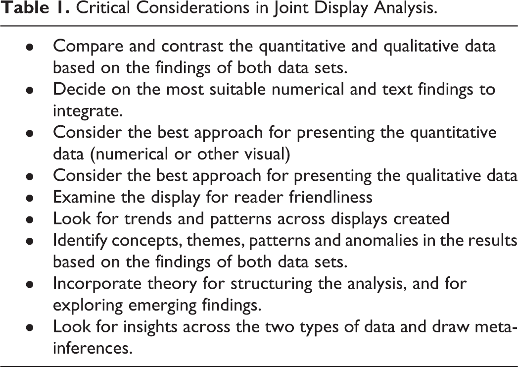
These considerations emerged from our experience with engaging in the iterative analytic process of joint display analysis. While we believe other researchers will find these useful, we acknowledge that there may be other procedures that could apply to joint display analysis that were not utilized or needed in the current study.
We learned in our initial attempt to create a triple group bar graph joint display that too many groups of triple group bar graphs in a single display comes at an expense, underrepresentation of the qualitative data. Another important lesson learned was that the overarching design of the study and purpose must be considered during the analytic process. Although ordering the data in some way—ascending or descending—might seem inconsequential, it proved important to the analytic process. It can make it easier for the researcher to identify trends in the data. These insights would potentially have been missed without careful reflection on the extent that the displays accomplished the organizational intent, analytic intent and provided an optimal representation of the integrated data.
Discrepancies between the quantitative and qualitative phases and datasets may emerge during the analytic process. However, when two data sets reveal inconsistency, they can provide valuable insights. The inconsistency might in fact be revealing two different dimensions of the same phenomenon (Tashakkori & Teddlie, 2008) and provide a more complete meaning that is bigger than its parts (Erzberger & Kelle, 2003). This more complete understanding is often supported by existing theories. Theories advance knowledge in various fields (Creswell, 2014) which make them key sources for understanding what is going on with the phenomena being studied (Maxwell, 2004). In mixed methods research, integrating the findings from both data sets may yield “stories that converge” or discrepancies that invoke fresh perspectives and new, more illuminating explanations (Kidder and Fine, 1987, as cited in Greene et al., 1989, p. 256). This was the case in the study conducted in Jamaica on how teachers’ beliefs shaped their classroom use of technology. The need to address the discrepancies in keeping with the recommendations presented in the literature, prompted a theoretical analysis that forged a more comprehensive explanation of how beliefs shaped teachers’ decisions in using technology.
Methodological Insight
This article adds value to the extant literature on integration of mixed methods research findings in several ways. First, it provides researchers with a detailed illustration of the iterative nature of joint display analysis. Second, it provides examples of challenges that may be encountered in building joint displays. Third, it presents ways of critically assessing the displays created to gain a more thorough understanding of the integrated data. Fourth, this experience provides an example of joint display analysis when using case study in mixed methods research. Fifth, this experience in joint display analysis highlights a novel approach for addressing the fit between data, that is, joint display analysis allowed us to address inconsistencies between the two types of data. Specifically, this provides a clear illustration of how theory provided an explanation for the seemingly disconfirming findings.
Limitations
A potential limitation of this paper is the focus predominantly on joint display analysis for mixed methods case studies. It should not be considered as illustrating the full extent of how procedures and insights gleaned can be generalized to building joint displays in general. However, owing to the detailed descriptions of the process and the examples provided, researchers can transfer the lessons learned generally in conducting their own joint display analysis, feel secure in the utility of the procedure, and appreciate the challenges and insights to be gained from the iterative process of creating joint displays. Another limitation of this article is that it focuses on bar graphs. There are relatively few examples in the literature using box plots and bar graphs (Bradt et al., 2015). There are additional exciting structures for presenting qualitative data along the quantitative findings in a mixed methods study in joint displays. For example, Bustamante (2019) has used a circular joint display, and Peroff and colleagues have integrated landscape photos into a joint display (Peroff et al., 2019). While these previous references provide unique and refined examples, they do not fully illustrate the analytic procedures.
Conclusion
In this study, we created a series of joint displays using bar graphs generated from the quantitative data and qualitative observations. The joint display analysis provided insights that helped us in understanding how beliefs and use of technology intertwine in ways that would not have been attained had the two data bases been analyzed separately. As Johnson et al. (2007) stated, mixed methods research offers a powerful third paradigm choice that will often provide the most informative, complete, balanced and useful research results owing to the integration of quantitative and qualitative data.
The qualitative findings revealed that in some cases, the teachers’ stated beliefs were easily identifiable as their classroom practices reflected these beliefs. On the other hand, the findings also revealed that for some teachers, their stated beliefs were not reflected in their classroom practices. The dichotomy between what the teachers said they believed versus what they did would possibly not have been revealed without combination of multiple quantitative and qualitative data sources using the joint displays. This experience clearly illustrates how building a joint display is an iterative analytic process that involves separating, redefining and reorganizing and discovering more robust relationships from the data.
Dr. Fetters’ participation in this research was made possible through his work in the Mixed Methods Program supported by the Department of Family Medicine, University of Michigan.
Footnotes
Authors' Note
Acknowledgments
Dr. Tashane Haynes-Brown’s participation was made possible in part by support from her then Director at the School of Education, The University of the West Indies, Mona Campus, Professor Stafford Griffith and one of the supervisors for her thesis Dr. Loraine D. Cook.
Declaration of Conflicting Interests
The author(s) declared no potential conflicts of interest with respect to the research, authorship, and/or publication of this article.
Funding
The author(s) received no financial support for the research, authorship, and/or publication of this article.