
Abstract
Network visualizations are alluring yet deceptively difficult to interpret. This article demonstrates several strategies for integrating qualitative data into interactive network diagrams for the purposes of providing contextual information about actors and their relationships. The result is a new joint display called a Narrated Network Diagram (NND). The development of NNDs aims to make network visualizations more reliable tools for reporting research findings, especially for researchers integrating Social Network Analysis tools into multi- and mixed-methods research designs. Until now, researchers primarily use interactivity to support exploratory analysis of large networks at various scales. However, interactivity can also be used to integrate diverse forms of data without sacrificing perceptual efficiency by essentially hiding significant amounts of text within nodes and edges as tooltips or by delineating additional data within legends, titles, and subtitles.
Keywords
Introduction
Social Network Analysis (SNA) represents “a distinct research perspective in the behavioural and social sciences” because it elevates relationships as the primary unit of analysis when attempting to explain social phenomena (Wasserman & Faust, 1994, p. 4). Modern SNA is often characterised as having a quantitative slant (Freeman, 2004; Barabasi, 2016) due to the prominent use of descriptive statistics to describe the structural properties of networks and the fairly recent proliferation of new mathematical modelling techniques for dynamic network data (Fritz et al., 2020). However, the origins of SNA are in the social sciences with many tools developed to help researchers engage with qualitative data (Moreno, 1941). Furthermore, researchers are often attracted to SNA for the perceived intuitiveness of the visual tools the methodology offers. Human actors, or any number of different entities, can be depicted as nodes. Nodes are then tied together by edges, or discrete lines, to represent various types of relationships. The resulting tangle of nodes and edges is commonly referred to as a network diagram, which can be represented as a static image, interactive visualization, or dynamic movie.
Readers are easily captivated by these data visualizations because they appear to offer a vantage into the incorporeal social constructs that surround all of us, persistently facilitating or frustrating our individual ambitions. However, like all data visualizations, network diagrams can be “easily manipulated to convey a viewpoint that would not hold up well to rigorous analysis” (Bender-deMoll, 2008, p. 36). Network diagrams are highly sensitive to missing data, as the exclusion of several nodes or edges, especially in a sparse network, can dramatically alter the graph (Borgatti & Molina, 2003). Oversimplification and misreading of network diagrams is common (McGrath et al., 1997; McGrath & Blythe, 2004). Which is why some SNA researchers have gone so far as to advocate that network diagrams only be used to generate questions rather than answer them (Hoppe & Reinelt, 2010).
The primary contribution of this paper is to demonstrate methods for integrating qualitative data into network diagrams, allowing readers to access important contextual information about the formation, maintenance, or collapse of relational ties. The resulting joint display, termed here for the first time as a Narrated Network Diagram (NND), will help prevent the misreading of node and edge visualisations, making them more effective research reporting tools and storytelling devices. NNDs will be especially relevant for a growing community of multi- and mixed-method researchers integrating SNA tools into research designs (Bolíbar, 2016; Crossley & Edwards, 2016; Domínguez & Hollstein, 2014; Froehlich et al., 2019, 2020).
To construct an NND, researchers can repurpose titles, legends, and node and edge labels, to integrate diverse forms of data into network visuals. The most compelling strategy to develop these joint displays is the use of tooltips to embed large quantities of text within the edge labels of an interactive network diagram. The utilization of interactivity allows users to call on qualitative data by placing their cursor over or clicking on an activated edge, effectively preventing visual clutter by hiding qualitative data that would otherwise obstruct nodes and ties.
Using interactivity to increase the quantity and diversity of data available to readers of network diagrams is a new development in network visualization. Until now, researchers have primarily deployed interactivity to support exploratory data analysis of large networks at various scales. This use of interactivity allows researchers to easily zoom in and zoom out of large networks to examine interesting structural configurations like small node clusters and structural holes within whole networks (Pirch, 2021). The focus of this article is instead to demonstrate how interactivity can help researchers realize the explanatory potential of network visualizations when reporting research findings by repurposing node and edge labels, along with other components of network diagrams, to display rich context about relationships, without sacrificing perceptual efficiency.
Delivering the results of an analysis can be just as important as the analysis itself (Lander, 2017) because it is presentation that stimulates dialogue and provokes action from an audience. Being strategic and rigorous in the reporting of research is therefore critical in generating desired impact. In the sections that follow, readers will first find a brief introduction to SNA, written for those without formal training in network analysis. Next, resources are provided to support readers in developing their own NNDs using RStudio, an open-source tool for statistical analysis, visualization, and reporting. These resources are written to reduce the burden on those that may be unfamiliar with the RStudio platform and R programing language. Finally, the use of RStudio to develop NNDs is weighed against other comparable network analysis software options.
Relevant Concepts from Social Network Analysis
Modern SNA research is “motivated by a structural intuition” (Freeman, 2004, p. 3), which can be understood by four basic propositions (Wasserman & Faust, 1994). First, actors in social systems are viewed as interdependent rather than independent. Second, relationships serve as channels for the flow of resources. Third, relational networks can facilitate or frustrate individual ambitions by providing opportunity or constraining access to resources. Finally, networks are dynamic, continuously changing as new relationships are formed and existing relationships collapse or are strengthened. These foundational principles are in stark contrast to more traditional research approaches in the social sciences that rely on descriptive and predictive statistics to demonstrate trends or model variation (Wetherell, 1998, p. 127).
SNA is being used in both the natural and social sciences to better understand the significance of relationships. Network medicine relies on social and biological connections to understand the spread and evolution of diseases, one of the more prominent areas of active research being in HIV prevention work (Friedman et al., 1998; Heckathorn et al., 1999; Wertheim et al., 2014). SNA in education continues to advance suicide prevention and substance abuse support programs for adolescents through the use of friendship networks to inform social contagion models (Kobus and Henry, 2010; Pickering et al., 2018; Wyman et al., 2019; Zimmerman et al., 2016). Researchers in criminology are also using networks to understand participation in political violence as an expression of political socialization through family and peer ties (Edgerton, 2022). Underlying each of these exciting areas of network research is the need to engage with relational data.
Relational Data
SNA relies on the systematic collection of relational data (Freeman, 2004). Relational data describes connections between human actors or other types of entities, allowing researchers to move beyond agential understandings of social phenomena to also account for the relational interdependence that can influence individual behavior and related outcomes. For example, an SNA researcher might observe interactions between school children on the playground or consult archives for a list of treaties connecting nation states. Surveys are commonly used by social network researchers to ask individuals to share information about their connections to others in different contexts. Wearable devices are also used to approximate relationships through patters of physical proximity (Altshuler et al., 2014; Lederman et al., 2018; Montanari, 2015; Montanari et al., 2017a; 2017b). Digital trace data from online activities such as email metadata, telephone records, and the digital archives of social media platforms can also support network analysis (Bird et al., 2006; Eagle, Pentland and Lazer, 2009; Ediger et al., 2010; Howison et al., 2011).
A common challenge for those using SNA tools is non-response and missing relational data, either from intentional or incidental omissions by research participants (Bright et al., 2021). Therefore, multi-method strategies for collecting relational data are becoming more common to help supplement and validate self-reported ties. These multi- and mixed-method designs generate diverse evidence, requiring the development of joint displays, capable of integrating both quantitative and qualitative data to report findings. The use of SNA tools in qualitative research is also growing (Heath, Fuller and Johnston, 2009; Luxton and Sbicca, 2021; Ryan and Dahinden, 2021). Network visualization tools need to be further developed to be useful to the MMSNA and qualitative SNA research communities.
Visualization Tools
Node and edge visualizations are commonly referred to as network diagrams. There are three types of network diagrams. Static network diagrams are common. These snapshots capture a particular social context at one moment in time. Alternatively, interactive network diagrams allow users to click on nodes and edges and drag components of the network around a canvas. As mentioned previously, interactivity primarily supports exploratory data analysis of large networks at various scales (Pirch et al., 2021). Finally, dynamic network diagrams are movies that depict network evolution and dissolution through time. These visualizations string together panels of networks from longitudinal relational data and are particularly useful for demonstrating the dynamic nature of real-world networks (Moody, McFarland and Bender-deMoll, 2005).
There are many different software options for network researchers. Attempting to compile a comprehensive list of these tools is difficult as there is a proliferation of free and commercial options. Researchers must weigh the costs of adoption versus the features provided when determining a suitable platform for their needs. However, this article encourages the use RStudio and provides resources in the appendices to ease the burden of adopting this platform for readers unfamiliar with the programming language. Adopting a programming language and learning the RStudio interface represents a steep initial cost for new users but offers incomparable levels of control and many different extensions to enhance the reporting of research that cannot be found in other open-source and web-based platforms.
Empirical Context for the Narrated Network Diagram Proof-of-Concept
England’s Rapidly Evolving Education System
England is experiencing a “radical restructuring” of educational governance at the local level (West and Bailey, 2013; Simkins and Woods, 2014, p. 321). The Local Authority (LA) was once largely responsible for public school provision within communities across England, tasked with allocating finances and overseeing expenditures, conducting external reviews of school performance, determining school places, and creating opportunities for continuing professional development (CPD) for classroom teachers. For over a century, these middle-tier governing bodies served as important intermediaries between individual schools and national government by providing statutory and non-statutory support (Greany, 2020). However, the expansion of academisation since 2010, a policy which allows schools to become independent legal entities directly funded by the central government, has accelerated the fragmentation of the longstanding tripartite administrative arrangement in the English schooling system between the central government, the LA, and education professionals working in schools (Whitty, 2008, p. 170; Chitty, 2014, p. 24; Woods and Simkins, 2014, p. 325).
A defining feature of the new middle-tier in England’s education system is multi-academy trusts (MATs), or chains of academies that function as relatively autonomous collectives of schools. The most recent government tally found that 54.6% of secondary schools and 30.2% of primary schools in England are now members of. Furthermore, the Department for Education (DfE) detailed an ambitious policy goal in Spring of 2022 to have “all schools to be in or joining a strong trust by 2030”. Given this policy context, it is pertinent to understand the growth of MATs and to cast a critical eye on the past performance and future potential for this new middle-tier governing entity to help drive improvements in education provision.
Boundary Specification when Exploring Slowly Emerging Social Phenomena
The development of NNDs is part of a larger research effort exploring if existing inter-school partnerships are predictive of eventual membership into a multi-academy trust. A significant challenge with understanding the drivers of MAT membership is that the related processes of academization and joining a MAT often take years to complete. Developing causal explanations for slowly emerging social phenomena requires ongoing data collection and can result in a diverse evidential record of the phenomena.
To explore if existing inter-school partnerships between schools is predictive of MAT membership, this research team first consulted relational data that was collected in 2015 as part of a previous research project undertaken by one of the authors (Greany and Higham, 2018). The 2015 project used a network survey to collect information about the inter-school partnerships of 13 primary schools and seven secondary schools across two different localities (rural and urban) in England. 1 Members of the school leadership team were also interviewed to learn more about each school’s self-reported partnerships. This initial phase of the research project generated a nodes and edges list and rich qualitative data about specific ties mentioned in the interviews. Engaging with multiple forms of data in this original phase of the project was the initial motivation for exploring how to integrate qualitative data into a network display.
Since the completion of the 2015 study, several of the participating schools became academies and joined MATs. Each of these schools took part in a unique multi-year journey to incorporate with a MAT. Armed with the advantage of hindsight, the authors of this article re-examined the network surveys and interview transcripts with leadership teams from each school that ultimately joined a MAT to search for drivers which might explain academy amalgamation. Not only were past partnerships not useful for predicting MAT membership, but also many of the eventual MAT partners were absent from the school’s inter-school partnership networks that were generated from the 2015 network proforma. 2
Therefore, the research team decided to expand the initial relational datasets by adopting a multi-method approach to reconstruct the inter-school partnership network for each selected school. In addition to the original network proforma and interviews with school leadership teams, a Web site detailing a formal federation between secondary schools was consulted along with school cluster profiles from the relevant LA. This multi-method approach to boundary specification-i.e., the use of a proforma, interviews, and both local and national government documents to compile a more complete relational dataset, provided opportunity to develop a joint display for reporting examples of drivers for MAT incorporation.
Methodology: Concepts Informing the Design of a Narrated Network Diagram
Perceptual Efficiency in Data Visualizations
A visualization is a type of object meant for human interaction. Visual displays are described as cognitive (Meirelles, 2006) or external artifacts (Ware, 2019a). Definitions also commonly describe visualizations as representations of data or ideas (Bertin, 2011; Card et al., 1999; Munzner, 2014; Ward et al., 2015). However, important distinctions within the visualization literature are recognizable when authors discuss the purpose of visualization.
For example, Jacques Bertin asserts that visual representation is a “point of departure” instead of “a final simplification” (Bertin, 2011). Bertin perceives visualizations as objects used for discovery and would therefore primarily use visual displays to aid in the collection of data or for interpreting evidence. Other visualization researchers conceptualize visualizations as a tool for communicating. For example, Albert Cairo differentiates between the acts of seeing, perceiving, and knowing when discussing the purpose of visualization (Cairo, 2012). He argues that well-designed visualizations can help readers develop new knowledge about underlying data. Similarly, Colin Ware describes the purpose of visualization in terms of visual thinking. Visual thinking “initiates a series of acts of attention, driving eye movements and tuning our pattern-finding circuits” (Ware, 2010). Data visualizations are also described as tools for supporting perception (Card et al., 1999) and to help people digest information more efficiently (Munzner, 2014). In this vein, visualizations become final simplifications of data to be primarily deployed in later phases of research.
Quality in data visualization is often measured by the perceptual efficiency afforded the reader by the developer (Bertin, 2011). Excellence in visualization is realized only when complex ideas are efficiently communicated to the reader (Tufte, 2001) leading to an optimization of cognitive work (Ware, 2019b). The value of graphics come from showing readers patterns in data without delay (Chambers, 2018), allowing readers to process visual queries rapidly and correctly (Ware, 2010).
Two Frameworks for Measuring Quality in Data Visualizations
Operationalizing perceptual efficiency requires frameworks that allow researchers to design visualizations for timely cognitive function. There are two distinct strategies within the visualization literature for increasing perceptual efficiency (Ware, 2019c). The first approach is design-based: this attempts to understand the different variables of visual displays such as color, texture, and shape (Tufte, 1990; 2001; Wilkinson, 2005; Meirelles, 2006; Fry, 2008; Dickinson, 2010; Bertin, 2011). Quality is insured through guidelines on how visual variables can be combined to enhance the richness and clarity of the data or concept being represented. This approach therefore encourages understanding of visual displays through the separation of its component parts, and is heavily influenced by semiotics, or the study of symbols.
The second approach to visualization incorporates research findings on human perception and cognition. Specifically, this research draws from Gestalt principles (Ellis, 1999; Koffka, 2013), or the belief that when an individual experiences visual stimulus, rarely does one notice individual components (Wertheimer, 1938). Instead, we experience the whole, which is entirely different from the parts (Kohler, 1938). Cognitive science research into human perception therefore attempts to understand how humans interpret complete visual displays. Findings on visual perception are then used to inform design decisions for data visualizations (Cairo, 2012; Card et al., 1999; Hansen & Johnson, 2011; Munzner, 2014; Spence, 2014; Telea, 2014; Ward et al., 2015; Ware, 2010, 2019). These perception-based approaches to visualization are fundamentally different from design-based frameworks because they are concerned with how individuals interact with the whole rather than dissecting and comparing the individual components of the visualization.
While cognitive science research into how readers perceive whole network diagrams would be a welcomed frontier for network visualization, this article adopts a design-based framework to develop various forms of NNDs. A design-based framework was used to inform the proof-of-concept to break network diagrams into their component parts. This allowed the research team to consider how multiple spaces within a network diagram could be integrated with qualitative data to aid in the reporting of research findings.
Methods
Several strategies are presented for creating NNDs. These strategies repurpose different spaces within network diagram displays to integrate qualitative data (see Figure 1). Two of the strategies make use of static network diagrams by permanently displaying qualitative data as a title, subtitle, or within a legend. The use of color then highlights relevant edges or nodes within the network diagram for which the qualitative data is providing context. A third strategy makes use of interactivity and uses tooltips to repurpose node and edge labels as discrete holders for excerpts of qualitative data. As previously mentioned, the use of interactivity prevents visual clutter by allowing the reader to call on qualitative data by scrolling over or clicking on a tooltip. Color is also used in this strategy to differentiate nodes and edges containing embedded data. Prior to introducing these three methods for qualitative data integration, a multi-method approach to collecting relational data is discussed. Potential spaces for qualitative data integration into network diagrams.
A Multi-Method Approach for Collecting Relational Data
Defining the boundaries of a network is a common challenge in SNA research (Laumann, Marsden and Prensky, 1989). The inclusion of all relevant actors and edges in a whole network or ego network is critical to ensure accurate analysis. In this research context, boundary specification involved identifying all the inter-school partnerships for each participating school, as the primary aim of the original research project was to understand if prior informal and formal collaborations influenced eventual MAT membership. The relational dataset in the following ego network was compiled from multiple sources, including a network proforma, interview transcripts, a Web site, and local and national government documents.
Initially, the research team relied on inter-school partnership data from 2015. This data was self-reported by a member of each participating school’s senior leadership team. A network proforma was distributed to either the headteacher or deputy headteacher at each participating school (appendix C). Next, ego networks of inter-school partnerships were generated for the 18 schools. For example, Figure 2 shows an ego network of a secondary academy that self-reported 17 inter-school partnerships in 2015. Ego network of inter-school partnerships for sample secondary academy (based on self-reporting of ties on the network proforma tool).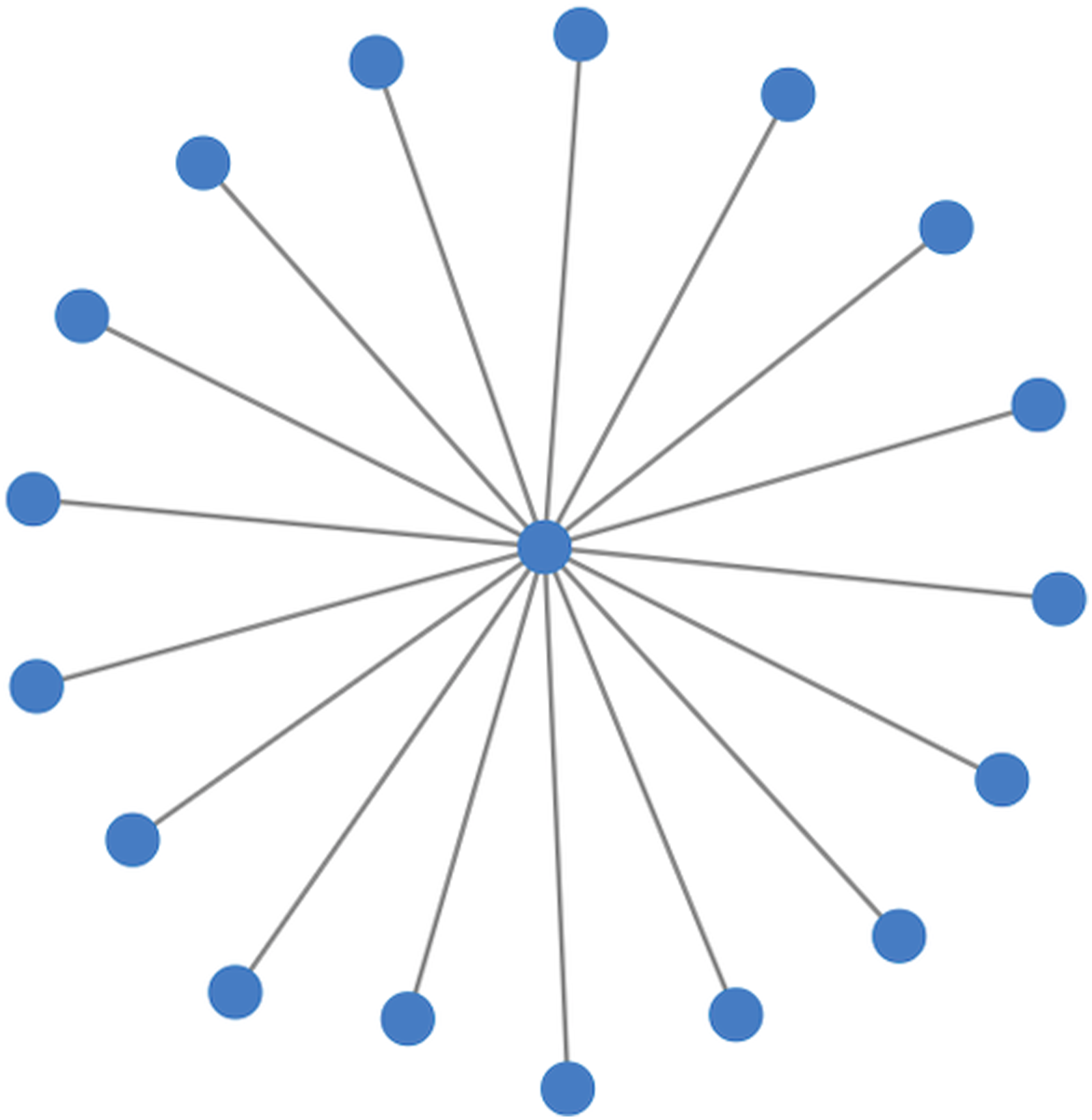
Next, the authors consulted a Department for Education schools database to determine which of the schools named in the proforma had converted to academies and joined a MAT. It was hypothesized that the formal and informal partnerships reported in 2015 would be relevant in explaining the eventual incorporation of individual schools into MATs. However, schools that were engaged in 2015 collaborations and partnerships rarely joined the same MAT, and none chose to build on their existing partnerships to form a new MAT. Taking the example shown in Figure 2, of the 17 named partners, six schools had incorporated with a MAT by 2022. However, only two of these schools had joined the same MAT, and this was due to the denominational mission of both schools.
This counter intuitive finding that pre-existing inter-school partnerships are not predictive of eventual MAT membership was consistent across all 18 ego networks studied. This signalled either a problem with the design of the network proforma or alternative drivers contributing to the incorporation of individual schools with their eventual MAT. Therefore, three additional sources of information were then used to check for potentially missing inter-school partnerships.
3
First, transcripts were consulted from interviews conducted with each member of a school’s senior leadership team. In the instance of the ego network displayed in Figure 2, seven additional school partners were mentioned during the interview with the school’s headteacher (Figure 3). The interviewee also mentioned a federation of local secondary schools that they frequently engaged with. An archived Web site for this schools federation revealed two additional partners (Figure 3). Finally, a document from the LA detailing feeder primary schools for each secondary school was also consulted. This local government document revealed an additional three alters for the ego network (Figure 3). Therefore, the multi-method approach for collecting relational data resulted in the identification of 12 additional inter-school relationships, a significant number of unintentional omissions by the school’s headteacher. Network series showing the addition of ties through a multi-method network boundary specification strategy for the inter-school ego network of the secondary academy.
Nodes and edges lists were then created. The nodes list included an initial column with the header ‘id’ displaying the name of each partner school. Additional node attributes were included as additional columns to indicate school type, phase, academy status, local authority, age of pupils, religious affiliation, the DfE reference number for the organisation, and a color contrast to differentiate the ego from the alters (appendix A). The edges list included ‘from’ and ‘to’ columns to indicate each inter-school relationship. Additional edge attributes were then added to the edges list, including a weight indicating relative strength of each relationship and an attribute column for ‘title’, which was filled with qualitative excerpts from interviews with members of the senior leadership team about the formation and maintenance of significant edges (appendix A).
Strategies for Creating Narrated Network Diagrams
Below are three strategies for integrating qualitative data into static and interactive network diagrams to develop NNDs. The networks are generated using nodes and edges lists, which are provided as appendix A. The R script detailing each of the integration strategies is provided as appendix B. The below methods reference specific lines from the R script. These line references are intended to support new R users navigate the script as they read explanations for each strategy below.
The story that will be told using NNDs is how one secondary academy ultimately chose to incorporate with a MAT. Most significant for understanding this process, was an interview excerpt from 2015 with the headteacher of the school. They stated: “Now we work with the [name redacted] Teaching School Alliance, so School Direct and teacher training. And I've always seen that as a very positive force for developing teaching and learning. When I first came here, I don't know that the school had had a student teacher in it for 4 or 5 years. I think my third year we had 14. Given that there's only 22 full-time equivalents in the school, that was a big culture change. But I perceive massive benefits from that.”
The lead school of the teaching school alliance was not mentioned by the headteacher when they self-reported inter-school partnerships on the network proforma. However, when the secondary academy ultimately incorporated with a MAT in 2019, the MAT was led by the lead school from the teaching school alliance. This relational history is pertinent when attempting to understand MAT formation and would provide helpful context for a reader attempting to differentiate between ties within an inter-school partnership network explaining academy amalgamation. Therefore, strategies were developed to repurpose spaces within the network diagram to integrate this qualitative data.
Method 1: Repurposing a Title or Subtitle
Titles and subtitles represent significant spaces within network diagrams for displaying qualitative data (Figure 1). This first NND strategy makes use of the subtitle to display qualitative information. The title space is reserved for a network diagram heading.
When creating a network diagram using the R package igraph, a title can be added within the plot function using the command ‘main’ and writing the desired text within quotations (see R script lines 75 and 84). Subtitles can also be added within the plot function using the command ‘sub’. Users can then display any amount of text by writing the desired subtitle within quotations (line 96). In Figure 4, an interview excerpt is included in the subtitle. This subtitle refers to School Direct, an alternative, employment-based route, for becoming a qualified teacher in England. NND with qualitative data displayed in the subtitle with the corresponding edge highlighted red.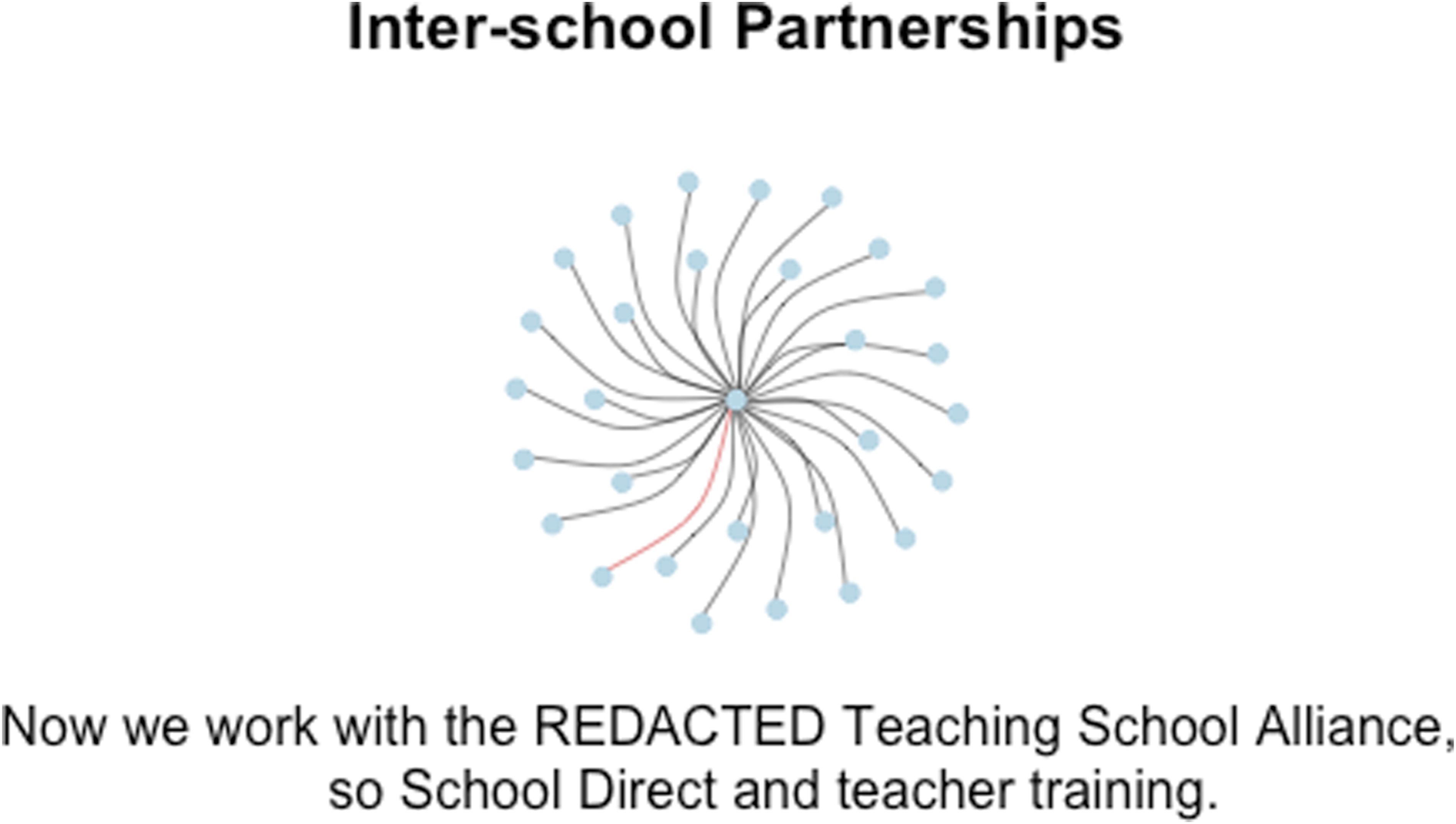
Color is a significant feature of this first NND strategy because it can help focus a reader’s eye on relevant local structures within a larger network. Adding color to the relevant node or edge provides important contrast and allows the reader to quickly determine which part of the network diagram is associated with the qualitative data displayed on the top or bottom of the visualization.
Method 2: Repurposing a Legend
Legends also provide ample space to display qualitative data and have the added advantage of being moveable across the network diagram using x and y coordinates (lines 137–141). This allows users to display qualitative data in lateral spaces instead of relying on centred headings at the top or bottom of the visualization. Repurposing the legend also delineates the qualitative content from nodes and edges by placing it within a box.
As with the first NND strategy, color is then used to direct the reader’s eye to the relevant node or edge, increasing perceptual efficiency. Figure 5 shows the node and edge colored red with the corresponding interview excerpt in a legend positioned off-center. Additional legends can be added to the image if a user needs to add multiple qualitative references to the static network diagram. Alternative colors could then be used to connect the qualitative evidence to the relevant node(s) or edge(s). NND with qualitative data displayed in a legend with the corresponding node and edge highlighted red.
Method 3: Repurposing Edge Labels
Large amounts of qualitative data in a static display will eventually obstruct edges and nodes. However, interactivity can be used to avoid visual clutter by embedding many qualitative data excerpts into edge labels. Users can then call on the data by scrolling or clicking their cursor on a component of the network (Figure 6). NND as an interactive diagram with qualitative data embedded into edge labels that are highlighted red.
This method makes use of the same nodes and edges lists as the previous two NND strategies. However, the R script includes commands from the visNetwork and htmlwidgets packages. The visNetwork package allows R users to add interactivity and the htmlwidgets package allows users to publish the network diagram as an html display, which can be opened by readers in a web browser.
The R script for this method requires reloading the nodes and edges lists into RStudio (lines 147–149). This is because node and edge attributes were added to the underlying dataset to simplify the R script. Multiple qualitative excerpts from interviews are embedded into the NND using tooltips. The interview excerpts are listed as an edge attribute in the edges list under the column header ‘title’. Edges with embedded qualitative data are then differentiated from other edges using color (lines 161 and 162). The two operators used to indicate which edges contain qualitative data are the ‘equality’ operator and the ‘not equal to’ operator. These two lines in the R script direct edges to be colored red if the ‘title’ edge attribute is not equal to a blank cell in the dataset and that the edges should be colored black if the ‘title’ edge attribute is equal to a blank cell.
Finally, the interactive network diagram is created by activating the hover feature (line 168) and visual settings for the tooltips that will ultimately display qualitative data as an edge label are included in lines 169 – 174. A dropdown menu is also added to the interactive diagram, which allows users to select individual nodes (line 175). Additional interactive features can be added to interactive networks using functions provided by the visNetwork package. The image is then saved as an html file, which is deposited into the RStudio users working directory (lines 177–180).
Discussion
Network Diagrams as Storytelling Devices
Providing readers with context about actors and their ties can help prevent misunderstanding or oversimplification of network diagrams. However, the utility of NNDs goes beyond preventing reader error. Integrating qualitative data allows researchers to use these visualizations as storytelling tools. Especially when users combine NNDs with various extensions such as interactive dashboards.
For example, the ego network used in earlier examples is a simplified rendering of the research context. These sparse networks were used to make it easier for readers to observe the different methods for qualitative data integration. The actual process of joining a MAT resembles a more complex social arena where school partners are themselves part of larger networks of schools, some of which are MATs. Partner schools in ego networks are not simply isolated alters.
Figure 7 begins to present some of this complexity by first tying together 10 of the alters from the original ego network in Figure 6. Each of these secondary schools were part of a regional federation, originally founded in the early 2000s, and comprised of both LA maintained and faith schools. Initially, the federation, which connected secondary schools across a 40-mile rural region, allowed for the pooling of resources to develop a more substantial vocational training programme for students across the region. This soon evolved into multiple initiatives for knowledge exchange, at one point involving interorganizational working groups with over 150 staff members from different schools. However, Figure 7 demonstrates how these federation schools have unexpectedly begun to incorporate with different MATs. Potential MAT partners within the Ego network.
Beyond the 10 secondary school partners that were members of the former federation, Figure 7 shows that six other school partners from the ego network were also members of MATs. Each of these MATs are represented as tight clusters, pulling ego away from its decades-old associations with the federation. Figure 7 therefore demonstrates a more complex social context where ego has connections to different MATs and can explore trusts before incorporating. Interviews with the headteacher and the head of teaching and learning at the ego secondary school revealed a series of dating events where the school declined several initial offers to join alternative MATs prior to ultimately joining a local, five-school MAT.
A related paper discussing the evolution of inter-school partnerships and how the expansion of MATs is reshaping notions of place, scale and networks is available for interested readers (Greany, Cowhitt and Downey, 2023). However, the primary aim of this article is to demonstrate how NNDs can help present this complex social process of schools effectively dating different MAT partners before ultimately incorporating with a trust. One option is to generate Figure 7 as an NND, integrating qualitative data into the inter-school ties that connect ego with partner academies that have already joined a MAT. This allows readers to scroll over each edge connecting ego to various MAT suitors to read about the conduct of both schools as a potential partnership was explored. This storytelling method is depicted in Figure 8, which represents a joint display with context for each dating event described by the headteacher and head of teaching and learning during separate interviews in 2015. An NND detailing dating events with inter-school partners of ego that are also members of MATs.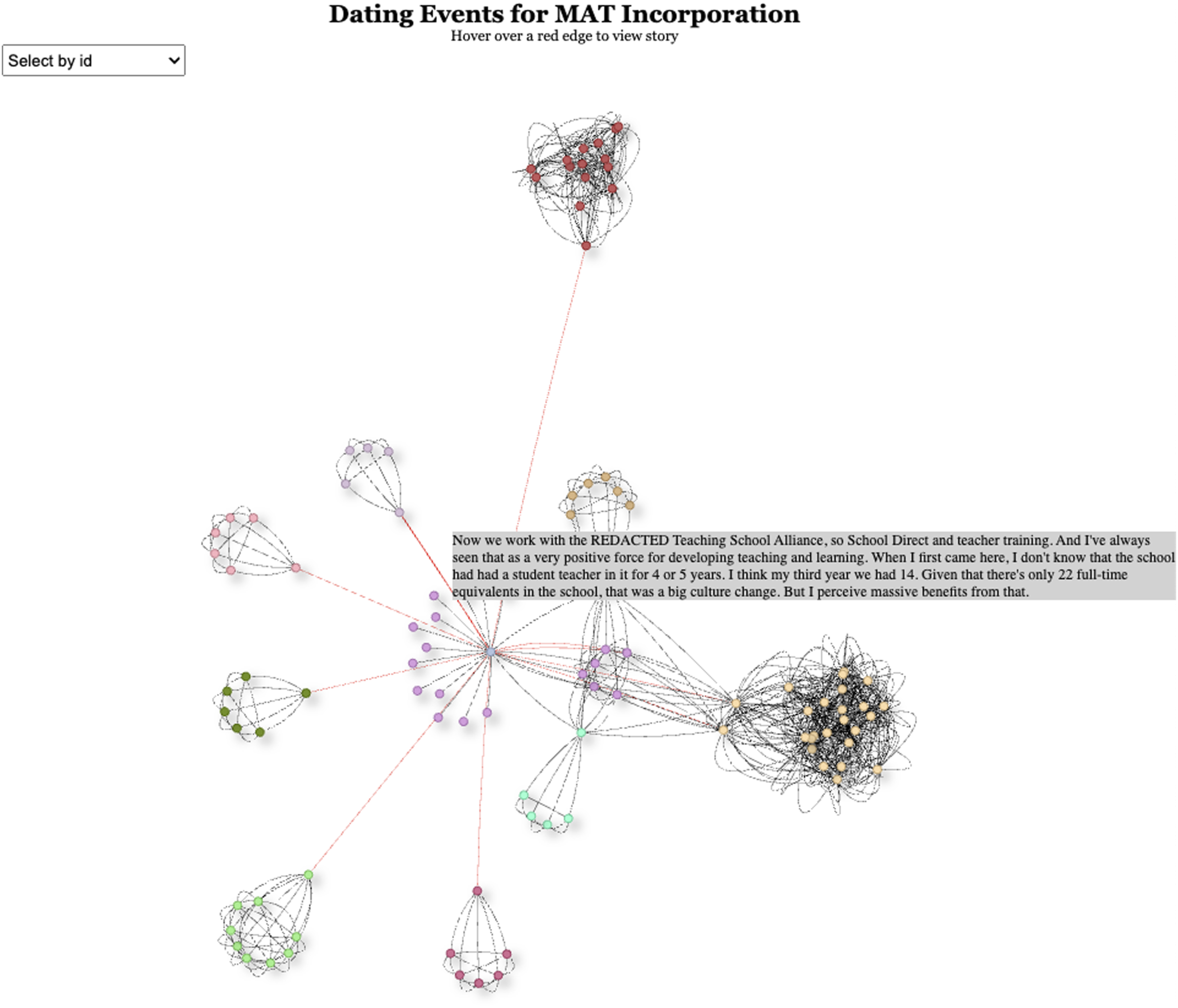
Another option involves the use of an extension available to R users, the ability to stack network diagrams in a dashboard to demonstrate sequence or highlight a series of vignettes. An html file demonstrating a series of dating vignettes between ego and partner schools that were members of MATs is provided as appendix D. Three of the vignettes detail rejection events. For example, vignette one provides readers with local political context that prevents ego from forming a local MAT with another federation secondary school. Vignette two details three instances where ego rebuffed offers to join different MATs because the school leadership team viewed the offers as a hostile takeover instead of a mutually beneficial partnership. Vignette three details a close partnership that failed to develop into a new MAT due to physical distance between the schools. Finally, vignette four shows ego’s eventual MAT partner, originating from a strong partnership over student teacher placements with an initial teacher education (ITE) program from a nearby teaching school alliance and eventual teaching school hub.
Potential Audiences for Narrated Network Diagrams
Developing joint displays answers explicit calls within the Mixed Methods Research community for authentic methods to integrate qualitative and quantitative data when reporting research findings (Sandelowski, 2003; Morse and Niehaus, 2009; O’Cathain, 2009; Dahlberg et al., 2010). There is also growing interest within SNA to develop mixed methods approaches (Bellotti, 2014; Domínguez and Hollstein, 2014; Crossley and Edwards, 2016; Froehlich et al., 2019, 2020). Narrated Network Diagrams will help Mixed Methods Social Network Analysis (MMSNA) researchers display diverse evidential records of social phenomena when reporting findings.
Developing joint displays to report SNA research is of particular interest as multi-method approaches become more common for specifying network boundaries. When school leaders were originally asked to self-report on inter-school partnerships, the headteachers of ego in the proof-of-concept network described 17 active partnerships. This school leader took time to complete the network proforma and even added additional notes for researchers in the margins. However, without rosters or name generator tools, intentional or incidental omissions are a common problem with survey tools. Three additional sources of information were thus consulted, resulting in 12 new ties to the inter-school partnership ego network of the secondary academy. These additional ties included the ultimate MAT partner school.
Multi-method research designs for network boundary specification are becoming more common because they allow researchers to validate and often supplement the self-reporting of survey respondents. Multi-method approaches to relational data collection will likely result in diverse evidential records of social phenomena. This will drive demand for new forms of joint displays and strategies for integrating qualitative and quantitative content.
Rationale for Using R
This article uses RStudio to generate NNDs. There are three important benefits for adopting RStudio compared to an alternative open-source software options such as Gephi that do not require learning a new programing language. First, using R to develop NNDs gives users complete control over each of the visual components within the network display. In the R script provided in appendix B, lines 169–174 provide six different options for formatting a tooltip, including position, visibility, wrapping text, font size, font color, and background color. Control over font and background color can help make the NND accessible to those with learning disabilities (Rello and Bigham, 2017). Furthermore, the ability to wrap text ensures that more substantial qualitative excerpts remain visible within the display.
Second, there is a substantial R community that continuously develops new packages of functions for users, creating unique extensions for enhancing the presentation of research findings. For example, RStudio users can publish their work products in many different formats, including dashboards and webpages by using the knitr and RMarkdown features. Other open-source software allows users to contribute through the development of plugins. However, these contributions are fewer compared to the additional features added to the CRAN repository for R users.
Finally, working in R provides users with unmatched transparency in their analysis procedures and in the building of joint displays. R scripts can be shared in code repositories or written into documents. For example, the R script provided in this article is shared in appendix B and is also available on github as a public repository titled ‘Narrated_Network_Diagrams’. This makes it easier to reproduce research, assuming the underlying datasets are also made available.
Limitations
There are several limitations for researchers wanting to use NNDs in their research protocols or to present research findings. The first limitation involves the integration of qualitative data in large or complex networks. Integrating qualitative data as a title, subtitle, or within a legend is somewhat limiting because the space at the margins of a network diagram (Figure 1) is limited and would prevent a researcher from displaying more than several qualitative excerpts. Furthermore, while the use of interactivity allows researchers to integrate much more qualitative data using tooltips to repurpose edge labels, displaying dozens of tooltips within a network diagram could still create a significant burden on the reader, as they would need to scroll over or click through each excerpt.
However, researchers must always be selective when presenting qualitative data to support findings. NNDs do not exempt researchers from filtering through transcripts for relevant qualitative evidence. When integrating qualitative data into network diagrams, researchers should only direct readers eyes to critical ties, providing context to significant relational events that help explain a social phenomenon of interest. NNDs are most effective when researchers are selective in how they integrate qualitative data to build story from structure.
Furthermore, there are instances where researchers could integrate many qualitative excerpts into large networks. The resulting NND would be unlikely to provide perceptual efficiency for a reader wanting to understand whole network trends. But it could help a reader understand the social context of local structural configurations. Network analysis of large networks is often directed by descriptive statistics that identify potential sub-structures that might be relevant in understanding a social phenomenon. For example, it is common practice to conduct a triad-census and then locate specific triad configurations within a large network. NNDs give researchers relational context of the ties comprising local configurations and therefore could be used to help explore large networks during earlier phases of research design.
Another potential limitation of the proposed methods for creating NNDs is the need to engage with a programming language. As mentioned previously, there are other open-source software options for developing network diagrams with tooltips. However, investing the time to develop NNDs in R provides researchers with complete control over the visual settings and provides unmatched extensions to users (i.e., the ability to stack NNDs in interactive dashboards). This article provides readers with several appendices to help less experienced users in R, including complete scrips and copies of the underlying data files. These resources should allow most readers to adapt the code and data files to fit their own research contexts.
Finally, there are limitations when publishing and sharing NNDs. While it is common to share data visualizations as static images, many publishing platforms do not yet allow users to share html files or other file formats that support interactivity. Embedding an NND in a word processing or presentation software proves equally challenging. For example, the figures included in this article are image files of interactive displays. As interactive displays become more widely used, their compatibility with publishing platforms and presentation software should improve.
Conclusion
Digital platforms provide opportunities for researchers to move beyond the two-dimensional printed page when reporting findings. However, to take advantage of these new platforms and reach wider audiences, researchers must think creatively about how to use visualization tools in new ways. Interactivity allows readers to move around a network diagram, which is important when trying to identify local structural configurations within large networks. However, this paper demonstrates additional uses for interactivity in terms of developing joint displays for mixed- and multi-method network researchers.
NNDs are not radically new visualizations. They are improvements on existing features that repurpose components of node and edge visualisations to enhance their explanatory potential, essentially allowing researchers to connect structure with story. Network diagrams can be so much more than intriguing webs of relationships. They can be used as devices to tell rich stories about complex human processes, so long as readers provided the important context underlying the formation, dissolution, or maintenance of the ties that bind us.
Supplemental Material
Supplemental Material - Storytelling With Networks: Realizing the Explanatory Potential of Network Diagrams Through the Integration of Qualitative Data
Supplemental Material for Storytelling With Networks: Realizing the Explanatory Potential of Network Diagrams Through the Integration of Qualitative Data by Thomas Cowhitt, Toby Greany, and Chris Downey in International Journal of Qualitative Methods
Footnotes
Declaration of Conflicting Interests
The author(s) declared no potential conflicts of interest with respect to the research, authorship, and/or publication of this article.
Funding
The author(s) received no financial support for the research, authorship, and/or publication of this article.
Supplemental Material
Supplemental material for this article is available online.
Notes
References
Supplementary Material
Please find the following supplemental material available below.
For Open Access articles published under a Creative Commons License, all supplemental material carries the same license as the article it is associated with.
For non-Open Access articles published, all supplemental material carries a non-exclusive license, and permission requests for re-use of supplemental material or any part of supplemental material shall be sent directly to the copyright owner as specified in the copyright notice associated with the article.