
Abstract
The repertory grid test has recently received attention as a convergent, mixed methods research design, but the analysis of grid data from multiple participants is challenging. In this article, we describe a method for organizing the data from multiple repertory grid tests, using a working theory derived from Silvan Tomkins’ Human Being Theory, to examine how medical students think and feel about digital learning. We show how theory can be used firstly to generate testable hypotheses, and then flexibly to frame and organize the data from multiple repertory grid tests. This methodological article contributes to mixed methods research by showing how a theory-driven approach allows qualitative interview data collected during the tests to be integrated with the grid data of multiple participants in a complementary way, with little loss of information. The flexible use of a working theory allows new data-driven theoretical insights to emerge.
Background
The repertory grid test has been proposed as an “advanced mixed method” (Fetters, 2020) and was described in detail in a recent Journal of Mixed Methods Research article (Hadley & Grogan, 2023). The test involves an in-depth discussion that generates rich narrative data, and also numeric data that can show patterns of psychological similarity in the way a person thinks about objects, other people, and situations (Hadley & Grogan, 2023). However, it was designed as a tool to uncover the thinking of an individual, usually in a therapeutic context, and combining the data from multiple tests in a research context to make more general claims is challenging (Jankowicz, 2004a). In this methodological article, we describe how a theory-based approach can be used to combine the data from multiple repertory grid tests. We illustrate this approach using a working theory, derived from Silvan Tomkins’ theories of personality and motivation (Tomkins, 1981, 1962/2008a), to synthesize data from series of repertory grid tests that were designed to uncover medical students’ constructions about digital teaching and learning. We will first outline the key features and value of the repertory grid test and describe the types of data produced by it. We then show why it is challenging to combine the numerical data from multiple tests and review the strategies conventionally used to do this, indicating how data is lost in the process. We then outline our empirical problem, before showing how the working theory was used to organize, and subsequently be modified by, the data with little loss of information.
The Repertory Grid Test
The repertory grid (RG) test was designed by George Kelly (1955) and is based on his Personal Construct Theory, in which thought and personality are explained in terms of a system of “constructs”—hierarchically linked dimensions of appraisal that we apply to our experience in order to make sense of it. In the RG test, this system of constructs is uncovered by asking a person to make discriminations between different elements that are found in a domain of interest, and to express their discriminations in terms of a set of dimensions, each with two poles.
To carry out the test, a group of elements that represent the types of things a person might encounter in a particular domain is first selected. This set of elements can be suggested by the interviewer or the interviewee. The features the participant uses to discriminate between these elements is then elicited, most commonly using a process called “triadic elicitation,” in which the participant is asked to consider three of the elements and name one way in which any two are similar to each other and different from the third (Jankowicz, 2004c; Proctor & Winter, 2020). Having named a discriminating feature, the participant is then asked for its opposite, thereby identifying two poles of a dimension. The selection of the opposite pole is important because it shows how somebody is thinking about the difference elicited. For example, in uncovering constructions of student behaviors, an interviewee who suggests “fun” as the opposite pole of “diligent” is constructing diligence differently from a person who suggests “careless.” Constructs can be probed, and further constructs generated, by asking a participant which pole of the construct they prefer and why, a process called “laddering” (Hinkle, 1965).
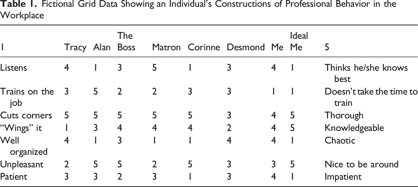
Fictional Grid Data Showing an Individual’s Constructions of Professional Behavior in the Workplace
Analysis of Data from the RG Test
The discussion during the RG test generates rich qualitative data because interviewees have to search for their own meanings about elements, how they distinguish between them, their preferences for different poles of their constructs, and their reasons for allocating scores to elements (e.g., see Proctor & Winter, 2020). This discussion allows the researcher to get “under the surface” of the topic being discussed, partly because the interpretation of responses to the grid test is not immediately obvious to the participant and this makes socially desirable responding less likely (Wheatley et al., 2020).
The scoring patterns in the grid itself add further insight, and are most usefully represented using a graph called a “biplot,” which shows clustering or separation of elements based on their scoring patterns, along with the constructions that shaped their thinking. The biplot is generated using a data reduction technique, based on singular value decomposition, and it produces new vectors that summarize the variation in the data into new dimensions (Fransella et al., 2004b; Gundersen, 2018). The scoring of elements can then be projected onto a two- or three-dimensional graph, using the first two or three dimensions.
As an example, a two-dimensional biplot has been generated from the fictional data in Table 1 and is shown in Figure 1. Elements are represented as points within the plot and the constructs against which they are scored are shown on the periphery. Three types of information can be derived from the biplot. First, closeness of elements indicates similarity in scoring across constructs and therefore similar constructions—in other words, clustered elements are seen as psychologically similar (Fransella et al., 2004d). Second, narrow angles between constructs indicate similarity in their scoring across elements, and likely semantic similarity. Third, the relative score of an element on a construct can be inferred by projecting the element’s position onto the construct axis. A biplot showing data from a fictional grid test examining professional clinical behaviors. Note that the x-axis (dimension 1) explains 55% of the variation in the scoring data, while the Y axis (dimension 2) explains 23% of the variation.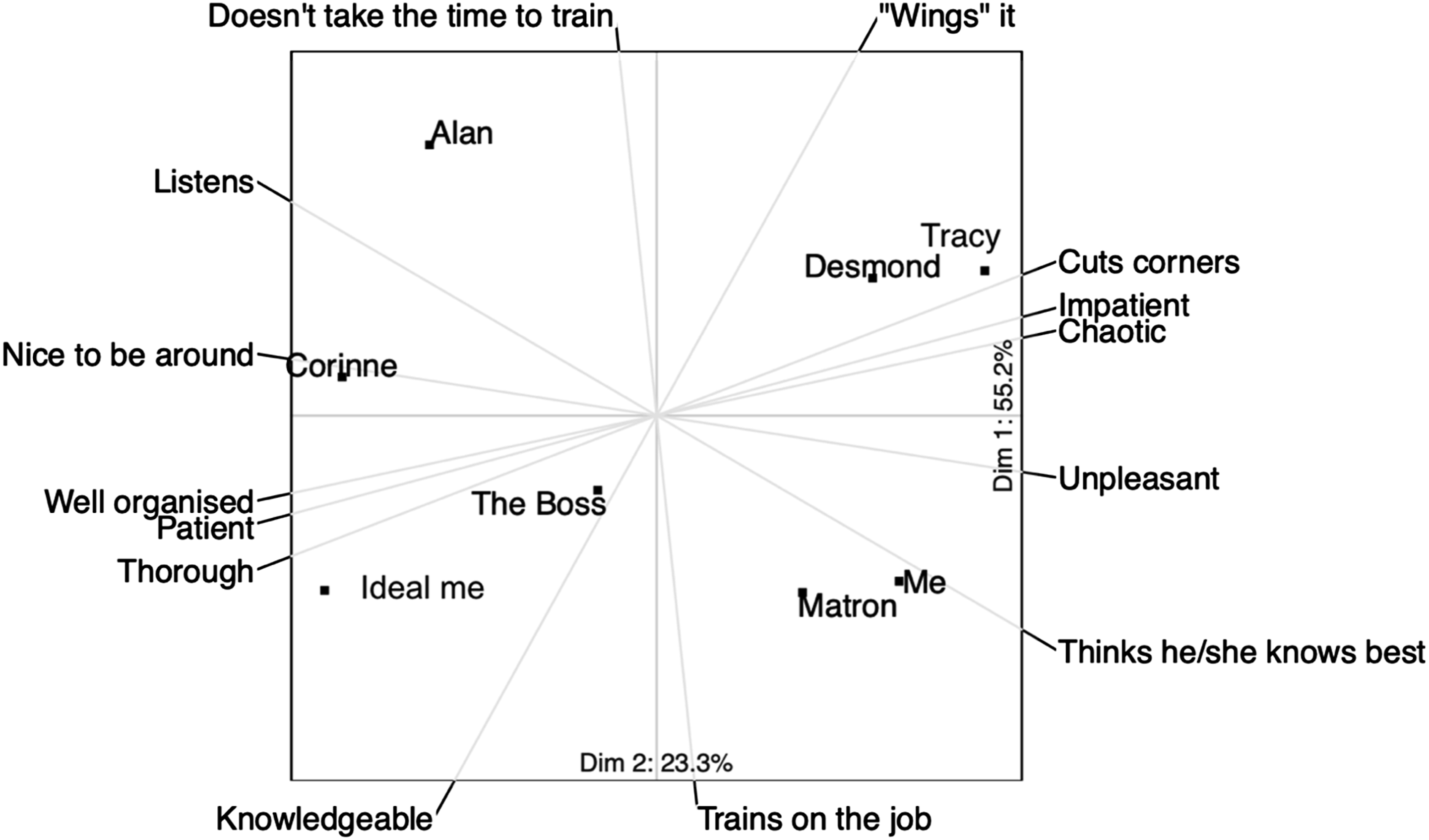
The plot in Figure 1 shows that the participant constructs himself similarly to Matron and, while being knowledgeable and providing training, his ideal professional behavior is in a different part of the graph where Corinne is modeling some alternative professional behaviors.
The Challenge of Using the Repertory Grid Test in Empirical Work
The combination of data from multiple RG tests to infer the shared construing of a group of people is permitted by Kelly’s Commonality Corollary, which states that “to the extent that one person employs a construction of experience which is similar to that employed by another, his processes are psychologically similar to those of the other person” (Fransella et al., 2004e, p. 10). However, the test was designed to uncover the thinking of an individual, often in a therapeutic context, and some personal construct psychologists feel that it should not be used as a normothetic, research tool (Fransella et al., 2004d). There are also practical difficulties because, while the narrative data from the discussion yield to standard qualitative methods, the combination of multiple grids is challenging and, as Hadley and Grogan (2023) point out, can result in a “cacophony of constructs.” The task can be made easier by supplying some fairly typical elements, rather than asking participants to identify their own constructs, something that is uncontroversial in a research setting (Jankowicz, 2004d). However, this still leaves the researcher with a large number of individual constructs, and the confusion of a biplot that shows dozens of constructs rather than the 7 in Figure 1 can be imagined.
Several approaches have been used to try to get around this problem. One solution is to ask a representative group of individuals to identify a set of constructs and elements likely to represent the shared construing of a group, and to create a single grid that is then administered to multiple participants in a “survey” type approach (Fransella et al., 2004a). Analyzing data from a single grid that has been scored by multiple participants is analytically straightforward but, while supplying participants with elements—the things they are construing about—is uncontroversial, the use of participants’ own, elicited, personal constructs, using their own vocabulary, is preferred because these are likely to be more meaningful to them (Hadley & Grogan, 2023; Jankowicz, 2004a; Mak et al., 2013), and because of the qualitative insights that are generated when participants seek discriminating features in the set of elements. Much of the value of the repertory test is lost when participants are asked simply to score elements against pre-specified constructs that may not represent their own thinking.
Several methods are described for grouping the constructs volunteered in a set of individual tests. For grouping of constructs across participants some sort of content analysis is often used, either an iterative, data-driven approach (Jankowicz, 2004a), or using a pre-specified category system, such as the general psychological system described by Feixas et al. (2002). After sorting, the constructs are analyzed within categories and the results are expressed as summary tables that indicate the frequency of their use, perhaps with a comparison of different frequencies between sub-groups of participants. However, while the claims from the frequency table can be supported with text data from the interviews, the numeric data from the rating of element on construct has been lost.
Honey (1979) reported a method for combining the grids of multiple participants that does use the scoring patterns in the data matrix. A superordinate construct is created that represents what the researcher is really interested in. In Honey’s example, which synthesized data from 73 individual grids to examine how employees constructed effective management, the superordinate construct was “most effective management style” vs “least effective management style.” Participants were asked to score the “elements”—these were their own managers—against this superordinate construct, in addition to generating and scoring their own personal constructs. The personal constructs with scoring patterns most like, and least like, the superordinate construct were identified as the constructs most important and least important to employees in identifying effective management. This interesting approach does permit the data in multiple matrices to be compared, but the focus on the constructs most and least like the superordinate construct means that much of the potentially interesting “middle” part of the data is lost. Honey’s approach also relies heavily on finding a suitable superordinate construct.
Hauser et al. (2011) synthesized the individual constructs of 100 participants, who were interviewed about food choices, by creating clusters of constructs that had similar scores on elements and were also semantically similar. By assigning a label to the cluster and removing individual construct lines and labels, they were able to produce an understandable three-dimensional plot that summarized the scoring of elements against 1,390 out of 1,544 individual constructs about food choices. However, while only 10% of the pooled constructs were discarded, the three axes of the graph summarized only 40.7% of the variation in the data, indicating that more than half of the variation had been lost.
Another approach used in the food and hospitality sector for combining multiple grids is the Generalized Procrustes Analysis (GPA) (Chang & Mak, 2018; Mak et al., 2013; Messina et al., 2008). For a GPA, data from multiple individual grids with supplied elements are mathematically manipulated so that individual differences in mean score or the use of scale are removed, and then rotated so that patterns of similarity and difference match as closely as possible, and a “consensus grid” is created. The constructs most closely matching the consensus grid are selected to create a plot of element scoring patterns. Grice & Assad (2009) give a worked example of GPA to examine students’ constructions of their peers. However, this biplot shows students clustered on a main axis that includes contradictory characteristics in the same part of the plot, and it is difficult to know how to interpret a biplot where contradictory characteristics are close together, a problem that probably arises from loss of data.
A problem common to these standard approaches is loss of information, either by discarding constructs, or by losing variation in scoring by using summary statistics or data reduction techniques.
Empirical Focus: Digital Learning Engagement
In the remainder of this article, we will show how we used a convergent mixed methods design to avoid this loss of data by using a working theory to organize and present narrative and pooled grid data. We show how constructs can be used as coding units for interview data, resulting in tight integration of the qualitative and quantitative elements, and we discuss the analytical advantages of combining qualitative and quantitative grid data in this way.
The unexpected pivot to digital teaching and learning during the Covid pandemic provided a valuable opportunity to examine, not only how the digital could best be used to support clinical teaching (Voss et al., 2024), but also how students feel about digital teaching and why so many continue to value face-to-face teaching regardless of the convenience of the digital medium (Kemp & Grieve, 2014; Pedrosa-de-Jesus et al., 2014; Raupach et al., 2009). Our own attempt to design engaging digital materials for clinical teaching during Covid-19 using design research and a game-based approach resulted in positive comments but minimal use of the tool, despite incorporation of all the features requested by the users (Voss et al., 2023). Because conventional interviews did not reveal the reason for this hesitancy, we wanted a research approach that would “get under the surface” of the comments and reveal what how students “really” felt about digital learning. The broad question that guided the research reported here was: in what ways, and why, is digital learning engagement different from face-to-face learning engagement?
The integration of qualitative and quantitative data, and the integration of theory with empirical data, is necessarily complex, and the method we used is summarized diagrammatically in Figure 2. Diagram of method showing mixing.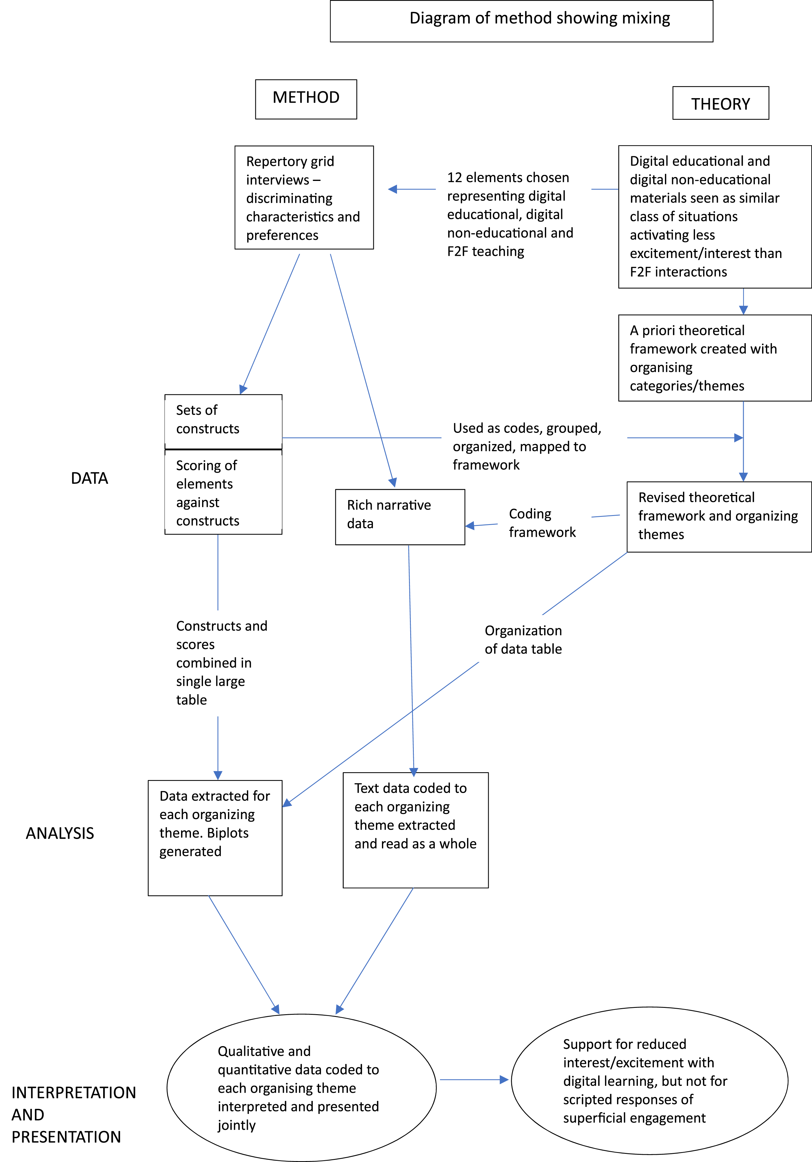
Step 1: Identify a Plausible, Testable Theory
Theory is valuable in structuring enquiry and organizing data (Casula et al., 2021; Evans et al., 2011; Haynes-Brown, 2023). Evans et al. (2011) argues that theory is particularly important in mixed methods studies, mitigating some of the “uncertainty and instability” inherent in social contexts and allowing us to integrate and draw causal links from data that has been generated from different epistemic traditions. Specifying an a priori theory also adds transparency to the analysis (Dixon-Woods, 2011) but, to avoid research that simply verifies existing theory, this needs to be done in a flexible way that allows theory to be tested, modified, and perhaps rejected (Gilgun, 2015; Merton, 1968). For a theory to be used in this way, it needs to be in what Merton (1968) called “the middle range”—that is, close enough to the data to be tested, but sufficiently abstracted to offer explanations that are transferrable to other contexts.
Theorizing Digital Learning Engagement in the Exemplar Study
Selecting a theoretical lens through which to examine learning engagement is challenging because, as D’Mello (2021) points out, learning engagement is a poorly defined, multi-dimensional concept with dimensions including behavior, cognition, and affect. While it would be legitimate to choose any of these dimensions, we found the affective dimension of engagement particularly interesting to explore; firstly, because of the argument that affects are the primary motivating mechanisms because they make us care about things (Immordino-Yang, 2016; Tomkins, 1981); and secondly, because there is empirical evidence indicating that students’ affective responses can be harnessed to improve learning (Artino et al., 2012; Osborne et al., 2021).
Silvan Tomkins was an important twentieth century theorist of affect, whose proposed typology of affects included the positive affect of interest-excitement—a motivating affect that is highly relevant to learning engagement because it directs attention toward objects and ideas (Tomkins, 2008b). Tomkins extended his ideas about affect to a more comprehensive theory of human behavior, in which he proposed that experience is organized as a series of affect-laden scenes that we recognize, to a greater or lesser extent, and which prompt scripted responses (Tomkins, 1995).
Tomkins describes some of the conditions necessary for interest-excitement, which include novelty, uncertainty, and “an enduring discontent, or at least the absence of complete seduction by the familiar” (Tomkins, 1,962/2008, p. 194), suggesting the possibility that, in digital environments, where the universe of human knowledge can usually be accessed in seconds by a digital search engine, the “quest for the novel” may be trivialized and the thrill of discovery missing, and interest-excitement might decline as a result. Tomkins’ work is a “grand theory” of human personality, in that it explains a wide range of human experience and is too abstracted to be tested, modified or rejected in a single study. However, drawing on his ideas, and other work indicating that, with too much choice, people experience unpleasant decision regret, choice switching, and prevarication (Chernev et al., 2015; Jessup et al., 2009; Reed et al., 2011; Schwartz, 2004), it is possible to derive and propose a lower level, working theory in Merton’s “middle range” that explains why the easily accessed riches of the internet might lead to unenthusiastic digital learning engagement. With this in mind, we proposed that:
Online learning tends to activate scripts of superficial engagement and facile termination of activities that have been fostered by other online activities.
Some testable hypotheses can be derived from this working theory. 1. Digital educational and digital non-educational materials are seen as representing a similar class of situations that activate similar feelings and behaviors. These are different from the feelings and behaviors activated by face-to-face learning. 2. Face-to-face learning is more likely to activate positive effects than online learning. 3. Face-to-face learning is more likely to activate interest-excitement than online learning.
A basic scheme for this working theory is represented schematically in Figure 3. This proposes that face-to-face learning, digital learning, and non-learning digital use are recognized as distinct scenes that prompt affect-laden responses. Although the scenes are distinct, the two digital scenes are closer to each other than they are to the face-to-face scene. They therefore prompt similar, affect-laden, scripted behaviors that are different from the scripted behaviors for face-to-face learning. Initial working theory showing affect-laden scripted responses to learning media. Digital learning and non-learning digital use are recognized as similar scenes, and are different from non-digital learning.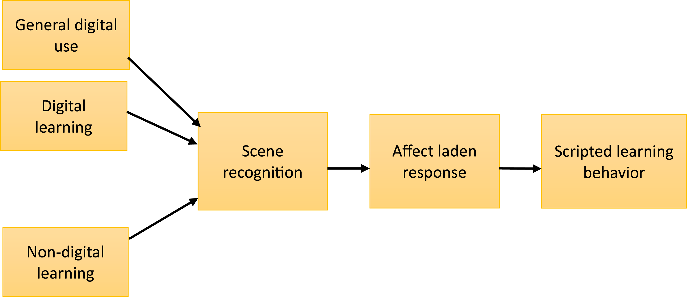
Step 2: Design a Repertory Grid Test to Examine the Theoretical Propositions
The RG test is a flexible tool that can be used in many ways (Fransella et al., 2004f). When using it as a research tool, important early decisions involve choices about whether to supply elements and constructs, or to use the patient’s own, balancing ease of analysis with the essentially individual nature of the grid test. As indicated above, supplying elements is generally accepted, but there are strong theoretical reasons for preferring the participant’s own constructs. When choosing a set of elements, these should represent the domain of interest and any important groupings in it, and be meaningful to the participants (Fransella et al., 2004c). Jankowicz (2004b) suggests using 6–12 elements, while Proctor and Winter (2020) suggest no more than 15 elements—more than this and participants are unlikely to be able to make considered judgments.
Grid Design in the Exemplar Study
An RG test was particularly relevant for testable hypothesis 1 because we wanted to see if digital learning and non-learning digital use were experienced as a similar class of situations. We opted for a research design that used supplied elements, but elicited participants own constructions. In order to test the working theory, we needed to compare constructions of digital learning with both general digital use and with non-digital learning. We selected twelve elements selected to map out the topic that included four examples of non-digital learning, four examples of digital learning, and four examples of digital use that is not obviously related to formal learning. The elements were tested and developed in three pilot interviews not included in the final analysis. One element was modified during the first interview. The final set of elements is shown in Table 2.
Step 3: Repertory Grid Tests with a Suitable Cohort
An additional issue is the number of individual tests required to make more general inferences about shared construing. Heckmann & Burk (2017) suggest a “rule of thumb” of 15–25 tests, but two reports have examined data saturation and reported that no new insights emerged after 17 tests (Napier et al., 2009) and 20 tests (van de Kerkhof et al., 2009).
Grid Tests in the Exemplar Study
We carried out individual repertory grid tests with 20 medical students, using 12 supplied elements, but asking participants to identify their own constructs. The students were a convenience sample of volunteers, who were attached to the Surgical Emergency Unit at the time of the study, recruited using word of mouth, and they received a book token as acknowledgment of their time. The topic of the discussion, presented to the participants, was “different ways of getting information, in terms of how you think and feel about them.” Repertory grid tests, taking a median of 60 minutes (range 38–88 minutes) were completed with 8 male and 12 female medical students. Eleven participants were students in the undergraduate program, while nine were graduate entry students. Fourteen students were in the first of a three year clinical program, one was in the second clinical year, and five students were in their final year. Their experiences of digital teaching and learning were heterogenous as a result of the rapid pivot to online learning that was necessitated by the Covid-19 pandemic.
The triadic elicitation method was used, in which students were shown three cards at a time, each card representing an element, and they were asked to identify “any way in which any two of these are similar and thereby different from the third.” Once the discriminating factor had been identified and clarified, students were asked for its “opposite” in order to create the two-dimensional construct. In several instances, if the construct was not particularly informative, such as “can do at home versus must travel to class,” the constructs were probed using Hinkle’s (1965) “laddering” technique: participants were asked which pole they preferred and why, and this often generated more interesting constructs. A repertory grid was constructed by creating a table with elements as columns and with the contrasting poles of the constructs listed, one on either side of each row. The pole on the left was allocated a score of 1 and the pole on the right was allocated a score of 5. Students were then asked to allocate a score of between 1 and 5 to each element against each of their own constructs, according to which pole it was closer to. The discussions were recorded and transcribed verbatim. The repertory grid was completed by hand and transcribed to an Excel spreadsheet later on the same day. The 20 students identified a total of 188 constructs.
Step 4: Extract the Pooled Constructs and Use for a Coding Framework Based on the Working Theory. Code the Narrative Data
The data provided by the RG tests is of three types. The discussion about discriminating characteristics and preferences yields narrative data that is particularly rich because of the probing nature of the interview. Several constructs also emerge from each test, usually around 8–12, in addition to the grid on which the elements have been scored against the constructs. The number of constructs elicited and the size of the grid is limited by participant fatigue (Proctor & Winter, 2020). If the “commonality corollary”—the idea of “shared construing” (Fransella et al., 2004e)—is accepted, then it is reasonable to combine all the constructs from participants into a pool that represents their shared construing.
Importantly, these constructs represent the way in which participants think about the domain of interest which makes it logical to use them as codes for organizing and interpreting the narrative data. This decision is a crucial part of our method because the construct becomes the key to integrating text and grid data. There will usually be several dozen constructs in the shared pool, but Attride-Stirling (2001) offers guidance for grouping and sorting codes (construct-codes in this case) into basic themes, which are low order themes that share a notion. The basic themes can then be mapped onto the working theory, which provides structure but should be considered a “best fit framework” (Carroll et al., 2011; Dixon-Woods, 2011) that accommodates data-driven modification.
Application in the Exemplar Study
Transcripts were imported into Atlas-ti qualitative data analysis software, version 9.1.1 (ATLAS-ti Scientific Software GmbH, Berlin), for coding. The pooled list of 188 constructs was also imported into Atlas-ti, for use as a code list. Following this, the 188 construct-codes were grouped with similar construct-codes and sorted into basic themes in an iterative fashion, understanding a basic theme as one that encapsulates a discreet object or idea but needs to be read in the context of other themes to make sense “beyond its immediate meaning” (Attride-Stirling, 2001, p. 389). As far as was possible, the basic themes were then mapped onto the working theory shown in Figure 3, while extending and expanding the theory as necessary to accommodate emerging data. The modified working theory is shown in Figure 4. The organizing theme “type of information source” was created to incorporate the pre-specified three groups of elements, together with new basic themes about their affordances. The organizing theme “learning behaviors and thinking” was derived from the pre-specified theme of “scripted learning behaviors,” and basic themes about learning behaviors that emerged from the data were mapped here. An important theme that emerged from the data, but which could not be accommodated on the pre-specified framework was “Perceptions.” This new theme grouped construct-codes that described students’ dimensional or sensory experience of learning. Modified working theory.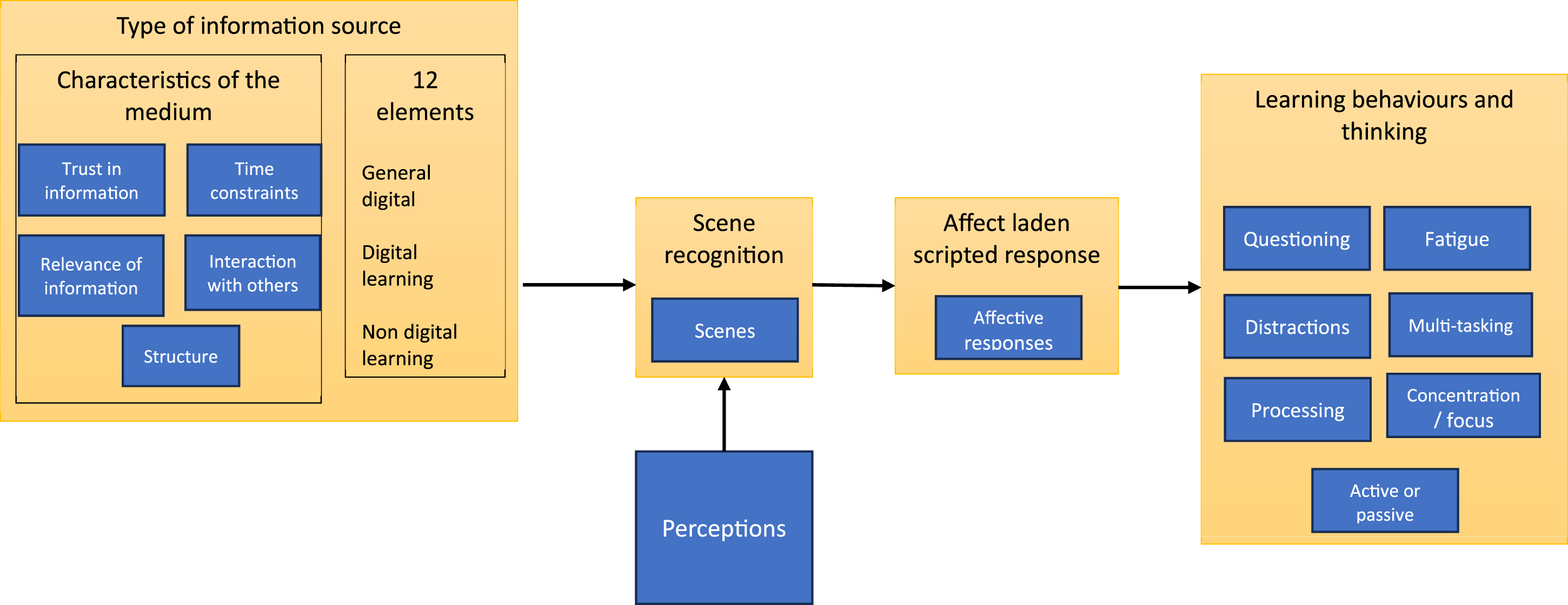
The narrative data was then coded using the basic and organizing themes shown in Figure 4 as a coding framework.
Step 5: Create Biplots from the Constructs Coded to Each Organizing Theme in the Revised Working Theory
The biplot is a useful, visual summary of the patterns of variation in the data that shows relatedness in scoring patterns between the elements, together with the constructs that explain the relationships. However, the plot is essentially descriptive and the elements on it are distributed against axes that summarize as much variation in the data as possible, but cannot capture all of it. Strategies to include more variation in the plot include the use of three-dimensional, rotational plots (an example can be found here: link to 3D rotational plot), or pseudo three-dimensional plots that use size variation to simulate distance in the third dimension (for example, Hauser et al., 2011). However, these can be difficult to interpret. The question of “how much variance is enough” when interpreting a biplot is an open one, but a rule of thumb of 70% is commonly used (Joliffe & Cadima, 2016). In other words, a sum of the percentage variance explained in the two dimensions of the biplot of around 70% is considered a good representation of the data.
Application in Exemplar Study
The quantitative data in the 20 grids was concatenated on an Excel spreadsheet to create a single table with 188 rows, representing the pooled constructs, and 12 columns, representing the scores allocated to the elements. Additional fields were added to tag the basic themes and organizing themes that these constructs had been coded to. The Excel data was imported into RStudio Team, 2022.07.1 + 554 “Spotted Wakerobin” Release (RStudio Team, 2022) for use with R version 4.2.1 (R Core Team, 2022) and formatted for the “OpenRepGrid” package version 0.1.12 (Heckmann, 2024). For each organizing theme, a biplot was constructed, using OpenRepGrid, that represented the numerical grid data for all the constructs grouped within that theme across all participants.
Step 6: Integration, Joint Display of Biplots and Narrative Data for Each Theme, and Drawing Metainferences
Integration of findings, in such a way that the whole is greater than the sum of its parts, is the defining feature of mixed methods research (Fetters & Molina-Azorin, 2017; Younas et al., 2023), and it is important to think about how different data types are integrated and to what effect.
Fetters et al. (2013) offer a useful typology of integration, which can be considered at several levels. First, the overall design of the study, in which different data types are either collected sequentially, with one type building on another, or convergent designs in which different data types are collected at the same time and compared. Second, integration can be considered at the level of methods which can be classified as either: connecting, in which the data types are linked because they are drawn from the same sampling frame; building, in which one database informs the collection of another; merging, in which different data types that answer similar questions are brought together and compared, usually after analysis; and embedding, in which there are multiple points of connection. Finally, Fetters et al. (2013) indicate that mixing should be considered at the level of interpretation and reporting, which can be considered as: narrative, in which the findings are described in a report; integration through data transformation, in which one data type is converted into another; and by joint display, in which the different data types are brought together through visual representation.
Data integration can result in three outcomes—confirmation, in which different data types suggest similar conclusions and increase the credibility of any inferences; expansion, when different data types provide deeper or broader insight; and discordance, when different data types are inconsistent with each other (Fetters et al., 2013).
Younas et al. (2023) offer methodological advice on how to generate inferences from the integration process, or metainferences. They recommend an initial reflexive process to identify prior assumptions, before drawing inferences from the data of each type, and then using visual displays to integrate different data types, indicating how the integration adds value. Although a repertory grid records participants’ own scoring of their constructs, it is important to recognize that these constructs are co-constructed with the researcher during the test (Jankowicz, 2019). This means that reflexivity, and an attempt to bracket one’s own experience, is as important for drawing good quality inferences from the grid as it is from the interview data.
Application in the Exemplar Study
Using the typology described by Fetters et al. (2013), the repertory grid can be considered a convergent mixed methods design and, as is shown in Figure 2, the integration is embedded. We opted to use joint display for our findings, representing the biplot alongside narrative data coded to the same theme, and considering to what extent the different data types confirmed, expanded, or were discordant with each other.
Considering Quality of Inference in the Separate Data Types
An assessment was made of the quality of the data in the biplots and the narrative data coded to the same theme. The repertory grid test is highly interpretative. The scores are the participant’s own, but the constructs are co-constructed with the practitioner or researcher conducting the test (Jankowicz, 2019) and, in this use of the test, the organizing themes are created according to the researcher’s interpretation of the data. The researcher undertook a reflexive process to establish self-positioning, and was aware of the temptation to supply words for the students who were struggling to articulate a construct pole.
Joint Display and Metainference
For the joint display, we wished to include as much variance as possible in the biplot. For this reason, we explored the use of 3D and pseudo 3D plots to include more variance, but found these difficult to interpret and the additional variance explained was usually less than 10% (Voss, 2023). As an example of a joint display we show here the biplot for the 21 constructs organized under the theme “Affective Response,” together with the narrative data, and showing how the joint display adds value through expansion (Figure 5). Biplot showing construction of elements within the theme “Affective.”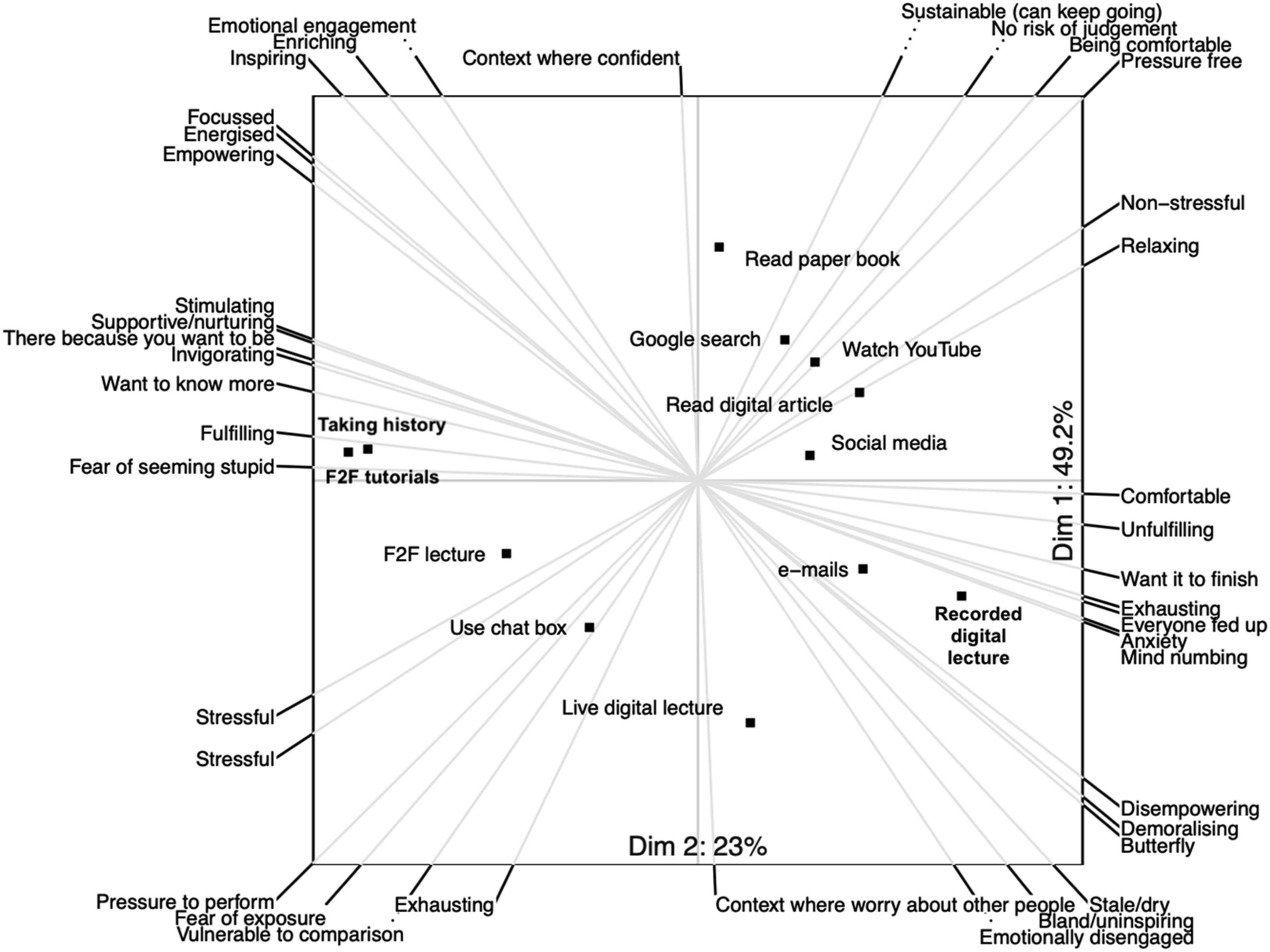
This biplot, which represents 73% of the variation in scoring patterns, shows that face-to-face learning that involves interaction with other humans is distributed along axes that represent greater stress, but more excitement and interest than digital learning. Face-to-face tutorials and taking clinical histories in particular are clustered around poles that express positive affects, while digital learning media are more closely associated with poles that express tiredness and anomie. This supports the hypothesis that interest-excitement is more likely to be stimulated by face-to-face learning media.
The magnification of interest-excitement in face-to-face learning was confirmed by the text analysis: while students commented favorably on the convenience of online learning, strongly expressed affective responses invariably favored face-to-face learning. Live digital lectures evoked some particularly strong responses: I HATE this live digital. Because it's just like, I’m getting all the negatives of both of them. I just don't like this at all. Because for [face-to-face lectures], I'm there and I'm paying attention and I can see the person lecturing and so I'm paying attention... in [live digital lectures], you don't get the person in front of you, because you don't really see their face, right? You just see their slides, which makes it just super impersonal, which makes you not, inherently like pay attention less, and you can't go back to the information... and you're forced to go at their speed. And it's just, it sucks. I don't like it. [P006] P: I just feel like this [live digital] to me, emotionally is so different to a face-to-face lecture, which is obviously a one. I: Which emotion in particular? P: Like in terms of my engagement and interest and like enjoyment. Enjoyment is probably the right word. Whereas watching a live digital lecture, it's fine, but it's not kind of something that I look forward to in anywhere near the same way as going to something face-to-face. [P017]
The fatigue associated with using digital media was frequently mentioned. This was particularly the case with live digital lectures: it's really exhausting to be in front of the screen. So like, no one wants to sit there and have an elaborate discussion. [P001] ... it doesn't feel enriching as a way of learning. [P005] Our finals revision course was, was two weeks of nine to six, on Teams with lectures. And that is, it's surprisingly fatiguing after a while, you really, really, really have to force yourself to be disciplined. Whereas if you were in the room, I think, for whatever reason, you're just more engaged [P003]
Revisiting the biplot with this insight, six of the students’ constructions included fatigue at one pole. These were. Draining—Intellectual energy Draining—Stimulating Exhausting—Invigorating Exhausting—Can keep going Mind numbing—Stimulating Demoralizing—Energized
In five of these six constructions, the opposite pole indicates interest-excitement, indicating that digital fatigue can be considered as an absence of interest-excitement. Given that interest-excitement is an affective response in Tomkins’ scheme, this suggests that digital fatigue could be considered an affective response that results from lack of interest-excitement. From the Personal Construct perspective, interest-excitement and fatigue are opposite poles of the same construction.
Step 7: Revisiting the Working Theory
Earlier in this article, we indicated the value of theory in designing a study, organizing data and interpreting results. However, the relationship between data and theory is bidirectional. As long as working theory is chosen at the right level of abstraction, empirical data can be used to develop mechanism-based explanations and “broaden the repertoire” of the grand theoretical orientations that informed the working theory (Kislov et al., 2019).
Application in Exemplar Study
The original working theory stated that: Online learning tends to activate scripts of superficial engagement and facile termination of activities, that have been fostered by other online activities.
The testable hypotheses were assessed against the empirical data.
Digital educational and digital non-educational materials are seen as representing a similar class of situations that activate similar feelings and behaviors. These are different from the feelings and behaviors activated by face-to-face learning The data offered limited support for Hypothesis 1. To examine the overall similarities in patterns of scoring, a biplot that compared the patterns of construct scoring across all 12 elements was run. This is shown in Figure 6, with the labels of the 188 constructs omitted for clarity. Overall, these data show three clusters, indicating three classes of situation: watching YouTube videos, recorded lectures, and reading both online and on paper are clustered together, and on the opposite side of the graph to face-to-face lectures and tutorials, and history taking from patients. Social media use, email writing and a Google search are clustered together below the x axis. Digital learning is constructed differently from face-to-face learning, but also differently from digital non-educational use, other than YouTube videos. The data do not support the claim that digital learning and non-learning digital used are constructed as similar classes of situation. Most variance is explained by the horizontal dimension and the clustering suggests that the distinction between experiences that are live and those that are recorded is more important than the digital versus non-digital distinction.
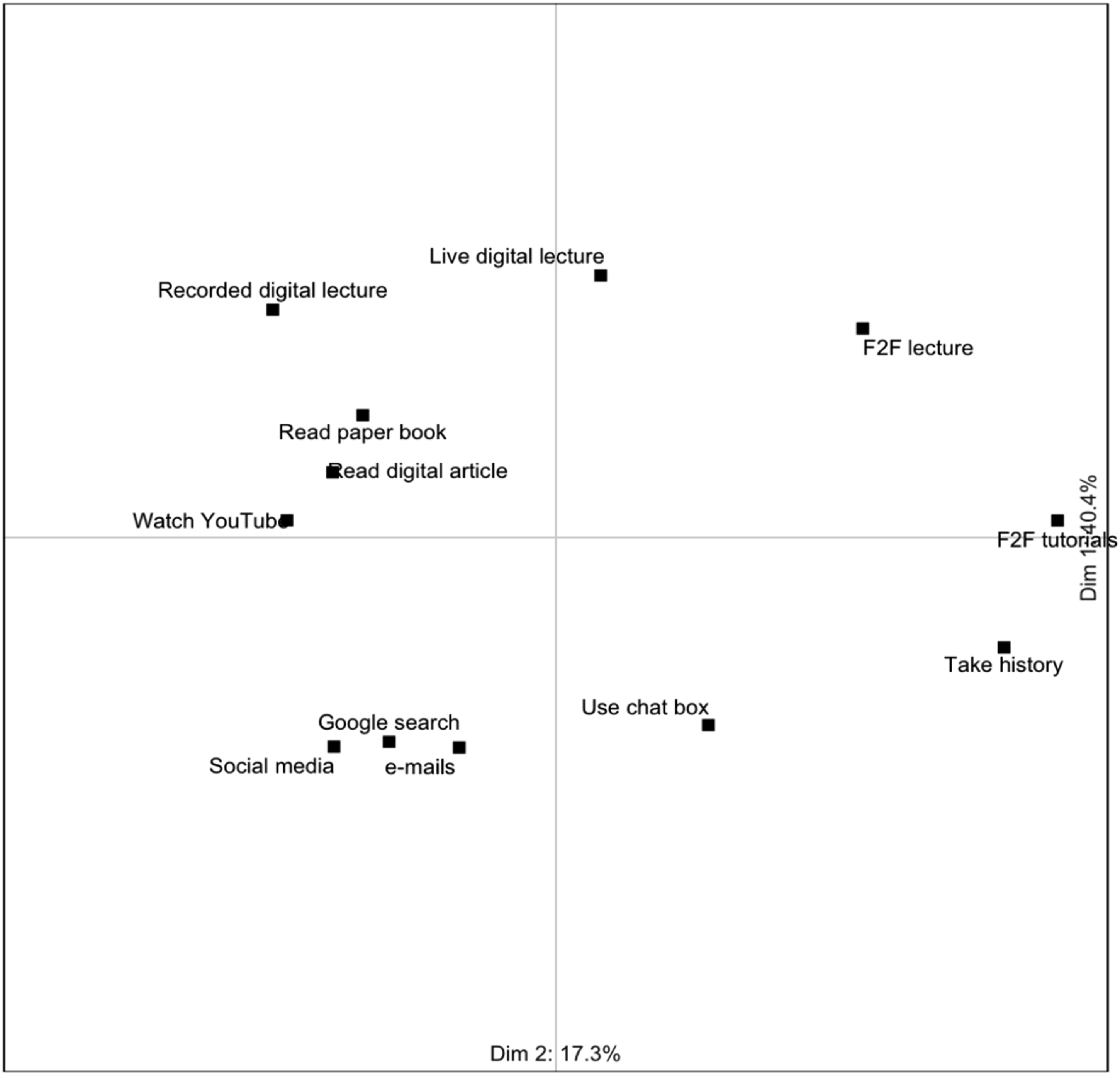
Biplot showing clustering of elements against all 188 constructs. Construct lines and labels have been suppressed for clarity.
Face-to-face learning is more likely to activate positive affects than online learning; and Hypothesis 3
: Face-to-face learning is more likely to activate interest-excitement than online learning
The joint display for affective response reported above supports Hypotheses 2 and 3 by indicating that the positive affective response of interest-excitement is magnified in face-to-face compared with digital teaching. However, there was no indication that digital learning activated scripts of superficial learning behavior as proposed in the working theory. The biplot and the text data for the theme Focus and Concentration (not shown here) indicated that, although students found it considerably more difficult to give sustained attention to digital teaching and learning, they used strategies to overcome this. For example, playing the recorded lectures at higher speeds and taking frequent breaks (Voss, 2023). The working theory that general digital use fosters scripts of superficial engagement with digital learning materials was therefore rejected. However, some other insights emerged from the data.
Emergent Findings
Perception was a New Basic Theme
The impoverished perceptual experience that students reported when using digital media was unexpected, with several participants constructing the elements in terms of the number of dimensions they presented, or the number of senses used. Figure 7 shows a biplot for the thirteen constructs that were grouped under the new theme of “Perception.” Inspection of this biplot suggests that face-to-face learning was constructed as more real, multi-sensory, human, and responsive. Biplot for perception.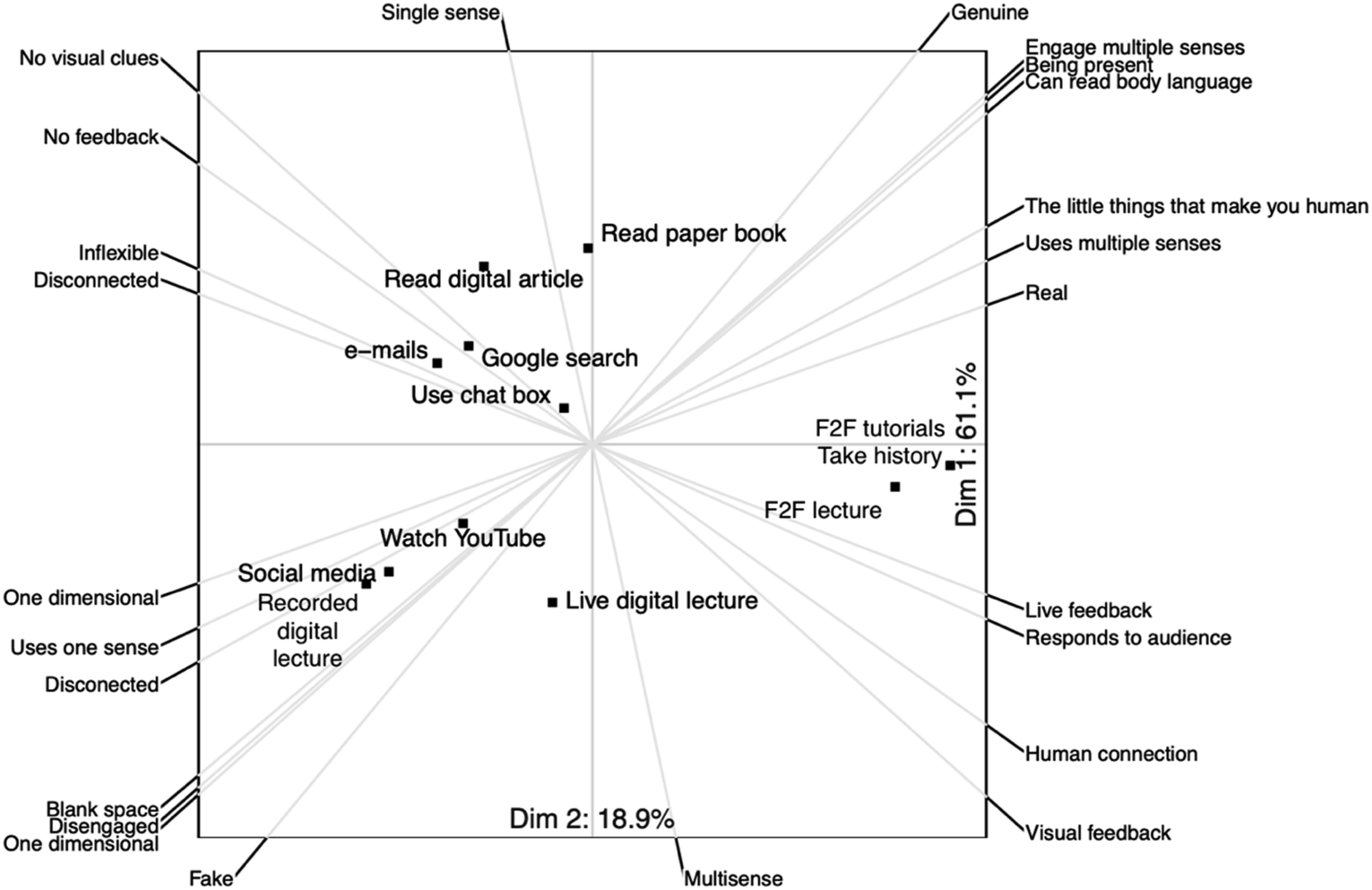
This inference is expanded by the text data. Students indicated that learning environments where they could not “sense the room,” have “feedback” from others, or have things “happening in front of you at a certain point in time” were perceptually uninteresting, and they explicitly linked the impoverished perceptual experience to loss of concentration or described it as unpleasant: so you're sat in your bedroom, and you turn on your Teams or you turn on Zoom. …you, you're there, and it's passive, and you can't... Yes, you can see a tiny square of a human being, but you can't hear the other things in the room, you can't feel the room, you can't see them move. You can't... there's no like palpable understanding of like, an atmosphere. And that's, I find that really jarring to learn from [P005] I: … so you say that these two hold your attention more than a recorded digital lecture? How would you describe the recorded digital lecture? P: ...It uses only one of my senses. Okay, so it's somebody talking, but usually there's no visual cue. And that for me, there's more scope for distractions [P015]
These comments again illustrate how narrative data can expand the insights provided by the biplots by offering links between the themes of perception, affect and attention.
The real presence of other human beings in the face-to-face environment was particularly identified as a stimulus to attention: I think if we're talking about face-to-face communication, there's loads of interaction that isn't asking questions. You know, just in terms of body language and things like that, you are constantly interacting, which you aren't doing in some sort of digital lecture, whether recorded or live. And yeah, I think that's part of... staying engaged when you're in a face-to-face tutorial, you have to be constantly interacting, even if that's nonverbal stuff. [P010] these things are happening in front of you at a certain point in time, and for whatever reason, I think it's a, it's a human thing to want to, to pay attention to that [P003]
When asked what it was that made digital learning less enjoyable, one student responded: I suppose you miss out on all the other things that make you human beyond just language. So... I think you become more, not robotic, but more kind of.... I think you lose the, the kind of little things that make us human [P009]
These comments indicated that events in real environments captured the students’ attention in a way that the digital did not, and that being in a three-dimensional environment, in the presence of other humans, was an important aspect of learning as a human being.
Discussion
The repertory grid test is a potentially valuable tool for convergent mixed methods research because it allows us to “get beneath the surface” of participants’ thinking, and because text and numeric data are collected at the same time. However, synthesizing multiple grids is challenging and led Hadley and Grogan to suggest that “the ideal sample size for a repertory grid is one individual” (Hadley & Grogan, 2023, p. 222). In this article, we have offered a theory-based method for combining data from several repertory grids without the loss of data, and illustrated it with an empirical study of medical students’ digital learning engagement.
Fetters (2020) characterizes advanced mixed methods as those that go beyond joint display and description, to theorizing and model testing, and which usually have a high degree of integration between the data types. In the example we have given, the RG method was used both to test hypotheses derived from a working theory, and to support new theorizing. The high degree of integration between the data types, and also between theory and data is summarized in Figure 2. When using the RG test, data integration happens naturally during data collection because narrative data, and the constructs and scoring patterns that create the repertory grid are collected at the same time. Using our approach, integration also happens during analysis, because constructs are used as a coding framework for the narrative data, and the organizing themes created from the construct-codes are, in turn, used to organize constructs and scores. The use of identical organizing schemes means that the grid data and narrative data can be jointly interpreted within themes.
As Figure 2 shows, integration between theory and data also happens at several levels. Specific hypotheses derived from the working theory were used to guide the choice of elements and, following data collection, construct-codes fed back into the working theory to modify it. Although the working theory was valuable for organizing the data and providing analytical transparency, it was close enough to data to be modified by it and to allow two new theoretical propositions to emerge from the data: one is that digital fatigue is the absence of the positive affect of interest-excitement, the other is the salience of students’ perceptual experiences.
Study Limitations
Empirical Limitations
We fully recognize the interpretive nature of the RG test and a more structured approach to making explicit any domain-relevant prior knowledge and experience, such as the one described by Younas et al. (2023), may have added rigor to our empirical work.
Although we have presented a method to combine data from several participants’ grids and discussions, this required a crucial assumption: that we could draw on Kelly’s Commonality Corollary and assume that this group of the students, who were all more senior students in a single medical school, shared constructions of digital clinical teaching. We did not collect data about the individual characteristics of participants, beyond the stage of their studies and their gender, and this is a potential criticism of our approach. However, we had no a priori reason to identify sub-groups of students for analysis and, even if we had, it is difficult to know how to interpret students’ constructions in terms of, for example, demography. Instead, we offer this data as a “global” view of their experiences of digital teaching and learning. It is a strength of the method that all the participants’ constructs coded to a theme are included in the biplot of that theme and can contribute to the distribution patterns of the elements. At the same time, the text data allows us to look for disconfirming statements; for example, a student who expressed a preference for recorded digital lectures because dyslexia made note-taking in live lectures challenging.
We also did not collect specifics about the exact nature of the digital learning that they were exposed to—which, given the nature of a pandemic, was necessarily somewhat ad hoc. As a result, it could be argued that a different group of students might experience digital teaching and learning differently, or that different educational designs might generate the interest-excitement that seemed to be missing when these students used the digital medium. We accept this, but, while we make no claims about the generalizability of our results, the students’ thoughtful comments about the importance of being in three-dimensional environments and learning with and from real others does suggest that something fundamentally human is missing from digital teaching and learning, and that the digital fails to spark perceptual interest-excitement in the same way as face-to-face teaching.
Theoretical Limitations
There is also an important potential theoretical objection to the use of the repertory grid in this way that needs to be addressed. Kelly’s Personal Construct Theory is an important theory in its own right. The repertory grid is an integral part of this theory, and it seems unlikely that Kelly intended the grid to be used as a standalone tool to test any other interesting, but unrelated, theory. Our position on this is that theoretical triangulation is helpful as long as the basic premises of the theories are similar enough (Hui et al., 2008), and Kelly’s and Tomkins’ views of the structure of thought are not dissimilar: Kelly argued that people interpret the world through a “construing system,” a raft of related constructs that “psychologically channelize [s]” their interpretation of events (Fransella et al., 2004b, p. 83), while Tomkins had a “minding system” in which psychologically connected scenes are recognized and prompt affect-laden, scripted responses (Tomkins, 1995). Triangulating these two theories allowed us to draw both on Kelly’s invaluable logic of enquiry, and Tomkins’ rich insights about the motivating power of affect. Researchers can, and should, make their own decisions about whether triangulating theories with Personal Construct Theory is legitimate, but we found this approach valuable. It allowed us to use the probing nature of the grid interview, the informative graphical representation given by the biplot, and Tomkins’ insightful claims about the motivating power of affect. Using two theories also provided metaphorical depth in understanding the nature of digital fatigue, which our data suggest is a result of the reduced interest-excitement that seems to be inherent to the experience of digital learning.
Directions for Future Research
From the empirical point of view, we were particularly interested in the relationship between an impoverished perceptual experience and the absence of interest-excitement. It would be interesting to explore whether this is mitigated in more perceptually rich, immersive, 3-dimensional virtual environments, or whether this response is something more profoundly human and related to the loss of the meanings we extract from real places and the presence of others. From a methodological point of view, our approach relies on the assumption of shared construing. We currently have little guidance about when this assumption is valid and future research indicating the conditions under which we can use the Commonality Corollary would add validity to studies using a similar approach. Dahl and Naes (2004) describe a participant analysis, based on GPA, to identify sub-groups and outliers in respondents. While this would require the analysis of the “shapes” of responses to a single grid with pre-defined constructs, this may be a promising first step for testing the Commonality Corollary prior to, or instead of, the elicitation of individual constructs in normative Repertory Grid research.
Contribution to the Field of Mixed Methods Research
In this article, we have offered a method for synthesizing the data from multiple repertory grid tests with little loss of data, and with tight integration of numeric and narrative data. Although here we have reported only the data from the most important organizing themes, we were able to allocate all 188 constructs to a basic theme, and to map all basic themes onto the revised organizing framework—there was no “miscellaneous” category for orphaned themes or codes, and all the constructs could be visualized in joint displays with same-coded text data (Voss, 2023). This means that it is not necessary to discard constructs that are not concordant with a superordinate theme, as is necessary when using Honey’s method, or data that does not match a “consensus grid,” as often happens when Generalized Procrustes Analysis is used. The variance explained by the two axes on the biplots was over 70% for nearly all the themes we examined (Voss, 2023). This compares favorably with the 40.7% explained by three axes in Hauser et al. (2011) approach, indicating that data reduction techniques may offer better summaries of variance when constructs are grouped by their meaning, rather than their scoring patterns.
The working theory provided a useful framework for analysis of several individual repertory grid tests, but the reverse was also true—the repertory grid data provided theoretical insights, in particular the importance of the perceptual experience and how face-to-face interactions supported the feeling of “being human.” This only became apparent when we realized that the data contained several interesting constructs and comments that did not fit our a priori categories. We hope this approach will be useful to other researchers who are open to the flexible use of working theories to organize data.
Footnotes
Funding
The authors received no financial support for the research, authorship, and/or publication of this article.
Declaration of Conflicting Interests
The authors declared no potential conflicts of interest with respect to the research, authorship, and/or publication of this article.