
Abstract
In everyday outpatient care, office-based medical professionals often face a growing volume of patient records, spanning years or even decades, while consultation times remain critically short. Much of this information is embedded in unstructured documents such as physician letters, lab reports, and diagnostic notes. The lack of time makes it difficult for physicians to comprehend the patients’ medical history and to base decisions on the full health and disease history. This paper presents a modular Visual Analytics approach particularly designed to support general practitioners in navigating long-term patient histories. Using transformer-based large language models, the system automatically extracts and classifies relevant clinical entities from unstructured documents. These extracted elements are mapped to a set of predefined data categories and visualized through tailored, interactive components, such as medication intake timelines, blood count diagrams, and named-entity highlighted texts. Visual components are selected dynamically based on content type and clinical relevance, allowing medical professionals to explore patient histories efficiently and to identify critical information at a glance. The modular architecture facilitates integrating new document types and visual modules, ensuring flexibility and scalability. Designed for real-world applicability, the system aims to reduce cognitive load, improve information accessibility, and support time-sensitive decision-making in primary care.
Keywords
Introduction
In outpatient settings, office-based medical professionals are increasingly confronted with vast and growing collections of patient data. As patients age and the volume of medical documentation accumulates over time, accessing and understanding the full medical history becomes more challenging. At the same time, consultation durations remain short averaging only 7.6 min per patient in German general practices, among the shortest in Europe.1,2 This time pressure makes it difficult for physicians to review long and often unstructured records to make fully informed decisions. Medical information in outpatient care is typically distributed across various unstructured documents, including physician letters, discharge summaries, lab reports, diagnostic findings, and historical correspondence. These documents often originate from different institutions, follow heterogeneous formats, and are rarely integrated into a unified system. Conventional EHR infrastructures, where they exist, generally lack the ability to interpret or summarize such heterogeneous documents.3–5 As a result, clinically relevant content remains buried in fragmented narratives, making it difficult to retrieve or synthesize during time-sensitive consultations.6,7 To address this challenge, we present a modular Visual Analytics system specifically tailored to the needs of office-based physicians. The system automatically extracts relevant medical entities from unstructured documents using transformer-based large language models (LLMs) and assigns them to predefined data categories. These categories drive the selection of appropriate visual representations, including medication intake timelines, lab value diagrams, and named-entity-highlighted text summaries. The resulting dashboard provides a condensed and navigable representation of the patient’s longitudinal medical history, enabling practitioners to comprehend the full trajectory of diseases and treatments as a foundation for informed clinical decision-making. The core innovation lies in the combination of deep language understanding with entity classification and structured mapping to visual components, enabling targeted information delivery under real-world time constraints. The contributions of this work are threefold: (1) a language model–based pipeline for extracting and classifying clinically relevant entities from heterogeneous, unstructured outpatient documents, building upon our previous work (to be cited after review); (2) a structured mapping approach that links extracted entities to appropriate visual modules based on their entity type and clinical relevance; and (3) a modular and extensible Visual Analytics dashboard tailored to the needs of office-based physicians, supporting efficient exploration of longitudinal patient histories and time-sensitive decision-making.
Related work
In this work, we propose a modular Visual Analytics approach that enables decision support in the medical context using interactive visualizations and structured representations of electronic health records and other forms of patient health data. Therefore, our literature review investigates methods and tools that enhance everyday medical practice through visualization, clinical decision support, and exploration of temporal or patient-specific data. We organize the related work into four thematic sections: Information Extraction from Health Data, Medical Decision Support through Dashboard interfaces, Temporal and Sequential Data Visualization, and Medical Data Exploration and Visual Pattern Mining. The first section includes approaches to information extraction from health data using transformers and large language models. The further three sections highlight advances in visualization design and interaction techniques that aim to reduce cognitive load, support clinical reasoning, and improve the overall quality of care. By focusing on systems that are either currently in use or show potential for clinical integration, we emphasize tools that bridge the gap between complex data structures and actionable medical insights.
Information extraction from health data
Raza et al. 3 apply Named Entity Recognition (NER) at scale to biomedical and epidemiological texts. The work emphasizes the importance of automatic entity extraction in handling large volumes of unstructured medical data. Using deep learning-based NER models, the authors demonstrate how key medical terms, like diseases, symptoms, treatments, and metrics, can be efficiently identified from research papers and clinical documents. Their results show high performance across diverse corpora, revealing patterns relevant to public health surveillance and clinical research. The approach helps transform raw medical text into structured, analyzable information, paving the way for more efficient biomedical data use. This transformer can recognize up to 107 different categories of named entities. Landolsi et al. 4 offered a detailed state-of-the-art review of medical information extraction. Covering rule-based, statistical, and neural methods, their synthesis emphasized the recent dominance of transformer-based techniques and highlighted limitations in temporal reasoning, negation detection, and cross-lingual generalization. Hahn and Oleynik 5 traced the progression from early symbolic and statistical systems to the current generation of deep learning-based extractors. Attention mechanisms, contextual embeddings, and end-to-end architectures have enabled new levels of performance across diverse clinical domains. The broader context of keyword extraction and document structuring was discussed by Komenda et al. 8 While predating the widespread use of transformers, their work underlines the importance of structured extraction techniques as foundational for later neural systems. One of the foundational transformer architectures for biomedical text mining is BioBERT. 8 Pre-trained on large biomedical corpora, it outperformed general-purpose BERT on a range of tasks, including NER and relation extraction in medical documents. Similarly, ClinicalBERT 9 fine-tuned BERT on MIMIC-III notes, showing improved results for EHR-based classification and tagging. Vishwanath et al. 10 introduce MedDistractQA, a benchmark that injects irrelevant yet realistic distractions into clinical question-answering tasks. Their findings reveal that large language models, especially open-source ones are vulnerable to performance drops when faced with extraneous information. While proprietary models like GPT-4 and Claude Sonnet show greater resilience, open models including Llama-3.1-8B-Instruct are more affected, with accuracy declining by up to 10%. Fine-tuning alone does not mitigate these issues, and retrieval-augmented methods (RAG) can further degrade performance. Despite this, Llama-3.1-8B-Instruct remains a practical open-source solution due to its strong baseline, efficiency, and the possibility of local deployment, a key requirement in handling sensitive health data. 11
Medical decision support through dashboard interfaces
Linhares et al. 12 proposed the system ClinicalPath, which aims to support and accelerate the decision-making of medical professionals through the visualization of clinical measurements. The applications’ idea is to divide data into five levels, which are represented on a timeline instead of specific measurement results. This abstraction was intended to simplify recognizing trends, patterns, and outliers. The interface is optimized for overview and not granular analysis, providing a new way to contextualize longitudinal clinical data.
For tumor board meetings, Oeser at al. 13 developed a dashboard structured into three primary sections: personal data, disease metrics, and a timeline of interventions. Rather than relying solely on verbal communication, this interface supports interdisciplinary case discussions by providing structured visual context. The visual layout reduces cognitive load and enables faster alignment across expert domains. The dashboard is shown in Figure 1.
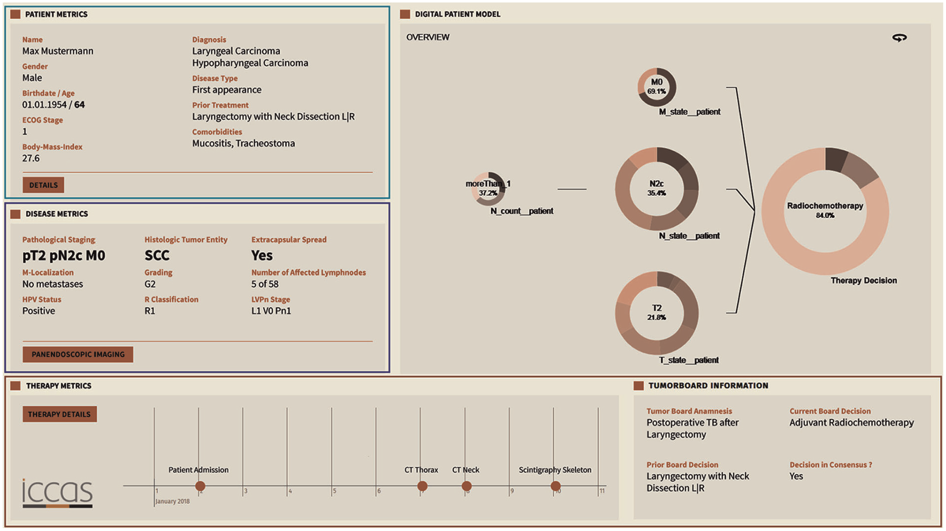
The tumor board presents patient information and medical history, reducing cognitive load and faster therapy decisions.
In our previous work, 15 we presented a Visual Analytics system tailored for the analysis of Electronic Health Records. The system combines transformer-based information extraction with interactive data visualizations to support patient care. Key focus areas include summarizing unstructured medical text, visualizing patient histories, and enabling dynamic decision-support. By integrating NLP techniques with intuitive dashboards, the approach bridges the gap between raw clinical data and practical medical insights. Medication safety in primary care is at the heart of the dashboard introduced by Yera Gil et al. 16 Emphasizing contraindications and interactions between drugs, conditions, and lifestyle factors, the system displays potential risks as indicators. These indicators can be explored temporally using a calendar-based diagram, allowing trends to be tracked and understood with minimal effort. Elshehaly et al. 17 built QualDash, a system for generating custom dashboards to support healthcare quality improvement. Its modular architecture lets users define their metrics and visualizations, making it adaptable to various institutional needs. Fadel et al. 14 investigated the integration of a hypertension dashboard with EHR systems. Their findings suggest that Visual Analytics can improve clinical adherence and reduce consultation time, underlining the efficiency potential of targeted visual tools, shown in (Figure 2). Khairat et al. 18 reviewed dashboards in intensive care settings. They found evidence for improved clinician satisfaction and care quality. Their emphasis on reducing cognitive load and enhancing usability highlights key design principles for future systems. Sutton et al. 19 explored the benefits and risks of clinical decision support systems. Visualization was emphasized as a tool to reduce cognitive burden and enhance decision-making in clinical environments.
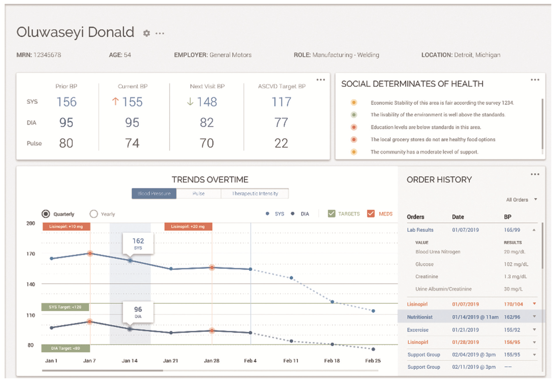
Visual analytic dashboard designed for implementation using visual tools for health data.
Temporal and sequential data visualization
Grasso et al. 20 implemented a straightforward interface for visualizing pain data. Their system arranges individual pain reports along a timeline, with the location of pain marked on a body diagram and its severity represented by a colored circle. This structure allows for rapid semantic interpretation, making it easier for clinicians to observe pain patterns over time without relying on numeric scales.
A review of visualization techniques for time-oriented patient data was created by Scheer et al., 21 shown in (Figure 3). Unlike many systems that focus either on single patients or on aggregated cohort data, they emphasized the need for systems that allow explicit comparisons across these entities. Timelines, histograms, and scatter plots were commonly used, but few implementations supported true comparative visualization. Wang et al. 22 designed ThreadStates, a system that introduces a glyph matrix and Sankey diagram to reveal disease progression states. Through clustering and sequence analysis, it identifies common patient trajectories and their transitions. Its development was guided by expert feedback, ensuring relevance to clinical needs. Zhang et al. 23 presented IDMVis to support decision-making in managing type 1 diabetes. The system aligns patient logs around dual sentinel events and scales intermediate timelines, enabling clearer pattern detection. It supports clinicians in identifying inconsistent behaviors and recommending targeted interventions. 24 introduced TimeSpan, which helps visualize multidimensional time-series data from stroke patients. The system supports comparative analysis of treatment pathways, enabling insights into rehabilitation effectiveness.
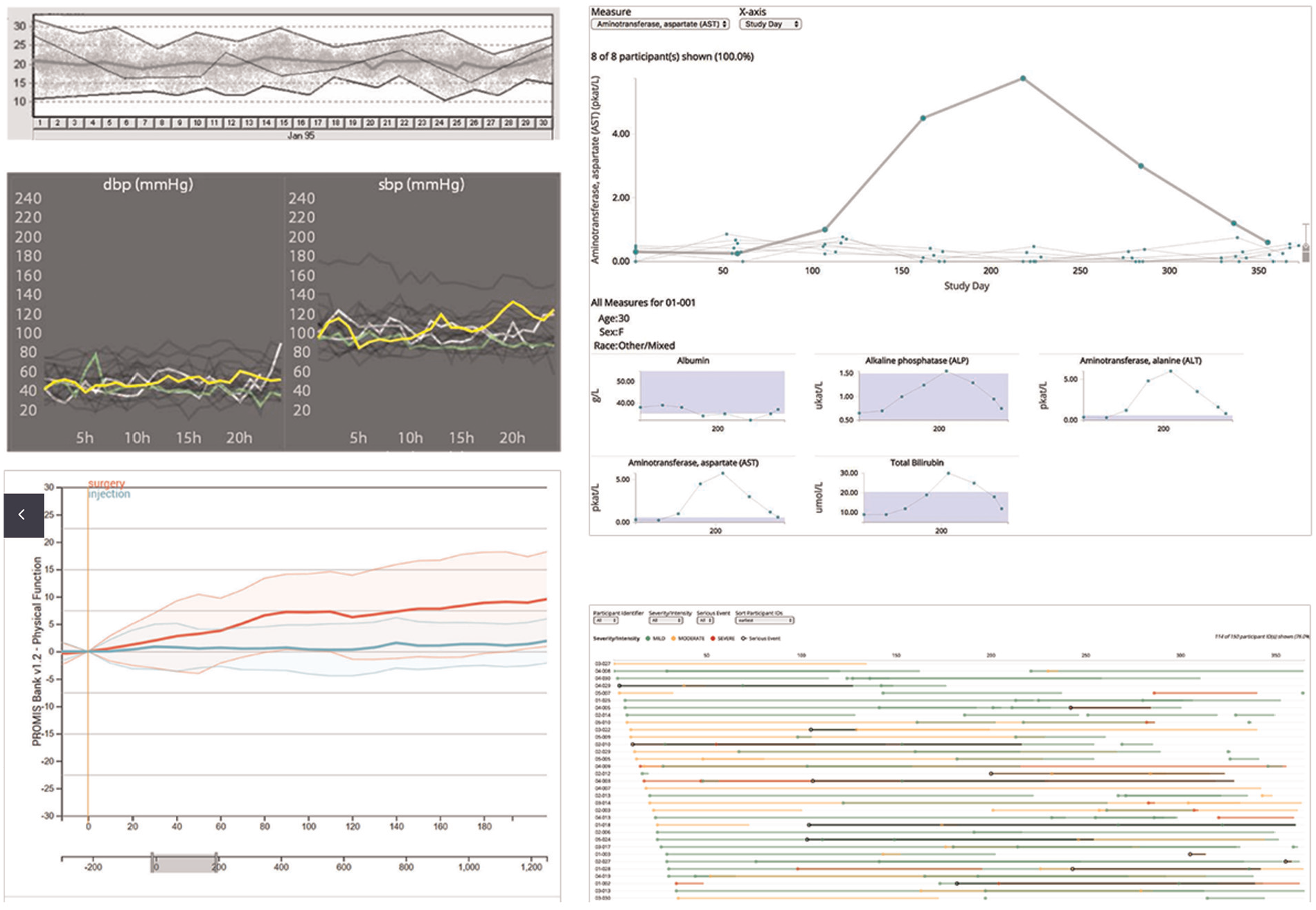
Overview showing line charts as the primary visualization technique for change of different health metrics over time.
Medical data exploration and visual pattern mining
Glicksberg et al. 25 introduced PatientExploreR, an open-source tool built on R/Shiny. It visualizes EHR data from the OMOP CDM and offers an intuitive interface for non-programmers. Cohort identification and interactive navigation of patient histories are central features, contributing to democratizing access to clinical data. Guo et al. 26 proposed a system using sequence embedding to assess patient similarity. By mapping complex medical records into a visual representation, users can compare trajectories and patterns among patients. The system enables granular investigations into patient pathways and disease correlations. Peekquence by Kwon et al. 27 offers a clustered view of event sequences in EHRs. Its design emphasizes usability and allows users to intuitively navigate and interpret complex datasets, supporting the identification of both trends and anomalies. Perer and Wang 28 developed Frequence, a system that integrates temporal sequence mining with interactive visual exploration. Frequent event patterns are extracted and visualized, allowing users to modify queries in real-time and discover new clinical insights.
Baytas et al. 29 built PhenoTree, an interactive tool for hierarchical phenotyping from large-scale EHRs. By arranging patients into phenotype trees, the system supports subgroup discovery and analysis across vast datasets. Abdullah et al. 30 addressed the challenge of dimensionality in EHRs by applying Visual Analytics to support clustering and reduction tasks. Their tool helps identify patient similarities and disease correlations. Rostamzadeh et al. 31 introduced VERONICA, a tool for visually identifying feature groups relevant to disease classification. It enables users to explore classification model outputs, validate features, and refine predictions interactively. Rostamzadeh et al. 7 reviewed existing Visual Analytics tools for EHRs and proposed a taxonomy to classify them. Their synthesis highlights trends in design and offers direction for future work. Park and Choi 32 presented the V-Model, a framework that maps data to clinical reasoning via a structured layout. It guides clinicians in recognizing phenotypic patterns and making informed decisions. Plaisant 33 outlined foundational visualization tools designed for EHR data. Her contributions span anomaly detection, pattern recognition, and cohort analysis, emphasizing the long-standing value of Visual Analytics in medicine.
General approach
Our general approach, abstractly presented in Figure 4, demonstrates an overview of patient health data processing, information extraction, and visualization as a dynamic user interface. Our proposed concept consists of four main modules: patient health data as a starting point, information extraction through transformer-based and large language models, data provision service including a database and application programing interfaces (API), and an interactive visual representation of the results. The different main modules interact with each other, allowing data processing. Each main module includes different submodules, which can only interact with each other within the main module. However, this does not apply to the first module, since it is storage of different data formats. Digitization, such as scanning or optical character recognition of the documents, is not part of this concept. For the purposes of this work, we assume that the data is already available in digital form.
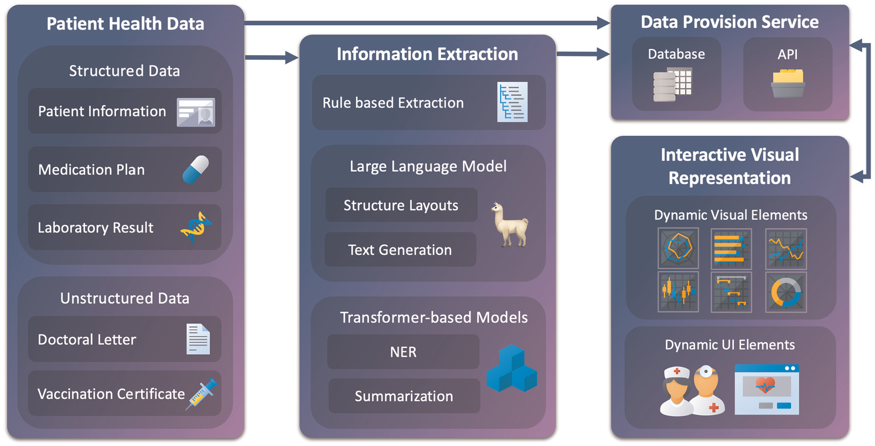
Our general approach consists of four main modules: patient health data, information extraction, data provision service, and interactive visual representation. These modules interconnect to process, store, and display various patient data and, subsequently, relevant information. Each module contains subcomponents that interact internally. Structured and unstructured data are fed into the pipeline, where rule-based and model-driven methods extract relevant entities and structures. Results are stored via a provision service and passed to the dashboard. Visualizations are dynamic and task-specific. Arrows indicate data flow and component integration.
Patient health data
The first module of the conceptual model consists of collecting available data and information on each patient. We can differentiate here between structured and unstructured data. Patient health data is usually available in an unstructured and machine-unreadable format. Thus, the data must be processed to be utilized in further steps. This process is outlined in the next module description, Information Extraction. The most common structured data available is the Patient Information. Through this, we receive the name and surname of the patient, birthdate, address, contact information, and health insurance information. This information is usually provided by the health insurance company or through a data comparison at the doctors’ office. The next data source, Medication Plan, is also commonly a structured format. However, it may need to be preprocessed into a format that can be used for further processing. This plan shows which medication is taken at what dose and over which period. It also shows the time of day at which the medication should be taken, when the treatment has started, and when the treatment should end. Additionally, it contains further information, such as the patients’ name and date of birth, the issuing doctor, the active ingredient of the medication, and the reason for the prescription. Following is data from Laboratory Results. The data is also usually structured but eventually needs to be preprocessed first. Laboratory results typically contain key indicators of a patient’s physical health. These include values like blood counts, liver and kidney function markers, electrolytes, and metabolic data such as glucose or cholesterol levels. Often grouped into panels, these measurements help assess organ function, detect infections, and monitor chronic conditions. Furthermore, standard ranges of the values are also shown, which can be used for reference. Since the laboratory values also have an unstructured explanatory text, it is also necessary to analyze this additional information. Allergy reports are another component of laboratory tests. Allergy reports deliver information about allergy findings and the date of the test. The reports are structured in semi-tabular form and contain patient information and a brief description. Our next type of data is unstructured. Doctoral Letters, often referred to as discharge or consultation letters, provide a structured narrative of a patient’s medical case. They typically include admission reasons, diagnostic findings, treatments performed, and recommendations for follow-up. These letters also document the patient’s medical history, lab results, and medications during the hospital stay. Often written in free text, they serve as a communication tool between medical professionals. While rich in information, their unstructured format poses challenges for quick comprehension and automated analysis. In summary, the letters are reports of every patient visit and contain major information about anamnesis, diagnosis, treatment, prescribed medication, date of attendance, and course of treatment for persistent complaints. Lastly, Vaccination Certificates document a patient’s typically include the type of vaccine, date of administration, manufacturer, batch number, and the administering medical professional. These records are essential for verifying immunity status, planning future vaccinations, and meeting public health requirements. The certificates can be digital in a structured format, but the most common documentation is a mention in a report or a stamp on a vaccination pass.
Privacy and data protection
Patient data is highly sensitive and subject to strict privacy regulations. The system was developed without using any real patient data, ensuring full compliance during the design phase. All synthetic data was created without any identifiable attributes and does not trace back to individuals. For future deployment, the system will follow the principles outlined in the EU Data Act and GDPR, 34 including data minimization, purpose limitation, and secure access control. Implementation will rely on local data storage within clinical infrastructure, access logging, and role-based permissions. Parallel integration with existing clinical systems will ensure that data remains under the control of healthcare facilities, and all processing steps can be comprehended.
Information extraction
The information extraction module consists of three submodules. The first module attempts to obtain information through rule-based extraction. This procedure is most efficient for structured data that is already available in machine-readable form, such as medication plans and laboratory results. Furthermore, various doctoral letters, especially if they were created from the same doctors’ office, offer similar structural properties and may be used for rule-based information extraction. For example, the head of the letter contains information about the patient and the issuing doctor. The middle part is divided into sections, which start with an introduction part followed by headings like anamnesis, diagnosis, treatment, course of the disease, etc. The letter closes with a summary, closing words, and the name of the treating doctor. A further example of rule-based extraction is the recognition of the patients’ birthdate and day of treatment. The past date is most likely to be the patients’ date of birth, whereas the most recent date in the letter is probably the date of the session. Another example is obtaining the different addresses. As already mentioned, the doctor gives his name at the end of the letter. The address that contains this name is likely to be the doctors’ address. The other address, which contains the patients’ name, is likely the patients’ address. If other addresses are mentioned, further processing is needed. The next layer of the information extraction process uses the generative capabilities of Llama-3.1-8B-Instruct 11 to handle both unstructured and semi-structured medical data. This includes diverse document types such as doctor’s letters, vaccination records, or loosely formatted medication plans and laboratory results. These sources often mix narrative and list formats, posing challenges for traditional rule-based approaches. Llama is prompted to extract relevant details—ranging from diagnosis to lab values—and return structured, interpretable fields. A key advantage of Llama is its open-source availability and lightweight architecture, which make it deployable locally. In the medical domain, where data privacy and compliance with legal frameworks are essential, local model hosting avoids transmitting sensitive patient information to third-party servers. Compared to proprietary models like Google’s Med-PaLM or ChatGPT, Llama offers greater transparency, flexibility, and control. To support downstream data processing, the model is configured to return JSON-formatted output, ensuring compatibility with other modules such as named entity recognition and summarization. For this, the XGrammar framework proposed by Dong et al. 35 is integrated, enabling structured output generation from large language models with precision and efficiency. XGrammar helps constrain and validate the models’ output schema, a critical feature for applications where reliability and structure matter.
The final component in the information extraction pipeline is based on transformer models. Two pre-trained models are integrated to deepen text comprehension and enhance output quality. First, a BERT-based architecture is used for Named Entity Recognition (NER). This step identifies specific entities such as symptoms, diagnoses, medications, and active substances. The model of choice is biomedical-ner-all, 3 built upon distilbert-base-uncased and fine-tuned with biomedical corpora. It supports the recognition of 107 entity types, optimized for clinical narratives and research text. For textual summarization, the pipeline incorporates the DistilBART model, 36 selected for its balance of performance and efficiency. This model condenses large text blocks—such as doctors’ letters or further medical data notes, into concise overviews, suitable for visual display. Previous testing showed that English-language models performed better than German models in both NER and summarization. Following the approach by Frei and Kramer, 37 German input is first translated to English, then processed and re-aligned at the token level to maintain semantic accuracy.
Database
The data provision service handles the structured delivery of medical information to the visual interface. It draws from a database composed of eight interlinked tables, all connected via a shared patient insurance ID. Core demographic details such as name, birthdate, and address are stored in a Patient Information table. Insurance-related attributes reside in a dedicated Insurance table, while appointments are managed in their segment. The remaining tables serve as repositories for the five defined medical information sources outlined in Section Patient Health Reports, including medication plans, lab results, doctoral letters, and vaccination certificates. To support flexible and dynamic storage, these data are formatted as JSON. This enables rapid access, structured queries, and seamless integration into interactive visualization pipelines.
Interactive visual representation
In the last module, the interactive visual representation is implemented through two distinct components. The first component generates visualizations based on the information source described in subchapter Patient Health Data, as well as its type and structure. For this, different visualization techniques are used. To visualize textual data, a combination of text summarization and highlighted named entities is used. For tabular data, basic bar, line, and radar charts are considered. Using stacked and superimposed visualizations, further data insight and data comparison are implemented. Lollipop charts are used for specific data, for example, Electrocardiogram (ECG) data. The visualization modules follow Shneiderman’s visual information-seeking mantra—overview first, zoom and filter, then details-on-demand, 38 each component is selected automatically to match the task and data characteristics. Depending on the data, visualizations are generated to offer overview and drill-down capabilities, while unstructured content is summarized with relevant sections highlighted. A summary or full text of the visualized report with highlighted named entities would be conceivable. This would allow the medical professional to check the information displayed in detail or, in case of doubt, to check its accuracy. The dynamic UI elements are interactive dashboard components, tailored to the workflow and expectations of medical professionals. These needs are grounded in previous work on medical dashboards by,13,14,21 and. 15 The resulting components are arranged in a structured dashboard environment that balances exploration and clarity.
To enable modular visualization of extracted medical information, we define a two-step mapping process. Let
We define a set of semantic types
Each string

Each type is assigned a set of suitable visualization modules:

The composed mapping assigns visualizations by:

Each string is mapped to a set of semantic types, and each type is mapped to one or more visualization components. The union over these yields the final set of visualization modules. Table 1 illustrates an example of our mapping process.
Example of multi-type assignment and visualization mapping.
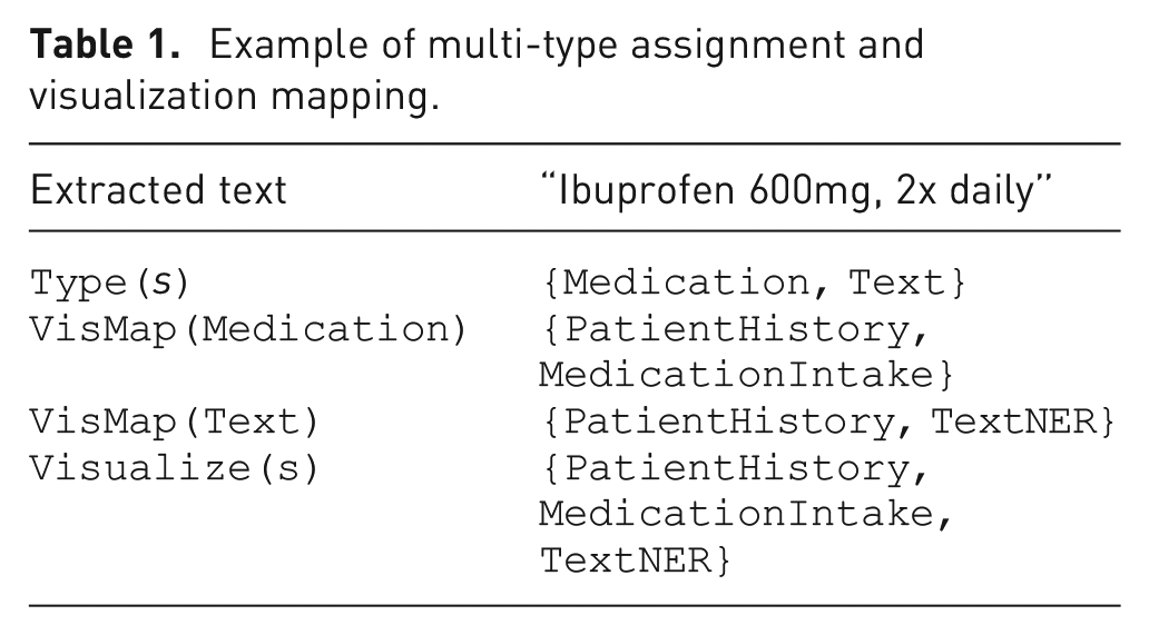
This structure supports assigning a single information item to multiple dashboard modules simultaneously, ensuring flexibility and semantic clarity in the visualization interface.
Visual analytics through a modular decision-support system for medical context
In this section, we will discuss integrating our conceptual approach into a modular Visual Analytics system. For this purpose, we will discuss the features of the Visual Analytics system in detail. Moreover, we will propose how different visual layouts suited to support decisions in a medical context. The Data used for demonstration purposes for this work was generated randomly. The information and personal data presented are fictitious, while closely resembling structure and characteristics to actual patient health data. For the implemented dashboard, initially only documents in English were processed, since German text needed further processing, such as translation and word alignment. The system runs locally on an Intel i7-8750H CPU, 16 GB RAM, and an NVIDIA GeForce RTX 4070 Ti with 12 GB VRAM. Documents of 1–4 pages are processed in 15–25 s, including section classification, entity extraction, timeline generation, and dashboard rendering. Longer documents require up to 40 s. All necessary ML processing and analyses are performed offline.
Information extraction process
To determine a compatible processing procedure for the documents, the user is asked what type of document it is when uploading a new document. The document then passes one or multiple steps for information extraction. In the first one, rule-based methods are used for structured data such as lab reports or medication plans. Repeating formats, allows for simple pattern-based parsing. For unstructured or mixed-format texts, we use Llama-3.1-8B-Instruct. 12 The model extracts relevant details from diverse documents and outputs structured in JSON format with standardized attributes. To process long text-based reports, we apply transformer-based models. Biomedical-ner-all 3 is used for named entity recognition, identifying for example, symptoms, medications, and diagnoses. Texts are then summarized using DistilBART. 36 Llama-3 was also used to determine suitable forms of visualization. The prompt used for this determination allows the data to be categorized into five different categories: Text, Medication, Single Lab Result, Comparable Lab Result, and Range Data.
Dashboard
Our interactive visual interface shown in Figure 5 consists of four main sections. The side panel (1) contains management options. The Patients options reveal patient searching, creating, and editing features. Underneath Documents are options to upload reports, allowing automatic document processing. Furthermore, an Upload Processing option allows verifying the current processing status, checking the processed documents, and correcting the extracted data in the event of a processing error. If the latter occurs, this is also indicated and displayed via the notification icon in the header. The user can then view the incorrect processing and enter the information manually. Currently, no automatic error prevention has been implemented. Furthermore, the user can view all processing and extractions and correct them if necessary. The header (2) includes a search bar, which allows searching for patients by full name or health insurance number, keywords, and named entities. The keyword and entity search is limited to the selected patients’ reports. On the right side, next to the search bar, the notification icon is located. Figure 6 shows the related notifications center with different events. Possible events include new document uploads, document processing alerts, or, like in this example, outdated information. A notification archive is available by selecting show past notifications. Next to this, the current user is shown. By clicking on the user icon, user management and the logout options are revealed. The top section of the main content section in the middle (3) shows four boxes, including the patients’ information, current warnings, diagnosis, and allergies. Patients’ information includes the patients’ full name, age, birthdate, health insurance, and number. Furthermore, the gender is displayed via an icon. In this example, the called patient, Lorena Ipsa is female. The next box shows actual warnings. Here critical findings are located and described with a designation, the source report of the finding, and date. By clicking on the (i) button, the full report is displayed. Box number four shows the current diagnosis. In this case, hypertension, being high blood pressure, and the date of the diagnosis. Here, it is also possible to view the full report by clicking on (i). The final box lists the patients’ allergies and intolerances. Date and further information are provided.
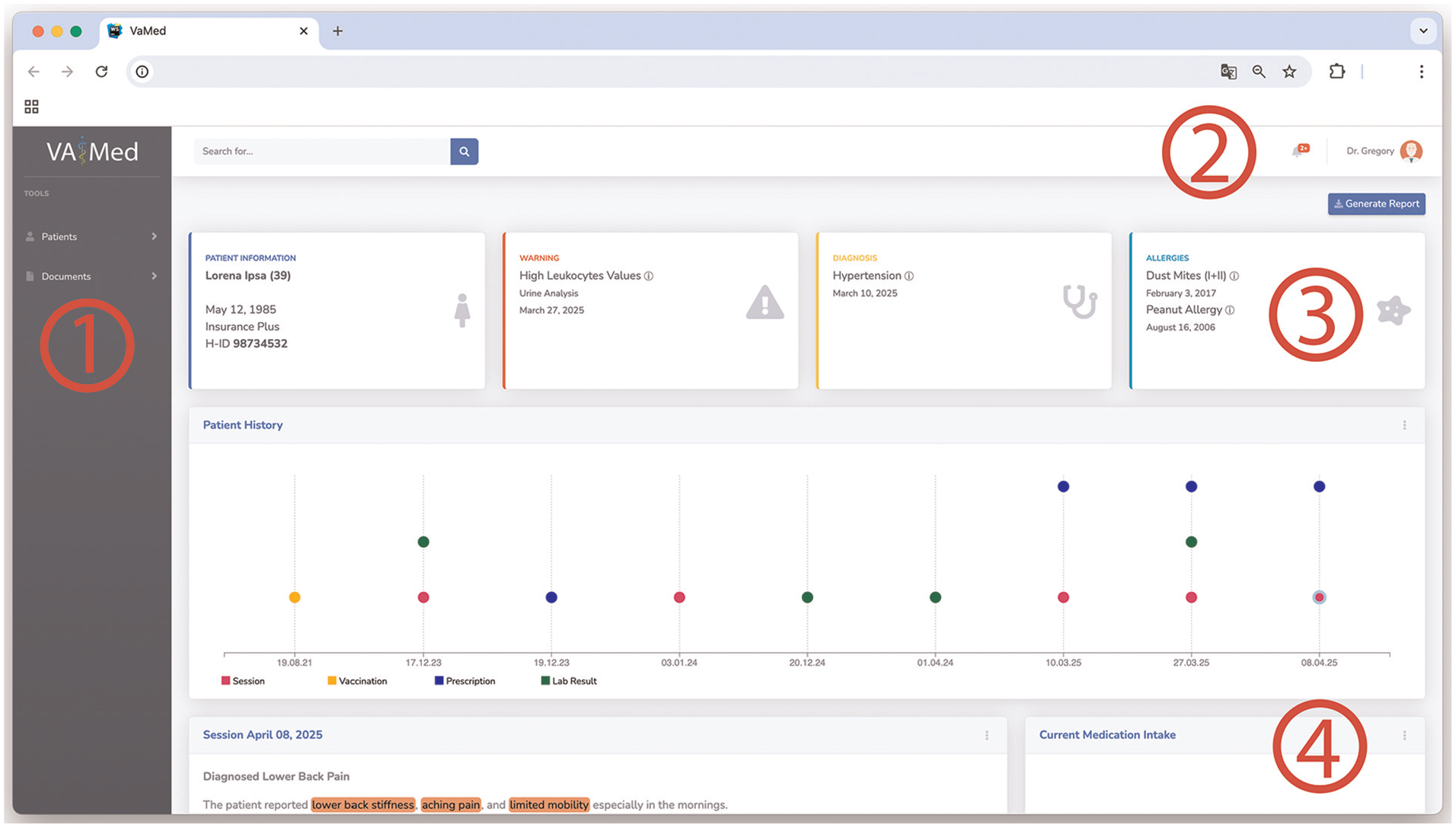
The proposed interactive visual dashboard includes four primary sections: (1) side panel, (2) header, and (3–4) main content section. Patient and document management options are located in the (1) side panel on the left-hand side of the dashboard. The header (2) in the top section, includes search options, notifications, and user management options. In the main section, the first set of modules (3) shows the patients’ overall health status. The following space underneath (4) houses dynamic visual and textual modules, allowing medical professionals to access and interact with various aspects of patents’ related documents and health information.
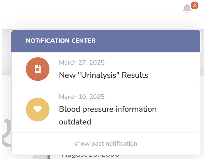
Patient-related notifications in the header section.
Our further space in the middle main section (4) houses the dynamic and modular visualizations, allowing medical professionals to access and interact with various aspects of patients’ related documents and health information. These modules also include an option menu (Figure 7) in the top right of each, allowing viewing, downloading, modifying, and deleting the shown data. Additionally, the models’ output is described by a heading and date. The arrangement of the modules is based on the currentness of the data. The Medication module is displayed at the top if at least one medication is currently being taken by the patient. The content of the modules is described in detail in the following section.
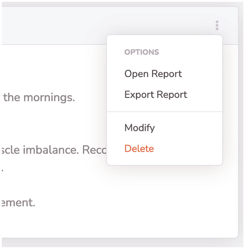
Visual module options, allowing detailed view of report, modification, and deleting.
Visual elements
As already mentioned in the previous sections, the visual representation of the information depends on the data structure and type. These representations were implemented by employing appropriate visualization techniques and related works that are compatible with the data type, in addition to user preferences, cognitive abilities, and data dimensions. The effectiveness of the visual component still needs to be evaluated by medical professionals. The first module in Figure 5 shows a summarization of patients’ recent health history. With the Patient History module, different medical events are plotted using colors for the specific events on a horizontal temporal axis. Sessions in the doctors’ office are colored purple, vaccinations in yellow, drug prescriptions in blue, and laboratory results in green. These events are represented as small circles, positioned along vertical axes, displaying each related date. In this way, doctors get an overview of the patients’ medical history at a glance.
By hovering with the mouse over the event circles, the title of the related data point is shown. It is also possible to click on a circle to add the corresponding information to the overview as a visual or text module, based on the information characteristics. The next proposed module, Current Medication Intake, shown in Figure 8, summarizes the medication intake, by using horizontal bar charts showing the intake process. Each medication is represented by the name, if available the dosage, the intake start and planned end date, and the days passed since then. A green, fully filled bar indicates that the intake is complete. A yellow, only partially filled bar indicates that the intake is not yet complete, while the length of the bar indicates how advanced the intake is.
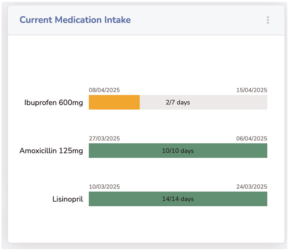
The current intake of medication is visualized by progress bars, showing drug, start, end dates, and intake periods’ progress.
Our proposed module for blood test-related results entitled Blood Count is shown in Figure 9. The reports’ information is visualized through bar charts for each tested blood value. Since these values have different standard ranges, a vertical green line, showing the standard range, is positioned in the center of each value bar. If a blood value deviates from the standard, the corresponding bar is colored red, alerting the medical professional. The test values are also displayed above the bars for quick acquisition.
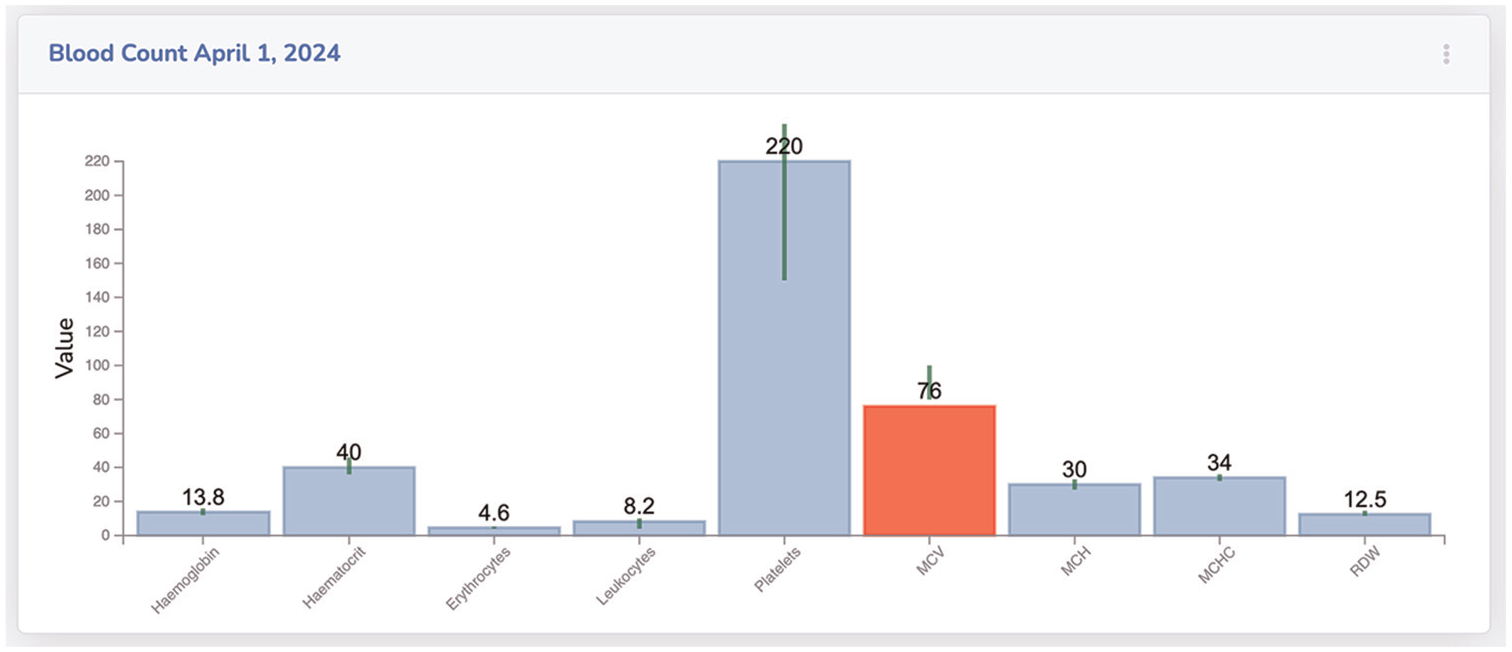
Blood count results are visualized through bar charts. Green lines, above each bar, show the acceptable range of each value.
The results of a urinalysis of different dates, which are compared with each other, are shown in Figure 10 as a radar chart. The module Urinalysis compares two reports from December 2024 and March 2025. The comparison of the values shows that two values have worsened since 2024, namely leukocytes and pH values. These values are now outside the normal range and are shown in red. Our last introduced module is the Long-Term ECG, which is presented in Figure 11. The ECG data shows minimum and maximum heartbeats per minute over a period. These are visualized as green for max and yellow for min values. The actual beat per minute is displayed on the y-axis and the timestamp on the x-axis. The connecting blue middle piece shows the range of sizes. Two horizontal lines represent critical values. If the hearts’ beat per minute is above or below this critical range, the circle with the respective value is colored red.
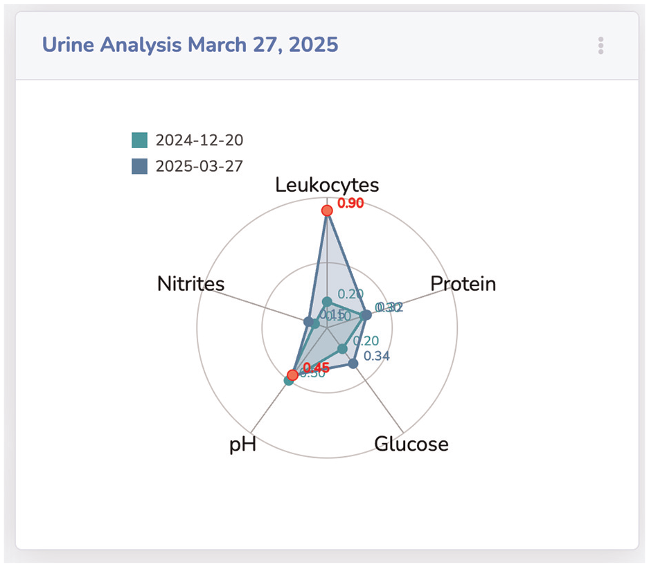
Comparing two urinalysis reports as a radar chart. The visualization shows different values and critical values in red.
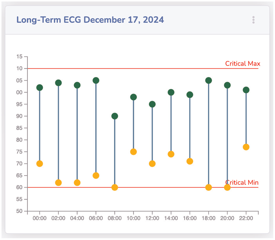
Visual module showing long-term ECG through a double-lollipop chart, including critical max and min.
Textual elements
Visualizing text-based information is a challenging task. By transforming text into a format suitable for visualization, important contextual aspects can be lost, or simple information perception can become more difficult. We propose summarizing textual information, such as doctors’ letters with named entities highlighted, so allowing fast information reception.
The summarizations of each report are limited to 120 words and include entity highlighting (Figure 12) for example, lower back stiffness - symptom - orange; lumbar tenderness - diagnostic - yellow; mechanical lower back pain - diagnosis - lime; stretching exercises - therapy - blue; and Ibuprofen - medication - mint. For the NER task, we used the biomedical-ner-all transformer 3 for best results. The displayed named entities are limited in this example to the five mentioned ones, and in the user settings, up to 107 available named entity categories of the transformer could be selected for highlighting.
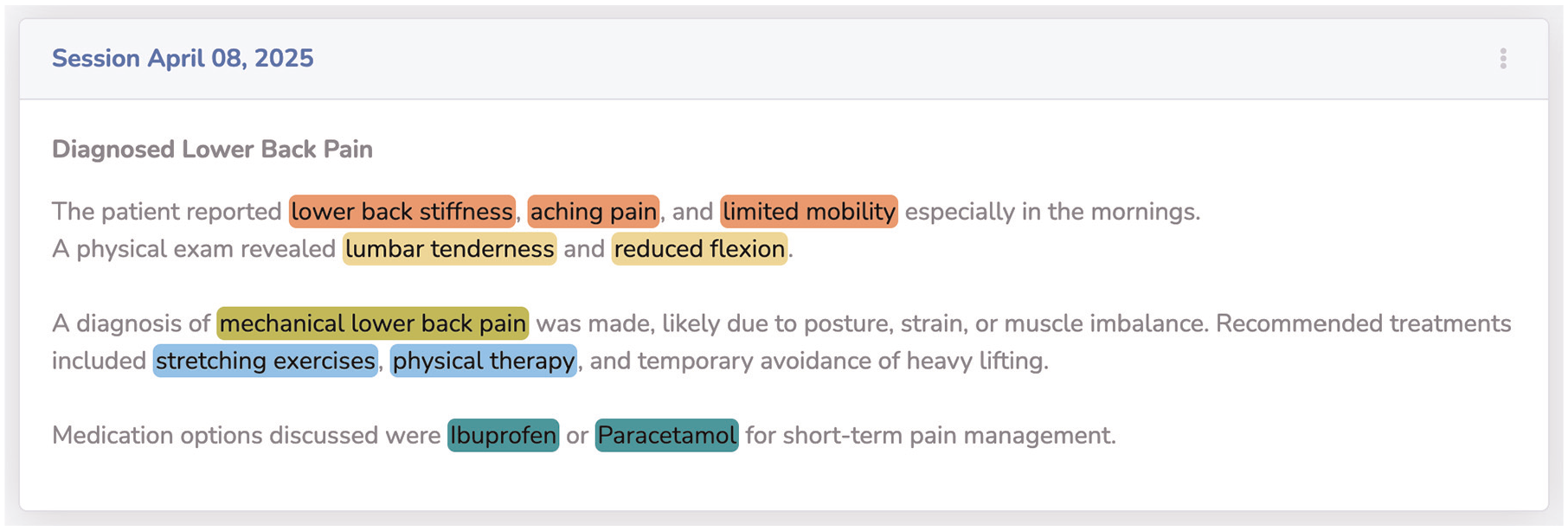
Reports with text-based information are visualized with a combination of summarized text and highlighted named entities. The named entities’ highlighting is color-coded based on the entities’ category.
Limitations
The current system has not yet been evaluated in clinical settings. While all core components are functional, medical professionals were involved during development, but no structured or valid user study has been conducted so far. The demo data used throughout the paper is synthetic but was carefully designed by reviewing primary physicians and comparing it to real patient records, recreating typical cases through generative AI. Although the extraction pipeline and interface show promising results, they have not been benchmarked against annotated datasets or tested under real clinical workload. These evaluations are already scheduled and will be addressed in future publications.
Conclusion
This paper presented a modular Visual Analytics system specifically designed to support office-based medical professionals in managing the increasing volume of unstructured patient data under significant time constraints. The system addresses the challenge of fragmented medical documentation, such as physician letters, lab reports, and discharge summaries—that often impedes fast and comprehensive understanding of a patients’ clinical history. Our approach combines deep language understanding with structured information processing and Visual Analytics. Using transformer-based large language models, clinically relevant entities are extracted from free-text documents and assigned to predefined data categories. These categories drive the selection of appropriate interactive visual modules, allowing extracted information to be translated into interpretable visual summaries, such as medication timelines, lab value diagrams, and named-entity highlighted reports. The proposed architecture follows a structured, four-step methodology: document ingestion, automated entity extraction, structured data provisioning, and dynamic visualization. This modular design ensures extensibility and adaptability to varying document types and clinical tasks. By systematically mapping extracted entities to visual components, the system reduces cognitive load and supports time-efficient decision-making. The resulting dashboard enables practitioners to access, comprehend, and navigate longitudinal patient information at a glance, without the need to manually sift through extensive and unstructured documentation. By bridging the gap between narrative clinical records and task-oriented visual summaries, this work provides a step toward a practically applicable and technically grounded solution for decision support in outpatient care.
Future work
The modular architecture and extensible mapping framework introduced in this work open several potential research directions. One central direction involves the integration of additional document types and data modalities, such as radiology reports, referral letters, or scanned documents processed via OCR pipelines. Expanding the systems’ coverage in this way would provide a more comprehensive longitudinal view of the patients’ clinical trajectory. To enhance the contextual appropriateness of visual representations, the entity-to-visual mapping logic could be augmented with domain ontologies or medical knowledge graphs. This would enable a more nuanced, task- and diagnosis-specific visualization strategy that adapts dynamically to user context and clinical focus. Beyond document interpretation, the system may evolve toward an active assistance platform. By linking extracted clinical data with external biomedical resources, such as PubMed, clinical guidelines, or drug interaction databases, the system could recommend up-to-date treatments or flag relevant therapeutic options based on the current patient profile. This would support continuity of care and ensure alignment with the latest medical evidence. Another future direction lies in enhancing the quality and robustness of the language processing components. This includes the fine-tuning of domain-specific large language models for improved recognition of subtle clinical expressions, temporal reasoning, and relationship extraction. Incorporating automated confidence measures and clinical validation layers could further increase reliability and trustworthiness in high-stakes use cases. To evaluate the systems’ practical relevance, extensive user-centered validation will be necessary. In-depth studies with practicing physicians in outpatient settings should be conducted to assess the dashboards’ usability, interpretability, and impact on workflow efficiency. A mixed-methods approach, combining task-based performance evaluation with qualitative insights, would provide a holistic understanding of how such systems integrate into daily medical practice and inform iterative refinement. A structured user study is currently in preparation and will involve general practitioners working with real patient data. The goal is to evaluate usability, accuracy of extracted information, and integration into clinical routines. In parallel, the extraction pipeline will be benchmarked using annotated datasets to assess its robustness across different medical texts. The outcomes of these studies will guide further refinements and be presented in future publications. In addition, multilingual support is planned, starting with German, to address language diversity in clinical practice and expand model coverage.
Footnotes
Acknowledgements
Declaration of conflicting interests
The author(s) declared no potential conflicts of interest with respect to the research, authorship, and/or publication of this article.
Funding
The author(s) disclosed receipt of the following financial support for the research, authorship, and/or publication of this article.