
Abstract
Graphical perception studies have largely focused on how accurate participants can be at extracting quantitative information from glyphs in various visualization types, including infographics. However, most studies assume that there is only one correct way to encode information, for example to compare two circles the encoding mechanism must be relative area. We suspect that this assumption is over-simplistic, especially for glyphs that have an obvious two- dimensional structure, and that some participants use relative height instead. This is a crucial, but it seems often overlooked, aspect of graphical perception studies, and indeed of data visualization in general. If participants are not using the same encoding mechanism that the designer has used, this represents a clear systematic bias that can induce large errors in viewers’ estimates. We therefore assessed which encoding mechanism was being used for several glyphs, including bars, squares, circles, triangles and human icons. We found that almost half of participants’ estimates were likely based on the encoding mechanism of relative height, not area, for all two-dimensional glyphs. A strong relationship was found between the relative size of the two glyphs being compared and the encoding mechanism used. Participants were much more likely to choose relative height if the smaller glyph was over 60% of the size of the larger glyph. In contrast for the one-dimensional glyph (bar), almost all participants chose relative height as the encoding mechanism. This study therefore shows the importance of considering what encoding mechanisms participants could use, and thus tailoring infographics and visualizations to avoid such ambiguity.
Introduction
Accuracy of infographics
The accuracy of visual displays of quantitative information has long been a source of debate for many quantitative scientists. As Tufte 1 notes in The Visual Display of Quantitative Information, some of the most heinous crimes in graphical accuracy are committed by those creating infographics, with some containing differences between actual and visualized differences of over 700%. He thought this type of inaccuracy was simply unacceptable, and we agree.
Tufte is not the only one frustrated by such data distortion. From the ire of many data visualization experts over the past century,2–4 and our own anecdotal experience in industry, many people frown upon the frivolity of infographics and the ambiguities in them.
A very common criticism is the ambiguity of using two or more icons to represent quantitative difference. Take the example in Figure 1. This simple infographic should demonstrate that the Allied powers in World War 2 outproduced the Axis powers in the number of combat aircraft built by a ratio of almost 3:1. 5
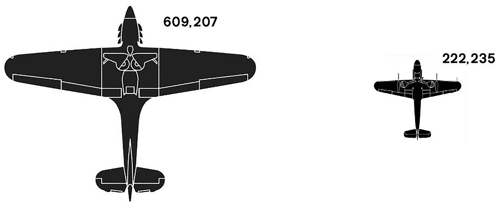
An example of using icons to encode quantitative difference. The Allies produced over 600,000 combat planes in WWII, while the Axis powers produced just over 200,000, a ratio of 3:1 in favor of the Allies. This ratio is encoded through the relative height of the icons, but a comparison of the two icons would suggest the ratio is much greater, presumably because we instinctively want to compare the areas of the obviously two-dimensional icons.
However, we believe most people would assume the ratio to be much larger than that looking at the silhouettes. The reason for this is that the difference in number has been encoded through the height of each plane, whereas we would presume most people would instinctively want to compare the areas of the planes.
This simple example illustrates a fairly obvious point: if the encoding mechanism is ambiguous (in this case it could be either relative height or area), we should expect at least a proportion of viewers to make inaccurate estimates of quantitative difference, if only because they chose a different encoding mechanism to the one which the designer implemented.6–8 This has the potential to induce very large, systematic errors into any analysis, no matter how conscientious the designer has been.
Surprisingly, this potential ambiguity over encoding mechanism seems to be an oft neglected factor in many graphical perception studies, with few authors ever questioning whether their implemented encoding mechanisms will also be the one participants choose.
That is, the default stance for most graphical perception studies and data visualization practitioner books is generally that the encoding mechanism for whichever glyph or chart type they are investigating is obvious.
For example, it is assumed that position (against a common scale) is the obvious encoding mechanism for aligned bars, and area is the “correct” way to interpret the difference between two or more circles or squares.3,4,6,9–12 Certainly, for glyphs that obviously exist in two dimensions, for example circles and squares, we suspect that this is too simplistic.
Indeed, the 100 years of the debate over whether to use pie charts is a good illustration of the problems ambiguous encoding mechanisms can cause. For example numerous authors assume that the encoding mechanism for a pie chart is angle,13–18 but many other authors assume that the encoding mechanism is the comparison of the area of segments, and yet others discuss the possibility of arc length.11,19,20 There are clear differences in the results of these studies depending on the assumptions made around encoding mechanism, and thus the questions asked of participants. 21
Thus, an over-simplifying assumption of what the “correct” encoding mechanism is can, and presumably does, affect the design and results of graphical perception studies, as well as cause ambiguity more widely when viewers interpret graphs, charts and infographics. This is especially problematic given that the seminal work of Cleveland and McGill is often the gold standard from which to compare graphical perception results against, with many authors simply taking the assumed encoding mechanisms of Cleveland and McGill for each chart type as given.14–18
Looking at many past graphical perception studies involving glyphs and charts where the encoding mechanism is not obvious (circle diagrams, pie charts, squares etc), we would not be surprised if the biases found were largely driven by a systematic error in an often conflicting choice of encoding mechanism by designer and viewer, rather than simple within-encoding-mechanism variation in accuracy.
The obvious place to start – The circle
The circle is an esthetically pleasing and compact way of encoding quantitative information, and so is popular in many forms of cartography, infographics, and data visualization. Bubble charts are ubiquitous in data journalism and quantitative cartography.9,22–24 Pie and donut charts are a familiar and constant adornment of business powerpoints, annual reports, and data dashboards (often to the chagrin of the data viz purist).25–28
An example dashboard using circles as comparative scales is shown in Figure 2.
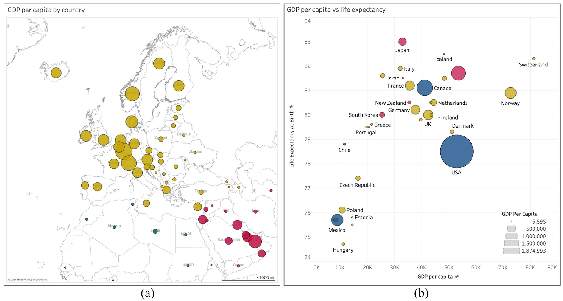
Examples of the use of circles and segments to represent quantitative difference in common infographics such as (a) a bubble map and (b) a bubble chart, produced in Tableau Desktop (v2024.1). Free data from World Bank via GapMind er.org, CC-BY license.
There is often little reference to how bubble charts and the like are constructed using typical graphing software. For example, Figure 2 was developed in the visualization and dashboard software Tableau (v2024.1). We could not find any obvious reference in the help files or online that specified how Tableau sizes the circles according to the data values (in this figure a country’s GDP). We had to count pixels on the screen and calculate relative diameters and areas to determine that Tableau seems to default to relative area for encoding data, rather than height/diameter.
That is, it’s not obvious what encoding mechanism Tableau uses, and this same criticism can be laid at most, if not all, graphing software (as a sanity check, we investigated the help files and online resources for the ggplot2 library in R, Python, and MATLAB and could not find any obvious reference to the encoding mechanism used for circles). It would therefore not be surprising if viewers did interpret relative difference through a different encoding mechanism than the one implicitly implemented by graphing software designers.
While the circle is visually pleasing, it is often considered inaccurate for comparing quantitative differences, as encapsulating numbers through the assumed encoding mechanism of area has been shown to be (slightly) less accurate than using either length or position to compare the relative size of bars.6,9,13
It does seem easier to extract the size of B relative to A from the bars in Figure 3 (panel a) than from the circles (panel b). However, note that this difference in ease of use between bars and circles seems to reduce if the size of A and B are similar (as in panels c and d).
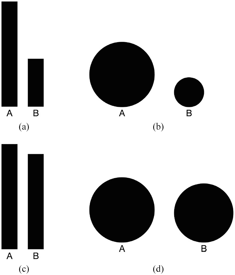
Common examples of encoding quantitative difference in infographics using bars and circles. The common assumption is that people extract the difference between the bars A and B using the encoding mechanism of position against a common scale, and between the circles A and B using area. It certainly seems a more accurate method to compare the bars in panel (a) than the circles in panel (b), which both encode that B is 45% of A (by height). However, when the relative difference between A and B is 90% (panels (c) and (d)), then the difference in accuracy of the two encoding methods is much less obvious.
Further empirical research on the use of circles in maps suggested clearly gradated circles allowed participants to be more effective at distinguishing circles of different sizes. 29 Providing an anchor from which to compare your own estimate should naturally help accuracy, but we wonder whether it also primes viewers on which encoding mechanism to use.
As Cairo 7 discusses in “The Functional Art”, it’s likely that many viewers of bubble charts, or any other infographic making use of circles, are comparing heights, not areas, and thus making large errors in their estimates because the designers encoded the difference using area (wittingly or unwittingly using the defaults in their software package).
Cairo 7 suggests from his own informal records that 70% of attendees at his presentations use height not area when asked to compare circles.
However, this seems to change in panels (c) and (d), which encode that B is 90% of A. In this case, it feels to us that the comparison of the circles becomes easier as it now makes more sense to use relative height as the encoding mechanism.
Cairo uses this information to ward infographic designers off from using bubble charts.
We agree with Cairo that the assumption of area is likely over-simplistic. However, such an insight is potentially profound for data visualization: we think the answer is probably not to ward designers away from using bubble charts, but to make sure that both designer and viewer know what encoding mechanism was used to encode the data.
Despite an exhaustive review since Cairo’s book was published in 2012, we can find no study that has formalized this question into a piece of empirical research.
In summary, we think the ambiguity of which encoding mechanism viewers should use when extracting relative difference from circles is a major source of error in real life data visualization. Indeed, we would go further than this into the scientific literature: we suspect that at least some of the bias found in previous studies that investigated the accuracy of circles is because participants used relative height instead of relative area when extracting information.29–31
The problem with implicitly assuming area is how people will extract quantitative information from circles (and other 2D glyphs)
As Cairo 7 suggests, it is surely easier to compare the heights (diameters) of two circles rather than areas, given height only requires assessing the relative size in one dimension, rather than the two of area. We suspect the use of relative height may be more common when the relative size of circles is close (as in Figure 3), as then it becomes easier to directly compare the heights.
For example, if as in Figure 3 we encode difference through height, then the relative size of B is given by the ratio of diameters of A (xA) and B (xB),
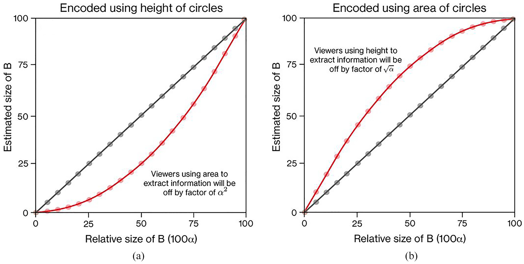
If the relative difference in size of a larger circle A and smaller circle B is encoded through height of the circles (panel (a)), then the estimates of viewers using height to estimate the relative difference should increase proportionally with the actual difference (panel a, dark straight line). However, if viewers use area to extract the difference (panel (b)), then their estimates will be off by a factor of α 2 (panel a, red, curved line). Conversely, if as in panel (b) the relative size of circle B is encoded using area, but viewers extract difference estimates using height, they will be off by a factor of √α (red, curved line).
However, if viewers use area, then we should expect to see viewers’ estimates lie upon a curved line, given by the nonlinear formula
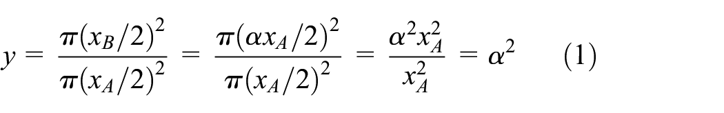
Thus, if viewers’ estimates are based on area not height, their estimates will diverge substantially from the true answers, especially when B is around half the diameter of A, because the relative area is proportional to α 2 , not α (see the red, curved line on panel a of Figure 4).
Naturally, if we reverse this encoding so that the relative area is now the way in which the size of B is encoded, then any viewer attempting to extract the size of B through relative height will be off by a factor of √α (see the red, curved line on panel b of Figure 4).
Therefore, if designers encode information through one encoding mechanism, but at least a proportion of the viewers are using a different encoding mechanism, we shall see substantial errors, especially when the relative size of circles is around 50%.
Previous research on the accuracy of circles
Previous empirical research suggests that the encoding mechanism of area (using various chart and glyph types) commonly has an average bias of around one or two parts in a hundred,13,14 which is not dramatically larger than the gold standard, position against a common scale. Thus this shouldn’t be too concerning to data visualization designers and users if the main insight is not distorted.
However, perhaps of more concern is that specific studies on the comparison of circles often find participants underestimate the relative area of a circle compared to a baseline one by the formula y = xγ, where y and x are the estimate and real values respectively, and γ, a correction factor, is around 0.75–0.87.30,32–34 That is, participants consistently under-estimate by 13%–25% the actual size of the second circle relative to the first. However, there is some dispute over whether such a systematic underestimation exists, as others have not found any under-estimation factor for areas of circles and squares, estimating that the average value of γ was around 1.32,35
A key factor that probably explains these inconsistent results is that in many studies the authors did not control for whether the baseline circle was bigger or smaller than the comparison circle.30,32–34,36 Comparing a smaller circle to the baseline (a part-whole estimate) and comparing a larger circle to the baseline (a one-to-many estimate) are arguably different mechanisms with different accuracies.
Indeed, when participants in Meihoefer’s 34 study were forced to make a one-to-many estimate they consistently under-estimated the relative size of the larger circle, but when participants were able to assess a part- whole estimate they over-estimated the relative size, and variance between participants decreased dramatically.
We suspect that the true reason for the observed under-estimation factors is not an innate under-estimation tendency as proposed in Weber’s Law,30,33,34 but rather some participants in these studies were not using area to extract information from the stimuli. This conclusion is also supported by the empirical evidence from studies that did control for part- whole versus one-to-many estimates (the latter part-whole estimates are our interest).
Where other studies have (i) explicitly encoded difference using area, (ii) only prompted for the part-whole estimate, and (iii) have reported the variation in error as a function of relative size of the two circles, we see a pattern of over-estimation, with small errors at the extremes of the range, and a maximum error around the value of 50%.6,37 Thus, the pattern of errors is remarkably similar to that displayed in panel b of Figure 4, suggesting that at least some participants in these studies were using height, not area, to extract difference information from two circles.
From equation (1) we saw that if designers encoded information in circles using height, but viewers assumed the encoding mechanism was area, they would often be off by quite some margin as they would under- estimate the ratio of A and B by assessing α 2 rather than α. Conversely, if designers encoded information using area (which it seems that many previous studies did so), but at least some viewers used height as the encoding mechanism, they would incorrectly estimate the ratio of A to B as √α rather than α.
That is, if participants on these studies used assumed height to be the encoding mechanism, when they should have been using area, they would consistently over-estimate the size of B, just as we have predicted through our previous analysis, and what we observe in the admittedly limited literature.
As we stated before, the ambiguity of the encoding mechanism of glyphs such as circles and squares does not seem to be have been studied in any rigorous manner. We suspect that this is an important factor in explaining much of the data behind these under-estimation factors.
This lack of research is surprising, given that the ambiguity caused by the multiple encoding mechanisms of comparing two or more circles is well-known. For example, in 1932 Croxton and Stein 6 stated “In popular publications comparisons by circles, squares, cubes, and various pictorial means are frequently drawn on a linear basis rather than upon the proper area or volume basis. Furthermore, the reader is frequently at a loss to know upon what basis they are drawn.” A similar observation was made by Riggleman 10 in the same period.
As Tufte 1 states, “the representation of numbers…should be directly proportional to the numerical quantities represented.” Quantitative scientists logically conclude that a shape which clearly exists in two dimensions, such as a circle or square, should invoke the encoding mechanism of area.
However, as with much of visual processing where context cues affect our perception, we do not think it is that simple. Unless it is explicitly stated by the designer of, for example, a bubble chart or treemap, then the viewer will not know whether area or height is the correct encoding mechanism, and we suspect that there are people who use one or the other, or both.
Other glyphs
This is not only an interesting question for circles, but also other shapes/glyphs commonly used in infographics and data visualizations, many of which also have a clear two-dimensional shape. For example, popular infographic chart types such as treemaps use squares, and icon arrays a host of different glyphs, from circles, to faces, to human icons.
While the research on glyphs other than circles is sparse, the same general hypothesis can be laid at many other glyphs’ feet. If the comparison of areas provokes a systematic error for circles, then there is no reason to think this would be different for other glyphs where area would be a natural encoding mechanism to use.
But again, the same counterargument can be made, where it is also possible that some or all viewers use position or length, rather than area, to extract difference information. Perhaps some people use one or the other, and perhaps people use a combination of both encoding mechanisms, depending on the glyph and the contextual clues.
The answer to all the above is, we suspect, “it depends.” No one study will either prove or disprove one encoding mechanism over another. However, we think it is an interesting question to investigate, as from our literature review, we cannot find anyone who has directly tested whether people use area, height or both to extract quantitative difference information from glyphs such as circles, squares and human icons.
Hypotheses
Therefore, our hypotheses are:
If participants are not given any guidance or prompt, they will use both area and height when extracting the part-whole estimate from two glyphs with clear two-dimensional morphology (e.g. circles, squares).
Conversely, without any guidance or prompt, participants will only use height when extracting the part-whole estimates from two glyphs with clear one-dimensional morphology (e.g. bars).
Given the relationships displayed in Figure 4, participants will be more likely to use height than area when the difference between the two glyphs is either very small (B is ≥80% of A) or very large (B is ≤20% of A).
Any under-estimation or over-estimation factor γ we observe will disappear once we have allocated likely encoding mechanism.
Materials and methods
Glyph design and generation
We chose a selection of common shapes and infographic glyphs, including circles, squares, triangles (right-angled and equilateral), bars and human icons (see Figure 5). The full set of images used in the study are displayed in the online supplementary information. While simplified, the circles, squares, and human icons also represent the foundational elements of common chart and infographic types, including bar charts, treemaps, bubble charts and icon arrays.
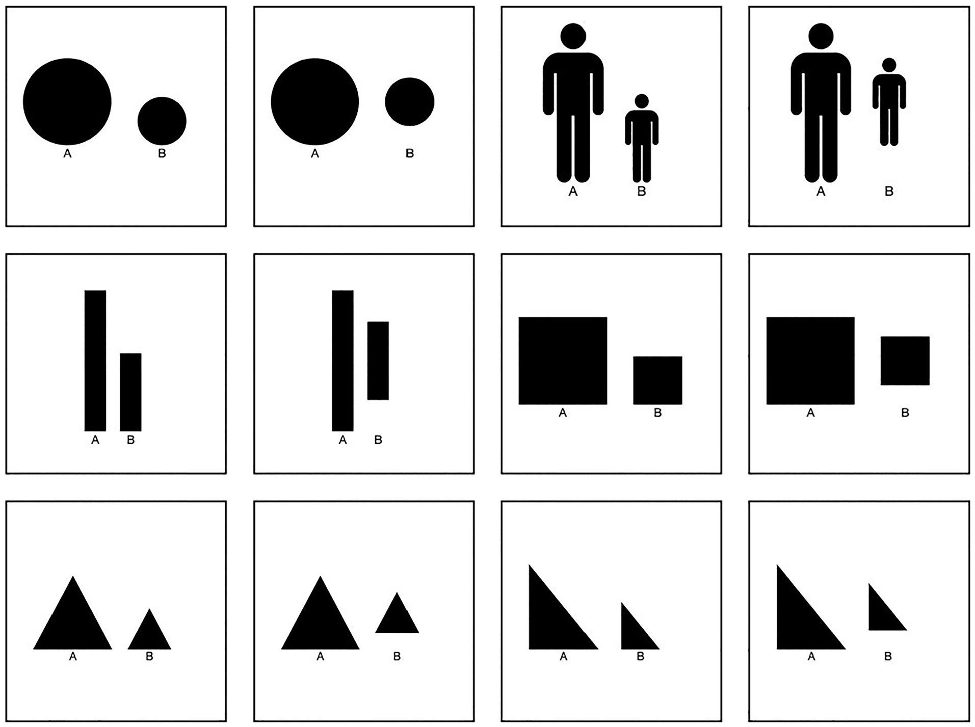
Examples of glyphs used in experiment, where the heights of A = 100, and B = 55. Images were produced for all B = 0.5, 5, 10, 15…95, and can be found in the online supplementary information. Participants were randomly shown four glyph/alignment combinations (e.g. circle lower-aligned, square mid-aligned), and then shown three random images from each glyph type.
The general design principle was to use two glyphs of different sizes, and to ask participants to extract the part-whole estimate from the two. Prompting for the part-whole relationship seems like the most sensible way for people to extract information - first find the bigger of the two, and then compare the relative size of the smaller. As discussed above, this is likely a much more accurate, as well as more natural, method to extract quantitative difference than prompting for the one-to-many estimate (where the size of the bigger element is estimated using the smaller one as the anchor).
Bars were included as a clear demonstration of a glyph that should use position against a common scale or length, as opposed to area. As people seem to intuitively recognize that the bar shape should be interpreted as a one-dimensional glyph leveraging height, we should therefore see datapoints fall along the proportional line in panel a of Figure 4, as opposed to the non-linear area line.
One clear aspect of the encoding mechanism hierarchy theory proposed by Cleveland and McGill13,38 is that bars aligned on the same scale should be more accurate than non-aligned bars (i.e. the encoding mechanisms of position against a common scale and length respectively). This raises the interesting question as to whether this difference applies more generally to glyphs that supposedly use area as the primary encoding mechanism. That is, is there such a thing as an encoding mechanism of area against a common scale?
Thus, we tested two different methods for displaying the glyphs: one where the glyphs were aligned at the bottom, and one where the second, smaller glyph was aligned to the middle of the first glyph. In a similar study that compared squares and circles when aligned at the bottom versus the middle, Croxton and Stein 6 found that there was little evidence to support alignment making any difference to accuracy. However, we include it here for completeness.
For each visualization, the smaller glyph on the right was sized relative to height, such that if the larger baseline glyph, A, is of height 100, the heights of B are of the set 5, 10,…, 95. This produced 19 variations of visualization for each glyph/alignment type. If area is the natural choice of encoding mechanism, then choosing height to encode the difference should encourage a systematic error that can be easily seen in the study results, as participants’ estimates will diverge from the proportional line panel a of Figure 4, and instead aggregate around the curved line.
To minimize variation and distraction in the diagrams, we used simple black icons on white backgrounds for all glyphs. These glyphs were produced in MATLAB 2023a and exported as PNGs. All glyph/alignment variations were then uploaded onto the online survey software Qualtrics.
Note that for all glyphs apart from bars the relative ratio of areas is α 2 , through calculations similar to equation (1). For bars the relative ratio for both height and area is α.
Experimental design
Experiment 1– Main online study
Our objective was to assess which encoding mechanism participants used to extract quantitative difference from various glyph types. That is, our task was not to assess the accuracy of a particular encoding mechanism, as most other graphical perception studies do.
Therefore, our questions were designed not to prompt for any particular encoding mechanism. For each image shown to a participant, we asked the question “If A is 100, what is the size of B?.”
As we were not seeking decimal place accuracy we gave participants the set of sizes for B in a multiple choice format. While this might limit the accuracy of participant responses, many participants in similar studies tend to give responses rounded to the nearest factor of five anyway.21,31 Therefore we believed a dropdown box of 19 options was a sensible choice that shortened the list of responses, while also limiting the potential for participants to give invalid responses (e.g. an answer above 100). Each participant was randomly shown four examples of three different glyph types. For example, one person might be shown squares aligned at the bottom, circles aligned at the middle, and human icons aligned at the bottom, and they would be shown four random sizes of each. Thus, each participant had to make 12 estimates of the relative size of B, and they were free to make these estimates however they felt best.
Experiment 2– Supporting study to assess variance by encoding mechanism
After an initial analysis of the responses from Experiment 1, we decided that it would be necessary to have specific estimates of the variance in participants’ estimates dependent on the encoding strategy they used (relative height or relative area; see calculations in the Analysis Section below). Therefore we ran another separate study to obtain these estimates.
The same experimental design was used, but with one tweak. Instead of asking the question “If A is 100, what is the size of B?,” participants were now either asked “If A is 100, what is the relative area of B?” or “If A is 100, what is the relative height of B?.” Which question participants were given was randomized. The question then remained the same for that participant. This enabled us to estimate the variance of the bias distributions for each encoding mechanism and glyph type.
Participants
The study was performed under the guidelines of the University of Surrey’s. Research Integrity and Governance Office (RIGO). The study was self-assessed using RIGO’s SAGE-HDR (Self Assessment for Governance and Ethics – Human and Data Research) form. Given the low-risk nature of the study, it was not necessary under the university s protocol to obtain further approval from RIGO itself.
To recruit online participants, we advertised the link to the study using a variety of methods. A link was posted to students at Surrey Business School, but most responses came through social media posts on Reddit and LinkedIn.
Participants were first presented with relevant participant information, and were required to indicate consent before the experiment started (those who did not consent were taken straight to the end screen). All data was anonymized and no IP addresses were collected. Some metadata were collected before the experiment proper began (device type, age, sex, comfort with data visualization).
Any participant who did not complete the 12 questions, or who took longer than 15 min, was excluded on the basis that they probably lost interest and were therefore likely to provide responses that were not well- considered.
At the end of the study there were 296 valid responses to Experiment 1 and 83 valid responses to Experiment 2. After a preliminary analysis, we were satisfied we had enough responses to correctly estimate the standard deviation in the bias distributions from Experiment 2, and to detect whether participants used either height or area as the encoding mechanism in Experiment 1.
Additionally, the raw data from both studies was also analyzed to detect participants who did not properly engage with the task. For example, participants who only ever inputted the minimum value (0.05) for all questions were removed from the analysis. This process removed 12 (4%) of the 296 main responses, and 7 of the 83 (8%) responses to the secondary study.
Analysis
Statistical analysis All statistical analysis was conducted in R (v4.3.1) accessed through the IDE RStudio (v2023.09.1+494). The code and summarized data used to run the analysis is available in the online Supplemental Information.
The question to answer in the study was how likely a datapoint came from someone using area or height to determine the relative size of B to A. This can be done by comparing the odds ratio of a new datapoint coming from either distribution, using Bayes’ Law.
Assuming no prior information, the prior odds ratio of estimates coming from either area or height distribution is 1. That is,
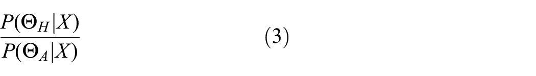
We need the odds of a new datapoint, X, coming from the height (H) distribution rather than the area distribution (A) at the actual height, HX, which can be written as
Using Bayes’ Theorem, the probability that height (H) or area (A) was used given the datapoint is
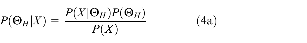
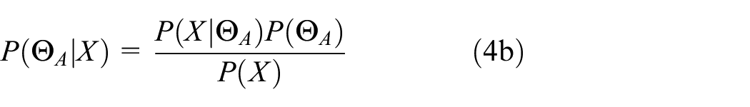
Substituting equations (2), (4a), and (4b) into equation (3) therefore gives the odds ratio for the new datapoint X,
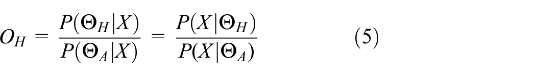
where P(ΘH|X) and P(ΘA|X) are the likelihoods of X coming from either the height or area distribution at point HX.
If the residuals are normally-distributed then the likelihoods can be represented by the normal likelihood equation,
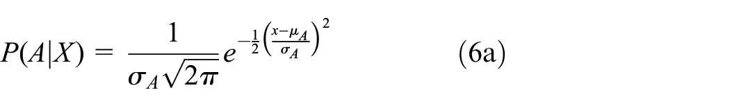
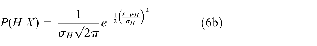
with µH, µA, σH, and σA the means and standard deviations for relative height (H) and area (A) respectively.
Finally we can convert the odds ratio into a probability using the following formula,
If P(H|X)≥0.5 then we assign that datapoint X at relative height HX as most likely having originated from a participant using height as the encoding mechanism; if not, we assign it to area.
An example is given in Figure 6. If participants are asked to estimate the relative size of a smaller circle (when that circle B is 50% of A by height), and they use the encoding mechanism of relative height, then we expect participants to pick a value from the top distribution, centered on 50%. However, if participants use relative area as the encoding mechanism, then we expect them to pick from the bottom distribution, centered on 25%.
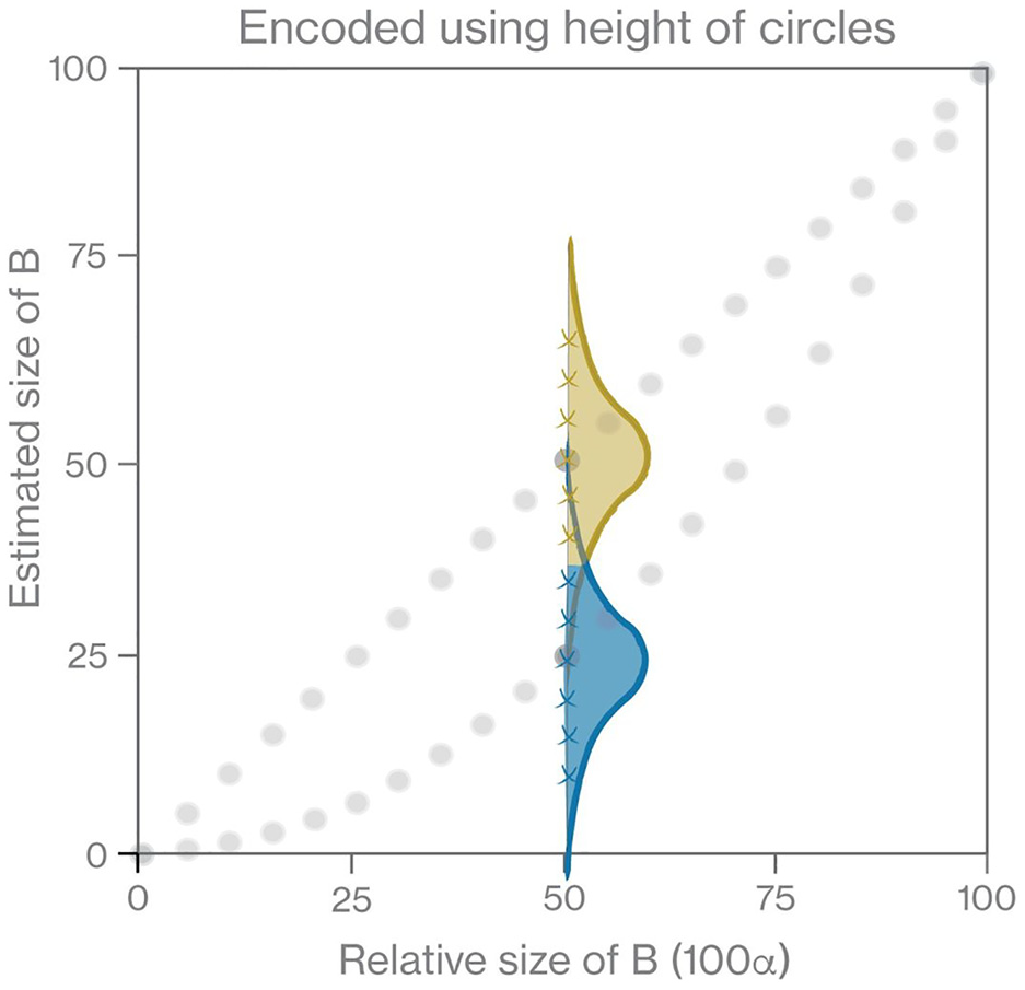
Example of allocation of encoding mechanism (relative height or area) performed in study. If the actual size of B was encoded as 50% of A by height, then a participant using relative height will choose an estimate from an approximate normal distribution, in this case the top, gold distribution centered on 50%. Conversely, if a participant uses relative area, they will choose an estimate from the bottom, blue distribution centered on 25%. From equation (7) we can then allocate which encoding mechanism each estimate (a cross on the figure) comes from - either relative height (gold/lighter color), or relative area (blue/darker color).
We then allocate encoding mechanism to the datapoints (crosses on Figure 6) by whether the probability density at datapoint X is higher for the height or area distributions.
Results
Results of supporting study (Experiment 2) to estimate variances in bias for relative height and area encoding mechanisms
The supporting study, Experiment 2, prompted participants to estimate relative difference in the sizes of A and B using either height or area as the encoding mechanism, giving us estimates for σH and σA in equations (6a) and (6b).
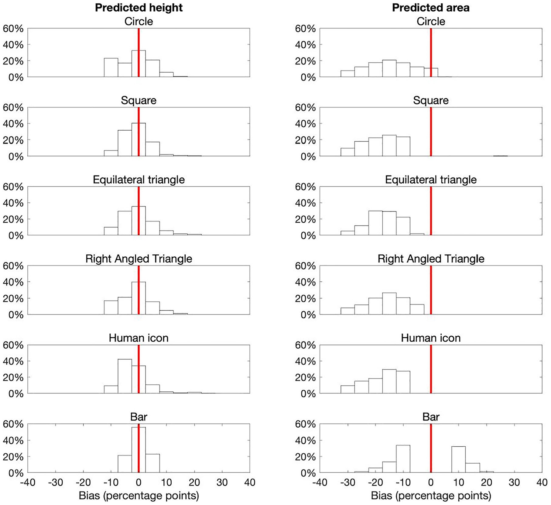
The bias distributions for each glyph type are presented in Figure 7. The y-axis alignment (middle/bottom) was only a statistically significant factor for squares (see statistical analysis in online supplementary information). However, even for squares the standard deviations were quite similar, and so for simplicity of analysis and statistical rigor we merged both alignments to increase the number of responses in each distribution.
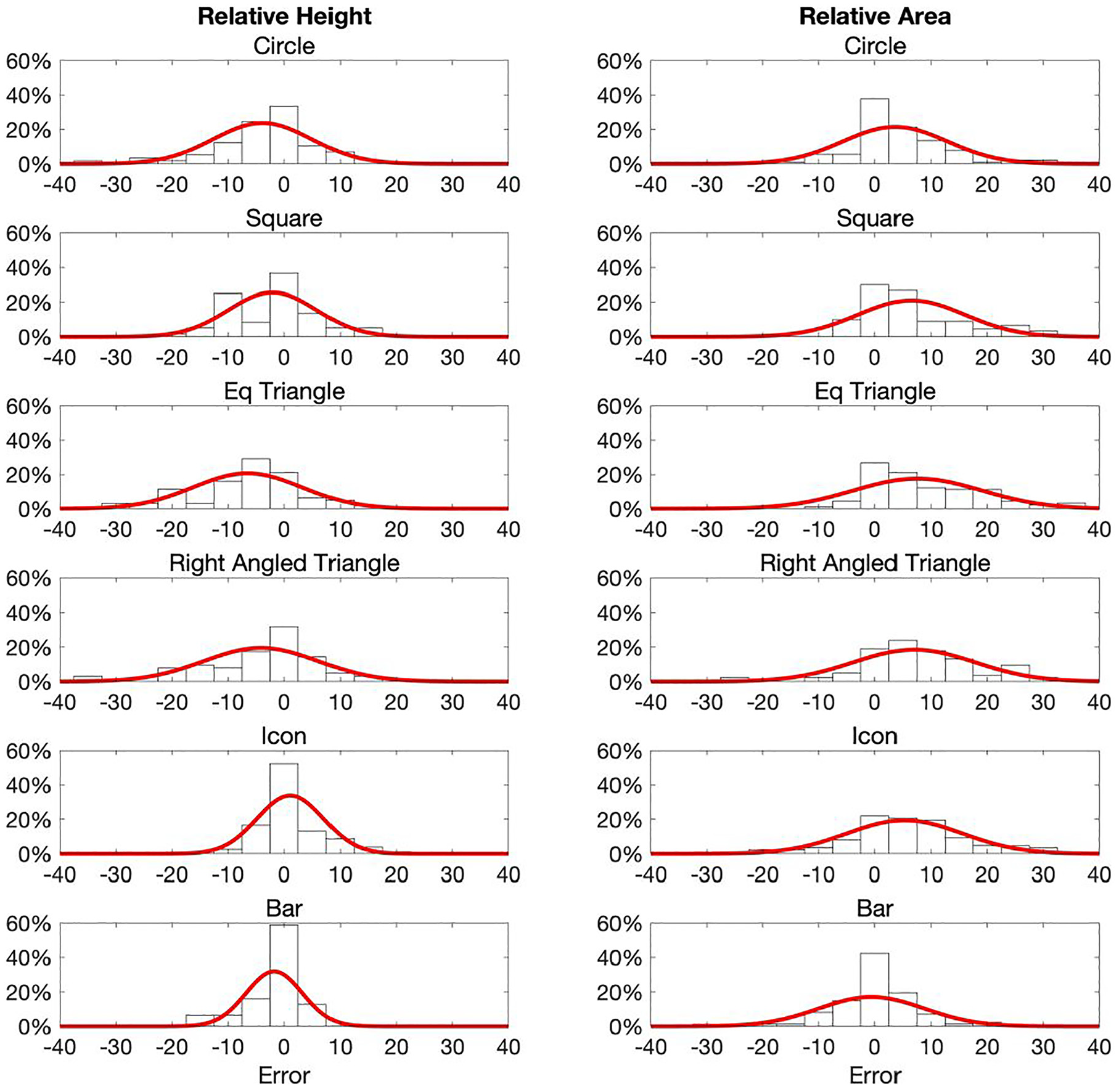
Response bias distributions for each glyph type when participants were prompted to use height or area. Fitted Normal probability density functions are also shown. The variances were reasonably similar for each glyph/strategy combination. Most bias distributions are reasonably symmetrical.
Note that the response bias distributions are only slightly skewed, which is more pronounced with the area distributions. This is as we would expect if the response errors are all from the same type of distribution and the Central Limit Theorem (CLT) applies (i.e. all participants used the same encoding mechanism). Given the lack of any meaningful skewness, we took the sample standard deviation of the response bias as a reasonable estimate for the variance for each glyph and encoding combination.
The means and standard deviations of each combination are shown in Table 1.
Sample means and standard deviations for each glyph type when participants were prompted to use either relative height or area to extract the size of B in Experiment 2.
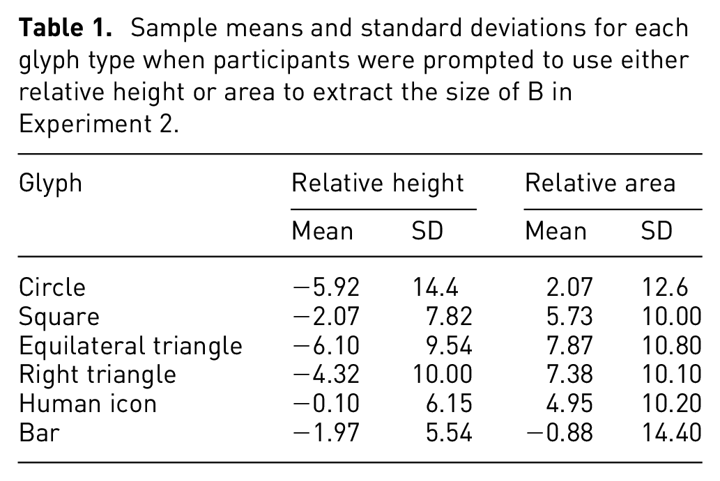
We can already see some interesting divergence between the glyphs for the different encoding mechanisms. As we might expect, for bars participants provided a much more consistent response than others when encoded by relative height (as shown by the smaller standard deviation). However, when participants were asked to assess bars by relative area, we can see that the responses are now the least consistent. Interestingly, even with 2D glyphs, we can see that assessing by relative height is generally the more accurate, consistent mechanism.
Overall, the variances of the 2D glyphs (circles, triangles, squares, icons) were not markedly different between glyph types.
Did participants use height or area to extract difference information?
In the main study (Experiment 1), participants were asked the question “If A is 100, what is the size of B?.” That is, there was no prompt for which encoding mechanism to use. The actual difference in the glyphs was encoded using relative height. Thus, there are three potential scenarios.
First, everyone extracts the difference between A and B using relative height; in this case we should expect to see responses distributed around the straight black line in Figure 4, with similar normally-distributed responses as in the left-hand panels of Figure 7.
Second, everyone extracts the difference between A and B using relative area; in this case we should expect to see responses distributed around the curved dotted line in Figure 4, with the distributions in response as in the right hand panels of Figure 7.
Finally, and perhaps the most likely outcome, is that some participants use one or other encoding mechanism, and/or individual participants use a mixture of both height and area to determine their response.
An important note here is that if participants only use one encoding mechanism, we should expect to see reasonably normally-distributed bias distributions, because the CLT applies. However, if participants are using a mix of encoding mechanisms (either within or between participant) then the response distributions are not independently and identically distributed, and thus will be skewed and stretched out, much like a typical mixture distribution is.
The response distributions from Experiment 1 are shown in Figure 8. Arguably these distributions best align to the third scenario. The bar distributions center on zero error and are reasonably normally-distributed, suggesting that participants only used relative height. However, all other glyph types have very skewed, elongated distributions, suggesting a mixture of encoding mechanisms were used.
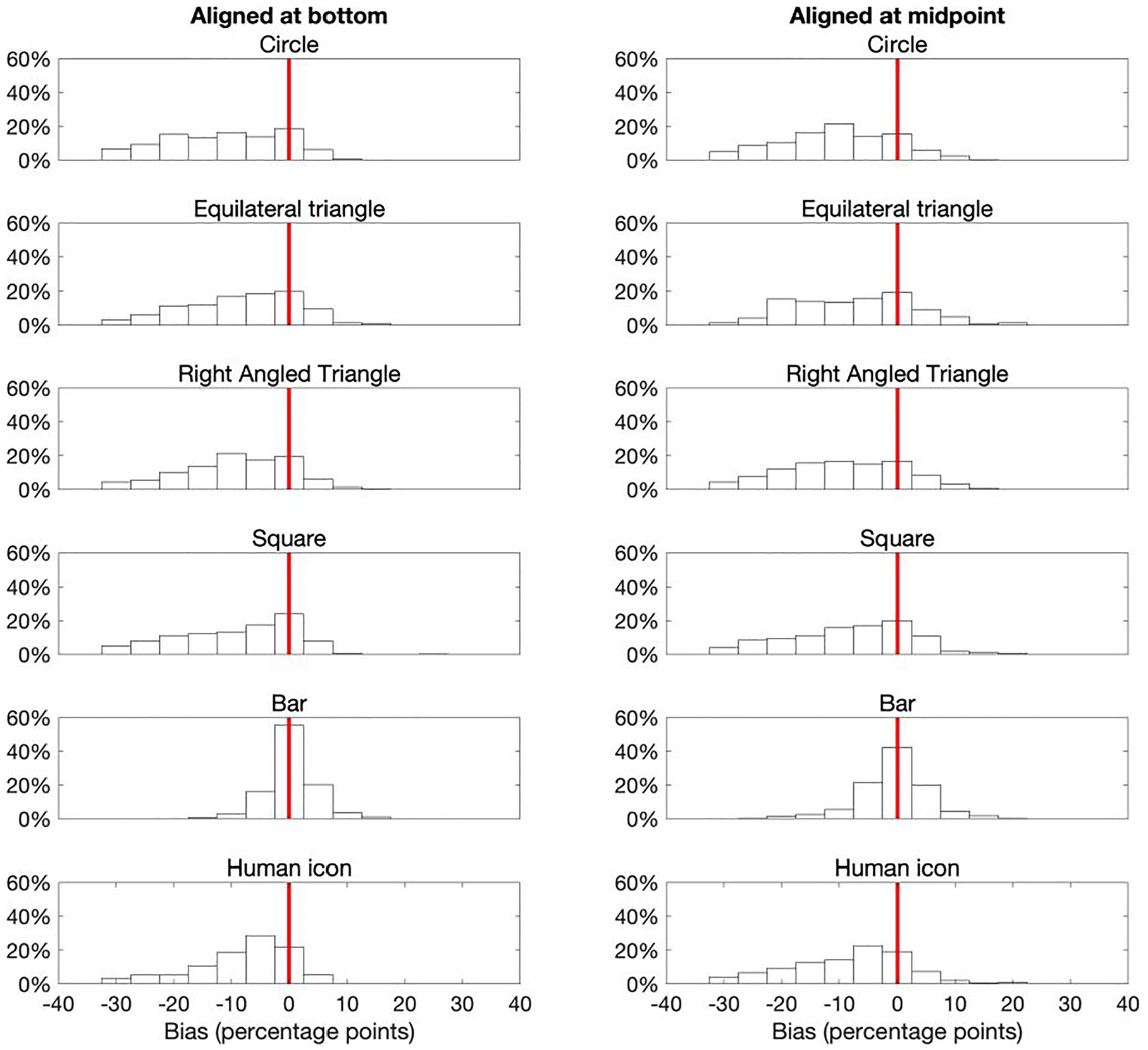
Response bias distributions from Experiment 1. Apart from for bars, the distributions are now more skewed than the reasonably normally-distributed responses observed in Experiment 2 (Figure 7), suggesting that participants used a mixture of both encoding mechanisms. Bars maintain a normally-distributed bias centered on zero, suggesting participants were almost universally using height to extract the difference between A and B.
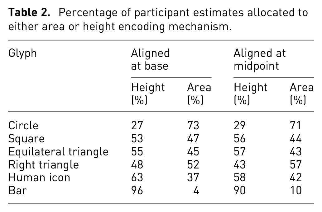
As described in the methods section, we allocated each of the participants’ estimates to either relative height or relative area according to which had the greater likelihood, using equation (7). The results are shown in Figure 9. The percentages of estimates allocated to either height or area for each glyph type are summarized in Table 2.
Percentage of participant estimates allocated to either area or height encoding mechanism.
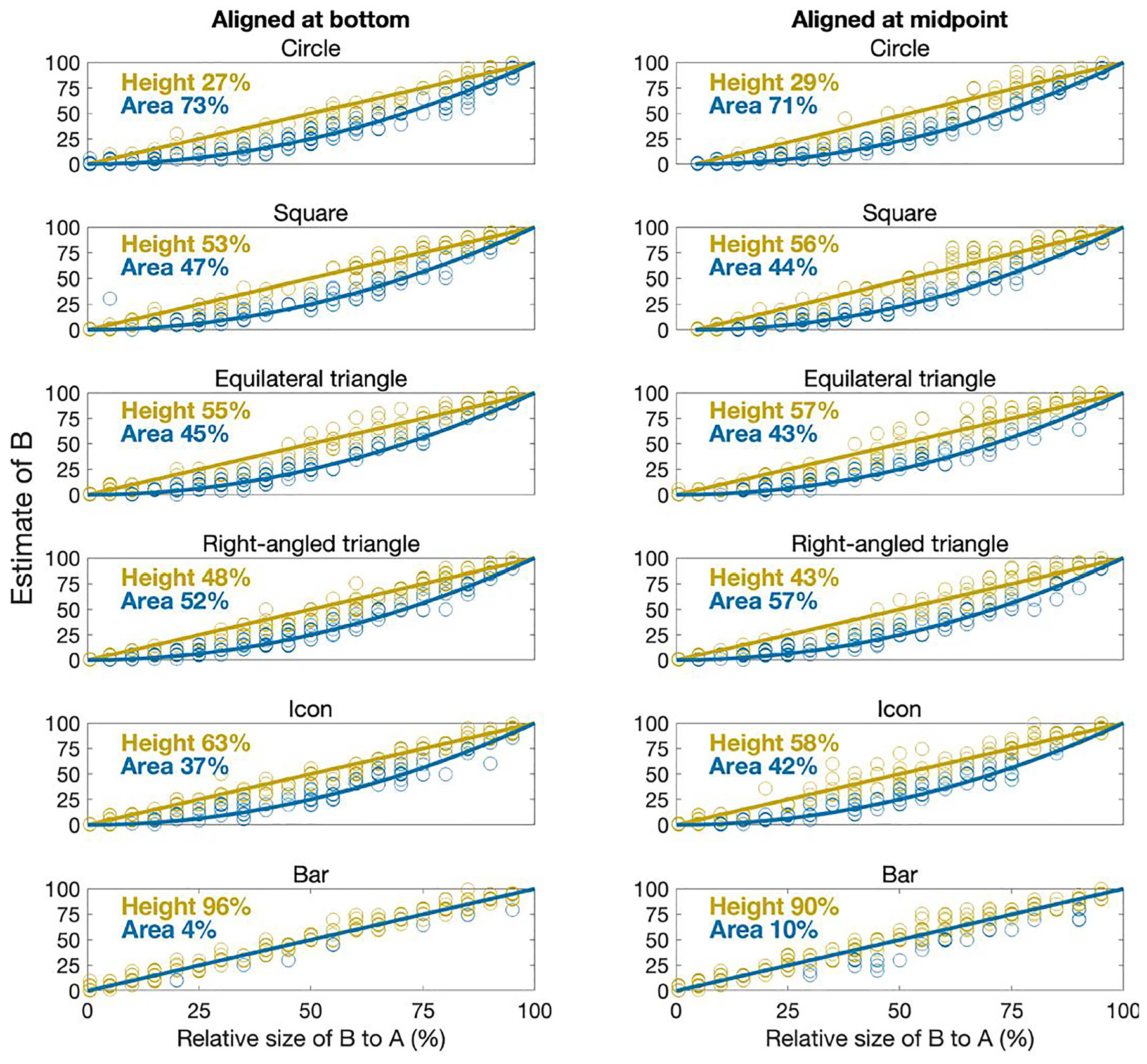
Comparison of actual difference in size of A and B and participants’ estimated size (x and y axes respectively). The blue (darker) and gold (lighter) lines represent the relative areas and heights of B respectively. Datapoints (open circles) are colored according to the predicted encoding mechanism from equation (7).
The results clearly show that the vast majority of participants assumed the encoding mechanism for bars was relative height, as we would expect. This lends a confidence to the analysis method, and shows we can reasonably differentiate height from area.
There was a mix of responses for the other glyphs, with just over half of responses suggesting participants used relative area rather than height for circles, squares and triangles. However, for all glyphs, around 30%–40% of estimates were assigned to the relative height encoding mechanism. That is, there was a strong mix of encoding mechanism being used, and it cannot be assumed (as is common in graphical perception studies) that everyone will use area to extract difference from circles, squares and other 2D glyphs.
Indeed, for most glyphs, height was just as common, if not more so, than area, making it even more important that designers of infographics and data visualizations using squares, triangles and human icons explicitly state how quantitative difference has been encoded.
There are perhaps some other explanations for the results in Table 2. For example, it could be that everyone used area for glyphs other than bars, but that the distribution of responses was so wide that bigger errors looked like participants were using relative height rather than relative area. However, we have i) used standard Bayesian likelihood to assign encoding mechanism to protect against this potential misinterpretation andii) the bias distributions observed in Experiment 2 (with much narrower, normally-distributed responses) suggest that such wide variances are implausible if participants were all using the same encoding mechanism.
To further confirm or deny that we have interpreted the results of Experiment 1 correctly, we also looked at the bias distributions if categorized by likely encoding mechanism. If we assume the skewed distributions from Figure 8 are due to participants using a mix of height and area, then we should be able to construct distributions that look more like the ones of those in Figure 7 through grouping by predicted encoding mechanism.
And that’s what we find (see Figure 10). While not perfect, by grouping response bias by whether we assign the encoding mechanism as height or area, we recover far less skewed distributions, which much better reflect what we might expect if only one encoding mechanism was used.
Bias distributions for each glyph, grouped by predicted encoding mechanism. The skewed distributions from Figure 8 now become much more normally-distributed, reflecting what is expected if participants use only one encoding mechanism.
Finally, median response speeds of around 8–9 s were consistent across almost all factors, with no statistically significant differences for glyph type, alignment and predicted encoding mechanism.
In addition, no statistically significant findings were observed on the metadata we collected (age, sex, confidence with data analysis). This is as we expected, as we assume that because few people are ever taught how to correctly interpret infographic glyphs, the actual encoding mechanism people use is instinctive, and probably independent of any characteristic that might represent experience (e.g. age or confidence).
What drives the choice of encoding mechanism?
The clear driver of which encoding mechanism participants used seemed to be the relative size of the smaller circle B to A, see Figure 11.
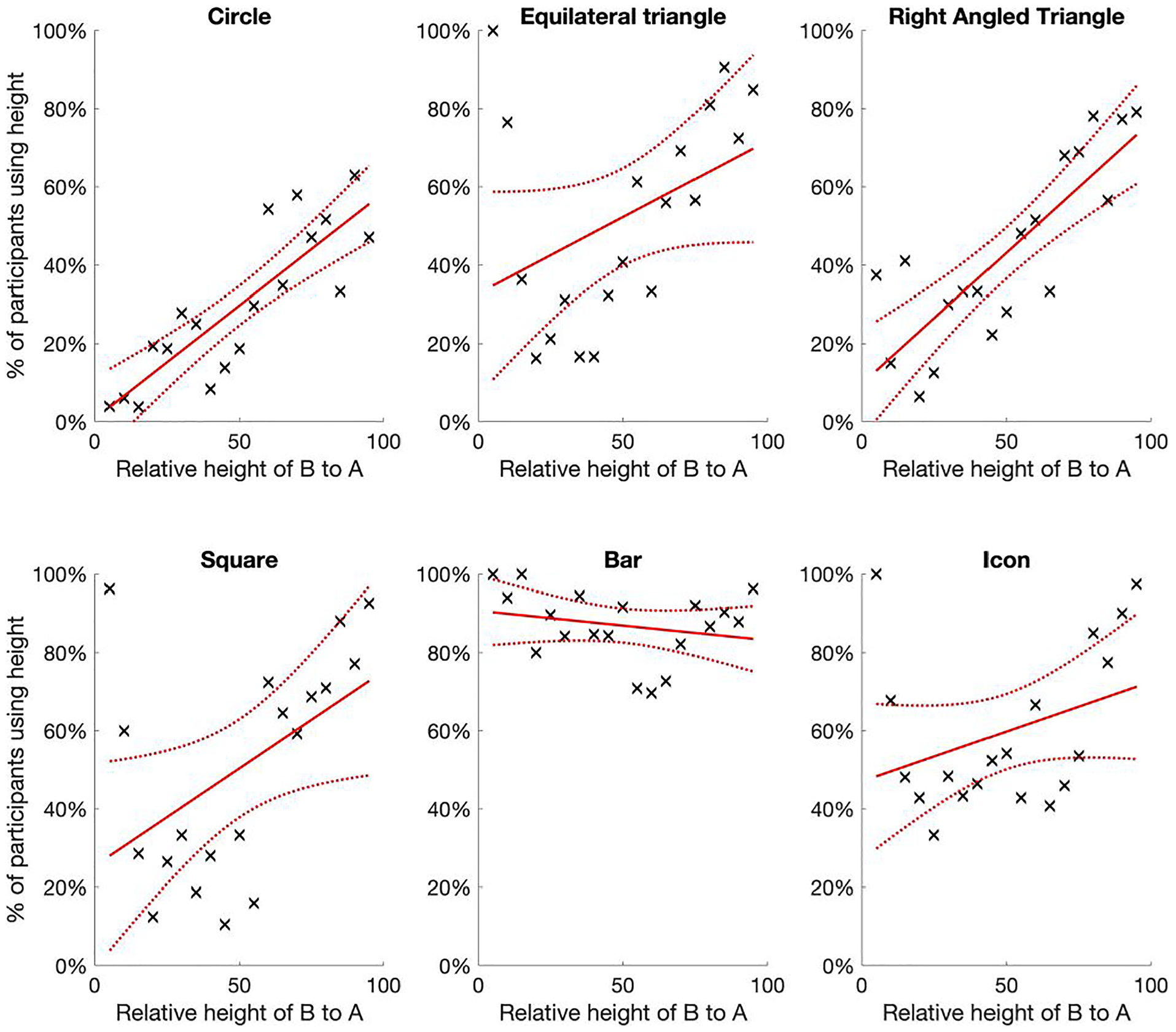
The percentage of participants that were estimated to have used relative height as the encoding mechanism, by glyph type and function of actual relative height. As we might expect, participants overwhelmingly used height for bars, but for most glyphs the trend is that participants were more likely to use area for lower relative sizes, but more likely to use height as the relative height of B neared the same as A.
For all but bars, there was a strong positive linear relationship between the relative height of B and the percentage of participants we assessed as using relative height as the encoding mechanism. That is, participants tended to be more likely to use relative area as the preferred encoding mechanism when the relative height of B was less than around 50% of A. However, when the relative height of B was more than 50% this flipped, and it was more likely participants used height as the encoding mechanism.
The only major shifts away from this linear trend were for bars (as discussed above, participants overwhelmingly used height anyway) and circles, where for the latter it appears that people are more likely to use area than height until the relative size of B is at least 80% of A. We suspect this might have something to do with the ease of assessing height. In all other 2D glyphs there is a clear way to identify the height of the glyph, by comparing the straight vertical lines, whereas for circles this is less obvious, and thus might prompt more people to use area until the sizes of A and B are more similar.
Despite hypothesizing that the relative difference would influence the encoding mechanism (through the relationships shown in Figure 4), we did not expect such a strong relationship. However, it does feel plausible. As an example, observe the circle diagrams (as in Figure 3 or in the online supplementary information): when the relative difference is large (e.g. B is around 50% of A) then it feels right to use area as the basis for comparing the two circles, but as the relative difference decreases (e.g. if B is around 80%–90% of A) then it does feel more natural to use height to compare the two.
Discussion
Unlike many graphical perception studies, the aim of this study was not to assess accuracy of encoding mechanisms, but to test which encoding mechanism was used for different glyphs. We believe we have shown conclusively that many people will use relative height rather than area, even for glyphs where the overwhelming scientific consensus is that people should be using relative area (e.g. circles and squares).
In summary, our main hypotheses were largely confirmed: participants clearly used both height and area as encoding mechanisms to extract the part-whole relationship from glyphs with obvious “two dimensions” (squares, circles etc). Indeed there seemed to be a very strong relationship, with participants increasingly more likely to use height to compare glyphs as the relative size of B to A increased. When B was 60% or more of A it was more likely that participants used height than area for all glyphs apart from circles.
However, we did not expect quite such a linear relationship. The switch to height occurred at a lower relative difference to what we predicted (around 60% rather than 80%, although this was what we saw with circles). However, we did not observe such a switch when B was small compared to A, as we also hypothesized. Therefore, hypothesis 2 was only partly confirmed, and it seems that the choice of encoding mechanism does not entirely rest on how different the predicted value between area and height is (as illustrated in Figure 4).
We observed no under-estimation factor, with or without categorizing by height or area. 29 In fact, there was a strong proportional relationship between the relative height of B and participants’ estimates, similar to that found by Cleveland et al. 35 We suspected that the previously reported under-estimation factors were perhaps due to the design of those studies, which mixed part-whole and one-to-many estimates. Thus, our more logical result is likely due to the simpler design of our study, where we only investigated the part-whole relationship.
In summary, this study highlights that the circle, and other two- dimensional glyphs such as squares and human icons, can be problematic for accurately extracting part-whole information. However, this is not because we are less accurate when extracting quantitative difference using area. Rather, it is because the data visualization designer has encoded difference through area, but many people will use height instead, and if they do so it will throw off their estimates by a factor (usually α 2 ) demonstrated in Figure 4.
As few other studies seem to have actively considered the possibility that participants/viewers will use a different encoding mechanism to the one assumed to be correct for the chart/infographic being tested, there is little other supporting evidence in the literature to validate our results. However, a couple of studies do support our conclusions and our overall theory. Croxton and Stein, 6 who asked similar questions of circles and squares to ours, clearly showed that his participants were less accurate when the size of the smaller circle and square was around 50%, and much more accurate at the extremes of the ranges, much like we predict from our calculations if some participants were using height rather than area.
Another interesting, and more recent, study is by Chun, 37 who focused on whether redundant encodings (e.g. by encoding data through both size and color of a circle) improved participants’ estimation accuracy. As part of this study the accuracy of redundant encoding with area was done through the evaluation of the part-whole estimate for a series of circles, in a similar way as asked in this study.
Chun found that the error in participants’ estimates of the relative size of the smaller circle was a function of the true proportional difference in percentage points, and that small over-estimates were found at very low and very high proportional differences (around 2-3 percentage points), but much higher over-estimates at proportional differences around 40%–60% (an average of 7 percentage points greater). This U-shaped parabola (similar to that shown in panel b of Figure 4) is exactly what we would expect if the actual encoding was area, but some participants were using height.
The average error between actual and estimated proportional difference was 7% in Chun’s study, much bigger than the theoretical differences in Figure 4, which again is what we might expect if there was a mix of participants that used height and area.
We have looked at several software packages used to design data visualizations such as bubble charts and cartographic maps (e.g. ggplot in R, Excel, Tableau, Python), and it seems that all of them implicitly assume that the correct encoding mechanism for circles and squares is area. This is not necessarily wrong, but the failure to explicitly identify the encoding mechanism being used is a problem.
Of course, the solution to this ambiguity is very easy, which is to identify how difference has been encoded in a visualization. In Experiment 2 we prompted participants to use either area or height and the results suggest that the majority of participants did then use the intended encoding mechanism. However, the encoding mechanism could also be directly integrated through visual affordances that prompt the viewer to decode the information correctly. 39
For example, Meihoefer 29 showed that visual legends showing the sizes of two circles next to each other (e.g. at 25, 50%) increased accuracy, and presumably implicitly suggested that area was the encoding mechanism being used. More explicitly the encoding mechanism could simply be written into the graph (“You should use the [area/height] of the glyph to assess difference”), or perhaps we could take inspiration from technical drawings, and use arrows to prime viewers on which encoding mechanism to use. For example, vertical lines next to a pair of circle could encourage viewers to use relative height, not area.
In summary, if designers tell or show viewers what encoding mechanism to use, be it area or height, it seems people are able to do so. Perhaps when the instinct is strong enough (e.g. when one shape is very similar size to another) viewers will still default to height, even if they are told that difference was encoded using area. If the latter is true, it might be that it is preferable to use one-dimensional glyphs (e.g. bars) over 2D glyphs wherever possible. Thus, a vital further study therefore seems to be to investigate efficient ways to prompt viewers to use a specific encoding mechanism, and whether that come reliably overcome any primary instinct to decode information from circles, squares etc.
We still think area is the more natural assumption to make especially when differences in glyphs are quite large, but the rationale given by Cairo is plausible: people have the tendency to default to the most relevant piece of information, discarding other information that may also be relevant (as seen in various cognitive biases such as the base rate fallacy, and Gigerenzer’s fast and frugal mental model of decision-making).7,40,41 Thus, perhaps people use height of the circles to infer difference, as it is a piece of information that will also dictate the area of the circle as well (and so why bother considering the extra dimension?).
An issue in historical graphical perception studies is that a singular encoding mechanism for a particular chart/glyph type is assumed to be the correct one. For example, it is assumed the “correct” encoding mechanism for a circle is area, and many authors explicitly follow Cleveland and McGill’s assumptions that the encoding mechanism for a pie chart and bubble chart is angle and area respectively.13,14,37,42 While the correct encoding mechanism for any specific data visualization is the one that the designer has used to encode information, it cannot be assumed that the viewer will know this unless it is explicitly noted how information is encoded.
These assumptions on what constitutes the “correct” encoding mechanism made by Cleveland and McGill, and others such as Brinton 9 and Tufte, 1 now permeate through the data visualization research literature. While there are now challenges to the perceptual task (encoding mechanism) hierarchy in terms of the ranking and order of encoding mechanisms,17,42 we would also suggest there is a further challenge in terms of the encoding mechanisms that many authors assume apply to glyphs, infographics and charts and graphs.
Indeed, in light of our findings, which strongly support the conclusion that viewers will use both height and area to extract information unless explicitly told which to use, we suggest that many of the results of previous graphical perception studies on infographics and data visualizations should be reviewed and reconsidered. There are many recommendations based on these results that can be questioned, but we suggest three that should immediately be queried.
First, as discussed already, the conclusion that circles and other 2D glyphs are inaccurate because there is an under-estimation factor γ was already questioned, but still many practitioner guides highlight this observation.1,3,4 A much better explanation seems to be the ambiguity in which encoding mechanism should be used (per the results of this study), along with the failure of previous studies to control for assessing a part-whole or one-to-many magnitude, which also introduced a systematic bias.
Second, we might also question Cleveland and McGill’s results (as well as the results from many other graphical perception studies) regarding the accuracy of area as an encoding mechanism, which was found to be (slightly) less accurate than position against a common scale. The authors did not prompt or control for which encoding mechanism participants used when extracting information from circles or squares. Therefore, it is possible that many participants were more accurate than they were assessed to be, but had simply chosen a different encoding mechanism (height) to the one Cleveland and McGill had intended (area).
Due to the objective and design of our study we were not able to assess the accuracy of extracting information to more than the nearest five. As many other studies have done previously, it would be interesting to replicate Cleveland and McGill’s study, but with specific prompts on which encoding mechanism to use. We suspect we would see some quite different conclusions around the perceptual task hierarchy.
Third, our results suggest that participants are willing and able to adjust the encoding mechanism depending on the context of the glyphs they are viewing. There was a strong instinct for participants in our study to use height when the sizes of A and B were similar, and a similarly strong instinct to use area when the sizes were very different. That is, we cannot simply assume that one encoding mechanism is the “correct” one. It would be productive for more research in this area, to see if this result of switching encoding mechanisms depending on relative size can be replicated, and if other visualizations also invoke such a switch (and why).
This prompts the question of why should the encoding mechanism change as the relative size of two glyphs changes? Like many other visual cognition strategies, perhaps we have simply evolved to compare two similar shapes via their difference in length/height, but two dissimilar 2D shapes using area? The Ebbinghaus illusion already clearly demonstrates that our perception of differences between circles is dependent on the context of target size, distance and relation to other objects.43–45 That is, the quantitative difference we perceive is often ambiguous, regardless of the encoding mechanism used. This has direct implications for infographics, but probably even more so for normal charts and graphs, which often have far more potentially contextual detail and artifacts included in them.
Therefore, we think that some valuable nuggets of insight can be found by investigating which encoding mechanisms viewers (instinctively) use, and when. An interesting way to pursue this research may be to look at what tricks designers have used for decades/centuries. For example, designers are well aware that the mathematical alignment of glyphs can often lead to viewers thinking of glyphs to be imbalanced. Thus, designers make circles slightly bigger than an equivalent square to make sure viewers perceive the two as having the same weight, or oddly shaped glyphs are aligned slightly off-center to maintain perceived balance to the eye.46,47
We also suspect that the physical analogy of the encoding mechanism is an important part of understanding (e.g. a bar chart looks like multiple stacks of lego bricks, which is easily interpreted as the higher the bar, the bigger the number), certainly for non-quantitatively trained viewers. For example, much of the literature that criticizes pie charts ignores the value of the visual cue, where the outline of a pie chart is instinctively understood to represent 100%, and the segments are inferred to be proportions of the pie. Two-dimensional glyphs also have value in that they can be understood to represent physical, individual items, for example in icon arrays, which can easily be counted and compared (if not necessarily with the accuracy of a bar chart).
Bresciani and Eppler, 8 discuss many of the pitfalls of data visualization, of which ambiguity in encoding mechanism is just one. Certainly for the case of the 2D glyphs we tested in this study, we suspect the allocation of one “correct” encoding mechanism (area) to a glyph or chart/graph type is too simplistic, and that some consideration of wider visual cognition is required, where different strategies are employed depending on the context of the image. The development of a framework to understand when and how certain encoding mechanisms are invoked would be a substantial challenge, but invaluable in preventing misinterpretation of visualizations because quantitative analysts want to follow strict mathematical logic. As suggested, we think there is merit in considering what artists and designers have known for centuries, and not just rely on mathematics and logic, which we know is not the way the brain/eye perceives images.
Having said that, our results do seem to show that we can plausibly split estimates by encoding mechanism, suggesting that in very simple contexts such as used in this experiment (when other visual cues and context are minimized), then height and area are the main encoding mechanisms at play in determining the accuracy of participants’ estimates.
Supplemental Material
sj-csv-1-ivi-10.1177_14738716251315912 – Supplemental material for There’s more than one way to get information from infographic glyphs: Evidence that people use both area and height to extract information
Supplemental material, sj-csv-1-ivi-10.1177_14738716251315912 for There’s more than one way to get information from infographic glyphs: Evidence that people use both area and height to extract information by Andrew Hill and Oshiorenua Imokhai in Information Visualization
Supplemental Material
sj-csv-2-ivi-10.1177_14738716251315912 – Supplemental material for There’s more than one way to get information from infographic glyphs: Evidence that people use both area and height to extract information
Supplemental material, sj-csv-2-ivi-10.1177_14738716251315912 for There’s more than one way to get information from infographic glyphs: Evidence that people use both area and height to extract information by Andrew Hill and Oshiorenua Imokhai in Information Visualization
Footnotes
References
Supplementary Material
Please find the following supplemental material available below.
For Open Access articles published under a Creative Commons License, all supplemental material carries the same license as the article it is associated with.
For non-Open Access articles published, all supplemental material carries a non-exclusive license, and permission requests for re-use of supplemental material or any part of supplemental material shall be sent directly to the copyright owner as specified in the copyright notice associated with the article.