
Abstract
Incidental visualizations are meant to be perceived at-a-glance, on-the-go, and during short exposure times, but are not seen on demand. Instead, they appear in people’s fields of view during an ongoing primary task. They differ from glanceable visualizations because the information is not received on demand, and they differ from ambient visualizations because the information is not continuously embedded in the environment. However, current graphical perception guidelines do not consider situations where information is presented at specific moments during brief exposure times without being the user’s primary focus. Therefore, we conducted a crowdsourced user study with 99 participants to understand how accurate people’s incidental graphical perception is. Each participant was tested on one of the three conditions: position of dots, length of lines, and angle of lines. We varied the number of elements for each combination and the display time. During the study, participants were asked to perform reproduction tasks, where they had to recreate a previously shown stimulus in each. Our results indicate that incidental graphical perception can be accurate when using position, length, and angles. Furthermore, we argue that incidental visualizations should be designed for low exposure times (between 300 and 1000 ms).
Introduction
People may enhance their ability to perform daily tasks more effectively if they had timely access to pertinent data. Despite the existence of real-time data retrieval methods, effectively presenting such information on-the-go and at-a-glance remains challenging to avoid becoming inconvenient. Even with devices like smartphones or smartwatches, individuals still need to remember that they can access information, and proactively seek it. However, by the time they do so, it is often too late, and the task has already been compromised. The very act of searching for information may give rise to undue cognitive loads, compromising the primary task, even when the information proves useful. As an illustration, Lu and Bowman 1 have examined the potential use of augmented reality interfaces for conveying information. Two commonly reported problems are distraction and occlusion. We argue that these issues may arise when attempting to present multiple graphs simultaneously, even though information visualization was not specifically explored in their research. Let us now contemplate a hypothetical scenario in which people live within an automated house, equipped with comprehensive real-time monitoring of all utilized resources. The utilization of graphical representations would enable them to gain insights into the patterns and dynamics of resource consumption, thereby facilitating more effective management. For instance, a line chart could be employed to monitor energy consumption over time, while a bar chart could depict the status of ingredient stock. The fundamental question that arises is how to convey this abundance of information to individuals only when relevant for some task and in a manner that minimizes distraction and does not hinder their performance in them.
Calm technology is any device that interacts with people via auditory or visual channels while allowing information to be conveyed from the periphery to the center of human attention and back. 2 Technology informs, but does not require our focus or attention. Ambient, 3 Glanceable, 4 and Incidental 5 are examples of ambient information systems that have been explored in Information Visualization. These last two types are seen at a glance for very short exposure times. However, they have different use cases. Glanceable visualizations assume that people are actively seeking information on a device like a smartwatch. 6 Unlike incidental visualizations, which depict information in one’s field of view without one actively searching for it. We believe that incidental visualizations are precisely what we would like for the aforementioned resource management example. In that house, people could be shown incidental visualizations through technology like augmented reality without having to look for the graphs. This would let them be aware of information in real-time on the go and at a glance without having to look for it.
Although this scenario assumes that there is already theoretical background regarding incidental visualizations, there are currently no design guidelines to create them. How to design such visualizations? Which marks and channels to use, how many, and for how long can they be seen? Although there are well-known cognitive principles to design visualizations, 7 there is no guarantee they apply in an incidental visualization. These guidelines come from research in psychophysics, particularly graphical perception and visual attention. Graphical perception is “the visual decoding of categorical and quantitative information from a graph.” 8 Visual attention research focuses on explaining how it is triggered and manipulated and how it shapes our memory. 9 However, do these results hold if we consider incidental information? Currently, ambient information systems studies have focused on glanceable information conveyed at people’s peripheral attention6,10–12 proving that people can see information quickly in their periphery on-demand. Still, would it be possible to convey information at brief exposures when needed without it being a person’s primary focus? Besides, would the performance of such graphical perception be compromised due to the primary task? Until now, it has only been shown that it is possible to perceive information displayed for very short periods at specific moments. 5
To answer all these questions, we conducted a user study with 99 participants as a starting point to validate how accurate people’s incidental graphical perception is. We chose three mark-channel combinations: position of dots, length of lines, and angle of lines. We varied the number of elements encoded in each combination and the time they were exposed to the user, and tried to understand how both variables influenced accuracy. Furthermore, we measured if people could remember where they saw all the elements. Our findings suggest that people can remember values encoded via different elements shown for brief periods, thus implying that people can get incidental information if those conditions are met. Our significant contributions are:
A crowdsourcing perception user study.
Key insights for selecting specific display times and the number of elements for encoding information.
Discussion about people’s incidental perception.
In the next section, we present essential related work regarding three topics closely related to incidental perception and explain how they support our work. Then, we explain how we conducted our crowdsourced user study. Next, we describe the attained results, and in the end, we present a discussion regarding our significant conclusions. Finally, we present the main conclusions of this research and some directions for future work.
Related work
This work combines several topics of current research:
Graphical Perception, with strong foundations defined during the 1980s, saw few major advances recently.
Glanceable Visualizations, where we explain their design and where they are mainly used.
Visual Attention, its pros and cons, and how designers can use it to create compelling visualizations.
Graphical perception
Cleveland and McGill conducted the first well-known studies regarding Graphical Perception,8,13,14 and were followed by various other authors.15–17 They focused on studying elementary perceptual tasks performed by people to extract quantitative information from graphs. For example, to decode the length of a bar into a value. From verbal reports of ratio judgments for ease of comparisons, their studies’ resulted in an accuracy ranking, which Heer and Bostock later validated via a crowdsourced user study. 18 In summary, the most accurate encoding is through position; however, although there have been several other studies that propose their guidelines regarding visual encoding channels,19–26 these initial results remain as the primary guideline for visualization creation. 7 In particular for incidental graphical perception, it has been demonstrated that it is possible to perceive information displayed for very short periods at specific moments. 5 In particular, the authors concluded that encoding values using a horizontal position is effective in those situations.
Graphical Perception studies are usually conducted using psychophysics techniques or specific visual tasks to test the accuracy of different visual encodings.27,28 In both, the most common one is using comparison29,30 via magnitude estimation and magnitude production. Magnitude estimation is a task in which people estimate the proportion of one element relative to another. 8 Magnitude production requires users to proportionally adjust the intensity of a visual encoding to a target intensity.22,31 In visual tasks, this can be done, for example, with change detection or discrimination. 28 Then, there are three main techniques in psychophysics: Method of Limits (MoL), Method of Adjustment (MoA), and Method of Constant Stimuli (MoCS). 28 In the MoL, the researcher wishes to identify the level at which people see a target property in an image by steadily changing that property until the viewer sees the target property. In the MoA, everything is the same, except that viewers directly adjust the properties of a visualization until they reach a perceptual criterion. Finally, in MoCS, people are presented with random levels of a target property, presented randomly across trials, and asked to draw inferences about that property.
Graphical perception studies focus on understanding which marks and channels allow people to decode the correct information to compare different values. With psychophysics techniques, participants are assigned visual tasks to estimate, reproduce, or detect changes. Although these procedures make up the foundations of design guidelines for chart creation, there is no evidence that they can be directly applied to an incidental visualization. In particular, Moreira et al. 5 did not explore incidental perception using quantitative value ranges, which limits graph design possibilities. Furthermore, researchers have not yet considered dual-task scenarios when evaluating different marks and channels.
Glanceable visualizations
In Information Visualization, glanceability means people can extract the necessary information at a glance.32,33 For a display to be glanceable, information must be simplified just enough to be perceived and processed,34–37 which might be important for situations where information is supposed to be more casual for users. 38 Furthermore, it also must be possible to see it at the periphery of one’s attention. 39 Currently, glanceable visualizations focus on mobile devices, such as smartwatches and smartphones, mainly for pervasive glanceable feedback. 33 Furthermore, because mobile devices have small screens, there is a need to study micro visualizations. 40 Blascheck et al. , for example, tried to validate the best visual idiom to convey information at a glance. They compared three visual idioms, donut chart, bar chart, and radial bar chart, and they concluded that the donut chart was the best to convey information at a glance via a smartwatch.
Between smartwatches and smartphones, the formers have been more studied for glanceable visualizations. 41 Moreover, with their embedded placement on people’s bodies, smartwatches are a convenient non-disruptive way to present personal information like one’s current health. 41 Particularly for activity trackers, Gouveia et al. have studied how glanceable behavioral feedback can enhance user engagement.6,10–12 In these studies, authors integrated small representations of activities as part of the smartwatch face, so feedback was available while checking the time. Their principal findings concern some design guidelines for glanceable information, such as the need for it to be more abstract than usual because of the short time people look at smartwatches. 6 Other guidelines include integration with existing activities, supporting comparisons to targets and norms, being actionable, and having the capacity to lead to checking habits and act as a proxy to further engagement.
The closest an information system has reached incidental information is via glanceable visualizations. They convey information at-a-glance in a non-disruptive way. However, participants perceive them as part of their primary tasks, meaning that information is received on-demand.
Visual attention
Visual attention is a set of cognitive processes driven by bottom-up and top-down factors.42–44 It selects relevant information and filters out irrelevant information from the environment. This process is necessary because people’s memory is limited45–49 and decays with time after approximately 5–10 s. 50 Therefore, it would be impossible to retain everything simultaneously. Instead, Miller argued that our memory could retain 7 ± 2 objects in memory. 51 Following a different approach, recent studies showed that people could retain four chunks in memory, regardless of the number of objects in each chunk.52,53
The bottom-up mechanism works like one of preparatory attention, which plays a significant role in theories of attention studied for several years now.54–59 Furthermore, it promotes significant benefits for data comprehension in visualizations56,60–62 because it reinforces the perception of essential areas in a scene whose visual properties contrast with those of their surroundings.63–65 For example, a blue circle will pop out if placed in the middle of red circles. However, this mechanism can also distract if not correctly used or managed 66 because attention can be misplaced to the location of a startling stimulus.67–76
The top-down mechanism comes into play whenever a goal is involved, it contributes toward faster cognition, and it is necessary for further analysis.42,44,77–82 In visualizations, it can increase the performance of perceptual tasks, including simple stimulus detection and localization, discrimination, and identification.72,83–88 For example, if people know they need to find a circle, their sight will be prepared to find a specific shape. However, performance can be significantly decreased in dual-task scenarios.89–93
The closest topics to visualization theory where researchers test how our attention works in a dual-task paradigm are subitizing, groupitizing, and estimation studies. All these phenomena occur in enumeration tasks. Subitizing was the term created by Kaufman et al. 94 to describe the ability for people to estimate sets up to four with no errors, which Jevons discovered in 1871. 95 Regarding subitizing, it has been shown that depriving visual attentional resources leads to massive detrimental effects on performance thresholds.89,96–100 Groupitizing is a similar phenomenon to subitizing, but works for larger sets when chunks can be formed.101,102 Finally, for higher numerosities, estimation comes into play, and errors are proportional to numerosity (Weber’s law).103–105
For visualization creation, attention plays a significant role when there is a need to emphasize something in particular. For example, knowing that position is the best channel to compare two different values does not help to find a particular target. In this case, designers make use of people’s bottom-up and top-down attention. The former gets triggered when certain visual features are intensified. The latter is triggered when there is a goal during a search task. Finally, several mechanisms may be triggered for the specific visual tasks for specific enumeration visual tasks: subitizing for sets of size up to four; estimation for bigger sets. Furthermore, the subitizing range has been explored in graphical perception tasks, and accuracy is overall high. 5 If the elements can form up to four visual chunks, then groupitizing can take place. Particularly for these three mechanisms, it is known that accuracy is significantly decreased in dual-task scenarios. One of the reasons for this is that people’s memory is limited.
So, although there are currently various guidelines regarding visualization creation, there is a gap in research regarding incidental perception. First, graphical perception experiments do not impose an incidental secondary task that involves perceiving marks and channels. Therefore, there is a need to explore how accurately people can decode incidental information. Then, we know that our visual attention is limited and is weakened in dual-task scenarios. However, we do not know the limits of incidental attention. For example, how many elements can be shown at a time, and for how long until accuracy drops significantly? Our work approached all these issues. We found that people could perceive incidental information, and its accuracy depends on the mark and channel used, the display time, and the number of elements shown simultaneously.
User study
We conducted a crowdsourced user study to define design guidelines for incidental visualizations. First, as with a standard graphical perception user study, we wanted to validate accuracy by asking participants to estimate values encoded by specific marks and channels. We investigated the position of dots, the length of lines, and the angle of lines as they are the topmost accurate encoding alternatives in current graphic design. 7 However, because Moreira et al. already tested these marks and channels, we decided to change slightly how they were encoded. Our position of dots combined both horizontal and vertical positions, the length of lines was encoded with a left-alignment, and the angle of lines was encoded inside one circumference, where the angle varied between 0 and 360º. Although they might end up having different complexity, we still wanted to assess how different the results are between them. Finally, we also tested all these marks and channels for brief exposure times. For each combination, we varied two properties: the number of elements displayed and the display time of each set of elements.
Crowdsourcing platforms like Amazon Mechanical Turk, Prolific, or CrowdFlower, have been used by the visualiza-tion community to conduct empirical visualization research. 106 Their main advantage is that they increase access to large and diverse participant groups for evaluation, solving one of the major struggles in research: obtaining data effi-ciently. 107 However, the main disadvantage is that it is challenging to eradicate malicious behavior.
Method
After participants clicked the study link in Prolific, our website redirected them to one of the stimulus types. Then, they watched a tutorial explaining how the study was going to be conducted, and after they started the warm-up trials. Finally, the test itself began. This was composed of four runs, each with 10 trials. Participants were not shown visual idioms due to this being a graphical perception user study. Instead, we only wanted to validate how accurately they could estimate one or more values encoded by different marks and channels. In our case, we varied their number between one, two, three, and four elements because of people’s memory limitation45,47,48 and the subitizing phenomenon. 94 Then, we wanted to know how the marks’ display time would influence perception, so we varied it between 100 and 1000 ms, at 100 ms increments. We chose this range to test accuracy inside and outside the preattentive phase while still being far from the glanceable visualizations’ usual threshold (5 s. 37 With these two properties plus the combination itself, our study ended up with three independent variables: the number of elements, display time, and stimulus type.
As is common for crowdsourcing, we followed a between-subject design. 108 In our case, the mark-channel combination was our between-subject variable. However, the number of elements and the display time differed in each task for each participant, making them our two within-subjects variables. Therefore, we conducted a mixed-design user study and, after having all results, used the three-way mixed ANOVA statistical test for studying the interaction between all three variables. This test allows us to understand how accuracy differs between values encoded using the positions of dots, length of lines, and angle of lines, depending on the number of elements and display time.
Phases and trials
Because of our between-subjects variable (mark-channel combination), our user study was divided into three separate sub-studies, all with the same structure. Each participant was shown a tutorial video explaining how the study would be conducted and how participants should interact with the browser to complete all the tasks. If participants skipped the video, a pop-up warning would be triggered, saying they should watch it from start to finish. After watching the video, participants were presented with a warm-up phase that simulated the tasks they would perform next. This way, we minimized errors due to inexperience regarding the task’s objectives and webpage interface.
The studies were divided into four phases, each corresponding to one number of elements displayed at a time (within-subjects variable). Then, each participant had to perform 10 trials in each phase, each corresponding to a different display time (within-subjects variable). So, for example, a possible trial of the study could be showing two dots for 200 ms. The order in which each participant performed each trial and each phase was generated using a Latin Squares distribution. In total, each participant performed 40 trials, four phases, each with 10 exposure times.
Tasks
We wanted participants to estimate values encoded with different marks. However, in traditional approaches, these estimations are part of the primary task during the study. In our case, perceiving the encoded values is a secondary task without the user explicitly requesting it. Therefore, we designed a decoy task (Figure 1) to serve as the participants’ primary focus. Although we did not register any data for this task, participants still thought they needed to perform it as accurately and quickly as possible to ensure they performed it as their primary task. It required them to drag a red circle inside a black circumference. Both the circle and circumference positions were always randomly generated. To present the incidental visualization in the participants’ field of view, an event would be triggered, while dragging the red circle, in the current location of the cursor. Both the circle and circumference would disappear, and the target stimuli would appear. This way, the visualization appeared without being requested while participants were focusing on a primary task.
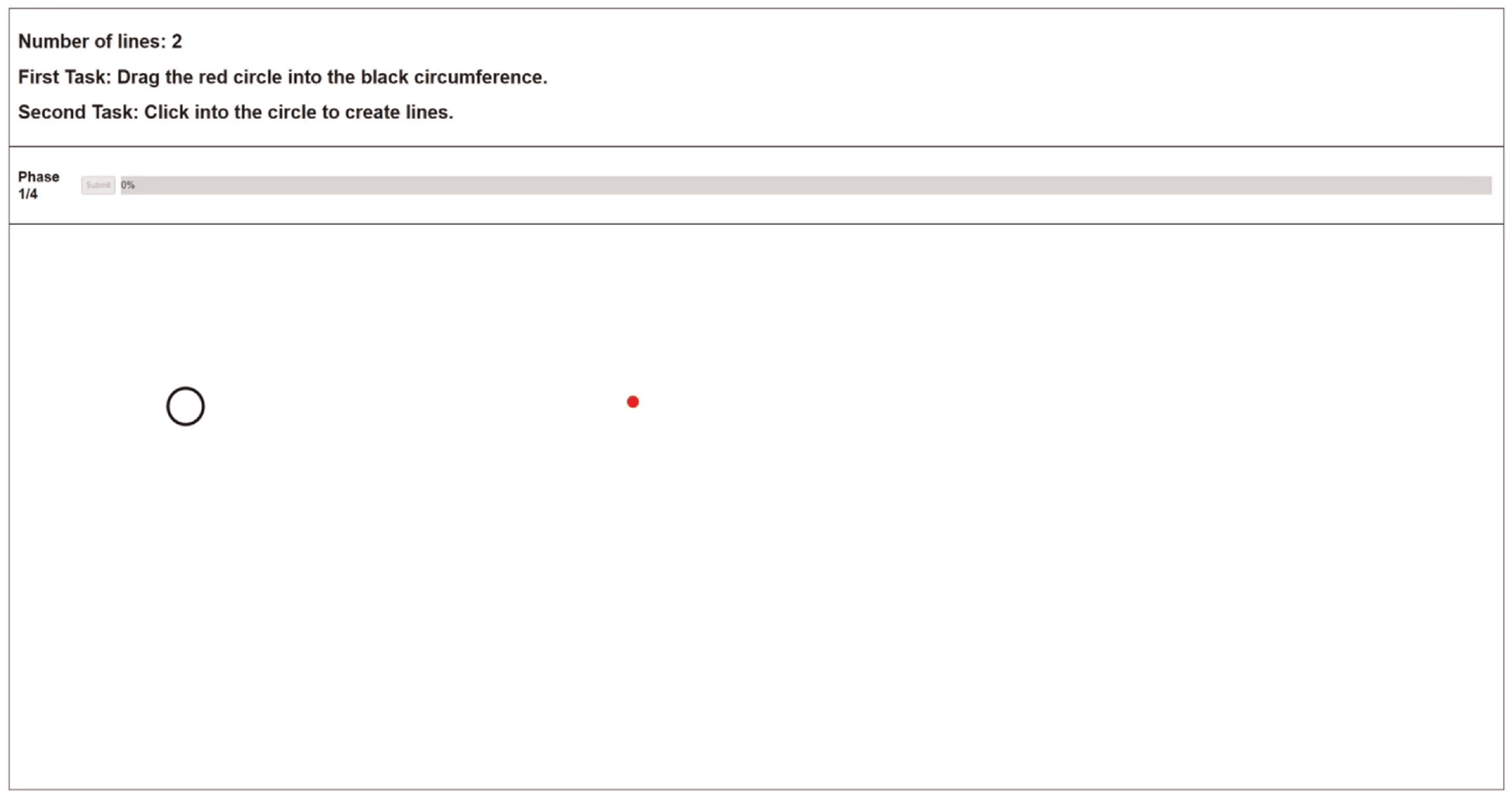
Example of a decoy task, which is performed before each trial.
According to the current phase and study, the event cleaned the screen and presented the marks and correspond-ing channel at the current cursor position, followed by a mask. Then, participants had to remember how the marks appeared and reproduce them as well as possible by inter-acting with the application. We chose reproduction tasks to understand what exactly was seen by participants, regardless of semantic meaning. Finally, after participants finished their reproduction task, they pressed a submit button to move on to the next decoy task corresponding to the subsequent trial.
We used masks because masking is a powerful tool used by researchers to regulate the difficulty of a task, 109 and to make sure people’s iconic memory did not bias the results. 110 For example, if a target is presented briefly, it can be rendered entirely invisible by the subsequent presentation of a non-target object. This phenomenon has been named backward masking. In our case, the mask was always presented for 100 ms. Furthermore, it was made of dots (position) or lines (length or angle) depending on the stimulus. Hence, it was made of the same marks and channels as the target stimulus. Finally, while the target stimulus had one, two, three, or four elements, the masks always had 50 and always displayed for 100 ms. Our study did not consider both properties because we did not intend to assess accuracy depending on the masks.
Marks and channels
In each mark-channel combination, participants completed a reproduction task. After performing the decoy task, they were shown a stimulus with one, two, three, or four elements, with a display time between 100 ms and 1000ms. However, instead of explicitly estimating the quantitative values, they had to create the marks and adjust their channel as needed using their mouse cursor to be close to the original stimulus. There was no time limit to complete each task, and each answer could be adjusted before submitting it. The tutorials presented to the users (available at https://figshare.com/s/967082b878cf0d530a04) exemplify each of the tasks explained below.
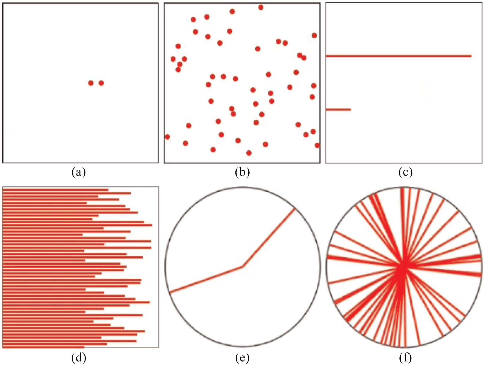
Stimulus and corresponding masks for each type studied: (a) position stimulus, (b) position mask, (c) length stimulus, (d) length mask, (e) angle stimulus, and (f) angle mask.
Participants
We conducted our user study with 99 participants using Prolific (*https://prolific.co/) 1 , an online crowdsourcing platform focused on academic research. Thirty-three were assigned to each value of our between-subject variable (stimulus type): position, length, and angle. The variable was studied in three independent studies conducted in sequence.
We imposed two restrictions on participants. The first was filtering out all participants who could not participate with a desktop computer. Then, we only wanted participants with a normal or corrected-to-normal vision to ensure it did not compromise perception. Initially, we gathered 114 participants. However, 15 were rejected due to malicious behavior, mainly rule breakers and some gold standard preys (more details below). Sixty-four participants were between 18 and 27 years old, 25 between 27 and 36, and the rest between 36 and 73 (mean = 27, std dev = 9). Furthermore, we got people from 25 different countries, most from Poland (18%), United Kingdom (16%), Portugal (11%), Greece (10%), and Italy (9%). Of the 99 participants, 63 were male, and 36 were female. Finally, the median time for each participant was 9 m 14 s, and each participant was paid £8.12/hr on average.
Online prototype
Everything was designed to be hosted online because we conducted a crowdsourced user study. Therefore, we created a webpage where each participant performed all tasks.
The webpage was always divided into three sections: the header, the progress section, and the stimulus area (Figure 1). The header always contained three lines of text. The first indicated the number of elements shown in the current phase. For example, it could say “Number of lines: 2,” which would mean participants were at the phase with two elements shown simultaneously. Then, the other two lines of text indicated the primary and secondary tasks. These last lines always displayed the same information, but they served as a reminder for participants to continuously know their goals.
Then, the progress sections showed the current phase, the submit button, and the progress bar. The submit button was disabled until participants finished reproducing the stimulus. After they pressed it, the study moved to the subsequent trial. Finally, the progress bar showed how many trials were left. Finally, the stimulus area served as the canvas for every stimulus shown to participants. It was also the place for participants to create and adjust the corresponding elements until they were satisfied that their version was similar to the original one.
Malicious behavior
Gadiraju et al. define five categories of well-known malicious participants 111 : ineligible workers, fast deceivers, rule breakers, smart deceivers, and gold standard preys. Ineligible workers participate even though they do not meet the requirements. Fast deceivers give random answers to finish a task as fast as possible. Rule breakers do not provide answers with enough quality. Smart deceivers conform to the rules but give semantically wrong answers. Finally, gold standard prey can only be caught with specific questions during evaluation, as they do not exhibit malicious behavior, but are still not paying enough attention. We implemented several validation mechanisms to identify these participants and reject their participation. Before starting the study, each participant answered some questions to make sure they were not ineligible workers:
They had to input their Prolific ID, so they could prove they were registered in Prolific.
Participants had to input their monitor size so that our webpage could calculate the pixels per inch ratio, thus ensuring everything drawn during the tasks had the same size for every participant.
They had to choose their age using a slider.
The age question was explicitly created to avoid fast deceivers. Because their profiles in Prolific have the ages registered, we could quickly check if participants were not paying adequate attention. To avoid rule breakers, we implemented two browser validations. The first was regarding the browser’s current zoom and window size; we wanted each participant to use all the available space to perform each task. In particular, we wanted participants to use their browser with 100% zoom and with its window maximized. Therefore, if these settings changed during the study, a pop-up message appeared. Then, the browser was blocked until both properties were changed to their required values. The second validation was regarding idle time, and we implemented two mechanisms. First, the browser was continuously checking if the mouse cursor was stopped for more than 30 s. Second, the browser continuously checked if the participants left the browser window for more than 30 s. If any of these situations occurred, a pop-up would warn participants that their behavior would compromise their results.
Furthermore, to avoid rule breakers, we analyzed idle time. Prolific has a standard way to measure this, which is by comparing the starting and ending timestamps. However, this is flawed because Prolific cannot know what happens outside its platform, namely on the test’s webpage. Therefore, we implemented several timestamps across the study:
We tracked the time between entering the webpage and finishing the warm-up phase. Some people entered and stayed idle for some time before actually starting the trials.
We tracked how much time they took from after the warm-up phase until the end of the study.
We also tracked how much time each trial took, corresponding to the time after the mask was presented and the trial answers’ submission.
To flag the participants that spent too much time idle, we first looked at the time each participant took during the warm-up phase. Then, we checked which ones were significant outliers according to each stimulus, and we rejected their submissions. Then, we looked at each participant’s total time during the study, and we checked again for outliers. However, we did not reject until we knew if the time was evenly distributed across trials. If only a particular trial took significantly more time, we would still accept the participation. This way, we avoided rejecting a submission whose participant could have been forced to stop the study while still wanting to finish it. The trial detected as an outlier was then removed when we applied our statistical tests.
To avoid gold standard prey, the webpage randomly chose one trial in each of the four phases and made it obvious. In graphical perception, specifically in studies about the subitizing range, when the stimulus comprises several elements that make up a pattern, the stimulus is perceived as one object. Therefore, it is possible to have high accuracy values over the subitizing range.112–114 We used these results to ensure the flagged trials were easy to perceive at any given display time by making the stimulus reassemble a pattern. For example, in the dots’ position flagged trial, all dots were next to each other, close to the center of the black stroked square (Figure 3(a)). In the lines’ length stimulus, all lines had half of the total length (Figure 3(b)). Finally, in the lines’ angle, the four lines were put to resemble the plus sign (Figure 3(c)).
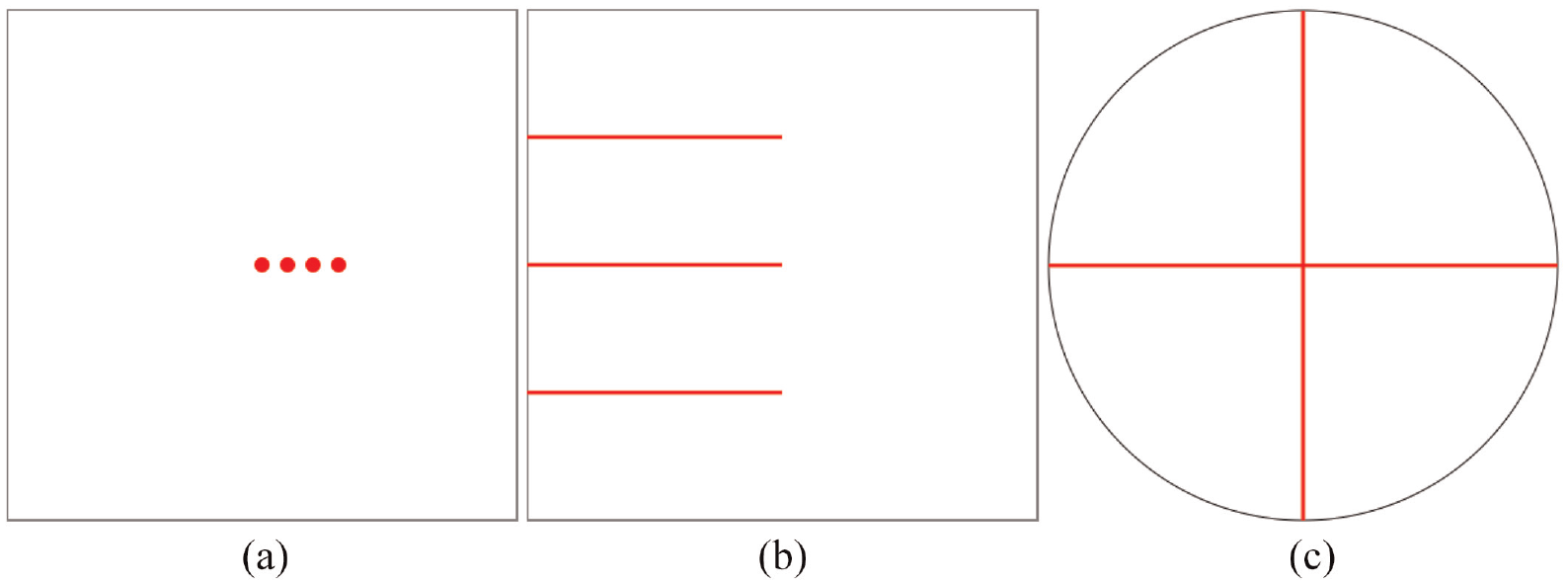
Stimulus generated to detect gold standard preys: (a) position of dots, (b) length of lines, and (c) angle of lines.
All these flagged trials made up our baseline for identifying participants that were not paying the required attention. Because each participant performed four flagged trials, we used them to get a mean flag accuracy value. Then, we compared all participants’ mean values and checked which ones were significant outliers inside each stimulus. Unlike the idle time strategy, the corresponding participant’s submission was rejected if the flag accuracy was an outlier.
Data
Our study measured each trial’s accuracy to understand how it changed according to the stimulus, the number of elements, and display time. Instead of asking participants to estimate the quantitative values of the presented marks, we asked them to reproduce them. There is usually no need to decode the exact value in a visual idiom because tables, for tabular data, for example, are better for that purpose. Hence, accuracy was measured by looking at the delta between the original marks’ positions, lengths, or angles and the ones created by participants. For example, in the position marks, we calculated the distance between the original marks and the ones created by the participants. Then, to get an accuracy between 0 and 1, we divided that value by the value of the worst-case scenario, which would be when participants create the marks the farthest possible from the original ones. The dataset used in the analysis is available at https://figshare.com/s/3fde55b17b58545c7ee2.
Results
We analyzed accuracy with two different statistical tests. First, we used the three-way mixed ANOVA statistical test to determine whether there was a statistically significant three-way interaction between the stimulus used (position, length, angle), the display time, and the number of elements. Then, we used the One-way ANOVA to determine if there was a significant difference between all three mark-channel accuracies to understand which one was more accurately perceived, regardless of display time and the number of elements. Our goal was to understand the influence of our three independent variables on accuracy.
Three-way mixed ANOVA
This test was run to understand the effects of the number of visual elements (number), perception time (time), and visual encoding (stimulus) in graphical perception accuracy error. There was a statistically significant three-way interaction between number, time, and stimulus, F(26.96, 1091.882) =2.430, p < 0.001, partial
The statistical significance of a simple two-way interaction and a simple one-way main effect was accepted at a Bonferroni-adjusted alpha level. This adjusted alpha level is determined by dividing the desired level of statistical significance (in this case, 0.05) by the number of simple two-way interactions being analyzed. In our case, since we had three interactions, we divided 0.05 by three, resulting in a value of 0.016. There was a statistically significant simple two-way interaction between number and time for the length stimulus, F(6.239, 180.92) =4.749, p < 0.001,
There was a statistically significant simple one-way main effect of the number of visual elements for all stimuli in all perception times (p < 0.05). For one particular stimulus and one particular perception time, varying the number of elements changes accuracy significantly.
Likewise, there was a statistically significant simple one-way main effect of the perception time for all stimuli in all number of visual elements (p < 0.05). For one particular stimulus and one particular number of elements, varying the perception times changes accuracy significantly.
All simple one-way pairwise comparisons were run between the different number of elements trials for all stimuli in all perception times. Likewise, all simple one-way pairwise comparisons were run between the different perception times trials for all stimuli in all number of elements. Bonferroni corrections were made in all cases, with comparisons within each simple one-way main effect considered a family of comparisons. Adjusted p-values are reported in Tables 1 and 2. The green cells correspond to p-values less than 0.05.
Simple one-way pairwise comparisons between the different number of elements with Bonferroni corrections within each simple one-way main effect are considered a family of comparisons.
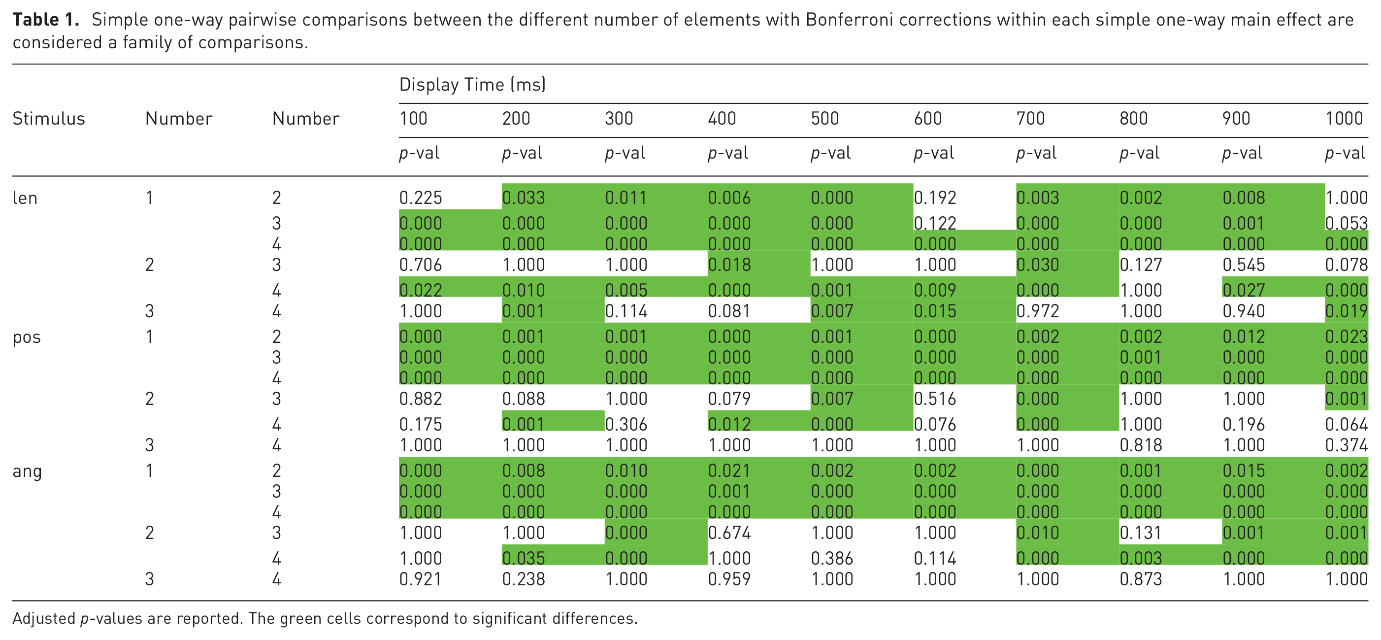
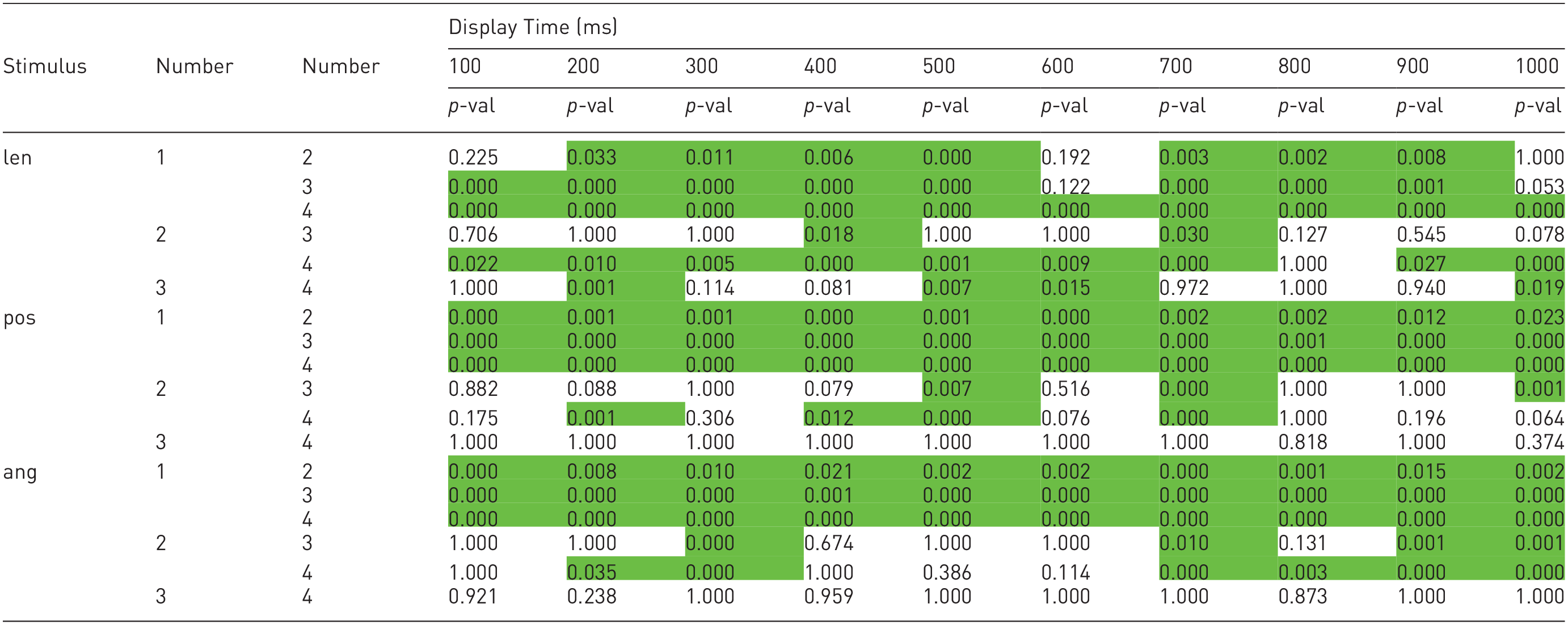
Adjusted p-values are reported. The green cells correspond to significant differences.
Simple one-way pairwise comparisons between the different display times with Bonferroni corrections within each simple one-way main effect are considered a family of comparisons.
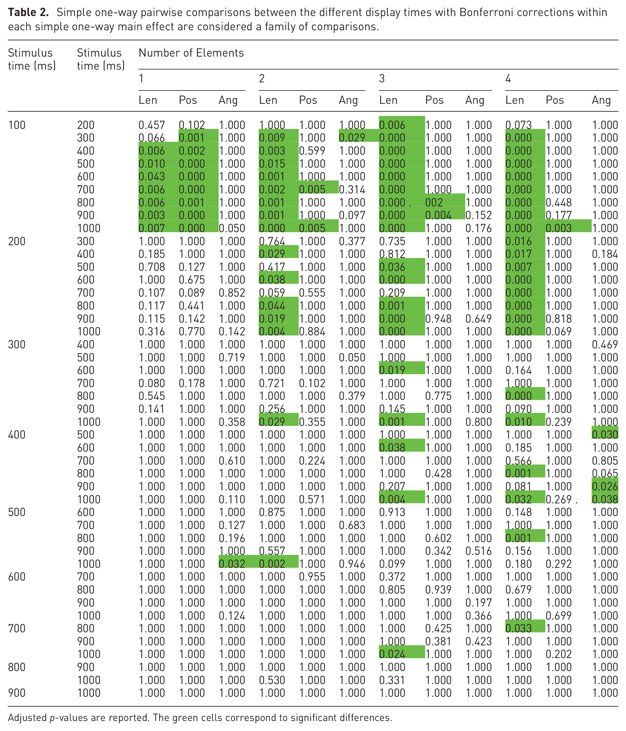
Adjusted p-values are reported. The green cells correspond to significant differences.
The results of the statistical analysis, regarding the number of elements, are in Table 1. At a glance, it is possible to see that most of the table is green, which means that, overall, increasing the number of elements significantly increases accuracy.
Looking at the length stimulus, it is noticeable that the most significant differences are from one element to two, three, and four elements. Besides, we can also see that the differences between two and four elements were mainly significant. Using one mark versus using two, three, or four, and using two marks versus using four will thus result in significantly more accurate perceptions of values encoded via the length of lines.
Looking at the position stimulus, all differences between one element and two, three, and four elements were statistically significant. However, between the other combinations, the majority of differences were not significantly different. Using one mark versus using two, three, or four will thus result in significantly more accurate perceptions of values encoded via the position of dots.
Finally, looking at the angle stimulus, we can see that all differences between one element and two, three, and four elements were statistically significant. Furthermore, again, between the other combinations, the majority of differences were not significantly different. Using one mark versus using two, three, or four will result in significantly more accurate perceptions of values encoded via the angle of lines.
By analyzing Table 2, it is possible to notice that, differing from the previous table, it mostly shows no statistically significant differences between display times. In particular, the most statistically significant differences happened between 100 ms and from 300 ms to 1000ms, mainly in the length channel. Changing the display time usually does not significantly change accuracy, except for the length channel with a display time below 300 ms.
One-way Welch ANOVA
A one-way Welch ANOVA was conducted to determine if the graphical perception percentage error differed for different mark-channel combinations. Participants were classified into three groups: length, position, and angle. The error percentage was statistically significantly different between different stimuli, Welch’s F (2, 2059.986) = 699.861, p < 0.001. The error percentage increased from the angle stimulus (0.022 ± 0.024) to the length stimulus (0.055 ± 0.041) and position stimulus (0.153 ± 0.147) in that order. Games-Howell post hoc analysis revealed that the increase from the angle stimulus to the length stimulus (0.032, 95% CI (0.024 to 0.041)), and the increase from the angle stimulus to the position stimulus (0.131, 95% CI (0.122 to 0.140)) was statistically significant (p < 0.001), as well as the increase from the length stimulus to the position stimulus (0.099, 95% CI (0.107 to 0.090), p < 0.001). From these results, we can specify an accuracy ranking; first the angle of lines, then the length of lines, and finally the dots’ position, from best to worst.
Accuracy variation
This section focuses only on how accuracy varied, regardless of significant differences. After knowing which differences were significantly different, we looked at how accuracy evolved when the number of elements (Figure 5) varied and how it evolved when the display time varied (Figure 4).
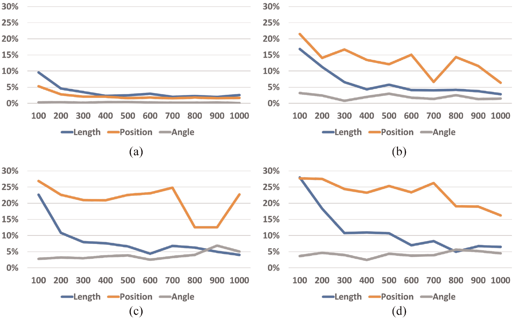
Error rate (y-axis) for each number of elements across all display times: (a) one mark, (b) one mark, (c) three marks, and (d) four marks.
We can see that the error rate decreased when the display time increased, which happened for one, two, three, and four elements (Figure 5). Increasing display time thus increased accuracy. However, the results for one element pop out when compared with the others, meaning that encoding information with only one mark was overall more accurate. Then, we can see that the error rate increased when the number of elements increased, which happened for all display times (Figure 4). Increasing the number of elements decreases accuracy.
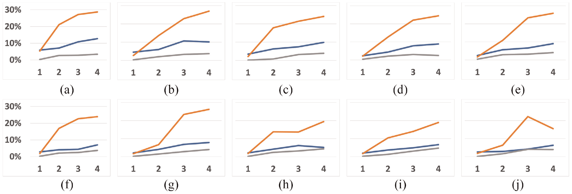
Error rate (y-axis) for each display time across all number of elements (x-axis). The orange line represents the dots’ position channel, the blue line represents the line length channel, and the gray line represents the line angle channel. The line at the top of the graph represents 30%, and the minimum represents 0%. For example, at the 100 ms figure, accuracy for the angle stimulus did not vary much as the number of elements increased: (a) 100 ms, (b) 200 ms, (c) 300 ms, (d) 400 ms, (e) 500 ms, (f) 600 ms, (g) 700 ms, (h) 800 ms, (i) 900 ms, and (j) 1000 ms
Finally, by looking at Figures 4 and 5, we can see that the error rates for the position of dots (orange lines) are usually higher compared with the other two encodings. Using the position of dots thus decreased accuracy.
Discussion
Although traditional visualizations are usually more complex than just having up to four marks simultaneously, and although our study did not explore all stimuli that exist in graphical perception for information visualization, we argue that our study serves as a starting point for future work. As we have explained in our literature review, people’s visual attention using a top-down mechanism (goal focused) is restricted due to working memory limitations, and is significantly impacted in dual-task scenarios. In particular, our decoy task required enough attention from participants so that we could explore incidental graphical perception. Fortunately, these limitations did not jeopardize people’s accuracy above a 30% error rate. We argue that this indicated that incidental perception may still be viable for receiving information during an ongoing primary task.
Our results from the Three-way mixed (BWW) ANOVA test indicated that the interaction between display time, number of elements, and stimulus type significantly affected accuracy. Because the results of our one-way Welch ANOVA test also showed us that changing between stimuli significantly impacts accuracy, we conclude that indeed choosing the correct stimulus can indeed make the difference. However, we were intrigued when we found that our ranking between the three stimuli differed from previous studies, as reviewed by Vanderplas et al., 7 indicating that incidental perception might not work the same way. We argue that that happened because our tasks (stimulus intensity) differ in nature from some studies mentioned by Vanderplas (magnitude estimation), which might compromise the comparison of our rankings and theirs. In any case, our results indicated that the less accurate task was estimating dot positions (avg = 85%), then the length of lines (avg = 93%), and finally, the angle of lines (avg = 97%), always with significant differences according to the one-way Welch ANOVA. Usually, in graphical perception, it is the other way around. Our results thus showed that encoding information to be seen incidentally using the angle of lines was better than using the length of lines, which was better than the position of dots. We found that our results were closer to the study of Blascheck et al., 40 where they concluded that the Donut chart was more effective than the bar chart and radial bar chart in smartwatches. One of the channels used to encode information in a Donut chart is the angle.
Furthermore, instead of magnitude estimation or production tasks, we asked participants to reproduce the entire stimulus. As a result, we obtained an overall high accuracy (no lower than 70%), meaning that individual marks were effectively perceived with no need for comparison during an incidental glance. Moreover, we think that angles were the best channel to encode values because people perceive them differently. Looking at all the channels we studied, only the angle has a fixed range of values: Between 0 and
Looking at the results regarding the number of elements (Table 1), we can see that the most significant differences occurred between having one element and having more than one. This result matches the subitizing phenomenon. It has been proved that counting items in the subitizing range requires attention. 115 Because participants performed trials with primary and secondary tasks, and because we know that attention significantly decreases in dual-task scenarios, encoding information for incidental perception will be significantly more effective by using only one element. However, accuracy will not significantly change with information encoded using two, three, or four elements.
If we look at the table with the display time (Table 2), the results differ significantly from the previous one. Now, almost all combinations do not show statistically significant differences in accuracy. We mainly have them between 100 ms and from 300 ms to 1000ms in the length channel. Once again, these results match previous research regarding preattentive processing, which has been said to happen during the first 250 ms. However, they do so only in one of the studied channels. Incidental perception is thus significantly less accurate if performed during the first 200 ms when the length channel is used.
The key insights on incidental graphical perception for an incidental visualization design process drawn from our results are as follows:
The positions of the dots should be further explored because the error rate was never above 30%.
Graphs can be designed up to four marks with no detrimental effects. For example, a bar chart with four bars (length), a donut chart with four sections (angle), or a Cleveland dot plot with four dots (position), would be effective as incidental visualizations. However, because our study focused only on the subitizing range, we do not know what happens for more than four marks.
An effective exposure time for marks to be perceived incidentally is between 300 and 1000 ms, and varying it will induce no detrimental effects.
Limitations
Because our work focused on graphical perception, it serves as the starting point in the design of incidental visualizations. However, traditional graphs usually have information encoded using more than four marks simultaneously, and the tasks performed in traditional visualization are not reproduction tasks. Furthermore, in real daily scenarios, the primary task complexity may significantly influence incidental perception accuracy. Therefore, future work should consider how incidental graphical perception should be adapted to create complex graphs and how it could be integrated into people’s daily activities. Moreover, 33 participants per condition might not have been enough, and the primary task that was tested could have been too simple and too repetitive to ensure the amount of attention expected from participants. Would the results be the same without this primary task? Finally, the fact that the angle proved to be the most accurate channel was surprising. However, we were unable to check if measuring error rates was the best course of action, or if this happened because of the nature of the stimulus. For example, the size of the dots at the positions’ stimulus, the low error possibilities of the angle stimulus, or the stroke of the lines. Additionally, measuring fixation points could have proved useful to understand participants’ behavior for the different stimuli.
Conclusion and future work
Having more ubiquitous devices in people’s lives allows them to have information available on the go. However, it must be conveyed without distracting too much to ensure primary ongoing tasks are not compromised. Although there are already systems whose purpose is to convey glanceable information, they still assume people want to look at these systems as part of their primary task. Therefore, we explored how people’s graphical perception works when information is conveyed only when needed, during brief exposure times, and without asking explicitly.
We conducted a crowdsourced user study with 99 participants to explore how people’s incidental perception works when information is encoded via the positions of dots, length of lines, and angle of lines. We varied two properties, the number of elements displayed at a time and display time. Our results strongly suggest that incidental perception is accurate. Moreover, varying display time (up to 1000ms) and the number of elements (up to four) do not significantly influence accuracy, except if more than one element is displayed or elements are displayed in less than 200 ms. Finally, the angle was the most accurate channel for incidental graphical perception, differing from traditional graphical perception rankings.
Footnotes
Acknowledgements
I would also like to thank my colleague Tomás Alves for his help in discussing the work, and with some minor revisions.
Funding
The author(s) disclosed receipt of the following financial support for the research, authorship, and/or publication of this article: This work was supported by FCT, through grants PTDC/CCI-CIF/28939/2017, UIDB/50021/2020, and SFRH/BD/143496/2019.