
Abstract
Decision Trees (DTs) stand out as a prevalent choice among supervised Machine Learning algorithms. These algorithms form binary structures, effectively dividing data into smaller segments based on distinct rules. Consequently, DTs serve as a learning mechanism to identify optimal rules for the separation and classification of all elements within a dataset. Due to their resemblance to rule-based decisions, DTs are easy to interpret. Additionally, their minimal need for data pre-processing and versatility in handling various data types make DTs highly practical and user-friendly across diverse domains. Nevertheless, when confronted with extensive datasets or ensembles involving multiple trees, such as Random Forests, its analysis can become challenging. To facilitate the examination and validation of these models, we have developed a visual tool that incorporates a range of visualisations providing both an overview and detailed insights into a set of DTs. Our tool is designed to offer diverse perspectives on the same data, enabling a deeper understanding of the decision-making process. This article outlines our design approach, introduces various visualisation models, and details the iterative validation process. We validate our methodology through a telecommunications use case, specifically employing the visual tool to decipher how a DT-based model determines the optimal communication channel (i.e. phone call, email, SMS) for a telecommunication operator to use when contacting a client.
Introduction
Random Forest (RF) algorithms are often used in classification problems – the process of distinguishing data classes1,2– so it is possible to predict the class of unknown objects. RFs are an ensemble ML model that consists of many independent Decision Trees (DTs). 3 The RF model receives an input and generates the final classification/prediction by feeding the input data to all DTs and aggregating their results.1,2,4
Despite RFs’ performance, its interpretability is usually difficult and time-consuming as it may contain hundreds of independent DTs. 4 Still, to increase the data scientists’ confidence in such models, the understanding of how the RF models classified the samples is of great importance. Additionally, other users, such as marketing teams can leverage these explanations to categorise clients and take different marketing measures for each of them. For these reasons, a visual summary of the RF is of utmost importance to enhance its interpretability.
To address this issue we propose a visual tool to ease the analysis and validation of RF models more efficiently. To do so, we divided the analysis of the RF model into three different depth/detail levels. First, we represent the RF’s feature importance to reveal insights for data scientists about their relevance in the classification process and the need for their use in the model. Second, we represent the relationship between feature values and classification to provide insights into the range of values associated with each class, which in turn, may assist data scientists, who know the context of application, in determining the correct labelling of the model. Finally, through the visualisation of each independent tree and respective summary, the analysis of the proper functioning of the model can be enhanced.
Our main aim is to provide different perspectives over the RF model, so the user can understand how decisions are being made. We use a set of visualisation models and apply a multiple view technique to uncover the relationships between features and classification.
We validate our approach with a use case in the telecommunications domain. More precisely, we use our tool to help data scientists understand how an RF model decides which is the most appropriate channel (i.e. phone call, e-mail, SMS) that an operator of a telecommunication company should use to contact a client. Nonetheless, our model can be applied to any RF model. In summary, our contributions are: (i) the development of the visualisation tool, tailored for analysing and interpreting Random Forest (RF) models, particularly emphasising feature analysis and its impact on classification; (ii) the introduction of a pixel-based matrix grid for comparing pairs of features; (iii) the demonstration of the tool’s insights through a practical use case in the telecommunications industry.
The remainder of the article is organised as follows. In Section Related work, we overview the visualisation models used to represent DTs and RF and discuss their main techniques. In Section Random Forest Model, we overview the structure of the RF model and the different data types. In Section Understanding the Forest, we present our work, the different visualisation models used to represent different aspects of the data, and how we group them in a web interface. In Section Use case, we present how our tool can be used, having as use case the data of the telecommunication company. Then, in Section Discussion, we refer to our findings and how to improve our models. Finally, in Section Conclusion we discuss future work.
Related work
In this section, we review other works that propose visualisation models to improve DTs’ interpretability. These works are divided into two classes. Firstly, we review works that focus on a single DT. Then, we focus on projects that aim to ease the comprehension of DTs ensembles, focussing on RFs.
Decision Tree visualisation
Decision Trees (DTs) are mainly visualised through node-link diagrams.5–7 This is due to the hierarchical rule structure of a DT, starting with one rule (i.e. decision root node), subdividing the data into subsets, and splitting each subset with other rules (i.e. decision nodes) until the final subsets (i.e. leaf nodes) are reached. A DT model contains two types of information: the tree structure (e.g. number of levels, decision nodes, and leaf nodes) and the data associated with each node (e.g. number of items and their distribution by class attribute). Usually, the tree structure is represented with links between nodes and the data associated with each node is usually represented by glyphs. 8 The most common visualisation models used to represent DTs or hierarchical information are: tree-maps, radial trees and icicle plots. 1
Tree-maps are the most common visualisation model for DTs. However, this type of model may require much vertical and horizontal space. To overcome this, Ambarsari et al. 9 propose the Pythagoras Tree, where the concept of the Pythagorean Theorem is used to position different squares, representing the data subdivisions at each level of the tree. Pham et al. 10 also propose a method to reduce the tree space by applying a radial node-link diagram with a fish-eye zoom technique to enable the exploration of nodes. Regarding a more pixel-based approach, Ankerst 11 use pixel bar charts, which although being scalable, cannot represent gaps between classes. Wlodyka et al. 12 use a more simplified view of the tree structure by creating a matrix of features that shows only the percentage of the majority class at each leaf, not giving insights over the class distribution. Wang et al. 13 also proposes a matrix view, enabling the analysis of the node distribution. Finally, Liu and Salvendy 1 use icicle plots that naturally convey node size, hence representing the distribution of items per node.
Regarding the use of multiple views, Barlow and Neville 14 created a multiple view tool that enables the user to analyse and select a subtree, overview the structure of the selected tree through an icicle plot and a traditional tree view, and analyse the list of variables in the model. The use of multiple views is especially used when dealing with interactive tools to create and analyse DTs. For example, Liu and Salvendy 1 propose an Interactive Visual Decision Tree (IVDT). IVDT combines parallel coordinates 15 and mosaic displays 16 and visualises the DTs using the icicle plot structure as it facilitates the identification of tree topology, node relationships, and node sizes. A similar approach is the work of van den Elzen and van Wijk, 8 in which a tree-map, a streamgraph, and a visual confusion matrix are applied to support domain experts in growing, pruning, optimising, and analysing DTs.
From the related work overview, we can highlight two main characteristics of DTs visualisation. First, in all projects, there is a representation of node-link diagrams to enable the analysis of the DT structure. These diagrams can be seen in the form of treemaps (radial or not) and in the form of icicle plots, which focus more on the tree structure than on the node representation. Regarding the node representation, the majority of the node-link diagrams represent only the distribution of samples per class. In our tool, we use a node-link diagram to represent each DT and improve node representation to inform the user about the class distribution as well as the impurity and feature split details. From our review, only one work 8 tackles a more complex visualisation. However, it may be too complex when dealing with dense tree structures. To overcome scalability issues, matrix-like visual metaphors have been used.17–19 However, these models may also be complex to analyse when dealing with large and complex trees. In our work, we apply such metaphors to represent other characteristics and enable a more general analysis, such as the influence of feature values in the classification.
Random Forest visualisation
Random Forests (RF) is a common ML technique for non-linear multivariate classification and regression.20,21 To interpret the RF model, it is important to understand and compare all tree’s properties. However, the visualisation of multiple fully grown trees may hinder the model interpretability and be challenging. 4
Although the visualisation of all DTs in a RF model is still an open challenge, some attempts have been made.4,21–23 For example, Yang et al., 24 use a literal implementation of a tree concept and create a forest where each DT is represented as a 3D tree. Welling et al. 21 present an overview of the geometrical shape of the model structure by analysing each tree by splitting features and projecting them into a 3D space. With this model, they can analyse the effects of each feature in the results. ReFINE 23 combines a set of visualisation models, such as small multiples, icicle plots, and scatterplots, to show the connections between proximity measures, interactions and prototypes and allow users to discover patterns in data sets.
Another example that combines different visualisation models is the iForest 4 that deals only with binary classification problems. To reveal the working mechanism of the model and enhance interpretability, it applies a multidimensional projection technique to overview path similarities between DTs. To give more information about selected features, it also presents a histogram of feature ranges by tree layer. 4 Finally, ExMatrix 22 is a visualisation method that enables the analysis of RF with complex tree structures. It uses a similar approach as RuleMatrix 18 by employing a matrix structure, where rows are rules, columns are features and cells are rule predicates. With this method, the authors aim to ease the burden of analysing and interpreting the classification results from RFs.
From our research, we can conclude that visualisation tools which focus only on the representation of each DT or focus only on features may not provide a good analysis of the RF results. In our project, to provide a more complete view of the data, multiple views will be applied to allow a more comprehensive analysis of such complex data. Also, we argue that the representation of RF through the visualisation of all DTs in a single space is not efficient, as it requires more effort from the user to analyse, compare, and retrieve information. Instead, the application of matrix metaphors may enable better analysis and comparison of all features. However, in contrast to the presented works, we will focus not only on presenting an overview of all features’ importance but also on how these features and their values impact the classification. In our project, we focus on (i) the analysis of each DT individually; and (ii) the overview of the RF’s results. We intend to merge these two tasks – seen in the state of the art as separate – in a single tool, creating a complete RF visualisation tool capable of analysing each DT individually but also providing an overview of the RF’s results.
Random Forest model
Random Forest algorithms are an ensemble learning method for classification, regression, and other tasks. By combining multiple DTs they can achieve better results, while addressing some of the limitations inherent to DTs, such as overfitting. 2 This method is characterised by the generation of multiple DTs and, in classification tasks, the output is the class selected by most trees. Each tree can be characterised by a flow chart of rules that gradually divides the data into smaller subsets. Each rule is defined by the features used to divide the data and corresponding split thresholds. In each node, all items are classified into different classes. In summary, the data from an RF model consists mainly of a summary of feature importance values and an array of DTs.
Each DT is defined by a hierarchical structure of nodes, each one containing information about the features used in the split, the threshold value, the impurity of that node, and the number of samples per class. Regarding our project, we implemented our RF model using the python library scikit-learn (Web-page of the scikit-learn library: https://scikit-learn.org/stable/modules/generated/sklearn.ensemble.RandomForestClassifier.html).
Regarding the computation of feature importance we rely on Gini Importance. The importance of a feature
with

where
where
For the visualisation of DTs, Parr and Grover 25 define a set of elements that should be highlighted in the visualisation: (i) the number and distribution of samples within the decision and node, to perceive how separable the values at each feature and threshold split are and to know where most samples are being routed through the decision nodes; (ii) decision node feature and split value, to understand which feature was used and where the split of observations occurred; (iii) purity of nodes, to be able to understand the confidence in each split – regarding classification, leaves with a majority target class are more reliable; (iv) number of samples in leaf nodes, so we can distinguish trees with fewer, larger and purer leaves (the goal) from nodes with few samples, that may indicate overfitting. In our work, we focus on the visualisation of these elements, but also on the presentation of a summary view of each DT and the whole RF model.
Understanding the forest
To analyse an RF, that is, to understand how the model classified the data samples and how each feature and respective values affect the classification, can be a complicated task. This is mainly due to the high number of DTs used and the varied characteristics within each tree structure. To support the analysis of RF models, with special interest in the features’ impact on the classification results, we introduce our tool – Understanding the Forest. Our tool is web-based and uses the library D3.js 26 to implement all visualisation models.
Our design process for creating the tool ‘Understanding the Forest’ began with the understanding of the underlying algorithms in RF models. This initial phase was conducted in collaboration with Machine Learning experts from a University (University of Coimbra, Portugal) and enabled us to gain insights into the key components driving the model’s functionality. Subsequently, and to identify existing methods and best practices, we conducted an overview of the state-of-the-art on the visualisation of RF models. Our conclusions from this analysis are detailed in Section Related work. These two phases, we derived the goals and main tasks for our tool. Following this, we embarked on designing our models in an iterative approach, refining visual representations through qualitative evaluations in collaboration with a reduced group of Machine Learning experts and researchers of Information Visualisation also from a university (University of Coimbra, Portugal). The most important design decisions are outlined in the following subsections. Upon completing the implementation and refinement of the visualisation models and interactive functionalities, we conducted a use case to demonstrate the efficiency of our tool. In the subsequent paragraphs, we provide a succinct description of our final tool to offer an overview of its functionalities.
Our tool is divided into two main areas: the upper part and the lower part. These two areas have different purposes. In the upper part, we aim to enable the user to analyse the overall RF model results, by providing a summary view of all feature importance values and DTs. To achieve this, we implemented a fixed dashboard (Figure 1, top), which represents the resulting feature importance of the RF model – represented with a bar chart – and a scatterplot of all DTs positioned in the x-axis according to their impurity and in the y-axis according to the maximum feature importance value (
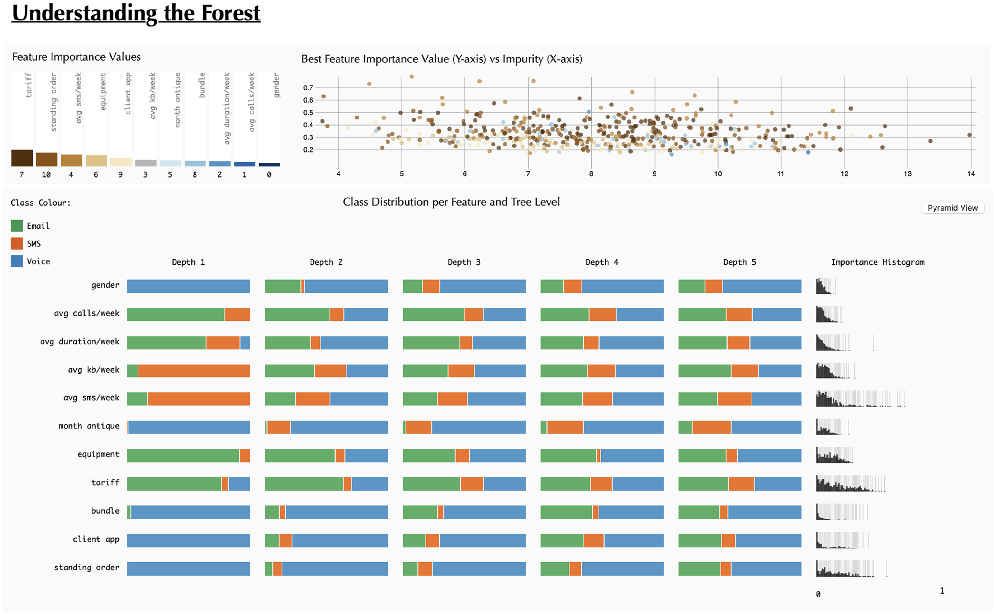
Snapshot of the starting point for ‘Understanding the Forest’: At this phase, users have the capability to observe a bar chart illustrating Feature Importance, a scatterplot displaying all Decision Trees, and beneath them, the ‘Classification Grid’.
In the lower part, initially, we aim to enable the users to deepen their understanding of the feature values impact on the classification of the overall RF model, and later, through interaction, enable the users to analyse each DT individually. To achieve this, in an initial state, we present the Classification Grid – that represents for every feature, the class distribution in the left branch per tree depth level and a histogram of importance values (Figure 1, bottom). Then, the user can change this view to the ‘Pyramid Matrix’. In this visualisation model, and to enable the analyses of pairs of features and their influence in class distribution, each feature is represented in a matrix-like disposition. In this model, we also defined two visual approaches: (i) a pie chart, to give an overview of the classification when two features are part of the rule and (ii) a heatmap, to give a more detailed view on the features values impact in the classification. A more thorough description of these models is given in Section Pyramid matrix. Additionally, the user can select any dot of the scatterplot – in the upper part – and analyse the resulting tree structure in two different ways: through a Tree Visualisation (i.e. node-link diagram) and in the Pyramid Matrix model referred to above.
Contrary to previous works 22 that focus on rules (i.e. sequence of feature splits and respective thresholds), we focus on each individual feature and pairs of features. By doing so, we aim to give the user a more interpretable view of feature relevance. This approach is also based on the fact that our tool may be used by data scientists, who aim to improve their models or gain confidence in them, or by non-data scientists who may need to make sense of the RF results. For example, RF models can be applied to enable marketing operators from a telecommunication company to identify which is the best channel to contact each client according to their characteristics. Nonetheless, we argue that this perspective is also relevant for other use cases and, for this reason, we argue that our tool can be applied to any RF in any domain.
In the following subsections, we present the main goals and tasks of our tool and overview the visualisation models and their disposition on the canvas.
Tool goals and tasks
Our main aim is to visualise an RF model to give insights into the data structure and feature relationships. We divided our tool into two analysis moments: an overview and a detailed view. These two moments were defined according to two goals: (
Classification grid
To enable the users to have an overview of all features and their relevance to the classification, we present the Classification Grid which visualises the class distribution per feature (rows) and tree depth level (columns) (Figure 1). Although the rule (i.e. the complete path from the root node to the leaf node) is what defines the final classification, we aimed to give another perspective on the features’ influence. Our goal is to see the class distribution in different depth levels (
Various methods for depicting the distribution of classes within the initial three levels. The colours depicted in the figure are not the final colours. The figure intent is only to present the different approaches.
Before representing the distribution, we needed to generate a summary of all DTs. To do so, we defined the relevant class per decision node through the true child-nodes. It is computed as follows. For each node, we retrieve the class with the higher number of samples and divide that number by the total number of samples in that node. With this, we get a percentage of the relevance of the class. With this method, nodes with only one class will have more weight than nodes with more classes or with samples more evenly distributed along classes. This weight will translate into a higher visual relevance of a certain class in the visualisation. When we have the relevant class for every node, we calculate the class distribution per tree depth level and feature by iterating over the nodes and summing separately all relevant classes that occur in that level and feature.
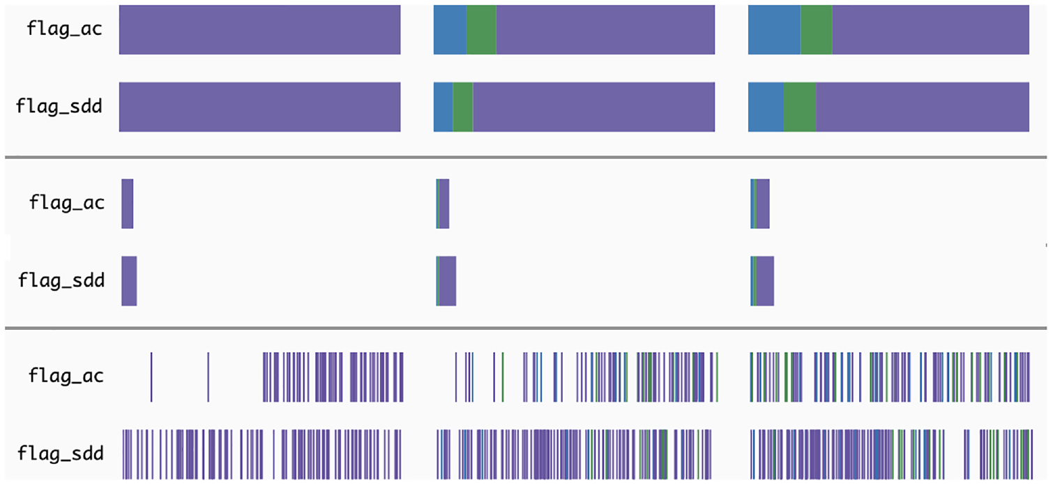
Regarding the visualisation, our first approach was to create a stacked bar, in which the class distribution is represented in a horizontal bar (Figure 2, top). By doing so, we can perceive the features’ influence on classification per tree depth level. However, we lack the understanding of how many times each feature appeared in the decision nodes at each depth level. To overcome this, we implemented a second approach.
The second approach follows the same idea as the previous one, however, we change the width of the stacked bar according to the number of times the feature is used in the decision nodes (Figure 2, middle). In this approach, we can understand which features are more used in the different levels, enabling an understanding of their relative importance for the RF model. However, with this approach, and as the width of the bars is mapped to the maximum value of feature appearances (independently of the depth), in the first levels, as there are a smaller number of feature splits, the corresponding stacked bar is too small to perceive the class distribution.
Finally, we aimed to understand if the threshold split also influences the classification. Hence, we created a Bar of Occurrences, in which we map the length of the bar to the minimum and maximum values of threshold splits, and then, position each split accordingly (Figure 2, bottom). The splits are represented by vertical bars, coloured according to the relevant class described earlier. With this method, the user can also analyse the threshold values more used in the different classifications. To better comprehend which approach would suit our tool best, we conducted an informal questionnaire with computer science students, who had no prior contact with the project. The third approach was referred to as a good overview of the frequency of splits along the feature values. However, the stacked bar and the sized stacked bar were better received and enabled a better analysis of the distribution of classes. Hence, we used the stacked bar approach for our tool.
On the right side of the Classification Grid, we visualise a histogram of the feature importance values by feature, to reveal the impact of each value in the classification. In this histogram, the higher the bar, the higher the number of DTs in which a certain feature has the corresponding importance value – which ranges from 0 to 1. Due to the small size of this graph, bars representing a reduced number of values (i.e. with smaller heights) would be difficult to notice. To overcome this issue, we draw a thin grey line below each bar, highlighting visually the values with a reduced number of occurrences.
Pyramid Matrix
To have another perspective on the RF results and understand the influence of the different features in the classification, we created the Pyramid Matrix visualisation (
Pie chart
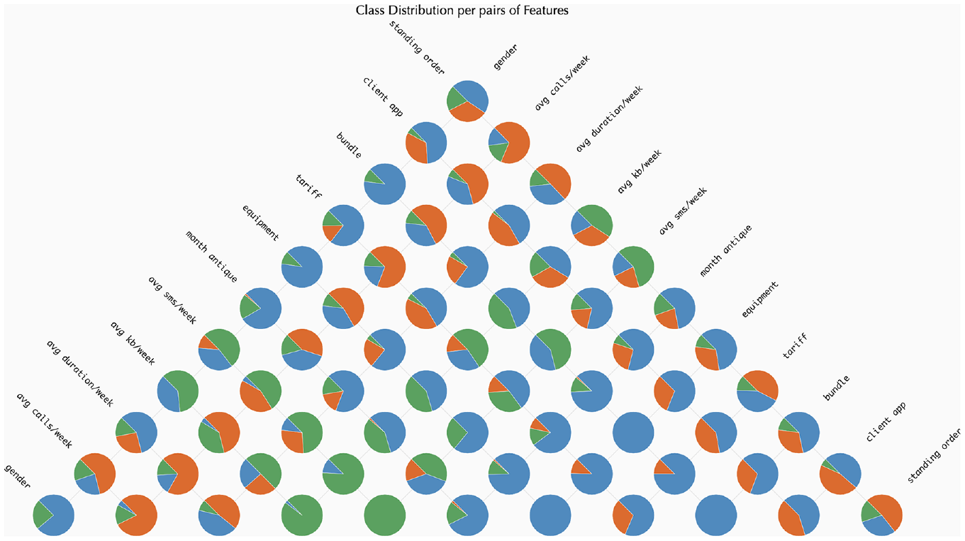
We opted for a pie chart since the number of classes is commonly small. Each pie chart represents the distribution of classes per pairs of features. To achieve this, per each rule (path of each DT in the RF model), we analysed the split nodes of the corresponding feature, and computed the relevant class, as explained in Section Classification grid. Then, in the Pyramid Matrix, we calculated the distribution of classifications per each pair of features and represented that distribution with a pie chart. The pie charts are placed in the corresponding cell of the Pyramid Matrix. An image of this approach can be seen in Figure 3. The idea behind this visualisation is to ease the identification of the features that influence each classification the most. With this visualisation model, we can perceive, for example, that the features ‘avg sms/week’, ‘equipment’, and ‘tariff’ have a higher impact in the classification of samples as ‘SMS’, as they are the only features in which such classification appears–pie charts with orange slices.
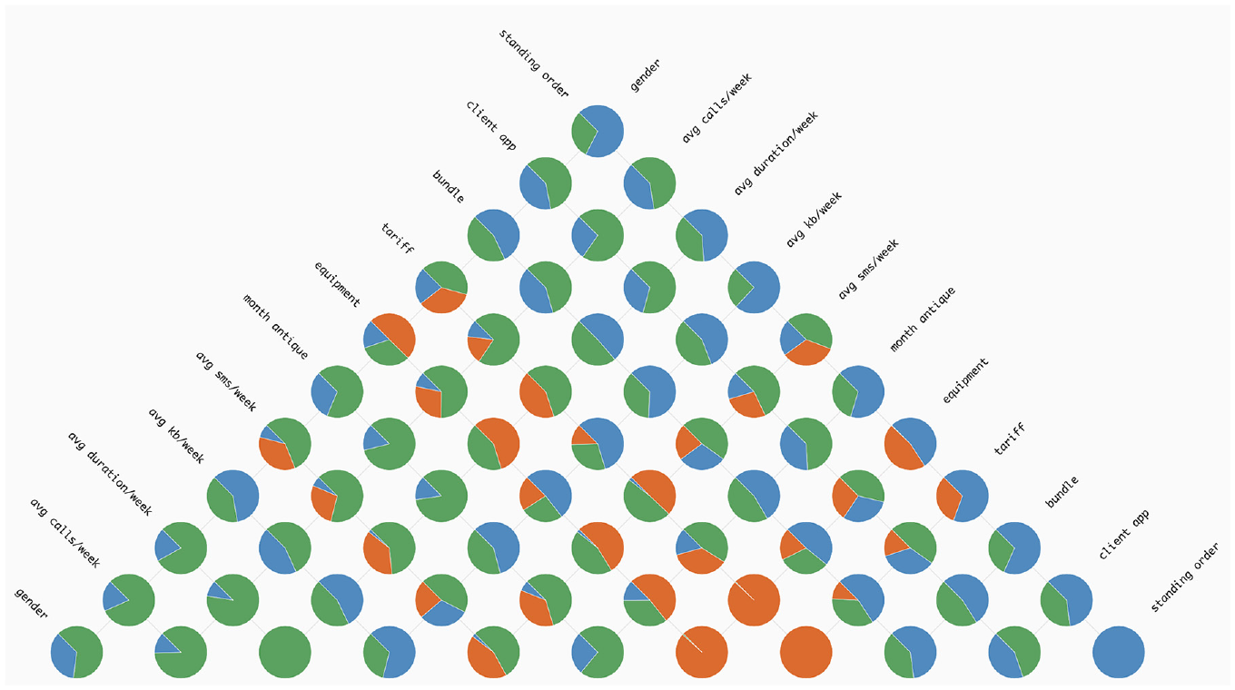
An instance showcasing the use of the Pie Chart method within the ‘Pyramid Matrix’. The colours represent the following classes: (i) green for ‘Email’; (ii) orange for ‘SMS’ and (iii) blue for ‘Voice’.
Heat map grid
To compute the matrix, we apply the same strategy as in the pie chart version. However, instead of looking only for the split features and resulting classification, we also analyse the split value of the rule.
In this approach, we aimed to give more details on the range of values that may influence the classification (
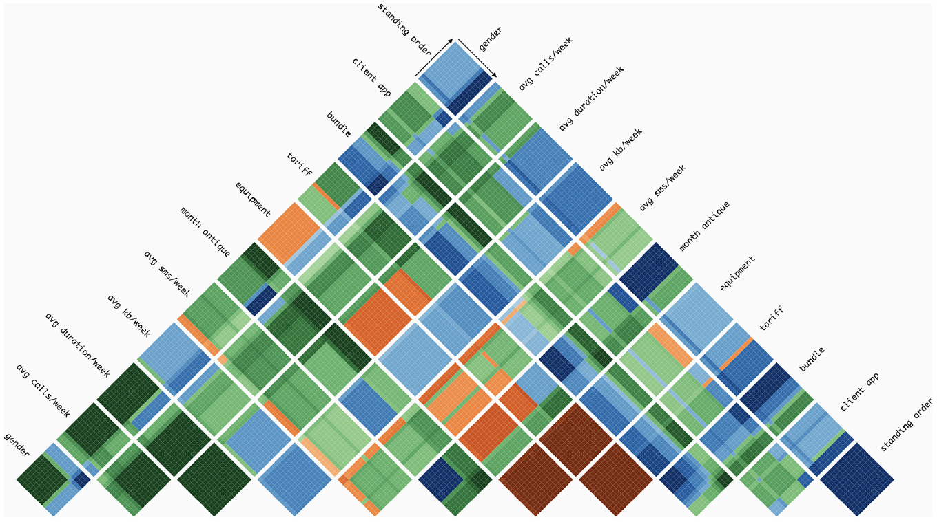
An example demonstrating the implementation of the Heat Map Grid technique in the Pyramid Matrix. Each colour represents a distinct class, with the intensity of the colour indicating the level of relevance of that class, per pair of features. In this visualisation, we can see that, for example, when feature ‘tariff’ and ‘equipment’ are considered, the classification of tends to be SMS (dark orange), independently of the feature values. Also, when feature ‘bundle’ and ‘month antique’ are considered, if both values are low, the classification of the samples are Voice (dark blue, left bottom part of the respective grid), whereas when the values are high the classification tends to be ‘Email’ (dark green, top right part of the respective grid).
To define the grid of cells, we first computed the range of feature values. As we had no access to the sample values, we calculated as follows:
Having established the range of values within the cell for each feature, the next step was to calculate the class distribution per range of values. Similarly to the Classification Grid, we needed to define a summary of the split thresholds and corresponding classification. Hence, we computed for each decision node the following: (i) get the fully classified data points, the left and right side of the parent node; (ii) for each of them, compute the relevant class and (iii) save this information in a new data structure. This new data structure summarises, per feature and cell (i.e. range of feature values), the relevant class. Then, we use this information to colour each cell with a gradient according to the distribution of classes. This kind of visualisation can help in understanding how decision nodes and features contribute to the classification of data in ML. For example, in Figure 4, we can perceive that higher values of ‘month antique’ tend to be classified as ‘Email’– grids with this feature tend to be divided in two and the second part tends to have green hues. Also, we can see the impact of the features ‘equipment’ and ‘standing order’ when paired with ‘month antique’. When we have the pair [‘standing order’, ‘month antique’], smaller values of ‘month antique’ are classified as ‘Voice’ (blue hues). Whereas, when we see the pair [‘equipment’, ‘month antique’], smaller values of ‘month antique’ are classified as ‘SMS’ (orange hues).
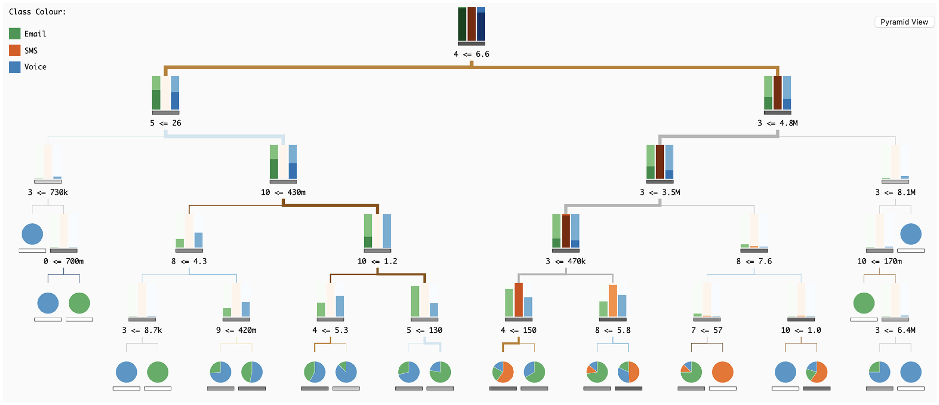
Tree visualisation
To visualise the DTs (
In our tree visualisation, nodes are divided into decision nodes and leaves. Both nodes have represented the respective impurity – a measure of the homogeneity of the classes at the node – through a horizontal bar, with a greyscale, the lower the impurity value the lighter the bar, and vice versa. With this, we can differentiate nodes with high values of impurity, meaning that the combination of split feature and split values resulted in an equal distribution of samples across all classes (not preferable), from low values of impurity, meaning all samples in the node belong to one class (preferred). Below this horizontal bar, we write the number of the feature, the signal of the split, and the split threshold. We opted to write the number instead of the name to prevent overlapping texts.
The samples in leaf nodes are visualised with a pie chart, representing the class distribution and positioned above the impurity bar. When the pie chart only has one colour, all the samples on that leaf are of the same class, meaning that the rule (sequence of split features and split thresholds) ends in a pure classification. On the other end, when a pie chart has more than one class, there is a higher value of impurity.
Regarding the decision nodes, we aimed to represent the class distribution (i.e. which class has a higher number of samples) but also to represent the number of samples at each tree depth level. We tried two approaches of bar charts. The first one is the application of a typical bar chart. This bar chart appears above the impurity bar and has as many bars as classes, representing the number of samples through height. This method is simple to analyse, however, with high ranges of values (nodes with many samples and nodes with fewer samples) the smaller values are difficult to see. To overcome this issue, we propose the application of a horizon bar chart. Its representation is similar to the horizon graphs, 31 but applied in bars (Figure 5). With this strategy, we aim to highlight higher values through colour, but improve the analysis of smaller values in relation to a simple bar chart. We analysed both approaches through an informal qualitative test. In general, the bar chart outperformed the horizon chart, regarding comparison tasks. However, the horizon graph was slightly better to distinguish smaller values, and for this reason, due to the reduced size of each bar graph, we opted for this last approach.
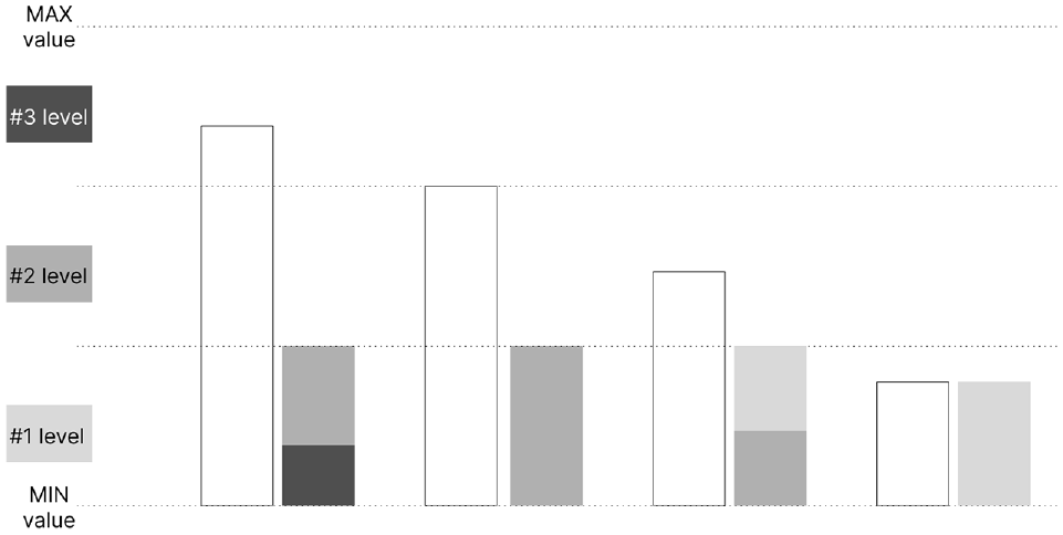
Diagram of the horizon bars: initially, the white bars are segmented along the dashed lines. Subsequently, each segment is compressed and coloured according to the specifications on the left. Smaller and darker segments take precedence in placement.
In our tree visualisation, the links between nodes also represent information. Their colour represents the split feature used in the parent node, and their thickness represents the number of samples in each link. Hence, splits, which can divide the samples into subsets of different sizes, are highlighted, and the user can distinguish how each rule affects the classification and sample distribution in all DTs.
Use case
To showcase the functionality of our tool and illustrate its application in analysing RF models, we present a use case involving client characteristics data from a telecommunications company. The RF model’s outcome was saved in a JSON file, encompassing class names, feature names, resultant feature importance values, and an array of DTs, each with the same number of depth levels.
Each tree in the array includes information such as the importance of each feature, tree impurity, and a list of nodes. Each node, in turn, is characterised by an ID, depth, split feature, split threshold, list of child nodes, impurity, and the number of samples for each class. The model involves three classes defining contact channels: e-mail, SMS and voice.
The features used in these models include gender, average calls per week, average GPRS duration per week, average kilobytes per week, average SMS per week, month antique, equipment, tariff, bundle, existence of a client app and standing order. While most features were already numerical, the gender field was encoded into integer values representing the two categories, Male and Female. Finally, the RF model was trained with input data from 1194 clients, using 500 DTs with a maximum depth of 5 levels.
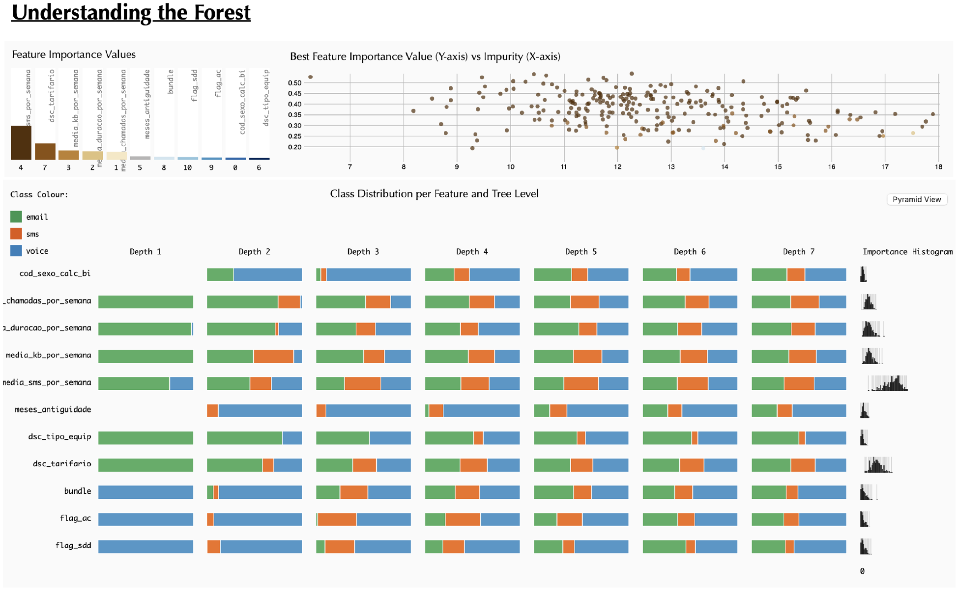
At the beginning of user interaction with our tool, the upper section displays the Feature Importance Values of the RF model (Figure 1). Although the importance values exhibit minimal variation in this instance, the bar chart, sorted from left to right by magnitude, enables the straightforward ranking of all features by importance. Notably, tariff emerges as the most relevant feature, while gender is the least relevant (
On the right of this chart, the distribution of DTs is presented along two axes – impurity tree value on the x-axis and maximum importance value on the y-axis (
To facilitate analysis, we incorporated a mouse-over action. When a user hovers over a specific bar, all dots corresponding to the maximum importance value of the hovered feature are highlighted in the scatterplot. This interactive feature revealed insights, such as the non-frequent appearance of month antique, avg kb/week, avg duration/week and avg calls/week in the scatterplot (less than four times), indicating low importance values across most DTs. Additionally, the gender feature never appears in this context.
To analyse in more detail the influence of each feature in each class (i.e. email, SMS or voice) the users can view the Classification Grid, represented in the lower part of the web-page (
By analysing the distribution across tree depth levels (columns), it becomes evident that as we descend deeper into the tree, the class distribution tends to look similar between features. This pattern arises because, at each depth level, particularly the lower ones, the rules become more intricate. However, distinct distributions emerge at the final level. For instance, in the case of month antique, the distribution reveals a decrease in classifications as email – green – and an increase in voice – blue. This shift may be attributed to the tendency for older clients to be less inclined to use email. Upon scrutinising all levels of this feature, a prevalence of the ‘voice’ class becomes apparent. On the contrary, equipment and tariff are features more inclined to be classified as email. This phenomenon might be attributed to the fact that various equipment, particularly more recent models, offer improved internet functionalities that older equipment may lack.
On the right side of the Classification Grid, there is a histogram of importance values (
To assess the impact of feature pairs on classification, users can click the ‘Pyramid grid’ button (Figure 6). Upon analysing the grid, it becomes evident that the ‘voice’ class predominates (
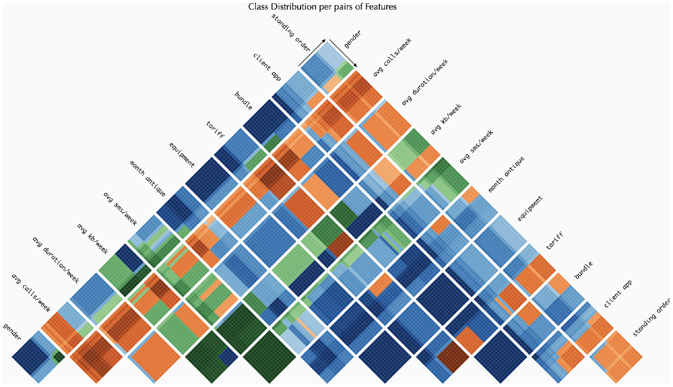
The heat map grid for the Pyramid Matrix. This visualisation enables the examination of class distribution and provides a more in-depth analysis of the range of values. The colours represent the following classes: (i) green for ‘Email’; (ii) orange for ‘SMS’ and (iii) blue for ‘Voice’.
Regarding the pairs of features, attention is drawn to those where only one class appears, such as [bundle, equipment] and [month antique, equipment], both of which display a grid entirely in dark blue (indicating the ‘voice’ class). For a more nuanced analysis of the influence of different value ranges, consider the pair [month antique, avg kb/week]. Additionally, classes influenced by ranges above or below a specific threshold can be observed. For instance, in the ‘avg kb/week’ feature, a vertical line appears in all pairs involving that feature. This line distinctly separates the classification in [avg kb/week, equipment], with the ‘email’ class (green) on one side and the ‘voice’ class (blue) on the other. The threshold line also emerges in pairs of the same feature, such as [‘tariff’, ‘tariff’] where smaller values are classified as ‘voice’, while higher values are classified as ‘SMS’ (orange).
For a more comprehensive analysis of class distribution, users can select the ‘Pyramid Pie’ button (Figure 7) (
The Pie Grid for the Pyramid Matrix. This visualisation allows for the analysis of class distribution. The colours represent the following classes: (i) green for ‘Email’; (ii) orange for ‘SMS’ and (iii) blue for ‘Voice’.
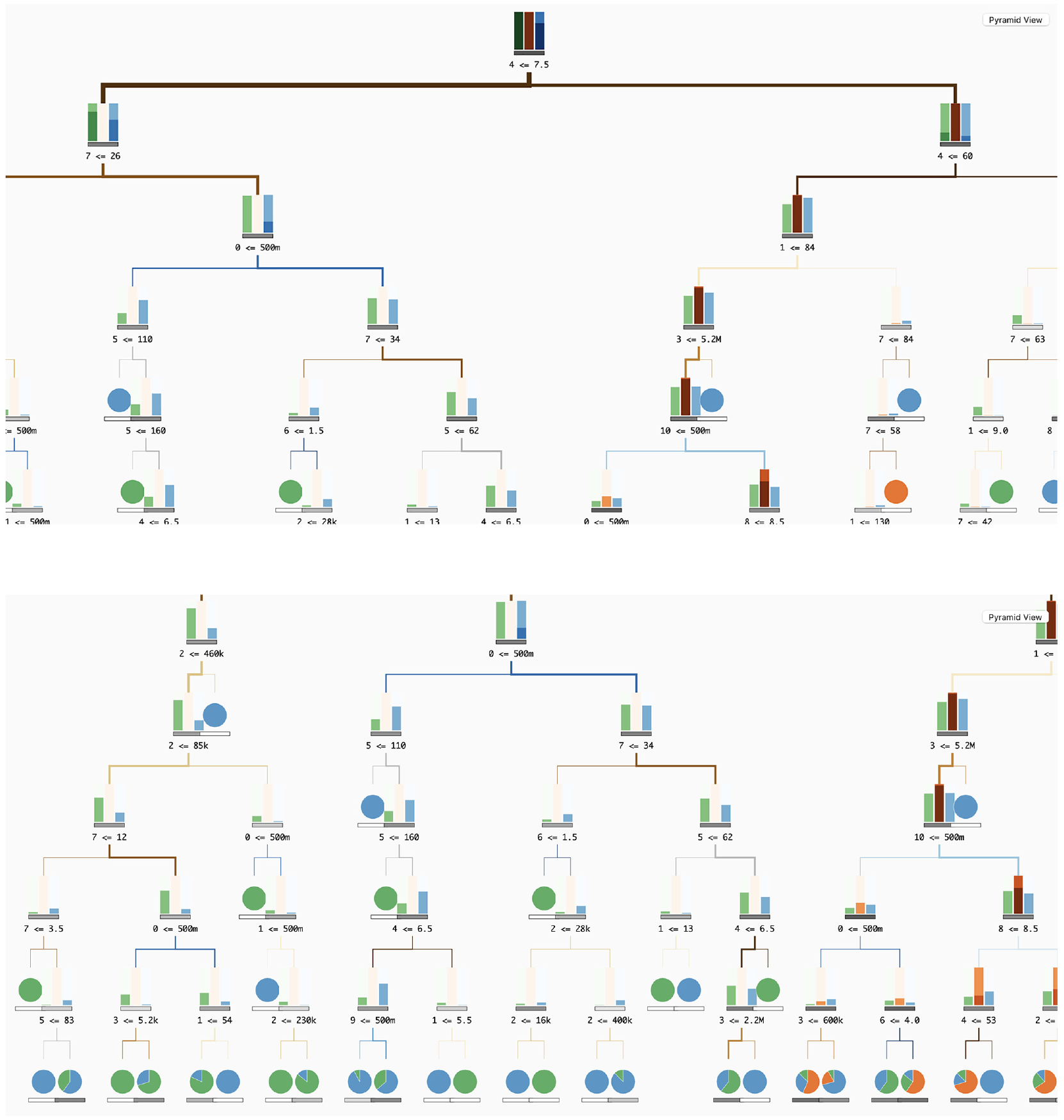
Additionally, users can analyse each tree independently (
By choosing multiple trees, the user can observe a pattern where DTs, on the left side of the scatterplot, exhibit fewer splits and more leaf nodes at upper levels, while trees on the right have a higher number of splits and fewer leaves at lower levels. This pattern suggests a correlation between impurity and the DT’s ability to effectively identify features for sample classification. For instance, after selecting a specific tree on the scatterplot (Figure 8), the user can perceive that from the root node, the majority of samples classified as ‘SMS’ (orange) go exclusively to one side. In the child node on the left, there is no orange bar, and on the right, the orange bar has the same representation as in the root node. The split rule is based on ‘avg sms/week’ being smaller than 6.6, implying that values above 6.6 may be classified as an SMS contact channel.
Visualisation of the Decision Tree (DT) that was previously chosen by the user.
In terms of interaction, the user can over each split feature number to reveal the corresponding feature name. Additionally, when hovering over the feature bar in the upper left corner, the tree is updated to highlight all splits associated with that feature. For example, by selecting the ‘avg sms/week’ feature, it becomes apparent that this feature is predominantly used in the root and at the fifth level.
To visualise an overview of each tree, users can select either the ‘Scatter View’ or ‘Pyramid Pie’ buttons. When examining the ‘Pyramid Matrix’, it becomes apparent that this DT does not use all features, as indicated by the blank spaces. Similar patterns are observable compared to the ‘Pyramid Matrix’ of RF models. For instance, pairs like [gender, bundle] and [gender, tariff] exhibit comparable patterns, wherein, before the threshold line and with high values of bundle and tariff, the classification tends towards ‘voice’. Conversely, on the right side of the threshold and with lower values of bundle and tariff, the class tends to be email’. While additional insights can be derived, we will refrain from further elaboration for simplicity’s sake.
Finally, when viewing the Pyramid Pie, we can see that, for example in this tree, the class sms appears mostly in features like avg kb/week and avg sms/week. Also, the features client app and standing order are the ones where the class voice is more prevalent.
On scalability
To illustrate our tool’s ability to accommodate larger decision trees (DTs), we employed the same Random Forest (RF) model but with an increased tree depth of seven levels. In the ‘Classification Grid’, scalability is seamlessly managed, with each bar within the grid being adjustable to accommodate varying levels (see Figure 9). Additionally, when employing larger trees, a horizontal scroll bar appears within the ‘Classification Grid’ area. Afterwards, if the user selects a DT in the upper right scatterplot, the visualisation of the corresponding tree appears in the bottom area. Initially, and although the nodes’ representation are slightly reduced in size, the tree will not be fully visible in the visualisation area (Figure 10(a)). However, the tree can be instantly explored and analysed by horizontally and vertically scrolling within the DT visualisation area (Figure 10(b)).
Visualisation of the Classification Grid with a RF model with seven tree depth levels.
Screenshots of the DT visualisation area with a Tree with seven depth levels: (a) at first the user only sees the root of the tree and (b) by scrolling down and left, the user can see the tree’s bottom left side.
Discussion
Our tool facilitates the analysis of RF models by enabling the exploration of their results and the analysis of each independent DT. In the upper part, the user can first overview how the features in the data influence the overall classification, detecting the ones with higher impact (bar graph of importance, upper left corner). In the scatterplot (upper right corner), the user can overview all trees within the RF model and distinguish them by impurity (how well data was classified in each DT) and feature importance.
The user can also analyse how each feature influences each class individually in the Classification Grid. In this, we present an overview of the features’ influence on classification per level, enabling the user to detect, regardless of the values, which feature may be more related to which class. For example, in Figure 1, we can see the features ‘gender’ and ‘month antique’ have more classifications as voice as the colour associated with this class is more predominant. In the same figure, we can see that ‘avg kg/week’ and ‘avg sms/week’ have a higher impact on the classification of ‘SMS’ (in orange). Also, with the histogram per feature of the values used in the splits (on the right side of the Classification Grid), the users can identify the most common values in the RF, and possibly identify thresholds for each feature.
Also in this more general view, we enable the user to analyse further the RF model and the impact each pair of features has on the classification – Pyramid Matrix. The pie matrix gives a better overview of the pairs of features impact in classification. The more evenly distributed the pie charts, the less impact a certain pair of features have in the classification distinction. On the contrary, the less evenly distributed the features are – bigger slices of a certain feature or a pie chart with only one class (full circle) –, the bigger the impact of the features in that class.
For a more detailed analysis – regarding the values contributed to the classification – the user can access the heat map chart. In addition to the analysis of how the different values– from low to high– influence the classification, we enable the confidence analysis of such classifications – by adding different shades of the same colour according to the distribution of the different classes in each range of values. Although this is a more complex visualisation, which requires a deeper understanding of how the colours are mapped and how the values are represented in the heatmap, we argue that this gives a better and more complete understanding of the ranges of values that influence the classification. These last visualisation models are available both to analyse the RF model as well as to analyse each DT.
To enable the analysis of each independent tree, the user can search for the DTs in the scatterplot in the upper right part of the tool. By hovering each DT, a tree visualisation is shown in the bottom part, enabling the user to analyse the different tree structures. Also, by comparing the tree structure and the impurity of the respective tree in the scatter plot, the user can perceive the differences between trees with higher and lower values of impurity, making it possible for ML developers to have a clearer insight into how these structures influence the classification.
Lastly, through the feedback obtained in informal meetings we could perceive that the tool can be generally understood if properly contextualised, and the tool equips data scientists with essential resources to enhance their RF models. Furthermore, it can be used by professionals such as marketing operators to interpret RF results and leverage this knowledge to improve their marketing campaigns.
Concerning generalisation, we assert that our tool is applicable to any other ensemble models based on trees. Furthermore, it serves a dual purpose, allowing for both analysis and interpretation, as well as verification and enhancement of RF models. Scalability is another consideration. In the ‘Classification Grid’, an increase in the number of tree depth levels leads to a wider grid, potentially causing visibility issues for all depths. To address this, we propose reducing the length of the bars and implementing a horizontal scroll. For the ‘Pyramid Matrix’ approach, the addition of more features may result in an overly complex shape. A possible solution involves decreasing the grid density (i.e. reducing the number of cells), making the squares for each feature pair smaller.
Conclusion
This paper introduces a visualisation tool designed for the analysis and interpretation of RF models, with a particular emphasis on feature analysis and their impact on classification. Our tool, named ‘Understanding the Forest’, comprises multiple visualisation models serving distinct purposes. Initially, we offer context on RF results, specifically regarding feature importance. Subsequently, the ‘Classification Grid’ provides a summary view of features, classes, and tree depth levels. We further explore relationships between features and their influence on classification using the ‘Pyramid Matrix’, which includes a pie chart grid for an overview of class distribution among feature pairs and a heatmap grid offering detailed insights into the influence of various feature values on classification. Additionally, our tool offers a Tree visualisation, allowing users to analyse each individual DT and comprehend the different rules employed in the model. The paper also includes a qualitative evaluation and a use case demonstration of our tool.
While a more in-depth analysis of the tool is recommended, based on our qualitative user studies and use case, we contend that this represents a crucial starting point for analysing RFs from diverse perspectives, thereby enhancing its interpretability. We acknowledge that our model requires refinements, such as the aggregation of ‘Occurrence Bars’ and stacked bars in the ‘Classification Grid’. As part of future work, our focus is on improving colour scales and enhancing interactive details on demand. We argue that further research on comprehending DTs and RFs is imperative, given its extensive use across various application fields. Therefore, our ongoing efforts involve refining our tool, not only by enhancing existing visualisation models but also by introducing new ones to represent data from alternative perspectives, thereby enriching user insights.
Footnotes
Funding
The author(s) disclosed receipt of the following financial support for the research, authorship, and/or publication of this article: This work is funded by the project POWER (grant number POCI-01-0247-FEDER-070365), co-financed by the European Regional Development Fund (FEDER), through Portugal 2020 (PT2020), and by the Competitiveness and Internationalisation Operational Programme (COMPETE 2020). This work is funded by national funds through the FCT - Foundation for Science and Technology, I.P., within the scope of the project CISUC-UID/CEC/00326/2020 and by European Social Fund, through the Regional Operational Programme Centro 2020.