
Abstract
This article presents an empirical user study that compares eight multidimensional projection techniques for supporting the estimation of the number of clusters,
Introduction
Visualizing the structure of a data set can be seen as an initial step toward gaining an understanding of the problem space represented by the data itself. Such an understanding can form the basis for subsequent analytical decisions, especially during exploratory data analysis
1
(EDA). Formally, data structure can be defined as “geometric relationships among subsets of the data vectors in the L-space,”
2
where
The concept of MDPs is commonly used in the context of dimensionality reduction (DR) and scatter plots. Here, for simplicity purposes, we extend its meaning to include any technique which visually encodes neighborhood relationships.
There are a variety of MDPs which can provide a two-dimensional (2D) visual representation of a data set’s structure. Scatter plots and scatter plot matrices are common examples for visually encoding data sets with dimensionalities between two and twelve. 3 For higher dimensional data sets, MDPs may rely on two types of unsupervised, machine learning (ML) techniques: DR and clustering. Both take a multidimensional data as input, and may produce an output which can later be plotted using a visual encoder (VE, also used for visual encoding), for example, scatter plots or dendrograms.
DR techniques project data from a multidimensional space onto a 2D or three-dimensional (3D) plane, enabling, thus, the use of common VEs (e.g. scatter plots or scatter plot matrices). Examples of these techniques—and which are of interest to this study—are Radial Visualizations (RadViz), 4 Star Coordinates (SC), 5 Principal Component Analysis (PCA), 6 and t-Stochastic Neighbor Embedding (t-SNE). 7
Clustering techniques, however, produce groupings and relations which can later be used to represent data structure. Examples of these—and also the ones of interest to this study—are hierarchical clustering (HC) methods (e.g. Ward), 8 ordering points to identify the clustering structure (OPTICS) density-based clustering, 9 Self-Organizing Maps (SOM), 10 and the Growing Neural Gas (GNG). 11 Their produced groupings and relations can, respectively, be visually encoded using dendrograms, reachability plots (RPs), unified distance matrices (U-Matrices), 12 and force-directed graphs (FDGs).
The previously mentioned MDPs provide a user-driven approach to estimating the number of
Within this context, we investigate the effects the aforementioned MDPs have on user-driven estimations of
MDPs versus MDPs
Q1.a: Are there differences between the estimates of
Q1.b: Will some MDPs lead to estimates which are closer to the number of classes in a data set?
Q1.c: Are some MDPs perceived as more usable than others for estimating
MDPs versus CQMs
Q2.a: Are there differences between the estimates given with MDPs and those given by NbClust?
Q2.b: Does NbClust provide estimates closer to the number of classes in a data set than users do with MDPs?
In order to answer these questions, we designed and carried out an empirical study where 41 participants were asked to estimate the number of clusters in a VE, as produced by eight MDPs, when applied to six real-world data sets. In addition, participants were requested to rank the usability of each plot, based on the following three aspects: confidence (how confident did a participant feel when given an estimate to the number of clusters), intuitiveness (how intuitive did the participant find estimating the number of clusters), and difficulty (how difficult was the task of estimating the number of clusters). To assess the second set of questions, we used 24 out of the 30 CQMs provided by the NbClust R library. These were applied on four CMs: single linkage, complete and Ward HC, and k-means.
In addition to these two sets of questions, and to further complement the work of Lewis et al.,
15
we investigated the effects of user experience in the estimation of
Q3.a: Are there differences between the estimates given by experienced and novice users?
Q3.b: Are there differences between the perceived usability of the MDPs?
Each MDP was assessed based on their static VE, as given by their default implementations and parameters. In that sense, we do not account for user interactions. The reason is that, in spite of any explicit designs for having user involvement (as in the case of RadViz and SC), all techniques require some parameter setting (even implicitly when using default values). This is a limitation of the study which is enforced both by the complexity of the problem space (provided by all possible parameter settings) and by the required number of experienced users (provided they needed to set those parameters). Even if based on default VE “snapshots,” we argue that the results from the evaluation still provide useful insight into the effectiveness and usability of each technique. Moreover, the results presented support users in the selection of MDPs for estimating
Organization of the article
Section “Background” is dedicated to reviewing and presenting the techniques compared in this study, while section “Related work” is dedicated to summarizing similar works. The evaluation methodology and metrics used in the study are described in section “Experimental methodology.” The results are presented in section “Results and analysis” and discussed in section “Discussion.” We finish this article with a summary of the lessons learned and some concluding remarks in section “Conclusion.”
Background
This section presents a summary of the MDPs assessed during the empirical evaluation, as well as a brief description of NbClust, which is the R library used as the automated approach for estimating
MDPs
An MDP, for the purposes of this study, is regarded as the combination of an ML algorithm and a VE. From a technical point of view, the former computes the neighborhood relations, whereas the latter makes a visual representation of them. The projection of a multidimensional data set onto a 2D plane cannot occur without either.
Figure 1 provides an overview framework of the characteristics of the MDPs of interest, that is, the independent variables of the study.
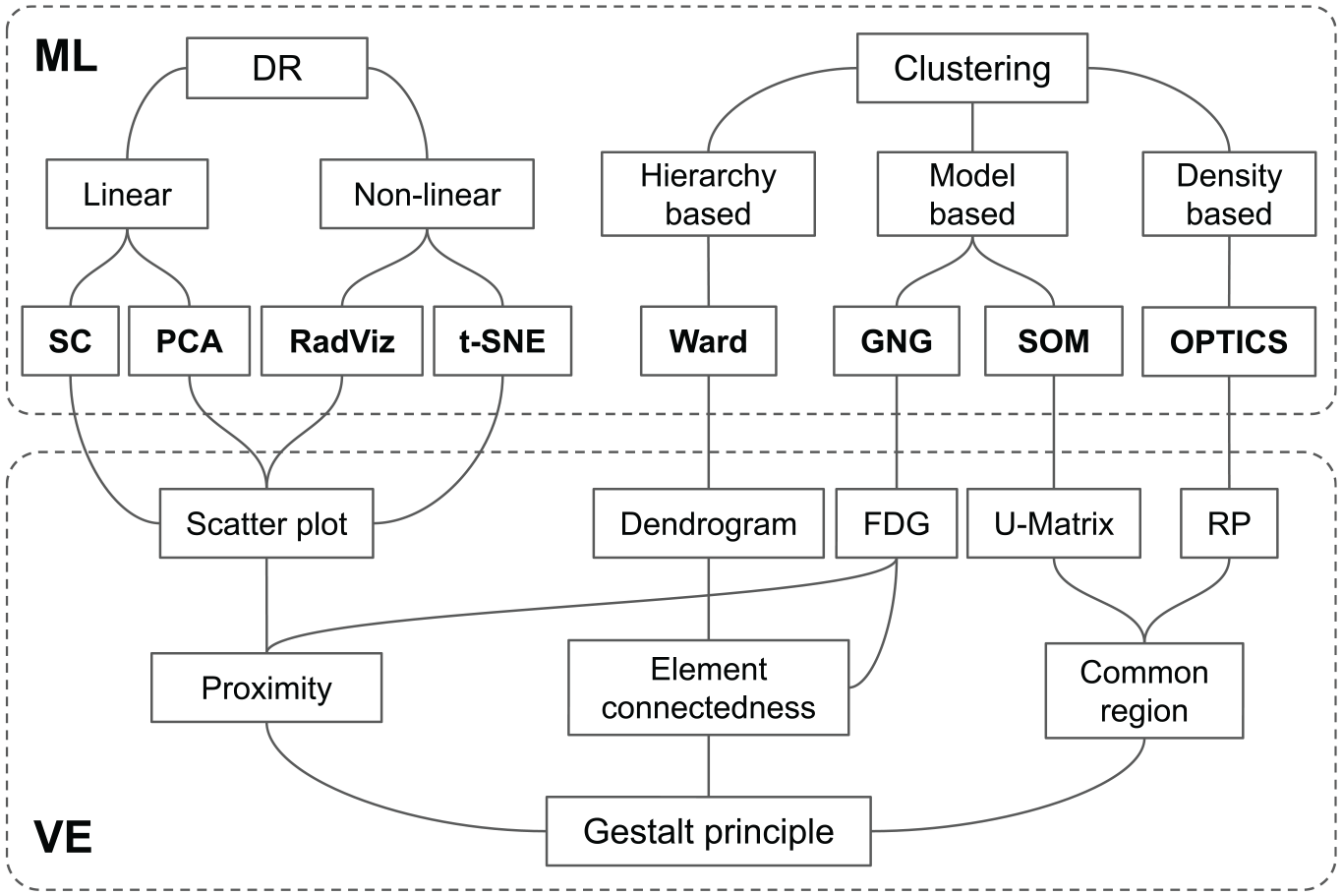
Overview framework of the multidimensional projection techniques used in the empirical study. The ML area represents machine learning techniques categorized as dimensionality reduction (DR) and clustering. The VE area corresponds to the visual encodings that were applied to each ML output.
DR
DR techniques are often divided into linear and non-linear. In this study, we account for two linear (SC and PCA) and two non-linear (RadViz and t-SNE) techniques. SC and RadViz are commonly regarded as visualization techniques and not as DR techniques. These, however, can be seen as such if their visual encoding (i.e. scaling and applying visual cues on Cartesian coordinates) is omitted—thus leaving only their 2D mappings (as latter described in this section). It may be argued that using either technique for the sole purpose of DR is unreasonable and, thus, not proper to label them under such category. However, we argue that such would also be the case of t-SNE, since its behavior as a general DR technique is uncertain, 17 and which is why it was presented by its authors as a visualization technique.
SC
The SC plot, proposed by Kandogan,
5
places in a radial manner as many axes as features there are in the data set. Each axis is represented by a 2D unit vector
PCA
PCA 6 reduces the features in a data set to a fixed (user given) number of principal components. The number of features is not only reduced but also sorted according to how informative they are, that is, by their variance. The intuition behind PCA is that correlated features are “merged,” while uncorrelated ones are kept separate. Reducing the number of features to two components enables the use of traditional scatter plots as well. PCA can also be used as a preprocessing technique, where the number of features is not necessarily reduced to two but more principal components.
RadViz
RadViz is a technique presented by Hoffman et al. 4 for visualizing DNA sequences. The solution places “anchor” points in the perimeter of a circle, where each anchor represents a feature of the data set (similar to SC). Data points are then arranged within the circle by attaching “springs” that pull with different forces from each anchor. The final position of each point is then given by the springs where the force is equal to zero. RadViz has the advantage of showing which feature in the data set contributes the most to the position of a data point, hence, to the cluster formations. Its effectiveness is, however, limited to a number of features.
t-distributed SNE
t-SNE 7 is a state-of-the-art DR technique for data visualization. The technique uses random walks on neighborhood graphs in order to capture both the local and global structure. The intuition is that neighborhood probabilities are constructed for each data point in the original multidimensional space, and then replicated (approximately) in a low-dimensional space. Unlike PCA, its performance is uncertain when applied as general DR technique, that is, when used to project to a number of dimensions greater than three. 7 The original t-SNE is computationally expensive, yet recent work has proposed means to accelerate it, for example, see Van Der Maaten 17 and Pezzotti et al. 18
The common VE for DR techniques is 2D or 3D scatter plots, or scatter plot matrices. All of these appeal to the Gestalt proximity visual perception principle, which states that elements close together tend to be grouped and perceived as similar. 19
Other well-known, non-linear DR techniques are Landmark Multidimensional Scaling (L_MDS), LSP (Least Square Projection), Isomap, and LLE (Local Linear Embedding). Isomap 20 and LLE 21 make use of graphs to capture neighborhood relations. The former looks at preserving global relationships, whereas the latter the local ones, that is, that of nearby data points. L-MDS 22 and LSP, 23 however, are the techniques which make use of landmarks in order to make faster projections, as well as to enable the projection of out-of-core data points, that is, new data points which were not part of the training data set.
Clustering
This type of MDPs relies on algorithms that group data points together based on a given criterion. Clustering algorithms can be classified in different ways, here we chose Fahad et al.’s: 24 partitioning-based, hierarchy-based, density-based, grid-based, and model-based. In this section, we give a description of the MDPs related to this study, and refer the reader to Fahad et al. for more details on each classification type.
Not all clustering algorithms, however, such as k-means, produce an output that can be used for visually encoding data structure. The ones hereby presented do provide such means.
Ward
HC represents a category of methods where data points are partitioned and arranged in a hierarchical manner. In the initial state of an HC algorithm, each data point is its own cluster. As the algorithm advances, each cluster is connected or merged with others until all data points belong to a single cluster. The merging criteria are set by a CM, for example, single linkage, complete, and Ward. In single linkage, for example, the criterion is based on the distance (e.g. Euclidean) between the two closest data points of two clusters. In Ward, however, the criterion is based on cluster variance. More detailed descriptions of these are given by Charrad et al. 13
HC algorithms produce a tree-like structure which can be visually encoded using dendrograms. This VE depicts data points at the bottom of the plot and then joins them with lines at different levels or heights. The height at which each joint takes place represents the distance measure used in the merging process. Perceiving groups in dendrograms can be related to the Gestalt principle of element connectedness, where pieces/elements connected together are perceived as part of the same object.
Optics
Developed by Ankerst et al., 9 OPTICS is a density-based clustering algorithm. The algorithm has a similar logic to that of HC algorithms in the sense that data points are brought together one by one. Clusters are initially formed by finding a set of core data points, that is, points with at least a given number of neighboring points falling within a fixed radius. Other data points are then grouped with a core point if they fall within a distance threshold around it, or around any other previously grouped point. A key characteristic of OPTICS is that data points are sorted in a way that can later be visually encoded using RPs. In this VE, the formed valleys can be seen as clusters, valleys within valleys as clusters within clusters, and peaks as outliers. Perceiving groups in RPs can be related to the common region Gestalt principle, where “elements that lie within the same bounded area (or region)” tend to be “grouped together;” 19 bounded areas, in the case of RPs, are represented by the hills or peaks.
SOM
Proposed by Kohonen, 10 SOM is a topology preserving neural network. The algorithm takes a set of n-dimensional training vectors as input and clusters them into a smaller set of n-dimensional nodes, also known as model vectors. These model vectors tend to move toward regions with a high training data density, and the final nodes are found by minimizing the distance between the training data and the model vectors. The output from an SOM can be visually encoded using a U-Matrix, which is a 2D arrangement of mono-colored hexabins (as proposed by Ultsch). 12 The opacity color of each bin is then varied based on a distance value between model vectors: the more opaque, the higher the distance, and vice versa. White regions in a U-Matrix can be interpreted as clouds of data points, whereas the dark regions as empty spaces. Perception of groups in U-Matrices can also be related to the common region principle, where boundaries are represented by the shifts in opacity.
GNG
GNG is described as an incremental neural network that learns topologies. 11 It is similar to SOM in the sense that the learning output is a network of nodes (units), and connections between nodes, as a representation of the data space. Unlike SOM, the algorithm starts with a two unit/node network, which grows and adapts to the data space as new data points are given. Growth is given in terms of units, and adaptation in terms of connections and units’ locations in the multidimensional space. Growth can be indefinite (bound only by the number of iterations) unless a limit is given. The topology built by the GNG can be visually encoded in a 2D plot using force-directed placement (FDG) or any other graph layout technique, as shown by Ventocilla and Riveiro. 25 Perception of groups in FDGs can be associated with the Gestalt principles of proximity and element connectedness. The latter is obvious since nodes are linked together by edges. Proximity, however, can be enforced, to an extent, by applying constraints on the lengths of the edges; this way, nodes close together may also be perceived as groups within connected networks.
CQMs and NbClust
Estimating the number of clusters
Due to the easy-to-deploy format of NbClust, we selected this platform for answering the second set of research questions (Q2) addressed in the study, which derived from a more general one: does user estimates of
Related work
Empirical studies
Sedlmair et al.
14
presented a four-category taxonomy of visual cluster separation factors in scatter plots (scale, point distance, shape, and position), which can be used to guide the design and the evaluation of cluster separation measures. The taxonomy was a product of an in-depth qualitative evaluation using a broad collection of high-dimensional data sets, using only multidimensional scaling techniques. Their method, as in our case, assumed data sets to have a representative class structure, so as to use as ground truth. In addition to the taxonomy, they found that two cluster separation measures failed to produce reliable results. Our study also accounts for similar measures, and the results are closely aligned to their findings, that is, there are often mismatches between what a quality measure proposes as a good
Sedlmair et al. 26 carried out a study on the use of scatter plots, in particular, 2D scatter plots and interactive 3D scatter plots, to support cluster separation tasks in high-dimensional data through an empirical study. Their results show that 2D scatter plots are often good enough and that their interactive 3D variant did not add notable additional support. These findings further contribute to justifying the design rationale of our study, concretely, to the use of 2D visual encodings.
Parallel coordinates plots (PCPs) for supporting cluster identification are investigated through user studies by Holten and van Wijk 27 and Kanjanabose et al. 28 Holten and van Wijk 27 performed a user study to evaluate cluster identification performance w.r.t. response time and correctness of nine PCP variations, including standard PCPs and other novel variations proposed by the authors. The authors highlight that a fair number of the seemingly valid improvements proposed (with the exception of scatter plots embedded into PCPs) did not result in significant performance gains. Kanjanabose et al. 28 compared the use of data tables, scatter plots, and PCPs for supporting value retrieval, clustering, outlier detection, and change detection tasks. Their results show that data tables are better suited for the value retrieval task, while PCPs generally outperform the two other visual representations in three other tasks.
Projection methods for multidimensional data were perceptually evaluated by Etemadpour et al.16,29 Etemadpour et al. 29 selected and compared four techniques as representatives of three distinct strategies for embedding data in two dimensions (PCA, Isomap, LSP, Glimmer, and Neighbor Joining (NJ) tree). Their results showed that the density and the shape of clusters significantly affected the perception during a visual inspection leading to bias; however, cluster size and orientation did not affect the interpretation significantly. This study was complemented with investigations using various analysis tasks (pattern identification, behavior pattern comparison, and relation-seeking) in Etemadpour et al. 16 The authors confirmed that no projection technique is capable of performing equally well on the different types of tasks and performance is dependent on data characteristics, especially in tasks that require distance interpretation.
In order to investigate the characteristics of the tasks that analysts engage in when visually analyzing dimensionally reduced data, Brehmer et al. 30 interviewed 10 data analysts from various application domains. They characterize five task sequences: synthesized dimensions, mapping a synthesized dimension to original dimensions, verifying clusters, naming clusters, and matching clusters and classes. These task sequences can be used in the design and analysis of future techniques and tools for data analysis, and have been used in the design of our study as well when specifying the clustering tasks.
Lewis et al. 15 compared formal CQMs with human evaluations of clustering. Their results show that some CQMs with seemingly natural mathematical formulations yield evaluations that disagree with human perception, while some CQMs such as Calinski–Harabasz measure and Silhouette have a significant correlation with human evaluations.
Reviews
There are several reviews that describe and compare DR techniques, for example, Van der Maaten et al., 31 Tsai, 32 and Sacha et al. 33 The exhaustive review on MDPs for visual analysis presented by Nonato and Aupetit 34 provides a detailed analysis and categorizations of the MDPs according to various parameters elaborating on the impact of their properties for visual perception and other human factors. Nonato and Aupetit 34 also presented a user evaluation investigating the impact of the distortions produced by these techniques when analyzing multidimensional data, followed by guidelines for choosing the best technique for an intended task. A complementary perspective is given by Espadoto et al., 35 where a large number of DR techniques are assessed in terms of different quantitative quality metrics.
Comparisons
Other existing works compare DR and visualization methods using various measures and metrics (but no user studies were carried out). Rubio-Sánchez et al. 36 compared two of the most popular projection-based visualization techniques that arrange features in radial layouts—RadViz and SC. After studying how the non-linear normalization used in RadViz affects exploratory analysis tasks (as detecting outliers), the recommendation of the authors 36 is that analysts and researchers should carefully consider whether RadViz’s normalization step is beneficial regarding the analysis tasks and characteristics of the data. One of the drawbacks of RadViz is, for example, that it can introduce non-linear distortions. García-Fernández et al. 37 presented a study of the stability, robustness, and performance of selected unsupervised DR methods with respect to variations in algorithm and data parameters and, in particular, they compared visualizations based on the use of PCA, Isomap, Laplacian Eigenmaps (LE), LLE, Stochastic Neighbor Embedding (SNE), and t-SNE. The results presented show that the local methods analyzed, LE and LLE (which retain the local structure of the data) are more likely to be influenced by small changes in both data and parameter variations, and they tend to provide cluttered visualizations, whereas data points in t-SNE, Isomap, and PCA are more scattered. t-SNE, due to the nature of its gradient, tends to form small clusters. The authors also highlight that when the visualization of the whole data set is required, graph-based techniques are not recommended, as the construction of the graph can lead to not fully connected graphs and so not all points will be embedded; however, PCA, t-SNE, and SNE are not affected by this problem. Of these, t-SNE and SNE present a better quality of the visualization, particularly when working with non-linear manifolds. 37
After introducing t-SNE, van der Maaten and Hinton 7 compared t-SNE to other non-parametric techniques for DR, in particular, Sammon mapping, Isomap, and LLE (t-SNE is compared to other techniques, up to seven, in their supplementary material). The authors demonstrate through various experiments that t-SNE outperforms the other techniques, but discuss three weakness of this method: (1) unclear how t-SNE performs on general DR tasks, (2) the relatively local nature of t-SNE makes it sensitive to the curse of the intrinsic dimensionality of the data, and (3) t-SNE is not guaranteed to converge to a global optimum of the cost function. 7
In summary, our study complements the works of Sedlmair et al., 14 Lewis et al., 15 and Etemadpour et al.16,29 by the following:
Studying the agreement between estimates of
Comparing the agreement between human and machine (CQM) estimates of
Studying different data sets and MDPs—including those which are cluster-based—as well as a larger set of CQMs.
Comparing MDPs in terms of usability.
Studying the impact of user experience in estimating
Experimental methodology
This section elaborates on the participants, the configuration of the study, visual cues, and the used data sets.
Participants
Forty-one participants took part in the study, 31 male and 10 female, with ages between 22 and 60 years. Their background varied between informatics, computer science, engineering, physics, data science, bioinformatics, cognitive science, cybersecurity, and game research. We asked about their years of experience analyzing data, that is, using any type of data and tool (e.g. Excel, Python, and SPSS) to draw conclusions. Seven had no previous experience, seven had 1 year or less, 10 had 2–3 years, and the rest 17 had 4 or more years. The only precondition to participate in the study was to be aware of the concept of clusters within the context of data analysis. All participants had normal or corrected normal vision.
Procedure
The procedure of the study was as follows: (a) an introduction to the study, (b) personal information, (c) general task description, (d) main tasks and questions, and (e) wrap-up questions. This was all given as a questionnaire in printed copies.
In (a) participants were given a general description of what was expected of them, that is, to identify clusters (groups of data points in a data set) as you perceive them through different visual techniques. Here was also stated that there were no right or wrong answers, and that they were to answer based on their own perception and intuition. Personal information (b) covered gender, age, field of study, years analyzing data (i.e. using any type of data and tool to draw conclusions), and whether they were aware of the concept of clusters. The questionnaire was anonymous, and no other personal information was gathered.
Further introduction to the task was given in (c), where it was explained that different plots were shown in the following pages of the questionnaire, that for each a number of clusters was to be estimated, and that three subjective questions were to be answered:
How confident do you feel about your estimation of the number of clusters?
How intuitive did you find the plot in order to estimate the number of clusters?
How difficult was it to give the estimated number of clusters?
Figure 2 shows an example of how the main tasks were given in (d). The description of the tasks varied depending on the type of VE. For those using the scatter plots (i.e. PCA, t-SNE, RadViz, and SC), the task was to “Circle groups of points.” For RP, the task was to “Surround valleys with a circle;” for HC to “‘Cut’ the tree with one horizontal line, at a height you find reasonable. Each branch cut by the line is cluster;” for SOM to “Circle the clouds (white areas);” and for GNG to “Circle groups of nodes.”
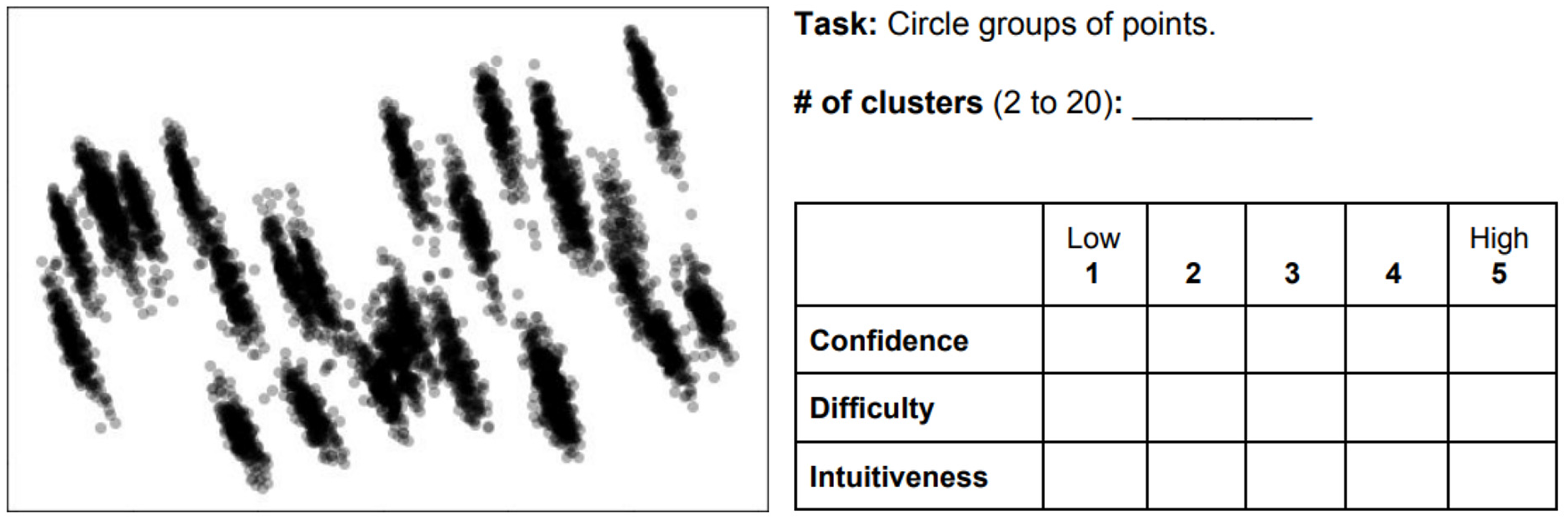
Case example where participants had to estimate the number of clusters by marking them in the plot, and then answer three subjective questions about the task: confidence, difficulty, and intuitiveness.
The number of clusters to estimate was limited to a range between 2 and 20. The purpose was to prevent participants from looking for too fine-grained clusters (i.e. indefinitely larger than 20)—therefore reducing the uncertainty of the task—and to emulate ML-driven clustering where
To provide a further understanding of the less common techniques (i.e. HC, RP, SOM, and GNG), the following descriptions were also given:
RP: in RPs, valleys are clusters and peaks are data points far from their cluster center. Valleys within valleys are clusters within clusters.
Dendrogram: the root of the tree (top) represents the whole data set, and the leaves (bottom) each data point. Branches (lines) connect data points, and groups of data points, based on some similarity. Leaves in a branch can be seen as a cluster. The longer the branch, the more distant its leaves from the leaves of other branches.
U-Matrix: in a U-Matrix, white areas are like “clouds” of data points, whereas darker areas are empty spaces. Clouds can be seen as clusters.
Graphs: each circle/node represents a set of data points; the bigger the node, the more data points it represents. Connected neighboring nodes are somewhat similar. Networks and nodes cramped within a network can be seen as clusters.
Three plots were laid out per page. Plots belonging to a visual technique (e.g. PCA) were placed subsequently on both sides of a paper (one plot per data set, three plots per page, six per paper). Their order was randomized within each paper, and each paper was randomized per participant. The study had a within-subjects design.
Finally, in (e), the questionnaire concluded with “which type(s) of plot(s) did you find less intuitive (not easy to understand) for estimating the number of clusters?” and, in a “general comments” box, the participants were welcome to write their final impressions/comments.
No limit of time was given. Participants could take the questionnaires with them and answer when and wherever they could. This may be seen as a limitation to the study, since context variables (e.g. noise and company) may have an impact on the responses. Such variability was sought to be diminished through corrected statistical inference (i.e. Holm–Bonferroni).
Data sets
Six data sets were used—four from the UCI ML repository 38 and two from projects within our institution. The data sets from UCI were Iris, Abalone, Breast Cancer Wisconsin (Diagnostic), and Isolet. One of our project data sets, regarded as Expressions, was about facial expressions and heart rate of a participant while playing games. The second data set, Weather, contains 7 years of aggregated weather data from a specific region in Sweden; this data set is used to predict certain condition associated with wheat in a farming project. All data sets came in table-like format (i.e. CSV), with ratio values only, with the exception of the labels, so that Euclidean distances are meaningful. Table 1 shows all six data sets, sorted by the number of features from left to right, plotted using each of the eight MDPs. Four of the data sets contain labels: three in Iris; two in Breast cancer; seven in Weather; and 28 in Isolet. For the purposes of this study, it is assumed that the features and values of the data sets are informative enough to represent, and distinguish, the members (data points) associated with each label.
The different plots evaluated in the study. MDPs (y-axis) applied to six data sets (x-axis, sorted by the number of features). The size, dimensionality, and number of labels are given for each data set.
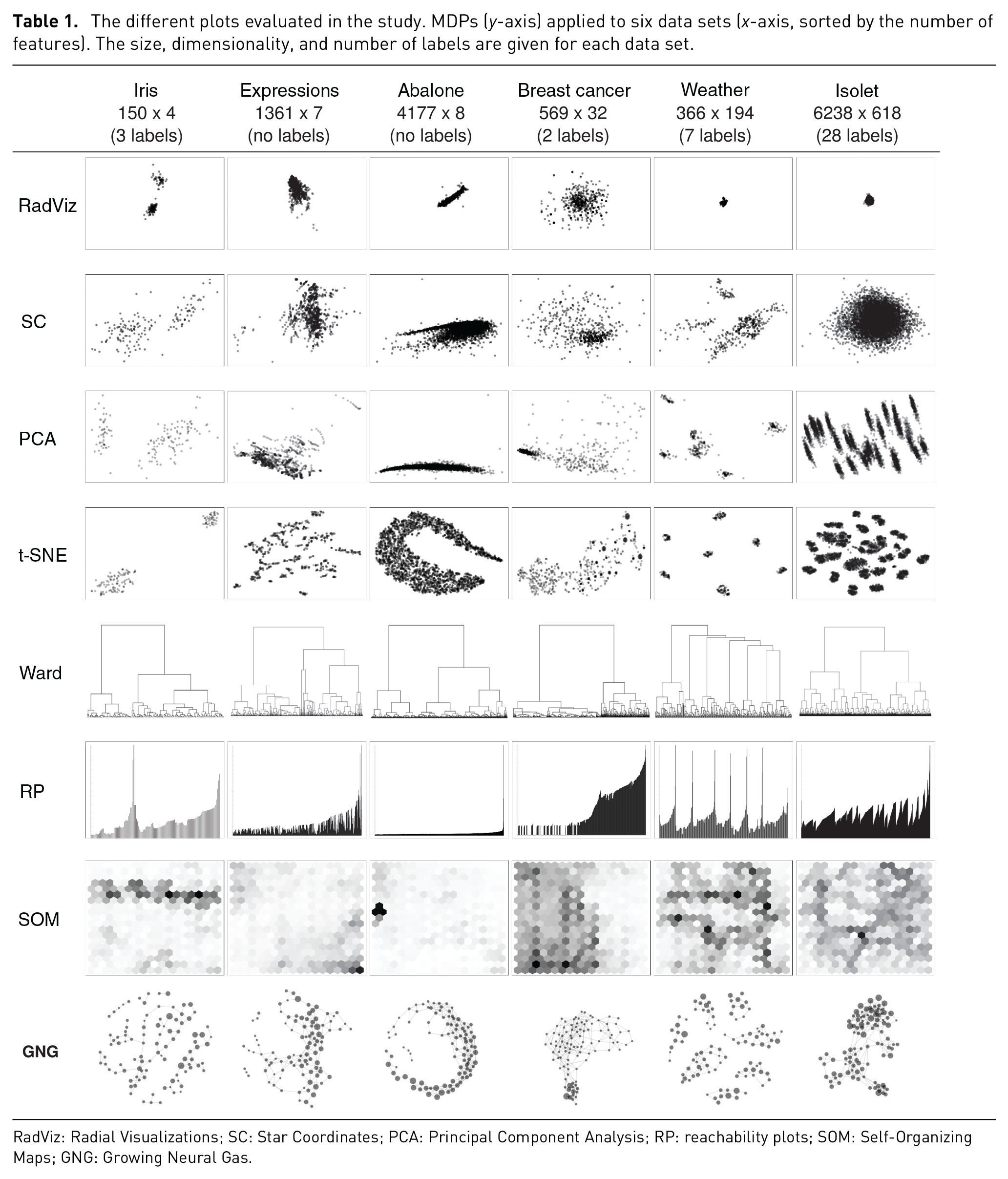
RadViz: Radial Visualizations; SC: Star Coordinates; PCA: Principal Component Analysis; RP: reachability plots; SOM: Self-Organizing Maps; GNG: Growing Neural Gas.
Criteria
Selecting representative data sets for these types of studies is challenging mainly because there are no properties that reflect the inherent cluster patterns of a multidimensional data set—size and dimensionality are arguably not enough. Sedlmair et al.’s 14 cluster separation factors represent a strong contribution in this direction. These, however, are dependent on the users’ visual perception and, therefore, on the layouts produced by MDPs themselves. This means that one would have to project data sets using some MDP before defining the cluster separation factors that apply to each of the data sets. In spite of these limitations, we relied on their work while accounting for other variables.
Our selection of the data sets was driven by the following criteria: real-life data sets with a commonly used format and value types in ML; accessible and frequently used; varied in size, dimensionality, and the number of labels; resulting in varied visual patterns (i.e. in terms of Sedlmair et al.’s clumpiness and shape factors); and, finally, suited for the selected set of MDPs.
From the UCI repository (publicly accessible with real-life data sets), we filtered by:
Format type matrix (table-like, e.g. CSV), which is a commonly used format in the ML community.
Data type multivariate, and attribute type real and integer; and categorical as long as it was only for labels.
The number of attributes greater than three (i.e. multidimensional data sets).
The number of instances greater than the number of attributes, and lower than 65,536, which is the limit of instances handled by the hclust method in R.
Used for the task of classification and clustering.
The search resulted in 58 data sets. These were further filtered by non-image related, and then sorted by number of hits in order to account for relevance. Iris, Breast cancer, and Abalone were in the top 5. From this point, we sought for variety in terms of number of attributes, size (instances), labels, and cluster patterns. Iris and Breast cancer had different number attributes, instances, and labels, and also resulted in different cluster patterns when applying the different MDPs. Subsequently, other data sets were filtered out to avoid similar properties to these two. Abalone was then selected for having different number of attributes and instances than Iris and Breast cancer, but especially for its cluster pattern (such Gaussian-like patterns are common in the Biology domain, particularly in relation to RNA transcripts, e.g., the E-MTAB 5367 transcriptomics data set from ArrayExpress). Finally, Isolet provided the next set of distinctive characteristics, especially in terms of number of labels and cluster patterns.
Parameters and visual cues
All ML techniques were deployed using the default parameters as given by the libraries used, with the exception of SOM and GNG, which had their number of units set/limited to a 100.
PCA and t-SNE were deployed using the Python library, scikit-learn. Their resulting 2D projections were then plotted using Matplotlib scatter plots. RadViz was computed using the Pandas visualization library; Ward (HC), RP, and SOM were computed using R. Ward was performed using the hclust method, with Euclidean distance and Ward.D2 as merging method. RP was deployed using the dbscan library; and SOM using the kohonen library with a hexagonal grid of 10 times 10 for all data sets. GNG was computed and visually encoded using VisualGNG. 25 SC was implemented by one of the authors based on the specification given by Kandogan. 5
All VEs were customized to have gray-scale colors. The opacity of the data points in scatter plots, and nodes in FDGs, was reduced to 30% (α = .3); the size of the circles was set to 15 points (as given by the Matplotlib Python library), except in the case of VisualGNG where nodes’ size varied based on the number of data points represented by their corresponding unit. Finally, all axis cues were removed. These were considered unnecessary for the task since users were unaware of the data sets used.
Results and analysis
Transcription and preprocessing
For consistency, all the answers to the questionnaires were transcribed manually by one of the authors.
Not in all cases did participants complied to the tasks as expected. Some participants, for some plots, did not give an estimate of
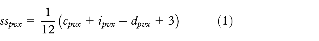
Answers to subjective questions—confidence, intuitiveness, and difficulty—were summed and scaled between zero and one (the value for difficulty was inverted)
where

where
Histograms are provided in the supplementary material for participants’ estimates, usability ratings, and NbClust estimates.
Statistical analysis
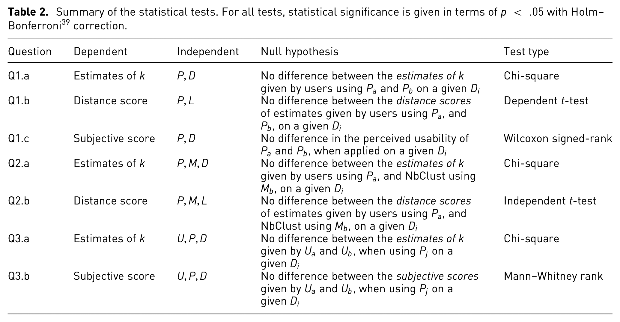
The statistical analysis is divided and described in three parts, one per each set of research questions. A summary of the independent variables is shown in Table 3, and a summary of the statistical tests is shown in Table 2. For all tests, statistical significance is given in terms of Holm–Bonferroni 39 corrected p < .05. The resulting p values from the statistical tests are provided in the supplementary material.
Summary of the statistical tests. For all tests, statistical significance is given in terms of p < .05 with Holm–Bonferroni 39 correction.
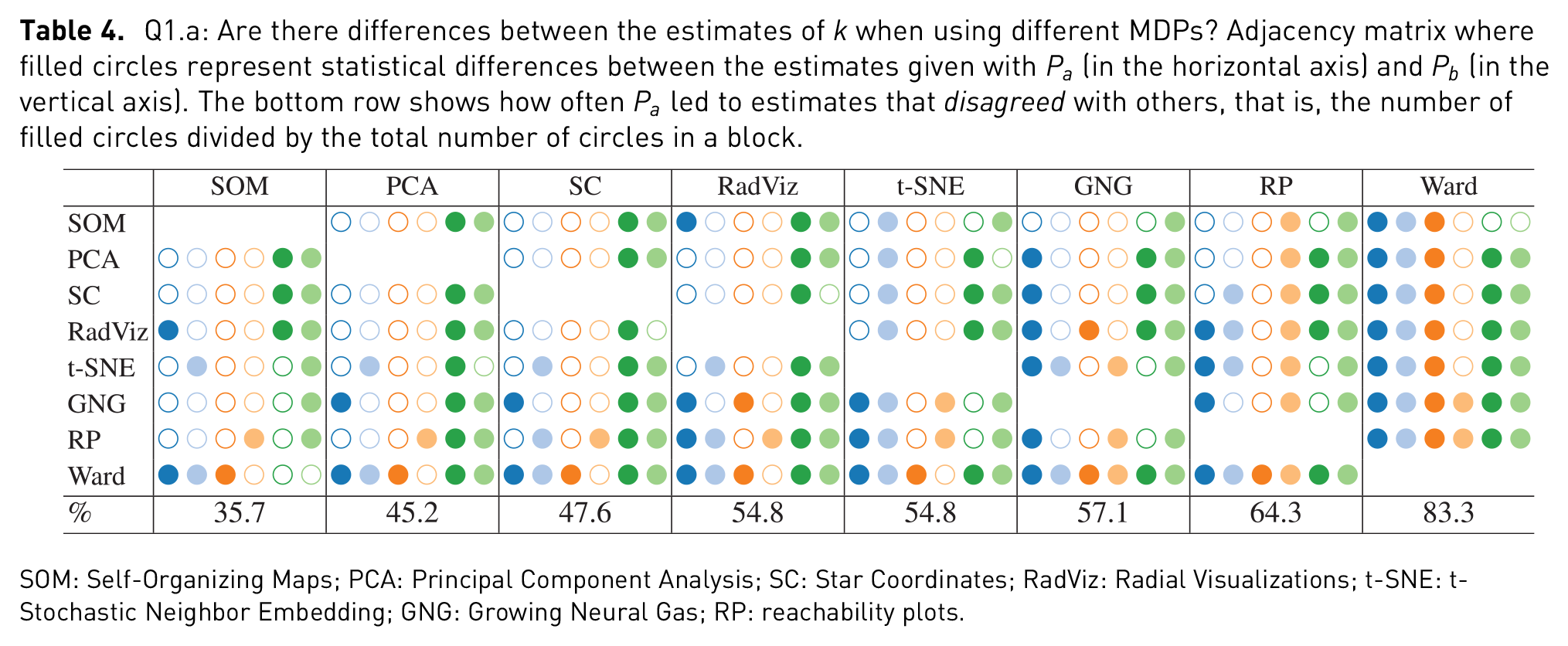
In order to facilitate the analysis of the results, we make use of a set of enriched Tables (4 and 6–9)—one for each of the questions in Table 2. Each cell in these tables is encoded as a circle, and each circle represents a statistical test comparing an element in the y-axis (row), with an element in the x-axis (column), for example, a chi-square comparing estimates of
Summary of independent variables used in the statistical analysis.
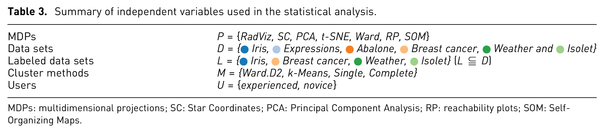
MDPs: multidimensional projections; SC: Star Coordinates; PCA: Principal Component Analysis; RP: reachability plots; SOM: Self-Organizing Maps.
MDPs versus MDPs
Q1.a
Figure 3 depicts the distribution of the estimations of
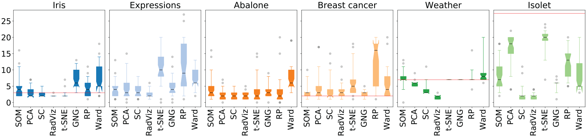
Estimations of
Q1.a: Are there differences between the estimates of
SOM: Self-Organizing Maps; PCA: Principal Component Analysis; SC: Star Coordinates; RadViz: Radial Visualizations; t-SNE: t-Stochastic Neighbor Embedding; GNG: Growing Neural Gas; RP: reachability plots.
Adjacency matrix showing the number of times
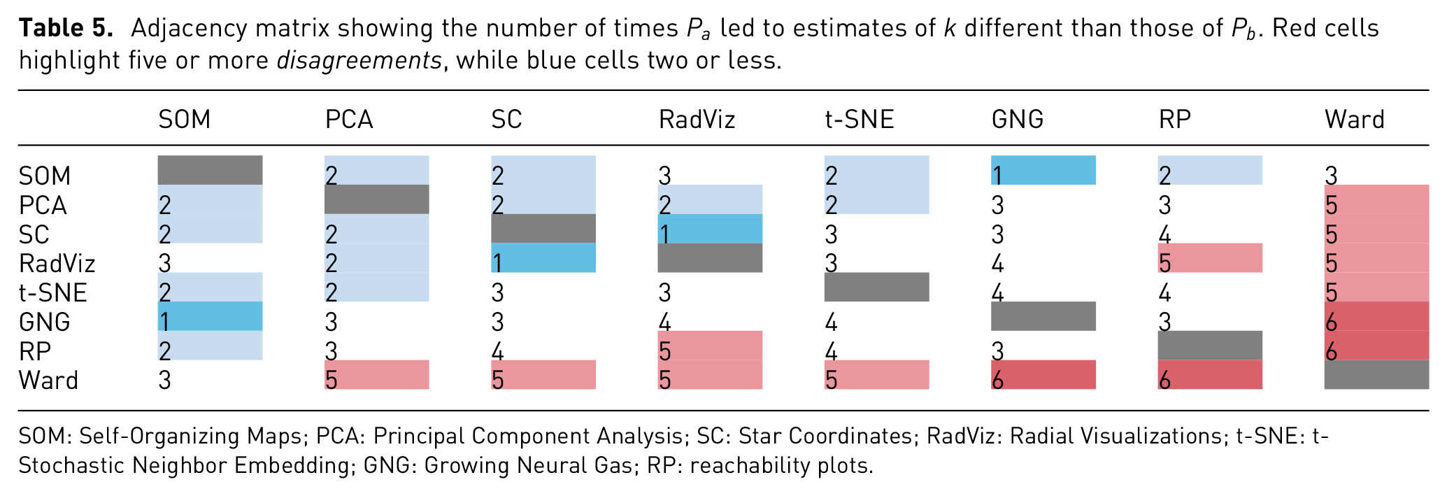
SOM: Self-Organizing Maps; PCA: Principal Component Analysis; SC: Star Coordinates; RadViz: Radial Visualizations; t-SNE: t-Stochastic Neighbor Embedding; GNG: Growing Neural Gas; RP: reachability plots.
Q1.b
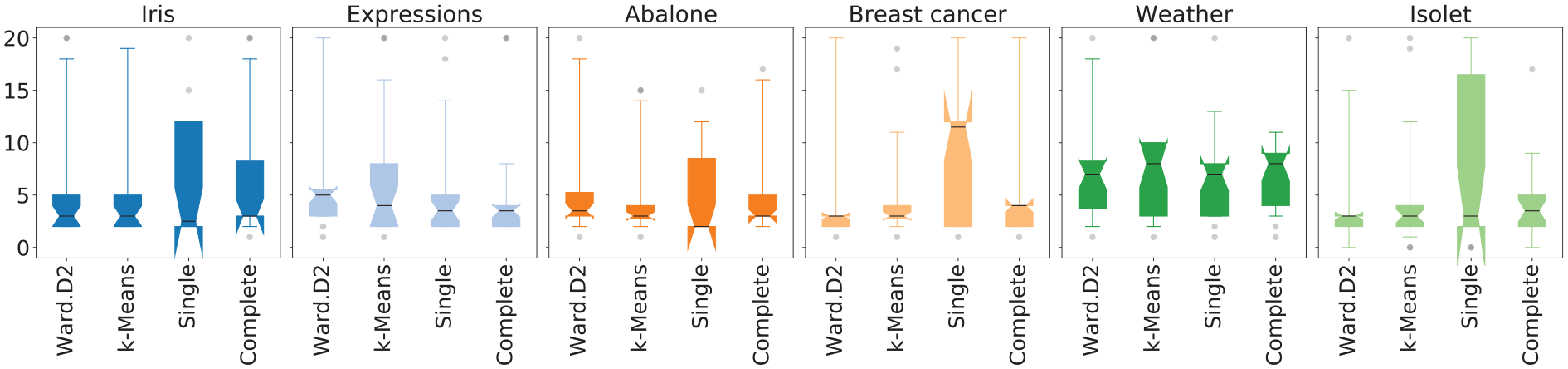
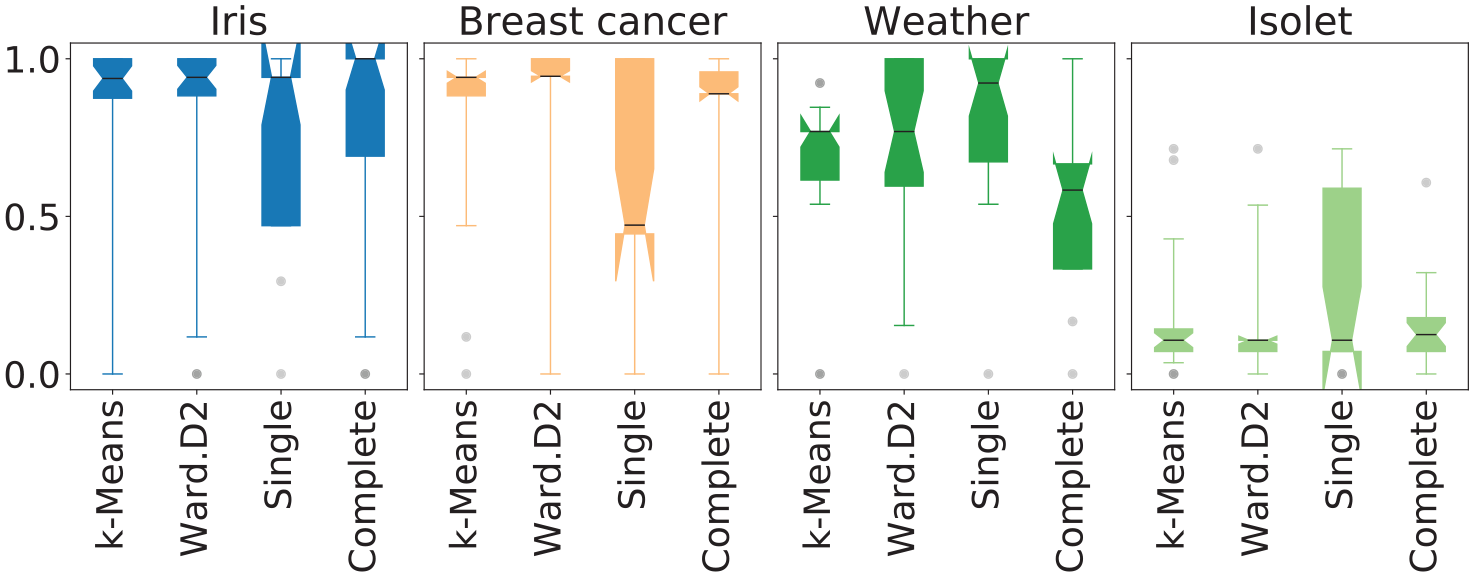
Figure 4 depicts the distributions of the distance scores (computed as defined in equation 2) for each MDP and data set, while Table 6 shows the results from the statistical analysis. The differences between the mean of the distance scores were assessed using the dependent t-test. Unlike the analysis applied for Q1.a, the winnings (where
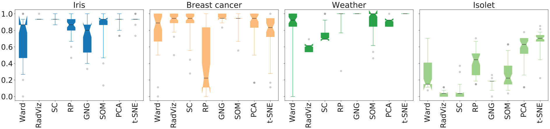
Distance scores for each
Q1.b: Will some MDPs lead to estimates which are closer to the number of classes in a data set? Adjacency matrix where filled circles represent statistical difference in the mean distance score between
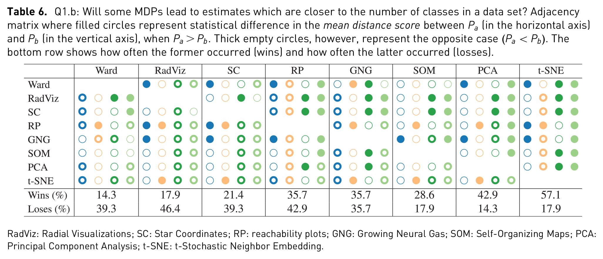
RadViz: Radial Visualizations; SC: Star Coordinates; RP: reachability plots; GNG: Growing Neural Gas; SOM: Self-Organizing Maps; PCA: Principal Component Analysis; t-SNE: t-Stochastic Neighbor Embedding.
Q1.c
Figure 5 shows the distributions of the subjective scores (computed as defined in equation 1) as boxplots, while Table 7 shows the results from the statistical analysis. The distribution of the subjective scores was assessed using the Wilcoxon signed-rank test. Similar to the analysis of the previous question, wins (where
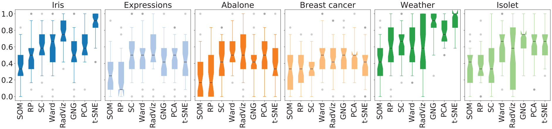
Subjective scores for each
Q1.c: Are some MDPs perceived as more usable than others for estimating
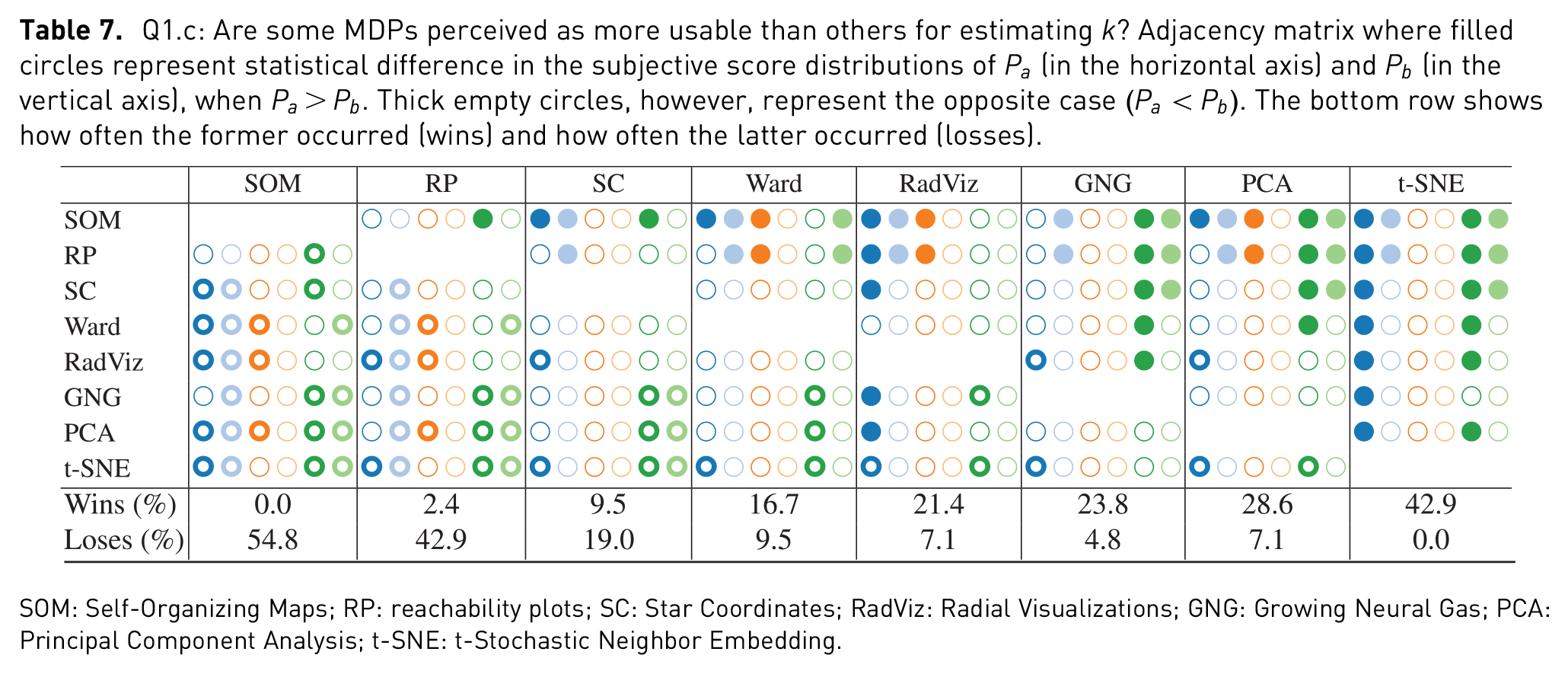
SOM: Self-Organizing Maps; RP: reachability plots; SC: Star Coordinates; RadViz: Radial Visualizations; GNG: Growing Neural Gas; PCA: Principal Component Analysis; t-SNE: t-Stochastic Neighbor Embedding.
MDP versus NbClust
Q2.a
Figure 6 shows the distributions of the estimated
NbClust’s estimations of
The distributions of the estimation frequencies of each
Q2.a: Are there differences between the estimates given with MDPs and those given by NbClust? Filled circles represent statistical difference between the estimates given with
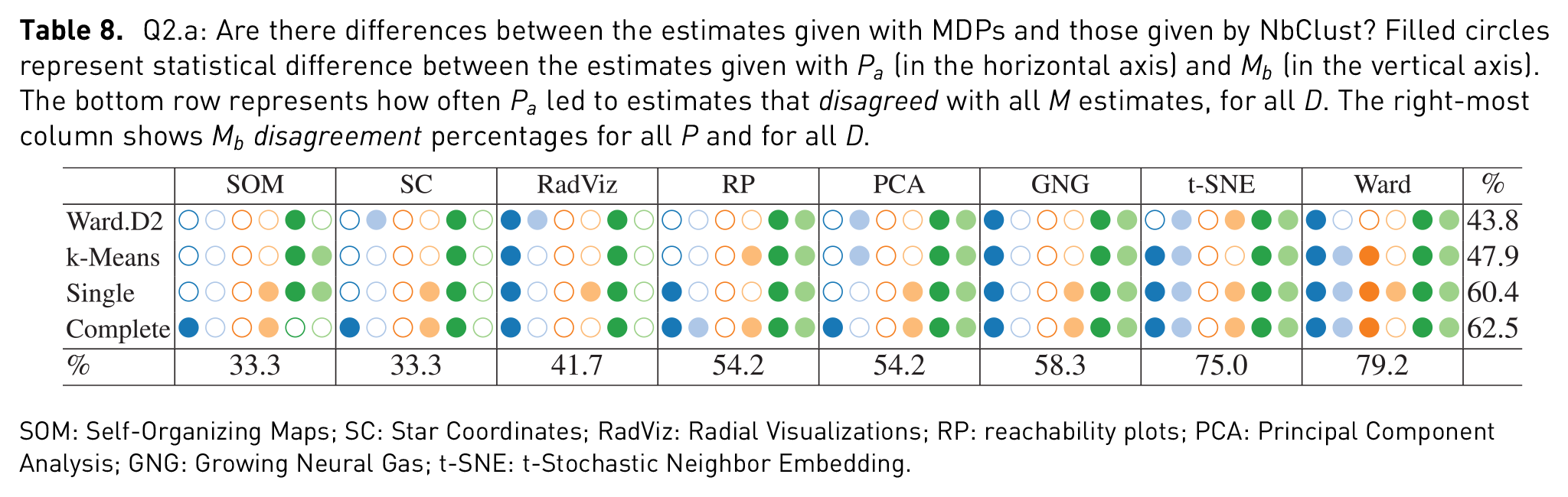
SOM: Self-Organizing Maps; SC: Star Coordinates; RadViz: Radial Visualizations; RP: reachability plots; PCA: Principal Component Analysis; GNG: Growing Neural Gas; t-SNE: t-Stochastic Neighbor Embedding.
Q2.b
Figure 7 shows distributions of the distance score computed on the estimations of NbClust for each
Distance scores for each
Q2.b: Does NbClust provide estimates closer to the number of classes in a data set than users do with MDPs? Filled circles represent statistical difference in the mean distance score between
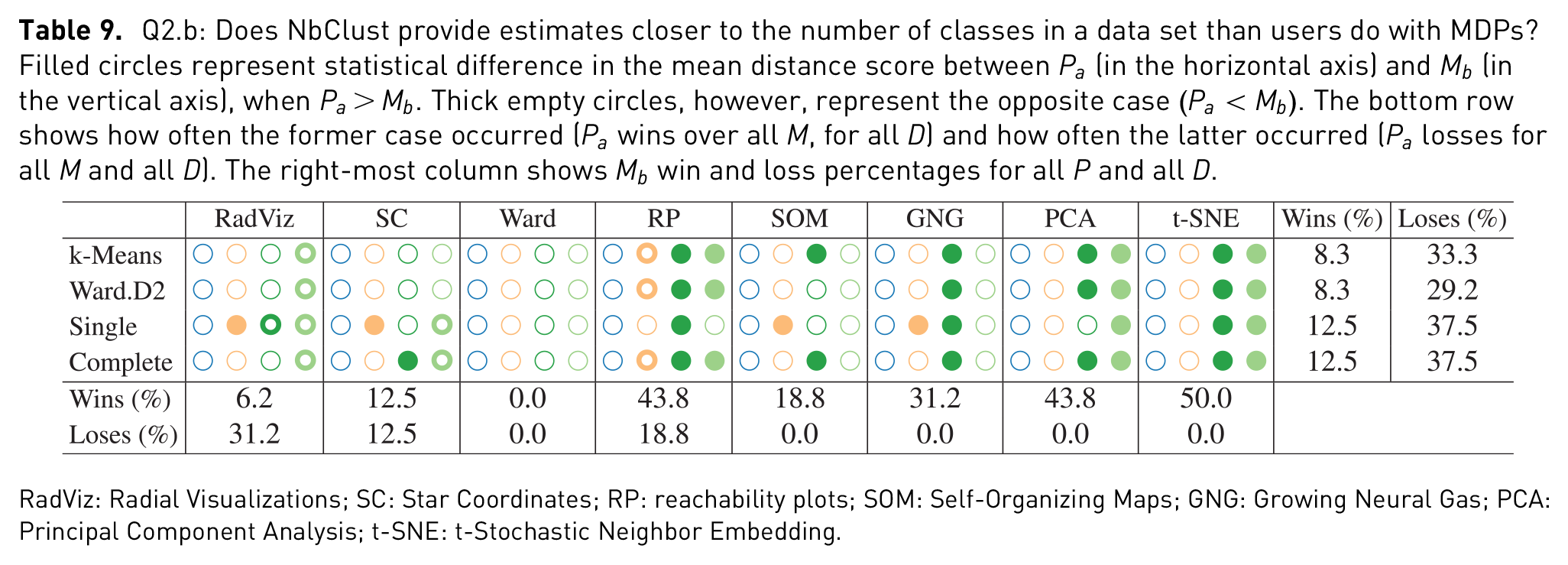
RadViz: Radial Visualizations; SC: Star Coordinates; RP: reachability plots; SOM: Self-Organizing Maps; GNG: Growing Neural Gas; PCA: Principal Component Analysis; t-SNE: t-Stochastic Neighbor Embedding.
User experience
Q3.a
Users with 4 or more years of experience analyzing data were regarded as experienced users (17 users), and novice otherwise (24 users). The estimates from both groups were compared using chi-square, as done in Q1.a. None of the results were significantly different and, therefore, they are only shown in the supplemental material.
Q3.b
Subjective scores from the two groups of users were compared using the Mann–Whitney rank test. Results did not show any significant difference for the subjective scores either and, hence, they are only shown in the supplemental material.
In addition to the statistical analysis, an overall performance plot is provided in Figure 8. In this plot, the farther to the right, the better the subjective score, and the farther to the top, the better the distance score. Visual techniques closer to the upper right-most corner may be said to have performed better than those closer to the lower left corner, in terms of both subjective and distance scores. The values of the subjective scores were computed taking only labeled data sets into account, and all data sets for the subjective scores.
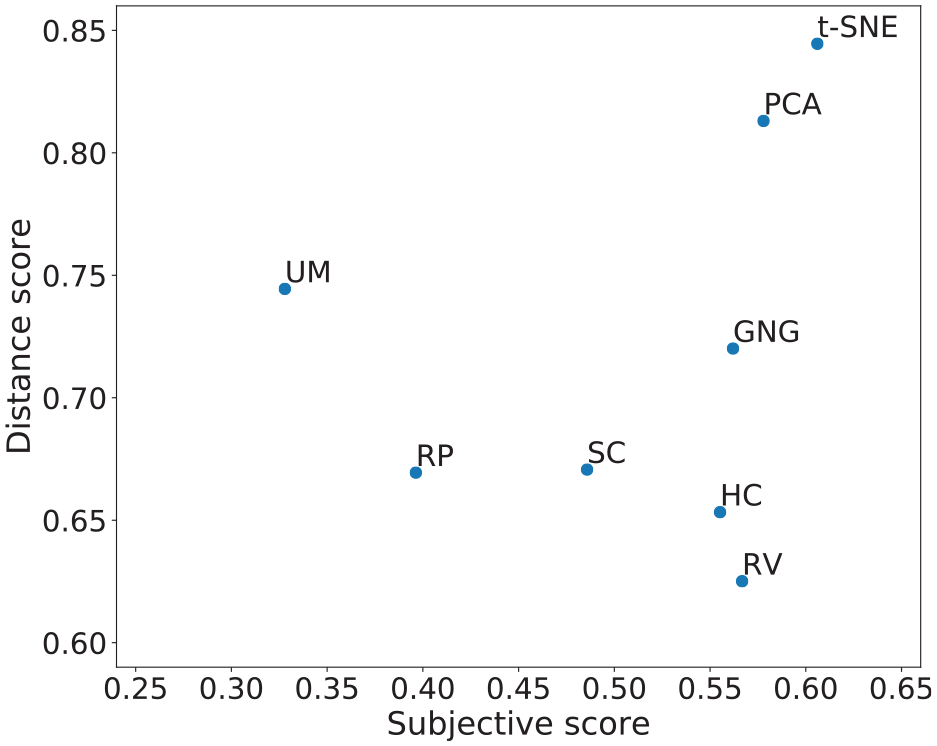
Distance score versus subjective score. To the right-most side are MDPs with a higher mean subjective score, and to the upper-most side are MDPs with higher distance score.
Discussion
The discussion is addressed per question basis. For simplicity, statistical difference between two samples will also be regarded as disagreement.
Q1.a
There are differences in user estimations of
Two other patterns emerge from the analysis of Table 4. The first is the frequency of the statistical differences between Ward and all other MDPs, for all data sets. 83.3% of the times the estimates given with Ward disagreed with other estimates. This result is further highlighted in Table 5, where disagreement counts for Ward are above 5 in all but one case. It is apparent that Ward will often lead to estimations different from those made with other MDPs; in that sense, Ward may be disclosing certain data structures that other techniques do not.
The second pattern drawn from Table 4 is the frequency with which higher dimensional data sets led to different estimates. The Isolet data set led to 25, out 28 comparisons, to statistically significant differences; this is compared to 14 statistical differences in the case of the Iris data set. One of the non-disagreements was between RadViz and SC, which is understandable when looking at their corresponding plots. It seems apparent that both SC and RadViz will tend to lead to the same estimates (as in the cases of Iris, Expressions, Abalone, and Breast cancer) and that both are quite limited by the dimensionality of the data sets (as in the case of Isolet); nevertheless, SC provides a more descriptive visualization of data with higher dimensionality than RadViz (as in the case of Weather). This result echoes the findings of Rubio-Sánchez et al. 36
Q1.b
Closeness to the number of labels in a data set also varied from one data set to another. We hypothesized that t-SNE would often lead to closer estimates than other MDPs. In 57.1% of the cases, t-SNE led to closer estimates than other MDPs, thus proving the hypothesis right. However, looking at the results on a per-data set basis, t-SNE had a high number of losses for the Breast cancer data set. Looking at the corresponding plots in Table 1, it is apparent that t-SNE is capable of disclosing more complex patterns than other MDPs—which is aligned with García-Fernández et al.’s 37 observation on the nature of t-SNE’s gradient. The highest number of losses and the lowest number of wins, however, are attributed to Ward. This result, and the previous, may be worth taking into account when selecting Ward for a given data analysis task.
Q1.c
Results in Table 7 show that RP and SOM were the ones with the lowest perceived usability for the purpose of estimating
In a more general sense, it seems that the confidence, intuitiveness, and difficulty to estimate the number of clusters, as well as the accuracy of the estimations, are influenced by both the complexity of the patterns inherent in the data set, and in the capacity of an MDP to disclose them. Furthermore, it is worth noting that perceived usability is not bound to the VE. That is, FDGs can be perceived as more usable than scatter plots, as it is shown by the wins and losses of SC (9.5% and 19.0%) and RadViz (21.4% and 7.1%), when compared to GNG (23.8.7% and 4.8%).
Q2.a
Revising the bottom row of Table 8, it is possible to see similar patterns like the ones mentioned for Q1.a. Concretely, a high percentage of disagreement on Ward’s behalf, as well as in the cases where higher dimensional data sets (Weather and Isolet) were used. Moreover, it is possible to see an equally high disagreement with t-SNE estimations. These numbers are further highlighted in Table 10, where in three out of four times, both Ward and t-SNE had statistical differences in over four of the six data sets. In other words, given six data sets with similar properties to the ones in this study, chances are that the estimates given with Ward or t-SNE will be statistically different from those given by NbClust, as with the settings given here. Furthermore, looking at the same table, it is worth noting that the least number of disagreements came from estimates given with k-means and SC. It may be worth investigating further to see if this lack of statistical differences generalizes to more data sets.
Number of times
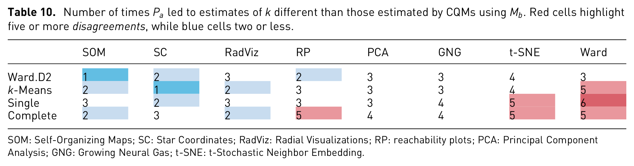

SOM: Self-Organizing Maps; SC: Star Coordinates; RadViz: Radial Visualizations; RP: reachability plots; PCA: Principal Component Analysis; GNG: Growing Neural Gas; t-SNE: t-Stochastic Neighbor Embedding.
Q2.b
Table 9 shows a lower number of statistical significant differences, when compared to the previous analyses. However, in the cases of where higher dimensional data was tested (Weather and Isolet), differences were much more frequent. For those, estimates given by NbClust performed poorly when compared to user estimations. Only when compared to RadViz and SC, for the Isolet data set, most CMs provide closer estimates to the number of labels. If the task is to estimate the number of labels in a data set, it may be safe to suggest to do so using an MDP, rather than NbClust. This is aligned with the findings provided by Sedlmair et al. 14 and Lewis et al. 15
Q3.a
Aligned with the findings of Lewis et al.,
15
we found no statistical difference in the estimates given by experienced users and novice users. Echoing—and also extending their work—it is not only possible to have inexperienced users estimate
Q3.b
In regard to the differences between the perceived usability of experienced versus novice users, no case led to a statistically significant difference either. We hypothesized that Ward would have a statistically significant difference in between both groups since dendrograms are a commonly used VE in some fields such as bioinformatics. To our surprise, the hypothesis did not hold.
Limitations
The problem space represented by data sets is vast if we consider it in terms of properties such as type (i.e. table-like, image, text, and graph), values (i.e. continuous, categorical, and mixed), dimensionality, size, and sparsity; and cluster separation factors (as proposed by Sedlmair et al.) 14 such as shape, mixture, and separation. This problem space is farther extended if we account for MDP classification types such as DR or clustering, linear or non-linear, density-based, model-based, stochastic or deterministic; as well as for VE types such as graphs, scatter plots, bars, gradients, and trees; and the Gestalt principles they represent (e.g. proximity, similarity, common area, and connectedness). All of these different characteristics will ultimately have an impact on a resulting layout, thus limiting the generalization of the results.
Taking the previous into account, the results here presented may be generalized to the described MDPs, with their default parameter settings, when applied to data sets with similar cluster patterns to the ones shown in Table 1. In other words, to data sets resulting in similar clumpiness and shapes, when visualized using RadViz, SC, t-SNE, PCA, SOM, GNG, Ward, and OPTICS. The impact of other MDPs—such as Isomap, LLE, and LSP—on the visual perception of clusters is left for future work.
Conclusion
This article presents an empirical study comparing several structure visualization techniques used for estimating the number of clusters of a multidimensional data set. The MDPs evaluated were RadViz, SC, 2D projections using PCA and t-SNE, U-Matrices derived from SOM, dendrograms from Ward clustering, RPs from OPTICS density-based clustering, and FDGs from the GNG. We compare the MDPs to each other and to automated methods of estimating
Ward (dendrograms) will likely lead to estimates of
SC and RadViz, however, will most likely lead to similar estimates when applied to lower dimensional data (~32 features as in the Breast cancer data set), but may lead to different estimates when applied to slightly higher dimensional data (~94 features as in the case of Isolet).
t-SNE will likely lead to estimates which are closer to the number of labels in a data set, when compared to other MDPs. Ward, however, will likely lead farther estimates.
SOM (U-Matrix) and RP will likely lead to low usability ratings when used for estimating
CQMs on CM centroids will likely lead to estimates which are different to those given with Ward and t-SNE.
CQMs on CM centroids will likely lead to estimates which are not as close to the labels in a data set, as user estimates given with an MDP.
During our analysis, we consider assuming that no disagreement between two estimations may be interpreted as a possible agreement. That is, if no statistically significant difference is found between two sample estimations, then it is possible for the estimations to be the same or similar. Even if this is a valid possibility, it is not possible to say that two similar estimates are describing the same clusters; it is probable, both from the user and the CQM-CM side, that two similar sample estimations describe different groups of data points. This we hope to analyze by taking into account the clusters marked by the participants during the study.
Moreover, in the context of estimating the number of clusters, we learned that the task and nature of the data sets have a high impact on the perceived usability of a visual technique. This implies both, limitations to the generalizations of the findings in this study and opportunities for future research. In regard to the former, our findings can be generalized to data sets whose properties are similar to the ones shown in this study. Nevertheless, it is a challenge to describe such properties, since size and dimensionality do not suffice to describe the inherent complexity of the patterns in a data set. The efforts of Sedlmair et al. 14 provide useful guidelines in this matter.
In the future, two lines of investigations continue the work are presented here. The first one concerns the understanding of cluster patterns (given a visual technique, why are data points distributed as they are?). The second concerns combining and applying these findings into generic solutions, and evaluating their usability for the purpose of EDA. This latter study will be targeted to users with well-defined expertise within a given domain (e.g. researchers in biology or medicine), in order to investigate their particular requirements.
Supplemental Material
Supplementary_material – Supplemental material for A comparative user study of visualization techniques for cluster analysis of multidimensional data sets
Supplemental material, Supplementary_material for A comparative user study of visualization techniques for cluster analysis of multidimensional data sets by Elio Ventocilla and Maria Riveiro in Information Visualization
Footnotes
References
Supplementary Material
Please find the following supplemental material available below.
For Open Access articles published under a Creative Commons License, all supplemental material carries the same license as the article it is associated with.
For non-Open Access articles published, all supplemental material carries a non-exclusive license, and permission requests for re-use of supplemental material or any part of supplemental material shall be sent directly to the copyright owner as specified in the copyright notice associated with the article.