
Abstract
Understanding how a classification result is generated and what role individual features play in the classification is crucial in many applications and, in particular, in medical contexts such as the translation of diagnosis biomarkers into clinical practice. The goal is to find (ideally simple) relationships between the features in multi-dimensional data and the classification for an explanation of the underlying phenomenon. Mathematical formulas allow for the expression of these relationships and can serve as classifiers. However, there are infinitely many mathematical formulas for the given features and they bear an inherent trade-off between complexity and accuracy. We present an interactive visual approach that supports domain experts to mitigate the trade-off issue. Core to our approach is a novel feature selection method, from which formulas are composed using symbolic regression and where state-of-the-art classifiers serve as a reference. To evaluate our approach and compare the achieved classification performance to the performance achieved by other state-of-the-art feature selection techniques, we test our methods with well-known machine learning data sets. Our evaluation shows that our feature selection method performs better than randomly selecting features for data sets with many features or when a low number of generations in the symbolic regression is required. Moreover, it consistently matches or outperforms state-of-the-art methods. Moreover, we apply our approach in a case study to a hemodynamic cohort data set, where we report our findings and domain expert feedback. Our approach was able to find formulas containing features that are in agreement with literature. Also, we could find formulas that performed better in the micro-averaged F1 score when compared to established histological indices.
Introduction
Classification refers to assigning class labels to data items based on their features, where the features often form a multi-dimensional data set. Many classifiers have been proposed for binary or multi-class classification purposes.1–6 They all come with advantages and limitations such that no single classifier can be considered the universal solution to all classification problems, but the choice of the classifier depends on the data and task at hand. While the performance of the classifier is generally of utmost importance, it is often similarly important to understand how the classifier comes to its decision. For example, for the translation of diagnostic biomarkers into clinical practice, it is crucial for the domain expert to understand the decision-making of a classifier. Ultimately, the domain expert must be in the position to explain the underlying phenomenon by a minimal set of features and their interplay. Mathematical formulas allow domain experts to formulate these relationships and can, theoretically, be derived from any state-of-the-art model. However, the complexity and readability of such formulas vary greatly depending on the model. For instance, deep neural networks combine all input features multiple times throughout many layers, which would result in extremely long formulas. Other models involve complex transformations of the input features (e.g. support vector machines 2 ) or even rely on randomness (e.g. random forest 4 ), rendering it difficult to obtain a single, simple formula.
Finding a simple formula is a non-trivial task, as it is a priori unclear how individual features need to be combined to achieve high classification scores. Hence, a search is required. Manual approaches have shown to not scale well to a large number of features. 7 On the other hand, depending on the set of allowed operations (such as addition or multiplication), and the number of features, the search space may be too large to run an exhaustive automatic search. Even if it were feasible, the issue of simplicity of the resulting formula cannot be solved automatically, as the answer depends on the exact task at hand. Hence, the inherent trade-off issue between accuracy and simplicity of such formulas needs to be resolved by a user-centric, semi-automatic approach.
To aid the user in this process, we propose an interactive approach to compose formulas that serve as classifiers from multi-dimensional data. The ongoing exchange with our collaboration partners from the cardiovascular imaging group motivated this work and allowed us to define tasks and requirements for our approach. An overview of our interactive visual system is depicted in Figure 1.
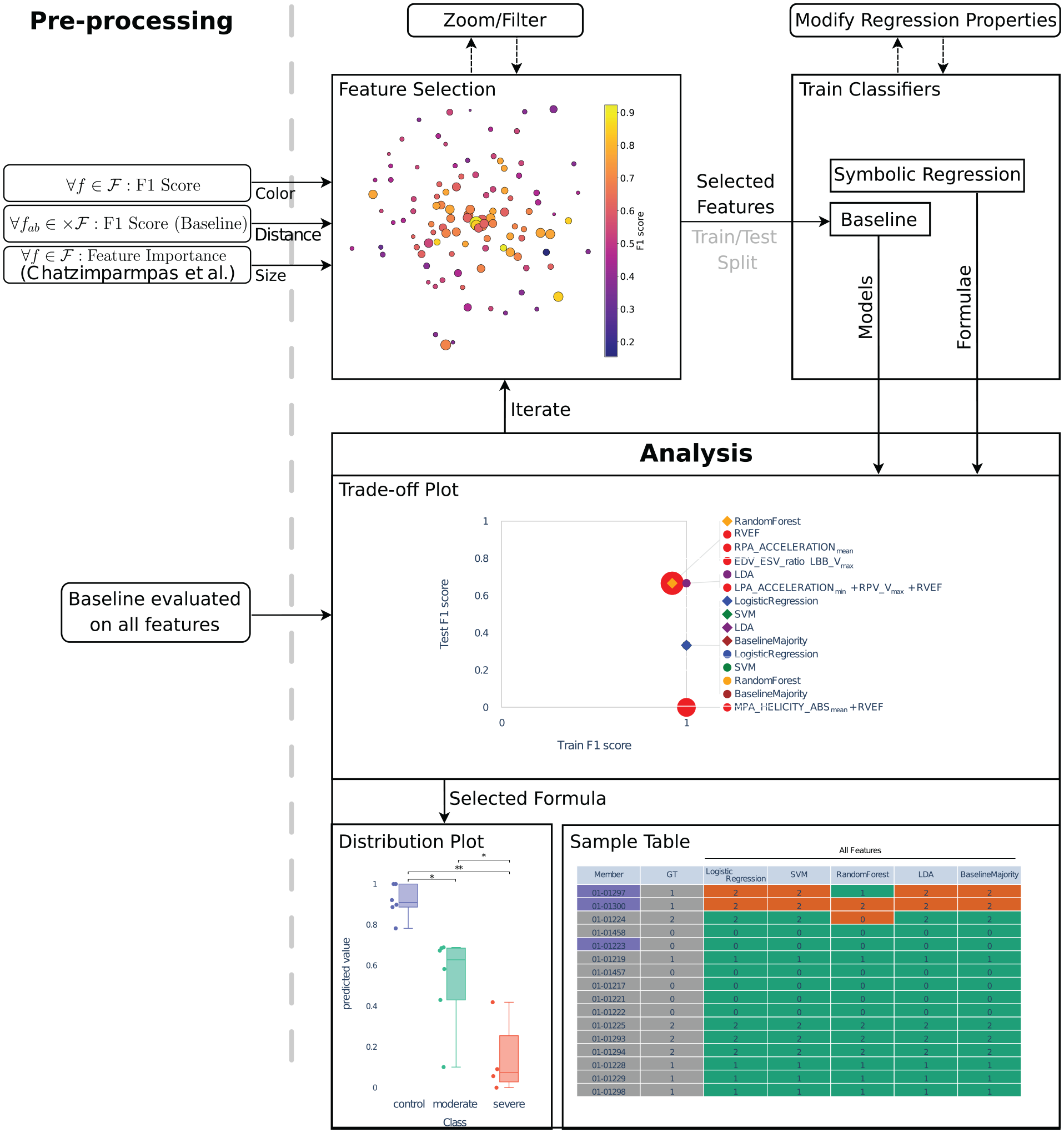
Overview of our approach: Given the set of all features
For the automated search component, we employ symbolic regression, 8 a genetic algorithm that tries to find a mathematical formula to describe the data, while allowing us to control the simplicity of resulting formulas. As reducing the size of the search space is still essential for such a search to find meaningful results in a reasonable time, we introduce a novel feature selection approach.
Central to the interactive feature selection step is an overview visualization of all features in a 2D embedding. The 2D embedding is computed using Multi-dimensional Scaling (MDS), 9 where the distance between each pair of features encodes their combined classification score. The resulting 2D scatter plot allows for the interactive selection of features, where color and size of the points encode the individual feature’s importance and classification score, respectively.
Once the user has selected a set of features, we compose formulas of these features using symbolic regression. To do so, we first split the data into a training and a test data set, as it is generally done for supervised classification. We rate the classification quality of each formula when applied to the training data and test data, which leads to two scores. We additionally rate the complexity of each formula leading to a third score.
The quality of the calculated formulas based on the three ratings is then analyzed in multiple coordinated views of statistical plots. Within these plots, the quality can also be compared against the performance of state-of-the-art classifiers, which serve as a baseline.
We tested our interactive visual system when applied to well-known machine learning data sets in an informal user study. We compare the classification performance achieved by the user-selected features to the performance achieved by features sets reported in other state-of-the-art articles. Finally, we apply our approach in a case study to a murine cohort data set acquired using 4D PC-MRI to analyze pulmonary hypertension in three different stages. We report findings and present feedback we received from domain experts when using our tool.
Our main contributions can be summarized as follows:
We introduce an interactive visual feature selection method that effectively reduces the feature space by leveraging pair-wise classification scores, per-feature classification scores, and feature importance to generate a feature space embedding.
We propose an approach to compose classifiers as formulas from labeled multi-dimensional data, which are compared against state-of-the-art classifiers in an interactive visual system.
We demonstrate our approach on multiple labeled multi-dimensional data sets and compare our user selections to state-of-the-art feature selection techniques.
We apply our approach to a pulmonary hypertension blood flow cohort data set acquired with 4D PC-MRI, from which hemodynamic features have been calculated, and report our findings as well as domain expert feedback.
In the remainder of the paper, we will first present our Task Analysis leading to the requirements for our system. At that point, we can discuss Related Work to our approach. As the goal of our approach is to find good classifiers, we next define what “good” means in the section on Classification Performance Calculation. Based on this measure, we then detail how the Feature Selection process is supported by our tool (Figure 1 top left). Having selected features, we explain how they are combined in the Formula Generation step (Figure 1 top right). All components then come together in the description of our Interactive Visual System that embeds the already explained steps and extends them with visual components for the analysis of generated formulas and their classification quality (Figure 1 bottom). Afterward, we present an Evaluation of our approach with multiple data sets, followed by a Case Study to analyze a hemodynamic cohort data set and respective Domain Expert Feedback. Finally, a description of Limitations and Discussion and Conclusion and Future Work wrap up our paper.
Task analysis
In multiple sessions with our collaboration partners from the cardiovascular imaging group, we discussed and analyzed their workflow and the typical problems they face in their research. Generally, they conduct animal studies to find non-invasive biomarkers extracted from time-resolved images acquired using four-dimensional phase-contrast magnetic resonance imaging (4D PC-MRI). In a first task (T1), all features are analyzed for statistical significance using statistical software, that is, they test if the animal cohorts can be separated through a single feature. However, even if a single feature may not serve as a classifier, the combination of multiple might be able to. Finding these combinations hence is the second task (T2). Due to the vast amount of features in spatio-temporal data, performing exhaustive computations to find the optimal classifier is often not feasible. Therefore, an interactive approach is desired to assemble classifiers (or biomarker candidates) that capture relationships between individual features. For the representation of these relationships, the domain experts prefer a mathematical formula over the alternatives, such as decision trees. The main reason for this is the familiarity of the domain with this particular representation. To give an example, the Teichholz et al. formula
10
From these tasks and details, we derived requirements with our collaboration partners that open the design space for our approach. We will later use these formulations to explain our design choices.
R1 Feature Overview: An overview of all features should be provided, such that the best, worst, and average performance of all features is assessable.
R2 Feature Detail: It should be possible to assess the individual features’ performance.
R3 Modelability: Each classifier should be represented by a single formula.
R4 Simplicity: The overall approach should favor a minimal set of features necessary to perform the tasks.
R5 Comparability: It shall be possible to compare different classifiers/formulas.
R6 Validity: Formulas shall be compared against a baseline, that is, state-of-the-art classifiers.
R7 Scalability: The approach should scale well with the number of classes (binary or multi-class), the number of features, and the number of samples.
R8 Interactivity: The formula composition process should be interactive, where necessary components may be computed in a pre-processing step.
Related work
In this section we discuss prior work on classification algorithms, automatic feature selection techniques, and why visual interactive feature selection techniques can yield better classification results.
Classification
Classification is a well-researched field with numerous existing algorithms. In this work, we focus on multi-class (R1), supervised classification algorithms. We focus on supervised algorithms since we assume the class labels to be known and can therefore improve classification performance during training. Classification algorithms can be classified into linear models like Linear Discriminant Analysis (LDA), 1 Support Vector Machine approaches (SVM), 2 tree-based models like Decision Trees 3 and Random Forest, 4 Bayesian models like Naive Bayes, 5 and Machine Learning models. 6 Different classification algorithms make different assumptions about the data. To capture different data properties, ensemble classifiers have been proposed.11,12 Ensemble classifiers combine the predictions of multiple classifiers into a more robust prediction. Similar to Haq et al., 13 we chose a linear SVM, L1-regularized Logistic Regression (L1-LR), and Random Forest (RF) as our baseline, as their underlying techniques and assumptions can be considered quite orthogonal to each other. These classification algorithms are quick and can have a good classification performance. However, the models of these classifiers tend to be more complex and it might be difficult to turn the models into a formula that can be easily interpreted (R3). We add LDA as a fourth baseline classifier, as it is straightforward to derive a formula from the model. However, the resulting formula is a linear combination of all features, that requires classes to be linearly separable, which cannot be generally assumed. Similarly, a linear SVM also computes a linear combination of features by applying a different decision function. L1-LR applies the Softmax function on the linear combination to obtain the class probabilities. Hence, the resulting formulas can become rather complex. Deriving a formula from an RF model is not straightforward, as one would first need to transform the individual trees and then apply a majority voting to retrieve the dominantly predicted label. 14 As our goal is to generate simple formulas, evolutionary algorithms can be used, as they allow us to search a large search space of features while taking into account simple models (R4). A taxonomy of different genetics-based classification algorithms was conducted by Fernandez et al. 15 However, these evolutionary algorithms tend to be slower with the number of features due to their iterative nature.
Feature selection
For classification tasks, feature selection plays an important role when the number of features is large. It was shown that the presence of redundant, irrelevant, or noisy features may affect prediction accuracy, 16 since models without integrated feature selection mechanism (such as convolutional neural networks 17 ) accumulate noisy contributions of each noisy feature. 13 To reduce the feature space, either feature extraction or feature selection methods can be used. Feature extraction methods tend to combine multiple features in more descriptive features, while feature selection methods try to find a subset of features that describe the data best. Since we do not want to transform the original features we will focus on feature selection methods. Some works18–21 were published that categorize filter selection methods into filter methods,22–24 wrapper methods,25–28 and embedded methods.3,4 A special type of wrapper method are genetic algorithms for feature selection,29–31 which try to find an optimal set of candidate features through natural selection of entities and an underlying functional that should be optimized.
These filter methods make different assumptions on the underlying data. There is no single feature selection method that works well for all data sets. Therefore, Haq et al. 13 present a feature selection approach using feature ranking and clustering to determine a suitable feature subset for classification. They employ multiple feature ranking techniques with different underlying assumptions regarding their regression function. This makes their approach more robust with regard to different data sets. Their approach filters out individual features based on their feature importance. Thus, their approach assumes that the least important features still perform badly, even when they are combined with other features. However, this might not necessarily be true. Therefore, we do not remove features prematurely but let the user decide which feature subset to keep.
Interactive visual feature selection
While automatic feature selection techniques might suffice in certain scenarios, it cannot be guaranteed that these approaches are able to find good minimal feature sets. 32 Therefore, multiple interactive visual feature selection methods were introduced that are user-centric and support data- or task-dependent feature selection. They can be categorized based on their visualization design into radial approaches,33–35 star coordinates, 36 scatter plot-based approaches,37,38 histogram-based approaches,39,40 and approaches using 3D visualizations. 41
Wentzel et al. 42 developed an interactive visual system for creating predictive models to estimate radiodose toxicities in head and neck cancer patients. They perform feature selection by encoding patient data into vectors based on organs and dose-volume histograms, using clustering algorithms to group patients and rank clusters by mean organ doses. In addition, they employ a constrained rule mining algorithm to generate dose thresholds for classification. However, they only derive threshold-based rules to explain their clinical use cases, while we are interested in an actual formula.
Chatzimparmpas et al.
7
employ a heatmap with features and feature ranking techniques as well as the mean feature importance based on all feature ranking techniques. The paper combines five feature ranking techniques namely Univariate Feature Selection (FS),
43
Impurity-based Feature Importance (FI),
44
Permutation FI,
45
Accuracy-based FI,
46
and Ranking-based FS
47
using Recursive Feature Elimination (RFE).
28
These techniques are integrated into their system by normalizing and averaging the scores and then using these scores to rank the features by importance. The user can select which features to exclude. As we believe our approach would benefit from a robust feature ranking technique, we integrated their feature importance into our approach. Chatzimparmpas et al. support filtered features to be analyzed further in a radial tree visualization. Each node in the tree encodes statistical measures like Pearson’s correlation coefficient and mutual information. The edges encode if the correlation between a feature and the transformed features increases or decreases, in general. For a selected feature more details can be shown in a graph visualization. Besides the encoding for Pearson’s correlation coefficient and mutual information, per-class correlation and variance inflation factor are encoded. This plot also allows for feature generation using four operations
In summary, we opted for a combination of an ensemble classifier and symbolic regression. The ensemble classifier allows for fast exploration of the feature space, while the symbolic regression is used to find a simple model with comparable classification performance. We choose symbolic regression as we ultimately want to generate a formula (R3). An embedding of the pair-wise feature classification performance, averaged feature importance, and single feature classification performance serves as an overview visualization. By taking those three aspects into account the users can interactively select a feature subset based on their background knowledge and use case.
Our approach generally aligns with the framework of biomedical data analytics as proposed by Nguyen et al. 48 That is, in order for domain experts to generate knowledge from their data, we also differentiate between Pre-Observation, including data pre-processing, such as normalization; Computational Analysis, where the feature embedding is computed; and Visual Analytics, allowing users to analyze the data using visualizations and interactions.
Classification performance calculation
Input to our approach is labeled multi-dimensional data, the dimensions of which we refer to as a set of features
To assess the performance of a classifier that is fitted on
where
It should also be possible for a single feature to serve as a classifier. In this case, the predicted label would be represented by the feature’s value itself, that is,
Feature selection
All classifiers that we use as a baseline (LDA, SVM, Logistic Regression, and Random Forest) are relatively fast to compute for a larger number of features. To compose formulas, however, we apply symbolic regression. 8 It uses a genetic algorithm that randomly initializes short formulas, picks the fittest among those formulas, and tries to converge to an optimal solution, that is, a solution with a high classification score, by applying genetic operations (such as selection, mutation, and cross-over).
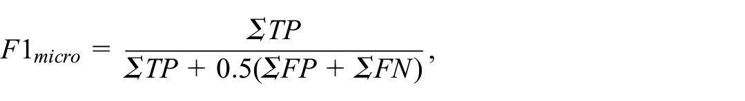
How fast a satisfactory solution can be found depends strongly on the number of features considered by the symbolic regression. We demonstrate this dependency by setting up a synthetic three-class problem
50
using the implementation of the scikit-learn library.
51
First, a 10-dimensional hypercube with side length 2 is constructed. Then, a total of 100 samples is distributed among normally distributed clusters
Line plot encoding the average number of generations needed by the symbolic regression to achieve an F1 classification score of 0.55 on a synthetic three-class problem with increasing number of additional random features. 50 The gray band encodes the 95% confidence interval.
We conclude from the experiment that reducing the number of features (being left with the most promising ones), on average, reduces the number of generations needed to find the same set of features in the regression. Hence, a reduction of the feature space is essential to maintain an interactive and iterative approach (R4).
To support feature selection, we first aim to identify measures that indicate or predict if combining a pair of features
Given the set of these four measures
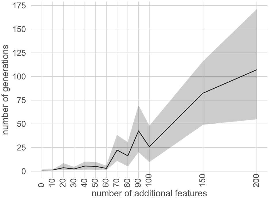
For all pairs of features
Comparison of F1 score achieved by our baseline ensemble classifier to the score achieved by symbolic regression. For all three data sets, we observe a high Spearman’s rank correlation coefficient.
To reduce the number of features, the goal is now to derive a feature embedding that includes all features but projects them into 2D space while preserving the following properties: On the one hand, features that combine well shall be projected close to each other. On the other hand, features that do not combine well shall be projected farther apart. Consequently, in a projection that satisfies these properties, clusters make for a good subset of features that can be selected. To obtain the projection we propose to use Multi-dimensional Scaling (MDS) 9 as it tries to preserve pairwise distances and, hence, allows us to estimate how well two features combine.
To transform the baseline classifiers’ F1 scores
For each data set used in this paper, the resulting projections were evaluated for their ability to preserve the topology of the high dimensional data using trustworthiness, normalized stress, and continuity. 52 The scores, presented in the appendix, indicate that most of the topology could be preserved.
Finally, we propose to visualize the projected space using a 2D scatter plot (R1) that allows for the interactive selection of projected features (R8). Additionally, we enrich the scatter plot by mapping the feature’s individual F1 scores to the color and the mean feature importance by Chatzimparmpas et al. 7 (cf. Related Work section) to the radius of the plotted circles (R2), see Figure 4 (gray areas show user selections).
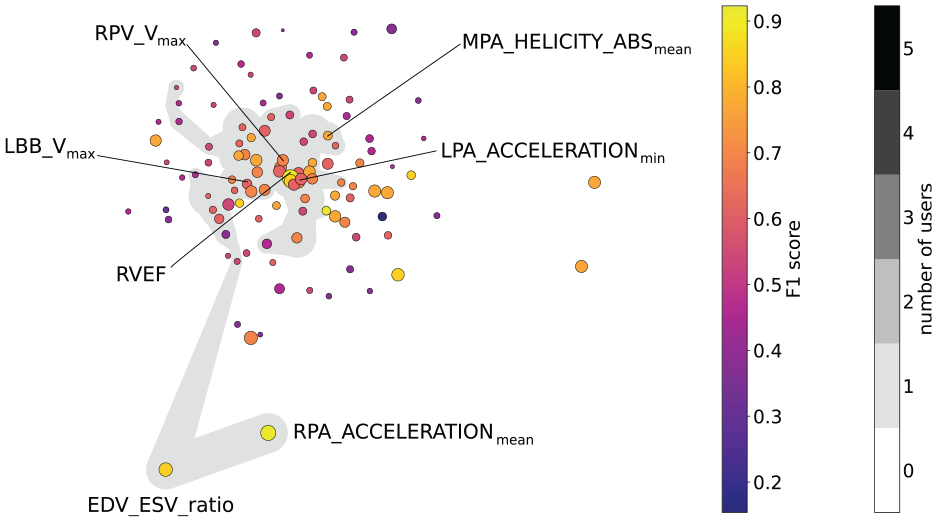
Feature embedding for the Pulmonary Hypertension data set, where colors encode the features’ individual F1 scores and size the mean feature importance. Only those features are labeled that are included in formulas found by the formula search. The gray area indicates the features selected by the domain expert who provided the data during our case study.
Formula generation
Given a selection of features
Symbolic regression maximizes a fitness function by assembling a mathematical formula. The formula is assembled by using a set of arithmetic operations and applying them to a subset of the features. While, in principle, any arithmetic operation is possible, we restrict the available set to addition, multiplication, subtraction, and division in our work. We argue that these operations allow us to generate truncated Taylor series. Therefore, any function that can be represented by a Taylor series (i.e. its error term converges to zero) can be approximated with these operations. Of course, the allowed operations are also straightforward to extend.
The constructed formula is an arithmetic expression, which is represented by a tree that evolves and is optimized in the fitting process. The evolution starts with a competing population of trees, created from a random subset of all available features that are combined using another random subset of available operations. From each generation, the fittest individuals undergo so-called genetic operations, basically meaning random mutations of the tree. The fitness function we use is, again, the (micro-averaged) F1 score. We also apply the mapping described in the Classification Performance Calculation section to allow for more flexibility in the regression process, that is, the regression only optimizes for separability, not for predicting the exact labels.
Another important aspect during the evolution process is the complexity of the resulting formula. We measure the complexity by counting the number of characters in a formula. Hence, a complexity value of one indicates the simplest formula, that is, a single feature.
To generate formulas, the user may start multiple fitting processes, each of which uses a different random seed, that is, it starts with a different initial population. On average, formulas tend to become more complex over the course of the evolution process, which is referred to as bloat. To counteract this behavior, complexity is penalized using a so-called parsimony coefficient in the symbolic regression. In essence, when comparing two competing trees from the current population, a penalty term is added to their respective fitness by subtracting the product of (non-simplified) complexity and the parsimony coefficient from the current fitness value. To the resulting formula, we apply a symbolic simplification to minimize the mathematical expression (e.g.
The outcome of the formula generation is a set of formulas with three ratings per formula, namely its F1 training score (i.e. F1 score for training data), its F1 test score (i.e. F1 score for test data), and its complexity.
Interactive visual system
To evaluate our approach and to apply it to different use cases, we implemented an interactive visual system using the Python programing language and the Dash and Plotly framework. A summary is presented in Figure 1. For a demonstration of the interactive system, we kindly refer to the accompanying video material.
Pre-processing
In a pre-processing step, the distance matrix required for the embedding is calculated (see Feature Selection section). Also, the baseline and the ensemble classifier are evaluated on all features to serve as references. In our application, we restrict the number of generations to 10 to maintain interactivity (R8). From Figure 2, we can deduce that this requires a very effective feature selection method to achieve high F1 scores.
Feature selection
As described in the introduction, the user is first presented with the feature embedding providing an overview (R1), see Figure 4. Also, the individual feature’s performance can be assessed by its color and radius encoding F1 score and feature importance, respectively (R2). The user, then, may select all features or a subset thereof, on which we run the symbolic regression and evaluate the baseline and ensemble classifier (R3). At this point, we assume the data samples to be randomly split into a training and a test set, containing 80% and 20% of the samples, respectively. Testing on unseen data is essential when investigating how a classifier generalizes and to judge if it is overfitted. Considering only a single data split is generally not enough to investigate generalization, but we cannot evaluate multiple splits due to the nature of how formulas are obtained. A detailed discussion on this can be found in the Limitations and Discussion section. For now, we assume that a single, randomized split is still beneficial in most cases, in particular to assess classifier overfitting.
Trade-off plot
While all baseline classifiers are evaluated (1) for all features and (2) for the subset selected by the user (R6), the formula search is performed only for the user selection (2) within an interactive setting. The classifiers’ performance is then encoded in a standard 2D scatter plot, where each classifier is represented by a point and where the horizontal and vertical axes encode the F1 score for the training data and test data, respectively. To distinguish the two feature sets (all vs selected subset), we depict each classifier as a diamond or dot, respectively, where we assign the same color for the same classifier using a categorical color mapping (e.g. red is chosen for formulas). For the formulas calculated from the user-selected feature subset, the size of the dots encodes the complexity of the formula. Instead of directly mapping the complexity value to the radius, we choose to reinterpret complexity as simplicity, that is, larger dots represent simpler formulas, such that the attention of the user is guided toward finding simple formulas. The exact (ranges of) radii have been chosen empirically. We draw lines between each glyph and its label to simplify the matching for the user. This is useful since all formulas share the same (red) color and might have similar radii. In cases where the glyphs of classifiers overlap, we change the rendering order, such that smaller glyphs are rendered on top of larger glyphs. In addition, we group all labels of overlapping points and only draw one line to the group of overlapping points to improve readability. This plot shall allow the user to decide on the trade-off between complexity and performance of formulas (R5). An example is provided in Figure 5.
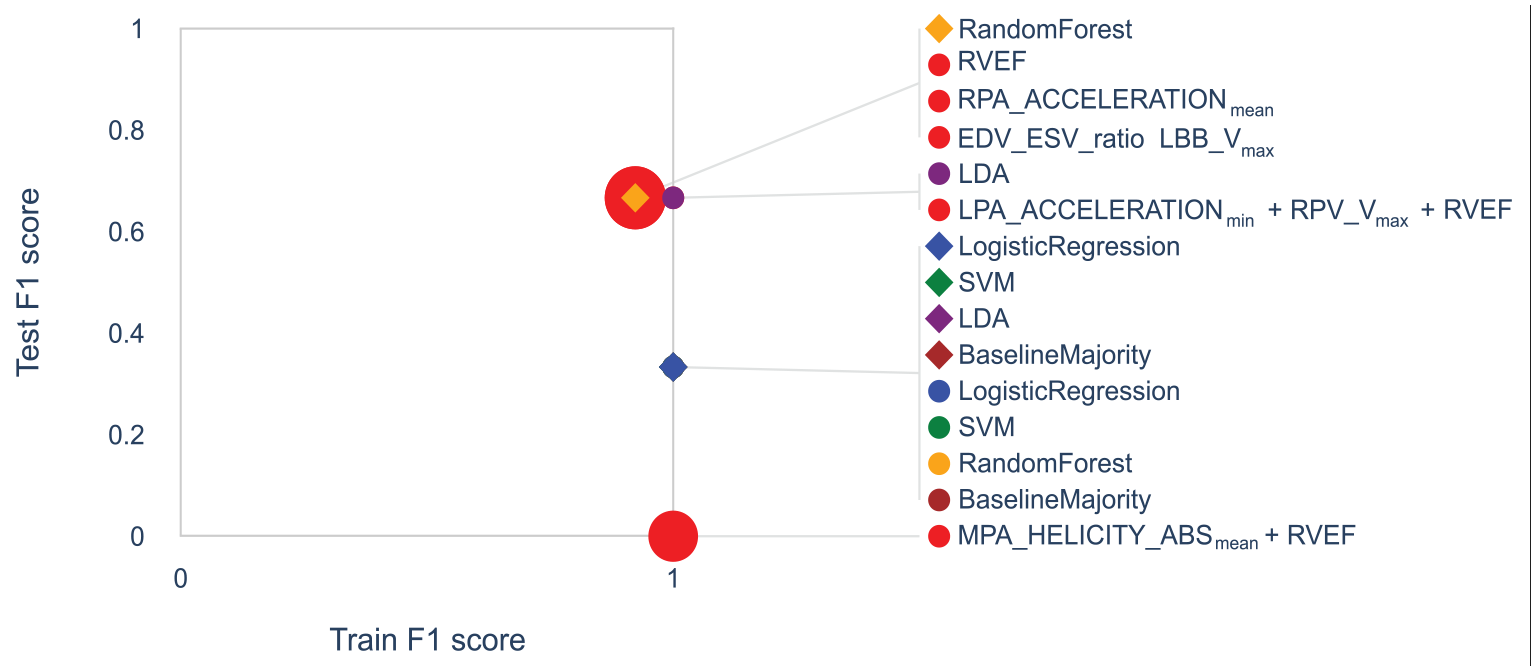
Trade-off plot for pulmonary hypertension data set. The trade-off plot visualizes the classification quality for training and test data for each classifier. Classifiers trained on all features are shown as diamonds, while those trained on user-selected features are shown as dots. Colors indicate which baseline classifier is used or whether a formula is used (red). For formulas, the radius encodes their simplicity. Overlapping glyphs are grouped in the legend.
Distribution plot
For a detailed analysis of the classification quality of individual classifiers, we provide plots that allow for investigating the distributions of predicted values for all classes. For a single formula (or baseline classifier) selected by the user, we plot the respective distributions of all samples when evaluating the formula (or the classifier) for each class in a diagram that combines box plots and bee swarm plots 6a and 6b. Additionally, the Mann-Whitney-U test is calculated for all pairs of classes and the resulting statistical significance levels (if any) are indicated in the plot (R6). Moreover, two formulas or classifiers may be selected to perform a direct comparison, in which case we juxtapose the diagrams of the two formulas/classifiers.
Sample table
Finally, we also support the analysis of how consistently each data sample is assigned to a class by all classifiers. We add a table (See Figure 6) summarizing the predicted class by each baseline classifier and each formula for each sample. The columns of the table represent the different classifiers, while the rows represent the different data samples. Rows can be sorted by the number of false predictions to spot samples, that are misclassified the most by the classifiers. The table contains training and test set, where samples that are part of the test set are highlighted using blue color. Correctly classified samples are color-coded in green while misclassified samples are colored in red.
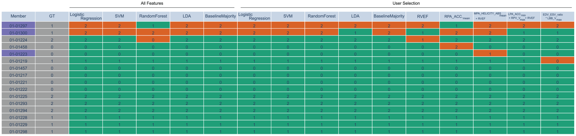
Sample table for pulmonary hypertension data set. The first column encodes the sample name (here, animal ID), where training data is shown in gray and test data in blue. The second column shows the ground truth (GT) labels. The other columns represent the classifiers’ predicted labels (either baseline or formula), where correct classifications are shown in green and misclassifications in red. The classifiers are split into two parts. The first part highlights the classifiers that were trained on all features during the pre-processing step. The second part contains the classifiers that were trained on the current user selection with a population size of 100 for the symbolic regression (formulas in last five columns).
Evaluation
For our evaluations, we selected two common data sets from the machine learning community, that is, the Wisconsin Breast Cancer (Classification) data set and the QSAR (Quantitative Structure Activity Relationships) biodegradation data set, as well as the Red Wine Quality data set. Details about the data can be found below.
Wisconsin breast cancer data set
The Wisconsin breast cancer data set 54 aims at classifying breast cancers as either malignant or benign. The data set consists of 30 features and 569 samples, of which 357 are labeled as benign and 212 as malignant. This data set was chosen, since it contains a larger number of attributes, that is, to evaluate how the proposed approach generalizes to higher-dimensional data sets.
QSAR data set
As a third data set, we utilize the QSAR data set, where molecules are classified as being biodegradable or not, hence, also representing a binary classification problem. The class distribution is relatively imbalanced with 356 degradable and 594 non-degradable molecules. The data set contains 41 features and was also used by Chatzimparmpas et al. 7
Red wine quality data set
The wine quality data set consists of two data sets of white and red Portuguese Vinho Verde wines and is used for classification and regression tasks. 55 The data set contains 11 physicochemical wine attributes as well as a wine quality score that had been assessed by 3 different sensory assessors and aggregated by taking the median of the three scores with possible scores ranging from 0 to 10. We focused on the red wine data set. It only contains 6 distinct quality scores from 3 to 8. The wine quality is roughly normally distributed with scores 5 and 6 containing over 600 samples each and the other four scores contain <300 or even 100 samples. This data set was chosen, as it was also used by Chatzimparmpas et al. 7 Like Chatzimparmpas et al., we split the six quality levels into three levels of inferior, fine, and superior quality classes comprising of the levels 3 and 4 with 63 samples, 5 and 6 with 1319 samples, and 7 and 8 with 217 samples, respectively. To counteract overfitting of the baseline classifiers, we used oversampling to get 325 samples per quality class but only selected every fourth sample of each class to increase the interactivity.
The feature importance of Chatzimparmpas et al. 7 for the red wine quality and QSAR data set was calculated using their reported setting. For the Wisconsin breast cancer data set, we used eightfold cross-validation to compute feature importance.
In our evaluation, we wanted to answer the question of whether our feature selection techniques encourage the user to intuitively select the most promising features, while leaving the flexibility to also choose other features on demand. Hence we formulate the hypothesis, that the feature subset selected by the user leads to better classification scores achieved by the symbolic regression than when applied on all features. We add the constraint that only a small number of generations is allowed such that an interactive workflow can be maintained (R8). Given a population size of 100, this number was empirically determined to be 10 on our system (Intel i7-6700k, 16 GB RAM).
To test our hypothesis, we conducted an informal user study with five domain experts, four from the visualization domain, and one collaboration partner from the medical imaging domain. The users were selected based on their availability and willingness to participate. Importantly, all participants had relevant domain expertise, which ensured their feedback was both insightful and aligned with the study’s objectives. While our collaboration partners conduct pre-clinical studies using PC-MRI data, the visualization experts were colleagues from our institute that are familiar with dimensionality reduction. Among these experts, three conduct own research in feature selection techniques, and one is specialized in statistical machine learning. All of them were familiar with MDS. In an individual hands-on session for each user, we briefly provided an overview about all plots and interactions of the entire system using a dataset that was not part of the study. They could familiarize with the tool and ask questions any time during the session. The users in our study had no prior knowledge about the features in the data sets. The task was to use the interactive visual system to select as few features as possible for constructing a simple formula that classifies the data with a decent F1 score, without specifying what “decent” means. The users were allowed to spend as much time as they needed, but we also instructed them to not try to engineer the optimal solution, as it may not exist. The users were asked to complete the task for each of the three data sets described above, in the listed order.
For the evaluation, we recorded all user interactions and, most importantly, the selection of features and formulas once the users were satisfied with the result, as well as the respective time stamps. On average, each session lasted approximately
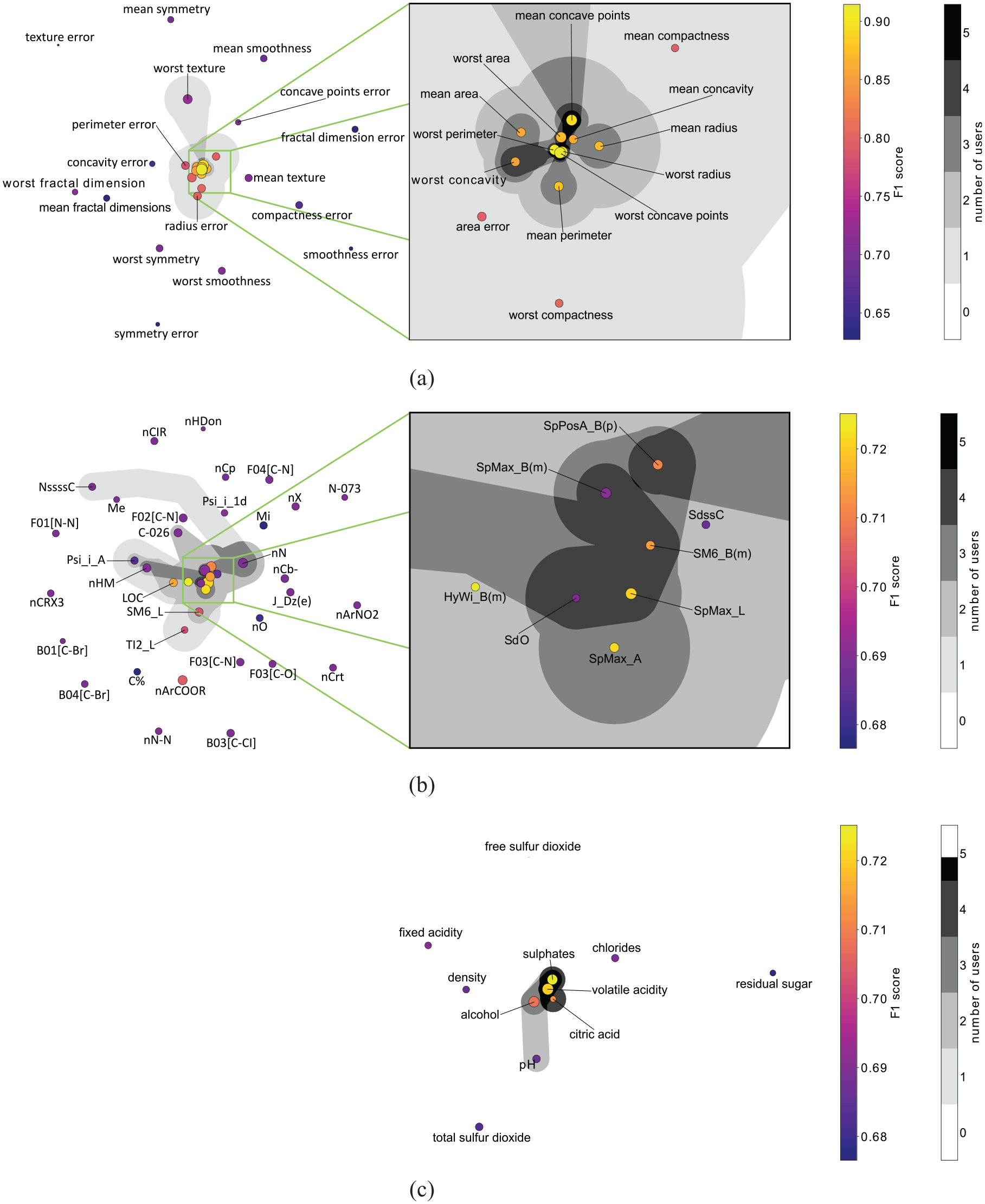
Feature embedding of the three data sets used in the user study. The gray areas indicate how often features have been selected for the final formulas by the five users of the user study. A connected area indicates an individual user’s feature selection. If multiple users have similar selections, these areas are shown in darker shades of gray (see color legend): (a) Breast Cancer (b) QSAR and (c) Red Wine Quality.
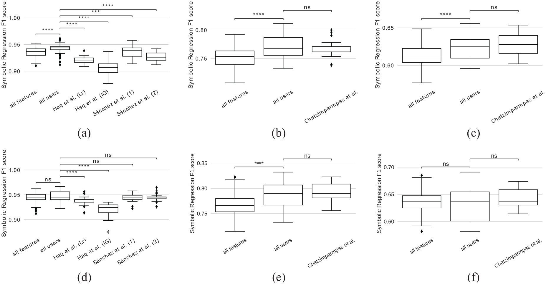
Comparison of F1 scores achieved by symbolic regression when applied to features selected by our approach (all users), when applied to all features, and when applied to feature selections reported in literature. Symbolic regression was applied to three data sets using 2 or 10 generations: (a) Breast Cancer, 2 generations (b) QSAR, 2 generations (c) Red Wine Quality, 2 generations (d) Breast Cancer, 10 generations and (e) QSAR, 10 generations.
We observe that for the two data sets with a low number of features (red wine quality and breast cancer), the formulas generated for the respective feature sets perform similarly well, that is, there is no statistically significant difference. The reason is that, for a population size of 100, the likelihood of each feature occurring at least once in the first generation is quite high. This is backed up by our findings shown in Figure 2. For the QSAR dataset with 41 features, this likelihood is lower and we observe a significant difference between the score achieved for user-selected features and all features. When we compare the F1 scores for the users’ selection against the selection reported by Chatzimparmpas et al. for the QSAR and red wine quality data set, no significant improvement can be observed. We want to emphasize that we encode their feature important measure (cf. Related Work section) as the dots’ size in the scatter plot and, hence, a similar result was to be expected. While the approach by Chatzimparmpas et al. requires the user to go through a list of all features row by row and decide if the respective feature should be included or not, ours supports filtering and selection of multiple features at the same time in the embedded feature space. For the breast cancer data set, the user selection performed significantly better than both feature sets reported by Haq et al., however no significant difference is observed when compared to the feature sets reported by Sanchez et al.
To study the impact of the number of generations, we repeated the same experiment with only 2 generations. The idea is that, ideally, one would like to have as few generations as possible for reduced computation time while maintaining the classification performance. In this scenario, we observe that, for all data sets, the scores are generally lower when compared to those achieved with 10 generations. Nevertheless, scores achieved by the user selection perform significantly better than those of all features. Still, no significant difference can be found when compared to Chatzimparmpas et al. for the red wine quality and QSAR data set. However, here the user selection performed significantly better for the breast cancer data set when compared to the feature selections reported by both Haq et al. and Sanchez et al. Again, this can most likely be explained by the low number of features of the data sets. With only 2 generations, the symbolic regressions that are evaluated for the user-selected feature sets have already good features to start with, while those evaluated for all features may need more generations to randomly select the good features, since the search space is larger.
We believe that the learning effect, induced by the repeated use of our system is negligible compared to the differences in complexity of the data sets. This is supported by the fact that, in the case of the red wine quality dataset, scores obtained using user-selected feature sets did not show significant improvement compared to scores obtained using all features. Conversely, for the QSAR dataset, which was provided to users prior to the red wine quality dataset, the results were significantly better when user-selected feature sets were used.
We could not find strong evidence about whether the feature embedding can correctly represent transitivity between features. For example, if feature A is projected close to B, and B is projected close to C, that does not necessarily mean that A and C also combine well together. When selecting the three features, the resulting formulas could include either one, two, or all of them. The feature embedding hence can only be viewed as a heuristic.
Our experiments support our hypothesis and show that our feature selection approach is effective, when (a) a low number of generations is required or (b) when the data set at hand has a large number of features or (c) both of the aforementioned is true. We conclude that our approach supports users in selecting a subset from all available features that is suited for composing formulas by means of symbolic regression.
Case Study
We, next, applied our approach in a case study with real users. The goal of this case study triggered the development of our tool. Our collaboration partners conducted an animal study to analyze the effect of pulmonary blood circulation. Three cohorts were incorporated: (A) a healthy control group, (B) a group with severe, and (C) a group with moderate alteration of blood flow. All experiments were conducted in accordance with approved ethical guidelines. 56 Prospectively cardiac and respiratory triggered 4D-flow stack-of-stars phase-contrast sequence was performed on a 9.4T Bruker BioSpec USR 94/20 imaging scanner. For more details about the setup and imaging parameters, we refer to their paper. 56
We used 16 subjects from the study, from which 6 were control animals, 4 were severely, and 6 were moderately affected animals. In total, 111 features were provided. While some of them were physiological features such as body weight, also anatomical measurements such as the diameter of the right ventricle were included. From the imaging data, several hemodynamic features were extracted for each segment of the pulmonary trunk, that is, for the right (RPA), left (LPA), and main (MPA) pulmonary artery. This includes velocity magnitude, vorticity magnitude, acceleration, and helicity density. Also, histological features were provided such as the lung assessment score (LASS) 57 to which we will compare our results later. We want to point to the fact that this data set contains very few samples, leading to overfitting and poor test validation, see next section for discussion. Hence, all results have to be interpreted carefully and conclusions cannot be drawn solely based on our report.
The feature space embedding is depicted in Figure 4 along with the feature selection (gray area) made by the domain expert who provided the data. For a better readability of the plot, we only show the feature names of those features that were part of the generated formulas. The trade-off plot that resulted from the domain expert’s feature selection is depicted in Figure 5. Five formulas were generated for the domain expert’s feature selection. Overall, all baseline classifiers and generated formulas performed similarly well on the training data (horizontal axis). The fact that all models were able to achieve a training accuracy equal to or close to one (vertical axis) suggests, that it is possible to capture the entire data set with most of the models, due to the small amount of samples. However, none of them achieved a perfect test data score (vertical axis). Since the random test data split only contains three samples, we observe three discrete values for the test data score. All formulas contain at most three features, indicating that the classification task for this data set is rather trivial, as their accuracy is still decent. This is backed up by the fact that LDA is the best-performing classifier, that is, the cohorts are linearly separable. Also, we want to point to the fact that LDA performed worse when trained on all features, than when trained on the selection made by the domain expert.
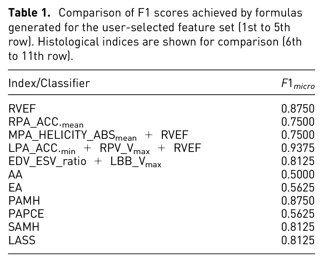
From the generated formulas, three contain right-ventricular ejection fraction (RVEF) that is considered a benchmark in literature when comparing to hemodynamic features.
56
The same scores of RVEF were achieved by the mean acceleration in the right pulmonary artery lumen (RPA_ACCELERATIONmean). However, the domain expert gave the feedback that if this feature appears alone in a formula, without the counterpart from the left pulmonary artery lumen (LPA_ACCELERATIONmean), it should not be considered. For the same reason, we also ignore the longest formula, that is, LPA_ACCELERATIONmin + RPV Vmax + RVEF. Additionally, this formula is longer while only increasing the train data score marginally. Hence we focus on the product of the ratio of end-diastolic volume (EDV) and end-systolic volume (ESV) (
Using juxtaposed diagrams of combined bee swarm and box plots, we compare the distributions of all animals as produced by the benchmark RVEF (see Figure 9(a)) to the mentioned formula (see Figure 9(b)). While the significance levels between the cohorts are identical - indicating that the benchmark could be reproduced - we observe slight differences in cohort distributions. Notably, the severe cohort has a smaller spread compared to the benchmark. Conversely, the control cohort experiences a wider spread.
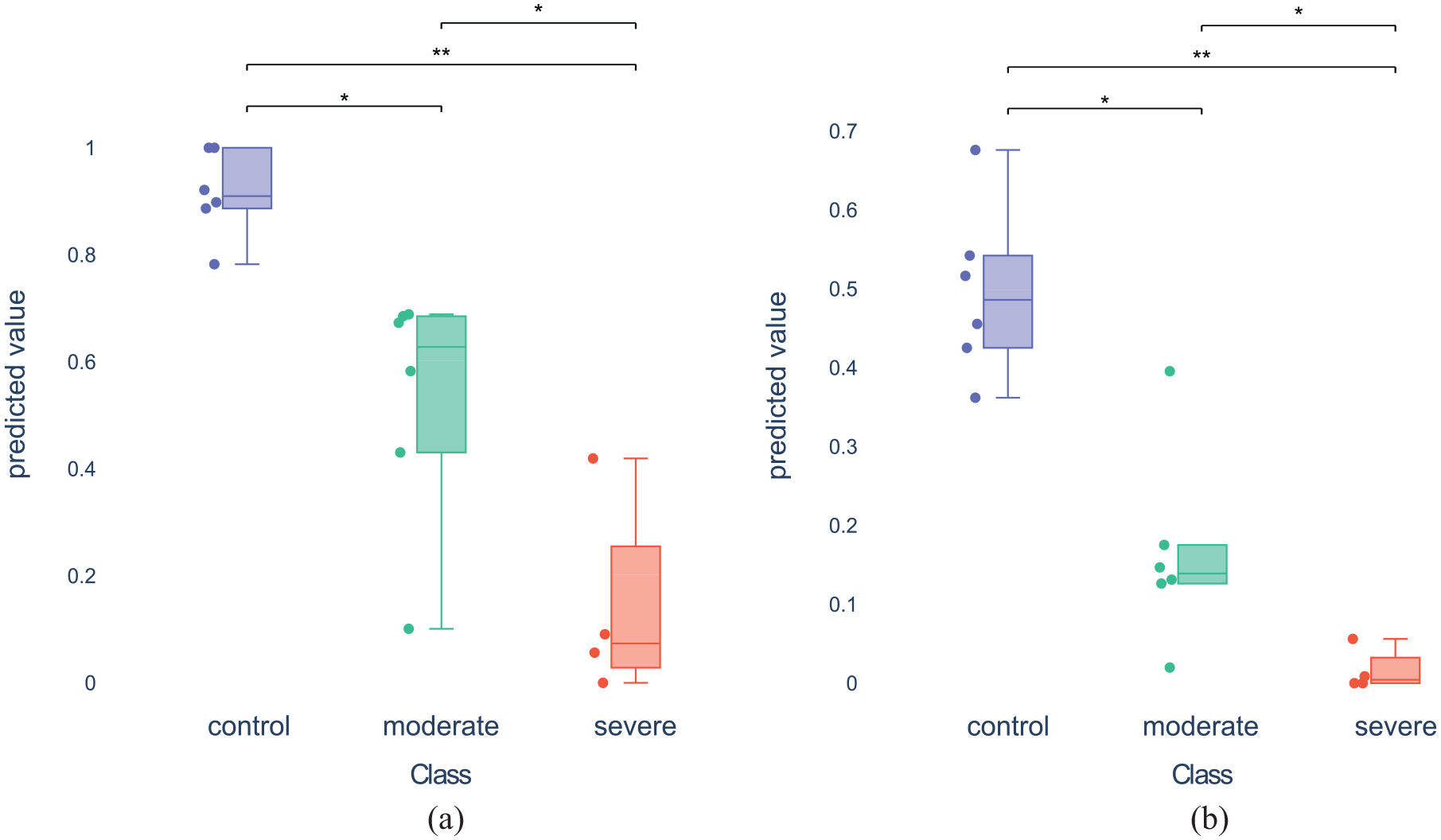
The distribution plots combine bee swarm plots, box plots, and the outcome of statistical significance tests to analyze the value distributions of the classes. Additionally, the Mann-Whitney-U test is calculated for all pairs of classes and the resulting statistical significance levels (if any) are indicated in the plot (* and ** indicate p-values below 0.05 and 0.01, respectively). Here, the user selected two formulas for comparison: (a) Distribution plot for formula “RVEF” and (b) Distribution plot for formula “EDV_ESVratio. LBBV_max”
To analyze the classification result of the two classifiers for each animal individually, we use the sample table (cf. Figure 6). The animal with ID 01-01297 was misclassified by both classifiers and also by most of the other classifiers. Hence, it could be considered an outlier and should be investigated in more detail. While the animal with ID 01-01300 was also misclassified by most of the classifiers, it was correctly predicted by the two selected classifiers.
In addition to the trade-off plot, we also compared the found formulas against established histological indices, that is, Atelectasis Area (AA), Emphysema Area (EA), Small Arteries Media Hypertrophy (SAMH), Peribronchial Arteries Perivascular Cellular Edema (PAPCE), Peribronchial Arteries Media Hypertrophy (PAMH), and Lung Assessment Sum (LASS). 57 We compute the F1 score between the predicted labels and the ground truth labels, since our formulas were only trained to distinguish different cohorts, while the actual value ranges of the cohort distributions do not matter (cf. Classification Performance Calculation section). The results are depicted in Table 1. The table shows two groups with (1) the five formulas trained on the user selection, and (2) the six histological indices. The two formulas that we analyzed in Figure 9 yield F1 scores comparable to or even better than the histological indices. This observation can be seen as an indicator that the formula generated from the user selection might be a suitable classifier, which will be further investigated by our collaboration partners.
Comparison of F1 scores achieved by formulas generated for the user-selected feature set (1st to 5th row). Histological indices are shown for comparison (6th to 11th row).
Domain expert feedback
Throughout the development of our system, we have had multiple meetings with our collaboration partners from the medical imaging domain. We performed a task analysis at the beginning and gathered feedback that we used to iterate our system. This was done by showcasing the current development of the system and letting them analyze their own data. Among the received feedback, physical plausibility was not important to them but rather the relationships between the hemodynamic parameters. Furthermore, certain hemodynamic parameters make only sense in combination with other parameters, which motivates why the user should be able to choose certain subsets of parameters for the symbolic regression. Lastly, a biomarker should have a high specificity and sensitivity to be considered a good candidate. Therefore, we chose train and test micro-averaged F1 scores as axes for the trade-off plot.
In the following, we will report our observations made during the user study and the feedback we got from our five domain experts. We observed varying behaviors. Users, when presented with a new data set, initially tended to select multiple features to familiarize with the data set, often by selecting features close to the barycenter of the scatter plot (cf. Figure 7) or by choosing features seemingly at random. Some users, upon finding an effective feature, tended to stick with it, generally focusing on discovering a single, superior formula without much regard for baseline comparisons. The strategies for composing a feature subset varied. Some identified a small feature set and gradually expanded it. Others repeatedly ran the algorithm to try different feature sets by selecting both central and peripheral features based on past experiences. Typically, this involved no more than three selections. One reason for this is that the system still needs some time to evaluate baseline classifiers and symbolic regression for the users’ feature selection.
Feedback from the study included the presumption that there is a bias for selecting from the middle and toward larger points. We agree with the users’ feedback and consider this bias a design goal of the embedding. Instinctively, users tend to select good features, while still being able to reconsider their selection. Also, users reported on usability aspects of the interactive visual system such as initially running the formula search via symbolic regression multiple times for a better understanding of variability. Because of performance reasons, the default setting is to use a single formula search, but we leave the option to perform additional searches to the user. Another requested change was to keep the formulas generated by the old feature set. In the system presented to the users, the trade-off plot would be cleared any time the user made a new feature selection, that is, only the baseline and formulas derived from all features remain as permanent references. The reason is that, otherwise, one would need to keep track of the features used for each baseline classifier and formula and encode them in a scatter plot, for example, by introducing a data provenance graph. Solving this problem is beyond the scope of this work, but shall be investigated in future work. Also, it was requested to visually highlight features that are part of the currently selected formula.
As one of our domain experts also provided us with a data set, we asked if this system would be a valuable addition to their work. They believe that the tool would save a lot of time. They want to use it for their work from now on.
Limitations and discussion
Test data validation
In our work, we focus on finding formulas that serve as classifiers. An important fact is that each formula has to be seen as a separate classifier. This makes it difficult to validate a formula in the general sense of machine learning, which typically requires techniques such as k-fold cross-validation to be applied in order to determine how well the model generalizes. However, for each split most likely a different formula will be generated, rendering it impossible to generalize a single formula. In fact, even running the formula search on the very same split multiple times will, in case of multiple selected features, lead to different formulas. As a compromise, we added pseudo-test validation to our system, by employing a single random split that could be changed by the user. If the sample size is large enough, the generalization score may be considered sufficiently trustworthy. Although we consider the research of test data validation of formulas beyond the scope of this work, we want to raise awareness of this problem and possible solutions. One approach could be to apply cross-validation, running the regression multiple times per split, and then analyze the mathematical expressions of the resulting formulas for similarity. Defining the similarity of formulas is a highly user- and task-specific problem. For example, one could check for common features or even terms.
Scalability
Concerning the scalability with the number of features, we already showed that decreasing the number of features, on average, decreases the time needed for the symbolic regression to find a good solution (R7), see Figure 2. We tested the embedding on the Pulmonary Hypertension set with 111 features, which would not be feasible by other presented methods.7,36,41 Also, the visual representation of the 2D embedding in terms of a scatter plot scales quite well with the number of features, and the other visual encodings do not depend on the number of features. How well the 2D embedding represents feature space, is another question that is well known to data analysts working with multi-dimensional data projections. If, for example, a data set contains hundreds of features that are irrelevant to the classification task, projecting the features into two dimensions would no longer preserve most of the variance in the data. This can be explained by the extreme case, where all features are equally unlikely to combine well. Then all pairs of features would need to have the same distance from each other, which is only possible in a space of dimensionality equal to the number of features minus one. However, from our experience with the presented data sets, we assume that this is a rather constructed, theoretical case that rarely happens with real data.
Concerning the scalability with the number of samples in a data set, the time needed to evaluate the baseline classifiers and the symbolic regression scales linearly with the number of samples. This leads, for example, for the red wine quality data set, to a longer waiting time when a new feature subset is selected by the user. As highly optimized code is not the focus of this work, reducing the time could already be possible by better utilizing parallel hardware. Another option would be to only use a subset of the data, for example, by applying Monte-Carlo sampling. The visual encodings are independent of the number of samples except for the sample table, but the sorting option allows for focusing on the data samples that require further investigation.
Interpretability
In our work, we neglect the features’ units. The symbolic regression will, hence, combine features of all units using addition, subtraction, etc., which may not be physically meaningful. In physics, one technique to mitigate the issue of very complex unit terms is to introduce constants that add the inverse units to the expression, effectively canceling out unit terms. However, which unit to expect and how to counteract is highly data- and task-specific. Since we aimed for a general solution that finds relationships between features for the purpose of classification, that may lay the foundation for an in-depth analysis, we consider a sophisticated analysis of this problem out of scope for this work.
Another limitation inherent to formulas is the division by zero. It can, generally, not be assumed that no sample of a data set contains zero values. When normalizing the data to the unit interval, it is even guaranteed. The assumed behavior is implementation-specific and should be chosen carefully. One option is to remove the division from the allowed set of operations. Since we believe the division should not generally be excluded, we utilize the default behavior of the symbolic regression implementation 59 that uses a protected division that evaluates a term to 1 in case of a zero division. Resulting formulas with a single feature as denominator should be viewed critically.
Conclusion and future work
We presented an approach for the interactive visual composition of classifiers in the form of formulas. The approach comprises a novel feature selection technique based on a projection of the feature space, projecting features that are likely to synergize well for the classification task close to each other. Our feature selection techniques allow for an interactive refinement of formulas generated through a symbolic regression. Together with a plot showing the micro-averaged F1 score and complexity of each formula and when compared against the score of state-of-the-art classifiers, our tool supports resolving the user- and problem-specific trade-off between quality and complexity of classification models.
In future, we plan to extend our approach to multi-field data, where the spatial dimensions shall be taken into account. This could be done by aggregating connected regions of similar value distributions in the spatio-temporal space in an effort to reduce the number of potential features. A heat map of said space could be used to encode found regions. The spatial position could also be mapped back onto a 3D model of the domain, for example, onto a vessel surface to maintain the anatomical context. 60 Moreover, visual analysis of formula similarity deserves more research.
Supplemental Material
sj-pdf-1-ivi-10.1177_14738716241270288 – Supplemental material for Interactive visual formula composition of multidimensional data classifiers
Supplemental material, sj-pdf-1-ivi-10.1177_14738716241270288 for Interactive visual formula composition of multidimensional data classifiers by Adrian Derstroff, Simon Leistikow, Ali Nahardani, Katja Gruen, Marcus Franz, Verena Hoerr and Lars Linsen in Information Visualization
Footnotes
Acknowledgements
The results shown in this paper do not constitute any medical advice.
Funding
The author(s) disclosed receipt of the following financial support for the research, authorship, and/or publication of this article: This work was funded by the Deutsche Forschungsgemeinschaft (DFG, German Research Foundation) grants 468824876 and 431460824 (CRC 1450).
Supplemental material
Supplemental material for this article is available online.
References
Supplementary Material
Please find the following supplemental material available below.
For Open Access articles published under a Creative Commons License, all supplemental material carries the same license as the article it is associated with.
For non-Open Access articles published, all supplemental material carries a non-exclusive license, and permission requests for re-use of supplemental material or any part of supplemental material shall be sent directly to the copyright owner as specified in the copyright notice associated with the article.