
Abstract
Visual identities can be constructed from a number of elements which together can be described as the Visual Identity System (VIS). Typography is one of the VIS’s central elements. Typically, the VIS elements have been considered as static and associated with prescribable visual mandates; however, the hypermodernity paradigm boosted the notion of mobility in everything – and brands are no exception. Brand logos now change in shape, colour, wear different textures and sit on top of a variety of backgrounds. All this incredible flexibility has implications for their typographical elements too. In the empirical part of this research, 50 dynamic logos were selected, grouped according to Van Nes’ categories in Dynamic Identities: How to Create a Living Brand (2012) and the changes in their typographic components were analysed under the Multilingual Typeface Anatomy Terminology framework (Amado, 2012), firstly by the researchers, and then by a group of independent coders. It was verified that dynamic logos present a consistent pattern regarding typography since they preserve consistency through type’s structural axes. This result led to a set of recommendations for both designers working with type in the context of the (re)design of dynamic logos, and academics preparing the next generation of brand designers. This research aimed at identifying the typographical inroads in brands with dynamic logos and is a relevant contribution to the perception of how the anatomy of type can define visual consistency.
Keywords
1. Introduction
The increasing competitiveness of markets places a greater significance than ever on brand logos as a key element of a brand’s visual identity. Brand logos stand for both tangible and intangible assets, therefore they are one of the most powerful communication elements an entity has, critical in building positioning and identity profiles that audiences recognise and value.
Visual identities are composed of a number of elements known as the Visual Identity System (VIS) forming a unit extremely important for brands, a concept that was formally introduced by Wolff Olins (1995) and Per Mollerup (1997). Among the VIS elements, several authors identify Typography as one of the main components, alongside Colour, Language and Name/Logo (Kreutz, 2005; Mollerup, 1997; Olins, 1995, 2008; Oliveira, 2013; Peón, 2009; Van Nes, 2012; Wheeler, 2017). Hence, the VIS grants brands with the very important and searched-for unity, relying on brand manuals and standards to make their use uniform, ensuring consistency and brand recognition.
However, the current info-communication phenomena and mobility paradigms (Passarelli et al., 2014) changed the way the user, the customer, the manager, the designer, the producer and the scholar deal with devices, applications, narratives, lives and also brands. For this reason, the elements within a VIS can no longer be strictly fixed. In fact, in several brands, we have witnessed different types of flexibility, during shorter or longer periods of time, with some of their VIS elements behaving in quite unexpected ways, in the sense they transmogrify, in which cases, traditional brand guidelines may not suffice because such modifications are hard to translate into brand guidelines/standards as we know them. Such graphical flexibility allows brands to fit within the different media and to adapt to a multimodal landscape, to keep on track with market expectations and still be quite efficient in not compromising their identification, distinction and recognition qualities (Aaker, 1996; Chaves and Bellucia, 2003; Costa, 2004; Kreutz, 2001, 2005; Lindon et al., 2011; Kapferer, 2012; Keller, 2012).
Typefaces have long played a vital role in commercial and brand identity design projects as an undeniably essential component in supporting brands in the fulfillment of the aforementioned functions. Fonts and typefaces, frequently custom and commissioned, combine with specified typographic approaches to help visualise brand identity. According to King (2001), tailored corporate type design has been one of the routes taken by independent foundries in order to face-off competition from companies who sell type in cheap packages. A unique typeface has become a must-have accessory among contemporary brands. It is partly due to the expansion of client-initiated design that the flow of new typefaces prompted by the technological changes of the late 1980s has continued unabated into the new century.
Over the last decades, technological developments have increased the potential for visual communication and design to explore ideas and meanings in many different ways. This means typography has taken on a variety of new functions. The impact of computer technology on type design has given rise to time-based typography (Bellantoni, 2000; Hillner, 2009), which is an interesting feature for brands to exploit. Typography, being one of the key elements of any brand’s VIS, whether it is more or less conventional, more or less flexible, requires a more detailed analysis in this specific context. With this research we aim to develop and deepen the understanding of typography as a VIS structural component, now that brands live and grow in flexible and dynamic multimedia environments. Thus, our research question is: How flexible is typography in the context of dynamic logos?
2. Brand Identity Now
A visual identity is one of the most concrete means to communicate a brand, translating its positioning, personality and global flux via visual elements, and a brand is a symbolic instrument of an identity, of its relationships, conveying specific promises about products, services or entities.
According to Kapferer (2012), the brand is a living system that allows changes to its tangible visual identity for, in a simple and direct way, giving meaning and purpose to the product, service or entity it represents, while instructing the consumer on how to use it. Several authors agree that a brand is something that people can experience but not see (Coelho and Rocha, 2007; Neumeier, 2006; Olins, 2008; Wheeler, 2017). However, the visualities and semiotics of brands have been widely researched and, to the marketing field, these have been especially relevant to understanding how the visual and design-oriented decisions impact consumers’ behaviours, attitudes, emotions and the overall brand experience (Bartholmé and Melewar, 2011; Machado et al., 2015; Walsh et al., 2010).
Irene van Nes (2012) states that in the last three decades there has been a shift towards creating more organic identities, using variable elements, promoting (through newly available technologies) the ability to combine the printed with the screen. According to Van Nes, this social, economic and cultural shift provided brands with the opportunity to create increasingly vivid and variable identities, for example, by using a modified signature virtually every day, as is the case with Google. This brand has been innovative in several domains: in both interface and user experience design, Google has been a leader with its Askew project, the I’m Feeling Lucky feature and its visual identity’s interactive gamified Doodles. Google is also known for adopting a rigorous localisation strategy with its Doodles being country or region specific, usually representing events that are celebrated in some places only but not globally. In fact, most countries have their own set of Google Doodles related to their history on many of the days throughout the year. International days and celebrations will have the same design, generally adopting a region-specific language. All this causes high variability in design performance.
As logos become crossmedia-friendly, different media attributes and constraints involve necessary differences in the way brands are presented to their audiences. This is particularly true when the media differ in the way they incorporate (or not) the dimension of time – which allows logos to include some kind of motion-like condition.
It is fair to say that commercial persuasion goals have changed: they not only inspire confidence, or help us in memorising a product, service or organisation but they also mystify and make us love a brand (Lipovetsky, 2014). Hence, brand (visual) identities have become variable, flexible, customisable, moody (Figure 1). In an interconnected and both analogue and digitally free world (Barabási, 2002), brands increasingly invest in a ‘human’ personality, through which they converse and exchange experiences and emotions with people who, more than mere customers, have become followers, friends. Apple would be the most resonant case, with a strong personality and millions of dedicated customers (beyond friends, maybe lovers?), but many other brands have been exploring this conversational approach that brings them closer to the audiences: Marmite, Rio450, Coca Cola, etc. To achieve this, the brand needs to be dynamic, to be alert and alive, to adapt to its surroundings. More than a trend or fashion, the brand reflects reality, with its own pace and movement.
Casa da Música’s flexible visual identity, designed by Sagmeister & Walsh. Reproduced with permission.
3. Taxonomies of Dynamic Brands
Both academics and practitioners are progressively more interested in these ever-evolving visual identities; the research and analysis of dynamic brands and their dynamic visual identities and logos have multiplied simultaneously in different locations and through different perspectives.
Kreutz (2005) identified two main visual identity systems, distinct in their strategies, objectives, positioning and communication: a group of brands categorised as Conventional (brands that feature characteristics such as stiffness in form/shape, standardisation, linear progress, fixedness, universality) and another that gathers the Non-Conventional (or Mutant) brands (brands defined as being flexible, dynamic, plural, ephemeral, fragmented and heterogeneous, and which can be either Programmed or Poetic. On this non-conventional branch, programmed visual identities are those whose variations occur within a certain predetermined time frame, while poetic visual identities tend to allow a wider range of exceptions: while keeping their visual identity’s essence, they are able to generate complicity with the audience who either interacts to interpret them (as in the case of MTV) or, in specific cases, is expected to manipulate some of their visual components, providing them with a personal view (as in Google’s gamified/interactive Doodles).
Irene van Nes (2012) considers that when brands become flexible, one or more of their VIS’s structural elements becomes liberated – but never all of them simultaneously. Thus, according to Van Nes, a VIS is either composed of elements where characteristics are stable and do not perform any changes (corresponding to Kreutz’s Conventional VIS), or it may provide different levels of flexibility, which can vary the consistency of just one or a changeable number of its elements (aligned to Kreutz’s Non-Conventional VIS), while preserving the basic standards that provide a brand with the power of being easily identified, recognised and memorised. Van Nes (2012) also assembled a framework of six categories that preserve the identifying essence of what she calls Dynamic Identities: Container, Wallpaper, DNA, Formula, Customised and Generative (Figure 2).
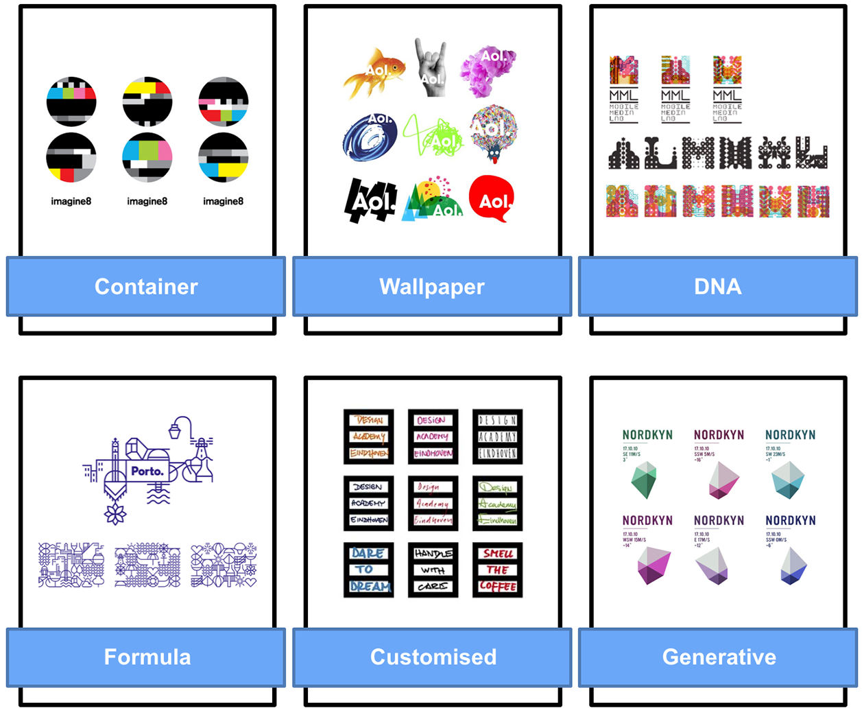
Van Nes’s (2012) six categories of dynamic identities.
Another taxonomy is the one proposed by Leitão et al. (2014a, 2014b), who set out to contribute to the analytical and operational model of brands’ visual identity practice, suggesting a group of underlying principles that help structure visual identities according to their most common elements. The authors maintain that brands’ visual identities, whether reflecting a modernist, postmodernist or hyper-modernist philosophy, are structured and oriented by four conceptual principles: Morphology, Syntax, Narrative and Experience. Eventually, this research has informed two other studies: (1) Lelis and Kreutz (2019) analysed hundreds of both conventional and dynamic logos in order to identify the narrative dimensions of visual identities at a discourse level. Conceiving logos as a brand’s story containers, the authors were interested in framing not WHAT the brand can tell, but HOW the brand can tell its story(ies) and found that the more dynamic a brand is, the more flexible its storytelling seems to be; (2) Lelis (2019) presents a method for analysing colour in dynamic logos and concludes that these do not rely on colour consistency, suggesting that, in fact, as opposed to conventional brand identities that used to own a colour, the most common colour harmony in dynamic logos is a variable polychromatic one.
In line with the latter, we aim to verify the levels of consistency of typography in dynamic logos.
4. Typography Behaviours
Defining typography is not straightforward. Short explanations inadequately capture its history, scope and evolution alongside technology. Typography is a multipurpose ‘tool’, according to renowned design educator Ellen Lupton (2010: 8). For Martin Lorenz, typography spans ‘the architecture of a single letter right up to the composition of a body of text’ (TwoPoints.Net, 2019: 3) and for the acclaimed Dutch design studio Experimental Jetset, typography is ‘language that has been shaped’ (Van Deursen, 2015: 429). The common themes running through these, and many other descriptions, are that typography involves shaping language visually so that form and meaning work together to communicate. In this context, we must see the letterforms and their arrangements in the VIS as becoming further steeped with meaning and values over time.
The name is the primary way a brand is recalled and discussed. Healey (2010) states that the brand is the joining instrument for both vision and the name, requiring a visual system that incorporates the logo, which is the form given to the name, i.e. the means through which the name becomes visual. The author attributes to type the definition of clothes that involve the words, by giving them a character and emphasising a subtle but distinct personality that the general reader is able to feel (although unconsciously), adding that typography reinforces the message of the words. Hence, in a branding context, typefaces can reflect, even if subtly, the sense of the entity’s values. This is supported by Serafini and Clausen (2012) and Ho (2013), who state that typography is an integral part of the narrative, acting as a powerful semiotic resource, capable of rendering additional meanings.
The emergence of desktop publishing and digital editing software increased creative freedom by opening up the range of typographic possibilities. Type was freed from its traditional physical nature, becoming digitally crafted and the subject of a much richer and diverse treatment. Digital technologies have brought the necessary tools to introduce typography to a fourth dimension: time (Rodrigues et al., 2008), leading to ‘type in motion’, sometimes known as ‘dynamic typography’, in which the message is conveyed depending on time, often using sound and animation techniques, operating as multimedia contents (Ho, 2013). This context also allowed the emergence of moving posters in which, due to time being used as a variable, the possibilities of storytelling have exponentially increased (TwoPoints.Net, 2019). In the same realm, Bellantoni (2000) proposed ‘kinetic typography’ in which designers use techniques such as blinking and flashing, in order to convey the required messages with increasing complexity (Woolman and Bellantoni, 2000). Ho (2013: 5577) explains, ‘as kinetic letterforms may be viewed from numerous angles, designers are presented with a multitude of new typographic possibilities.’ Syntactic variations, such as the formal relations between the letters, the rhythms and the compositional proportions, are significant values of typographic sign and visual brand identity, carrying new meaning (Rodrigues et al., 2008).
However, Koch (2012) found that each specific typeface triggers a particular emotion which depends largely on the type’s structuring form, weight and width. In this case, it seems that, for brands, the best option would be to engage and commit to a unique typeface, guaranteeing a stable emotional perception. In fact, the same should apply to dynamic brands’ contexts, in which type is used as a structural and aesthetic component of their visual identity. Jochum (2013: 66) states that: Most of the (dynamic) brands stick to defined typefaces for their communication touch points. Type is a big topic when being applied to logos . . . it seems that type serves as recognisable add-ons to symbols used in logos . . . Type still is a way to keep the brand recognisable, even without the logo as the distinctive trademark.
Hagtvedt (2011: 86) performed three studies to research incomplete typeface logos’ recognition, where ‘parts of the characters in the company name are intentionally missing or blanked out, giving rise to a form of perceptual ambiguity’. The results show that, although incomplete typeface logos negatively affect the company’s trustworthiness (which seems to be tied to the logo’s clarity), they score high on perceived innovativeness. Childers and Jass (2002), grounded on the fact that the visual properties of typefaces can carry unique semantic associations that differ from the content of the written word, found that memorability was enhanced with the increase of the level of consistency among brands’ typeface semantic cues, advertisement visual cues and advertisement copy.
Brand logo recognition certainly has a close relationship with the concept of readability which, unlike most other languages, in English differs from the one of legibility. Pinheiro (2012) explains that whilst legibility deals with the perception of information, the ease and accuracy with which the reader perceives printed texts – hence related to the details of letters and words that allow these to be decoded and recognised individually – readability deals with the overall intellectual understanding of this information by means of identifying basic syntax rules, such as when a word can be perceived even if its letters are fragmented, deformed or even absent which, in some cases, have been strategic and conscious approaches in the context of dynamic logos.
Beatrice Warde, an unequivocal figure in the development of typography in the first half of the 20th century, believed that, for effective readability, typography would provide a window into the communication of ideas and should be conceived as an invisible resource. Unlike Warde, for whom good readability would not entail the fruition or experiential states caused by the aesthetic and functional components of type, this research rejects the idea of invisibility of type; rather, it advocates that substance and presentation coexist in type and that, in the case of brand logos, both substance and presentation can change. Therefore, and within the context of modern media, we understand that type can be described and used almost as a topological element that, by dealing with elastic surfaces subject to continuous deformations, preserves its essential properties, treating its geometric objects by their relations to each other, regardless of the characters’ actual dimensions. The development of variable fonts, a new technology standard added to the OpenType® specification in 2016, is a very good example of this. They are built on ‘axes’ that describe one or more of the font’s characteristics, such as width, height or slant. Fixed extremes, ranged around a central master design, usually the regular weight, define the limits of the design space. Between these boundaries, alongside a few specified points, intermediate versions of the font can be generated.
In Netflix’s series Abstract: The Art of Design, episode ‘Jonathan Hoefler: Typeface Design’ (2019), the eponymous type designer highlights that currently the design process of a font involves breaking down ‘screen’ into large screens, smartphones, watches, etc., where haptics and gestures have to be considered. Therefore, the OpenType specification has been reformulated to include fonts that are responsive regardless of the media and with the ability to adapt to not only fast-changing technological contexts, but also new needs and behaviours, which could include interactivity features too (TwoPoints.Net, 2019). A case to consider is FIT, a variable and hyper-stylised bold font, designed by David Ross, featuring an expansive range of widths (up to 3600%) with the purpose of using text to fully fit and fill up any available space.
Regardless of all these developments, there is no exploratory research on how consistent typography is in the context of dynamic visual identities and, for that reason, we intend to initiate it with this article.
5. Methodological Approach
This section describes the analytical method that contributes with valuable insights into the typographic analysis of logos, in terms of consistency and flexibility, in the current context of contemporary dynamic brand design.
A thorough analysis of work based on the collection, comparison and synthesis of dynamic brands was supported by a comprehensive literature review framed within the study of brands, visual identity language, visual semiotics, and information and communication technologies. This exercise delivered an overall proposition for this research and produced a representation of the empirical reality of the topic.
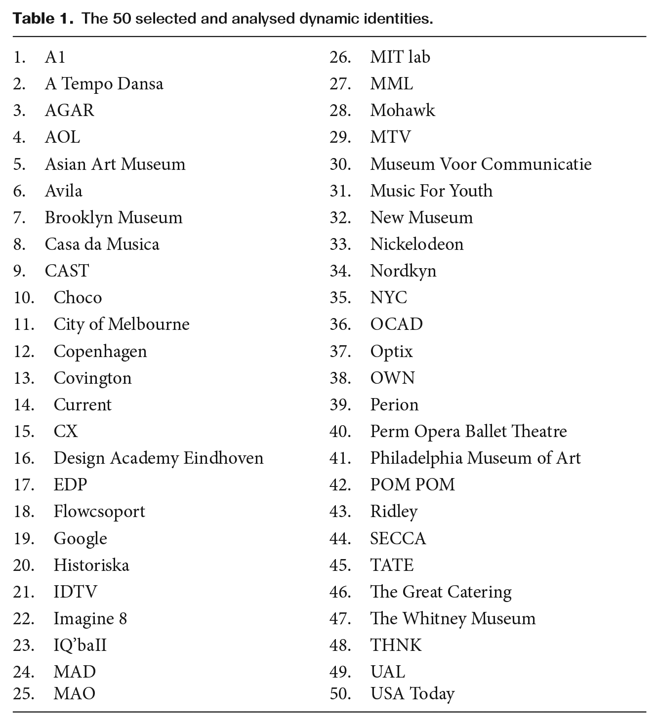
Subsequently, visual content analysis was used to identify the existence of changeability in the typographic components of 50 brand logos (see Table 1). To be considered in this study, brands had to (1) from a graphic point of view, include either their name or tagline in a type-based format, (2) present a certain level of credibility (either by the entity they represent or by the agency or studio responsible for their design), and (3) have online activity, as the internet (world wide web) was where their dynamic incursions and logo variations were identified and retrieved from. Therefore, we relied on logo images published by the brands themselves and/or their creative agencies, assuming aspect ratios were the correct ones, as per brand standards/requirements they certainly followed, and guaranteeing that all selected bitmaps with logos and their variations were consistent in regard to background, avoiding any possible deviations forced by an irregular analyses environment. Although the sector of activity where one can most abundantly identify dynamic visual identities is the quaternary one, the selection also entailed the inclusion of brands from a wide variety of sectors in order to guarantee the sample was significantly representable: Culture, Design, Education & Research, Electronics & Telecommunications, Energy, Entertainment, Fashion, Hospitality & Tourism, Manufacturing, Media and Information, and Service Consultancy.
The 50 selected and analysed dynamic identities.
This visual content analysis can be described in two steps: firstly, the brand logos were categorised according to the dynamic identities framework proposed by Van Nes (2012), and then each logo was scored according to the anatomic variations that their typographic elements might suffer, supported on the Multilingual Typeface Anatomy Terminology and its eight drivers of typeface anatomy: (1) Measurement Lines, (2) Proportions (these first two represent the structural components), (3) Positive and Negative Shapes, (4) Strokes, (5) Stroke Connections, (6) Stroke and Glyph Properties, (7) Terminal and Serif Properties, and (8) Optical Adjustments (Amado, 2012).
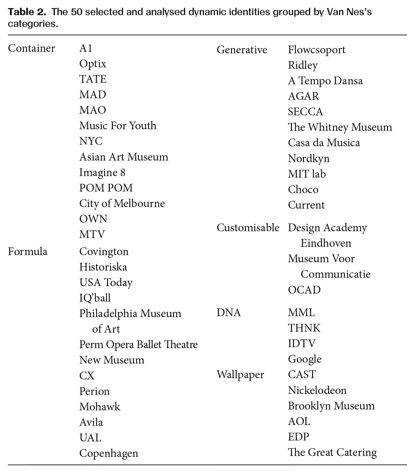
Therefore, the 50 selected logos were grouped according to the six categories proposed by Van Nes (2012) (see Table 2) and three variations from each were analysed – this means a total of 255 independent type characteristics, some of them broken down into very specific features, which were thoroughly scrutinised for each logo variation (x3[50]), resulting in a total of 38,250 elements of analysis). This part of the research was broken down into two studies: the first, where the analysis and initial coding were performed by two of the researchers/authors (R); and a second study, in which the analysis and scoring were performed by design students and graduates, as independent coders (IC) (Figure 3).
The 50 selected and analysed dynamic identities grouped by Van Nes’s categories.
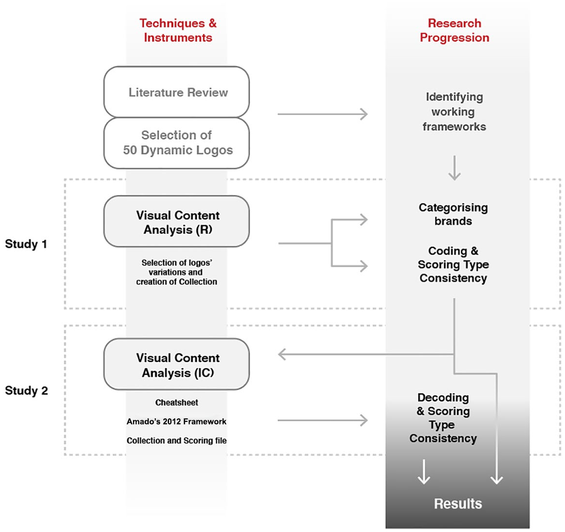
The research architecture.
Study 1: Coding and validating the analysis tool
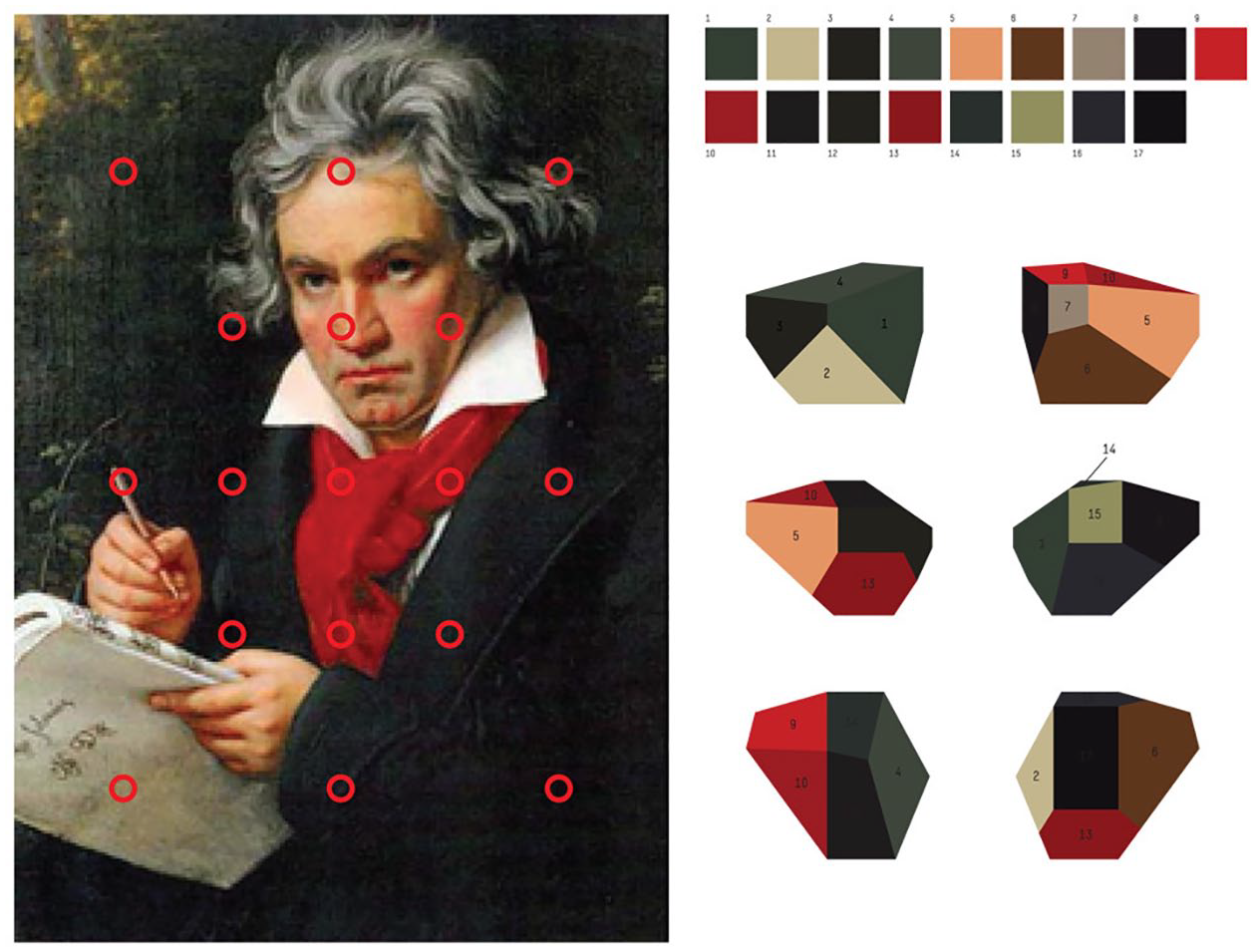
First, two of the researchers (R), both with an academic background and practice experience in Graphic Design, separately scored each logo and coded the levels of consistency. The classification of each indicator (Ci) was done using a 0–10-point scale: a logo would get a 10-point score if consistency was absolute for a particular typographical feature and would receive 0 points if consistency was not depicted. Whenever these features had no application or relevance within the logo under analysis (e.g. when the feature had to do with serifs and the brand’s logo was depicted via non-serif fonts only, or when the characteristic would have an application in lowercase characters and the brand was depicted exclusively through capital letters), the cases would be classified as ‘N/A’ and these would not impact the average scores achieved by that logo in particular. The two coders compared their 0 and 10 results and found there was agreement on all of them, hence allowing the use of a unique scoring sheet for subsequent analysis. The intermediate values of consistency for each Ci (i=1–8) was done based on the interpretation of the R, again separately, using the previously achieved scoring sheet, which was presented to Amado for pre-validation and fine tuning purposes (Figure 4).
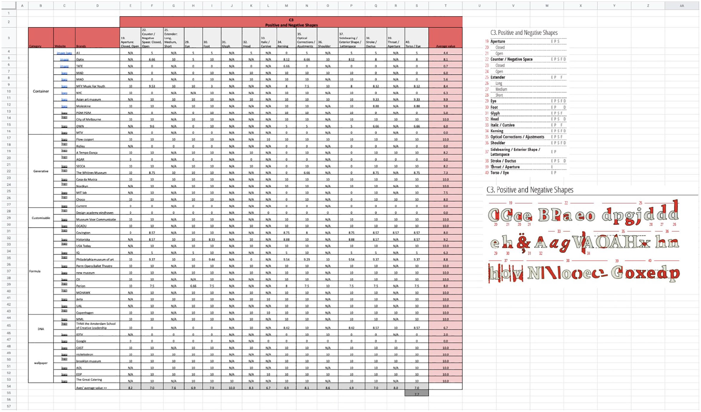
Coding process of C3, positive and negative shapes.
Study 2: Decoding and analysing type consistency
A total of nine design undergraduate students (n=5) and graduates (n=4) participated in this study as independent coders (IC). All of them were recruited at the University of West London: undergraduate students were in their final year of studies of BA Graphic Design; graduate students were enrolled at postgraduate programmes, all of them were cumulatively working in branding/design agencies and had already completed their undergraduate studies in Graphic or Communication Design in different geographical contexts: UK, Denmark, Romania and Saudi Arabia universities.
To support the participants in the process, a cheat sheet (Figure 5) was prepared and distributed. This instrument was essential for coders who had never had any contact with any of the chosen frameworks to quickly get acquainted with:
The main concepts and terms (e.g. the visual identity categories and the typography anatomy components);
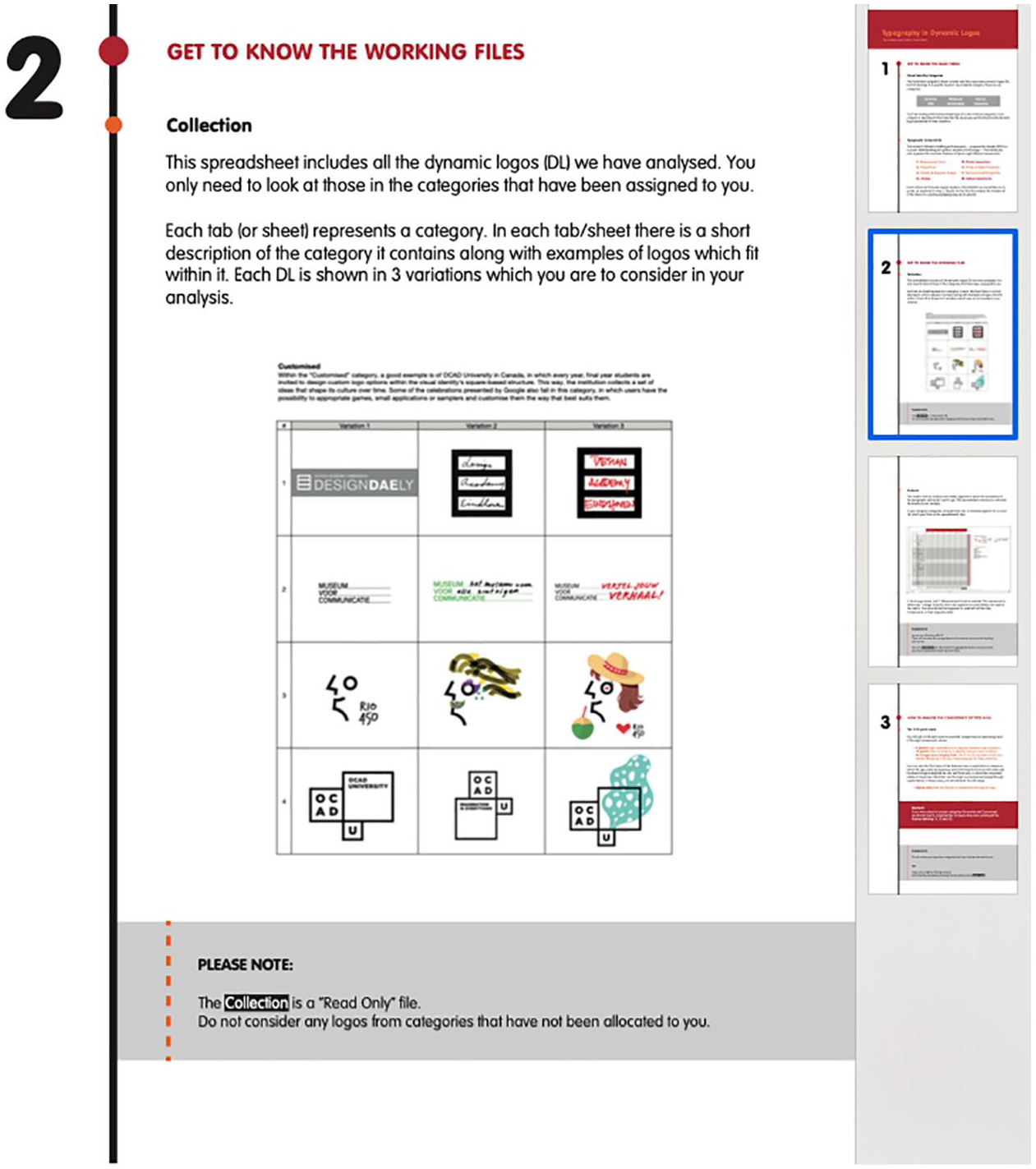
The working files: • Collection, a PDF with the 50 brands and their selected three logo variations; • Analysis, a spreadsheet file for the scorings to be introduced in each Ci (i=1–8);
An explanation on the scoring system and the tasks they were expected to perform.
Cheat sheet distributed among independent coders.
All participants received a synthesised and very visual version of Amado’s (2012) framework. Undergraduate students were physically gathered in a classroom, where a quick and additional introductory presentation was delivered. Due to work commitments, graduates could not join the former, for all files and materials were electronically sent to their emails and, whilst their analysis was being done remotely, all queries and doubts were clarified almost synchronously.
6. Results
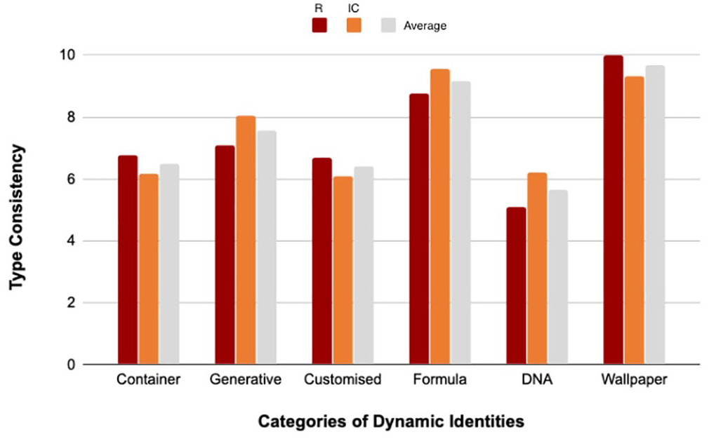
In both studies, a consistent pattern was observed with respect to the main structure graphically defining the brand name. In general, it is possible to state that dynamic brands tend to maintain their typographical components either consistently or very consistently. The results achieved in both studies are expressly similar, although with some differences, namely because R reached a higher number of extreme scores (both 0, in cases such as MTV and Google, and 10, allocated to cases such as AOL and Mohawk) if compared to IC, whose lowest score is 1.3.
Figure 6 presents the average consistency of type achieved by each category of dynamic logos when analysed against the Typeface Anatomy indicators, both by R (red bars) and IC (orange bars). For R, the category Wallpaper shows the highest level of consistency (10.0) in all eight typographical components, whereas for IC the most consistent category is Formula (9.57); this may be linked to the fact that, from a morphological perspective, these two categories are, per se, the least flexible: in the case of Wallpaper, the graphics used as background can change dramatically, for which reason, type-based components must remain fixed in order to guarantee recognition; similarly, Formula cases, and according to Van Nes (2012: 8), can follow a fixed language that, following certain rules, ingredients or parameters, allow the creation of a series of graphics that define the identity ‘in combination with set typography and colour’.
Results of type consistency per category in both studies (and average).
For R, category DNA – with very unique, distinct, creative and differentiated structural visual languages – is the category presenting the lowest rate of consistency (5.08), immediately followed by Customised (6.67) and Container (6.77). Conversely, IC scored Customised as the most flexible category (6.10) followed by Container (6.18) and DNA (6.19). Given that both DNA and Customised can be subject to the intervention of (1) a technological algorithm which is randomly applied or (2) human beings to whom is given an enormous freedom of expression, this kind of result had been predicted.
In regard to the Typeface Anatomy components (Ci), it should be highlighted that all the axes reveal high levels of consistency, considering their identified characteristics: both studies uniformly show that C1 (Measurement Lines) and C2 (Proportions) present the highest values of consistency (R = 8.5, IC = 8.6 and R = 8.1, IC = 8.6, respectively), mostly remaining fixed, namely when logos are displayed in their corporate, formal versions (Figure 7). Due to their proximity to the morphological aspects of a visual identity (see Leitão et al., 2014a, 2014b), it was in fact expected that C1 and C2 would perform consistently and be the less dynamic components.
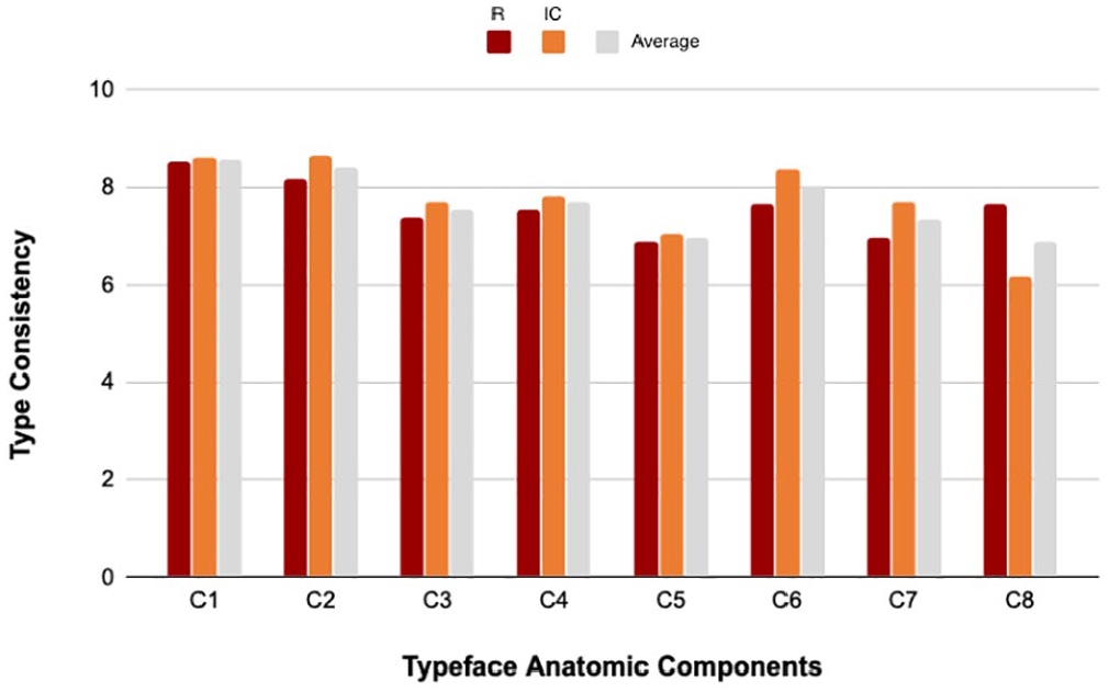
Results of type consistency per typeface anatomic component on both studies (and average).
On the other hand, when jointly considering the achieved results in both studies (grey bars), C5 and C8 (Stroke Connections and Optical Adjustments) seem to be the most subject to variability (7.0 and 6.9 on average, respectively) – although, still, with relatively high levels of consistency, as all components score considerably above 5.0 in both studies. In fact, according to ‘Jonathan Hoefler: Typeface Design’ (2019), these smaller features seem to be the ones that attract higher levels of flexibility so type can adjust to different kinds of media and devices: I had been designing a typeface myself called Hoefler Text and I had been giving this typeface a lot of automated features like ligatures and swashes and things. Apple licensed it for inclusion on the Macintosh and subsequently on every iPhone and iPad ever made.
It should be noted that a group of 8 out of the 50 logos present at least one more creative, informal, commemorative version (typically in specific periods of time), such as Google with its Doodles, or the Design Academy Eindhoven, whose name can be handwritten by anyone as they please. Cases like these justify the lower scores when assessing the consistency of details such as strokes, connections and adjustments. Thus, in some occasions, this group of brands presents a completely different positioning, more dynamic, metamorphic, on all analysed axes of typeface anatomy, including the most static ones, C1 and C2.
The final step consisted of representing the classifications/scorings of each one of the 50 logos on a multivariate and multidimensional radar chart. This visualisation resource was organised in as many sectors as the different categories that were used to classify the brands. In Figure 8, that uses the average results obtained from both studies brought together, the 50 logos are visually displayed in a way that allows the identification of their dynamic categorisation and typographical consistency.
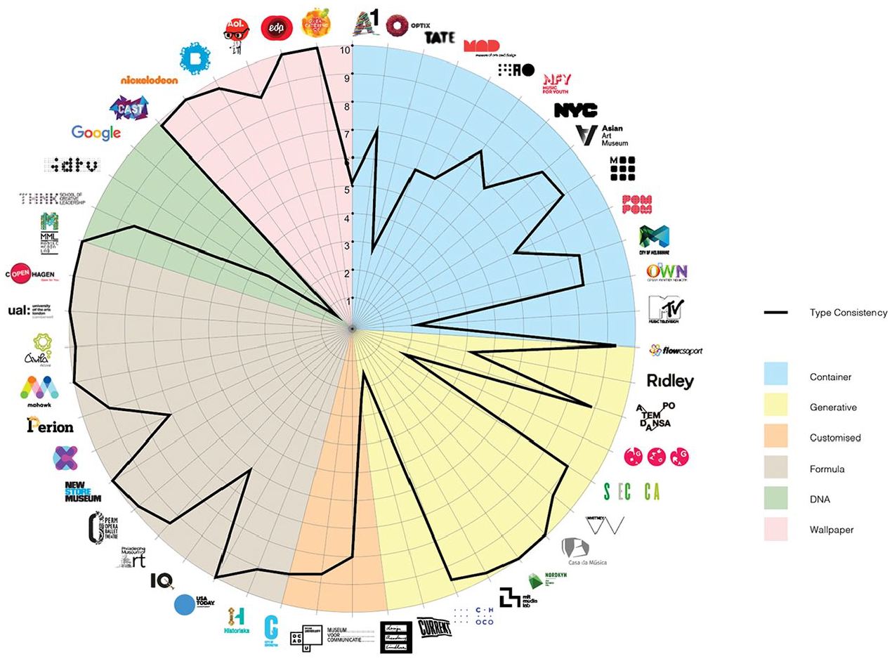
Typographic consistency scores per brand.
7. Implications
It seems that the medium in which these identities are presented to the user – typically the audiovisual and ever-evolving networked devices – is a determining factor for this more dynamic stance, either because it justifies their existence, or because it is considered ideal for the dissemination of short-term changes and/or for a particular event/celebration. The majority of the visual identities within the group of brands identified as belonging to Formula (except 2 of the 13 cases in this category) also reveal a high level of typographical consistency due to the maintenance of typeface anatomic components; these predict the possibility of incorporating complementary or additional words/expressions that define or specify a service, product or place. For example, the identity of New Museum adjusts its signature according to a temporary exhibition within its construction/safety area, which expands. Hence, this type of visual identity varies in its overall graphic construction grid, assuming different widths and heights, incorporating one or more lines of text between the words New and Museum.
The results show that brands categorised as DNA (Google, IDTV, THNK and MML) and the most customisable visual identities (Design Academy Eindhoven, Museum Voor Communicatie and OCAD) have a lower percentage of visual identity consistency. The opportunity to personalise allows the audience to interact and join the brand as much as the owner or designer. Customisation is the first step towards making the visual identity reflect a concept of community and create an emotional bond with the audience, therefore increasing the sense of belonging. It is also interesting to verify the consistent pattern representing Generative brands, depicting a rigorous structure of typographical components (C1 and C2) that define these logos’ typography as constant, fixed or fully consistent, not admitting any variability.
Hence, the extremes on type consistency in dynamic logos should be highlighted: on one side, logos that have greater metamorphic flexibility (Google or Ridley) and, on the opposite side, the logos of brands categorised as Wallpaper, guaranteeing the accuracy of all the typographical axes that define their signature (e.g. EDP, AOL, Brooklyn Museum). This means, though, that Wallpaper logos are dynamic on visual identity elements other than type, such as colour (Lelis, 2019).
Therefore, and as an answer to this article’s research question, it is possible to state that most of the analysed brands are very consistent in terms of their typographical components since, in considering both studies together, only eight (16%) present an overall score of less than 5.0 pts. From these, only three can be classified as typographically very flexible, since their score is in-between 0.0 and 2.5. This is the case for: (1) Current (Generative), which is depicted in a waving flag way, even in static cases, hence affecting not just its typography details but its perceived morphology too; (2) Design Academy Eindhoven (Customised), freely handwritten and, therefore, dependent of each participating individual’s calligraphy, and (3) Google’s Doodles (DNA), in which some instances depict a completely diluted typographic exercise and in which one can ‘see’ the Google characters because they are being presented in a Google context. The remaining brands, representing 84 percent of the selected sample, were all graded over 5.0 and, out of the total, 20 percent scored 10.0 pts, depicting an approach of absolute consistency in regard to type.
This research’s insights lead to three main recommendations:
Where previously the VIS used to ensure a brand’s visual consistency through restrictions, it now faces new and demanding challenges as visual consistency is still a very necessary quality for brand recognition. This may imply a need for a new generation of brand manuals/guidelines, in which another level of topics has to be addressed in order to balance the necessary consistency of a dynamic identity to be perceived as such, and for its VIS to allow proper recognition, alongside the elasticity inherent to design in the 21st century. The results of such a speculative exercise would subsequently be included in rethought VIS guidelines. As a suggestion on how to minimally guarantee the consistency of cases falling under said categories such as Customised, Generative, DNA and even Container, designers would have to contemplate both tricky combinations of type with other VIS elements, and diverse technological and media-related scenarios. For example, the variety of possible devices and extent of transmediality, the levels of expected interaction and participation from the audience, the data it captures and supplies, the narrative dimensions it can admit, and the responsiveness it should carry. This also means that design practitioners involved in the creation and development of dynamic visual identities should be minimally aware of not only the full range of possibilities that dynamic VIS can bear, but also the implications they may bring on each of their elements.
As a consequence, this research also suggests the need for brand designers to get more deeply acquainted with VIS elements (in this case, typography), exploring their details and constraints. One of our IC mentioned: ‘after this research, I will be more patient and careful with type when I design or redesign a logo. I observed that some small adjustments in the font could result in a completely different visual identity.’ In fact, all participating graduates, with professional experience in the design sector, mentioned that taking part in this research allowed them to see logotypes in a ‘more respectful’ way. This leads to a belief that maybe type design is not that well understood by young brand design practitioners and/or that possibly, in many Graphic Design undergraduate courses, type design is only superficially addressed and Flexibility, which could be explored in both process and outcome, is not even a syllabus topic.
Therefore, for design academics with teaching responsibilities, these results may indicate the need to guide students through a wider range of visual analysis techniques where overlapping lenses look at syntax-related graphical details, as much as they examine composition and semantics. For those engaging in design research, the presented analysis framework is just one of many possible ways to scrutinise brand visuals. It should also raise questions that inspire the development of other systems of inquiry in the domain of visual communication.
8. Limitations and Future Research
Neither the design nor the variations in the 50 analysed logos follow any common rule; in fact, such ‘rigour’ is almost impossible to achieve (and probably undesirable, for the sake of creativity). Likewise, the typeface consistency measurement scale used in this research lacks an observation formula or rigorous criteria for a more accurate calculation of intermediate values, which relied on a subjective scrutiny procedure by both R and IC. A large amount of human (hence fallible) judgement was involved in this research.
In order to reduce potential biases whilst increasing replicability, the selected coding stage (clearly defined criteria, pre-selected logo variations, definition of independent coders) was designed to avoid coders attempting to confirm or disconfirm any assertions or results achieved by the researchers. On this matter, the notions of graphic knowledge and graphic ideology developed by Jürgen Spitzmüller deserve some reflection. The author states ‘not every perceivable thing is perceived (by everybody), not every perceived thing is deemed to be interpretable (by everybody), let alone actually interpreted (by everybody)’ (Spitzmüller, 2015: 128). The semiotic condition of what was to be analysed derives from the researchers and coders’ perceptions and interpretations of the objects (logos) presented to them. The idea of stance-taking, in this case by the students who may not have their graphic knowledge and ideology fully constructed, may be a reason for some bias to be considered. However, on a semantic level, students were looking into very detailed aspects of a typeface instead of looking into the typeface as a whole, that may affect the interpretation of social meaning of these typefaces which is highly context-dependent. They were briefed not to do so. Moreover, agents ‘draw specific inferences from specific forms of design, with regard to the genre, the time of origin, the social background of the producers, etc.’ (p. 133), which means that while professional designers might also be biased due to developed knowledge on the subject, the students are less so.
Another limitation is that only 50 brands were analysed. It became very clear, once the frameworks for analysis were identified, that it would have been extremely time-consuming dealing with a larger sample (given the thousands of elements to be analysed). Therefore, the authors made the conscious decision that 50 cases would suffice to test the analysis method and retrieve first impressions on the relevance of the research supposition.
In many cases, it was necessary to differentiate between subtle typographic nuances, such as in the case of two of the characteristics of C5 (Stroke Connections): 131–Cross/Crossing/Junction/Crossbar and 138–Waist/Juncture (Amado, 2012). For this reason and, despite the diversity and large number of elements that were analysed, the authors acknowledge constraints on result generalisation. However, given the exploratory nature of this research and the novelty it entails, the applied scale was considered operative and relevant as an initial approach to the topic, allowing a holistic, systematic comparison. In the future, applying a more robust and objective tool would address the research differently, possibly under an approach grounded in hypothetico-deductive reasoning, specifying, for example, the logic that explains the relationships between brand flexibility and certain variables such as memorisation, resorting to eye tracking instruments.
9. Conclusion
This article presents the assessment of typographic consistency of 50 brand logos using two approaches: their categorisation within the framework of dynamic brand identity proposed by Van Nes (2012) and the anatomy of typeface taxonomy suggested by Amado (2012) which was used to analyse the logo of each of the selected brand identities. This is a qualitative exploratory analysis that proved to be efficient as it allowed the verification of the influence each of the several typographic indicators has on the logos under inquiry, through the evaluation of the standards of both graphic consistency and flexibility of each brand’s visual identity.
The empirical qualitative data depicted evidence that, in general, dynamic visual identities show a pattern of consistency in relation to the anatomic features of type. The analysed logos are consistent across their structural axes: Measurement Lines and Proportions. Flexibility occurs with higher incidence in detail-related components, for example Strokes and Optical Adjustments, but in its overall structure, typographic choices in dynamic logos tend to be preserved without significant changes or distortions. The specific cases in which we identified complete flexibility of type represent a small fraction of the 50 visual identity systems under analysis.
The results highlight that morphologic features remain consistent even in highly mutable contexts, since typography, as the key graphic resource for the immediate translation of a brand’s name, even in different languages and using different alphabets, seems to be a pivotal feature for guaranteeing brands’ recognition and memorisation. And, unlike the findings of previous research on other VIS elements (e.g. colour), type seems to be the most constant component, probably because of its incontestable role in guaranteeing readability.
Hence, this research can be framed as an important contribution to the perception of how typeface anatomy can define the consistency of brands, even in the case of flexible multimodal brands, in which diversity and entertainment are essential for their visual profiles.
Footnotes
Acknowledgements
The authors would like to thank the reviewers’ constructive feedback that very much enriched the article. An enormous thank-you to all the students and graduates who took part in this project as independent coders: Adina Bostinaru, Adrian Istrate, Beata Borisovaite, Karoline Lundberg, Laura Bakalka, Lynda Aneno Aciro, Nilay Zaimoglu, Ollie Slater and Saffron Harrison-Abbas. Finally, a word of gratitude to Dr Pedro Amado for sharing some of his time to confirm queries and fine-tune the framework.
Funding
The authors received no financial support for the research, authorship and publication of this article, and there is no conflict of interest.
Biographical Notes
CATARINA LELIS is a Senior Lecturer in Branding and Innovation at the University of West London. She began her professional experience in 1997 as a graphic and software interface designer. She started her teaching experience in 2007. Her research and entrepreneurial ideas were recognised and funded by FCT, the Portuguese national funding agency for science, research and technology. Catarina lead OurBrand®, an entrepreneurial project whose main goal was the design, development and deployment of a technological/digital solution for the creation of participatory design-led brand centres. With this project, she won a national entrepreneurship contest, which took her into a one-week immersion program in Silicon Valley, and her team was selected for the semi-finals of the MIT-Portugal Innovation & Entrepreneurship Initiative Building Global Innovators Venture Competition. Her research interests include Participatory Brand Design, Brand-Oriented Ecologies, Dynamic/Flexible Brands, Creative Skills Development, Visual–Digital Literacy, Technology-Mediated Communication and User Experience.
Address: University of West London, St Mary’s Road, Ealing, London W5 5RF, UK. [ email:
SANDRA LEITÃO is a Freelance Graphic Designer with an MA in Multimedia Communication. She has more than 10 years of experience in communication design with a special focus on brand design. From 2009 to 2011, she was Educational Coordinator of a Professional Course in Communication, Marketing, Public Relations and Advertising, developing training contents for topics such as Graphic Communication, and Audiovisual and Advertising Communication and Creativity. Her research interests lie in the area of contemporary brands, namely dynamic brands, interaction and health.
Address: Lisbon, Portugal. [ email:
ÓSCAR MEALHA is an Associate Professor at the University of Aveiro and develops his research in the area of ‘Information and Communication in Digital Platforms’ in the context of ‘Knowledge Media and Connected Communities’ with several projects, masters and doctoral supervisions and publications on interaction design and analysis techniques and methods, namely for usability evaluation, UX and visualisation of interaction/info-communication activity. He is involved in projects such as ‘Visualisation of Open Data Dashboards for Citizen Engagement and Learning’ in smart territories, and ‘Knowledge Interface School-Society (KISS)’ within the scientific network ASLERD (![]() ).
).
Address: Department of Communication and Art, University of Aveiro, Portugal. [ email:
BEN DUNNING is a Lecturer in Graphic Design at the University of West London. He is also a graphic designer and author specialising in graphic, digital and interactive design. He began working in web QA then UI/UX and Web design in the early 2000s before moving into education in 2006. He graduated from his MA in Graphic Design at LCC in 2011. His first book, Video Games: An Introduction to the Industry, was published in December 2015 by Bloomsbury Fairchild and he is working on a follow-up about UI Design in Videogames. Ben has research interests that include the design and role of the UI in Videogames, Dynamic Branding and Typographic Systems.
Address: as Catarina Lelis. [ email: