
Abstract
The paper uses examples of multimodal discourse to show how frame analysis can account for the choices of form in a range of multimodal (image or image-plus-text) artifacts addressing issues of climate change. Relying on the concepts of frame metonymy and blending, the article discusses a selection of artifacts representing emergent frames such as Save the Planet and Hourglass, which are pervasive in multimodal representations of climate change. The article describes the advantages and disadvantages of common multimodal stylistic choices, while addressing issues of ‘persuasive bleaching/overload’. It also uncovers some frame-related specificities of multimodal discourse.
Climate change and its potentially devastating effect on life on Earth is now the subject of numerous discussions, publications, organizational efforts, and government policies. It takes a range of forms and refers to facts, speculations, scientific analyses and doomsday predictions. We are all inundated with these discourses, trying to find our way through the morass of opinions, proposals and denials. In this paper, I focus on the popular take on the problem, as represented in Internet discourse; specifically, I consider the most pervasive frames recurring in numerous easily accessible artifacts.
There are some specific features of such discourse that are worth noting at the start. First of all, the artifacts available typically use images, sometimes clarifying the point being made with a simple slogan. I will refer to such artifacts as multimodal. Secondly, the images used are not realistic representations of real-life behaviors. They are produced for the specific persuasive purposes and so involve a range of figurative meanings, typically rendered through frame metonymies and blends. 1 The conspicuous presence of such artifacts in online media entrenches the frames, while also de-emphasizing the role of figuration.
Unlike texts, internet campaigns, memes and posters have to rely on immediate recognition of frames referred to – as a result, the comprehension process is based more on somewhat simplistic triggers of the intended frames than on any in-depth understanding of the issue. In what follows, I will identify several such frames and discuss ways in which frame evocation patterns create persuasive effects. This study in framing has been conducted on the basis of data gathered from a range of websites. It was not possible to rely on a corpus of artifacts, so I collected the examples myself, via searches on Google Images (also Pinterest and Reddit). The types of artifacts suggested as a result of such searches were surprisingly consistent. For example, searching with the use of the Save the Planet slogan yielded thousands of examples, basically all of which (with the exception of some mis-hits) represented the image of planet Earth as seen from outer space, with a range of varieties pertaining to the specific aspect of the climate change frame, without affecting the leading frame. The imagistic consistency of examples found was possibly the most surprising and significant aspect of this study.
Frames, frame metonymy, and blending
In my discussion, I rely primarily on some basic claims of frame semantics. Introduced by Fillmore (1977, 1982; Fillmore and Baker, 2009), the concept of a frame is understood as a knowledge structure, maintained in language users’ minds as a structured whole, such that not only can we use linguistic labels to evoke the entire frame (e.g. the Commercial Transaction, 2 or Buy/Sell’ frame), but also salient parts of it (Buyer, Seller, Price, Transaction, Object Transferred as a result, Money spent/received, etc.). The crucial feature of a frame is that it can be accessed via the mention of any of its components; for example, references to entities such as the seller, the sales tax, or the discount price are understood only in the context of the pre-existing familiarity with the Commercial Transaction frame. Multimodal discourse of climate change relies almost exclusively on this mechanism, leading to somewhat repetitive references to salient aspects of the frame.
Within cognitive linguistics, the concept of a frame led to at least two kinds of developments. On the one hand, analysts started proposing very broad frames as explanations of pervasive patterns of conceptualization which do not necessarily rely on specific choices of linguistic expressions. Lakoff’s well-known attempt (1996) to offer a better understanding of the US political landscape is a case in point. Lakoff suggested that the core of the distinction between the Democrats and Republicans is grounded in frames which bring moral issues to the very core of political values. Lakoff’s distinction between the Strict Father frame (as applied to Republicans) and the Nurturant Parent frame (the Democrats) explained the apparent inconsistencies and led to a re-evaluation of political stances. It is thus potentially quite close to the original term introduced by Goffman (1974) and offers grounds for discussion in terms of Social Movements discourse.
The second trend in the use of the term ‘frame’ took it in a different direction, prompted partly by Fillmore’s (1968) original study of semantic case. Looking at sentential instantiations of frames (such as the buy/sell frame, with its basic ‘exchange’ scenario and specific roles assigned to the participants) led to the development of computational tools (known as FrameNet, see FrameNet, 2022; Petruck, 2022; Ruppenhofer et al., 2010), now applied to the study of several languages (e.g. Spanish and German). The FrameNet projects are offering efficient ways to study linguistic structure from the perspective of semantic frames.
Finally, the Fillmorean frame has provided a base for analyses of figurative language. Sullivan (2006, 2013) offers a framework for conceptual metaphor analysis based on frame structure; her theory is also utilized in Dancygier and Sweetser’s (2014) broad approach to figurative language. In this study, however, I focus more on the mechanism that offers a way to consider multimodal artifacts. Broadly based on Fillmore’s observation (profiling one aspect of a frame evokes the entire frame), the concept of frame metonymy (Dancygier, 2011; Dancygier and Sweetser, 2014), identifies one of the most common types of metonymy and shows the efficiency of framing in enriching discourse. Using a visually salient element of a frame to provide access to the frame as a whole and thus allow further emergence of meaning is a pervasive phenomenon in online discourse of climate. 3 In some cases, though, the persistent use and easy accessibility of a frame-metonymic element leads to undesirable effects. One example is a representation of a polar bear, often a polar bear cub, stranded in the expanse of the ocean on a solitary ice floe. An image like that is commonly used to signal an aspect of global warming, such that melting ice is responsible for stranding various species of animals away from their habitat, thus threatening them with extinction. However, the repetitive nature of some aspects of framing, while increasing the public’s perception of climate issues, may lead to desensitizing effects on viewers and readers (a phenomenon I describe below as ‘persuasive bleaching’).
Another theoretical concept I will rely on is conceptual integration, or blending (Fauconnier and Turner, 2002; Oakley and Pascual, 2017). It is not possible to discuss blending here in any detail, but let me just point to some crucial aspects of the theory. Blending is a process which relies on input conceptual structures (often best described as frames), being combined into new conceptual configurations. The process requires that some elements of the input frames are disregarded, while others are highlighted and inserted into a different conceptual structure. The structure of the emergent concept (the blend) proposes a previously unavailable meaning. For example, a commonly used phrase carbon footprint combines the frame of carbon emissions (one of the causes of climate change) with the material trace of a moving body, to represent the totality of greenhouse gas emissions produced by an entity such as a business, a country, an event, or an organization. The size of such a footprint can then be measured to evaluate the entity’s contribution to the totality of harmful emissions. The blend prompted by the expression creates a way to evaluate the climate impact of various entities. The visual artifacts to be considered below often manipulate available frames to use frame metonymic concepts in prompting blends – the blends, in turn, allow us to understand the emergence of meaning in the artifacts.
In what follows, I discuss several instances of ways in which multimodal discourse relies heavily on frame evocation and blending, while prompting the emergence of frames specific to the discourse of climate change. While the emergence of such frames prompts and facilitates public perception, it also creates issues of its own.
Save the Planet frame: Consequences and agency
One of the most pervasive expressions in climate change discourse is an appeal to Save the Planet. The components of the frame conceptualize the Earth not just as a planet that we, humans, inhabit, but also as the celestial body that we have taken responsibility for. In the frame, the planet is suffering as a result of climate change, and our duty – as the planet’s inhabitants and also the species responsible for creating the current situation – is to stop the process of deterioration and avert the disaster. The Save the Planet frame established a pervasive shift in the view of the roles of humans – from happy inhabitants, building a life on the bountiful planet, we have shifted into those who are causing the destruction of the Earth, and we have a duty to stop the process and avert the disaster. In other words, the Save the Planet frame puts us in charge and delivers the fate of planet Earth into our hands.
The images produced in the context of this frame are surprisingly consistent in their representation of the situation. They typically show the planet from a distant perspective (as if the viewer were out in outer space). However, the Earth is not seen against the background of the solar system or the galaxy – rather, it is situated in the context of a landscape or situation which is realistically only possible when an object is situated on Earth. The resulting concept emerges primarily from re-framing the understanding of size. Rather than being a large planet, providing space for billions of inhabitants, and typically not experienced from off the surface of the Earth itself, our planet is shown as a sphere, with continents and oceans on it, but perceived in its entirety. Consider Figures 1 and 2 below:
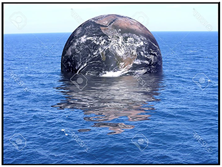
Save the Planet frame (1).
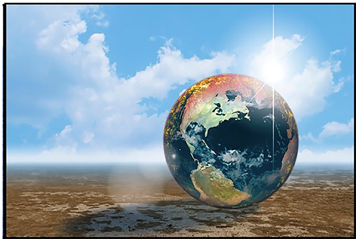
Save the Planet frame (2).
In Figure 1, the Earth is partially submerged in a large body of water (an ocean? water from melted icecaps now covering everything?); in Figure 2, it rests on the ground, parched and lifeless like a desert. These two ‘environments’ in which the Earth is shown to exist evoke two commonly recognized consequences of climate change – flooding from the melting icecaps and a draught resulting from rising temperatures. The fact that such climate features will eventually affect the planet as a whole is suggested by placing the whole Earth in the post-climate catastrophe landscape. The images rely on frame metonymy (features of climate predicted for the future), but also on blending – so that the entirety of the planet can be shown to be affected by the changes. The surprising manipulation of size and a part-whole relationship is created via the blending process, where the dual view of the Earth (as a planet and as a habitat) can be visually combined. Importantly, Figures 1 and 2 (still just examples selected among many similar posters) focus on the final results climate change might bring, without any reference to causes, or to the fact that the planet is also home to the entire human race. One might wonder whether such images are indeed effective if they do not include human inhabitants of the Earth.
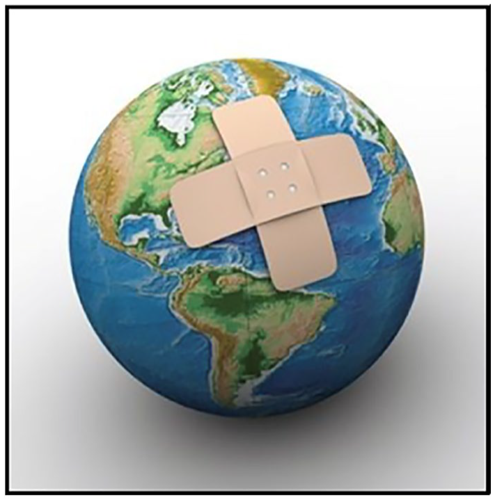
The frame-metonymic construal of the planet as an object we can observe in its entirety without going into outer space is also present in Figures 3 and 4. And yet, the resulting ‘view’ of the earth is construed even more clearly, because other aspects of the image involve a distinctly human perspective. In Figure 3, the planet is blended with a human body. However, applying band-aids to an ailing human would only make sense if the condition treated were a minor superficial scrape or cut – nothing dangerous. Evoking a band-aid in the context of the planet suggests a striking lack of proportion. In fact, the term apparently evoked is band-aid solution – a superficial remedy which does not address the nature of the problem. The image in Figure 3 sets up a blend of the body and planet Earth which depicts our efforts to stop-climate change as inadequate. The blended combination of two frames creates an evaluative construal of the situation.
Save the Planet frame (3).
Save the Planet frame (4).
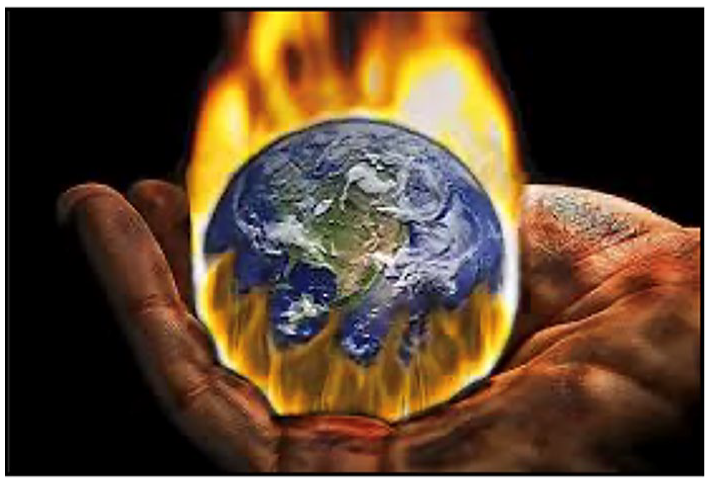
In Figure 4, the human body is also added to the frame, but only as a human hand. Various body parts are used metonymically to evoke frames associated with the role those parts play in our lives – so that, to give a simple example, a representation of an eye evokes vision and, consequently, knowledge, while a representation of a heart evokes emotions. The frame of the human hand is very rich, covering numerous situations where using one’s hand suggests action or control (give someone a hand, take something in hand, etc.) The fact that the hand in Figure 4 is depicted as cradling the burning planet evokes our stewardship of the planet we occupy, but also pain. The planet is on fire – either because of temperatures rising or because of wildfires – and yet a human hand, metonymically standing for humanity, rather than one person, suggests giving support and caring.
Figures 3 and 4 both thus involve us, the Earth’s inhabitants, as responsible for the ailing, burning planet. This is achieved, again, via blends demanding that the size of the planet is very small, and that we are given an active role in dealing with the problems affecting the planet in our care. The frames combined in these blends give us agency in the climate change scenario, unlike in Figures 1 and 2, where we are excluded from the frames evoked.
And yet, all four of the images rely on yet another frame, prompted directly by the now idiomatic call to Save the Planet. The assumption of the slogan and the images it prompts is that humanity is in some way independent of the planet and can exercise care or agency in coming to the rescue. The problem is, however, that the planet as such can very well heal itself – if only humans stopped causing harm. It is the humanity that is in danger of suffering irreparable harm. Human race may not survive intact and so the climate emergency is about us, not the integrity of the planet as such. It is interesting to see how the frames evoked through the Save the Planet artifacts consistently avoid portraying the fate of humanity, while transferring all the suffering and destruction onto the planet – diminished, helpless, and left in our hands to be protected. Such a representation can be justified in some way. First of all, an accurate visual representation of what might happen to the inhabitants of the Earth would be difficult to portray or too explicit to be acceptable. But, perhaps most importantly, the Save the Planet campaigns offer us some agency, and with it, some hope of being able to stop and reverse the damage. There is no need to campaign if there is nothing to do, and so we need to think of the fate of the planet, not our own, in order to feel empowered to act. The moral standpoint we are meant to take, as the planet’s protectors, is noble and hopeful. One might wonder whether it accurately reflects the attitude of the majority of the planet’s inhabitants, but we can hope that it will prompt a change.
The Hourglass frame: Time, causes, and consequences
While images of planet Earth constitute a large portion of multimodal discourse online, the next competitor is the Hourglass frame, a traditional way to measure the passage of time. An hourglass has two glass compartments which can be filled with sand, one up and one down, connected by a narrow passage. It can be flipped, so that when all the sand has trickled down, signaling the passage of a certain amount of time, the measurement of another installment can start. Sand is a mass (rather than count) material, but the compartments of the hourglass can turn it into countable portions. It thus makes sense to talk about running out of time when the upper compartment is nearly empty. The same concept can be used metaphorically, to evoke a well-known mapping representing our management of time –
It is not surprising that the concept of an hourglass has prompted a range of visual representations in which sand is replaced by another substance. Some internet posters represent an upper compartment filled with crude oil, slowly dripping onto the natural environment below, others show the whole Earth (the planet, again), filling up the top compartment and trickling down as sand – apparently as a result of draughts which might kill all life on Earth, still others divide the Earth’s regions to put the melting icecaps in the top part, and show nothing but raging waters in the bottom part. The frame thus relies extensively on the visual framing of climate change in terms of the most publicized processes – rising temperatures resulting in the death of life and melting ice drowning habitable land.
Importantly. the conceptualization of climate change in the two frames shown so far is different in their treatment of time and causation. Figures 1 and 2 focus on the final result, portraying the apocalyptic future, Figures 3 and 4 attempt to capture the current situation and our role in it, while most of the Hourglass posters capture the process, also suggesting we have little or no time left to avert the consequences. I include two examples of the Hourglass frame, Figures 5 and 6.
Hourglass frame (1).
Hourglass frame (2).
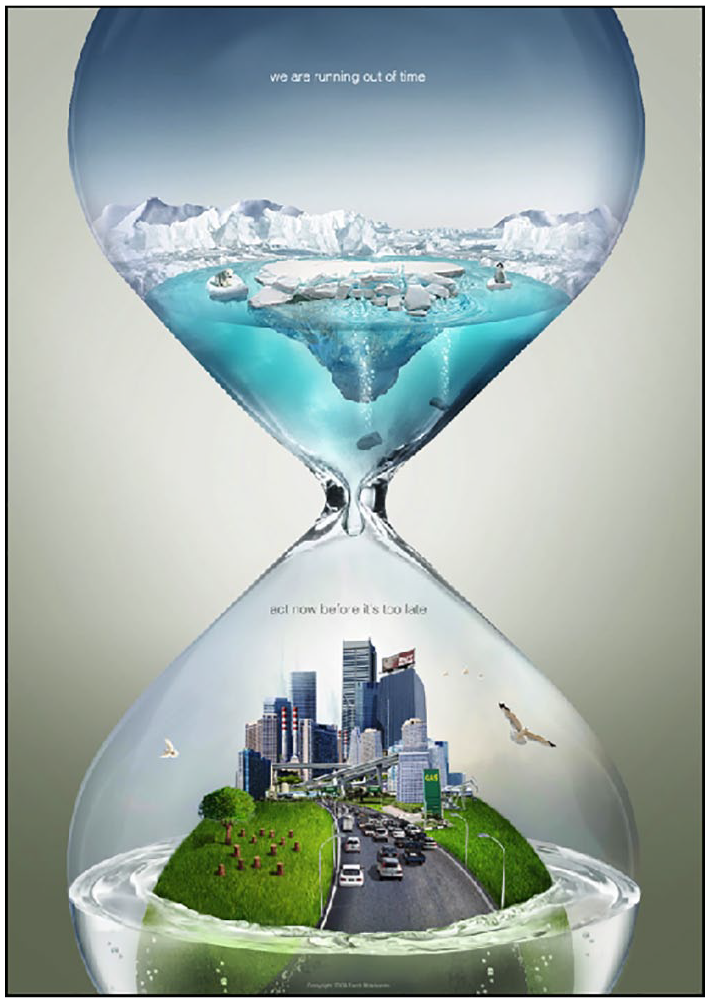
Figure 5 above shows an hourglass with two predictably structured compartments, but is also richer than most in detailing the causes and consequences while also making interesting visual choices, complicating the frame metonymies relied on. The text says: We are running out of time/Act now before it’s too late, combining the alarmist use of the
The lower compartment is now half-filled with water, slowly drowning the sphere on which human environments are shown (the sphere is not the usual representation of the planet, but could be read that way). All the items represented on the surface of the sphere frame-metonymically evoke the aspects of our civilization which are typically connected to climate change – a road with many cars, a gas station, a refinery, tree stumps (standing for deforestation), a busy city, etc. The image thus evokes Time, as a factor in potential solutions, some Causes (fossil fuels, deforestration) and some Consequences – melting icecaps drowning the environments that humans and animals call home. Time and Causation are two of most common vital relations identified by blending theorists; below, I will refer to this standard package via an acronym: TCC.
What is perhaps quite striking about Figure 5 is its attempt to detail as much as possible, while formulating a call to action; also, it does not focus on the planet as an abstract entity. Still, the role of humans – as causes and as possibly affected entities, is downplayed, and only evoked in the call to act now. What appears to diminish the impact of the image is what we might refer to as ‘persuasive overload’. The image of the city is so complex that it is actually quite hard to see what is included, and it requires some interpretive effort to grasp all the details. Also, perhaps most importantly, the text included (We are running out of time. Act now before it’s too late) is not very effective – on the one hand, the idea of ‘running out of time’ is already represented by the hourglass, while the call to ‘act now’ sounds a bit hollow, because it is not clear at all what actions are referred to.
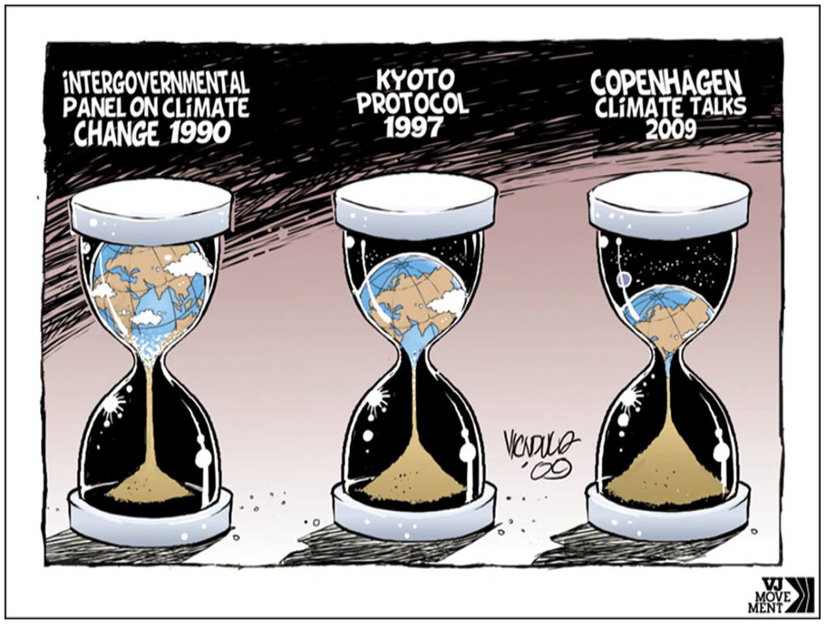
Figure 6 relies on the general Hourglass frame, but it adds an important aspect of the construal – a more specific measurement of the time elapsed and the progress of international efforts to stop climate change.
There are three hourglasses, each representing the situation at the time of the relevant international climate conference. The image sets up the timeline (organized as it typically is, with earlier events on the left), showing how little progress in slowing down climate change was really happening between various rounds of talks. The progress of climate change shown via the emptying top compartment is clearly (and alarmingly) captured via the hourglass/timeline blend, and thanks to this visual transparency the image does not use any slogans to support the message. Importantly, the labeling of the three hourglasses with the references to climate summits can be read to suggest the inefficacy of the process. Countries are reviewing the status quo at every stage, negotiating a new protocol, and presumably attempting to implement the changes agreed upon, but the progress of climate deterioration proceeds apace. Without resorting to abandoned bear cubs and images of a wasted planet this image is possibly the clearest of the ones considered so far in its pessimistic predictions.
Repetitive frame metonymy
The role of multiple frames can be seen in the campaign launched by the environmental organization Greenpeace against the toy producer Lego. For many years, Lego partnered with Shell Oil to brand its brick sets and sell them at gas stations. The intended framing was the primary frame of the Lego brand – creativity and imagination, and the Shell involvement didn’t seem to matter. However, 8 years ago Greenpeace started a campaign against Lego, accusing them of duplicity – presenting themselves as ‘green’, while supporting the oil business. The campaign was quite bitter, but the public sided with Greenpeace, especially after the release of a video of a pristine arctic environment built in Lego gradually drowned by oil (https://www.youtube.com/watch?v=qhbliUq0_r4). Consider Figures 7 and 8 – clips from the video – to appreciate the visual impact. In the end the partnership fell apart. From the perspective of the concepts used in this paper, the incident is quite telling – various brands build a public image which has to respond to expectations, now also including caring for the climate.
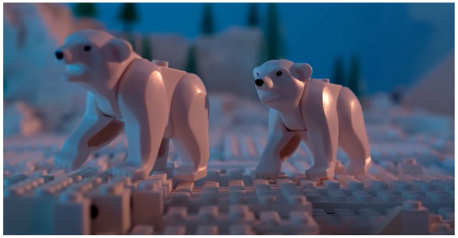
Greenpeace video (1).
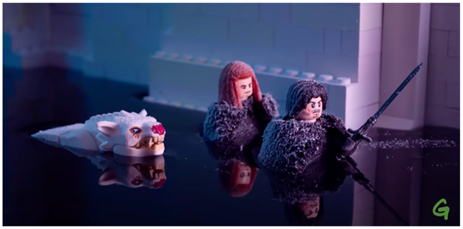
Greenpeace video (2).
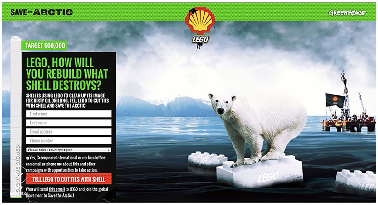
But the expressive means used are becoming rather stereotypical as well. In a poster available online (Figure 9), Greenpeace tried to raise public awareness of the partnership.
Greenpeace poster.
I asked my students to evaluate the impact of the poster, and the responses I got suggested that the poster was not quite effective. Most students agreed that Lego made a mistake, but many of them also noted that the polar bear on the Lego brick ice floe diminished the effect (note the polar bear representations also in Figures 5, 7, and 8). They thought that some types of climate messages (such as always relying on the same species to evoke empathy for wildlife) are becoming counter-productive. The effect of this repetitiveness is what we might call ‘persuasion bleaching’ – so that the ads and campaigns reiterating the same framing simply stop being effective. It would be worth investigating the public’s response to frames such as Save the Planet, as there is a clear danger of bleaching in this case as well.
The Greenpeace poster (Figure 9) is a prime example of how visual viewpoint is used in climate change campaigns. The item that attracts attention first of all is the centrally located image of a polar bear on a small white Lego brick (representing an ice floe). The ice floe-Lego brick blend relies on the merging of two frames: Lego (the company criticized here) and polar environment. The interpretation of the blend is meant to be straightforward – polar bears will suffer as a result of global warming and its effects on the polar environment, and Lego is supporting this by collaborating with an oil company. But the interpretation relies much less on the image, and much more on the frame being evoked – now all too familiar. In fact, the image as such could suggest, outside of the standard frames, that Lego gives support to endangered species (the ice floe supports the bear and prevents it from drowning). At the same time, the black and smoky oil rig is way back in the background, not very important. The primary persuasive clash is between the Shell Oil logo on top of the image, and the bear. Considering the salient frame trio (time, cause, consequence – TCC) the cause is not highlighted, and the consequence is portrayed through an ambiguous image. However, thanks to the image being that of a polar bear (in a sense, a poster child of climate discourse), the expectation is that the viewer’s empathy will be immediately evoked. That expectation may in fact not be fully justified – because of the ‘bleaching’ of the polar bear trope.
Looking at the examples discussed so far, one might make several observations. As suggested above, there are three salient aspects of the climate change frame: time, causes, and consequences. The Hourglass frame is the primary carrier of the idea of Time (treated as a diminishing resource), Causes are usually restricted to some representation of our reliance on fossil fuels, and the Consequences are typically represented in one of two ways: drought/flood (the core of the Save the Planet frame) or endangered species (the polar bear again). The campaigns are thus predicated on two types of emotional responses: fear and empathy. In multimodal contexts, it is common to rely on blends that do not fully include the human race – either as potential agents of possible change (except the ‘band aid’ and the ‘protective hand’ images) or as a civilization built on the reliance on fossil fuels. Figure 5 is one of the very few images found which attempt to depict all the aspects of the TCC focus – while running the risk of both ‘bleaching’ and ‘overload’, and reducing the call to action to ‘act now’ – without saying anything about actions to be taken. Blends are generally so effective because they compress vital relations such as Time or Causation, but in the case of climate discourse these compressions feed ‘climate doomism’ rather than supporting attempts to address the problem. Being bombarded with images representing the dramatic consequences of climate change does not prompt the eagerness to ‘act now’. It appears, then, that the primary strength of blending – the ability to compress complex concepts and reduce them to ‘human scale’ – may also be its primary weakness. Consequences are relatively easy to show, remedies are not.
Is originality effective?
Independently of the ‘mainstream’ frames discussed above, there are cases of climate change messaging that are much less predictable and end-up being broadly discussed in blogs, on social media and on public forums. Figure 10 below is one such example.
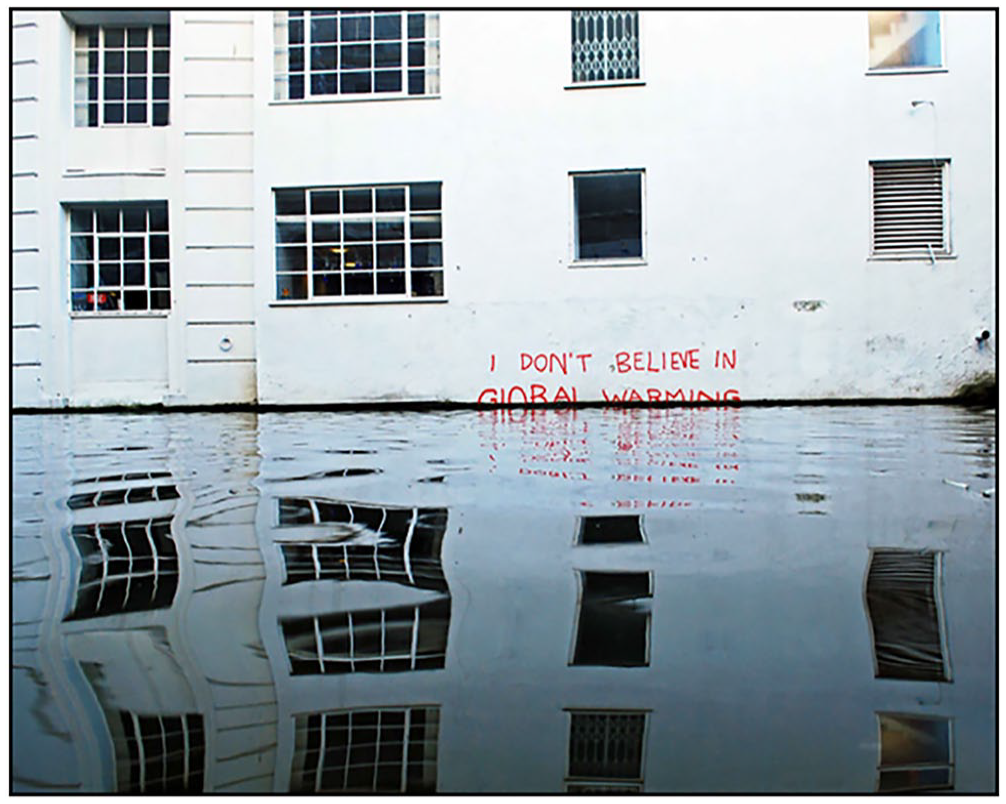
“I don’t believe in global warming” graffiti (Banksy).
The photo represents Banksy’s graffiti on the wall of a building over Regent’s canal in Camden, north London. The central aspect of what the photo represents is the red text sprayed by an anonymous person – I DON’T BELIEVE IN GLOBAL WARMING. The overall effect is quite complex, though. The graffiti is not quite above the water level and is partly submerged while still being readable. The effect is puzzling, as it forces the viewer to imagine that the graffiti was spray-painted when the wall was still accessible to a passer-by from the street level, and then the rising water partly covered it up. The graffiti thus construes a sequence of events: graffiti was done by a climate-change denier, at the time when access was easy, then the water level rose (presumably as a result of global warming, which the viewer has been primed to use as an explanation). The words of a passer-by thus denying the reality of global warming have been literally drowned by water, creating the next level of denial – denying the false belief of the denier. What is more, since the water level rose so much since the ‘denier’ was there, it will likely continue to rise, covering the graffiti entirely, and thus making the words of climate-change deniers invisible and inaccessible. While relying on our general understanding of the phenomenon and the effects of global warming, we do not need to construct new frames to be persuaded by the graffiti. Importantly, and somewhat ironically, we are not persuaded by the content of the graffiti, but by the effect of it being drowned. The internet popularity of this photo may suggest that the public enjoys being teased and made to think, rather than being exposed to predictable frames and stances.
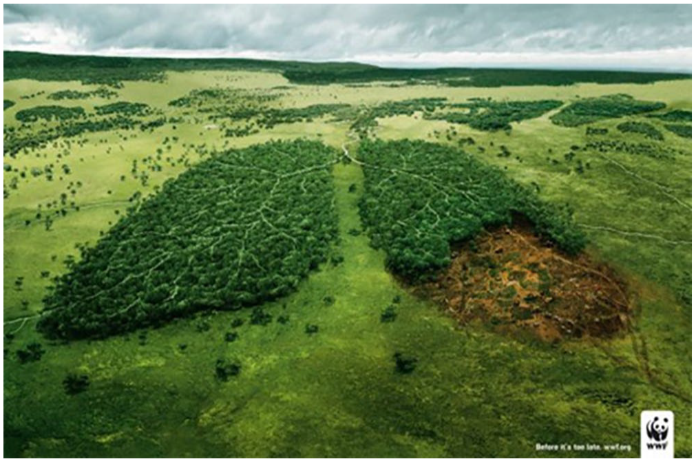
My final example, Figure 11, is a World Wildlife Fund ad. It has been discussed extensively online, in blogs and on social media, primarily because the meaning of the image is potentially ambiguous. The small-print line of text at the bottom – Before it’s too late – clearly correlates with appeals I described above (act now, before it’s too late; we’re running out of time), but the image is an example of neither of the major frames – Save the Planet or the Hourglass. Instead, it proposes a blend of the Earth and a human body, focusing specifically on the familiar shape of the lungs, here represented as areas of forests. Additionally, the visible tracks of rivers or streams re-enforce the blend by evoking the net of veins running through the human body. A part of the distinct lung shape, however, is brown, rather than green, suggesting some missing or damaged tissue. Now, depending on what the viewer focuses on while looking at the image of the lungs, the image may suggest one of two meanings. In the context of environmental concerns, the image seems to evoke a well-known slogan: (Tropical) forests are the lungs of the Earth/the planet. In that context, the brown section suggests damage – lung damage in the ‘human body’ input, or deforested area in the ‘planet’ input. If one’s focus is the planet, then the ad can be read as a warning against the progress of deforestation. If one chooses to read the blend as referring to a human body, the damaged tissue may be seen as representing damage caused by cigarette smoking. While the latter reading is not very common, it is accessible, and sometimes prompts search engines to profile the ad among non-smoking ads. Importantly, the line of text applies to either meaning – calling for the end to deforestation or for quitting smoking.
World Wildlife Fund ad.
The ambiguity is not really problematic, as it arises on the basis of two input frames, while showing how well the inputs are integrated in the blend. If the image, and its internet popularity, suggest anything, it is that a rather familiar persuasive message can be framed in an original way while also relying on very simple visual means supported by contextual availability of the participating frames.
Framing the message effectively
The examples above suggest several points concerning the deployment of frames as persuasive strategies in the multimodal discourse of climate change. We can note the following:
Visual and multimodal persuasive discourse relies extensively on frame-metonymy. Elements of multimodal artifacts created in the context of campaigns can contribute to the persuasive impact if they feature highly evocative elements, clearly connected to the frame being evoked (showing melting ice caps to evoke global warming);
The images discussed above are visual blends of all kinds. The visually represented frames are packaged into configurations which highlight the intended message.
It is important to note that these blends, while built out of metonymically evocative images, focus primarily on two types of blends: temporal compression and cause-effect compression. They attempt to show the future of the environment (though the exact timeframe is not really known to anyone) by showing the future consequences of the progress of climate change (desert-like landscapes, melting icecaps, etc.). While causes are occasionally represented, they are often conceptualized without reliance on human agency.
In some cases, the metonymies and blends proposed yield an entirely new frame which then becomes uniquely associated with the issue represented (the Save the Planet frame is a case in point);
Lower-level metonymies representing selected aspects of the major frames may weaken their impact through excessive repetition and the resulting desensitization of the viewing public (consider the ubiquitous polar bear cub); I have referred to this effect as ‘persuasion bleaching’;
Framing the issue while relying on easily accessible conceptual metaphors is an effective strategy (consider
It is very common (perhaps even necessary) to further use the frames evoked in patterns of figuration (metaphor, metonymy, and blending all play a significant role);
The level of detail in representing the intended organizing frame may sometimes be too high, thus overwhelming viewers with the sheer number of details (the Hourglass in Figure 5 seems to be overburdened with very specific details);
Visual evocation of appropriate linguistic expressions (such as a band-aid solution) is effective in supporting the general framing;
Visual reference to relevant parts of the human body (a hand, lungs) helps the viewer grasp the experiential impact of the frame;
In general, visual artifacts seem to have become such a popular form of framing for a reason – they do facilitate fast evocation of complex concepts, and they can rely on original and complex blends in the framing of the issue. At the same time, they effectively use the frames to prompt emotional alignments, leading to advocacy. The successful campaign against Lego is an example of how framing the debate, also through visual media, is an effective tool in shaping corporate behavior.
However, there are important aspects of the frames relied on that do not seem to support effective conceptualizations. I have noted above that agency is commonly an underrepresented aspect of the framing. The calls to action are often overwhelmed by visually striking images of doom (the drowning planet, the planet as a desert, etc.). Occasionally, the ease of visualizing the changes affecting the climate yields images that are persuasively misconstrued. One such case is a whole series of images available online showing the Earth as a melting scoop of ice cream. This trope takes just two things out of the whole frame – the Earth in danger because of increasing temperatures. While these two concepts are indeed important to the Save the Planet frame, presenting the planet as an edible item, a dessert treat, does not seem to yield the required emotional response and seems to be reduced to the re-iteration of the already bleached idea of rising temperatures.
Finally, it is still worth noting that multimodal discourse, while perhaps a bit simplistic at times, may be an important factor in the emergence of organizations and movements on a larger scale. The accessibility is an asset, as is the reliance on the Internet as the primary communicative medium.
Footnotes
Declaration of conflicting interests
The authors declared no potential conflicts of interest with respect to the research, authorship, and/or publication of this article.
Funding
The author(s) received no financial support for the research, authorship, and/or publication of this article.