
Abstract
Acute coronary syndrome (ACS) in women is a growing public health issue and a death leading cause. We explored whether the hospital healthcare trajectory was characterizable using a longitudinal clustering approach in women with ACS. From the 2009–2014 French nationwide hospital database, we extracted spatio-temporal patterns in ACS patient trajectories, by replacing the spatiality by their hospitalization cause. We used these patterns to characterize hospital healthcare flows in a visualization tool. We clustered these trajectories with kmlShape to identify time gap and tariff profiles. ACS hospital healthcare flows have three key categories: Angina pectoris, Myocardial Infarction or Ischemia. Elderly flows were more complex. Time gap profiles showed that readmissions were closer together as time goes by. Tariff profiles were different according to age and initial event. Our approach might be applied to monitoring other chronic diseases. Further work is needed to integrate these results into a medical decision-making tool.
Keywords
Introduction
The opening of health data provides undoubtedly new perspectives. In the field of health, the challenges to be tackled are huge, at the levels promised by Big Data and Open Data: to improve the medical knowledge to better care, 1 to optimize the efficiency of services and organizations of care, 2 to invent new economic models around medicine. 3 Therefore, health data is a strategic issue. France, like other countries such as the USA, Canada, 4 Northern Europe countries or Australia, 5 have set up a national medico-administrative data warehouse that centralizes data describing the care pathway that is useful for reimbursement. 6 It covers 99% of the French population and consists of 20 billion lines articulated with the French National Hospital Discharge Data Base (NHDDB) together with the Epidemiological Center of Medical Causes of Death (CépiDC). The national health data system (SNDS) includes demographic, out-hospital reimbursement (including drug dispensing), medical (costly long-term diseases, occupational diseases, sick-leave. . .), and in-hospital data. It is valuable for research and allows studies including: populations treated in real life, use of medical devices, pharmacovigilance.7,8 A challenge associated with this data is to develop tools that would both manage massive data and extract relevant information. 9
Meanwhile, cardiovascular diseases account for 31% of all deaths worldwide, or 17.9 million people. 10 These diseases (stroke, heart attack. . .) are often considered males’ diseases, females are considered “protected.” However, World Health Organization statistics showed that cardiovascular mortality is higher among women than men. 11 Cardiovascular disease is the leading cause of death in women, higher than breast cancer mortality more frequently cited. 12 The diagnosis of acute coronary syndrome (ACS) is often more difficult in women because symptoms may be atypical. Women with myocardial infarction are generally older and have more coronary risk factors.13,14 In this context, apart from combating modifiable risk factors, improving health planning is an important additional area for exploration. Although complications related to ACS are already well described, 15 their occurrence and proportion of admissions are less known. In addition, in the context of health expenditure reducing policy, it is important to characterize these healthcare flows according to these criteria: number of concerned patients, time gaps between readmissions and care costs. This is the reason why we intended to improve the health management of this disease by characterizing the hospital healthcare flows of patients with ACS in France from the French NHDDB. For all the reasons mentioned above, we focused our attention on the female population over 45 years old.
To meet the challenge in the predictive utility of health planning, we targeted the most frequent common care pathways. In a way, pattern-mining in care pathways is analogous to pattern-mining in moving objects 16 since a patient trajectory can be assimilated to a moving object trajectory. Indeed, as a moving object, a patient trajectory is a chronological succession of events occurring at different timestamps. For patients, the time was related to an event occurrence rather than considering a continuous time. In addition, rather than considering spatiality, we directly considered the leading cause of hospital admission (coded by the International Classification of Diseases 10th revision (ICD-10)). Consequently, we hypothesized that mining spatio-temporal pattern is a relevant method to cluster patients having identical medical events at the same time of their care trajectories. Spatio-temporal patterns have been successfully used in various domains: to follow bird 17 or salmon migration trajectories, 18 to explain highway traffic pattern formation 19 or to discover spatio-temporal patterns in urban dweller travels. 20 The main goal of this work is to investigate how such methods are appropriate for medical data to highlight new knowledge about patient trajectories.
In parallel, we envisaged to determine time and tariff profiles to characterize these flows according to time and cost criteria. In fact, the NHDDB only provides the tariff associated with the stay and not its actual cost. More precisely, hospital reimbursement is based on tariffs (not costs). It is based on the principle of the Diagnosis Related Groups (DRGs). Tariffs are estimated from the “National Costs Study.” Therefore, we analyzed the tariff data. Identifying profiles is similar to gathering similar variations in a single category. As time and tariff trajectories are longitudinal data, it is comparable to identify curves evolving in the same way or having the same shape. Thus, to address this problem, we used a shape-respecting clustering method. 21 This method has been used in various domains: to establish a relationship between DNA mutation and production in dairy cattle, 22 to identify groups of patients with Alzheimer disease, 21 to describe hormone profiles in the normal menstrual cycle. 23
This paper is an extension of a previous presentation held at the Medical Informatics Europe conference 24 where we introduced the PaFloChar method. The latter principle is as follows (see Figure 1): from the NHDDB, we extracted patterns characterizing patient care trajectories by adapting a spatio-temporal pattern mining method. 16 The spatio-temporal patterns have been integrated into a visualization tool to trace the various ACS evolutions. Besides, we clustered these trajectories to identify temporal trends between stays and tariff trends as well. The originality of the approach is to include visualizations that are easily understandable by health professionals. Combining the results obtained is a further step dedicated to setting up a decision tool to implement new health planning strategies.
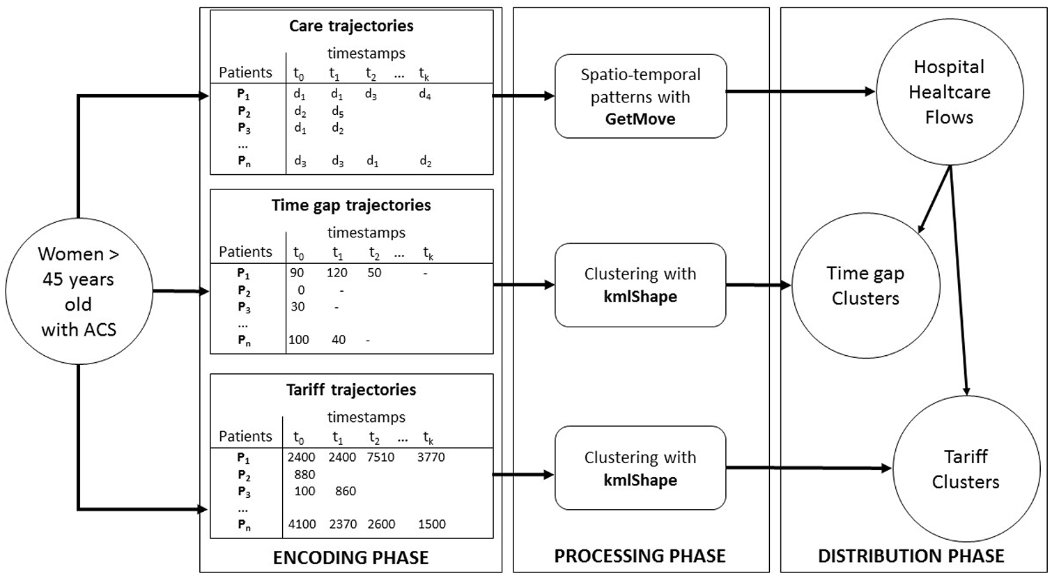
Exploring healthcare flows: an overview of the three-phase approach. Women >45 years old and hospitalized during the study period (2009–2014) are selected. A first encoding phase is performed by considering for each patient their diagnosis at admission (symbolized by d1–d5) and for each admission (care trajectory), the time between two hospitalizations (time gap trajectory) and the tariff of each hospitalization according to ordered timestamps (tariff trajectory). Then, a processing phase is applied in order to look for spatio-temporal patterns and clusters. Finally, in a distribution phase, the results obtained in the previous step are connected to each other in order to describe the distribution of healthcare flows according to the above-mentioned clusters, in terms of time gaps between hospitalizations or tariffs.
Material and methods
Dataset
All hospital discharge summaries for women over 45 years old admitted for ACS in France from March 2009 to December 2014 were extracted from the French NHDDB. Since 1986, all public and private French healthcare facilities caring for medical, surgical, and obstetric patients have been required to submit anonymous patient data to the NHDDB. Information in these discharge summaries includes both medical and administrative data. Each discharge summary submitted to the NHDDB is linked to a national grouping algorithm leading to a French DRG. This data is de-identified with a secure hash algorithm allowing to link discharge abstracts related to a given patient. 25 This data includes the diagnoses (principal and related), which are coded according to the International Classification of Diseases 10th Revision (ICD-10). Investigations on different health topics have shown the reliability and validity of this data since 2009.26,27 This study was conducted according to the approval given by the Commission Nationale de l’Informatique et des Libertés (National Commission for data protection and freedom): agreement No. 1375062 (www.cnil.fr/en/home). All patient records were de-identified and analyzed retrospectively, and as such, no informed consent was required in accordance with the terms of January 6th, 1978, relative to Informatics files and freedom (www.legifrance.gouv.fr/affichTexte.do?cidTexte=JORFTEXT000000886460). This law has been adapted on June the 20th 2018 to be following the new European regulation (https://eugdpr.org/): the General Data Protection Regulation (GDPR). All methods were performed under the relevant guidelines and regulations.
Spatio-temporal patterns
Spatio-temporal mining aims at extracting sets of individuals sharing the same behavior during a given period. Even if many different patterns can be extracted, in this paper, we used closed swarm patterns. Informally, a swarm is a group of at least mino individuals taking the same value for at least mint timestamps. More formally, a swarm can be defined as follows: Let V be a set of possible statuses (e.g. “Chest pain”; “Diabetes”. . .); T = {t1, . . ., tp} a set of timestamps; O a group of n moving individuals valued in V (e.g. individuals with a given symptom);
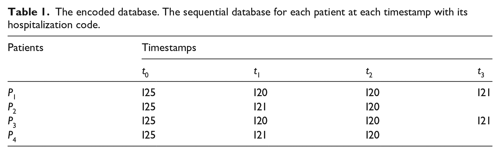
The encoded database. The sequential database for each patient at each timestamp with its hospitalization code.
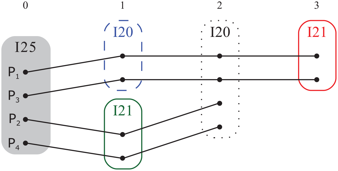
Patient trajectories. The different trajectories when grouping together patients sharing the same code.
Longitudinal data clustering
Longitudinal data are measured repeatedly over time for the same individual. One way to analyze this data is to partition them with methods like k-means or variants of this method. 28 In this article, we are interested in the evolution of a phenomenon rather than in its moment of occurrence. Consequently, we used the kmlShape method which is shape-respecting. 21 In the following, we present its operating principle, and we define the two key concepts of distance and mean this method is based on.
The k-means algorithm is a partitioning algorithm. It has been used extensively used for longitudinal data.29,30 The R package kml is dedicated to it. 31 It alternates two stages: (1) calculating the mean trajectory of each group; (2) calculating the distances between the individual trajectories and the mean trajectories of each group. This algorithm affects an individual to the group he is closest to. The kmlShape algorithm is a variant of k-means using both a distance and a mean that are shape-respecting: Fréchet distance and Fréchet mean. 21 It uses Fréchet distance to compute the distance between trajectories. Informally, Fréchet distance is often compared to a leash between two trajectories. The Fréchet distance is the minimum length of a leash that would separate a master from his dog walking at different speeds along two trajectories. In other words, each point of each trajectory is associated with the nearest point on the other trajectory. The Fréchet distance is then the longest link between the two trajectories. The Fréchet mean 21 between two trajectories is the middle of the leash that links the dog to the master when each goes along its way.
More precisely, a reparameterization is a continuous non-decreasing surjective function α: [0,1] → [0,1]. Let R be the set of all possible reparameterization. Then the Fréchet distance between two trajectories P1 and P2 is defined as

Note that according to the definition, the sequences P1 and P2 do not need to have the same size.
So kmlShape is a clustering algorithm that alternates the same two steps that k-means, but with Fréchet’s tools: (1) it calculates the mean trajectory of each group using Fréchet’s mean; (2) it calculates the Fréchet’s distances between the individual trajectories and the mean trajectories of each group. More details including the precise definition of the Fréchet’s mean can be found in Genolini et al. 21
To illustrate, let us consider the tariff hospital events trajectories of ten patients over a given study period (see Figure 3(a)). These are longitudinal data. Some patients have similar curves (e.g. P6 and P10) with tariffs decreasing slowly at the end of the observation period. Let us now assume that k = 3, the three clusters obtained are (Figure 3(b)): (P1, P4, P7, P9), (P2, P3, P8) and (P5, P6, P10) with A, B, C curves as clusters representatives. A curve is the Fréchet mean of the tariff curves of P1, P4, P7, and P9 patients.
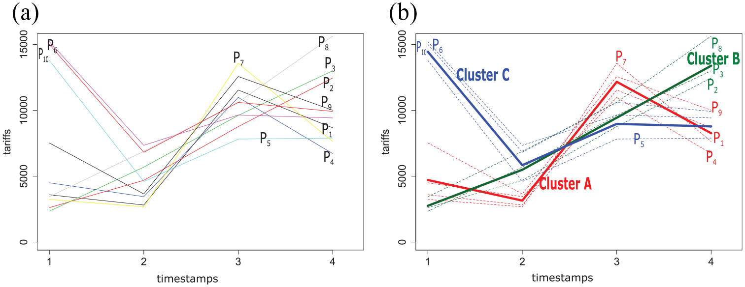
Example of clustering tariffs trajectories of 10 patients (P1–P10) with kmlShape in three clusters (A, B, C): (a) population and (b) clusters using the shape-respecting method, kmlShape. The medoid (center of the cluster) is shown in bold in the figure.
Characterization process of hospital healthcare flows
The hospital healthcare flow characterization process, illustrated by Figure 1, includes three main phases. The encoding phase generates the sequential database. Then, the processing phase clusters trajectories—highlights care trajectories—time gaps, and tariff profiles. This phase is divided into three steps: Step (a) extracts and sorts spatio-temporal patterns from the NHDDB. These patterns will correspond to care trajectory profiles. Step (b) provides an overview of all the patient’s pathways, identified in the previous step, in a visualization tool. These results are the hospital healthcare flows. Step (c) clusters the time gaps between hospitalizations and tariff trajectories to identify trends. Finally, the distribution phase describes the distribution of healthcare flows according to the above-mentioned clusters, in terms of time gaps between hospitalizations and tariffs.
Encoding phase
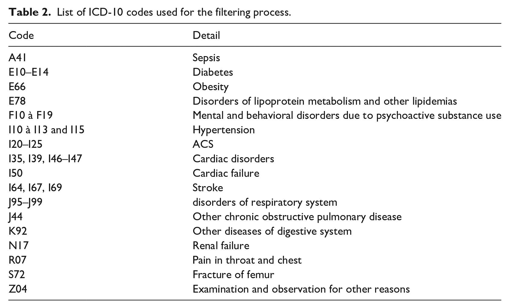
Each patient has a sequence of ICD-10 codes of principal diagnoses (i.e. the event that motivates the hospitalization)—whose length is equal to the number of stays over a 6-year period. Thus, there is only one ICD-10 code by timestamp. First, a filtering process is performed to remove hospitalizations characterized by motives out of scope, that is, irrelevant of ACS, for instance for a cure of cataract. Table 2 presents all the ICD-10 codes, selected by the medical expert, used for the filtering process.
List of ICD-10 codes used for the filtering process.
Then, sequences are ordered according to the relative time corresponding to the occurrence of a stay (see Figure 4). These final sequences are called
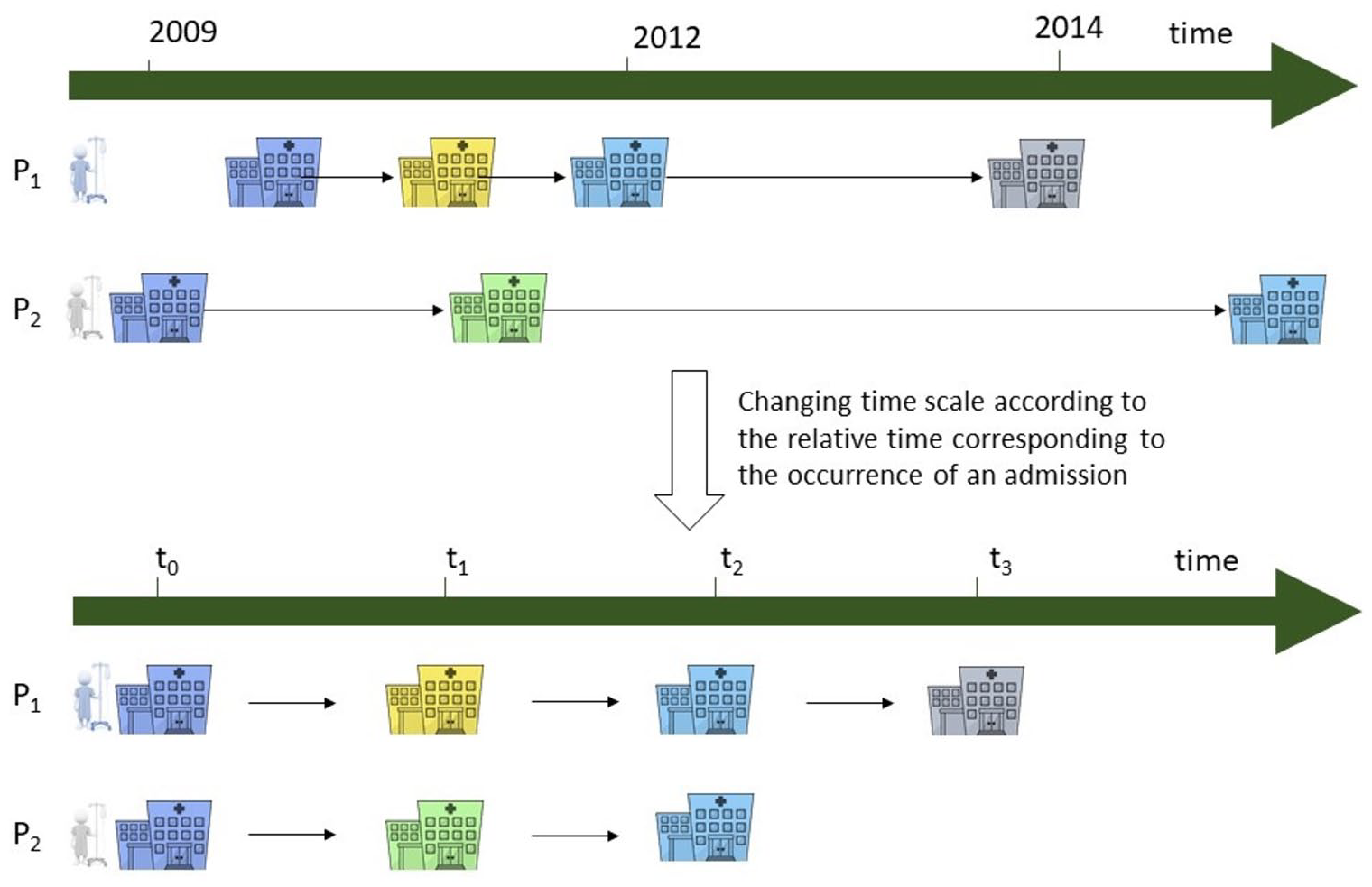
Reordering the patient trajectories to a relative time. The trajectories are reorganized according to the occurrence of an admission.
Processing phase
Step a: we mined closed swarms using the Get_Move algorithm 16 with the following thresholds: mino = 1% of the group studied and mint = 2.
Step b: we used a flow diagram, in which the line width is proportional to the represented flow, that is, the number of considered patients, called a Sankey diagram, it represents patients’ trajectories, retained previously. In some cases, the graph appears unclear because of the many vertices. Therefore, to combat this, based on cardiology knowledge, we gathered vertices according to a medical coherence (e.g. paroxysmal tachycardia and fibrillation are both rhythm disorders.). 28 Then, we created flow groups according to the first trajectory event.
Step c: in parallel to steps (a) and (b), we clustered time gap and tariff trajectories with kmlShape. 21 Usual methods to determine the optimal k number of clusters are designed for classical distances like Euclidian distance. 21 So, to make this decision we chose an analytic method: k was chosen as the best result in a mortality prediction model. We got k = 3 in all cases.
Distribution phase
finally, we established the assignment of the flow groups, created in step b), in the time gap and tariff clusters.
Then, the features of our model are ICD-10 code, tariff, and time gap trajectories.
Results
In the NHDDB, over the 2009–2014 period, 41 770 women have been hospitalized for an ACS. In the following case study, we compared 45–65 (10 442) versus >65 years old (31 328) women.
Care trajectory profiles
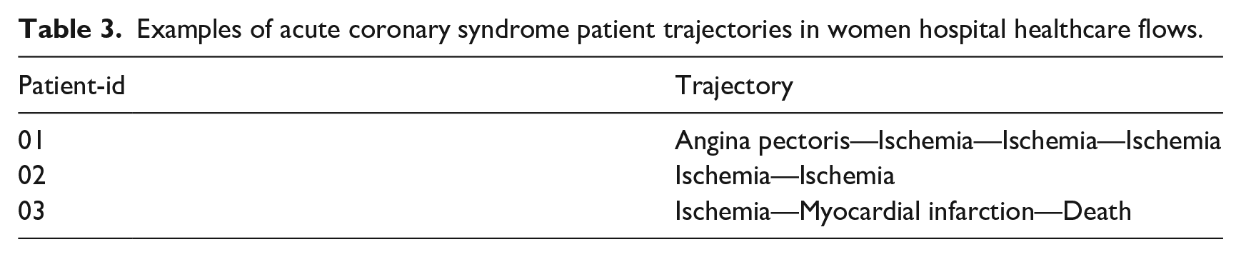
Table 3 presents some examples of patient trajectories. The Get_Move algorithm was used to mine spatio-temporal patterns by age groups in women trajectories. We extracted four and five closed swarms for women >65 years old and women 45–65 years old, respectively. These patterns can be spotted in the healthcare flows represented in Figure 5.
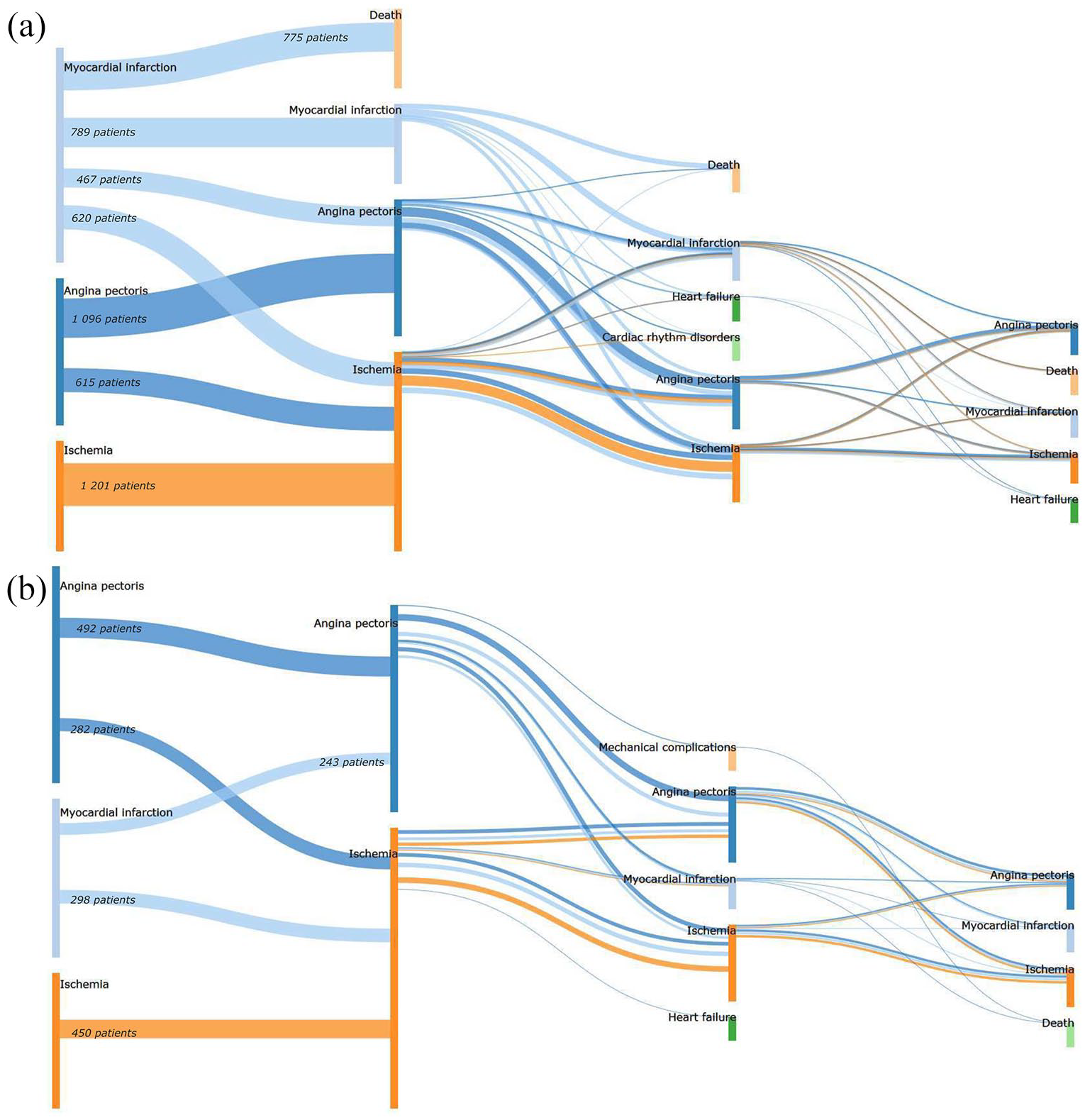
Sankey diagram representations of ACS healthcare flows in women: (a) >65 years old and (b) 45–65 years old with identical events at similar times in their hospital trajectory. Nodes represent symptoms at admission. The width of the lines is proportional to the number of patients (for readability reasons, we only reported the numbers at the beginning). The color of the lines depends on the first event: the blue flows refers to the patients whose trajectory was initialized by an Angina pectoris, the light blue flows refers to the patients whose trajectory was initialized by an Myocardial infarction and the orange refers to the patients whose trajectory was initialized by an Ischemia.
Examples of acute coronary syndrome patient trajectories in women hospital healthcare flows.
Then, patterns were integrated into a visualization tool. Figure 5 shows three flows for women, whatever their age, initialized by Angina pectoris, Myocardial Infarction (MI), and Ischemia, respectively. Then,
Time gaps and tariff evolution profiles
In parallel, clusters of time gaps and tariff trajectories were explored by using the kmlShape algorithm.
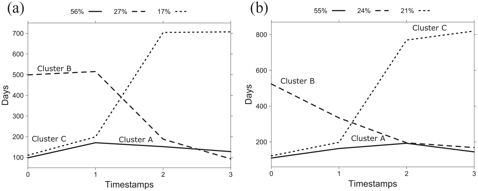
Time gap profiles between hospitalizations clusters resulting from kmlShape for women >65 years old (a) and 45–65 years old (b). The ordinate represents the time gap between two stays: for instance, on Figure 6(a) the dashed curve (corresponding to cluster B, representing 27% of the distribution), has an ordinate equal to 500 days: it means that the time gap between the first and the second stay is about 500 days in this cluster. Therefore, a growing curve means that hospitalizations are more and more distant in time. Conversely, a decreasing curve means that hospitalizations are closer in time.
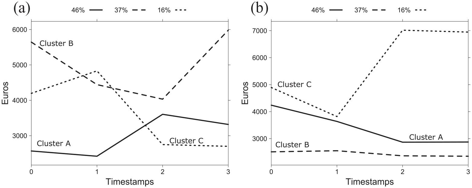
Tariff profiles for women: (a) >65 years old and (b) 45–65 years old resulting from kmlShape. The ordinate represents the tariff (Euros) of a stay. A growing curve means hospitalizations are more and more expensive. Conversely, a decreasing curve means that hospitalizations are less expensive.
Flow group distribution are presenting in percentages (%) by time gap and tariff clusters (A, B, C correspond to the clusters of Figures 5 and 6). The table reads as follows: the flow group whose first event is Angina pectoris, is represented by 1711 and 774 women >65 and 45–65 years old, respectively. Considering time gap clusters, the distribution for the Angina pectoris flow group showed that 47% and 65% women >65 and 45–65 years old, respectively were in cluster A. Thus, Angina pectoris group flow is more represented in cluster A, which corresponds to early readmission (see Figure 5).
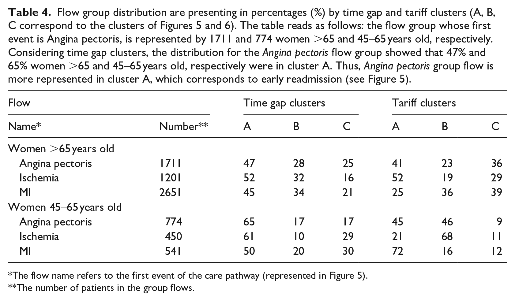
The flow name refers to the first event of the care pathway (represented in Figure 5).
The number of patients in the group flows.
Discussion and conclusions
This paper presented an innovative process to characterize ACS patients’ trajectories based on hospital healthcare flows by combining data mining and biostatistic techniques. First, we looked for spatio-temporal patterns in these ACS trajectories. The originality of the approach is that spatiality was assimilated to proximity of the studied conditions 32 and the temporal aspect was related to the occurrence of a stay. Then, we integrated these patterns into a flow visualization tool. Finally, we clustered their time gap and tariff trajectories to determine trends.
The flow diagrams provide information on the evolution of coronary artery disease, which is consistent with ACS epidemiological data. 33 The comparison between the two age groups showed differences: (i) on average longer trajectories for the elderly comparing to the whole population; (ii) more events, and so more complex flow patterns for the elderly. The size of this group was larger because women are later affected by heart disease. Thus, the probability of observing different trajectories was more important. In addition, the mortality rate was higher in this group (18% vs 0.45% for the 45–65 age group). To sum up, we highlighted three key steps in hospital healthcare flow patterns: Angina pectoris, MI and Ischemia. In most women, the recurrence of coronary artery disease occurred as angina pectoris. Many of them experienced MI relapse and/or other manifestations of their ischemic heart disease.
The time gap profiles provide information on future hospitalizations related to cardiac disease. In most cases, after an MI, hospitalizations are increasingly close in time (on average 3 months). To explain these results, we suggest the following hypotheses: (1) the follow-up of these patients implies regular controls 34 ; (2) a re-assessment of the treatment is indicated since the disease does not appear controlled 35 ; (3) some revascularization techniques may present additional re-intervention risks. For example, in the case of stenting, some medical devices may cause restenosis. 36 However, further investigations are necessary to confirm these hypotheses. 37
The tariff profiles were different according to age. For young women, most patients have a downward trend in tariffs whatever the initial event (clusters A or B in Figure 7(b)). Conversely, for older women, most parts of the flows initialized by Angina pectoris and Ischemia display an upward trend in tariffs. In contrast, hospital healthcare flows initialized by MI largely show a downward trend in tariffs. Furthermore, this work raises questions about the rhythms of hospitalization frequency and tariffs over time. For example, the flow initialized by MI had most profiles with close hospitalizations, but also a majority of profiles with a downward trend in tariffs. In this case, further investigations would be needed to explain the reasons for shortened time gaps between readmissions, but also to establish whether there is a relationship between these time gap profiles and the decreasing tariff profiles.
This study had several limitations. First, the choice of the database: the NHDDB is a budget allocation tool, so it presents some pitfalls for epidemiological studies. 38 Yet, they are undeniably an important source of information. There are some examples of successful recent investigations that underline the interest of this data for medical research: elaboration of a prognostic score of post-operative mortality, 39 highlighting a spatial overlap between obesity and depression 40 and establishing an increase in acute kidney injury incidence in France. 41 The comparison with other studies is another limitation. Time gap is mostly investigated 42 as a precise event such as readmission for heart failure, but less frequently for the more general event of heart disease. Moreover, most direct cost studies take into account emergency cost and drug consumption. 43 Access to the SNIIRAM (National health insurance system of inter-scheme information) database would allow a similar analysis to be carried out. A significant parameter is the length of a stay (LoS), it is also an indicator of the level of severity of the hospitalization. This parameter is not considered in this study. However, we suggest two ways to consider it, by including the LoS in the definition of time gap or by associating the LoS to the hospital event and mine spatio-temporal patterns in trajectories of couples (ICD-10 code, LoS). In this way, the mining algorithm can be used in its original version with spatial coordinates, here represented by the event and the time spent in the event. Finally, our observation period was limited: most patients (67%) had between 1-year to almost 4-years of follow-up.
Only 33% of them had a 5-year follow-up. So, we mostly had patients with short-length trajectories which does not allow sufficient history to observe all key events in the care pathways. Consequently, the flow diagrams represented in Figure 2 do not display the overall possible trajectories, because some events were insufficiently frequent to be extracted as patterns. Currently, the NHDDB does not provide important history such as investigations based on registries. 44
Exploring patient trajectories from NHDDB is an important issue, with several applications, and has no single solution. For instance, to highlight trajectories that significantly altered sepsis mortality together with key insights in sepsis networks, the researchers used a logistic regression-based model combined with an ordered-event relationship analysis. 45 Others proposed a data-driven methodology to model patient’s multidimensional clinical records into one-dimensional sequences and then identified subgroups of patients by clustering these sequences.46,47 Data mining techniques are commonly used to exhibit hidden patterns in patient trajectories. Perer et al. 48 developed a system, Care Pathway Explorer, to mine and visualize common sequences of medical events (frequent patterns). This system also investigates how these frequent patterns correlate with patient outcomes. Giannoula et al. 49 extracted temporal patterns in trajectories of patient diseases and identified groups of patients sharing the same time temporal characteristics based on the dynamic time warping technique. Also, visual analytic systems are designed. An example is MatrixFlow that discovers temporal patterns in clinical event sequences. 50 Furthermore, process mining approaches might be of interest to explore care pathways and describe healthcare flows. 51
Unlike conventional approaches,43,52 we proposed an approach that incorporates a set of essential steps to make a competitive care system and deliver better and more personalized patient care. 53 Indeed, the strength of our approach is to combine a care flow analysis with a cost evolution profile analysis associated with time gap profiles. Besides, in the context of rising healthcare expenditure and shrinking budget allocations, organizational attempts based on data-driven solutions might bring additional opportunities to be more elaborate and competitive. 54 Also, the results of our approach could be integrated into a decision-making tool. Indeed, this could be useful for a clinician to compare patient profiles to other similar profiles and warn them about the risk of MI relapse for example. A tool that would disentangle drug interactions would provide aid to the prescription of anti-thrombotic drugs 55 is one example of this kind of application. Moreover, with this method, we could consider a territorial analysis. Preliminary studies have shown a North-South divide in MI cases.14,56 Analyzing hospital healthcare’s flows with the patient’s home as a contextual parameter would offer a flow comparison either in terms of care or in terms of cardiac disease progression. Here, we present the results for one type of pattern: closed swarm. However, the Get_Move algorithm has the advantage of extracting many other patterns in a single pass. 16 In future work, we might enrich the knowledge on care trajectories that could lead to death 57 by investigating the convergent groups.
Footnotes
Author’s note
All relevant data are within the manuscript and its Supporting Information files. The original data source is not accessible because it is protected by data confidentiality. The data is stored by a third party, which delivers the permission to access this data in the same manner as the authors. The authors did not have any access privileges that other researchers would not have. The request for data has to be sent to the Système national des données de santé (SNDS). The procedure is clearly described here: ![]() ’.
’.
Author contributions
J.P., J.A, S.B, P.P. conceived the experiments. J.P. conducted the experiments, and C.G. provided technical support on kmlShape implementation. P.L. analyzed and interpreted the results. All authors reviewed and agreed the manuscript.
Declaration of conflicting interests
The author(s) declared no potential conflicts of interest with respect to the research, authorship, and/or publication of this article.
Funding
The author(s) disclosed receipt of the following financial support for the research, authorship, and/or publication of this article: This work was supported by Montpellier University and did not receive any specific grant from funding agencies in the public, commercial, or not-for-profit sectors.