
Abstract
Employing qualitative structured interviews with mobile health app users, this research describes shared mental models for mHealth and reveals their complexity. The findings uncover prototypical design components common to mental models beyond health apps and suggest that users’ mental models are multimodal, containing distinct and often contradictory dimensions for evaluations of aesthetics and for craftsmanship. The findings also indicate that users’ mental models are informed by experiences with apps from across the mobile landscape. This research suggests that designers of consumer mobile health apps and mobile health interventions should incorporate prototypical or salient features. In doing so, they should index designs to trends across the larger app landscape and innovate the means to balance between multidimensional and conflicting mental models.
Introduction
The proliferation of mobile technologies has expanded opportunities to reach broad populations with health information. A total of 81 percent of Americans own a smartphone, 1 and as of 2015, 60 percent reported using their phone to look up health information. 2 It is estimated that there are now between 165,000 and 325,000 health and wellness mobile health applications available. 3 Through a range of interactive features, these mHealth apps promote preventive health behaviors and healthy lifestyles. 4
To be effective, however, mobile health apps must be used. The vast majority of apps downloaded are soon abandoned. 5 There is strong evidence that users make judgments of apps based on visual design in a matter of milliseconds. 6 These judgments can notably increase (or decrease) the likelihood that an app will be adopted. 7
Existing scholarship recognizes that when confronted with mobile (health) apps, users draw on cognitive prototypes or mental models as reference points. 8 Since the early 1980s, cognitive psychologists 9 have recognized “mental models” as “naturally evolving models” of the world 10 that “play a central role in representing objects, situations, orders of events, and social actions of daily life.” 11 These mental models are complex and ever evolving; they “are built through interactions with the target system, experiences with similar systems, and are influenced by users’ background and expertise.” 11 Visual communication scholars define prototypical or salient objects as those that are “representative of a class of objects” 12 or are representative of existing mental models.
Beginning in the early days of the Web, scholars have observed that users hold shared mental models of digital content. 13 Scholars have accumulated evidence that prototypical designs of online content are found faster, 11 are more memorable,11,14 are more appealing, 15 and are easier to use. 16 Design choices as simple as the location of search boxes 17 or navigational buttons 11 can have a notable influence on users’ experience of a Web app.
While existing research has investigated the mental models of websites,11,9 we know far less about current mental models of mobile apps—and even less about those of mHealth apps. However, Roth et al.’s 11 observations that users often hold different mental models of different types of Web pages/apps suggest that users may have unique mental models of mobile health apps.
Similarly, less research has considered how important prototypicality is in eHealth or mHealth interventions. Lazard and Mackert 7 contend that prototypicality, along with other design principles, can help to increase the efficacy of health interventions, especially for individuals with low health literacy. In order to integrate prototypical design elements into health interventions, however, public health practitioners and designers must first have some understanding of existing mental models of mobile health apps.
This study was designed to explore what features users expect in health apps, identify the expected location and function of these features, and investigate how mental models function more generally. To do so, this research involved 25 interviews with health app users. Interviews reveal a set of common design components and features indicative of prototypical elements of mHealth apps. They also suggest that mental models are multimodal, containing distinct and potentially contradictory facets or dimensions. As a result, this research offers some suggestions for both mHealth researchers and app designers.
Methods
We recruited young adults (n = 25) through university email to share their thoughts about mobile health apps. Interviews were no longer than 75 min, participants were over 18 years of age, and there were no other inclusion criteria. Participants were compensated for their time with a US$40 gift card. All recruitment and study procedures were approved by University of North Carolina at Chapel Hill’s Institutional Review Board (IRB# 17-2535).
Following informed consent, participants were given a sheet of paper with four outlines of a mobile phone screen. All screens were blank (free of content). The participants were instructed to write or draw in features they thought were important for a new fitness tracker app. Drawings and sketches have been shown to be helpful tools to reveal individuals’ conceptualization and mental models of technology.18–20 The participants were told to draw features of any size or shape they desired and indicate placement within the app. They were given as much time as they desired to create their illustrated health apps. After they signaled to the researcher that they had finished, the participants were asked to elaborate on why features were included and insights for their app design and feature placement. The combined use of sketches with interviews for participants to annotate and expand on their initial ideas allows for a richer method to uncover insights than interviews alone, especially when participants may not have knowledge of the appropriate design terminology to convey their thinking. 18
Interviews and designs were both qualitatively coded by a single coder in MAXQDA12. Codes emerged inductively and correlated to common design elements and features in informants’ drawings as well as to persistent themes of interviews.
Findings
Participant demographics
Participants’ average age was 25 years (M = 24.64, SD = 4.91). The sample included more women (n = 15, 58%) than men (n = 10, 39%). Most participants identified as non-Hispanic (92%). Participants also identified as White (58%), Asian (23%), African American (8%), multiracial (4%), or other/decline to report race (7%). The education level ranged among those having a master’s degree (31%), bachelor’s degree (27%), associate degree (4%), some college (31%), or some high school (4%). The participants generally reported their health to be good (81%) or very good (8%), with few reporting as fair (8%). The reported mental health ranged from poor (4%) to fair (23%) to good (50%) to very good (19%). Half of the participants (50%) reported currently using health apps.
Common design elements
While there is some variation across the 25 designs produced for this project, there are a number of individual design features that appeared consistently across interviews.
Importantly, most of the informants adopted a similar app design structure. This included an initial start or menu page, followed by a series of subsequent pages, each devoted to a different health area. Some of these subsequent pages include exercise, nutrition, sleeping, and social connections.
Start page
Many designs included some form of a distinct start page. Four included a logo and “Loading Screen,” or a logo and a login. Others gave the option to login or create a profile/account, or simply including a large button that says “START” (see Figure 1).
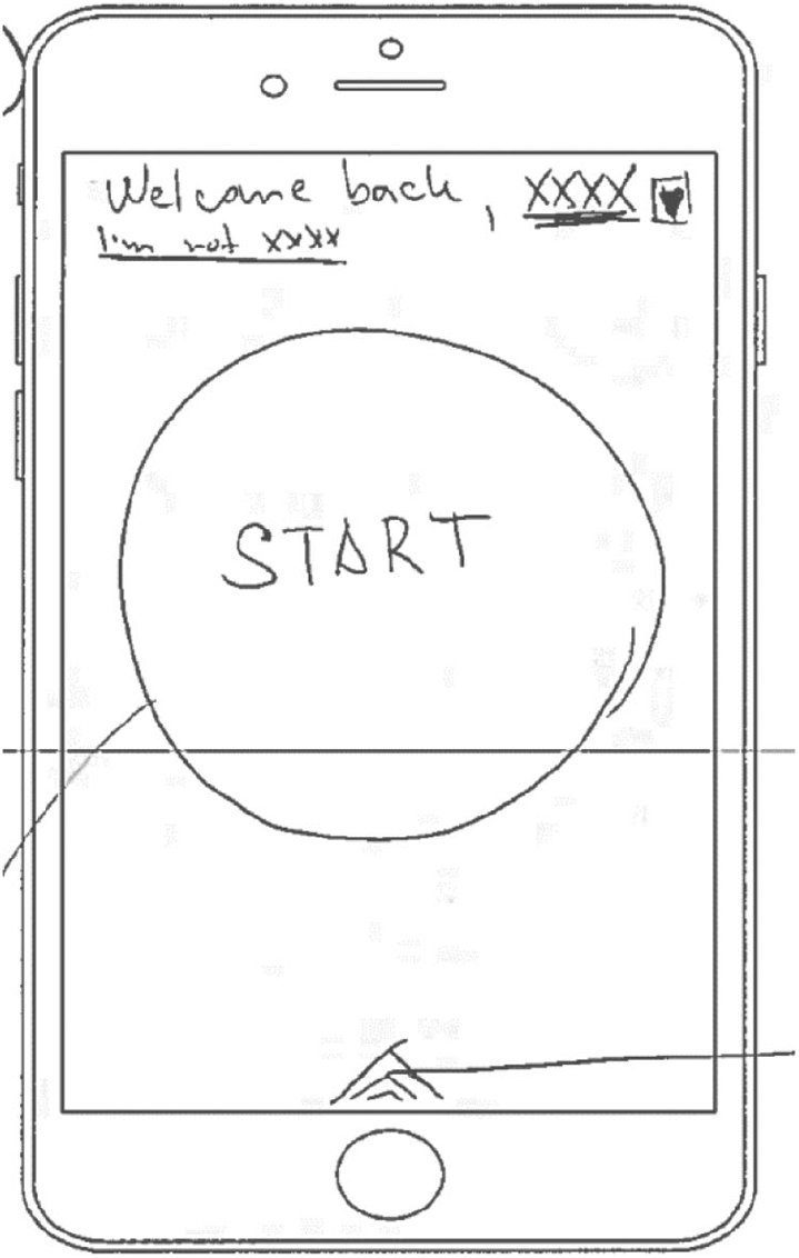
Example of Participant START Page.
Nearly a third of the participants included a summary of statistics for the day, week, or month on the first page of the app (see Figure 2(a)). One informant broke these summary statistics down by “light, moderate, intense” activities or “sleeping.” Two others gave a summary of “Your Day So Far,” including how many meals eaten, minutes of exercise, steps, flights of stairs, and hours of sleep. Three informants chose a single statistic to display: for one, it was steps; for another it was time and mileage of running; the third had the quantity of food eaten.
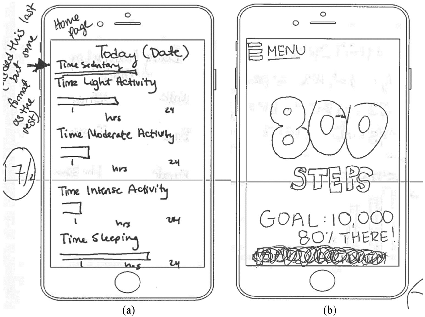
Examples of participant designs for (a) summary statistics page and (b) drop down menu.
One-fifth of the informants included some sort of menu on the opening page that listed the pages in the rest of the app. These menu styles varied from distinct buttons to lists or tiles.
Standing distinct from the other designs, one chose to open the app with “description of why exercise/fitness is so vital.”
Menu
Whether as part of the first page or not, more than two-third of the informants included a menu through which each page of the app can be accessed. Nine designs included a drop-down menu, usually indicated by an icon of three parallel lines on the top left of the screen, which when selected would reveal the page options (see Figure 2(b)). Four other designs included a bottom bar menu that had a series of icons representing the different pages.
Three designs included a menu in the form of a series of buttons. Another had a menu as a series of horizontal bars or tiles.
Other icons
In addition to the well-known drop-down menu icon, several designs included icons commonly seen across mobile apps. For example, several designs included settings icons in the form of a gear. Another design included a magnifying glass as part of a search feature. Another included both a battery icon and a cell service icon.
Interactive features
Similar to homogeneity in design elements.
Over half of the participants drew a feature tracking step activity. Six designs included pages specifically dedicated to tracking and displaying the number of steps taken by users (see Figure 4(a)). Seven more included a step counter in other pages.
Seven designs also included some form of exercise page. Of these, five included more specific activities, such as running or lifting, and two included a “running map” through which users could tracker their runs.
Ten participants included some sort of food dairy or calorie tracker (see Figure 3(b)).
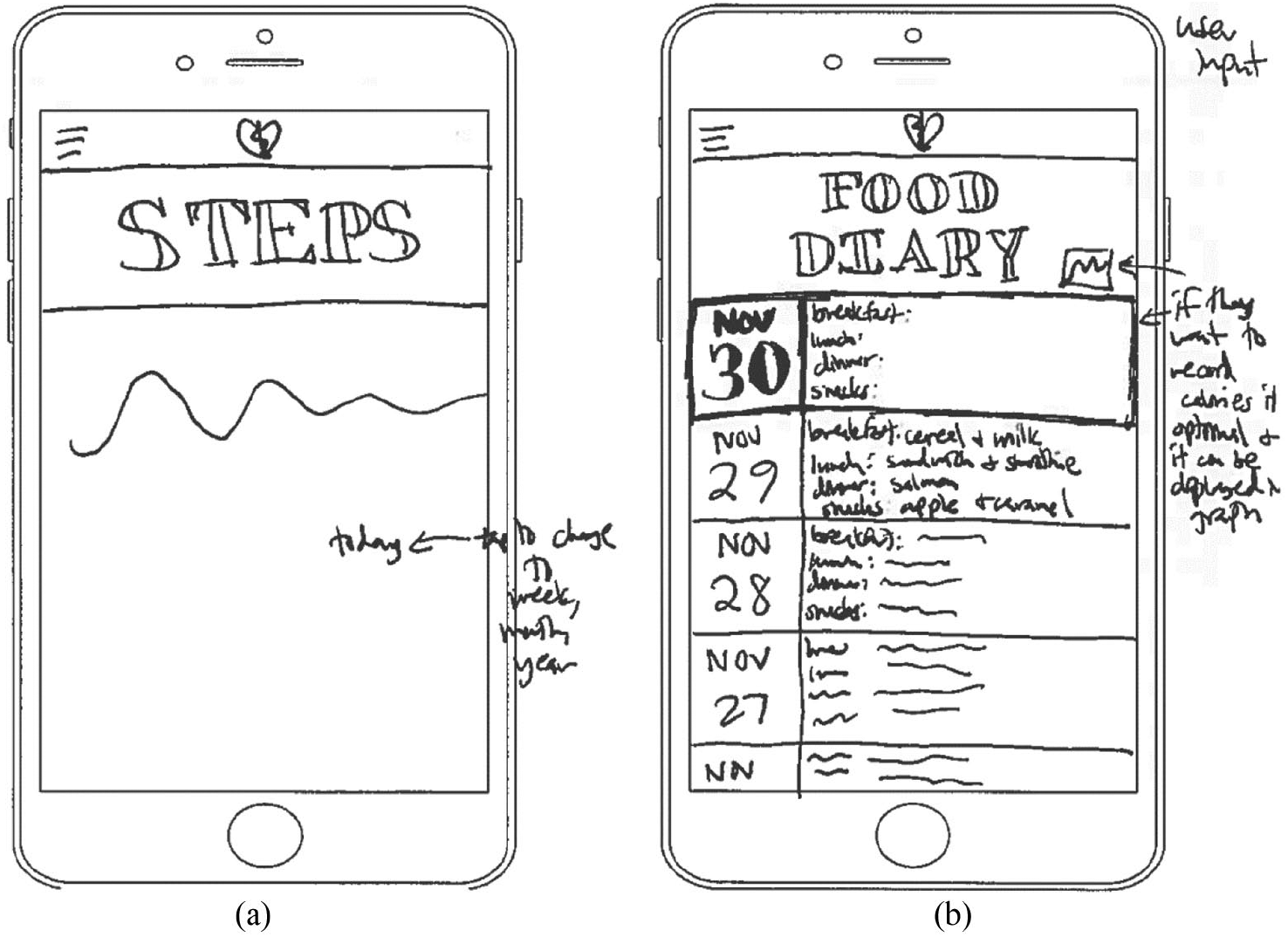
Participant example of (a) step counter and (b) food diary.
Nearly a third of the designs included features that allowed users to share data or connect with others. One informant explained including this simply as users “need to share with someone.” Another noted, “I am super competitive, and like to know I am beating my friends.” A third summed up these points more generally, noting that social functions have “been shown to help [achieve] goals.” The social features included in designs ranged from allowing users to build a “team” to compete with or against, to sharing events on a social calendar, to a messaging feature (see Figure (4)).
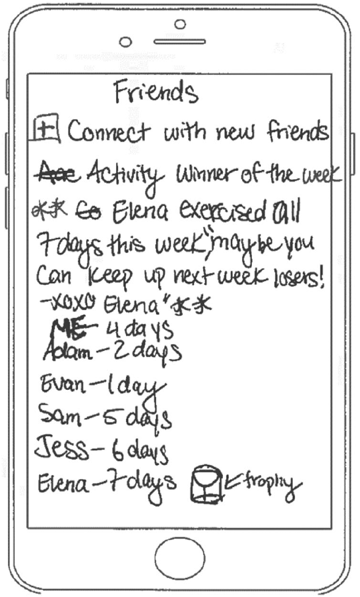
Example of particiant social feature.
Several designs also included a page for tracking sleep. However, informants were split on how these should work. Some imagined the app could somehow automatically record the duration of sleep, and parse out different periods of the sleep cycle. One informant objected strongly to these sorts of devices. They observed that there are devices that users could put under their pillows to track their sleep; however, they were worried that the device might set the pillow “on fire, or is like nuking my brain.”
Besides these, designs included a number of other features. One design allowed the user to create playlists to go along with workouts. Two included features that gave out “prizes” for achieving certain goals. Another (see Figure (5)) translates achievement into qualities associated with video games (or role-playing games): “STR” (Strength), which the informant associated with workouts, END (Endurance), which they associated with cardio, and “INT” was because they were not sure “how to sum up mental health,” but could include “meditation, or time spent journaling . . . whatever you put in as mentality” including “a social aspect.” Three different designs also included calendars.
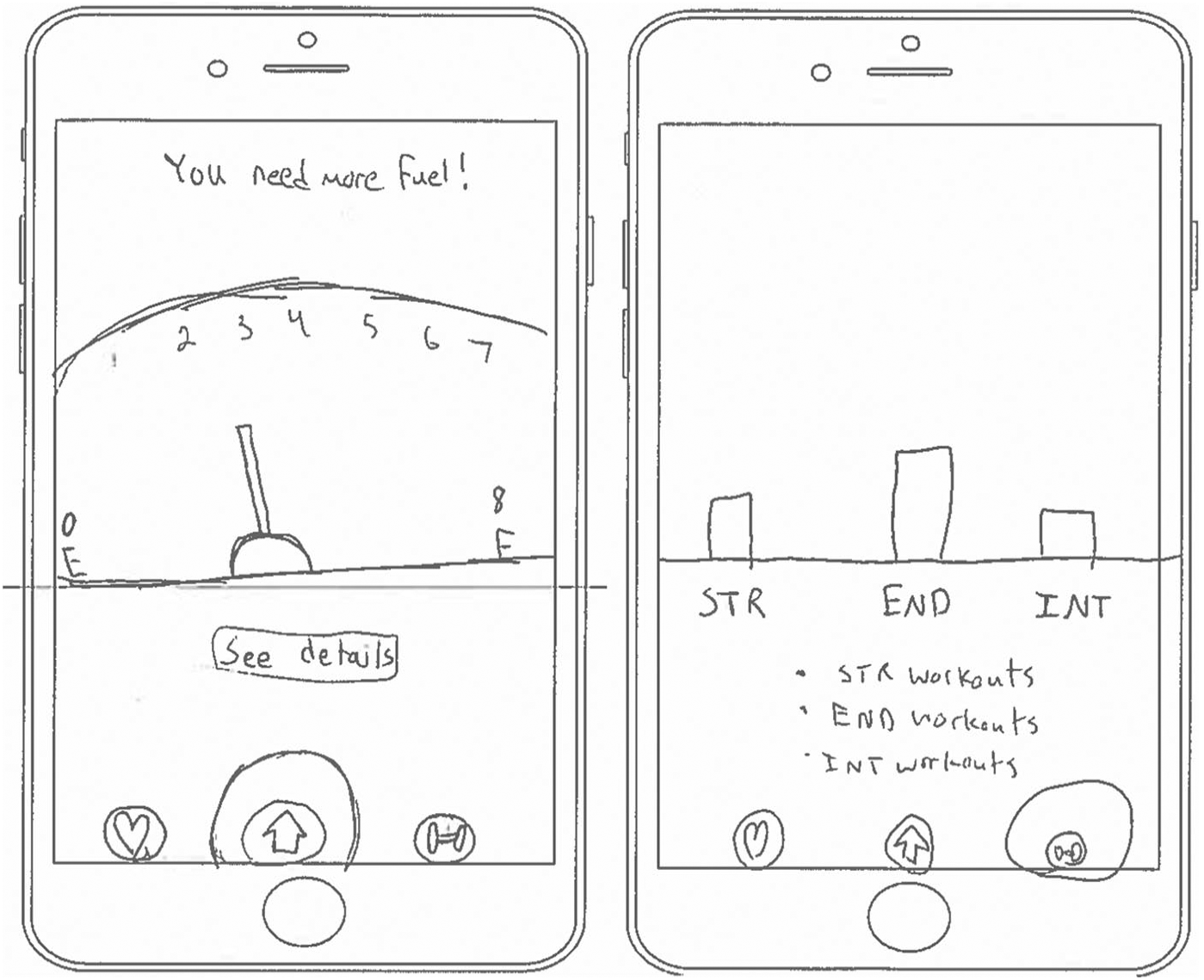
Example of design that models a role-playing game by (a) including an energy counter and (b) translating qualitites into STR (strenght) END (endurance) and INT (mental health)
One design was radically different than the other (see Figure (6)). This design was organized around a series of interactive augmented-reality challenges related to different movies. For example, a running page recreated a scene from the movie Forest Gump. Another, designed around “triathlon training” recreated the “Tri-Wizard Tournament” from Harry Potter. The creator of this design observed that the app is geared toward motivating exercise by “match[ing] with scenes of things I might want to enact.
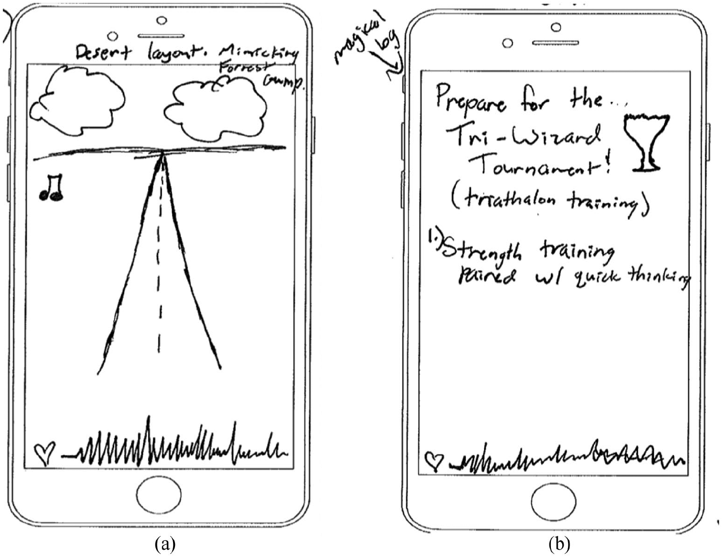
Examples of augemented-reality designs based on (a) Forest Gump and (b) the “Tri-Wizard Tournament” from Harry Potter.
Referenced health apps
Design
As might be expected, informants drew on a range of existing fitness and health apps to justify and explain their design choices.
Several informants referenced the graphs or data displays of existing apps. Nearly a fourth of the participants invoked the Fitbit app as a model for design decisions. This app provides a number of different types of data displays and graphs. One informant referenced the “circular” display of the Fitbit app; others referenced the way it provides stats for the entire day, week, or month, the way it displays sleep data, or its color scheme.
Perhaps more notably, many informants referenced existing fitness apps as models of what not to do as far as design. Some found existing designs, such as My Fitness Pal to be too “complicated.” One informant called the iPhone’s method of displaying data “boring.”
Features
Broadly speaking, many of the fitness tracker features or elements participants included in their designs were drawn from existing health-related apps.
Most notably, four included a step tracker, invoking the iPhone app or the STEPZ app. Other informants included the ability to track and monitor users while running, referencing the Garmin app, Map my Run. One informant, whose design involved a complicated interactive component, invoked Zombies Run as a model for how an augmented reality app could work. Another informant, who studies exercise science, suggested that the Fitbit app is too narrowly concerned with tracking steps. As a result, they explained that they had intentionally chosen to not include steps in their design.
Although they were instructed to design a “fitness tracker app,” a number of participants included either sleep or food trackers as well. In justifying including a sleep tracker, some referenced the IPhone fitness app or the Fitbit app. My Fitness Pal links food and exercise in a way that several different informants referenced. One also noted how My Fitness Pal has a library of calorie amounts of common foods—something they noted was not accurate enough to be useful. For their own design, this informant suggested including such a database of common foods would be helpful, although admitting that it would be hard to have a database that was both inclusive and accurate.
Goal setting and incentives were two additional common interactive features. Informants invoked both Lose It and My Fitness Pal to explain and justify goal inclusion—though in different ways. Lose It allows users to set their own goals, while My Fitness Pal offers only preset goals. Notably, nearly half of the participants, if they included goals in their designs, allowed users to set their own goals. One participant observed that the Nike Fuel Band App set unrealistically high expectations and goals.
Similarly, two informants invoked Fitbit to explain why they included incentives, while others referenced Weight Watchers and SweatCoin.
Non-health apps
Designs
Informants also invoked many non-health/fitness apps to explain their design decisions. Nearly a third of the participants did so while explaining that their apps should have more “minimalist” designs.
One informant described being “inspired by the design of contemporary apps. Older apps had more art, now most are very streamlined.” Others specifically referenced the fact that many newer apps have buttons on the bottom of the screen, making it easier and quicker to access the most important features: these apps ranged from Instagram and Snapchat to the ESPN app. Some noted that current apps provide clear models of what not to do. One suggested that the Duolingo App is too “cutesy” in having a cartoon owl, and that they would want a more simple, straightforward design. Another informant suggested that too many apps devote screen space to “features no one uses.”
In contrast to these calls for more minimalist designs, one informant referenced the Accuweather app, which connects its design to the current weather, so that as the weather changes, so does the apps design. The informant suggested that this feature could be helpful in their fitness tracker in allowing users to know the weather before heading out to exercise (see Figure 7).
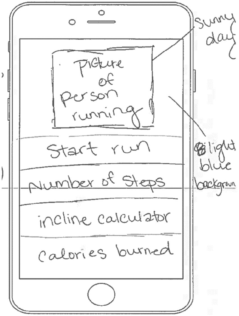
Example of design that indicates current weather.
Finally, several informants invoked other non-fitness apps to explain more routine design decisions. For example, one explained their decision to include a settings icon on the top right of every page by noting that “settings are always on the top” in apps like Facebook or Instagram. Similarly, another informant explained putting a logo on every design page because this is what ScoreApp, a sports score app, does.
Features
Informants also pulled a number of different features from non-fitness or health apps. Perhaps most notably, several identified some of the social features of social media apps. One described how a recently added new feature on Snapchat provides a map of friends/users. The informant suggests this ability to map connections could help users identify with whom they might exercise. Another informant spoke of the importance of sharing exercise data, noting that much of their design was directly “inspired by Facebook.”
But it was not only social media apps that provided models for app features. One invoked the Chik-Fil-A app, which tracks purchases and grants prizes. Another suggested that an app they had recently heard about being developed for the Haj in Mecca, allows users to see where the highest density of attendees are. The informant thought this could be a useful tool to see the congestion of running trails or routes before starting to exercise.
Discussion
Health communication and public health researchers and practitioners are increasingly adopting mobile health platforms and technologies to design health interventions. Prototypical designs, or ones that fit users’ expectations and mental models, “can potentially increase the use of an e-health website or app, regardless of health literacy levels.” 5 According to the Technology Acceptance Model (TAM), 21 the prototypicality of an app may moderate users’ behavioral intentions to use an app by modifying the perceived ease of use and/or perceived usefulness of the app.22,23 That is, when an app conforms to our expectations for what an app should look like, we may believe it to be easier to use or more useful to us.
This project provides detailed insight into the mental models that users hold of health/fitness tracker apps. The previous section articulates some of the key design elements and some of the key features that help constitute prototypical apps. Most notably, this project has found that prototypical mHealth (fitness tracker) apps contain drop-down or bottom bar menus, page titles, logos, social sharing features, calendars, and search bars. Users expect these features in fairly predictable locations; including these salient objects where users are looking for them is one straightforward takeaway for app developers. However, what else these apps should include to ensure they meet users’ expectations is less clear.
The findings described above reveal an instructive contradiction in the ways that informants reported desiring simple, minimalist designs, but then seemed to associate app quality with the quantity and diversity of features. As noted above, a number of informants specifically observed that they prefer apps that have minimalist or simple designs. Simultaneously, when describing how they use existing fitness tracker apps, a number of informants suggested that they only use a small fraction of the total features in any fitness app. For example, one noted that while she has a Fitbit, as well as the accompanying app, she only uses it to trace her sleep habits and patterns. This stated preferences for minimalist designs aligns well with the persistent indication that users prefer “orderly and clear design” associated with “classical aesthetics,” 24 what others identify as design “simplicity.” 25 Similarly, there is evidence that “simplicity aesthetics”—classic simple designs—strongly influence patients’ use of health portals. 26
However, when given intentionally vague instructions and a limited amount of time, many informants filled their apps with myriad features, visuals, and functions. Informants often interpreted “fitness tracker” expansively, as encompassing many different features of healthy living from exercise, to diet, to water intake, to sleep.
In a broader sense, these findings suggest a dissonance between how we assess the design and how we assess the value of an app. Informants may only use a small subset of features of existing apps, yet, as they attempt to produce good designs, they felt they need to include many features and design elements. One possibility is that these additional components may take on a symbolic role, signaling an app’s quality in terms of the professionalism and craftsmanship of its production, indicating the app “was designed with skill and care using modern technologies.” 21 Scholars in consumer health informatics have long recognized that consumers of online health information “are interested in being able to evaluate a health Web site in order to separate the wheat from the chaff” 27 —to separate high- and low-quality information. Even as consumers express aesthetic preferences for simpler and more minimalist designs, it is possible that the breadth of an app’s features influence these evaluations of quality or craftsmanship. This is to say, what we want and what we do or use are not always the same
Norman 10 describes mental models as “incomplete,” unstable,” “unbounded,” “unscientific,” and “parsimonious.” However, this project reveals something else about mental models. Reconciling aesthetic evaluations of simplicity with quality evaluations of completeness suggests that consumers might have multimodal mental models that have different (though interrelated) registers. Rather than consumers holding simple one-dimensional mental models of what a prototypical (health) app looks like, this research suggests that they hold complex mental models that proscribe different design elements to satisfy evaluations of aesthetic design and professionalism. Notably, the different facets of these multimodal mental models need not be consistent or logically coherent. Ultimately, this study suggests that we can hold complex, evolving, and contradictory mental models simultaneously with little problem. Importantly, this could pose difficulties for designers of mHealth apps attempting to produce prototypical designs, who must juggle complex and occasionally conflicting mental models.
In addition to demonstrating the multimodal character of mental models, the findings of this study further complicate prototypical assessments of mHealth apps. Rather than being constrained to fitness tracker apps, users invoked a much wider universe of apps in describing their mental models of fitness trackers. Across interviews, informants identified a range of different apps as influential in their own designs, ranging from Instagram to the Chick-Fil-A app. Similarly, that many informants had limited experience with fitness trackers did not appear to stymie their efforts to produce designs. All informants were able to complete designs—most of which were similar. This in part is because, regardless of informants’ familiarity with fitness trackers, they could draw on more general, shared mental models of what constitutes good app designs.
The findings suggest that while designers and scholars often define exclusive categories for the types of apps, mental models do not respect these boundaries. 8 In addition to being complex, mental models are broad, involving not only “target” apps but also similar or adjacent app types. 8 Given the utility of aligning mHealth interventions with prototypical designs and users’ expectations,7,9 app developers—for research or practice—would be well served to be broadly aware of design trends occurring across types of mobile apps.
Limitations
While interviews can supply detailed insight into mental models, this approach has notable limitations. Given the small number of interviews completed and the lack of diversity of informants, our results are not generalizable. For example, the mean age of participants was just above 25 years; an older population might relate alternate experiences and opinions of mobile apps. Similarly, this research placed participants in an artificial situation and asked them to complete a task many had never done before. Some seemed more comfortable producing designs than others. Factors such as design experience, test anxiety, or artistic training all likely influenced the designs informants produced. What influence, however, these factors have on participants’ mental models, remains unclear. That being said, the findings here help to establish the basic dynamics of mental models. As Flyvbjerg 28 suggests, for case study research, non-generalizable cases can serve an important role in establishing phenomenon.
Conclusion
This study has shown that in designing health interventions, public health researchers and practitioners must attend to the different facets of multimodal mental models, as well as mental models for apps in general. Rather than simply adapting designs of existing health apps, designers need to consider trends and changes occurring across the landscape of mobile app design. Of course, designers must continue to balance concordance with prototypical features with the function and utility of their products.
While aspects of mental models might be generalizable across types of apps, this research suggests that mental models defy simple categorization and change over time. This study therefore asserts the value of empirically determining current mental models of target audiences for apps and health interventions. One way for developers or scholars to do so is to look broadly at design elements of widely used mobile apps, synthesizing common elements. This study, however, presents an alternative approach: asking users to identify important design components of mental models directly. Although it takes time—and often money—empirically determining mental models is necessary to capture some of their complexity, unpredictability, and contingency.
Footnotes
Declaration of conflicting interests
The author(s) declared no potential conflicts of interest with respect to the research, authorship and/or publication of this article.
Funding
The author(s) disclosed receipt of the following financial support for the research, authorship and/or publication of this article: Research reported in this publication was supported by a University of North Carolina at Chapel Hill Lineberger Comprehensive Cancer Center Developmental Award funded through the University Cancer Research Fund. The funders had no role in the study design, data collection and analysis, decision to publish, or preparation of the manuscript.