
Abstract
The high data density on electronic medical record screens is touted as a major usability issue. However, it may not be a problem if the data is relevant and well-organized. Our objective was to test this assumption using a comprehensive set of measures that assess the three pillars of usability: efficiency (both physical and cognitive), effectiveness, and satisfaction. Physicians were asked to go through a series of tasks using two versions of the same electronic medical record: one where all the display items were separated into tabs (the original display), and one where important display items were grouped logically in one tab (the redesigned display). Results supported the hypothesis that combining relevant data in organized fashion into a smaller location would improve usability. The findings highlight the role of good display organization to mitigate the effects of high data density, as well as the importance of assessing cognitive load as part of usability studies.
Introduction and motivation
In general, the introduction and adoption of electronic medical records (EMRs) has been touted as a means of providing better patient medical care. 1 However, the reality is that EMRs have solved only some problems, such as providing remote access and medication management.2,3 At the same time, EMRs have introduced a host of other novel problems.4,5
The root of many of the problems encountered, whether related to frustration, medical errors, or delays, can be traced to the usability of the EMRs. 6 Usability is defined by the International Organization for Standardization (ISO) as “the effectiveness, efficiency and satisfaction with which specified users achieve specified goals in particular environments.” 7 Good EMR usability can improve the quality of patient care and enhance hospital operations. 8 Poor EMR usability, however, can prevent medical personnel from carrying out their tasks in a timely and correct fashion.9–11
The problem of data overload
EMR usability straddles a number of different issues, including color variation, readability, preservation of context, and others. 12 In particular, one of the major problems within the broad umbrella of EMR usability is that of data density—often referred to as clutter or data overload. 13 This refers to the amount of data within a certain screen area.14,15
In the medical domain, data overload has figured most prominently in the EMRs used by physicians.4,10,16–19 EMR data overload can take on many forms, such as a high density of alerts 18 or simply a large amount of poorly organized, irrelevant medical information.17,20,21 Data overload has been shown to prevent physicians from quickly and accurately extracting EMR information, which can compromise both efficiency and safety in the hospital.18,22,23
However, combining data into one common location does have its advantages. It can greatly help physicians find the information they are looking for and improve system navigation. 12 Poor navigation was one of the four major EMR usability issues identified by Clarke et al. 24 A recent review about the problems with EMR navigation highlighted how inefficient navigation and a large amount of switching between screens can lead to errors and user fatigue. 25 Moreover, data spread over fewer areas allow physicians to obtain the big picture of the patient they are supposed to be diagnosing. 26 It is clear that higher data density has its own advantages and disadvantages, and the debate is then whether higher data density would lead to better or worse usability in the context of EMRs.
The key factors in answering this question are organization and task relevance. 27 In their literature review of the topic, Moacdieh and Sarter 28 defined clutter as “performance and attentional costs that result from the interaction between high data density, poor display organization, and abundance of irrelevant information.” Despite the worry that high data density will lead to less EMR usability, it is possible that good organization and task relevance might play a critical role in mitigating these effects. There is a need for more EMR usability evaluation studies that target this issue in a systematic and controlled fashion.
Evaluating EMR usability
Frequently used usability evaluation methods in the literature include interviews,29,30 surveys, 31 observations, 32 heuristic walkthroughs, 33 and different types of analyses such as task analysis, user analysis, representational analysis, and functional analysis. 34
However, it is important to supplement the subjective data obtained from such techniques with more objective measures that are not dependent on the opinions of medical personnel, as highlighted in a recent review of EMR usability. 35 In addition, it is important to assess the different pillars of usability: efficiency, effectiveness, and satisfaction. 12 Otherwise, the impression of usability that is obtained would be incomplete.
Efficiency
Efficiency is related to the amount of resources that must be expended to complete a task. In general, efficiency could have both an overt, physical component related to the speed needed to finish a task and a mental or cognitive component related to the mental resources needed for a task. From an overt physical perspective, measures that can be used include response time, key presses, mouse clicks, scrolling activity, screen visits, and back button uses. 12 Response time is the prevalent performance measure when it comes to evaluating the amount of data on a screen and how that relates to usability.36,37
From a cognitive perspective, the mental resource that a person must devote to complete a certain task within a certain time frame is referred to as cognitive load. 38 A complex construct, cognitive load is mainly linked to limited memory and the limited attentional resources that people have.39,40 Given the importance of this construct, there are several approaches that have been used to measure cognitive load.
One approach makes use of a well-established questionnaire for mental workload, the NASA-Task Load Index, 41 which asks respondents to rate their impression of cognitive load on several scales. Another less-used approach is the Keystroke Level Model (KLM), together with GOMS (goals, operators, methods, and selection). 42 KLM predicts the time it will take for a user to carry out a certain computer task and has been heavily used in the human–computer interaction literature as a means of determining response time. 43 GOMS, however, is a way to perform cognitive task analysis (CTA), or breaking down all the mental and physical tasks of a certain interface interaction into its constituent parts. 44 Once GOMS has been performed, it then becomes possible to apply KLM to determine how much time each task needs. KLM includes one mental operator that represents the mental workload that a user needs to go through. By separating this mental operator from the other physical ones, one can get an impression of the percentage of time that the user will spend doing mental processing. 45 This would then be another measure of cognitive load.
Finally, yet another approach is the use of eye-tracking measures. Eye tracking is a non-invasive, infrared-based technique that is used to trace where a person is looking on a screen. 46 The eye-tracking coordinates are used to determine eye fixations, or when a person looks at something for a minimum period of time, 47 and saccades, which are rapid jumps between fixations. 48 Fixations and saccades then form the building blocks for several eye-tracking metrics that can be used to assess cognitive load, among other constructs.
The most frequently used eye-tracking metrics for workload evaluation are pupil size or diameter49,50 and eye blink frequency. 51 These measures have shown to be significantly affected by high workload; however, these measures are also extremely sensitive to other factors, such as the amount of light. 52 Alternatives to pupil size include mean fixation duration and mean saccade length, 53 as well as the nearest neighbor index (NNI), 54 which can be used to determine how spread out or concentrated fixations are (see Table 1). NNI has been successfully used in airplane pilot studies and has also shown to be sensitive to workload changes in a medical scenario. 28 In addition, convex hull area 58 can also be used in order to see whether higher workload causes users fixations to be more dispersed. A higher value of all the mentioned metrics would indicate higher cognitive load.
Eye-tracking metrics that can be used to assess cognitive load.
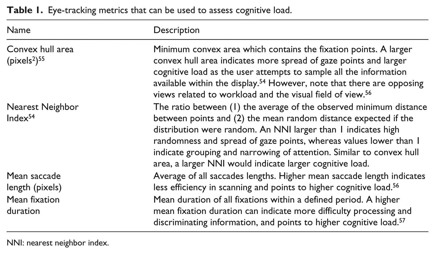
NNI: nearest neighbor index.
Effectiveness
While efficiency is related to speed, effectiveness is related to accuracy and correctness. 12 The most obvious measure of effectiveness is error rate. More complex and detailed measures of effectiveness do exist, however, such as Failure Modes and Effects Analysis (FMEA), where errors and risks at each stage of a product’s use are evaluated. 59
Satisfaction
Surveys and questionnaires are the most commonly used approaches when it comes to evaluating physicians’ satisfaction. For example, a survey was used to determine whether practitioners thought there were too many medical alerts in the EMR. 18 In other cases, interviews with physicians were carried out to obtain their insight on data overload. 19
The present study
Despite the body of work on EMR usability so far, there are gaps when it comes to assessing data density. As seen from the recent literature, high data density is discouraged given the risk of clutter or data overload, although, for medical personnel, high data density might help solve issues of poor navigation and assimilation of patient information. The overall research question in this study was whether higher EMR data density would necessarily lead to poorer EMR usability. Our hypothesis was that adding more information into one display space would not inevitably lead to poorer usability if the information is task-relevant and well-organized.
To test this hypothesis, a controlled experiment was conducted where the usability of the two EMR designs was assessed. In one version, each set of relevant items was placed in a separate tab (Display 1: low data density), whereas in the second version, all display elements were combined into one page (Display 2: high data density). This approach of using two versions of the exact same EMR is a unique feature of this study. A review of the literature on EMR usability highlighted the paucity of papers that have used this approach. 35 One notable exception is the work of Ahmed et al., 16 where two EMR versions were compared that purportedly have different levels of data; however, the EMR versions were significantly different in various aspects, making it difficult to attribute any benefits specifically to the quantity or distribution of data.
Moreover, in order to assess the usability of the two versions, we comprehensively assessed each of the different dimensions of usability, another approach that is not commonly encountered in the literature. The measures that we used in this experiment were the following:
Efficiency:
○ Physical: response time.
○ Cognitive: NASA-TLX, KLM-GOMS, and the eye-tracking metrics of Table 1.
Effectiveness: error rate.
Satisfaction: user preference.
Methods
Participants
The participants were 13 residents (6 males and 7 females) from the Family Medicine (FM) Department at the American University of Beirut (AUB) medical center. Their average age was 29 years (standard deviation (SD) = 2.68) with an average of 2.46 (SD = 1.00) years of experience in the FM Department. Participants had self-reported normal or corrected to normal vision. The eye-tracking data of one participant was not collected due to problems with the eye tracker software, resulting in a count of 12 residents for the eye-tracking results. Participants’ ratings of their proficiency with the EMR had a mean of 4.0 (SD = 0.39) on a scale of 1 (poor) to 5 (excellent), confirming that they were all proficient with the EMR.
Participants signed an informed consent document at the beginning of the experiment. As an incentive, participants were awarded a $25 gift card to a restaurant. This study was approved by the AUB Institutional Review Board.
EMR versions
Two different versions of the same EMR were used for Display 1 (data separated into tabs) and Display 2 (data combined into one location). The original (current) EMR being used in the FM Department was used for Display 1. This EMR contains several functions, including writing notes using the “Progress Notes” tab and reviewing patients’ medical history using the ROS tab. Each different function is separated into a dedicated tab. The complete set of tabs can be found in Table 2.
EMR tabs and their uses.
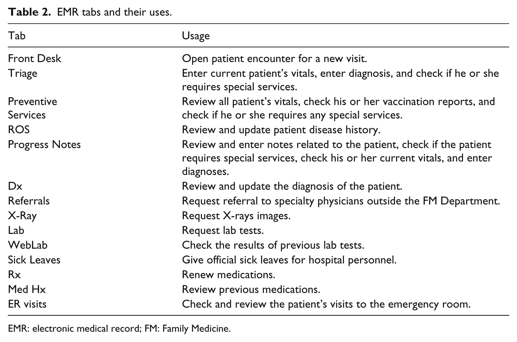
EMR: electronic medical record; FM: Family Medicine.
The EMR used for Display 2 was labeled the redesigned EMR. This EMR combines the data from the ROS, Progress Notes, and Preventive Services tabs into one tab, labeled the Physician tab. In an earlier preliminary study, these three tabs were found to be the ones that were (1) most commonly used by physicians and (2) required searching for certain information (as opposed to requesting services). The nature of the actual display elements (i.e. text boxes, drop down menus, etc.) was not changed between Display 1 and Display 2 (see Figure 1). However, the EMR elements in Display 2 were logically grouped and organized, following the principles of proximity compatibility. 60 Both EMRs were populated with real patient data that had been completely de-identified. The names of the patients were fictitious.
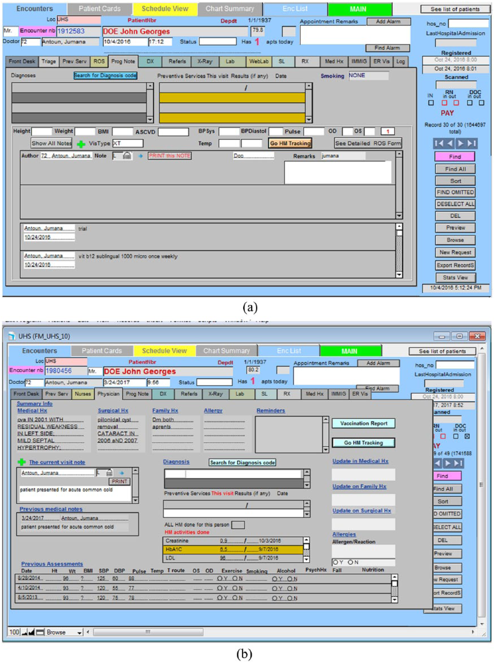
(a) Current EMR display (Display 1) showing the Progress Notes tab and (b) redesigned EMR display (Display 2).
Experiment setup
This study used a Tobii T120 eye tracker, which is embedded in a monitor of size 17 in (resolution: 1280 × 1024 pixels). Participants were seated at a distance of 60 cm from the eye tracker.
Experiment design
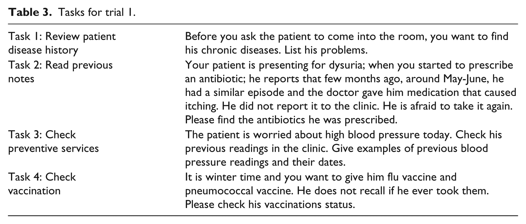
The independent variable in this study was the type of display (original or Display 1 vs redesigned or Display 2), which was varied within subjects. Participants were asked to carry out four types of tasks on each of the EMR displays. These tasks were selected to be representative of those that physicians perform using their EMR, based on earlier interviews and observations conducted with the FM Department physicians. The tasks were presented to participants in sets of four that revolved around one fictitious patient, who was portrayed as presenting to the physician with a certain complaint. This set of four tasks was always connected to the same patient and was labeled a trial. All of the tasks involved the search for a given target item that is related to that patient’s diagnosis or treatment. An example of each of the four tasks can be found in Table 3. Each task took a maximum of 2 min, and participants were always given some background information about the patient before being given their task. The type of task was treated as a blocking variable:
Task 1. Review patient disease history: physicians used the ROS tab to review a patient’s disease history and identify whether or not the patient had a given disease/condition within a particular time frame.
Task 2. Read previous notes: physicians used the Progress Notes tab to go through the patient’s physician notes and find certain information.
Task 3. Check preventive services: physicians used the preventive services tab to check the blood pressure, weight, and height of the patients.
Task 4. Check vaccination: physicians used the preventive services tab to check whether a particular vaccine was given to the patients.
Tasks for trial 1.
There were six trials of each task (i.e. each task was repeated for six different patient scenarios), making for a total of 24 tasks for each experimental condition. In other words, there were 24 tasks (six trials) that were done using the current EMR display (Display 1) and the same 24 tasks were done using the redesigned display (Display 2). Four different fictitious patients were created for the six trials, meaning that three of the trials shared the same patient. Each trial was always associated with the same patient for both displays. The order of presentation of the trials was counterbalanced across participants using a Latin square approach. Participants first did all of the trials for one EMR design before moving on to the next set of trials on the other EMR design; the order with which participants used the displays was also counterbalanced.
The dependent measures in this study were response time, error rate recorded while performing the different tasks, the various eye-tracking metrics listed in Table 1, NASA-TLX measures, KLM-GOMS measures, and subjective preferences. Participants were asked to think aloud and give their answers orally during the experiment. The time between the start of a task and when participants gave their complete answer was manually measured as the response time. The raw eye-tracking data were obtained through the Tobii Studios eye-tracking system. The eye-tracking metrics of Table 1 were then calculated using MATLAB.
Experiment procedure
When the participants arrived to the lab to perform the experiment, they were first given an overview of the experiment and asked to read and sign the consent form. Next, participants were shown the redesigned EMR page with all the locations of the features and allowed to practice using it. They were then given the instructions for the experiment and told what the experiment tasks would entail. Each participant was next asked to do a practice scenario with both the original and new EMR pages to become familiar with the experiment process. After this step, the eye tracker was set up and calibrated using a nine-point grid. This first part of the experiment took around 10 minutes.
Participants then logged in to the EMR using their credentials and carried out 24 tasks that corresponded to one of the two displays. When all the tasks on that one display were done, participants were given a 5-minute break and then continued the experiment with the other display. At the end of the experiment, participants were given a questionnaire in which they were asked to provide NASA-TLX ratings of workload for each EMR display, as well as their preference for the version of the EMR.
Results
Efficiency
Both physical and cognitive efficiencies were assessed in this study. For physical efficiency, response time was calculated. We elected not to measure mouse clicks as the redesigned display was deliberately designed to have fewer mouse clicks. Response time data was averaged across the six trials for each participant and each task. Response time started after participants had read their tasks, so it was not affected by the length of the task description. Response time was analyzed using a repeated-measures analysis of variance (ANOVA). The assumptions for the ANOVA procedure were tested for each response measure and each task. There were some measures where the normality assumption did not hold, as evidenced using a Shapiro–Wilk test (p < 0.05) and a normality plot. The data of these measures were transformed using either the inverse or logarithmic transform.
The results of the ANOVA analysis can be seen in Table 4. For Tasks 1, 2, and 3, there was no significant difference in response time between the original and redesigned displays. For Task 1, however, the redesigned display had significantly lower response time as compared to the original display.
Response time ANOVA results.
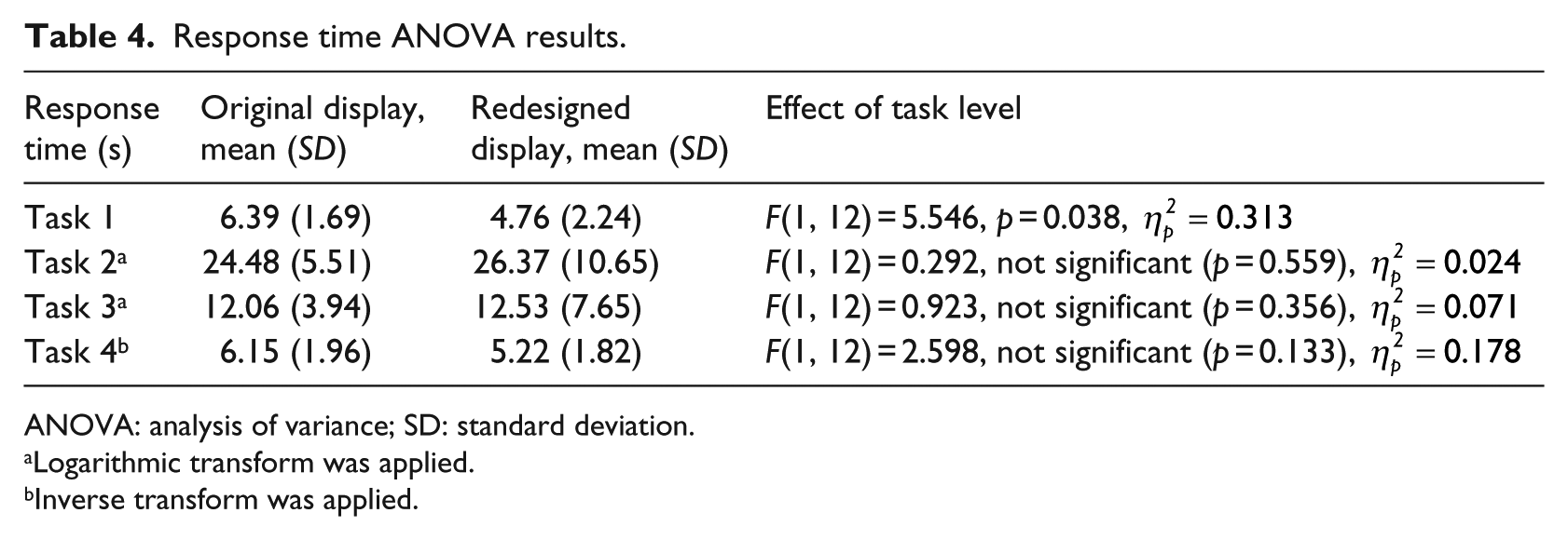
ANOVA: analysis of variance; SD: standard deviation.
Logarithmic transform was applied.
Inverse transform was applied.
Cognitive efficiency was measured using a combination of subjective and objective approaches: NASA-TLX (subjective), KLM-GOMS (objective), and several eye-tracking metrics (objective). For NASA-TLX, only one dimension, mental workload, was used with a scale from 1 (very low workload) to 5 (very high workload). The results of the NASA-TLX ratings were analyzed using a Wilcoxon Exact sign test for ordinal data. Results showed that there was a significant decrease in the mental workload (Z = −2.04, .04, p = 0.041), from means of 3.3 (SD = 1.3) for the original EMR to 2.46 (SD = 0.877) for the redesigned EMR.
In addition, GOMS analysis that was based on a CTA showed that the percentage of mental workload for each of the tasks was lower, on average, for the redesigned display as opposed to the original display (see Table 5).
Percent mental load (compared to the total time) in each of the different tasks (based on KLM-GOMS analysis).
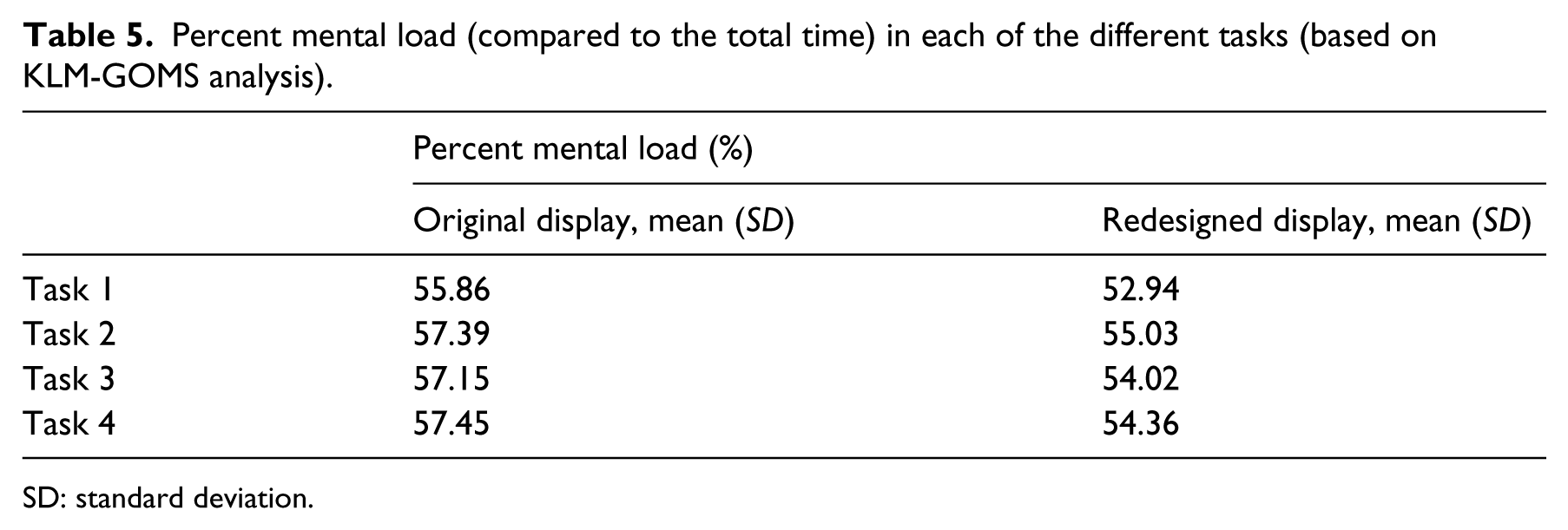
SD: standard deviation.
The final measures of cognitive load are the eye tracking metrics of Table 1. As with the performance measures, the data was analyzed using a repeated-measures ANOVA with list-wise deletion. After averaging the trials for each task and each participant, the assumptions of the ANOVA procedure were checked. In the case of violations of normality, as evidenced using a Shapiro–Wilk test (p < 0.05) and a normality plot, the data was transformed using logarithmic or inverse functions. A summary of the eye tracking results across all the tasks can be seen in Table 6. Across all tasks, several metrics indicated a significant decrease in mental workload for the redesigned display as opposed to the original display.
Summary of eye-tracking results. In all the metrics, a higher value indicates a higher cognitive load.
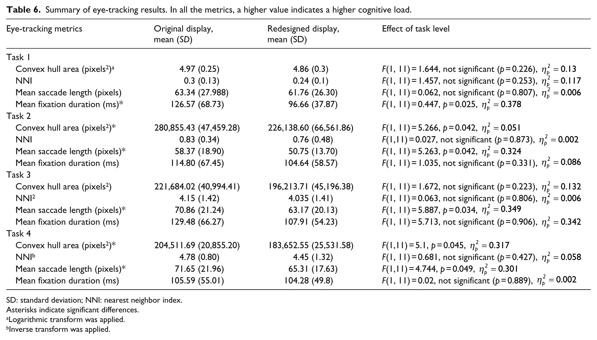
SD: standard deviation; NNI: nearest neighbor index.
Asterisks indicate significant differences.
Logarithmic transform was applied.
Inverse transform was applied.
Effectiveness
Effectiveness was assessed using the error rate. However, the error rate was zero across all trials, with all participants carrying out their tasks correctly.
Satisfaction
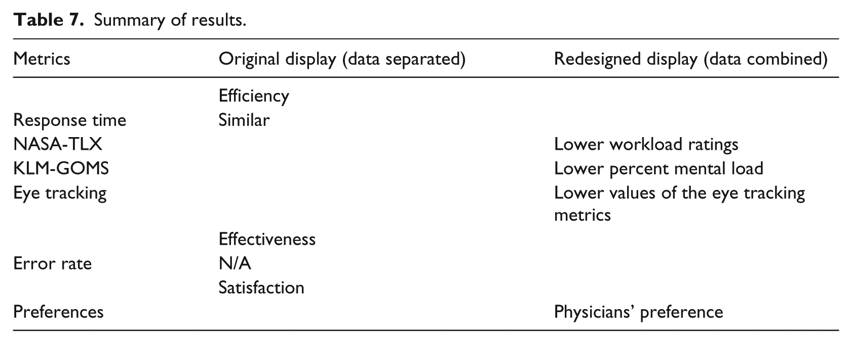
Participants were asked to point out which EMR display was easier to use. All except two participants indicated that the redesigned display was easier to work with. Of the remaining two, one indicated that the original display is easier and the other indicated that they were both the same. Table 7 summarizes the findings from all of the different metrics.
Summary of results.
Discussion
The overall research question that we were trying to address in this research study was whether higher EMR data density would necessarily lead to poorer EMR usability, as is commonly assumed. Given that usability is defined in terms of efficiency (both physical and cognitive), effectiveness, and satisfaction, several subjective and objective metrics were calculated that fall under these brackets. Our hypothesis was that combining information into one display space would not inevitably lead to poorer usability if the information is task-relevant and well-organized.
The study provided interesting results. From a user satisfaction perspective, the participant subjective feedback showed a clear preference for the redesigned display. In terms of physical efficiency, the response time suggested that the two displays are largely similar. In terms of cognitive efficiency, however, all three of the NASA-TLX ratings, KLM-GOMS, and the eye tracking metrics indicated that the redesigned display led to lower cognitive load. This result was obtained with just one change—combining the same elements into one page.
In summary, physical efficiency indicated that the two displays were similar, whereas user satisfaction and cognitive efficiency showed a clear preference for the redesigned display. Comparisons with the literature are difficult given that few studies have made a systematic analysis of the kind done here. The most similar study is Ahmed et al., 16 where, in contrast to this study, they found that higher data density was associated with higher response time and higher cognitive load ratings. However, that study examined two different versions of the EMR.
In contrast, the results of this study lead to three main conclusions. The first, as hypothesized and reiterated, is that good display organization is crucial to mitigating the effects of high data density. The second is that usability needs to be evaluated by more than just effectiveness and the physical efficiency measures of response time. While undoubtedly useful, there is so much more to usability than these measures, as evidenced in this study. The focus has understandably been on medical errors in the past, but as EMR systems become better established, the focus might need to shift more to user satisfaction and cognitive load. These factors can eventually lead to user fatigue, dissatisfaction with the work environment, and frustration, all of which contribute to the usability of a display. Usability professionals would thus be encouraged to include user satisfaction and especially cognitive load or cognitive efficiency as part of their usability analyses.
Third, and following from the last point, usability professionals and researchers are also encouraged to diversify the metrics that they use to measure cognitive load in EMRs. NASA-TLX is very useful, but we showed here that KLM-GOMS is also a very beneficial tool. Moreover, to our knowledge, no other study has used KLM-GOMS to compare the cognitive load of two EMRs, although previously it has been successfully used to evaluate a single display. 45 KLM-GOMS also has the added advantage that it does not involve users and is just based on the CTA, which is typically carried out in any usability study anyways. In other words, from a purely step-by-step inspection of the processes, the redesigned display was found to require less mental processing, which could include steps such as comparing information or searching for an item. Eye-tracking metrics are also a valuable addition to any usability study. Although they require more setup and analysis than other measures, they more than make up for that in the detailed insight they provide about the display. Such insight allows designers to decide where to focus their efforts—if there is a discrimination problem, as evidenced by mean fixation duration, perhaps the font size should be bigger. If there is too much spread of gaze points, as evidenced by convex hull area, then better grouping of information needs to be applied.
So, not only do the metrics indicate whether there is high or low cognitive load, they also provide suggestions for improvement. In addition, the use of eye tracking for EMR usability evaluation could form the basis of an adaptive, intelligent EMR display, where information is updated in real time based on user needs, as identified using eye tracking. There are several other eye-tracking metrics that could be further explored for their use as an indication of EMR cognitive load in real time.
Similarly, for the eye tracking metrics, only one other study has evaluated these metrics on two EMR versions. Moacdieh and Sarter 28 also found significantly lower mean saccade length for the higher data EMR display, although there was a significant interaction effect with stress. However, they found significantly higher convex hull area, which is the opposite of what we found here. They also found significantly higher NNI. The fact that NNI was not significantly affected in this study can be attributed to the very low duration of most tasks, as this metric is a lot more involved than the others on this list 54 Crucially, the difference between the two studies is that the higher data display was not well-organized in Moacdieh and Sarter. 28 The medical history display used in that study has very little grouping of relevant information, and physicians typically have to serially scan the display in order to find their target. In this study, what lower convex hull area and mean saccade length indicate is that good organization can significantly decrease the spread of eye movements, helping users to focus their gaze on what is important. Significantly lower mean fixation duration also suggests that there was a discrimination issue in the case of the current EMR. Although that was not replicated in Moacdieh and Sarter, 28 it is consistent with low-workload conditions across the literature.61,62
This study presented a unique approach to evaluating the usability of EMRs; however, there are some limitations. The tasks were relatively simple in order to allow for a high degree of control. The zero error rate, the low response time, and the low NASA-TLX ratings can be attributed to the simplicity of the tasks given to physicians. The simple tasks were selected in order to be able to have highly controlled and structured tasks, as was done in other studies.16,28,63 In addition, simplicity was favored in order to reduce the variability between residents with different levels of experience in the AUB FM Department. The downside of this simplicity was the difficulty in truly assessing effectiveness. However, more complex tasks would have meant a lower degree of control over what physicians do with their display, particularly as physicians tend to have vastly differing—yet still correct—approaches to diagnosing patients. Also, physicians typically interact with the patient while using the EMR, which was not captured here. Future work will consider a wider variety of tasks and more complex tasks.
In conclusion, this study provided support for the notion that combining EMR information into a compact, smaller location that minimizes navigation to different tabs leads to a more usable display, if the combined items are relevant and well-organized. The evidence presented here shows that this approach leads to lower cognitive load and higher satisfaction, two important aspects of usability that should not be neglected. This research can help inform EMR designers in their creation of the next generation of EMRs, while the methods used in this study can provide a framework for EMR evaluation. The idea of examining the three aspects of usability using a combination of subjective and objective measures proved to be very beneficial and can help better structure future usability studies in the healthcare domain.
Footnotes
Author’s note
Maher Al Ghalayini was earlier affiliated with American University of Beirut, Lebanon.
Declaration of conflicting interests
The author(s) declared no potential conflicts of interest with respect to the research, authorship, and/or publication of this article.
Funding
The author(s) disclosed receipt of the following financial support for the research, authorship, and/or publication of this article: This research was funded by the American University of Beirut University Research Board (URB).