
Abstract
The use of complexity science in evaluation has received growing attention over the last 20 years. We present the use of a novel complexity-appropriate method – Participatory Systems Mapping – in two real-world evaluation contexts and consider how this method can be applied more widely in evaluation. Participatory Systems Mapping involves the production of a causal map of a system by a diverse set of stakeholders. The map, once refined and validated, can be analysed and used in a variety of ways in an evaluation or in evaluation planning. The analysis approach combines network analysis with subjective information from stakeholders. We suggest Participatory Systems Mapping shows great potential to offer value to evaluators due to the unique insights it offers, the relative ease of its use, and its complementarity with existing evaluation approaches and methods.
Introduction
This paper presents our approach to systems mapping, which we refer to as ‘Participatory System Mapping’. Using two real-world examples, it explores how it can be of value in evaluation. We outline how the method can be applied, and hope this paper will encourage others to consider using the approach where appropriate.
The influence of complexity science has been felt in the evaluation community for the last 20 years (Gates, 2016, Barbrook-Johnson et al. 2020). Gates (2016) reviews the implications of systems thinking and complexity science for evaluation. They highlight how complexity has implications for practice in all stages of evaluation, from framing interventions and contexts, to selecting and using methods, to engaging in valuing, to producing and justifying knowledge, and facilitating use. Over this period, the literature has shifted from speculations and theoretical contributions on how complexity can be of value (e.g. Barnes et al., 2003; Sanderson, 2000), to examples of methods being applied (e.g. Qualitative Comparative Analysis, Befani, 2013; Byrne, 2013; and causal loop diagrams and system dynamics, Dyehouse et al., 2009; Fredericks et al., 2008; Grove, 2015), to reflections on the success and value of complexity’s application (e.g. Gates, 2016; Mowles, 2014; Reynolds et al., 2016; Walton, 2014; Williams, 2015).
There is a range of different methods which are taken from, or inspired by, complexity science and applied in evaluation. The most well-used include qualitative comparative analysis (Befani, 2013; Blackman, 2013; Blackman et al., 2013; Byrne, 2013), process tracing (Schmitt and Beach, 2015), case study approaches (Woolcock, 2013), approaches to working with stakeholders (Copestake, 2014), agent-based modelling (Morell et al., 2010), and social network analysis (Drew et al., 2011; Durland and Fredericks, 2005).
More closely related to the Participatory Systems Mapping approach we present here are causal loop diagrams and Systems Dynamics (e.g. Dyehouse et al., 2009; Fredericks et al., 2008; Grove, 2015), and Bayesian Belief Networks (sometimes known as ‘dependency modelling’) (Brand et al., 2015; Sedighi and Varga, 2019). Fuzzy Cognitive Mapping (e.g. Penn et al., 2013) and System Effects (Craven, 2017) are also closely related, but we are unaware of published examples of their application in ex-post evaluation contexts. All of these approaches are sometimes referred to as ‘systems mapping’. ‘Systems mapping’ is a broad phrase which we see as an umbrella term capturing a wide variety of related methods. Our approach, Participatory Systems Mapping, sits alongside these.
Beyond those with direct connections to complexity science, there are a of range of logic or causal-based mapping methods that are popular in evaluation, including policy maps, logic models and logframes, and Theory of Change (ToC) maps, which all have overlaps with Participatory Systems Mapping. Concept mapping (e.g. Knox, 1995) is also a popular and sometimes conflated approach, but does not use any sense of causality in its approach, so we do not cover it here. ToC maps first emerged in the 1990s in the United States (see Weiss, 1995), and have become popular both within and beyond the evaluation community (Coryn et al., 2011; Ofek, 2017). The actual use of ToC maps varies among different practitioners (Mason and Barnes, 2007); some use them in relatively linear and policy-focussed ways, whereas others include feedbacks and wider contexts, some use programme-oriented maps, whereas others also use actor-oriented maps (Ofek, 2017). Despite its popularity, ToC is not beyond criticism, perhaps one of the most common being that they are too inflexible and linear, meaning they struggle to deal with complex contexts (Ofek, 2017). The main response to this has been to construct ToCs that focus more on actors, rather than variables, and to develop maps that show webs of actors, rather than chains of events and actors (e.g. Davies, 2005; Earl et al., 2001; Ling, 2012; Van Ongevalle et al., 2014; Williams and Hummelbrunner, 2009).
Those that have addressed (and articulated themselves) the call in the literature for more complexity-appropriate, or systems-aware, ToC maps include Abercrombie et al (2018), Davies (2018) and Ling (2012). The former develops practical guidance on how to build ToC maps that can support efforts towards system change, using five rules-of-thumb which are elaborated in detail, these are understand context, know yourself (i.e. how might we need to change), think systemically, learn and adapt, and recognise change is personal. Though framed as technical challenges, Davies (2018) systematically sets out a set of potential weaknesses in the practice of ToC, mostly related to incompleteness and vagueness. A set of six possible solutions to these issues are then laid out: more nuanced description of connections in ToCs, use of better software to draw ToCs, use of some basic network analysis, participatory development of ToCs, and two more technical analysis and modelling approaches to extend and complement ToCs (predictive analytics and dynamic modelling). Finally, Ling (2012), in a broad fashion, outlines how we might incorporate the concepts of uncertainty and complexity into a ToC evaluation approach; they also provide a helpful introduction to definitions of simple, complicated, and complex settings and interventions.
This paper lies at the cross-roads of these streams of work (i.e. between related complexity-appropriate modelling approaches, and calls for more complexity-appropriate evaluation methods). It explores the use of a novel approach to systems mapping, Participatory Systems Mapping, in evaluation settings, which begins to address the calls made in these streams of literature. Participatory Systems Mapping is novel because it combines a strong emphasis on stakeholder input in map building and analysis, with the use of network analysis and information from stakeholders to construct ‘submaps’ to generate new narratives and questions. The approach is intended to be practical, flexible and easy to use, while providing the potential for rich complexity-appropriate insights. This is just one of many potential steps in developing a suite of complexity-appropriate evaluation approaches and tools. It is not our intention to suggest Participatory Systems Mapping is better than any other method; appropriateness of methods (see Befani, 2016) to purpose and context is what should drive method choice; and we discuss this further in the section on ‘When to use Participatory Systems Mapping’ below.
This paper is applied in its focus, setting out the approach briefly before exploring its use in two case studies. The next section outlines our approach to building and analysing Participatory Systems Maps, including discussion of how to run workshops online. We then describe and reflect on its use in two evaluation settings; one in evaluation planning in energy, and the second in one particular evaluation of a large central government policy on renewable heating. We then explore more widely how others might use Participatory Systems Mapping in other evaluation settings.
Our approach to Participatory Systems Mapping
Participatory Systems Mapping is a general-purpose method for developing a rich and participatory understanding of the nature of the system under question. The process of mapping has great value for those involved, and the map(s) produced can be used in a variety of ways, including in support of evaluation. See Penn and Barbrok-Johnson (2019) for a detailed and practical introduction. This method has been developed over a number of years through the course of multiple projects and case studies with diverse sets of stakeholders in complex settings. It grew out of our initial use of Fuzzy Cognitive Mapping (see Penn et al. 2013), and evolved through a range of responses aimed at improving stakeholder interaction and the validity and actionability of technical modelling and analysis (see Penn et al. 2016).
What is in a map?
The Participatory Systems Mapping approach involves teams of up to 12 people collaboratively constructing a causal map of their system of interest. They do this around a table with ‘post-its’, ‘white-board paper’ (i.e. shiny paper which can be used like a whiteboard) or flip-chart paper, and felt-tip pens. The map is made up of factors and their causal connections as seen in Figure 1.
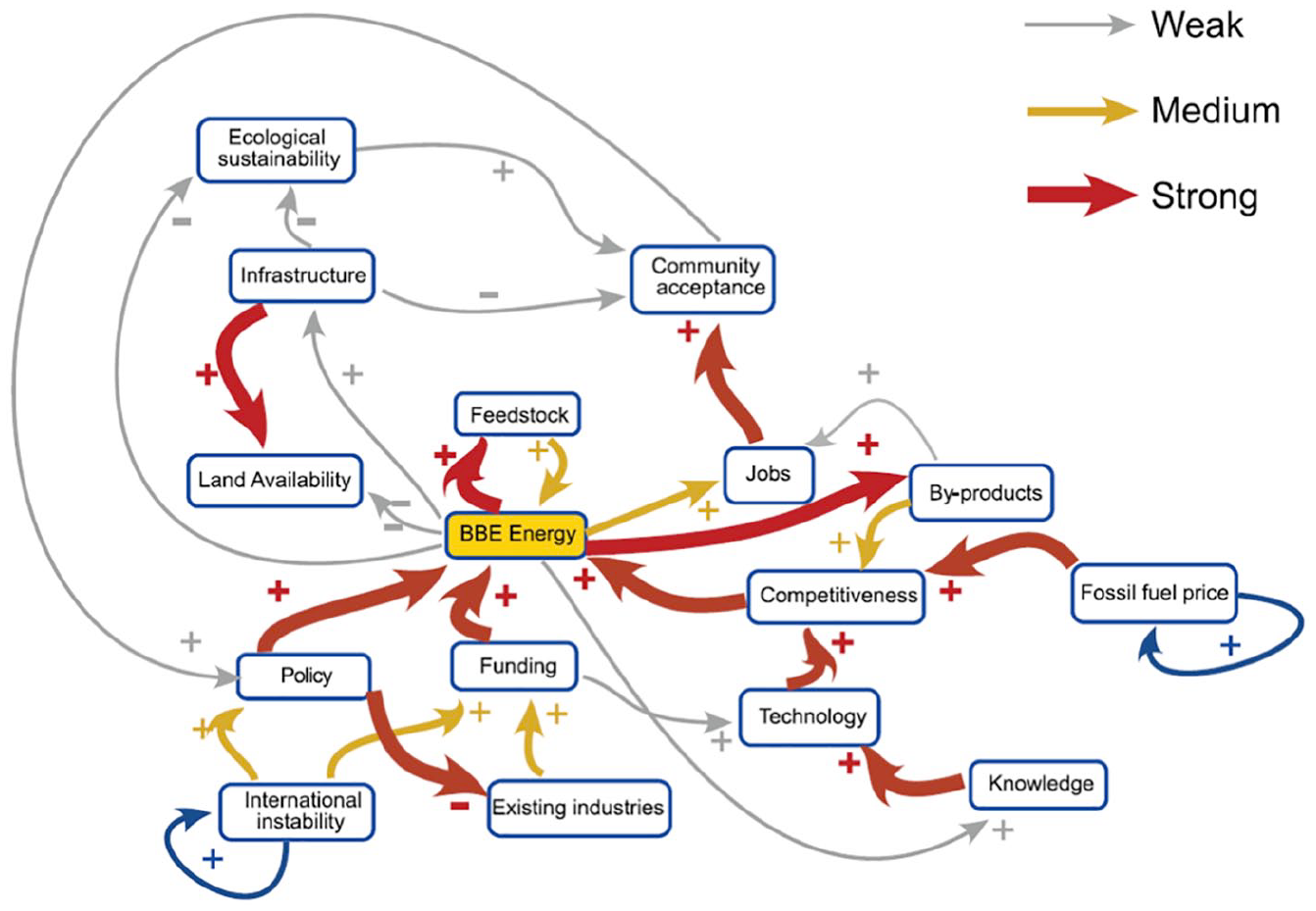
An example of a Participatory Systems Map, developed by Penn et al. (2013).
Factors can represent anything as long as they are variables (i.e. they can go up and down); note this does not mean they need to be directly measurable or a continuous variable, they can still be qualitative in nature, but it must make sense to talk about them increasing or decreasing in their amount or value. Once we have decided on a system or topic, and have assembled the people to build the map, the actual process starts by choosing and defining one or a few focal factors. These are usually factors which are key outcomes of the system or policy in question. We then use them as hooks to start the map.
Connections (uni-directional arrows) represent causal relationships, in a mathematical sense, and are either positive (i.e. an increase in one factor causes an increase in the next, or a decrease in one factor causes a decrease in the next), negative (i.e. an increase in one factor causes a decrease in the next, or a decrease in one factor causes an increase in the next), unclear (i.e. we believe there is a causal relationship but we are unsure of its nature), or complex (i.e. the relationship depends on other factors, or is non-linear). Note, the terms positive and negative here are not used in a normative sense; this is a common misunderstanding during workshops, that is, a participant will misunderstand a positive connection to mean ‘this factor is a good influence on this factor’. In effect, all connections represent an influence which is sufficient to cause a change in the factor they point to, but none are by definition necessary.
Additional optional information can be collected and included in a map as evaluators see fit. For example, strength of causal connections (as in Figure 1) can be collected and may highlight particularly clear causal paths in the map. For factors, information on important, controllable, or vulnerable factors can be collected. For both factors and connections, views from stakeholders can be gathered on where most uncertainty lies, or which have the least evidence or data associated with them. In practice, we have found that the information which is most useful to collect here is different in each application of the method. The generic descriptions of ‘important’, ‘controllable’, or ‘vulnerable’ factors crystallise in each example in different ways and can become central to map interpretation or can be irrelevant or not applicable. They key is to ask stakeholders about what things they might want to collect more information on or visualise in a map, and to consider what themes might be useful to cross-reference any analysis you wish to do.
The map produced is an intersubjective object; it reflects the beliefs of the group of people that built it. As with any model, it should not be assumed to be objective or comprehensive. This is an important but often forgotten point. The value in using such an approach is not in arriving at some definitive model of a system, but in the process of learning and building a map together with stakeholders.
Starting the mapping process
The full mapping process involves 11 essential steps. These are fully described with a practical focus by Penn and Barbrook-Johnson (2019). A brief description is presented here, with an evaluation focus, to orient the reader.
System identification and mapping focus
Before we get around a table to actually build a map, the process begins with the identification of the system to be mapped. This can be done by an evaluation (and client) team together, or with a wider group of stakeholders. The choice of what level or scale to focus the map on can be a difficult one, and is often the most underappreciated challenge in the whole process. It is important not to choose too large a system, which can become impossible to map fully, and/or be too broad to serve the purposes of an individual evaluation. Equally, the system should not be too narrow so that important context is ignored. This choice is similar to that of choosing boundaries for an evaluation focus or design. In practice, a specific problem or objective may be what brings people together to a mapping session; the process should still begin with identifying the most appropriate system, and boundaries, through which to address that problem or objective. When including a wider group of stakeholders in the system definition, perhaps at the beginning of a mapping workshop, extra care will be needed to ensure the level of focus is coherent with the intended use of the map in the evaluation. In practice, the choice of system and boundary setting if often pragmatic, to allow a process to be tractable given resources, or to meet clear objectives in an evaluation.
Inviting stakeholders
Though a mapping exercise can be undertaken by a small closed group or even one individual, it is likely to be far more valuable to invite a range of stakeholders to be involved in map construction. The identification of who should be invited into this process is similar to that of any sampling process during an evaluation; any stakeholder who could plausibly hold knowledge that is relevant for the evaluation, or of the system the policy being evaluated operates in, is likely to be worth including. The only constraints on inviting stakeholders are that the workshop should not include too many participants and should not over-prioritise one perspective. Any one workshop should not have more than 12 contributors, excluding the facilitator, observers and note takers. Beyond this facilitation and discussion become increasingly difficult to do as one group. If you wish to include more than twelve individuals, multiple group sessions (in series or parallel), or bilateral sessions with a strategy to integrate the resulting maps, may be needed. However, keep in mind that combining multiple maps built in parallel can be significant challenge in its own right.
How to run a mapping workshop
The next seven steps typically occur during a mapping workshop, which we recommend is three hours long at a minimum, and uses a room which encourages participants to stand and move around a large table, rather than sit, or huddle around flipchart. It is useful to have at least one dedicated note-taker in the workshop, to take note of the thrust of conversation, and particularly record points of disagreement and discussion, and the causes of unclear connections or uncertainty.
Though it is not the purpose of this paper to consider wider issues with using participatory methods in evaluation, it is worth briefly considering them before we describe the workshop process. A key concern is that all participatory processes have the potential to reproduce or exacerbate inequalities of power and voice, and to allow stakeholders to dominate or exclude one another. Care should be taken in designing the process, inviting stakeholders, and in workshop facilitation to ensure these risks are managed. In most contexts, we recommend using a map and the mapping process to diffuse tensions or mitigate inequalities. To do this, use the map as an object which stakeholders can critique rather than each other (see Johnson, 2015, for more on this), or use the excuse of being ‘true to the mapping process’ to ensure those who have not contributed so far, are given a voice. This approach is also a good starting point when there are fundamental differences of opinion on basic concepts such as, ‘should we use a systems lens for this?’ or ‘does this system exist?’. For a full discussion of using participatory approaches in evaluation, see Chambers (2009), Guijt and Gaventa (1998), Guijt (2014) and Zukoski and Luluquisen (2002). For a wider overview of modelling with stakeholders see Voinov and Bousquet (2010) and Voinov et al. (2016).
Pick focal factor(s)
As a starting point, one or a few, factor(s) should be chosen to seed the map. Some discussion on what these may be is useful before the workshop, but it is often also helpful to have this discussion with all participants. A, or a set of, focal factor(s) may be a key outcome or objectives or a central activity or process. Whatever it is, it must be expressed as a variable. It is also useful to note the privilege given to the focal factor(s); it will be given the most focus of anything in the whole map, and will drive the direction of the mapping process as a whole. The focal factors should thus be chosen so that the map has appropriate breadth to ensure that different and potentially interacting goals or stakeholder interests are included. In an evaluation context, we strongly recommend starting with focal factors that are outcomes, and not starting with the intervention. This will allow the map to focus more on the wider context of the intervention rather than allow participants to fall into a well-worn narrative on how the intervention leads to outcomes without considering what else is happening in the system.
Brainstorm factors
Participants should individually brainstorm factors they believe have a direct or indirect influence on, or are influenced by, the focal factors, either positively or negatively. They should write each factor they brainstorm on its own post-it note. Be careful to stop stakeholders individually brainstorming dozens of factors; if you need to reduce the number to not be overwhelmed, suggest they focus on strong or important influences, rather than any plausible thing they can think of.
Consolidate factors
Once a ‘longlist’ has been brainstormed, the whole group should bring these together and clarify and consolidate, remove duplicates, and create new factors that capture others from the brainstorm that were similar but not exactly the same. The facilitator should help to keep all the factors at broadly the same level of specificity. It may be helpful to match or merge factors with established concepts or indicators that are being used in the evaluation, or are familiar to the evaluation team; however, care should be taken this does not mean participants fall back unthinkingly on existing narratives around these. The key challenge here as a facilitator is leading this consolidation task with a group of stakeholders watching you. If you need help, ask the stakeholders to lead too, they will often see patterns before you.
Connecting factors
The whole group should begin making the causal connections between factors. All connections should be discussed collectively, and the facilitator should ensure the group do not break into smaller groups, and work on the map separately (this is the most common challenge at this point). It is particularly useful to use ‘white-board paper’ here which allows for the ‘rubbing out’ of connections drawn (e.g. as on a whiteboard), because when using standard paper and pen, participants are often hesitant to draw connections, knowing that removing them can be difficult.
Check the map and iterate
Once you are up and running in building the map, the process can often take on a life of its own as the participants get more engaged. This is to be encouraged and is a sign of a good mapping session; however, the facilitator should still try to encourage the participants to keep the map consistent, coherent, and in line with its purpose in the evaluation. This can be done by regularly checking the connections that are being added (e.g. by looking for duplicates where a connection is made between A->C and A->B->C, both of which represent the same influence), and regularly checking factors to ensure they are coherent. The skill of facilitation here can be difficult to master, and will take a few rounds of mapping to perfect, but general group facilitation skills and experience with other mapping approaches will speed up this process.
Collect factor information
Once you have been through a few cycles of building and sense-checking the map, you should begin to collect a range of information on the factors in the map. See the section ‘What is in a map?’ for a discussion of what can be collected.
Weight the connections
This step is optional, but you may wish to identify which of the causal connections are believed to be strong and which are weak.
Verification
After the first mapping process, a map will often need to go through a verification stage, where the facilitator and observers work with the evaluation team to ensure the map reflects the discussion in the workshop, and remove any spurious or incoherent elements or omissions from the map. The map may also be sent out to participants for feedback. The number of iterations of verification needed depends on a range of factors (e.g. experience of facilitation team, level of disagreement on map content, clarity of purpose), but, as a rule-of-thumb, you should continue refining the map until it appears there are increasingly diminishing returns to the effort put in. This is a key point of the process in which we must remember we are not aiming for a comprehensive or objectively ‘true’ map (should such a thing even be possible), but rather a map which is fit for our purpose, and which captures the various stakeholders’ views.
Map analysis
Once a ‘final’ version of the map is reached, any analysis of the map can be started. The range of options open for analysing a map is large however, the common theme in all analysis approaches is to use the network structure of the map (i.e. what is connected to what, and via what) in combination with subjective information collected from participants on what is important, controllable, vulnerable, or an intervention or outcome. The aim is to use the analysis to pull out narratives and a richer understanding than may be possible from simply interrogating the map as a whole. Thus, most analysis will involve creating and exploring a ‘submap’; the question becomes, how to identify the starting point for this sub-section, and how to ‘build’ from there. Table 1 sketches out some of the options.
Overview of analysis starting point and sub-section creation.
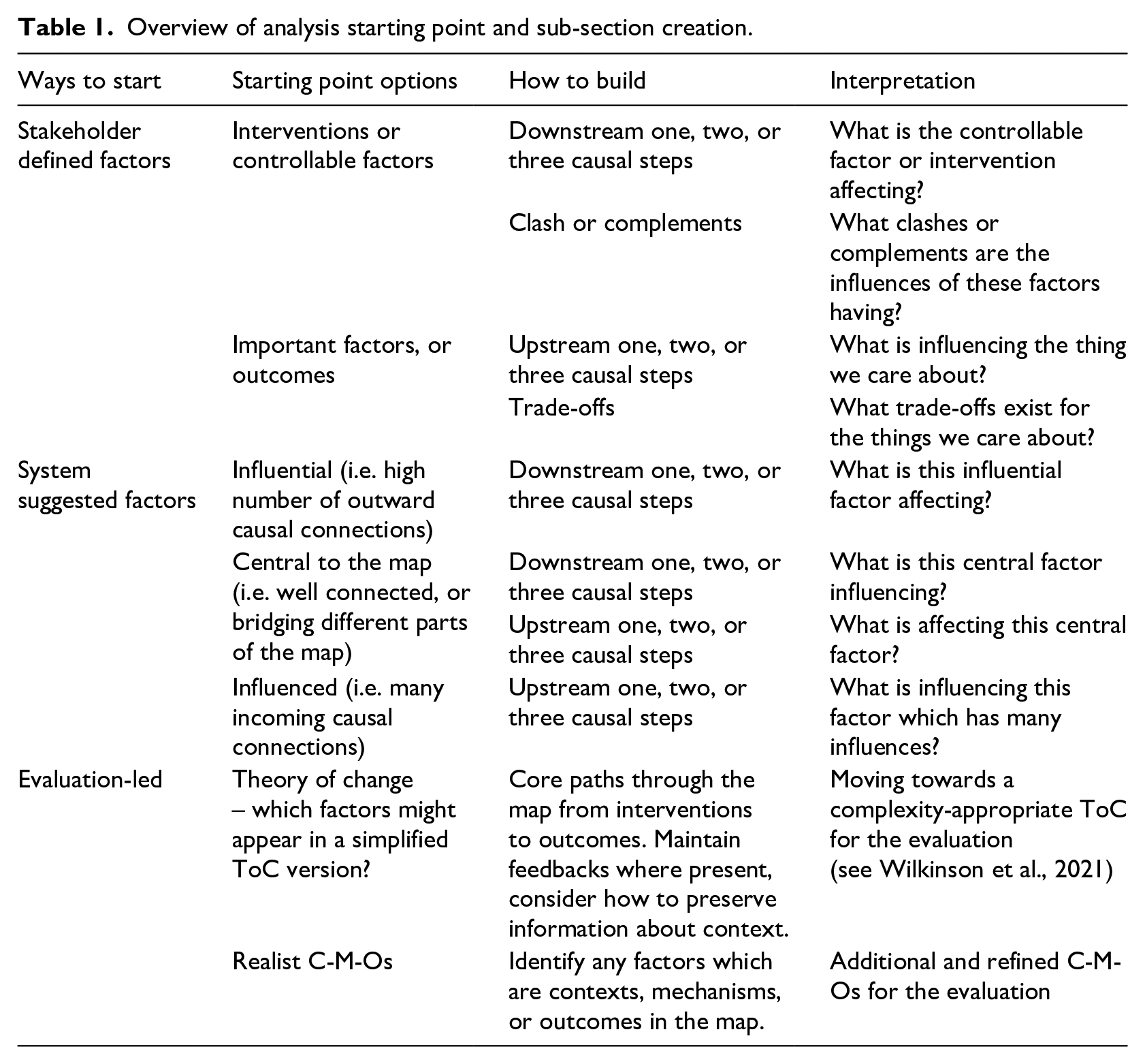
In general, there are three main places to start to build these sub-sections of the map: (1) stakeholder-led, using factors which are important, vulnerable, or controllable to them; (2) system-led, using factors which because of their network properties (e.g. how connected they are to the whole map, calculated using traditional network analysis) appear to play an important role (e.g. bottle-necks, highly influential factors), or (3) evaluation led, using some aspect of your evaluation approach to identify factors or sets of factors which may be important or more relevant.
There are then four options for building from the starting point(s): (1) looking ‘upstream’ from one factor (i.e. what influences it, see Figure 3 for an example); (2) looking ‘downstream’ from one factor (i.e. what it influences); (3) when starting with several factors, looking for clashes and/or complements in what influences them, or what influence they are having (see Figure 4); or (4) looking for trade-offs between different outcomes, where they will influence one another or be pushed in different directions by other factors. With any of these, you may choose whether to look one, two, or three steps up or down from factor(s), and whether to include cross-connections, or only those influences directly into or from the analysis factor starting point. In practice, including more than three steps tends to include much of the original map, and including cross-connections can make the sub-map too difficult to interpret quickly.
All of these ways to analyse a map, and many more, can be applied to an evaluation context. These are just guidelines for getting started, and in practice you may want to mix and merge different ways of creating submaps. They can all help improve the understanding the map generates of the system or policy being evaluated, can generate new potential evaluation questions, can help identify evidence or theory gaps, and can help identify ways the map may connect to other elements or methods in the evaluation.
Running workshops online
Owing to COVID-19, many processes such as that we describe above are likely to be run online. Running a session(s) online should not be a reason to default to a simpler or less participatory process. Care needs to be taken to select the most appropriate software for participants to take part in live mapping (i.e. multiple participants editing the same map). Software should be easy to use and compatible with a wide range of web-browsers and operating systems. Lag-time between one participant drawing a node or connection, and it appearing on others’ screens needs to be short. There are many commercial and free options available, we have found the following two to be useful: Participatory System Mapper (https://cress.soc.surrey.ac.uk/prsm/) and diagrams.net (https://www.diagrams.net/). Both are free, Participatory System Mapper is developed by CECAN but has a small development team; whereas diagrams.net is a well-established diagram drawing tool with more functionality but a longer lag-time for users to see others’ changes.
Another key decision is how to structure online workshops, in their number and length, and in how individuals interact. We have found that (multiple) shorter sessions followed-up with bilateral one-to-one and email exchanges are needed to replace longer in-person sessions. Interaction also requires more careful facilitation online, with group size reduced to five or so, parallel groups, or with more detailed structure and instructions on how individuals in larger groups can contribute. The interactive nature and impromptu conversations are perhaps what is most at risk of being lost online, so care should be put into considering how space can be created for these.
Case studies
Here, we use two case studies of the application of Participatory Systems Mapping to demonstrate and reflect on how the approach can be used in evaluation. They are not comprehensive descriptions of the process in each case, but rather are intended to give a fuller picture of how Participatory Systems Mapping can feed into evaluation practice in different ways.
Evaluation planning in the energy trilemma
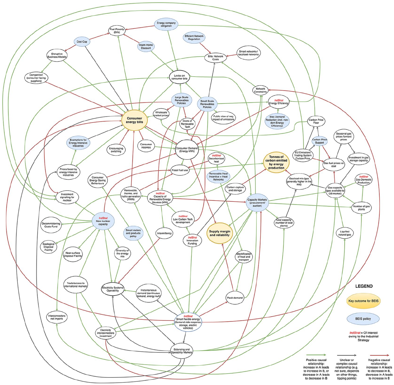
There is a large range of UK central government policies and programmes that have effects on the energy trilemma (i.e. the interplay and trade-offs between energy sustainability and greenhouse gas emissions, consumer energy prices, and security of supply). Examples include those specifically targeted at: security, such as the Capacity Market; renewable energy, such as Contracts for Difference; and protecting consumers against high prices, such as the Warm Home Discount. The sheer number of programmes and policies with close interaction and overlap in this area has led to a crowded and complex policy landscape with a range of potentially complementary and conflicting aims.
Analysts and evaluators in the UK Department for Business, Energy and Industrial Strategy (BEIS) expressed an interest in developing a richer understanding of the interaction of policies and other contextual factors on the energy trilemma. This understanding was primarily to help inform evaluation plans and priorities (e.g. to make the case within BEIS for, and to develop, proportionate evaluations) but also potentially to be used, for example, in developing policy maps and ToC diagrams for individual policies and interventions. Thus, the aim of the case study was to explore, via Participatory Systems Mapping, the energy trilemma policy landscape, and specifically to map various relevant policies, their interaction and impact on the trilemma. In addition, analysis was focussed on highlighting: (1) policy impacts on the three ‘legs’ of the trilemma (i.e. the key outcomes of energy related emissions, energy prices, and energy security of supply), and (2) common and/or contradictory aims and mechanisms among policies.
One large mapping workshop with a selection of BEIS staff from different teams was held to create a map. This was followed by multiple smaller sessions to refine and validate the map. The mapping process began with the three ‘legs’ of the trilemma as focal factors, and finished with the addition of BEIS policies to the map. The map was kept intentionally broad and high-level because of its purpose, to be used across a selection of related policy areas.
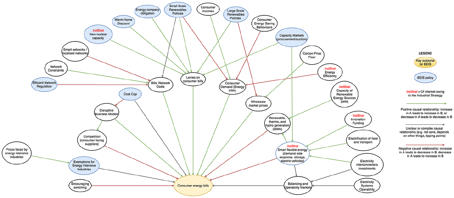
Below are three versions of the map: (1) a full version of the whole map (Figure 2); (2) one focused on the factors and connections ‘upstream’ (i.e. that influence) of one of the three trilemma legs – energy prices, specifically Consumer Energy Bills (Figure 3); and (3) a subset of the full map, which focuses just on those factors one causal connection ‘downstream’ (i.e. influenced by) of the BEIS policies included in the map (Figure 4). The second two are examples of the analysis combining network structure with information about factors (i.e. subsets of the map focussed by factors that are important outcomes, or policy interventions) discussed above.
Upstream of Consumer Energy Bills.
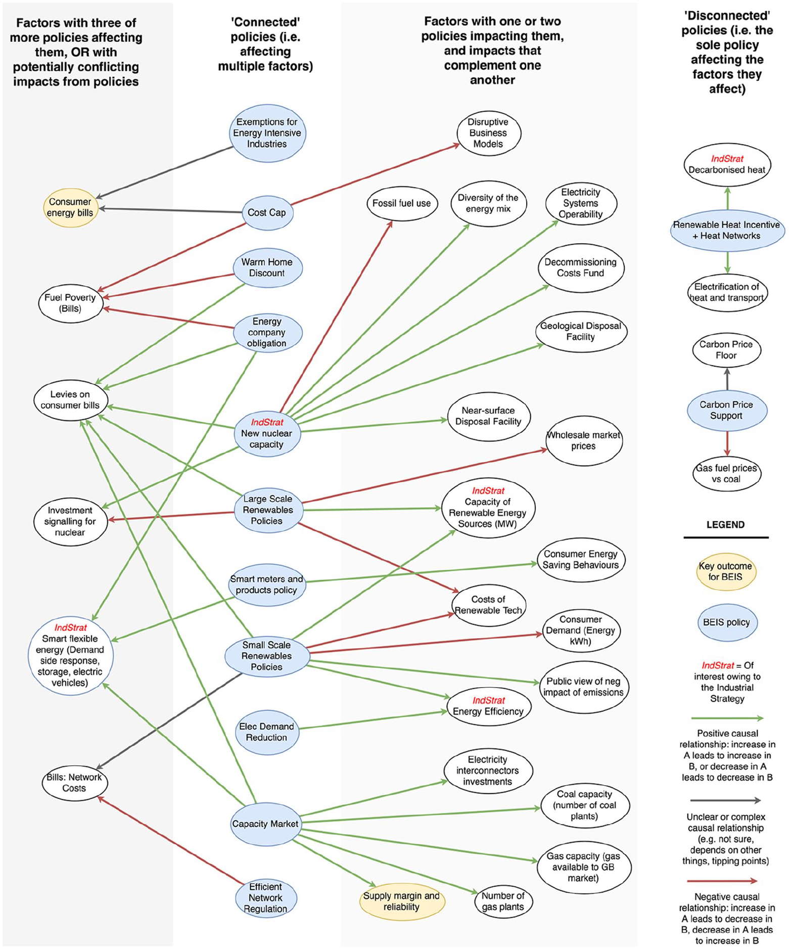
Factors within one causal connection downstream of BEIS policies.
The full version of the energy trilemma map.
The full map (Figure 2) was primarily used as a general-purpose discussion and reference tool by analysts and evaluators in BEIS. In practice, this meant the map was printed out on a large sheet of paper and put up on the walls near teams’ desks. Participants in the map building process reported using the map to think about what other teams within BEIS, and other departments, they should be talking to in their day-to-day analysis and evaluation activities. They also reported that the map made explicit some areas of common interest that were not apparent from their day-to-day work, or the team structures they worked within.
Figure 3 shows the subset of the map upstream of Consumer Energy Bills (one of the legs of trilemma). This provides a picture of what influences the achievement of this outcome, including potential risks, trade-offs and opportunities suggested by the complex causal structure. Narratives emerging from this include the fact that Consumer Energy Bills are impacted by a large number of factors which are pushing in different directions (in particular, this is the case relative to the other two legs of the trilemma); Levies on bills mediate the influence of all but two of the BEIS policies within two causal steps; Smart Flexible Energy appears to represent a key opportunity to reduce bills, and notably has three short paths into Consumer Energy Bills, which may not always complement each other. These narratives are examples of the kinds of interrogation and implications which can be taken from a map like this, and are now being used by BEIS in their evaluation planning. For example, impact of multiple BEIS activities in increasing Levies in the short term (i.e. policy budgets being partially funded via levies on bills), versus the longer term aims (and potential outcome) of reducing the cost of energy, could be a core focus of any evaluation in the area, or a meta-evaluation could be designed on this exact question across multiple policies.
Figure 4 shows the third and final example of analysis and use of the map. Here only factors within one causal step downstream from BEIS policies are included. These are then laid out in groups, showing factors with many policy influences on the left, and those with fewer on the right.
The map suggests some factors are impacted by a relatively large number of BEIS Policies that appear to be pushing in the same direction, but may not be coordinated, for example
Fuel poverty: bills: Fuel poverty’s status as a key focus for BEIS is reflected in its position in the map, being affected directly by three BEIS policies. Evaluation activities may wish to prioritise considering more closely exactly how these policies interact with bills for those in fuel poverty, that is, asking, is coordination between the policies optimal?
Smart flexible energy: Again, this was impacted by a range of policies which may not be directly related. Evaluation planners may need to consider, are policies which are not closely related coordinated when they have impacts on the same areas?
The map suggests the following factors are influenced in potentially contradictory ways by BEIS policies:
Investment signalling for nuclear: Messages to the nuclear industry may be mixed owing to the signals large-scale renewable policies send, alongside new nuclear capacity efforts. Evaluation planners may wish to ask, are evaluation efforts considering or studying the tensions and impacts of these contradictions on industry sentiment (especially where the signals might not be coming from specific policy interventions)?
Consumer Energy Bills: This key outcome is affected in complex ways by the exemptions for energy intensive industries and the cost cap BEIS factors. Any evaluation focusing on this outcome would need to consider how to elucidate these influences further.
These examples show the way in which the map and its analysis were used to generate narratives and questions which could then be used in evaluation planning and prioritisation. A longer discussion of this case study can be found in Barbrook-Johnson and Penn (2018). In practice, the ongoing use of the map by evaluators and analysts in BEIS revolve around three key activities: (1) printing and putting up on the wall the map in team areas, (2) using the map as a reference document before, during, and after other policy mapping sessions, and (3) staff accessing, using and sharing an editable version of the map to embed ownership, further use, and updating of the map.
The Renewable Heat Incentive and the biogas and biomethane sectors
Based on the Energy Act 2008, the Renewable Heat Incentive (RHI) is a payment system for the generation of heat from renewable sources, overseen by BEIS. The RHI is designed to support households, businesses, public bodies and charities in transitioning from conventional forms of heating to renewable alternatives. At the time of writing, an evaluation of the reformed RHI is underway.
The aim was to apply Participatory Systems Mapping to support this evaluation, and specifically to understand the causal and stakeholder relationships underpinning applications to the RHI to instal biomethane and biogas plants, and their outcomes. BEIS and CAG Consultants, the evaluation contractors, believed that the approach would be particularly useful in this context as biomethane and biogas plants typically operate within a wide network of actors, stakeholders and beneficiaries.
The map created is shown in Figure 5. A large mapping workshop was held to create the map, with a wide selection of stakeholders from within BEIS, other departments, and industry. The key outcomes, ‘energy from biogas’ and ‘energy from biomethane’, were used as the focal factors. The map was then refined with the RHI evaluation team and shared with the wider stakeholders again for comment. During the refining process, it was decided to shift the layout of the map from that developed in the first workshop (which was unplanned, being the result of starting with the focal factors in the centre, and building outwards) to a more traditional, left-to-right, policy activities to outputs layout. Those using the map felt this made it more readable and usable. Rearranging the map like this is quite common and can help make it more accessible to new readers, but can mean it makes less sense to those involved in the workshops.
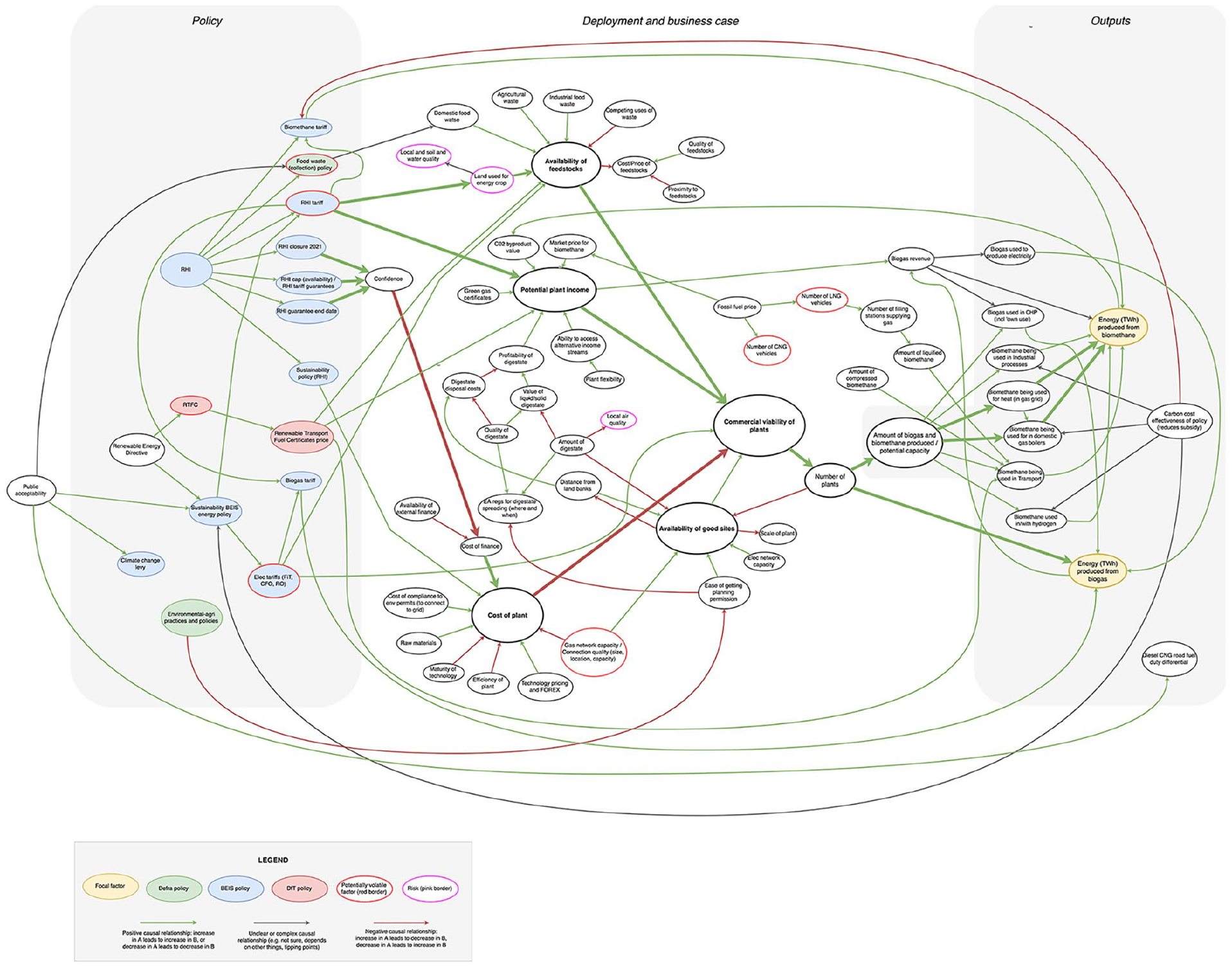
the full RHI map: note, emboldened lines represent particularly strong or important causal connections, and emboldened factors are core concepts or centres of clusters of factors.
The final map is supporting an exploration of the impact the RHI scheme has had on enabling installations (for whom and under what circumstances), and on the biogas and biomethane supply chains. Discussions with the evaluation team identified six ways in which the map has been used:
Being present during the map building process was helpful in enriching the evaluators’ knowledge of the policy and this specific element of it (i.e. biogas and biomethane plants). Connections with other sectors (e.g. transport), the breadth of considerations that go into a business plan for renewable heat, and the importance of availability of good sites for installations, were specific examples of this. The mapping process helped the evaluators orient themselves to the area quickly, something which is often valuable where evaluators are under tight time pressures and face steep learning curves.
The map is supporting the refinement of the theoretical framework for biomethane and biogas installations. The evaluation’s theoretical framework is defined in realist terms, and sets out hypotheses about for whom, and in what circumstances (i.e. in what ‘contexts’), the policy is expected to lead to particular reasoning or choices (i.e. causal ‘mechanisms’), leading to desired or undesired policy outcomes. These realist hypotheses are generally known as context-mechanism-outcome configurations, or C-M-Os (see Jagosh et al., 2016, to begin reading about realist evaluation). The evaluation team had already identified many of these, so the map helped sense-check and refine them. The team used the map to ask whether the C-M-Os they had were accurate and ‘deep’ enough. To do this, they looked for factors in the map which had any overlap with any of the components of their C-M-Os and then check the connections and nodes close to that factor to see if there were any additional concepts which they might add in to their C-M-Os. They also looked at the map to find any potential C-M-Os which they had not already generated. They noted the map tended to contain factors which represented contexts, but fewer that corresponded to mechanisms and outcomes. At a slightly higher-level, the team used this process of cross-referencing C-M-Os and the map to consider which part of the system, and the evaluation, each were covering best. The C-M-Os and map thus became relational objects which helped users understand the definition, scope, and value of the other. Finally, the team used the map to help generate the qualitative description of C-M-Os, using the wider context the map brought into specific C-M-Os to inspire some of the C-M-O text.
The team also used the map and mapping process to inform the evaluation scope. They noted the system boundary question was similar to the evaluation boundary question, but that because the map is not solely focussed on assessing the impact of the policy, it helped them to avoid an overly narrow focus that ignored the context. They also noted that the map helped them avoid confirmation bias on a few issues (i.e. overemphasising an impact they repeatedly learn about), making them realise a particular element of the evaluation was more complex than they had understood previously.
Topic guides for interviews in the evaluation were updated to reflect some of the concepts and factors that appear in the map.
The map helped convince the team to conduct a wider stakeholder mapping exercise and informed their sampling approach, particularly in sampling beyond applicants to the RHI.
Finally, the team explained how the map helped give them prompts for concepts and themes to look for when analysing qualitative data collected during the evaluation.
Overarching all of these uses of the map, the team felt the map gave them a quick visual orientation to the policy area and made them understand the system better. They felt this made them better evaluators and better ‘realist theory makers’. They noted they might have developed this understanding in other ways, but that the mapping process was a particularly quick way to do it.
Reflections on the two case studies
The two case studies give us different modes in which Participatory Systems Mapping has been used in evaluation settings. In the trilemma example, we see how a map gives a ‘big picture’ above any individual policy or evaluation. In contrast, the RHI map focuses down on one element within a larger evaluation. This highlights how flexible the choice of the system to be mapped is. The choice must be driven by the purpose to which the map will be put, but these purposes may be contested by stakeholders (e.g. if some stakeholders wish to contest and evaluate the whole design of an intervention, but others wish to consider specific elements and focus on fine tuning). The purpose may also be unclear at the beginning of the evaluation.
We have seen how maps and their analysis generate narratives and questions. This is similar to the way in which analysis of qualitative social research data generates themes, yields narratives, and throws up new questions. The maps become a resource that can be used in many different ways, in the same way that qualitative data often is. In evaluation settings, the narratives are important for prioritising, sampling, and building theory, but the new questions they create will often be the most unique value they offer.
The narratives provided by both maps, and the applicability and potential value in policy design and issue identification, also serve to show how Participatory Systems Maps often prompt users to think about the policy cycle in a more joined up manner. Because of their general-purpose nature, it is often easy for others to see how they could be used in policy design, or in informing ex ante appraisal efforts. In this way, maps can be a useful tool in arguing for more joined up design, appraisal and evaluation, should researchers and practitioners wish to make such a call.
The two examples also show us how maps can be difficult to communicate to those not directly involved in their development and use. Individuals at BEIS sometimes remarked on concerns about taking maps to senior staff or politicians, feeling that they would not be well received because they are complicated or are perceived not to give immediate action points. There is a need to think more about how maps can be communicated to others, and whether sometimes the narratives, learning, and findings extracted from maps are what should be communicated, rather than the maps themselves.
There is clear value in connecting Participatory Systems Maps to other methods and processes. This was done well in the RHI case study, connecting with an evaluation design and sampling, and with Realist C-M-Os, but in the trilemma example this was less clear. A suggestion of how a map could be used to sense check or refine a policy map, logic model, or ToC is elaborated in Wilkinson et al. (2021).
Some evaluators in BEIS and elsewhere have also asked how a mapping exercise can be standardised and how it can be quality assured. These are difficult questions for an approach which is so inherently flexible and multi-purpose. We provide guidance on how to run the process, and these are useful for standardisation and quality assurance purposes, but ultimately it will be for evaluators leading a process to ensure it is rigorous, complete, and appropriate for its purpose, and to articulate this to others. A key strategy might be to ensure the process is well-document and transparent. For such an iterative and participatory method, this can be laborious, but is likely to be of high-value when used in a high-scrutiny context.
When to use Participatory Systems Mapping in evaluation?
We now turn to considering both when it might be appropriate to use Participatory Systems Mapping instead of other related methods, or vice versa, and at what point in before or during an evaluation we might want to use the approach.
Choosing participatory systems mapping over other methods
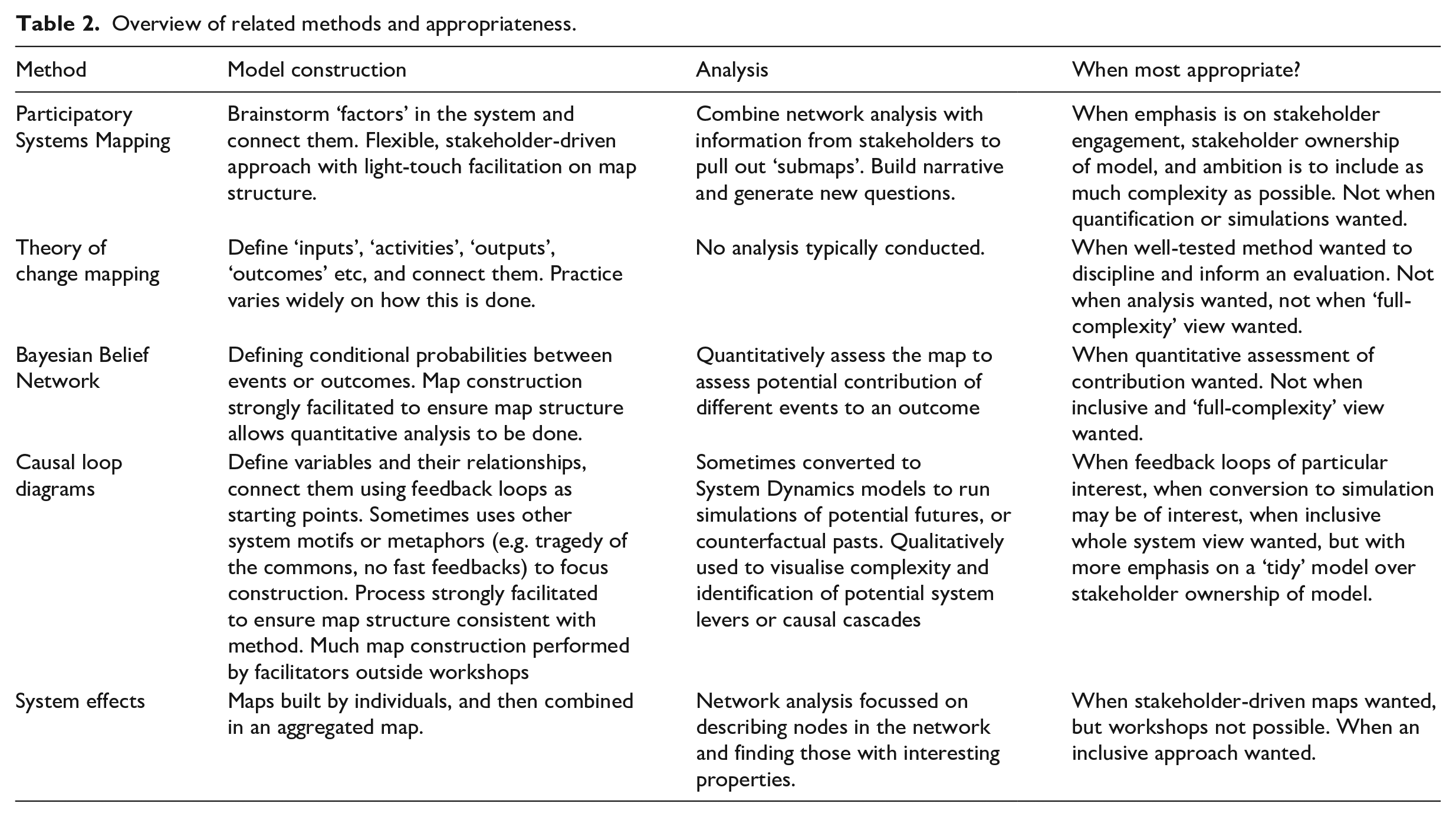
Befani (2016) outlines the original and a revised (evaluation) design triangle (Stern et al., 2012) which both show how evaluation designs and method must align with the evaluation questions, the evaluand attributes, and any other objectives or context of the evaluation. In our review above we outline a number of methods (e.g. ToC, causal loop diagrams, Bayesian Belief Networks) which will often align with these considerations in similar ways (i.e. where there is a need for holistic and systems analysis, and where there is appetite for diagrammatic representations), meaning the choice between them may be subtle. Important differences that will likely drive choices between them are outlined in Table 2, which describes the different foci in model construction and analysis phases.
Overview of related methods and appropriateness.
‘Before’ evaluation
Here, we split a set of different modes of use into ‘before an evaluation’, and ‘during an evaluation’. Only in the most highly-specified and rigid evaluation designs are these two stages entirely separate, but we use them to differentiate between planning and designing, and conducting and supporting evaluations.
Before an individual evaluation has begun, or during planning processes, there is value in using Participatory Systems Mapping in four specific circumstances (there may well be more, but we focus here on four):
Questions over evidence gaps, uncertainties or different opinions: a mapping exercise may demonstrate there are clear evidence gaps, uncertainties, or differing opinions on causal structures, around certain key objectives or interventions. This may be difficult to predict before a mapping exercise, but if there is any suspicion that these issues may be present, or evaluators want to check, Participatory Systems Mapping will help.
Policy landscape questions: maps help us understand where policies and interventions are potentially complementing or potentially undermining each other. Observing complements or clashes, triangulating with other information or knowledge, may prompt planners to seek evaluations which can provide a richer understanding of complements or clashes, or may necessitate the inclusion of evaluation questions on these topics.
Stakeholder engagement desired: maps are invaluable as a stakeholder engagement tool. Their ability to facilitate robust and purposeful discussion between stakeholders is often the most immediate value evaluators get from their use. As maps have clear immediate use in an evaluation or evaluation planning, in the eyes of stakeholders, stakeholders are also typically keen to engage with them, to ensure their viewpoint is represented in the map.
Identifying new questions: as stated above, maps can prompt many new evaluation questions, which can then be added to evaluations being developed. Where evaluators desire a fresh perspective on an issue, a mapping exercise may help.
During evaluation
During an evaluation, we see three modes of use:
Informing data collection in an evaluation: this may be in sampling strategies, as seen in the RHI example, or in identifying additional factors, indicators, or concepts to capture data on. It may also be in including new classes of questions or data on topics, where a map throws up new questions.
Informing evaluation theory: maps can be useful to directly inform, refine, and sense-check theory, if it is being used in an evaluation. We have seen this in the RHI example, but it applied equally to theory of any kind, used in evaluation, such as ToC, or logic models.
Identifying negative programme theory: maps have a potential role to play in identifying potential causal mechanisms whereby an intervention has negative or unintended consequences. Because Participatory Systems Maps start from the system, rather than from the intervention, they are well placed to highlight these.
Conclusion
This paper presented our approach to Participatory System Mapping and, using two examples, explored how it can be of value in evaluation. We have considered when the approach might be applied by others and described the mapping process in detail. We hope this paper will encourage others to consider using the approach where appropriate.
Participatory Systems Mapping can serve as an intuitive and flexible tool in an evaluator’s toolkit. It is a cost-effective approach compared to other engagement and modelling approaches, but perhaps less cost-effective compared to desk-based research. We believe the shared understanding, structure, and ways into complex settings it provides makes it worthwhile even where it incurs higher costs. We have seen how maps can be analysed in different ways, and how narratives and new questions are often the most compelling insights offered. The approach does not give us certainty, and may be difficult to communicate to others not involved in the process; however, it does allow us to take action in the face of the potentially overwhelming complexity of intervention impacts, and can be an entry point into a cultural shift in individuals, teams and organisations, towards more complexity-appropriate evaluation. Ideally, ownership of maps will be taken over by stakeholders and they become living documents that they regularly use and update.
We do not suggest Participatory Systems Mapping is inherently better or worse than any other method; appropriateness of methods to purpose and context should drive choices about methods and designs. Future work could include the development of protocols or designs of how the approach can fit into existing evaluation approaches (as done in Wilkinson et al., 2021, and HM Treasury, 2020), and how it can support and complement existing data collection methods and analysis.
Footnotes
Acknowledgements
We would like to thank the respective teams at BEIS and CAG Consultants for their engagement with this work, and the wider CECAN team for their intellectual support, and for helping to inform the wider research programme which allowed us to write this paper.
Funding
The author(s) disclosed receipt of the following financial support for the research, authorship, and/or publication of this article: This work was supported by the Economic and Social Research Council (grant numbers ES/N012550/1 and ES/S000402/1).