
Abstract
In digital culture, visualizations are a prevalent and ubiquitous form of communication. A veteran journalistic tool, and an increasingly popular one in digital politics, visualizations offer informative value, attract readership, and increase engagement. Visualizations’ multimodality enables them to convey rhetoric through informative, narrative and visual strategies, making them particularly well-suited for future-oriented discourse. Despite the rise of visualization-focused scholarly work over the past decade, several analytical lacunas remain, due to visualizations’ multimodal nature and their rich array of actors, contexts and usages in the digital world. Specifically, no scholarly approach examines forward-looking visualizations comprehensively, addressing the ways in which their rhetorical layers coalesce to broker knowledge in multimodal predictive discourse. To fill this gap, our paper proposes a holistic framework for their analysis, addressing knowledge-brokering functions, predictive components, and rhetorical strategies. Thus, we ask, ‘How are predictive visualizations rhetorically constructed to mediate the future?’ and answer through conceptualization complemented by qualitative analysis of predictive pandemic visualizations from journalistic and social media. We begin by creating a theoretically informed framework, based on existing perspectives from data-journalism studies, projection studies, and visualization scholarship, which we then refine through analytical workshops and empirical application. Our final analytical framework encapsulates each visualization’s rhetorical strategies, its knowledge-brokering functions, predictive structure, and their interrelations, highlighting the division of rhetorical and predictive labor across each visualization’s components. We conclude with an analytical epilogue in which we demonstrate the usefulness of this framework in holistically analyzing predictive multimodal rhetoric by revisiting the elusive concept of rhetorical complexity in predictive visualizations.
Keywords
Introduction
In the image-saturated realm of social media, visualizations ranging from data graphs to complex infographics are ubiquitous (Engebretsen and Kennedy, 2020; Nærland and Engebretsen, 2021). Often, they are the objects of political rhetoric, designed to convey information, underline positions in data, or delineate contingent futures (Amit-Danhi, 2022a; Allen et al., 2023). As evident by the globally ubiquitous use of curve graphs during the Coronavirus pandemic, visualizations aid audiences to tap into a collective vision of an upcoming reality. Furthermore, they may affect crucial decision-making processes, whether it be a specific vote or the choice to adhere to a new policy.
Although they are an integral part of digital public life, assuming a key role in journalistic coverage as well as political and social-change campaigns (e.g., infographic-heavy political tweets in Amit-Danhi and Shifman, 2018; advocacy campaigns in Wang et al., 2018), visuals and visualization-based rhetoric in the mediation of futures have been only marginally explored. Work on predictive digital visualizations tends to focus on use contexts (i.e., journalism, campaigning, advocacy, e.g., Bradshaw, 2017) and follow focused scholarly avenues (i.e., visualization conventions, semiotic explorations, or design effectiveness, e.g., Bryan et al., 2017; Kennedy et al., 2016; Weber, 2019). In part, this is due to the analytical challenge posed by visualizations’ complex multimodal rhetorical form. That leaves the field without an in-depth understanding of visualized future-oriented rhetoric, and how it mediates the future to a public engaged in orienting itself towards it.
In this contribution, we propose a holistic analytical framework for the exploration of predictive visualization rhetoric, addressing intertwining knowledge-brokering functions, predictive components, and rhetorical strategies. We aim to develop an approach that helps to engage with the way predictive visualizations are constructed so to mediate the future. We began by reviewing current works on predictive visualizations and highlighting the analytical issues they entail, chief among them the multimodal complexity of visualized future-oriented discourse. We then met these challenges by constructing a theoretically-based analytical framework, reliant on previous visualization research, works on predictive data journalism, and projection analysis. To strengthen, test and refine the viability of the theoretically-informed analytical framework, we performed qualitative inductive analysis on a sample of 158 future-oriented Coronavirus news and social media visualizations collected from Israel, the US, Germany and the UK. We demonstrate the framework’s usefulness by highlighting its ability to address commonly under-studied elements such as rhetorical complexity and the multimodal division of rhetorical labor, and conclude by reflecting on the methodological, normative, and deliberative implications for deeper understanding of rhetorical complexity in predictive visualizations.
Theoretical background
Predictive visual rhetoric
The notion of ‘visualizations’ denotes a spectrum of formats sharing a common purpose: to utilize attributes of visual communication in order to convey information to an audience. This spectrum encompasses data visualizations, which tend to visualize primarily numeric data and align with graphical simplicity (Engebretsen and Kennedy, 2020; Tufte, 2001), up to complex and emotive infographics (Amit-Danhi, 2022a). So far, research tends to see visualizations as an accessible shell for numerical data catered to a lay audience (Allen et al., 2023; Cairo, 2019; Kennedy et al., 2016). It assumes that data, and specifically numbers, have a truthfulness to them that visualizers should adhere to (Holthrop, 2018; Krum, 2013; Tufte, 2001).
However, studies of political visualizations have shown that infographics assume a wide variety of shapes, for which social scientists have suggested operational and thematic logics (e.g., Amit-Danhi and Shifman, 2018; Otten et al., 2015). In many cases, visualizations assume a rhetorical function (Dailey et al., 2022). When disseminated by public actors, rhetorical visualizations tend to be used to further political goals and normative re-evaluations, in parallel to conveying information. Such thematic usage forgoes graphical simplicity and employs a wide range of methods (e.g., emotionality, see Amit-Danhi and Shifman, 2022b; Kennedy and Hill, 2017) to activate audiences, promote certain norms, or political ideologies and narratives (Nærland and Engebretsen, 2021; Švelch, 2022). These ambitions are based on visualizations’ appeal: they offer informative value, attract readership, increase engagement, and reflect an ‘aura of truth’ (Kennedy et al., 2016) onto the accompanying narratives.
Those same qualities extend to visualizations that promote predictive narratives (Allen et al., 2023; Amit-Danhi, 2022a; Pentzold and Fechner, 2019). They are especially prominent in the temporal mediation work expected from journalists (Tenenboim-Weinblatt, 2013), but can also be found in candidates’ campaign materials (Amit-Danhi, 2022a), government officials’ pandemic visualizations (e.g., Allen et al., 2023), and social media content related to future-oriented topics such as climate change (e.g., Wang et al., 2018). The use of visuals in future-oriented communication may tap into a basic cognitive use of eyesight to illustrate problematic scenarios and prepare for dangers (Arp, 2008), making the response to future-oriented visual stimuli less reliant on logical thinking rather than instinct.
Having established that visualizations have unique advantages in delivering political rhetoric and predictive narratives, we note that some aspects of this genre pose considerable analytical challenges, in particular in their multimodality that is difficult to disentangle. For example, Amit-Danhi and Shifman’s (2020) work on visualization engagement converted Berger and Milkman’s (2012) engagement enhancing variable of ‘writing complexity’ into ‘informational complexity’. Though a relevant operationalization, it does not fully address the complexity of the narrative conveyed. This is due to the multiple channels that multimodal rhetoric orchestrates (Foss, 2004), leading quantitative studies to limit the scope of their investigation to either a specific aspect of visualized communication (Bryan et al., 2017; Weber, 2019), or an enumeration of its instances (Allen et al., 2023). The same challenge also bedevils qualitative ventures where thematic content analysis proves incapable of separating how the message is conveyed in order to examine which aspects of a multimodal composition deliver what elements of the argument. Thus, a large portion of visualization studies focus on either a large collection of simple images (e.g., data graphs and generic visuals, see Aiello et al., 2022); or on specific attributes of visualizations (like mapping narrative-oriented design and interactivity elements in Segel and Heer, 2010; or different metrics displayed in COVID-19 slides in Allen et al., 2023). Although such explorations are important, they neither generate a holistic understanding of the mechanisms through which differing types of visualizations convey information, nor do they offer a nuanced mode of analysis.
These shortcomings stem from the limitations of the three prevalent analytical approaches used in visualization studies. Visualizations are often analyzed as informative vessels (how they convey a ‘correct’/’incorrect’ reading), story venues (the relationship between user and story experience), or with a focus on their visuality to the exclusion of all else. These decisions to focus on a specific venue or purpose, or to analyze visualization in places where role perceptions are normatively, professionally, or institutionally defined (such as journalistic data visualization in Pentzold and Fechner, 2019; governmental science communication in Allen et al., 2023; or advocacy campaigns in Wang et al., 2018), is entirely valid. They do, however, leave the field without a multi-layered exploration of the construction of visualization rhetoric. Visual rhetoric requires a more holistic approach that resonates their process of creation: the analysis of data into information (Allen et al., 2023), the cultivation of a story that serves an actor’s goals and role perception (Amit-Danhi and Shifman, 2018; Pentzold and Fechner, 2019), and the choice of visual modes to effectively deliver it (Cairo, 2019; Tufte, 2001).
The visual mediation of future-oriented knowledge
Future-oriented discourse provides an apt venue for developing approaches to study visualized narratives online. Its informational attributes require the elicitation of a forward-looking and somewhat speculative narrative, a story, out of data collected in other temporalities (Amit-Danhi, 2022b; Pentzold et al., 2021; Weber et al., 2018). This has been explored primarily in the context of professionality, showing that certain actors’ role perception leads them to avoid making overt predictive claims, while others see the brokering of future-knowledge as part of their normative and professional positions (Aharoni et al., 2020; Reich and Lahav, 2020; Waddell et al., 2005).
Thus, in journalism visualizations have been used frequently to deliver complex information about prognosticated trends and events, primarily in data journalistic practice (Pentzold et al., 2021; Pentzold and Fechner, 2019). They also surface in political and advocacy campaigns (Amit-Danhi, 2022a; Wang et al., 2018). The predictive story must be engaging enough to drive the collective imagination of a proposed future, gain the trust of an audience, and promote its dissemination on social media (Aharoni et al., 2023; Berger and Milkman, 2012; Milkoreit, 2017). For this purpose, the intrinsic connection between ‘seeing’ and ‘knowing’ (Drucker, 2020) proves useful, as different agents utilize visuals to show the future, rather than tell their audiences about it. Hence, predictive visualizations ground predictions in a tangible imagery form, which may take vastly diverse shapes (Pentzold and Fechner, 2019). Thus, predictive visualizations require a holistic, adaptable approach for analyzing their visual rhetoric.
Predictive visualizations have been studied from two main vantage points: (1) as a method in which they are employed to elicit predictive insight (e.g., Palanisamy, 2022); and (2) as a part of journalistic expertise and knowledge brokerage (Diakopoulos, 2022; Pentzold and Fechner, 2019). Focusing on the rhetorical attributes of predictive visualizations, our paper builds on this second strand and seeks to provide an analytical framework that untangles the relationships between knowledge brokerage and rhetoric in future-oriented discourse. By doing so, our framework allows audiences, researchers, and practitioners to examine the articulation of each visualized predictive argument, as well as the ways in which the different components work together to carry out the message. The ability to see into and beyond the combined product of multimodal rhetoric also affords to note inaccuracies and hidden acts of obfuscation, and invites scholars to explore their effects. Such relationships are worthy of analysis due to the preemptive power of future-oriented public discourse: by creating better or worse ideations of the future, it may affect the public’s orientation towards the future, and effectively contribute to shaping it (Tenenboim-Weinblatt et al., 2022). Because of the array of rhetorical modes and professional considerations in the mediation of the future, works on predictive visualization rhetoric have focused on journalistic and scientific endeavors.
The research on predictive visualizations offers several analytical challenges, which this paper seeks to address. First, while knowledge brokerage via visualization has been explored in the context of journalism, other actors’ utilization of visual rhetoric for knowledge brokerage may manifest differently. Second, whereas attention has been given to learning how to better direct audiences towards a ‘correct’ understanding, existing tools do not address the rhetorical aspect of predictive visualization. We therefore see predictive visualizations as something of a juncture of both visualization rhetoric and predictive discourse, exacerbating the analytical and rhetorical challenges associated with both scholarly bodies. It is therefore a suitable starting point from which we can address gaps and analytical inadequacies, by formulating a holistic framework for the analysis of visualization rhetoric.
Methodological process
To develop an approach for the analysis of predictive rhetoric in visualizations, we relied on an empirically grounded, inductive procedure. This procedure was used to construct a theoretically-informed framework (Stage I). It combined components derived from three bodies of work: journalistic knowledge brokerage, visualization rhetoric, and projection analysis. This theoretically-informed framework was then tested and refined via empirical application (Stage II), first conducted in team workshops and then individually by the three authors, until we arrived at a final, consistently useful framework. In what follows, we detail the sampling and empirical elements of this process, as a precursor for the introduction of the framework. In essence, the analytical framework will help to examine the rhetorical construction of predictive visualizations, to discern its forms, and gauge its levels of complexity.
Sample
Following the construction of the theoretically-informed analytical framework (Stage I), we refined it and tested its applicability with a sample of future-oriented data journalistic pieces and social media visualizations, collected during the Coronavirus pandemic (N = 158). The Coronavirus pandemic was a period of heightened and continuous uncertainty, rich in scientific and para-scientific deliberation, and therefore a uniquely suitable case for the exploration of predictive visualization rhetoric. To encompass the different ways in which actors utilize visualization in journalistic, political, and para-scientific discourse around COVID-19 futures, we compiled a multi-layered sample, based on social media and newsmaking across major outlets and profiles. It is important to note that our selection of countries (Israel, US, UK, and Germany), actors and media was directed towards compiling a diverse dataset in order to test and reshape the framework, rather than towards generalizability of findings. Nevertheless, we strove for variability in (data-)journalistic cultures, pace and timeline of pandemic progression, and the role of Twitter in the local media ecologies.
Thus, our sample comprised of two main clusters: (1) Data journalism pieces (n = 89) from Germany (Süddeutsche Zeitung, Die Zeit, Der Spiegel, Frankfurter Allgemeine Zeitung) the UK (The Economist, The Guardian, Telegraph), and the US (Time Magazine, Washington Post, Wall Street Journal) and English-language pieces by prominent journalists on Medium. We collected units in two stages – the beginning of the pandemic (December 2019–July 2020); and the Omicron wave (November 2021–February 2022). (2) Future-oriented multimodal tweets (n = 69) from prominent experts, journalists, and government officials in Israel and the US, collected between 2019 and 2023, using manually-validated automated dictionary searches. Starting off with 10 prominent experts and media actors in each country, we collected their tweets from December 2019 to January 2023. As it already concluded prior to the changes in Twitter’s API in 2023, sampling was unaffected. We utilized an automated dictionary to select Coronavirus tweets. Finally, a research assistant was tasked with validating the dictionary search results, making sure the final sample included only tweets containing visualizations (according to definitions by Amit-Danhi and Shifman, 2018 and Engebretsen and Kennedy, 2020) that convey a future-oriented claim. The final collection of tweets included tweets by the 10 prominent actors as well as their retweets (thereby including also content tweeted by politicians, scientists, and private citizens).
Analytical workshops and empirical application
Once the analytical framework was constructed and a sample was compiled, we started testing its application using selected units from the sample. This included four empirical workshops with the authors, research assistants, and academic colleagues. The participants began by classifying visualizations individually according to the analytical framework, and then compared, discussed, and aligned congruent classifications to establish a consistent application. Following the workshops, we noted several changes to the analytical framework, reported below. We then went on to classify the entire sample, using a spreadsheet to document all connections made in the analytical framework for each unit. Finally, we returned to the analytical framework to mark consistent connections across all sample units.
Crafting an analytical framework for the analysis of predictive visualizations
Our final framework was created in two stages. In what follows, we begin by outlining our theoretically driven framework and how we combine its three pillars (Stage I; Figure 1). We then describe the process of empirically testing and further refinement towards the final framework (Stage II; Figure 4) through an example (Figure 2; Table 1), which provides the basis for a step-wise explanation (Figure 3) of its application. Theoretically-informed analytical framework. Original ‘Flatten-the-Curve’ visualization (CDC, 2007). Application of the three approaches onto Figure 2. The analytical framework application process.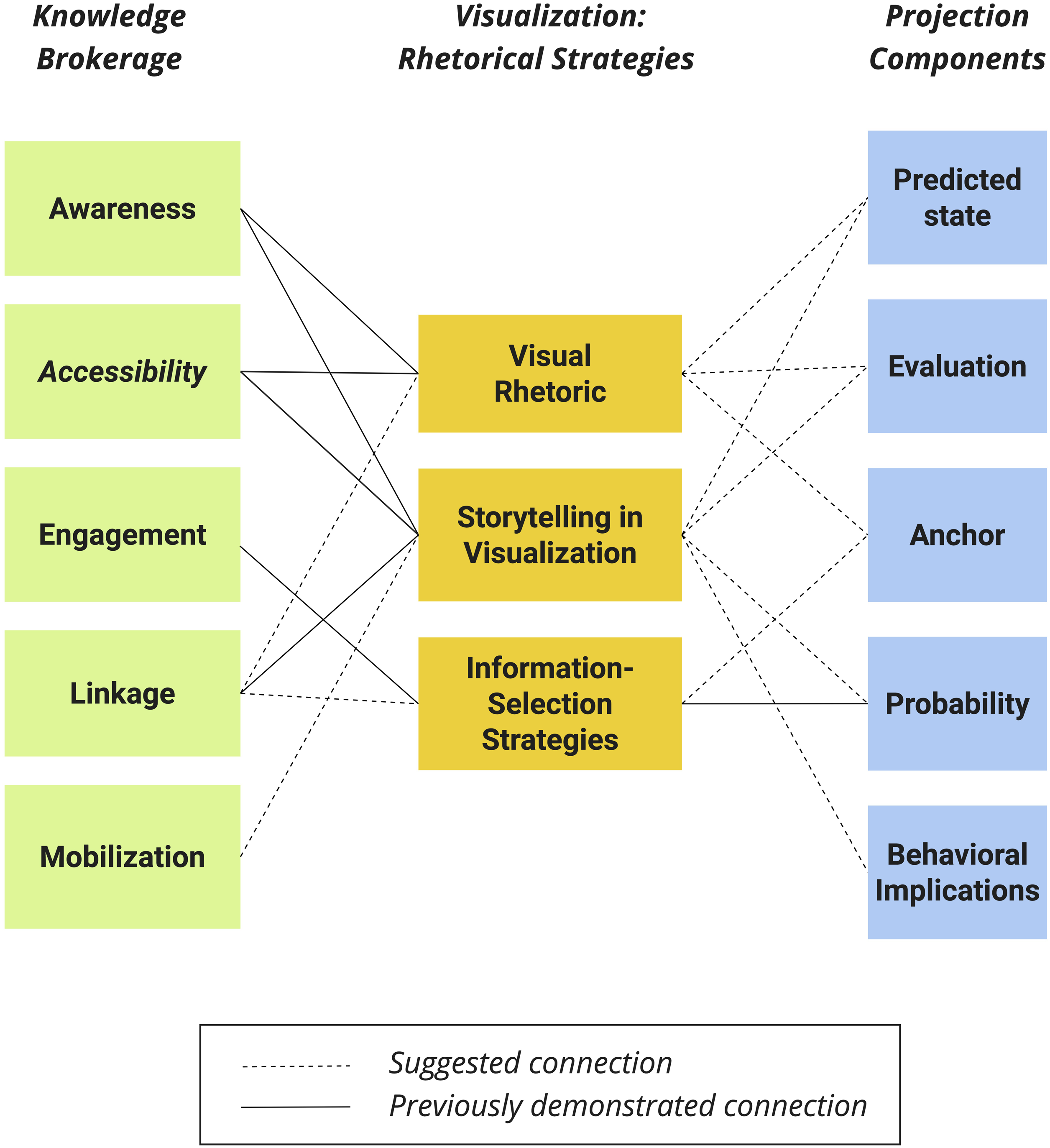
Stage I: Theoretical construction of an initial analytical framework
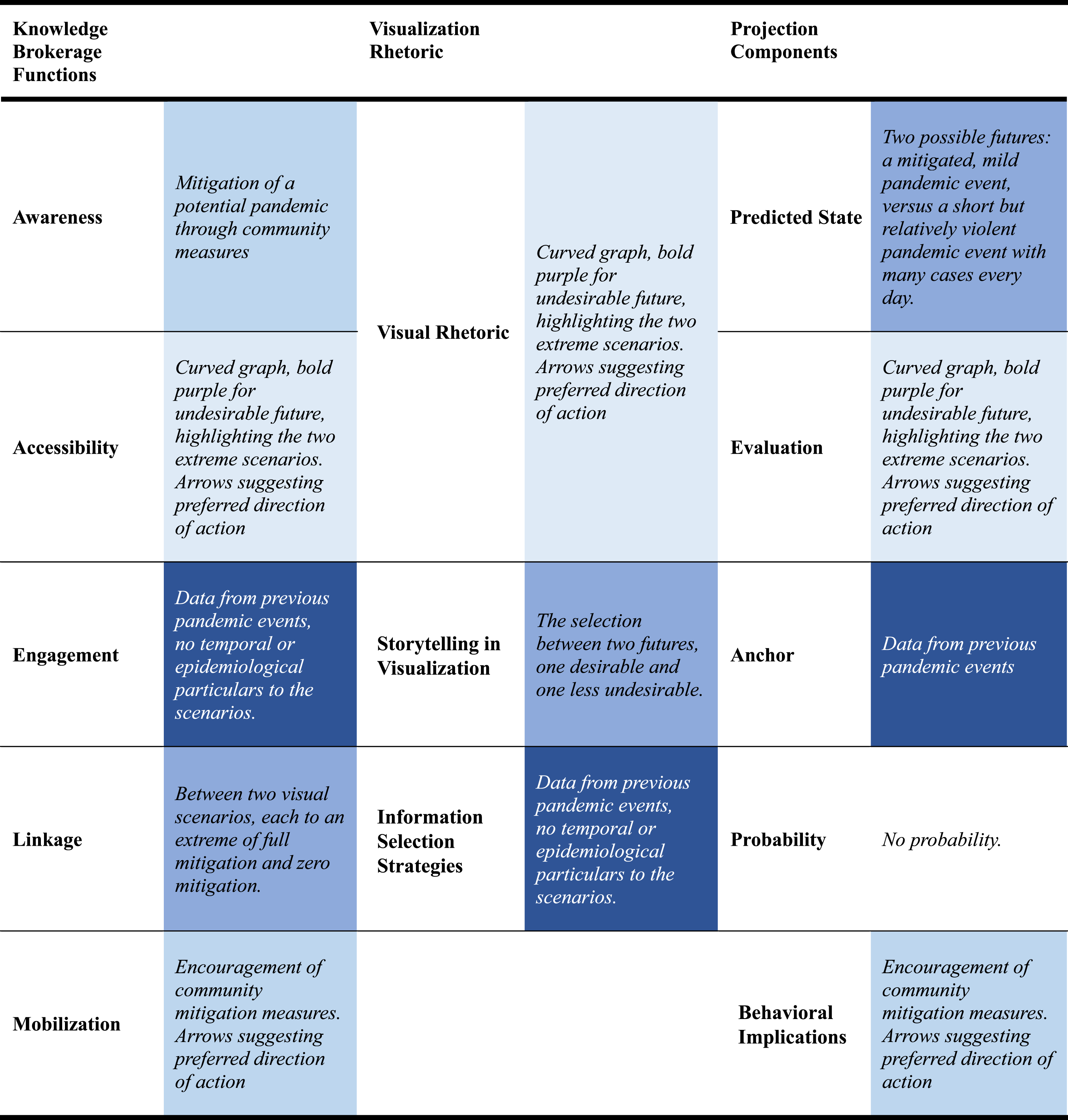
In the first stage, we relied on three existing contributions related to the analysis of predictive rhetoric in visualizations: (1) Amit-Danhi’s (2022b) three-layered approach to visualization rhetoric; (2) an operationalization proposed by Pentzold and colleagues (2021) for the study of knowledge brokerage functions and their execution in predictive journalistic visualizations; and (3) Tenenboim-Weinblatt et al.’s (2022) five-component framework (predicted state, evaluation, anchor, probability, and behavioral implication) for the analysis of projections. In creating the theoretically-informed analytical framework, we associated related components in the three existing tools, by interlinking possibly associated aspects in each of the frameworks so to arrive at a default setup (Figure 1).
Future-oriented knowledge brokerage
In the left column of our analytical framework (Figure 1), we propose examining the mechanisms through which each visualization brokers knowledge for its audiences. We start from a model adapted by Pentzold et al. (2021) from Yanovitzky and Weber (2018). Their approach originally highlights five knowledge brokerage functions: awareness, accessibility, engagement, linkage, and mobilization, which were then broken down into visualization-specific questions. Initially, our analytical framework included all five functions, which were then reduced to four in the process of removing redundancies between the three pillars.
Starting from the top of the left column of Figure 1, we begin with ‘awareness’. This knowledge brokerage function serves to inform the audience about the topic of the visualization. Next, we arrive at ‘accessibility’, defined as the ‘function of aggregating and synthesizing evidence so as to make it accessible’ (Pentzold et al., 2021, p. 1374), that includes five components (level of abstraction, timeframe, interactivity, mode of visualization, and role models). The third function is ‘engagement’. Originally conceptualized as ‘engagement with meanings and implications of projections’ (Pentzold et al., 2021, p. 1374) through features in the design of data-journalistic experiences, we focus our interpretation of this function on informational engagement through different sources, information-types and varying levels of ambiguity. The fourth function is ‘linkage’, defined as any ‘point of connection or contention for sources and issues’ (Pentzold et al., 2021, p. 1374). Since the current project deals with the way in which visual rhetoric portrays the future, our analytical framework proposes that future-oriented linkage in visualization is better conceptualized as links and connections made between different future scenarios. The fifth and final function is ‘mobilization’. Based on a wide range of scholarly literature on political and journalistic visualizations online (Amit-Danhi and Shifman, 2020; Cairo, 2019; Pentzold et al., 2021), we suggest that visualized predictive rhetoric may also orient audiences towards a preferred reaction or behavioral implication for the future scenario.
Visualizations: rhetorical strategies.
Over the past decade, several efforts have taken on the mapping of affordances of visual rhetoric (e.g., Dailey et al., 2022; Otten et al., 2015; Weber, 2019). Due to the aforementioned limitations of each specific endeavor, in the center column of our analytical framework (Figure 1) we adopt Amit-Danhi’s (2022a) holistic approach to visual rhetoric, wherein she encourages researchers to see visualization rhetoric as comprised of three types of rhetorical actions embedded into the creation of a digital visualization: ‘information selection strategies’, the selection of specific data to be visualized, and the specific analytical processes that prepare it for visualization (Amit-Danhi, 2022a); ‘visualization storytelling’, the narrative chosen to deliver said data (Amit-Danhi, 2018; Weber, 2020); and ‘visual rhetoric’, the design and visual choices made in converting said narrative/informational combination into a visualization (Cairo, 2019; Foss, 2004; Kennedy et al., 2016).
When used in analysis, this approach requires accounting for the role and composition of each rhetorical layer. First, in ‘information selection strategies’ we examine the type of information chosen, its foundation, components and analytical structure (Amit-Danhi, 2022b). Second, in analyzing ‘visualization storytelling’, we examine the textual representation of the argument carried out by the visualization and its rhetorical aims. In this aspect, we are informed by a rhetorical approach wherein visuals and text create a combined impact (Foss, 2004). Here, we look at the overall argument carried out by the visualization: how the predictive argument is expressed. Finally, in ‘visual rhetoric’, we approach visual rhetoric as ‘the actual image or object rhetors generate when they use visual symbols for the purpose of communicating’ (Foss, 2004, p. 304). Thus, we explore the professional vocabulary with which visualizations convey meanings through forms, symbols, visual semiotics and/or any visual emphasis or redirection.
Projection components.
Finally, we suggest that visualizations be explored as predictive discourse. Thus, our analytical framework adopts Tenenboim-Weinblatt and colleagues’ (2022) conceptualization of projections as typically including five components (Figure 1, right): the ‘predicted state’, its ‘evaluation’, its evidential ‘anchor’, its ‘probability’ to occur, and any related ‘behavioral implication’. While the five components often appear together, projections may manifest with only some of the components. Using this framework, we discern and define each prediction component as it may manifest in each specific visualization.
We begin by defining the ‘predicted state’, what the visualization suggests might occur. Second, we note whether said predicted state is given an ‘evaluation’, that is, what the predictor believes is good or bad about the predicted state. Third, we search for any evidential ‘anchor’, by asking what is the evidential basis on which the predicted state is projected (e.g., references to source materials, analyses or experts). Fourth, we note whether the projection includes the projections’ ‘probability’ of materializing. Finally, we discern whether the projection suggests a ‘behavioral implication’, as a part of the predictive act, that is, should measures be taken to prepare for, bring about or prevent the predicted state?
Amalgamating the approaches to create a holistic framework.
Our theoretically-informed analytical framework relies on the assumption that the three approaches do not exist independently of one another: at times, they may complement, inform or even substitute each other. Thus, the framework documents visualizations’ attributes, but also how the functions, layers, and components coalesce into multimodal predictive rhetoric. Stage I was concluded by examining parallels and repetition between the approaches in search of commonalities, and highlighting relationships hypothesized based on existing literature. In the theoretically-informed analytical framework (Figure 1), we note previously proven connections with a straight line, and hypothesized connections with a broken line. A connection denotes that the knowledge brokerage function is executed by the rhetorical layer it is connected to. It also denotes that a certain rhetorical layer serves as a certain predictive component.
We begin by exploring the relationship between knowledge brokerage functions and visual rhetoric. Based on practices in visualization design (Cairo, 2019; Tufte, 2001), we connect ‘awareness’, that presents a topic with the primary interpretive layers (Amit-Danhi, 2022a) of ‘visual rhetoric’ and ‘storytelling’ strategies. We continue by connecting ‘accessibility’ with ‘visual rhetoric’ since visual rhetoric involves the selection of symbolic and graphical modes to deliver meaning, and thus parallels the majority of the knowledge-brokerage function components (‘graphical abstraction’, ‘role-model’, ‘interactivity’, and ‘mode of visualization’ see Pentzold et al., 2021). Furthermore, based on visualization conventions (Kennedy et al., 2016), we surmise that ‘storytelling’ argumentation can serve to fulfill the ‘abstraction’ and ‘temporality’ components in the ‘accessibility’ function, and thus our analytical framework also connects ‘storytelling’ and ‘accessibility’. Third, the attributes of the ‘engagement’ brokerage function parallel with the operationalization of ‘information-selection strategies’ as they both relate to the data, sources, and information that underlie a projection (Pentzold et al., 2021). Fourth, our analytical framework presupposes that ‘linkage’ can be performed through all strategies, although it has been demonstrated primarily in the storytelling layer (Amit-Danhi, 2022a). Finally, as the most explicit rhetorical layer, ‘storytelling’ is suggested to connect to ‘mobilization’.
We continue by suggesting connections between the three layers of visual rhetoric strategies with prediction components, aiming to reveal their future-oriented functionality. Here, the analytical framework depicts our informed suggestions. Based on previous works on visualized argumentation (Allen et al., 2023; Foss, 2004) we propose that the rhetorical richness of ‘visual rhetoric’ is robust enough to also deliver a ‘predicted state’. Furthermore, ‘visual rhetoric’ choices made in visualization often include comparative visualization modes (Cairo, 2019; Kennedy et al., 2016), and can thus evoke ‘evaluation’ via design. Drawing from works on predictive visualization as method, we also suggest that visual rhetoric (e.g., a specific attribute in the visualized mode, combined with a specific storytelling mode) can serve as ‘anchor’. Because Tenenboim-Weinblatt and colleagues’ (2022) framework for prediction analysis was developed for textual databases, we suggest that the ‘storytelling’ layer will likely deliver the ‘predicted state’, its ‘evaluation’, ‘probability’, and ‘behavioral implication’. As per visualization conventions (Cairo, 2019; Kennedy et al., 2016), ethical informational practices embedded in both data-journalism and visualization design would lead to a frequent connection between ‘information-selection strategies’ with the ‘anchor’ and ‘probability’ components.
Empirical demonstration of the Stage I framework.
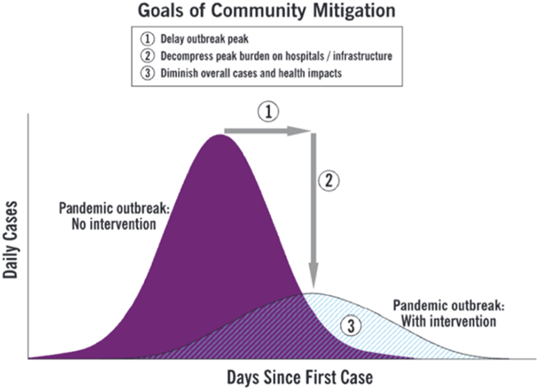
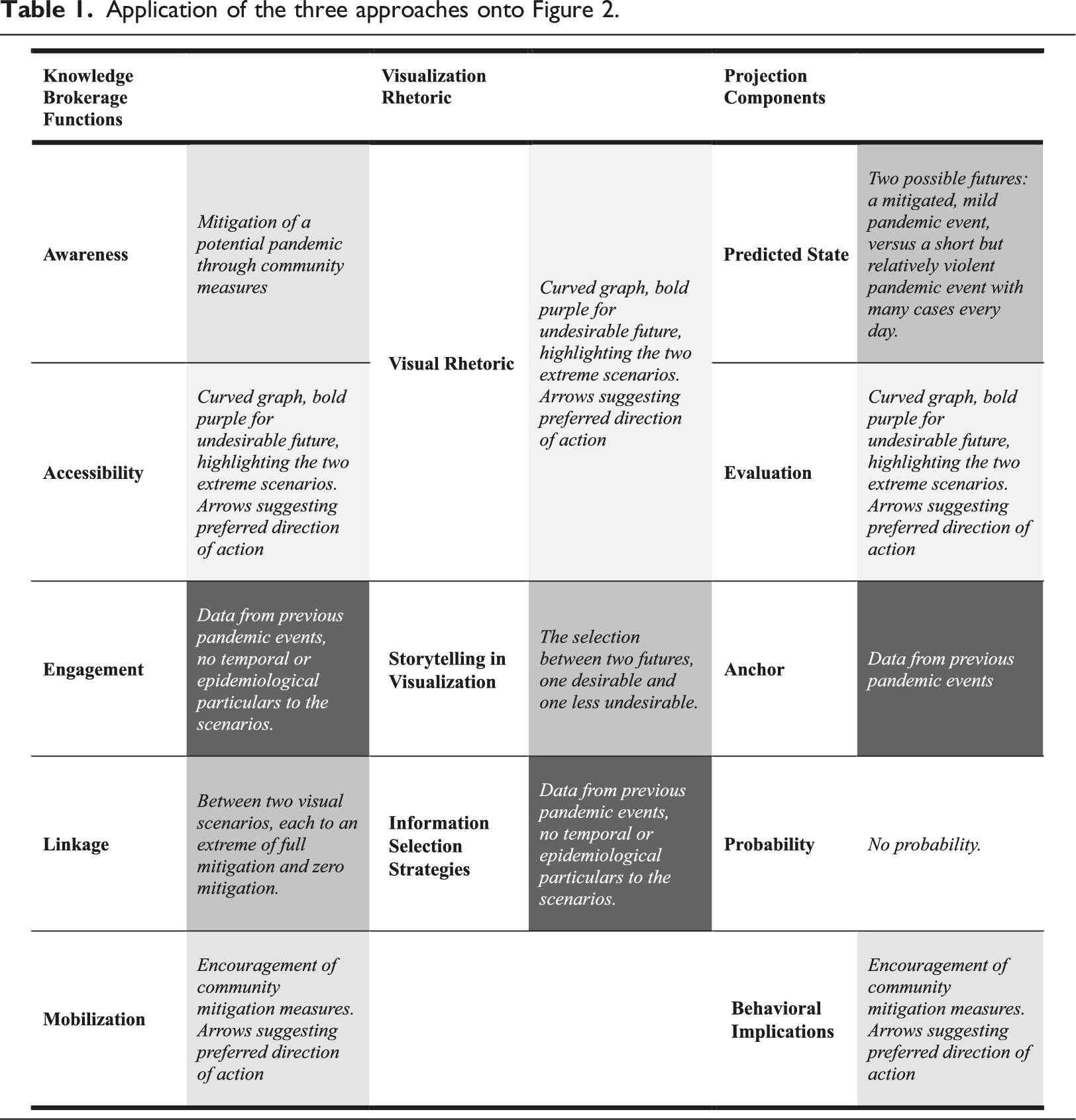
Emulating our workshops, we demonstrate the framework’s applicability with well-known predictive visualizations from contexts that preceded the sample’s period. Here, we use a pre-pandemic version (Figure 2) of the ‘Flatten-the-Curve’ visualization (Li and Molder, 2021), originally shared in a report about community mitigation measures for influenza-related pandemics (CDC, 2007). Following Figure 3, which demonstrates the operative logic of our framework onwards, we first demonstrate how elements from the three approaches manifest in the ‘Flatten-the-Curve’ visualization (Table 1), and then proceed to highlight parallels (colored in Table 1) and suggested links between the three approaches which informed our empirical refinement in Stage II.
We begin by noting each component of the analytical framework independently (Figure 3), as detailed in Table 1. Proceeding from the top of the left column, we start with ‘awareness’. In Figure 2, the topic is the possible attainment of mitigation in a future pandemic through community-based measures. It is relayed primarily via the textual elements of the visualization, supported by the visualization form, the epidemiological curve. Second, the ‘accessibility’ function is executed via the choice of a curved graph, with a bold purple for the undesirable future, the choice to highlight only two extreme scenarios and the suggested direction of action signified with arrows. Third, we find that the ‘engagement’ function, the audience’s mediated engagement with the data the visualization is based on (the full report cites data from previous pandemic events), is expressed through the two scenarios detailed in the visualization, alongside the lack of engagement with temporal or epidemiological particulars. The fourth component is ‘linkage’. In our conceptualization of linkage as connection between different future scenarios, Figure 2 creates linkage between two visual scenarios: full mitigation and minimal mitigation. The fifth and final component is ‘mobilization’. In Figure 2, this manifests in the preferred future between the two scenarios: the choice to adopt mitigation measures in order to avoid negative implications of the alternative, as well as the arrows suggesting the preferred direction of action.
We then turn to note the attributes of the three rhetorical layers in the visualization in Figure 2. As for information-selection strategies, this visualization appears among text depicting previous pandemics as its evidential basis, and readers must venture beyond the visualization to find out what is the basis for the two projected scenarios. Informational choices also include such choices as narrowing data to two possible edge-scenarios, or omitting epidemiological and temporal specifics. Second, as for ‘visualization storytelling’, the visualizers chose to highlight a preferred scenario through the title, as well as a detailed set of goals in the textual elements of the visualization. Finally, in ‘visual rhetoric’, Figure 2 features the epidemiological curve, a numerically-driven depiction of possible contagion scenarios, as well as the choice to colorfully highlight the undesirable future, and to direct attention to the preferred course of action using arrows.
Finally, we examine the visualization to discern and define each prediction component as it manifests in the visualization. We define Figure 2’s ‘predicted state' as the two projected scenarios (full or zero mitigation). Second, we note that the scenarios are visually evaluated: the ‘no intervention’ scenario is suggested to be bad with an emphasis on the much-higher number of daily cases in bold purple, whereas the ‘with mitigation’ scenario is suggested to be good, as this option is marked as semi-translucent and less daunting. Third, the visualizations’ evidential anchor lies in its accompanying text that refers to analyses conducted by the Centers for Disease Control and Prevention (CDC, 2007), based on data collected in previous pandemic events. Fourth, we see that while the visualization is indeed numerically-based, it is left without specific probability to the emergence of either of the predicted states. The ‘behavioral implication(s)’, are derived from the list of goals and the visual evaluation, suggesting that said list will bring forth the desirable future.
In creating the empirically-informed framework, our goal was to identify connections between the three pillars’ components, and examine how they manifest in each visualization (Figure 3). An overview of the colored markings in Table 1 reveals several repetitions across the columns: ‘accessibility’ and ‘evaluation’ refer to the visual attributes of the visualization, indicating that both the knowledge function and the projection component are executed via the ‘visual rhetoric’ layer of Figure 2. Similar relationships can be indicated between ‘engagement’, ‘anchor’, and the ‘information selection’ layer.
Stage II: Empirical refinement and arrival at the final framework
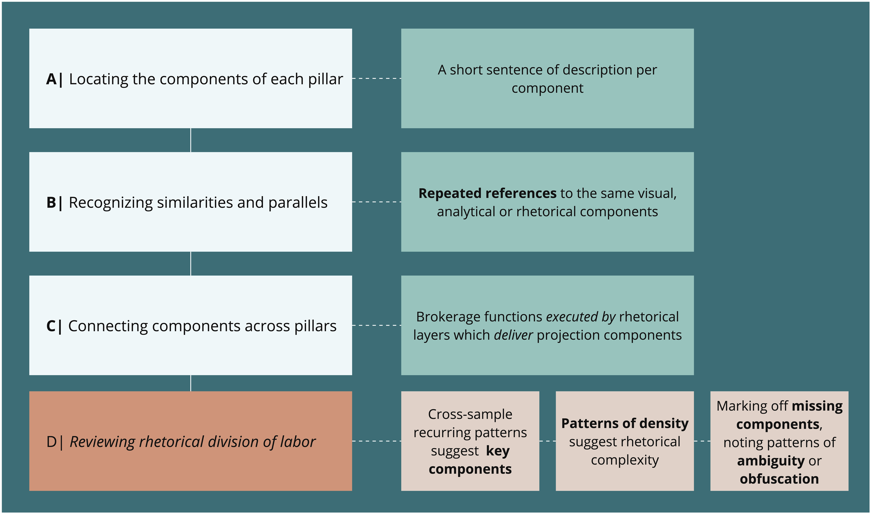
To test the viability and usefulness in empirical application, we applied the theoretically-informed analytical framework (Figure 1) as follows: we used a blank version of the analytical framework, containing the three pillars, without connecting lines. For each visualization, we first located the components independently (Figure 3, demonstrated via Table 1) and then turned to mark unit-specific similarities and connections: first connecting relevant knowledge brokerage functions to visualization rhetorical strategies by which they are executed, and then examining which projection components are delivered by each of the visualization rhetoric layers, allowing for multiple connections in each stage. We considered the application of the analytical framework sufficient once each of the layers in the central pillar was connected to at least one brokerage function (left pillar) and/or at least one projection component (right pillar).
We then proceeded to collect insights and implement them back into the analytical framework’s design in two stages: First following the empirical workshops, and again following the full-sample application, until the final analytical framework was reached (Figure 4). The following changes were implemented: first, a theoretical repetitiveness between ‘visual rhetoric’ and ‘accessibility’ was further ratified by the empirical work. Owing to the vast similarities between the knowledge function and the rhetorical layer, we find that inclusion of both in the framework did not produce unique insight. We have therefore omitted ‘accessibility’ from the first pillar and folded its five components into the elements examined within ‘visual rhetoric’. Second, we found that the topic of visualizations was consistently conveyed via their visual rhetoric. We therefore established a default connection between the ‘awareness’ and ‘visual rhetoric’ components in the brokerage and visualization rhetoric pillars in our final analytical framework. Third, our proposed connection between the ‘engagement’ and ‘information-selection strategies’ was confirmed by the empirical application. Fourth, we note that when a projection includes an ‘anchor’, it is primarily conveyed by ‘informational-selection strategies’. Finally, we noted a parallel between ‘behavioral implication’ and ‘mobilization’, yet it may manifest via different layers in each unit. Stage II, final analytical framework.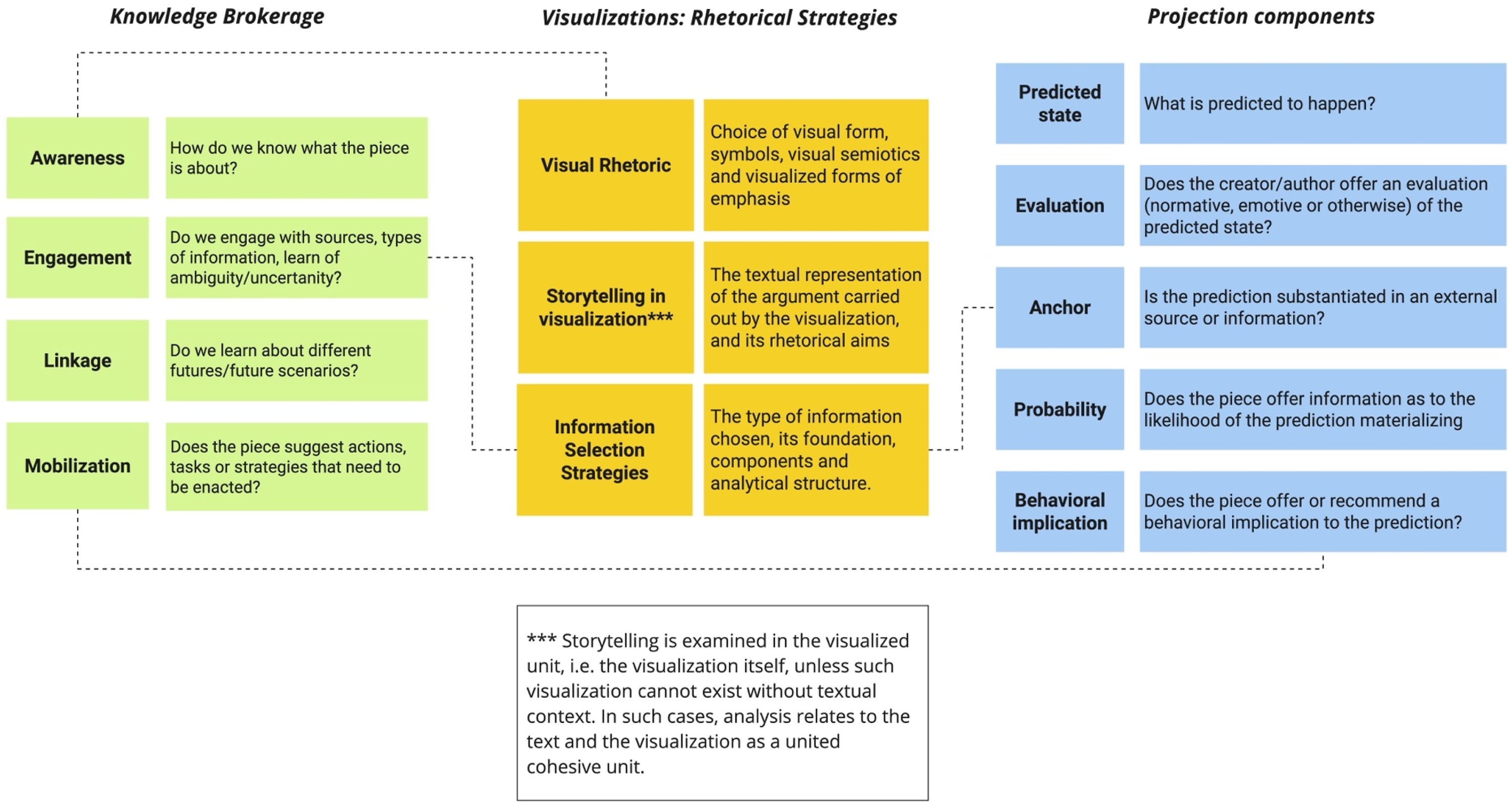
How to use this analytical framework
Applying the final analytical framework (Figure 4) onto an empirical unit means to first locate each component by addressing its leading questions (Figure 3), and then follow the three pillars and trace connections made between each component and the components in the pillar to its left, with the notion of ‘executed by’ guiding each connection (Figure 3). Application of the analytical framework is sufficient when each of the layers in the central pillar is connected to at least one brokerage function and/or at least one projection component. In what follows, we demonstrate the analytical framework’s ability to produce insight (Figure 3) through a sample unit that draws its origins from Figure 2: Der Spiegel’s version of ‘Flatten-the-Curve’ (see Figure 5, bottom). While the two visualizations are not identical, we see Figure 5 as a Coronavirus adaptation of the original. The full classification of this unit according to our analytical framework is shown in Figure 5. Classification of Spiegel_11.03.20 (Weber, 2020).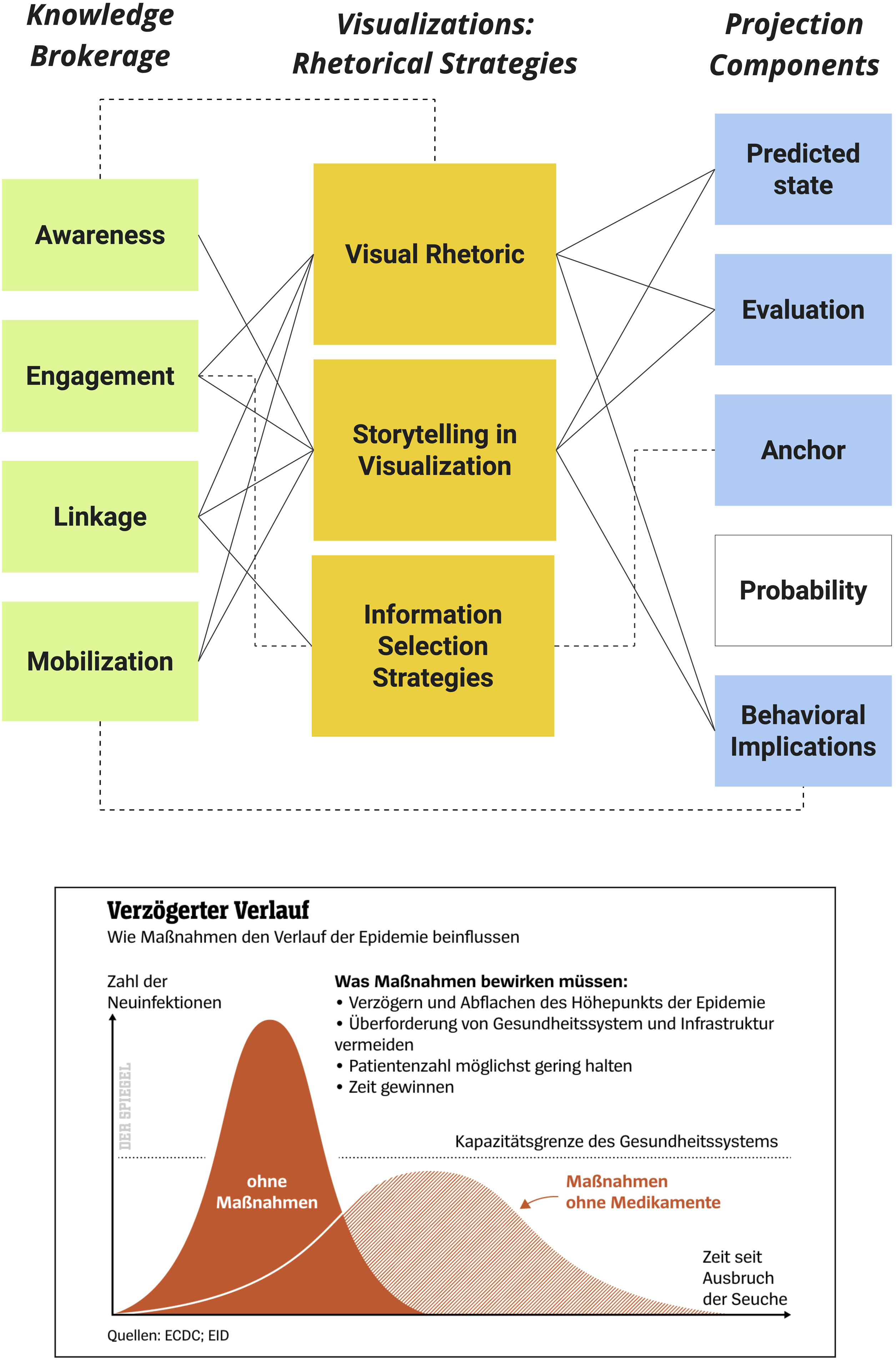
Classifying Der Spiegel’s visualization starts by examining the ‘awareness’ knowledge brokerage function and looking for the rhetorical layers that carry out the task of clarifying the topic of the visualization. As Figure 5 demonstrates, in this version of ‘Flatten-the-Curve’, ‘awareness’ is executed via the visual and the storytelling rhetorical layers. Thus, in addition to the enduring link between ‘awareness’ and ‘visual rhetoric’ the classification would also include a link between ‘awareness’ and ‘storytelling’. We then move on to ask how to best engage with the sources, the information, and differing levels of ambiguity in the visualization and propose that ‘visual rhetoric’ and ‘storytelling’ work to elucidate uncertainty, while ‘information-selection strategies’ engage audiences with this visualized end-product of both the original analysis in Figure 2 (CDC, 2007) and the analysis by the ECDC (European Centre for Disease Prevention and Control), cited in the bottom of the visualization. Thus, all three rhetorical layers connect with ‘engagement’. Similar logics lead to connecting ‘linkage’ and all three layers of the rhetorical strategy pillar: we explore the scenarios’ attributes through a combination of ‘visual rhetoric’ and ‘storytelling’, but the choice to highlight two scenarios is borne out of ‘information-selection strategies’. Finally, ‘mobilization’ is carried out primarily through the ‘storytelling’ layer, aided by ‘visual rhetoric’ – the highlighting of the preferred course of action through mitigation, and the embedded text (which stresses the correct measures). The next step is the examination of each rhetorical layer in relation to the five projection components (Figure 3). Here, we determined that the ‘visual rhetoric’ and ‘storytelling’ layers convey the attributes of the ‘predicted state’, its ‘evaluation’, and the suggested ‘behavioral implication’. Finally, the ‘information-selection strategies’ layer works as the projection’s ‘anchor’.
Examining the completed classification, we are able to go beyond a descriptive analysis of rhetorical, brokerage or predictive features and venture into the relationships between the different components and how they utilize visualized rhetoric to mediate the future (Figure 3). Although Figure 5 aligns with professional standards of graphical simplicity, it executes a complex knowledge brokerage act (note the density of lines across the left side of the analytical framework), which primarily relies on the visual and storytelling rhetorical layers to construct the actual projection. In an overview of the rhetorical division of labor, the ‘visual rhetoric’ and ‘storytelling’ layers seem to be carrying the rhetorical workload of delivering the projection (they are connected to most predictive components). However, we ascertain that they deliver a primarily ‘linkage’–'engagement’ based argument, revealing that the informational components have been folded into the argument in order to make them easier for consumption.
Furthermore, our analytical framework is particularly useful in highlighting not only how the visualization’s predictive argument is constructed, but also what has been omitted from it (Figure 3). For example, Figure 5 clearly indicates that the predicted state is not given a probability of materialization. Upon further inspection, this underscores the temporal and numeric ambiguity that allows ‘Flatten-the-Curve’ to be communicated across national contexts as a generic symbol of the pandemic (Aiello et al., 2022), global meme (Li and Molder, 2021), and over-anchored public metaphor (Amidon et al., 2020). Finally, its rhetorical division of labor also reveals somewhat of a contradiction: its central knowledge brokerage functions are inherently relational to informational aspects of the predictive act, despite the projection being deliberately vague in probabilities.
Applying the analytical framework in thematic analysis
The analytical framework can also be used to conduct thematic analysis in manageable samples. In the application of the analytical framework, our team documented which components and layers were linked in each unit of the sample, in a way that enabled us to explore recurring classification structures. In such deployments, we advise following a theoretically driven pathway in trying to locate the key components related to a certain type of predictive visualization, or to follow what we call the ‘rhetorical division of labor’ across the sample (Figure 3). That is, to utilize existing literature to hypothesize which components of the framework could prove pivotal in analysis. For example, in Coronavirus predictive visualizations, we demonstrate this by highlighting ‘linkage’, while election projections could be analyzed with ‘engagement’, ‘evaluation’, and ‘anchor’ as core components.
Looking at epidemiological curve graphs utilized by actors of different backgrounds, we found that with the exception of the visualization in Figure 5, all data journalism pieces that featured a curved graph operated without ‘linkage’. Upon further examination, a recurring pattern of omission (Figure 3) emerged: scientific actors (data journalist or citizen expert) typically used visual predictive rhetoric to break down a single predicted-state into specific attributes (e.g., breakdown into sick, dead, healthy, and infected in Figure 6(a), Natan, 2021) or locations (different projections for each country in Figure 6(b); Pueyo, 2021), rather than explicating several possible predicted states. This lack of linkage highlights a normatively-driven professional practice in data-journalistic depictions of the future: to make a single future scenario clearer by utilizing a simplistic visualization form and by taming the analytical workload required in deciphering it. In the few cases (including Figure 5, as well as several data journalistic pieces that were included in the social media sample, see Figure 6(c); Wei-Haas and Elliott, 2021) where data journalistic pieces brokered knowledge through linkage, it was always intertwined with mobilization, as the comparison between different future scenarios was geared towards a path through which society would be able to achieve a preferred future. Thus, with a theoretically-informed emphasis on a single visual theme (the curve graph), and a key component (linkage), our analytical framework enables us to discern genre-specific predictive attributes consistent across our sample. This can be achieved by defining a pattern in the rhetorical division of labor (Figure 3) that highlights one or several key components for a certain visualized argument type. Data-journalistic curve graphs.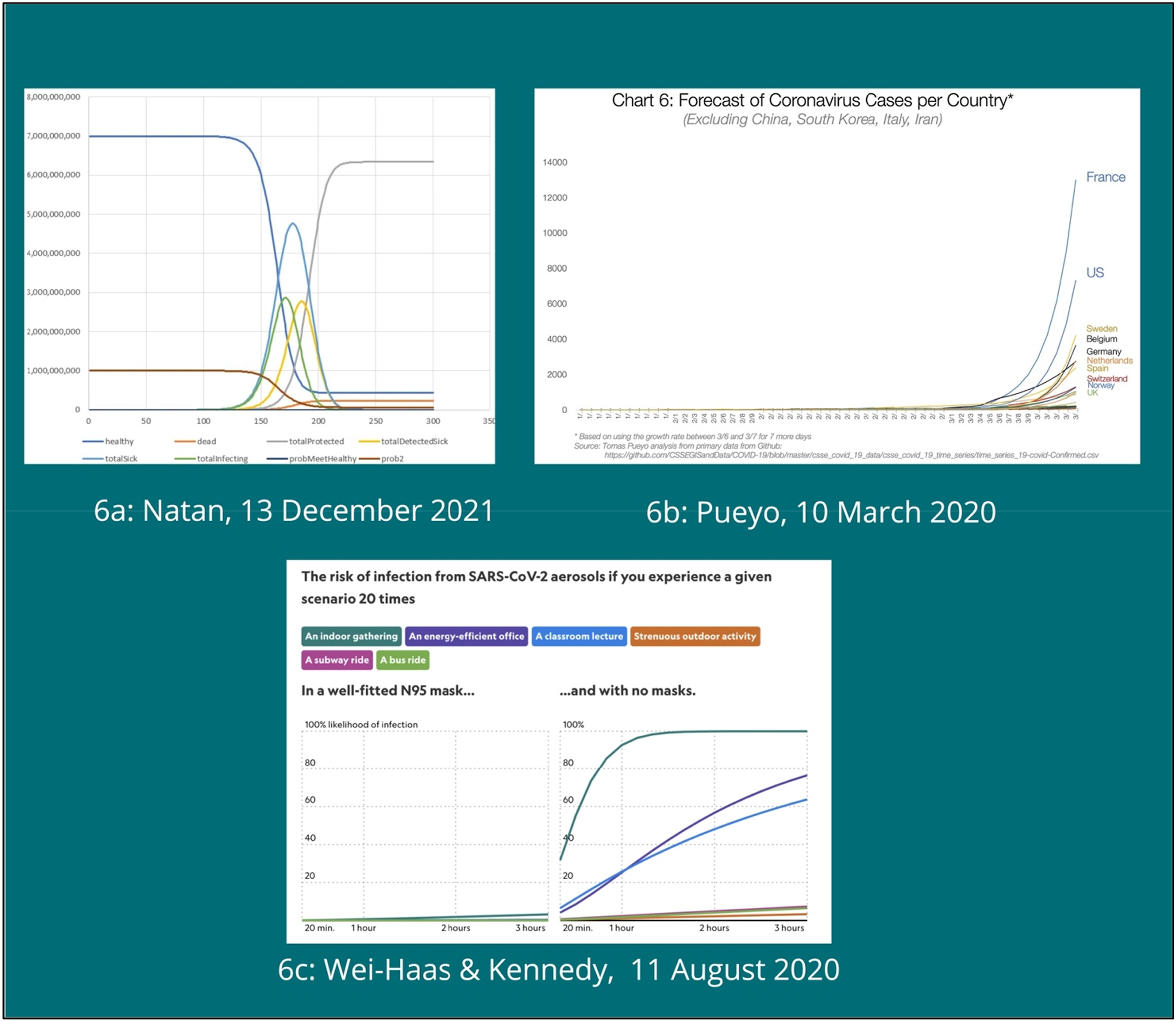
Analytical epilogue: Rhetorical complexity in predictive visualizations
While aspects of simplicity in visualizations are lauded as beneficial for visualized communication in practitioner literature and studies of visualization conventions (Cairo, 2019; Kennedy et al., 2016), complexity has generally been explored as a visual (i.e., complex graphics), or informational (large datasets, complex analyses, etc.) attribute. However, the oft-evoked notion of rhetorical complexity in visualization has so far escaped scholars, primarily due to the analytical challenges we previously defined, rooted in the multimodality of this genre. As Tenenboim-Weinblatt and colleagues (2022) suggest, projections are multi-layered discursive structures. Thus, visualized rhetorical complexity is also a challenge that translates into the specific context in which we explored visualization rhetoric: predictive arguments. Instead of focusing on an attribute-based approach to complexity (number of visual elements, scope of data, amount of text, or data-to-ink ratio; see Kennedy et al., 2016; Krum, 2013), we propose that the holistic nature of our analytical framework provides a new avenue for the exploration of rhetorical complexity as a task-oriented concept, demonstrated in the context of projections, but applicable in other contexts as well.
Accepting the premise that all visualizations in our sample share the same task (conveying predictive narratives), the classified sample makes clear that simple visual modes (such as the curve graphs depicted in Figures 2, 5, and 6) can still carry out rhetorically complex acts. Through our analytical framework, we define rhetorically complex visualizations as those in which patterns of density in the division of rhetorical labor (Figure 3) showcase multiple rhetorical layers carrying out several brokerage functions, and communicate several predictive components (see Figure 5). In other words, when we note patterns of density in the classification of a specific unit, we find visualized rhetoric to be more complex, even if the visual form seems simplistic, as rhetorical complexity is carried out by the interaction between multiple components in the multimodal argumentation.
This, in turn, allows researchers to inductively define types of complexity typical to each rhetorical genre and operationalize them. Upon examination of the fully classified sample, we noted a recurring pattern of density around the use of ‘linkage’, suggesting that rhetorical complexity in predictive visualizations is inherently related to the way in which it approaches the work of linking betwee different proposed scenarios. Linkage-driven rhetorical complexity appears when visualizations must convey multiple predicted states, often interlinked as alternative scenarios (Figure 2), whereas a lack of ‘linkage’ (when visualizations do not link between multiple predicted states) typically indicates rhetorical simplicity.
For example, in Figure 7(a), the CDC (2021) utilizes human icons to present a single projection: ‘unvaccinated people are 17 times more likely to be hospitalized’. Its classification pattern is ostensibly less dense in connections than previous classifications shown, and is thus considered rather simplistic. In Figure 7(b) Israeli mathematician Eran Segal (2020) anchors a current projection by visualizing his predictive track-record. He engages with only one projection, and rhetorically (and visibly in our analytical framework), the argument is simplistic. Unlike graphical and informational complexity, linkage-driven complexity does not necessarily contradict the conventions of design that aspire to an efficient informational transfer. These rhetorically complex visualizations are not more challenging to understand, but rather the predictive argument is intricate, making it harder to untangle in terms of verifying and evaluating. An example of linkage-driven rhetorical complexity can also be found in Figure 7(c) (Stevens, 2020), an award-winning data journalistic piece which used both ‘engagement’ and ‘linkage’ to showcase randomly-generated predictive scenarios, according to metrics adjusted by the reader/user. While these are visually-simplistic graphics, rhetorical complexity stems from the near-infinite number of proposed and unverifiable predictive scenarios. In our sample, social media visualizations were rhetorically simplistic (similar to Figures 7(a) and 7(b)), whereas data journalistic pieces demonstrated a wider scope of complexity. Rhetorical complexity in predictive visualizations.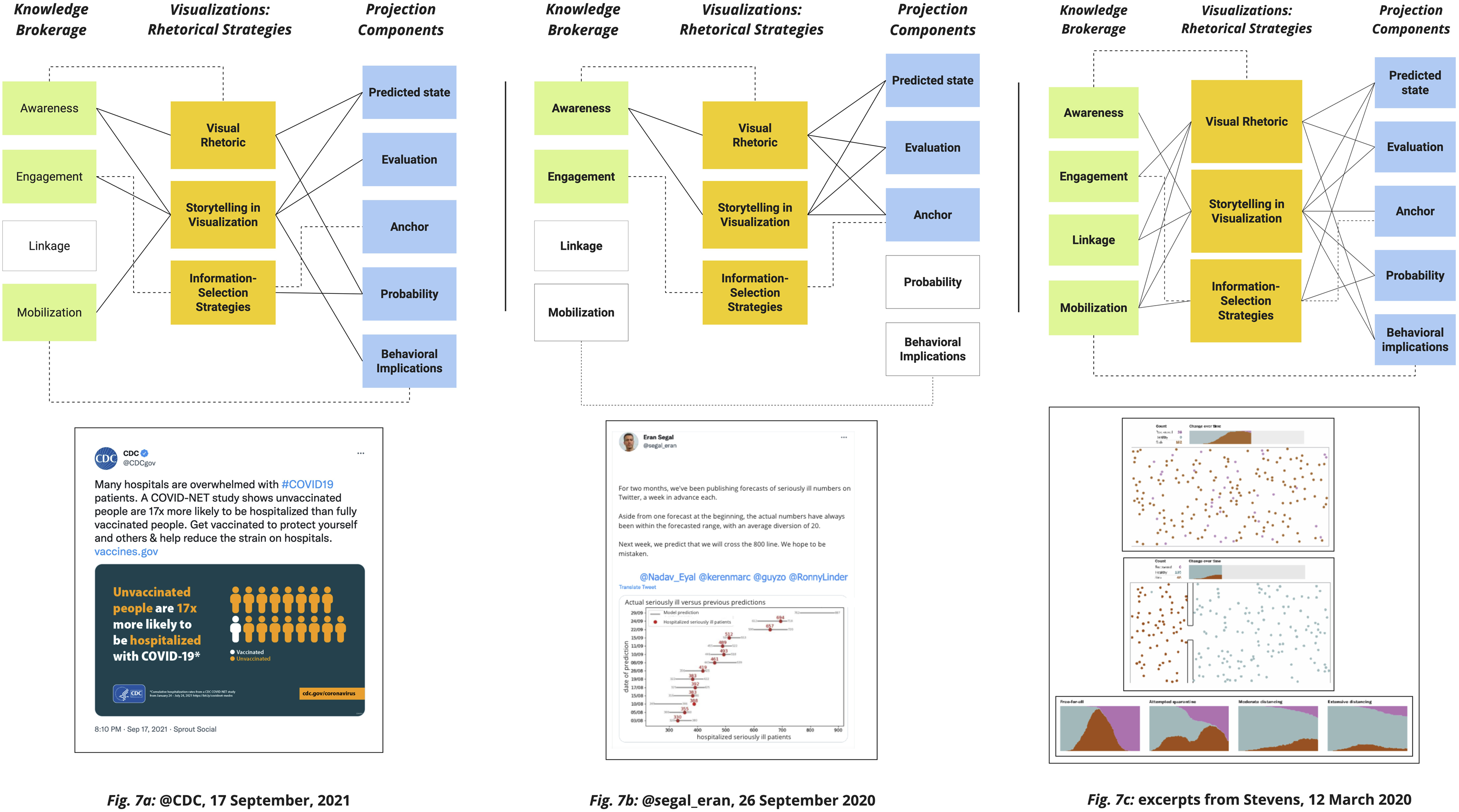
This conceptualization of rhetorical complexity in predictive visualizations is better suited for qualitative analysis, as it requires an initial stage in which researchers examine patterns of density in the analytical frameworks. However, it also clears away irrelevant aspects and allows for a quantitative analysis to focus attention on specific key elements. Our analytical framework allowed us to better understand predictive rhetoric in visualizations, but future ventures can shape analytical frameworks designed to untangle the workings of persuasive, emotional, and ideology-driven formulations of visualized rhetoric.
Overall, the ability to discern and explore rhetorical complexity in visualization is prudent to the deliberative nature of digital democracy. The practice of mapping the division of labor across informative, visual, and storytelling layers of visualized rhetoric provides a new avenue through which practitioners, audiences, and scholars can come to re-examine the visualizations they encounter and gauge their value normatively. Being able to examine visualizations beyond singular characteristics, audiences and practitioners, as well as scholars may adopt new practices of excellence, in pursuit of a more informative deliberative space.
Conclusion
To conclude, our paper proposes a new integrative tool for the rhetorical analysis of predictive visualizations, which highlights the roles afforded to visualizations in the predictive act, and their knowledge-brokerage functions. We began by outlining the theoretical framework which informed its creation, the three approaches it binds together, and our use of our sample of 158 visualizations in ratifying, refining and testing its suitability for qualitative applications.
This analytical exploration is limited in several aspects, which suggest a host of avenues for the study of future-oriented visual rhetoric. First, we chose to design our analytical framework with a focus on future-oriented rhetoric. While this choice served us well in tapping into the rich scholarly resources examining projections in the process of designing our analytical framework, we hope that its logic will be further tested in other settings: political campaigning, advertising and science communication. Second, our analytical framework was developed based on a sample that corresponds with a unique period of uncertainty in history, the Coronavirus pandemic. Albeit beneficial for the exploration of predictive discourse, future studies may choose to explore its application in more present-oriented times. Third, the study is limited by the choice of platforms and actors sampled. We utilized a Twitter sample collected prior to major changes in the platform’s API, from actors prominent in largely Western countries, as well as major Western news publications. Forthcoming ventures might want to explore visual rhetoric posted to additional platforms and in non-Western contexts. Finally, as a qualitative venture, this analytical framework cannot be directly applied to large-scale corpora. We thus encourage the use of this analytical framework as a preliminary exploratory stage in quantitative rhetorical analysis, in order to gain insight into typical rhetorical patterns and their application in a specific context.
This paper opens up a new, holistic approach to the study of predictive visualization rhetoric. It offers the following contributions: it provides a new integrative tool for the rhetorical analysis of predictive visualizations, which highlights the roles given to visualizations in the predictive act, their knowledge-brokerage functions, and affords a mechanism to examine their construction and predictive complexity. The analytical framework is based on scholarly and theoretical perspectives from visualizations, communication, journalism and design studies, and is further tested in the context of an international English, German, and Hebrewlanguage sample of predictive visualizations related to the Coronavirus pandemic. Beyond its methodological innovation, our analytical framework works to bridge the separation of visualization research in design, communication and journalism studies, and offers a new way for educators, campaigners, and design practitioners to re-examine their own work. In its application, the analytical framework can serve upcoming studies to examine and define styles of predictive visualization rhetoric across different national contexts, media and platforms, narrowing scholarly gaps relating to future-oriented visual communication. Furthermore, our analytical framework can be used as a preparatory stage in larger-scale quantitative research of visualization rhetoric, and its operational logic may serve to create similar task-oriented rhetorical analytical frameworks. Finally, this initial empirical application of the framework contributes a new conceptualization of rhetorical complexity in visualizations, which might serve to explore task-oriented rhetorical complexity in other contexts such as political persuasion, science communication and journalistic informational transfer.
Footnotes
Acknowledgements
This study was supported by the Digital Communication and Society Fellowship at Universität Leipzig. It has also enjoyed support from the PROFECI research project (‘Mediating the Future: The Social Dynamics of Public Projections’, http://profeci.net/). The authors would like to thank Shahar Biroteker and Keshet Galili for their assistance in the sampling of the social media corpus, as well as Keren Tenenboim-Weinblatt for her notes and insight along the process of developing the final manuscript.
Declaration of conflicting interests
The author(s) declared no potential conflicts of interest with respect to the research, authorship, and/or publication of this article.
Funding
The author(s) disclosed receipt of the following financial support for the research, authorship, and/or publication of this article: This work was supported by the Universität Leipzig, Digital Communication and Society Fellowship, as well as the Eurpean Research Council (StG 802990).