
Abstract
This article uses John Berger’s idea (1972) that images are connected to ‘ways of seeing’ to reflect on the creation of interactive visualizations of peace agreement and peace process data. We reflect on three visualizations created during a three-year long collaboration. We first describe our data, the peacebuilding ambitions for its use, and why we produced interactive forms of visualization. Second, we describe how the process of producing these visualizations created an interdisciplinary conversation and collaboration, which also connected different epistemic and geographic communities involved in peace processes. We term this ‘visualization-as-scoping’. Third, we reflect on both ‘what we saw’, through the process of visualization, how it affected policy, and the lessons we learned regarding visualization in the peacebuilding field. In the article, we argue that our experience of ‘visualization-as-scoping’ inverts traditional assumptions about the connection of data visualization to policy influence. In place of the notion of visualization-as-communication, focused on transmitting clear policy ‘messages’, we point to visualization-as-scoping as a practice of interchange, critique and re-iteration. Using John Berger as inspiration, we suggest that the ‘ways of seeing’ that result can usefully disrupt the idea of a data producing singular policy prescriptions, and rather enable people to grapple better with the complex political processes they are involved in.
Keywords
Seeing comes before words. The child looks and recognizes before it can speak. But there is also another sense in which seeing comes before words. It is seeing which establishes our place in the surrounding world; we explain that world with words, but word can never undo the fact that we are surrounded by it. The relation between what we see and what we know is never settled. (Berger 1972: 1)
Introduction
Central to Berger’s paradigm-shifting book on art criticism was the idea that art is never simply about producing or viewing and appreciating images (1972). Creating and viewing images is never a ‘neutral’ process, but is mediated both by the social context in which they are produced and the social context in which they are viewed. The image is always situated in a context with power relationships, and these relationships, and therefore the perception of the image, change across the times and spaces in which it is viewed, a view emphasized later by scholars such as Kennedy et al. (2016) and D’Ignazio and Klein (2020).
To some extent Berger’s account challenges social science and data visualization research where data is understood as having some sort of objective meaning, and visualization viewed as a tool for effective communication of that meaning, in ways that might better influence policy-makers (see e.g. Kirk, 2016; and in the development field see Mayne et al., 2018 for some of the complexities of this narrative). In contrast, Berger’s analysis points to interactive visualization as providing new ‘ways of seeing’ data, in ways that are never objective or merely ‘representational’ but always provoke a form of dialogue between the viewer with the image, which is shaped by their own time, place and situation.
We use Berger’s perspective to elaborate our attempt to visualize data on peace agreements and processes. We use Berger’s insight to reflect on our methodology, learning process, challenges and interactive visualizations focused on how to visualize peace agreement data, drawing from existing methods on reflection in design studies in visualization (e.g. Sedlmair, 2012; Meyer and Dykes, 2019). This reflection sets out a procedural approach to visualization – that we term visualization-as-scoping. We distinguish this from the widely known uses of visualization for data exploration (visualization-for-exploration) and explanation (visualization-as-explanation), (Riche et al., 2018). Visualization-as-scoping, we suggest, creates a conversation between those engaged in the visualization as a research process - ‘visualization as open-ended participatory discourse between disciplines’ (Hinrichs et al., 2019). We point to how it resulted in visualizations that changed our own thinking and helped us create a picture of how complex political processes work. We suggest that this picture was able to shift the peacebuilding policy field in a manner that could not have been achieved by visualization-as-communication or visualization-for exploration approaches. We conclude by identifying lessons for those interested in adopting this approach, in particular in the peacebuilding field.
Context: Peace agreements and peace processes
Our visualization project involved a three-year long loose collaboration process that involved interdisciplinary peace and conflict researchers, peace builders (from non-governmental and governmental organisations), as well as visualization researchers and students, designers and developers. The story starts with our production of a large-scale unique database on peace agreements. The PA-X peace agreement database is a database containing 1915 peace agreements, found in more than 150 peace processes between 1990 and mid-2021 (Bell and Badanjak, 2019, figures from version 6). It can be accessed using a simple or advanced search mechanism, and data downloaded in various excel formats, in timeline form, and in ‘corpus’ form (meaning that forms of natural language processing can be used to interrogate it). The dataset uniquely comprises a comprehensive census of peace agreements, including not just ‘comprehensive agreements’ which were key to terminating a conflict, but also the agreements which came before – ceasefire agreements, pre-negotiation agreement on how to hold and enter talks, and partial agreements on key issues; and the agreements which come after – and agreements renewing or providing for better implementation modalities for agreements not honoured (on stages of Agreement, see Bell, 2000: 15-27). In a sense, PA-X comprises multiple datasets for each stage of an agreement within one database. Each agreement is classified and coded in terms of an ontology of issues which it addresses. The data supports quantitative analysis of where and how peace agreements are produced, which actors are involved and the types of issue they deal with. However, it also supports qualitative analysis of how peace processes unfold – who is involved at what stage, and how this impacts on the issues dealt with. The combined quantitative and qualitative uses to which PA-X can be put aim for the holy grail of ‘mid-level’ analysis: that is, analysis bridging between large-n quantitative studies with their overly broad general conclusions, and the small-n qualitative case studies that dissolve completely into context and are difficult to generalise from at all (Coppedge, 1999). PA-X enables single case studies to be put in quantitative comparative context, and most strikingly because the database provides a form of comparative ‘process data’, enabling not just comparison between peace agreements, but comparisons of peace processes and how exits from conflict are constructed over time. This is an unusual type of data and comparative enterprise.
PA-X data were produced for several overlapping purposes. First, it was produced to support better research on peace processes and in particular questions of who was included when, and how that shaped peace process agendas. The data were part of a much broader research at the Political Settlements Research Programme (PSRP), involving University researchers, peacebuilding and international organisations, to examine the political dimensions of how peace settlements are reached. The data are fully public and open access and were intended to support the wider research community. 1 Second, the data were intended to support actors in-country, from armed actors to government officials, women’s groups, business leaders and religious actors, all of whom can be involved in creating a peace process and negotiating the terms of an agreement. For these actors, it offers a tool to access past precedents. Third, the data were intended to support external policy actors in non-governmental and inter-governmental organisations, and third party states, who invest money and time in supporting peace processes through mediation and financial and political support and who always seek to understand how to do it more effectively. All of these purposes were connected to a normative goal of supporting peace processes to end violent intra-state conflict in ways that are inclusive and sustainable. 2
From its inception, PSRP researchers presented the data in visual but static forms, for example, pie charts and bar graphs. These sorts of visualizations provide an at-a-glance overview of key findings in the data, revealing peace agreement trends and other characteristics through visual patterns and were used as a simple communication tool. We began to consider better visualization of our data, in part inspired by a ‘sister’ Constitute project – a project which contained a similar database of the world’s constitutions and their amendments and for which all content was coded by topic, which had produced simple but interactive timeline visualizations. As we began to create the partnerships and collaborations that would enable this work, the project became part of a broader more self-conscious effort to build a ‘PeaceTech’ vision related to how data can be used to support peacebuilding, where we sought to contribute to a new and evolving field of practice (for definition and introduction to PeaceTech see Centre for Security Governance, 2017). We consider visualizations as technology: first because visualizations are both conceptual and technological tools for research on data, and because we aimed to create visualizations as interactive applications which allow researchers and analysts to engage with their data through interactive interrogation, view specification, filtering, querying, and annotation.
The story of visualization-as-exploration methods
Over the course of three years, we have now produced a number of interactive data visualizations. A number of partnerships were crucial to their production. The first step was to create a partnership between academics at the Visual+Interactive Data Group in the School of Informatics and academics on the PSRP, both at the University of Edinburgh, which researched the dynamics of inclusion in peace processes. This combined team consisted of lawyers, social scientists, visualization academics, visual designers, web developers and a product designer. The team coalesced initially around student projects, which began to approach visualization of PA-X data as a research project, producing bespoke maps, timelines and agreement comparisons (see e.g.Havens et al., 2019). These early initiatives helped us establish more formalised relationships with some of these students and with the visualization researchers connected to the School of Informatics. Second, the PSRP consortium meant that we were closely connected to peacebuilding actors in the field and country-based researchers, and all of the researchers involved have a ‘praxis’ approach to their work which understands the research to be produced as a matter of a practice-research interface (on praxis research see Kress, 2011). Other more formal collaborations emerged. We worked for a period of time in a project led by Scottish-based non-governmental organisation Beyond Borders in cooperation with the UN Office of the Special Envoy in Yemen (UN OSGEY), on an exploratory project established to consider whether and how online tools could be used to support the very nascent peace process in Yemen. This initiative began to push our work into a direct engagement both with researchers and peace builders from Yemen, and the wider community engaged with the peace process, many of whom we were already connected to: women activists, members of the Women’s Technical Advisory Group appointed by the UN to advise on the gender dimensions of the process, the OSGEY staff, and other international organisations and governments engaged. We initiated work to be ‘illustrative’ of the type of way that visualization could support actors seeking to understand the peace process history that had continued, in a sense, for decades. We developed further refinement and ideas by holding a ‘design sprint’, involving a range of peacebuilding stakeholders as described above and Yemeni digital designers and international PeaceTech entrepreneurs using tools such as gaming, complex early warning systems or WhatsApp groups to promote inclusive peacebuilding strategies. 3
The story of the visualizations which evolved from these collaborative processes and their connection to impact in the peace process can be illustrated using three collaborations between the three co-authors, the wider research team and end-users. All these collaborations involved what we now term ‘visualization-as-scoping’, which involved an active conversation over ‘ways of seeing’ that sought to provide a way to bridge between data points and the lived experience of conflict and conflict resolution processes.
Peace agreement hierarchy and continuity visualization
Context
Our first two visualizations, a visualization on ‘Peace Agreement Hierarchy and Continuity’ (hereafter ‘the Hierarchy’ visualization) were embarked from the perspective of PSRP peace and conflict researchers to communicate the existence and innovative process nature of PA-X data, and illustrate its global reach and considerable scale. As ‘domain experts’ (that is, experts in the subject matter, see Hall et al., 2019; Sedlmair, Meyr and Munzner, 2012, Wood et al., 2014: 34, 43, 48 and 49), these researchers sought to engage with their informatics counterparts as ‘design experts’ in a ‘design and thinking process in order to help explore and define approaches or solutions to a problem’ (Hall et al., 2019). So the approach involved creating data visualization as an (interactive) exploratory research tool, rather than as a mechanism primarily of communication to research end-user communities (although this was defined as an outcome). As PSRP researchers had capacity to use a range of visualization tools, such as RAWgraphs and Tableau, we were keen to go beyond these and think about bespoke visualization solutions for exploration of our data.
Challenge
Specifically, the peace and conflict researchers were interested in building a visualization for better understanding how different categories of our PA-X peace agreement data related across our ca. 2000 documents and how these categories were distributed. Documents had been manually coded and categorized and the main mechanism for searching and interrogating the data was through a specifically create search interface designed to query documents and categories along the categories and types of documents coded. We now aimed for a visualization that could show us ‘the big picture’ of trends, correlations, distributions and outliers in this relatively large dataset, and in particular some sort of way of beginning to understand breadth of potential topics addressed by peace agreements, and a sense of which ones were common approaches in mediation and which were not.
Collaboration
For the process of this and the next visualization, after online exchange, we spent a day in a team workshop to brainstorm and generate ideas. Inevitably, the process involved a lot of interchange in what PA-X data did, what ways it could be visualized, and whether we felt end-users would derive anything useful from what could be achieved visually. The designer in our team then produced the Hierarchy visualization through a number of iterations, which were in particular used to refine the ways the visualization could be organised and searched, as well as ‘logical orders’ for how categories were ordered in terms of the ‘sense-making’ of the data.
Design
The resultant visualization shows the hierarchy of categories that are present in the PA-X codebook (See Figure 1). Each agreement is represented by a thin vertical line. Along this line, black dots indicate whether a given subcategory is discussed in the agreement. The size of the dot indicates to what extent the category is present in the given document: small dots show a light presence, large dots show strong presence. The design was implemented using the d3.js data visualization library (Bostock et al., 2011). The visualization offers different ways of slicing and dicing the data, by choosing whether to sort the agreements based on their country, geographical region, peace process, stage and agreement type. Doing so allows the user to visually suggest topical clusters based on various features of the agreements. For example, we see that Framework agreements generally cover a broader range of topics than Implementation documents (see Figure 1(a)). While a strong black line running horizontally along a topic within a peace process indicates a singular issue which are consistently more often dealt with across peace processes and types of agreement – such as Refugees/displaced persons in the ‘Groups’ categories (Figure 1(a)). If we reorganise the visualization by peace process (Figure 1(b)), the more solid black lines vertically (more and denser dots) point quickly to what have been the more ‘comprehensive’ agreements in peace process; and a section of horizontal black line of denser dots in a particular process means that an issue has been consistently dealt with in that process (e.g. Prisoner release in the Syrian Local Agreements, Diagram 1b). Peace agreement hierarchy and continuity visualisation.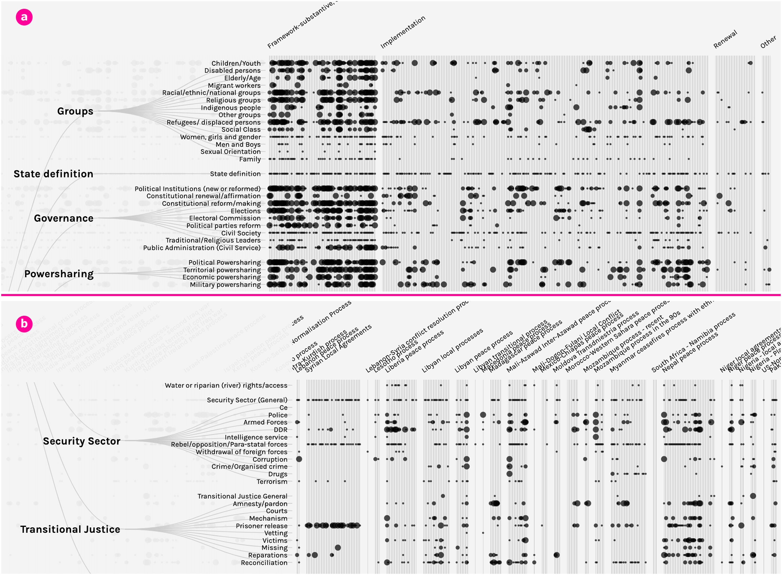
Reflection
If evaluated as a communication tool in terms of its capacity to simplify and enable ‘sense-making’ of large-scale data and communicate trends, then the visualization arguably does not achieve these goals: it is scary. It provides a complex matrix, that almost defies any attempt to ‘see anything’ other than complexity. Even so, it communicates the simple fact of extensive data of global scale and scope, as a ‘billboard’ for what the data contains. This billboard has its function: it illustrates to actors in conflicts and external supporters of peace processes the wealth of comparative data they might draw on as inspiration for the process they are engaged with. This message can be important to maintaining the data or supporting more marginalised groups such as non-state armed actors or women who may have had little opportunity for political engagement, to understand how peace processes work and what types of commitments are included and where these can be pushed. The visualization has also proved useful in third level teaching, for giving students a quick sense of comparative data on peace processes and what is available.
Once understood as a research product from the exploratory process, the visualization takes on its true strength. After the panic of looking at the data resides, and it is looked at from a distance, conceptually – different things can be seen by focusing in or focusing out. Interestingly, this dual-focus has something in common with memorialisation of deaths in conflict, which nearly always counter-poses the ‘individual’ against ‘the collective’, in ways that enable just such a focusing in and out (the US Vietnam memorial, the Holocaust memorial in Berlin). With our visualizaton, if one ‘focuses out’ say on the ‘stage’ view, patches of dark and light indicate complexity at different stages of the process, creating a simple and graphic illustration of the type of content of peace agreements that gets dealt with at different stages. Where the weight of larger black dots predominate – at the comprehensive stage – an intuitive picture is built up that more issues are dealt with here in more detail than at earlier pre-negotiation stages and later implementation stages.
The visualization began to take us away from understanding peace agreements as ‘events’, with content that can be explored and visualized, towards a picture of peace agreements as telling a story of peace processes. The data provides an account of the ways that actors in conflict contexts attempt to create a route out of it. The result was to visually reinforce early research findings and make them more explicit and visible. For example, on gender (Bell and McNicholl, 2019; Bell and O’Rourke, 2010), a United Nations Security Council Resolution (1325 of 2000) specified that peace agreements should adopt a ‘gender perspective’ (paragraph 8). A 15-year review of the resolution's operation, included PSRP data and analysis as evidence that pathways to women’s inclusion are often set before the moment when the UN is present to negotiate a ‘comprehensive’ agreement. Inclusion at the comprehensive agreement state can be pre-determined by pathways set earlier, and can be reinforced or undermined by agreements that come years after the comprehensive one. As a result, the UN Secretary General and UN Security Council noted the importance of supporting inclusion at all stages of a peace process. The Hierarchy visualization makes these sorts of patterns and pathways through processes much more visible. For all of those using it, investing the time to explore the different ways of seeing can pay-off in terms of what is learnt.
The messy timeline visualization
Context
Through the discussions over this first visualization, the limitations of understanding the data as we had primarily understood it up until that point – as peace agreement data, became clear. As the process of collaboration was taking place alongside attempts to write up introductions to the data for quantitative social science journals and the codebook, discussion turned to whether PA-X data is better understood as ‘peace agreement data’ or ‘peace process data’ – what is the best ‘level of analysis’.
Challenge
While the data are presented as a ‘peace agreement’ dataset, as noted above, documentation of how agreements are fashioned over time in a process provides a way of understanding comparative peace processes: how are peace processes structured in varied contexts; what are the ‘equivalent’ agreements in different contexts for sake of comparison? What agendas and actors come in and out of peace processes at different points? How do the actors, stage and nature of the peace process influence what issues are included to be addressed? Our visualization collaboration turned to whether there was any way to visualize the ‘comparative process’ dimension of the data, again for exploration’s sake, but also to communicate this element of the data’s capacity. Through this discussion one of the most innovative, creative and effective visualizations – the Messy Timeline visualization—was born.
Collaboration
We discussed as a group, the idea of stages of agreement and whether there was any way to visualize this and provide some sort of comparison of peace process trajectories. Was this something which could be visualized? The discussion involved jointly drawing possible designs, and deliberation over what they showed, why this might be useful to end-user, and what the level of interactivity could be. Again, the specification was then left fairly open, in terms of implementation, and our visualisation designer created the Messy Timeline visualization, again with a number of iterations involving consultation and deliberation with peacebuilding experts in a fairly ad hoc way. An initial version had ways of searching and filtering added as an alternative to intuitive ways of exploring.
Design
The resultant Messy Timeline visualization (see Figure 2), displays each peace process as a curved line, spanning through time (left right) from peace agreement to peace agreement. Stages are ordered along the right hand vertical ‘axis’ in what would be a logical chronological evolution if peace processes went to plan: (1) a ceasefire is agreed; (2) parties discuss and agree how to enter talks (pre-negotiation agreement), (3) they reach agreement on some issues (partial framework/substantive agreement), and then conclude in a (4) comprehensive agreement, with some later (5) agreement to implement. The further the stage of an agreement progresses towards a permanent implementation of peace, the higher the position of that agreement on the vertical axis. To give an example, the ‘perfect’ peace process would move smoothly up through each stage from the bottom left to the top right (Figure 2(b)). The design was implemented using the d3.js data visualization library (Bostock et al., 2011). Messy timeline visualisation.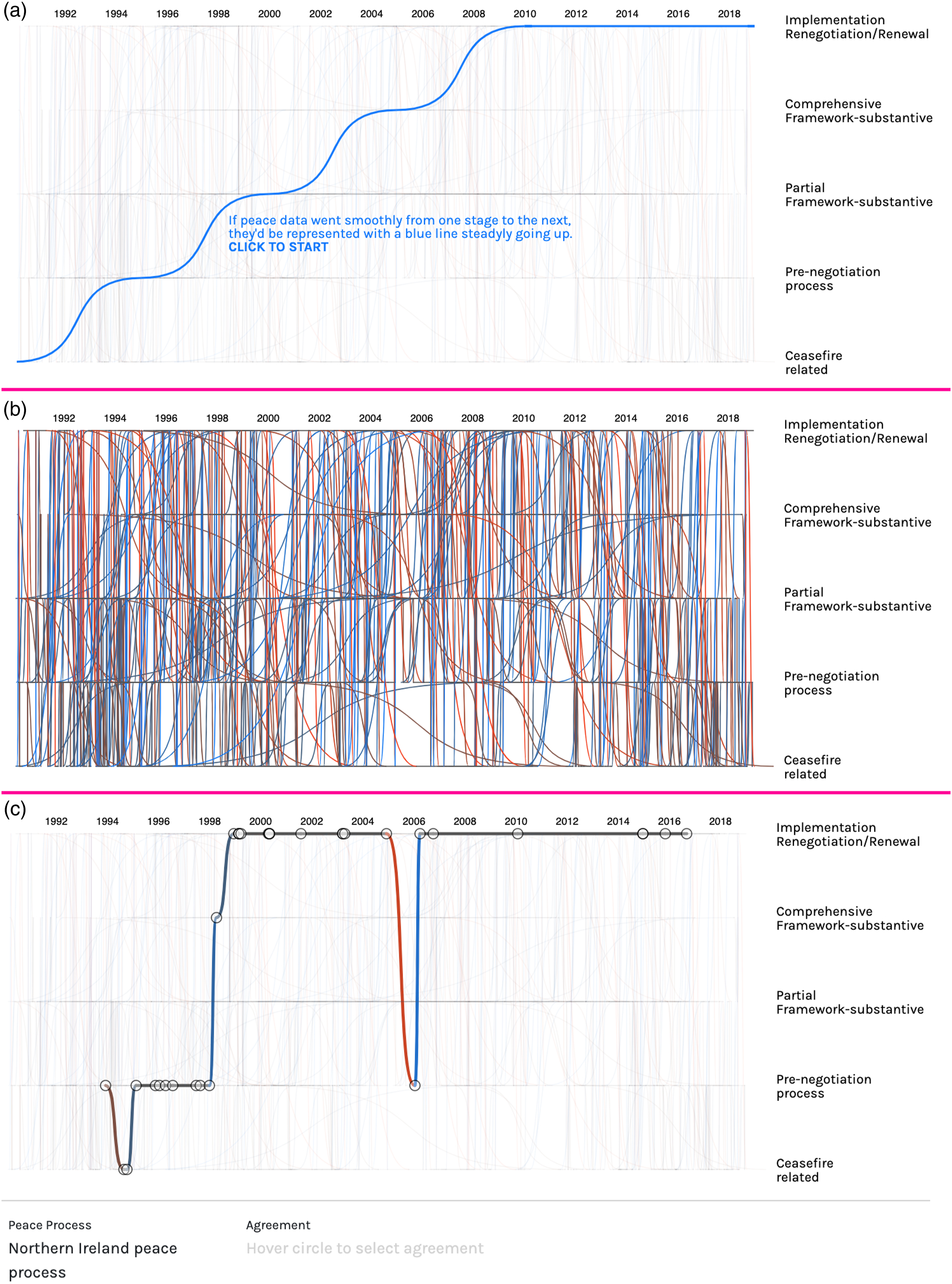
Reflection
This visualization, more than any other, has both a ‘wow’ factor and an ‘aha’ factor. It works at multiple levels, including, we suggest, at an artistic level. First, the overall representation of the timelines when one clicks, is that of a ‘mess’ – a morass of timelines all juxtaposed, like tangled threads (Figure 2(a)). There is an artistry to this: it is the modernist Jackson Pollack, it is the back of the tapestry of life particularly in conflict, it is the mess of and chaos of geopolitics and conflict, it is the ‘web’ of conflict we tangle people up in. The way in which the visualization resonates with all of these images, and indeed the language of conflict and peace processes, 4 is part of its power.
However, if one simply hovers wherever the cursor touches a timeline it ‘lands’ and highlights that single timeline picking it out (Figure 2(c), showing the Northern Irish peace process). Peace process timelines can also be searched by typing in a box. Then the visualization starts to make sense – it tells the story of the trajectory of an individual peace process. Immediately a broader point is made: peace processes are not linear, they go backwards as well as forwards, they start, stop and start again. As the Northern Irish timeline indicates, an initial agreement to talk may be followed by a ceasefire rather than preceded by it; parties may then take a long time ‘talking about talks’, and need to take steps to implement what they have agreed before they deal with any substance. They may reach a comprehensive agreement but take many more implementing agreements over the next years – to draw in outliers to the process, or those who win elections but oppose the agreement, or new splinter armed groups or ‘spoilers’ of the process. While the non-linear nature of peace processes may now seem to be a truism, in fact the very idea of a ‘peace process’ implies a story of linear progress and must be disrupted, as Maiese (2005) writes: The true nature of social and human change is obscured by the metaphor of agreement and the linear image of conflict. Speaking of agreement implies that the parties have reached a solution and that the conflict has ended. However, it appears that agreements that end conflict are difficult to find. In fact, most peace accords propose negotiated processes and aim at stopping the shooting and killing. While these are laudable goals, they are only a small part of the change process that needs to occur.
In terms of policy shifts, the messy timeline and underlying data has been effective. Showing an alternative story from the PA-X data and analysis, and being able to communicate it quickly and graphically, has been really crucial in building the acceptance that peace processes have much longer trajectory than was previously realised, with the comprehensive peace agreement only one ‘moment’ in the field – particularly with high level political decision makers who are not steeped in comparative peacebuilding research. It has produced new ‘ways of seeing’, in which the message is less about a particular policy prescription, and more about a different way of working. The impact of the visualization with government ministers and mediators is often immediate and instant: the peace process is much longer than the moment we are focused on or ‘see’; success or failure has to be understood in the light of much longer timelines and what happens after. Immediately this reframes approaches to policy as not about finding ‘solutions’ to the particular problem of the moment, but of understanding that matters which cannot be achieved in the present, can have processes put in place for later.
Interestingly, different end-users have had markedly different reactions to this visualization. As part of both dissemination and creating ‘feed-back’ loops for visualization, the PA-X team have showed this visualization and encouraged people to play with it in many different venues with different peacebuilding constituencies. Often, the reaction of international western donors invested in a formal talks process is one of pessimism: ‘so this is how long it takes and how hard it is, even if we get an agreement now we cannot expect it to hold?’ However, the reaction of those who had lived in conflict and were invested in the peace process was often one of optimism: ‘oh this is how peace processes go – we thought ours was going really badly and could not conclude in anything useful, but how interesting that peace processes that have been our inspiration also went on a twisted journey’.
Much has been made of both how to present a ‘killer fact’ visually in ways that shift policy discourse, and also of the problems that arise from selecting one piece of data from what will have been more complex data and analysis (Mayne et al., 2018). However, achieving this type of impact, however problematic, is itself a key challenge: most social scientists have trouble having their data make any such impact. The Messy Timeline visualization provided a new 'way of seeing’ which resonated and reinforced substantive theoretical work of the research team. The visualization in turn prompted refinement of the data: the attempt to present the data ‘by process’ prompted us to find better ways of defining and categorising ‘peace processes’, and building in peace process search mechanisms to our data.
The Messy Timeline visualization, resonating as it did with the reality of experiences of the peace process, told those who were attempting to support peace, whether local pro-peace constituencies or international donors in ways that they could ‘see’ and therefore ‘hear’. These messages included: your timelines need to be longer, your commitment made in the understanding that it will be one step forward and two steps backwards; and you need to understand better how what has come before has shaped where you are now because there is no model peace process. The project you are supporting has never tracked forward in any context in the linear way you are timetabling it in key peace agreements, so you may want to consider the rigid timelines and deadlines you are committing to, and what happens if they are not met. Rather than getting an agreement to ‘solve’ the conflict and walking away, the process might be better approached as one of ‘achieving what one can, and putting in place the right hooks to try to achieve something more at a later stage’ (see Bell and Pospisil, 2017; Pospisil, 2019). Neither disasters nor triumphs are final, sometimes between success and failure, there is ‘failing better’ and evolving iterative approaches to what can be built over time. The visualization was also useful in refocusing the research community away from comparing agreements to comparing ‘processes’, and therefore fulfilled our ambition of bringing to light a dimension of PA-X that was not readily visible at that point from the search interfaces. The PA-X findings on the need to focus more on pre-negotiation and implementation stages of processes, and the need to understand the indefinite nature of transitions are all now key themes in contemporary research and policy discourses (see, e.g. De Waal, 2021; Paffenholz, 2021; van Santen, 2021).
The Yemen timeline visualization
Context
The Yemen Timeline visualization brought together earlier visualization attempts and an experimental PeaceTech conversation related to peace processes. First, the PSRP researchers became aware of timeline tools which could be used ‘off the shelf’, notably the tools of Knightlab , and had begun developing timelines and building them into the PA-X search mechanism. 5 Secondly, engagement with the UN Office of the Special Envoy to Yemen as part of a wider collaboration supported by the Mediation Unit of the Department of Political Affairs, prompted us to see how specific data on Yemen could be produced to support attempts to put in place a Yemen peace process, as part of a wider attempt to innovate with regard to digital support for mediation and consultation.
The Yemen context provides peace process and digital challenges almost beyond any other. The conflict is entrenched, protracted and extreme; other serious humanitarian challenges such as disease pertain; different authorities and armed groups govern in different areas; different communities have different access to internet and different capacity to be safe when inputting to digital tools; internet provision is both divided and controlled by different centres of power (there are separate armed group controlled and government-controlled internets); key activist groups and ordinary citizens have been actively displaced, meaning that often only digital forms of working collaboratively are possible; and access to technology carries heavy gender and geographic biases which operate to exclude women and other minorities or rural constituencies if not mitigated. The main language is Arabic, but with many distinct dialects, however, not all of those internationals supporting the process or even on the UN team speak Arabic. Both despite and because of these challenges, the activist and diaspora community have a distinctive reliance on technology, strong capacity and show innovation. The obstacles to consultation in general have produced use of WhatsApp groups, online apps and automatic translation as necessary to peacebuilding organisation, even in a context of cyber-risk.
Challenge
Our very initial response to the context was to aim – as part of a series of ‘proof-of-concept’ initiatives – to produce a bilingual timeline of peace agreements and other related events to inform all of those engaging with the peace process of its history, and to provide easy access to past documentation. We had peace agreements readily to hand, and automatically imported from the PA-X peace agreement database.
While starting from our peace agreements, early quick feedback from our peacebuilding interlocutors highlighted the need to include significant conflict and wider political events which were just as significant to understanding the contemporary peace process. Given the desire to have the tool to support women’s groups and civil society engagement with the peace process, as well as international organisation engagement, we also wanted the timeline to be able to show the content in both English and Arabic. Finally, our data on Yemen by this stage included not just data on the national process, but data on the many very local agreement processes that are often not well-known by international actors but can be critical to events on the ground. We wished to show these agreements as also part of the picture in ways that did not complicate any simple timeline story. As we could not find existing tools that create such more sophisticated timelines (Brehmer et al., 2016), we decided to design and implement our own visualization (Figure 3). We made this visualization open source to allow reuse by others.
Collaboration
From the outset, therefore the timeline’s creation involved engagement of designers and visualizers with UN organisations, end-user Yemeni communities, including women and civil society actors in conflict, Yemeni researchers, Yemeni digital experts, and other human rights and peacebuilding groups and researchers from Yemen or closely engaged in supporting the process. Through processes involving these groups collectively and separately a number of prototypes were produced.
Design
The resultant visualization involves a scrollable design that aligns all agreements and events on four vertical timelines (See Figure 3): national agreements, local agreements, political events (such as agreement) and conflict/violent events. The design is divided into two views: the left side provides an overview over the whole timeline, where every dot represents one peace agreement or event. This visually communicates the temporal density of political or violent events and the national and local agreements that unfold thereon. The right side provides a more detailed view by naming and describing events, displaying their exact dates and linking to the full document texts of agreements in the peaceagreements.org database. This and all other visualizations were created with the data visualization library d3.js (Bostock et al., 2011) and went through several iterations to refine the look, modes of interaction and visual encoding of the data. The timeline can be navigated in several ways – by scrolling up or down through the boxes, or clicking dates, or the dots that signify events. Yemen timeline.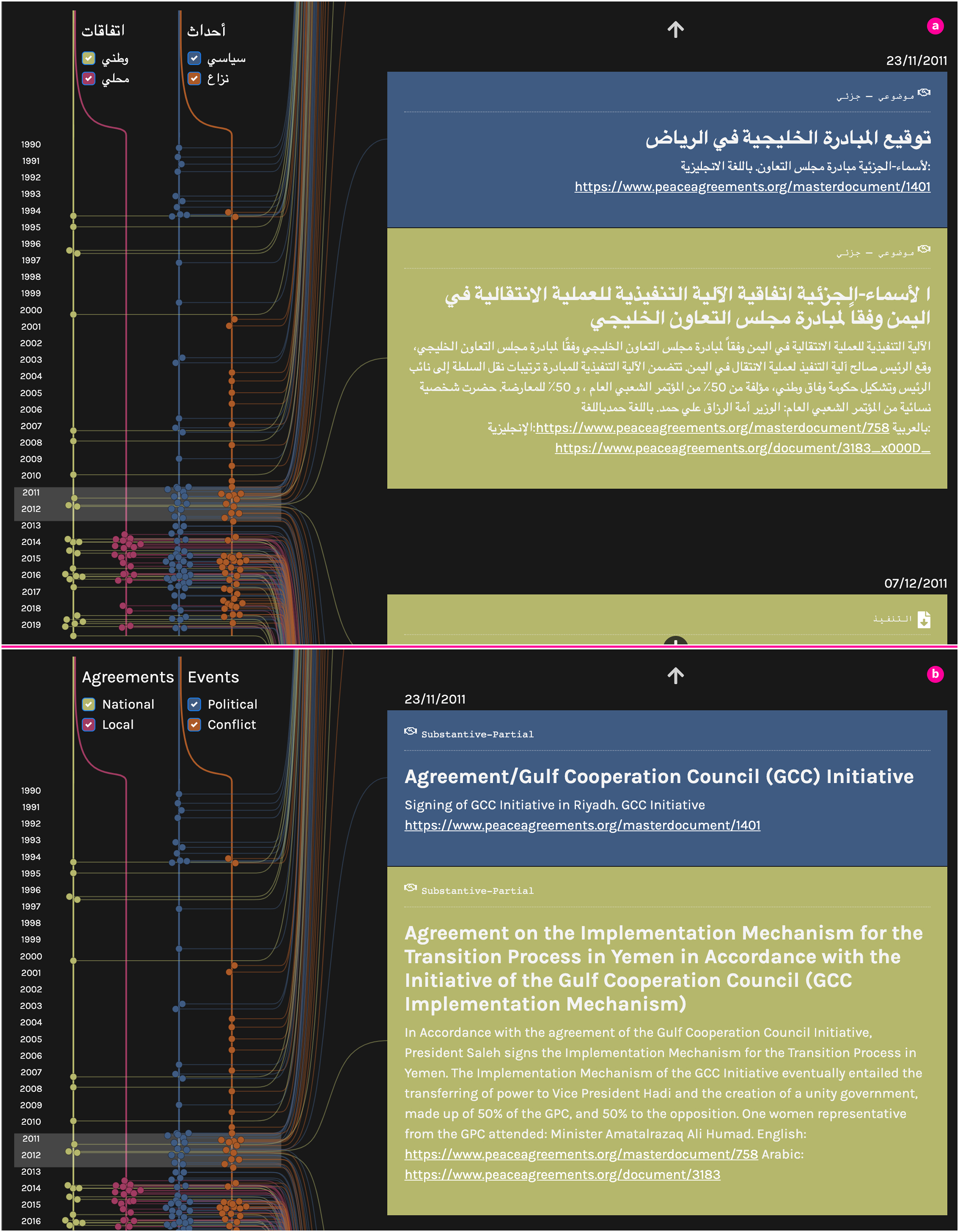
Reflection
The decision to create a parallel set of ‘political and violent’ events for the timeline posed new collection, selection and sustainability challenges. If we were to visualise every small event, we would become an ongoing news agency for which we had no capacity or budget. However, to make a selection of key events historically runs into issues of choice, controversy, bias and political challenge. We resolved this conflict by deciding to only include events based on consulting with Yemeni and non-Yemeni experts on Yemen, from a range of backgrounds. We also explain clearly in the surrounding material of the visualization that any timeline has an element of subjectivity and that it remains under constant refinement. However, remaining true to refinement requires a commitment to updating. Other issues then arose, such as deliberation on the draft timeline, and our own experience from our gender-research, made us aware that focusing on peace agreements and violent events privileges male interventions in the process. We engaged in deliberation on what a timeline of important interventions would look like from a more women-centred perspective – if women’s interventions were taken seriously. We consulted with Yemeni women advocates on key events and included some, although not in a way that significantly challenges the bias inherent to capturing political and violent events understood as central to the conflict and peace process trajectory.
Developing a bilingual visualization gave rise to design challenges beyond merely planning and budgeting for translation as discussed further below. Design-wise, early on, we thought bilingual access would be sufficiently granted by allowing to switch the language of the website with a button. However, the whole initial design of the visualization was thought out from a Western perspective, and a reading direction to be left-to-right, while Arabic is read right to left. While the vertical timeline luckily was not affected, the initial team at the start failed to consider how how Arabic readers would orient themselves in the interface with both relation to text and the general flow from overview to details. It took many iterations with the interpreter, domain experts and the visualization designer to work out a compromise that was intuitively accessible across cultural differences in how text is accessed and read. In some cases, the solution was to change the overall design to be centrally aligned, in others we changed the design based on the currently active language so that text elements would flow from left-to-right in the English design and vice versa for the Arabic version. In each case design and testing of these matters, and appropriate colours (which can have particular political significance if not carefully chosen), had to involve ongoing deliberation. A wider cultural critique of the projects would point to the ways in which time pressures and a move to use the low-hanging fruit of producing an interactive visualization from existing data as a way of supporting a wider PeaceTech exploration, bypassed a more end-user focused Yemeni-based design process from the outset, in ways the process had to layer-in over time (see further below). Yet, it was only the attempt to use existing data to facilitate peace process actors in Yemen that enabled a wider Yemen-focused PeaceTech collaboration. This helped us evolve modalities of working, building up the relationships that would have been necessary to achieve this sort of collaboration from the outset, and helped us convene and learn from others who had evolved cross cultural digital projects.
Ways of seeing: Visualization-as-scoping
Based on our reflections, this section introduces our notion of visualization-as-scoping. Where one has a clear idea of what the data says, and what a key policy message might be, then it is relatively easy to commission a visualization as a communication tool. However, the process we outline above we would term visualizing-as-scoping which involves letting the visualization process shape the view of the data and the sense-making process itself. In other words, rather than using visualization as the end goal of communication (explanation) or as a form of exploratory data analysis (exploration), we approached the process of thinking about an appropriate visualization for a problem/data as a tool to engage and think about the data and research. To return to Berger, the process of production involved a self-conscious and explicit team conversation about the relationship of the data to the social context, and an attempt to also think-through what different epistemic and actual communities of people viewing and interacting with the image would make of it.
Visualization-as-scoping, as we term it, provokes questions such as: is our data complete? What is the data about ‘really’? What questions are we asking? Can our data tell us the answer? Do we have enough data? Are these data correct? What methods (analysis/visualization) do we need to properly interrogate our data? Can we trust our data? Can we trust the visualization? Which design decisions are we making in our data analysis/visualization process? As Cornelio and Roig (2020, 1) pointed out in a self-reflection of a mixed methods data analysis and visualization project, ‘[d]ecisions made regarding visualization processes posed different challenges regarding the intermingling of qualitative and quantitative data and the layout of our results’. We would go further and say that the data-as-scoping process helped us to see what our data was – in particular its comparative peace process dimensions – in new ways.
However, visualization-as-scoping involves a product of conversation between interdisciplinary research teams and inter-epistemic communities. From our wider PeaceTech attempts to connect different forms of peace and conflict data, we have become very aware that data can only really be understood when one understands the purposes for which it has been created. To hand over data to a designer and say ‘visualise this in some interesting way to show us something we do not know’, will not necessarily produce purposeful results even when it produces interesting visualizations. The design expert must invest time in understanding the domain and carefully make decisions about visual representations, embellishment (Bateman et al. (2010), Hullman et al. (2011)), aesthetics (Lau and vander Moere (2007)), how to support engagement (Kennedy et al. (2016)), and many more. Similarly, the domain experts must come with an openness to what is to be produced visually. The more an innovative creative visualization is being designed, the less the researcher or even end-user can dictate or provide a definitive specification for the visualization: they must understand the visualizer as in a sense also the artist committed to the joint enterprise in which the key design elements are defined but design left open.
A number of tensions between domain and design researcher require to be navigated. In our conversations design experts often favoured ‘maximum functionality’ design whereby an interactive visualization would provide a range of mechanisms to interact and push the boundaries of interactive visualization and innovation. Domain experts seek simple intuitive interfaces, to supplement and create a range of additional ‘entry points’ to explore the data beyond the existing fairly complex PA-X search interface. A little like an electronic gadget, there is often a direct trade-off often between all the things the gadget can be designed to do, and the ease with which the non-technical expert who is uncommitted to learning technlogy as an end-user can use it.
A second tension involves differences in ways of working. Design experts often work using different ways of collaborating online, with different computer software to those social scientists are used to. We resolved these tensions largely by having the information on programmes social scientists are familiar with, such as Word table and Excel, which then required ways of automatically or manually importing data into the visualization. However, in the peacebuilding field of research design has a number of constraints which are not necessarily obvious to the designer: colours and maps have political meanings and are contested and viewed differently by different sides in the process. Translations too can be political or at least require a set of cultural sensitivities and even ethical issues to be considered: should the term ‘crimes of moral chastity’ be included in this way to mean ‘rape’ (Philippines), or an armed actor’s resistance even to the word ‘peace’ as political and belonging only to ‘the other side’. 6 Considering and consulting on colours and politics across communities of which we did not have full access to (for example, we were much less in contact with Yemenis from Houthi-controlled areas than others) was a major challenge of the work. We used a Yemeni translator based locally in Edinburgh to do the translation, but initial feedback on the Arabic found it to be too literal a translation from English, and so considerable work had to take place supported by a Yemeni researcher to proof the translation more conceptually and generally become a core member of the timeline team. Inevitably, this then led to more deliberation on what we had included and not included. Budgets which had contemplated the project to be static and produce a ‘deliverable’ now had to be revisited and new funds found – at each point we got better at anticipating the interactive processes we would need.
Reflecting on these issues, while our collaboration evolved, key ingredients proved vital. First, while the social scientists on the team had approached the visualization initially from a commission perspective, the advantage of working with visualization designers and researchers was that they brought formal design knowledge to the relationship, which included approaches to iterative collaborative design and feedback loops with end-users. This resonated with the praxis commitments and connections of the research team in question, that sought visualization not as something to be produced in the academy and then disseminated to end-users ‘out there’, but rather something that ideally should be co-incubated and co-designed with end-users if it was to support them in peace process interventions. Second, the wider research data and ethical requirements of the University of Edinburgh and the UK Foreign, Commonwealth and Development Office who provide funding for PSRP, mean that ethical and duty of care codes all had to be complied with, and PSRP had had to develop these codes over time beyond the normal ethical and security and data concerns, to be relevant and effective in situations of extreme and protracted violent conflict. Experience ‘conflict sensitivity’ and ‘do no harm’ approaches to research had to be layered onto the normal ethical considerations of safety of those impacted by the visualizations and wider PeaceTech infrastructure being engaged. Requirements of North–South partnership helped to drive and underpin the design sprints.
A final ingredient was the choice and capacity to design our own visualization as part of the process. Design choices must be made as to what visualization tools to use. From our experience, we see three ways of approaching the process of obtaining a visualization depending on budget and capacity. First, using existing tools to create out-of-the-box visualizations, such as Tableau, Timeline.js, Rawgraphs and many others freely available (Ridley et al., 2020; see further http://vistools.net). These tools provide data-uploading routines and a range of built-in visualizations that can be configured in multiple ways (in terms of colour, labelling etc.), for quick results. However, the dataset needs to be in the right format, and the range of actual visualization types is limited to those commonly used for quantitative data (e.g.linecharts, barcharts, choropleth maps) but fall short when it comes to more complex data that requires, for example, networks, timelines, multidimensional data on maps and interaction. Tools for such more complicated data exist (e.g. Bach et al., 2015), but their number is limited.
A second way of creating visualizations is to commission ‘bespoke’ and custom-designed visualizations that meet specific criteria of the data, end-users and context of use (e.g. exploration, communication, etc.). However, working with professional visualization designers requires a formal collaboration process which includes fixed deadlines and action items from both sides of the 'domain expert' / 'design expert' team, and – most importantly – a clear set of requirements and specifications as iteration is expensive and frustrating for the designers. Given the often dynamic – at times chaotic – nature of academic research (including shifting priorities, leaving staff, new research questions and fluctuating budgets) formal processes need proper planning and budgeting.
The last option of creating visualizations is to engage in bottom-up in-house design, development and implementation as our examples illustrate, involving academics on both sides. With a training in computing and an inherent interest in academic research, these people could join regular meetings, integrate with the team, engage in discussions and reiterate drafts. More important, those academic designers could use our collaboration as a means to think about new questions and solutions to advance visualization beyond our project and the domain of peace studies. This is the approach we describe in this article. It is the most intense one (both in term of budget, time and commitment) but it can result in truly bespoke and interactive visualization that fit most of the given needs and can draw from the wealth of visualizations in the academic literature (e.g. Brehmer et al., 2016; Bach, et al., 2017; Hogräfer, et al., 2020; Von Landesberger, et al., 2011). While developed for a specific use case or project, many of these visualizations can then be reused with different data and in other scenarios.
Lessons learned
The new ‘way of seeing’ we arrived at through our visualization-as-scoping process, was one of understanding the complex and adaptive nature of peace processes. What for Berger goes on in the artist’s and the viewer’s head, for us became situated within the co-production interdisciplinary visualization process as an open conversation between groups of designers and end-users. These are conversations that have the potential to continue beyond the visualization’s initial production with feedback loops that refine, develop or amend the visualizations. The following summarizes the lessons that have particular relevance to visualization in the conflict and peace studies field.
Collaboration, co-design and inclusion
1. Visualization-as-scoping requires visualizers learning what the data are, what the tasks are, what the data are not and why end-users might want to use it. It also requires social scientists to understand what is possible in design-terms. Often, what our visualizers thought was interesting and challenging in visualization terms was not focused on revealing something that peace studies researchers thought they and their end-users would be concerned about. Finding common ground takes time, resources and team capacity (cf Skuse et al., 2020; Hall et al. (2019); Sedlmair et al., (2012)). The ideal of ongoing iterative processes, also requires budget and staffing flexibility and that as much attention is paid to ‘back end’ upload and updating mechanisms as the front-end design, if the process is to be ‘future-proofed’. 2. Involving end-users in the design process, in the peacebuilding context can itself involve peacebuilding. Visualization-as-scoping in the peacebuilding domain involves conversations about violent conflict, in contexts with strong social divisions and competing social narratives. There are logistical, ethical and risk dimensions to establishing and operationalising these relationships, from safety to the logistics of bringing people together, to the types of security that any tool needs to deploy. Strong sensitivities with respect to both culturally loaded visual choices (colour, symbols, labels, terms, maps) can point to controversies that are not evident to those with less contextual knowledge. For example, a visualization might show facts in a way that counters existing political narratives or might even implicitly accuse one or the other side. This in turn will shape who is prepared to engage with the visualization and what they will take from it. As visualization in the peacebuilding domain has received little dedicated discussion, close collaborations with peacebuilders and peace researchers help in ‘seeing’ beyond the technical aspects of visualizations and to seek solutions for challenges in the field: cultural codes and cultural visual symbolism, provisions for trust, transparency and data provenance, usage scenarios, audiences and levels of visualization literacy, storytelling, and eventually means of wider participation (Kauer et al., 2021). 3. Where data is to travel cultures and relates to sensitive political events there are a broad range of additional challenges which need to be thought through. These challenges include those we have outlined above relating to actual and conceptual translation, capacity to test visualizations in-country, dealing with issues such as reading from left to right and right to left differences; understanding culturally specific colour schemes, font-types, visual symbols, ideas of data literacy, visual literacy, general literacy, numeracy, etc.
Multivalence, porosity and contagion
4. A visualization can have many success criteria: clearly communicating a single message; helping with decision making; providing an overview of the data; engaging a wider audience with a topic; educating, or interactive exploration and hypothesis generation. Establishing criteria of success and collecting evidence about this access has a long research tradition (Lam et al., 2011) but many questions remain open, especially questions about measuring engagement (Mahyar et al., 2015) and studying visualizations in the wild (Shneiderman and Plaisant, 2006). We are not aware of specific criteria for success of visualization in the field of peace studies but would suggest that they should also have a normative aim of supporting the peace process, and not damaging it. However, our insights from our visualization-as-scoping process, point to the ways in which data visualization can demonstrate complexity and help actors seeking to end conflict, to engage with it. 5. Visualization as part of the politics of change. As per Berger, we suggest that any separation of data (content) from visualization (form) is impossible in the peacebuilding context (and we suggest beyond it). For the visualizers, the data domain ‘leaks’ into their own concerns and values regarding interactivity and visualization. This reality questions conventions of data visualization per se, and the visualizer as a general-purpose service provider.
Conclusion: From new ways of seeing to new ways of doing
We did not, and could not have worked out all of the above issues from the start. In some senses our approach was inductive: without formalising the idea of ‘messages’, our explorative approach to creating interactive visualizations resonated with the writing we were engaged with on peace processes and how we were trying to connect it to policy-makers and actors in the field. The story that emerged from the data in both our writing and the visualizations that resulted, reinforced each to create a powerful message of the complexity of peace processes: peace processes last many years; they are non-linear; they take place at different local, national, and international levels none of which are coordinated; they are deeply iterative and even when ‘successful’ build that success incrementally; they are shaped not by the best way to make peace but by compromises which emerge from ‘balance-of-power’ dynamics; and they are much more global than one might expect. Visualization opens up a new way of seeing peace processes in a way that is disruptive of the type of timetables and linear processes that international actors often try to impose, but resonates strongly with experience in the field. Being honest about the data visually has enabled a form of policy influence, which is about both conveying effectively and dramatically the complexity of peace processes, while giving people a way of situating their own activities in a complex unfolding process, enabling them to engage constructively with the ongoing nature of the process. This, we suggest, is a form of policy-input which moves away from trying to influence particular policy actions and outcomes, to trying to influence a new way of understanding the peace process and working within it.
Footnotes
Declaration of conflicting interests
The author(s) declared no potential conflicts of interest with respect to the research, authorship, and/or publication of this article.
Funding
The author(s) disclosed receipt of the following financial support for the research, authorship, and/or publication of this article: This study was supported by Foreign, Commonwealth and Development Office, UK AID, P0 6660.