
Abstract
Data visualisations are intimately connected to the emergence of public health as a discipline and policy area. Besides the mapping of cases and deaths, the COVID-19 pandemic has seen an explosion of attempts to track policy responses. They have come from actors sometimes initially unfamiliar with public and global health. In this paper, we analyse seven of the most successful tracker initiatives that have sought to map governments’ reactions to COVID-19 and reflect on our own. When not led by international organisations, the trackers primarily rely on networks of volunteer country expert contributors (who need to be incentivised in the medium term). The vertical crowdsourcing approach means that, despite good intentions, contributors have a relatively limited agency in shaping the trackers. Maps and timelines comparing countries are the most popular visualisations; they suggest that (some) policy solutions can be found abroad and rely on policy taxonomies established by the trackers’ core teams. We contend that such taxonomies, which compete with each other, constitute attempts to frame the complex issue of which policies matter in responding to COVID-19. All the projects are large and complex and often without a well-defined intended audience. We hypothesise that the popularity (in terms of backlinks) of the most successful tracker arises from the fact that it sums up COVID-19 policies in one easily visualisable indicator. We suggest that the trackers are a more helpful emergency policy tool when they provide contextual information, keep policy details or refer to them (rather than only reduce them to categories), and suggest ways to link different elements—including the relationship between health or societal outcomes and policies.
Introduction
Visual representations of the spread of diseases, health conditions and health-related measures are intimately related to the development of public health as a scientific discipline and as an area of policymaking. Choropleth maps have long been used to show the spread of diseases and describe health policies. In recent years, authoritative cross-country health policy visualisations were typically produced by the usual global public health ecosystem suspects, such as the World Health Organization (WHO). The COVID-19 pandemic affected this situation: the visualisation of COVID–19-related policies suddenly garnered significant attention from well beyond global health experts. New actors – researchers and policy-related institutions alike – started assembling datasets and creating visualisations of the policies put in place. The multiplication of (online) trackers was such that, by September 2020, a ‘super-tracker’, 1 a tracker of COVID-19 (policy) trackers, was born (Lehner, 2020). By the time of finalising this article in late April 2021, it listed over 150 (carefully curated) initiatives that contributed to what some described as the COVID-19 ‘infodemic’ (Mooney and Juhász, 2020). This article analyses seven of the most significant COVID-19 policy tracker projects and reflects on our own attempt to set up one such tracker. We interrogate the nature of the visualisations produced, the understanding of policy (-making) they reflect, and the aims they pursue.
Our approach focuses on the different stages in the production of COVID-19 policy trackers, including the knowledge and expertise they mobilise and the transformation of narratives into categories they imply. We contend that visualisations are more than a by-product of the databases; they often shape the design of such databases as well as data collection. Visualisations are probably the most significant end-product of tracker initiatives, especially for non-researchers who are unlikely to exploit the ‘raw’ data. They can potentially help the actions of a wide range of actors, from policymakers seeking to understand dynamics at home or abroad to civil society actors trying to hold such policymakers to account. We show, however, that the appeal of and focus on visualisations may come in the way of the trackers’ relevance and usefulness.
The following section describes some of the historical background and scholarly debates around public health mapping. We then present our methods and focus. Section three analyses seven of the most significant COVID-19 policy tracker initiatives, while section four discusses the significance of the findings for public health policymaking and the political economy of knowledge production.
Background and rationale
Public health researchers and policymakers have a long history of using visuals to make sense of information about the spread and mortality of disease over time and by geographical area. For example, Florence Nightingale famously used visual diagrams to show that preventable disease was a more common cause of death among wounded soldiers in the Crimean war than the wounds themselves, which shaped her work towards improving hospital conditions (O’Connor et al., 2020). Later in the 19th Century and the first half of the 20th Century, in Africa and Asia, where public health officials served colonial projects, health visualisations provided the ‘evidence’ that would be used in attempts to engineer societies profoundly (e.g. Lyons, 2002). In today’s humanitarian emergencies, visually mapping public health indicators such as nutrition levels, access to drinking water and the prevalence of health conditions is standard practice. It is still described as a powerful tool to help policymakers make both urgent and complex decisions (Otten et al., 2015), especially when it renders visible the linkages between different pieces of information (O’Neill et al., 2017)
The internationalisation and globalisation of health concerns and policies have pushed health-related visualisation to the planetary level and made choropleth world maps comparing countries’ health (policies) a common occurence (Aung et al., 2019). A growing literature has documented the effects of such a trend. Implicitly or explicitly, cross-country visualisations participate in the economy of global performance indicators (Kelley and Simmons, 2019), which help individuals and organisations frame issues. It should, therefore, not be a surprise that visualisations are a favourite tool of health policymakers. The academic literature on the topic also suggests that ‘recurrent comparison stimulates governments’ concerns for their own and their country’s reputation’ (Kelley and Simmons, 2019), primarily via pressure on elites (Honig and Weaver, 2019).
In approaching visualisations, we have identified a series of key dimensions or building blocks in the literature, which correspond to the need to critically understand the broader political economy of developing and sharing visualisations: (1) the sources and system of data collection, (2) categorisations and data transformations, (3) visualisation choices and, related to them, (4) audiences.
The first dimension echoes dense and fast-growing literature exploring the political economy of gathering (international) data and the generation of knowledge regarded as valid (e.g. Bhakuni and Abimbola, 2021). Control over data is a major determinant of power in societies (Ruppert et al., 2017) and gathering data necessarily means partaking in data politics. A central element raised time and again by the literature is the agency of those whose data are collected or who end up being represented in the data (e.g. Kennedy et al., 2015; Munro, 2013)
Then come the second and third dimensions, the choice of categories and visualisations can be forms of (un)intended ‘manipulation’ and the same literature warn of the risk of situations where, not unlike the colonial experiences mentioned earlier, interpretations are imposed upon people via simplified visualisations and without further forms of engagement (e.g. Sui and Holt 2008). More technical considerations also come into play, and the literature stresses good and bad practices in using different types of visuals (e.g. Bujack et al., 2018). This issue is closely related to our fourth and final dimension on audiences, as visualisations can be interpreted to serve the purpose of its consumer. Kennedy et al. (2016) emphasise the importance of perceived neutrality and ‘the impression that the visuals are showing the facts’ (p. 716) even though they reflect the convention or social practice of a given group (and, often, audience).
The academic literature on COVID-19 visualisations and dashboards is growing; most pieces so far have been commentaries that are generally critical of dashboard initiatives (Everts, 2020) or more technical papers looking at the challenges of representing pandemics in ways accessible for a general audience (Mocnik et al., 2020; Mooney and Juhász, 2020). While our paper does engage with the question of the representations and audiences, our focus is different from the more technical papers as we are not concerned with the representation of the pandemic per se (e.g. cases and casualties) but rather the representation of related policies. More critical commentaries, such as Everts’ (2020), are again focused on epidemiological data. They are concerned with dashboards missing ‘more nuanced spatial, temporal, social and epidemiological information’ (p. 260), which will be a crucial point of attention in our study.
Methods and focus
COVID-19 policy mapping projects.
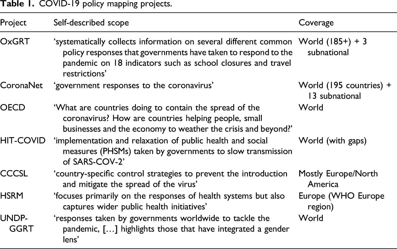
Our aim is not to present a comprehensive analysis of all tracker initiatives. Instead, we focus on a set of initiatives that gathered significant public and/or scientific attention. The OECD, UNDP and WHO are key international organisations whose publications and visualisations are consulted by policymakers around the world, the OxGRT data features on the dashboards of key newspapers such as the Financial Times and the HIT, CSH and CoronaNet trackers each had dedicated publications and coverage in either the journal Nature: Human Behaviour or Nature: Scientific Data (Cheng et al., 2020b; Desvars-Larrive et al., 2020; Zheng et al., 2020).
The primary data for this paper are the visualisations, data explorers (dashboards) and related technical documentation of each initiative. It is publicly available online in most cases. Additionally, we used a dedicated toolset for identifying backlinks (Ahrefs.com) to explore the potential visibility and perceived authority or importance of each project (Introna and Nissenbaum, 2000). We did consider using the social media footprint of each project, but it appeared impractical as not every project had its own dedicated account (some had leading researchers promoting it from their own accounts) and importantly, it was unclear which terms (e.g. Twitter hashtags) should be used. Backlinks offer a picture of the situation that is easily comparable among projects. Backlinks are about visibility and authority rather than popularity per se (they are not always an accurate reflection of the number of visits – a metric that we could not obtain and which online tools would not estimate (reliably or at all) given the limited data available for our selection of websites). For each project, we considered both their main website and sub-directories and, when different, the website containing the raw data – often a GitHub account, and the flagship academic publication when available.
The analysis started with the documentation of each ‘building block’ (see background section) in each of the seven projects; we proceeded block by block, which helped ensure that the analysis was both consistent across projects (indeed comparing the same dimensions) and also iterative and reactive to unexpected elements highlighted by particular projects (which we would then check in all projects). We aimed to stress and understand differences as well as similarities among projects.
Analysis
The analysis is divided into four sections, exploring each of the aspects identified by the literature. The first section seeks to understand the data sources for each project, thereby providing insights into tracker initiatives' political economy. The second section focuses on indicators and the choices that each project made in terms of coding data – typically creating taxonomies from ‘free’ text. These first two sections are essential to understand the visualisations produced by each project, analysed in the third section. Section four gives a sense of the footprint, reach and impact of each project.
Crowdsourcing data collection
The four academic mapping initiatives all boast impressive collaborations centred around a group of lead researchers (often based at the same institution) who tap into a network of hundreds of collaborators and contributors. The power of crowdsourcing ‘local’ information known or accessible to ‘local’ researchers, which had been described as very promising but not void of complications in the academic literature (Mulder et al., 2016), has been unleashed in the different projects. The publication that counts the smallest number of authors, CoronaNet’s paper in Nature: Human Behaviour, explicitly refers to ‘more than 260 RAs from colleges and universities around the world, representing 18 out of the 24 time zones’ (its website now boasts ‘500+ researchers’). At the time of finalising this paper, CCCSL mentioned 200 volunteers ‘primarily through professional and social networks associated with academic institutions of the management team’, CSH listed 44 names that appear to be in the professional network of the core team, and OxGRT listed 403 volunteers said to be Oxford University staff, alumni, and students. In each case, the organisational challenge is substantial. Important resources provided by home institutions and funders (such as the European Commission) are used to coordinate contributions and ensure data quality. The projects mention training the volunteer contributors, to varying degrees, on how to research appropriately, code and cite public policy measures. The emotional shock, and sometimes frustration, caused by COVID-19 (and the policy response to it) in the first half of 2020, as well as unemployment and furlough schemes, may explain the impressive number of people who chose to give their time to the various fully online mapping initiatives (Lachance, 2020). After the initial enthusiasm, however, retaining volunteers is a crucial issue. The trackers’ background papers and websites mention resorting to various strategies such as stimulating their network of contributors with incentives such as training on statistical tools and workshops to develop academic papers from the datasets (Cheng et al., 2020a). The difficulty to retain contributors explains the lack of frequent updates – and de facto discontinuation – of a series of initiatives such as our own governance mapping initiative and the Internal Science Council’s 11 . As of April 2021, OxGRT still provided frequent update and CoronaNet appeared to have secured its financial future with European Commission Horizon 2020 funding for a Covid Atlas under the PERISCOPE consortium. 12 CCCSL and HIT-COVID had less regular updates early in January but they had not documented much of the ‘third wave’ set of restrictions coming into force in Western Europe in January 2021 at the end of that same month.
The WHO-HSPM and OECD mapping initiatives evolve in substantially different spaces as the two institutions could rely on an existing workforce spread in different countries. HSPM is a network of 48 public health institutions and universities in 36 OECD countries 13 , and both the WHO and European Commission have their specialists who could be allocated to the project. Similarly, the OECD’s tracker – albeit seemingly not substantially updated since mid-2020 – is part of the wider set of data and analyses that the organisation set to create. It is hard to compare the completeness of the different projects since, as the next section will show, they used different formats, but CoronaNet is likely the most detailed, followed by OxGRT and HSRM (which is comprehensive but covers only Europe). HIT-COVID and CCCSL also boast an impressive number of entries despite the updating issues reported earlier (the former has substantial gaps in its coverage, while the second explicitly only focuses on parts of the world).
The UNDP-GGRT stands out as a model of its own. It explicitly relies on existing mapping efforts, including the OECD mapping described in the present paper, for a series of indicators. They are complemented with context-sensitive data collected by online (unpaid) UN Volunteers 14 (their number is unspecified). Its human resource model, which includes support from UN staff and University of Pittsburgh experts, seems more developed than the other projects’ – possibly because it launched later than the other initiatives, in September 2020.
Not surprisingly, given the many calls for ‘open’ science in recent years (Evans and Reimer, 2009), the collaborative nature of the projects, and the push for international institutions to release their data, the projects make their data publicly available (CCSL and CoronaNet use CC-BY-SA 4.0, OxGRT CC-BY ‘standard’ Creative Common, and HIT-COVID GNU General Public v3.0 licences; HSRM and the OECD have a copyright on the data but make it public). CCSL, HIT-COVID, CoronaNet and OxGRT provide easy connectors via GitHub, and OxGRT even has a ready-made API connector. The UN-GCRT does not provide information on licencing, but a detailed and annotated Excel workbook of the data is downloadable.
Indicators and variables
As reflected in Table 1, the objectives of the different projects are strikingly similar: HRSM and HIT-COVID have a slightly narrower and more health systems–oriented framing, but they also acknowledge the need to go beyond health systems in their analysis. Moreover, the data collected by the projects appear similar in many respects: all projects (seemingly) independently collect data on the ‘core’ public health measures and social distinction measures (e.g. masks, lockdowns, border closures, public services and shop closures). There is, however, clear differences in the treatment of such information and what is available to users in a raw format.
Data presented in the dashboards
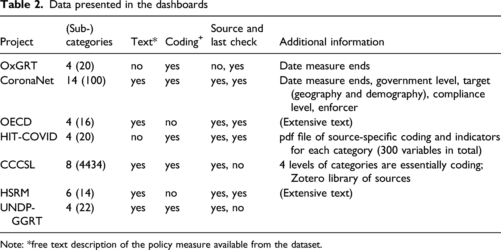
Note: *free text description of the policy measure available from the dataset.
Visualisations
Visualisation types, by project.
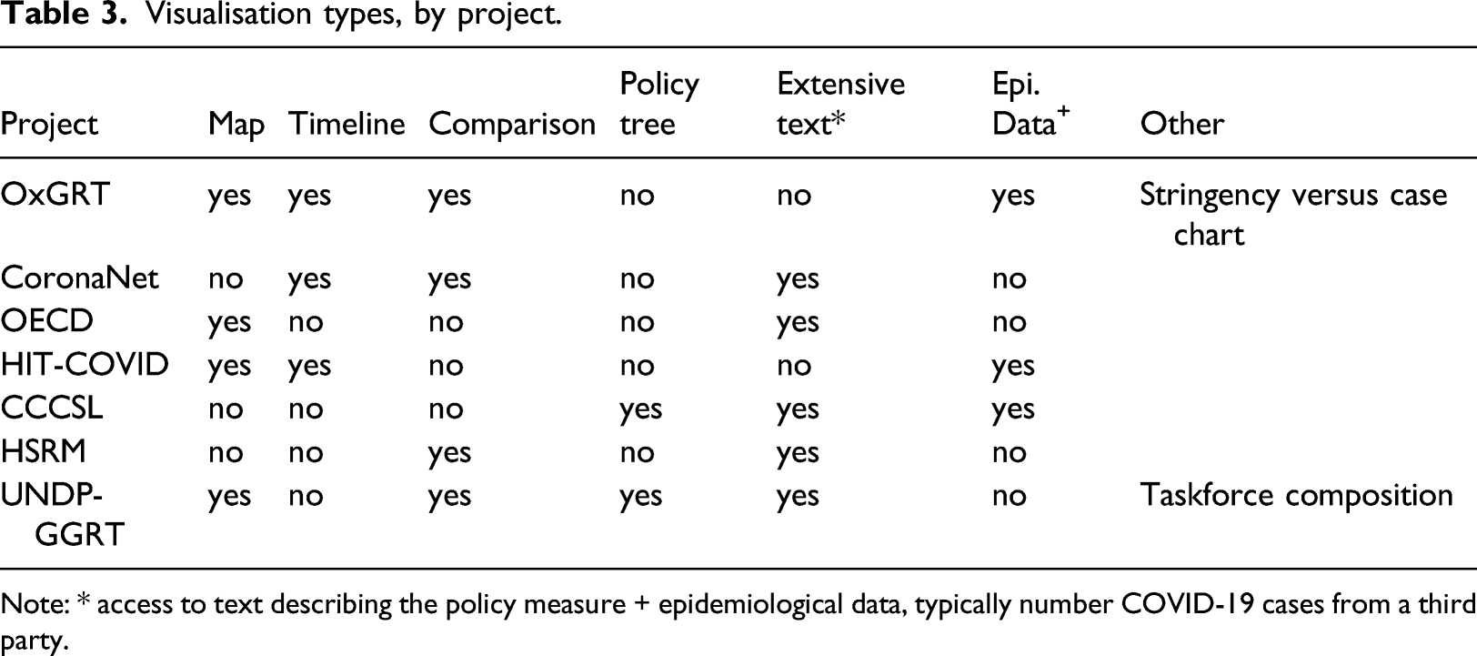
Note: * access to text describing the policy measure + epidemiological data, typically number COVID-19 cases from a third party.
Only four projects use maps, and in OECD’s case, it is only for users to access text (by clicking on the country). OxGRT’s data explorer features a heatmap of its flagship ‘stringency index’ value at the country level, using a 10-colour gradient. The index is the weighted mean of nine sub-categories that each has their stringency coded using a 3, 4- or 5-point scale. 15 For instance, the ‘workplace closing’ sub-category takes the value 1 if the closing is recommended, 2 if required for some professions and 3 if required for all-but-essential workplaces. HIT-COVID lets the user visualise its 20 indicators by ‘simplified status of policy’, which takes one of three values (and colours): ‘not implemented’, ‘partially implemented’ and ‘strongly implemented’ – a click provides the users with more details when available (around 70% of cases when we checked in April 2021). As in OxGRT’s case, it is derived from an indicator-specific assessment made by the contributor and, albeit being called implementation, it reflects whether measures were taken rather than enforced (even if the dataset does contain some extra indicators on military or police enforcement). In addition to a national-level colour code, a sub-national colour dot is also present when data are available (around 60% of the data was subnational as of April 2021). Finally, the UNDP-GGRT map displays a pie chart showing the ratio of gender-sensitive policies in each country. In all cases except OxGRT, which allows visualising the map over time, the information is the latest check for a given country, which may not be the same for every country.
Each project approaches timelines slightly differently. OxGRT shows the measures in place (in short form) for one or multiple countries; a cursor allows the user to see the situation at a given date. Another visualisation of OxGRT has the stringency index in the Y-axis and the (log) of the numbers of COVID-19 cases as the X-axis; a cloud of points represents the countries, and selected countries are highlighted. It is possible to visualise the situation on various dates. HIT-COVID presents timelines comparing either different interventions in the same country or the same intervention in different countries. Time is the Y-axis, and the implementation level of a measure is represented by a coloured square (or dot if at subnational level). CoronaNet uses a more standard presentation in which policies at the country level are horizontal bars (time is the X-axis) covering the duration of the measure – substantial details are found in a ‘policy records table’ tab. It is possible to visualise multiple countries at the same time. CCSL’s tool does not provide direct comparisons between countries, but it presents four different timelines: (a) the number of measures in each of the key categories, together with the presence of national lockdown and cordon sanitaire; (b) the same adding a line that is the smoothed daily number of new cases; (c) a timeline with a colour gradient of the smoothed daily number of new cases; and (d) the number of measures over time and by category.
Finally, CCSL and UNDP-GGRT also use relational trees to show the breakdown of measures, allowing to drill down into their respective 3-tier systems. UNDP’s approach, which was developed with the specialised firm Tableau, is more accessible and superficial than CCSL’s (see Figure 1 below for UNDP-GCRT). The trees display the number of items in each category and give a sense of their relative importance. Only CCSL’s tree is directly linked to a table containing more details for each policy measure – such as the source and comment on the policy measure – which is also available and updated to match the selection Figure 1. Tree of policy categories (UNDP-GCRT).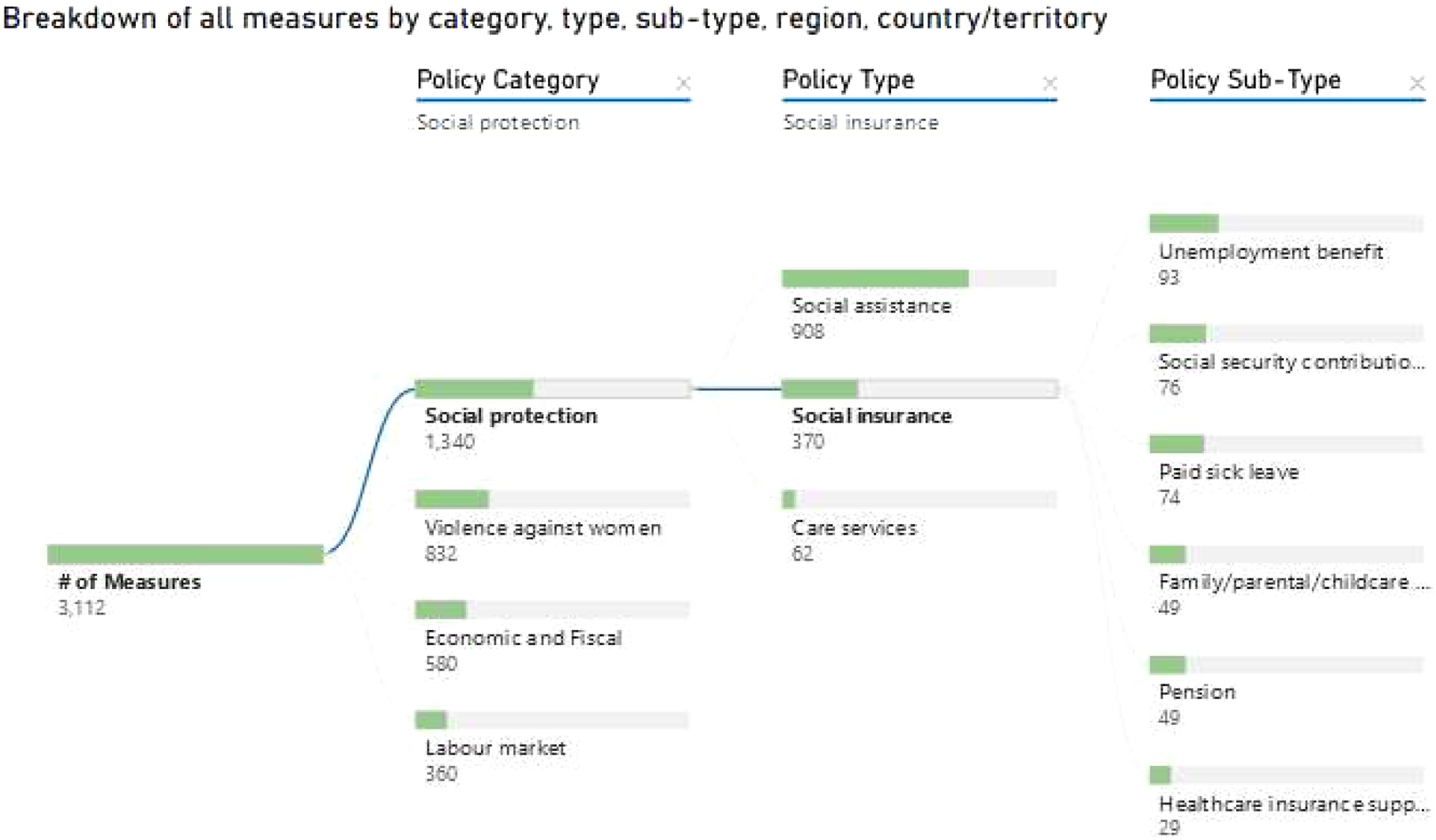
We were unable to find data allowing us to systematically describe third parties’ usage of visualisations and how they evolve over time. OxGRT’s data is part of the COVID-19 dashboard of the website ‘Our World in Data’, in a format very similar to the map we described, as well as in the Financial Times where data journalists have created a new timeline with a colour gradient for the stringency index (and compare a few countries that way). CoronaNet’s academic paper (Cheng et al., 2020b) primarily uses timelines reflecting policy activity that are not accessible through its main portal. CCSL’s presents a heatmap showing the time difference between countries when they enacted policies after 10 cases were declared (Desvars-Larrive et al., 2020).
Audience
The only project that claims a particular audience is UNDP’s. Its webpage states that ‘the Tracker can provide guidance for policymakers and evidence for advocates to ensure a gender-sensitive COVID-19 policy response’. The other projects are silent: their landing pages describe what they do but not who they do it for. The website of OxGRT, CoronaNet, HIT-COVID and to a much larger extent, UNDP-GGRT provide substantial explanation in plain language about how to use their data explorer (there is not much of a data explorer in the OECD and HSRM cases, which are more akin to a collection of pages for each country). UNDP-GGRT has the most advanced approach, with a tutorial video available in all five UN languages. CCCSL and, to a lesser extent, CoronaNet and HIT-COVID appear geared towards a more specialised, academic, audience and use more technical jargon.
Four of the project teams (CoronaNet, CCCSL, HIT-COVID and OxGRT) are founders of the COVID-19 Public Health and Social Measures (PHSM) Data Coverage Network established in March 2021. This initiative aims to provide a space for research teams behind policy trackers to network and exchange ideas, ‘with an eye towards providing a public good of a complete and accurate dataset on government responses to COVID-19’. The network was launched at a conference including representatives from 40 tracker teams as well as international organisations including the European Union, WHO, International Monetary Fund, United Nations and International Labour Organisation. A session on stakeholder expectations on trackers established that the most common use is researchers and policymakers attempting to understand the impact of measures to inform government responses (COVID-19 PHSMs Data Coverage Conference, 2021).
Looking at backlinks – that is, considering the web domains that link to a specific project– gives us a sense of the visibility of each project in the public space. As Figure 2 clearly shows, OxGRT is the most important (a different scale is needed to add it to the chart), with about tenfold as many references as its two nearest competitors, HSRM and UNDP-GGRT. Expectedly, CoronaNet and CCSL received a slight boost when their Nature papers came out, but it remains minimal in both cases. In the discussion, we present hypotheses about this striking difference in popularity among projects. Number of backlinks (websites) per tracker.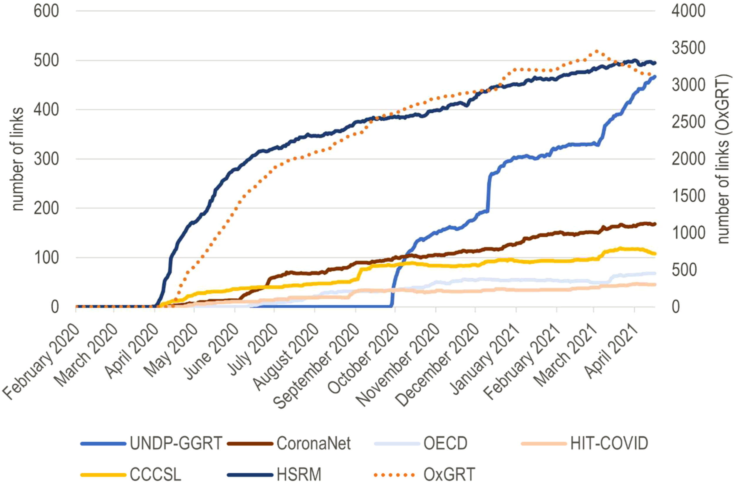
Discussion
The seven COVID-19 policy tracker initiatives we analysed present rich data not confined to the epidemiology of the disease; they are well-organised responses to calls for a holistic understanding of the effect and responses to pandemics (Douglas et al., 2020). The core outputs of the initiatives are frequently updated and interactive data explorers (dashboards). Whether built from scratch or using existing technology such as Tableau or Google Data Studio, they are visually attractive and user friendly. They include extensive, and sometimes even multilingual and video-enhanced, instructions. They also rest on a large amount of locally collected and often double-checked data. Most are structured around the categorisation and quantification of health-related policies – often with the implicit or deliberate effect of making them more ‘visualisable’. The amount of data on crisis-time policies they provide, readily accessible to all, is likely unprecedented in the history of global crises. Although most initiatives set for themselves a similarly vague objective (and most do not appear to target an explicit, specific, audience), they made different choices that reveal diverse knowledge production ecosystems and understandings of health-related policy. In this section, we discuss these differences and broader implications and lessons for health policy visualisations.
On the political economy of trackers
All trackers are large-scale endeavours that are reliant on a network of contributors. Their expertise is first and foremost with the national context they document. Data are usually available somewhere on the Internet, and contributors speak the relevant language, know which websites to consult, which media are reliable, and how to translate national policy into the format that suits the data collection framework. They may also be able to connect to gatekeepers to obtain information that is not published on the Internet. The model is ‘free-willingly extractive’: (paid or unpaid) contributors are effectively enumerators who ‘extract’ information. While their feedback is openly welcomed and encouraged by the different initiatives, their agency in shaping the process is de facto limited – in a fashion that is not dissimilar to ‘collaborative’ big data visualisations discussed in the literature (Kennedy et al., 2015). The contributors take part in an economy of knowledge production and representation that is all too common in Global Health: decisions about what is important (to show) mainly come from the initiators of the project, who are often based in institutions of the Global North, rather than from end-users (Abimbola, 2021) or the ‘field’ contributors of the project (whose collaboration is, however, fully acknowledged as vital). The websites and background papers of the various trackers show an awareness of this issue, and document attempts to be inclusive and responsive in the definition of ‘what counts’. However, the focus on relatively simple visualisations based on set categories mean that important information that does not quite fit or match the categories is relegated to text boxes that are far remote from the main channel through which people to engage with the data – when not simply erased in the process.
Sustaining data collection over time means coordinating and stimulating a network. International organisations such as UN Women or HSRM have the advantage of having networks made of in-country staff members (whose jobs may include contributing to trackers). For other trackers, the incentivisation of contributors is a challenge. Skills development, having one’s name listed among the contributors, and being invited to research projects are all strategies that have been deployed – especially by CoronaNet (Cheng et al., 2020a). Oxford’s Governance Tracker draws on labour that can be easily incentivised: students who are all too keen to be associated with Oxford’s name and alumni for whom the mapping exercise is a way to reconnect at a time of externally imposed isolation. The Internet is fraught with examples, 16 including our COVID-19 Governance Mapping Initiative, of trackers that ended up covering only a handful of countries and struggle with updates. Such initiatives typically seized the right momentum, the high emotion in the first half of 2020 and related appetite to contribute to global sense-making projects (Lachance, 2020), but often lacked a well-developed pre-existing network and strong incentives for contributors to sustain their work. The next stage for many of the surviving trackers has been to set up a formal and often vertical organisational structure (such as CoronaNet’s) 17 and transition from volunteers to paid contributors. It may also be (further) collaboration between trackers – CoronaNet and OxGRT had started a formal collaboration by the time we revised this paper.
The success of the trackers can be assessed in different ways. OxGRT, CoronaNet, CCSL and UNDP-GGRT certainly pass the bar if the criteria are coverage and frequent updates. As shown in Figure 2, OxGRT, followed by HSRM and UNDP-GGRT, appears the most authoritative if the number of backlinks is judged. The latter could be seen as a proxy of usage – trackers that are more used are also more likely to be referenced. In a context where the seven trackers effectively compete against each other (their focus is similar), a few hypotheses may explain the trackers’ visibility in the public space. HSRM and UNDP/UN women are established global actors (on European health care and gender equality, respectively), which operate inside well-established networks. HSRM barely has any visualisation on its platform. Still, the comprehensive text data is organised in categories that immediately speak to global and national actors as there are written in the language and semantics of WHO and global health debates (Fassin, 2013). UNDP-GGRT’s tracker is heavier on the visuals and uses a taxonomy and representations familiar to the actors (and critics) of gender mainstreaming: ratio of gender-sensitive policies, ratio of women in COVID-19 taskforces, etc. (Rajan et al., 2020). Even though Oxford University is very established as an institution, the case of OxGRT is more peculiar, and more research would be needed to pinpoint what exactly made it such a success. It has a polished website (and video) and was set up soon after COVID-19 became global. It is, however, not clear that it benefitted from a first-mover advantage: other initiatives started at the same time, and CCSL even started earlier. A plausible hypothesis is that OxGRT’s success is related to its easily visualisable ‘stringency index’. This ‘stringency index’ is an in-house product based on the team’s assessment of what constitutes a firm policy approach and what is worth including in the index. The team is transparent about this fact, and the ‘stringency index’ does not have much history before COVID-19. However, it quickly spread in the media as a convenient summary of a country’s COVID-19 policy situation and perfectly embodies the power of global indicators (Kelley and Simmons, 2019).
What trackers do (not) afford
The COVID-19 dashboards’ visualisations invite comparisons that are first and foremost between countries. Comparisons are the raison d’être of the initiatives we documented. They are unavoidable, and each initiative was expected to develop comparison tools (even the text-based HSRM did). Nevertheless, it is worth reflecting on what these comparisons do; choropleth maps and other comparison-based visualisations highlight differences and, willingly or unwillingly, suggest that some countries may have better, or take more (appropriate), measures than others. They often end up conveying the idea of a deficit of some sort and, therefore, a need to ‘keep up with peers’ (Kelley and Simmons, 2019). Such pressure may be beneficial, but it may also be detrimental –the difficulty with COVID-19 policies is that we (as most people) are typically not well-placed to make an informed comment on how ‘good’ a measure is (especially outside its context), contrary to health outcomes. Indeed, two complications need to be emphasised. First, policy comparisons often implicitly refer to an outcome variable, but most trackers do not define any outcome. Is it COVID-19 deaths, contaminations, excess deaths, all three? We go back to this issue at the end of this section. Second, the comparators and visualisations we examined often zoom in on one dimension, obfuscating the policy context (when at all documented) and, in turn, heightening the risk of hasty conclusions and ‘best practices’ narratives (Frenk and Moon, 2013). There are, for instance, well-documented examples of countries with very few (if any) COVID-19 cases implementing severe lockdown measures, apparently because it was the reported trend of countries seen as ‘doing well’ (Al Dahdah et al., 2021), and substantial debates about the appropriateness of such measures given their dire implications on food security and livelihoods (Haider et al., 2020).
Most of the tracker initiatives genuinely attempt to – and often manage to – allow users flexibility in their exploration of the data; for instance, by coding a high number of categories through which datasets can be explored (CCSL and CoronaNet), proposing interactive policy trees (CCSL and UNDP-GGRT), and – in all cases– being open access. At the same time, the trackers also establish categories and taxonomies that unavoidably frame debates. Such taxonomies reflect efforts to think through the set of policies that matter for COVID-19 control, and it is encouraging to see that they extend far beyond health systems. They also reveal disciplinary and socio-geographical prisms that need to be acknowledged. More preoccupying perhaps is the apparent limited theoretical or conceptual foundations of the taxonomies. The trackers (except for UNDP-GCRT) are not concerned with COVID–19-induced changes in the policymaking space that may affect the categorisation of policies – for instance, the rise of authoritarianism or taskforces that reconfigure power (Rajan et al., 2020). The trackers’ background documents and websites do not engage (much) with academic or policy debates on health governance and policy either. Ultimately, the risk is that the trackers' taxonomies, which may endure the pandemic, only add more noise to debates already saturated with idiosyncratic ‘governance frameworks’ (Meessen, 2020). As Mooney and Juhász (2020) stress, the issue with COVID-19 policy mapping is often not so much to create new information or frameworks but rather to make sense of the data.
The policy trackers mostly focus on policy measures announced by governments. Some also consider sub-national governments that can be a more relevant unit of analysis, especially in federal states. As pointed out earlier, the trackers describe policies as legal and regulatory measures. In the visualisations they produce, the trackers, do not seek to assess the actual level of enforcement of such measures (albeit some, such as HIT-COVID, have sought to collect such information). Countries with a history of disconnect between official and actual policy, or where the State has limited ability to enforce measures over its entire territory, are presented alongside countries where the ‘rule of law’ is stricter. However, the same ‘Covid-19 stringency score’ (to take OxGRT’s flagship indicator) means a different reality in Singapore, where law enforcement and obedience are strict, than in the Central African Republic, where the government’s control of its territory beyond the capital city is at best limited. Of course, and at the risk of repeating ourselves, it would be unfair to blame the trackers that never claim socio-political contexts are all equal, but some of the visualisation, and especially choropleth maps, make hasty comparisons easy.
Finally comes the ‘so what’ question. Most health policy visualisations seek to link policy and health outcomes and thereby answer a (very legitimate) question: which are the policies that ‘work’? However, the focus of most COVID-19 trackers (with OxGRT an outlier) is not linking health (-related) policies with health indicators; it is a ‘simple’ description of policies. This approach is a double-edged sword. On the one hand, the fact that most COVID-19 trackers tend not to suggest inference – which is anyway not something easy to do given the uncertainties around the disease – creates more room for a nuanced understanding of health policies and their consequences as complex and fuzzy (and often as a product of diseases as well as a cause of their prevalence). On the other hand, this lack of ready-made linkage puts the onus on the users and may defeat the purpose and value-added of visualisations, which lies in making linkages between variables clearer and more explicit (O’Neill et al., 2017)
Concluding remarks
The proliferation of COVID-19 policy trackers raises fundamental questions that our analysis could not fully answer: what are they for and which policy or academic questions do they help answer? The dashboards and visualisations reflect the perennial problem of sacrificing complexity for simplicity (Kennedy et al., 2016) and the quest for an elusive balance between them. The trackers’ visualisations focus on categorising, ranking and comparing countries – on the condition of a substantial simplification of the nuances of COVID-19 policymaking. Unsurprisingly, the most visible tracker is also the one that provides the most simplified visualisation of COVID-19 policies. Nice-looking, simple (or simplified), visualisations can be reported as ‘facts’ in the media (Jacob, 2020), but they are not necessarily of high policy or analytical value – especially when most trackers may miss the chance to point to contextual elements and do not address specific audiences (interestingly, the data provided by HSRM, which has a clear audience, is not simplified in visualisations).
The most promising part of the COVID-19 policy trackers may not be the visualisations they present but rather their approach, which adopts a broader than usual view of public health and appears genuine about freely providing a ‘common good’ to the public. The datasets are all public, sometimes in a relatively raw format (e.g. long text form), and the initiatives even provide tools for exploring them (e.g. policy trees).
Indeed, most trackers ambition to go beyond providing a top-down ‘common good’ by engaging in genuine ‘crowdsourcing for the people’ (Munro, 2013). They are, however, painfully aware that they have not reached that stage yet. For such crowdfunding to occur, approaches would need to evolve in at least two related ways. First is the question of information quality, which is commonly described as ‘fitness for use’ (Miller, 1996). Multiple frameworks have been developed to approach this question (e.g. Fadahunsi et al., 2019), and they should absolutely be used in the case of the trackers. However, without a defined audience and to be genuinely crowdsourced common goods, the trackers need to approach information as (also) ‘fitness for re-use’ and re-combination. This new definition requires quality assessment by a wide variety of potential users. Second is the question of taxonomies. The way forward may be to relinquish pre-set policy categories and taxonomies (or at least not to foreground them) – and thereby to reduce the trackers’ power to frame issues – to allow a flexible, user-driven, re-coding and re-categorising. The danger is that datasets become unusable without substantial programming experience, but artificial intelligence tools could assist with a more personalised exploration of large qualitative datasets.
There is little doubt that documenting COVID-19 policies is important. The amount of data on policy readily available as the crisis is still unfolding is likely unprecedented. However, in the absence of set questions and audiences, trackers will be most helpful if potential users have a way to ask questions and, therefore, somehow shape data collection and visualisation.
Footnotes
Declaration of conflicting interests
The author(s) declared no potential conflicts of interest with respect to the research, authorship, and/or publication of this article.
Funding
The author(s) disclosed receipt of the following financial support for the research, authorship, and/or publication of this article: This work was supported by Scottish Funding Council - GCRF (Urgency Fund) and CovidAction.