
Abstract
This article questions the rhetoric of objectivity attached to cartographies of migration and their relationship to a contemporary political context. A search on Google Images for the keywords ‘migration’ + ‘Europe’ allows us to observe the increasing popularity of maps to portray displacements of people. These maps are created by geographers and analysts from data collected and compiled by international organisations and NGOs. These visual messages are widely disseminated in mainstream media, research papers and educational resources. An examination of these cartographies shows that in their greater part they are representing human displacements by broad arrows, often in warm colours, pointing in the direction of European countries. These cartographies have a war-like aspect conveying the idea of a threatening invasion. How can one reveal the relationships between the messaging conveyed by migration mappings and the public narratives on the same topic? Building on a wide scholarship on critical geography and on art historian Aby Warburg’s theories on the survival of images later theorised by Georges Didi-Huberman, this article focuses on cartographies illustrating the so-called 2015 migration ‘crisis’ to highlight the collective imaginary attached to mainstream cartographies of migration. As a first step, it provides an historical perspective on the way this kind of messaging has impacted visual descriptions of human mobilities to the point of influencing the Brexit referendum campaign. As a second step, it explores the experimental cartographies created by geographers and artists that embrace subjectivity and offer unique overviews of the experience of the border.
Keywords
‘Pre-existing dysfunction in the asylum system was laid bare by an increased number of people but we have continued to focus on the numbers and not the dysfunction’ (Collett, 2017). Commenting the so-called 2015 ‘migration crisis’, Elizabeth Collett, Founding Director of the Migration Policy Institute (MPI) Europe and Senior Advisor to MPI’s Transatlantic Council on Migration, suggests that behind the question of the data lies a political question.
A search on Google Images for the keywords ‘migration’ + ‘Europe’+ ‘crisis’ allows to observe the increasing popularity of maps to portray contemporary displacements of people. These maps are created by geographers and analysts from data collected and compiled by international organisations and NGOs. These visual messages are widely disseminated in mainstream media, research papers and educational resources. An examination of these cartographies shows that in their greater part they are representing human displacements by broad arrows, often in warm colours, pointing in the direction of European countries. If drawing on Collett, a political crisis lies behind a crisis numbers, these cartographies would take place in the wider social imaginary of the European communities.
As Charles Taylor (2002) and later Benedict Anderson (2006) have conceptualised, social communities are made of social imaginaries whose aesthetics form one main component. According to Cornelius Castoriadis (1999: 8), the imaginary ‘it is not an image of. It is the unceasing and essentially undetermined (social-historical and psychological) creation of figures/forms/images, on the basis of which alone there can ever be a question of something. What we call “reality” and “rationality” are its works’ 1 . Social communities would not be a given fact but would be made of a collective imaginary.
Applied to the field of cartography, Castoriadis’ view challenges the rhetoric of objectivity guiding the scientific mode of knowledge largely adopted during the second half of the 20th century and which is predominant in today’s maps (Crampton and Krygier, 2010: 52 and 39). Born from the theory of information developed by mathematician Claude Shannon, this model entails that information would be countable and fungible, and thus reducible to binary conclusions (Crampton and Krygier, 2010: 51 and 52). This approach has been called into question by geographical literature on critical cartography represented, for example, by Jeremy Crampton, John Krygier, Denis Wood and Mark Monmonnier as well as by alternative forms of mapping described in particular by Philippe Rekacewicz, Nepthys Zwer, Martina Tazzioli and Glenda Garreli. These counter models ask what the implications of the scientific mode of knowledge are, and whether alternative ways of knowing are possible (Crampton and Krygier, 2010: 40). In line with this scholarship, political geographers Henk van Houtum and Rodrigo Bueno Lacy designate the instrumentalization of maps as ‘cartopolitics’, that is as a ‘political discourse that relies on cartography to b/order geography and thus to b/order history, culture and people through the geographical imaginations that maps arouse ‘(2020: 164). The spelling of the word ‘border’ is separated by a slash between the ‘b’ and the ‘o’ to highlight the power exercised through the making and the dissemination of cartographies.
Having for main hypothesis that cartographies of migrations are subjected to the influence of other visual content such as mainstream media images, this article explores how contested forms of counter-geographies have been used as alternative ways of cartopolitics during the period. To this end, it combines critical geography with the framework of visual anthropology as embraced by art historian Hans Belting (2011). According to this perspective, the human subject is thought of as homo pictor – a being who shapes images, who produces images of the world and who, through these images, gives oneself a world: ‘We live with images and we understand the world in images’ (Belting, 2011: 9).
Drawing on a selection of alternative cartographies and art works produced to document the so-called 2015 crisis, two contrasting visual approaches are considered. If we first assume that cartographies are inscribed into a wider visual tradition of a war-like nature that can influence political language (1), then exploring a formal laboratory constituted by experimental geography and contemporary art could calm down the mood created by the mainstream data visualisation habit in a manner that is conducive to deferral policies. These visual forms could influence mainstream data visualisation of migration to trigger a more welcoming atmosphere (2).
The misleading rhetoric of objectivity in mainstream cartographies of migration
To reveal the influence of other visual content on cartographies mapping the 2015 ‘migratory crisis’, I will first build on critical geography’s scholarship which shifts attention from the ‘form’ of the map to its ‘meaning for behaviour’ and which, instead of asking whether the brain was overcharged with the density of symbols, asks how the body of the subject was constructed by the map, that is, how the map oppressed, subjugated, or otherwise impinged on people (Wood and Krygier, 2009: 342). Combining this perspective with art historian Aby Warburg’s notion of ‘survival images’, I will then examine how this kind of data visualisation deals with one political context, that of the Brexit referendum campaign.
In the social imaginary of migration, exiles are gathered in three main administrative categories: regular migrants, undocumented migrants, and other migrants. Other categories also exist that include stateless persons, victims of trafficking, unaccompanied children and unsuccessful asylum seekers, who also seek protection under international law. Moreover, an exile ‘can fall into two categories (asylum seeker and victim of trafficking for example) or move from one category to another (undocumented migrant in country A and asylum seeker in country B)’ (Ktistakis, 2014: 10). These complex and politicised classifications are handled with difficulty by media. Regarding the journalists’ use of data, Ann Singleton, Senior Research Fellow in the School for Policy Studies of the University of Bristol and co-editor of the IOM handbook series Fatal Journeys, Improving Data on Missing Migrants, observes that: ‘The limited knowledge and technical understanding of migration that prevails among many media professionals, as well as the lack of migration information and data available to inform the work of even well-intentioned journalists often results in reporting that reduces migration to its extremes’ (2017: 55). The excluding aspect of migratory policies transpires in visual language, more specifically in the field of cartography. An overview of these data visualisations shows that in their greater part they are representing human displacements through menacing broad arrows designated by van Houtum and Bueno Lacy under the term ‘the invasion arrows’ (2020). What is the origin of this repeated way of visualising migratory movements?
The notion of the ‘survival image’ has been experimented in practice by the art historian Aby Warburg through the making of his Mnemosyne Atlas (2012). This iconographic collection reveals the afterlives of Western Antiquity representation modes, especially through the statuary produced during the Renaissance, and in later periods of art history. The Mnemosyne Atlas constitutes an attempt to map the ‘afterlives of images’ by showing how images of great symbolic, intellectual, and emotional power emerge in Western antiquity and then reappear and are reanimated in the art, maps, newspapers and magazines of later times and places.
Some ‘survival images’ of symbolic relevance to today’s cartographies of migration seem to be historical maps of foreign invasions, such as depictions of the German invasion of French territory during World War II. The importance of this type of cartographic visualisation in the collective imagination has been facilitated by its diffusion in the cinema. As shown by Tom Conley in his essay Cartographic Cinema (2007), cartographies are present, more or less explicitly, in a majority of films. The experience of contemplating a map would be ‘co-extensive’ of that of watching a film (2007: 1). For Conley, cartographies would be a way of viewing cinema. To the extent that images, such as cartographies, are human made, the anthropological perspective on them leads us to consider cartographies as ways of viewing policymaking.
Following Teresa Castro’s observation (2011: 250), the proliferation of cartographic tools that enable us to geo-locate individuals in real time are extensions of paper-based cartographies and they constitute disciplinary devices. With regard to the scale of the surveillance technologies being deployed at the borders with the aim to deter individuals, for example, in the Mediterranean Sea, today’s cartographies of migrants’ arrivals in Europe appear as the afterlives of yesterday’s military invasions. These cartographies of a war-like aspect convey the idea of a threatening invasion that also contaminates the collective imaginary of mainstream media images of the 2015 ‘crisis’. Critical geographers confirm that modern cartography was born from military intelligence which implies that nowadays ‘“Peace” cartographies are not divorced from war cartographies’ (Crampton and Krygier, 2010: 61). Moreover, these cartographies are involved into an iterative process with other elements of the visual culture which dealing with same topics.
Before borders were closed, migrations by land, especially by the Balkan route, have been photographed to portray endless lines of people. In these photographs, the choice of framing is crucial. Playing on this approach, the main pro-Brexit political party successfully used the journalist Jeffrey Mitchell’s photograph of an endless queue of refugees walking along the Croatian-Slovenian border (Figures 1 and 2). Refugees arriving to Slovenia, Jeff Mitchell/Getty Images, October 2015. UK Independence Party leader Nigel Farage poses during a media launch for an EU referendum poster in London on June 16, 2016, Stefan Wermuth/Reuters.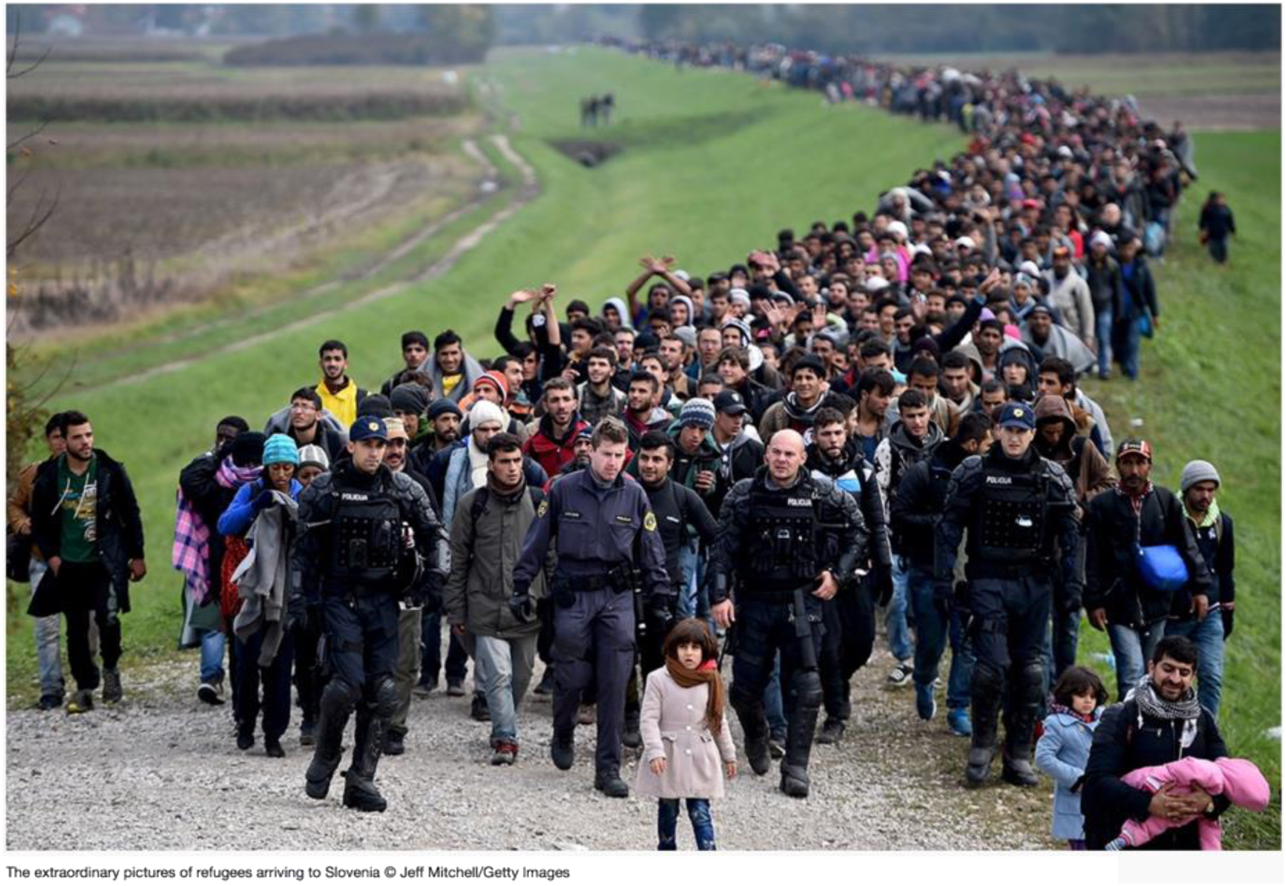
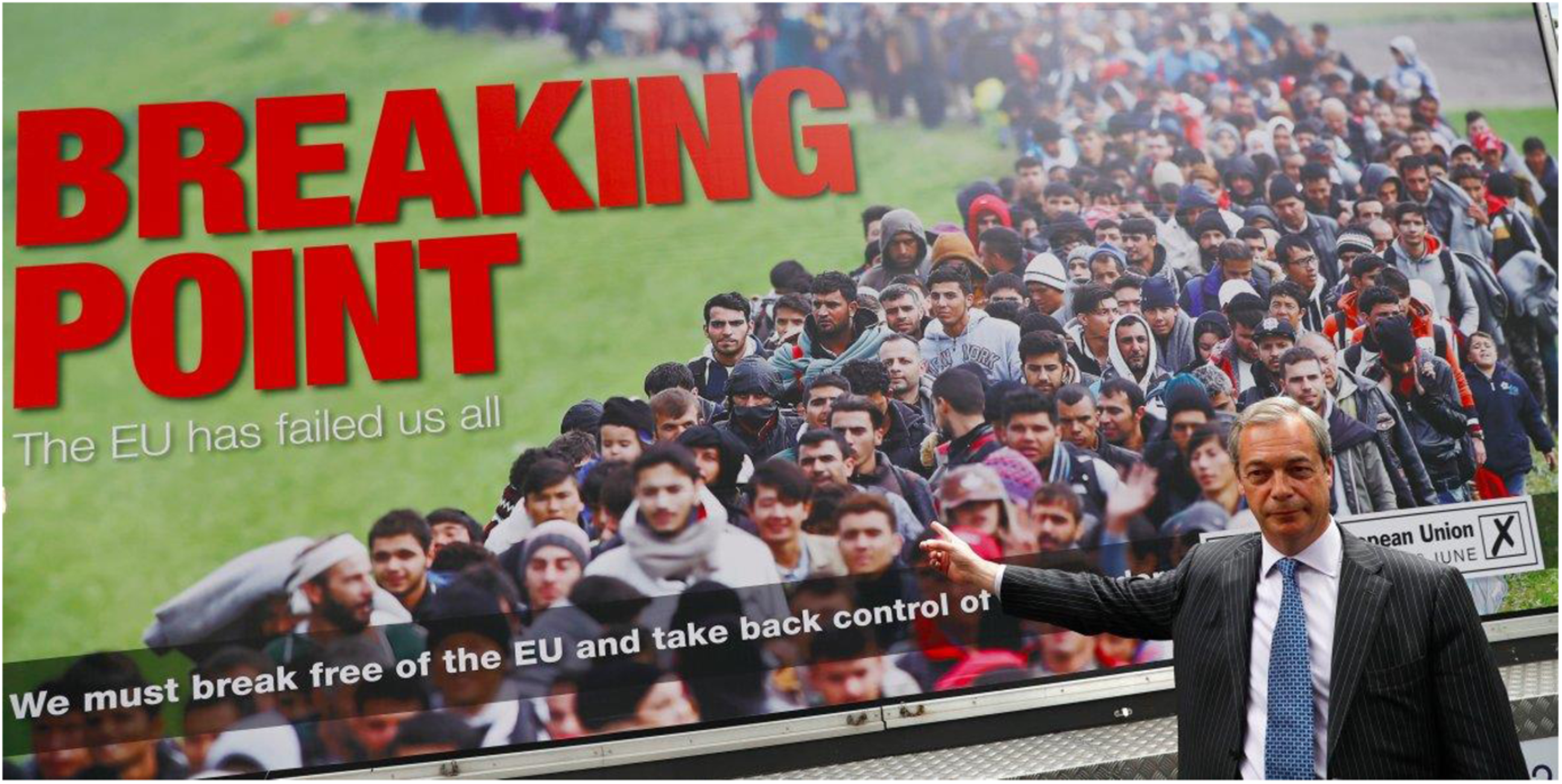
This photograph, displayed on a truck by the UK Independence Party leader Nigel Farage, emblematised a specific use of images in the service of border shutdown agendas. As art historian Antigoni Memou observes (2019: 8), the line of refugees walking to the Croatian-Slovenian border are in stark contrast with the stillness of Farage when posing for his campaign in front of the image. Furthermore, in Mitchell’s photograph, the beginning and the end of the queues are kept out of frame conveying the feeling of an endless line. Opponents to Farage’s UKIP movement denounced the similarity of Mitchell’s photograph to images of Nazi propaganda broadcast in 2005 in a BBC documentary (2016). If Godwin’s law has been invoked in relation to this comparison, effectively ending the debate, the historical reference remains telling regarding the symbolic mark and afterlives of motifs associating migration with invasion.
Afterlives of war-like cartographies also transpire in political leaders’ speeches. In July 2015, when asked about the migrants trying to reach Britain by Calais, the British Prime minister at the time, David Cameron, referred to ‘a swarm of people coming across the Mediterranean, seeking a better life, wanting to come to Britain because Britain has got jobs, it’s got a growing economy, it’s an incredible place to live’ (BBC News, 2015). His words were condemned by opponents and activists regretting the world leader’s ‘dehumanising language’. After the referendum, the think tank British Future held a survey showing that around two-thirds (64%) of interviewees felt that the referendum campaign became ‘dangerously overheated’ regarding the immigration debate (2016: 7). If the imprint in the words and in the minds of menacing mainstream images of migration contributed to this feeling, this impact must be all the stronger when it comes to official images.
Official cartographies of the European Union, as in, for example, the map below produced by Frontex, also seem to visually perpetuate the ‘dehumanising language’ of this discursive heritage. Moreover, being an official document provided in a public report by a democratic international organisation, the source reinforces its legitimacy (Figure 3). Frontex map, FRAN Quarterly, Quarter 2, April–June 2017.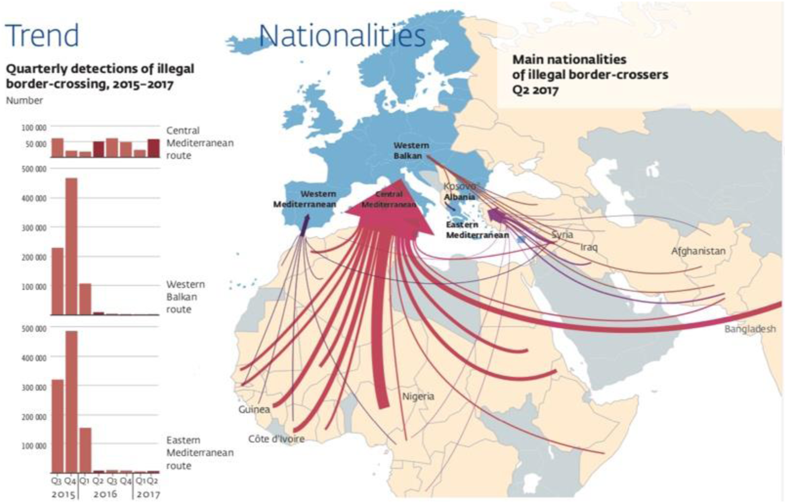
As demonstrated by van Houtum and Bueno Lacy, by analysing the map’s grid, its frame, and its arrows, the undertones of neutrality and objectivity this map conveys appear to be fraudulent (2020). Bearer of a tradition of threatening encirclement, the Frontex map constitutes an example of cartopolitics in the sense in which it manufactures ‘perceptions of all-encompassing geographical scale, […] implant[ing] in people’s heads a mediated reality – ideas of the world people acquire not through first-hand experience but through representations that other people have made of it’ (Van Houtum and Bueno Lacy, 2020: 207 and 213). Being the norm rather than the exception, this kind of cartography takes place in a larger discourse in which it can be seen as a reading grid of migratory policies. Coined by anthropologist Nicholas De Genova as ‘Border Spectacle’, this wider framework is defined as ‘a heterogeneous assemblage of discrepant state and non-state actors, beginning first of all with the diverse formations of human mobility that we come to know as migrant or refugee movements, which states and capital seek to subordinate and discipline in various ways’ (2018). Narratives, images and maps reporting border enforcements in this context stage insubordination and indiscipline. Border spectacle is pictured as being ‘“out of control,” and associated with the discourses and images of “invasions” or “floods” of migrants and/or refugees’ (2018). The width of the arrow leads to think that the amount of population converging to Europe is massive and contributes to this spectacle whereas ‘the statistics show that it was about 600,000 to 900,000 people arriving in Europe over a period of 3 years, i.e. between 200,000 and 300,000 people per year for a population of about 508 million at that time, i.e. between 0.04% and 0.06% 2 ’ (Zwer and Rekacewicz, 2021: 73). Similarly, the choice of the colour red associates these arrivals with the idea of a threat. As cartographer Mark Monmonnier notices in his seminal book How to Lie with Maps (1996): ‘Most colors […] relate to several concepts, favorable and unfavorable. Red, for instance, is associated with fire, warning, heat, blood, anger, courage, power, love, material force, and Communism, and its effect probably depends very much upon context’ (1996: 170–171). The context of the Frontex map is that of today’s Border Spectacle, a spectacle which, following the situationist philosopher Guy Debord’s conception, is not a set of images; rather, it is a social relationship between people that is mediated by images (1967: 19). The social relationships born from border spectacle thus act deep down in the mind to intertwine migratory policies and the cartographies that are related to this topic. Instrumentalised by populist parties (Van Houtum and Bueno Lacy, 2020: 207), maps making use of the “invasion of arrows” constitute a cartopolitics that exacerbate migrants’ otherness and perpetuates exclusionary policies.
However, while cartographies such as the Frontex map are repeated by the mainstream and are deeply rooted in the collective imaginary of migration, this kind of data visualisation does seem to be avoidable. In their recent book Cartographie radicale. Explorations, Nepthys Zwer and Phlippe Rekacewicz suggest, for example, one way to avoid arrows in cartographies of migration. The authors recall the existence of ‘Isotypes’ that are pictograms created by cartographers Marie Reidemeister/Neurath and Otto Neurath in the 1930s to represent the map’s key elements. This ‘language’ made of thousands of pictorial signs (Krygier, 2009) has been used by Neurath in 1930 to picture the migratory movements by land and by sea through main countries of the globe. The Austrian scholar retraced these circulations by detailing the migratory balance of each of country. When the Frontex map was depicting one-way displacements with disproportionate arrows, Neurath’s map highlights that migratory movements affect countries both in terms of arrival and of departures. Far from the ‘sole message of the invasion’ conveyed in the cartopolitics governing the Frontex map (Zwer and Rekacewicz, 2021: 77), the symbol chosen for all countries by Neurath is a same walking character that recalls the human dimension of these mobilities (Figure 4). Wanderbewegung wichtiger Länder (Migration of major countries) 1920-1927, Otto Neurath, 1930.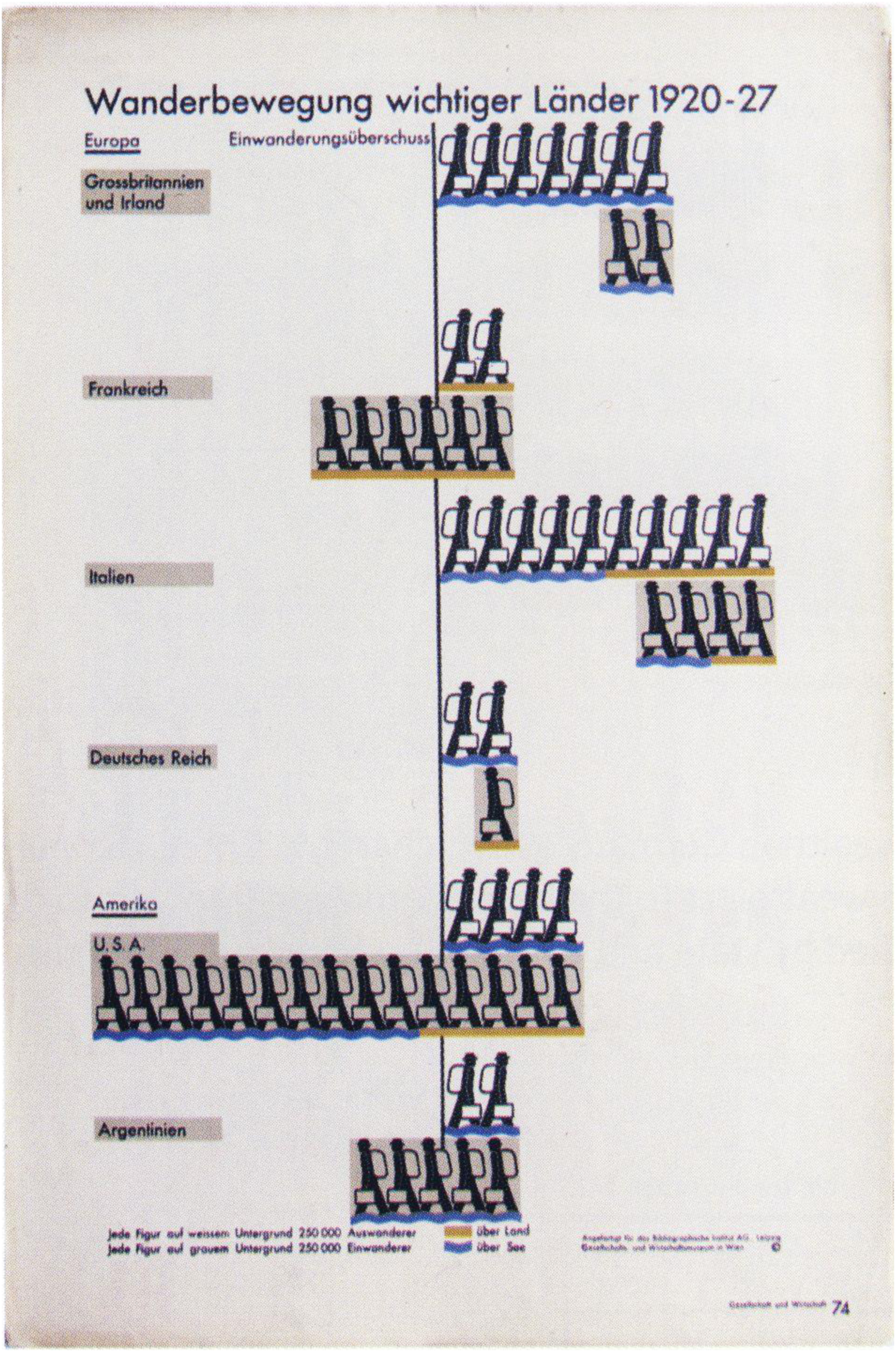
Heirs of Neurath’s cartographies, hundreds of ongoing projects throughout the world aim today to bring a social change through mapping. In line with the notion of ‘critical geography’, that appeared in France in the 1970s and in the English-speaking world in the 1980s, this movement within the field of cartography is characterised by methodological and conceptual experiments aiming to produce a renewed relationship to the world (Zwer and Rekacewicz, 2021: 10 and 14). For these cartographers, questioning dominant cartographies implies ‘Rather than discussing the relevance of certain cartographic proposals which, in the end, are neither right nor wrong in the sense that they illustrate the more or less laudable intention of their designer, […] to carry out a cartographic analysis which takes the form of a constructive and reproducible critical demonstration (Bahoken and Lambert 2020). Following section analyses a selection of counter cartographies challenging dominant trend in cartography from which is stemming the Frontex map.
Jostling visual cartographic habits to change the perspective on migratory policies
If, following the perspective of visual anthropology, cartographies can be seen as reading grids of the migratory systems, artistic practices belonging to the aesthetics of subversion (Mazzara, 2019) could constitute an ‘oppositional force’ (Demos, 2013: xv) to counteract the dominant imaginary of migration. To explore this assumption, I will consider experimental cartographies created by geographers, in particular those associating directly with migrants in their making, and I will look at cartographies made by artists from the countries of departure of today’s migrants.
As Ann Singleton explains, various actors including Eurostat, the European Asylum Support Office (EASO), the IOM, the European Border and Coast Guard Agency (Frontex), the UNHCR and a whole ‘industry of migration specialists’, governments, think tanks and academic research centres, are all dependent on the same set of national sources and on some European Union operational data (2016: 3). Yet, these various organisations might provide diverging figures about the same topic.
Regarding the number of arrivals by the Mediterranean, it is arduous, for instance, to follow one segment of the population on their migratory journey to Europe. With the help of the IOM data, it is feasible to isolate how many people arrived by the Mediterranean in one particular year. With the help of the EASO data, one can estimate to what extent people applied for ‘international protection’ in Europe. With Eurostat, one can know the number of asylum applications. However, on the whole, it is not possible to know for certain how many people who arrived by the Mediterranean applied for asylum.
Besides, the data coming from various agencies does not seem to be appropriately aggregated. For example, to comprehend the total number of departures by the Central Mediterranean, the Frontex data regarding Illegal Border Crossings by this path cannot seem to be combined with IOM data on death by the route. Consequently, both these data sources cannot be correlated to provide an overview of the dangerousness of this migratory route. For Minos Mouzourakis, Asylum Information Database Coordinator at the European Council on Refugees and Exiles (ECRE), these discrepancies should alert us to the difficulties encountered by the Union’s web of sources in producing accurate and coherent asylum statistics (2014: 5).
In his maps, Rekacewicz is embracing this quest for accuracy. To this end, he realises pencil-hand drawn maps instead of using digital mapping and rehabilitates sketching to be a form derived as closely as possible from his emotions. In a cartography called The map of the great wheel, Rekacewicz rebalances the relationship between the two continents of Europe and Africa. In an interview with Delphine Papin (2020), Rekacewicz explains that he focused on ‘the interactions, the systems’, before he even represented the world. Instead of inserting large arrows pointing to Europe, positioning this continent as the victim of a menacing invasion, Rekacewicz draws a more balanced composition. He reveals the commercial and industrial interests that European countries have in the African continent by tracing two wheels, one for each continent, interconnected by the circulations of individuals, knowledge and values (Figure 5). The map of the great wheel, Philippe Rekacewicz, 2007.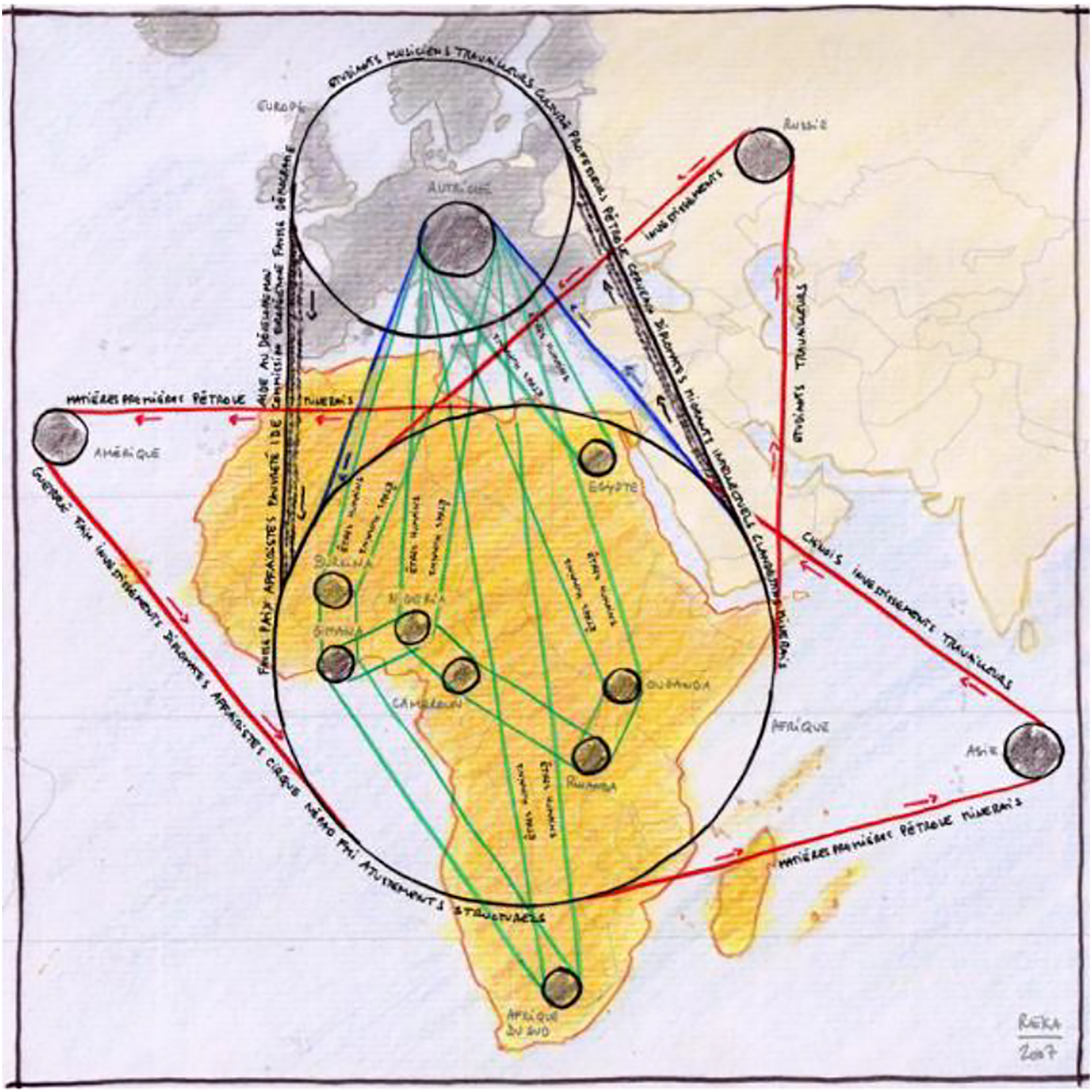
Rekacewicz appreciates that ‘in this kind of mapping, precision isn’t important anymore as we are not seeking to fly an aircraft or to plan an urban area, but we are looking for understanding systems, processes and movements, for which the precision doesn’t matter as long as we manage to make understandable the links in between all elements represented on the map: the migrants and its relationship to border, to territories. The spatial organisation and functioning of societies, and how they produce and manage their territories. I like the idea of rehabilitating the cartographic imprecision’.
From this perspective, maps are understood as intellectual constructions rather than as ‘faithful representations of reality’. Rather, maps are understood as phenomenological tools, as visual translations of the experience of migration.
In this vein, geographer Nicolas Lambert’s map is called ‘La Butte rouge’ migratoire
3
(2017: 128) as a reference to the title of an anti-war song from 1923. This cartography deals with the number of disappearances caused by border crossings between 1993 and 2016. The number for the period reaches 40,000 deaths. The information is materialised in two ways. First, a histogram displayed on the left-hand side provides a chronological repartition through the years. Second, the map shows the geographical split around the Schengen territory. Furthermore, the map is inclined, as if the point of view on the represented lands would be from a Southern country inhabitant’s perspective. This specific orientation also allows us to visualise the reliefs. Using the visual grammar attached to landscape representations, the geographer has chosen to materialise the number of deaths by hills and mountains. The higher they look, the deadlier is the border. Of several hundred kilometres in length, the Central Mediterranean route between African and European shores is characterised by far by the highest peak (Figure 6). La butte rouge migratoire, Nicolas Lambert, 2017.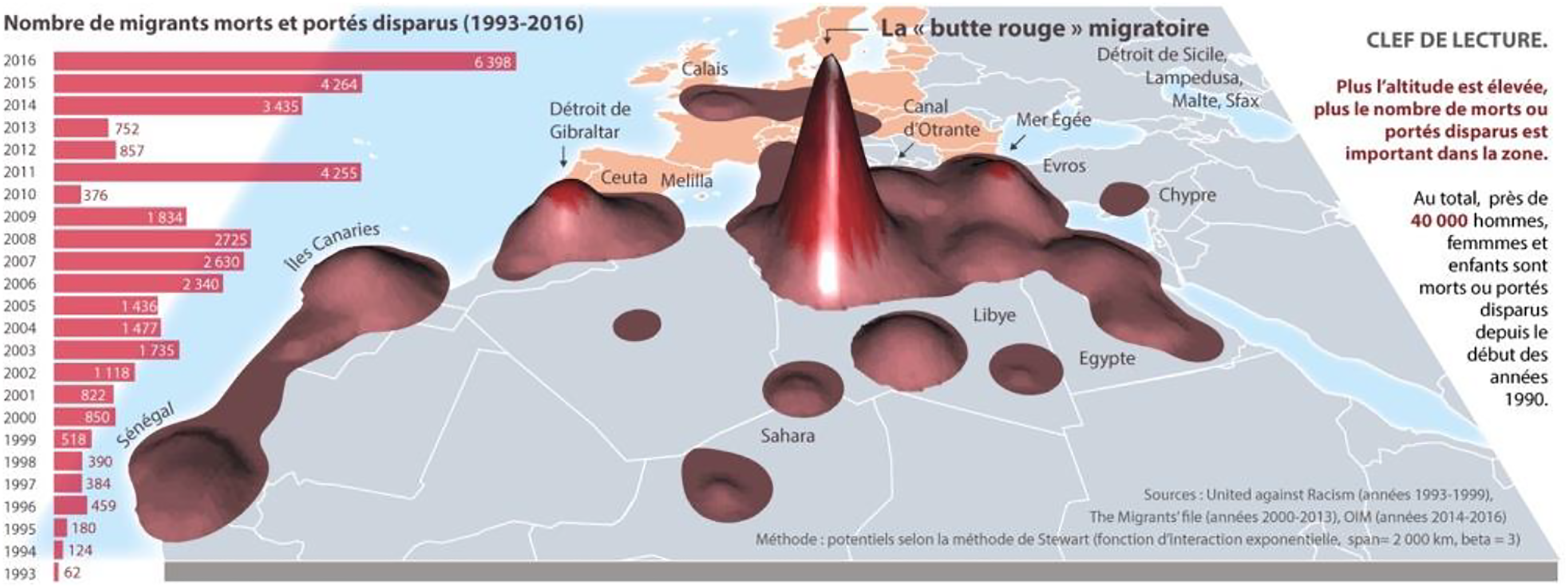
In this map, data are used not as devices encapsulating a phenomenon, but as tools ostensibly materialising the facts they reflect. From the African perspective highlighted, crossing the Mediterranean Sea returns the exile to a situation where they must overcome a deadly bulwark. The price of war, persecution, deprivation and despair has to be paid at a heavy price. Sustaining hope for a better life, or for life itself, represents a return to an acceptance of losing it. Put another way, exiles appear to be plunged into a despair that is deep enough to make them prefer placing their life at risk, rather than staying in their homelands. This topographical visualisation calls for alternative representations of the territories challenging Westphalian imaginary on nation-states underpining dominant cartographies such as the Frontex map (Tazzioli and Garelli, 2019: 397). It recalls the world map, created in 1154, by the Sicilian Arab cartographer Muhammad Al-Idrisi. Upside down compared to Western cartographies, this ancient map challenges today’s imaginaries of the Mediterranean (2013: 327) (Figure 7). World map, Muhammad Al-Idrisi, 1154.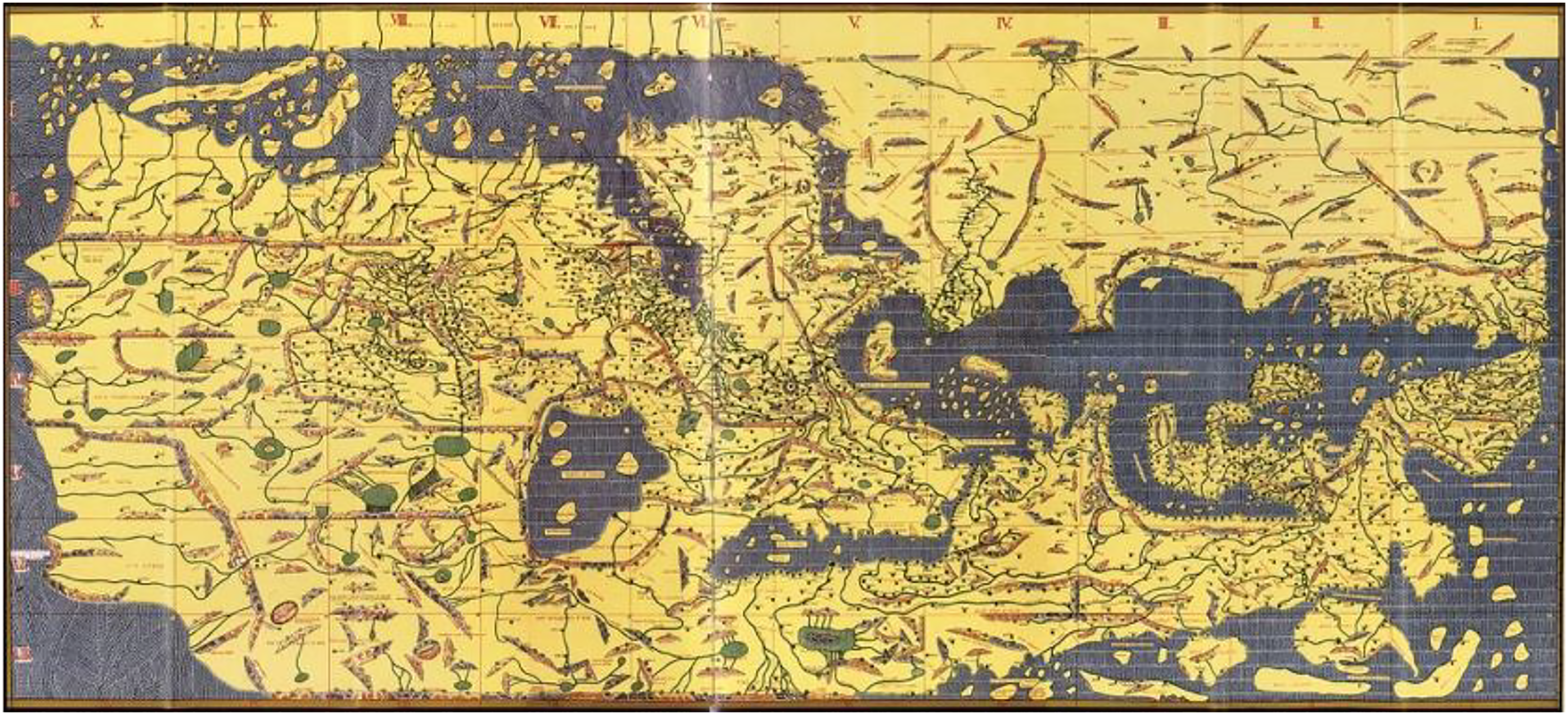
In 2017, the same year than La Butte Rouge migratoire, another cartographer adopted a change in perspective. The aerial view of the Mediterranean Sea published by Levi Westerveld in the Swiss newspaper, Le Temps (2017), breaks with the usual North/South representations. The North is designated with a black line, as if it was a skyline from an African point of view. Each red dot stands for 17 deaths that resemble pools of blood off the coasts of the European territories of Lampedusa and Malta (Figure 8). Those Who Did Not Cross, Levi Westerveld, 2017.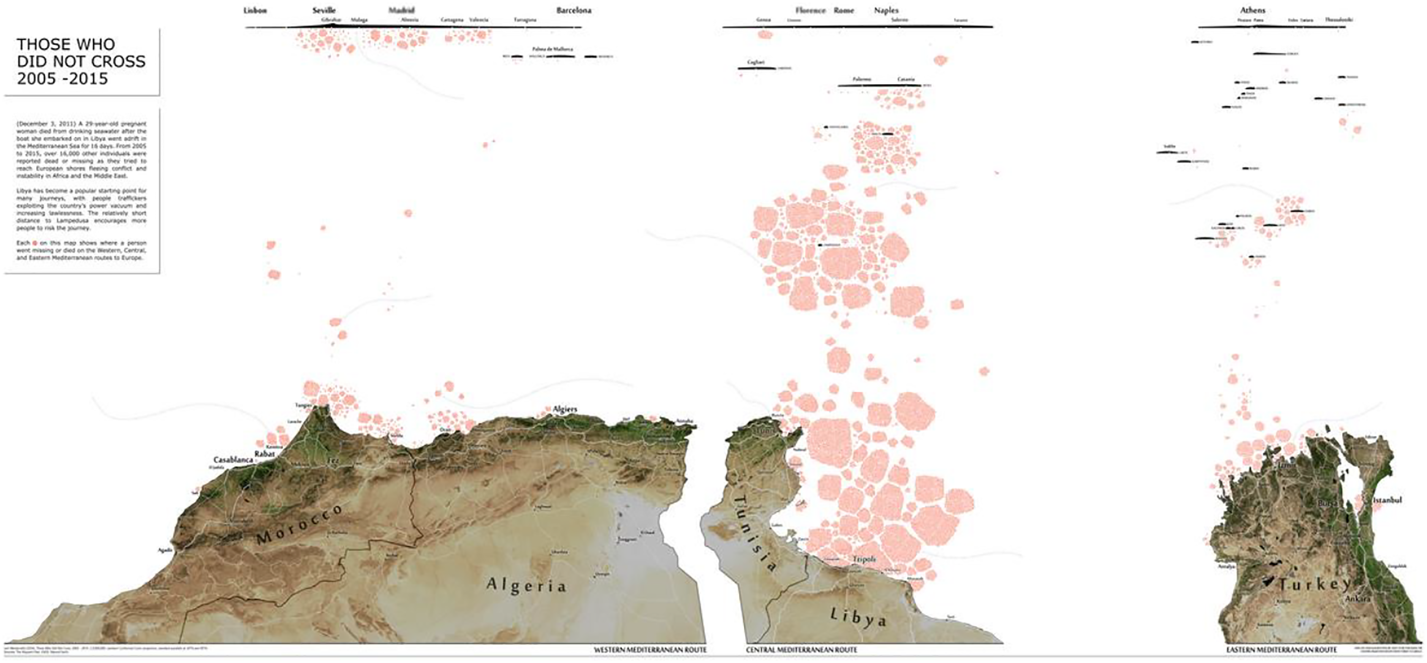
In line with both Kitchin and Dodge who assume that a map is ‘a co-constitutive production between inscription, individual and world’ (2007: 335) and with Pickles who offers a way of thinking mapping that denaturalises and deprofessionalises cartography (2004: 17), geographers Sarah Mekdjian and Anne-Laure Amilhat Szary put pens in asylum seekers’ hands so they could report their journeys toward Europe through experimental cartographies on paper and various materials. A series of workshops conducted by Mekdjian and Amilhat Szary helped create a unique set of pictograms that compose a shared legend. For example, red dots stand for danger, yellow dots for being cold, brown dots for being lucky, and so on (Mekdjian and Amilhat Szary, 2018: 1). At the Migreurop Observatory of the borders, other geographers also created participatory mapping workshops in which refugees could make their own cartographies.
In the City Plaza, a former squatted hotel in Athens which used to host more than 700 refugees, a florist Kurdish refugee from Syria, Mustafa Hadj Rasheed, drew a map that associates the path to France to a series of emotions. The map he creates is a means of expression ‘which says a lot about the physical and moral ordeals that Mustafa has gone through and which shows the migratory experience that has become daily, through the prism of emotions and memories: the departure, the uncertainty about the routes, the fear, the difficult living conditions, the impossibility sometimes to find food or something to take care of, the racism in some countries… and the relief of having arrived and being able to settle in France where Mustafa has been since March 2017’ (Migreurop Facebook account, 2017, personal translation) (Figure 9). We Are Not Refugees We Are Human, Mustafa Hadj Rasheed, 2017.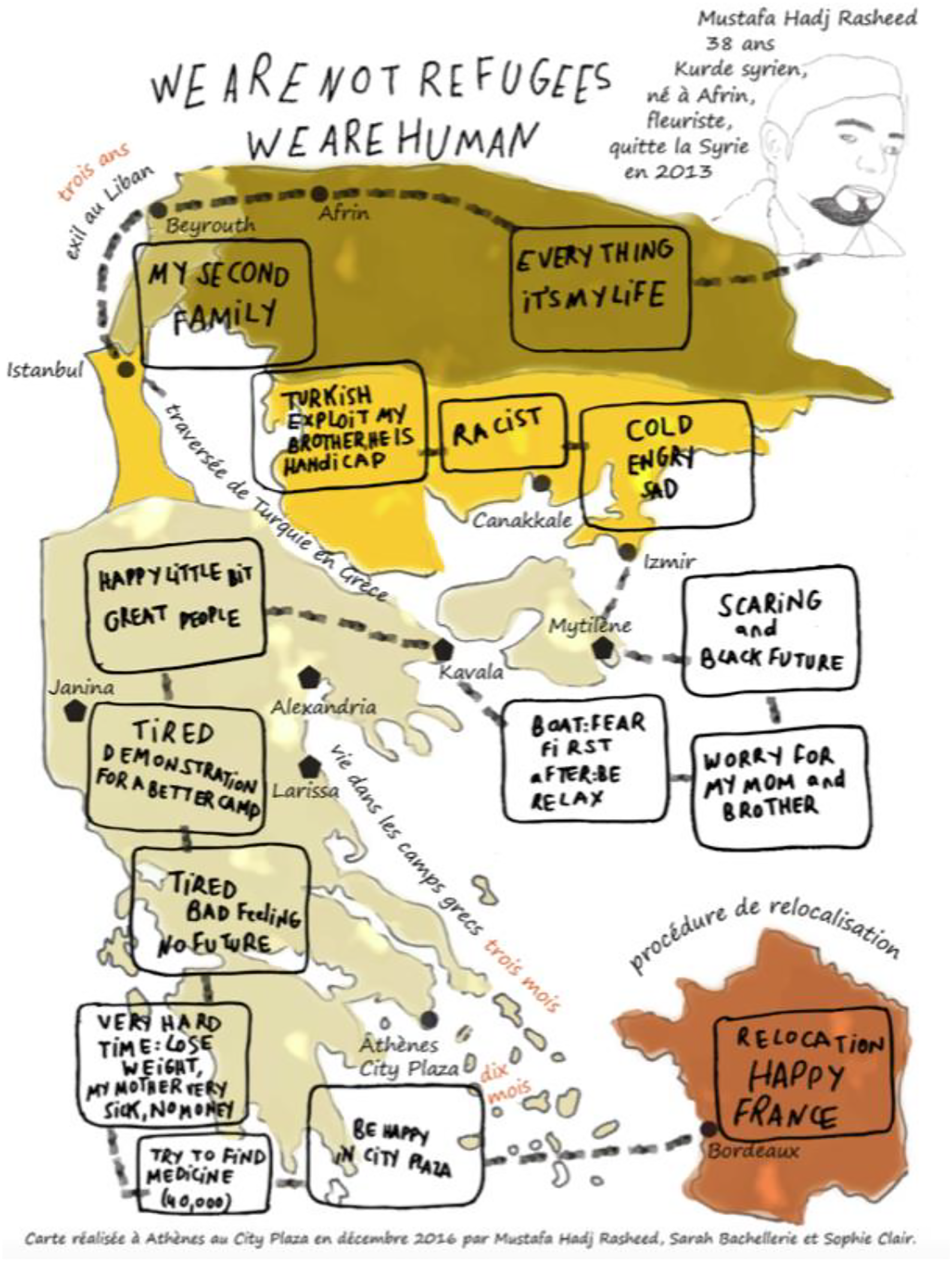
Overcoming the polarised debate adopted by cartographies emphasising the world’s partition into dividing lines, Hadj Rasheed’s visualisation attaches the territories he describes to a sensitive experience of the border. Being a phenomenological tool, this kind of map challenges not only the European defensive vision embodied in the Frontex map, but also the notion of data transcription. It stands in line with psychogeography, a concept created by Debord, later experimented by the art collective Glowlab to describe projects that ‘produce AFFECT in relation to the geographic environment’ (Glowlab Art Collective, 2005). Cartographies made by the primarily concerned individuals can defuse debates around data accuracy and about the so-called burden that refugees might become for Western countries. They allow more than the possibility of visualising migratory paths, as they draw a phenomenology of exile that places political debates in the sphere of the human. By expressing the consequences of European migratory policies, these alternative cartographies recall that migration is above all a human experience and that, as such, it should be handled accordingly, by putting human concerns at its core.
Far from the mathematical dimension of the scientific mode of knowledge, contemporary artists from the countries of departure of today’s asylum seekers are at the forefront of data visualisations embracing the author’s subjectivity, in that they have created their images prior to other practical implementations.
These artists do more than rebalancing the relationship between countries of destination and countries of departure, for they move beyond the victims/perpetrators debate. In 2010, Algerian visual artist Zineddine Bessaï stepped back and created a map called H-Out. The Immigration Guide. The letter H stands for ‘Hell’ and ‘Harraga’. This Arabic expression designates the ‘burners’, namely the North African migrants who burn their identity papers to escape European authorities. A saying acts as a sub-title: I’d rather be eaten by the fish than by worms (Laggoune, 2017, and online chat with the artist, 2020). It makes reference to this slang expression, and to the way of life that has developed among Algerian youth (Figure 10). H-Out. The Immigration Guide, Zineddine Bessaï, 2010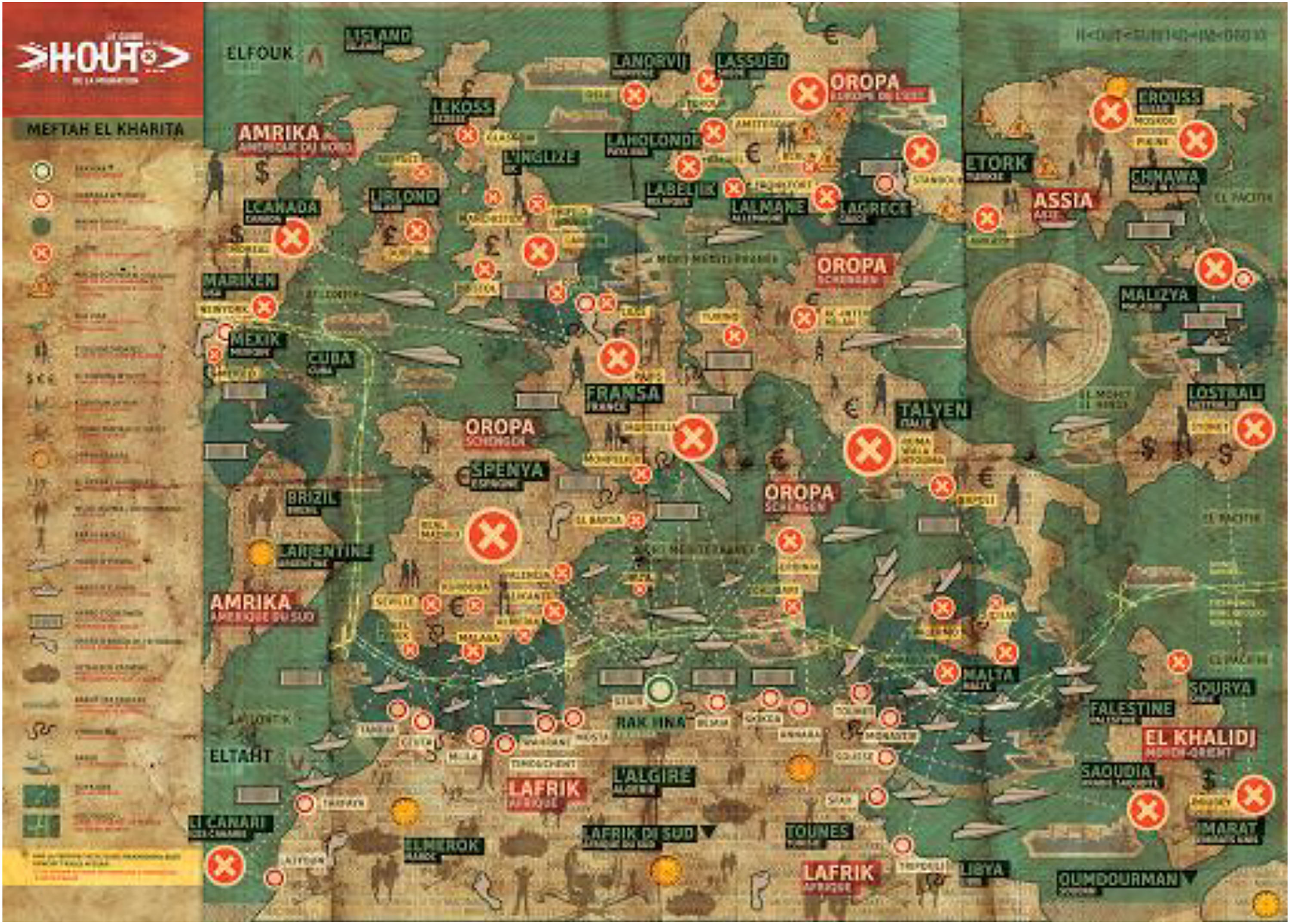
From these words, Bessaï creates a map in the shape of a board game in which the Mediterranean border is the nerve centre. Using humour, Bessaï shakes up the usual grid of nation states to put focus instead on the main countries of destination. He accompanies his map with a legend that evokes the particular slowness of the paths (footprints for walking routes) and their unwelcoming nature (snakes for local authorities). The overall effect recalls a treasure map full of obstacles and shortcuts. In 2016, Bessaï’s visualisation was taken up by the NGO Médecins Sans Frontières in a campaign called This is not a Game: The Life and Death Obstacle to Europe.
Between 2007 and 2011, before the Migreurop network gave voice to refugees through cartographies, this method was undertaken by Moroccan artist Bouchra Khalili with a 7 channels video installation entitled The Mapping Journey Project, in which individuals recount, pencil in their hand, the journey they experienced (Figure 11). The Mapping Journey Project, Bouchra Khalili, 7 channels video installation, 2007–2011.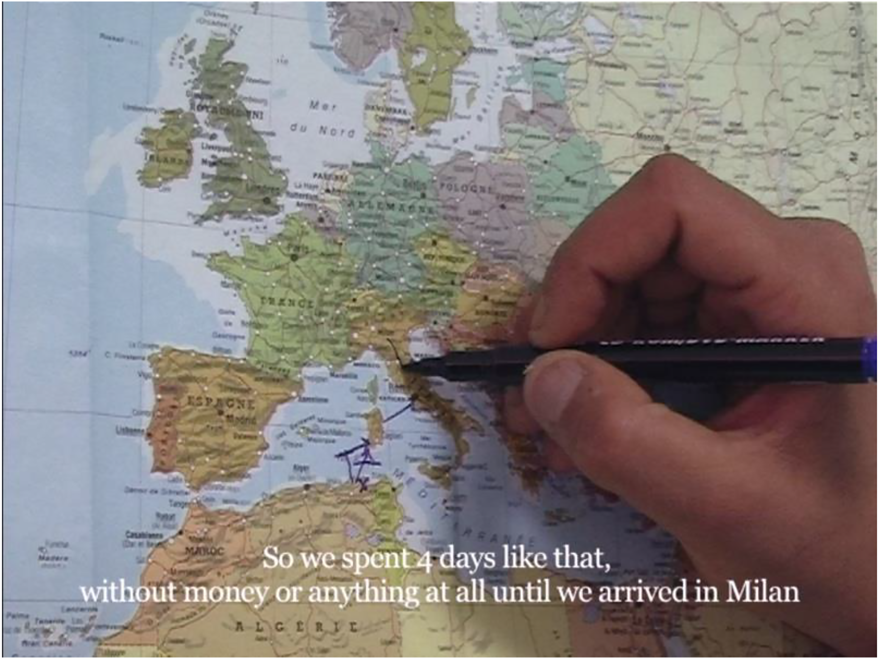
In 2016, also prior to the French geographers proposing to asylum seekers to design cartographies by themselves, Algerian artist Zineb Sedira was delineating by herself the land that used to belong to her father before being colonised by France, and before her family had to leave. The editing of the film superimposes colonial topographical surveys of her father’s land and contemporary video images of him and her striding up the acreage. Dr Amy Hubbel observes how ‘by layering the old canvas map over the moving contemporary image, and by superimposing the fictional boundary across her filmed experience in Algeria, Sedira demonstrates the cleavage created by the French imagination – its attempt to divide, distribute and direct the colony – which remains superimposed on the land’ (Hubbell, 2018: 13). By appropriating the cartographic gesture, Sedira appropriates the imagination of her father’s land. She heals the wound born from her family’s experience of forced expropriation and takes over the stolen cartographic imaginary.
Forerunners of experiments later implemented by NGOs, scholars and cartographers, artistic mappings constitute an indispensable formal laboratory for renewing visual habits conducive to predominant cartopolitics. Although not being a majority, these renewed representations expand beyond the circle of activism (Migreurop), are now published in mainstream newspaper (Westerveld), and are subject to a growing number of publications. The chart below shows the quantity of documents recorded in October 2021 under the key word ‘counter migration’ in the database of the library of Oxford University which registers documents as far as from 1600 (Figure 12). Chart representing the number of resources recorded on the database of the library of the University of Oxford under the keyword ‘counter migration, Elsa Gomis, October 2021.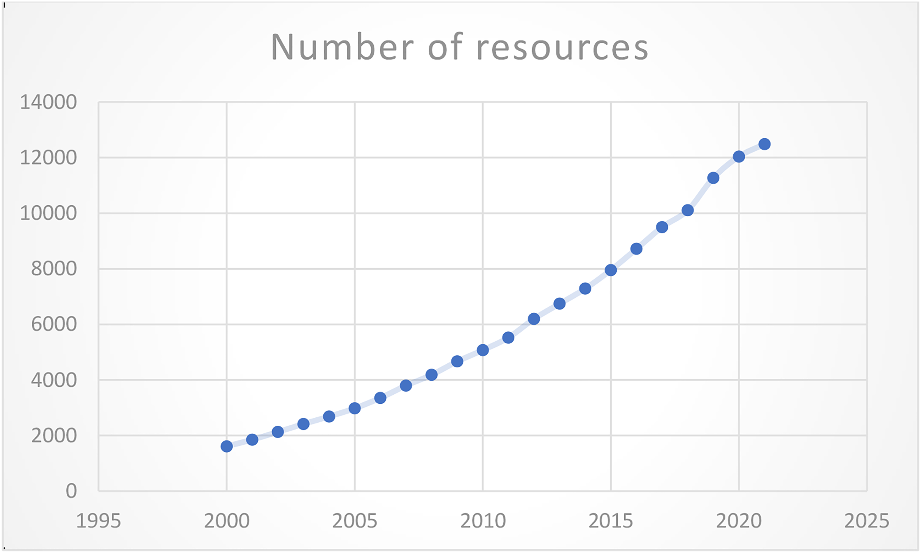
Showing a constant progression of studies analysing and promoting cartographic methods alternative to cartopolitics, the record of the libraries of the University of Oxford also reflects an epistemological change. By rebalancing (Rekacewiz), shifting the point of view (Lambert), revealing the harsh reality (Westerveld) and the human experience of border crossing (Migreurop), counter cartographies put into question the Euro-centred perception of the territory. As recalled by Tazzioli and Garelli, ‘Counter-mapping as method means, first of all, conceiving of counter-mapping as an epistemic approach and not merely as a cartographic perspective’ (2019: 398). Hijacking playfully the migratory regulations imposed to Northern African countries (Bessaï) and by giving voice to the refugees (Khalili) to recall the Western historical implications in today’s migrations (Sedira), artistic forms of mapping contribute to decolonise the dominating epistemology in cartography to create a renewed imaginary of migration.