
Abstract
The paper explores Google Maps’ COVID-19 layer, a special feature launched by the cartographic platform in September 2020, and shut down two years later. Through the reading of promotional corporate blogposts and interfacial analysis of the layer, it critiques the layers' mediation of the pandemic, caught between public health needs and Google's overarching ethos. The analysis underscores three central claims: that interfacial choices endemic to the layer impose certainty and reduce necessary user hesitancy; promote data commodification regardless of its pandemic need; and stake unnecessary exceptionalism to the pandemic-spcecific information rather than integrating it into the maps’ existing hybridity. The paper ends with design recommendation for a better COVID layer, centered around bottom-up community practices, higher degree of personalisation, and increased friction.
Keywords
Introduction: The pandemic and Google Maps
For many, Google Maps has become the de facto representation of the world, an “objective” layer superimposed on reality, built on massive and variegated data streams (McQuire, 2019; Plantin, 2018). It was therefore not surprising when, in late September 2020, Google introduced a COVID-19 layer into its mapping platform, indicating infection levels and, in some countries, also guiding users to testing centers (Banerjee, 2020). The rollout of this feature proceeded quickly, and, in the uncertainty of the pandemic, the map (app) as quickly became a focal point in decision making. However, spatial technologies are never a straightforward depiction of a stable world. They are objects in flux, nested in ontogenetic processes of always-becoming (Kitchin et al., 2013), counter-use (Akrich, 1992), or on-the-fly creative networked bricolage (de Souza e Silva & Xiong-Gum, 2020). The layer exemplifies such flux well in and of itself: it existed for only two years, before being discontinued in September 2022.
This paper thus unpacks Google Maps’ COVID-19 layer and its app version in particular. It questions the company's professed intentions regarding the feature, examines the consequences of its deployment, and marks the lessons in mapping pandemics and other disasters that can be learned for the future. It conceptualizes the layer as a form of a “weaponized skeuomorphism” (Bratton, 2015, p. 224) that modulates users’ spatiotemporal understanding of the range of options available to them (Ash, Anderson et al., 2018) by paying special attention to its interface and User Experience (UX) design. Furthermore, it conceives of the digital map as a predominantly mobile object, integrated into a network of everyday navigational practices and the politics of corporate encroachment into everyday spaces (Farman, 2014; Wilken, 2019).
With the emergence of the COVID-19 virus in December 2019, and its global rollout into a full-fledged pandemic throughout winter 2020, experiences varied greatly between various countries or even administrative units. In some places, quarantine was mandatory for confirmed virus carriers and those exposed to them. Others kept it as a recommendation. Some authorities mandated the complete closure of all public spaces, while others allowed for open-air gatherings. Levels of perceived personal risk thus varied greatly from place to place and, moreover, changed drastically with time, leading to a continuous reconfiguration of established spatial logics throughout the pandemic (Löw & Knoblauch, 2020). It is in this context that Google Maps’ COVID-19 layer should be understood, as a seemingly fixed referent under conditions of uncertainty. Specifically, the paper is written from the perspective of my perspective as then-resident of the Netherlands, where relatively lax guidelines; lack of testing and—later—vaccines compared to its neighboring countries; and under-reported case rates (Erdbrink, 2020) created a growing sense of uncertainty among many residents. Thus, this analysis does not claim a universal experience of the pandemic or of the COVID-19 layer in it—no such thing exists. Rather, I aim to show one probable interpretation of its main research object, while relying on local experience and Google's global communication strategies.
To do so, let us first briefly examine the timeline of the digital giant's response to the pandemic, to establish both the significance of the layer and the methodology used subsequently. Google was quick to launch a “COVID-19” section on its corporate blog as early as March 2020, when many schools across the world went into lockdowns (https://blog.google/inside-google/covid-19/). The first posts under this rubric were all related to health and education. Content regarding maps followed suit, as part of a series of posts highlighting the repurposing of existing Google products for pandemic life. Thus, for example, a story of a tour guide uploaded touristic content in an endeavor to continue her business online through Google Maps’ street review (Malczyk, 2020). Another post highlighted examples and tips for using the customizable My Maps function to generate personal map layers, which promoted self-help and could facilitate bonding within communities (Herwig, 2020).
In June, the next map-related post under the rubric announced the expansion of Google Maps’ navigation features for both cars and public transport (Nagarajan, 2020), and, in July, a new bike/scooter integration into route planning, to better avoid congested public transport (Dutta, 2020). At that point, warnings were added about potential health checkpoints and guidelines on medical facilities en route. The service also introduced a simplified way to report on how crowded public transport happened to be at the time, either manually or through automatic measurement for those who opted into sharing their phone's location history. The latter innovation marked the beginning of Google Maps’ more structured response to the changing conditions of the pandemic, particularly through mobile media (Hardley & Richardson, 2021): repurposing what had hitherto functioned as predominantly a commercial platform to serve as a health and safety tool.
This trend culminated in September, with the addition to Google Maps of a special COVID-19 layer (Banerjee, 2020), in the form of a choropleth map 1 indicating infection trends, that displayed a color overlay alongside numerical data for specific regions. The layer, as it will be referred to henceforth, (Figure 1) is the central case study for this paper. In its examination, I utilize two methodologies: First, a close reading of all nine blog posts on the official Google blog, under the COVID-19 rubric, tagged with “maps”—a scrutiny of this content will afford insights into how the Google teams envision the uses of their products. Second, a critical interface analysis of the layer through the post-phenomenological framework developed by Ash, Anderson, et al. (2018). To do so, in the next section I establish that, in the context of post-representational cartography, the layer needs to be read as an ontologically unstable object. Then, using the above two methodologies (blogposts and interface analysis), I showcase how the layer's interfacial features are likely to enact a certain understanding of the pandemic world. In this analysis, I follow three inductive thematic trajectories, related to hesitancy, data commodification, and hybridity. Following, I examine the layer as a particular type of cartographic user interfaces, through the spatial agency exercised by it at the time of social uncertainty. I conclude with suggestions for improving this feature in case of another pandemic, focusing on its hierarchical imposition of information, lack of personalisation, and a frictionless design which reduces reflexivity.
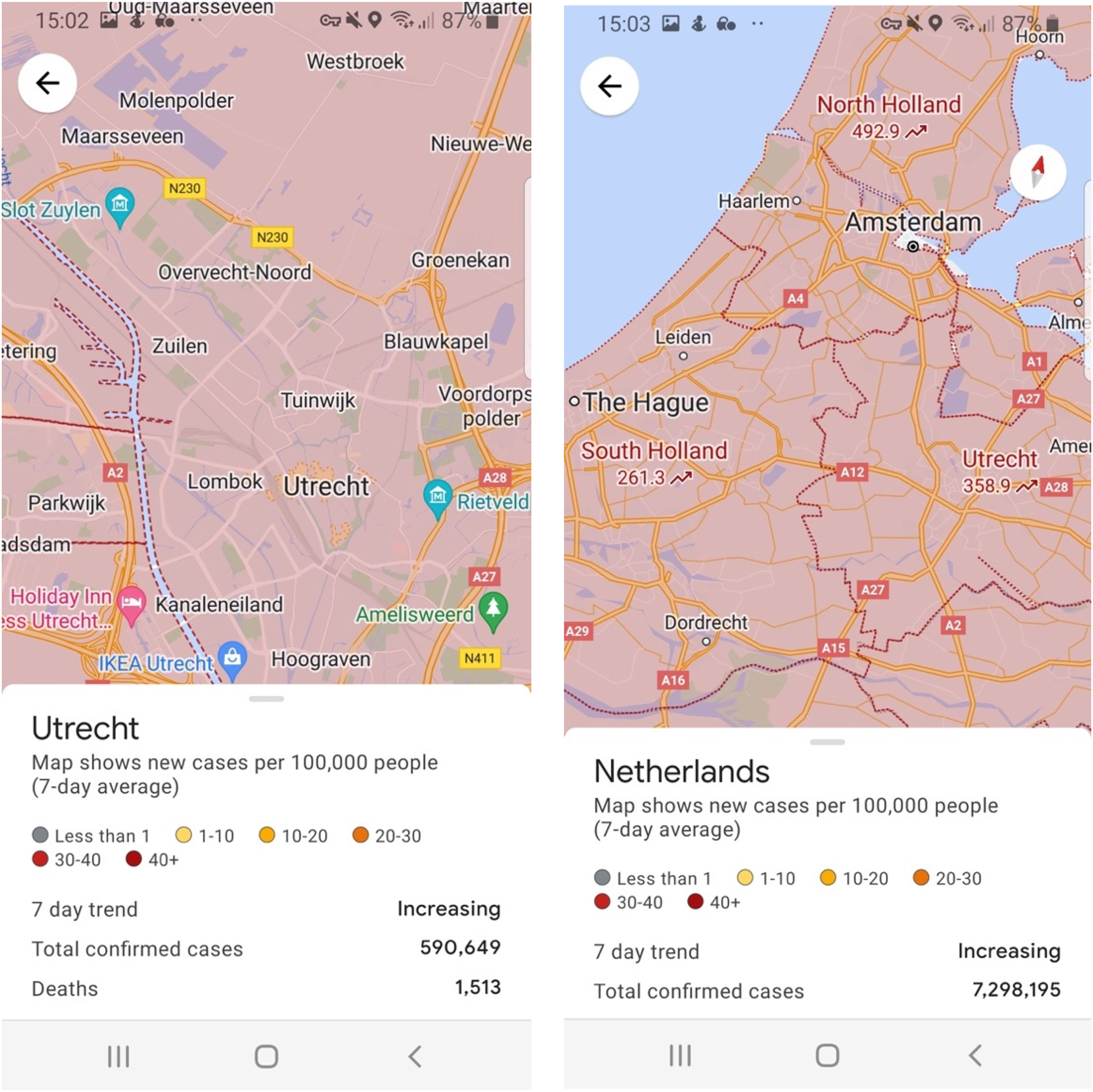
Two zoom levels through the COVID-19 layer: province and country. Screenshot by the author.
The COVID-19 layer as emergent mapping
Google Maps have become widely used and accepted as the norm in digital cartography (McQuire, 2019). Along with other algorithmic technologies, delivered through personalized quotidian interfaces, they have increasingly affected everyday life and specifically human decision making (Amoore, 2020; Bucher, 2018). Indeed, through these technologies, people make sense of the world around them (Ash, 2015; Bratton, 2015; Galloway, 2012). Moreover, they contribute to what has been termed as the ludification of culture, a contemporary trend manifested also in digital design that draws on casual and fun engagement with media, particularly by borrowing from video games (Bunz, 2015; Fuchs et al., 2014; Raessens, 2006; Walz & Deterding, 2014). To understand these processes and the role of Google Maps’ COVID layer within them, we must first take a brief detour into the ontological relations between mapping and territory. To this end, I will employ three chronologically successive paradigms that have been suggested for studying maps: the descriptive, prescriptive, and emergent mapping.
The ontological view of the map as a stable object was challenged by Harley (1988, 1989) in his important inquiry into Foucauldian notions of power-knowledge. As a historical geographer, Harley recognized the technical limitations of paper maps, warning “not only of the geographical limits to knowledge, but also of the technological constraints to representation, and of the silences in the historical record owing to the destruction of evidence” (Harley, 1988, p. 57). Making maps involves complex decisions regarding form and content; for instance, whether a given resolution allows the inclusion of certain landmarks or whether to smoothen certain “real” contours in consideration of aesthetics and readability (Monmonier, 2018). Harley purposefully termed the information missing from a map “silence,” rather than “lacunae” or “errors.” By supplanting the designations bearing a negative connotation with a semantically neutral expression, Harley challenged the dominant perspective on mapping as an unbiased and scientifically objective practice. This latter notion had been entrenched in cartography since renowned cartographer Arthur H. Robinson, while leading the US military mapping division during World War II, introduced user-testing and laboratory precision into the field (Crampton & Krygier, 2005). For Harley and his followers, the map is never merely made; rather, it is created by someone, and that individual operates in a specific socio-political context, and thus invests the map with certain discursive meanings and claims, which in turn shape its final form and determine what is included and what is omitted.
According to geographers Kitchin et al. (2013), the debate outlined above reflects the descriptive approach to maps: the map is considered either a true representation (for Robinson) or a social construction (for Harley) of space. Even on the latter view, as a description of the world, however flawed, the map can uncover some truths about it, provided one is careful enough to peel away the ideological outer skin. Kitchin et al. contrast this perspective with the later work of such critical cartographers as Wood and Fels (2008), who reject the inherent truth of maps-as-descriptions; rather, they argue, the map delivers a series of propositions. In other words, the map is prescriptive, in that it effectively forms the world it set out to represent. Such a theoretical perspective aligns with the understanding of western cartography as a predominantly colonial enterprise, concerned with creating power structures on the ground much more than merely documenting them (Rankin, 2016). For all that, Wood and Fels still see the map is an ontologically stable entity, one is endowed with a “finality” that renders it immutable. In a similar vein, science and technology studies (STS) scholar Bruno Latour viewed the map as an “immutable mobile” (Latour, 1990, p. 37): a flat inscription (one that reduces the complexity of the world to a drawn schema) which can be reproduced, re-combined, or super-imposed in conjunction with other such inscriptions to generate new forms of (scientific) knowledge.
To be sure, Google Maps are different from representations on paper in that they are a software product, personalized and customizable. Yet media scholar Sybille Lammes (2016) claims that, even with the advent of digital mapping, maps still remain immutable mobiles, despite the technology that allows the image to be manipulated on the screen. In Lammes' opinion, this immutability of the digital map is anchored in its hidden infrastructure of computation and satellites “that is not easily transformable and operates according to set rules” (2016, p. 1,030). And, just like their ink-on-paper counterparts, such maps conjure up a certain kind of world.
Kitchin and colleagues, for their part, subscribe to a view that is even more radical than the prescriptivist angle outlined above. They regard their own work as a logical conclusion of the aforementioned succession of increasingly critical and relativistic approaches to maps. They propose a conceptualization of maps as emergent; that is, as processual entities completely divested of stable ontology. Such an approach moves beyond socio-political conditions, the technological wherewithal, or the effect of a map's ideological content on reality. As the authors themselves put it, [s]uch a reconsideration necessitates a radical shift, as the conceptual bases of cartography move from being concerned with the “rules” of map design, and techniques of cartographic production, and/or documenting and deconstructing the underlying ideologies and agendas of maps, to a processual perspective concerned with how mappings and cartographic design, technique and ideology emerge time and again through a plethora of practices framed within a complex discursive and material context, and the diverse, unfolding work of mappings in the world. (Kitchin et al., 2013, p. 2)
This approach looks at mapping rather than maps as such. Mappings (that is, products of mapping) are contingent and emergent; they are affected by the context and depend on the decoder at least as much as on the creator. A processual view of mapping takes into account such pragmatic aspects as a map's navigational aims (Brown & Laurier, 2005; November et al., 2010). It treats maps as spaces and performances (Del Casino & Hanna, 2006); as ontogenetic entities which are constantly co-created through their use (Kitchin & Dodge, 2007; Rossetto, 2019); as objects of play, both inherently and as revealed through use (Perkins, 2009); and as game-boards (Lammes, 2011). Such a view of maps takes count of the complex sociotechnical infrastructure on which they are built, and which involves a variety of multi-disciplinary methodologies and theoretical frameworks. The COVID-19 layer epitomizes this complexity: it leverages the commercial capacity of Google Maps, capitalises on the initial pandemic shock, and operates in the face of data scarcity, among myriad other factors. It feeds into the changes in the nature of mobile media, where one can be connected to the internet continuously, day in day out, whether stationary or on the move, and where such connection-through-movement alters the types of information available to the user and the range of the user's reactions (de Souza e Silva & Sheller, 2015).
This view of maps as emergent entities also highlights what mapping ontologist Tania Rossetto terms “moments of particularization” (2019, p. 35): when mapping objects become (temporarily) stable, in part, due to an epistemic shift in research cultures. During the current pandemic, for one, the sheer focus on ways of knowing has crystallized this particular form of map on this particular platform. This emergent approach thus dovetails with the “digital turn” in geography, espoused by Ash, Kitchin, et al. (2018), in that it questions the layer's capacity to accurately represent geospatial data and probes the impact of this gap on the world; to use the authors’ terms, the emergent approach critiques “geographies of the digital” and “geographies produced by the digital”, respectively.
The Google Maps platform is representative of the current surge in popular, consumer-oriented mapping through web-, digital- and neo-cartography (Bittner et al., 2013; Della Dora, 2012; Farman, 2010; Haklay, 2013; Perkins & Dodge, 2008). Regardless of the term, the emergent approach conceives of the COVID-19 layer as a tool for its—mostly amateur—users to co-create external pandemic reality, which is ontologically unstable and never “completed.” Indeed, Google Maps as a whole cannot be conceptualized as static or self-contained; it increasingly influences the view of the physical world even among individuals who do not actively use the app; for example, by changing road congestion through collecting driving data from a subset of road users (Hind & Gekker, 2019; van der Graaf & Ballon, 2019). As we will see further, the design choices of the layer can similarly affect the pandemic spread beyond the immediate map user.
A key feature of digital cartography is its ability to visually adapt itself to the ever-changing requirements of the end-user, often through clever algorithms that learn and anticipate users’ actions. This is particularly crucial when considering the layer within a mobilities perspective—as a function that allows people to make decisions how to act in the pandemic reality while in motion. In such cases the emergent quality of the maps is especially susceptible to one's being “inside” versus “outside” one's home (de Souza e Silva & Hjorth, 2009; Pink et al., 2018); it is contingent on the locative infrastructures of cellular towers and Wi-Fi hotspots (Farman, 2015; Wilken, 2019); and, above all, it posits a radical difference between a mobile (device) map and mobile mapping—notions that can be easily, and erroneously, conflated: The inequalities established through the relations of measurement become distorted through the establishment of elements: people are not made of binary codes, our places and locations lose flavour when reduced to coordinates, and so the paths and spaces between such abstracted inferences (such odd logics), journeys and space-times which are measured and calculated, are already hollow. Within mobile mapping, these discourses jar with something else – something intangible and inexpressible, something not quite right – as we use phones and signs to navigate but still end up lost, stare baffled down impossible inclines on roads that should never have been built, mirthfully note the numbers all around us describing slopes and trees and swells, and wonder why that bit of town just doesn't make sense. (Wilmott, 2020, p. 206; emphasis original)
The bewildered and frustrating attempts at sense-making described in the passage above have much to do with Google Maps’ position as just another app on a phone screen. It amalgamates and personalizes information for the user, while still conforming to the design rules of its superordinate mobile platform. In fact—and unsurprisingly—each of the blog entries detailing the changes in Google Maps focused mainly on the operation of the new features (how to use them) rather than on the rationale behind their development or on the principles underlying their functionality. This is because any pandemic-specific feature, including the COVID layer, requires that a map should be experienced primarily as an interface.
Media geographer James Ash and colleagues provide a set of guidelines for analyzing user interfaces. They reject the notion that interfaces exert power directly or manipulate users, and instead see interface design as “an experimental process of managing friction.” They elaborate this idea as follows: By friction, we mean a series of bodily and technical obstacles or hesitancies that interrupt, slow or stop a user from completing a task within a digital interface, such as choosing a service or buying a product. Friction is a matter of attempting to not only produce smooth experiences, although that is part of what is being done, but of producing the possibility of a transition between thresholds at the right time. (Ash, Anderson et al., 2018, p. 3)
Friction is thus understood as a design technique that attempts to either extend or diminish the range of possible actions; to either facilitate or hinder a user's transition through a key point (threshold) of a digital interface. As an ontologically unstable map, the COVID layer can thus be mentally visualized as a probabilistic membrane between the user and the world. In other words, we might ask: what actions would individuals navigating the pandemic through the layer be more likely to take? And would individuals who do not use it behave differently?
The next section is thus concerned with how the COVID layer acts as an interface for the user in motion during the pandemic. Methodologically, the section combines several approaches. The first is an interface reading (Ash, Anderson, et al., 2018; Drucker, 2011; Stanfill, 2014), paying attention to the arrangement of on-screen elements designed to facilitate certain types of actions, for example the highlighting of specific buttons or sliders. Such provisions are supposed to make a certain action more convenient than others, rather than outright disallowing the latter. In my examination of the interface, to determine how it acts as a map, I also take count of established cartographic principles such as generalization or smoothing (Monmonier, 2018). Finally, I supplement the assessment using highlights from the nine thematic blog posts by Google, which are indicative of designers’ intent.
The COVID-19 layer as an interface of hesitancy, data commodification, and hybridity
As previously discussed, for each user the layer emerges as a function of many diverse factors, including individual preferences, data available for each region, personal travel requirements, and more. Thus, when considered as a post-representational map, the layer affords a wide range of readings. The list of interpretations I discuss in what follows is on no account exhaustive, and neither are the themes outlined necessarily salient to every situation or user. Rather, I endeavor to present some probable ontologies, based in part on my personal close engagement with the layer over two years of the pandemic, and supported by existing cartographic scholarship. The section comprises three central themes: discouraging a critical reflection regarding one's available courses of actions (under the rubric “Hesitancy”), framing data as the solution to pandemic issues (“Data commodification”), and the fragmentation of access to pandemic information (“Hybridity”).
Hesitancy
By hesitancy I mean the productive ability to pause and critically reflect on the state of the pandemic world before operating in it. Google's official blogposts continuously present the layer's features as rational and deliberative, invariably using the verbs “see” and/or “plan,” and creating the impression that the map is a decision-making tool to be consulted before or while traversing the pandemic space. The reality, however, is very different. As discussed previously, maps as a form of visualization exert a measure of authority, making the world seem knowable at a glance. When activating the COVID layer, one is presented with a clearly color-coded map detailing the number of infections per 100,000 people in an area (country/region for most countries but detailed down to individual neighborhoods for some places), alongside an information ribbon at the bottom of the screen. The ribbon's title shows an aggregate number for the region, although for some countries the color overlay and associated numbers are missing, and only the aggregated data ribbon appears (Figure 2).
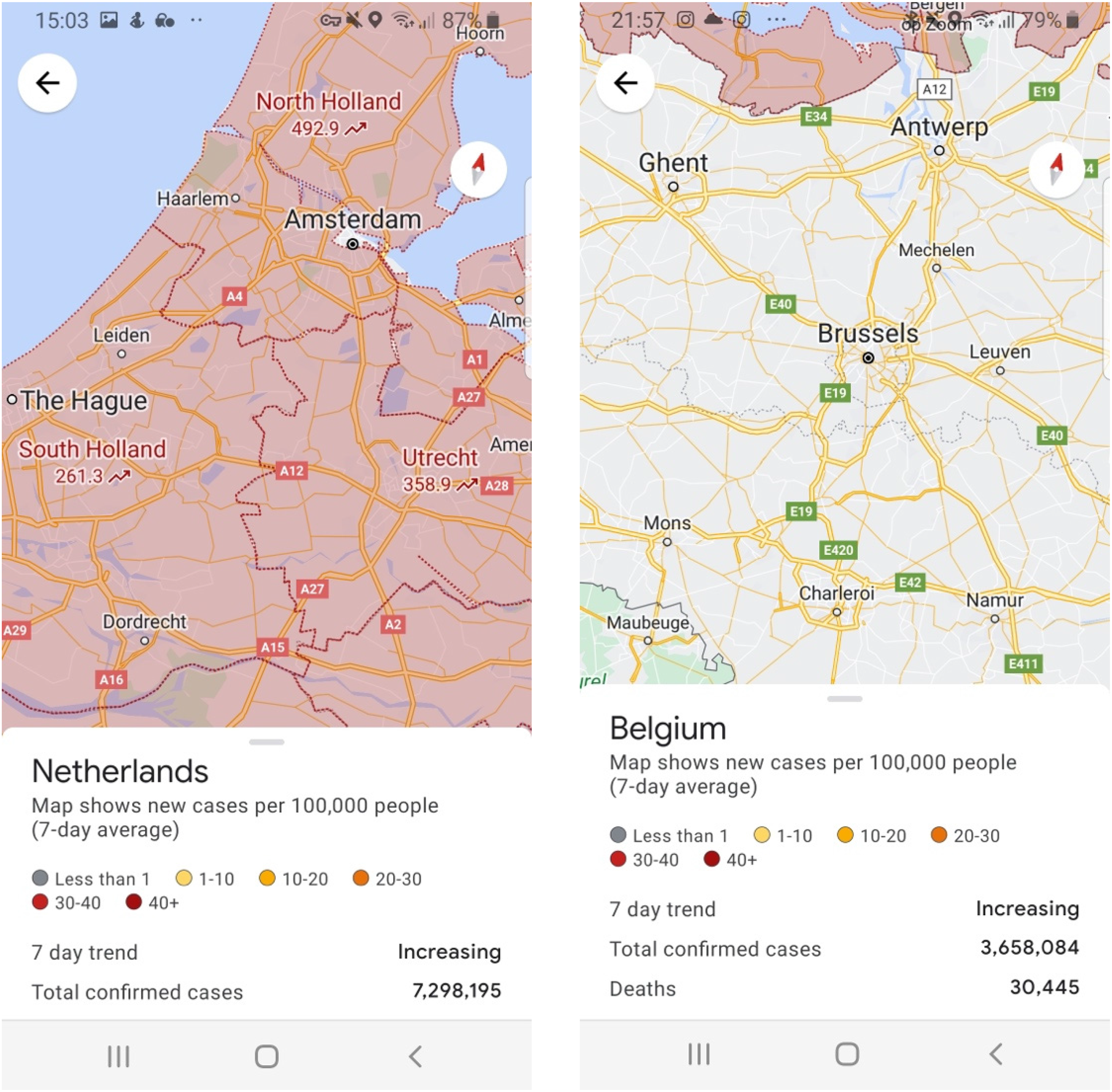
Two neighboring countries seen through the COVID-19 layer. Screenshot by the author.
Shortly after the feature's rollout, health expert and Forbes columnist Bruce Y. Lee (2020) warned that the layer is only as accurate as its data source is. For the layer, that source was the Johns Hopkins Corona Dashboard (https://coronavirus.jhu.edu/), an aggregator of disparate global databases varying in their coverage and methodology. Yet nowhere in the mapped interface is this limitation indicated. Even the official blogposts fail to state the source of the data, but only designate it as “authoritative” (a term appearing in all but one posts). They do, however, encourage users to “get around safely” (Nagarajan, 2020), “ride easy” (Dutta, 2020), or “navigate safely” (Banerjee, 2020) with Google Maps. The arrangement of the elements on the interface further precludes this uncertainty: the data are presented continuously and assertively, seamlessly altering with the familiar “pinch and zoom” motion. The changing zoom level reflects the map's infamous “God View,” further hampering a critical take of the data thus presented (Dalton, 2012; Della Dora, 2012; Gekker, 2016; Parks, 2009). To be sure, real infection numbers are reflected in but not affected by aggregated displays, and a town adjacent to one's own, but located in a different administrative region, might show in a completely different color. The spread of the contagion, however, is not susceptible to administrative boundaries. As with most mapping, the COVID layer is unable to convey uncertainty. It presents the world in binary terms: either we can confidently state what is going on in an area, or there is no data and we are completely at sea.
Data commodification
As with other Google Maps features, the COVID layer's functionality relies, in large part, on a combination of location tracking and data gathering. Data are collated through multiple sources and inscribed into the layer's interfacial features, to act upon the users—and to be acted back upon by them; for example, through the automatic tracking of phone density for the “Area Busyness” feature (congestion of public transport and other public spaces). Most of the blogposts put special emphasis on uploading and curating data, presenting this as an imperative (see also Mejias & Couldry, 2019); for instance, by way of a compelling example: “People can import their own data into a custom map, similar to how the San Francisco Department of Homelessness & Supportive Housing mapped downtown hand-washing and hygiene stations to support hand hygiene and reduce the spread of COVID-19” (Herwig, 2020, n.p.). As a similar nudge, an announcement detailing the availability of special first-responders-friendly hotels in Google Maps and Travel puts the spotlight on the respondents themselves, before switching focus to those working in the hospitality industry, and urging them to indicate this special availability through “Google My Business” (Holden, 2020).
Such appeals are directed not only at the individual user but also at organizations and institutions. A failure to provide up-to-date information that fits into Google's template is fraught with complications. Thus, a restaurant that did not publish its policy regarding wearing a mask, even if it implements such guidelines, may miss out on bookings; a person may not be able to secure a vaccination appointment at a clinic that did not input its operation hours (possibly because its staff were overstretched). Such cases resemble past scenarios in which businesses were “punished” by Google for not adhering to its standards in providing information—even if this allowed the search giant to potentially “hijack” such businesses’ customers through the reorganization of users’ search result (De Chant, 2022). Data aggregation by Google is presented as the solution to pandemic issues.
Hybridity
For mapping, the word “layer” implies superimposition, a hybrid mode of presenting information that allows combining different viewpoints. Locative media in particular—as when using Google Maps on a mobile device—has been described as fundamentally layered, which “helps us know our place in the world in a proprioceptive way that allows us to ‘see’ our location in relationship to the local landscape that is out of sensory view” (Farman, 2014, pp. 88–89). Turning on the “Traffic” layer of Google Maps results in an additive view that combines “base” map information with additional real-time traffic data. The COVID layer, however, is different: It blocks out much of the other information on the map. Points of interest (businesses, government buildings, etc.) are no longer tappable, and neither do most of Google Maps’ inherent features function, from pressing for additional details to driving directions. The map reverts to being a purely informational tool, showcasing the infection rates in the area, which is not defined by the user to boot. The only exception to this lack of interactivity are areas marked as “busy area” that sometimes appear on the map at various zoom levels, but then disappear following the user's finger movement and can no longer be recalled. Those are ostensibly major transport and recreational hubs (though without any label and not always corresponding to familiar physical sites), and tapping on them produces vague statements; for example, “somewhat busy” or “busier than usual” (Figure 3). Yet the blogposts invoke this feature as one of the powerful mobility tools that are supposed to allow the user to collate information regarding place occupancy and “busyness” of public transport in order to avoid crowding (Day, 2020; Nagarajan, 2020).
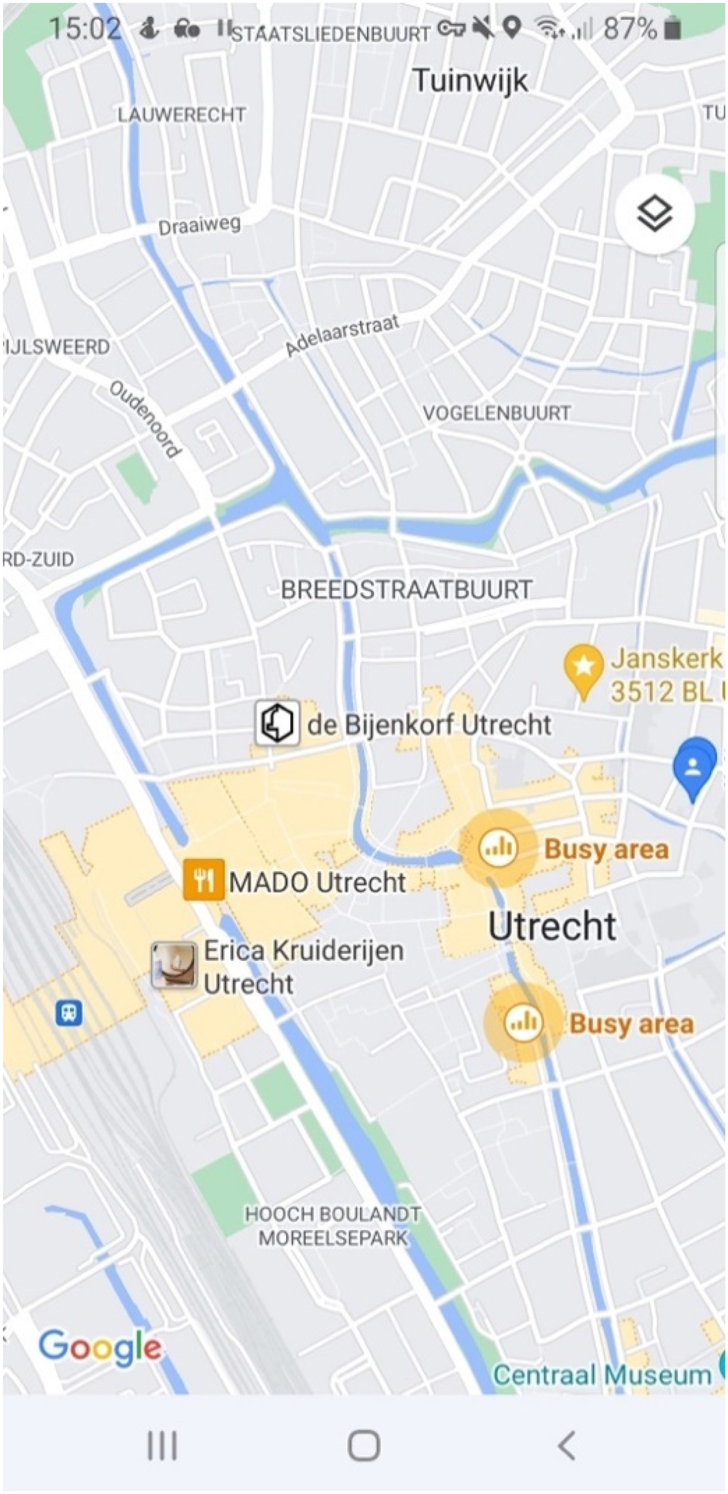
Busy areas are the only interactive elements on the COVID-19 layer. Screenshot by the author.
Such a lack of grounding or any frame of reference makes it difficult to base decisions on the information provided by the layer. For all that, the layer espouses the pandemic reality as a domain in its own right. Users are faced with a dichotomous choice of either engaging with the world as it “normally” is or entering a separate COVID realm that restricts their freedom of action. In my experience, with such limitations one cannot effectively plan one's travel route on a mobile device but must utilize two different mapping versions: one “normal” and the other “COVID layered.” This is because it is impossible to check the busyness level of a place, for example, or the infection rates in a neighboring city, and then immediately request traveling directions there. Those things belong to different realms, as it were.
The COVID-19 layer as a cartographic interface
When examining in-depth the three themes outlined above, we must remember that Google Maps has facilitated a transition in the very conception of the map by introducing a superior interface that combines satellite imagery, smooth scrolling and zooming, addresses, business search, and much more (Ćmielová & Pánek, 2016). The predecessor of Google Maps went under the name of Google Earth, a free Geographic Information System (GIS) platform first launched in 2005. Mobile media scholar Farman (2010) ties together the popularity of Google Earth with the increased use of aerial and spatial imagery. In a similar vein, Dalton (2012) relays the history of Google's acquisition of Keyhole, Inc., the company behind Google Earth, and elaborates the way Google has integrated the latter's locative data into its own lucrative core business of search and advertising. After acquiring the proprietary software—then named Earth Viewer—Google opened it to a wide variety of non-professionals at no cost. Comprised of multi-layered tiles combining aerial and satellite photography, the program featured a 3D virtual globe, based on technology developed for video games, complete with zooming functionality, as well as a map and 3D building models, the latter two components incorporated at a later stage.
The integration of various modes of data visualization into a single cartographic interface, and the removal of barriers to the use of this tool, have dramatically enhanced the perception of future digital maps as neutral and apolitical. In the past, maps were drawn by hand by identifiable individuals, their authors, for all intents and purposes. When mechanical reproduction became available, the authorship lost its salience, and, with it, also personal responsibility (Harley, 2001)—and with Google Earth (and now Maps), the process continues. As Dalton (2012, 2015) points out, Google is interested in maintaining the ambiguity between authoritative generalisation and individual personalisation. Paradoxically enough, the map is popular both because it claims to represent the world objectively and because it shows the user a unique version tailored to one's search history and other preferences. Through these strategies it attracts large numbers of users, which secures revenue from advertisements and from data analysis, as discussed above under the ‘data commodification’ rubric. But this does not mean that the layer—as an interface—is a deterministic conduit for designers’ intent. It is subject to counter-uses, repurposing, and hacks, all of which are common strategies when engaging with sociotechnical assemblages, particularly through networked communal efforts (de Souza e Silva & Xiong-Gum, 2020).
A key element in this interfacial mapping experience is personalisation. The option of saving My Places originated with the introduction of mashups, combinations of several maps together. The first such instance was built in 2005 by Paul Rademacher, creator of housingmaps.com, which overlayed the addresses of the Craigslist housing listing on a map—ironically enough, in violation of Google Maps’ terms of use. Google embraced mashups, opening the data underlying the map via an Application Programming Interface (API) to external developers. Google even hired Rademacher (after his project had become a success), and, shortly after, it introduced My Places (My Maps prior to 2013). This lowered the skill bar for creating mashups by allowing any user to set routes and locations as markers on a personalised Google map, which could then be shared, collaboratively adjusted, and saved (Dalton, 2012).
Media scholars have argued, however, that the transformation of Google Maps into a platform has put such personalisation at odds with the freedom of action afforded by map mashups (McQuire, 2019; Plantin, 2018). The regimented arrangement of the Google Maps interface appropriates the “real estate” it displays (Alvarez León, 2016), by collecting many kinds of geographic data. Google thus “benefits from the decentralization of cartographic knowledge production, through multiple forms of participation to feed its maps; however, it also shows that this openness simultaneously comes with new forms of recentralization” (Plantin, 2018, p. 499), such as through controlling which types of entities appear on the map or which additional operations can be done with the data provided (McQuire, 2019). This strategy is clearly evident in the layer's insistence of data commodification while also preventing easy co-use (lack of hybridity).
The construction of lived spaces through interfaces becomes tangible in the tension between one's direct experience of a place, and one's simultaneous experience of it as mediated by a mobile screen (Farman, 2021). Such a discontinuity is typical of the increasingly “smart” urban space, planned and implemented based on top-down strategies (Mattern, 2021). Thus, the layer does not only depict the dynamic of the pandemic for humans, but becomes enmeshed in it, and reproduces it; for example, by making certain behaviors more legible and more likely than others. This is also evident in the workings of Google Maps’ public transport busyness indicator. One could argue that this feature, which was substantively fine-tuned during the pandemic, constructs such notions as, for example, what constitutes a “busy” bus; or that the decision a passenger takes after checking this indicator feeds back into the very object it aims to measure.
This co-creation through the interface is reminiscent of Ash's definition of interfaces as “environments of inorganically organized objects, which communicate through processes of transduction” (2015, p. 23). This characterization shifts away from the traditional view of interfaces as human-centric or as a dividing binary (hardware/software, or human/non-human). In this perspective, the layer is no longer seen merely as a tool for human users to operate on underlying data structure, and instead incorporates its software interface with the Google Maps app, or its modulation through the hardware of the phone on which it runs. As Ash puts it, such a theorization allows us “to analyse [interfaces] without reducing them to a set of quantitative mathematical states on the one hand or subjective human experience on the other” (2015, p. 51).
Furthermore, echoing Galloway's (2012) conception of interfaces as unceasing effects rather than singular entities, Ash further describes interfaces as “localised foldings of space-time that work to shape human capacities to sense space and time for the explicit purpose of creating economic value” (2015, p. 4) While at first glance Google Maps might seem like little more than a conduit for rational information and cognitive actions, it is in fact an embodied sensorial experience that conditions us to imagine our range of possibilities for action in the world. Thus, the Google Blog states that the layer enables us to “know at a glance if there are specific guidelines or restrictions in the area you’re visiting” (Day, 2020, para. 3), and that we would do well to use it for this purpose. Admittedly, this suggestion has as much to do with creating a habitual action script for travel as it does with delivering information, furthering Google's hold on daily movement and data gathering.
Conclusion: Towards flexible cartographic interfaciality
The Google Maps COVID-19 layer presents a challenge for academic analysis. As a map, and particularly a mobile map, it is rife with the same biases and distortions that beset both cartography and interface design. To be sure, it was created with a praiseworthy purpose of mitigating the spatial effects of the pandemic, yet its limitations as a component in data-centric commercial platform are all too obvious. Moreover, if indeed “a service such as Maps becomes a powerful force in the shaping of social realities” (McQuire, 2019, p. 158), one cannot but feel a modicum of disappointment over the lack of impact in this regard of Google Maps in general and the COVID layer in particular. Considering that the layer was developed by one of the five richest corporations in the world, whose stated aim has historically been to “organise all of the world's information” (Morozov, 2011, p. 1), the feature is lacking in functionality. Neither does it have much to show in terms of the overall specialization of Google, a company that is astute at combining its different products into a consistent workflow and that is famed for creating entire ecosystems of interconnected services. In its last instance before shutdown, in early 2022, the layer was seemingly no longer being adjusted. The spread of the Omicron variant has dwarfed the preceding statistics (hitherto with the highest rates of 40+ infections per 100,000), further underscoring the futility of the layer (Figure 4). This critique adds to the already discussed drawbacks, rooted in my analysis of the layer's interface: it is premised on certainty and discourages hesitancy appropriate in the face of the complexity and instability of the situation; it serves Google's overarching ethos of data commodification, even when this is unnecessary; and it unjustifiably treats the pandemic information as unrelated to other aspects of reality, rather than integrating it into the map, in congruence with its inherent hybridity.
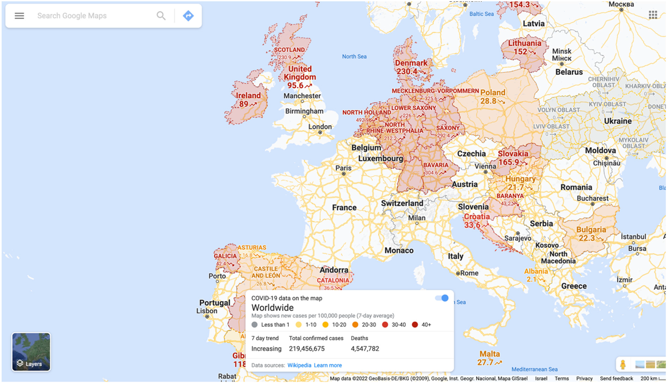
Rising infection in shades of red. Screenshot by the author in March 2022 (done through a browser for a wider display).
I conclude the paper with a tentative set of guidelines—for Google or, hopefully, also for non-commercial actors—for building a mapping service in the event of a new pandemic, or perhaps even another large-scale public crisis. If, as Ash (2015) claims, interface envelopes are designed to shape our spatiotemporal perceptions towards particular economic goals, it stands to reason that Google Maps might simply not be able to retool for any other objective other than monetary gain. After all, it boasts two decades of operations devoted to this goal, and thousands of staff working to develop and improve features that serve it. And plausibly enough, looking at the pandemic through Google Maps’ team point of view, one's perception of what is or is not “public good” would be fundamentally contingent on existing (commercial) practices.
First and foremost, I question the validity of generalized, top-down geographic knowledge, particularly under conditions when information is limited and events are in flux, and when the goal is to manifest a digital sense of belonging (Halegoua & Polson, 2021). As shown by de Silva e Souza and Xiong-Gum (2020), given the right tools, mobile networked communities present astounding resilience and creativity, and are able to generate lower-cost and more accessible solutions than those imposed hierarchically. Initiatives such as local food and medicine delivery, grass-root support groups at the street or neighborhood levels, informal open-air children's activities—all these, and more, are forms of communal space- and place-making that might help individuals not only to survive but to thrive. Adding such events to the map—and doing so locally and privately—could prove invaluable. Of course, this should be done with care, including tools to give local communities content moderation powers to prevent the spread of misinformation.
Second, a cartographic interface intended for uncertain times needs to allow for some personal choice. In becoming a platform, Google Maps has gradually discarded many of the features that made it a favorite with journalists, activists, and community organisers by affording the possibility to make the map “truly your own.” While the map does let a user save locations and share custom layers with others, at the basic operational level, very little can be altered. An example of this restriction is infection rates, which are reported according to pre-defined administrative boundaries, regardless of the changes on the ground or user needs. Yet what if you were able to delimit customised areas of interest or movement; to set up alerts for changes in that area, be it in infection rates or vaccine availability; or, more generally, use the map according to the needs of your own reality, shrunken by the pandemic to new dimensions?
Third, in contravention of the “frictionless” design ethos espoused by modern digital giants, when the layer is concerned, I call for more rather than less friction. In discussing the colonial bias of modern cartography, historian Raymond Craib puts in a word of caution regarding maps. “No other image has enjoyed such prestige of neutrality and objectivity,” he writes. “The most oppressive and dangerous of all cultural artefacts may be the ones so naturalised and presumably commonsensical as to avoid critique” (Craib, 2000, p. 8). No predecessor of Google Maps was ever perceived as more “naturalised” or “commonsensical” (Plantin, 2018): Google Maps tells us what the world is, and we believe it. But when the changes in the world become more rapid and dramatic than what we are accustomed to, and we must keep up with them, the old, established templates and cartographic inscription of Google Maps are liable to do more harm than good. Let us therefore envision a pandemic map that bids us to pause, take a breath, and think, rather than act on the spot.
Footnotes
Acknowledgments
I would like to thank the special issue editors for valuable feedback and graciously extending deadlines in the face of pandemic uncertainty and other life events; the anonymous reviewers for their thorough engagement with the text; students of the Law & Technology Workshop at TAU Law for their valuable insights at the paper's final stages; and to Nina Luskin whose editorial eyed helped me greatly improve the flow and coherence of the text.
Declaration of conflicting interests
The author declared no potential conflicts of interest with respect to the research, authorship, and/or publication of this article.
Funding
The author received no financial support for the research, authorship, and/or publication of this article.
Notes
Author biography
Alex Gekker is a Senior Lecturer at the Dan Department of Communication, Tel Aviv University. His research incorporates various aspects of digital media, primarily focusing on platforms and interfaces to analyse maps, surveillance assemblages, autonomous cars, videogame ecosystems and more. He published in New Media & Society, Social Media + Society, American Behavioral Scientist, Surveillance and Society, and Geoforum. He co-edited two Open Access books on mapping, one on temporality and the other on play.