
Abstract
High-throughput screening (HTS) of chemical and microbial strain collections is an indispensable tool for modern chemical and systems biology; however, HTS data sets have inherent systematic and random error, which may lead to false-positive or false-negative results. Several methods of normalization of data exist; nevertheless, due to the limitations of each, no single method has been universally adopted. Here, we present a method of data visualization and normalization that is effective, intuitive, and easy to implement in a spreadsheet program. For each plate, the data are ordered by ascending values and a plot thereof yields a curve that is a signature of the plate data. Curve shape characteristics provide intuitive visualization of the frequency and strength of inhibitors, activators, and noise on the plate, allowing potentially problematic plates to be flagged. To reduce plate-to-plate variation, the data can be normalized by the mean of the middle 50% of ordered values, also called the interquartile mean (IQM) or the 50% trimmed mean of the plate. Positional effects due to bias in columns, rows, or wells can be corrected using the interquartile mean of each well position across all plates (IQMW) as a second level of normalization. We illustrate the utility of this method using data sets from biochemical and phenotypic screens.
Introduction
Once the exclusive domain of the pharmaceutical industry, high-throughput screening (HTS) methodology has been widely adopted in academic settings over the past decade due to the accessibility of instrumentation and the power of high-throughput approaches.1,2 The parallel development of large chemical libraries and ordered genome-scale clone sets for model organisms has allowed significant advances in the fields of chemical and systems biology. HTS produces large data sets over a period of weeks or months. Data variability and quality can obscure bona fide chemical activities or genetic interactions. To be able to compare data across different days and different assay plates and assess data quality, various methods of normalization and data visualization are typically used, ranging from very simple to very sophisticated. Here, we present a simple and intuitive, but effective, approach to data visualization and normalization.
An important prerequisite for effective data normalization is to collect high-quality data. The largest contributors to variation in cell-based assays are arguably the conditions of incubation and the cell growth period of the experiment, rather than setup or measurement. Such variations in growth conditions manifest, for example, as an edge effect, where the outer wells behave differently than the inner wells, or as a stack effect, where plates behave differently depending on their positions within a stack. Edge effects can be significantly reduced with humidity-controlled incubators and protection of plates from direct exposure to the internal fans of the incubator to reduce evaporation. A practical solution to the stack effect is to use well-designed racks in incubators, which leave an air space above and below each plate for even heating across the plate. These measures may reduce the impact of positional variation.
The data produced by a high-throughput screen will nevertheless have some level of variability, which necessitates data normalization so that hit selection is not biased toward or against a subset of the data. A common method of normalization of HTS data is to calculate the activity of the sample wells relative to high activity and low activity of on-plate controls. Furthermore, the mean and variance of the controls are often used to normalize the data and set a threshold for hit selection. Chemical and microbial strain collections are often formatted such that controls are placed on the outer columns of the assay plate. Where the outer wells are often subject to significant edge effects and increased noise, control-based normalization can introduce unwanted bias. The edge effect problem can be remedied to an extent by placing controls throughout the plate; however, the format of the assay plates is limited by the format of the library being tested. Even when controls occupy almost 20% of the wells on a plate, the normalized data can display a large amount of variation across the screen due to outliers in the control data or differences in the preparation and stability of the control reagents compared with the samples. Furthermore, ordered genomic libraries, such as the library of nonessential gene deletions in Escherichia coli, 3 are often formatted in a manner that excludes positions for controls wells. For these reasons, normalization methods that are not based on control wells have a particular advantage.
Several methods of normalization have been proposed that rely on the observation that most samples in a screen are unperturbed.4–9 One of the more sophisticated methods of normalization is the B score, which corrects biases in plates, rows, columns, and batches. 4 The B score method involves an iterative two-way median polish and a smoothing function. Implementation of the B score is not trivial, as the data must be processed using sophisticated statistical software or a programming language, such as R or MATLAB. Thus, while the B score method offers a powerful tool for data processing, it also presents a formidable barrier to accessibility and understanding among nonexperts. Indeed, where data normalization can be carried out with more accessible methodology, such as described herein, more users have the potential to benefit from hands-on data processing and its attendant benefits.
Another method of normalization of HTS data is the Z score for plate-based normalization. 5 Like the B score, the Z score method assumes that the vast majority of compounds on a plate are inactive. To calculate the Z score, the difference between the sample value and the plate mean is divided by the standard deviation of the plate. While this method is accessible, the Z score has the disadvantage that both the mean and the standard deviation are influenced by the number of hits on the plate, which means that a hit might be missed if it is on a plate with many other hits. This would be less of an issue if compounds in chemical libraries were randomly arrayed; however, libraries tend to have related compounds on the same plate so hits tend to cluster on certain plates. Likewise, in ordered microbial clone sets, genes from the same pathway tend to be found on the same plate. A plate containing the pathway of interest will contain many hits, which may be masked after normalization by the Z score, resulting in a false-negative result.
In addition to the B score and the Z score, other statistical methods of noncontrol normalization have been proposed. In the background correction method, global trends and local fluctuations of the background surface are computed by polynomial least squares fit or by multiple linear regression. 6 Deviations of the background surface from the zero plane are considered to be due to systematic error and are subtracted from each well. The well-correction method of Makarenkov et al 7 uses linear least squares approximation or polynomial fit to look for a trend in each well position and either adds or subtracts the trend from the original values to bring the mean of each well position to zero. This is followed by independent Z score normalization of each well position. The R score method is similar to the B score, but it estimates row and column effects using the robust linear model. 8 More recently, two new methods have been proposed: the matrix error amendment method, which estimates row and column effects using singular value decomposition to solve a system of linear equations, and the partial mean polish, which is an extension of the Tukey median polish that is applied only to the rows and columns that show bias. 9 All of these methods have similar barriers to accessibility as the B score.
Here, we propose an alternate method of normalization that is resistant to outliers and can be implemented with a simple spreadsheet program. Plots of the rank-ordered data for each plate provide intuitive visual information on the spread of the data on the plate. The shape of each curve reflects the frequency and strength of inhibitors, activators, and noise on that plate, allowing potentially problematic plates to be flagged. Quartiles are the three points that divide a rank-ordered data set into four equal parts. The interquartile region represents the central 50% of the values of a rank-ordered data set, which should exclude the inhibitors and activators on the plate. The interquartile mean is often also referred to as the 50% trimmed mean, where the highest 25% and lowest 25% of values in a data set are trimmed before calculating the mean. In Excel, the interquartile mean (IQM) or 50% trimmed mean can be found with the function =TRIMMEAN(start:end,0.5), where start and end define the location of the data. Herein, we use biochemical and cell-based high-throughput data sets to show that normalization by the mean of the interquartile (middle 50%) of the data on each plate is an effective method of minimizing variability. Like the Z score, the interquartile method avoids the potential problems of control-based normalization; however, since only the middle 50% of the data is used for normalization, the interquartile method has the advantage of not being influenced by the outliers on the plate.
Materials and Methods
Control-Based Normalization
The percent activity of each compound was calculated from the measured value using equation (1), where S represents the measured sample value and H and L represent the mean of the high-activity and low-activity controls, respectively, of on-plate controls.
B Score Normalization
The B score normalization, as described by Brideau et al, 4 was carried out using the R statistical package (R Foundation for Statistical Computing, Vienna, Austria). Briefly, the Tukey median polish procedure was applied to a 16 × 24 matrix, representing a 384-well plate. The residual activity (rijp) for each sample in the ith row and jth column of the pth plate was found according to rijp = S – (µ p + Rip + Cjp), where S is the measured sample value, µ p is the mean of the pth plate, and Rip and Cip are the corresponding row and column effects. The median absolute deviation (MAD p ) of the pth plate was found according to MAD p = median(|rijp – median(rijp)|). Finally, the B score for each sample was calculated according to B score = rijp/MAD p . Parameters for the median polish function in R were as follows: eps = 1e-05, maxiter = 200, trace.iter = !TRUE, na.rm = TRUE. Parameters for the MAD function in R were as follows: constant = 1.4826, na.rm = FALSE, low = FALSE, high = FALSE.
IQM Normalization
Quartiles refer to the division of a rank-ordered data set into four equal parts. The interquartile mean is the mean of the middle two quartiles or the middle 50% of rank-ordered data. Sample data were normalized on a per plate basis by dividing every well of the plate by the interquartile mean of the plate according to equation (2).
S represents the measured sample value and µ iq represents the mean (µ) of the interquartile (iq) data of the plate. The value of µ iq was found for each plate by sorting the data in ascending order using the =SORT function of Microsoft Excel software and then finding the mean of the interquartile (middle 50%) data. Sorting the data facilitated the creation of rank-ordered plots. Alternatively, the interquartile mean can be found directly from unsorted data using the =TRIMMEAN function of Microsoft Excel. The trimmed mean of the middle 50% of the data, which is the same as the interquartile mean, can be found with the formula =TRIMMEAN(start:end,0.5), where start and end define the first and last cells of the data, respectively. As a quality control check for each plate, the interquartile mean was compared with the plate median, and any plates where the two values differed by more than 15% were flagged as potentially problematic.
Interquartile Mean Well-Based Normalization (IQMW)
Data were first normalized according to equation (2) on a per plate basis and then further normalized by the interquartile mean of each well position (IQMW) according to equation (3).
SIQM represents the sample value after IQM normalization, which was calculated by equation (2), and µ iqw represents the mean (µ) of the interquartile values (iq) of each well position (w) across the entire screen.
Results and Discussion
Rank-Ordered Plots for Data Visualization
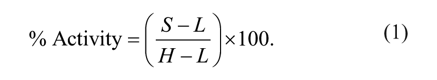
When viewing a plot of an entire HTS data set, much of the data are obscured due to the density of information that is presented. The quality of HTS data can be evaluated more carefully by viewing data on a plate-by-plate basis. Rank ordering the data for each plate from lowest to highest value is a useful method of quickly visualizing inhibition (or activation) on the plate and identifying potentially problematic plates with, for example, many outliers. Figure 1A shows rank-ordered plots of representative plates from a screen of the E. coli metabolic enzyme cystathionine β-lyase, which produces L-homocysteine and pyruvate. 10 The rank-ordered data from a typical assay plate of the screen are represented by circles in Figure 1A ; the data are symmetrically distributed, with inhibitors at the far left and activators at the far right. Examples of plates with atypical distributions are represented by triangles and squares; there are higher numbers of apparent inhibitors on the far left. When viewed as rank-ordered plots, plates with a high number of outliers can be visually identified as potentially problematic or containing a high number of hits.
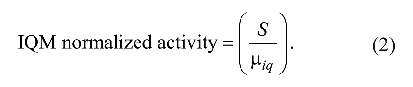
Plots of rank-ordered data from representative assay plates of an enzymatic screen and comparison of interquartile mean to median. The Escherichia coli cystathionine β-lyase enzyme, which produces pyruvate and L-homocysteine, was previously screened against a chemical library.
10
(
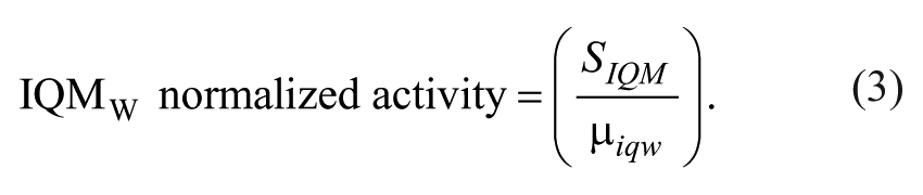
A more quantitative and potentially automated method of flagging plates is comparing the interquartile mean to the median of the plate. A large discrepancy between the two values indicates a wide variation of the data, where more than half of the samples on the plate deviate from the mean. The value of the interquartile mean includes more of the plate data than the value of the median since the interquartile mean is calculated from the central 50% of the measured values, whereas the median is represented by the central one or two values. Figure 1B shows the effect of normalizing two types of assay plates by either the median or the interquartile mean of the plate. For a typical screening plate with a relatively symmetric rank-ordered plot, normalization by either method produced overlapping plots ( Fig. 1B , circles). For a plate with a left skew, the IQM and median differed by 6%, and this produced a small difference in the normalization plots ( Fig. 1B , squares). Figure 1C shows the fraction of IQM divided by median for each plate of the screen. The average ratio of IQM/median was 0.995 because the two values are usually close to each other; however, of the 625 plates screened, 7 plates had IQM/median values that were more than 3 standard deviations away from the average of 0.995. Special attention might be paid to these seven plates, for example, by creating rank-ordered plots to examine the distribution of hits and activators on the plate more closely. In this screen, the difference between IQM and median values was at most 6%, which had a small effect on normalization, as described in Figure 1B . For differences between IQM and a median of more than 15%, we would recommend that screeners consider rescreening those plates to verify that the large number of outliers is not due to artifact.
Application of Interquartile-Based Normalization to a Biochemical Screen
We applied interquartile mean normalization to a data set from a screen of the essential E. coli GTPase EngA against a library of 30,800 compounds. 11 EngA hydrolyzed guanosine triphosphate (GTP) to guanosine diphosphate (GDP), producing phosphate, which was detected by the malachite green colorimetric assay. Each 384-well plate contained 32 high-activity controls (uninhibited reaction) and 32 low-activity controls (lacking enzyme) in the first two and last two columns. A plot of the controls from the entire screen showed that the high-activity controls for this enzyme assay had slightly lower activity on the first day of the screen ( Fig. 2A ). Figure 2B depicts the raw data from one replicate of the EngA screen as an index plot in chronological order. Individual days of screening are apparent from the periodic rise and fall of the data throughout the screen. This may be partially due to degradation of GTP to GDP and phosphate over the course of each day of screening. Normalization of the data by the controls, using equation (1), reduced the overall spread of the data and partially normalized the daily trend of increasing values ( Fig. 2C ). Due to an idiosyncratic difference between the controls and the samples on the first day of the screen, the control-normalized activity is higher on this day.
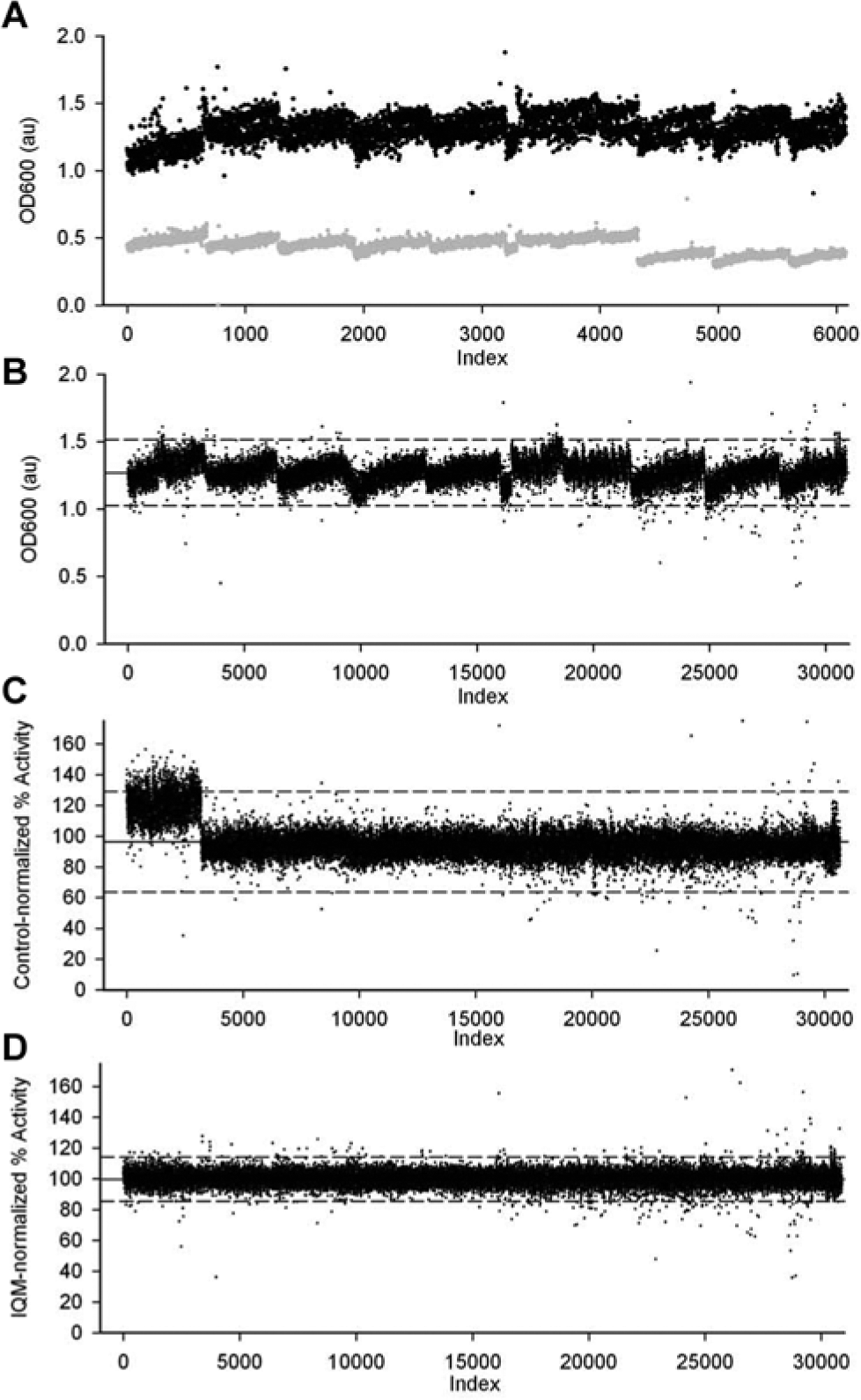
Control-based or interquartile mean (IQM) normalization of an enzymatic screen. A pilot screen of 30,8000 compounds was carried out in duplicate against the GTPase activity of EngA in a 384-well density.
11
Phosphate production was detected by the malachite green colorimetric assay by measuring absorbance at 600 nm. Shown are (
IQM normalization was applied to the raw data, using equation (2). Compared with control-based normalization, the IQM method was more effective at equalizing the center of the data across the screen and narrowing the spread of data ( Fig. 2D ). When using a global cutoff to select active molecules, effective normalization of the data set reduces the tendency for plates with lower activity to be overrepresented in hit selection (false positives) and plates with higher activity to be underrepresented (false negatives). Outliers in the control data may skew the mean value of the controls and introduce bias to the data. The systematic increase in activity over the course of the day was normalized more effectively by interquartile normalization than by control-based normalization, which is probably a reflection of slight but systematic differences between the controls and the samples.
Application of Interquartile-Based Normalization to a Whole-Cell Phenotypic Screen
We previously published a study describing the synergistic antibacterial effect of combining the antibiotic minocycline and the antidiarrheal drug loperamide in Pseudomonas aeruginosa. 12 To investigate the mechanism of action of loperamide, the drug was screened against the Keio collection, which is an ordered E. coli gene deletion set of some 4300 strains. 3 The sensitization of each deletion strain to treatment with loperamide and EDTA was calculated by dividing the cell density of the untreated samples by that of treated samples. Of note, the microplate format of the Keio library does not include empty wells that can be used for on-plate controls. Figure 3A depicts the response of each strain to treatment with loperamide and EDTA, when the fold sensitivity was calculated using the raw data. There was a high level of variation in the data and a trend toward decreased fold sensitization as the screen progressed, which may be due to differences in incubation time, incubation temperature, and inoculum. Variation in each data set was amplified by the division function used to calculate fold sensitization.
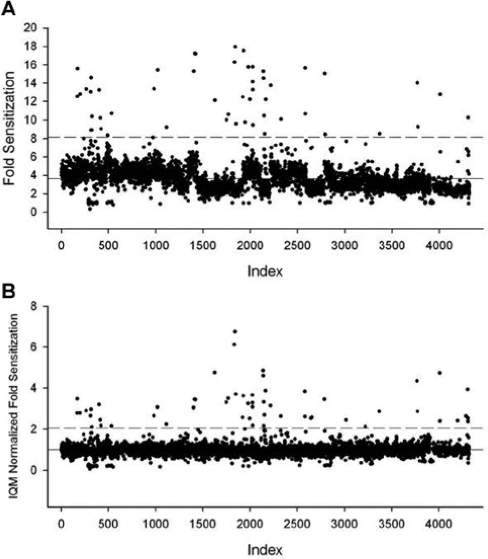
Interquartile mean (IQM) normalization of a cell-based screen of a genetic library. A library of strains containing deletions of nonessential genes in Escherichia coli was screened for sensitivity to treatment with the drug loperamide in combination with EDTA.
12
Cultures were incubated in 96-well plates and growth was measured by optical density at 600 nm. (
The raw data from treated and untreated samples were normalized using the IQM method prior to calculating fold sensitization. IQM normalization resulted in a much narrower distribution of fold sensitization, which is expected, since most deletion strains should not show any genetic interactions with loperamide ( Fig. 3B ). The mean sensitization of all the plates was close to a value of 1 (no sensitization), and the trend toward decreasing sensitization in later plates was corrected.
Comparison of Normalization by IQM and the B Score
We screened 142,000 compounds for inhibitors of E. coli growth in 384-well density (unpublished data). When the mean value of each row and column was plotted for one replicate of the screen, the outer rows and outer columns had higher means than the inner rows and inner columns (
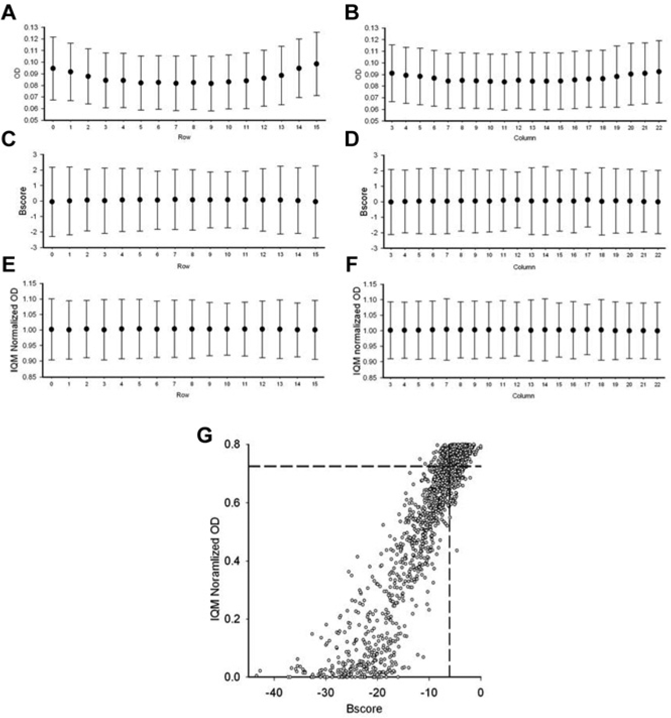
B score or interquartile mean (IQM) normalization of a cell-based screen of a chemical library. A laboratory-derived strain of Escherichia coli was screened for growth inhibition against a library of 142,000 compounds at a 384-well density by measuring optical density at 600 nm (unpublished data). Shown are the mean values of unnormalized data in rows (
To normalize this edge effect, we used either the B score method or the interquartile mean of each well position. B score normalization, which was performed using a script for the R statistical package, effectively normalized the mean values across all rows and columns ( Fig. 4C , D ). Alternatively, normalizing the data using the interquartile mean of each plate (IQM) and then the interquartile mean of each well position (IQMW), which simultaneously takes row bias and column bias into account, was also effective at normalizing the mean values of all rows and columns ( Fig. 4E , F ). Thus, both the B score and well-based IQM approaches were effective at removing positional bias in this example.
To compare the difference in hit selection between IQM-normalized and B score–normalized data, the two were plotted against each other ( Fig. 4G ). A hit was defined as a compound with a value that was 3 standard deviations below the mean of all samples. Of the 1002 hits identified by the B score normalization and the 979 hits identified by IQMW normalization, 862 hits were common to both methods, representing almost 90% of the hits. Of the 140 and 116 unique hits for the B score and IQMW methods, respectively, most were only weakly potent and had values near the cutoff ( Fig. 4G ). Similar confirmation rates were obtained for the two methods. In follow-up dose-response curves, 69% of the B score hits and 72% of the IQMW hits demonstrated minimum inhibitory concentrations (IC50s) of <100 µM. Although the sophisticated positional adjustment and smoothing functions that are carried out by the B score are necessary in some screens, we conclude that IQMW normalization was also an effective method of normalizing positional effects in the screen described here and is highly accessible to a growing user base.
Here, we have illustrated the utility of interquartile-based normalization using rank-ordered data from four HTS campaigns, including two biochemical screens and two cell-based screens. Since only the middle 50% of the data is used to calculate the interquartile mean, inhibitors and activators do not influence the normalization. Rank ordering data facilitates data visualization, and the IQM approach to data normalization is intuitive, robust, and easy to adopt. Furthermore, while it has become standard to devote up to 20% of the wells of a screen to high- and low-activity controls, IQM normalization has the potential to increase the productivity of screens by dispensing with these control wells while still allowing effective normalization between plates or well positions.
Footnotes
Acknowledgements
The authors thank Gerry Wright for providing data from the screen of cystathione beta-lyase.
Declaration of Conflicting Interests
The authors declared no potential conflicts of interest with respect to the research, authorship, and/or publication of this article.
Funding
E.D.B. acknowledges salary support from the Canada Research Chairs program and operating funds from the Canadian Institutes of Health Research (MOP-15496, MOP-64292, and MOP-81330) and Cystic Fibrosis Canada. The other authors received no financial support for the research, authorship, and/or publication of this article.