
Abstract
Data, numeric or visual, can contain misinformation and contribute to the spread of false information. Yet the role of data has received little attention in misinformation research. This scoping review analyzes 41 studies across various disciplines and synthesizes how data are processed within a dual-process framework to map research on data and misinformation. The review identifies an overall lack of research in this area and highlights the need to consider multimodal data formats, as numerical and visual misinformation have largely been addressed separately. The study identifies research gaps and opportunities for future research, as well as implications for data communication praxis.
Keywords
The COVID-19 pandemic raised awareness for the fact that misleading data can result in the spread of misinformation (Engledowl & Weiland, 2021). During the pandemic, a plethora of statistics and graphs about the number of infections, the amount of free hospital beds, etc. were communicated to a wide audience, some of which were misleading (Doan, 2021). In May 2020 for instance, a bar chart published by Georgia’s Department of Public Health caused headlines (Collins, 2020; McFall-Johnsen, 2020; Waldrop et al., 2020). The chart seemingly shows a decrease in COVID-19 cases, however upon closer inspection, it becomes evident that the dates on the x-axis of the chart are not in chronological order, causing the highest values to cluster on the left and the lowest values to cluster on the right. The misleading graph was corrected after being criticized by journalists and a Georgia state representative. However, misinformation often persists even after retraction, with debunking efforts such as fact-checking showing mixed effectiveness (Lewandowsky et al., 2012; Ognyanova, 2024; Stubenvoll & Matthes, 2022; Tang et al., 2025).
To date, misleading numeric and graphical representations of data or fabricated data have rarely been considered in the broader context of misinformation research. Misinformation, defined as “information considered incorrect based on the best available evidence from relevant experts at the time” (Vraga & Bode, 2020), has been a matter of broad public concern since the 2016 U.S. presidential elections and has seen a rise in scholarly attention (Broda & Strömbäck, 2024; Hoes et al., 2024; Righetti, 2021; Watts et al., 2021). However, as Weikman and Lecheler (2022) point out, so far, most of the research conducted in this field primarily focuses on text-based misinformation and neglects other forms, such as visual or numerical misinformation. Data in misinformation, that is, fabricated data as well as misleading graphical and numerical representations of data, is usually not the primary concern of the analysis. Instead, it’s often mentioned as one example of misinformation or included as stimulus material, but its particular effects are not further expanded on (Heley et al., 2022; Rhodes, 2022; Weikmann & Lecheler, 2022).
While the dangers and risks misinformation poses for society and democracy are at the center of attention for both lay people and decision-makers in business and politics (Knuutila et al., 2022; World Economic Forum, 2024), recent research has shown that intentionally deceptive forms of misinformation (disinformation) are not always persuasive and are disseminated in fringe groups rather than within the general population (Baqir et al., 2024; Guess et al., 2020, 2023; Nyhan et al., 2023). Consequently, scholars call for an investigation of more subtle forms of misinformation, such as misleading data (Altay et al., 2023). In this context, data, including fabricated data and misleading graphical and numerical data, are particularly relevant. Information containing data can be perceived as more credible and therefore more persuasive (Appelman, 2024; Du et al., 2019; Peters et al., 2024). Since perceived message and source credibility influence the spread of misinformation, data may enhance its persuasive power (Christner, 2023; Traberg & van der Linden, 2022). To examine how data affect recipients, this review adopts a dual-process perspective that distinguishes rapid, automatic responses from more reflective reasoning. Although data seem objective, this is often not the case, they are frequently distorted, for example, through numerical framing or misleading graphical representations (Lauer & Sanchez, 2023; B. Lee et al., 2021; Spiegelhalter, 2017). This paper is an initial step toward shedding more light on this area of research and identifying research gaps.
To this end, the present study will analyze to what extent the use of numerical data and its graphical representations are the subject of misinformation research, focusing on the different forms of data representation (RQ1), effects of data and data graphics on recipients (RQ2) and boundary conditions moderating these effects (RQ3). To investigate these questions, a scoping review was carried out, in which ultimately 41 publications were analyzed. Overall, this review finds that a substantial body of knowledge exists regarding the impact and perception of data, for example, in the fields of communication science and psychology. Research shows that, in the early processing stage, perception of data is strongly shaped by salient features and numerical anchors. While learned schemas can enable more automatic processing, when mismatches occur, more effortful processing is necessary, which in turn can lead to interpretation errors. Graph literacy and numeracy, as well as topic knowledge and individual attitudes, moderate these effects across the processing stages. However, misleading data are often not considered in the broader context of misinformation research, resulting in a limited understanding of how data are utilized in the dissemination of misinformation. In this respect, research gaps can be identified that require further investigation. More research is necessary to examine how data are portrayed in this context, what effects misinformation with data have on recipients, and how boundary conditions, such as graph literacy and numeracy affect the influence of misinformation with data on recipients. This paper concludes with suggestions for future research and provides potential research questions as well as implications for data communication praxis.
Context and Terminology
Clarifying Misinformation and Related Concepts
Misinformation can be defined as “information that is false but not created with the intention of causing harm” (Wardle & Derakhshan, 2017, p. 20). Misinformation can thus be distinguished from disinformation, which implies an intention to cause harm (Zeng & Brennen, 2023), but also from malinformation, which refers to information that is correct, but is presented in a misleading way with the intention to cause harm (Wardle & Derakhshan, 2017). This paper uses the term “misinformation” as an overarching concept, as the aim of this scoping review is to identify a broad body of research in this area. Building upon Vraga and Bode’s (2020) framework, the present study defines misinformation as inaccurate information that, at the time of dissemination, is not supported by the best available evidence from relevant experts. The term fake news is not employed here, as it is highly polarized and is increasingly used by actors to discredit undesirable news coverage (Tandoc et al., 2018; Vosoughi et al., 2018).
Data as a Reconstruction of Reality
Data can be understood as: “information, especially facts or numbers, collected to be examined and considered and used to help decision-making or information in an electronic form that can be stored and used by a computer” (Cambridge Dictionary, n.d.-a). Data are socially constructed. The method of collection influences the quality and nature of the data (Olson, 2021). This implies that, on its own, “data has no truth” (Rosenberg, 2013, p. 37). With this statement, Rosenberg (2013) points out that empirically collected data, for example, has no claim to absolute truth, but rather depicts the reality that we are able to reconstruct with data. Depending on the scientific discipline and the method of collection, data can take different forms. It can result, for example, from surveys, temperature measurements, or textual analyses (Joshi & Krag, 2010). The level of measurement and thus the information content and possible steps for further interpretation also differ depending on the method of collection and the origin of the data (Stevens, 1946). However, data are also influenced by the concepts and theories used in the operationalization process—which in turn are also socially constructed and often depend on preceding observations and measurements (Olson, 2021; Måseide, 1990).
Data can be presented in a variety of modalities, including spoken, written, and gestural forms. This paper will mainly explore the most commonly studied modes of representation, which are numerical and visual. A variety of terms are used interchangeably to refer to the visual representation of data. Diagrams refer to plans or systems that describe a process (Cambridge Dictionary, n.d.-b). They “explain rather than represent” (Merriam-Webster, n.d.-a). Yet, diagrams do not always “explain” data; they can also represent a model, such as a machine, thus this term is not used in this paper. Graphs, on the other hand, refer to the graphical display of one or more data variables in relation to each other, often in the form of line diagrams (Cambridge Dictionary, n.d.-c; Merriam-Webster, n.d.-b). Because this definition excludes the representation of univariate data, it will not be used in this paper. Instead, the term graphical representation will be employed, as it encompasses various forms of graphical depiction of data (Dodge, 2008).
Visual and Numerical Misinformation: Exploring Multiple Data Modalities in the Context of Misinformation
Visual misinformation, referring to visual contents such as images, memes or data visualizations that contain false information, has been under-researched to date. This is despite visual content playing a major role in the media landscape (Peng et al., 2023; Y. Yang et al., 2023). In the context of misinformation, images are known to create stronger framing effects when presented alone compared to textual misinformation. They influence behavior and opinions due to more heuristic processing via emotions, while textual information exerts a more persuasive effect through more systematic processing (Chaiken, 1980; Powell et al., 2015). Several factors determine how credible visual misinformation appears, specifically the format used (e.g. a picture, or a data visualization) and its features, both objective (e.g. color, composition, the presence of people) and perceived (e.g. quality) (Peng et al., 2023). Overall, data visualizations seem to be underrepresented in the field of visual misinformation research. For example, studies that address visual health misinformation, a topic that suggests the use of graphical representations, often do not address them (see Brennen et al., 2021). Numerical misinformation, on the other hand, refers to incorrect numerical data, for example, incorrectly quoted figures (e.g. quoted out of context), which are disseminated and thus contribute to the spread of misinformation (Stubenvoll & Matthes, 2022). The research field of numerical misinformation is also limited.
Both numerical and graphical representations of data as well as multimodal formats are considered in this study. In regard to the present study, data in misinformation are defined as both fabricated and misleadingly framed data, either numerical (e.g. “80 percent”), visual (e.g. line charts or bar charts), or multimodal (e.g. infographics), which display facts that contradict or distort the best available evidence of that time. By investigating multiple data modalities, the present analysis aims to contribute new insights to the field of both numerical and visual misinformation. Like language itself, numerical communication is a multimodal process (Winter & Marghetis, 2023; Holler & Levinson, 2019). Graphical representations are usually accompanied by numerical data in text or verbal speech. Winter and Marghetis (2023) argue that the reception of numerical communication always depends on the interplay of these different modalities; therefore, they propose a multimodal approach to numerical communication research. In the context of misinformation research, there is conflicting evidence regarding the persuasiveness of multimodal versus text-based evidence (Hameleers et al., 2020, 2023; Powell et al., 2015). However, research has shown that both statistical data and visualizations can affect the perceived credibility of information content, with visualizations potentially making information easier to process, as discovered for journalistic content (Henke et al., 2020). This underscores a critical need to better understand how multimodal formats, particularly data visualizations, shape the perception of misinformation, given their potential to simplify complex information while also influencing credibility.
Research Questions
The objective of this study is to provide a comprehensive overview of the existing research on data in the context of misinformation. By looking at different data modalities, this study aims to make a contribution to both the fields of numerical and visual misinformation. It will provide a concise overview of the existing interdisciplinary literature on this topic and aims to answer the overarching question:
The focus of this paper is on three aspects: the research on misleading presentation of data; findings on the effects of (misleading) data on recipients; and what is known about the boundary conditions that may enable these effects.
When addressing data in the context of misinformation, the ways in which data are presented are of importance. Weikmann and Lecheler (2022) identify distorted data visualizations as a particularly sophisticated form of visual misinformation. These misleading data visualizations can be caused by different factors, such as the truncation of axes (see, Cairo, 2019). Numerical data, in turn, can be misleading through framing. In the context of the use of statistics in politics, Lawson and Lovatt (2021) have identified framing as one of four rhetorical tropes politicians use to communicate statistical data. However, the fabrication of data, that is “made-up data,” may also be a possible way to mislead with data. This review aims to provide a concise overview of the current state of research on misleading representations of data, adding to the existing findings from popular science. Therefore, the following question is posed:
Another central aspect in addressing the implications of data in the context of misinformation is the effects data have on recipients at different cognitive processing stages. Numerical and graphical representations of data, as well as multimodal formats, play an important role in the decision-making process. A good example of this is the COVID-19 pandemic, in which a variety of constantly changing data points and models were used to determine which countermeasures to take (Jahn et al., 2022). (Misleading) data can therefore potentially influence decision-making. How data are processed across different processing stages, as well as the extent to which data are persuasive and whether they can affect judgment are therefore relevant factors in the context of misinformation research. The following research question is therefore posed:
A third aspect, addressed by this study, is the variables potentially moderating the effects of data on recipients at different cognitive processing stages. One possible variable that comes to mind, and is also frequently addressed by popular science books, is literacy. In the context of data, we can differentiate between graphical and numerical literacy (Balchin, 1976; Peters et al., 2006). However, other factors, such as source credibility, might also moderate how data affects recipients (Chaiken & Maheswaran, 1994; Wertgen & Richter, 2020). The following research question is posed:
Methods
To answer the research questions outlined above, a scoping review based on the extension of the PRISMA statement for scoping reviews was conducted (Tricco et al., 2018). Scoping reviews typically encompass a more expansive range of research questions than systematic reviews, offering a valuable approach to mapping a field of evidence and identifying potential research gaps (Munn et al., 2018). The objective of this analysis is to provide a comprehensive overview of current research on data in the context of misinformation. Since this particular issue is not a well-defined area of research in itself, a broader approach, mapping out the different areas addressing the topic, seems appropriate. In addition, it is likely that research in this area is spread across several research areas, making a scoping review the method of choice. The PRISMA Extension for scoping reviews was chosen because it provides a clear framework to conduct the review and thus ensures replicability and comprehensibility (Tricco et al., 2018). The focus of the review lay on English- and German-language journal articles, conference papers and book chapters published no earlier than 2010 in order to cover the current state of research, although exceptions were made for frequently cited studies (namely Cairo, 2019; Peters et al., 2006 and Tufte, 2007). Research in the field of misinformation gained momentum around 2016 in the wake of the U.S. presidential elections and the Brexit referendum, therefore, this particular time period was chosen (Broda & Strömbäck, 2024; Righetti, 2021; Watts et al., 2021). Gray literature such as preprints, dissertations and theses were also included to take the latest research findings into account. Between September 19 and October 25, 2023, the databases Web of Science, EBSCO (Communication & Mass Media Complete and Political Science Complete), JSTOR, and Google Scholar (for gray literature) were searched. To address both numerical and graphical representations of data, the following keywords were used: misinformation with data, statistical misinformation, misinformation with statistics, graphical misinformation, misinformation with graphs, numerical misinformation, misinformation with numbers, misleading graphs, misleading statistics. A total of 2,413 contributions were identified (see Figure 1). The final search strategy for Web of Science can be found in Supplemental Appendix A.
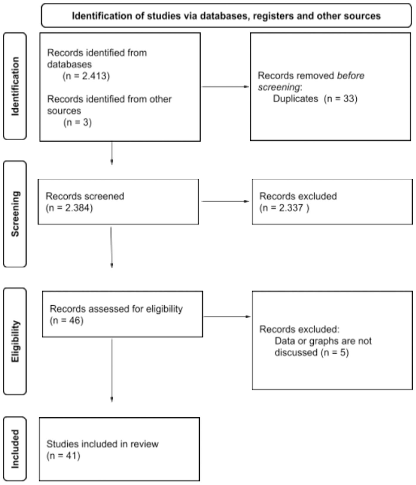
PRISMA Flow Diagram on Data Collection for the Scoping Review.
The metadata of the search results (author name, publication title, journal, abstract, etc.) were saved in Excel files. After sorting out duplicates (n = 33), the remaining list was screened. Only publications whose title and abstract were deemed relevant to at least one of the research questions were selected. To be included, publications had to focus on one or more of the following areas: the content of data in the context of misinformation (RQ1), effects of data on recipients (RQ2) and potential moderating variables (RQ3). Studies that only focused on misinformation, without addressing graphical representations of data or numerical data, were excluded. A total of 41 publications were selected for a closer examination and comprehensive review. Furthermore, three additional works were included in the analysis (namely Peters et al., 2006; Cairo, 2019; Tufte, 2007), as they were cited on more than three occasions within the existing database and are therefore considered to be of particular significance in terms of providing a deeper understanding of the body of research. After reading the selected publications, some publications were excluded because, contrary to the original assumption, they did not address data and graphical representations (n = 5).
The final database (see Supplemental Appendix B) contains 41 entries (including 36 journal articles, 2 monographs, 2 book chapters in an edited volume and 1 conference paper) that were published between 2006 and 2023 (see Figure 2). The following sections summarize and discuss the key findings derived from the identified publications.
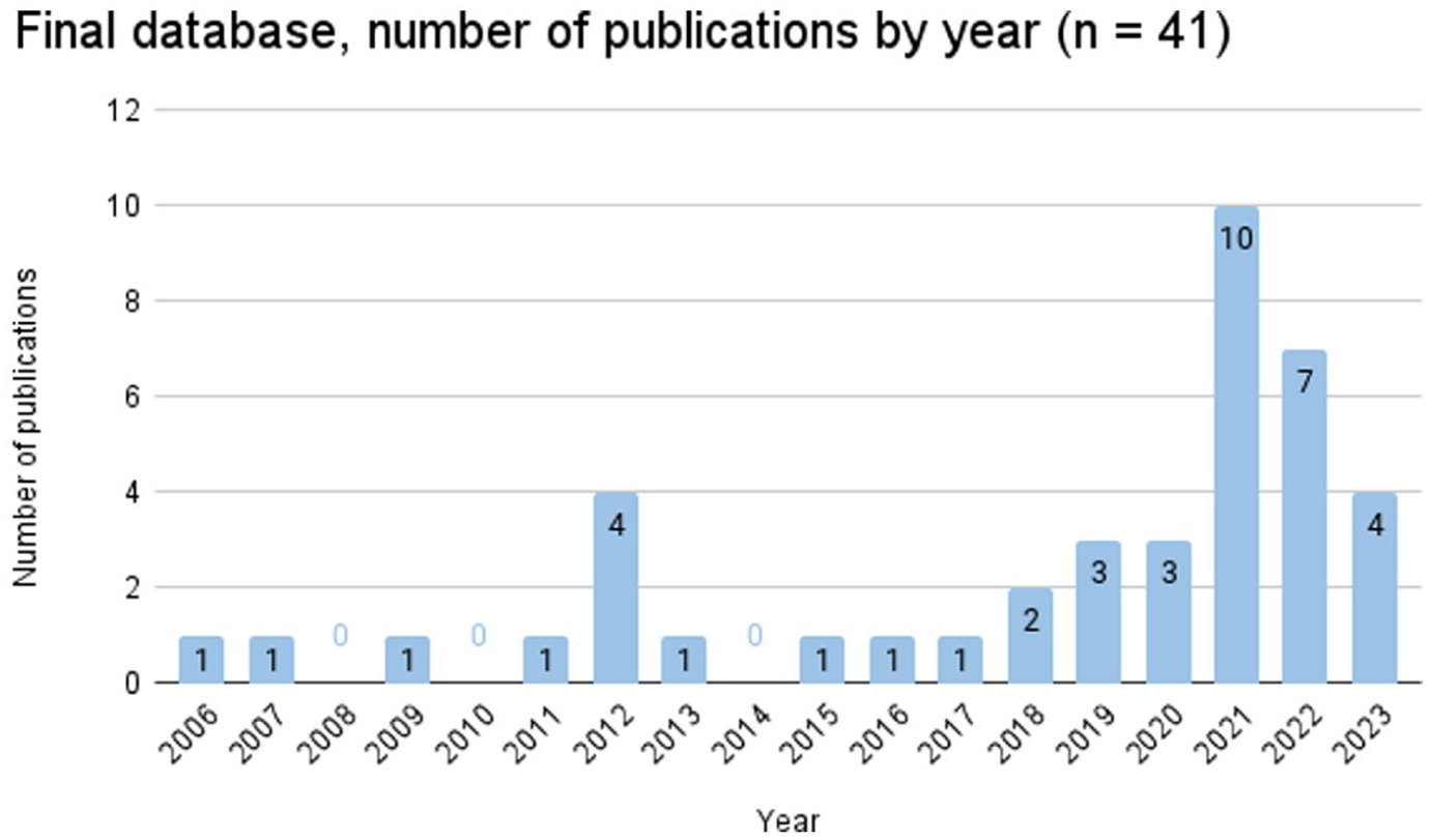
Final Database, Number of Publications by Year (n = 41).
Results
Corpus Map and Disciplinary Lenses
Before the contents of the analyzed records are discussed, a brief overview of the general characteristics of the database will be given. Most publications in the database were published after 2018 (see Figure 2). While earlier work scatters across fields such as psychology, medicine, and statistics, from 2019 onward, there is a notable trend toward studies in psychology and communication science, which together account for 30 of the 41 studies (see Table 1). While studies in the field of psychology (n = 15) primarily examine how individuals perceive and process data, communication science (n = 15) emphasizes larger implications for the public, particularly in science communication and journalism.
Characteristics of the Final Database.
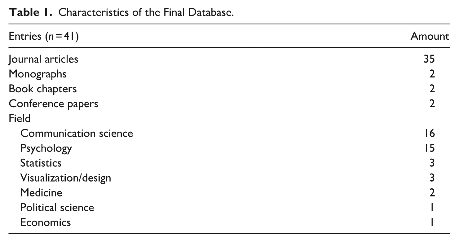
The remaining studies (n = 11) span disciplines such as statistics, visualization, and design and mainly address the misleading representation of data and how to create better, less biased representations of data. Most studies originate from the United States (n = 27). The remaining publications, except one Chinese study, originate from European countries, including the United Kingdom (n = 5), the Netherlands (n = 3), and other countries, namely, Austria, Germany, Lithuania, Spain, and Sweden.
To demonstrate the connections within the analyzed corpus, a citation network was computed using the online tool Research Rabbit (n.d.). Given that the software is only able to display journal articles in citation networks, the network consequently displays the interconnection between the 35 journal articles included in the corpus (Figure 3). Two clusters emerged: One surrounding Peters et al. (2006) foundational study on numeracy and connected literature on numerical framing effects and the role of numeracy in the perception of misleading data. And another one, surrounding a theoretical contribution by Padilla et al. (2018) elaborating on heuristic processing of visual data. However, most publications (19) exhibit no interconnections, indicating limited interdisciplinary integration. Connections primarily appear between publications in psychology and communication science, particularly between publications examining the impact of data framing on recipients and the role of data in judgment and decision-making. However, publications on numerical data and graphical representations of data being remain largely separate, suggesting a lack of consideration for multimodality. Only one study by Okan et al. (2016), who analyzed how people with low and high graph literacy observe health graphs, also consider findings on numerical data. They took Peters’ (2012) considerations on numeracy into account, testing both for numeracy and graph literacy as a moderating variable. The implications of these connections, or rather the absence of such connections, will be addressed in the subsequent discussion.
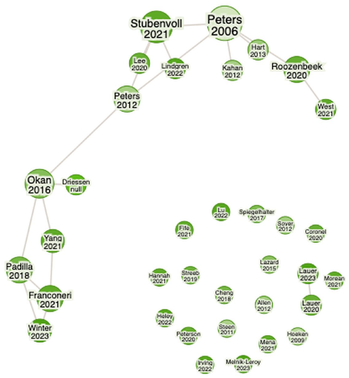
Citation Network (Journal Articles Only, n = 35).
Synthesis Framework: Processing Modes and Data Modalities
The summary of results is organized as follows. We begin by outlining the limited state of research that explicitly addresses the role of data in misinformation, summarizing the few studies that directly investigate this phenomenon. This provides the foundation for the subsequent sections, which address the three research questions. First, the origins of misleading data are discussed (RQ1), providing an overview of the current state of research on misleading representations of data. Second, research on the effects of data on recipients (RQ2) is synthesized using a dual-process framework, as the dominant theories applied in these studies are grounded in dual-process accounts of cognition. Finally, boundary conditions (RQ3) moderating these effects are summarized and linked to the processing stages they influence. The section concludes with a cross-field synthesis highlighting convergences, tensions, and remaining research gaps.
What Constitutes “Misinformation with Data”
Overall, only three papers directly addressed the role of data in the context of misinformation. Heley et al. (2022) address data visualizations within their taxonomy of visual misinformation. They demonstrate how recontextualization (e.g. a graph with a misleading headline) and visual manipulation (e.g. the manipulation of the axis of a graph) can apply to data visualizations. Although a visual representation of fabricated “made up” data could be an example of visual fabrication, no example for this category is given in their taxonomy.
Hannah (2021) draws on the case of QAnon to demonstrate how complex data visualizations are used interactively to spread misinformation. The author argues that this collaborative “research” and resulting visualizations foster apophenia, the tendency to perceive patterns in random data points. This case illustrates how complex data visualizations can legitimize conspiratorial narratives.
Franconeri et al. (2021) discuss best and worst practices in data visualization. In one example, they illustrate how individuals who deny or downplay anthropogenic climate change utilize graphical representations to support their arguments. By altering the zero point of the classic hockey stick graph (the graph depicting the rise in global temperature in the past centuries until today), they suggest that the effect of the global temperature rise is significantly smaller than it actually is. However, the focus of their review is on best practices in visual data communication, rather than on misinformation involving data.
To date, there is only scarce research on the role of data in the spread of misinformation. However, findings, especially from the fields of communication science and psychology, illustrate the effects of misleading data, demonstrating the potential impact of misinformation with data. The different aspects and how they interact with each other are depicted in Figure 4. The findings will be discussed in detail in the following paragraphs.
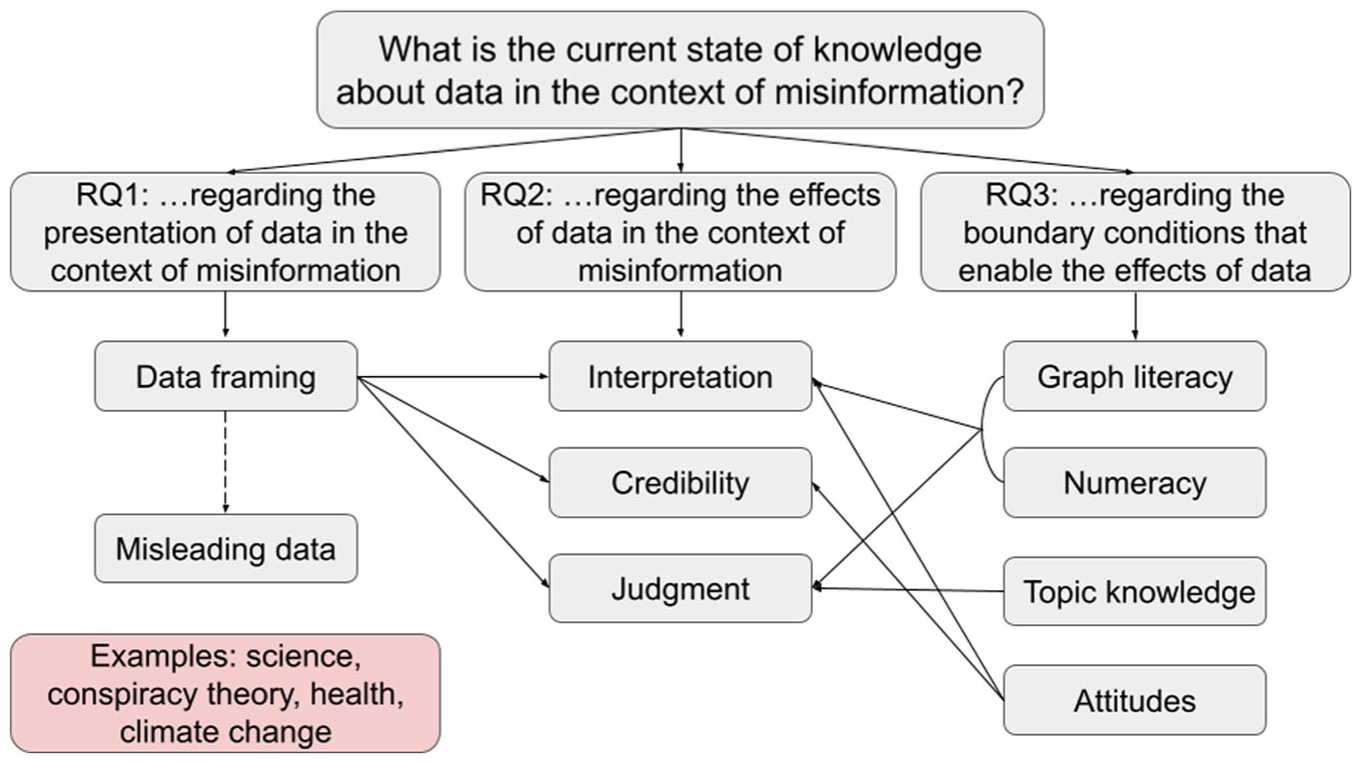
Research Questions and Main Aspects Addressed.
Origins of Misleading Representations
Literature on the misleading representation of data (RQ1) addresses framing and a potentially resulting misrepresentation of data and shows where biases arise, impacting the processing stages outlined below. A key argument in the literature is the inevitability of framing when representing data, and therefore the likelihood of misleading representation. In data communication, framing, for example, “[the selection] of some aspects of a perceived reality to make them more salient in a communicating text” (Entman, 1993, p. 52) is inevitable, as it is impossible to communicate raw data without first adapting it into a format that is more readily comprehensible. A page filled with raw data in itself does not communicate any meaning. It is only through the process of framing, whether through graphical representation or summary statistics, that data becomes meaningful. Framing, however, can also lead to bias. In the case of data visualizations, Streeb et al. (2021) point out that a certain extent of bias is inevitable. Therefore, “the costs of displaying different aspects of data, and the costs of not displaying them” need to be balanced (Streeb et al., 2021, p. 2,232). Tufte (2007) has quantified this cost in his “lie factor,” a value representing the discrepancy between the effect size depicted in a graphical representation and the actual effect size found in the data.
A second strand of work focuses on the detection of misleading representations data and points out how to avoid bias by creating better visualizations (Cairo, 2019; Fife et al., 2021; Streeb et al., 2021; Tufte, 2007). Fife et al. (2021) draw attention to the fact that software can further encourage incorrect or misleading graphical representations, for example, by making it difficult to change pre-set settings concerning the axis range. The results of these data biases are depicted by popular science books, such as Cairo’s (2019) How Charts Lie who give advice how to spot misleading visualizations.
A third strand of research points to misleading data in scientific publications (E. A. Allen et al., 2012; Shenavarmasouleh & Arabnia, 2019; Steen, 2011; West & Bergstrom, 2021). Analyses of published articles reveal inadequate labeling and missing uncertainty information (E. A. Allen et al., 2012) as well as biases arising from methodological and design choices (Steen, 2011; West & Bergstrom, 2021). However, authors also point to the biases caused by choices made in design or data collection method resulting in misleading data (Steen, 2011; West & Bergstrom, 2021). West and Bergstrom (2021) that is, identify misleading data, for example, cherry-picked or misinterpreted data, as one of many factors that contribute to the spread of misinformation in and about science and research. Similarly, insufficient statistical training has been cited as a cause of unintentional misrepresentation (Shenavarmasouleh & Arabnia, 2019). This demonstrates that both misleading representations of data and misleading data can occur in more professionalized settings, where a higher familiarity with data communication is likely, thus misinformation with data can originate in an academic context.
The studies outlined above demonstrate that misleading data are not the result of isolated errors, but rather a systemic outcome of how data are produced, framed, and communicated. Most studies focus on how the framing of graphical data can lead to biased representations; however, biases can also arise earlier, that is, at the point of data collection or design choice, showing that data can be misleading even before a representation is chosen. Factors such as a lack of statistical training, cherry-picked data, and careless mistakes can contribute to biases. Literature from design studies and popular science literature largely addresses the symptoms of the problem by focusing on how to recognize and improve these visualizations rather than on the conditions that create them. Notably, the role of journalists and other communicators, including politicians, in creating misleading data is rarely discussed despite their frequent citation as originators or disseminators of such representations.
Effects of Data on Recipients
In the perception of data, certain heuristics apply. These heuristics can be categorized and explained by dual-process theory. Underlying this theory is the assumption that there are two different forms of decision-making: A fast, automatic one without major cognitive effort (Type/System 1) and a slower, more elaborate one with higher cognitive effort (Type-/System 2) (Evans & Stanovich, 2013; Kahneman, 2011). Guided by this perspective, findings in this subsection are structured according to how recipients process graphical, numerical, and multimodal representations of data across four stages: perception and attention (Type 1), interpretation and inference (Type 2), credibility judgments, and judgment and decision-making. Supporting theoretical approaches, such as cognitive fit, the elaboration likelihood model, prospect theory, framing, and anchoring, are mapped to each stage.
Stage 1: Perception of- and Attention to Data (Type 1)
Research on early processing stages of data indicated that salient features are processed first. Visual encodings such as truncated axes and numerical framing act as heuristic shortcuts, directing attention to these salient features.
Graphical Representations of Data
Recipients initially pay close attention to salient features, such as the magnitude and configuration of graphical elements as well as titles, which may result in errors in perception. Experiments demonstrate that individuals are often misled by common deceptive tactics, such as a truncated y-axis, which can result in misinterpreting the data. These effects can persist even after individuals are educated about them (Lauer & O’Brien, 2020; B. W. Yang et al., 2021). Evidence from eye-tracking studies support these findings, showing that viewers usually only briefly skim graphical representations, focusing in particular on elements from which they expect to gain the most information (Lauer & Sanchez, 2023).
Studies also indicate that unfamiliar graphical representations can lead to errors in perception. In an experiment among students, Melnik-Leroy et al. (2023) found this to be true for exponential growth, which is often not recognized as such. Viewers usually pay attention to distinctive features, such as the size of different bars in bar charts which caused the subjects different problems in interpretation for log and linear scale. Errors could be remedied by a short educational intervention. The authors therefore conclude that overall better graph and statistical literacy programs are necessary to avoid such errors. Qualitative data from the above-mentioned experiment by B. W. Yang et al. (2021) also indicate that unfamiliar graphical representations, such as bubble charts, are more challenging for recipients to comprehend and interpret.
Numerical Data
A single study examined how numerical formats affect perception and found that frequency format framing led to more errors in interpretation than percentage format for large-scale statistics (B. Lee et al., 2021). Drawing on prospect theory, the authors tested the effect of gain and loss frames as well as frequency and percentage framing of risk information (cf., Quattrone & Tversky, 1988). While gain frames focus on positive aspects in a statement, for example, “(. . .) 93.3% of the licensed drivers in the United States will not drive while impaired,” loss frames instead lay the focus on the negative aspects “(. . .) 6.7% of the licensed drivers will drive while impaired” (B. Lee et al., 2021, p. 401). The authors argue that overall, frequency formats are harder to grasp, especially in the case of risk assertions, where the ratio of risky behavior in a population is usually low, such as in “14.9 in 222 million.” From a dual-process perspective, this shows that the easier to process percentage formats can be processed automatically (Type 1) whereas frequency formats are more computation heavy, requiring Type 2 processing.
Multimodal Data
One study investigated how multimodal data formats are perceived. Building on the elaboration likelihood model (Petty & Cacioppo, 1986), Lazard and Atkinson (2015) shows that people show a higher level of elaboration in the processing of infographics and that they thus hold more persuasive potential. In their experimental study, they found infographics to be more engaging for viewers than written numerical information or illustrations without numerical information, showcasing the importance of multimodality for data communication.
Overall, there is robust evidence for visual salience effects of graphical representations of data. The effects are confirmed by eye-tracking. However, less evidence is found for numerical data. The available evidence suggests that format matters in initial perception, though numerical format may be more relevant in later stages with higher levels of elaboration. Research on the effects of multimodal data at this stage are limited, the existing evidence indicates that multimodality may increase attention and elaboration.
Stage 2: Interpretation of- and Inference from Data (Type 2)
Studies focusing on the second processing stage, the interpretation and inference from data, show that schema alignment (cognitive fit) impacts the interpretation accuracy. Mismatches in schema alignment raise working-memory load and make errors more likely. Multimodal representation formats might aid interpretation.
Graphical Representations of Data
In their comprehensive literature review, Padilla et al. (2018) both look at Type 1 and Type 2 processing of graphical representations of data. As discussed above, they show how, during rapid Type 1 processing, prominent features of graphical representations are processed first. This can lead to incorrect interpretations in the case of manipulated or misleading graphical representations. However, the authors also discuss the incorrect interpretation during Type 2 processing. According to cognitive fit theory (Vessey, 1991), learned conventions, so-called schemas, are used when interpreting graphical representations. These learned schemas can be integrated into Type 1 processing. If there is an inconsistency between a mental schema used for Type 1 processing of a graph and its content, Type 2 processing and thus working memory is engaged for a corrective effort. This can result in an overall slower processing time and in some instances may lead to errors in the interpretation of misleading or unfamiliar graphical representations, for example, uncertainty visualizations. In a further review, Padilla et al. (2021) identify three types of errors in the interpretation of uncertainty visualizations: early-, middle-, and late-stage processing errors. Early-stage processing errors refer to errors in the initial viewing of a graph, middle-stage errors can be triggered by incorrectly applied schemas, while late-stage errors—the stage of decision-making—are usually caused by framing. The authors conclude that there appears to be an ideal level of working memory demand for interpreting uncertainty visualizations, although further research is necessary to determine this optimal level.
Numerical Data
Different numerical formats have interpretative consequences, as the aforementioned study by B. Lee et al. (2021) demonstrates. The authors show that risk statistics in frequency format are more likely to be misinterpreted in loss frames than in gain frames. However, if these statistics are expressed as percentages, this effect is reduced. From a dual-process perspective, this reflects greater working-memory demands during Type 2 reasoning.
Multimodal Data
Research examining the impact of multimodal data on interpretation of data demonstrates that multimodality can assist in accurate interpretation. Winter and Marghetis (2023) posit this very argument in their conceptual paper and add that the chosen modality can also be misleading, for instance, when a gesture is used to represent a quantity that does not align with the actual amount depicted in a graph. Soyer and Hogarth (2012) empirically demonstrate the importance of providing multiple data modalities in their study of statistics in academic literature. Their survey among academic economists found that respondents produced more mistakes in inferences when they were only provided with regression statistics. Providing them with scatter plots slightly reduced errors, however they still mostly relied on the statistics in their inferences. The least mistakes were made, when subjects were only supplied with a scatter plot, pointing to the importance of graphical representations in the interpretation of complex data.
In summary, the causes for interpretation errors are best documented for visuals, though the evidence is largely conceptual. Evidence examining the effects on the interpretation of numeric data is notably thinner. Taken together, evidence for both visual and numerical data shows that longer elaboration (Type 2) can lead to processing errors due to the higher demand on working memory. Literature on multimodal data representation suggests that it can aid recipients in accurately interpreting and drawing meaningful inferences from data.
Stage 3: Credibility Judgments
Research on the impact of data on the perceived credibility of information and data itself indicates that data can influence credibility perceptions. However, numerous factors can moderate these effects, including framing, preexisting personal attitudes, and general trust in data.
One strand of literature addresses to what extent statements with data are perceived as credible. Spiegelhalter (2017) discusses an overall eroding of trust in numbers. He argues that misleading representation of existing data reflects poorly on its source and may therefore impact the overall trustworthiness of those who supply data, such as the statistical bureaus of government or scientists in general. Spiegelhalter thus considers misleading representation of data as a potentially bigger risk for overall trust in numbers than outright fabricated data. Wackowski et al. (2022) investigate whether numerical data are trusted as part of a focus group study on the evaluation of risk information on e-cigarettes and snus products (e.g. “95 percent less harmful than cigarettes”). The findings reveal that these messages are generally appealing to consumers, although some respondents expressed skepticism regarding the credibility of the claims. The authors discuss several possible reasons for the perceived lack of credibility, including anchoring bias, the effect of gain and loss frames, and a possible low level of numeracy (anchoring effect and numeracy will be discussed in the following paragraphs).
Also, the impact of the chosen representation on the perceived credibility of data was addressed. In an experiment among Swedish citizens, Lindgren et al. (2022) were able to show that negatively framed statistical statements are perceived as more credible than those that are positively framed. However, this effect was influenced by preexisting individual attitudes: when aligned with positive framing of the statistical statements, participants’ prior opinions significantly diminished the impact of negative framing on perceived truth in the statements. Their study confirms the negativity bias found in earlier studies.
In some instances, statements containing statistical data can be more convincing than those without. Hoeken and Hustinx (2009) have confronted their subjects with statements containing statistical and anecdotal evidence. The anecdotal evidence was either supported by arguments by analogy, or by arguments by generalization. The results demonstrate that statements containing statistical evidence are more convincing than statements containing arguments by generalization, arguments by analogy, however, are just as convincing as those containing statistical evidence. (Hoeken & Hustinx, 2009).
Overall, research indicates that trust in numbers is far from guaranteed and people are skeptical of statistical statements. Credibility judgments are shaped as much by recipients’ attitudes and prior knowledge as by the statistical content itself. Statements including data are not inherently judged as more credible; rather, credibility depends on how well the representation aligns with existing beliefs and how easily it can be integrated into intuitive (Type 1) reasoning. Representation choices, such as framing and modality, can therefore influence credibility evaluations, but their influence is constrained when strong attitudes or knowledge-based expectations dominate.
Stage 4: Judgment and Decision-Making
Research on the impact of data on judgment and decision-making consistently shows that initial numerical or visual cues anchor later evaluations, often even when corrections are issued.
The majority of studies examine this phenomenon through experiments involving the retraction of information containing data. Two of these studies draw upon the anchoring effect. The anchoring effect states that people tend to use previously introduced values as a reference when they have to make an estimate (Tversky & Kahneman, 1974). Referring to this effect, Stubenvoll and Marquart (2019) as well as Stubenvoll and Matthes (2022) showed in two experiments that false numerical information about climate change continued to influence judgments after retraction, although distrust in the source slightly weakened the effect. In contrast, Irving et al. (2022) demonstrated that corrections can succeed. Participants exposed to a clarification that only a correlation, not causation, had been established were significantly less likely to reproduce the misinformation. Extending this logic to graphical representations of data, Lu et al. (2022) showed that the shape of a histogram displaying the ratings of a film impacts the perception of its mean rating, which in turn affects decision-making. The authors propose the histogram distortion bias (HDB). Similar to Tufte’s (2007) “lie factor”, the HDB represents the difference between the graphically perceived mean rating and the actual mean rating.
The literature discussed above shows that decision-making with data is strongly shaped by early reference points; anchors in case of numerical data or salient visual features in case of graphical representations of data. These cues can bias judgment even when corrected. However, corrections can still reduce misinformation effects, for example when an alternative inference rule (e.g. clarifying that correlation does not imply causation) is provided. Together these findings indicate that decision-level corrections are effective only when they engage Type 2 processing and alter the inference rule itself; simple retractions rarely override the Type 1 anchors created by initial numerical or visual cues.
Boundary Conditions (Literacies, Attitudes, Knowledge)
The effects of data on recipients are subject to specific boundary conditions (RQ3). The literature primarily addresses three factors: (a) literacies: numeracy and graph literacy, (b) individual attitudes, and (c) topic knowledge. Boundary conditions are discussed according to the processing stage they impact.
Stage 1
The initial processing and attention to data are primarily driven by salient features and fast, automatic modes of thinking. Numeracy, defined as “the ability to process basic probability and numerical concepts” (Peters et al., 2006, p. 407), and graph literacy, or graphicacy (Balchin, 1976), an individual’s ability to read graphical representations of data and draw accurate conclusions based on this information (Freedman & Shah, 2002), are the main moderators of these effects.
Research has shown that people with a higher graph literacy are more resilient toward biases in graphical representations of data. In an experiment using line graphs with truncated y-axes, Driessen et al. (2022) found that the overall context the graph was set in was more important in the decision-making process than the graph itself. Overall, respondents were not influenced by the manipulated graph, except for individuals with a low graph literacy. Evidence from eye-tracking indicates that this resilience of individuals with higher graph literacy lies in their higher likeliness to recognize conflicts in graphical representations, such as truncated y-axes or misleading labels. Experiments by Okan et al. (2016) showed that people with higher graph literacy spend more time analyzing a graphical representation and pay closer attention to spatial features as well as title and captions.
Improving overall graph literacy with perceptual training has proven to counteract conflicts in the initial interpretation of graphical representations of data. In an experiment, Ramly et al. (2021) systematically confronted subjects with misleading bar charts, training them to extract meaningful information from these graphical representations. Providing the subject with the “true ratio”—bar charts with a smaller lie factor, to quote Tufte (2007)—made the perceptual training more effective. But also, numeracy improves automatic processing. In four experiments, Peters et al. (2006) were able to show that individuals with higher numeracy derive more meaning from numbers, even in a faster, more affective mode of thinking.
These findings suggest that literacy improves initial, automatic processing of data (Type 1), resulting in a higher resilience toward misleading representations of data.
Stage 2
At this stage, recipients move from intuitive impressions to deliberate reasoning, applying schemas to interpret data (Type 2 processing). This stage is influenced by both numeracy and graph literacy.
Research on the role of numeracy in deliberate reasoning, such as risk assessment, has yielded mixed results. Hart (2013) found that less numerate individuals are more susceptible to numeric risk information, than risk information without numbers, showing greater concern and willingness to donate. Whereas Kahan et al. (2012) reported that higher numeracy and science literacy did not improve risk assessment and, in some cases, increased polarization. The cultural worldview of the individuals, however, explained a higher proportion of the variance than numeracy and science literacy. However, the much-cited study was later contested, with Cho et al. (2023) being unable to find a stronger polarization among particularly numerate individuals in two experimental studies with over 300 and over 500 subjects, respectively. To the contrary, the results of these studies show that people with higher numeracy have more precise knowledge about climate change.
Intervention studies further show that analytic reasoning can be strengthened. Cheng et al. (2018) found that embedding critical-thinking training into university statistics courses improved students’ ability to detect manipulative graphs, and Ramly et al. (2021) showed that perceptual training reduced misinterpretation of distorted charts.
Taken together, these findings suggest that numeracy and graph literacy determine whether recipients engage in analytic reasoning (Type 2) or rely on intuitive judgments. Higher literacy facilitates accurate interpretation of data, whereas low literacy sustains Type 1 heuristic processing and emotional responses.
Stage 3
At this stage, motivated reasoning dominates: attitudes and prior knowledge determine whether analytic (Type 2) re-evaluation occurs or intuitive (Type 1) acceptance persists.
Individual attitudes—or schemas—influence how numerical information is perceived. In two experiments across different samples, Coronel et al. (2020) found that although schema-inconsistent information is given more attention, schema-consistent information is remembered better and is harder to correct. This suggests that, when it comes to remembering numerical information, belief alignment outweighs accuracy. Partisan bias as a common schema also influences the perception of (political) statistics. For example, facts that contradict individual political attitudes are more likely to be classified as untrue, even if true, and vice versa (Peterson & Iyengar, 2021). The difficulty in correcting such misinformation underscores the influence of motivated reasoning in the assessment of numerical information, as discussed by Lind et al. (2022).
Prior knowledge of the topic also influences the extent to which graphical representations can influence credibility judgments. In an experimental setting, Mena (2023) investigated the extent to which graphical representations in fact-checking articles help to clarify misinformation. The study found that graphical representations in the article did not make a significant difference in providing clarification. However, it was shown that graphical representations have a stronger effect on people with little prior knowledge of the topic.
Similarly, Roozenbeek et al. (2020) showed that numeracy strengthens resistance to misinformation, indicating that analytic ability supports reflective credibility judgments. Using the example of COVID-19 misinformation and international survey data, the authors show that individuals with higher numeracy and higher trust in scientists are less vulnerable to misinformation related to the virus and the pandemic. They conclude that training in numeracy and critical thinking skills are pivotal in order to bolster overall resilience against health-related misinformation.
Together, this evidence indicates that credibility judgments depend more on motivational and knowledge-based factors than on cognitive ability alone. Strong attitudes anchor evaluations at a heuristic level, whereas higher topic knowledge and analytic skills can support reflective reassessment, albeit rarely enough to override deeply held beliefs.
Stage 4
In this fourth and final stage, recipients apply information in evaluative or behavioral choices. Numeracy plays a central moderating role by determining whether judgments are guided by affective impressions or by analytic reasoning.
Across four experiments, Peters et al. (2006) examined the impact of numeracy on the rapid, less elaborate processing of numerical information. Their findings indicate that individuals with higher numeracy scores are more likely to incorporate numbers in their judgment and decision-making processes. In a later conceptual paper, Peters (2012) argues that high numerate decision-makers are less likely to rely on emotional information when making decisions and overall incorporate more numbers in the decision-making process.
However, investigating the impact of numeracy on judgments and decision-making based on numeric risk information yielded mixed results regarding numeracy’s role. Less numerate individuals may be more susceptible to numeric risk information, which can impact decision-making and behaviors such as the intention to donate (Hart, 2013). Moreover, numeracy can also lead to greater cultural polarization. This has led authors to suggest that other factors, such as motivated reasoning, play a more significant role in forming judgments on topics like climate change (Kahan et al., 2012). In contrast, Cho et al. (2023) found that individuals with higher numeracy are more informed in their judgments and decisions, even when confronted with controversial topics.
These findings indicate that numeracy plays an integral role in shaping judgment and decision-making. Overall, greater numeracy leads to more informed decisions. However, as shown in Stage 3, attitudes and topic knowledge can still constrain Type 2 reasoning, leading even skilled individuals to rely on intuitive judgments.
Cross-Field Summary
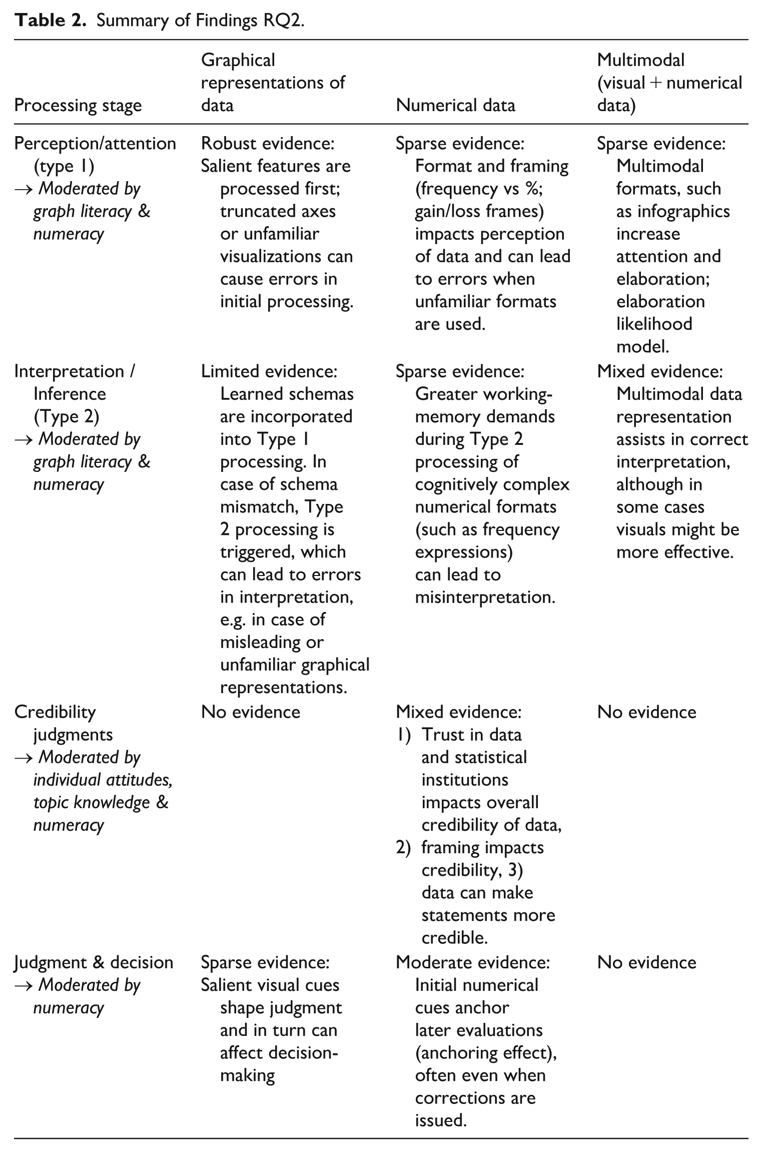
Table 2 summarizes the strength of the evidence by processing stage and modality, indicating which boundary conditions moderate these effects. Overall, there is robust evidence of the effects of graphical representations of data in the early stages of processing, with salience effects and schema mismatches producing errors in processing and interpretation. These effects are moderated by graph literacy. For numerical data, the evidence is less substantial in the initial stages of processing. More evidence emerges at the decision stage, particularly regarding the anchoring effect. These effects are influenced by numeracy and individual attitudes. For multimodal data only limited evidence exists, suggesting that multimodality aids in perception and interpretation of data, however, this evidence is mixed. Additionally, there are mixed findings on whether higher numeracy reduces or amplifies motivated reasoning.
Summary of Findings RQ2.
Discussion: Implications for Misinformation Research and Data Communication Praxis
This scoping review found research on data in the context of misinformation to be very limited. Although misleading numbers or misleading graphical representations of data are established concepts in various fields, such as design studies (Streeb et al., 2021; Tufte, 2007), psychology (Driessen et al., 2022; Franconeri et al., 2021) and communication science (Stubenvoll & Marquart, 2019) and despite the prevalence of misleading data in popular discourse (Bergstrom & West, 2021; Cairo, 2019), there is a lack of research clearly framing misleading data as misinformation. Only three publications clearly addressed how data actually occur in the context of misinformation (Franconeri et al., 2021; Hannah, 2021; Heley et al., 2022). However, none of these studies conducted original empirical research.
Overall, the literature examined in this scoping review predominantly addresses misleading data as an isolated issue. For instance, it is often characterized as data visualization errors (Franconeri et al., 2021) or the focus is placed exclusively on individual competencies in interpreting data correctly (Lauer & O’Brien, 2020). Current literature fails to address this potentially subtler form of misinformation, by neglecting to frame this issue as misinformation with data. Framing misleading data as misinformation—or disinformation, if it is deliberately disseminated—would allow us to link insights from misinformation research with findings on data manipulation. For instance, the heuristic processing of data is different from the processing of text-based information, rendering them easier to process and potentially more persuasive (Henke et al., 2020). In the context of misinformation, this could mean that misinformation with data could be potentially more persuasive than text-based misinformation. Failing to conceptualize misleading data within the broader framework of mis- and disinformation also limits our ability to connect individual-level cognitive processing effects to their broader discursive and societal consequences. Positioning misleading data within the broader context of information disorder (Wardle, 2018) allows us to investigate this issue in future research.
The present review synthesizes findings across psychology, communication, and design studies into a four-stage dual-process framework. This framework distinguishes rapid, heuristic processing of salient numerical and visual cues from more effortful interpretation and decision-making. It shows that anchors introduced early in processing can continue to shape judgments even when recipients deliberate or receive corrections. Conceptualizing misleading and fabricated data within this processing chain allows misinformation research to locate specific stage-related vulnerabilities and to design interventions that target them.
Currently, research on misinformation with data primarily addresses misleading information, not fabricated data (Driessen et al., 2022; Franconeri et al., 2021; Stubenvoll & Matthes, 2022). While misinformation encompasses both misleading information and false claims (Wardle & Derakhshan, 2017), and general misinformation research suggests misleading content can be more prevalent and persuasive than wholly false information (J. Allen et al., 2024; van der Linden & Kyrychenko, 2024), it remains uninvestigated whether this pattern holds true for misinformation with data. Therefore, future analysis must include fabricated data to address this gap.
Despite recognizing that misleading data can stem from methodological flaws, interpretive errors, or faulty design tools (Fife et al., 2021; Shenavarmasouleh & Arabnia, 2019; Steen, 2011; West & Bergstrom, 2021), current research on misinformation with data insufficiently addresses the role of data sources. However, the credibility of the source and its alignment with the recipient’s attitudes and beliefs have been demonstrated to influence the receptiveness to misinformation (Mang et al., 2024; Traberg & van der Linden, 2022). The underexplored role of data sources is particularly problematic given that the analyzed literature indicates that credibility judgments are shaped by source trust and attitude alignment, often overriding representational features. Integrating source cues into experimental designs on misinformation with data would therefore be crucial for understanding their effects as well as their origins.
Regarding misinformation with data, the following research questions should be addressed by future research: How prevalent is misinformation with data in relation to misinformation without data? Does misinformation with data have a different impact on individuals than comparable misinformation without data? To what extent are information and misinformation containing data processed differently? What sources are common when misleading data are used in the context of misinformation?
Lack of Multimodal Perspectives of Data in the Context of Misinformation
Data in the context of misinformation have not yet been investigated from a multimodal perspective. The limited existing studies, addressing the portrayal and effect of (misleading) data, as well as their boundary conditions, either focus on visual misinformation and address graphical representations of data in this context (Heley et al., 2022), address “misleading graphs” (see Cairo, 2019; Driessen et al., 2022; Lauer & Sanchez, 2023; Ramly et al., 2021; B. W. Yang et al., 2021), or are concerned with numerical misinformation (Coronel et al., 2020; Stubenvoll & Marquart, 2019; Stubenvoll & Matthes, 2022). Only two empirical studies look at multimodality effects in the perception of data, albeit without addressing its role in the context of misinformation (Lazard & Atkinson, 2015; Soyer & Hogarth, 2012). Notably, only a minority of studies in this scoping review reference each other, indicating a clear disconnect between studies addressing graphical representations of data and numerical data (see Figure 3). However, research on the effects of misleading data on recipients as well as their boundary conditions show similar variables are at play. For example, the effects of salient features such in graphs or format framing in numerical data both affect early processing stages and are likely to trigger similar heuristics (Lauer & Sanchez, 2023; B. Lee et al., 2021). These effects may be altered by multimodal data representation across processing stages, by enabling a higher elaboration and easier interpretation (Lazard & Atkinson, 2015; Soyer & Hogarth, 2012).
Visual and numerical misinformation research are largely separated, with research mostly focusing on one modality, despite the majority of misinformation content online containing multimodal elements (Hameleers et al., 2023; Peng et al., 2023; Weikmann & Lecheler, 2022). This also includes (mis)information containing data, as for example, data visualizations are usually accompanied by text. Focusing solely on one modality when looking at misinformation with data causes us to overlook the potential effects of multimodal data in this context, such as differences in credibility perception. Furthermore, current research also does not address how different data modalities interact with each other in this context. It is imperative that future research considers different data modalities, when looking at misinformation with data, and also addresses the interaction between different data modalities as the interplay between these modalities affects how data are perceived (Winter & Marghetis, 2023).
Regarding the role of multimodality in the context of misinformation with data, the following research questions should be addressed by future research: Which data modalities are most prevalent in the context of misinformation? To what extent does data in the context of misinformation manifest in multimodal forms? Does misinformation content containing multimodal forms of data representations have a different effect on recipients than content with solely numerical or visual data?
Fragmented Knowledge and Methodological Biases: Hindering a Comprehensive Picture
The extant literature is scattered over different disciplines, such as communication science, psychology, design studies and statistics. As discussed in the results section, there are currently few established connections between these disparate fields. Only a few connections exist, primarily between psychology (cognition and learning) and communication science (misinformation). Failing to connect findings from different fields results in an incomplete understanding of the issue. For example, findings from psychology regarding data-driven decision-making could be linked to misinformation research to investigate whether misinformation impacts behavior differently when accompanied by data. While only limited effects of misinformation on behavior have been documented to date (Altay et al., 2023), recent research on health misinformation has shown that in some instances misinformation can impact decision-making, such as lowering vaccine intentions (J. Allen et al., 2024). Connecting these strands of research would enable us to examine, for example, whether misinformation content containing data triggers heuristics more strongly than content lacking a data reference.
Existing methodological biases further hinder a comprehensive picture. Firstly, the majority of the publications, conducting original research, were experimental studies. Consequently, the ecological validity is limited, as the experiments primarily focus on single stimuli and individual effects. Nevertheless, particularly within the domain of communication science, the broader impact of misinformation on audiences and emergent network effects would be a significant area of interest worth exploring.
Secondly, overall, the great majority of publications analyzed in this scoping review comes from Western, educated, industrialized, rich, and democratic (WEIRD) countries. This can be seen as problematic, because misinformation is a global phenomenon, although most of the research in this field is conducted in WEIRD countries (Murphy et al., 2023). This also seems to be true for misinformation with data. In general, research originating from lower- and middle-income countries is less frequently indexed and therefore cited, consequently reinforcing this phenomenon (Sahdra et al., 2024). More research in non-WEIRD countries is necessary to account for cultural differences in the use of data in misinformation. As autocratic regimes utilize statistical bureaus as instruments of state propaganda by manipulating data to serve their agenda (Georgiou, 2021), it appears particularly crucial to address non-WEIRD countries in this context.
Thirdly, to a certain degree, concerns regarding external validity can be raised, particularly with respect to the reliance on convenience samples. A considerable number of experimental designs relied on university students (see, Peters et al., 2006; Stubenvoll & Marquart, 2019; B. W. Yang et al., 2021) or online workers at Amazon Mechanical Turk (see, Lazard & Atkinson, 2015; Lu et al., 2022; Mena, 2023). This can be seen as problematic, as both groups are known to often have a younger demographic (Aguinis et al., 2021). Therefore, the findings’ generalizability remains uncertain, particularly in light of the potential differences they might exhibit in an older, less educated population. As a result, the samples used may underestimate the extent to which misinformation with data exploits rapid, heuristic processing in more diverse and less numerate populations. Although the influence of age on misinformation dissemination and belief is mixed (see Guess et al., 2019; J. Lee et al., 2025; Pennycook & Rand, 2019), it is crucial to ensure the use of diverse samples when conducting research on the impact of misinformation with data.
The following research questions could be used to address these identified research gaps in future research: To what extent does misinformation with data impact behavior? How does the inclusion of data in online misinformation influence user engagement metrics such as likes, shares, comments, and replies, compared to misinformation without data? To what extent does misinformation with data differ in WEIRD and non-WEIRD countries?
Practical Implications: Preventing Misinformation with Data
This scoping review highlights practical implications for data communication praxis that could help prevent both the creation and dissemination of misinformation with data. First, it is crucial to ensure that research methods and underlying theories are robust. While seemingly obvious, studies have shown that flawed methodologies and faulty statistical training are a primary source of misleading data in academic publications (Shenavarmasouleh & Arabnia, 2019; Steen, 2011; West & Bergstrom, 2021). Second, when representing data, whether in academic publications, conference presentations, or press releases, multimodality is essential, as it helps recipients to accurately interpret data (Winter & Marghetis, 2023). Visualizations should be self-explanatory yet accompanied by supporting text or speech. Third, research indicates that individuals often focus on the most salient visual elements during initial processing and are susceptible to numerical framing effects (Lauer & Sanchez, 2023; B. Lee et al., 2021; Okan et al., 2016). Therefore, it is important to minimize the “lie factor” as described by Tufte (2007) and avoid exaggeration. Although graph literacy and numeracy moderate the effect of misleading data, also data-literate individuals can be misled by deceptive visualization tactics (Stubenvoll & Matthes, 2022). Framing of data should therefore always be in balance with the intended message. Finally, while not the primary focus of this review, transparency regarding data collection processes and, when possible, access to raw data is also important to prevent misinformation with data. While this is already common practice in academia, sources are not always quoted accurately, and access to data is not consistently provided, especially to those outside the field, such as journalists and other disseminators. Transparency regarding data practices is crucial in preventing the dissemination of misinformation and can potentially enhance public trust in academic institutions (Spiegelhalter, 2017).
Limitations
This review is subject to some limitations. In particular, the selected databases and keywords employed limit the scope of the analysis. For example, the term fake news was deliberately not searched for in connection with data, statistics or graphical representations, as this term is widely rejected and does not only refer to incorrect information (Tandoc et al., 2018; Vosoughi et al., 2018). However, as a reviewer rightly pointed out, the decision to exclude the term “fake news” as a keyword could have resulted in the exclusion of relevant studies from the analysis, particularly in the early 2010s. Future reviews should consider incorporating the terms “disinformation” and “fake news,” as their inclusion could yield more detailed results. Databases for scientific publications are also known to be biased toward publications from low- and middle-income countries (Sahdra et al., 2024). Therefore, some publications might have been missed by this approach. The decision to exclude studies published before 2010 from the search query also influenced the results of the analysis. Although exceptions were made for two frequently cited publications, studies on dual-process theory, particularly those examining heuristics and biases influencing the perception and interpretation of data, could have been overlooked, as this field originated much earlier. Although, foundational work was integrated in the study, it is possible that studies explaining the effects of data on recipients were overlooked. As a result, it cannot be ruled out completely that relevant publications might have been missed.
Conclusion
Although they appear neutral, data can be misleading, as is widely known and addressed by literature. The present analysis of 41 publications showed that the portrayal of misleading data, the effects of data framing on individuals, and the boundary conditions impacting these effects are quite well understood. However, how data are used to spread misinformation has not been addressed yet. Although extensive research examines the dissemination of misinformation in general, this review highlights that the role of data within misinformation remains underexplored. Because numerical and graphical representations of data can lend credibility to statements and, in some cases, mislead even individuals with statistical experience, data should be considered a central dimension of misinformation. This underscores the need for future research to systematically examine how frequently data appear in misinformation, how they shape recipients’ judgments across processing stages, and to what extent disseminators intentionally exploit the persuasive power of data. To support this line of inquiry, this scoping review provides a foundation for future scholarship in at least three ways. It introduces an analytical framework that helps scholars conceptualize how misinformation with data may unfold across cognitive stages. It synthesizes the baseline literature on data effects and their boundary conditions, offering a starting point for empirical designs. And it formulates specific research questions that can help structure and advance subsequent work in this area.
Supplemental Material
sj-docx-1-jmq-10.1177_10776990251410602 – Supplemental material for Data in the Context of Misinformation: A Scoping Review
Supplemental material, sj-docx-1-jmq-10.1177_10776990251410602 for Data in the Context of Misinformation: A Scoping Review by Julia Sophie Blaß in Journalism & Mass Communication Quarterly
Footnotes
Acknowledgements
I acknowledge the use of the generative AI tool ChatGPT Model 5.0 and 5.1, in creating the initial outline of the results section structure, as well as in proofreading and stylistic refinement of parts of the text.
Funding
The author disclosed receipt of the following financial support for the research, authorship, and/or publication of this article: The author is the recipient of the Gelsenwasser Doctoral Scholarship of the Guenter Thiele Foundation for Communication & Management (Grant no. 16510825).
Declaration of Conflicting Interests
The author declared no potential conflicts of interest with respect to the research, authorship, and/or publication of this article.
Supplemental Material
Supplemental material for this article is available online.