
Abstract
Background and Aim:
The process of manuscript submission and review in academic publishing is multifaceted, with figures playing a crucial role in communicating research findings effectively. However, the precise impact of these visual elements on reviewer perceptions and manuscript acceptance remains underexplored. This study aims to investigate the significance of figures in the peer-review process of medical imaging journals, elucidating their impact on reviewer approval ratings and manuscript acceptance.
Methods:
A cross-sectional survey was conducted among 105 clinicians, predominantly from orthopaedics and radiology specialities, who serve as editors and reviewers for imaging journals. Participants were queried on the importance of figures, preferred types of images, the impact of schematics on reviewer decisions, and the significance of graphical abstracts (GA) and detailed legends.
Results:
The survey revealed that the majority of respondents accorded paramount importance to the inclusion of figures in manuscripts (91.7%), with original images (85.7%) and schematics (60.5%) being preferred. While the presence of schematics alongside original images was perceived to enhance manuscript acceptance (57.1%), the number of figures did not necessarily correlate with reviewer favourability (25.6% against). Additionally, opinions on the inclusion of GA were divided (40% in favour vs. 32.3% against). Concise and informative legends were deemed essential for figure comprehension.
Conclusion:
Figures play a pivotal role in shaping reviewer perceptions and manuscript acceptance in imaging journals. While visually appealing figures enhance comprehension and engagement, they should complement methodological rigour and comprehensive textual exposition. Authors are encouraged to allocate resources judiciously towards creating figures that encapsulate the essence of their research endeavours, thereby augmenting the likelihood of manuscript acceptance and dissemination within the academic community.
Introduction
The landscape of academic publishing is characterised by a staggering three million articles being published annually, with a growth rate of 5%-6%, inundating peer-reviewed journals in the English language as of 2018.[1] Within this expansive ecosystem, over 30,000 active peer-reviewed English journals exist,[1] with widely varying acceptance rates.[2] Authors invest significant effort into creating compelling narratives supported by rigorous data analysis and interpretation. However, amidst the intricate tapestry of scholarly discourse, one often overlooked aspect stands as a powerful determinant of reviewer perceptions and manuscript fate: figures and schematics.
The visual representation of data and concepts through figures and schematics holds a pivotal role in communicating research findings effectively. Beyond mere adornments, these visual aids serve as linchpins that anchor the narrative, elucidating complex methodologies, results, and interpretations with clarity and precision. As manuscripts traverse the gauntlet of peer review, the impact of these visual elements on reviewer approval ratings emerges as a critical consideration, wielding the potential to sway decisions toward acceptance or rejection.[3] While it is a common belief that high-quality figures can sway the decision of editors and reviewers in favour of a manuscript, while poor-quality figures encourage them to reject the manuscript,[3] this, however, has not been proven via formal analysis.
This cross-sectional survey delves into the nuanced interplay between figures, schematics, and the approval ratings of journal reviewers, unravelling their significance in shaping the fate of scholarly submissions. Through empirical analysis and theoretical discourse, we navigate the intricate landscape of academic evaluation, shedding light on the intricate dynamics that underlie the reviewer’s perception of visual representations within manuscripts. We hypothesise that there is a higher likelihood of manuscripts with well-synthesised figures to receive the reviewers’ approval and to quantify this claim, we perform a formal analysis to assess reviewer beliefs and biases. By elucidating the importance of figures and schematics in the peer review process, this study aims to empower authors with insights to enhance the effectiveness of their visual communication strategies, ultimately augmenting the likelihood of manuscript acceptance in reputable imaging journals.
Materials and Methods
Ethical Considerations
This study was conceived as a cross-sectional study, to document the response of editors and reviewers of reputed radiology and Orthopaedic journals. Given the nature of the study design, which excluded the utilisation of any actual human data, the Institutional Review Board (IRB) permission was deemed unnecessary.
Participant Characteristics
The questionnaire survey was conducted over a weeks’ duration on 30th March 2024 and distributed among a mix of predominantly Orthopaedic surgeons and Radiologists, volunteering as editors and reviewers for journals like the Journal of Orthopaedics, Journal of Orthopaedic Reports, Journal of Clinical Orthopaedics and Trauma, Journal of Arthroscopic Surgery and Sports Medicine, and Clinical Radiology.
Questionnaire Design
The questionnaire was designed as an online Google form, allowing easy administration, and analysis, while maintaining the anonymity of the response providers. The questionnaire was designed to assess the impact of figures and illustrations on the publication outcomes, and to evaluate the effects if any they might have on the evaluation process of an article. Toward this end, we included a set of nine representative questions, with the first three questions centred on assessing the characteristics of the respondents:
Q1: Do you review papers for journals? Q2: How many papers do you review in a year? Q3: What is your speciality?
The follow-up questions were to assess the impact of various characteristics of an image on the respondent.
Q4: How important are figures in publications?
Q5: What type of figures would you prefer- schematics, versus line diagrams versus original images like CT/MRI/radiographs/intra-operative/cadaveric images? [Figure 1]
Q6: Do schematics in addition to original figures, increase the acceptance rates of papers?
Q7: Will a greater number of figures in a paper, make it more acceptable during the process of review?
Q8: Do GA affect the acceptance rate of paper?
Q9: How important are detailed legends for figures?
For questions 4 through 9, except 5, the participants were provided with the option to record their responses on a Likert scale of 1 to 5, with 1 equating to strongly disagree, 2 to disagree, 3 to neutral/ equivocal response, 4 to agree and 5 to strongly agree.
At the end of the form, there was a provision for all respondents to provide any other descriptive comments, they deemed important regarding the context of the importance of figures.
Statistical Analysis
The analysis was performed utilising integrated data from the Google forms, and by data interpretation through Microsoft Excel. Quantitative information was represented using appropriate graphs, while descriptive comments were assessed and summarised manually.
Results
The survey received a response from 114 clinicians, amongst whom 9, responded to having a registered reviewer profile, but not having reviewed any papers, we excluded their responses from the survey analysis [Supplementary Figures 1A and 2A].
Of the 105 active reviewers and editorial board members, who were included in the final analysis, 30 (28.6%), reviewed more than 20 papers each year, while 31 (29.5%) reviewed between 10 and 20 papers annually, the remaining 44 (41.9%) reviewed less than 10 papers each year [Supplementary Figure 1B].
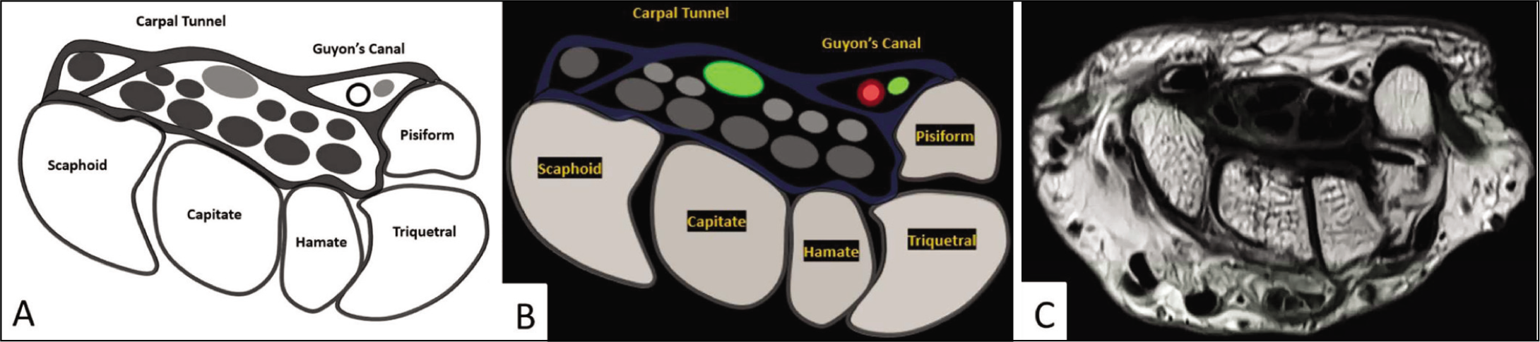
To depict the differences between a line diagram, schematic and original images, representative images of carpal tunnel and Guyon’s canal have been shown. (A) Is a line-diagram depiction, (B) is a corresponding schematic and (C) is an original non-contrast MRI image of the wrist at a similar cross-section
Among the 105 clinicians surveyed, the majority were orthopaedics, comprising 71 individuals (67.6%). Radiologists constituted the second most numerous group, with 18 participants (17.1%) in the cohort. The remaining 16 respondents (15.2%) belonged to other specialities such as medicine, surgery and anaesthesia [Supplementary Figure 2].
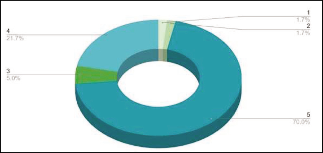
Regarding the importance of figures in publications, the responses to the first Likert scale question indicated a strong consensus among clinicians. A significant majority, accounting for 70% of the respondents, considered figures to be imperative for publications, assigning a score of 5/5. Additionally, 21.7% of the participants with a rating of 4/5 also believed that figures were crucial in a research paper. A small minority (5%) expressed equivocation, assigning a score of 3/5, while an even smaller percentage (3.4%) believed that figures were not important for publications [Figure 2].
To depict the importance of figures in publications, a 3D doughnut was conceived, to visualise the responses recorded on a 5-point Likert scale
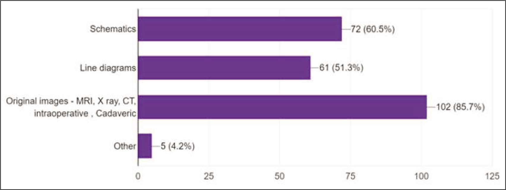
For the choice of images, the respondents could choose multiple provided options. Nearly 85.7% of the cohort had credence that the presence of original images, such as plain radiographs, computed tomography (CT), magnetic resonance imaging (MRI), and intra-operative images, provided a compelling narrative to the textual description. Schematics was the second most favoured at 60.5%, while slightly more than half of all the respondents (51.3%), ascribed line diagrams as an important adjunct to manuscripts [Figure 3].
A horizontal bar diagram representing the responses recorded for the preference of the respondents to the ‘type of figure’
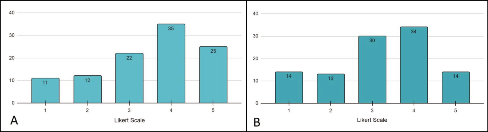
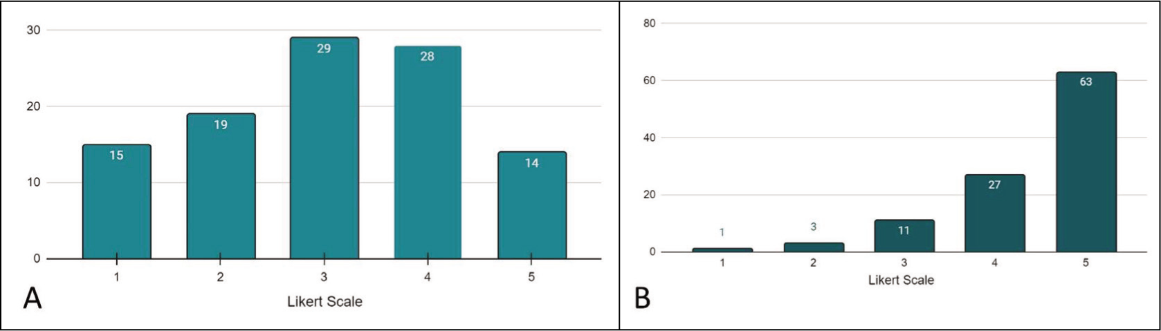
The opinion on whether the presence of schematics in addition to original images might sway reviewer opinion towards acceptance of the paper, revealed that 60/105 (57.1%) were likely to favour papers with both, while 22/105 (20.9%) were neutral to their added presence. Only a fifth, 23/105 (21.9%) respondents believed they were not likely to be swayed by the presence of schematics. While this may lead one to believe, that having a larger number of figures would correlate well with the acceptability of papers by the reviewers, this is not the case [Figure 4A]. Out of the 105 respondents, less than half 48/105 (45.7%) answered they would directly appreciate the presence of a greater number of figures, while 30/105 (28.5%) felt equivocal on the matter and the remaining 27/105 (25.6%) answered that there is no such correlation [Figure 4B].
(A) A vertical bar diagram depicting the responses on a 5-point Likert scale, to the survey question pertaining to the correlation of the impact of the presence of schematics in addition to original figures, on the acceptance rate of paper. (B) A vertical bar-diagram depicting the responses on a 5-point Likert scale, to the survey question pertaining to the correlation of the impact of the number of figures, on the acceptance rate of paper
Few of the journals have also introduced the option of including a GA and Infographics in addition to the usual textual abstract, while this is optional many authors choose not to dedicate more time towards this, believing this time to be well spent on the actual research, we wanted to explore if they were to include it, would it increase the chances of acceptance. 42/105 (40%) of our respondents ascribe value to their presence, while 29/105 (27.6%) are equivocal and 34/105 (32.3%) do not provide any added value [Figure 5A]. So, while the opinions are split, there may be a positive side to including them in a research paper, based on the 40% of reviewers who may value it.
Lastly, the response to the opinion on the presence of self-explanatory legends for figures revealed a resounding support for concise, yet explanatory legends. While 63/105 (60%) associated tremendous importance with the presence of such legends, overall, nearly 90/105 (85.7%) ascribed them to be significantly important from the perspective of representing a figure [Figure 5B].
(A) A vertical bar-diagram depicting the responses on a 5-point Likert scale, to the survey question pertaining to the correlation of the impact of the presence of a graphical abstract, on the acceptance rate of paper. (B) A vertical bar-diagram depicting the responses on a 5-point Likert scale, to the survey question pertaining to the correlation of the impact of the presence of self-explanatory legends, on the acceptance rate of paper
Discussion
Our endeavour to explore the significance of figures during the process of manuscript submission and approval by reviewers and the editorial board reveals some noteworthy insights. There exists a pressing need for clinicians to refine their skills as visual communicators, harnessing the power of visual aids to convey data amidst the sea of textual content inundating academia.
We found a lack of any prior formal published analyses scrutinising reviewers’ perceptions regarding the importance of figures within scholarly papers and their consequential impact on approval or rejection decisions. However, our cross-sectional survey garnered a robust response, with 105 participants offering valuable insights. Notably, nearly 70% of respondents accorded paramount importance to the inclusion of figures in manuscripts destined for publication in prestigious journals. In an editorial by Hmeljak et al.[4] to assess the importance of figures for readers, they commented that figures are essentially the first section a reader will assess, before committing time to the rest of the paper. Multiple studies in the past[3,5-7] to assess this question revealed that using figures, charts, graphs, and flow diagrams makes the paper suitable for reading, and these are often the first elements assessed by a reader.
Our survey unearthed a notable trend: reviewers exhibited a discernible inclination towards manuscripts adorned with original images, with a striking 57% attributing even greater significance to papers supplemented by schematics alongside the original images. Delving into the feedback provided by reviewers shed light on the rationale behind this predilection. Primarily, reviewers articulated those figures, particularly original images and schematic, wielded a transformative effect on data comprehension. They lauded these visual aids for their capacity to elucidate complex methodologies, provide a holistic overview of manuscript content, and enhance the portrayal of techniques and statistics compared to textual descriptions alone. Notably, line diagrams and schematics garnered heightened favourability, particularly in scenarios of intricate case presentations.
While repurposing figures by ‘drawing inspiration’ from other publications is often the easy route to the inclusion of figures by authors, they need to understand that while what might be highly accurate in one publication may not be entirely suitable for the other publication.[8] Comments by the participants in our study underscore a crucial caveat: the allure of visually appealing figures should not overshadow the paramount importance of methodological rigour and comprehensive textual exposition. Reviewers unanimously emphasised that figures serve as supplements to textual data rather than substitutes. While captivating visuals may initially sway reviewers’ opinions towards approval, their true value lies in enhancing the overall narrative of a methodologically sound research paper. The notion of employing captivating figures as a ‘honey-bee’ tactic to entice reviewers may yield initial interest, yet it is imperative to recognise that such allure dissipates upon closer scrutiny.[9] Reviewers are quick to discern discrepancies between visually appealing figures and the integrity of the underlying data. Consequently, manuscripts adorned with misleading or inaccurately represented figures face swift disapproval upon full assessment.
A thoroughly crafted research paper with equally well-created figures provides the opportunity for the authors, to reach a much wider audience.[9] The capacity to interpret textual descriptions varies across specialities, yet there exists a remarkable consistency in the comprehension of visual figures among diverse disciplines. As highlighted by Umoquit et al. in their systematic review of diagrammatic approaches, well-crafted figures serve as navigational beacons guiding readers to the thematic core of a paper. This facilitates efficient recall of pertinent aspects that might otherwise fade with time.[10] Figures play a crucial role in the communication of research findings in scientific publications by presenting complex data in an accessible visual format. Graphs, charts, and images allow readers to quickly grasp the primary message, thereby saving time and effort. Visual representations clarify intricate concepts and highlight relationships between variables that might be difficult to understand through text alone.[11] High-quality figures also enhance the perceived credibility and impact of the research, potentially leading to increased citations.[12]
Researchers commonly use a variety of figures in their work, each chosen for its ability to effectively convey specific types of information. Line graphs are excellent for illustrating trends or changes over time,[13] while bar graphs are ideal for comparing different categories of data.[14] Pie charts are suitable for representing proportions or percentage distributions,[15] and scatter plots are useful for exploring relationships or correlations between variables.[13,16] Photographs are crucial for depicting research subjects, experimental setups, or visual evidence of findings,[17] and flowcharts and schematics[18] are essential for outlining complex processes, methodologies, or system structures. Illustrations can provide a detailed and clear depiction of anatomical structures, experimental designs, or theoretical models.[19,20] Thus, selecting the right figures can greatly enhance the effective communication of research findings. Thoughtfully chosen figures can illuminate complex data, bolster arguments, and engage readers, reviewers, and editors.
Infographics and GA are important visual tools for disseminating research. Infographics provide a comprehensive overview by combining text and visuals to outline the background, methodology, results, and conclusions of a study. Their complexity can vary depending on the scope of the research.[21] In contrast, GA offers a succinct summary of the key findings, primarily relying on visuals with minimal text.[22] These visual tools enhance the written text, contributing to a more effective and impactful presentation of the research in publications.[23-25]
The significance of legends within figures cannot be overstated. Feedback from our surveyed reviewers consistently emphasised the importance of concise yet comprehensive legends. It was reiterated that legends should encapsulate all necessary information for reader comprehension without excessive verbosity. This sentiment echoes findings from previous studies,[26] where authors have underscored the pivotal role of succinctly crafted legends in enhancing figure interpretability and streamlining the reader’s experience. By providing a brief explanation directly within the figure, well-crafted legends not only facilitate comprehension but also optimise time utilisation for the reader.[4,5,9,26] However, authors are urged to allocate resources judiciously towards the creation of figures that not only captivate but also encapsulate the essence of their research endeavours. Each diagram should serve as a conduit, guiding the reader towards the central tenets of the paper, thereby amplifying its impact and resonance within the academic community.
While our study provides valuable insights into the impact of figures on manuscript evaluation, it is important to acknowledge its limitations. Foremost being the predominant representation of reviewers and editors from orthopaedics and radiology specialities in our survey sample. Additionally, the sample size of slightly over 100 respondents may limit the generalizability of our findings. Moving forward, future research endeavours should strive to address these limitations by encompassing a larger and more diverse pool of reviewers spanning various specialities such as medicine, surgery and beyond. By broadening the scope of participant demographics, subsequent studies can offer a more comprehensive understanding of the nuanced perspectives regarding the role of figures in scholarly manuscript evaluation.
Conclusion
Our investigation into the influence of figures on the evaluations rendered by experienced reviewers and editors offers a nuanced glimpse into their evaluative paradigm. Our initial hypothesis regarding the impact of figures on a paper’s publication prospects was validated, elucidating the pivotal role these visual elements play in the peer review process. While our respondents expressed a clear preference for manuscripts enriched with figures, it is discernible that such visual aids serve as augmentations rather than determinants in the evaluation continuum. The figures serve to streamline comprehension and enhance the scholarly discourse, yet they do not stand alone as the sole arbiters of a paper’s merit.
Supplemental material
Supplemental material for this article available online.
Supplemental material
Supplemental material for this article available online.
Footnotes
Declaration of conflicting interests
The authors declared the following potential conflicts of interest with respect to the research, authorship, and/or publication of this article: Authors Rajesh Botchu, Karthikeyan P Iyengar and Vijay Kumar Jain are members of the Editorial Board of Apollo Medicine. Author Raju Vaishya is Editor-in-Chief at Apollo Medicine. The authors did not take part in the peer review or decision-making process for this submission and have no further conflicts to declare.
Funding
The authors received no financial support for the research, authorship and/or publication of this article.
Institutional Ethical Committee Approval Number
Ethical committee approval was not applicable as the study was based on a survey approach.
Informed consent
Informed consent was not applicable as the study did not involve patient data or human subjects.
Credit author statement
All the authors have substantially contributed to the manuscript.
Data availability
The data collected from the survey is available in the form of a Google Form and the corresponding Excel sheet. Requests for access to the data can be made and will be considered on an acceptable basis.
Use of artificial intelligence
For grammar editing purposes.
References
Supplementary Material
Please find the following supplemental material available below.
For Open Access articles published under a Creative Commons License, all supplemental material carries the same license as the article it is associated with.
For non-Open Access articles published, all supplemental material carries a non-exclusive license, and permission requests for re-use of supplemental material or any part of supplemental material shall be sent directly to the copyright owner as specified in the copyright notice associated with the article.