
Abstract
Research on circadian rhythms often requires researchers to estimate period, robustness/power, and phase of the rhythm. These are important to estimate, owing to the fact that they act as readouts of different features of the underlying clock. The commonly used tools, to this end, suffer from being very expensive, having very limited interactivity, being very cumbersome to use, or a combination of these. As a step toward remedying the inaccessibility to users who may not be able to afford them and to ease the analysis of biological time-series data, we have written RhythmicAlly, an open-source program using R and Shiny that has the following advantages: (1) it is free, (2) it allows subjective marking of phases on actograms, (3) it provides high interactivity with graphs, (4) it allows visualization and storing of data for a batch of individuals simultaneously, and (5) it does what other free programs do but with fewer mouse clicks, thereby being more efficient and user-friendly. Moreover, our program can be used for a wide range of ultradian, circadian, and infradian rhythms from a variety of organisms, some examples of which are described here. The first version of RhythmicAlly is available on Github, and we aim to maintain the program with subsequent versions having updated methods of visualizing and analyzing time-series data.
Circadian clocks are thought to have evolved to equip organisms with 2 critical functions, namely, measuring the passage of time and recognizing local time. Together, these 2 functions contribute to the organism’s ability to capitalize on a temporal niche that may enhance its survival and reproduction (Nikhil and Sharma, 2017). As researchers, we are interested in asking how these functions differ within and across species, for a wide range of reasons. Commonly measured parameters to answer such questions are period of the oscillation under constant conditions, day-to-day variability in period, robustness of rhythm, phase relationship of the rhythm under different environmental conditions, day-to-day stability of these phase-relationships, and of course interindividual variation in period and phases. While many of these quantifications require manual or semiautomated detection of phase, estimates of period and power can be largely derived through the use of time-series analyses (Refinetti et al., 2007).
Time-series analysis to estimate period and robustness of rhythm has been of considerable interest since the early days of research on circadian rhythms. Among the earliest used tools were Fourier analysis, analysis of variance, and the autocorrelation function (Mercer, 1960; Refinetti et al., 2007). Over the years, there has been much effort in modifying and adapting different tools to suit our needs, which gave rise to the Enright or chi-squared periodogram (Enright, 1965; Sokolov and Bushell, 1978), COSINOR (Halberg et al., 1967), Lomb-Scargle periodogram (Lomb, 1976), maximum entropy spectral analysis (reviewed in Dowse, 2013), and, more recently, wavelet-based analysis for estimating periodicity and predicting phases of behavior (Leise, 2013; Leise et al., 2013). These are only a few of the commonly used time-series methods. For a history and more complete review of all methods, please see Refinetti (2007), Dowse (2009), Díez-Noguera (2013), and Leise (2015). Although Leise et al. (2013) proposed the use of wavelet-based methods to predict phases, many studies still estimate phases of behavior either subjectively or by using arbitrary thresholds.
Given the considerable investment in developing time-series analysis and phase prediction tools, we feel that there has not been a commensurate increase in software that helps researchers visualize and analyze their time-series data sets using these tools, in terms of cost, interactivity, and ease and efficiency of use. Although there are programs such as ClockLab (Actimetrics, Wilmette, IL), the Chronobiology Kit (Stanford Software Systems), ActogramJ (Schmid et al., 2011), and Chronomics analysis toolkit (Gierke and Cornelissen, 2015) that are available for use, they have some combination of the aforementioned limitations. More recently, a free program was published for analyzing Drosophila activity and sleep called ShinyR-DAM (Cichewicz and Hirsh, 2018). However, this program will be useful only for researchers working with Drosophila and only for those that exclusively acquire data from the Drosophila Activity Monitor (DAM) system. In addition, although very useful, this program allows only limited interactivity with the plots that are generated. Therefore, to have a general program that can analyze and visualize a wide variety of time-series data using highly interactive graphics and a comfortable graphical user interface (GUI), we have developed RhythmicAlly, which is written on the R platform (R Core Team, 2018) in collaboration with Shiny (Chang et al., 2018) and Shiny Dashboard (Chang and Rebeiro, 2018).
R is a free programming language meant to facilitate statistical analysis/computation and data visualization. R is very useful because it can compile and run on a wide variety of operating systems such as Windows, UNIX and MacOS. The program is available for use under the GNU General Public License v2. Although R has its own command line interface, there is RStudio, which is a powerful GUI for R. Shiny and Shiny Dashboard are packages written to enable the creation of powerful and interactive applications by the use of “‘reactive’ binding” between user-defined inputs and precoded outputs. Other packages that have been used to write RhythmicAlly and will not be cited in the rest of the text are zoo (Zeileis and Grothendieck, 2005) and pracma (Borchers, 2018). The rollapply and Reshape functions from packages zoo and pracma have been used to rearrange data to facilitate the plotting of actograms and averaging of data for each individual over cycles, respectively. RhythmicAlly has 2 components, and a brief description of their functionality follows. For information on initializing the application and other details, see Supplementary Methods and the Supplementary Video.
Installing R, RStudio, and RhythmicAlly
The first step to use RhythmicAlly is to install R (https://www.r-project.org/) and RStudio (https://www.rstudio.com/). A more detailed explanation of R and RStudio installation can be found in the Supplementary Methods and the Supplementary Video. Once installed, RhythmicAlly (https://github.com/abhilashlakshman/RhythmicAlly) can be initialized. The downloaded ZIP file must be extracted, and inside the “RhythmicAlly-master” folder, an “initialisation.R” file can be found. This must be opened and run in RStudio (see Supplementary Video). Once initialization is complete, the following message will be prompted in the RStudio console: “Initialisation complete! RhythmicAlly is now ready for use.” After this, every time RhythmicAlly needs to be used, RStudio must be opened, and the following must be typed into the console: shiny::runApp(“path/location/of/the/For_DAM/or/Others/application/inside/the/RhythmicAlly-master/folder”, launch.browser = TRUE). This should start RhythmicAlly, and the home screen should look like the image shown in Figure 1.
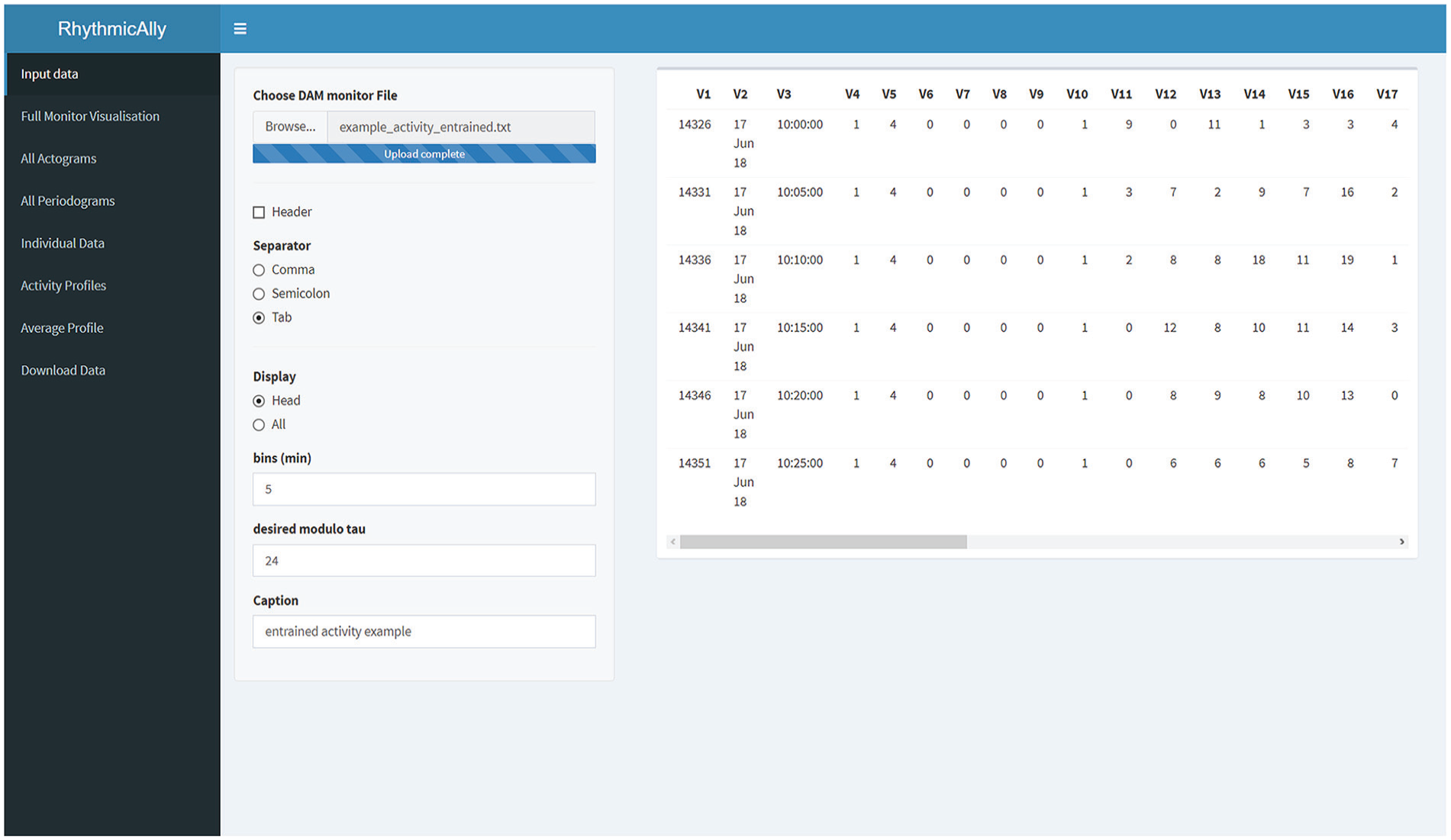
Screenshot of the home screen of the RhythmicAlly/For_DAM/ application. On the left side is displayed all the functionalities that the application offers. Once the input file is browsed and loaded, users can verify the data in the preview of the data set on the right side of the home screen. If the All option is selected under the Display input choice, the entire data set will be displayed on the right side for the user’s perusal. The bins and modulo-τ must be entered carefully as they will be used for further analysis in the other tabs. The caption is important as all downloaded files will be labeled with the name that users provide in this field.
RhythmicAlly/For_DAM/
The first component of RhythmicAlly is coded to analyze locomotor activity time-series data collected from Drosophila melanogaster using the DAM system made by TriKinetics (Waltham, MA). The first page is the input page, and users can browse and load their scanned DAM monitor files. In the same page, input regarding the bins in which the data were saved, modulo-τ, and caption need to be entered (Fig. 1; Suppl. Fig. S1). All subsequent tabs analyze data using the bins and modulo-τ specified here, and the caption provided by the user must have a unique identity because all analyzed files for download will use this name to save files on the user’s local disk.
Full Monitor Visualization
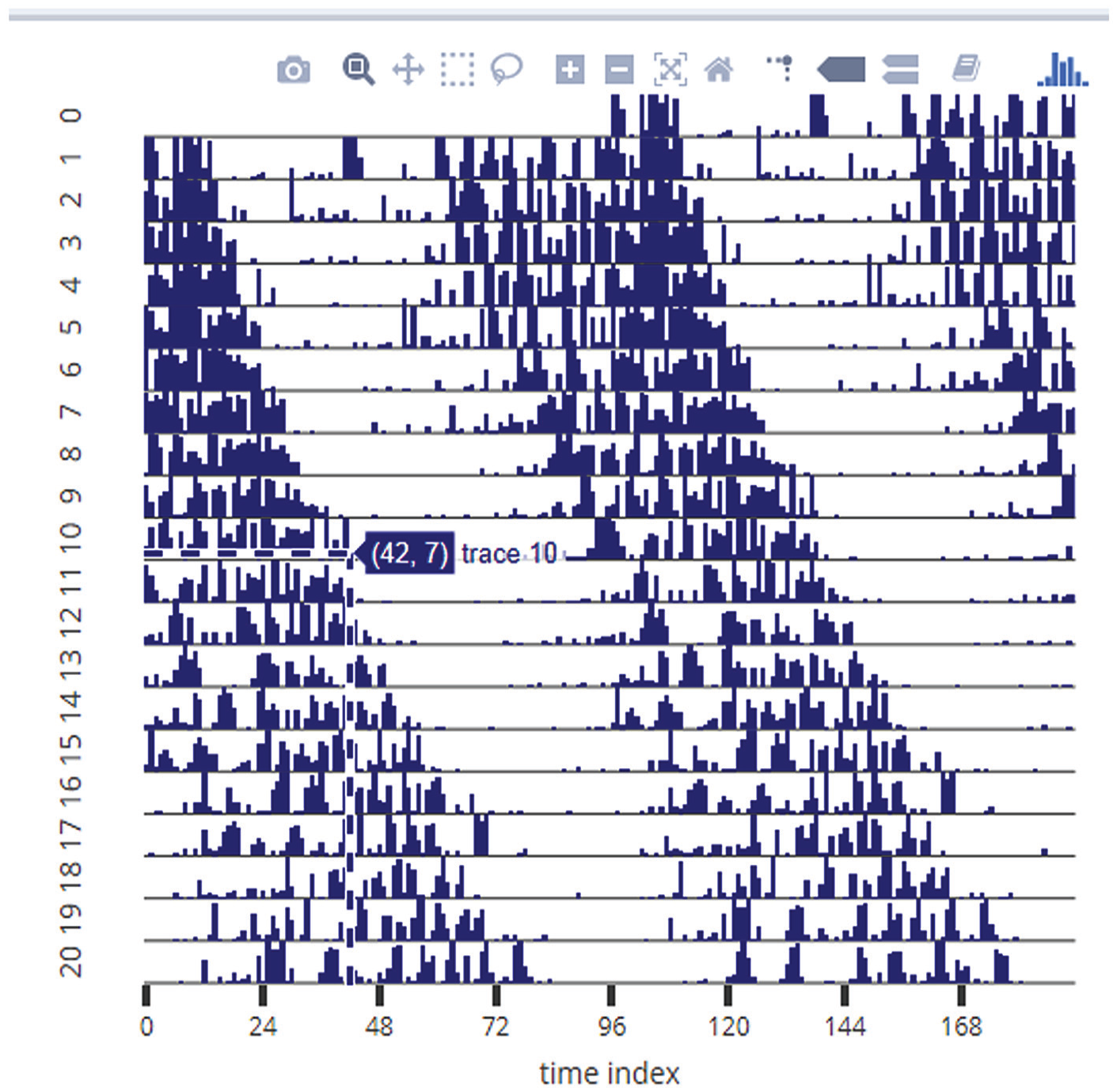
This is a useful feature enabling visualization of all 32 channels in one window that can reveal interindividual variation in time-series across all the cycles of data (Fig. 2; Suppl. Fig. S2). Along the x-axis, the time series is plotted for each individual as a heat map, and along the y-axis are individuals. There is a reactive input variable in this page that allows the user to modify the maximum color intensity so as to set a threshold on the maximum activity in the heat map, thereby allowing easy visualization. This plot allows one to see how well rhythms of all individuals are aligned with each other and with reference to local time. In addition, users can easily visualize changes in such alignment across cycles. For instance, in this example it is clear that interindividual variation in the phase of onset of activity is much higher than the phase of offset of activity (Fig. 2; black arrows). This figure (and all other plots in this application) are made using “plotly” for R (Sievert, 2018) and therefore are highly interactive. Users can zoom into a few cycles of interest and look at just a few individuals that they want to in more detail. The figure can be downloaded as a .png file by clicking on the camera button on the top right corner of the figure. The last row of time series in this heat map is the average time series of all the individuals.
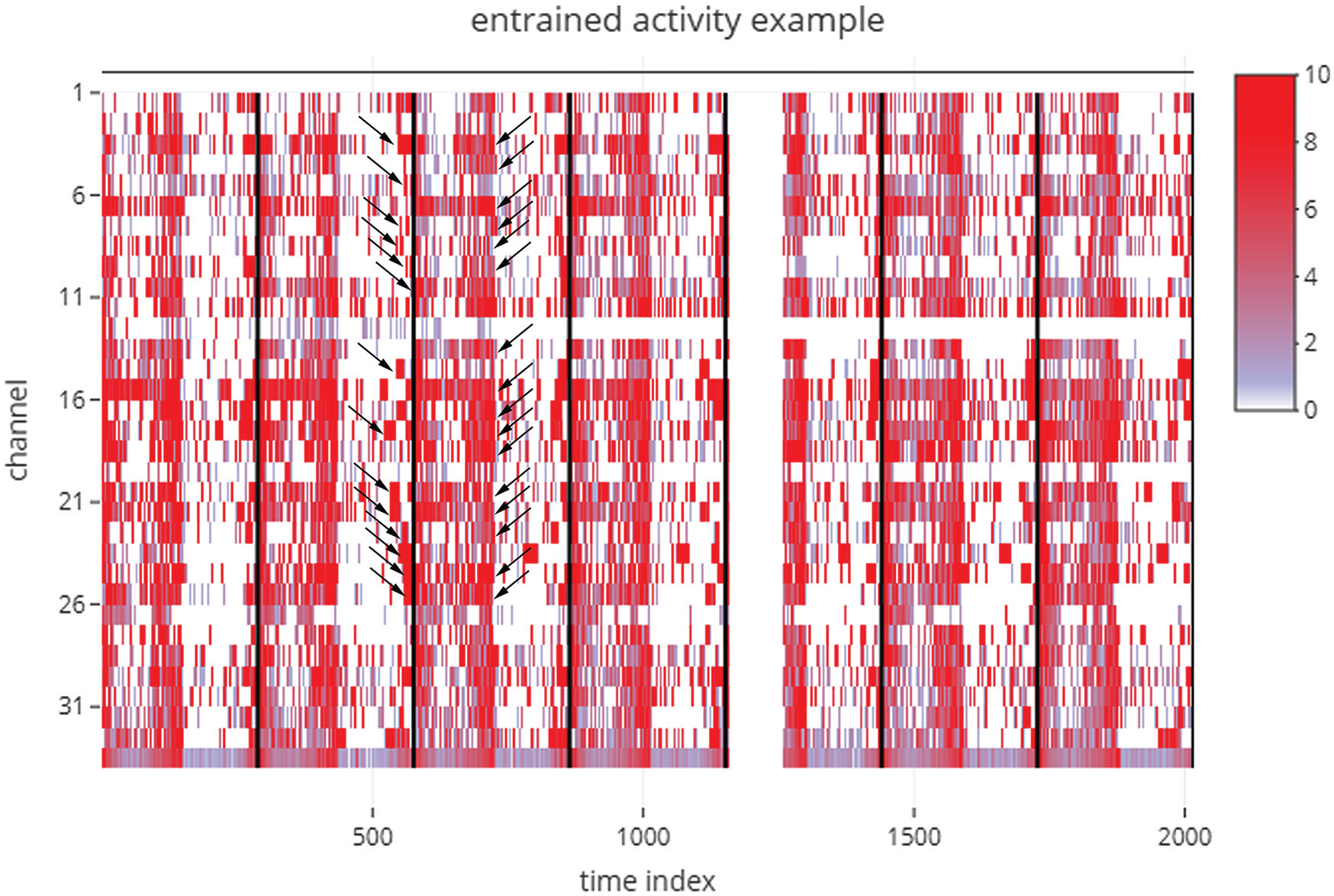
Figure downloaded, as is, from the Full Monitor Visualisation tab of an analysis session, where the example data set labeled “example_activity_entrained.txt” in the RhythmicAlly-master/For_DAM/ folder was used as input. This is an example data set of the locomotor activity of D. melanogaster recorded using the Drosophila Activity Monitor (DAM) system. The time index is plotted along the x-axis (i.e., if the input data are collected in 5-min bins and the first time point in the data set is 1000 h, then a time index of 100 would imply 500 min after 1000 h, which is ~1820 h. Each individual is arranged in sequence along the y-axis, and the color indicates the amount of activity displayed by each individual at a given time during the experiment. Each black bar indicates the end of one cycle as defined by the modulo-τ input given by the user. Note here that the interindividual variability in the phase of onset of activity is much higher than that of the phase of offset of activity (arrow heads). These are features that are not easy to see and interpret in the absence of visualizations of this kind. The gap in this example heat map just after the end of the fourth cycle indicates a technical glitch in recording, for the entire monitor.
All Actograms
This tab generates actograms in the form of a heat-map for each individual and displays it together, so users can visually compare activity patterns across all individuals that were recorded in the same monitor (Fig. 3a; Suppl. Fig. S3). The inputs in this tab include one which can modify the number of plots in the actogram and the maximum activity threshold in the actograms (similar to the input in the Full Monitor Visualisation tab). The last actogram is that of the averaged time-series across all individuals (Fig. 3a; marked as “Batch”). We feel that the visualization in this tab allows users to easily weed out individuals that are arrhythmic or that die in the middle of the experiment.
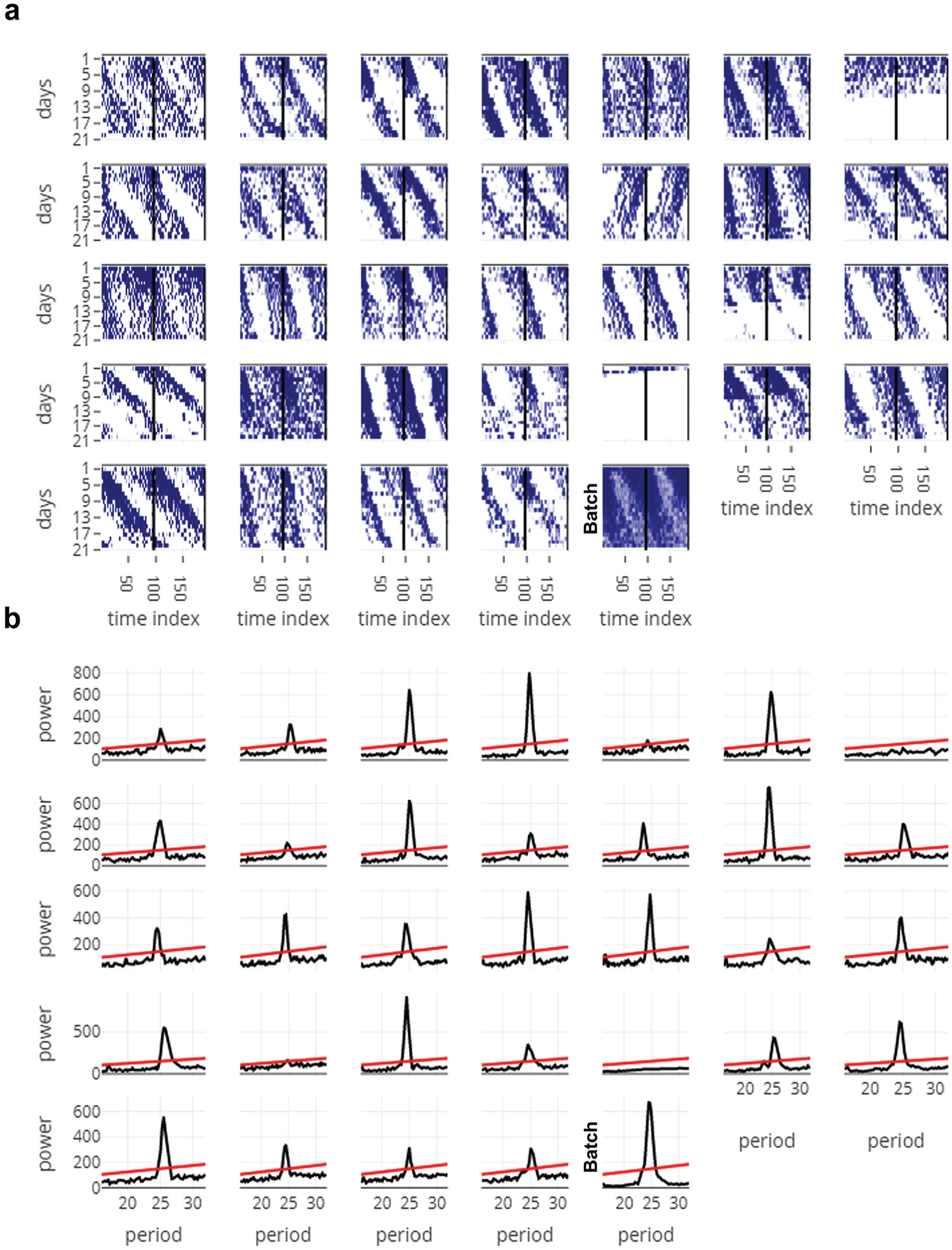
Figures from the All Actograms (a) and All Periodograms (b) tabs, downloaded as is. Data used here are obtained from free-running activity behavior of D. melanogaster (“example_activity_freerunning.txt” in the RhythmicAlly-master/For_DAM/ folder). (a) The time index is plotted along the x-axis and days along the y-axis, and the actograms are double plotted. It is clear from a glance of all the actograms that most individuals show longer than 24-h free-running periodicities. In addition, it is clear that individual 5 is arrhythmic, and individuals 7 and 26 died soon after recording started. (b) Periodograms of all individuals whose actograms are displayed in panel (a). Period being tested is plotted along the x-axis and power along the y-axis. The line is the significance line calculated based on the alpha input given by the user in the All Periodograms tab. In most other applications/software, the period and power for each individual must be noted down separately, thereby making it cumbersome. In RhythmicAlly, users can move the cursor along the peak of the periodogram and can click on the peak, wherein the period and power at that point of click is stored in a table below the plots in the All Periodograms tab. These data are then available for download as a .csv file in the Download Data tab. See Supplementary Figure S4 for more details.
All Periodograms
This tab analyzes time series for all the individuals using 1 of the 3 time-series analysis methods that are currently employed by the program (i.e., Enright or chi-squared periodogram, autocorrelation, and Lomb-Scargle periodogram; Fig. 3b; Suppl. Fig. S4). Codes to run these periodogram analyses are already published in the form of a very convenient R-package called “zeitgebr” (Geissmann and Garcia, 2018) and have been used by us in this application. Time resolution for the chi-squared periodogram analyses has been programmed to be same as the binning resolution. Users can modify the period range and significance values according to their need while performing the analysis. Power versus period plots for all individuals are simultaneously displayed with the help of an interactive chart. Moreover, when users move their cursor along these plots, period and power of the corresponding nearest point are displayed and stored in a table at the bottom of the tab on clicking (Suppl. Fig. S4, table).
Individual Data
This tab has a user interface similar to that of ClockLab (Actimetrics). For each individual, the actogram is plotted and the periodogram for that individual is displayed (Fig. 4; Suppl. Figs. S5, S6, and S7). The input values for plotting the actograms are the individual ID (channel number as referred to in the DAM system), the number of plots in the actogram, the threshold for maximum activity to be plotted, and the starting time of input data set (in decimal values, not in time format). The input values for the periodogram on the right side of this tab are taken from whatever input values were provided in the All Periodograms tab. To analyze day-to-day variability in period and/or phases, it is important to first identify and mark phases of interest. Although there are recent nonsubjective ways to identify phases of onset and offset of activity (Leise et al., 2013; Schlichting et al., 2016), researchers continue to prefer to mark phases subjectively. In Drosophila activity time series, this is partly due to noisy data and the smaller length of data sets compared with those that have been used in the examples shown in Leise et al. (2013). To the best of our knowledge, no freely available application allows subjective marking of phases. RhythmicAlly now allows users to subjectively mark phases in the actogram (on click), which can be stored in the table within this tab (Fig. 5; Suppl. Fig. S5, table). This we are certain will be a very useful feature for many researchers who are unable to afford expensive software and also need to manually mark phases of behavior. In this tab, every time the channel number is changed, the actogram and periodogram will get updated, but the table remains unaltered. Thus, phases of all individuals can be stored in the same table and downloaded, thereby making subsequent analyses of interest on a spreadsheet program such as MS Excel easier for users.
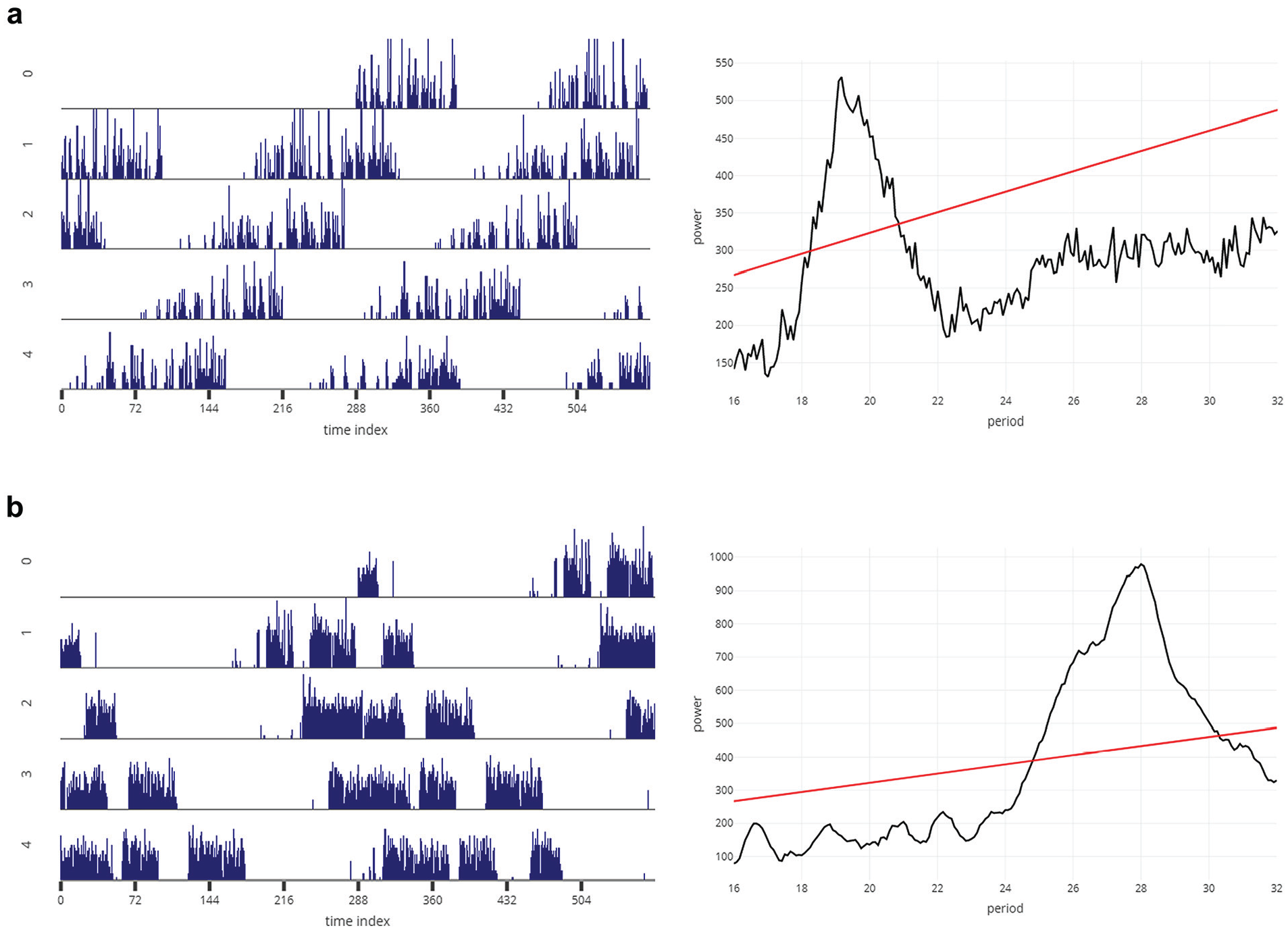
Representative actogram (left) and periodogram (right) for a fly (D. melanogaster) with shorter than 24-h (a) and longer than 24-h (b) free-running period, downloaded from the Individual Data tab, as is. The x-axis and y-axis of the actograms and periodograms are the same as those described in Figure 3.
Example of the subjective phase-marking feature of RhythmicAlly. The representative actogram is a screenshot from the Individual Data tab. Turning on the Toggle Spike Lines option allows the user to visualize the x- and y-coordinates at the point of the cursor. Users can move their cursor to the end of activity on each day (in this example, the cursor is being pointed at the end of activity on day 10) and click. On this click, the subjectively estimated phase of offset of activity gets stored in a table at the lower part of the Individual Data tab. This can be done for each day and all individuals and can be together downloaded as a .csv file from the Download Data tab. See Supplementary Figure S5 for the interface of the Individual Data tab. Similarly, users can mark phases of onset, peak, and so forth.
Activity Profiles
This tab shows the profile for each individual’s raw time-series values averaged over all the cycles (Fig. 6a, left, and 6b, left; Suppl. Fig. S8). One cycle’s length is defined by the modulo-τ input from the first tab; therefore, the program can be used for visualizing average profiles under DD and/or T-cycles with periodicities very different from 24 h. The data used for making this plot are displayed in a table at the bottom of the plots (Suppl. Fig. S9, table).
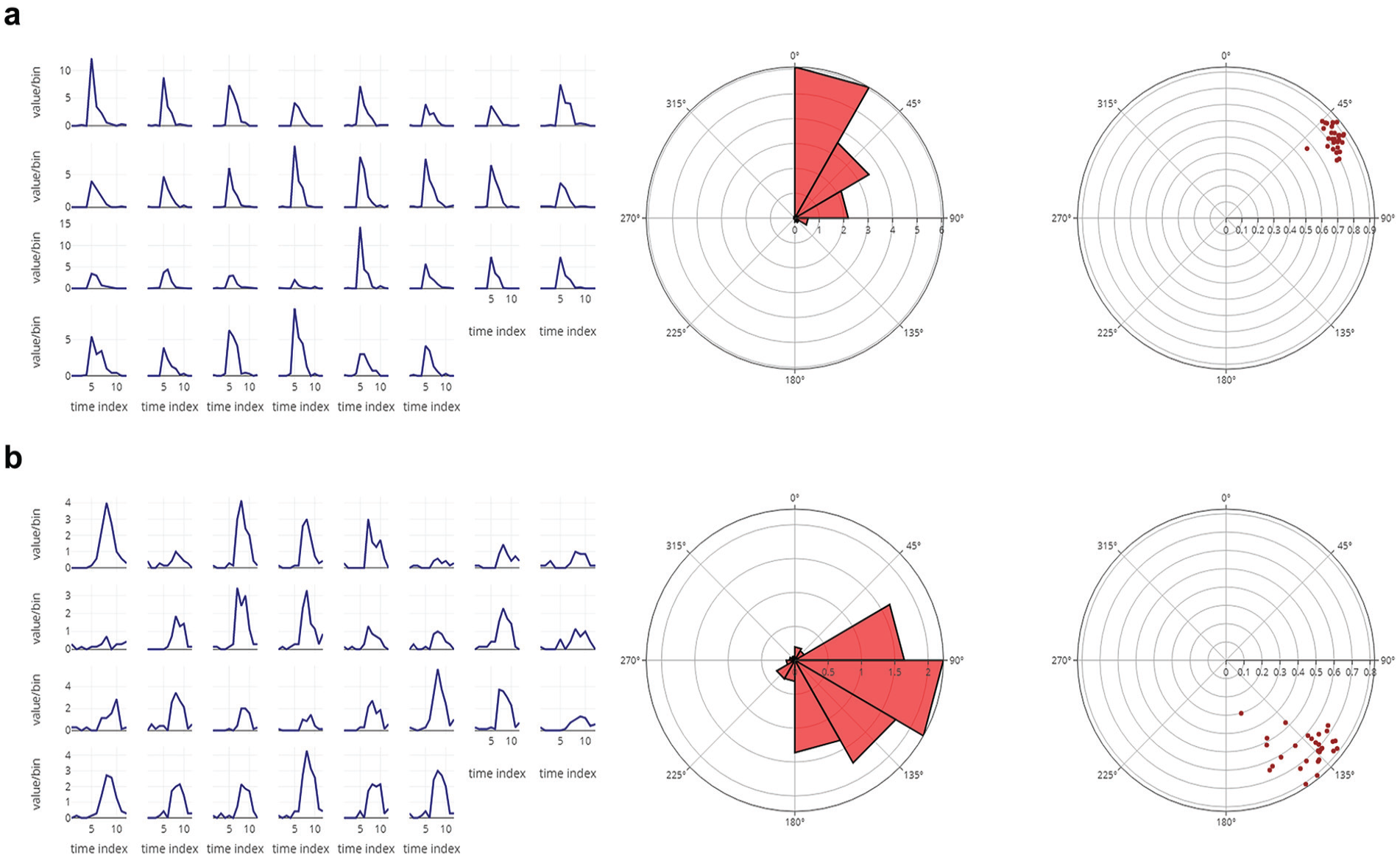
(a) The eclosion profiles of 30 independent vials averaged over 6 cycles of data for a D. melanogaster strain having advanced phase of eclosion (left). Also shown is the average rose plot of the eclosion profile averaged over all 30 vials (middle). The 0° on the rose plot refers to zeitgeber time 00 (ZT 00). The radial distance of each triangle on the rose plot indicates the total number of flies eclosing in the defined bin. The angular width of each triangle is the bin size. As is clear, the peak of eclosion occurs between ZT 00 and ZT 02 in this case. The center of mass (CoM) values for each vial are displayed on the right. Each dot represents a single vial. The radial distance of each dot reflects the gate width or consolidation of the eclosion rhythm, and the angle it makes from 0° (ZT 00) is reflective of the mean phase of the oscillation. (b) The eclosion profiles of 30 independent vials averaged over 6 cycles of data for a D. melanogaster strain having delayed phase of eclosion (left). Also shown is the average rose plot of the eclosion profile averaged over all 30 vials (middle). As is clear, in this case, the peak of eclosion occurs between ZT 06 and ZT 08. On the right is displayed the CoM values for each vial. Raw data for all the average profiles are displayed in a table below the plots in RhythmicAlly (Suppl. Fig. S9) and will be downloadable in the Download Data tab. The interactivity of the plots will allow users to gather a lot of information regarding the shape of the waveform and phases in average profiles by just moving the cursor along the plots.
Average Profile
This tab displays the profile of activity averaged over all individuals (Suppl. Fig. S9). We think that this and the previous tab are useful for users, because it provides them with the opportunity to visualize all their individuals simultaneously and look for subtle changes in the waveform of their behavior, such as interindividual variation in nighttime activity, anticipation, midday activity, phases of peaks, and so on.
Download Data
This tab has a drop-down menu that allows users to choose their data set of interest that they want to download (Suppl. Fig. S10). They can download the average activity profiles for each individual or the period and power values that were stored on click or the phases that were marked on click.
RhythmicAlly/Others/
This component allows analysis of time-series data for behaviors other than “scanned” DAM data, which may be obtained either from flies or other model systems (e.g., locomotor activity, oviposition, eclosion, feeding, body temperature, blood pressure, etc.). Here, we describe only the additional things that this application can do over and above what it does for data acquired through the DAM system. An important feature to note here is that in the Full Monitor Visualisation, All Actograms, and Individual Data tabs we have provided an additional input option that allows users to choose the minimum value on the y-/z-axis (thereby allowing users to scale their axes appropriately). This is important because, for instance, in the case of data such as body temperature, raster plots that start plotting on the y-axis from 0 are not helpful for visualizing rhythms that have an amplitude of ~3 °C or so around a mean temperature of ~37 °C.
Prop Ind Profiles (Proportion Individual Profiles)
Often, researchers may be interested in profiles that are averaged over cycles for each individual sampling unit (e.g., for a vial or an individual), but the use of raw values for such purposes may be inappropriate. For instance, in the case of a damped oscillation, averaging raw values over all cycles gives rise to a misleading profile. In such cases, it is worthwhile to compute values as a fraction of the total value for each cycle and then average these values over cycles. This is what is done in the Prop Ind Profiles tab.
Rose Plots
The circular histogram representation of data is displayed here (Fig. 6a, middle, and 6b, middle). Users can visualize rose plots for each individual and also for the average across all individuals. Often, this is useful to observe the distribution of data around the clock, when linear profiles are difficult to read because of high noise in behaviors, such as in the case of oviposition rhythms in Drosophila.
Center of Mass
Phases are circular random variables and must be treated as such wherever possible (Batschelet, 1981). This tab computes the mean angle of the oscillation (center of mass [CoM], represented as θ; a nonsubjective phase marker) for each individual and the consolidation of the rhythm (r) and represents it on a polar plot (Fig. 6a, right, and 6b, right).
Download Data
In this part of the application, 2 additional data sets can be downloaded; the profiles computed by averaging the proportion of values and the phases of CoM.
To illustrate the utility of our program in analyzing other time-series data, we visualized and analyzed some example time-series from rodents. We visualized the activity of ice rats (Otomys sloggetti) collected using infrared (IR) captors and running wheels (Fig. 7a) and activity using IR and body temperature using a passive integrated transponder tag of mole rats (Cryptomys hottentotus pretoriae; Fig. 7b). Data for the mole rats have been published (Haupt et al., 2017), but that of the ice rats are not yet published. Finally, we also analyzed circatidal rhythms in activity/rest behavior of the mangrove cricket (Aptorenemobius asahinai; Fig. 8). The cricket data have been published earlier (Satoh et al., 2008) and can be referred to for comparisons. These highlight how users can use a single platform to analyze a variety of data from different organisms.
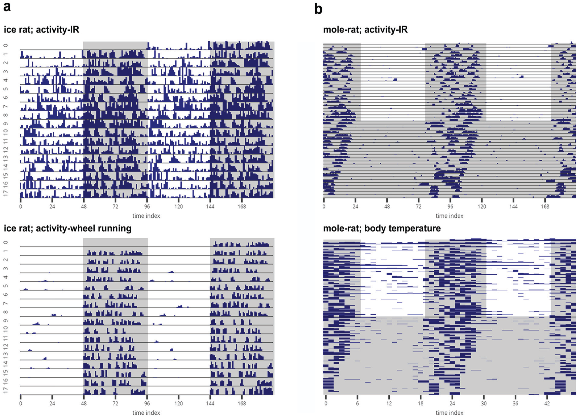
(a) Representative actograms of the locomotor activity of a single ice rat (Otomys sloggetti) as estimated using an infrared (IR) captor (top) and a running wheel (bottom). The rat was recorded under LD12:12 at 25 °C. (b) Actogram of locomotor activity of a mole rat (Cryptomys hottentotus pretoriae) measured using an IR captor (top), and raster plot of body temperature of the same animal measured with a passive integrated transponder tag (bottom). The mole rat was recorded for 25 days under LD12:12 at 30 °C and then under DD at 30 °C. The mole rat data have been published elsewhere (Haupt et al., 2017). All activity data sets are binned in 15-min intervals, and the body temperature data are collected at 1-h intervals. All of the gray-shaded regions indicate scotophases. The data sets were provided by Maria Oosthuizen, University of Pretoria, South Africa.
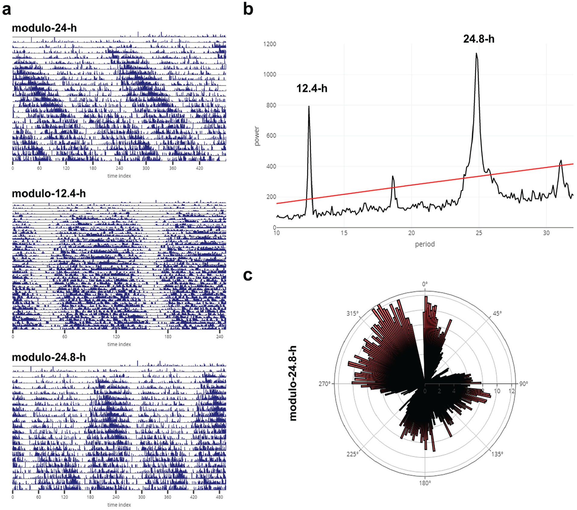
Representative actogram of a mangrove cricket (Apteronemobius asahinai; data shared by Aya Satoh, the Graduate University for Advanced Studies, Kanagawa, Japan) displaying circatidal rhythms downloaded as is from the Individual Data tab of RhythmicAlly. Activity data for the cricket are recorded under constant darkness in 6-min intervals. The actogram is plotted as modulo-24-h (a-top) for the same animal displayed in figure 1a in Satoh et al. (2008; see for comparison). Also shown are actograms for the same cricket under modulo-12.4-h (circatidal rhythm; a-middle) and under modulo-24.8-h, which shows 2 bouts of circatidal activity (a-bottom) within approximately a day (consistent with there being 2 bouts of low and high tides within a day). (b) Chi-squared periodogram for the same cricket (see fig. 1a in Satoh et al., 2008). The bimodality seen in the actogram (a-bottom) under modulo-24.8-h can also be visualized as a rose plot. The time series was averaged over all cycles, with the length of 1 cycle being 24.8 h. This average is plotted as a rose plot in (c). 0° represents 0000 h local time, and one can clearly see that there is a major bout of activity between 90° and 180° and another major bout between 270° and 360°.
All codes for running this application are uploaded on Github (https://github.com/abhilashlakshman/RhythmicAlly) under the General Public Licence version 3, along with a user manual and example data sets to familiarize users with the interface. We aim to keep the program up to date by modifying and adding new modules that will make the program more useful than it is now and hopefully improve the user’s experience. For instance, we intend to include newer methods of time-series analyses and phase-shift estimates using objective phase markers as have been used in Schlichting et al. (2016). Although the goal of RhythmicAlly was to cater to biological rhythms in the circadian range, changing parameters can also allow one to use the program to analyze ultradian or infradian rhythms (see Fig. 8). Lastly, RhythmicAlly will appeal to researchers who are uncomfortable with coding because of the availability of a user-friendly GUI and also to researchers who are familiar with coding who can very easily modify the codes to tailor the program specifically to their needs.
Supplemental Material
AbhilashandSheeba_RhythmicAlly_SOM_revision1_14052019_(1) – Supplemental material for RhythmicAlly: Your R and Shiny–Based Open-Source Ally for the Analysis of Biological Rhythms
Supplemental material, AbhilashandSheeba_RhythmicAlly_SOM_revision1_14052019_(1) for RhythmicAlly: Your R and Shiny–Based Open-Source Ally for the Analysis of Biological Rhythms by Lakshman Abhilash and Vasu Sheeba in Journal of Biological Rhythms
Footnotes
Acknowledgements
We thank Arijit Ghosh, Chitrang Dani, Aishwarya Ramakrishnan, Saloni Sinha, and Divyesh Joshi for going through the program and installation tutorials and informing us of potential changes that would benefit users, and Pavitra Prakash, Viveka Singh, Anuj Menon, Ankit Sharma, and Manishi Srivastava for providing us with example data from flies for testing the program. We are also very grateful to Aya Satoh and Maria Oosthuizen for circatidal data from crickets and activity and body temperature data from rodents, respectively. These data sets were used to make Figures 7 and 8. We would also like to thank the 2 anonymous reviewers for their comments on a previous version of the manuscript. We would also like to acknowledge financial support from Jawaharlal Nehru Centre for Advanced Scientific Research (JNCASR), Bangalore. We encourage users to communicate with us (
Conflict of Interest Statement
The authors have no potential conflicts of interest with respect to the research, authorship, and/or publication of this article.
Notes
References
Supplementary Material
Please find the following supplemental material available below.
For Open Access articles published under a Creative Commons License, all supplemental material carries the same license as the article it is associated with.
For non-Open Access articles published, all supplemental material carries a non-exclusive license, and permission requests for re-use of supplemental material or any part of supplemental material shall be sent directly to the copyright owner as specified in the copyright notice associated with the article.