
Abstract
The Journal of Biological Rhythms will be publishing articles exploring analysis and statistical topics relevant to researchers in biological rhythms and sleep research. The goal is to provide an overview of the most common issues that arise in the analysis and interpretation of data in these fields. By using case examples and highlighting the pearls and pitfalls of statistical inference, the authors will identify and explain ways in which experimental scientists can avoid common analytical and statistical mistakes and use appropriate analytical and statistical methods in their research. In this first article, we address the first steps in analysis of data: understanding the underlying statistical distribution of the data and establishing associative versus causal relationships. These ideas are then applied to sample size, power calculations, correlation testing, differences between description and prediction, and the narrative fallacy.
Research findings in biological rhythms and sleep research are frequently applied to human health and safety. Recognizing the potential pitfalls in even basic statistical analysis is crucial for the continued advancement of these biologically and clinically relevant fields. Inappropriate analyses and statistics may compromise conclusions and waste time, money, and resources. Examples recently noted by the authors include publications applying statistics that assume a Normal (Gaussian) distribution to analysis of non-Normally distributed data sets or to under-sampled data sets containing only three or four points per group, and other analyses of datasets with the pitfalls described below. The issue of inappropriate statistical methods has also been recently addressed in other contexts (Lehrer, 2010; Preece et al., 1999; Button et al., 2013; Smith, 2004).
Two main goals of statistical analysis are to extract a relevant feature from a group of observations and to utilize some summary of the feature for comparison with another group or condition. The choice of summary statistics requires knowledge of the underlying distribution of the data. Since sleep and circadian variables are frequently non-Normally distributed, the types of analyses applied to these variables are limited, and may not include the types of analyses most commonly taught, since many of those assume a Normal distribution of data. Understanding the distribution of the data requires adequate sample sizes, which may be limited either because of a small available population or difficulties (including expense) in data collection.
For demonstration purposes, we will consider statistical issues in the context of (simulated) data from a research group that has created a new mouse strain harboring a deletion of a novel gene, bayz, which they hypothesize is involved in sleep and circadian physiology. After each section, we will highlight key points. We will not recommend specific commercial programs or websites for performing statistical analyses. Readers may choose their preferred programs/websites; they are encouraged to know how thoroughly the program/website was tested and under what conditions it is designed to be used.
Importance of Plotting Data in-the-raw and Making Qualitative Assessments
A simple habit can protect the researcher against many statistical errors: plot the raw data before engaging in analysis. Insights gained from this simple step can lead to choosing proper methods for further analysis. Plots help to identify outlier points including erroneous values, such as negative values when only positive values are possible (negative values are sometimes used as a placeholder to indicate when there are missing or invalid data), or other non-plausible values (e.g., nap durations of 45 h). If below-threshold measurements (e.g., hormone concentrations) are replaced with zero values or threshold values, it is important to check whether this decision alters the statistical assumptions and conclusions.
Plotting options include scatter plots (usually for continuous bivariate x-y data), or dot-plots in which all data points within a group are displayed as different y-values at a single x-axis value (group indicator); examples are given in the next section. A qualitative sense of the distribution of the data obtained from inspecting the plot may inform statistical as well as biological insights. For example, a multi-modal distribution (i.e., two or more clusters in an x-y plot or peaks in a histogram) may suggest biological heterogeneity of the sample in the variable of interest, and also indicates which kinds of statistical tests should be avoided (e.g., those assuming a Normal distribution). Anscombe’s Quartet is a famous example of four distinct data distributions that have identical mean, standard deviation, and correlation values.
Making a habit of reviewing raw data plotted as individual points will reduce inappropriate inferences about characteristics of the data. Intuitions at this initial stage should then be pursued with formal analysis tools, including tests of Normality and handling of outliers or errors.
Key Points
Always plot the raw data before selecting statistical tests or performing formal statistical analyses.
Determine the distribution of the data before choosing statistical methods. Not all data sets are Normally distributed, symmetric, or unimodal.
Establish pre-experiment the criteria for how to handle outliers or inappropriate values.
Distributions and Display Strategies
To begin, we test bayz mice for total sleep time (TST) during the light condition of a 12:12 light:dark cycle experiment. TST from this dataset has a Normal distribution, meaning we could use statistical tests that assume Normality. Figure 1A shows different ways we might choose to plot data from 10 mice. At this step, we can already see that the plotting choices convey very different impressions of the data sample. Compared to the dot-plot, which shows every point in the sample (n = 10), the bar graph with standard error of the sample mean (SEM) gives the impression of a “tight” distribution of data. Note that SEM is a metric of the precision in the estimation of the population mean, not the variability of the observed data. Unfortunately, SEM bars are often misconstrued by readers and investigators to reflect the variability of the data, rather than the correct interpretation as variance in the estimate of the mean of the data. Unless interpreted properly, the SEM can give a false sense of reproducibility.
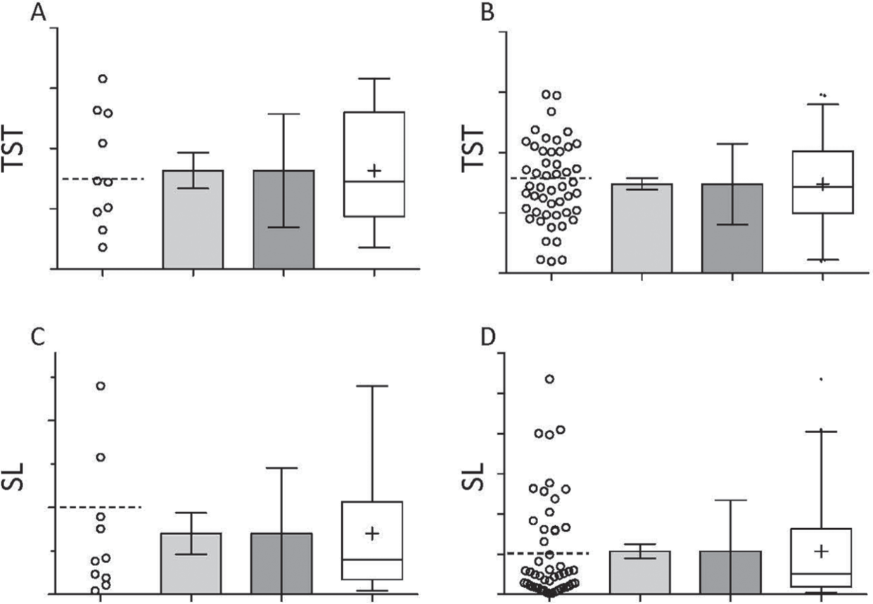
Comparison of basic display options. (A) Random sample of total sleep time (TST) values (n = 10) drawn from a Normal distribution, with SD equal to 50% of the mean value, displayed from left to right as: dot-plot, bar with SEM, bar with SD, and box-and-whiskers plot showing the median and 25% to 75% range (box), 2.5% to 97.5% range (whiskers) and the mean (“+”). In this and subsequent panels, the dotted horizontal line in the dot-plot is the “true” mean of the population from which the sample is derived. The y-axis units are arbitrary. (B) As in (A), but with n = 30. (C) As in (A), except with a random sample of sleep latency (SL) values (n = 10) drawn from a mono-exponential distribution that has the same mean value as in (A) and (B). (D) As in (C), but with n=30.
The bar plot with SD captures the variability in the sample. However, because the SEM and SD bars are, by definition, symmetric around the mean (even if the data sample is not), they may not accurately reflect the underlying distribution. This is especially a problem if the data are not Normally distributed (e.g., if they were heavily skewed or bimodal).
The box and whiskers plot, by contrast, provides an additional sense of any asymmetry in the distribution by showing interquartile ranges and 95% confidence intervals; values other than 95% can also be chosen for the “whiskers”.
Figure 1B shows a larger sample (n = 30) of the same distribution, along with the same four display techniques. Note that the SEM is particularly sensitive to sample size: SEM is computed as the SD divided by the square root of the sample size. The SEM therefore is sensitive to sample size, while the SD is not.
Next, we examine sleep latency (SL) after the transition from lights off to lights on. SL from this dataset is not Normally distributed. Figure 1C shows the results for n = 10 mice using the same four plotting techniques as above. It is not readily apparent that the distribution is non-Normal from the bar with SEM plot. Note that the bar with SD plot shows an SD that reaches into negative values: this implies asymmetry in the data because negative values are not possible for SL: the only way the distribution of SL could have such a large SD would be from points much larger than the mean. This asymmetry is appreciated more easily in the box and whiskers plot.
Increasing the sample size to n = 30 yields a much clearer view of the asymmetry in the dot-plot and the box and whiskers plot (Fig. 1D). By comparison, the bar with SEM plot still does not indicate information about the sample distribution (see previous paragraph). It is almost never helpful to show data as mean ± SEM, even when the distribution meets criteria for Normality, because of the risk that this approach will hide potentially interesting or important features of the distribution, and readers may falsely think that the sample presented had very small variance. Therefore, we strongly suggest that all data sets—even those that have Normal distributions—be plotted with either box and whiskers plots or as dot-plots, with the mean or median indicated. This is especially relevant for datasets with less than 10 points, in which accurately assessing the underlying statistical distribution (e.g., for Normality) may be difficult, because there are so few data points (see below).
Finally, it is worth noting that the 95% confidence interval of the distribution is not the same as the 95% confidence interval for the mean of the distribution (Fig. 2).
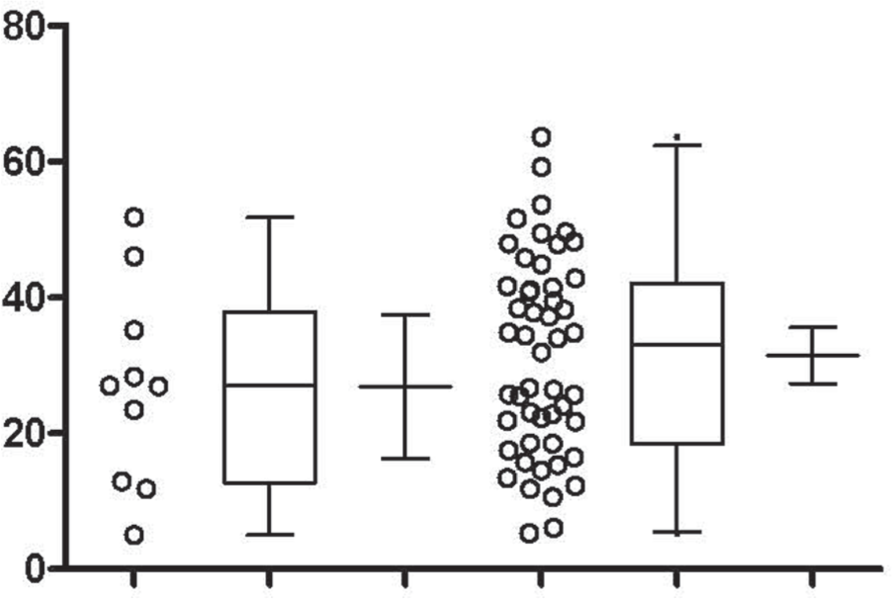
95% intervals. Random draws from a Normal distribution are shown for n = 10 (left three columns) and n = 50 (right three columns) samples. The box and whisker plot shows the 95% interval of the data itself, while the dot-plot shows the raw data points, and the mean with 95% confidence interval of that mean shown separately. Notice that for the larger sample size, the 95% interval of the data remains similar but that of the 95% interval of the mean (not of the data) is reduced.
Key Points
Plots of raw data show information about the sample distribution and outliers.
Box plots, or other graphs that indicate the variability and symmetry of the data, are preferred over mean ± SD graphs. These graphs could include both raw data and a summary statistic, such as median, mean or box-and-whiskers. Mean ± SEM graphs should be avoided unless there a strong justification for choosing them.
Data from Normal and non-Normal Distributions
Now consider if 10 different laboratories performed the same experiments described above of TST (Fig. 3A) and SL (Fig. 3C) in the bayz mice. The dot plots and box and whiskers plots represent each group’s data, which were each simulated as random draws from an identical Normal distribution of TST and from an identical non-Normal (exponential) distribution of SL. We can qualitatively appreciate that each laboratory observed a somewhat different distribution in their sample data when n = 10. When the sample from each laboratory is increased to n = 30 (Fig. 3B and Fig. 3D), the distributions become more similar, emphasizing the utility of increasing sample size for the purpose of confidence in understanding sample distributions. Note that most of the data in each sample fall outside of the boundaries defined by the mean and SEM (red horizontal and vertical lines in dot plots), a reminder that the SEM gives a false impression of low data variability.
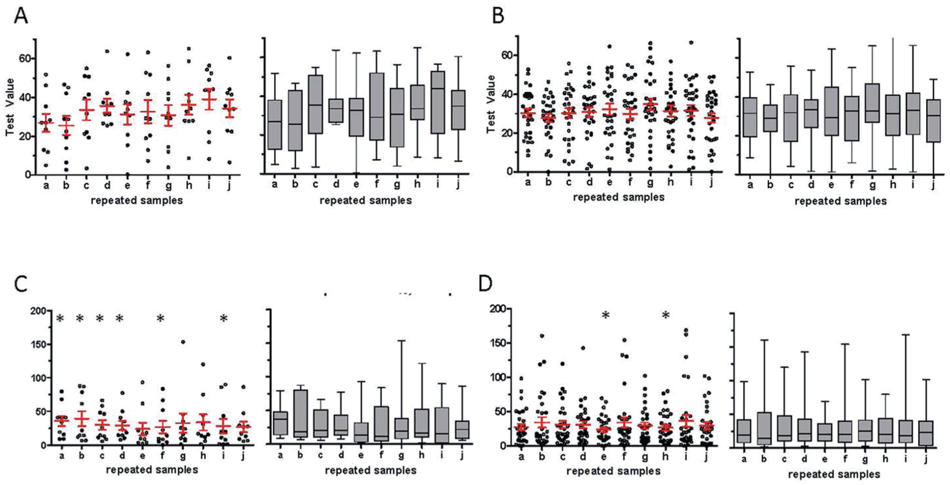
Distribution variations and sample size. (A) Dot-plots (left) and box and whiskers plots (right) of 10 random samples (n = 10 each) from a Normal distribution. (B) As in (A), but with n = 30 for each random sampling. (C) Dot-plots (left) and box and whiskers plots (right) of 10 random samples (n = 10 each) from a mono-exponential distribution. (D) As in (C), but with n = 30 for each random sampling. *passed D’Agostino and Pearson test of Normality.
Recalling that the SL data are sampled from a non-Normal distribution, for illustrative purposes we applied the D’Agostino and Pearson test for Normality. Asterisks indicate distributions that passed this test for Normality: 6 of the 10 experiments from the n = 10 groups passed the test for a Normal distribution, while only 2 of the 10 experiments passed from the n = 30 groups. This example illustrates that under-sampled, non-Normal distributions can appear Normal even by formal testing. Note that one sample from the Normal distribution of n = 10 (sample d) and of n=30 group (sample h) actually failed this test of normality, a reminder that the reverse error can also occur.
Statistical tests of Normality can be performed on samples of any size. However, you must independently assess whether the sample size is powered to confidently evaluate whether there is a Normal distribution. How many samples is “enough” depends on several factors, including a priori information about the expected distribution, such as expected heterogeneity when a mixture of distributions is possible. An example of heterogeneity due to a mixture of distributions is body weight in mammalian species: while weight might be predicted to be a Normal distribution, the mean value differs by sex. In other cases, predicting the distribution or its heterogeneity a priori is not straightforward. In such cases, an iterative approach may also be useful: for example, the presence of outlier data in an initial experimental group should prompt further data collection that may help adjudicate the question of how many samples is enough to understand the distribution, and thus the outlier(s); this is further discussed below.
Examples of circadian data types that are not Normally distributed include activity counts and lengths of sleep-wake bouts, both of which tend to be skewed with long tails. Other common distributions in biology include binomial (e.g., number of males in a litter), Poisson (e.g., probability of an event occurring in time or space), exponential (e.g., enzyme kinetic transitions), zero-inflated Poisson (e.g., actigraphy based activity counts), and power-law (e.g., EEG power or network connectivity). There are also different distributions for ratios or rates. Each of these distributions have summary statistics that describe them. Transforming the data to a distribution that is more approximately Normal may enable use of statistics that assume Normal distributions. Consulting a statistician and/or advanced statistics references is suggested for finding appropriate summary statistics formulae. As a final note, the Central Limit Theorem does not mean, as it is sometimes mis-stated, that larger sample sizes increasingly approach a Normal distribution. Rather, the theorem refers to the fact that the distribution of mean values obtained from repeated sampling from any population will be Normally distributed.
Key Points
Different distributions require distinct summary statistics.
Transforming data to a Normal distribution may be useful.
The sample size required for determining the underlying distribution depends on the variability of the data and on the nature of the underlying distribution(s).
If the expected distribution is not known a priori, then additional sample size and power calculations may be required after initial data collection, since power calculations depend on the distribution.
We discourage using only means and SD to summarize data if there are less than 10 data points, or if the distribution is non-Normal.
Pearson Versus Spearman Correlation Analysis
Correlation analysis is commonly undertaken between variables of interest, both in exploratory and hypothesis-testing settings. Recognizing the potential pitfalls of correlation analyses begins with understanding the different assumptions underlying Pearson and rank-based methods (such as Spearman Correlation). A Pearson correlation assumes a linear relationship between the two variables. The R2 metric used for Pearson correlation is an index of the percent variance explained by the association between the variables and/or how close the points fit a regression line (i.e., linear relationship). In contrast, a Spearman correlation assumes a monotonic relationship (i.e., the y-axis variable consistently increases or consistently decreases as the x-axis variable increases), but makes no further assumptions about the shape of the relationship. In the Spearman approach, the data points from each group are replaced by their rank assignments. The resulting R-value (not R2) is an index of how well the variables are related by a monotonic function.
Certain kinds of dependencies are not captured by either Pearson or Spearman correlations; namely, those that do not follow linear (Pearson) or monotonic (Spearman) relationships, such as a U-shaped curve. Thus, a non-significant correlation coefficient does not necessarily mean that the variables are not related. Plotting raw data will help to identify such relationships. In cases of nonlinear or non-monotonic relationships between two variables, a nonlinear statistical model, such as a generalized additive model, is needed to describe the data. Additional examples of confusion of correlation and causation, spurious correlations in exploratory data analysis, and how plotting choices influence interpretation, can be found in Vigen (2015).
Key Points
Pearson and Spearman correlations inform the extent to which linear or rank/monotonic relationships, respectively, exist between two variables.
A lack of statistical correlation does not necessarily mean there is no relationship between the variables. Plotting the data is a first step in determining whether there is a more complicated relationship.
Effect of Outliers
Decisions about how to handle “outliers” need to be made carefully. Figures 1C and 1D illustrate how data points might incorrectly be considered outliers of an assumed Normal distribution when they are actually part of the tail of a truly skewed distribution. Apparent outlier points could also represent non-homogeneity of the sample; for example, if a subset of the studied animals exhibited different sleep physiology. In such cases, you would not want to remove or “Winsorize” outliers (e.g., replacing an extreme outlier point with the next highest or lowest point). There are two basic approaches to handling outliers. If it is feasible, increasing the sample size is preferred, because this increases confidence in the distribution. If this is not feasible, then a priori biological knowledge may inform handling outliers. Data transformation (e.g., log) or using median values instead of mean values can reduce the statistical influence of outliers. However, we emphasize that outliers can be clues to interesting biological heterogeneity rather than simply being “anomalies” to be removed or ignored. Removing outliers should be justified on reasons independent of the outlier status (e.g., knowledge about the expected distribution) to mitigate the risk that removing outliers introduces bias in favor of the hypothesis under consideration.
Pearson correlation, linear regression, statistics based on Normal distributions, and other summary statistics may be sensitive to outlier points. Importantly, this is true even if the sample size is large. Figure 4 illustrates how a single outlier point can yield a significant Pearson coefficient (or linear regression line) when combined with an otherwise uncorrelated data set (Fig. 4A). In addition, a single outlier point can render the Pearson correlation (or linear regression) of a data set non-significant when added to otherwise highly correlated data (Fig. 4B). Plotting the raw data, as recommended in earlier sections, would reveal the outliers in Fig. 4A. There are statistical metrics for calculating how much of an effect such single points have on the results; we suggest consulting a statistician. In some cases, it may be appropriate to consider making the data categorical instead of continuous.
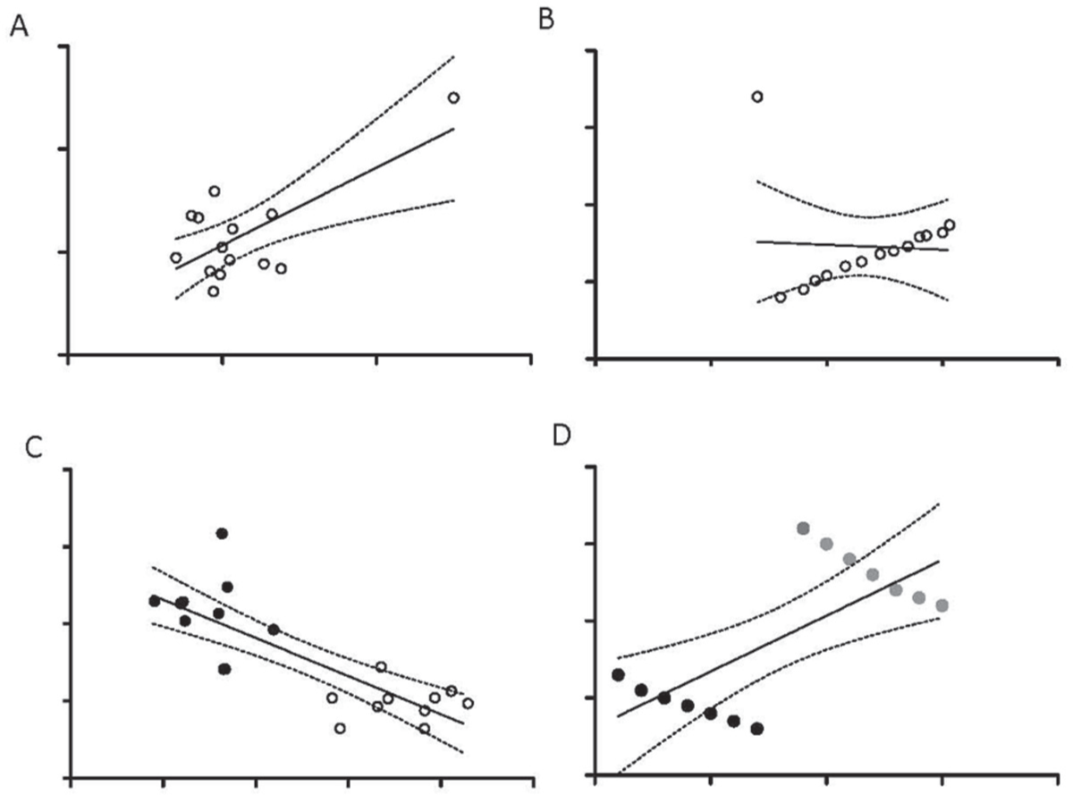
Pitfalls in correlation analysis. (A) Scatter plot of a sample of data with a cluster of values in the lower left and a single outlier point (upper right). The correlation coefficient of the cluster (excluding the outlier) is uncorrelated in the x-y metrics (R2 = 0.01; p > 0.7). Including the outlier point results in a significant correlation (R2 = 0.49; p < 0.005). The linear regression line (and 95% CI) of the full sample (cluster and outlier) is shown for comparison. (B) Scatter plot of a sample of data containing a highly correlated cluster as well as a single outlier point (upper left). The correlation coefficient of the cluster (excluding the outlier) is significant (R2 = 0.99; p < 0.001). Including the outlier point eliminates the correlation (R2 = 0.003; p > 0.86). The linear regression line (and 95% CI) of the full sample (cluster and outlier) is shown for comparison (which is not significantly different than zero). (C) Scatter plot of a sample of data containing two groups (open versus solid circles), each of which is uncorrelated in the x-y values in isolation. However, taking the full dataset together reveals an apparent correlation in the x-y values. The correlation coefficient of the full dataset is significant (R2 = 0.64; p < 0.001). The linear regression line (and 95% CI) is shown for comparison. (D) Scatter plot of a sample of data containing two groups (solid vs gray circles), each of which is strongly correlated in the x-y values in isolation (R2 > 0.9). However, taking the full dataset together reveals an apparent correlation of the opposite directionality (known as Simpson’s Paradox). The correlation coefficient of the full dataset is significant (R2 = 0.50; p < 0.005). The linear regression line (and 95% CI) is shown for comparison.
Key Points
Outliers can have disproportionate effects on summary statistics. They should be identified before further analyses and careful consideration must be given to their treatment and how the treatment impacts final analyses.
Effect of Confounding Factors
Confounding factors can also cause inferential problems to arise in correlation analyses. Consider an experiment in which slow-wave EEG activity is found to be lower in male bayz mutants compared to females, and alcohol self-administration is higher in the mutant males. In addition, within each sex, there is no relationship between slow-wave activity and alcohol consumption. If correlation is performed to compare slow-wave activity and alcohol intake, without separating male from female mutants, a “significant” correlation is inappropriately observed (Fig. 4C). Even more striking is a circumstance known as Simpson’s Paradox, in which two groups (such as males vs. females), each with strong positive within-group x-y correlations (e.g., between alcohol consumption and slow-wave activity), may yield significant correlations of the opposite direction when the data are combined across the sexes (Fig. 4D).
Identifying these kinds of confounding variables by visual inspection of the data may not be straightforward; although, if sub-groups are sufficiently distinct, plotting the raw data can provide some clue. Another important step of model checking, beyond visual inspection, is to analyze the residuals after linear regression. In this technique, you subtract the best fit function from the actual data at each point. If the scatter of the residuals is a Normal distribution, and there is no special pattern of residuals across the range of independent variables, then it is less likely that biologically meaningful heterogeneity is present in the data set. As stated above, the examples are reminders to avoid simply performing correlation analyses and interpreting the R values without viewing the raw data or checking that the assumptions of the correlation test are satisfied. When potential confounding variables are identified, more complex analyses are needed, using regression models that include multiple predictor variables.
Key Points
Unrecognized biological heterogeneity may result in inappropriate statistically significant or non-significant summary metrics.
Plotting the raw data can allow identification of these falsely significant or non-significant correlation coefficients.
Sample Size as a Surrogate for Distribution Coverage
Experimental methods necessarily under-sample the true population of interest due to constraints of cost, time, access to research subjects, and other reasons. The sample is nevertheless presumed to be adequate for meeting investigative goals, based on features such as sample size and unbiased sampling. This necessary difference between the size of the true population and the size of the experimental sample is the source of certain pitfalls. A Normal distribution will need fewer samples to describe it compared to a multi-modal population with a mixture of multiple Normal distributions or multiple exponentials. Complex distributions have been described in the distribution of time spent in different sleep/wake stages in humans (Bianchi et al., 2010; Swihart et al., 2008; Norman et al., 2006) and in rodents (Joho et al., 2006). Even when sample sizes are large, understanding the distribution may not be straightforward. For example, we showed that human sleep stage bout length distributions previously attributed to power-law equations could be equally well described by the sum of 2-3 exponential functions (Chu-Shore et al., 2010).
How do we know if we have a sufficient sample to understand the distribution of the data? The concepts of statistical power to describe a distribution and to estimate experimental size requirements are related. Therefore, the answer requires some knowledge about what to expect of the distribution itself, before considering the effect of an intervention or a group difference (to which traditional power calculations are more intuitively applied). From a general statistical standpoint, the capacity to estimate the distribution of an experimental measure depends on the sample size: larger experimental samples confer increased confidence that the distribution is well characterized, and can therefore be appropriately analyzed (e.g., is it Normally distributed?). This is a different way of thinking about statistical “power”—we usually think of power in terms of the probability of detecting a difference between groups of data given assumptions of effect size and variance. The two ideas are, of course, interrelated: understanding the distribution informs the descriptive statistics used in power calculations. In the absence of prior knowledge of the distribution, power calculations can still be performed using a plausible choice of the expected distribution. Thus, a sensible strategy would be to estimate the required sample size using power calculations on the expected distribution to observe a certain effect size. Therefore, sample size should be large enough to understand the underlying distribution of the data and to have statistical power to detect differences; this may be difficult practically. Note that both of these intentions (e.g., understanding underlying distribution and having statistical power to detect differences) require some prior knowledge of what to expect.
Interestingly, the summary statistics of small samples are more likely to exhibit extreme values and sometimes false-positive statistical inferences. As an example, consider the hypothesis that the bayz gene variant alters the probability of live birth differently for male vs. female offspring. The null hypothesis is that male and female live births occur with equal frequency. Extreme results of a sample (e.g., a litter with all males or all females) are 400% (i.e., four times) more likely when a three-pup litter is the observed sample size compared to when a five-pup litter is the observed sample size (2/8, or 25%; versus 2/32, or 6.25%). As the number of offspring in a litter increases, extreme findings of the population summary statistic become increasingly rare. Thus, there are at least three potential problems with small sample sizes: (i) small sample sizes might not be sufficient to demonstrate true differences; (ii) with small sample sizes, you cannot determine if the underlying distribution is as expected, and (iii) there is a false-positive risk (i.e., risk of deciding that there is a statistically significant difference when there is no true difference) associated with small sample size.
Key Points
Knowledge of the distribution of the data is needed to calculate the sample size required to detect a difference between groups.
However, the sample size must also be large enough to determine whether the underlying distribution of the data is as expected.
Power calculations should ideally be performed before initiating an experiment. Power calculations should not be made post hoc to justify an experimental sample size. Power should be computed for the smallest biological effect that is worth detecting. Consider an experiment in which bayz mice are found to have the same amount of REM sleep as wild-type mice, using group sizes of five and eight mice, respectively. Imagine that the mean REM percentage in bayz mice is within 1% of control mice. The authors concede in their discussion that the small sample size is a limitation but then assert that the observed difference of 1% predicts that they would need >1000 mice to detect a true difference at this small apparent effect size—if it were a true difference—and thus the small sample size is not such a limitation after all. Where is the fallacy?
The fallacy is that, with a small sample size, we don’t have confidence in the distribution (see above), and, related, we don’t have confidence in the observed mean value (Fig. 3A). Therefore, we don’t have confidence in the magnitude of the group difference. Even if we ignore the first problem and assume the distribution is Normal, we still can only have low confidence that the 1% difference is close to the actual difference. To illustrate the fallacy of this post hoc power argument, imagine you are given two coins, and your task is to determine if they are both fair, or if one is biased to show heads more often. You toss each coin twice, and in each case you get one head and one tail – a 50% probability of heads in each case. Can you conclude that both coins are fair, or claim that even with infinite coin tosses you could never demonstrate a difference (because the mean heads probability was 50% in each case, for a difference in means of zero)? You could not conclude either of these statements because you have a small sample size, and therefore the true mean value is uncertain. In the case of small sample sizes, you should not perform post hoc power calculations to defend a null finding.
Key Points
Perform power calculations before doing the experiment. Post hoc power calculations should be avoided.
If the expected distribution is not known a priori, then additional sample size and power calculations may be required after initial data collection, since power calculations depend on the distribution.
Importance of Statistical Assumptions
From a broader perspective, we note that the choice of data analysis will influence the result and interpretation, because each data analysis technique has underlying assumptions. For example, a regression assumes that the dependent variable depends on the independent variable, while a correlation does not assume such causality. In addition, linear regression assumes (i) homoskedasticity (i.e., homogenous variability of residuals across the range of observations), (ii) Normal distributions of residuals (i.e., difference between the actual points and the fitted function), and/or (iii) independence of data points (e.g., repeated measures from one individual are not independent). Data analysis programs will always yield an answer; whether this answer is appropriate depends on the knowledge and assumptions of the analyst. An informative example of different analyses of one data set yielding different results has been previously demonstrated (Aschwander, 2016).
A statistically significant fit of a model to a distribution of data may or may not be biologically significant. One option is to a priori set the range of acceptable parameter values for a fit to be within a biologically relevant range. In cases where the biologically appropriate model is not known, then it may be useful to compare the fits from different candidate models; for example, via the Akaike Information Criteria (AIC) or Bayesian Information Criterion (BIC). The AIC and BIC quantify the quality of the fit relative to the number of parameters used in the fitting, and thus allow for comparisons between different models, rather than an absolute quality measure. Therefore, the AIC and BIC will not reveal whether the best model fit was actually poor; goodness of fit metrics must therefore be used too.
As noted above, ideally an experiment should be designed and statistical tests planned before the experiment is conducted. It is tempting, however, to perform additional analyses and report any that are “statistically significant”. While this practice, sometimes called “p-hacking”, is important for exploring the data and generating new hypotheses, it can yield potentially false-positive results, since multiple comparisons are being performed on the data.
Key Points
The statistical test used will affect the results, because each test has underlying assumptions.
Plotting residuals to test for distribution and homoskedasticity provides an additional test of appropriateness of regression methods.
Consider comparing multiple candidate statistical models using both goodness of fit metrics and tests such as the AIC or BIC.
Perform additional non-planned statistical tests only as exploratory measures due to the danger of falsely reporting a comparison as statistically significant when multiple comparisons are made.
Distinction Between Description and Prediction
It is tempting to conflate descriptive relationships and predictive relationships. However, the extent to which we can use information about one variable to predict the other depends on multiple factors. Figure 5 illustrates simple examples of dissociating the R2 value, the p value, and the predictive value. In Figure 5A, two data sets have a similarly high x-y correlation (R~0.9 each) but have a difference in the steepness of the linear relationship. Consider the two groups to be wild-type and bayz mice, respectively, and, in each, we are considering how water maze performance (y-axis) depends on the amount of slow-wave activity of prior sleep (x-axis). In each case, we can make similarly confident correlations between performance and slow-wave activity. However, the relationship is much steeper (based on the slope) for the wild-type mice. Predicting variation in performance (y-axis) based on slow wave activity (x-axis) is different for the shallow sloped line: similar y values are predicted across a large range of x values. Put another way, knowing the x-axis value in that case does little to help us predict the y-axis value.
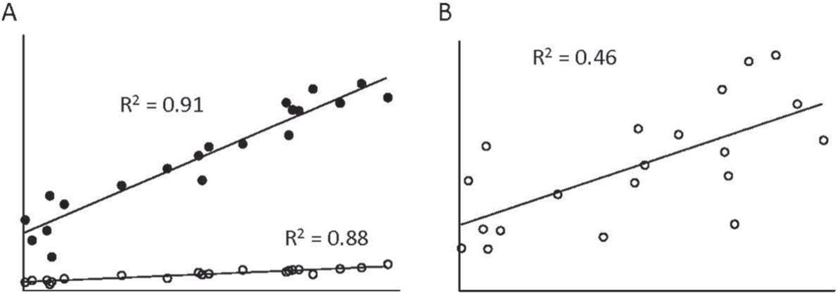
Distinguishing slope and variance. (A) Scatter plot for two groups of data, each with strong x-y correlation (R2 approximately 0.9 in each case), but one with a steeper slope (black points)—i.e., a steeper relationship—than the other. (B) As in part (A), but with a modest x-y correlation (R2 = 0.46).
Next, consider a different behavioral test, alcohol self-administration, in which the slope of association is similar to the wild-type mice in panel A, but the scatter is larger (Fig. 5B). Here, we are much less confident about our prediction, despite the small p value and the steep slope, due to the increased variance (lower R2 value). One could justifiably report for each of these distinct scenarios that “x and y are significantly correlated”, but the practical implications are different. A highly significant relationship does not necessarily imply a large or biologically meaningful effect size but it does imply great confidence that a difference exists.
The statistics for description and prediction are also different. There are potential problems when a descriptive analysis of data (usually at the group level) and a predictive use of data (usually for an individual) are incorrectly used. The range of expected y values is much larger for prediction than the SD or SEM from descriptive analyses. For example, there may be a strong, linear relationship between water maze performance and slow-wave activity; but, if you consider only the slow-wave activity in a single mouse, then predicting the actual water maze performance for that mouse is more difficult. The difference between standard deviation of a regression line and prediction of points using that line is shown in Fig. 6. You should not conflate the confidence interval for a best-fit function (e.g., regression line) with the confidence interval of the y-values across the range of x-values.
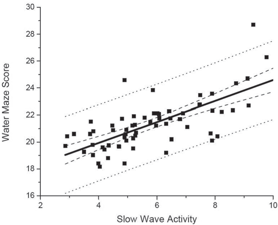
Distinguishing predictions and correlations. Scatter plot data (black squares) with strong x-y correlation. The heavy black line is the best fit linear regression. The dashed black line is 95% CI, sometimes called “prediction bands” of the regression line. The black dotted line is 95% CI of the predictions of y-axis values, based on x-axis values. Note the much larger range of CI for predictions than for a summary statistic, such as the linear regression.
Key Points
Data described by a shallow slope (i.e., with a small range of y-values relative to the range of x-values) may not be useful for prediction.
Prediction models typically have wider confidence ranges than descriptive models; as a result, you should not extrapolate from descriptive statistics for prediction.
There are additional potential problems with an incorrect use of descriptive analysis of data (usually at the group level) and predictive use of data (usually for an individual). For example, the described relationship may not continue outside of the range covered by the original dataset, or for situations with different underlying parameters (e.g., different populations) or conditions. In basic science, experiments are frequently conducted in a restricted sample population (e.g., healthy people or a particular mouse line), even if there are plans to apply the results or intervention to a larger population. Testing a restricted-sample population facilitates defining the underlying physiology with minimal confounds. However, the benefits of improved experimental control are balanced by challenges with external validity. Individuals have varied genetic background, health histories, prescription and nonprescription drug usage, environment conditions, and varied response to each of those conditions. This real-world variability necessitates that experimental interventions be re-examined under those conditions before predictions from the experimental data are extrapolated to individuals from other populations.
Key Points
Extrapolating beyond the original population studied requires careful justification.
Narrative Fallacies
The common mantra that “the data don’t lie” (or its cousin platitude, “the data are the data”) may seem useful—or, at worst, simply an innocent aphorism—but the reality is that statistical inference is challenging, even in routine experimental settings. It is very tempting to do a post hoc interpretation of data to fit the story; for a discussion see Taleb (2010). Even when the statistics are technically appropriate, we must resist the allure of the post hoc narrative. Consider the possibility that the bayz knockout has no obvious phenotype, sleep or otherwise. Two equally compelling but biologically opposite interpretations are that the gene is not important for basic survival or that the gene is so important that redundancy evolved to avoid impact in the case of a mutation. Having flexible creativity is arguably essential in scientific inquiry, but there are risks. Apophenia, or seeing patterns in randomness, is a pitfall to be avoided, whether we take formal protective steps (e.g., performing power calculations to reduce Type 1 errors), or we arm ourselves with knowledge of how seemingly “significant” results can in fact be statistical fallacies. Such processes equally require care in avoiding false-negative inferences. Knowing when to trust the data, and when to doubt it, comes with experience and is the cornerstone of Bayesian thinking, which interprets new information in the context of prior knowledge.
Key Points
Beware of post hoc interpretation of data to create a “story” beyond the original design of the experiment.
Conclusion
In conclusion, we strongly suggest plotting raw data before performing any further analyses. Such plots will enable better assessment of the underlying distribution of the data and the relationship between or among variables. Understanding the underlying distribution is necessary for determining the next statistical analyses and for calculating statistical power and/or sample size. Specification of hypotheses and assumptions before data collection and analysis may reduce problems in interpretation and extrapolation of results. Collaboration with a statistician, early and often, should lessen the occurrence of many of the errors we described above.
Footnotes
Acknowledgements
The authors thank Ellen Frank, Karen Gamble, William J. Schwartz, and Katie Sharkey for helpful discussions. This work was supported by NIH K99/R00 HL119618 (AJKP); NIH K24-HL105664 (EBK), R01-HL-114088, R01-GM-105018 and P01-AG009975, and NSBRI HFP02802; MGH Neurology Department (MTB).
Conflict of Interest Statement
Dr. Bianchi receives funding from the Department of Neurology, Massachusetts General Hospital, and is the recipient of a Young Clinician Award from the Center for Integration of Medicine and Innovative Technology. Dr. Bianchi has a patent pending on a home sleep monitoring device. Dr. Bianchi has consulting agreements with GrandRounds, and International Flavors and Fragrances, received research support from MC10, Inc, and Insomnisolv Inc., and serves on the advisory board of Foramis,. Dr. Klerman has received travel funds from Servier, the Sleep Technology Council, and the Employee Benefit Health Congress.