
Abstract
We use a continuous improvement model to evaluate an information design assignment by analyzing 120 student drafts and finals alongside instructor feedback. Using data from across sections (N = 118), we illustrate a process focused on improving student learning that other technical and professional communication program administrators and faculty can follow, while also offering insights into ways programs can assist a contingent labor force with improving pedagogical practice. This study provides insights into assignment design through data-driven evidence and reflective work that is necessary to help continuously improve a service course and to assist students in meeting learning outcomes.
Information design, as a form of visual communication and visual literacy, is not new to the technical and professional communication (TPC) curriculum. Brumberger (2007a) found that over 75% of working professionals spend 20% or more of their workweek attending to various levels of visual design (p. 378), and an “astounding 94%” (p. 385) felt that TPC curricula should include visual communication. The growth of visually focused courses in TPC undergraduate curricula has expanded from 4% to more than 40% (Melonçon & Henschel, 2013). Visual communication is not only increasingly important in TPC degree programs, but it is also a vital component of the service course, defined as an “introductory course for nonmajors delivered primarily as a service to other departments and programs on campus” (Melonçon & England, 2011, p. 398). Griffith et al. (2022) analyzed student learning outcomes (SLOs) from the service course at 93 institutions and found that a visual focused outcome was one of the most common SLOs. This finding suggests that TPC program administrators (PAs) and faculty understand visual communication's importance and value its place in student learning, which is further supported by research in the field. For example, Veltsos and Patriarca (2017) found service course stakeholders across departments wanted visual communication (creating tables and graphs), document design and layout, and numerical literacy included in the course.
To align our local program with field-wide trends and skills for the workplace, we added an information design assignment to the service course curriculum at a large R1 university in the Southeast. A year after its introduction, we wanted to see how well students were learning key concepts as represented by the learning outcomes. In the published literature, however, TPC has not given much attention to the effectiveness of assignments across a service course program, but we did see how our concerns intersected with Brumberger and Northcut (2013), who argued that “instructors should be able to answer questions about what we are doing and why” (p. 6, emphasis added). Thus, in this study, we set out to find the answers to the “what” and “why” around assignment design.
We begin by situating our study in the existing literature. We then move on to introduce the methodological approach to the research study design, the approach to analyzing data, and the institutional context. Next, we put theory into practice by describing our implementation of a continuous improvement model (Gather–Read–Analyze–Make [GRAM]) created for higher education (Schreiber & Melonçon, 2019). In the last section, we offer pedagogical and programmatic implications that were uncovered from this process that can be applied in other contexts.
This study offers three takeaways for TPC: it offers a novel approach of programmatic evaluation that examines student work in conversation with instructor feedback; it offers insights into ways programs can assist a contingent labor force in improving student learning; and it illustrates a process focused on improving student learning (rather than institutional assessment) that other TPC PAs and faculty can follow to improve assignment design. By uncovering an assignment to see why it is not, we show the type of evidence-based and reflective work that programs must do to help students meet learning outcomes.
Grounding Our Study in the Literature
Since the publication of Bernhardt’s (1986) classic, “Seeing the Text,” TPC has produced extensive research on visual communication. We limit our focus to scholarship that centralizes research on teaching visual communication in its various forms in TPC since that is the focus of the assignment we wanted to evaluate. The field has several texts available that theoretically ground the teaching of visual communication and document design (Kimball & Hawkins, 2008; Kostelnick & Roberts, 2011; Riley & Mackiewicz, 2010). Further, TPC scholars have offered conceptual approaches to course design such as design as problem-solving (Carnegie, 2013), visual argumentation (Driskill, 2013), visual thinking (Brumberger, 2007b), rhetorical choices (Dinolfo et al., 2007; Lauer, 2013), and issues of clarity (Kostelnick, 2007/2008). All of these approaches can enable students to learn to “move fluidly between and within [visual and verbal] modes of communication” (Brumberger, 2007b, p. 376) when making arguments from data. However, these theoretical texts and conceptual approaches are more suited for full courses in an undergraduate major rather than to the service course.
In acknowledging these difficulties, Brumberger (2005, 2018) argued that the way to solve the crucial need of teaching visual communication is by integrating it into existing courses, and we assert that this begins at the assignment level. For example, Melonçon (2013) achieved integration by designing a series of classroom exercises culminating in a “data handout” assignment. Similarly, Bell (2019) developed curricular interventions across an entire first- and second-year engineering course sequence that integrated effective use of visualizations through fostering a rhetorical awareness of what visualizations accomplish in a text. Focusing on data and the representation of data, Wolfe (2015) described two classroom assignments that examined the rhetorical choices made to visually represent data. Homing in on data more deliberately, Colombini and Hum (2017) described the creation of four explicit learning outcomes, including one that encouraged students to “make meaning through visual displays using the situated knowledge of rhetorical, visual, and design principles” (p. 384). What this literature shows is that integrating visual communication skills and literacies into the service course via assignments has the potential to achieve “the ambidexterity of thought” (Brumberger, 2007b, p. 376) that enables students to connect textual and visual literacies—a skill necessary for productive communication in the workplace and civic life. Even though we found this literature on integrating visual communication into existing courses, useful to out thinking about our own course design, our review of the literature could locate no study that evaluated assignments across a service course program. Thus, we found a methodological approach to help us answer our questions about the “what” and “why” of assignment design. In the next section, we explain the methodology we employed.
Methodological Approach
“Methodology is understood as a way of being in the world” (Liboiron, 2021, p. 37), which is often based on disciplinary ideology (e.g., Sullivan & Porter, 1997). However, some methodological approaches move across disciplines, such as the scholarship of teaching and learning (SoTL). “Scholars of teaching and learning are prepared to mess with the world even more boldly than their colleagues who are satisfied to teach well and leave it at that…. they examine the quality of those practices and ask how they could have been even more effective” (Shulman, 2002, p. viii). Similar to the “what” and “why” encouraged by Brumberger and Northcut (2013), SoTL scholars focus on asking questions specific to teaching and learning, and Hutchings (2000) went as far as to categorize SoTL research questions. One of Hutchings’ categories includes questions that ask “what works.” Hutchings described this type of question as “inquiry into the effectiveness of teaching practices and pedagogical approaches” (pp. 4–5). Using SoTL as a methodological approach aligned to our need to understand this assignment at the micro level of the specific course, and the macro level of pedagogical practice and program evaluation. To be clear this is not a traditional assessment study. Rather it was investigating the assignment itself. While parts of the approach may feel and sound familiar to faculty who have had to submit institutional assessment reports, our purpose was different.
For these reasons, we turned to a continuous improvement model. Employed in industry, continuous improvement models are used “to organize several iterative processes and practices in conversation with each other, promoting alignment without sacrificing important deliberation” (Schreiber & Melonçon, 2019, p. 258). GRAM as a continuous improvement model created for higher education contexts (Schreiber & Melonçon, 2019) encourages evaluation that is reflective, iterative, flexible, and ethical—all hallmarks of program evaluation that can ensure student learning and experience are prioritized. GRAM operationalizes into concrete steps ways to evaluate aspects of curricula and programs systematically. Assignment evaluation at the program level responds to SoTL research as an iterative and reflective approach to support student learning rather than as a means of programmatic assessment, but TPC has few models to accomplish this type of SoTL research at the programmatic level. We needed an approach that aligned with SoTL research and was available to explicitly guide our evaluative work. GRAM also helped us to create a research study that could be scaled up or down depending on the institution and the questions being asked programmatically. While focused on a single institution, the methodological approach and research study design provided an appropriate sample and variable control that offers insights that can apply in other institutional and programmatic contexts. In other words, the type of study and data examined may provide a better place to start in understanding assignment design beyond even much smaller scales across institutions.
This research also serves as an evaluative exercise to improve teaching and learning with a contingent labor force that does not have training in TPC. One of the reasons for choosing GRAM rather than an assessment model was we needed to uncover where the assignment may not be working pedagogically. This move to gain actionable feedback was necessary so that we could provide support and resources for contingent faculty that in turn would (hopefully) improve student learning. In the next section, we put the theory of GRAM into practice by performing each of the four steps to better understand the “what” and “why” of pedagogy and to answer the question of “what works” in relation to student learning.
Institutional Context
This study took place at the University of South Florida an R1 university. The TPC Program resides in the English Department, and it teaches ∼5000 students a year from Engineering, Allied Health Sciences, Business, and a smattering of other colleges or departments. Courses are capped at 19 students. The program uses a uniform curriculum, meaning that there is a common textbook and four required assignments. The assignment discussed here is the second of the term.
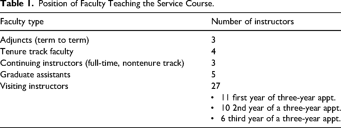
While the scale of the service course may be larger at our institution, the challenges are not different from most locations in the United States (Melonçon et al., 2020b). Contingent faculty (graduate students and visiting instructors) teach 95% of the sections in the program, which is slightly higher than the national average of 87% (Melonçon & England, 2011). Of the 27 visiting instructors, only two had a terminal degree related to composition or TPC. Table 1 shows the breakdown of all faculty.
Position of Faculty Teaching the Service Course.
All data are from Spring 2020, one year after the assignment discussed below was introduced in the curriculum, and our use of student and instructor data is in accordance with the University of South Florida's Institutional Review Board (Study002887).
The information design assignment aims to have students critically and creatively engage with data to create visualizations and to write about that data in meaningful ways, which aligns the assignment with trends in the field. To be clear on terminology, data visualizations are created to “present large amounts of data according to certain parameters or categories” as seen through “charts, graphs, scatter plots or other standard visualization types” and information design operates as a larger system, incorporating “explanatory text, headings, and other layout features” as well as data visualizations (Melonçon & Warner, 2017, p. 1). The final product is a short informational report (see online Appendix A for the original assignment description with SLOs).
Programmatic Feedback Approach
The TPC Program takes formative feedback to mean a mechanism that “supports teachers’ and students’ inferences about strengths, weaknesses, and opportunities for improvements in learning,” and it “includes both general principles, and discipline-specific elements that comprise the formal and informal materials, collaborative processes, ways of knowing, and habits of mind particular to a content domain” (Cizek et al., 2019, p. 14). Seen in this way, formative feedback is instrumental in connecting SLOs to expectations within assignments.
To make the connection between SLOs and the assignment, the TPC Program uses collective feedback (CF). CF contains three main elements:
A compilation of excerpted anonymous examples from student drafts that illustrate the most common areas that need improvement. An explanation of why these examples can be improved by relating the example back to course content. An example of how to improve the document.
This approach aligns with research around effective formative feedback (Doan, 2019; King & King, 2020; Still & Koerber, 2009; Taylor, 2011). CF deliberately ties revision to the goals of the assignment and the SLOs. CF is gathered from instructors, allowing the program to use instructor data alongside student documents, which is a novel addition to TPC research design and the literature.
Gather–Read–Analyze–Make
By reflecting on the information design assignment in a systematic way, we hoped to determine where, how, and most importantly, why, the assignment was not working as we had intended (Hutchings, 2000). In the next four sections, we describe how we enacted each step of GRAM.
Gather and Read
Gather, refers to “the process of gathering together existing data about the program,” while Read is “the process of reading landscapes to obtain additional information and to better understand the multiple perspectives that programs must consider for sustainability” (Schreiber & Melonçon, 2019, p. 262). Gather and read materialized in the process of developing a sampling plan and then coding the information.
Sampling Plan of Dataset
We had a sense that the assignment was problematic based on regular professional development sessions, queries from instructors, and hallway conversations. Yet, we needed an adequate sampling plan that would provide valid evidence to answer our SoTL research questions. Pedagogical and programmatic research in TPC has focused on student products in a single class (e.g., Bourelle, 2014; Lam, 2018; Lauer, 2013; Tham, 2021) or student documents across sections (e.g., Johnson & Elliot, 2010).
The read step helped us realize that to fully understand assignment design we needed to look at instructor feedback alongside student products because assignments only work if both students and instructors fully understand them. The relational nature between student drafts, instructor feedback, and student finals could shed insights into where the assignment may not be working in ways that previous research had not been able to do.
Table 2 describes the sampling plan, which we take to mean a “detailed outline of which measurements will be taken at what times, on which material, in what manner, and by whom” (Stimson, 2018, p. 305).
Sampling Plan and Description.
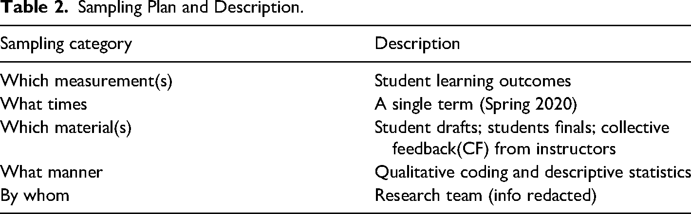
Because student learning starts with teaching, we initiated our sampling plan considering the number of instructors rather than the number of students being taught. We randomly selected 12 of our contingent instructors (34% of the contingent instructors). Once the sample of 12 instructors was determined, we randomly selected 10 students per instructor (120 students). We pulled the draft and final for each student, resulting in a total of 240 student documents. This number of student papers and related CF data from instructors would achieve a measure of transferability, which suggests that conclusions or processes can be used in other contexts, and credibility, which focuses on whether we are accurately describing the thing (Lincoln & Guba, 1985). Student documents were coded by the research team as described in the next section.
Coding Information
We looked at the student drafts and finals qualitatively, focusing on “collaborative discussion rather than independent corroboration” (Smagorinsky, 2008, p. 401). The codes were based on the learning outcomes and what those outcomes may have looked like in student documents. Each code was discussed in a meeting with the research team until a consensus was achieved. This approach to coding offered “a means through which levels of expertise may emerge through the process of discussion in relation to data” (Smagorinsky, 2008, p. 402). Following is the final list of the codes we used because they aligned with the SLOs:
Creation of visual
Appropriate visualization (i.e., pie charts represent parts of a whole, line graphs show progression over time, etc.) (y/n). Use of labels (i.e., x and y axes, pie chart sections, etc.) (y/n). Use of captions (figure or table and name of visual) (y/n). Use of source (y/n). Overall point/argument of the document Integration of visuals as part of the argument (ranking 1–3).
We concede that the question of appropriate visualization for the data was subjective based on the researchers’ background and knowledge, but part of the original discussions of the research team involved working through the more subjective views of coding to create a common understanding.
Two teams of two researchers were assigned half the student products (60 student drafts and 60 student finals = 120 student products). Each team coded half of their assigned products and then coded the other team member's products for consistency. Once all products were coded (half coded by one team and the other half coded by the other team), an additional researcher from the team who was not involved in the initial coding went through and performed another round of consistency coding, completing the internal process of ensuring that the same codes were applied for like items (Clegg et al., 2021, p. 22).
We also used the instructor CF that was provided to students at the draft stage. Instructors assigned their comments to preexisting categories (or codes) based on the assignment SLOs. For example, a comment about the technical aspects of the visualizations (e.g., captions on the visual) is assigned the category of visual. We also performed a consistency coding review of the instructor CF categories.
Analyze
Analyze refers to the “process of analyzing together the information from the gather and read steps” (Schreiber & Melonçon, 2019, p. 262). We limited our analysis to the SLOs specific to the visual aspects of the assignment. The Gather and Read stages immediately helped us to see that our SLOs needed revision and that two of the outcomes were virtually ignored by faculty and students alike (see the “Make” section for more information).
Create Appropriate Visuals from Numeric Data
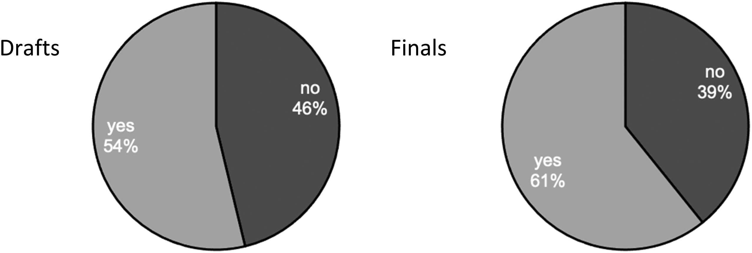
The SLO “create appropriate visuals from numeric data” asks students to create three visualizations from data, yielding a total of 360 visuals in the drafts and 360 in the finals to code. Our coding for this outcome focused on the overall appropriateness of the visual. We understood “appropriate” to mean that the visual was technically accurate and was clear and ethical for the readers. Technical accuracy aligns with common effective practices of choosing a visual format (e.g., bar graph) appropriate to the goal (e.g., Brown et al., 2011; Duke et al., 2015; Wong, 2013), creating a visual that includes labeled axes, a caption, and a source, and not distorting information (e.g., Barnes et al., 2016; Kostelnick, 2007/2008; Tait et al., 2010; Zikmund-Fisher et al., 2014). See Figure 1 for the coding results of appropriate visuals.
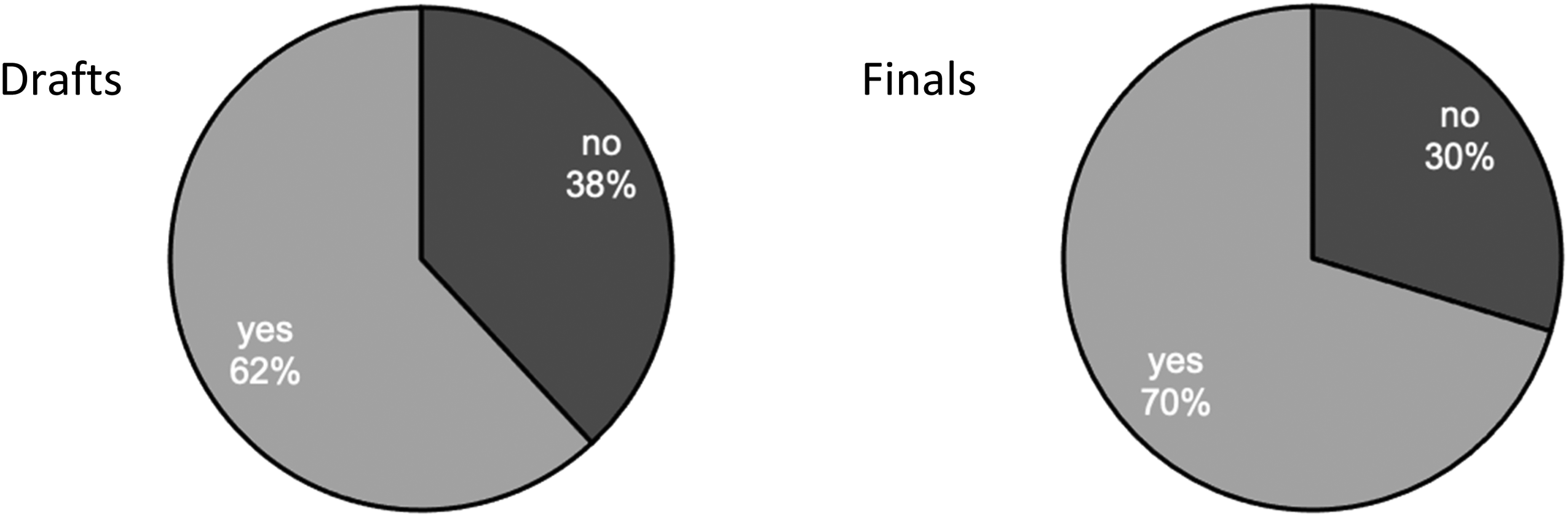
Comparison of selecting the appropriate visualization type in student drafts (n = 120) to finals (n = 120).
Figure 1 shows a comparison between the percentage of students who selected and created an appropriate visual type in their drafts and finals. While the percentage increased 8% from drafts to finals, approximately one-third of students still did not create appropriate visuals in the finals.
Instructor feedback at the drafting stage is key to getting students to ask important, reflective questions about visualizations. The CF data in our sample showed that 25% (n = 130) of instructor comments in our sample were categorized as visual design, which also aligned with all instructor comments that were categorized as visual design (25%, n = 416). In examining instructors’ comments, we found that few instructors specifically focused on the visual type, and when they did, the feedback did not adequately direct students toward effective revision. For example, one instructor wrote, “Pie charts do not display dynamics; this type of visual is good to show the relationship between variables within a whole.” This is not wholly accurate since pie charts are generally used to show parts of a whole. Another instructor suggested: “Explain what you mean by ‘Economic Situation’ and adjust the visual accordingly,” but does not comment on whether the appropriate visual was chosen for the argument rather simply noting that the “Chart is confusing.” Without specific direction on what is confusing about the chart, students would be unable to use the comment for revision.
Here are two additional instructor comments that are representative comments that illustrate the vagueness of instructor feedback:
“Less text the better. If not designed write [sic], the visual meaning should be clear.” “Not only do the visuals create a poor ethos (in this case, a dull, boring, unhelpful one) but they don't communicate useful information to the audience.”
In both cases, the comments were focused on visual design, but did not allow students to address the outcome in a way that could be productive and helpful. There was an assumption that students would make the connection between what clear and useful means.
While there was an overall 5% increase in the effectiveness of visuals between drafts and finals, clear instruction via CF that point students to the “why” by including the “because” and the “how” could increase improvement between drafts and finals. Moreover, the vast majority of comments (98%) did not address the appropriate choice for visuals; rather, instructors focused on the details of the technical components. Figures 2–4 show the technical components of labels, captions, and sources in student drafts and finals.
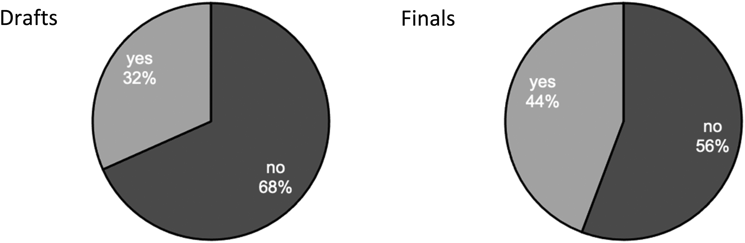
Comparison of students who included captions in drafts (n = 120) to finals (n = 120).
Comparison of percentage of students who included labels from drafts (n = 120) to finals (n = 120).
Comparison of percentage of students who included sources in drafts (n = 120) to finals (n = 120).
Roughly one-third of students (32%) included captions for their visuals in the draft, while 68% did not. In the finals, the number of students that included captions increased moderately to 44%. Even after revision, more than half of the students failed to properly caption their visuals by adding a figure number and description under the visualization.
Ethical data visualization requires teaching how to use, visualize, and discuss data in a crafted argument. Because certain conventions within a genre guide how people read and comprehend visual information, parts of visual design, such as using captions, have become generic conventions (Kostelnick & Roberts, 2011). For example, an instructor noted that “‘writing the graph below’ (or to the right, or above, or ‘the first graph/table’) is insufficient for labeling your data visualizations.” This comment points to how captions are a generic requirement that ensures the creation of appropriate visuals. Additionally, this example shows the disconnect among instructors connecting feedback to SLOs. If students are not taught how to navigate these conventions, overall effectiveness and clarity are affected.
In addition to the lack of captions, students failed to label the data within the visualizations. As seen in Figure 3, only slightly more than half (54%) of the students included labels in the draft stage. During revision, an additional 7% of students added labels to their final version. One instructor wrote, “Your visuals should all have very clear labels: title, each axis, values, a legend, etc. You want to avoid any confusion on the part of the reader.” Another instructor commented, “The numbers on this graph are a little too small. It's hard to read the numbers, the axes, and the legends.” While this instructor’s comment is accurate, it misses the larger considerations in the SLO about creating effective visuals and does not mention if the visual is accurate. These types of comments call to mind when instructors focus on lower-order concerns such as commas rather than larger concerns like content—a pedagogical contradiction among TPC instructors also found by Doan (2019).
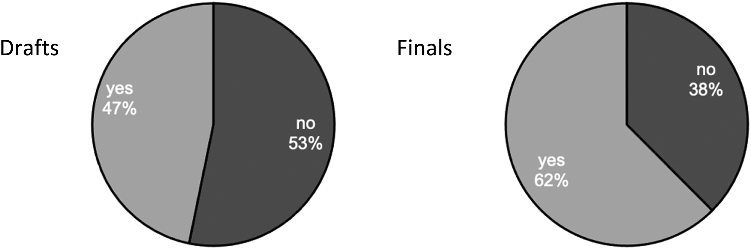
A source needs to be included in either the figure, the text, or both for a data visualization to be ethical because communicators have a responsibility to create documents that “serv[e] the purposes of those who will view the information” (Amare & Manning, 2013, p. 6), and any issues with design can cause ethical problems due to the “undue effort imposed on users by careless design” (Amare & Manning, 2013, p. 5). See Figure 4 for the use of sources in the creation of the visualization.
As shown in Figure 4, the difference between the draft and final deliverables displayed a noticeable increase (9%) in the number of students who incorporated sources within their work.
This increase can be attributed to instructor CF that directed students to make technical fixes to their documents. A representative instructor comment stated, “Make certain for your overall document and for each visual that you are clear about the scope of the data being represented, such as who the affected populations are, and the source for where the data came from. You can describe the source in the text or use a citation under the visualization.” This comment accurately communicated to the students how to integrate sources into the deliverable. Further, it stressed the ethical dynamics of representing data, such as affected populations and data scope.
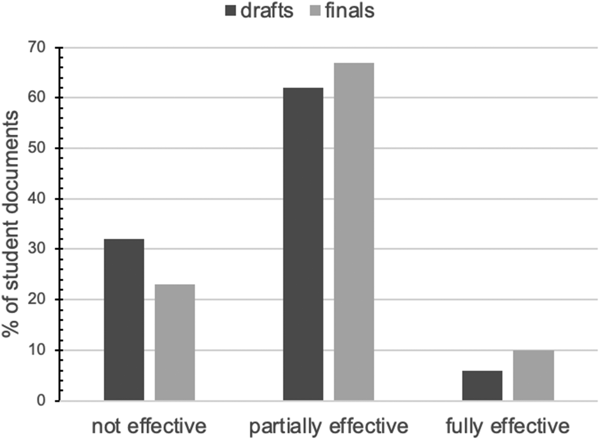
The last step of our coding process took a more holistic approach by considering the effectiveness of the visual. We used a three-point scale:
Ineffective visual: Fails to include the necessary technical elements (an appropriate visual for the data, captions, x-/y-axis labels). Partially effective visual: Includes all of the above and is partially useful to the audience based on the type of data chosen and its role in the report. Fully effective visual: Includes all of the above and is fully useful to the audience based on the type of data chosen and its role in the report.
Of the drafts, 94% were coded as ineffective with 5% as partially and only 1% as fully. For the finals, the numbers change only slightly: 89% not effective; 9% partially effective; and 2% fully effective.
Most student visualizations did not achieve even a minimum level of effectiveness. Kostelnick (2007/2008) explored this impact and suggested that students must ask important questions such as “does the data display enable optimal perceptual uptake of the data,” and does the data display “tell the truth” (Kostelnick, 2007/2008, p. 119). Understanding the rhetorical situation is a requirement for determining how to create effective data visualizations, however, it is problematic that a key SLO received so few instructor comments for student revision. The effectiveness of the visualizations was further diminished when the technical elements and appropriate visual choices were considered together. This was a major issue and an indicator of something not going right with the assignment because ineffective data visualizations “leave the readers [most] unprepared to accurately interpret the data being displayed” (Bell, 2019, p. 128). Without a clear explanation and incorporation of data and the appropriate visualization, students struggled to successfully meet the assignment outcome.
Use Visuals to Support a Specific Point or Argument
For our analysis, we combined the following two outcomes:
Use visuals to support a specific point or argument. Analyze visuals to integrate data into an argument.
These two outcomes ask students to use visuals to communicate an effective overall argument, which aligns with research in the field (e.g., Doumont, 2002; Driskill, 2013). We found that the interpretation of “using visuals” and “integrating visuals” are so closely interwoven, that keeping them separate would be unnecessary. Thus, we evaluated document design holistically for use and integration of visuals connected to the explanation of the central point or idea of the product. Our research team decided that for students to qualify as integrating the data into the text, they must discuss the visuals to some degree. In this case, simply stating “see visual 1” with no additional discussion of the data would not count as properly integrating the data into the text. A student example that would count as properly integrating the data into the text is as follows: “In figure 2, it can be seen how the usage of the internet has changed on different devices over the years. Since 2011, it is seen that mobile devices have become more common than computers which makes sense as they are portable devices.” This example qualifies as “integrating data into text,” because the student provided a written discussion of the data in the visual, which would work toward building an argument using data.
We coded the student documents (as described above) based on how well the visualizations and text worked toward a central point or argument:
Fails to connect data to a central point or idea throughout the document. Partially connects data to a central point or idea throughout the document. Fully connects data to a central point or idea throughout the document.
Percentage of overall effectiveness among student documents that included integration of visuals to contribute to main argument (n = 120 drafts; n = 120 finals).
Figure 5 illustrates that the vast majority of students were unable to fully meet the outcome of having an overall point or argument of the document. The improvements between drafts and finals left the majority of students in the partially effective category, with only 10% meeting the outcome completely. The data demonstrate that students were struggling to write about the data in a fully effective way. When we turned our attention to the instructor CF data, we found that less than 1% (n = 120) of our sample instructors focused on this SLO, and if we moved outside of our sample, only 9% (n = 416) of all instructors’ comments focused on this SLO.
The minimal number of comments that specifically addressed this learning outcome suggest that students were not given enough guidance to revise their assignments effectively. Additionally, the instructors were not connecting SLOs to their student feedback. Thus, there was a disconnect between outcomes and feedback that resulted in students not successfully achieving this SLO. While students did not meet the outcomes specific to visual communication at a level that we had hoped, the implementation of the continuous improvement model allowed us to uncover the why and how, and to gain insights into ways we could improve the assignment and improve at the program level. In the next section, we summarize what changes we made.
Make
The final step of the continuous improvement model is Make, which involves the “implementation of changes or the making of adjustments to documentation or curricula or process[es]” (Schreiber & Melonçon, 2019, p. 263). Based on the results of Gather, Read, and Analyze, we now describe the specific changes we made to the information design assignment, which serve as the discussion and implications of the findings and results of the data. The changes we made included
Updated course level SLOs. Revised assignment description. Shifted pedagogical practices.
Updated Course Level SLOs
During the process of performing the Read and Analyze steps, we realized that the original SLOs did not work (see online Appendices A and B for the before and after). We eliminated the two outcomes on purpose and audience. Only 10% of instructor comments focused on purpose and 5% on the audience. From the student documents, 21% addressed the audience, which also suggested that students were not as focused on this outcome as necessary. Students did indicate purpose 57% of the time, but this awareness was not enough for the outcome to remain.
Even though purpose and audience are fundamental pillars of TPC, we realized that purpose and audience were hard to measure or quantify in the way the assignment was written. More so, the information design assignment needed to put the primary focus on using data to create visuals and integrating those visuals into a short report. For these reasons, we eliminated the purpose and audience outcomes, and as we describe in the next section, we updated the assignment description to include a given purpose and audience for context during the invention process.
Outside of eliminating two outcomes, we also combined the following two outcomes:
Use visuals to support a specific point or argument. Analyze visuals to integrate data into an argument.
These two SLOs were intended to address the necessity of discussing visuals as part of a larger argument. We recognized, however, that we did not need two outcomes to do that. We also could see how the two outcomes could be confusing to students and instructors alike. We challenged ourselves to create a single outcome that was clearer. Thus, the revised outcome is “Analyze data to create visuals that support a specific point or argument.” The outcome transparently explains to students the skill they will learn and the reason it is useful. First, they learn what they will do (analyze data and create visuals), then they learn why the tasks matter (to support a specific point or argument).
The final change we made in the Make stage was to include outcomes specific to writing style because nearly 17% of instructor comments were focused on writing issues. This resulted in the addition of an outcome, “Write using a style that emphasizes clarity, concision, and accuracy.” This programmatic emphasis on a writing outcome aligns with previous research in TPC (e.g., Driskill, 2013; Griffith et al., 2022).
Revised Assignment Description
After we removed the purpose and audience outcomes, we knew we had to give students a clearer direction in the assignment description. That is, rather than the students needing to also determine their own purpose and audience, we gave them the purpose and the audience. The TPC Program uses a problem-based scenario approach (Melonçon, 2018), which aligns with research in the field on cases (see e.g., Harvard Business School, n.d.; Maricle, 2016; Robles & Baker, 2019; Williams & Strother, 2004). Giving students the purpose and audience still maintained the TPC Program's deep commitment to realistic and meaningful assignments (see Eodice et al., 2016). By limiting the number of moving parts in the assignment, we reduced the cognitive load of new material for students (and contingent instructors alike). Also, this change allowed instructors and students to focus on the essential visual components of the assignment within a context that was described to them. Keep in mind, however, that students still have to think about purpose and audience even when it is defined for them. For example, saying that the audience are incoming college students still means students will be researching to expand out characteristics of those students.
When making the change about purpose and audience, we also recognized that we could improve the clarity of the instructions. We eliminated the length suggestion for students to create a one-page report because it was supposed to be only a guide—but students took it literally. The flexibility for a longer length helped solidify that it was a short report and not an infographic. Next, we clarified students’ goals in four concrete steps. Each of these clarifications was meant to offer more clarity to both the instructors and students (see online Appendix B for the revised project description with the revised SLOs).
Shifted Pedagogical Practice
The results of our evaluation altered pedagogical practices and the way we organized professional development for contingent faculty. We found that instructors were challenged by the complexity of visual communication pedagogies in part because they lack a grounding and background in TPC, which is the same as others have found (Brumberger & Northcut, 2013; Welhausen, 2018). This is particularly true for the service course as instructors are thrust, often unwillingly, into teaching arguments in new forms and introducing students to new skills that often are also new to them. However, scholarship has also shown that contingent faculty desire professional development opportunities specific to understanding curriculum and pedagogical practices (Mechenbier et al., 2020; Wilson et al., 2020). We did two small things to assist contingent faculty. First, we limited the number of sample datasets that were given to students so that we could help instructors provide more support for students and help the program provide more targeted support for instructors. An example of one resource we added is a worksheet to help train instructors. In turn, they used the same worksheet as an in-class exercise. This set up a dialectical question-and-answer-based conversation to assist students in critically assessing the type of visuals needed and the role they would play within their report (see online Appendix C for the worksheet). Second, we also emphasized easy tools for visual creation to keep the focus on the SLO rather than distracting students and instructors with learning new technologies (e.g., Hovde & Renguette, 2017; Kostelnick, 2007/2008; Northcut & Brumberger, 2010). We then were able to provide resources for instructors to learn the technology and to provide some of the same resources to students.
The most substantial change we made at the program level was providing professional development focused on feedback strategies and connecting those strategies to SLOs. Much like Doan’s (2019) results, we found instructors were focusing their feedback on lower-order concerns or those things not directly connected to the SLOs. For example, in reviewing the CF data, there were no instructor comments about explaining what the visual was doing in the overall document to advance the point of the report. To address this, we explained to instructors in our orientations and monthly professional development sessions, how learning outcomes are keyed to the products students create. We further emphasized providing feedback that pointed to SLOs, and we modeled what teaching to outcomes looks like in classroom exercises and activities. We also discussed how to consistently assess student deliverables through understanding and identifying outcomes in deliverables. After this directed professional development, we looked at the CF comments in Fall 2020, and instructor CF comments that discussed the two visual outcomes doubled. While we will continue to use GRAM in the future, the initial increase in comments suggests that we were on the right track with our professional development approach. Each of these updates to pedagogical practice was meant to demystify the program for contingent faculty to enable them to teach the assignment more effectively.
Conclusion
TPC has little published research on assignment evaluation at the program level, which meant we had to find a way to systematically look at one of our assignments. Used at the assignment level, GRAM is a way of thinking and doing that makes more transparent the shadowy, squishy space between deliverables (assignments produced by students) and outcomes (goals for the assignment as they relate to the course or program). We put the theory of GRAM into practice to evaluate and adjust an assignment for continuous improvement rather than for assessment. By examining student products alongside instructor feedback, we uncovered the need to update SLOs, revise the assignment for more clarity and streamlined goals, and shift pedagogical practices across the program and within individual sections. It allowed us to Make an improved assignment—one that ideally will help students better meet SLOs. The process we performed using GRAM can be done at any program or course or assignment. The built-in reflective work that GRAM encourages helped to illuminate problems with the assignment that we would not have seen otherwise. We found what GRAM uncovered and the changes we made are almost less important than the process because the overall goal of GRAM is to find ways to improve student learning.
Although the data presented is a product of multiple sections and moves beyond single classroom instructional case studies that have previously been criticized (Melonçon et al., 2020b), it remains the result of a single institution. This does limit the generalizability of the conclusions. While the sampling plan does not align with quantitative standards of confidence intervals based on the full number of student papers in that term, the number of student papers reviewed provides ample evidence as part of an assignment evaluation in relation to SoTL research questions. We encourage faculty at other institutions to consider adapting this process of assignment evaluation that aligns with their local contexts.
By answering the SoTL question of “what works” in a systematic way across a service course program, we show that “pedagogical research and programmatic research overlap in iterative and reciprocal ways that lead to continuous reflection and improvement in how we teach and how we administer programs” (Melonçon et al., 2020a, p. 93). We will be performing GRAM again to continue to find ways to improve student learning and be reflective on the “what” and “why” of our pedagogical strategies. We encourage others to do so as well.
Supplemental Material
sj-docx-1-jtw-10.1177_00472816221124605 - Supplemental material for Implementing a Continuous Improvement Model for Assignment Evaluation at the Technical and Professional Communication Program Level
Supplemental material, sj-docx-1-jtw-10.1177_00472816221124605 for Implementing a Continuous Improvement Model for Assignment Evaluation at the Technical and Professional Communication Program Level by Michelle Sonnenberg, Carolyn Gubala, Justiss Burry, Jessica Griffith, Tanya Zarlengo and Lisa Melonçon in Journal of Technical Writing and Communication
Supplemental Material
sj-docx-2-jtw-10.1177_00472816221124605 - Supplemental material for Implementing a Continuous Improvement Model for Assignment Evaluation at the Technical and Professional Communication Program Level
Supplemental material, sj-docx-2-jtw-10.1177_00472816221124605 for Implementing a Continuous Improvement Model for Assignment Evaluation at the Technical and Professional Communication Program Level by Michelle Sonnenberg, Carolyn Gubala, Justiss Burry, Jessica Griffith, Tanya Zarlengo and Lisa Melonçon in Journal of Technical Writing and Communication
Supplemental Material
sj-docx-3-jtw-10.1177_00472816221124605 - Supplemental material for Implementing a Continuous Improvement Model for Assignment Evaluation at the Technical and Professional Communication Program Level
Supplemental material, sj-docx-3-jtw-10.1177_00472816221124605 for Implementing a Continuous Improvement Model for Assignment Evaluation at the Technical and Professional Communication Program Level by Michelle Sonnenberg, Carolyn Gubala, Justiss Burry, Jessica Griffith, Tanya Zarlengo and Lisa Melonçon in Journal of Technical Writing and Communication
Footnotes
Declaration of Conflicting Interests
The authors declared no potential conflicts of interest with respect to the research, authorship, and/or publication of this article.
Funding
The authors received no financial support for the research, authorship, and/or publication of this article.
Supplemental material
Supplemental material for this article is available online.
Author Biographies
References
Supplementary Material
Please find the following supplemental material available below.
For Open Access articles published under a Creative Commons License, all supplemental material carries the same license as the article it is associated with.
For non-Open Access articles published, all supplemental material carries a non-exclusive license, and permission requests for re-use of supplemental material or any part of supplemental material shall be sent directly to the copyright owner as specified in the copyright notice associated with the article.