
Abstract
Urban resilience has become an increasingly critical theme in contemporary urban discourse, particularly in light of disruptions that alter everyday routines. This study examines how urban hotspots in Auckland, New Zealand – one of the world’s most stringently locked-down cities – were impacted by and recovered from COVID-19, using the recovery of human mobility pulses as a way to assess their resilience. We define urban hotspots as vibrant places that attract both dense (high-frequency) and diverse (multi-origin) visitor flows. Using 85.53 million mobile location data points from approximately 3 million users in 2020, we identified these urban hotspots using a threshold-based approach combining grids above the median visitor density and the first-quartile Shannon Diversity Index. We then developed a recovery ratio to measure the extent to which visitor flows (in terms of frequency and origin diversity) returned to pre-lockdown levels across 26 bi-weekly periods spanning the year 2020. Our findings reveal that, while essential services, such as supermarkets and healthcare facilities, remained active, urban parks demonstrated high and stable recovery, functioning as vital public infrastructure during lockdowns. Overall, these results suggest that planning policies should prioritize both the expansion and spatial accessibility of green spaces to strengthen urban adaptability in times of crisis.
Introduction
Urban resilience has gained increasing attention in recent years, particularly regarding how cities can withstand, recover from, and adapt to major disruptions (Afrin et al., 2021; Jha et al., 2013; Rajendran and Odeleye, 2020). The COVID-19 pandemic (hereafter “the pandemic”), which brought massive social, environmental, and economic disruptions, has accelerated this discourse, leading most studies to examine how lockdowns and social distancing measures affected day-to-day life. However, the longer-term effect of such disruptions remains largely unknown.
Although mobile-location and GPS data have been widely used to track broad mobility trends during the pandemic, few studies have focused on fine-grained “mobility pulses” (Pouso et al., 2020; Reisch et al., 2021), the fluctuations in food traffic across different times and places. Even fewer have linked these pulses to established urban resilience frameworks. As a result, our understanding of how temporary changes in human movement reflect or shape the adaptive capacity of urban places remains limited. To against this backdrop, this study introduces a novel pulse-detection approach and provides a resilience-oriented interpretation of human movement over the pandemic timeline. To shed further light on recovery dynamics, we then assess changes in returned foot traffic over an extended period.
The advent of data-streaming techniques through social media or mobile location data has shown the capability of recording human footprints (Grantz et al., 2020; Tsao et al., 2021). These data, if leveraged properly, could help capture changes in mobility and clustering patterns for large swaths of the population, making it possible to quantify the potential impact of human mobility (Tang et al., 2018) and subsequently provide opportunities to advance our understanding of urban resilience, particularly with respect to evaluating the returned footprint flows compared to the initial state prior to the pandemic. In recent decades, there has been a growing consensus favoring compact urban growth as the future outlook for our cities (Duranton and Kerr, 2015). Both density and diversity of population and activities are encouraged for a vibrant urban environment (Gehl, 2004). Coinciding with this concept is the notion of “urban hotspots,” which has been generally used as an indicator for investigating the distribution of popular places in the city (Chang et al., 2010; Zheng et al., 2009). In the urban context, this also implies that these places are vibrant places where people gather and socialize (Kim, 2018; Lynch, 1984).
However, during the pandemic, implemented prevention and control measures generally only allowed restricted essential work trips, grocery shopping, doctor visits, and outdoor exercise in some cities to maintain physical and mental health. As a result, human mobility decreased involuntarily, and the potential deactivation of urban hotspots identified pre-pandemic. Additionally, urban hotspots have commonly been perceived as “unsafe” due to higher transmission risk (Chandra et al., 2013). From this point of view, detecting altered human mobility patterns (before and after the lockdowns) in urban hotspots during the pandemic can complement the understanding of how robust the current urban spatial structure is (Cesario et al., 2021) and how resilient each urban place is in terms of recovery ability.
To address this gap, we introduce a novel pulse-detection approach that synthesizes visitor density and diversity into a recovery ratio, enabling the first direct linkage between fine-grained mobility surges and urban resilience frameworks. We demonstrate its utility on an Auckland mobile-location dataset covering both the March and August 2020 lockdowns. The rest of this article is structured as follows: after reviewing existing work on the relevance of urban hotspots and human mobility and the use of geographical location data for urban analysis, we detail the methodology used to detect urban hotspots and monitor changes in visitor behavior. Subsequently, we apply the methodology to the case study of Auckland City. Through empirical analysis, we show the added value of human mobility analysis for urban hotspot detection and conclude by discussing our results, the research limitations, and opportunities for future research.
Literature review
Since the emergence of the COVID-19 pandemic in late 2019, urban researchers have sought to understand its effects on urban environments (Sharifi and Khavarian-Garmsir, 2020). This body of work spans environmental (Braga et al., 2020; Nottmeyer and Sera, 2021), social (Gravlee, 2020), economic (Antipova, 2021), governance (Chu et al., 2021), and developmental (Hamidi et al., 2020) impacts. During the early phase, much research mainly focused on environmental implications due to readily available data on air quality and weather conditions (Cartenì et al., 2020; Qi et al., 2020). However, understanding other impacts, such as the long-term effects on transportation systems, access to essential services, and public space usage, requires more extensive, long-term data collection, which is crucial for comprehensively evaluating the broader effects of the pandemic on urban resilience and recovery. As the pandemic evolved, subsequent studies have assessed its long-term impacts on urban infrastructure and social dynamics, including changes in transportation modes (Bucsky, 2020), inequalities in service access (Finn and Kobayashi, 2020; Sharifi and Khavarian-Garmsir, 2020), and potential shifts in the use of public and green space (Volenec et al., 2021). These findings highlighted the need for strategic adaptation, reinforcing resilience as a guiding principle for cities responding.
Urban resilience itself has become a prominent framework since the early 2000s (Saxena and Saxena, 2021), illuminating both immediate responses and longer-term adaptations. Meerow et al. (2016) define urban space resilience as “the ability of an urban system, and all its constituent socio-ecological and socio-technical networks across temporal and spatial scales, to maintain or rapidly return to desired functions in the face of a disturbance, to adapt to change, and to transform systems that limit current or future adaptive capacity.” Initially rooted in ecological theory (Holling, 1973), the concept has evolved from “bouncing back” (Klein et al., 2003) to “bouncing forward” towards more sustainable, adaptive urban systems (Fields and Renne, 2021). The pandemic has catalyzed this shift, driving flexible infrastructures, enhanced digital connectivity, and community-centered approaches that prioritize social equity and services access (Afrin et al., 2021; Sharifi and Khavarian-Garmsir, 2020; Syal, 2021).
Human mobility underwent equally profound changes. Stay-at-home mandates, social distancing, and border control measures saw a sharp decline in public transport usage (Heiler et al., 2020), accompanied by an increased reliance on private vehicles, and active transportation modes like walking and cycling (Bucsky, 2020; Cartenì et al., 2020). Municipal responded with pop-up cycleways, widened footpaths, and pedestrian zones (Law, 2021; Volenec et al., 2021). To capture these rapid, localized shifts in mobility, and to move beyond static surveys, researchers increasingly turn to location-based service (LBS) data, which record millions of mobile phone pings, GPS traces, and transit-card taps at high temporal resolution (González et al., 2008). Advancements in LBS enable the concept of “human mobility pulses,” the spatiotemporal rhythms of footfall that proxy urban vibrancy (Pouso et al., 2020; Reisch et al., 2021). Unlike conventional resilience assessments, surveys, infrastructure audits, and expert interviews rely on static or self-reported data and often lack the granularity and real-time responsiveness to capture rapid shifts during acute disturbances (Meerow et al., 2016). Applications of LBS data have included predicting transmission spread (Roy et al., 2021), detecting or monitoring human behavior (Boschi et al., 2021; Lai et al., 2019; Reisch et al., 2021), and assessing urban vitality. For instance, research has correlated mobility with mental health and emotional status under lockdown (Pouso et al., 2020) tracked public space usage (Volenec et al., 2021), and investigated shifts in town-center footfall across pandemic stages (Enoch et al., 2021). Many adopt pre-pandemic movement rates as baselines to detect permanent spatial reconfigurations (Chu et al., 2021).
Building on concepts of urban vibrancy, the complex network of human activities within the built environment (Chion, 2009; Jacobs, 1961), we focus on “urban hotspots” (Montgomery, 1998; Sulis et al., 2018): high-density, high-diversity gathering places that proxy for vibrancy. Changes in hotspot usage reveal how different parts of the city respond to and recover from disruption, offering a useful proxy for place-based resilience (Campanella, 2006; Chu et al., 2021; Syal, 2021). The resilience of urban hotspots – which we identify as key indicators of urban vibrancy – sheds light on the broader capability of urban areas to mitigate the impact of the COVID-19 pandemic and navigate through its aftermath. Accordingly, we monitor changing urban hotspot usage dynamics based on human mobility patterns corresponding to the pandemic restriction timeline, aiming to understand how these critical nodes in the social fabric react to and recover from significant social “shock.”
In summary, while prior work has descriptively documented mobility pulses and adaptations, few studies have combined high-resolution LBS data with algorithmic pulse detection or embedded these metrics within a resilience framework. Our approach advances the field by leveraging the unparalleled spatiotemporal granularity of LBS-derived footfall data, applying dynamic change-point and clustering analyses to quantify surge amplitude, duration, and recovery, and integrating these pulse metrics into a scalable, system-level model of urban resilience. This framework not only delivers greater real-time responsiveness than static surveys or infrastructure audits but also enables fine-grained, actionable insights for planners aiming to design adaptive, future-proof cities.
Despite these advances, existing LBS-based analyses remain largely descriptive. They documented week-by-week and even day-by-day “pulses” in foot traffic (Santana et al., 2023; Hu et al., 2021; Santana et al., 2023) but rarely applied dedicated pulse-detection algorithms (e.g., change-point analysis, time-series clustering) to quantify surge amplitude, duration, or recovery rates within urban hotspots. Moreover, resilience assessments typically treat infrastructure and behavior as static subsystems, failing to integrate how rapid reconfigurations (e.g., pop-up cycleways, repurposed public spaces) interact with emergent patterns of remote working, micro-mobility uptake, and risk-averse trip-making (Afrin et al., 2021; Syal, 2021). To bridge this gap, our work makes two main contributions: (1) applying change-point methods to extract quantitative pulse metrics from urban-hotspot footfall and (2) embedding those metrics within a resilience framework that concurrently captures infrastructure flexibility and shifting mobility behaviors.
Methodology
Studies focusing on understanding the interactions between human movements and the built environment have increasingly relied on leveraging LBS data (e.g., social media data, cell phone data) (Jurdak et al., 2015; Yang et al., 2016). These studies have pointed out that urban hotspots are particularly revealing regarding how people utilize urban places or the quality of urban vitality (Chen et al., 2019; Kim, 2018). As such, identifying urban hotspots could be valuable for understanding the changes in the degree of interest in a place, which is essential for recognizing resilient urban places through recovering the vibrancy under the pandemic impacts. To illustrate the proposed approach, we take Auckland, the largest city in New Zealand, as a case study (Figure 1). Since the pandemic outbreak, New Zealand has adopted particularly stringent lockdown policies to eliminate and prevent the pandemic from entering local communities (Baker et al., 2020). New Zealand’s first countrywide lockdown (designated as Alert Level 4) began on 26 March 2020. It lasted until 8 June 2020, when the government announced a move down to Alert Level 1, indicating that coronavirus had been largely eliminated in New Zealand. The second wave of lockdown measures started on 12 August 2020 (designated Alert Level 3) due to a small number of confirmed community cases in Auckland, and the whole country did not return to Alert Level 1 until 12 October 2020. These two lockdown events have caused dramatic alterations to people’s daily movement routines, and our research sought to determine which urban hotspots have recovered to their original vibrancy by exploring visiting patterns before and after the aforementioned lockdowns.
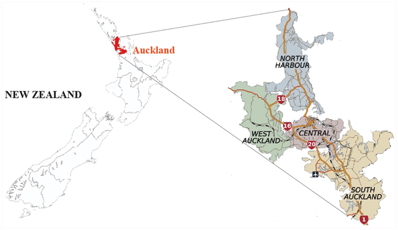
Map of the study area: Auckland City, New Zealand.
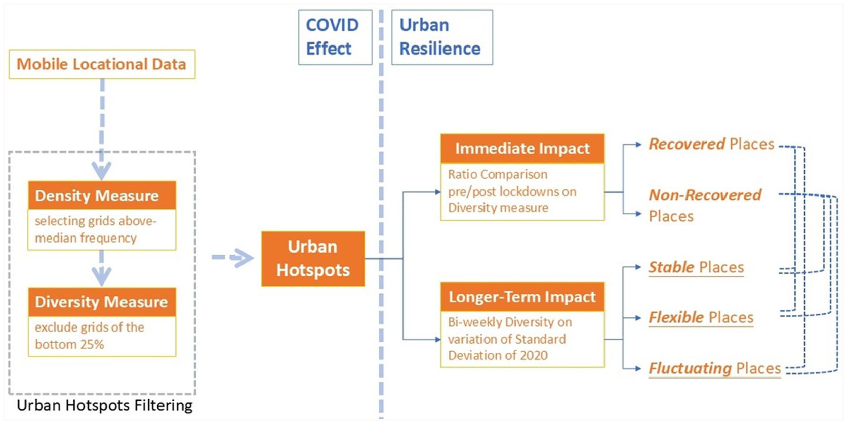
Within this section, we begin by introducing the operationalization of the mobile location dataset used in this study, followed by a description of how we determine the urban hotspots. We then compare the changing dynamics of visiting patterns within each urban hotspot over bi-weekly periods. Finally, we identify the resilient urban hotspots based on their visiting pattern recovery rates, followed by a discussion regarding their characteristics and functions in the urban context. Figure 2 illustrates the research outline.
An overview of research outline.
Data preparation
Ever-evolving digital technologies are providing increasingly available big data sources (e.g., social media data and mobile phone data), making the study of diverse urban phenomena on a granular scale feasible (Martí et al., 2019). In this study, we used an anonymous mobile location dataset provided by a third-party data trader (Quadrant), which consists of around 85.53 million data points collected from 323,534 users in Auckland in 2020. Each data point consists of three attributes: the unique identifier for each user, the specific geographical information, and the timestamp that records the time the data point was generated. The data points were collected with users’ consent through mobile phone applications operating in the background. The temporal resolution of the data varies, with updates typically occurring every few seconds to several minutes, depending on user activity and application settings. However, the data is captured only during phone usage, which may limit its representativeness.
Furthermore, the geographical precision can vary due to differences in smartphone types (Crampton et al., 2013; Shelton, 2017). To address these challenges, we aggregated all data points to 300-meter hexagonal grid cells, defining visits as data points presenting a unique device ID in a grid location, though dwell time was not considered due to the inconsistent temporal resolution. This aggregation mitigates uneven geographical precision, safeguards data privacy, and adheres to ethical standards while ensuring sufficient observations within individual grid cells for subsequent analysis. The decision to use a 300-meter resolution was informed by insights from Chen and Porthos (Chen and Poorthuis, 2021), who demonstrated that varying grid cell sizes (from 250 m to 1,500 m) had minimal impact on the accuracy of inferring meaningful locations for smartphone users. It is necessary to stress that while this aggregation resolution is appropriate for our analysis of Auckland’s urban landscapes, where block sizes typically range from approximately 100 to 300 meters, the choice of grid cell size should ultimately be determined by researchers based on the specific requirements of their research questions. In doing so, we obtained a total number of 12,032 grid cells. Each grid cell is referred to as an urban place and serves as the unit of analysis. Subsequently, the aggregated dataset was utilized to construct home-to-destination networks of individual users based on their footprint flows between homes and urban places, using the “homelocator” package developed by Chen and Poorthuis (Chen and Poorthuis, 2021).
Urban hotspots screening
As discussed earlier, urban hotspots are places with vitality that can be analyzed in terms of visitor density and/or diversity (Gehl, 1996; Kim, 2018; Lynch, 1984). To detect urban hotspots in Auckland City before the pandemic, we used both density and diversity measures based on visitors’ movements. We utilized the constructed home-to-destination networks combined with the social diversity and visitor density analysis approach proposed by Chuang et al. (2023) to measure the diversity of visitors’ patterns. Specifically, density is calculated based on the total number of visitors in a grid cell relative to the sum of visitors in all other adjacent grid cells within a 1 km buffer zone around the grid cell (i.e., encompasses a community with a 15-minute walking distance). The visitors here refer to users with home locations outside the grid cell. This relationship is expressed mathematically as:

where
Unlike the concept of social diversity in social science, which links it to demographic characteristics and socio-economic status (e.g., age, gender, ethnicity, and household types), we defined diversity based on the variety of visitor groups. This definition is rooted in the concept that household economic and social resources, knowledge about options, preferences, and demographic features influence individual residential choices and urban residential dynamics. Residential locations are thus seen as spatially self-organized segregations (Benenson, 2004; Bruch and Mare, 2015). We argued that participants from different directions and distances are more likely to have social characteristics that differ from other neighborhoods. Similarly, the concept of daily activities and geographical exploration in the study of spatiotemporal behaviors suggests that human mobility is spatially and temporally constrained among various groups (Schwanen and Kwan, 2008). Therefore, we proposed that the distance and direction of human footprints could be utilized as a quantitative measure for the diversity of social groups that visited the urban hotspots.
The diversity of a grid cell is measured here according to the number of visitors’ origin locations (i.e., home grid cells/neighborhoods) deriving from the visitors’ footprint flows. This relationship is expressed mathematically using the Shannon Diversity Index (S), which evaluates both the richness and evenness of the geographical distribution of visitors’ home grids. In other words, it measures how many different neighborhoods are represented and how evenly distributed the visitors are among these neighborhoods:

where
In the urban design context, density is often perceived as a prerequisite to diversity (Jacobs, 1961). Given this, we ensured that the density of visitors in each grid cell was sufficient before evaluating diversity. We filtered out grid cells with a density

It is important to note that threshold settings are generally subjective. In our case, excluding the bottom quartile helped ensure that we identified resilient urban places detection while avoiding false positives. Any grid cells that met both criteria were designated as urban hotspots. To analyze the potential effect of a change in threshold, we have performed a sensitivity analysis on different threshold combinations. A complete analysis result is available in the appendix (Table A1). Overall, the consistency of the identified hotspots is high (at least 67%).
This urban hotspot screening process was applied to each bi-weekly period of 2020 (i.e., a total number of 26 bi-weekly periods). We acknowledge that we did not account for dwell time due to data limitations. Our dataset lacked the temporal granularity needed to measure how long visitors stayed at each location, which focused on spatial patterns of visitor density and diversity based on visitor counts and origins. The potential implications of this limitation for hotspot classification are discussed further in the limitations section.
Recovery ratio analysis
Although density and diversity are critical concepts in urban studies, density is recognized as an embedded characteristic in the urban context. In contrast, diversity is regarded as a quality that urbanists have associated with reviving and safeguarding. As we focus on mobility movement patterns with the precondition of having a sufficient density of people visiting an urban place, visitors from diverse origins can have greater prominence in revealing the “vitality” of the location. In other words, urban areas may be perceived as vibrant, popular destinations among similar groups of demographics without supporting people from diverse neighborhoods or backgrounds. Therefore, we argue that comparing changing visitor diversity patterns can assist in identifying the vibrancy and recovery of particular urban places.
To operationalize this concept, we took the diversity of the bi-weekly period immediately preceding each lockdown in Auckland (i.e., 11–25 March and 5–11 August 2020) as our baselines for “normalcy.” We then compared the diversity measures of each subsequent bi-weekly period (i.e., from 26 March to 10 August and from 12 August until the end of the year) against the baseline. We selected a two-week period because it balances the need for more data points while accounting for the uncertain resolution of the data. This duration also mitigates the impact of short-term variations, such as weather fluctuations, that could distort the analysis if observed over a shorter timeframe. While we acknowledge that global awareness of the pandemic might have influenced mobility patterns prior to New Zealand’s first lockdown, we chose this period to capture the immediate effect of the stay-at-home mandate while noting the implication of other unaccounted variables (weather or temporal regularity) when using the average of the diversity of the bi-week period.
To quantify recovery, we applied the recovery ratio equation, which captures the relationship between diversity measures over time and provides a clear threshold for determining recovery:

where
To further analyze how visitor patterns at these urban hotspots evolved over a longer period in response to the pandemic, we classified the hotspots into three different categories based on the diversity variation/dispersion across all bi-weekly periods by measuring the standard deviation (SD) of each hotspot. The SD of the bi-weekly diversity visitor pattern provides an understanding of the degrees of fluctuation over each period. Once the standard deviation SD is calculated for each hotspot, they are classified into three categories based on the value:
Low fluctuation (stable response): hotspots where the SD value falls within the first quartile of all standard deviations (i.e., lowest 25%).
Moderate fluctuation (flexible response): hotspots where SD value falls between the 25th and 75th percentiles (i.e., middle 50%).
High fluctuation (unstable response): hotspots where the SD value falls within the fourth quartile (i.e., highest 25%).
After classification, the diversity distribution over time for each category of hotspots is graphed and visualized to investigate the longer-term impacts of the pandemic on human mobility.
Spatial regression analysis
To contextualize the spatial variation in recovery outcomes, we conducted a spatial error model (SEM) with the recovery ratio as the dependent variable and a set of temporal, mobility, and land-use features as independent variables. These include (1) bi-weekly time dummies reflecting different phrases of COVID-19 alert levels and lockdowns, (2) mobility metrics, such as the number of visitors, number of locals, and average travel distance from home locations to visited locations, (3) land-use attributes collected from Auckland Council Open Data, including the proportions of business (e.g., town center zone, neighborhood center zone, city center zone, metropolitan center zone), general (e.g., road, water), residential (e.g., single house zone, mixed housing urban zone, terrace housing and apartment building zone), special purpose zone (e.g., cemetery zone), and public open space (e.g., civic space zone, conservation zone). All independent variables were harmonized to the same spatial resolution used in our analysis.
An ordinary least squares (OLS) baseline was first estimated, but Moran’s I test on the residuals revealed spatial autocorrelation (Moran’s I = 0.068, p < 0.001). Model comparison further supported a spatial error specification as the SEM provided a better fit than OLS (
Contextualizing with Open Street Map
The numerical values of density and diversity calculated for each 300-meter hexagonal grid were systematically linked to their geographical locations, allowing for a detailed contextual analysis of urban space. To facilitate this, we employed OpenStreetMap to map and identify existing urban land uses within each grid, thus embedding our findings within the broader urban context.
Specifically, we generated interactive maps with embedded OpenStreetMap layers to visually analyze the dominant land uses within each grid. By examining the interactions and overlaps between different land uses within these grids, we contextualized how specific land uses contribute to the vibrancy and recovery of urban spaces (see Figure 3). However, in some cases, it was challenging to identify specific land uses that induced higher density or diversity, especially in larger clusters with similar quality. In these instances, we cross-referenced the Auckland Unitary Plan (Auckland Council, 2016) to determine the predominant land uses and key infrastructure, such as the hierarchy of roadways. This approach provided a more nuanced understanding of how different urban features influence the resilience of hotspots. The combined visual and contextual analyses, along with the recovery ratio discussed under “Recovery ratio analysis,” allow us to identify patterns in how various land use types contributed to the recovery process.
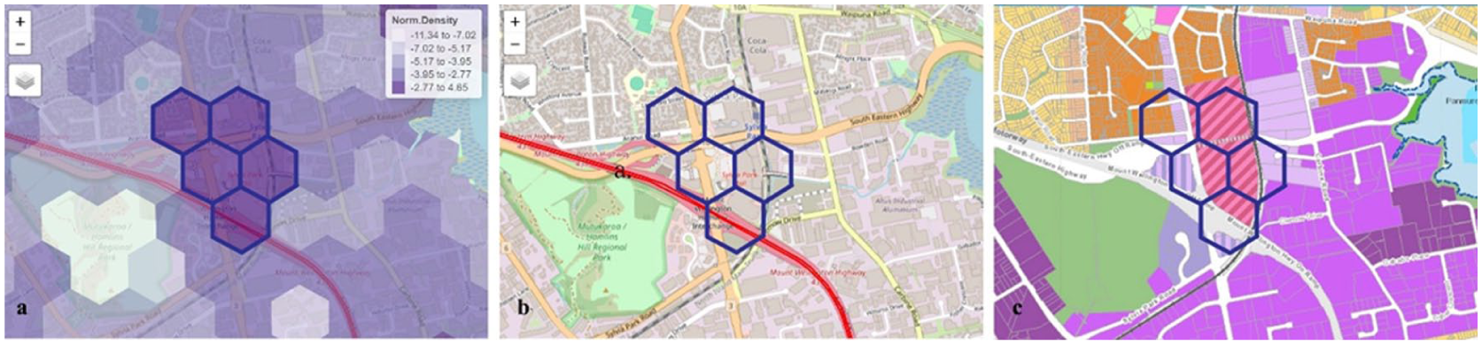
Contextualization of urban hotspots through: (a) geographical mapping, (b) OpenStreetMap layers, and (c) Auckland Unitary Plan land uses.
Results and discussion, and future research
Figure 4 shows the spatial distribution of identified urban hotspots across Auckland City. The results showed that the most visitor-diverse locations were the main highways and arterial roads. The largest hotspot clusters were located in the downtown region of the CBD and the regional center of Manukau City, the third-largest and fastest-growing area in Auckland. Another prominent node is Sylvia Park, the city’s largest mall complex, which sits at the intersection of two major highways and is connected by rail to the downtown CBD.
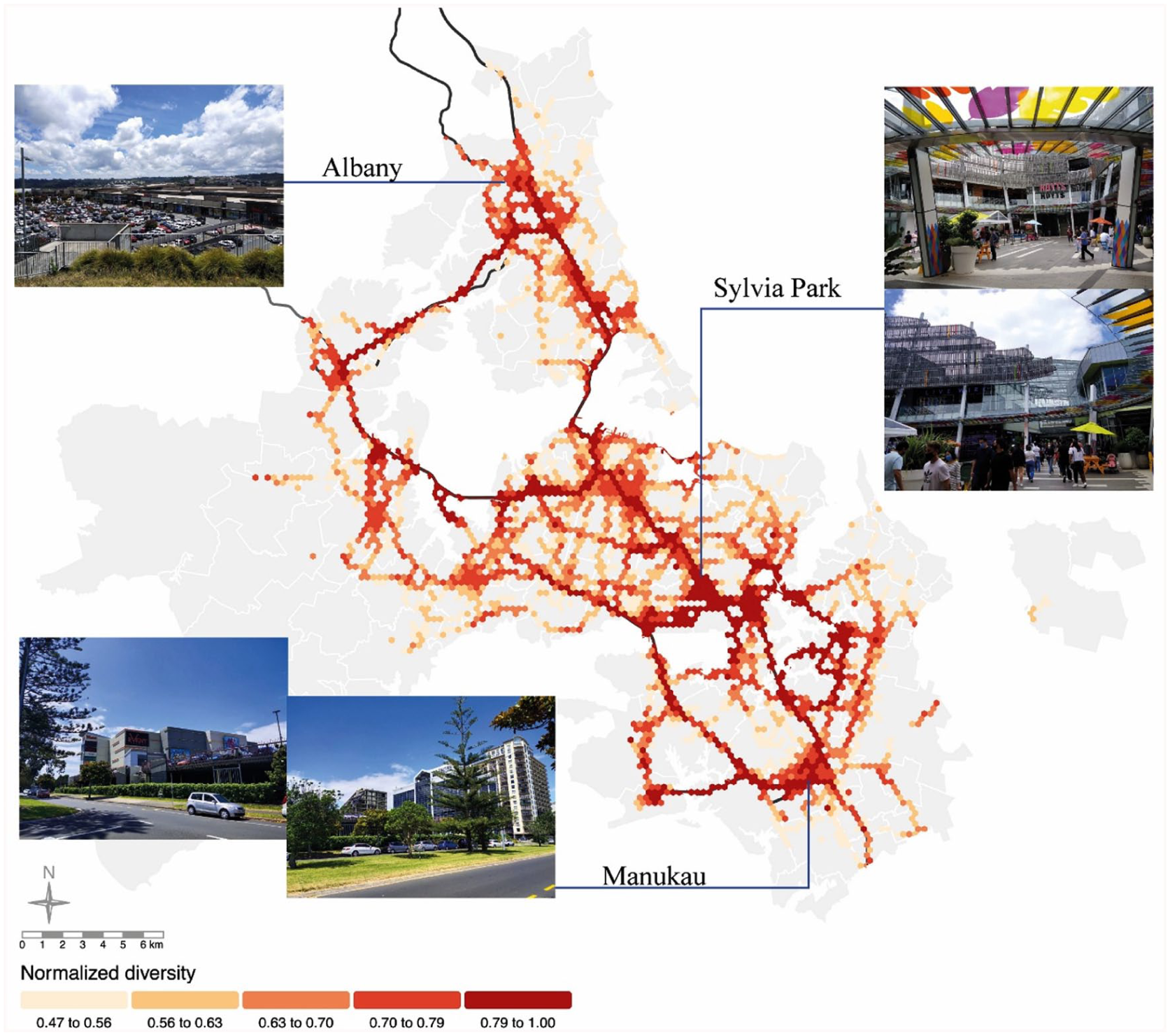
The spatial distribution of visitor diversity in Auckland City (2020).
Under New Zealand’s stringent lockdown measures, only essential services (e.g., medical care and grocery stores) were accessible, logistic services were limited, and close-to-home outdoor exercise with social distancing was allowed (Department of the Prime Minister and Cabinet (DPMC), n.d.). To examine the implications of the lockdown measures on the identified urban hotspots, we compared the diversity measure of the two bi-weekly periods right after each of the two lockdown events with the diversity measure of the bi-weekly period right before the first lockdown event (i.e., the baseline) (see Figure 5). It is evident that most locations, especially high-diversity clusters in the downtown CBD, light industrial areas, and commercial clusters, experienced a significant drop in their diversity measure.
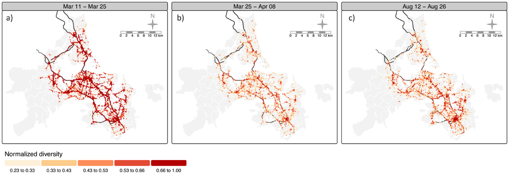
Comparison of the spatial distribution of diversity in different bi-weekly periods. (a) The spatial distribution of diversity of the bi-weekly period right before the first lockdown (25 March 2020). (b) The spatial distribution of diversity of the bi-weekly period right after the first lockdown. (c) The spatial distribution of diversity of the bi-weekly period right after the second lockdown (12 August 2020).
However, our research focuses on understanding how urban hotspots have recovered from the evolving impacts of the lockdowns. Social distancing and stay-at-home mandates may have long-term implications for people’s behaviors and their regular routines. What characteristics enable some urban hotspots to recover from such shocks and make them more resilient? To answer these questions, we narrowed the scope of our examination to the urban hotspots in the top 15% of the sample regarding recovery rate. We investigated the underlying reasons that may contribute to specific activity levels within these places. Figure 6 shows the geographical locations of these hotspots (highlighted with red outlines). In other words, these places have the same level of diverse groups of people after lifting the lockdown mandate, which can be understood as places with greater resilience to the adverse crisis.
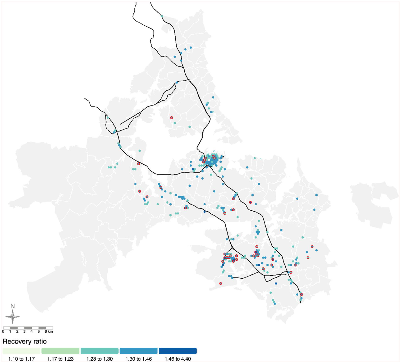
Spatial distribution of urban hotspots that have been recovered. Red outlines indicate the hotspots with a recovery rate in the top 15% of the sample.
Close inspection of the best-recovered hotspots revealed that they were either essential- or leisure-related places with the contextualization of the current urban functions of these locations. Specifically, the essential places were schools, hospitals, and neighborhood grocery stores. Although access to these critical places was limited during the lockdown periods, they were expected to remain comparable in their diverse visiting patterns and return to normalcy or even greater vibrancy after the lifting of restrictions. They are essential service infrastructures critical for society, the economy, and urban living. The other well-recovered places were urban green places (e.g., Albert Park, Mayor’s Park, and Newmarket Park) and other places in suburban areas. This observation is further reflected in the results of our spatial regression analysis, where mobility variables, such as number of visitors, number of locals, and average travel distance, were significantly associated with higher recovery ratios. This suggests that places, as highlighted in Figure 6, which served as either essential service infrastructures or urban green places and attracted both nearby and distant populations, tend to demonstrate stronger post-lockdown vibrancy. Additionally, the temporal fixed effects from the model revealed significantly negative coefficients during or immediately after the lockdown periods, indicating that recovery vibrancy was tied to policy-imposed mobility restrictions.
Furthermore, we found that the usage of urban parks did not decrease due to the lockdown restrictions. The result coincides with the work of Volenec et al. (Volenec et al., 2021), where the authors found a 63.4% increase in park visitation frequency since the onset of the pandemic. This finding was expected, as the importance of urban green places to urban residents has been well established (Evenson et al., 2013; Goličnik and Thompson, 2010). They offer people a place to exercise and conduct leisure activities, which improve their physical and mental well-being (Ayala-Azcárraga et al., 2019). In the context of the pandemic, the revealed high recovery of vibrancy in urban green places indicates the resilience of green places in supporting citizens even during times of crisis. Our finding demonstrates the validity of the proposed approach for identifying resilient urban places based on the recovery ratio of diversity.
To understand the long-term impacts on the essential and leisure-related places discussed above, we measured the SDs of all bi-weekly diversity measures for these best-recovered urban hotspots. The value of the SD reflects the degree of stability of an urban hotspot’s response to pandemic-related restrictions. Figure 7 shows the distribution of the bi-weekly diversity measures of the recovered hotspots grouped by the different ranges of SD. Precisely, we categorized urban hotspots into three levels. First, suppose the SD of an urban hotspot falls within the first quartile of all SDs. In that case, we consider the hotspot to have a relatively stable response to the pandemic (i.e., the diversity measure shows minimal impact from the mobility restrictions). Second, if SDs fall between 25% and 75%, we consider the urban hotspots to have a flexible response to the pandemic (i.e., the place may or may not be affected by the emergency measures). Last, if the SDs of a hotspot fall within the fourth quartile of all SDs (i.e., 75-100%), that place had a fluctuating response to the emergency measures (i.e., its diversity measure was significantly affected by the lockdown mandates).
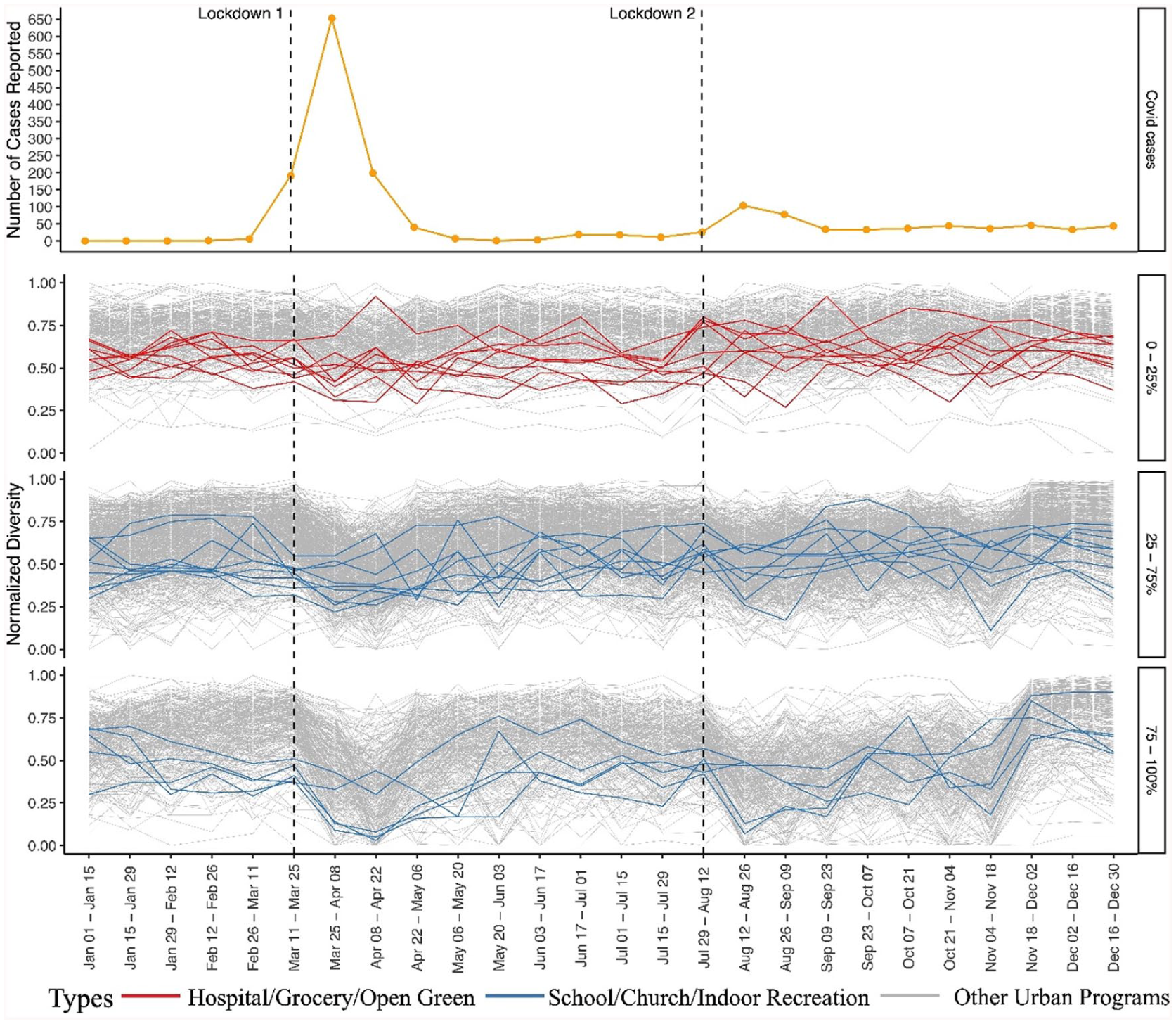
COVID-19 epidemic curve and the distribution of bi-weekly diversity of recovered hotspots by different SDs of the bi-weekly diversity. COVID-19 case data from 26 February 2020 to 30 June 2025 provided by the New Zealand Ministry of Health, available via the Ministry’s COVID-19 Data GitHub repository.
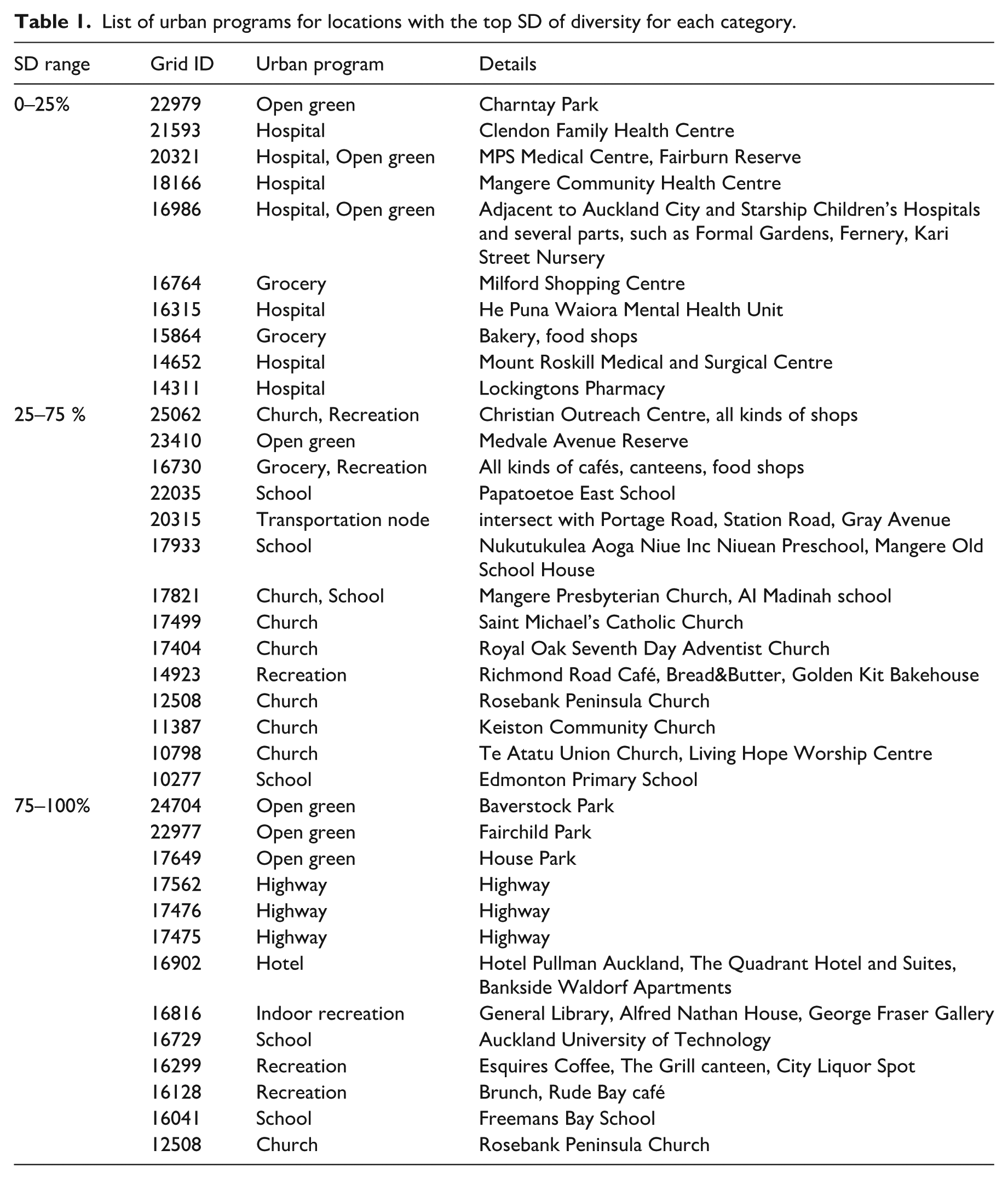
The results show that the most stable locations corresponded with essential services (e.g., hospitals, neighborhood shopping centers, and green places (e.g., Auckland Hospital, Grey Lynn Countdown, Albert Park)) (see Figure 7). Services at these locations were open regardless of the status of the emergency measures. Therefore, as expected, the access pattern would remain unchanged or experience minor changes. Places with high diversity variation included schools, transportation nodes, footbridges, churches, and temples. These places were closed entirely during the lockdown and were the last to reopen due to the nature of their operation. As a result, their diversity patterns declined sharply during lockdown but quickly returned to normal after restrictions were lifted. The top locations for each SD range are shown in Figure 7, and the corresponding urban programs are listed in Table 1 below.
List of urban programs for locations with the top SD of diversity for each category.
In the New Zealand context, where urban parks are accessible during the lockdown measures, their SDs of diversity illustrated stability throughout the study period as the same category of the essential services programs (hospital and grocery store). However, urban parks and essential service programs operate fundamentally differently based on people’s activity characteristics. In the book “Life Between Buildings,” Gehl (1996) argued that human activities could generally be divided into three categories: necessary, optional, and social. Necessary activities occur in every condition as participants have no other options but to engage, such as work and school. Similarly, in our research context, these essential service places, such as hospitals and grocery stores, were expected to be resistant to minimal disruption due to the characteristics of the activity type.
On the other hand, urban parks facilitate optional and social activities sensitive to events or environmental changes. The frequency of these activities is directly correlated with environmental conditions. In other words, it might be assumed that urban parks would be more valuable in severe crises such as COVID-19. However, the results suggest otherwise; we argue that urban parks display a high recovery ratio because, although they may be optional in the normalcy of daily life, during a pandemic event where stringent restrictions hinder human mobility, urban parks can become essential to life. This suggests that urban green spaces, regarded as desirable locations, continue attracting visitors, even amidst a crisis.
This finding provides an informative aspect supporting the criticality of green infrastructure in the urban environment. It also echoes the research of Pouso et al. (Pouso et al., 2020), which confirms a direct correlation between urban blue- and green-scape access to people’s well-being during the pandemic. Therefore, we contend that urban parks are among the most resilient and essential urban spaces during a pandemic, comparable to other essential service programs. To date, the health, social, and ecological benefits of urban parks have been widely recognized within urban study frameworks; this research itself does not present novel findings. However, its novelty lies in the comparative analysis of vitality across all urban spaces without prior assumptions. Therefore, emphasizing urban parks as highly resilient urban spaces provides new empirical evidence of their value in enhancing urban resilience during a global pandemic.
Taken together, the hotspot recovery patterns, stability classifications, and regression results point to distinct trajectories of resilience across different urban programs. While the SEM highlighted the importance of mobility and land-use variables, the SD-based analysis revealed how consistently places maintained or regained vibrancy during restrictions (Table 2). To better understand these dynamics, it is useful to compare the recovery pathways of fluctuating, flexible, and stable locations.
Statistical summary of spatial error model (SEM) results.
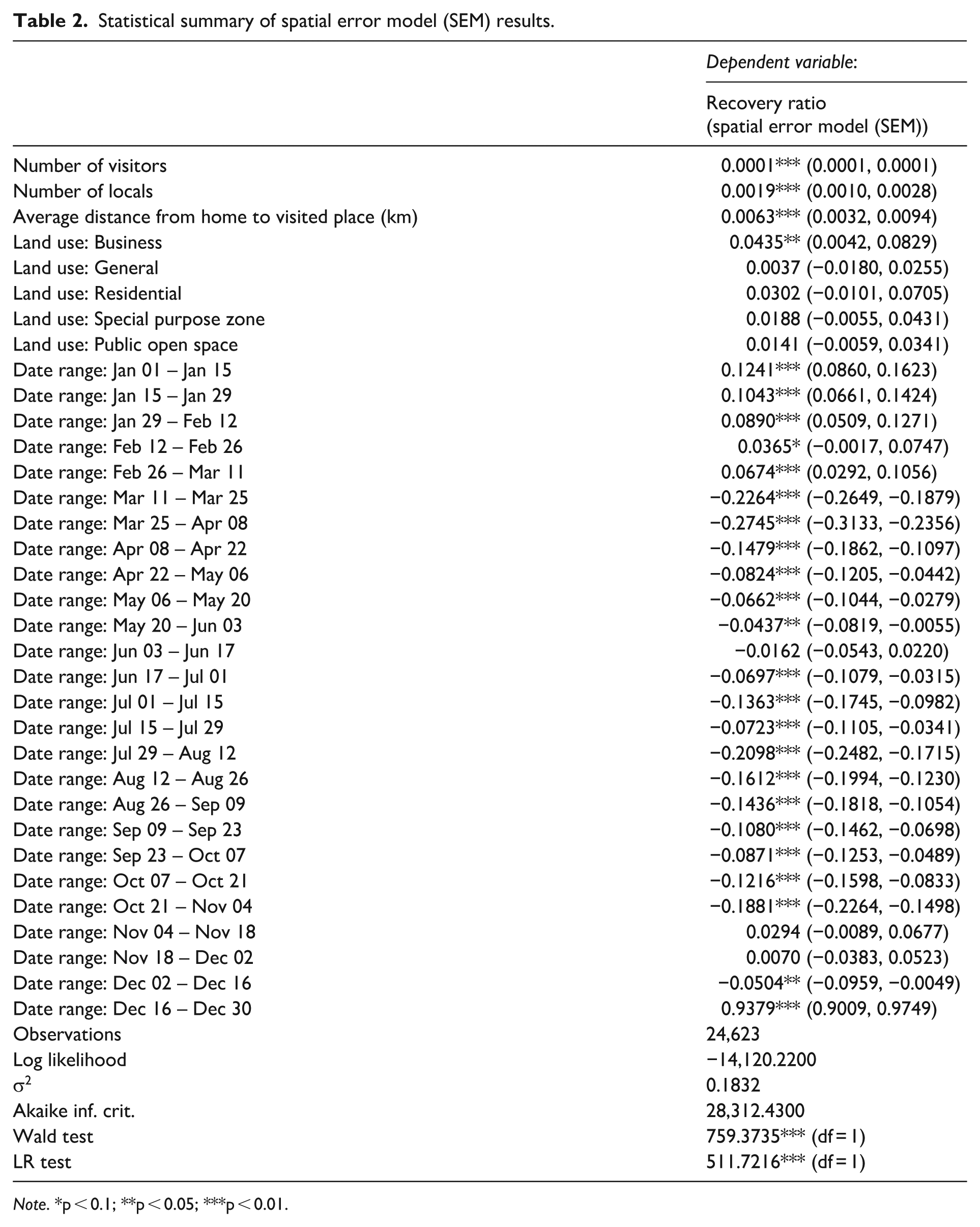
Note. *p < 0.1; **p < 0.05; ***p < 0.01.
Our findings also highlight important contrasts between different categories of resilient hotspots. Locations with fluctuating responses, such as schools and educational institutions, experienced steep declines in visitation during restrictions but rebounded quickly once lifted. In contrast, stable essential services (e.g., hospitals and grocery stores) showed minimal variation, consistent with their critical role in everyday life. Urban parks, however, revealed a distinctive pattern: while often associated with optional leisure activities, during the pandemic they functioned as essential infrastructures, providing stable and restorative environments for physical and mental well-being. This comparative perspective underscores the varied pathways through which urban places contribute to resilience.
Building on these insights, several limitations and avenues for future work emerge. First, our exclusive use of a single LBS-derived “diversity” metric and reliance on Auckland’s 2020 dataset may constrain generalizability. Future studies should experiment with alternative hotspot definitions and couple mobility pulses with census-based demographic attributes to capture a fuller spectrum of social diversity. Second, adopting early-2020 data as a baseline risks contamination by pre-lockdown behavioral changes; incorporating robust pre-pandemic time series (for example, 2019 data adjusted for seasonality) will establish firmer benchmarks. Third, by omitting dwell-time measures, we limit insight into how long visitors engage with different functions, particularly relevant when contrasting parks with retail or transit nodes, and so adding stay-length analyses would enrich our understanding of space utilization. Finally, although our change-point and clustering framework is inherently scalable, the spatial bias of our mobile-location dataset cautions against unqualified extrapolation beyond similar urban contexts. Validating the methodology in other cities and with diverse data sources will be essential to confirm its broader applicability.
Addressing these limitations promises to refine our methodological framework, enhance the precision of recovery-ratio analyses, and ultimately equip urban planners with more nuanced, data-driven tools for designing adaptive, future-proof cities.
Conclusion
This study introduced a methodology for assessing the resilience of urban hotspots during pandemic-related restrictions by analyzing changes in human mobility patterns across Auckland. By integrating spatial clustering, temporal comparisons, and spatial regression analysis, we were able to capture not only where and when vibrancy declined but also which places demonstrated a stronger capacity to recover. The findings show that essential services and urban parks consistently exhibited higher recovery ratios, while central commercial clusters and transport-related facilities were more vulnerable to lockdown measures. Beyond identifying resilient places, the study demonstrates the analytical value of combining mobility-derived diversity measures with spatial econometric modeling. The SEM results confirmed the significance of mobility factors—particularly visitor numbers, local visitation, and travel distance—as well as land-use attributes in shaping recovery patterns. This methodological contribution offers urban planners a replicable diagnostic tool for evaluating resilience in other contexts where granular mobility data are available.
The implications are twofold. First, the resilience of urban parks suggests that these spaces, while traditionally framed as optional leisure environments, can function as essential infrastructures for physical and mental well-being during crises. Second, the stability of essential services highlights their irreplaceable role in maintaining everyday urban life under restrictive conditions. Together, these findings emphasize the importance of protecting and investing in both functional service infrastructures and accessible public green spaces as part of resilience-oriented planning.
However, several limitations must be acknowledged, which also suggest valuable directions for future research. Expanding beyond Auckland with cross-city validation, integrating longer pre-pandemic baselines, incorporating dwell-time or stay-length measures, and refining diversity proxies to account for socio-demographic characteristics will all strengthen the framework’s robustness and generalizability. Pursuing these extensions can enhance our understanding of how different types of urban places contribute to resilience and help cities prepare for future disruptions, whether from pandemics or other crises.
Footnotes
Appendix
Comparison between OLS and SEM models.
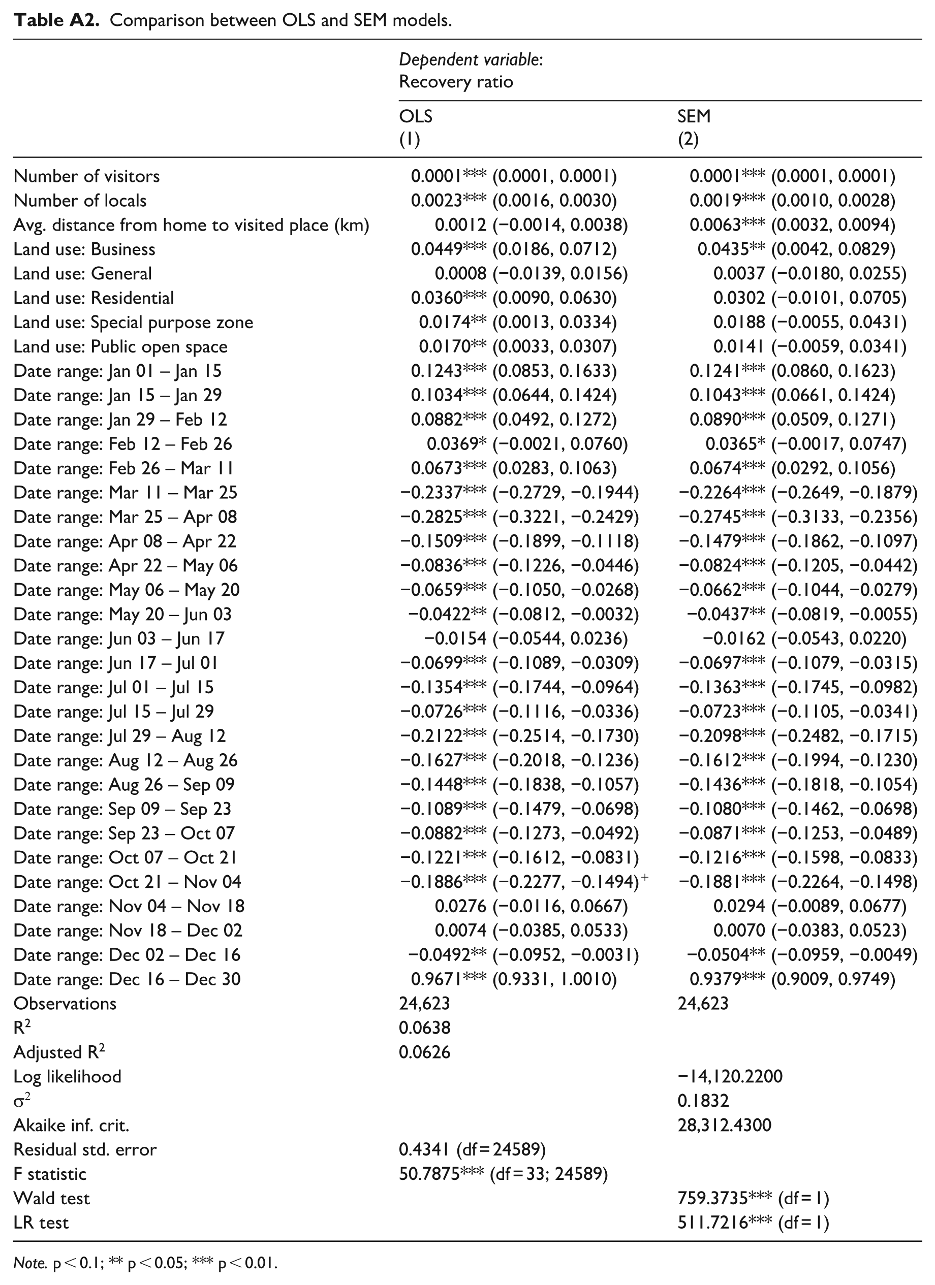
| Dependent variable: |
||
|---|---|---|
| OLS |
SEM |
|
| Number of visitors | 0.0001*** (0.0001, 0.0001) | 0.0001*** (0.0001, 0.0001) |
| Number of locals | 0.0023*** (0.0016, 0.0030) | 0.0019*** (0.0010, 0.0028) |
| Avg. distance from home to visited place (km) | 0.0012 (−0.0014, 0.0038) | 0.0063*** (0.0032, 0.0094) |
| Land use: Business | 0.0449*** (0.0186, 0.0712) | 0.0435** (0.0042, 0.0829) |
| Land use: General | 0.0008 (−0.0139, 0.0156) | 0.0037 (−0.0180, 0.0255) |
| Land use: Residential | 0.0360*** (0.0090, 0.0630) | 0.0302 (−0.0101, 0.0705) |
| Land use: Special purpose zone | 0.0174** (0.0013, 0.0334) | 0.0188 (−0.0055, 0.0431) |
| Land use: Public open space | 0.0170** (0.0033, 0.0307) | 0.0141 (−0.0059, 0.0341) |
| Date range: Jan 01 – Jan 15 | 0.1243*** (0.0853, 0.1633) | 0.1241*** (0.0860, 0.1623) |
| Date range: Jan 15 – Jan 29 | 0.1034*** (0.0644, 0.1424) | 0.1043*** (0.0661, 0.1424) |
| Date range: Jan 29 – Feb 12 | 0.0882*** (0.0492, 0.1272) | 0.0890*** (0.0509, 0.1271) |
| Date range: Feb 12 – Feb 26 | 0.0369* (−0.0021, 0.0760) | 0.0365* (−0.0017, 0.0747) |
| Date range: Feb 26 – Mar 11 | 0.0673*** (0.0283, 0.1063) | 0.0674*** (0.0292, 0.1056) |
| Date range: Mar 11 – Mar 25 | −0.2337*** (−0.2729, −0.1944) | −0.2264*** (−0.2649, −0.1879) |
| Date range: Mar 25 – Apr 08 | −0.2825*** (−0.3221, −0.2429) | −0.2745*** (−0.3133, −0.2356) |
| Date range: Apr 08 – Apr 22 | −0.1509*** (−0.1899, −0.1118) | −0.1479*** (−0.1862, −0.1097) |
| Date range: Apr 22 – May 06 | −0.0836*** (−0.1226, −0.0446) | −0.0824*** (−0.1205, −0.0442) |
| Date range: May 06 – May 20 | −0.0659*** (−0.1050, −0.0268) | −0.0662*** (−0.1044, −0.0279) |
| Date range: May 20 – Jun 03 | −0.0422** (−0.0812, −0.0032) | −0.0437** (−0.0819, −0.0055) |
| Date range: Jun 03 – Jun 17 | −0.0154 (−0.0544, 0.0236) | −0.0162 (−0.0543, 0.0220) |
| Date range: Jun 17 – Jul 01 | −0.0699*** (−0.1089, −0.0309) | −0.0697*** (−0.1079, −0.0315) |
| Date range: Jul 01 – Jul 15 | −0.1354*** (−0.1744, −0.0964) | −0.1363*** (−0.1745, −0.0982) |
| Date range: Jul 15 – Jul 29 | −0.0726*** (−0.1116, −0.0336) | −0.0723*** (−0.1105, −0.0341) |
| Date range: Jul 29 – Aug 12 | −0.2122*** (−0.2514, −0.1730) | −0.2098*** (−0.2482, −0.1715) |
| Date range: Aug 12 – Aug 26 | −0.1627*** (−0.2018, −0.1236) | −0.1612*** (−0.1994, −0.1230) |
| Date range: Aug 26 – Sep 09 | −0.1448*** (−0.1838, −0.1057) | −0.1436*** (−0.1818, −0.1054) |
| Date range: Sep 09 – Sep 23 | −0.1089*** (−0.1479, −0.0698) | −0.1080*** (−0.1462, −0.0698) |
| Date range: Sep 23 – Oct 07 | −0.0882*** (−0.1273, −0.0492) | −0.0871*** (−0.1253, −0.0489) |
| Date range: Oct 07 – Oct 21 | −0.1221*** (−0.1612, −0.0831) | −0.1216*** (−0.1598, −0.0833) |
| Date range: Oct 21 – Nov 04 | −0.1886*** (−0.2277, −0.1494)+ | −0.1881*** (−0.2264, −0.1498) |
| Date range: Nov 04 – Nov 18 | 0.0276 (−0.0116, 0.0667) | 0.0294 (−0.0089, 0.0677) |
| Date range: Nov 18 – Dec 02 | 0.0074 (−0.0385, 0.0533) | 0.0070 (−0.0383, 0.0523) |
| Date range: Dec 02 – Dec 16 | −0.0492** (−0.0952, −0.0031) | −0.0504** (−0.0959, −0.0049) |
| Date range: Dec 16 – Dec 30 | 0.9671*** (0.9331, 1.0010) | 0.9379*** (0.9009, 0.9749) |
| Observations | 24,623 | 24,623 |
| R2 | 0.0638 | |
| Adjusted R2 | 0.0626 | |
| Log likelihood | −14,120.2200 | |
| σ2 | 0.1832 | |
| Akaike inf. crit. | 28,312.4300 | |
| Residual std. error | 0.4341 (df = 24589) | |
| F statistic | 50.7875*** (df = 33; 24589) | |
| Wald test | 759.3735*** (df = 1) | |
| LR test | 511.7216*** (df = 1) | |
Note. p < 0.1; ** p < 0.05; *** p < 0.01.
Funding
The authors disclosed receipt of the following financial support for the research, authorship, and/or publication of this article: This work was supported by the University of Auckland, Performance Based Research Fund (grant numbers 71301, 2021).
Declaration of conflicting interests
The authors declared no potential conflicts of interest with respect to the research, authorship, and/or publication of this article.
Data availability statement
Upon publication, we intend to make the source code repository publicly available as open-source material via Figshare.
Ethical approval
Ethical approval for the use of anonymized mobile location data was obtained from the University of Auckland Human Participants Ethics Committee (Ref. UAHPEC27241).