
Abstract
This study engages with a growing body of literature on numerical communication in COVID-19, which suggests that numbers and numerical measurements can be manipulated to shape governmental policy and public health measures. It uniquely focuses on numerical graphs generated through professional open-resource visualization tools but used by laypersons in social media debates. By combining theories of multimodality and linguistic theories of argumentativity, we analyzed Twitter interactions on COVID-19 policy that occurred on the Twitter account of a leading public health figure in Scotland. Our fine-grained qualitative analysis shows that while language choices are essential for establishing the argumentative context for graphs, choices about how to encode visual information, such as the placement of elements in the composition, can also provide information about the communicator’s intention. To understand the argumentative purpose of the graphs, the interlocutor needs to grasp not only how information is packaged in the multimodal message but also the argumentative agenda of the speaker/writer, which is encoded in their multimodal message and other contextual information.
Introduction
Numbers—infection cases, death tolls, and vaccination rates—played a central role in our collective experience of the COVID-19 pandemic, occupying daily news headlines, informing governmental policies, and fuelling public debates. The global nature of the pandemic meant that the numbers we encountered were often large in scale, and adding to the complexity is the fact that the same information can also be expressed in different numerical forms. To understand the impact of COVID-19 mortality
1
, for instance, we can refer to total death numbers, which were 7.02 million as of April 2024. Alternative ways to communicate this information include COVID-19 deaths per million (97,233.08) or case fatality rate (2%–3%). Figures can also be presented in the form of visual graphs, such as the ones shown in Figure 1: in this case, the precise (quite complex) metric used is described in the top-level heading above the graphs. COVID-19 estimated cumulative excess deaths and visualization from Our World in Data (Right).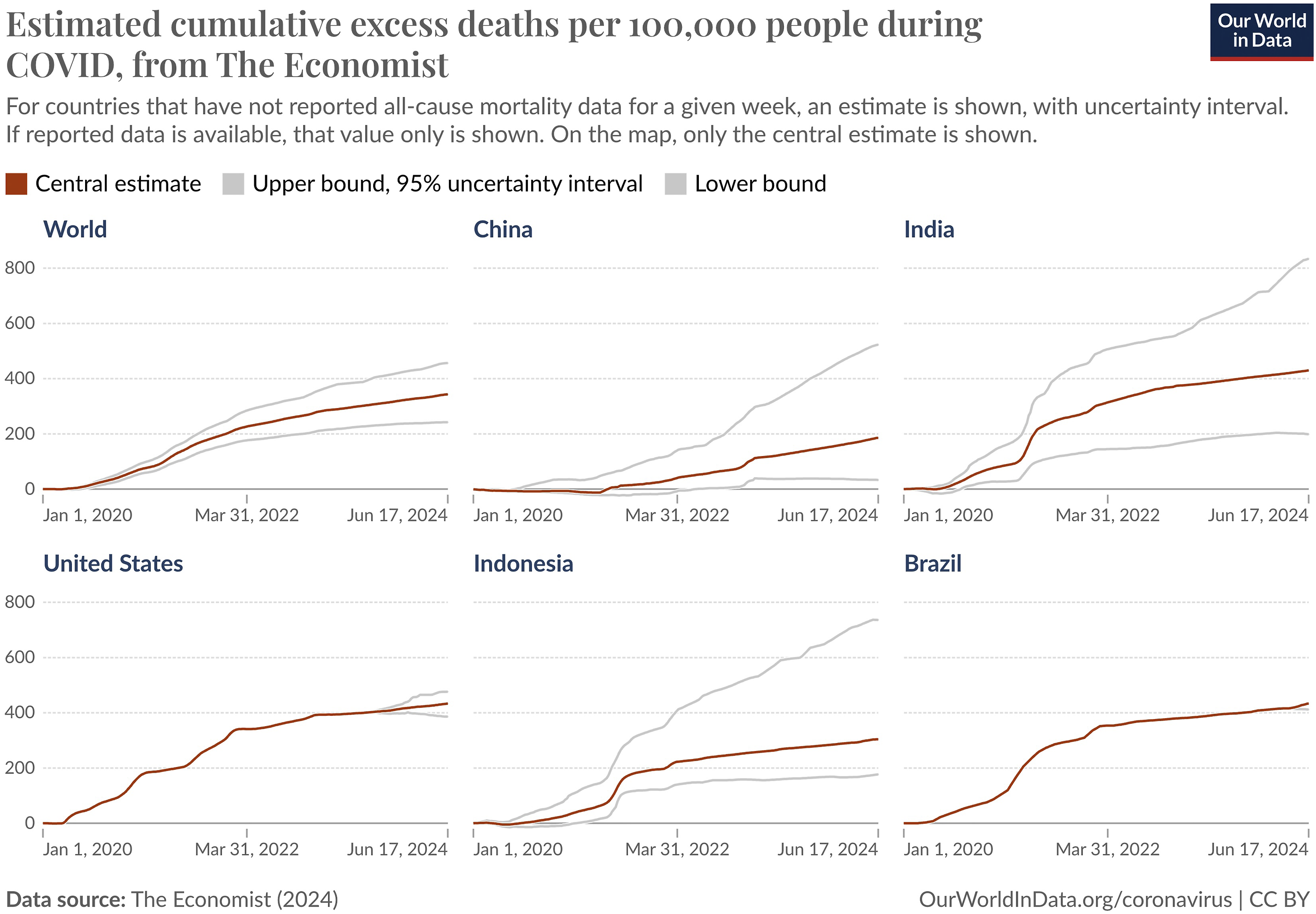
The graph in Figure 1 and some of the numbers we have just quoted come from an open-access Web site known as Our World in Data 2 , which gives public access to quantitative data as well as visualization tools that were historically exclusive to scientific experts. Open resources such as Our World in Data are a product of the big data society (Kitchin, 2014), which continued its rise during the pandemic. The visual graphs generated by these resources can be easily downloaded, posted, and circulated on social media sites such as X (formerly Twitter), inviting public discussion and debate. The ultra-numeric nature of the global pandemic, the easy access to quantitative data and visualization tools by ordinary citizens, and the ubiquitous nature of social media in our social lives together shaped the unique communication landscape of COVID-19.
The rise of the big data society focalizes challenges that have previously been identified concerning how people deal with quantitative information. In a study of frequency of numbers and numerical expressions on the World Wide Web and in the British National Corpus (BNC) published in 2011, sociolinguist Nikolas Coupland noted a decline in the frequency of use as the size of numbers increases. He suggested that ….it would be valuable to know how people cope or fail to cope with ultra-human numerical scaling…It would be even more valuable to know how statements of this kind are put to work discursively in the service of particular political interests, for example in engendering ‘statistical panic’. (Coupland, 2011: 36)
This paper addresses the research gap identified by Coupland, using COVID-19 discourse as a case study, while speaking to a growing body of literature on numbers in COVID-19, which aims to demonstrate how numbers and numerical measurements can be manipulated in shaping governmental policy and health communication (Billig, 2021; Billig and Marinho, 2023; Dahl and Ytre-Arne, 2023; Gal and Geiger, 2022; Lawson and Lovatt, 2021). In contrast to existing studies which typically focus on public discourses produced by governmental bodies and news media, our project uniquely zooms in on netizens’ uses of numerical expressions especially in the form of graphs in social media posts. Our investigation is guided by a central research question—Can a visual graph encode an argumentative agenda (for or against a COVID-19 policy) when this is not explicitly expressed in the written text? In taking this approach, we aim to identify implications beyond the case of the pandemic and to reflect more broadly on the nature of multimodal communication and literacies in the age of big data and social media. Methodologically, our work brings into dialogue theories of multimodality and pragmatic theories of argumentativity and develops an analytical framework for analysing graphic information in argumentative contexts. We will introduce the theory of argumentativity in the following section, by contextualizing it within linguistic and multimodal approaches to numbers and numerical communication.
Understanding numbers: From language to multimodality
The meanings of numbers and other quantifying expressions have long fascinated linguists working in semantics and pragmatics, whose work typically aims to establish whether those meanings are intrinsic to the expressions or arise because of contextual factors. Even in seemingly straightforward cases such as the quantifier some, this is a surprisingly complex matter. Consider (1). 1. Some vaccine recipients have died from side-effects
It is widely agreed that the core semantics of some encodes an existential meaning, and hence that (1) is true only if there exists a vaccine recipient who has died from side-effects. Thus the speaker/writer of (1) is taken to assert the existence of such an individual. There is debate as to whether some plus a plural noun (e.g. recipients) also encodes plurality in its semantics, and hence whether the speaker/writer asserts the existence of more than one such individual. If in fact there is only one, items like (1) are judged much less acceptable but not completely unacceptable (Degen and Tanenhaus, 2015). Alongside this, there is widespread consensus that some usually conveys not all, and that this is a pragmatic enrichment which is traditionally regarded as a scalar implicature (Horn, 1972), based on the speaker/writer’s decision not to utter the stronger alternative statement with all. It has also been argued that some has some form of typicality structure, and is less natural with reference to higher proportions (Bååth et al., 2010; Geurts and Van Tiel, 2013)– for instance, more than 50%.
Similarly, when numbers are used to describe quantities, unexpected complexity of meaning can arise. Consider a case such as (2). 2. 100 people died of COVID since this time yesterday.
As used in natural language, numerals such as 100 vacillate between (at least) two meanings: one in which they convey the cardinality of a set (‘exactly’ readings) and one in which they convey the existence of a set of the stated size (‘at least’ readings). The question of which – if either – of these meanings is primary has been extensively debated (for discussion see Breheny, 2008). In addition to these meanings, round numbers also have the potential to be used in an approximate sense, even without explicit modification (Krifka, 2002, 2009). Thus, the speaker/writer of (2) can either be understood as asserting that, in the preceding 24 h, exactly 100 people died of COVID, at least 100 people died of COVID (i.e. there exists a set of 100 who died, as well as perhaps others), or that approximately 100 people died of COVID.
Of course, numerals (and some quantifiers) can also be modified, and the resulting linguistic expressions carry a further panoply of potential meanings, as illustrated by (3) and (4). 3. At most 2500 people are currently being treated. 4. More than 2000 people are currently being treated.
From a mathematical perspective, both (3) and (4) appear to assert a single bound on the number of people being treated. However, at most n is argued also to convey that the speaker/writer considers it possible that ‘exactly n’ is the case (Cummins and Katsos, 2010; Geurts and Nouwen, 2007). More than 2000 crisply rules out the possibility of ‘exactly 2000’ but is argued to implicate the falsity of equally round alternatives such as ‘more than 3000’ (Cummins et al., 2012) – which would lead to (4) conveying that between 2000 and 3000 people are currently being treated. It is also worth remarking that, even in the absence of pragmatic inference, the choice of reference point may (irrationally) influence the hearer/reader’s interpretation of the likely true value, due to anchoring effects (Tversky and Kahneman, 1974), the disproportionate influence of initial information on judgements. Thus, uttering (3) might cause a hearer to believe that the number of people currently being treated is nearer 2500 than 2000, whether or not this was the speaker’s intention.
In practical terms, the implications of this complexity for communication are considerable. Firstly, because of the richness of the quantificational domain – numerals in particular – a speaker/writer who wishes to make a statement about quantity typically has access to a very large number of ostensibly truthful alternatives. Secondly, it is often unclear to what extent a speaker/writer is responsible for making sure that their hearer/reader does not draw erroneous inferences that go beyond the literal meaning of the original statement. As discussed by Weissman and Terkourafi (2019), many types of pragmatically conveyed meaning are not judged as lies even when they are at variance with reality. Thus, a speaker who asserts (3) when in fact only 500 people are being treated, or who asserts (4) when 5000 people are being treated, may be judged as truthful even though their utterance is clearly misleading in its effect on the average hearer.
Given the potential for quantity information to be presented so selectively, even by a speaker who is scrupulously maintaining the appearance of honesty, it is helpful to think of quantity expressions through the lens of argumentativity (Anscombre and Ducrot, 1983). That is to say, we can better understand what is the case in the world, given a speaker/writer’s utterance, if we better understand what they are trying to get their hearer/reader to believe by bringing this particular information to their attention. By the same token, if we know what is the case in the world, then knowing what information the speaker/writer has selected to bring to our attention tells us something about their likely argumentative agenda. If we discern that they have uttered (3) even though only 500 people are being treated, we might reasonably infer that they are trying to exaggerate the problem; if they utter (4) when 5000 people are being treated, we might infer that they are trying to play down the extent of the problem.
The argumentative perspective offers a potentially useful complement to the traditional approach of the linguistic literature, which thinks of meaning predominantly in terms of truth-conditions (semantics) and implicatures (pragmatics). We can see the usefulness of the argumentative dimension of analysis if we compare (1) with (5). 5. Few vaccine recipients have died from side-effects.
As discussed earlier, some appears preferentially to convey existence, plurality, and a relatively low proportion. Few is similar in all these respects but seems to differ in its argumentative orientation. That is to say, although (1) is true whenever (5) is true, (5) appears to suggest that there is not a problem where (1) suggests that there is a problem. To put it differently, it would be coherent to continue (5) ‘…which is reassuring’ and to continue (1) ‘…which is concerning’, but not vice versa. Correspondingly, we might judge the speaker/writer of (1) to be misleading under circumstances in which we would not say the same about the speaker/writer of (5).
In high-stakes domains such as medicine and public health, it is typical for quantitative information to be expressed in contexts where a speaker/writer is briefly and selectively summarizing rich, complex and sometimes equivocal data. This offers the speaker/writer considerable latitude for choosing a potentially misleading description, particularly if they have a particular agenda in mind (Cummins and Franke, 2021). Argumentativity thus provides a useful analytical lens in the setting of our study, where numerical information is used predominately to justify and debate policy preferences and choices.
Linguists have also explored the uses of numbers and numerical expressions in naturally-occurring discourses using qualitative or quantitative methods. One of the earliest works was carried out by Roeh and Feldman (1984) who investigated the rhetorical effects of numbers in public communication and mass media. More recently, this line of work has been pursued by Billig (2021) and Billig and Marinho (2023) in their study of statistical figures used to communicate COVID-19 policies by the UK government. Their research focuses on how specific types of numerical expressions, such as round numbers, and other linguistic resources, such as taxis (co-dependent relations between sentences), can be used to legitimize political agendas. Quantitative or corpus approaches to numerical expressions are represented by Coupland’s work (2011) discussed earlier. In addition to observing the general frequency of numbers in natural language corpora, Coupland’s work also highlights the functional characteristics of specific groups of numbers in discourses. For instance, round numbers are preferred in some contexts for their systemic naturalness but are avoided in others when precision is required, such as in financial reports. Coupland’s findings have been replicated in a recent corpus study by Goodwin and his colleagues (Woodin et al., 2024), who analysed more than 1.7 million occurrences of numbers in the BNC. A new finding that emerged in this work is the link between register formality and the frequency of numbers. Informational written texts are found to contain more numbers, types of numbers, decimals, and larger numbers than less informational texts.
As exemplified by the linguistic literature we have discussed so far, linguists have taken a logocentric perspective on numerical expressions. With the increasing call for a multimodal perspective within the field, a new wave of research has emerged which engages with the wider interdisciplinary dialogue on multimodality. Winter and Marghetis (2023), for instance, have approached multimodality from a cognitive perspective and argued that numerical communication is shaped by interactions between modalities such as written text, speech, graphs, and gestures. Based on a case study of a BBC documentary on statistics, they have demonstrated that different modalities interact in four basic ways to convey numerical information: amplification, directing, explanation, and reinterpretation (for more discussion see Discussion).
Winter and Marghetis’ research agenda is familiar to scholars in multimodality who have long been interested in the interaction between different modes of communication. One of the best-known multimodal studies related to numbers is O’Halloran’s (2008) work on mathematical discourse, which investigates how different types of mathematical symbols and visual images work together with language to organize “mathematical realities,” particularly in educational contexts. O’Halloran’s pioneering work has inspired a sizable body of research on the multimodality of mathematical communication (Boistrup, 2010, 2015; Fernandes et al., 2017; Ferrara, 2014; Valencia Mazzanti, 2022). Nevertheless, this line of work is not concerned with numerical information per se, but instead focuses on multimodal meaning-making within the broader domain of mathematics and explores its implications for mathematical education. Another body of multimodality research relevant to our project is the study of the meaning-making potentials of data visualization, as exemplified by the works of Engebretsen (2020) and Hiippala (2020). Both works have explored the meaning-making mechanisms underpinning various forms of data visualization prevalent in contemporary public communication, with the former adopting a semiotic analytical approach while the latter draws on interview data with young children who interact with visualizations in digital news media. Again, neither study focuses exclusively on graphs that encode numerical information.
The review of the two bodies of literature – linguistic analysis of numeric information and multimodal research into visualizations – suggests that both traditions have foregrounded the “ideational” functions of graphs: how they convey information or shape “reality” together with language and other communicative modes. Bridging the broader research agenda of multimodality and linguistics, our paper aims to develop a pragmatically-informed approach to analysing visual graphs, especially those that encode statistical and numerical information. One innovative aspect of our approach is that it moves beyond the informational function of graphs and examines whether and how graphs function in an argumentative context with or without accompanying text. Our study also diverges from previous studies of a similar kind by exploring the graphs and visualizations produced by laypersons (rather than experts of varying kinds) and used in social media (rather than professional media and educational contexts), a development made possible by the new waves of open visualization tools as discussed earlier. The research question that we seek to address in our analysis is this: • How do we know whether a social media post is arguing for or against the previous post when this is not expressed in the written text?
Data and analysis
Dataset
The main site of our investigation was Twitter (now known as X), a social media platform that played a critical role in global information dissemination during the COVID-19 pandemic (Rosenberg et al., 2020). The platform is now typically referred to as X (formerly Twitter. However, we have opted for the term Twitter as the online ethnography occurred throughout 2021 and early 2022, with the collection of multimodal data in May 2022, whereas the renaming to X occurred in July 2023. Our use of Twitter also acknowledges the change in platform and algorithm design and its potential impact on the uses 3 . We focused exclusively on the UK context, where the two authors were based. Based on a period of 3 months of discourse-informed online ethnography (Androutsopoulos, 2008) by Zhao as well as Cummins’ knowledge of UK news media, we drew up a list of a group of public experts that were highly active both in traditional news media and Twitter during the pandemic. These experts cover a range of expertise, including public health, epidemiology, mathematics and statistics. In this paper, we zoom in on one of them – Devi Sridhar, a professor in global public health and a major voice in the debate on COVID policy in the UK. Sridhar had an active media presence before the pandemic, writing for news outlets such as the Guardian and CNN, and rose to prominence during the pandemic as the adviser to the then Scottish First Minister, Nicola Sturgeon. As a supporter of the zero-COVID policy at the time, Sridhar gave interviews in news media in the UK and globally, wrote a series of opinion pieces for the British national newspaper The Guardian, and maintained an active presence on Twitter. Her Twitter account had 323.7 k followers at the time of data collection in May 2022.
We collected all tweets she posted on her accounts between March 15, 2020, when her first column on COVID-19 appeared in The Guardian, and April 18, 2022, when the final COVID-related legal requirement (mask-wearing in public transport) was removed in Scotland. The period of data collection mirrors closely the timeline of COVID-19 in the UK, especially in Scotland 4 , where Sridhar played a significant role in shaping public policy. We devised a multi-stage, mixed-method data collection approach informed by our ethnographic observation of the Twitter interactions described in the previous paragraph. While qualitative researchers increasingly rely on software such as MAXQDA for mining social media data (see, for instance, Noakes et al., 2023), we opted for a combination of scraping and manual methods to better manage the rhizomatic nature of Twitter interactions, where a single post can generate multiple layers and strands of replies. We first built the dataset using the online service Apify 5 , which allowed us to automatically scrape all the tweets during the specified period. We manually cleaned up the dataset, removing tweets that are not related to the discussion of the pandemic. In the COVID-19 tweets, we identified 10 in which Sridhar used numerical graphs in her initial post, two of which included two graphs. To ensure we identified all instances of numerical graphs in the data, we used metadata provided by the scraper that indicates the presence of images in tweets. Additionally, we manually reviewed the Media tab on Sridhar’s account, which displays all image files she posted. We then collected all replies to her tweets, isolating those that contained numerical graphs, resulting in a dataset of 20 graph tweets and 34 graphs. Finally, we manually collected descriptors of the users who posted these tweets, as well as the second-tier interaction sequences (i.e., replies to the tweets) in which graph tweets were embedded.
While Twitter allows users to engage with a tweet by replying, retweeting, or quote tweeting, we included only replies in our dataset for both empirical and methodological reasons. Empirically, existing research indicates that quote and reply features are used differently by users, with the former often employed to broadcast, whereas the latter is used to engage in debate within a Twitter conversation (Zade et al., 2024). This pattern of use seems to align with Twitter’s affordance design, where a user can disable the Reply function for a tweet but not the Retweet feature. Moreover, during our data collection process, we manually checked all quotes using the View Quotes function and did not identify any instances of quotes in the form of visual graphs, which were the main focus of our analysis. Methodologically, we chose to control the dataset for interactional context, ensuring that Sridhar’s tweet would be the first pair in a conversation sequence. A quote tweet, on the other hand, initiates a new sequence with the quote tweet as the first pair (see further discussion of conversational sequences in Section 3). Additionally, we employed a two-coder process to ensure that our dataset was comprehensive.
A note on ethics
Our study follows the guidelines established by the Associations of Internet Researchers (Heise et al., 2019) and the British Applied Linguistics Association (BAAL, 2021), as well as practices widely adopted in multimodality research on Twitter (e.g., Zappavigna, 2018). We adopted a contextualised approach to assessing and mitigating potential risks and harms to the participants, balancing the need to protect the researchers. Specifically, we take into consideration five dimensions of ethics (potential harm, public/private, vulnerability, intrusiveness, confidentiality) proposed by Convery and Cox (2012), as well as recommendations made by Fiesler and Proferes (2018) based on a study of perceptions of Twitter research by its users. As a result, we collected only tweets that were publicly available 6 . We decided to take different approaches to handling Sridhar’s tweets and tweets produced by other participants. The former tweeted in her public and official capacity during the pandemic 7 , so we retained her name in the study and created attributions to her tweets. None of the other participants in our dataset had a blue tick (verified accounts) at the time of data collection, and a considerable portion of them tweeted under pseudonyms (see e.g., Figure 4, right). This factor, together with the contentious nature of the COVID-19 debate, led to our decision against an informed consent approach. As one of the authors is ethnically Chinese, our approach also aimed to protect her from potential online harassment (Heise et al., 2019: p. 11). We have anonymised all other users as recommended by Fiesler and Proferes (2018). While we acknowledge that in the context of qualitative research such as this one, the users can still be retrieved by trawling through Sridhar’s tweets or by using reverse image search, we do believe anonymization will deter this process. Finally, we consider our research poses a very low risk to the participants due to the nature of our research question; that is, we are not interested in the content and ideological nature of the tweets but in their configurations of multimodal features.
Data coding and analysis procedure
In the first stage of the analysis, we manually coded the dataset for four dimensions informed by our analytical lens. • • • •
The coding of argumentative agenda was initially performed separately by the two authors. The main evidence for argumentative agenda comes from the text accompanying the graph. When the argumentative agenda is not clearly expressed in the tweets, the profile descriptor as well as the interactional sequences were examined to look for further evidence. The two authors would then discuss their coding. When disagreement arose and no further textual evidence can be found to support a clear coding, a tweet would be marked as unclear (which occurred for only one instance in the dataset).
After coding the dataset, we analysed the tweets from two perspectives. We first analysed the inter-semiotic relationship between the graph and the accompanying text using an analytical framework developed by Zhao, which will be introduced in the following section. The framework investigates how text and graphs are semantically related in these tweets and how this unique relation provides the argumentative context for the graph. The graphs were then analysed through the lens of argumentativity drawing on the work by Cummins discussed in the previous section.
Discussion
Multimodal argumentative context: an overview
We will begin the discussion in this section with an overview of the types of tweets containing graphs as well as the interactional context in which they occur. This discussion will lay the ground for understanding how argumentative contexts arise in multimodality environments and how graphs function argumentatively. The interaction in which graph tweets occur is relatively simple in terms of sequential organization. The sequence starts with the original post by Sridhar, a verified expert in public health, which usually contains a statement and a graph, as demonstrated in Figure 2 (left). The original graph tweet is sometimes followed up with a second graph tweet (Figure 2, right), which shows as Sridhar’s reply to her original tweet. The follow-up tweet in this example consists of a graph post by another Twitter user and Sridhar’s rephrasing of the post, expanding on the original tweet as further evidence. An example of a graph tweet: original posts (retrievable at https://x.com/devisridhar/status/1458330831076962308).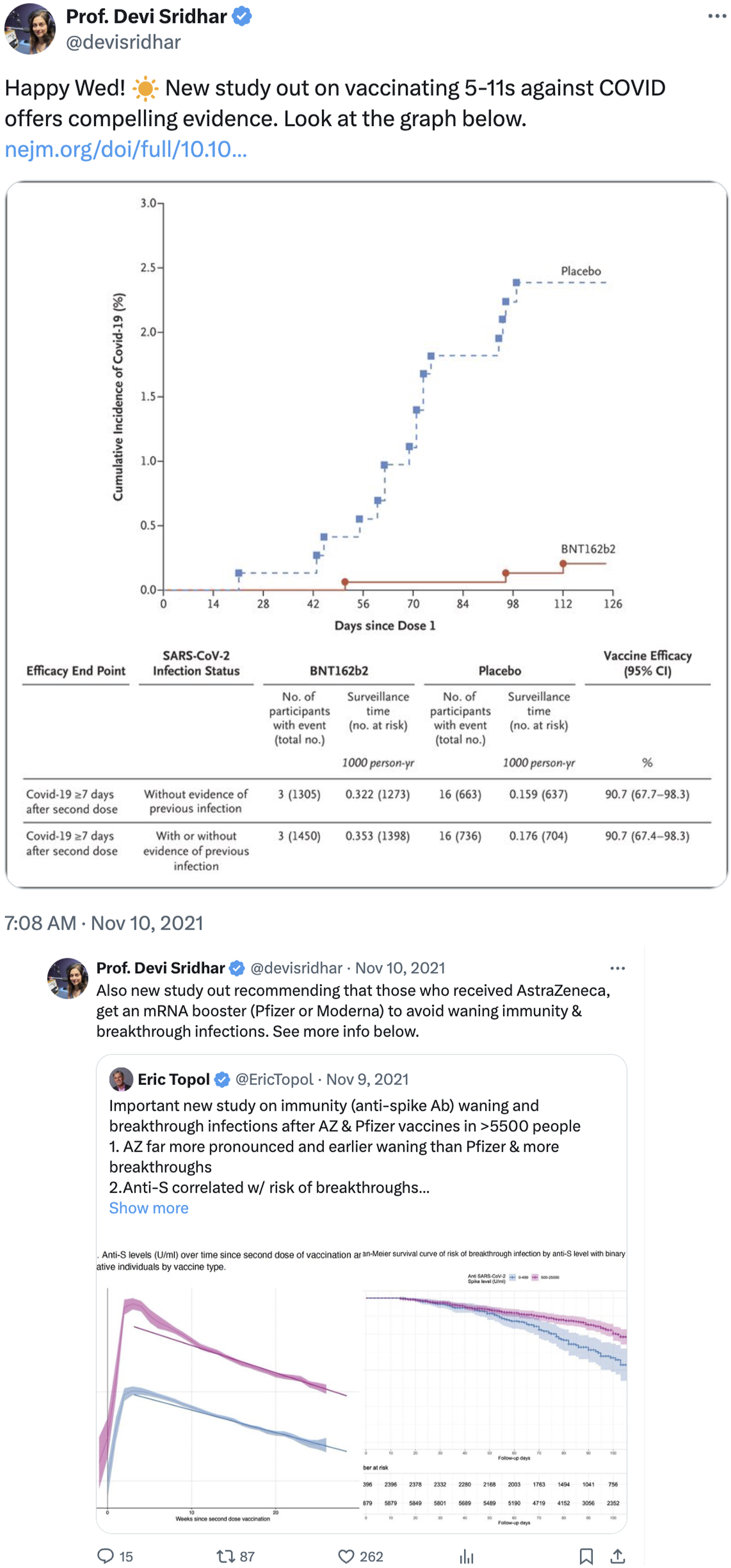
In the first tweet, the written text does not explicitly take a position on vaccinating children. Instead, it refers to “compelling evidence” presented in “the graph below”, which is a secondary source reposted from a research publication. To infer the tweeter’s position on the issue, the reader needs to interpret the graph that Sridhar encouraged everyone to “look at” or rely on contextual knowledge of her views on vaccination. The relationship between the text and the graph can be analysed as ‘minimally mapped’ in their semantic domains. The Minimum Mapping Hypothesis is a theory of inter-semiotic relations that suggests text and images form a coupling if there is a minimum amount of mapping between the field (ideational domain) of each modality (Zhao, 2012). In this case, the text makes an exophoric reference to the graph (“the graph below”) and evaluates its content as “compelling evidence”. It also can be argued that semantic bridging is required between “evidence” and the graph. There is no further domain mapping between the two modalities, resulting in the semantic labour of the tweet (i.e., the argument for vaccinating children) being primarily carried out by the graph.
The intermodal relation observed in this type of tweet differs significantly from those described by Winter and Marghetis (2023) discussed in Section 3. In their research on multimodal numerical communication, they explore how language can explain, amplify, or reinterpret the graphic information, or direct (together with gestures) the reader’s focus to a specific area of the graph. Tweets in our dataset are unique in their intermodal coupling, which can be distinguished from other forms of visual and language coupling, in which semantic work tends to be distributed across modalities (see e.g., Zhao, forthcoming, Logi and Zappavigna, 2023). As we will observe in the replies, the minimum mapping between the text and the graph, or even the absence of written text, is the necessary condition for the emergence of an argumentative context for numerical graphs.
These graph tweets by Sridhar received both replies in text-only and graph tweets. Sridhar, unlike celebrities on social media (e.g., Tanupabrungsun and Hemsley, 2018), rarely engages with the replies to her tweets. As a result, the interactional sequences involving graphs typically constitute a simple two-part adjacency pair, as demonstrated in Figure 3. More extended interaction sequences do occur in our dataset when users start to reply to these replies rather than the original tweet, creating nested interactions within the thread. In an interactive sequence, the first pair part (the original post by Sridhar) will constrain the second pair part (i.e. the replies). Therefore, the argumentative nature of Sridhar’s graph tweet is also a condition that produces the argumentative context for graphs used in the subsequent replies. In other words, if the users interpret Sridhar’s intention as using graphs to argue for her policies, they are likely to use graphs to attempt either to support or to refute her tweet. An example of an interactional sequence.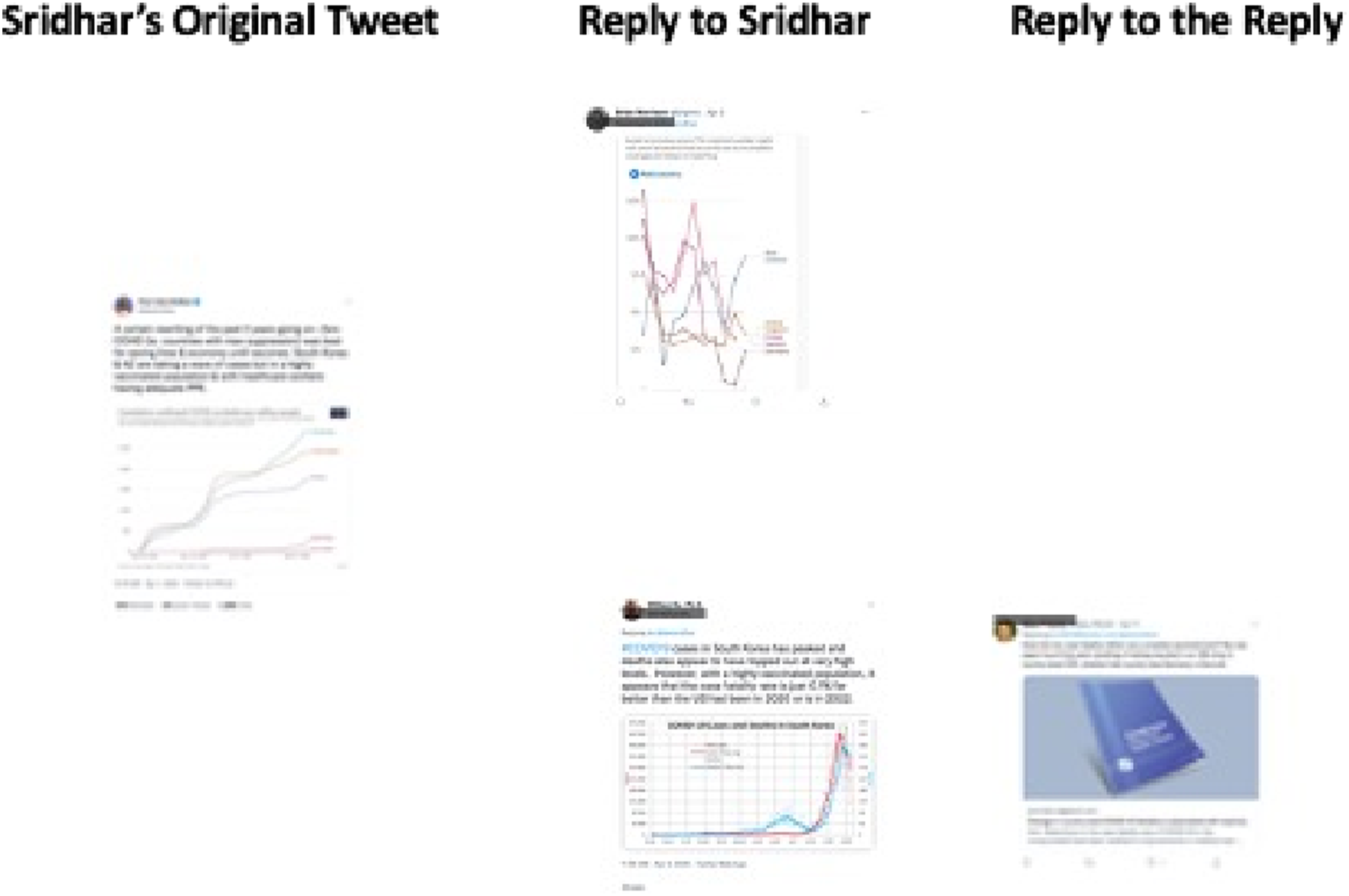
When examining the replies in detail using the four dimensions—social agent, multimodal format, data source, and argumentative agenda—that we introduced in section 3, we observe several distinctive trends important for understanding the argumentativity of graphs in this setting. The users replying to Sridhar can be grouped into two main categories based on how they construe their online identities through their Twitter profiles: expert or non-expert. An expert is understood as someone who claims access to some form of knowledge about COVID-19. A user can assert their expertise by stating their profession or field of study (such as data scientist or statistician) or by claiming personal experience with COVID-19 (e.g., “my son died of vaccination”) 8 . These claims of expertise, of course, are not verifiable in the context of social media. The nature and level of expertise do not necessarily impact whether and how a user would use graphs in their tweets, as access to data and graphic representations of the data are no longer constrained by one’s level of expertise or numeracy. The uses of scientific data and graphs by “the layperson” in civil debates seems to be an emerging phenomenon brought to light during the COVID-19 pandemic.
In terms of data sources, most tweets rely on graphs reposted from other sources (such as research publications or governmental reports) or generated using online data visualization tools (e.g. Reuters Graphics
9
). Both types can be considered secondary sources since the posters do not produce the data or the graphs themselves. Secondary source graphs prevail in our dataset, including those posted by non-experts and the majority of experts. The two instances of primary data both came from users who self-identified as statisticians. These graphs are essentially “recontextualised” (Bernstein, 2000) multimodal texts, which have been transposed from their scientific contexts—where their primary function is informative or explanatory—to social media. Like the graph tweets produced by Sridhar, the text accompanying the graphs in replies is also minimally coupled with the visuals, focusing on the argumentative agenda (e.g., to convince the reader that “We need vaccination, masks, and social distancing”) as demonstrated in Figure 4 (left)
10
. In several instances, however, there is no text accompanying the graphs (see Figure 4, right). These extreme cases raise an interesting question, which we will address in the following section: how do we know if they are arguing for or against Sridhar’s position? Examples of graph tweets: Replies.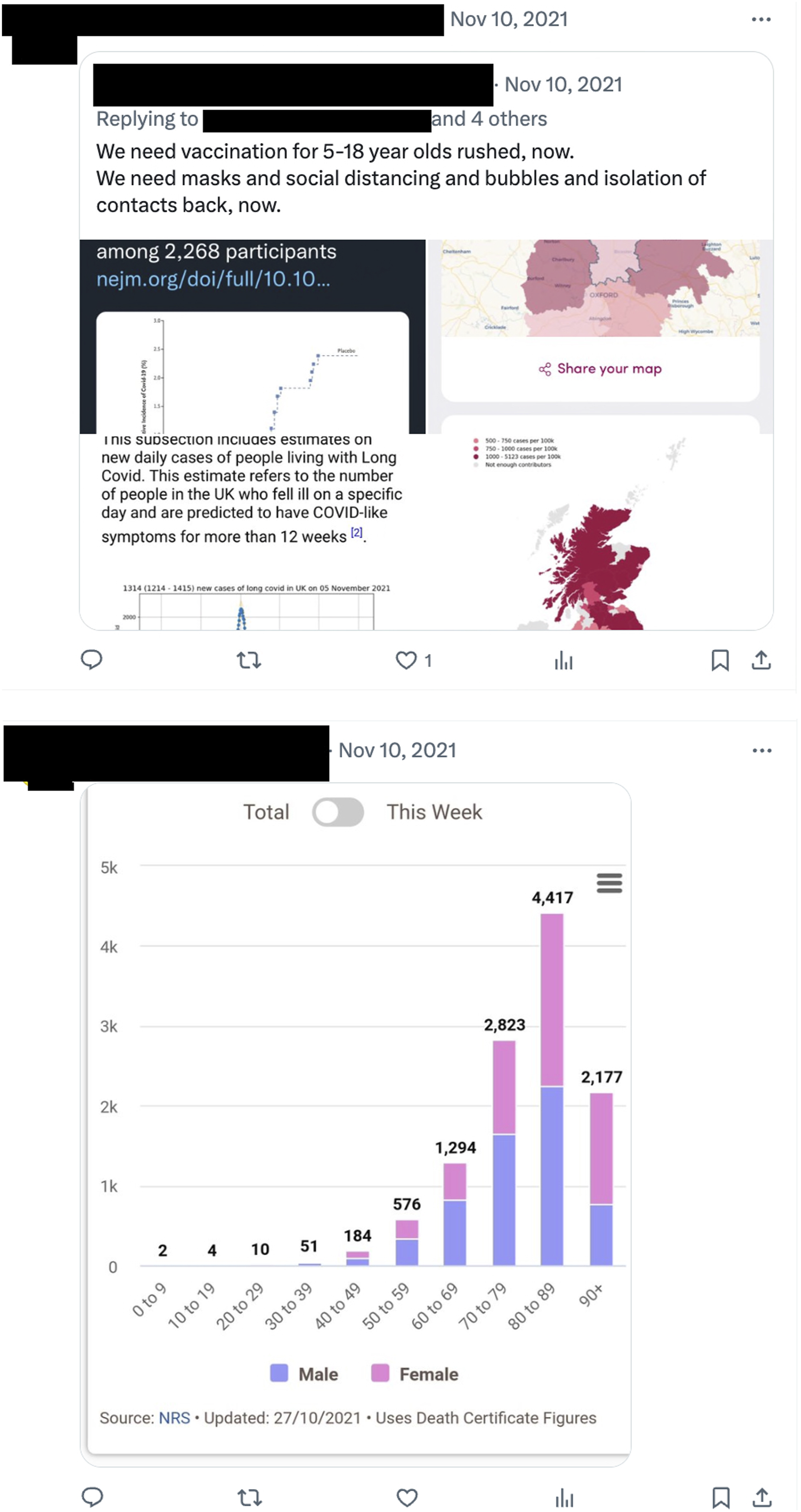
Inferring the likely argumentative agenda of a graph tweet
In this section, we discuss a specific example in which a graph is tweeted, without accompanying text, in response to an initial tweet comprising a graph and text. This example illustrates some of the factors that we take to influence the reader’s attribution of a specific argumentative agenda to the poster. We could alternatively think of this in terms of how the reader’s disposition to search for coherence in a response to a tweet, drawing upon multimodal resources, makes it possible for a poster to convey their argumentative agenda without recourse to words.
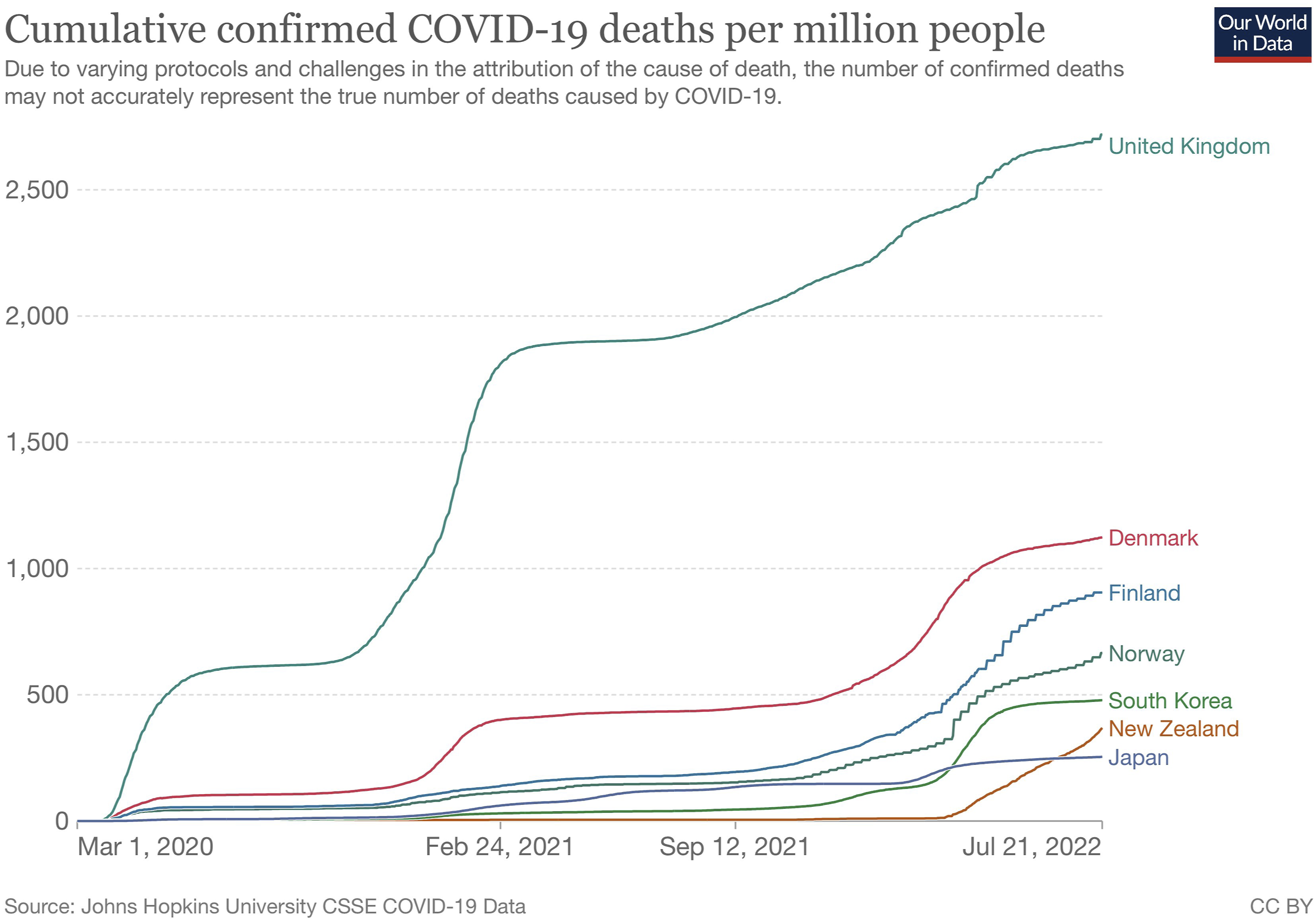
In the exchange we examine, the initial post by Devi Sridhar comprised the graph shown in Figure 5 and
11
the following accompanying text: 6. “A certain rewriting of the past 2 years going on- Zero COVID (i.e. countries with max suppression) was best for saving lives & economy until vaccines. South Korea & NZ are taking a wave of cases but in a highly vaccinated population & with healthcare workers having adequate PPE.” Graph accompanying original tweet by Devi Sridhar.
To understand the argumentative dynamics of the exchange, it is helpful to get a clear sense of the initial poster’s intent. The text in (6) conveys a complex message in relatively few words, relying in part upon pragmatic inferences made available to the reader by the use of specific lexical items. For instance, the first sentence implicates through the use of until that the poster is not committed to the claim that “zero-COVID is best for saving lives and the economy” continues to apply after the introduction of vaccines, while asserting that this was true prior to the introduction of vaccines.
The use of but in the second sentence has subtler pragmatic effects. But is typically analysed as a trigger of conventional implicature which pragmatically conveys contrast between its two conjuncts. Superficially, we might take this contrast to arise between “taking a wave of cases” and “[being] in a highly-vaccinated population”, and read the sentence as conveying a sense of surprise that a highly-vaccinated population would be susceptible to a wave of cases. This is a reading we might get from the invented example (7). 7. South Korea has a highly vaccinated population but is taking a wave of cases.
However, on closer inspection, this is clearly not the intended contrast in (6). The second conjunct of but here is, in full, “[being] in a highly vaccinated population & with healthcare workers having adequate PPE”, and there is no intuitive sense in which a contrast could exist between there being a wave of cases and healthcare workers having adequate PPE. Hence, a more likely interpretation of (6) is one in which the first conjunct of but contrasts with its second conjunct in terms of its effect on something else: given the previous sentence, “saving lives & economy” is a plausible candidate. Thus, we read the second sentence of (6) as expressing a contrast between having a wave of cases (a negative event in respect of “saving lives & economy”) and the provision of vaccines and PPE (a positive event). Importantly, the use of but generally suggests that the speaker takes the second conjunct to be argumentatively more consequential (Winterstein, 2012). Hence, we read this sentence as expressing the view that the fact of there being a wave of cases in South Korea and New Zealand is now not particularly worrisome given the provision of vaccines and PPE.
A further important inference that can be drawn from (6) is that South Korea and New Zealand are countries which pursued a “zero COVID” or “max suppression” strategy. This is intuitively fairly obvious but in fact depends upon complex pragmatic reasoning. First, we infer that the relation between the second sentence and the first is likely one of elaboration, with the distinction implicitly drawn by the first sentence (between countries which implemented “max suppression” and those which did not) being picked up in the second sentence. We then infer from the use of the conjunction “South Korea and NZ” that these two countries fall into the same group with respect to that policy, and are being contrasted with other countries which fell into the other group. To understand that South Korea and New Zealand – rather than those other countries – implemented “max suppression”, we can use the fact that (as stated by the poster) the wave of cases in those countries occurred after vaccination rather than earlier in the pandemic. Thus, we can arrive at the interpretation that South Korea and New Zealand initially adopted a zero-COVID strategy, departing from this only after the introduction of vaccines, consistently with the poster’s recommendation. Finally, the graph selectively depicts data from only five countries, and suggests a clear distinction between the outcomes for, on the one hand, South Korea and New Zealand, and on the other hand, the US, the UK and Sweden. This distinction is visually constructed through the gap (the blank space) between the two groups. The gap, occupying “the new” and “the real” in the composition (Kress and Van Leeuwen, 2020), is arguably the most salient visual element in the composition. The graph thus invites us to draw a relevance implicature to the effect that the US, the UK and Sweden did not adopt a zero-COVID strategy.
The reader of (6) might not need to undertake all the above pragmatic reasoning: they may already happen to know that South Korea and New Zealand initially pursued a zero-COVID strategy while the other named countries did not. However, importantly, this process of pragmatic inference makes the information available to the careful reader of (6) even in the absence of prior knowledge. Similarly, the reader may be aware of the poster’s likely views on the zero-COVID approach (based on her past tweets, for instance). However, in this case, the reader must correctly draw the pragmatic inferences discussed above in order properly to understand which points the poster is arguing for at present, which is a crucial prerequisite for the reader to be able to engage appropriately and relevantly with that argument.
It is striking that the correct interpretation of the original post in this exchange requires not only a nuanced understanding of the meaning contributions of lexical items such as until and but, and the application of general pragmatic principles, but also the integration of textual information with information presented in the form of a graph. The communicative effectiveness of the post reflects the poster’s ability to exploit the readers’ capability for pragmatic inference. To the extent that there is a risk of the interpretative process breaking down and resulting in misunderstandings, we might reasonably expect that risk to be higher in posts by less skilled or experienced communicators. Nevertheless, readers are still able to bring their sophisticated interpretative capabilities to bear on such posts, as we see when we turn to one of the responses to this post: a graph posted without accompanying text, reproduced here
12
as Figure 6. Graph posted as a response to Devi Sridhar’s tweet.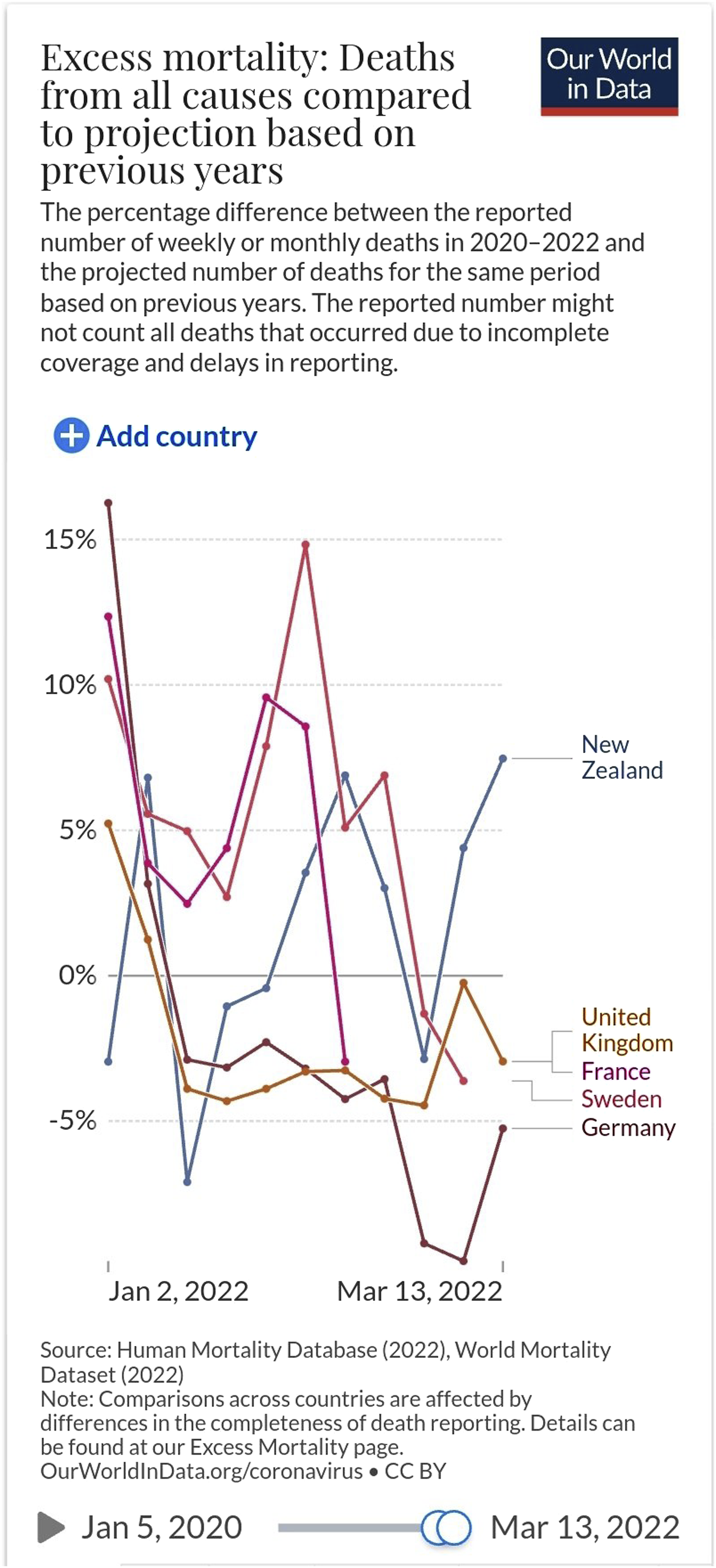
The lack of accompanying text to Figure 6 in the Twitter post itself invites inferences. One is that the poster feels that a comment would be redundant, as the data ‘speak for themselves’. However, a second (and compatible) possibility is that the lack of verbal engagement with the original post is itself pragmatically meaningful. The poster of the response has not availed himself of the opportunity to acknowledge the content of the original post or the argument put forward in it. This striking omission might incline the reader to think that the respondent’s attitude towards the original post (er) is hostile and hence that we should attempt to understand the response as a rebuttal to the original poster’s argument.
If we tentatively adopt that position, can we find corroboration in Figure 6? Like Figure 5, Figure 6 represents time elapsing on the x-axis and an outcome measure on the y-axis, with the upwards direction corresponding to negative outcomes. Compositionally, the graph reproduces Figure 5, making “the gap” the visually salient information. Like in Figure 5, there is a clear sense in which we can distinguish between two sets of outcomes, with reference to the right-hand side of the graph, we have a cluster consisting of the UK, France, Sweden and Germany, and an outlier which represents New Zealand. Whereas in Figure 5 the cluster containing New Zealand was situated below the cluster containing the UK and Sweden (as the “real” in composition; see Kress and Van Leeuwen 2020), in Figure 6 that pattern is reversed, with New Zealand being associated with a strikingly more negative outcome than the other countries. This supports the view on which we take this tweet to be intended as a counterargument to the original post: the respondent takes their data to indicate that New Zealand (a country which adopted a zero-COVID policy) is in fact doing worse than countries which did not.
It is important to note that, while we can read Figure 6 as supportive of the argumentative agenda which we conjecture its poster has, the data presented do not ‘speak for themselves’, and objectively it is not clear that they constitute any kind of effective rebuttal to the argument in the original post. Not only does Figure 6 present a different outcome measure to Figure 5 (excess mortality rather than deaths directly attributed to COVID-19), more importantly it represents a week-by-week figure rather than an aggregate, and it does so over a different time range (from January 2022 rather than from February 2020) and with respect to a slightly different range of countries. Taking Figure 6 as a whole, the visual identification of clusters within it is less straightforward than for Figure 5 due to the comparatively disorganized visual layout (i.e. entangled lines). New Zealand’s status as an outlier emerges only at the last two time points represented in Figure 6: if we looked at mid-February, we would identify two clusters, one comprising New Zealand, the UK and Germany (better outcomes) and one comprising France and Sweden (worse outcomes). Indeed, if we average across the graph in order to get an impression of the aggregate outcomes across the time period depicted (i.e., the percentage excess mortality across this period), we would find Sweden to have the worst result of the countries represented, and New Zealand to have a middling result.
In summary, then, if we conjecture that this graph is being offered as a counterargument to the original post, we can find support for that conjecture by focusing on the right-hand side of the graph (nearest to the current time) and observing that the pattern of zero-COVID versus non-zero-COVID countries is reversed, compared to the original poster’s graph. However, if we interpret the graph as a whole, we find no evidence for any systematic difference between the two categories of country: New Zealand’s results are not out of line with the other countries depicted. This is very much as we might expect from a careful reading of the original graph, which documents a noticeable upswing in the death toll in New Zealand (and South Korea) in March 2022 compared to those countries’ previous results, but which provides no indication of the gap in death toll between New Zealand and the UK or Sweden having narrowed appreciably over the first 3 months of 2022.
From this perspective, the argumentative role of Figure 6 is equivocal. If we are correct in claiming that readers will tend to interpret this post as a counterargument rather than a corroboration of the original post, this interpretative preference appears to arise from the way the contribution is framed instead of its content per se. If we attempt to find evidence in the second graph that runs counter to the main argument of the original poster (which we might paraphrase as ‘New Zealand was among the countries to adopt the right policy, and its circumstances are not currently worrisome’), we can do so (‘New Zealand’s circumstances at the present moment are worse that countries which adopted a different policy’). However, if we attempt to find evidence in the second graph that reinforces the main argument of the original poster, we can similarly do so (e.g. ‘Despite the current wave of cases, New Zealand has had fewer deaths that Sweden over the first 3 months of 2022’).
The compatibility of the data depicted in the two graphs is, in one sense, reassuring: both are drawn from credible sources, and although both may reflect some cherry-picking in the choice of measure, time range and countries involved, we should at least expect the results to be logically consistent with each other, with the graph lines of Figure 6 approximately corresponding to the gradients of the graph lines in Figure 5. However, it is striking that a re-presentation of the data can appear sufficiently distinct from the original data to license the conclusion that the poster is marshalling a counterargument: that the data in some sense ‘speak for themselves’ in contradicting themselves. This potentially speaks to the rhetorical force of our assumptions about connected discourse turns. It also demonstrates our ability as readers to identify features (e.g. visual saliency and other compositional cues) of a multimodal discourse to which a contributor might plausibly be intending to draw our attention, and how we are able preferentially to attend to these rather than to other features of the discourse (e.g. lexical information) which might be much less helpful to the argument they are putting forward.
Conclusion
We conclude our paper by returning to the question we posited earlier: “How do we know whether a social media post is arguing for or against the previous post when this is not expressed in the written text?” Our analysis suggests that in a multimodal communicative context, language is necessary for setting up the argumentative context for visual graphs, even when it does not explicitly encode evaluative meaning. This can be achieved through linguistic strategies such as lexical choices (e.g., the choice of “but”) and/or discursive strategies such as the position in the conversation action sequence (e.g., the second pair part in an assessment). To interpret the argumentative purpose of the graphs, we need to understand not only how information is packaged in the multimodal message but also the argumentative agenda of the speaker/writer. This applies to graphs as well as language.
The most significant implication of our analysis is that interlocutors are very adept at inferring the writer/speaker’s argumentative agendas based on very little multimodal information (e.g., simple visual compositional cues). This observation calls for a rethinking of the analytical goals of multimodal analysis. Much of the focus in multimodality research has been on understanding the ‘orchestration’ of meaning (i.e., how different modes work together to make meaning), which can inadvertently result in overly descriptive analysis in complex multimodal contexts, such as interactive videos (e.g., TikTok), where there is an overload of modality choices. Our analysis points to an alternative agenda that focuses on how semantic labour is distributed across different modalities (or what multimodal features are ‘activated’) in various communicative contexts. Understanding this distribution may also help us better understand the semiotic potentials of a specific communicative mode.
Methodologically, our work brings into dialogue theories of multimodality and pragmatic theories of argumentativity, and it develops a framework for analyzing graphic information in argumentative contexts. This analytical framework helps to explain how quantitative information is used by and packaged for laypersons as visualizations and visualization technologies become readily available in social discursive domains beyond science and education. Our study suggests that visual literacies in the context of data visualizations should include an understanding of the semiotic potentials of digital tools themselves, as suggested in studies of semiotic technologies by van Leeuwen and colleagues (Zhao et al., 2014). We also hope that this dialogue illustrates the productiveness of a meaning-oriented approach to multimodality. While the rapid expansion of multimodality as an interdisciplinary field of study has seen it moving away from its meaning-making oriented analytical approaches, there are rich theories within linguistic that can produce fruitful dialogues and generate new insights into multimodal phenomena in the digital age, as demonstrated in this study and beyond (see, e.g., theories of grammatization in Zhao, forthcoming; theories of coupling in Logi & Zappavigna (2023)on emojis; theories of morphology in Cohn (2014) on comics).
While our study is qualitative and small in scale, the method we have proposed can be used for larger-scale studies of visual graphs produced by laypersons in a variety of non-scientific contexts. This line of research could in turn help us identify types of multimodal literacies needed across different stages of schooling. Additionally, our project highlights the importance of understanding how non-experts engage with quantitative and numerical information. As we move further into the era of big data, civic debates on global issues such as climate change, inequality, and personal decisions related to health and finance will increasingly depend on the ability to engage with quantitative information in multimodal forms.
Footnotes
Declaration of conflicting interests
The author(s) declared no potential conflicts of interest with respect to the research, authorship, and/or publication of this article.
Funding
The author(s) received no financial support for the research, authorship, and/or publication of this article.