
Abstract
The UK Brexit debate and the current Covid pandemic have been fertile grounds for people seeking poor use of statistics, and demonstrate a need to reiterate some basic principles of data presentation. Communicating basic numbers to convey the correct message is a vital skill for a public health professional but even basic numbers can be difficult to understand, and are susceptible to misuse. The first issue is how to understand ‘orphan’ numbers; numbers quoted without comparison or context. This leads on to the problems of understand numbers as proportions and how to make comparisons using proportions. Percentages, and in particular percentage changes, are also a major source of misunderstanding and the baseline percentage should always be given. The use of relative risk can also convey the wrong message and should always be accompanied by a measure of absolute risk. Similarly, numbers needed to treat should also refer to baseline risks. Communicating numbers is often more effective using natural counts or frequencies rather than fractions or proportions, and using pictorial representations of proportions can also be effective. The paper will also examine the problems of using simple ratios to try and adjust one continuous variable by another in particular the use of the BMI and for standardising death rates by institution. The misuse of reporting occurs in primary sources such as academic papers, but even more so in secondary reporting sources such as general media reports. It is natural to try and convey complex messages using a single summary number, but there are assumptions behind these summaries that should be questioned. It is usually better to give the individual numbers rather than a ratio of them.
Keywords
When is a number large?
Consider the following examples:
On May 6th2020 there were 30,000 deaths due to COVID-19 in the UK, 75,000 in the USA and 265,000 in the world
1
There were about 634,000 deaths in the UK population, 2,909,000 in the USA and 58 million deaths in the world in 2018
2
The UK Government stated in 2018 ‘We have invested an extra £1 billion in the NHS this year.’
3
The UK sent £350 million to the European Union every week
4
The Global Burden of Disease Report (GBDR) on sepsis estimated there were 48.9 million cases in 2017, and 11 million deaths, across 195 countries and territories
5
Are these large amounts? They certainly sound like large amounts, but how do we come to terms with what they mean? Large numbers are often quoted on their own by people in authority, to try and impress the public with how big the numbers are. (A useful term might be ‘orphan’ numbers because they are not related to other numbers). However, there is an old joke that if you ask a statistician how well they are, they will reply ‘Compared with whom?’ Likewise, numbers on their own are by-and-large meaningless, it is only with comparisons that we can extract a meaning. In the first example (i), the COVID-19 deaths are, on their own, just large numbers. However, we can employ an analogy to give them some meaning. The first number of deaths roughly equates to the same number of people at an average Premier League Football Club in the UK whereas the second is closer in number to a capacity crowd at Old Trafford, home ground of Manchester United. The third is the size of an average town in the UK (eg Southampton). These analogies put the number of deaths into a very human perspective. However, to get a better understanding of these numbers we need more specific comparisons.
A helpful basis for comparison is knowing that the approximate size of the populations to which each statistic is referring. In 2019, the population of the UK was 67 million, that of the USA was 330 million and that of the world 7.7 billion (7,700 million). 6 We can then calculate the ratio of the number of deaths to the size of the population. A ratio is simply one number (numerator) divided by another (denominator). In this case, since the numerator is a subset of the denominator, we have proportions. The deaths per head of population are 0.044%, 0.023% and 0.003% for the UK, USA and the world respectively. These proportions lead to another comparison; comparing between countries. The UK appears to be doing worse that the US which is doing worse than the rest of the world. Is this a reasonable conclusion? Cause of death is often very unreliably reported. Completion of a death certificate is often assigned to a junior doctor with little training. In an elderly patient with multiple diseases, it can be especially difficult to ascribe one main cause. So in this example we should consider, how do we know the person died of COVID-19? Presumably the patient was tested before they died or they had symptoms similar to COVID-19. However testing rates have varied widely between countries and diagnosing symptoms of COVID-19 is very subjective. Thus, these numbers for death rates due to COVID-19 are not at all reliable and a reliable comparison is therefore difficult.
In contrast, deaths (from any cause) are reliably reported in the UK and the USA and probably well reported for the rest of the world. In example (ii) again the numbers by themselves are not meaningful but compared to the size of the relevant populations we can extract some meaning. A quick calculation reveals that 0.95% of the UK population die every year, compared to 0.88% in the USA and 0.76% in the world. These numbers on their own are interesting. In the UK about 1 person in a 100 dies each year. This brings the numbers down to something we can appreciate. Again, we can compare the proportions dying by country and again it appears that the UK is so much less healthy than the USA and are both less healthy than the rest of the world. This may lead to further investigations and, for example, looking at the ages of the people who die.
In the third example (iii), we could compare the extra sum invested in the NHS to the annual budget for the NHS, which is about £130 billion, so this extra £1bn is less than 1% of the total. Another way to look at it, is to consider that we now know there are about 67 million people in the UK, so £1bn equates to about £15 for every person in a year, roughly the cost of 5 pints of beer (at current UK prices outside of London). It doesn’t sound so big now, does it?
In the fourth example (iv), it is worth knowing the UK economy was worth £8.8 trillion a year in 2016 (a trillion is 1,000 billion).
7
The £350 million a week given to the EU is £18.2 billion a year, so the amount the UK sends to Europe is
If we combine the information from the fifth example (v), with the worldwide death data in (ii), we would deduce that approximately 1 in 5 deaths worldwide is due to sepsis. This certainly is a large number! However, all unusual numbers should be subjected to a little scrutiny. As a quick reality check you might start by asking yourself whether of the people you know of who died recently, did 1 in 5 die of sepsis? One would expect the answer is no. Thus, we might query whether the Global Burden of Disease Report is right. One issue is that sepsis can be difficult to diagnose and the rate of diagnosis varies hugely from one country to another, so local experience may be misleading in that I another country sepsis might be more readily diagnosed.
When one hears a number given which you believe the presenter wants to sound big, it is always worth applying reality checks such as the ones described in Box 1. A light-hearted example has been provided in a video from the Sheffield Methods Research Institute
8
concerning a news report, which stated that floods in New Zealand had caused 30,000 pigs to be washed down a river. This was then reported uncritically by other news outlets, until someone thought ’30,000? That is an enormous number, is it believable? How many pigs are likely to fall into a river at any one time?’ Going back to the original broadcast, it turned out that the reporter had in fact said 30 sows and pigs but owing to their New Zealand accent, this got ‘misheard’ and repeated uncritically to the wider media. Things to think about to help understand numbers.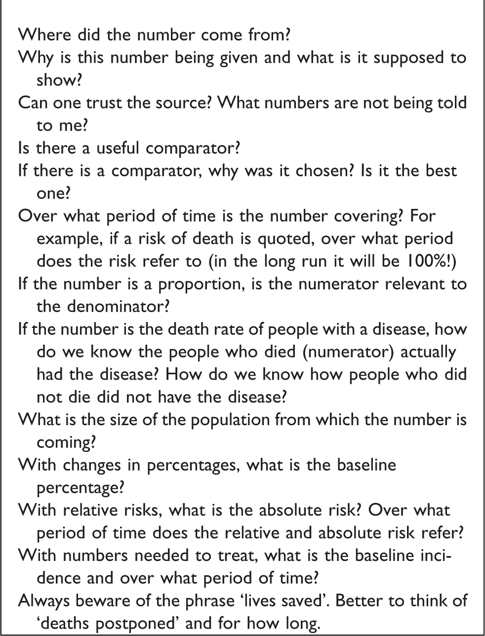
A further question of a large number is to ask, over what period of time does the number refer to? By expanding or contracting the time scale, a presenter can make a number look big or small. When a large sum of money is promised, one should ask, how much does this equate to per year? In the second example above, 634,000 deaths sound large whereas 0.95% sounds small. However if one stated that approximately 1650 people die every day, or about 1 every minute, it may sound even bigger, since in our everyday experience people are not dying every minute! It is worse when reports state ‘the risk of death’ or ‘lives saved’ without stating a time period. The risk of death in the long run is 1! The period of time is particularly relevant to the COVID-19 example, because the numbers will depend on when the first case occurred.
Definitions of the quantities discussed in the paper are given in Box 2. Definitions.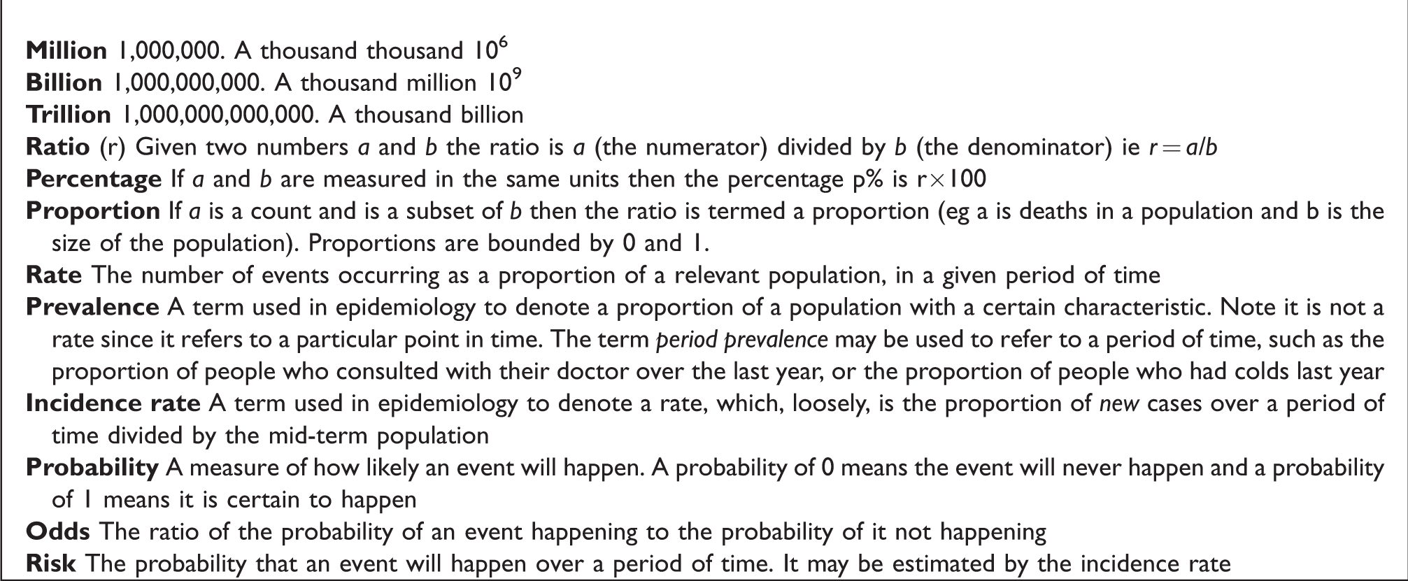
Proportions and percentages
As we did earlier, we often multiply proportion by 100 to give a percentage. Thus it is easier to state that the percentage of people with diabetes (Type 1 and 2) in the UK is 6% rather than say that the proportion is p = 0.06. 9 We can express this as a count by saying for every 100 people in the UK, six have diabetes. These whole numbers are termed natural frequencies and convert the percentage to a count. Gigerenzer 10 showed that people understand counts, or natural frequencies, better than proportions and so they more often use frequencies in communications. So for example, rather than telling a patient there is a 30% chance developing side effects, it is better to say that out of 10 patients like you, three will develop side effects. If the proportions are small, the denominator can be increased to ensure the proportion is a whole number. For a percentage, the denominator is 100, but for smaller proportions denominators of 1000 or 10,000 are used.
Note the denominator should be a relevant population. In an example from a Lullaby trust report 11 there were 200 deaths from Sudden Infant Death Syndrome (SIDS) in the UK in 2017. There were 755,000 live births in the UK that year so the proportion of SIDS to live births is 200/755,000 = 0.00026. This is expressed in the report as per 1000 live births, which makes it 0.26 SIDS per 1000 live births. However, one might argue that 26 SIDS per 100,000 live births is easier to understand, especially when comparing different time periods or countries. Note that for SIDS the relevant denominator is the number of live births, not the number of people in the population.
Another way to express a proportion (p) is to use the reciprocal (1/p). Thus, we can say that approximately 1 person out of every 17 (1/0.06) in the UK has diabetes or that about 1 in 4000 (1/0.00026) babies born every year will die of SIDS. These are often easier to understand.
Percentage changes, the importance of baseline
We use percentages to express differences as a fraction of the whole. However, it is crucial to define the baseline. The difference in mean height of British adults aged 20 years is 177.3 cm for men and 163.6 cm for women, a difference of 13.7 cm.
12
Women are
Percentages are often used to show change. However, there are a number of issues to be aware of. In particular, percentages critically depend on the baseline. Suppose a headline was, ‘The number of cases of knife crime has risen by 20% this year’. One should automatically ask, ‘from what to what and when?’ The baseline could have been 10, and it has gone up to 12, or it could have been 1000 and gone up to 1200. The interpretation of the same percentage is very different in the two scenarios! The ratio of baseline to final figure is 1.2, thus a simple way to find the final figure is to multiply the baseline by 1.2. If knife crime continues to rise as a fixed proportion of the previous year, (which is termed exponential rise), then from a baseline of 1000 the next year we would expect
This problem of understanding percentages is even worse for percentages over 100. Suppose there were 100 deaths from some cause in a year. If one were told that deaths had risen by 200% the following year, how many deaths would one expect? 200/100 is 200% so the rise in deaths is 200 and one would expect 300 = 200 + 100 deaths to have occurred this year. However, some people would think it was that the deaths would rise to 200! It is better to state the beginning and end numbers to avoid confusion (it is puzzling to hear of people who make ‘110% effort’).
A problem with baselines is illustrated in the recent statement ‘Between 15 March and 27 March (2020) the UK government’s numbers on death from COVID-19 have been more than 100% less than the actual figures on three occasions’. 13 If something reduces 100% from baseline then it is zero! Here, the authors have used the UK government’s figures as the baseline and so what they really mean is that the actual deaths are 100% greater than the UK government figures. Nevertheless, it would be easier still to say that the number of deaths was twice the UK government figures.
Another way to make numbers look bigger is to choose the smallest baseline. Given a slowly changing rate, the baseline may be chosen some way in the past. Thus It has been quoted that the rate per 1000 live births of SIDS in the UK declined from 0.48 to 0.26 from 2004 to 2017, (or from 48 to 26 per 100,000 live births) a reduction of 46%. 11 Whilst this is a noticeable achievement, one might ask why choose 2004 as the baseline year? In fact, this is when this particular definition of SIDS started to be used (but one has to dig to find this). A much easier statistic to recall is that the death rate almost halved from 2004 to 2017.
Even if the choice of baseline is clear, such as the previous year, there is another problem with percentage change. If you go up x% and then down x% you don’t end up where you started! Thus we may find out that that the number of cases of knife crime last year was 1000, and are told it has risen by 20% this year, so one would expect the number this year to be 1200. Suppose there was then a successful campaign to reduce the cases of knife crime by 20% the next year. Since 20% of 1200 is 240, one would expect the actual number of cases to drop to 960, 40 less than the baseline! Similarly, if deaths from some cause dropped from 300 to 100, what is the percentage drop? In fact it is 100×
In clinical trials, there have been a number of authors warning about the use of percentage change from baseline (See for example 14 ). The general recommendation is to use methods that that allow a more flexible relationship between baseline and outcome (such as analysis of covariance).
When a measure is itself a percentage, it is even more important to avoid confusion about the percentage change. If an HbA1c has gone down from 7.5% to 7% then this a 0.5% drop but it can also be expressed as a 6.7%c (100×0.5/7.5) drop. It is better to use the term ‘absolute percentage points’ for differences in percentages, so we would be better to say that HbA1c% has dropped by 0.5 absolute percentage points.
Probabilities and risks
One particular type of proportion is a probability. The probability of choosing a ‘diamond’ from a shuffled pack of cards is 0.25 because there are 13 diamonds in a pack of 52 cards and so the proportion of diamonds is 13/52 = 0.25. One could think of this as the probability that a randomly chosen card is a diamond. Similarly, we could say that a baby born in 2017 in the UK has a probability of 26 out of 100,000 of dying from SIDS. Here we are implicitly assuming that the probability applies to a randomly chosen baby, or a ‘typical’ one. If we knew more about the baby, such as whether the family had suffered a SIDS death before, then the probability would change (this is known as conditional probability, since the probability is conditional on other factors).
The proportion of events occurring over a particular time is called a rate (a term we used without definition earlier). If the events are new events in a population, it is an incidence rate. Thus, we can talk of the rate of SIDS or incidence of SIDS in 2017 as being 26 per 100,000 live births. This can also be described as the risk of dying from SIDS in 2017. Note that in contexts where the event is bad, many people prefer the term ‘risk’ to the term ‘probability’.
One way of thinking of the probability of an event is to think of the frequency with which an event occurs in a larger population. However, we often use probability in a different way, to indicate our strength of belief that an event will happen. Thus, we might describe the risk of someone dying in the next 10 years. An example of this is the risk predictor QRisk. 15 This uses data from a large population, to model the expected risk of developing heart disease or stroke. Again, it uses natural frequencies to express risk. Rather than stating (to a 70 year old man with no other risk factors) ‘your risk of heart disease in the next 10 years is 15%’ it states ‘In 100 people like you, 15 of them will develop heart disease in the next 10 years’. QRisk also uses a ‘smiley face’ plot to help convey the meaning of a percentage. This is a diagram with 100 faces on it, with 15 in red and frowning, and 85 plain and smiling to show 15% visually. For some people, this is easier to appreciate than a number. Further suggestions for understanding risk are given by Gigerenzer and Edwards. 16
Another ratio that is commonly used is a relative risk. This is the risk in a group of interest divided by the risk in a control group. For example, women aged 40-74 years old who have a mammogram have a relative risk of dying from breast cancer of 0.78 compared to women of the same age who do not have a mammogram when followed for an average of 10 years.16,17 This is often expressed as a relative risk reduction of 22%. This sounds like an impressive number, until one realizes that out of 1000 women who do not have a mammogram about five will die from breast cancer in 10 years, whereas out of 1000 women who do have a mammogram four will die from breast cancer. This is an absolute risk reduction of 1 in 1000 in 10 years, which sounds much less impressive. This can be written as the number needed to treat (NNT) which is that one has to give 1000 women a mammogram in order to prevent one extra death from breast cancer in ten years. (Note the word ‘extra’- some authors state the NNT is the number needed to treat to prevent one death, which is wrong). It has been claimed that NNTs, which use natural numbers are a good way to express risk differences. 18 However, many authors have disagreed for example. 19 There are a number of problems with NNTs, the main one being that the interpretation of the NNT depends critically on the baseline risk. If the baseline risk was 5 in 100 rather than 5 in 1000 from the mammography example, for the same relative risk reduction, the NNT would be 100 rather than 1000. This relates to the fact that although the relative risk is often found to be independent of the prevalence of the risk, this is not true of the absolute risk reduction therefore of the NNT. For example the relative risk of smoking for an individual is likely to be the same in an area with a high prevalence of smokers as in an area with a low prevalence but the absolute risk will depend on how many people smoke in an area. The NNT is also difficult to interpret if the relative risk is not statistically significantly different from 1 since the NNT could be plausibly infinite.
For all these measures, the period of time to which the measures refers should also always be given. For example, outcomes are often given at 1 year or 5 years after the start of a study, and this will help gauge whether one treatment is working faster than another but it is important to know whether the outcome referred is for one year or 5 years! Be careful of any risk or relative risk in a paper that does not give the time period.
Ratios of continuous variables
So far we have largely discussed count data, but ratios are used for continuous data as well. Ratios of continuous variables are often used to ‘adjust’ the numerator by the denominator. Possibly the most commonly used ratio in medicine is the Body Mass index (BMI), which is the weight in kilograms divided by the height in metres squared
It is important to note that one can make a ratio smaller by either reducing the numerator, or increasing the denominator. For example, cholesterol is a dense, fatty substance found in every cell of the human body. The two main types in the blood are high-density lipoprotein (HDL, the ‘good’ cholesterol) and low-density lipoprotein (LDL, the ‘bad’ cholesterol). A cholesterol ratio is the ratio of the total cholesterol in the blood to the HDL and its main advantage is that it is a single number that is easy to remember. A low cholesterol ratio is good. Thus, one can reduce the HDL ratio by either increasing HDL, or reducing LDL or doing both. It is not clear, from a single number, what approach to take.
The BMI is an example of adjusting one variable to control for another by simply dividing by it. Another common technique occurs where the variable of interest is in fact a subset of a larger variable and both variables are expect to vary in the same way. For example, in respiratory medicine, a commonly used index is the FEV1/FVC ratio. The FEV1 is the volume of air one can blow out in one second and the FVC is the total volume of air one can blow out. This ratio, in theory allows for the fact that larger people will have larger lungs, as an FEV1 reading on its own will not have much meaning. The ratio is expressed as a percentage, and a normal value is considered to be greater than 70%. The advantage of using the FVC is we would expect it to change with height and age in the same way as the FEV1, so it in some way ‘adjusts’ for these quantities. However, one has to assume that any hazard (such as air pollution) affects the FEV1 but not the FVC. The assumption underlying these ratios is that the adjustments are proportional. If one person has an FVC 25% higher than another person, we would expect their FEV1 also to be 25% higher if they are healthy.
A further example shows that care is needed to determine the denominator. The Summary Hospital Mortality Index (SHMI) is a ratio of the observed number of deaths in a hospital in a year with the number expected, based on the demography of the hospital population using a prediction equation. 22 Thus a hospital can lower its SHMI by reducing the observed number of deaths or by increasing the expected number. One way of doing this is to ensure that all comorbidities are included in the prediction equation. (A comorbidity is an underlying health issue that is not the reason for coming into hospital this time.) For example, a person may have heart disease, but come into hospital with a broken leg. Including the comorbidity in the coding will increase the expectation of death and so reduce a hospital’s SHMI. This is because anyone admitted with heart disease will increase the expected number of deaths, even if they don’t change the observed number of deaths. Suppose for people with heart disease their risk of death was 2 in 100, each person coded with heart disease will increase the expected number by 0.02, and with large numbers of patients admitted to a hospital these add up! Thus, hospitals might strive to increase their expected values as much as possible. Not including the comorbidity might penalise a hospital because its SHMI would appear too high if the patient happen to have a heart attack in hospital.
Trusting numbers
When given a statistic, one should always ask, why are they telling me this and where did this statistic come from? The reason for quoting a particular statistic may be to convey a particular message, even if the numbers are unimpeachable. For example the UK Government were not lying when they stated they had invested an extra £1 billion in the NHS in 2018 but possibly their reason for stating it in the way they did was to convey the message that the Government was committed to the NHS. Without knowing what the NHS requires, however, it is a meaningless number. One would like to think that the campaigners who wanted the UK to leave the European Union were not lying when they stated that £350 million goes to the EU per week from the UK, when in fact when taking the rebate into account it was ‘only’ £276 million. 23 However, to the person in the street these are both big, meaningless numbers. Expressing them as a comparison renders them much more meaningful, perhaps something the campaigners wanted to avoid.
With ratios, it is important to consider whether the denominator is suitable. In example (i) the denominator was the whole population. However, older people have a much higher risk of dying than younger people and a more relevant population would be the proportion of people over 65 (say). In fact, 18% of the population of the UK is over 65, compared with only 9% in the world. This might explain the ‘anomaly’ that the UK appears to be less healthy than the whole world.
In this era of ‘Fake news’, vigilance in the use of numbers is even more important than ever before.
Conclusions
Numbers are only interpretable when used in comparison with other numbers. Thus, when presented with a single number, it is a worthwhile exercise to ask ‘how big is this number compared to other relevant numbers?’ Furthermore, you should consider how the number might change if the time scale were to be changed. If a comparison is already given, is the comparison valid? Always check with a proportion that the denominator is relevant. We have discussed the numerous problems of trying to condense a comparison into a simple proportion or ratio. The general rule of thumb is when giving a ratio or a difference always also give the two numbers which are used to calculate it. Thus: for a percentage change, give the baseline and final value; for a relative risk, give the baseline risk and the final risk, and the risk difference. In addition always state the period of time over which these measures pertain.
There are many ways to display even simple proportions, and people find some ways of display easier to understand than other ways. When you present numbers, help your audience through these difficulties by always offering a variety of presentation methods. Basic understanding of numbers is everyone’s responsibility. Reuben’s book 23 describes simple ways to avoid being misled by numbers, some of which are in the medical field. For further reading on these issues Spiegelhalter’s Understanding Uncertainty website 24 has numerous example of displaying risk and his book 25 is a good introduction to the topic. Further details on understanding data, expanding on the theme of this paper are given by Campbell. 26
Footnotes
Declaration of Conflicting Interests
The author(s) declared no potential conflicts of interest with respect to the research, authorship, and/or publication of this article.
Funding
The author(s) received no financial support for the research, authorship, and/or publication of this article.