
Abstract
In psychology and human neuroscience, the practice of creating multiple subplots and combining them into a composite plot has become common because the nature of research has become more multifaceted and sophisticated. In the last decade, the number of methods and tools for data visualization has surged. For example, R, a programming language, has become widely used in part because of ggplot2, a free, open-source, and intuitive plotting library. However, despite its strength and ubiquity, it has some built-in restrictions that are most noticeable when one creates a composite plot, which currently involves a complex and repetitive process with steps that go against the principles of open science out of necessity. To address this issue, I introduce smplot2, an open-source R package that integrates ggplot2’s declarative syntax and a programmatic approach to plotting. The package aims to enable users to create customizable composite plots by linearizing the process of complex visualization. The documentation and code examples of the smplot2 package are available online (https://smin95.github.io/dataviz).
With modern software tools, there has been a surge in the number of methods and tools through which researchers and clinicians can perform data visualization, an important skill in scientific research. For instance, R, a programming language (R Core Team, 2021), has become exponentially prevalent for statistical data visualization in the last 15 years in part because of ggplot2, a plotting library that was introduced in 2009 by Hadley Wickham (2009). Its citation count has towered over that of Python’s matplotlib (see Fig. 1), an extensive, flexible, but challenging low-level plotting library that was first introduced by John Hunter in 2007 (Hunter, 2007). The reason for the recent rise of ggplot2 is that the library is free, open-source, and intuitive for users. Layers of graphics can be added sequentially on a plotting space to produce complex plots. The details of the philosophy behind ggplot2, which is better known as the “grammar of graphics,” are well explained in a tutorial in this journal (Nordmann et al., 2022). In brief, as long as users know how to add a layer of points, a layer of lines, and other specific layers sequentially using ggplot2’s declarative syntax, they will be able to plot their data in both simple and complex fashions with a high level of customization without applying the programmatic approach, such as creating loops and functions (Hehman & Xie, 2021). Furthermore, because of the active community of users, there exist diverse third-party R packages (Mowinckel & Vidal-Piñeiro, 2020; Patil, 2021; Tang et al., 2016), which complement ggplot2, that provide shortcut functions for plotting, allowing users to plot data in just a few lines of codes in wide-ranging ways. These factors have made R, rather than Python, a preferable tool for data visualization for researchers and clinicians across disciplines and levels of experience.
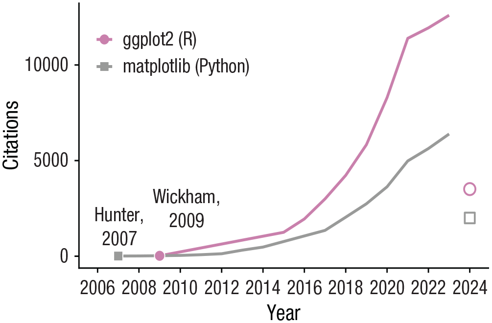
Year-to-year citation count of two major plotting libraries in R and python: ggplot2 and matplotlib. The year 2024 shows a partial count of the citations. Each point denotes the time point when the authors have published an article regarding their software. Citation counts were collected from Google Scholar on April 4, 2024.
Built-In Restrictions of ggplot2
In psychology and human neuroscience, the practice of creating multiple subplots and combining them into one composite plot is common (Kubilius, 2014). This method of data visualization is known as “subplotting.” In the last few decades, it has become more widespread as research has become increasingly sophisticated, as demonstrated by the recent trend of including more variables and conditions in experiments, conducting collaborations with other laboratories if possible, and implementing multiple methodologies for data collection and analysis (Lin & Lu, 2023). These, in turn, create data sets with complicated structures, thereby requiring complex forms of data visualizations. However, as a high-level plotting library—which does not require users to plot each detail of the plot separately—ggplot2 has some built-in restrictions that are most noticeable when one creates a composite plot.
Currently, creating a composite plot in ggplot2 is complex for several reasons. First, although ggplot2 allows for flexible customization of individual plots with concise codes, it is not compatible with the most well-known programmatic approach—iteration using a for loop—unless unorthodox methods are used. Consequently, users unfamiliar with proper methods may struggle with applying iterations in ggplot2.
Second, ggplot2 provides limited options for subplotting. A typical ggplot2 operation returns a single plot object that can be easily manipulated or stored. Although
For plotting unique visual elements that have no relation to the given data across panels, a third method has been used. It involves combining separate ggplot2 plot objects into one composite figure using libraries such as cowplot (Wilke, 2019) and patchwork (Pedersen, 2019). This method enables users to draw a composite plot flexibly but requires them to code each subplot separately (see Pseudocode 1), resulting in repetitive scripts, albeit with minor differences (compare Plot 1 and Plot 8 in Pseudocode 1). In addition, this approach restricts the aesthetic control of the composite figure, such as its layout, annotations (including legends), and marginal space (see Fig. 2), further encouraging users to code each subplot individually.

A comparison of the standard routines for subplotting in between matplotlib from Python and ggplot2 from R. In Python, it is standard to generate multiple panels using iterative or functional programming approach. After the plots have been combined, the specific aesthetics of the composite plot, such as the number of rows and columns, the common legend, and x-axis and y-axis labels, can be adjusted without modifying the individual plots. Furthermore, it provides a full flexibility for text, shape, and other types of annotations to be added on the combined image. The process of visualizing a composite plot is linear in Python’s matplotlib given its clear starting and ending points. However, in R’s ggplot2, the process often requires users to go back and forth between the stages of creating individual plots and then combining them. Users are encouraged to plot one graph at a time and then combine all plots together as late as possible. The goal of smplot2 is to simplify the process of complex data visualizations by resolving these issues.
Put together, although ggplot2 has enjoyed its widespread user base, for visualizing a composite plot, users have had to write repetitive scripts, seek third-party packages, or resort to a vector graphics editor, straying from the recommended practices for scientific reproducibility:

On the other hand, the workflow for subplotting and creating a composite plot is simpler and more concise in Python’s matplotlib because it requires programmatic approaches such as building loops (see Pseudocode 2) and custom functions. Applying a programmatic approach ensures a full flexibility for graphical aesthetics because users can then allocate subsets of data to unique panels using any number and combinations of variables and dynamically control the aesthetics, such as color, without writing repetitive scripts:

The first line of Pseudocode 2 determines the structure of the composite figure. The data themselves are plotted within a for loop at each panel, iterating for the length of the total number of subplots (eight total; see Fig. 2). Because of the programmatic approach, the color and other aesthetics in the plot for each panel can be different, yielding more flexibility. In addition, although the codes that generate the panels are identical, the panels actually look different from one another; some have y-axis ticks or x-axis ticks (or both; see Fig. 2) because the layout of the combined figure has already been established in the beginning. Furthermore, the aesthetics of the composite figure can be controlled, such as the amount of blank space between panels (
A Need for a Solution: smplot2
Although the grammar of graphics interface in ggplot2 simplifies the code for a standalone figure, it can complicate the workflow when multiple ggplot2 outputs are combined into one composite figure, which has restricted flexibility for aesthetics. Users have been encouraged to separately code each subplot and combine the subplots as late as possible. This is concerning because ggplot2 has been widely used (see Fig. 1) and research routines in psychology and human neuroscience have become more sophisticated.
To address this issue, I introduce smplot2, an open-source R package that integrates the practice of data visualization in ggplot2 and the programmatic approach to plotting. This package gives users equal levels of control over both individual subplots and a composite plot. It has more than 40 functions at the time of writing (see 300+ examples in https://smin95.github.io/dataviz), but for brevity, in this tutorial, I primarily discuss how it can linearize the workflow of visualizing elegant composite plots using a programmatic approach and maximize the flexibility for aesthetics in ggplot2. All examples here are created with aesthetic defaults of the smplot2 package, which are clean and appropriate for research articles across various fields and data structures. The functions of smplot2 have been optimized for subplotting to maximize the visibility of data in a composite plot by controlling the extent of blank spacing, scaling, and the relative text size. I hope that this tutorial can empower readers to perform complex and expressive data visualizations of a composite plot using a structured workflow.
Aim and structure of the tutorial
The aim of this tutorial is not to reiterate the contents of the package’s documentation from the web in its entirety or introduce ggplot2 (Hehman & Xie, 2021; Wickham, 2016; Wickham et al., 2023). Instead, I aim to present a new workflow for the visualization of a composite plot in ggplot2 with a programmatic approach and the smplot2 package. In the first section, I briefly introduce some of the visualization functions of smplot2, such as its background themes, that improve aesthetics for subplotting. Then, in the next three sections, I demonstrate how researchers can produce subplots in ggplot2 iteratively and then combine them into a composite plot using a linear process (similar as shown in Fig. 2 for Python’s matplotlib) with three examples. The examples become increasingly more sophisticated to demonstrate there is no limit to how users can create and customize composite figures. The tutorial is summarized in Table 1.
Summary of the Tutorial

Target audience
In this tutorial, I assume that readers have some basic knowledge of R and ggplot2 and some experience with working with data frames using functions such as
Readers who have not used ggplot2 and R should read Chapters 2 and 3 of the package’s documentation webpage (https://smin95.github.io/dataviz) before starting this tutorial. The chapters provide a step-by-step guide on how to install RStudio and use ggplot2. Individuals who have not worked with data frames in R are recommended to read the tutorial by Nordmann et al. (2022) or the early sections of Chapter 7 of the documentation webpage (Sections 7.1 and 7.2). Completing these two prerequisites for the tutorial would take about 2 to 3 hours.
Installation requirements for this tutorial
These two packages—tidyverse (Wickham et al., 2019) and smplot2—should be downloaded for the completion of the tutorial from the Comprehensive R Archive Network (CRAN). The tidyverse package is a suite of multiple packages, such as ggplot2 (for plotting and saving visualizations), dplyr (for working with data frames), and readr (for reading external data files):

Open-science practices
With more than 300 examples, smplot2 has been documented online in detail (https://smin95.github.io/dataviz); there are 12 are chapters devoted to the package at the time of writing. The documentation webpage was created using the bookdown package for reproducibility (source codes in https://www.github.com/smin95/dataviz). The codes in the tutorial and their outputs are posted online (https://www.smin95.com/smplot2doc).
Introduction to smplot2: Background Themes
First and foremost, one should load the two packages to memory:

smplot2 offers various plotting and thematic functions. In this section, only the thematic functions are discussed. For more information about the plotting functions (raincloud plot, slope chart, forest plot, Bland-Altman plot, etc.), see examples in Chapters 3 through 6 from the documentation webpage.
In this example, a randomly generated data set is used as shown below:

The data frame is stored in the object
In this section, raincloud plots are drawn using the function

(a) A default raincloud plot with a background theme that has major horizontal grids. (b) A raincloud plot with a classic theme. (c) A raincloud plot with a minimal theme (no grid).
Figures 3a through 3c show a different background theme. The theme with major horizontal grids is used in Figure 3a by default because

The themes have been developed to optimize the discernability of each plotting feature (e.g., relative text size, blank spacing) even when multiple subplots are combined into one composite figure. Here, for instance, the three examples of the raincloud plot have been combined into one figure using the function
In the next three examples in which composite plots are created, I strictly use the thematic functions
Example 1: Subplotting Data Using One Variable
Simulated data set
Amblyopia is a visual deficit with origins in the primary visual cortex (Min et al., 2022). The simulated data here represent visual health in individuals with amblyopia and normal vision at various experimental conditions and types of visual stimuli. They are used throughout the rest of the tutorial.

This data set should be loaded to memory using the code above. Throughout the tutorial, I use
The column
In this example, I allocate data to each panel by using the variable
lapply()
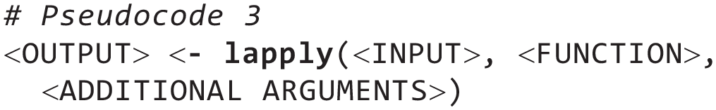
The input can be either a list or a vector. If the input has a length of 5 (i.e., five elements), then the function will be run five times, and an output list that has a length of 5 will be returned. In this case, the function will be plotting the data, with specific mapping and aesthetics, and generate ggplot2 objects. I plot each of the nine individuals’ data, so I run the function nine times (i.e., nine iterations). The returning output should therefore have a length of 9, each of which is a plot. Additional arguments can be passed to the function, but in this tutorial, there will not be any additional arguments, so these can be ignored.
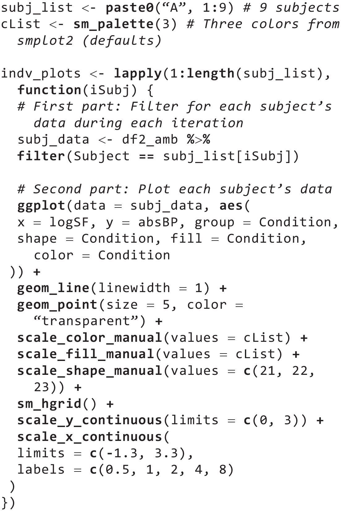
First, I create an input object that specifies the nine subjects in the Amblyopia
In the
The first part filters data using the index of the iteration. Here,
The second part of the lapply() function plots the filtered data. The variables are mapped to aesthetics, and the appearance of the plot is customized using functions from ggplot2. Here, the specifications are set so that the data frame to be used is
In this example, each condition is coded to a unique shape with the function
As
When one codes for multiple subplots in a
To display a plot from the object

Next, users define the title and common x- and y-axes labels of the composite figure that they will create. As their names suggest,

Notice that this process is highly similar to what is often used in Python’s matplotlib, where
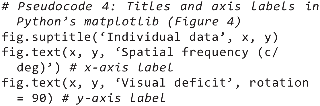
In Python’s matplotlib, the text labels and the title get added to

Users can save the figure using

A composite plot with three columns and three rows. Each panel plots each subject’s data across all three conditions. A legend is absent in this figure.

Immediately in Figure 4, one can notice that the function
One can also label each panel by annotating each subject’s identifier (e.g., A1 for Subject 1 in

A composite plot with two rows and five columns. Nine panels display each subject’s data in the amblyopia group, and the last panel shows the legend, representing each condition with a unique color.

The function
One can also label each panel so that the first panel has “a)” and the second panel has “b).” To do so, use the function

Next, one can sort the nine panels into a layout with five columns and two rows (

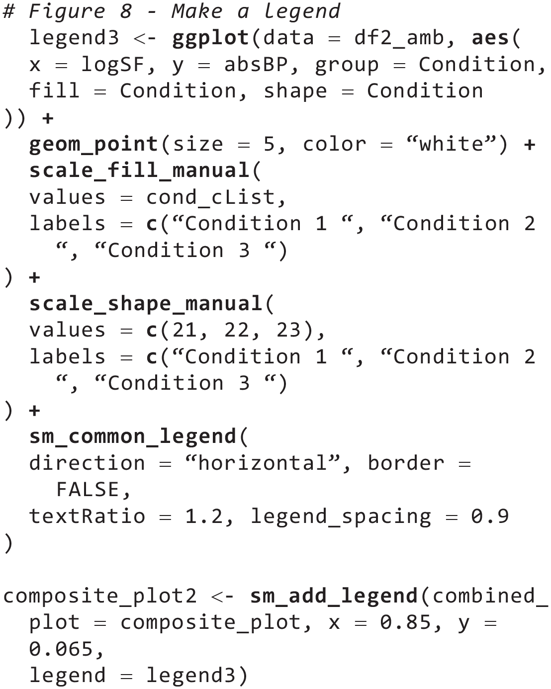
Now that a composite figure has been created with individual subplots and labels, one can add a common legend in the combined figure
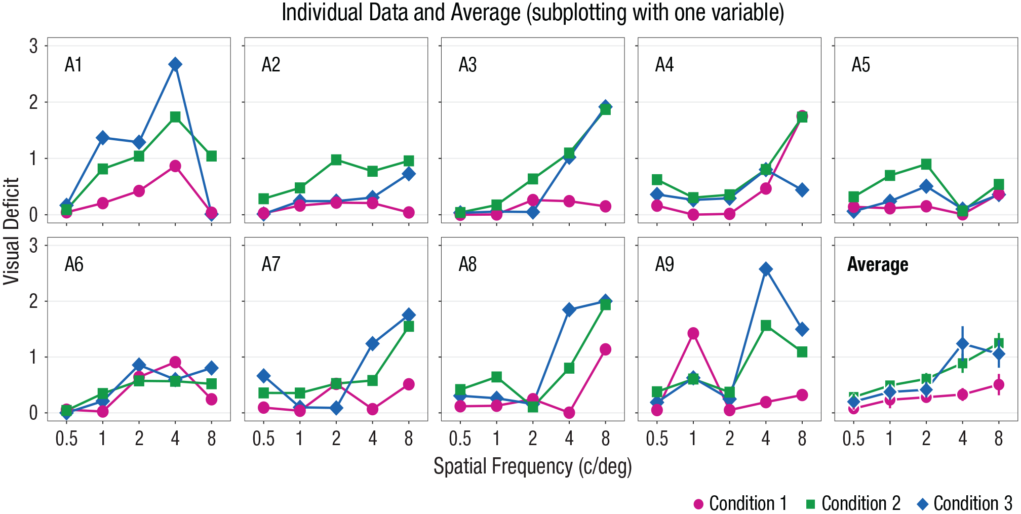
A composite plot with two rows and five columns with a common legend that is located at the bottom-right area of the figure. The first nine panels display each subject’s data from the amblyopia group, and the last panel shows the average data with error bars, which represent standard errors.
The first method of adding a legend basically forces

Two observations can be made from the legend in Figure 5. First, the legend’s title matches to one of the column’s name (

Because there is one empty panel that is available for plotting (10th panel of Fig. 5), users can add an additional panel that shows the average data of the nine subjects with error bars (e.g., standard error). This panel showing the average data should have the same x- and y-limits as those of the individual subjects’ panels. Next, one can compute the average and standard errors of the data from nine individuals for each independent variable (
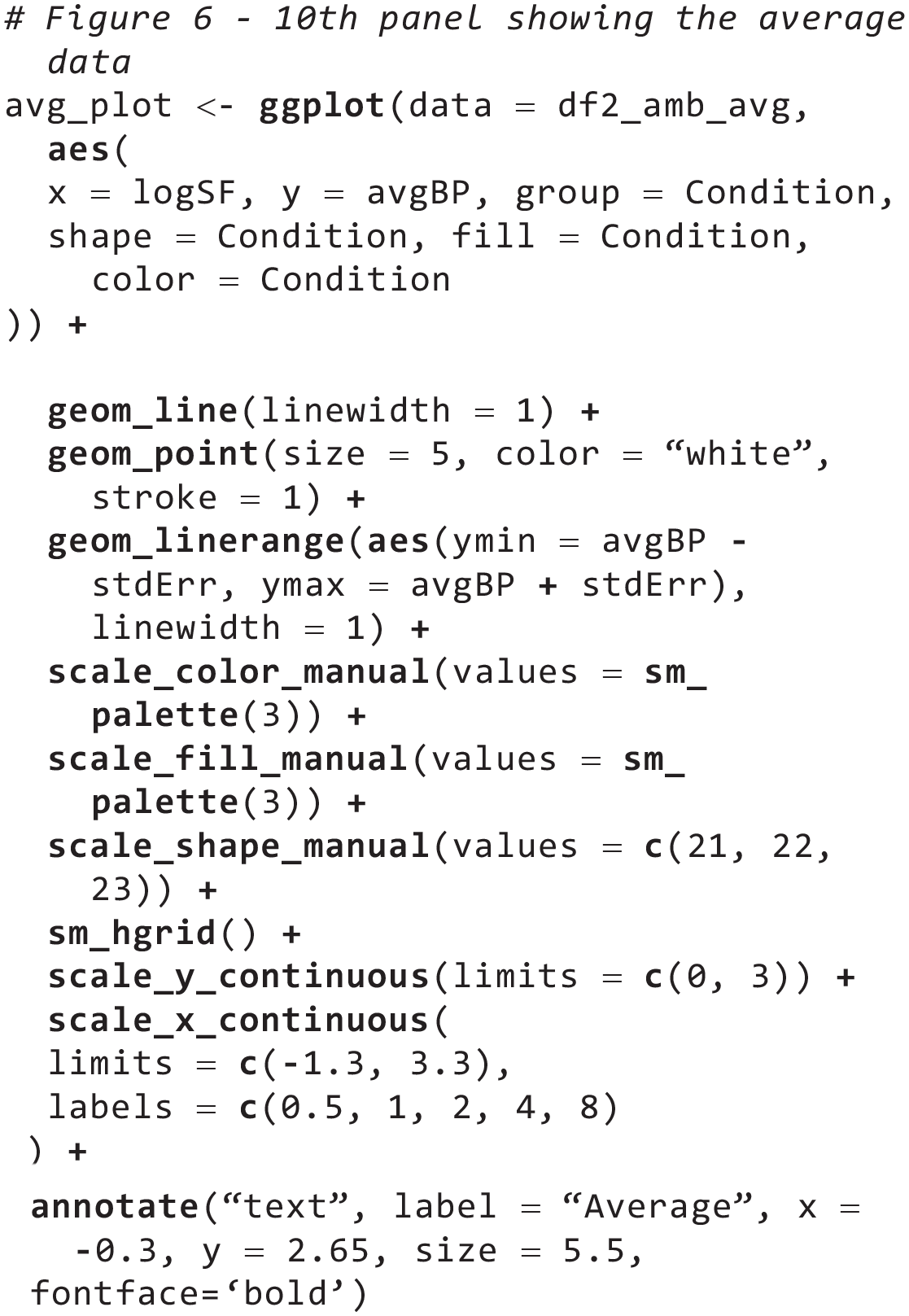
With the newly created data frame
The limits of both x- and y-axes and the thematic background (i.e.,
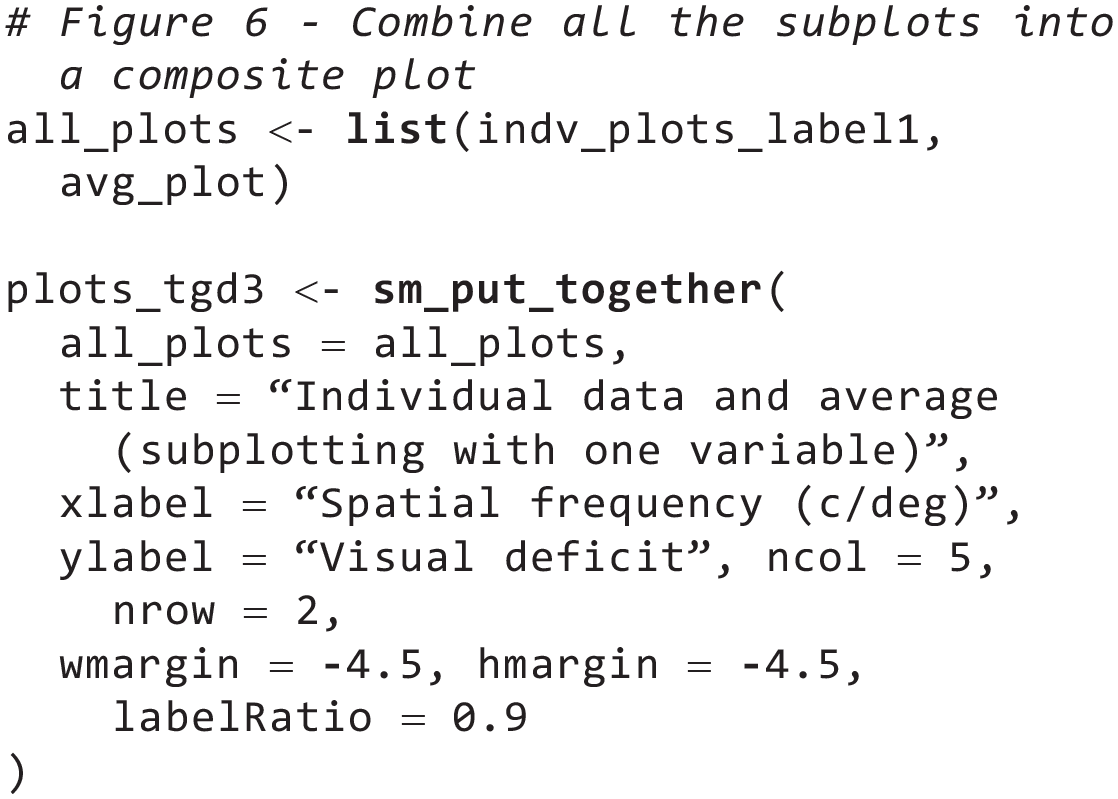
Then, store all 10 plots (9 individuals’ plots in
Because there are 10 panels to plot in a layout with five columns and two rows, there should already be a limited amount of available space for the legend (for the final output, see Fig. 6). To effectively use the remaining plotting space, users will have to build and customize a legend using the function
To do so, users need to essentially create a new plot using the standard procedure of ggplot2 (see codes below). This includes setting the mapping
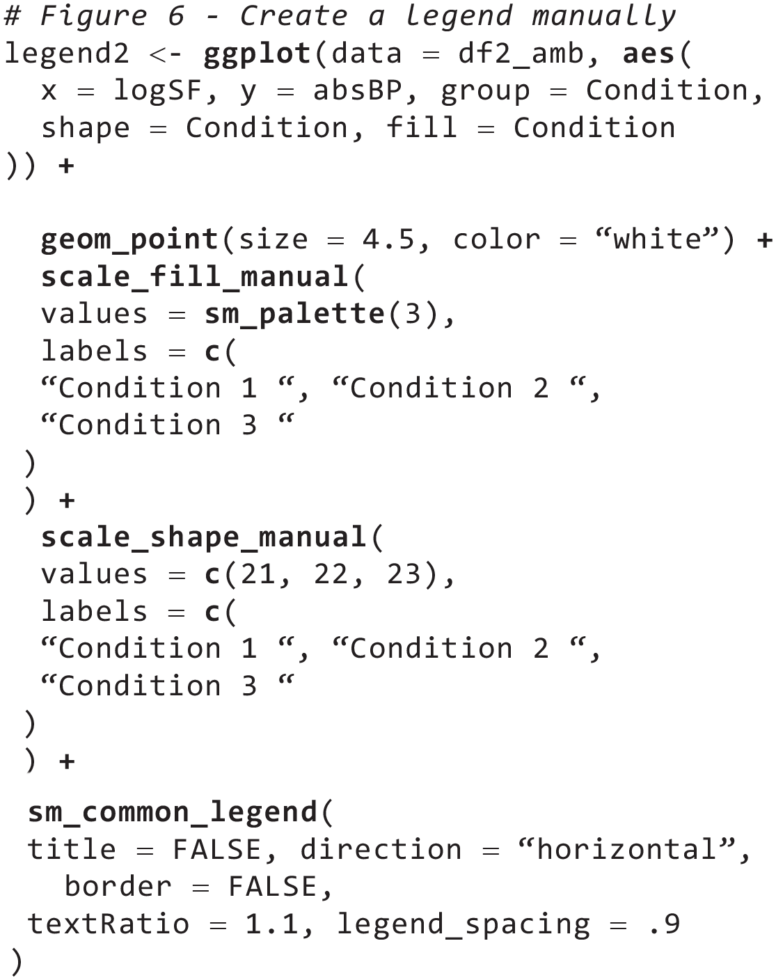
The customized legend can be added to the composite plot with the function

Readers might realize that they could also generate Figures 4 through 6 with
Example 2: Subplotting Data Using Two Variables
Thus far, I have explored only a relatively simple way of assigning data to each panel. In this example, I allocate data to each panel using two variables (
In this example, the same data set (

To begin with, the original data frame
In this example, there will be two levels of
With the structure of the nested
In addition, shapes are set to be unique for each of the three experimental conditions; their values are stored in the

A composite plot with two rows and three columns, showing the average data from each condition and group with error bars (standard error). The first row shows data of the amblyopia group, whereas the second row shows the data of the normal group, as specified in the lapply() function. The main and secondary titles have been added as annotations.
As in Example 1, the

Notice that in this example, the object
Next, I set y-axis label of the combined figure as in Example 1 by directly providing character strings in
In this example, notice that I also did not supply a character string for the main title (
As for the group labels, one can also use
Next, because I have assigned data to multiple panels using two variables (groups and conditions), it leaves one more variable (

The final figure is stored in the object
Example 3: Complex Subplotting Using Separate lapply() Functions
In this example, using the data frames


A composite plot with five rows and six columns. Twenty-seven panels display each subject’s data from each condition, and the last three panels show the average data with error bars, which denote standard errors. A borderless legend is placed at the bottom-right corner of the composite figure.
As the title for this example implies, I create two separate
To generate a plot for each subject at each condition using
In Example 1, I annotated each panel with the subject’s identifier using the function

Next, construct codes that generate plots using the average data (from
In the
I then combine two objects (
Thirty panels that have been generated with the two separate
Finally, users can add other types of annotations (besides

Finally, the final figure is stored in the object

Through these examples, I have shown that the workflow for complex data visualization in ggplot2 can be structurally linear, with its clear beginning and resolution. In addition, the examples have illustrated that the limitations of how users can allocate different subsets of data to distinct subplots and dynamically control the aesthetics are not determined by what ggplot2 and its third-party packages are capable of but by their own ability to apply the programmatic approach using the
Discussion
In this tutorial, I have demonstrated how smplot2 can improve the user experience for data visualization using ggplot2 in coding both standalone and composite plots. Specifically, the package can be useful for both beginners who wish to visualize their data with elegant aesthetics and advanced users who wish to structure their workflow for drawing composite figures with programmatic approaches and extend their level of customization. In the long term, the package can provide users a flexible and programmatic approach of plotting data that could yield more diverse, expressive, and powerful visualizations across different fields, including psychology and human neuroscience.
Key advantages of smplot2
The smplot2 package can provide benefits to both entry-level and advanced R users.
To begin with, a major advantage of smplot2 for incoming users, as noted by a recent review from a group of clinicians (Gandhi et al., 2024), is that it flattens the learning curve of ggplot2 (Item 1 in Table 2). The visualization functions are flexible, and their aesthetics have been optimized for the general format of scientific journals (Min & Zhou, 2021). More than 300 reproducible examples are provided in the documentation page (https://smin95.github.io/dataviz), so users can freely use and modify these codes for their own purposes. In addition, the codes of the package have been reviewed for quality and stability across different computing systems by CRAN. Some of the functions that users from eclectic fields and levels of experience have used are raincloud plots (Chen et al., 2023; Gómez-Robles et al., 2024), regression analyses (Hamad et al., 2024; Ilyés et al., 2024), and forest plots (Grobler & Kramer, 2023) in both standalone and composite forms.
Contributions of smplot2
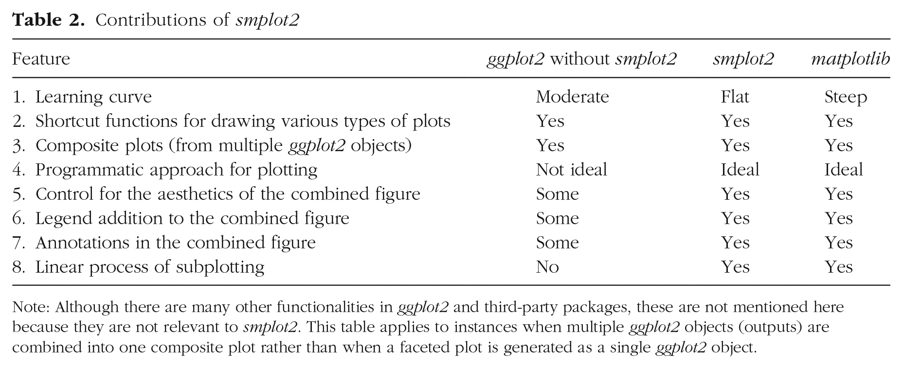
Note: Although there are many other functionalities in ggplot2 and third-party packages, these are not mentioned here because they are not relevant to smplot2. This table applies to instances when multiple ggplot2 objects (outputs) are combined into one composite plot rather than when a faceted plot is generated as a single ggplot2 object.
For users with working knowledge of R and ggplot2, smplot2 has potential to affect how they perform complex and sophisticated data visualizations. Specifically, it provides key functions for them to integrate the practices of data visualization using ggplot2 and the programmatic approach because smplot2 overcomes the limited flexibility of aesthetics at the level of composite figures in ggplot2. That is, it provides a complete, flexible, and linear workflow for combining multiple ggplot2 outputs into a composite plot. It also integrates the programmatic approach, which can generate multiple ggplot2 outputs, into the visualization pipeline by handling different (nested) structures of list objects from
Numerous packages, such as ggfortify (Tang et al., 2016), ggstatsplot (Patil, 2021), and GGally (Schloerke et al., 2021), have been developed to allow users to easily plot data using different types of graphs in a few lines of codes (shortcut functions; Item 2 in Table 2), thereby extending the functionalities of ggplot2 and flattening the steep learning curve for beginners. There are also packages, such as grid, patchwork, and gridExtra, that provide functions for users to create composite figures in ggplot2 in various layouts from combining discrete ggplot2 objects (Item 3 in Table 2). This approach has been widely used so that users can achieve a maximum flexibility of aesthetics of the combined figure (see Fig. 1). Nevertheless, they do not offer significant versatility for users after subplots (multiple ggplot2 objects) have been combined into a composite plot, thereby encouraging users to create plots separately and shirking away from applying programmatic practices (Item 4 in Table 2). For instance, after multiple ggplot2 objects are combined into one form, controlling the positions of legends and annotations and extent of margin between subplots in the combined figure becomes more difficult (Items 5–7 in Table 2), a task that can be easily performed in Python’s matplotlib. This has made users implement practices that go against the principles of open science, such as using a vector graphics software (e.g., Adobe Illustrator) to annotate the final figure generated from R. These restrictions can now be lifted with smplot2, which linearizes the workflow for complex data visualizations (Item 8 in Table 2) and elevates the level of customization for aesthetics in situations in which users want to stitch multiple ggplot2 objects together to construct a composite plot.
R or Python?
The dispute about which of ggplot2 and matplotlib is better for data visualization has been ongoing for some time (Ozgur et al., 2017). A well-known plotting package that complements matplotlib, seaborn (Waskom, 2021) has captivated a wide user base in Python with its beautiful aesthetics and shortcut functions for plotting. The two libraries (seaborn and matplotlib) embrace the programmatic approach, requiring users to apply iterations and conditional statements to plot data. Although this steepens the learning curve for users, it increases flexibility for aesthetics, allowing users to dynamically control each component of the figure. A comparable library with matplotlib in R is ggplot2, which is convenient for plotting different types of graphs without the requirement for users to understand concepts of programming, such as loops and functional methods, primarily because of its layered approach. This simplicity and the fact that ggplot2 can generally reproduce figures from matplotlib with fewer lines of code have expanded its user base rapidly (see Fig. 1). However, this layered approach comes at a cost because it hinders users from controlling the aesthetics using the programmatic approach. Although ggplot2 can be superior in many aspects of visualizations to matplotlib, notably for concisely plotting different types of graphs with its declarative syntax, its design can complicate the workflow for users when it comes to subplotting and creating composite figures, leaving Python’s matplotlib slightly more suitable for performing complex visualizations (for their comparisons, see Table 2).
Throughout the tutorial, I have compared Python’s matplotlib and R’s ggplot2 closely to demonstrate that the gap between ggplot2 and matplotlib has been minimized with smplot2 in the realms of subplotting and flexibility. With the arrival of smplot2, it is now possible to linearize the process of subplotting with its clear starting and ending points because the package integrates the interface of ggplot2 and the programmatic approach.
Why use the programmatic approach?
So far, the programmatic approach has not been ideal in ggplot2 because it creates various ggplot2 objects that need to be joined together using other packages. Unfortunately, the level of aesthetic control decreases steeply from when a plot is built as a single ggplot2 output to when multiple outputs are combined into a composite figure, encouraging users to generate each subplot separately. However, in this tutorial, I have demonstrated the efficiency of the programmatic approach with three examples using smplot2.
I support this plotting method for several reasons. First, complex data visualizations, such as composite plots, can be performed concisely. Second, it increases code readability and reproducibility because the pipeline remains very similar regardless of the number of variables or
For example, users can create a complex composite plot, such as a lower triangular matrix form, without relying on external packages. They can use
Closing remarks
In this tutorial, I have introduced smplot2, an R package that provides a structured workflow for plotting by integrating a programmatic approach and visualization and layout functions for advanced data visualizations. The defaults of the plots generated by the package are simple and minimalistic and have also been optimized for subplotting so that individual components of the figure are still clearly visible in a composite plot. In addition, the functions introduce a linear process of creating a composite figure by giving users full control of aesthetics at multiple stages of plotting in ggplot2. I hope that the package can encourage more users to use R as part of their visualization routines.
Footnotes
Acknowledgements
I thank smplot2 users who have given feedback and raised issues about the package since its inception. I am also grateful to Mengting Chen, Chenyan Zhou, and Shiqi Zhou, who tested the package numerous times during its development.
Transparency
Action Editor: Pamela Davis-Kean
Editor: David A. Sbarra
Author Contribution