
Abstract
Cities are dynamic entities, continuously evolving and shaped by their inhabitants. With the rise of digital technologies, urban practitioners increasingly rely on human-centered data collected through digital participation. These platforms gather public opinions in natural language, generating large-scale textual datasets about cities. However, the integration of this data into decision-making remains underexplored. This research introduces the concept of post-participation, referring to the phase following citizen engagement where data is processed, analyzed, and interpreted to inform urban decisions. Focusing on large-scale datasets from Hamburg, Germany, this study employs advanced AI-based methods, such as Natural Language Processing, Topic Modeling, and sentiment analysis, to efficiently extract and analyze relevant information. In addition, it develops visualization systems that present information through an analytical framework, revealing thematic structures, hierarchical relationships, semantic similarities, and high-dimensional clustering. These systems spatially track temporal evolution and emotional resonance of public discourse, offering multi-layered narratives for comparative topological analysis, temporal dynamics, and hierarchical structures. By addressing textual data visualization challenges, this paper balances clarity and complexity in visualization systems, integrating both quantitative and qualitative metrics. Ultimately, situated at the intersection of human–computer interaction, data analytics, and urbanism, this research aims to foster informed, transparent, and democratic design and planning processes.
Keywords
Introduction
Cities are dynamic entities that constantly evolve to create more livable spaces through the intricate interplay of social, economic, environmental, and infrastructural factors (Ataman and Tuncer, 2022). These transformations result from deliberate decisions that address spatial, temporal, and cultural dimensions, aiming to meet long-term needs while fostering a sense of urban identity (Gunder, 2011). Consequently, urban practices necessitate collaborative actions drawing on input from diverse stakeholders. In this context, citizen participation has long been recognized as essential for successful urban transformations, which refers to systemic and long-term changes in spatial, social, and infrastructural configurations of cities, particularly as driven by informed design and planning interventions. Arnstein (1969) introduced the concept of participation as a redistribution of power to include marginalized citizens in political and economic processes. Building on this foundation, contemporary studies emphasize participation models that transcend passive feedback mechanisms to actively involve citizens (Keck, 2012) and ensure that the concerns and needs of all stakeholders are reflected in policy and project outcomes (Martin et al., 2019).
The increasing use of digital participation platforms offers new opportunities for engaging a wide range of stakeholders, including local communities, municipal authorities, and commercial entities (Ataman et al., 2022). These platforms facilitate the collection of large-scale datasets from online debates, predominantly expressed in natural language. However, despite extensive research on citizen participation in urban design and planning, a significant gap remains regarding how the vast amounts of collected textual data are processed and utilized in practical contexts within urban transformation projects. Addressing this gap, this research focuses on how data collected through digital citizen participation can be translated into actionable insights for urban design and planning. To achieve this, the concept of “post-participation” is introduced, emphasizing the processing and application of participation data to effect long-term impacts. In the post-participation phase, visualization and information systems serve as mediating tools, supporting the interpretation and integration of citizen input into urban decision-making. By revealing spatial, emotional, and discursive patterns, these tools enhance transparency and responsiveness in planning processes. However, this mediative stage is often overlooked, despite its significance in effectively utilizing large-scale participation datasets to make informed decisions, thereby minimizing the loss of information when translating raw data into practical actions (Ataman et al., 2023).
Recent studies have introduced various computational approaches and digital tools to analyze citizen-generated content for real-time opinion clustering (Debnath et al., 2020), CONSUL for managing participatory budgeting and deliberation (Ataman et al., 2022), and sentiment-based urban dashboards (Lock and Pettit, 2020). These platforms typically focus on structured feedback formats, survey aggregation, or sentiment snapshots, with limited ability to handle unstructured textual data at scale. NLP-based methods like LDA or clustering have also been explored in urban discourse analysis (Wang and Taylor, 2018), yet often lack integration with spatial, temporal, and hierarchical dimensions that urban planners require for decision-making. In contrast, this study introduces a post-participation framework that combines topic modeling, sentiment scoring, hierarchical structuring, and geospatial mapping within one visual ecosystem, allowing more nuanced and actionable interpretation of urban discourse. The proposed system not only advances analytical depth but also enhances transparency and accessibility for non-technical stakeholders, setting it apart from existing models. This positions the research within and beyond current practices by bridging methodological innovation with practical utility.
Motivated by this need, the research aims to create information packages from participation data in the form of visualization systems, facilitating the complex tasks of processing, interpreting, and applying citizen-generated data. By proposing advanced analytical reasoning interfaces, the research offers efficient strategies for interpreting extensive datasets through multidimensional, actionable visual media. These visualization systems are tailored to the specific needs of diverse stakeholders, representing a crucial first step in problem-solving and supporting decision-making processes. Consequently, positioned at the intersection of urbanism, data analytics, and participatory design, this research contributes to the development of more inclusive and sustainable urban environments.
Human-centric decision-making: Beyond data collection
Digital citizen participation enables the direct involvement of diverse stakeholders, including citizens, architects, planners, and policymakers, in urban development processes. The digital nature of this participation allows for a larger and more diverse pool of contributors, leading to vast quantities of textual data from numerous stakeholders, which provide vital information to inform solutions developed in the post-participation phase (Bouzguenda et al., 2019). This phase necessitates advanced analytical techniques for effective information processing to fully harness the potential of participation datasets. Therefore, it is necessary to align data-driven processes with human-centric decision-making frameworks that prioritize stakeholders’ needs, values, and experiences in urban contexts.
The literature emphasizes the need for advanced data analysis and interpretation methods to bridge the gap between data collection and practical application (Ataman and Tuncer, 2022; Ogie, 2016; O’Halloran et al., 2018). While digital participation generates rich data repositories, effective communication channels become essential for connecting collected data with post-participation stakeholders. Studies highlight the varying needs of diverse stakeholders, necessitating systematic approaches to identify trends and patterns within large datasets (Ataman et al., 2022). Further research advocates integrating advanced data analytics tools, such as machine learning algorithms and geographic information systems (GIS), to enhance data accuracy and utility (De Carvalho and Giatti, 2018; Ngo et al., 2022). In many of these studies, data visualization systems play a pivotal role, especially when designed considering varying levels of digital literacy in post-participation processes. Accordingly, this section aims to provide a detailed examination of the conceptual foundations and methodologies facilitating data transition, emphasizing visualization’s role in interpreting data types and guiding principles for effective visual representations for diverse audiences.
What is project-based participation?
Various forms of participation engage residents at different scales, utilizing platforms ranging from specialized websites and forums to social media to foster interaction, disseminate information, and capture public opinion (Ataman and Tuncer, 2022). For example, city-scale participation involves residents engaging with broader topics and contributing their own issues and feedback (Conroy and Evans-Cowley, 2006). In contrast, local-scale participation targets specific contexts, collecting information directly from residents within a particular area (Salvati and Serra, 2016). While both modes facilitate extensive data collection, ensuring the relevance and quality of this data can be challenging. This challenge has led to the emergence of a new type of participation called project-based digital participation, a distinctive form of civic engagement characterized by its focused scope and scale.
Project-based participation aims to achieve specific objectives within a limited time frame, necessitating flexible governance and short-term technological solutions (Hudson-Smith et al., 2009). It operates within a more targeted framework, concentrating on specific urban projects, such as creating new public parks or developing transit systems, that stem from larger urban governance discussions (Bai et al., 2017; Fung, 2015). By facilitating rapid responses to public input, it enhances stakeholder engagement and fosters public trust through visible, tangible outcomes (Seltzer and Mahmoudi, 2013). However, the concentrated focus of project-based participation may inadvertently obscure broader urban dynamics essential for comprehensive transformation. Therefore, integrating data collected from individual projects into larger urban scales is crucial. Without such integration, this fragmented focus may lead to stakeholder fatigue due to frequent demands for engagement, hindering the attainment of a holistic approach (Du Toit and Pollard, 2019).
In light of these advantages and challenges, this paper analyzes project-based participation datasets from Hamburg, Germany (details provided in Participation Context: Hamburg, Germany) and explores strategies for aligning these initiatives with broader urban objectives within a holistic urban design and planning framework.
Post-participation: From data to decision-making
Post-participation, the main focus of this study, refers to the critical phase where collected participation data is translated into actionable insights. This stage involves processing and refining the collected data to make informed decisions. Due to inherent challenges and stakeholders’ lack of technical expertise, this step is frequently outsourced by architects and designers (Ataman and Dino, 2022). These challenges result from the complexity of textual data, which is often heterogeneous, voluminous, multidimensional, and subject to interpretive biases, complicating the extraction of reliable conclusions (Ataman et al., 2023; Masseroli et al., 2016; Perrault and Zhang, 2019). Furthermore, the lack of appropriate methods to represent qualitative data and identify relevant information jeopardizes decision-making (Ataman et al., 2022).
To effectively utilize such data and minimize loss in translation, generating information packages for stakeholders is essential during post-participation. These information packages serve as the first step in problem-solving in urban design and planning, providing insights from various data types that cater to diverse needs. Therefore, integrating stakeholder feedback into these packages ensures that data processing, analysis, and evaluation address their distinct requirements (Hamdan et al., 2021).
The term “post-participants” refers to actors such as planners, analysts, or policymakers who engage with citizen-generated data after its collection. As they typically operate within institutional or professional contexts, they do not reflect the full socio-demographic spectrum of the original participants, introducing a representational asymmetry in the feedback loop. While these actors play a key role in shaping planning outcomes, maintaining transparency at this stage is essential to ensure accountable decision-making and foster trust between participants and post-participants (Ataman and Tuncer, 2022).
Considering the complex nature of post-participation, this paper proposes methods for creating information packages in the form of visualization systems to facilitate this phase. It promotes post-participation as a bridge between citizen participation and urban interventions, advancing the concept of the “responsive city” (Goldsmith and Crawford, 2014), where digital tools are used to create feedback loops between citizens and urban governance. The visualization systems developed here operationalize this concept by translating large-scale participation data into actionable insights, supporting more adaptive and evidence-based urban interventions. While post-participation marks the conclusion of citizen participation, it serves as a critical link to future urban interventions (see Figure S1 in the Supplemental Material). To provide a comprehensive understanding, the paper explores stakeholder preferences, data processing methodologies, and innovative visualization approaches.
The imperative of visualization in post-participation
In the post-participation phase, transforming collected textual data into actionable insights requires tailoring information to the varying needs of diverse stakeholders. Digital participation practices generate sub-datasets through computational analyses of textual content (Borner, 2015; Kitchin, 2014), as traditional analytical methods often struggle with the sheer volume of data (Debnath et al., 2020). When understanding and analyzing these datasets, from their metadata to subsets quantitative methods and representations such as summary reports fail to capture the full scope of participation data and the depth of the underlying narratives. Therefore, post-participation necessitates systems that can manage the intricacies of textual data through robust filtering and categorization techniques and effectively represent them to diverse stakeholders (Aparicio, 2017).
Moreover, the diversity of data types, including textual comments, discussions, and geospatial information, further complicates this process (Wang et al., 2020). Each data type presents unique challenges, whether temporal, relational, hierarchical, or multidimensional in nature. In this context, AI-based natural language processing (NLP) methods offer promising solutions for processing and analyzing large datasets (Baumer et al., 2017; Hong et al., 2022). “AI-based NLP” refers to the use of transformer models and contextual embeddings, which allow more accurate and scalable analysis of semantic structures compared to standard rule-based or statistical NLP methods. However, it is crucial to structure the analysis results to convey insights in meaningful and practical ways through effective communication methods.
Given the vast amounts of textual data and analysis results, advanced data analytics and visualization techniques are necessary to identify patterns, synthesize information, and enhance the accessibility of such information (Ataman et al., 2024; Saha et al., 2022). This necessity has been widely recognized in fields such as human–computer interaction, human–data interaction, and data literacy (Boy et al., 2014; Malinverni et al., 2016; Victorelli et al., 2020). These disciplines emphasize the importance of visualization systems as essential tools for organizing and interpreting complex patterns, relationships, and details within the data. Dynamic and interactive visualization systems enable decision-makers to decode large datasets more easily, fostering problem-solving and helping overcome computational delays (Stolper et al., 2014). This allows stakeholders to explore the data more efficiently in post-participation processes.
Ultimately, visualization systems in post-participation serve as a bridge between raw data and decision-making. Effective visualizations combine clarity and aesthetic appeal, underscoring the importance of “visualization literacy,” the ability to interpret and derive meaning from visual patterns (Boy et al., 2014). To maintain data integrity while promoting engagement, visualizations must offer clarity without oversimplifying the data. Techniques such as filtering, zooming, and abstraction help reduce clutter, allowing stakeholders to focus on relevant insights while catering to varying levels of familiarity with the data (Elmqvist and Fekete, 2010; Wang et al., 2020). Furthermore, overlapping visualizations like scatterplots or node-link diagrams, and space-filling techniques such as treemaps are particularly effective for presenting complex data in an interpretable manner (Fekete and Plaisant, 2002; Flaten et al., 2021).
Consequently, this paper integrates advanced technical processing and analytical frameworks into multidimensional and multi-layered visualization systems, enabling enhanced exploration and understanding in post-participation. These systems generate near real-time insights, depending on the availability and refresh rate of new participation data provided through the municipal platform, that support both current digital participation practices and future advancements in urban design and planning.
Methodology
Case study
This section presents the methodological framework, detailing the case study of Hamburg, Germany, to investigate the efficacy of project-based citizen participation in urban design and planning. By examining the city’s participation processes, it provides context for discussions on data visualization and offers insights into localized digital participation models in complex urban environments.
Participation context: Hamburg, Germany
The city of Hamburg is utilized as a case study in this research to examine project-based citizen participation. Hamburg, a major city in northern Germany with a population of 1.85 million, is characterized by its cultural and demographic diversity (Statistische Jahrbücher - Statistikamt Nord, 2023). The city is divided into seven boroughs and 104 neighborhoods, each with its own unique identity and set of challenges. This diversity necessitates a contextualized approach to urban design and planning, as one-size-fits-all solutions are often ineffective. Therefore, Hamburg emphasizes democratic participation by encouraging its residents to co-create and share responsibility with its decentralized government. It employs a combination of digital and traditional platforms, integrating online surveys and public forums with town hall meetings to create a comprehensive system for civic engagement. The digital component of this participation model will be further elaborated in the following section.
Participation tool: DIPAS|digital participation system
Established in 2016, the Digital Participation System (DIPAS) serves as Hamburg’s digital platform for incorporating public involvement in urban development projects (DIPAS, 2023). Notable for its design, data collection methods, and variety of data types, such as comments, replies, timestamps, and geolocations, DIPAS aims to democratize urban development by providing residents with a platform to express their views and engage in substantive dialogues. Users can optionally georeference their comments by placing them on specific locations on the map, thereby indicating the spatial focus of their concern or suggestion. It promotes adaptability, transparency, and accessibility to harness collective intelligence in addressing urban challenges (Thoneick, 2021). This is achieved by harmonizing digital and physical domains, where users can engage via conventional web browsers or specialized touch desks in participation workshops, fostering inclusive civic engagement (Lieven, 2019).
To further facilitate this engagement, DIPAS presents users with an interface displaying civic contributions, serving as both an informational artifact and an interactive medium. These visual components enable users to conceptualize urban initiatives within specific community settings, integrating both content and spatial variations. An example of a participation project interface with its discussion can be seen in Figure S2 in Supplemental Material.
While this study focuses on consultative participation processes, as defined by the structure of the DIPAS platform, it is important to acknowledge the increasing relevance of co-creative models in urban planning. Co-creation involves citizens in shaping agendas, generating proposals, and contributing to decision-making, extending beyond feedback collection. Although the methodological requirements differ, the analytical and visualization frameworks that are introduced in this study also support co-creative settings by helping to structure shared insights and make collective narratives accessible.
Participation process: Participants and data collection
The DIPAS platform removes common barriers to participation, such as eligibility criteria and mandatory registration, allowing a broad cross-section of residents, including various age groups, socio-economic backgrounds, and digital literacy levels, to engage in urban governance. The platform operates through specialized web domains created for each civic project, enabling residents to provide input and commentary specific to ongoing initiatives. It supports fully digital, asynchronous participation, allowing individuals to contribute at their own pace.
All datasets used in this study were provided by the Municipality of Hamburg in anonymized form, with no access to personal or identifying information. The DIPAS platform enforces user anonymity as part of its operational protocol, ensuring that all citizen contributions are de-identified prior to release. This study adheres to these ethical standards and analyzes participation data at an aggregated level. Furthermore, the visualizations developed focus on structural patterns and thematic clustering rather than individual-level tracing, reinforcing both data protection and ethical use of public input. This anonymity is crucial in creating a safe space for civic discussion.
Each DIPAS project is initiated and managed by a municipal authority and typically remains open for public input over a period of three to sixweeks. This time frame ensures extensive participation while maintaining a manageable scope for downstream data processing. For this research, we analyzed datasets from 22 distinct DIPAS projects, which together encompass more than 19,000 comments submitted in response to online planning debates. Eight of these projects used an earlier platform architecture (Drupal 7), with data provided as .xlsx files, while the remaining 14 were hosted on an updated system (Drupal 8), which supports automated data retrieval via API.
To contextualize the relevance of the cross-project visualizations presented later in this paper, it is important to note that these 22 projects span a variety of urban design and planning themes, including mobility infrastructure (Elbchaussee), climate-responsive neighborhoods (Klimafreundliches Lokstedt), public realm design, green space interventions, and district-scale planning frameworks (Eimsbüttel). While each project is thematically focused and geographically anchored, several share overlapping districts, complementary timeframes, or similar policy objectives. This makes cross-project analysis both possible and meaningful. For instance, recurring concerns about accessibility, environmental quality, or housing pressure emerge in different project contexts, enabling comparative insight. These relationships justify our use of integrated visualizations later introduced in this paper, which aim to capture systemic issues across planning initiatives and provide post-participants with a broader, evidence-based view of community discourse.
Participation data analysis framework
Given the increasing complexity and volume of data, meticulous preprocessing, analysis, and interpretation of datasets are essential in post-participation. Accordingly, this research employs NLP techniques for data preprocessing, utilizes unsupervised AI-based methods, such as topic modeling and sentiment analysis, to analyze textual data, and applies geospatial methods to address the spatial dimension of citizen contributions. Lastly, it introduces interpretation criteria that combine both quantitative and qualitative aspects.
Data preprocessing
The data preprocessing steps include data extraction, translation, linguistic pattern identification, and storage of the preprocessed data in a database. Initially, the relevant dataset for the project is extracted and subjected to translation using Python libraries such as “pandas” for data manipulation and “googletrans” for interfacing with Google Translator services. Titles, comments, and replies are translated from German into English and stored in a data frame.
This translation step was necessary to ensure compatibility with the NLP techniques applied in this study, particularly topic modeling and sentiment analysis, which are optimized for English-language corpora and demonstrate greater accuracy and model stability in English. While translation may introduce minor semantic drift or nuance loss, the analytical focus remains on broader discourse structures and thematic patterns that are generally preserved across translation. In real-world applications, by using the same embedded libraries that supported the original translation, the results and visualizations can be accurately translated back into German, allowing local stakeholders to access and interpret the findings in their native language without loss of structure or analytical value.
Following translation, the Natural Language Toolkit (NLTK) Python library is used for data cleaning. This process involves converting all text to lowercase, tokenizing the text, removing punctuation, special characters, and stopwords, and applying stemming and lemmatization techniques.
After cleaning, terms that appear less frequently than a designated threshold are eliminated. This minimum word frequency threshold (cut-off value) of 10 was applied to remove infrequent terms unlikely to contribute meaningfully to topic formation. Additionally, bigrams and trigrams, combinations of words that frequently co-occur, are generated. The Term Frequency-Inverse Document Frequency (TF-IDF) algorithm from the Gensim library is then applied to filter out words that are overly common and thus non-contributory to the clustering algorithms. In TF-IDF, the topic contribution threshold of 0.03 was set to exclude marginal topics that contributed less than 3% to the dataset, based on initial model tuning and inspection of coherence scores and keyword clusters. These values were selected iteratively to balance model interpretability and granularity. This configuration yielded the most coherent and stable results for downstream visualization and analysis.
To ensure data quality and analytical robustness, a comprehensive filtering and validation process preceded model execution. Incomplete, duplicate, and off-topic entries were removed, and text normalization ensured linguistic consistency across the dataset. A 10-fold cross-validation was conducted to verify topological homogeneity, confirming that topic clusters and distributions remained stable across data partitions. This combination of quality control and validation procedures ensured that the dataset was both thematically relevant and structurally consistent, providing a reliable foundation for subsequent visualization and interpretation.
Data analysis methods
After data preprocessing, advanced analytical techniques are applied to both textual and spatial data, structured into three key areas: topic modeling with BERTopic, sentiment analysis using TextBlob, and geospatial data analysis through interactive mapping. Collectively, these methods provide a comprehensive understanding of citizen participation by capturing the semantic, emotional, and spatial dimensions of public discourse as discussed in S1. Details of the Data Analysis Methods are in the Supplemental Material.
Each method used in this study addresses a distinct aspect of large-scale participation data. Topic modeling (BERTopic) uncovers latent thematic structures, sentiment analysis captures emotional tone, spatial and temporal mapping situates discourse in place and time, and network-based visualizations (e.g., Sunburst and Text-Network Diagrams) reveal structural and interactional patterns (Campello et al., 2015; Devlin et al., 2019). Each method offers a unique perspective, and their combined use forms a multi-method framework that supports interpretation beyond surface-level trends.
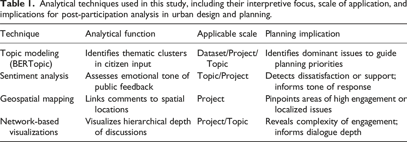
Analytical techniques used in this study, including their interpretive focus, scale of application, and implications for post-participation analysis in urban design and planning.
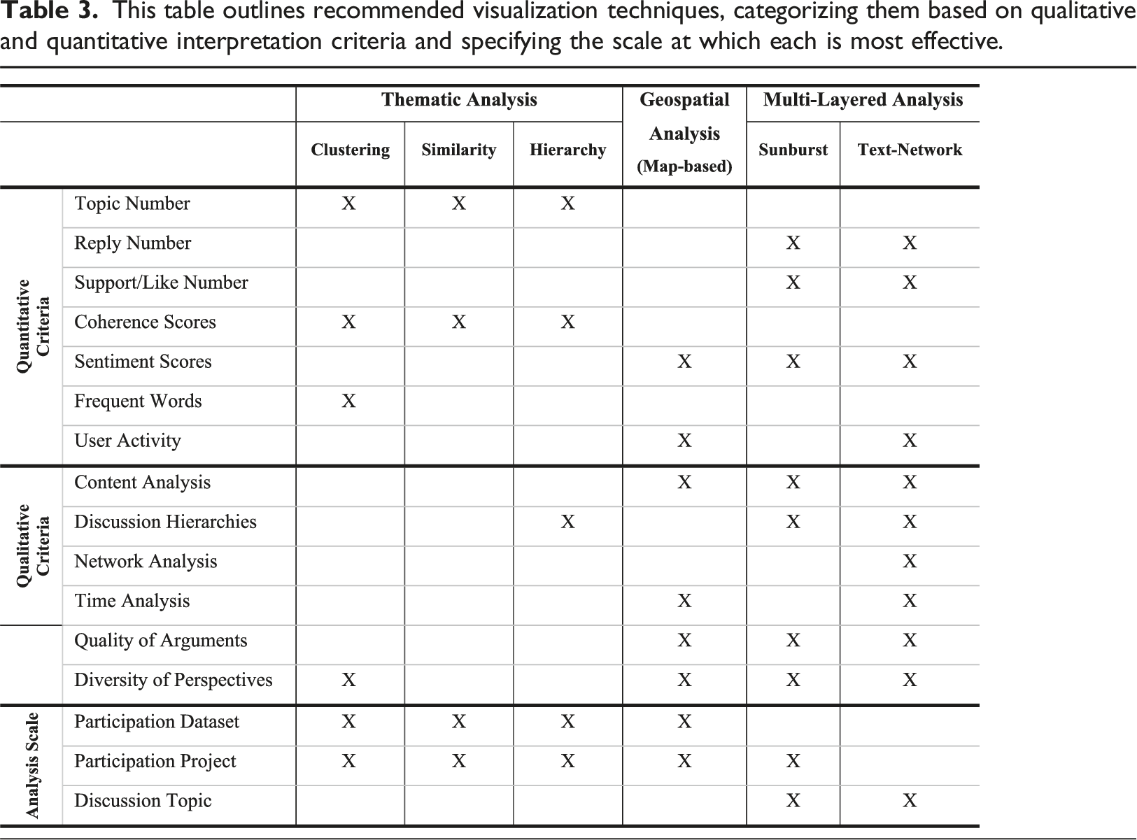
Data interpretation criteria
The interpretation of results derived from preprocessing and analyses steps often faces challenges due to the complexity of the data and the limitations of tabular presentations in illustrating correlations and hierarchical relationships. To overcome these challenges and provide actionable insights for post-participants, this research proposes the development of a rigorous set of interpretation criteria. These criteria combine the quantitative rigor with the qualitative depth of digital citizen participation data, enabling a more detailed and meaningful analysis.
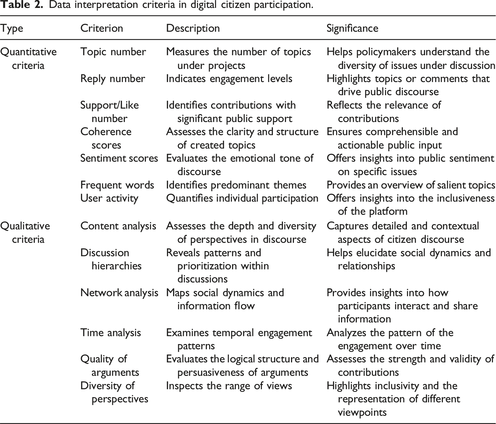
Data interpretation criteria in digital citizen participation.
Accordingly, quantitative criteria, such as Topic Numbers, Reply Numbers, and Sentiment Scores, offer empirical rigor by providing objective metrics that facilitate systematic analysis of large datasets. These metrics help quantify aspects like issue diversity, engagement levels, and public sentiment, enabling policymakers to gauge community concerns effectively. In contrast, qualitative criteria like Content Analysis, Discussion Hierarchies, and Diversity of Perspectives delve into the nuanced and contextual dimensions of citizen discourse. They capture the depth and diversity of perspectives, reveal underlying patterns, and offer insights into social dynamics and participant interactions. Together, these criteria form a comprehensive framework that balances empirical data with contextual understanding, thereby enhancing informed decision-making in urban transformation processes.
Participation data visualization as information packages
Understanding the learning potential within digital participation data is critically important for guiding decision-making and policy formulation as the previous sections discussed. Visualization techniques are indispensable for engaging with this multifaceted data, providing a platform to encapsulate a wide array of voices and opinions. These following sections explore various visualization methodologies that accommodate both qualitative and quantitative interpretative criteria, offering a holistic examination of the participation data. A selection of projects from the DIPAS dataset is used to illustrate these visualization methods. The selection, whether involving a single project or a group, is based on specific characteristics, aiming to comprehensively demonstrate all facets of the introduced methods while ensuring their applicability to all other projects within the dataset. All visualization modules presented in this study are customizable, allowing post-participants to adjust them based on data size, structure, and analytical focus. This flexibility supports targeted interpretation and application across diverse planning contexts.
Analytical framework for textual data in digital participation
In the analysis of digital participation data, NLP methods systematically uncover hidden characteristics in digital participation data, providing crucial insights for post-participants. Project-based participation yields focused, comprehensive outcomes, and NLP analyses offer deeper understanding. This section examines how topic modeling results elucidate interrelationships among topics from project-based participation data.
Thematic structures and hierarchical relationships
A thorough understanding of project-specific data is essential in the initial phase of the analytical procedure. Utilizing Topic Modelling (TM) techniques enhances the depth of understanding of dialogues within the citizen participation process. This foundational step facilitates the identification of key issues and trends within public discussions. For example, by constructing the BERTopic model for the “Elbchaussee” dataset from DIPAS, 17 topics were generated based on the highest coherence value of the model. These topics included pertinent keywords and their importance scores, calculated using the Class-based Term Frequency-Inverse Document Frequency (c-TF-IDF) metric, which assesses term relevance within specific topics rather than individual documents (Grootendorst, 2022). Following the BERTopic model, 17 corresponding bar charts were created as visual glossaries, capturing topics and their characteristic keywords or phrases (Figure 1(a)). Insights into the most relevant community issues, such as “city,” “cycling,” and “traffic,” were identified within the “Elbchaussee” dataset. The granularity of this method enhances the precision and specificity of data interpretation, significantly contributing to the understanding of community preferences and concerns. This figure displays (a) the topic-word scores for 17 topics with the X-axis indicating the weight of each word within its topic, and (b) the hierarchical clustering graph that delineates the root and branch topics among 17 distinct topics, as identified by the BERTopic model applied to the Elbchaussee dataset.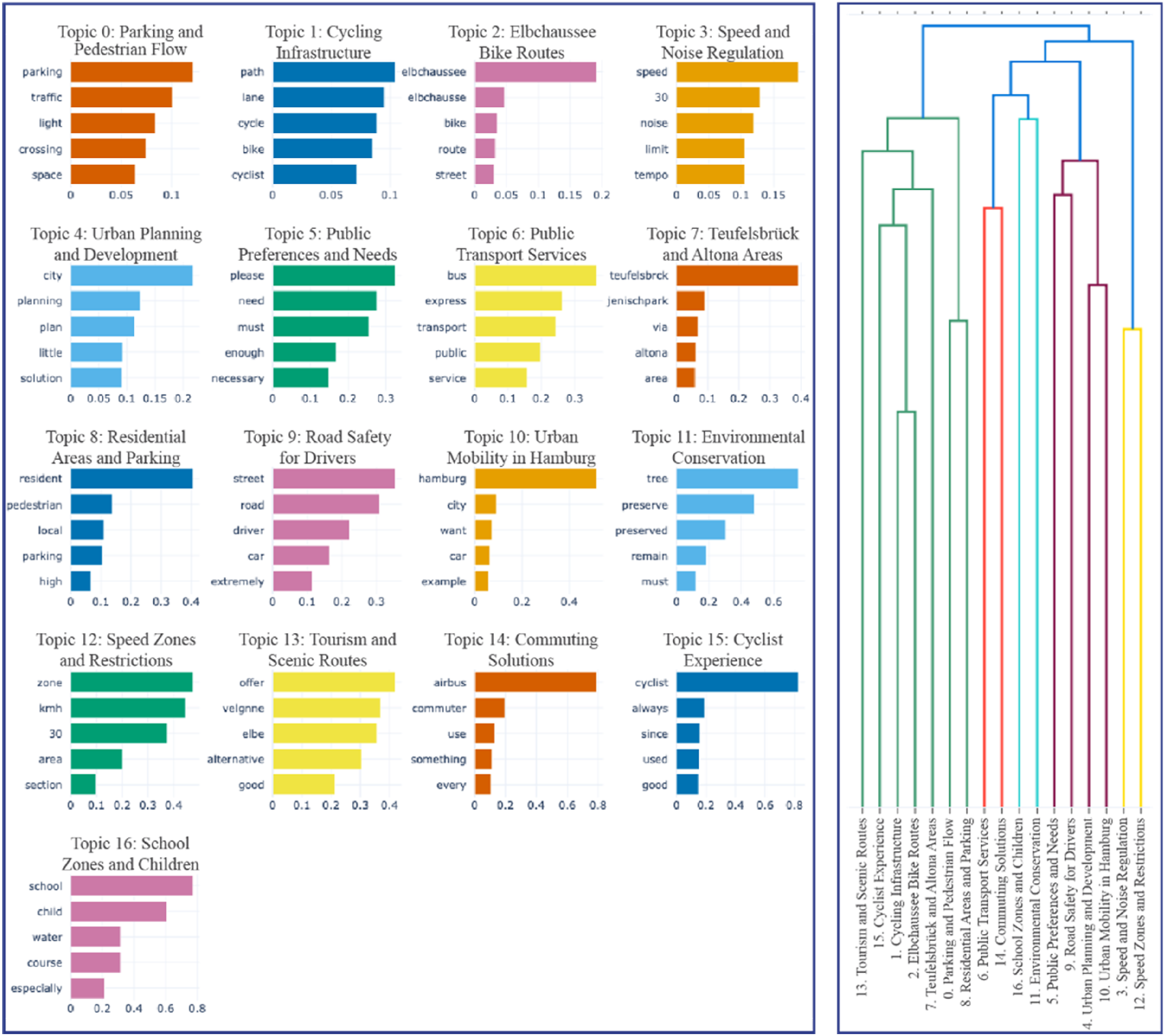
After identifying topics within specific projects, the next analytical phase focused on discerning hierarchical relationships among these topics. Examining topic hierarchies revealed structured interrelations, showing how specific topics are nested under overarching themes and exposing varying levels of granularity within the discourse. In the same “Elbchaussee” dataset, a dendrogram visualizes the multi-level hierarchical relationships among topics (Figure 1(b)). For example, an overarching theme like “Cycling” can be subdivided into more focused categories such as “Experience,” “Bike Routes,” and “Infrastructure.” This hierarchical structure deepens the analysis by situating specific topics within a broader context, providing a contextual understanding of their significance and interconnectedness with wider developmental concerns.
The BERTopic model yielded 17 distinct topics from the Elbchaussee dataset, derived through density-based clustering and coherence optimization, which balances thematic granularity with interpretability. This number is not pre-set but emerges from the model’s internal algorithm, guided by a coherence score that evaluates semantic consistency within each cluster. Each topic consists of a ranked list of keywords produced using class-based TF-IDF, with associated weights indicating their relevance. Based on these keywords and representative comments, thematic labels were qualitatively assigned to aid interpretation (e.g., “Cycling Safety,” “Public Transport Access,” and “Green Space Usage”). While topic modeling is inherently unsupervised, the resulting structure offers a high-level overview of discourse complexity.
For post-participants, the number and composition of topics signal the thematic diversity and fragmentation of public input. A higher number of coherent topics may reflect multidimensional discourse, suggesting that different groups prioritize different concerns. Understanding topic content and overlap enables post-participants to identify emerging tensions, prioritize issues, and tailor interventions accordingly, whether through design refinements, communication strategies, or targeted follow-up.
It is important to note that these topics are derived entirely from BERTopic modeling and are distinct from the project-defined topic categories within the DIPAS platform (e.g., Topic 452 and Topic 19), which are created by the system to structure citizen input during the participation phase. This distinction is maintained throughout the analyses.
Applying hierarchical investigations to citizen participation data has significant implications for post-participation analysis. It supports the development of strategies that address issues at both general and specialized levels. The hierarchical structuring of topics allows post-participants to understand how specific issues fit within broader thematic frameworks, facilitating the creation of detailed and contextually relevant interventions. Additionally, this approach offers a multi-tiered perspective on topics, providing post-participants with contextual insights that support informed and multifaceted urban interventions. This heightened level of analysis is crucial for offering a comprehensive overview of textual data in urban environments, thereby enhancing the capacity to engage more meticulously with the diverse concerns of the citizenry.
Quantitative assessment of semantic similarities
Following the thematic and hierarchical analysis, lexical overlaps among different topics indicated significant semantic similarities. These overlaps necessitated a detailed exploration to discern interrelationships and subtle distinctions between topics. To identify such similarities, topics were graphically represented using an intertopic distance map and a similarity matrix.
In Figure 2(a), the intertopic distance map is created for the “Elbchaussee” dataset from DIPAS. In this multidimensional space, each circle on the map represents a topic, with the circle size indicating its relative importance and overlaps signifying high degrees of thematic similarity. In Figure 2(b), on the other hand, topics were quantitatively assessed for their similarities by computing similarity scores ranging from 0 to 1. The quantitative foundation of the similarity matrix enhances the reliability of interpreting topic interrelations, making it particularly effective for identifying clusters of semantically related topics. (a) Intertopic distance map generated by the BERTopic model for the Elbchaussee dataset, where each circle represents a topic and the distance between circles indicates their semantic similarity. Larger circles denote topics with higher prevalence in the dataset. (b) Similarity matrix visualized as a heatmap, demonstrating pairwise cosine similarity scores (ranging from 0 to 1) between 17 identified topics. Higher values indicate stronger semantic overlap, helping to identify closely related thematic clusters within the public discourse.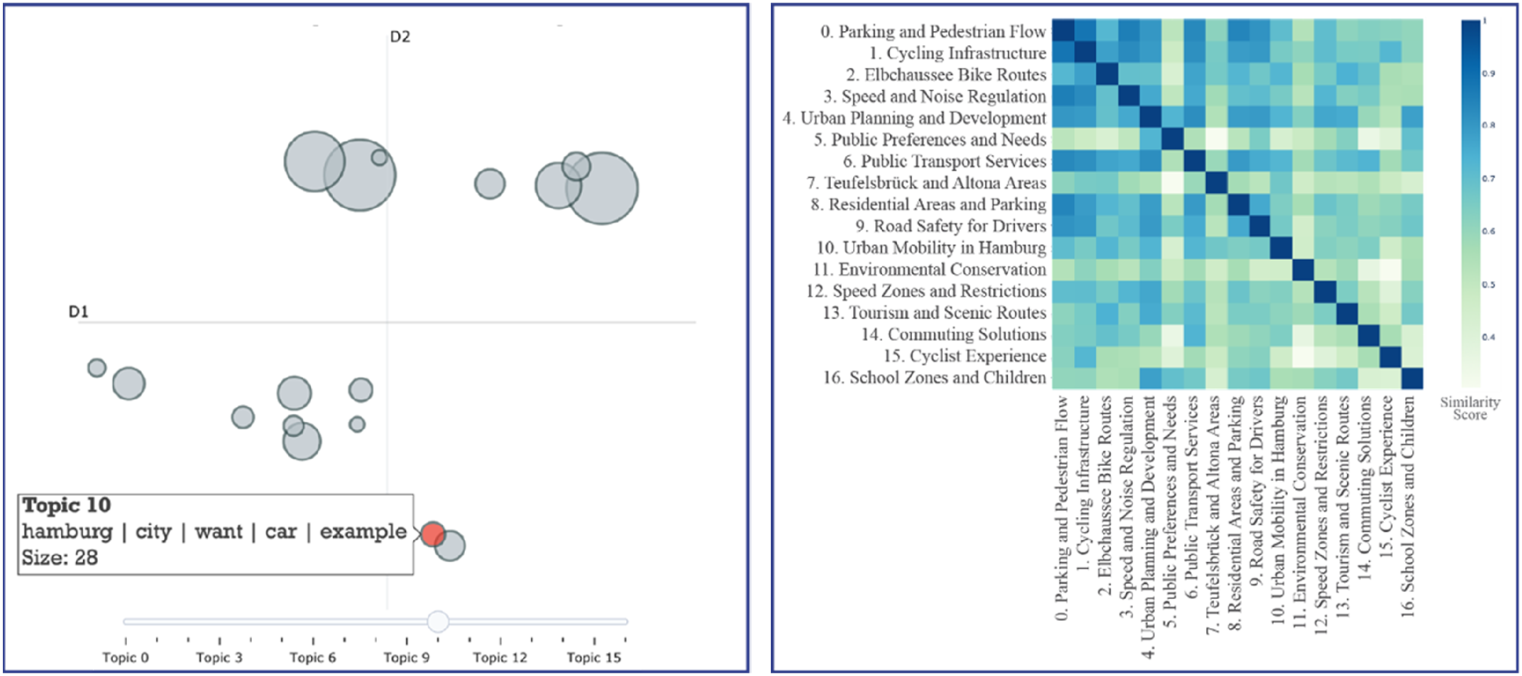
While both the dendrogram (Figure 1(b)) and the intertopic distance map (Figure 2(a)) visualize relationships among topics generated through topic modeling, they offer different perspectives and serve complementary purposes. The dendrogram presents a hierarchical structure, clustering topics based on their semantic proximity in a tree-like format. It reveals how specific topics are nested under broader thematic umbrellas, supporting structured exploration of discussion depth and sub-theme organization. In contrast, the intertopic distance map offers a spatial representation of topics in a two-dimensional semantic space, where the proximity between circles indicates overall similarity, and the size of each circle reflects the relative prevalence of that topic in the dataset.
For post-participants, the dendrogram is useful when understanding the layered structure of public discourse, for example, how general themes like mobility branch into more focused concerns such as parking or cycling. The intertopic distance map, on the other hand, enables quick identification of thematic overlaps, redundancies, or topic clusters that may require integrated responses. Taken together, these visualizations help interpret both the structure and the spread of discourse complexity in a given participatory context.
Similarity scores in the presented matrix were calculated by representing each topic as a vector, with each word in the vocabulary assigned a weight based on its relevance to that topic. Cosine similarity was then used to compare these vectors, evaluating the degree of similarity between topics. The similarity scores were organized into a matrix, with each entry indicating the closeness between two topics. This matrix is subsequently visualized using a heatmap, where each cell reflects the level of similarity between the topics being compared.
For instance, in the “Elbchaussee” dataset heatmap (Figure 2(b)), a substantial similarity score of 0.88 exists between “Parking and Pedestrian Flow” (T0) and “Cycling Infrastructure” (T1), suggesting these issues are frequently discussed together and conceptually interconnected. Similarly, “Parking and Pedestrian Flow” (T0) registers a similarity score of 0.83 with “Public Transportation Services” (T6), indicating an intrinsic relationship between various transportation concerns. Such analyses provide insights into efforts, for example, parking spaces should not be isolated from broader concerns such as cycling routes and public transportation networks. Addressing these interconnected issues synergistically helps alleviate congestion and improve overall urban mobility.
Consequently, the dual capabilities of semantic analysis enhance the ability to make substantive recommendations based on detailed understandings of topic relationships. By isolating clusters of closely related topics, post-participants can detect underlying patterns or emerging trends in community sentiment, enabling more targeted and evidence-based policy initiatives.
High-dimensional data clustering
Following the generation of TMs, post-participants obtain topics with their prevalent words; however, the dataset still includes thousands of sentences from comments, replies, and descriptions on the online platform. To effectively trace content through these topics, it is necessary to represent this high-dimensional data using clustering techniques that combine the content with the TM results. The aim is to simplify complex datasets by grouping similar data points, thereby aiding in the identification of patterns and relationships. In this study, t-distributed Stochastic Neighbor Embedding (t-SNE) is employed, which is a machine learning technique that reduces dimensionality by preserving local structures, ensuring that similar data points remain close in the lower-dimensional space (Zhu et al., 2019). t-SNE was selected for its ability to reduce high-dimensional topic distributions into a two-dimensional space while preserving local semantic relationships between comments, thereby enabling post-participants to visually detect thematic clusters, overlaps, and outliers within complex discourse data.
The results of the t-SNE were plotted using the “Elbchaussee” dataset, as presented in Figure 3. In the figure, each point represents a comment or reply, with proximity indicating similar topic distributions. Distinct clusters emerged in the plot, such as Topics 1, 10, and 11. This distinction is due to their unique focuses, with Topic 11 concentrating on community governance issues like “bike” and “dog.” Conversely, some clusters showed proximity to other topics, such as Topic 2, which represents more interconnected arguments (Figure 3(a)). These clusters reflect topic differentiation, while outliers indicate comments that deviate from primary themes. Additionally, interactive features like hover tools were embedded into the interfaces to provide additional context, allowing deeper exploration of specific clusters, as seen in Figure 3(b). In this way, t-SNE serves as a robust tool for high-dimensional data visualization while maintaining local document structures. (a) Visualization of comment-level data using t-SNE, where each point represents a comment or reply from the Elbchaussee dataset. Clusters indicate groups of semantically similar content, with selected dominant topics highlighted. (b) A zoomed-in view of Topic 11, illustrating its internal structure and displaying an outlier comment accessed through the interactive hover over function. This view demonstrates how local variations and anomalies within a topic can be explored in greater detail to support deeper interpretation of public discourse.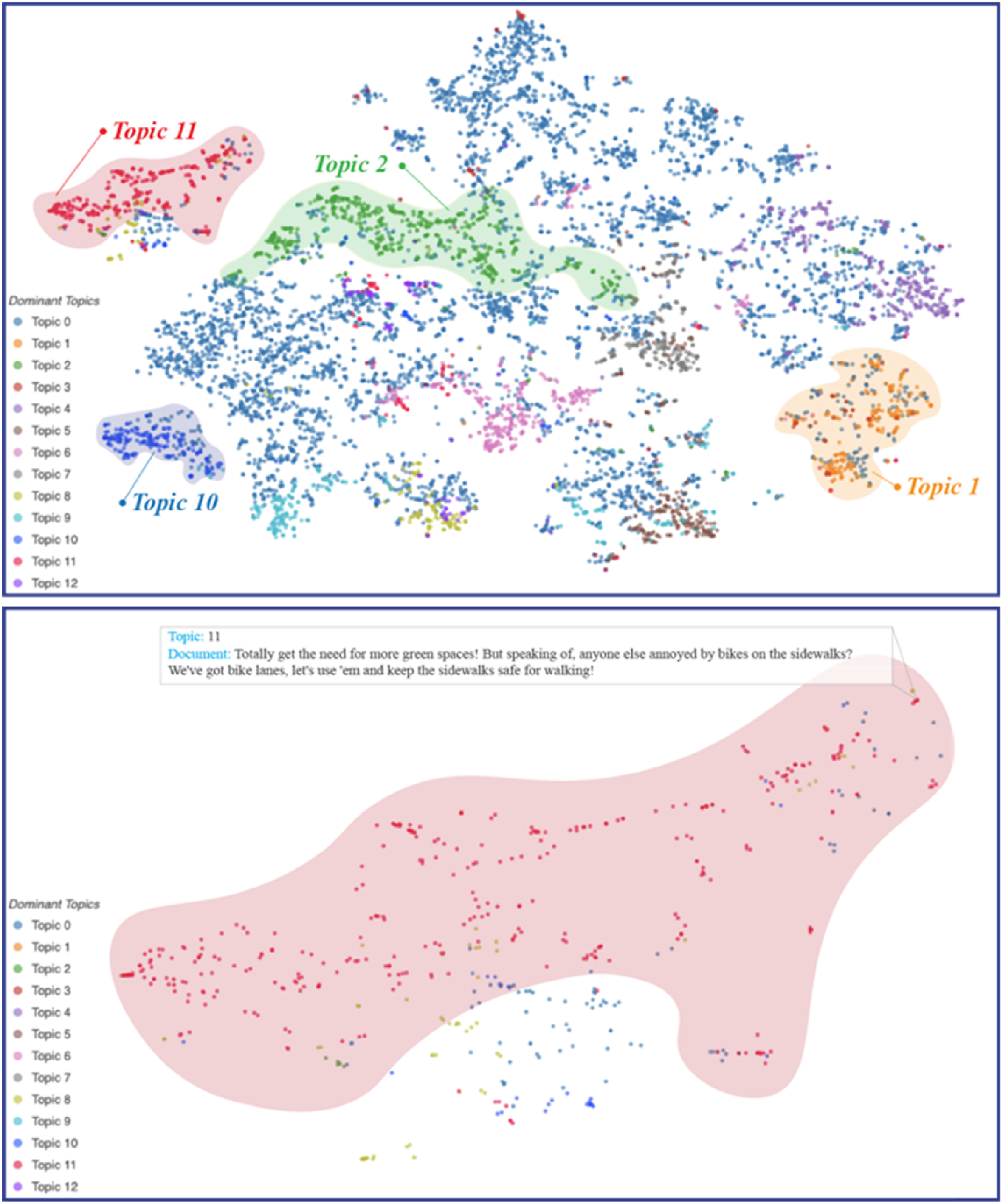
After identifying topics and presenting them in multidimensional spaces, determining which require further investigation becomes crucial. To achieve this, three metrics are deployed: (i) average topic contributions across documents to display the average contribution of each topic, highlighting prevalent themes (Figure S3i); (ii) documents based on topic contribution percentages, offering a granular view of topic distribution (Figure S3ii); and (iii) Kernel Density Estimate (KDE) plots to reveal the modes and spread of topic contributions, indicating clusters and the thematic composition of the corpus (Figure S3iii). Together, these plots help post-participants interpret the relative focus and diffusion of public concerns.
For instance, topics with high average contributions and dense clustering may reflect persistent concerns that cut across different user groups, while topics with low contribution values might indicate niche but coherent perspectives. These patterns inform the prioritization of engagement strategies: widely discussed and emotionally charged topics (when combined with sentiment scores) may call for immediate attention, whereas low-frequency topics may uncover emerging themes or overlooked voices. Thus, topic contribution analysis functions as both a diagnostic and prioritization tool, enabling informed decision-making by assessing the scope, depth, and balance of community discourse.
Spatial contextualization of public discourse through geo-locations
Another distinctive feature of the DIPAS dataset is the inclusion of geolocation data for each comment and reply, enabling the identification of spatial engagement patterns, location-specific concerns, and varying levels of participation. This research introduces geospatial visualization methods to map project datasets by creating a map object. The map is configured with zoom levels and scrolling options, initially centered at [0, 0] for a global overview, and enhanced with high-resolution tiles from OpenStreetMap and Carto for detailed geographical context. A standardized color-coding scheme differentiates data points by origin, while a secondary scheme assigns chromatic colors based on source data and sentiment scores (ranging from darker (negative) to lighter (positive) tones). Customized icons reflect sentiment, thereby enriching informational density. Subsequent sections detail the applications of these techniques for analytical objectives.
Geospatial insights into community engagement
The spatial maps generated in this study represent projects within DIPAS. Each dataset is color-coded, with comments and replies mapped using geospatial coordinates, providing a visual representation of the entire DIPAS dataset or selected sub-datasets based on the post-participants’ preferences (Figure 4). This geospatial approach serves several key objectives. First, it enables post-participants to allocate resources more effectively to areas of high engagement, or “hotspots,” where public interest is concentrated and additional resources may be needed. Second, it identifies regions with unusual engagement levels, such as in the “Eimsbüttel” project, where comments from peripheral areas offer unique community perspectives (Figure 4(a)). These insights inform outreach strategies aimed at improving participation from underrepresented groups. (a) Interactive map interface displaying geolocated comments from eight selected DIPAS participation projects across Hamburg. Each point represents a user contribution, color-coded by project to illustrate spatial distribution and engagement patterns. While this version uses point-based data to maintain granularity, the system also supports aggregation to spatial units such as neighborhoods or districts for higher-level comparative analysis. (b) Zoomed-in view of two overlapping project areas, highlighting how cross-project spatial analysis can reveal participation patterns, localized concerns, and areas of shared interest or potential conflict.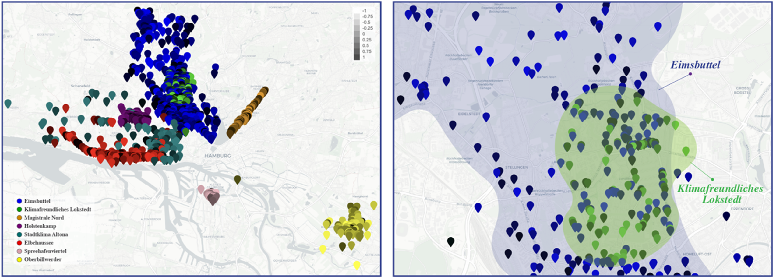
Moreover, this approach facilitates the mapping of conflicts and consensus by displaying overlapping comment areas, thereby signaling regions of disagreement or collective agreement related to project-specific or emerging local issues. Cross-project data integration, such as between the “Klimafreundliches Lokstedt” and “Eimsbüttel” projects (Figure 4(b)), provides broader insights into community perspectives. This spatial analysis highlights areas of interest, conflict, and consensus, ultimately informing more targeted and inclusive urban interventions.
Temporal evolution of participation data
Another important advantage of incorporating geospatial aspects of participation data is that it allows for the examination of the temporal evolution of public discourse, thereby understanding the dynamics of civic engagement over time. To achieve this, the study utilizes the timestamps attached to each comment and reply within the DIPAS dataset and constructs a temporal profile that captures evolving patterns, as well as peaks and troughs in public engagement. This temporal dimension serves multiple analytical and policy objectives. Firstly, it identifies critical moments in public discourse, such as the emergence of new themes or the intensification of conflicts, which may require immediate intervention by post-participants. Secondly, fluctuations in engagement levels can be correlated with external events (e.g., announcements or public meetings), offering post-participants exploratory insights into how civic discourse evolves over time. While causality cannot be confirmed, these patterns can help anticipate emerging issues when interpreted alongside contextual knowledge. Lastly, the system evaluates the continuity of participation through descriptive temporal visualizations; a stable profile, reflected by steady comment distribution over time, signals consistent engagement, which is crucial for long-term projects requiring sustained public involvement.
For example, the temporal progression of the “Elbchaussee” project is illustrated through maps from March 3, April 4, and April 17, 2018 (Figure 5). The steady engagement levels during these months suggest a well-managed participation initiative without significant fluctuations. This temporal analysis, while not highlighting major peaks or drops, demonstrates the stability and constant evolution of public engagement. By tracking such patterns, the analysis helps identify key trends, correlate engagement with external events, and ensure continuity, thereby supporting the development of adaptive and sustained public engagement strategies in urban transformation projects. Temporal snapshots of the Elbchaussee participation project on three dates, March 3, April 4, and April 17, 2018, visualized through map-based representations. The geolocated comments and replies illustrate how public engagement evolved over time, enabling the identification of participation peaks, sustained discussions, and emerging spatial patterns across the project duration.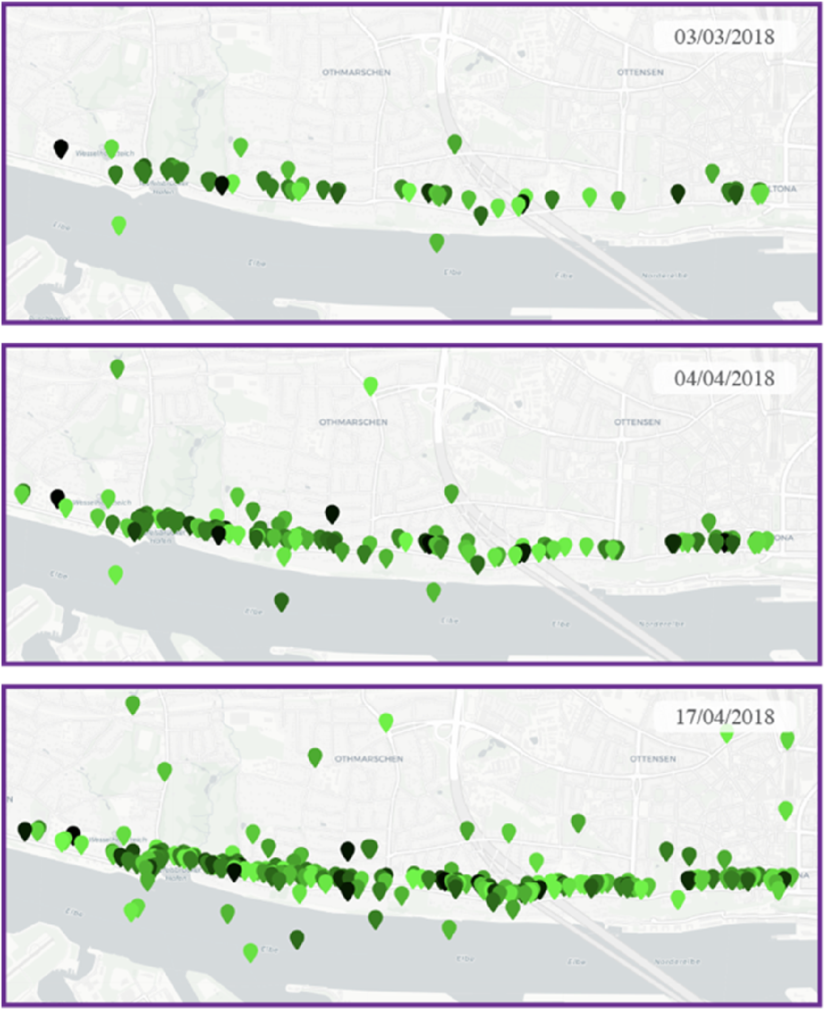
Emotional resonance in community engagement
Sentiment analysis serves as the third analytical pillar in this study, complementing spatial and temporal analyses by adding an emotional dimension to public discourse. By examining the affective responses within the DIPAS dataset, this study categorizes comments along a spectrum from positive to negative. Aggregating these sentiment scores and mapping them across various projects in a map interface offers several advantages in the post-participation phase. Firstly, it facilitates the examination of cross-community interactions by identifying shared sentiment trends across different projects and neighborhoods. This fosters dialogue and collaboration, guiding collective initiatives to address common concerns. Secondly, sentiment analysis enhances problem identification and resolution, as persistent negative sentiment in specific areas, such as the “Holstenkamp” project (Figure 6(a)), may indicate issues requiring immediate attention and targeted interventions. Sentiment analysis visualization for the Holstenkamp participation project within the DIPAS dataset. (a) Map showing a localized cluster of comments with predominantly negative sentiment (darker shades), indicating areas of concern or dissatisfaction. (b) Interface feature that enables post-participants to hover over geolocated points and access the original comment content, providing contextual depth to the sentiment data and supporting more nuanced interpretation.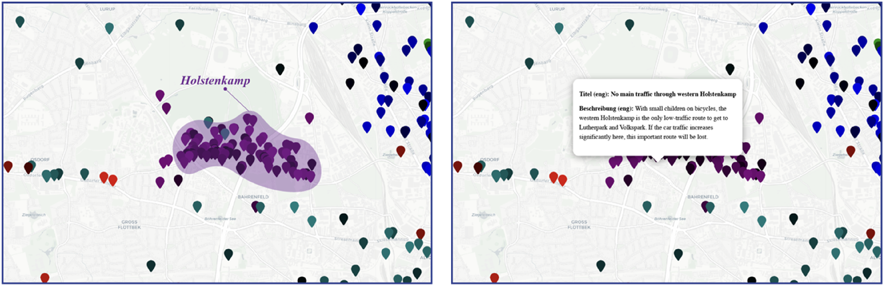
Additionally, the visual tools developed in this study enable users to access specific comments by hovering over geographic markers, facilitating close textual analysis and spatial interpretation of user input (Figure 6(b)). Combining sentiment scores with spatial and temporal data, along with content tracing features, creates a three-dimensional framework for public sentiment analysis. This framework provides critical support for developing effective, context-sensitive policies. This methodology is essential for understanding the intersections of participatory activities and for guiding effective decision-making in urban transformation projects.
Complex narratives through multi-layered visualization
Thus far, the thematic structures provided an understanding of the topics discussed, along with their geolocation-based interpretations. However, online debates are formed by initial comments that frame the discussion topics and the replies to those initial comments. This creates a network that also offers important insights. Accordingly, this study further investigates these narratives through multi-layered visualizations, providing a robust framework for interpreting intricate textual data. To achieve this, Sunburst Diagrams (SDs) and Text-Network Diagrams (TNDs) were developed as advanced visualization techniques. These methods serve two primary purposes: structurally representing the hierarchy of discussion topics, comments, and replies to clarify community dialogues; and integrating numerical metrics, such as sentiment scores and time intervals, into visualizations. By merging qualitative and quantitative data, these techniques enhance interpretive tools, facilitating more informed decision-making.
Comparative topological analysis of discussion topics
The primary feature of SDs and TNDs is their ability to represent the topological structures of discussion clusters across DIPAS digital participation projects. These visualizations illustrate high-level hierarchies and assess the depth and engagement within community dialogues. For instance, Figure 7(a) integrates SDs into the DIPAS dataset to compare engagement levels across projects. The “Stadteingang Elbbrücken” project exhibits a complex, branching structure, indicative of a rich and diverse community discourse. In contrast, simpler structures in projects such as “Spielplatz Op’n Hainholt” suggest lower engagement, often attributable to the specialized nature of topics requiring more expertise. Conversely, TNDs reveal intricate discussions at the topic level, as demonstrated in Figure 7(b), where topics like Topic 452 and Topic 12 in the “Magistrale Wandsbek” project display complex structures. Meanwhile, Topic 16 exhibits a simpler structure, suggesting lower engagement. By utilizing TNDs and SDs, widely discussed topics can be distinguished from niche interests, thereby facilitating the evaluation and comparison of discussion narratives across projects for cross-project analysis. (a) SDs representing the discussion topologies of different DIPAS projects, arranged from right to left to demonstrate increasing structural complexity and engagement levels. Each layer indicates hierarchical relationships between topics, comments, and replies. (b) TNDs visualizing the internal topology of specific discussion topics, with nested structures indicating more detailed and interactive community engagement. Together, these visualizations reveal variation in participation dynamics across projects.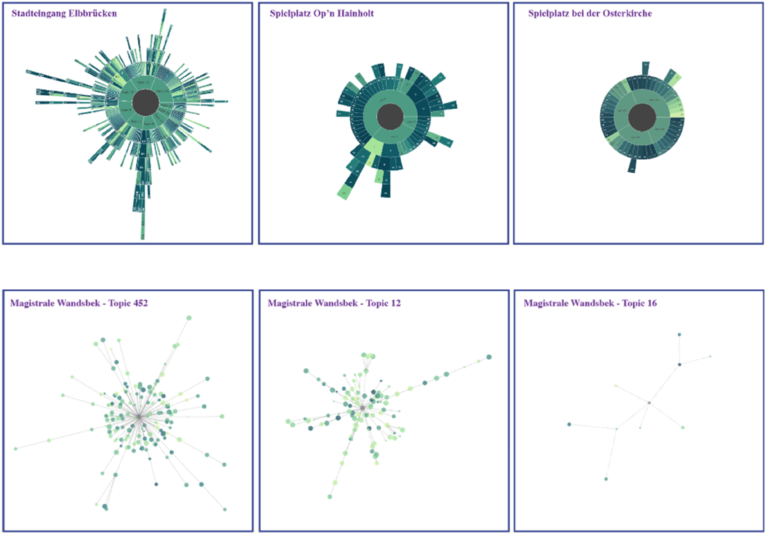
Hierarchical and sentiment analysis
While both SDs and TNDs provide insights into discussion topology, SDs are particularly effective for analyzing hierarchical relationships and sentiment trends in digital participation topics. By visually representing the hierarchy of topics, comments, and replies, SDs simplify the tracing of conversation flows. Developed as interactive plots, they allow post-participants to hover over nodes to preview specific comments and replies. This interactivity enables users to zoom into discussions for a detailed view of nested comments and their hierarchical structure. For instance, in the “Stadteingang Elbbruecken” project, “Topic 19” includes multiple comments, with “Comment #3” receiving a series of replies (Figure 8). This functionality aids in tracking conversation threads dynamically across various levels. Demonstration of the interactive features of the SD for the Stadteingang Elbbruecken project in the DIPAS dataset. The diagram allows users to navigate through hierarchical layers of the discussion by clicking sequentially, from the project level to Topic 19, and then to Comment #3, revealing the structure and depth of public discourse. This interactive functionality supports targeted exploration of complex participation data.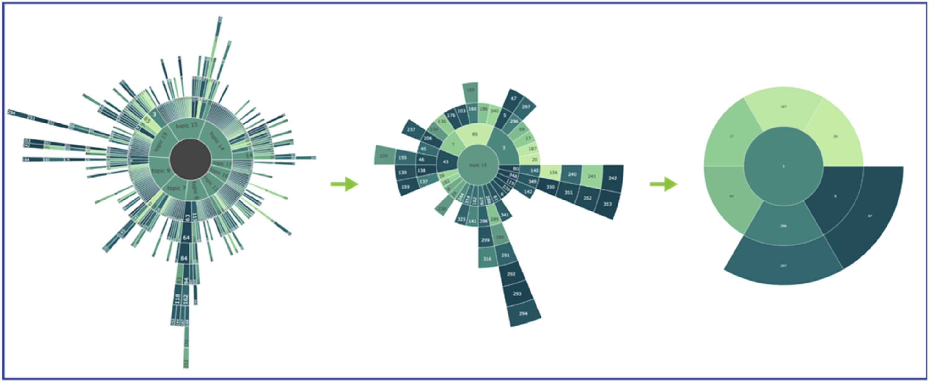
In addition to representing hierarchy, SDs offer instant visual insights into the emotional tone of discussions through color-coded sentiment scores. Positive scores indicate agreement or support, while negative scores reflect criticism or dissent. Root-level comments are organized by sentiment, allowing post-participants to quickly gauge the emotional tone of key discussions. For instance, in Figure S4 in Supplemental Material, comments are arranged from most negative to most positive within the highest hierarchical circle. Consequently, the integration of hierarchical dynamics with sentiment analysis in interactive SDs provides an effective medium in analyzing digital participation projects within the DIPAS dataset.
Temporal dynamics and comment quality
While SDs emphasize hierarchical and sentiment analyses, TNDs are instrumental in revealing temporal relationships and assessing the substance of individual comments. TNDs achieve this by representing comments and replies as nodes and the time intervals as connections between these nodes. In TNDs, shorter edges indicate faster response times, reflecting higher levels of engagement with the debate topics, whereas longer edges suggest delayed responses, indicating lower urgency. Similarly, node sizes correspond to comment and reply lengths, serving as proxies for comment quality. Larger nodes represent more thoughtful, detailed contributions, as they include more information, while smaller nodes reflect shorter, potentially reactive replies to other comments. However, since comment lengths and time intervals vary from minutes to days and from one-word replies to paragraphs, logarithmic normalization is applied to these parameters, enabling more balanced visual representation across the network. After normalization, the temporal edges preserve relative differences in engagement speed while allowing post-participants to interpret response patterns on a unified scale, thus improving readability and comparative analysis of discourse dynamics. Additionally, TNDs incorporate color-coded sentiment scores to depict the emotional tone of content in an unstructured manner, unlike SDs.
Figure S5 in the Supplemental Material illustrates a TND formed for Participation Topic 19 in the “Stadteingang Elbbruecken” project. As presented, it is possible to trace and integrate temporal intervals, comment quality, and sentiment scores through the TND system. Together, SDs and TNDs constitute powerful tools for analyzing complex and dynamic digital participation narratives. SDs excel in mapping hierarchical relationships and sentiment, while TNDs highlight temporal interactions and comment quality. Combined, these visualizations enhance post-participants’ ability to interpret discussions and make informed decisions in urban transformation projects.
Discussion
This study has explored the role of visualization systems and interfaces as dynamic information packages designed to meet the diverse needs of various stakeholders. As discussed earlier, the flexibility and adaptability of these visualizations are crucial, given that different groups require specific types of information. Visualization, as a medium that translates raw data into actionable insights, must strike a balance between clarity and complexity, ensuring that both quantitative and qualitative metrics are effectively integrated. This integration is particularly important in the context of post-participation in urban design and planning, where informed decision-making depends on the ability to present complex data in an accessible and meaningful way. Therefore, understanding the challenges in developing such systems is essential for enhancing their functionality and utility for all users.
Challenges of visualizing large-scale textual datasets
Project-based participation data exists at varying levels of complexity, with different projects bringing diverse contexts, ranging from streets to neighborhoods and even entire cities. While the embedded information, comprising both qualitative and quantitative metrics, offers comprehensive insights into citizen input, visualizing these within a single system presents its own set of challenges. A key issue is managing the cognitive load involved in organizing and interpreting data in the post-participation phase. The vast amount of data from diverse participants often results in two common problems for post-participants: first, the tendency to oversimplify the data, which risks overlooking deeper insights and second, the creation of overly complex systems that overwhelm non-experts and stakeholders, thereby limiting access to meaningful information. The visualization systems presented in this research, as introduced in the previous sections, aim to balance these extremes by employing innovative data reduction and representation techniques. These methods are designed to maintain interpretive value while simultaneously ensuring accessibility and minimizing cognitive load for post-participants.
Another significant challenge is the risk of bias, particularly when relying on automated filtering techniques. Algorithms often depend on predefined criteria, as in TM visualizations in this research, that may not fully capture the diversity of perspectives within the data, leading to the potential exclusion of minority or outlier views. This bias is further exacerbated when algorithms prioritize quantifiable patterns, such as term frequency, over qualitative elements like context or sentiment. To mitigate these risks, this research emphasizes transparency in algorithm design, combined with the integration of human oversight and mixed-method approaches, to enhance the robustness of the analysis.
A further challenge lies in managing semantic ambiguity. Textual data is rich in meaning, but this complexity can lead to misinterpretations when context is lost, or meanings vary across disciplines. Automated semantic tools may struggle to navigate these nuances, resulting in generalized or inaccurate interpretations. Incorporating domain-specific expertise into the visualization process helps ensure that the analysis remains contextually accurate. To address these challenges, this study adopted an iterative refinement process during the development of visualization systems, focusing on flexible, multi-layered visual representations that cater to different levels of detail.
For example, in early prototyping stages, planners provided feedback on which topic clustering levels best reflected planning-relevant discourse, while participation officers emphasized the need to surface low-frequency but emotionally charged comments. Their input directly informed the configuration of topic coherence thresholds, sentiment coloring schemes, and the level of spatial granularity used in geovisualizations. This iterative co-development process ensured contextual accuracy and increased the usability of the system for practitioners.
In practice, the visualization systems were conceived as complementary decision-making aids, allowing multiple perspectives to coexist. For example, text-network diagrams supported policy-level synthesis and thematic framing, whereas geospatial interfaces facilitated detailed zoning and spatial development discussions. The overlap between these visualizations further allowed stakeholders to interpret data from shared representations, strengthening collaborative understanding and alignment across decision levels.
Balancing clarity and complexity in visualization techniques
A key finding of this study emphasizes the necessity of balancing clarity and complexity in the visual representation of large-scale participation data. Achieving this balance hinges on the implementation of effective filtering systems that categorize data according to its relevance to specific design and planning decisions. By enabling stakeholders to focus on data most relevant to their concerns, this approach maintains the richness of the dataset while enhancing its manageability. The analytical framework introduced, through NLP methods for textual data, exemplifies this strategy.
Another way to strike this balance is by creating interactive systems. These systems enable post-participants to engage with the data in a more personalized and meaningful way. By allowing users to navigate through the dataset, from project-level overviews to specific comments and replies, stakeholders intuitively access critical information. All the visualization systems developed in this study allow users to interact with specific data features, such as displaying content or exact numerical metrics when hovering over visual elements, or adjusting the scale and details by clicking. This flexibility enables each post-participant to manage the interfaces according to their unique needs, and for technically proficient users, advanced fine-tuning options, such as modifying clustering thresholds, adjusting sentiment polarity cutoffs, or changing the spatial aggregation level, are available to adapt the system further to specific analytical goals.
Finally, semi-automating and automating the data processing and filtering systems help mitigate errors that may arise from post-participants who lack technical expertise. These features facilitate the translation of data from one domain to another, particularly in fields like urban design and planning, where practitioners may not possess the technical knowledge to fully utilize these systems. In this study, automation was applied to NLP algorithms, content analysis, topic modeling, sentiment scores, similarity scores, and geolocation extraction, enabling efficient dataset visualization. Nevertheless, fine-tuning options remain available for post-participants with the necessary technical expertise, allowing them to further individualize the visualization systems if needed.
The visualization systems introduced in this study do more than represent data; they serve as mediating tools in the post-participation phase, enabling stakeholders to derive meaning from citizen input and integrate it into urban decision-making. For example, geospatial maps help identify localized concerns and areas of concentrated engagement, while sentiment-based visualizations reveal emotional responses to specific planning topics. Multi-layered visualizations such as text-network diagrams provide insight into the structure, urgency, and depth of public discourse. These tools allow post-participants, such as policymakers, planners, and engagement facilitators, to monitor recurring concerns, identify contentious issues, and develop targeted responses. In doing so, the visualizations contribute to more transparent, evidence-based, and responsive governance, strengthening the feedback loop between citizen engagement and urban interventions.
Integrating quantitative and qualitative metrics for deeper insights
A key contribution of this research is its emphasis on integrating both quantitative and qualitative metrics into the visualization process. Quantitative measures, such as topic numbers and sentiment scores, offer a high-level overview of the dataset, enabling post-participants to quickly assess patterns of engagement, community sentiment, and the breadth of topics discussed. These metrics provide an objective foundation for decision-making, particularly in large-scale analyses where manual review is impractical.
However, qualitative insights are equally important for contextualizing these metrics and understanding the deeper social dynamics at play. Techniques such as content analysis and discussion hierarchies allow post-participants to explore the complexities of public sentiment, uncovering how different community groups engage with planning proposals and with each other. This combined approach enriches the overall analysis, enabling post-participants to understand not only what the community thinks but also why they think it.
This table outlines recommended visualization techniques, categorizing them based on qualitative and quantitative interpretation criteria and specifying the scale at which each is most effective.
From project-based insights to city-wide discourse mapping
While the present study focuses on project-based analyses of digital participation data, the proposed methodological framework also holds significant potential for cross-project evaluations. Applying the developed visualization systems and interpretation criteria to a broader set of participation procedures enables the identification of recurring patterns, persistent concerns, and thematic clusters that extend beyond individual urban projects. For instance, collectively analyzing participation data from projects related to mobility, housing, or climate adaptation can reveal city-wide patterns, helping to align interventions with shared public priorities.
These systems are particularly beneficial in early-phase planning for identifying localized needs, informing design priorities, and evaluating responses after public consultation. For example, planners can use topic and sentiment visualizations to detect dissatisfaction around proposed mobility changes, or geospatial tools to highlight areas of concentrated concern regarding green space or noise pollution. By surfacing such insights across both individual and multiple projects, the framework supports more targeted, inclusive, and evidence-based urban strategies.
This broader application enhances both responsiveness and long-term governance capacity. Aggregated visualizations of public discourse can alert decision-makers to emerging challenges, shifts in public opinion, or misinformation that may affect project implementation (Fung, 2015). Thus, the framework contributes not only to tactical improvements in project outcomes, but also to strategic planning, democratic accountability, and adaptive policy formulation at the city scale.
In considering the broader institutionalization of these tools, the question of long-term sustainability is critical. Although the current system employs open-source software and modular Python libraries to ensure replicability, it still relies on third-party services for certain functions such as language translation. To mitigate this, the system is designed to be lightweight and integrable with municipal IT infrastructure. Importantly, its modular and open-source structure allows it to be applied in cities with varying levels of digital capacity. In contexts where structured participation data or digital platforms are not yet available, the same methods can be used with alternative sources such as survey responses, consultation transcripts, or social media discussions. This adaptability enables municipalities to adopt individual components, such as topic modeling, sentiment analysis, or mapping, independently or combine them as part of a larger digital ecosystem. Key components can be locally hosted to reduce external dependencies, and all workflows are documented and versioned to support portability. In this way, the framework supports both technologically advanced and data-scarce municipalities in developing transparent, data-informed, and participatory planning processes. Future work will focus on embedding the tools within municipal digital ecosystems, ensuring data protection, IT compatibility, and alignment with open data governance frameworks.
Conclusion
This study underscores the pivotal role of visualization systems in enhancing the interpretability and usability of digital participation data while highlighting the need for advanced strategies to manage the challenges of large textual datasets. By refining and expanding existing analytical methodologies, this work democratizes access to complex datasets for diverse post-participants, ensuring that urban design and planning processes are inclusive, transparent, and data-driven. The findings make significant contributions to the field of urbanism, demonstrating the capacity of visualization tools to facilitate informed, equitable, and responsive decision-making in the context of urban transformation.
While the advantages of information and data visualization are undeniable, addressing the challenges of working with expansive participation datasets is essential. These datasets, predominantly composed of textual data, introduce complexities in data translation and interpretation. Recognizing and addressing these challenges was a core focus of this research, which proposed effective strategies to make complex participation data comprehensible and actionable for diverse stakeholders. In this framework, visualizations transcended their role as mere representational tools, becoming crucial instruments that encapsulate challenges and convey foundational conceptual frameworks. They serve as initial steps in problem-solving processes, establishing a basis for informed strategic decision-making and policy development.
From the findings, this study highlights several key insights in the development and utilization of visualization systems for digital participation data, particularly in urban design and planning contexts. The findings demonstrate that topic modeling and similarity mapping (Figures 1 and 2) are effective in organizing large-scale textual data into interpretable themes, allowing planners to distill thousands of citizen contributions into meaningful clusters. Building on this, the integration of interactive and multimodal visualizations, combining spatial, temporal, and hierarchical dimensions (Figures 3–6), supports different stakeholder needs and planning perspectives. These diverse visual layers enable users to move between macro-level patterns and micro-level details. For instance, sunburst and network diagrams (Figures 7 and 8) offer holistic overviews of discourse structure and intensity, while interactive comment-level sentiment views enhance transparency and traceability (Figures S4-S5), allowing users to contextualize aggregated findings. Furthermore, spatial and temporal mappings (Figures 4–6) help to uncover how public concerns evolve across time and location, framing citizen input within broader planning trajectories. Importantly, the visualizations presented in this study strike a balance between quantitative structure and qualitative depth, enabling post-participants to engage with both abstracted patterns and specific, sentiment-tagged contributions. This integrated approach enhances interpretability and supports more nuanced, data-informed decision-making in post-participation processes.
This study also confronted challenges related to the semantic ambiguities of textual data, along with certain limitations. Issues of inclusivity arose due to the digital divide, where varying levels of digital literacy and access affected participant involvement. Data anonymity introduced ambiguity, making it difficult to analyze individual participation data comprehensively. Additionally, there were methodological limitations in assessing the impact of participation tools on decision-making, as only one participation tool focused on collecting textual data was employed.
Given these limitations, future research should explore a broader range of data sources and types for visualization systems. Additionally, advancing data visualization by incorporating NLP and AI, as well as investigating strategies for integrating Large Language Models (LLMs), will be critical. Moreover, establishing connections between digital participation and emerging technologies, such as digital twins and city information modeling, can significantly enhance urban practices and civic engagement. This might benefit from enhancing the geospatial dimension of the framework concerning the incorporation of spatial statistics. Lastly, the visualizations presented in this study are based on batch-processed data. Updating them requires re-running the analysis pipeline whenever new comments, replies, or projects are added. However, the entire workflow is modular and script-based, allowing for efficient updates. In future applications, the framework can be extended to support dynamic or semi-automated integration with live participation platforms, enabling more continuous and adaptive forms of post-participation analysis.
In conclusion, this study provided a comprehensive framework for understanding and applying data visualization in complex participatory settings. It underscored the importance of fostering data-driven interpretive analysis in post-participation, particularly focusing on human-data interaction. The research addressed existing challenges while anticipating future developments, thereby laying a robust and adaptable foundation for continued research and practical applications.
Supplemental Material
Supplemental Material - Big data from online debates to urban design and planning actions: Visualizing large-scale human-centric data for post-participation
Supplemental Material for Big data from online debates to urban design and planning actions: Visualizing large-scale human-centric data for post-participation by Cem Ataman, Simon Perrault, Bige Tunçer in Environment and Planning B: Urban Analytics and City Science.
Footnotes
Acknowledgments
The authors would like to thank the Municipality of Hamburg, specifically the Behörde für Stadtentwicklung und Wohnen, for sharing their datasets. Special thanks go to Mateusz Lendziński for his help in explaining the DIPAS datasets, which greatly assisted us in developing the systems presented in this paper.
Funding
The authors received no financial support for the research, authorship, and/or publication of this article.
Declaration of Conflicting Interests
The authors declared no potential conflicts of interest with respect to the research, authorship, and/or publication of this article.
Data Availability Statement
The data supporting the findings of this study are not publicly available due to confidentiality agreements with the city administration of Hamburg. However, the data may be made available from the municipality or directly from DIPAS, contingent upon obtaining the necessary permissions.
Supplemental Material
Supplemental material for this article is available online.
Author biographies
References
Supplementary Material
Please find the following supplemental material available below.
For Open Access articles published under a Creative Commons License, all supplemental material carries the same license as the article it is associated with.
For non-Open Access articles published, all supplemental material carries a non-exclusive license, and permission requests for re-use of supplemental material or any part of supplemental material shall be sent directly to the copyright owner as specified in the copyright notice associated with the article.