
Abstract
Urban mobility analysis using Twitter as a proxy has gained significant attention in various application fields; however, long-term validation studies are scarce. This paper addresses this gap by assessing the reliability of Twitter data for modeling inner-urban mobility dynamics over a 27-month period in the metropolitan area of Rio de Janeiro, Brazil. The evaluation involves the validation of Twitter-derived mobility estimates at both temporal and spatial scales, employing over 1.6 × 10¹¹ mobile phone records of around three million users during the non-stationary mobility period from April 2020 to June 2022, which coincided with the COVID-19 pandemic. The results highlight the need for caution when using Twitter for short-term modeling of urban mobility flows. Short-term inference can be influenced by Twitter policy changes and the availability of publicly accessible tweets. On the other hand, this long-term study demonstrates that employing multiple mobility metrics simultaneously, analyzing dynamic and static mobility changes concurrently, and employing robust preprocessing techniques such as rolling window downsampling can enhance the inference capabilities of Twitter data. These novel insights gained from a long-term perspective are vital, as Twitter - rebranded to X in 2023 - is extensively used by researchers worldwide to infer human movement patterns. Since conclusions drawn from studies using Twitter could be used to inform public policy, emergency response, and urban planning, evaluating the reliability of this data is of utmost importance.
Introduction
The substantial increase in the volume of geodata collected worldwide on human mobility behavior has the potential to yield valuable insights about various application domains, including urban transportation planning and epidemiology (Barbosa et al., 2018). By leveraging information on human trajectories, urban planners and policymakers can create more livable, sustainable, and responsive cities that cater to the needs of their inhabitants. This ranges from optimizing traffic flow and more efficient resource allocation to understanding infectious disease dynamics (Ruan et al., 2020; Wang et al., 2021a, 2021b). However, the availability of freely-accessible mobility data sources with high spatio-temporal resolution is limited, which often hampers quantitative research on unexplained phenomena associated with human movement patterns. Consequently, researchers have commonly resorted to open-access and georeferenced Twitter data as a proxy for inferring human mobility patterns. Twitter, a social media platform named X since 2023, enables users to tag their online posts with geocoordinates. Inferring mobility patterns from this data involves tracking the successive tweet locations of individuals over time. These locations typically do not represent trajectories in the conventional sense of semi-continuous paths but rather a random collection of locations with temporal references. Nonetheless, given that not all individuals use Twitter and not all content is posted with geocoordinates, there exists a concern regarding potential biases in this data and its inference capabilities for mobility patterns of the general population (Tsou et al., 2017; Zhao et al., 2021).
In literature, there is a paucity of studies that justify and validate the use of Twitter as a reliable proxy for mobility patterns, particularly on a small spatial scale where Twitter data may be extremely sparse. The interest in using Twitter data for mobility-related urban phenomena, however, is increasingly high, encompassing real-time event monitoring for example of traffic congestion and accidents (Bao et al., 2017; Zia et al., 2022), disaster relief to improve coordination of rescue efforts (Reynard and Shirgaokar, 2019; Wang and Taylor, 2018), social sensing of urban land use (Soliman et al., 2017), urban planning (Milusheva et al., 2021), as well as the early detection and analysis of disease outbreaks (Bisanzio et al., 2020a, 2020b; Huang et al., 2020a, 2020b). Validation studies that exist on larger scales have employed survey data (Terroso-Saenz et al., 2022a, 2022b), census tracts (Petutschnig et al., 2022), or tourism statistics (Hawelka et al., 2014; Provenzano et al., 2018) for evaluation purposes. At the urban scale similar data sources have been utilized, but only five validation studies have been conducted to the best of our knowledge. Kurkcu et al. (2016) compared Twitter data with regional household travel surveys by calculating various mobility metrics, such as the radius of gyration and origin-destination flows, for New York City. However, this study did not examine temporal mobility trends over longer time periods. Lenormand et al. (2014) performed a comparison of Twitter data, mobile phone records, and census statistics, assessing spatio-temporal mobility metrics for Barcelona and Madrid. This study compared datasets from two different time frames, which we consider to have limited validity particularly during non-stationary periods like pandemics. The same limitation applies to the studies conducted by Qian et al. (2018), Steiger et al. (2015), and Osorio-Arjona and García-Palomares (2019), as they used either survey or census data from earlier years than when the Twitter data was collected.
Consolidating aforementioned findings highlights the research gap concerning long-term validation studies pertaining to inner-urban mobility metrics extracted from Twitter data. More specifically, this relates to employing a time-overlapping validation set to assess the accuracy and reliability of Twitter-derived mobility estimates for urban areas over an extended time period. Given these limitations, this paper introduces a novel urban validation study comparing long-term mobility dynamics extracted from geolocated tweets with mobile phone records covering a time frame of 27 months. The research was carried out in the city of Rio de Janeiro during and after COVID-19-related lockdowns, specifically from April 6th, 2020 to June 30th, 2022. The second-largest city in Brazil was chosen due to the availability for mobile phone records and the extended use of Twitter in the country, which ranks fourth globally in terms of Twitter usage (Statista, 2023). Furthermore, the metropolitan area of Rio de Janeiro, with its nearly 14 million inhabitants, provided a suitable urban landscape to address research objectives related to urban science. More specifically, we addressed the following two research questions (RQs): • •
Materials and methods
In order to answer the derived research questions, we propose a consecutive framework of data processing, modelling, and validation (cf. Figure 1). The processing part describes the retrieval and filtering of applied datasets as well as the generation of individual movement trajectories and collective origin-destination (OD) matrices. In the modelling section, a stack of five representative spatio-temporal mobility metrics were calculated. The validation part was divided into two studies: (i) a dynamic assessment of long-term mobility trends and (ii) a static validation of mobility change detection capabilities. Workflow for the comparison of inner-urban mobility metrics derived from Twitter and mobile phone records. The quantitative validation study is divided into two parts: (i) a long-term trend analysis and (ii) a validation of Twitter’s capability for static mobility change detection.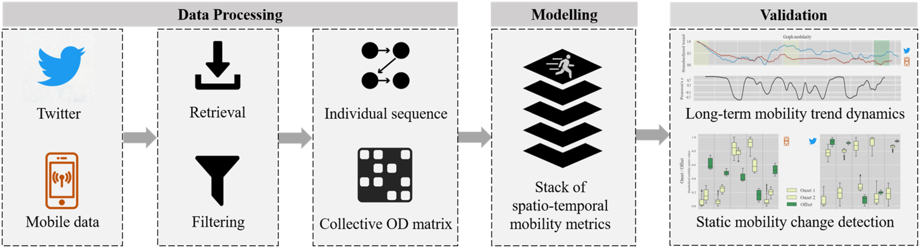
Data processing
Twitter data
Twitter data was derived from the publicly available Twitter API v2 (Twitter, Inc. 2023b) with special terms of use for academic research (Twitter, Inc. 2023a). The research licence supported the collection of more precise, complete, and unbiased datasets than the publicly available API for commercial use. API access policies and privacy concerns can undergo constant change. We treated all data in accordance with stringent privacy by design guidelines published in Kounadi et al. (2018) and Kounadi and Resch (2018). During the API request we specified an API token, start and end timestamps for the period of analysis, details regarding the case study region presented as rectangular bounding boxes, and two parameters to filter retweeted content and tweets lacking geolocation. Twitter stores geotags implicitly via place IDs. A place ID can be either a point of interest (POI) such as a bus stop close to a user location, a neighborhood, a city or a country name. As we are only interested in inner-urban movement patterns for the city of Rio de Janeiro, tweets with any ‘place type’ larger than a city were excluded from the API request. This selection resulted in 696,235 tweets for the whole study period of 27 months.
After this initial data retrieval, tweets which were located inside the rectangular bounding boxes but outside of the city boundaries of Rio de Janeiro were removed. Since we encountered issues with the shape and naming of city districts within Twitter, tweets with the ‘place type’ tag ‘neighborhood’ were additionally filtered out. This filtering step was applied to prevent possible distortion of the Twitter data in space and, consequently also resulted in a higher resolution of geocoded tweets. The final analysis was therefore conducted on tweets of ‘place type = poi’ only. The ratio of tweets per user exhibited notable heterogeneity over time (cf. Figure 2 - top right), as indicated by a standard deviation of 20.96. To address this imbalance, we employed supplementary bot filtering technique. Through a comprehensive examination of tweet distributions across all users, we identified and filtered out tweets originating from potential bot accounts by implementing a maximum daily tweet threshold of 50 and a maximum daily tweet share threshold of one percent. This was found to be consistent with methodologies employed in other twitter studies (Osorio-Arjona and García-Palomares, 2019; Terroso-Saenz et al., 2022b). Sankey diagram of Twitter filtering process (top left); daily geolocated Twitter stream used for long-term validation study with corresponding number of unique users and tweet amount per user in the city of Rio de Janeiro (top right); histogram of inter-tweet time for study period in the city of Rio de Janeiro (bottom left); schematic rolling window downsampling concept for temporal Twitter signals (bottom right).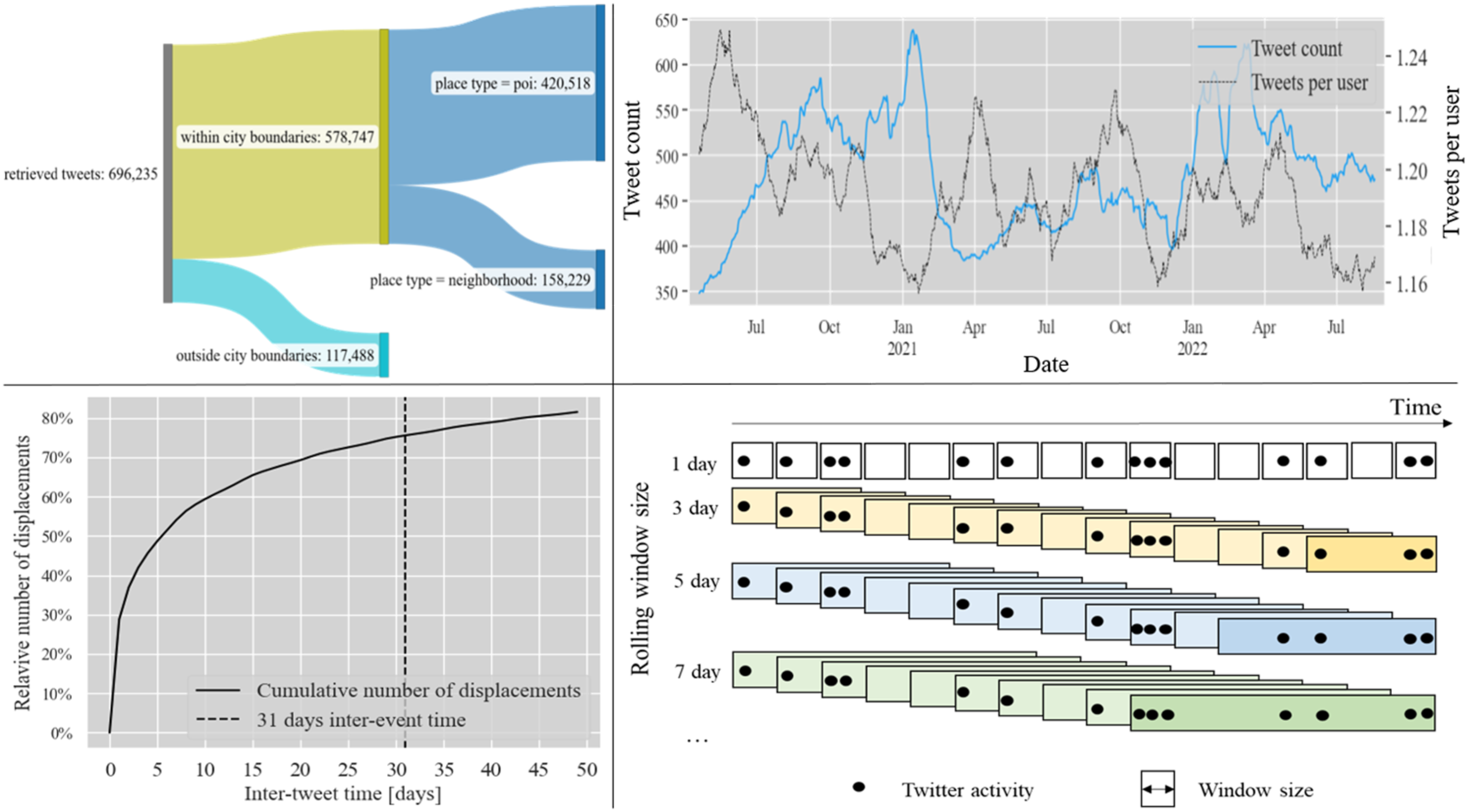
After data cleaning 420,518 geolocated tweets from 107,500 unique users were used to build individual user movement sequences with the scikit-mobility python library (Pappalardo et al., 2022). To address the daily scarcity of geolocated tweet sequences from individual users (cf. Figure 2 - bottom left), a rolling window downsampling approach was implemented. This method, contingent upon the chosen window size, can increase data volume, enabling the calculation of individual movement trajectories by enhancing the length of tweet sequences from unique Twitter users (Li, 2008). This method enables the calculation of daily mobility metrics while effectively smoothing out short-term fluctuations and outliers, thereby preserving the temporal trend within the dataset. This collective functionality renders it a suitable approach for deriving daily mobility trend signals from limited datasets, such as daily geo-tagged tweets from urban areas, aligning with the necessary objectives of the study. From a practical standpoint, this method involves aggregating and sequencing tweets accumulated over multiple days to compute mobility metrics specifically for a single day positioned at the center of the aggregation window (cf. Figure 2 - bottom right).
However, it is crucial to acknowledge that this method may also entail certain adverse consequences, such as diminished granularity or analytical precision. To address this concern, we applied a rolling window downsampling approach using a grid search across various, uneven window sizes spanning from three to 31 days, resulting in 15 distinct temporal signals. The optimal choice of these window sizes to calculate urban mobility metrics was evaluated as described in Section “Sensitivity of rolling window size”. The selection of the range of window sizes employed for the grid search was predicated on the objective of encompassing around 75% of individual displacements identified in the Twitter data (cf. Figure 2 - bottom left).
Individual human movement trajectories were retrieved from the list of temporally-ordered tweet locations of single users. The collection of these sequences over all users contributed to the generation of collective OD matrices. During this process each tweet location was matched to one of the 163 neighborhoods present in the city of Rio de Janeiro, characterized by a different ratio of tweets per capita for the residential population (cf. Figure 3). The scale of neighborhoods was chosen to align with many census statistics, which could be potentially relevant for follow-up studies. The geographic matching process resulted in daily OD matrices of shape 163 × 163 used for the subsequent calculation of spatio-temporal mobility metrics as explained in Section “Mobility metrics”. To enhance comparison capabilities with mobile phone data, OD matrix entries on the diagonal were set to zero and normalized by the amount of measured movements, which is equal to the remaining sum of OD matrix entries. Ratio of tweets per capita for the residential neighorhood population in the city of Rio de Janeiro.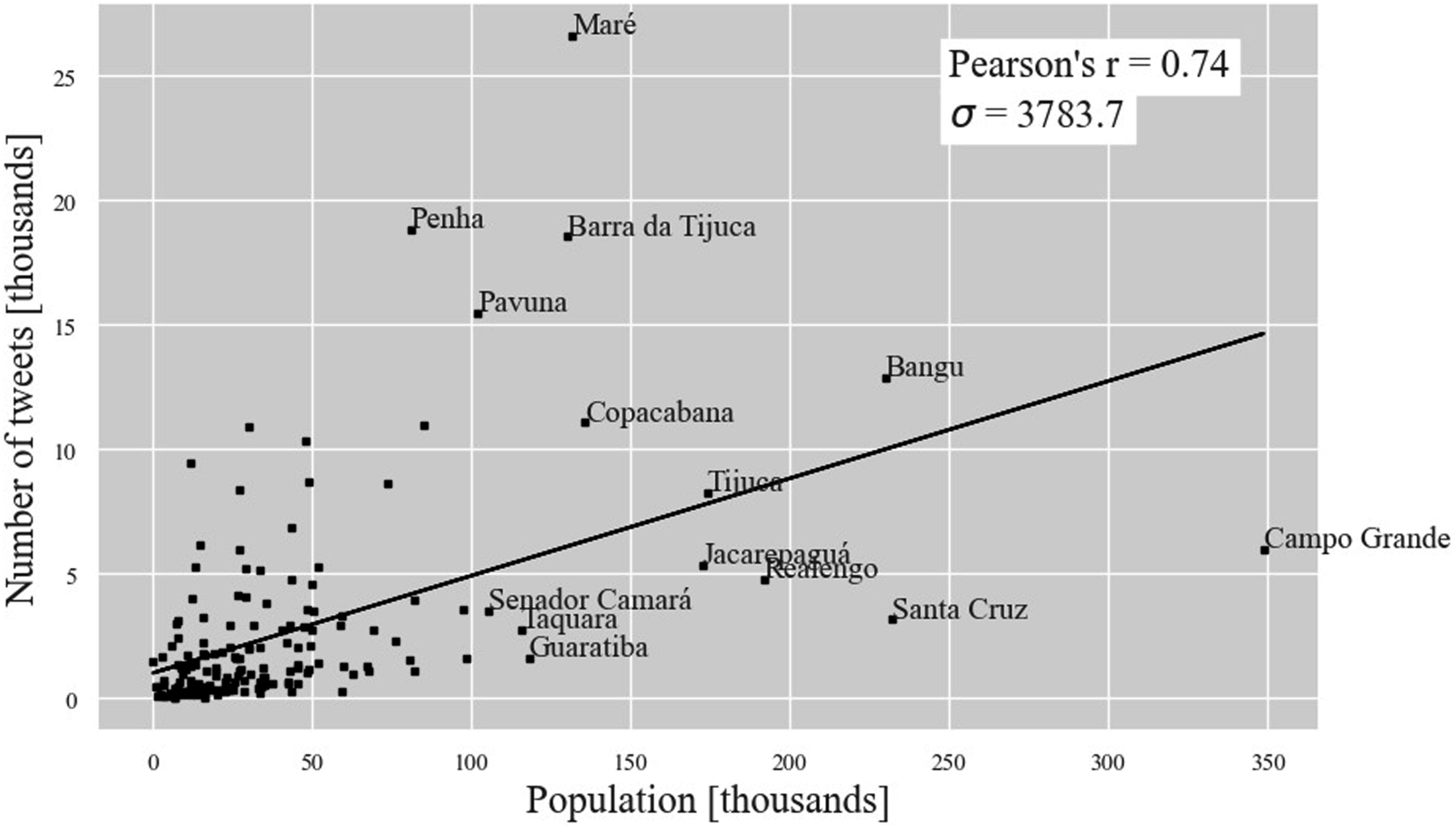
Mobile phone data
As a validation set we used anonymized mobile phone records provided by a large Brazilian telecommunications company. The dataset included individual antenna connections from approximately three million unique users over a time period of 27 months. This is equal to an approximated penetration rate of around 45% for the population of the city of Rio de Janeiro. The temporal resolution of the raw data was 5 min. The data was provided at the level of the antennas (cf. Figure 4 - top right). The mobile phone user is typically connected to the closest antenna, which is used as a proxy for the position of the user at this point in time. The number of antennas in our data set varied daily between 1,200 and 1,250 due to technical failures of some antennas. An antenna connection from an user was recorded when sending a text message, using mobile internet data, or making a call. We retrieved and processed the data of 164,250 million mobile phone records via the distributed computing tool Apache Spark as well as the GPU-accelerated parallel computing framework Dask using the mobilkit python library (Ubaldi et al., 2021). As a first cleaning step, we dropped connections with antennas outside the city boundaries. In order to derive human movement patterns, we generated a sequence of antenna connections for each user over the whole time period using a machine with 7 TB of local scratch. To increase the informative power of successive antenna connections for inferring human movement patterns, we introduced a lower bound (LB) and upper bound (UB) as filters for the inter event time (IET) between sequential antenna connections from a single user as proposed by Zhao et al. (2019). As a result, successive antenna connections between which less than 15 min (LB) or more than 4 hours (UB) elapsed were not counted as movements (cf. Figure 4 - top left). The introduction of a LB was justified by the fact that antenna congestion can cause the user to jump back and forth between antennas without physical moving. A UB was introduced to avoid the counting of movements that are not necessarily made in a direct way. The choice of the lower threshold was selected based on Zhao et al. (2019) and Schlosser et al. (2020). The choice of the upper threshold was inspired by Barboza et al. (2021). OD matrices were created based on IET-filtered daily user sequences. The entries in the diagonal of daily OD matrices were set equal to zero. To ensure comparability with the OD matrices of Twitter data, the OD matrices were normalized by the overall amount of movement activity before being converted from antenna format (1,250 × 1,250) to district format (163 × 163) using methods from Fabrikant (2017) (cf. Figure 4 - bottom right). Schematic time line of recorded antenna connections with IET-filtering (top left); resulting antenna to antenna OD matrix flows for the first day of analysis derived from mobile phone data, where darker color represents larger movements (top right); formula for OD matrix conversion from antenna to admin level with schematic illustrations of ”antenna to admin” (orange) and ”admin to antenna” (grey) matrix calculation (bottom right); resulting admin to admin OD matrix heatmap for the first day of analysis using mobile phone data, where darker shade of green describes a higher percentage of measured movement in the city (bottom left).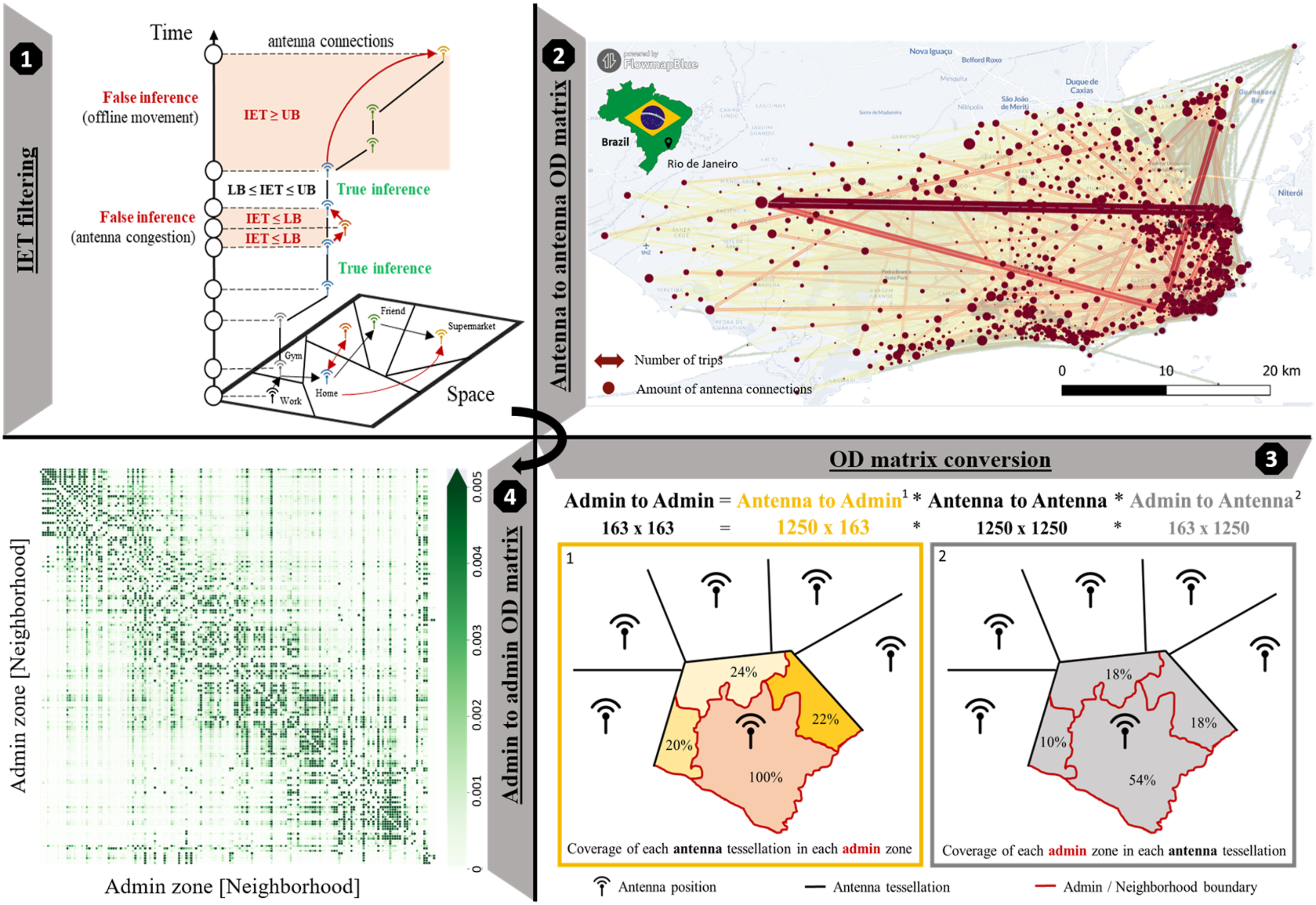
Mobility metrics
In order to answer our second research question, whether Twitter is a good proxy for modeling inner-urban human movement patterns, we calculated five spatio-temporal mobility metrics. These include the (i) total number of movements, (ii) the average movement distance of individuals, (iii) land use activity metrics, (iv) graph modularity, and (v) the radius of gyration (cf. Supplemental Appendix Figure A1).
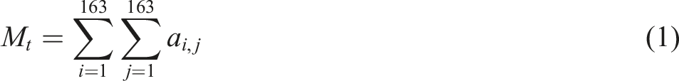
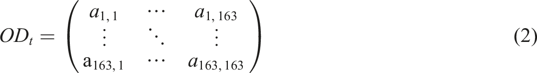

Inspired by previous research on human movement patterns (Aletta et al., 2020; de Haas et al., 2020; Hensher et al., 2021; Li et al., 2021; Mützel and Scheiner, 2022; Schlosser et al., 2020), the total number of all movements, denoted as M
t
, (cf. Formula (1)), was calculated using daily OD matrices, where a
i,j
= 0 for i = j (cf. Formula (2)). The daily average travel distance over all users U, denoted as D¯
t
, was derived from the number of visited locations n
u
in the IET-filtered user sequences for each user u (cf. Formula (3)). For each movement from the ith location visited by user u on day t to the (i + 1)-th location, the Euclidean distance between each consecutive pair of visited locations by user u (x
u,i
, y
u,i
) was calculated. The geolocations of sequential tweets were used as location coordinates for Twitter data. For mobile data, the distance between antennas was utilized. The sum of all tracked paths was then divided by the total number of considered movements, M
t
, to calculate the average travel distance in kilometers, following the precedent set by other research papers (Abdullah et al., 2020, 2021; Engle et al., 2020; Fatmi, 2020; Gao et al., 2020a, 2020b; Pardo et al., 2021; Park et al., 2022).
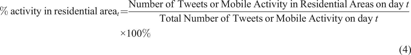
We calculated land use-dependent activity metrics using land use land cover maps from the DATA.RIO portal (Municipality of Rio de Janeiro, 2022). These metrics can provide information about the percentage of Twitter or mobile activity that can be assigned to a certain land use structure (Aktay et al., 2020; Da Cavalcante Silva et al., 2021; Hakim et al., 2021; Nanda et al., 2022; Ossimetha et al., 2021; Paez, 2020; Saha et al., 2020, 2021; Shumway-Cook et al., 2005; Sulyok and Walker, 2020; Zhu et al., 2020). In our analysis, we measured the percentage of activity for six types of typical urban land cover categories (residential, public, leisure, industry, education, commerce) present in the city of Rio de Janeiro. For the validation of Twitter, only the percentage of activity in residential areas was used as a representative of this mobility metric type (cf. Formula (4)). The inclusion of all land use-dependent activity metrics was rejected to improve clarity and diversify the analyzed mobility metrics in this study. Several metrics of land use-dependent activity were considered redundant. Residential areas were chosen as the land class of highest interest as they promised the highest variability related to lockdown style policies. For calculating land use-dependent mobility metrics, tweet POI and antenna location were used correspondingly.
The graph modularity, a measure indicating the extent of links within communities compared to links between communities (cf. Figure 5), was calculated using the Louvain algorithm. Modularity, denoted by Q, is computed as the difference between the observed fraction of intra-community edges and the expected fraction if edges were distributed randomly (Blondel et al., 2008). It is defined as follows Schematic concept of graph modularity and radius of gyration. Graph modularity is a measure for the strength of the division of a graph into communities, based on the density of connections within communities compared to connections between communities. The radius of gyration refers to the average travel distance of an individual measured from the center of its movement circle, representing the overall distribution of visited places.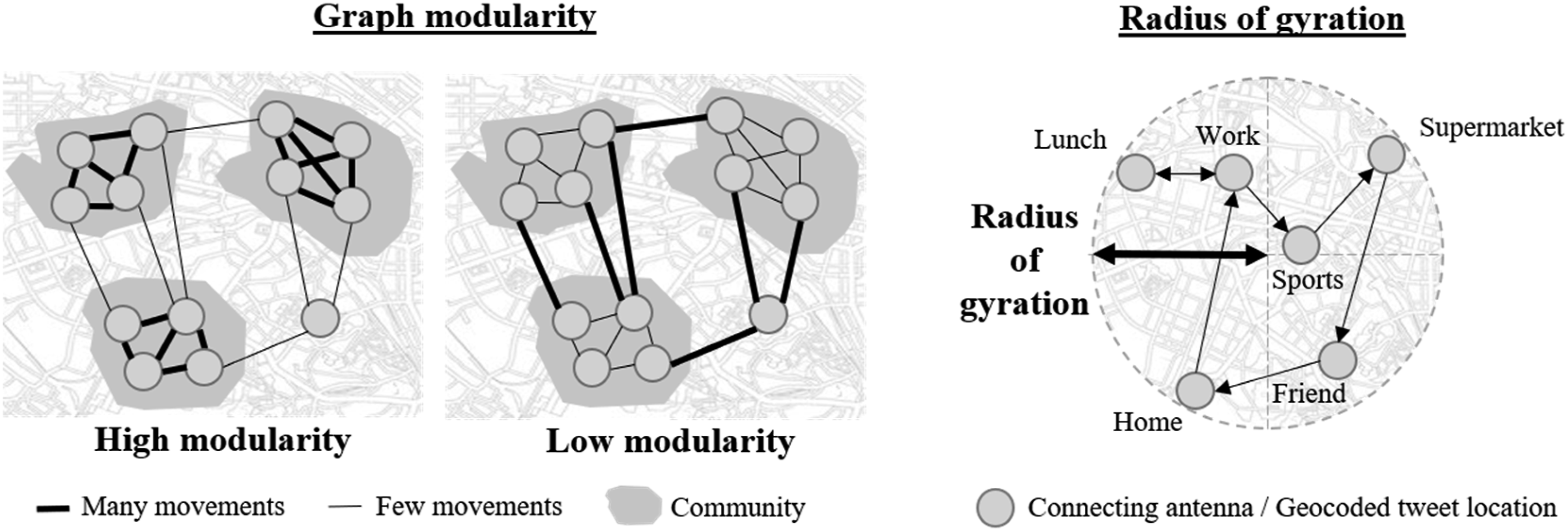


The radius of gyration R g indicates the average radius of movement of a single user u (cf. Figure 5). We averaged this value over all recorded users U and calculated it on a daily basis. Analogous to the methodology applied in computing the average movement distance, we conducted distance calculations between the Twitter POIs and the antenna location, respectively. Both calculations were run on the basis of the IET-filtered user sequences (Hernando et al., 2021; Kishore et al., 2020; Liu et al., 2018; Wang and Taylor, 2014). The variables x¯ u and y¯ u correspond to the mean of the x-coordinates or y-coordinates of user’s visited locations on day t.
Long-term validation of urban mobility patterns derived from Twitter
The long-term validation of urban mobility metrics derived from Twitter was conducted over a non-stationary mobility period of 817 days. This time period covers the major peaks of the COVID-19 pandemic including subsequent months with high to low mobility restrictions implemented by the local state and municipal government of Rio de Janeiro (Mathieu et al., 2020). The capability of Twitter as a data source to detect long-term mobility change in urban environments was evaluated using mobile phone records. To justify the utilization of mobile phone records as a ’ground-truth’ validation set in our case study, we previously tested spatio-temporal mobility metrics derived from mobile phone data as valid evaluation sets for modeling real-world human movement behavior at an urban scale. For this evaluation, we obtained the stringency index for the city of Rio de Janeiro (cf. Figure 6), which is a globally-standardized indicator of politically-implemented mobility restrictions affecting human movement behaviour (Mathieu et al., 2020). It is a widely-used indicator derived from ordinal measurements for containment, closure policies, and public information campaigns. For the whole study time period during and after the COVID-19 pandemic, we calculated an average absolute Pearson correlation coefficient of 0.7 between all mobility metrics and the stringency index. The graph modularity mobility metric showed the highest overall Pearson correlation coefficient of 0.77. The main advantage of mobile phone records over the stringency index as an assessment dataset for this case study was the high temporal resolution of mobility measurements on a daily basis. Stringency index recording the strictness of lockdown style policies in the city of Rio de Janeiro and graph modularity measurements derived from mobile phone data (red). On- and offset time periods indicate manually selected time frames of high to low mobility restrictions defined for static mobility change detection analysis.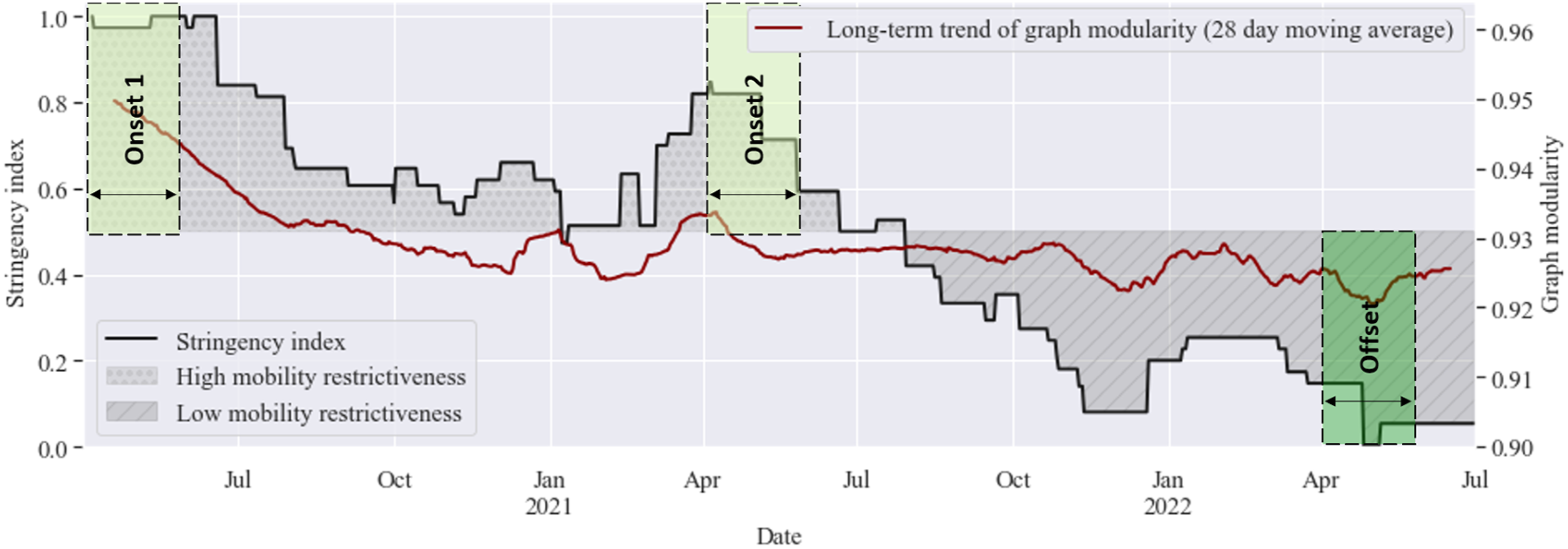
The quantitative assessment involved the computation of moving window synchrony among long-term mobility trend signals indicating individual and collective mobility metrics derived from Twitter and mobile phone data as outlined in Section “Mobility metrics”. Time series synchrony denotes the extent to which time series exhibit similar patterns across multiple time steps. Unlike correlation, which quantifies the strength and direction of the linear relationship between time series, synchrony characterizes the temporal alignment and similarity in temporal patterns. We approximated the moving window synchrony by calculating the daily Pearson’s correlation coefficients applying a window size of 60-days.
Long-term trend signals of calculated daily mobility metrics were generated by applying a moving average of 28 days and MinMax-Standardization considering the whole time frame of analysis. Moving average size for trend decomposition was selected based on visual diagnostics to remove weekly oscillations and outliers that appear due to technical antenna failures (cf. Supplemental Appendix Figure A1). The moving average size of 28 days seemed to generate a plausible trade-off signal between long-term trend and short-term mobility changes. Absolute moving window synchrony surpassing values of 0.7 was classified as indicating a high level of alignment, while values below 0.3 were considered to signify a weak tendency to exhibit similar temporal pattern. Intermediate moving window synchrony values ranging from 0.3 to 0.7 represented moderate alignment of events and changes in our study.
Three on- and offset periods were defined based on the stringency index to evaluate the capability of Twitter to additionally measure static change detection (cf. Figure 6). Considering implemented mobility restrictions in the city of Rio de Janeiro, we classified the two-month time periods from April 6th to June 6th in 2020 and 2021 as lockdown style periods (onset) and the time frame from April 6th to June 6th in 2022 as post-lockdown period (offset). With this selection, our goal was to include time intervals that exhibit diverse levels of human mobility, independent of potential seasonal fluctuations, throughout the 3 years of analysis. We selected a two-month interval period starting at the beginning of our analysis to capture both static mobility circumstances and their associated changes. The outcomes of the static mobility change detection were displayed through boxplots and compared with weekday/weekend onsets and offsets extracted from the entire analysis time period. To provide statistical quantification for static urban mobility changes, we conducted Mann-Whitney U tests between on- and offset periods, applying a confidence threshold of 0.05.
Results and discussion
RQ1: evaluation of rolling window downsampling
Examining the initial time period of analysis spanning from April 2020 to September 2020 (cf. Figure 7), all computed mobility metrics derived from Twitter exhibited discernible patterns that aligned with our expectations based on the implemented lockdown measures in the city of Rio de Janeiro. Notably, while the long-term trend of the graph modularity metrics and the percentage of activity in residential areas decreased, the long-term trends of average movement distance, overall movement volume, and the radius of gyration increased. Standardized inner-urban mobility metrics derived from daily tweet sequences applying rolling window downsampling (RWDS). Results of 7-day and 27-day rolling windows (dark blue) are compared with the daily raw and trend signal of Twitter mobility metrics without applying RWDS (light blue). The trend signals are calculated using a moving average of 28 days. Non-standardized mobility metrics derived from Twitter for a 11-day rolling window size are visualized in cf. Supplemental Appendix Figure A2.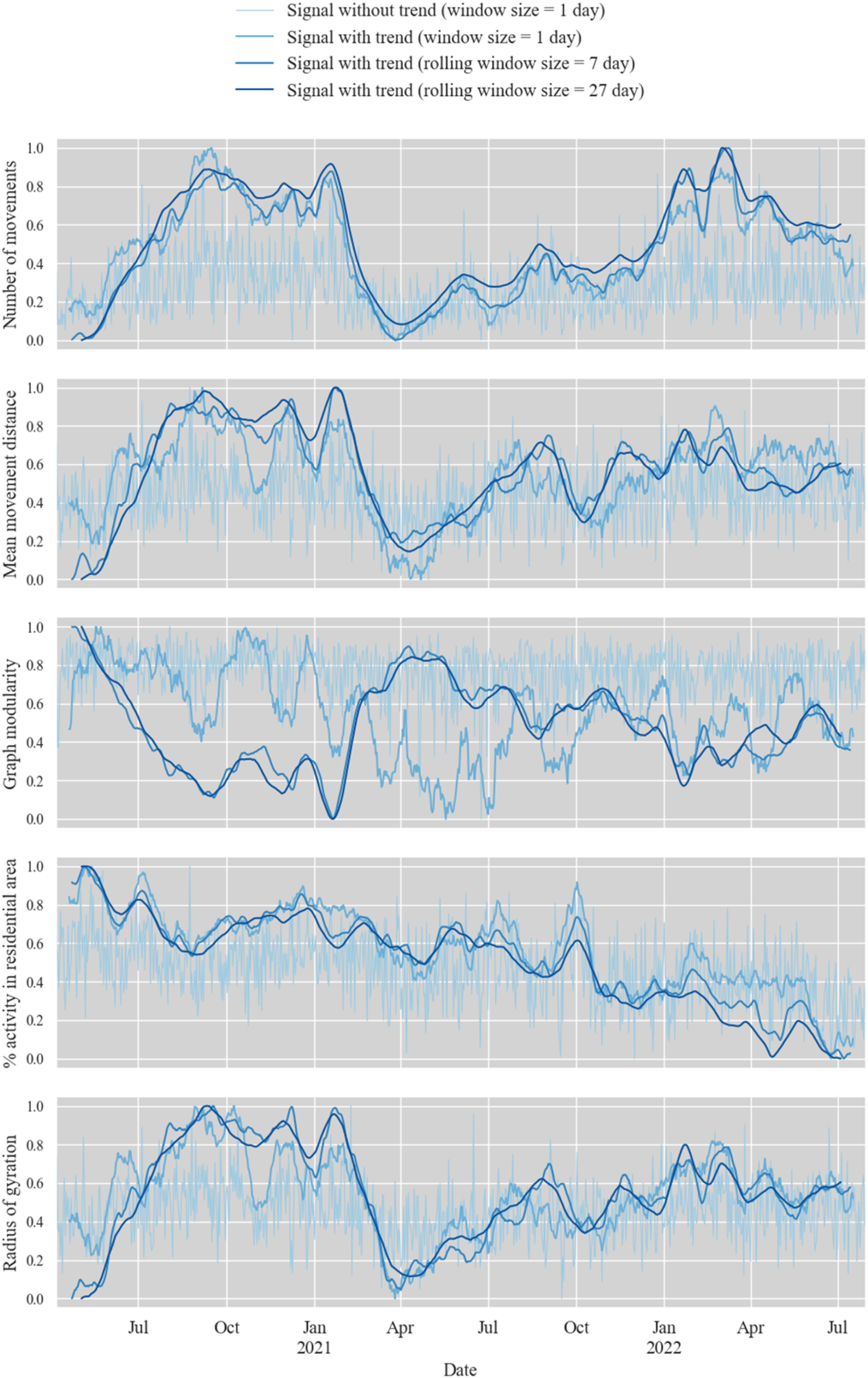
During the subsequent time period from September 2020 to May 2021, all mobility metrics derived from Twitter, except the percentage of activity in residential areas, displayed unexpected changes. They all showed a rapid shift starting in February 2021 dis-aligning our assumptions on more or less constant mobility behaviour in that time period. Coinciding with this period, there was a sharp decline in the number of geolocated tweets collected via the public Twitter API (cf. Figure 2). We hypothesize that this decline was attributed to changes in the terms of use implemented by Twitter. However, official evidence of regulatory changes during that specific time period has not been found. Additional experiments using a constant amount of tweets per day, derived by the 98th percentile of tweet volume in the corresponding rolling window subset, showed a similar shift in mobility metrics (cf. Supplemental Appendix Figure A3). This highlights the robustness of calculated mobility metrics in the face of daily fluctuations in the number of tweets.
For the analysis period subsequent to May 2021, the calculated mobility metrics once again aligned with our expectations and confirmed our knowledge of fewer mobility restrictions implemented in the city of Rio de Janeiro following the COVID-19 pandemic.
The results also demonstrate that, while a moving average can effectively eliminate weekly fluctuations and data noise, it does not suffice for generating accurate long-term trends for all considered mobility metrics in this analysis. However, when combined with the specifically designed rolling window downsampling (RWDS) approach, more precise long-term mobility trends can be derived. This effect becomes particularly evident when examining the calculated graph modularity metrics in our case study, as the modularity values between the 1-day window size signals and the seven- or 27-day rolling window size signals exhibit larger differences. In contrast, for other calculated mobility metrics, the impact of RWDS appears to have relatively low significance and yields effects comparable to those obtained by calculating a 1-day window trend signal. Supplementary materials provide corresponding results of daily mobility metrics calculated without applying a moving average (cf. Supplemental Appendix Figure A3). The influence of different rolling window sizes is more extensively investigated in the subsequent section in conjunction with long-term trends derived from mobile phone data.
RQ2: validation of long-term urban mobility patterns derived from Twitter
Long-term validations of urban mobility metrics derived from Twitter are infrequent, despite the well-established usage of Twitter applications in various research domains worldwide. However, the outcomes of our comprehensive long-term validation study emphasize the need for caution when utilizing Twitter data for urban studies within restricted time frames. Although urban mobility metrics derived from Twitter may exhibit high correlation values with mobility metrics computed from mobile phone data during short time periods, long-term validation with mobile phone data reveals fluctuating deviations (cf. Figure 9). This phenomenon can potentially give rise to erroneous assumptions when relying solely on Twitter as a reliable source for modeling human movement patterns.
Sensitivity of rolling window size
The results presented earlier in Section “Evaluation of rolling window downsampling” demonstrate that the RWDS method is a valuable tool for addressing the data scarcity challenge associated with urban Twitter data and deriving more precise long-term mobility trends. However, additional findings highlight the significant dependence of these findings on the chosen rolling window size (cf. Figure 8). In our experiments we observed the highest average correlation value between mobility metrics from Twitter and mobile data when using an 11-day rolling window size. Increasing the window size from 1 day to 3 days had the most pronounced effect on the calculated Pearson correlation values. For window sizes exceeding 11 days, the correlation values remained consistently high but showed a slight flattening. This can be attributed to the loss of high-resolution information resulting from the application of larger window sizes beyond 11 days. These findings align with our expectations regarding the functionality of the RWDS method described in Section “Twitter data”. The mean movement distance index yielded the highest average Pearson correlation coefficient among all considered mobility metrics, achieving its peak of 0.48 at the 11-day rolling window downsampling size (cf. Supplemental Appendix Table 1). Long-term mobility metrics derived from Twitter (blue) applying rolling windows size of 11 days and mobile phone data (red) including moving window synchrony of 60 days (black), where on- and offset represent time periods of high and low mobility restrictions. The moving window correlations exhibited statistical significance, except for transitional phases between positive and negative synchrony. Non-standardized mobility metrics are visualized in Supplemental Appendix Figure A1 and Supplemental Appendix Figure A2. (cf. Supplemental Appendix Figure A4 for more detailed visualization).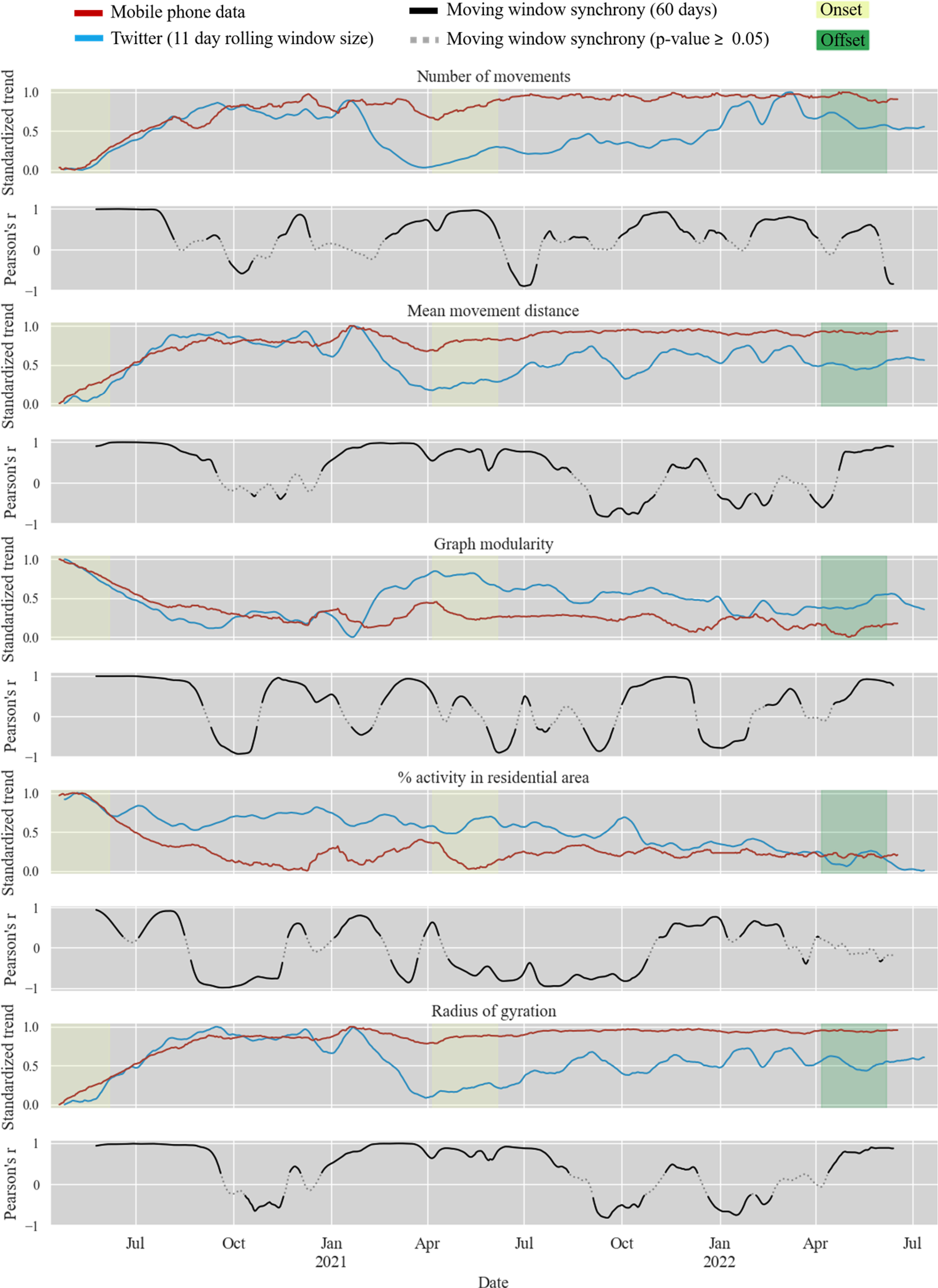
Long-term mobility trend
During the dynamic analysis of the long-term trend of calculated mobility metrics using moving window synchrony, it becomes evident that the Pearson’s correlation coefficients exhibit substantial variations over time for all the calculated mobility signals (cf. Figure 9). We observed the occurrence of short time periods characterized by both extremely high and extremely low correlation values. These findings indicate that the informative capacity of mobility metrics derived from Twitter exhibits temporal variability and is strongly contingent upon the chosen time frame for analysis. During the initial phase of the study period, when the most stringent mobility restrictions were implemented (cf. Figure 6), we observed high positive correlation values across all metrics simultaneously. Conversely, we did not observe similar prolonged time periods characterized by a weak alignment, as indicated by low Pearson’s correlation coefficients around zero. Notably, higher moving window correlation values exhibited greater statistical significance than lower values. Mean Pearson’s correlation coefficients calculated over the whole time period of analysis between mobility metrics derived form Twitter and mobile phone data considering varying window sizes for RWDS.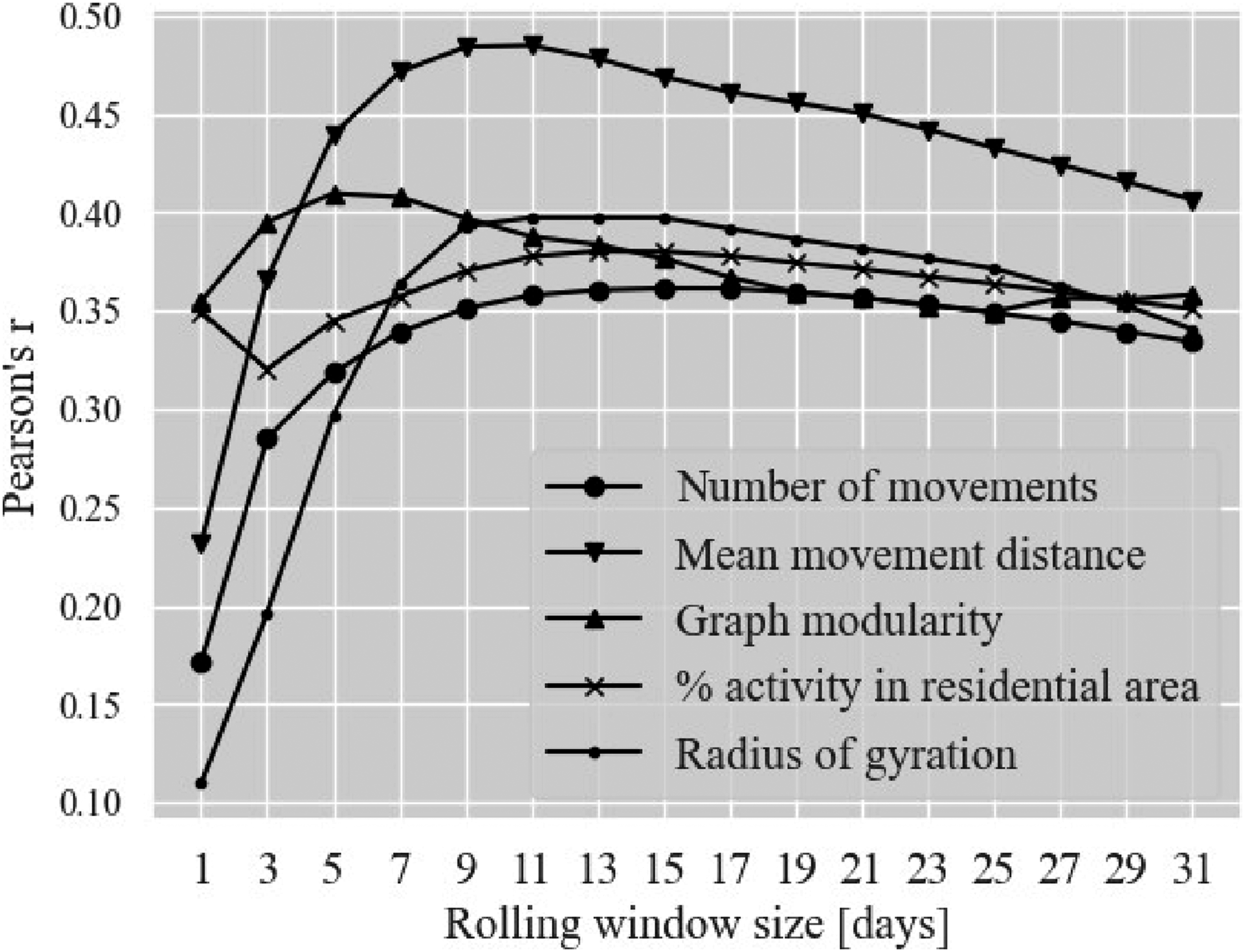
To eliminate the possibility of spurious correlations, all time series were examined for unit roots using the appropriate version of the Dickey-Fuller test before calculating Pearson correlation coefficients. The test results indicated that seven out of ten time series were stationary, allowing for the calculation of Pearson correlation coefficients. However, the time series for “Number of movements”, “Graph modularity”, and “% activity in residential areas” measured based on Twitter data, remained non-stationary. Following the ”Standard sequence of steps for dealing with non-stationary time series” as outlined by Studenmund (2017), we tested the pairs of Twitter data and mobile phone time series for the metrics “Number of movements”, “Graph modularity”, “% activity in residential areas” for cointegration using the Engle-Granger test. The Engle-Granger test results indicated that the time series for the metrics “Number of movements” and “% activity in residential areas” were cointegrated at a confidence level of 95%, while the time series for the metric “Graph modularity” were cointegrated at a confidence level of 90%. According to Studenmund (2017), if the variables have unit roots and are also cointegrated, this allows for the calculation of the Pearson correlation coefficient using the original units, thereby ruling out spurious correlations.
Static mobility change detection
Additional findings from a static change detection analysis reinforce the results of our long-term trend analysis (cf. Figure 10). While it is evident that Twitter data does not always accurately capture long-term mobility trends, it does have the potential to detect significant (cf. Supplemental Appendix Table 2) inner-urban mobility changes measured by mobile phone data and indicate the correct direction of the shift. In our case study, this holds true for all the measured variables except for the percentage of activity in residential areas during the time period of the second onset. In summary, we conclude that both the Twitter and mobile phone datasets synchronously detected the shift in inner-urban human movement behavior between the years 2020, 2021, and 2022, attributable to COVID-19 lockdown policies. Static mobility changes between weekdays and weekends were not detected to be significant (cf. Supplemental Appendix Table 2) when testing both datasets, leading to the conclusion that Twitter can be a useful substitute for mobile phone records when trying to derive the direction of static inner-urban mobility shifts. Static urban mobility change detection applying Twitter and mobile phone data. Comparison between weekday/weekend (top row) and lockdown style/post lockdown style time periods (bottom row). p-values of applied Mann-Whitney U tests for static urban mobility change detection are listed in cf. Supplemental Appendix Table 2.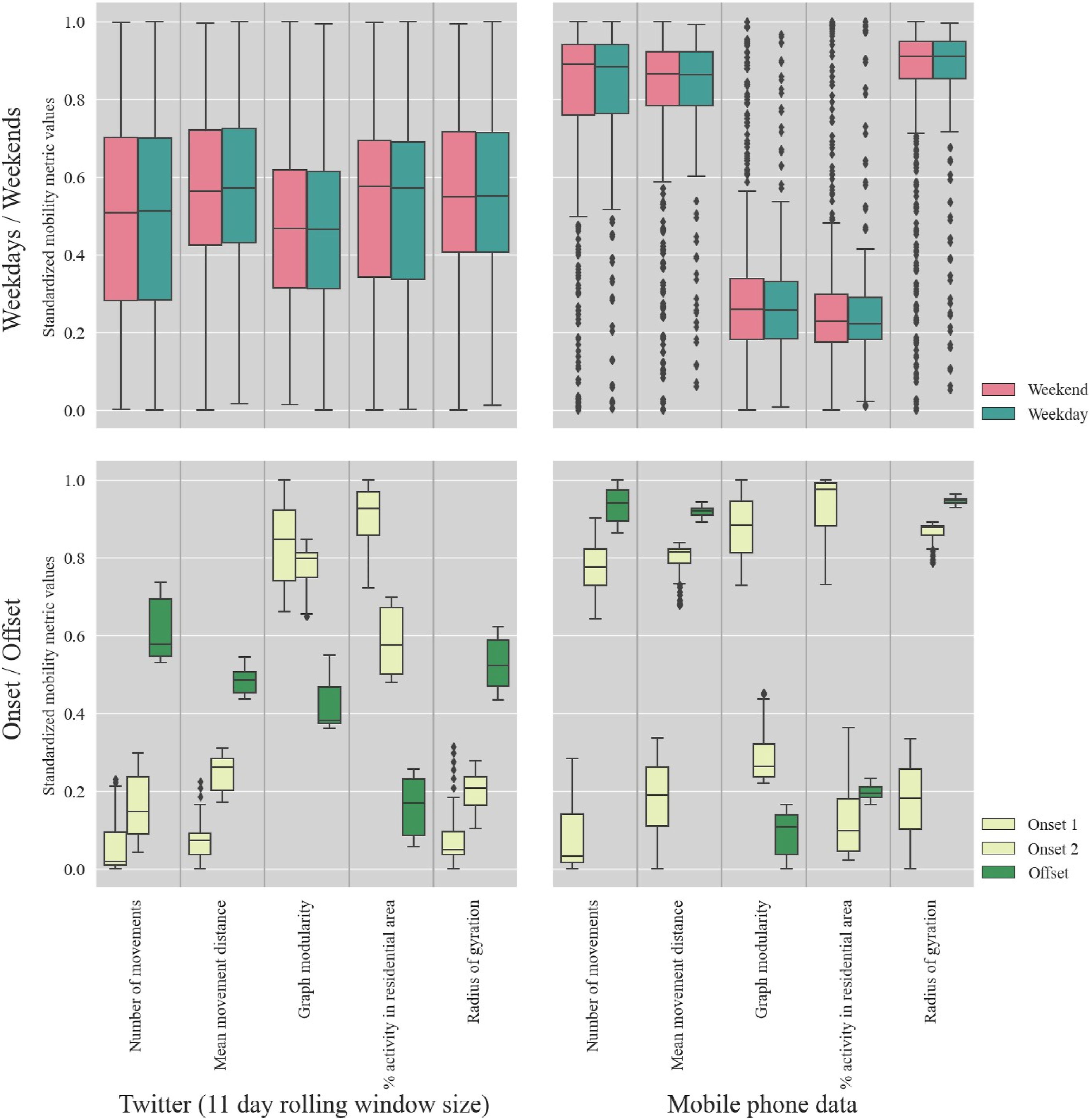
Limitations
We performed a sensitivity analysis of various window sizes for RWDS. Thereby, we employed a combination of different modeling techniques. This included a dynamic mobility trend analysis and a static mobility change detection. In addition, we considered a set of five distinct mobility metrics. However, our findings show certain limitations, primarily stemming from the choice of a 28-day moving average for trend calculation, a 60-day window synchrony time frame for analyzing dynamic alignment of trend signals, and the temporal selection of on- and offsets for static change detection analysis. Furthermore, our results may be subject to potential biases due to the uneven distribution of Twitter user groups within the overall population (Li et al., 2013; Malik et al., 2015). We did not account for the spatial distribution of inferential uncertainty in our analysis either, although districts with fewer geocoded tweets can be expected to exhibit a higher degree of uncertainty (Huang and Carley, 2019; Huang and Wong, 2015). This particularly affects the graph modularity metrics calculated based on daily OD matrices. The spatial distortion in the applied datasets is supported by the low correlation of non-zero OD matrix entries aggregated over the entire analysis period (cf. Figure 11). Additional results from spatial data exploration, which highlight these issues, are provided in the supplementary GitHub repository (Knoblauch and Groß, 2023). Comparison of temporally aggregated OD matrix entries from Twitter and mobile phone data without considering zero values. Here an OD matrix entry represents a movement between two distinct neighborhoods.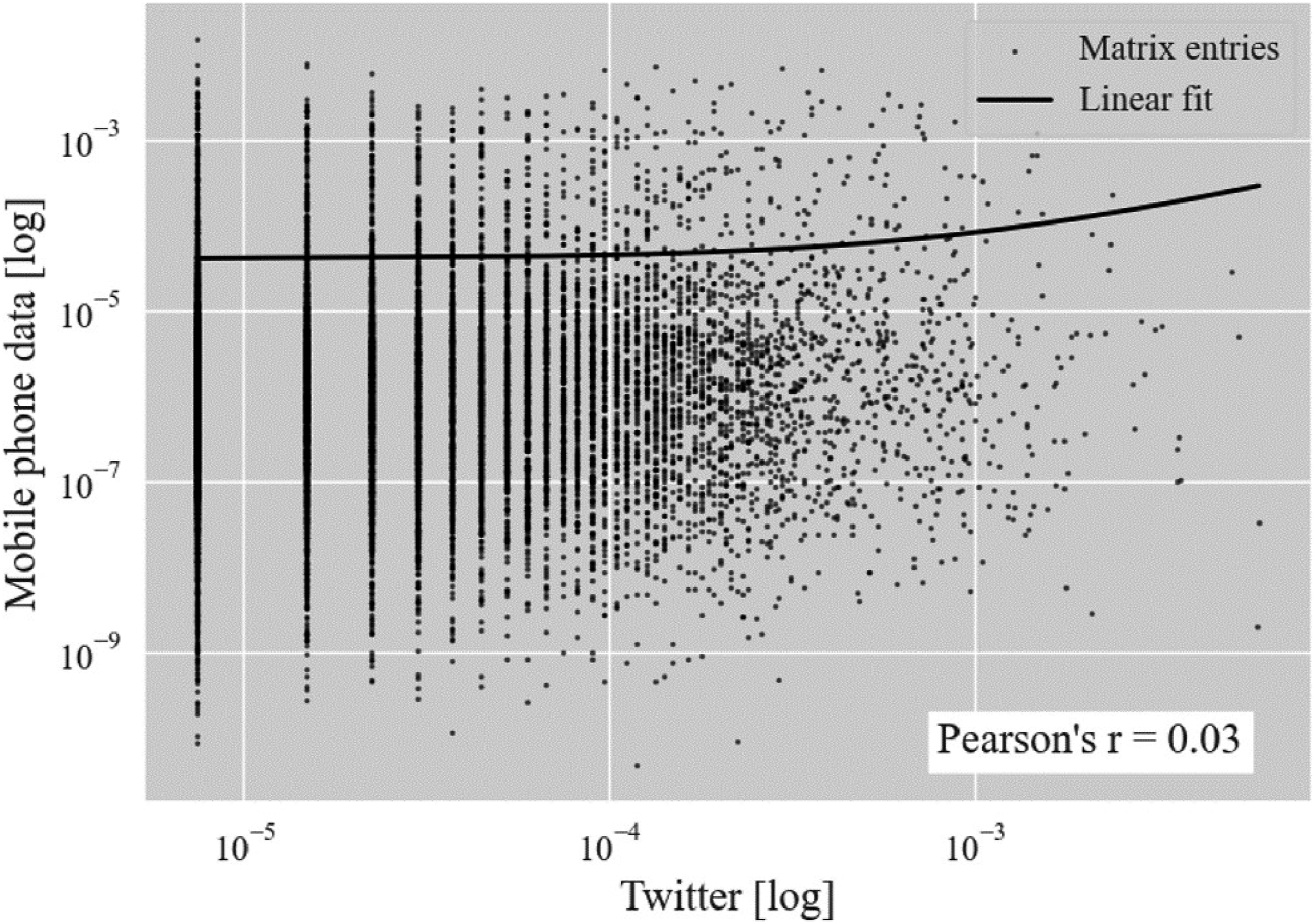
To address these limitations, several approaches might be applicable: Recent studies on semantic analysis (Hu et al., 2023; Serere et al., 2023) demonstrate promising results in deriving geolocalized information from tweet texts of non-geolocated tweets, which could enhance the Twitter dataset with supplemental geoinformation. Another approach involves utilizing the locations provided in user profiles as a further source of geoinformation. However, it should be noted that these techniques have limited applicability in the context of inner-urban mobility studies (Nguyen et al., 2022).
Another aspect of discussion in our long-term validation study pertains to the disparate spatial and temporal resolutions of the employed datasets. Additionally, the raw Twitter data utilized represents less than one percent of the total mobile phone records used in this validation study, leading to a substantial imbalance with potential implications on our validation outcomes (Zhao et al., 2021). Furthermore, certain assumptions were made during the pre-processing stage to facilitate the generation of our validation signal. These assumptions include the selection of lower and upper bounds for IET filtering and the assumption of a uniform distribution of cellular activity in space when converting antenna-based OD matrices into neighborhood-based mobility flows. Additionally, we assumed that the sequential activities of individual users directly represent movements, disregarding the possibility of detours which may introduce a bias in our results. However, we believe that the overall impact of these constraints is relatively minor. We anticipate that conducting supplementary sensitivity analyses on the model parameters would not alter the main findings of this novel long-term validation study, primarily because all parameters and steps were carefully chosen and justified, as described in Section “Materials and methods”.
Conclusion
Our findings demonstrate the effectiveness of employing rolling window downsampling as a viable strategy to address the limited availability of geolocated tweets in urban areas (cf. Figure 7). Our results indicate that Twitter has the potential to capture short-term changes in mobility at an inner-urban scale (cf. Figure 10), although long-term disparities were observed when compared to mobility metrics derived from mobile phone data in our case study (cf. Figure 9). To enhance the reliability of short-term inference from Twitter data on inner-urban human movement patterns, we propose a combination of multiple analysis techniques, including dynamic and static mobility change detection, simultaneous consideration of various human movement metrics, and sensitivity analysis for modeling parameters. Implementing these approaches can significantly mitigate the risk of false inference in diverse application domains where Twitter is commonly utilized as an open-source proxy for deriving human movement patterns.
Considering the increasingly stringent open-access limitations to Twitter data, this long-term study establishes a foundation for assessing the validity of also upcoming social media platforms. Voluntarily shared geo-social media data can be a powerful and promising tool, especially in locations where other mobility data sources are not openly-accessible or to costly to generate. Since the availability of data sources significantly impacts applications, future research should encompass not only data performance metrics for delineating mobility patterns but also sustainability in terms of long-lasting and openly accessible APIs. Another research option could involve the fusion of data from multiple sources such as Waze, GDELT, Facebook, Instagram, Reddit, Telegram, YouTube, or Weibo. The methods developed in this paper could then be transferred to other geo-social media platforms. Besides that developed methods and egnerated insights could always be applied with payment plans for API access offered by Twitter.
By conducting this study, our aim was not only to support researchers in effectively utilizing social media data for modeling human movement patterns but also to gain valuable insights into human mobility within the city of Rio de Janeiro, Brazil. These findings open up new avenues for future research on unexplained mobility-driven phenomena in urban science, such as the location of informal economy (López-García, 2023), accessibility impacts of transport policy (Pereira, 2019), and inner-urban transmission processes of mosquito-borne diseases (Ramadona et al., 2019).
Supplemental Material
Supplemental Material - Long-term validation of inner-urban mobility metrics derived from Twitter
Supplemental Material for Long-term validation of inner-urban mobility metrics derived from Twitter by Steffen Knoblauch, Simon Gross, Sven Lautenbach, Antonio A de A Rocha, Marta C González, Bernd Resch, Dorian Arifi, Thomas Jänisch, Ivonne Morales, Alexander Zipf in Environment and Planning B: Urban Analytics and City Science.
Footnotes
Declaration of conflicting interests
The author(s) declared no potential conflicts of interest with respect to the research, authorship, and/or publication of this article.
Funding
The authors disclosed receipt of the following financial support for the research, authorship, and/or publication of this article: This work was supported by the German Research Foundation (DFG) [grant number 451956976].
Data availability statement
All digitally shareable materials necessary to reproduce the reported methodology have been made available in a public, open-access repository (https://doi.org/10.5281/zenodo.8305678).
Supplemental Material
Supplemental material for this article is available online.
References
Supplementary Material
Please find the following supplemental material available below.
For Open Access articles published under a Creative Commons License, all supplemental material carries the same license as the article it is associated with.
For non-Open Access articles published, all supplemental material carries a non-exclusive license, and permission requests for re-use of supplemental material or any part of supplemental material shall be sent directly to the copyright owner as specified in the copyright notice associated with the article.