
Abstract
Origin–destination datasets representing millions of travel desire lines and routes are common in transport planning, but visualising such datasets is challenging. Existing methods often produce illegible results, low spatial resolution, or only a relative indication of the variation of flow on each road. This paper presents a new open-source algorithm called overline along with an accompanying method, to efficiently convert disparate geographical transport data into a policy-relevant summary form. Specifically, overline aggregates many individual routes into a route network map. These vector and raster maps provide total flow counts for each road and junction and are scalable to regional or national datasets. The method is demonstrated by visualising four million routes for a publicly accessible web mapping application, the Propensity to Cycle Tool, across the whole of England and Wales.
Introduction
The visualisation of movement data is useful in a wide range of transport applications. The human brain has evolved proficiency in processing large quantities of visual information to understand the world (Bova, 2002). This, combined with advances in data availability and computer graphics capabilities, has led data visualisation to become more than an optional extra in transport planning. Increasingly, visualisation is core to urban planning and the process of developing and implementing evidence-based policies and interventions (Appleton and Lovett, 2005; Pettit et al., 2013; Salter et al., 2009). Likewise, effective visualisation holds enormous potential for evidence-based transport planning.
It is therefore surprising that there is not more work in transport research which has focussed explicitly on visualisation, with a few notable exceptions. Wood et al. (2010) present a number of innovations in visualisation methods for large origin–destination (OD) matrices. The authors demonstrate the scalability benefits of ‘rasterisation’ at the desire-line level and amply illustrate these using OD data for commuting and migration patterns across the USA, a technique we build on, but at the road network level, in this paper. In another paper, Calvert et al. (2017) demonstrate, with the aid of many figures, new ways to demonstrate uncertainty in transport models at the level of individual road segments. However, such work is a small proportion of the total amount of transport research and has yet to percolate into the core of the discipline and transport planning.
The two aforementioned papers are instructive in their focus on two levels of data foundational to transport research. First, OD data are typically derived from large scale surveys and passive data collection devices such as mobile phones. Second, ‘flow’ level data are typically from GPS devices, routing algorithms, or screen-line counting devices on roads. Flow data are often sufficiently detailed to identify individual segments of a road, for example splitting a road at each junction into many road segments. Such movement data sources are central to quantitative transport research and modelling (Ortuzar and Willumsen, 2001). It is therefore crucial to be able to visualise the resulting datasets in ways that are easily comprehensible and emphasise the underlying reality that the data represent.
This paper presents a new method in the field of visualising transport data at both the OD and road segment level. The aim is to demonstrate the advantages of effective visualisation, not only for increasing the appeal and public understanding of transport data and modelling but also for directly informing the decision-making process. The research has been applied to a nationally scalable web application, and links to shifts in transport planning approaches in response to the ‘data revolution’. The applied nature of the work is reflected in its structure, which outlines the visualisation challenge created by large transport datasets (‘The visualisation challenge’ section), describes the data and methods (‘Data and methods’ section), presents the results of the work and how they advance the utility of transport data (‘Results and discussion’ section), and discusses the end product and the strengths and limitations of the approach (‘Conclusions’ section). In the closing section, we conclude with remarks on how the methods can be used to support more sustainable transport planning practice internationally and suggest directions for further research.
The visualisation challenge
In modern GIS software, it is easy to generate and plot many routes on a map. However, beyond a certain density of intersecting and overlapping lines, the results rapidly become incomprehensible. Among the multitude of overlapping routes in Figure 1(a), it is impossible to see where the largest number of traces, which would represent the greatest flow, occurs. Figure 1(b) illustrates this concept with a simple example, where the total number of travellers on the East–West routes exceeds the number on the only North–South route. Without the ability to aggregate flows, a transport planner may prioritise the single busiest route rather than identify where many smaller flows accumulate into major flows. Thus, visualising aggregate flows is not just aesthetically useful, but also enables additional insight to be extracted from flow datasets. Indeed, flow maps have been used in transport studies since the 1950s (Chicago Area Transportation Study, 1959).
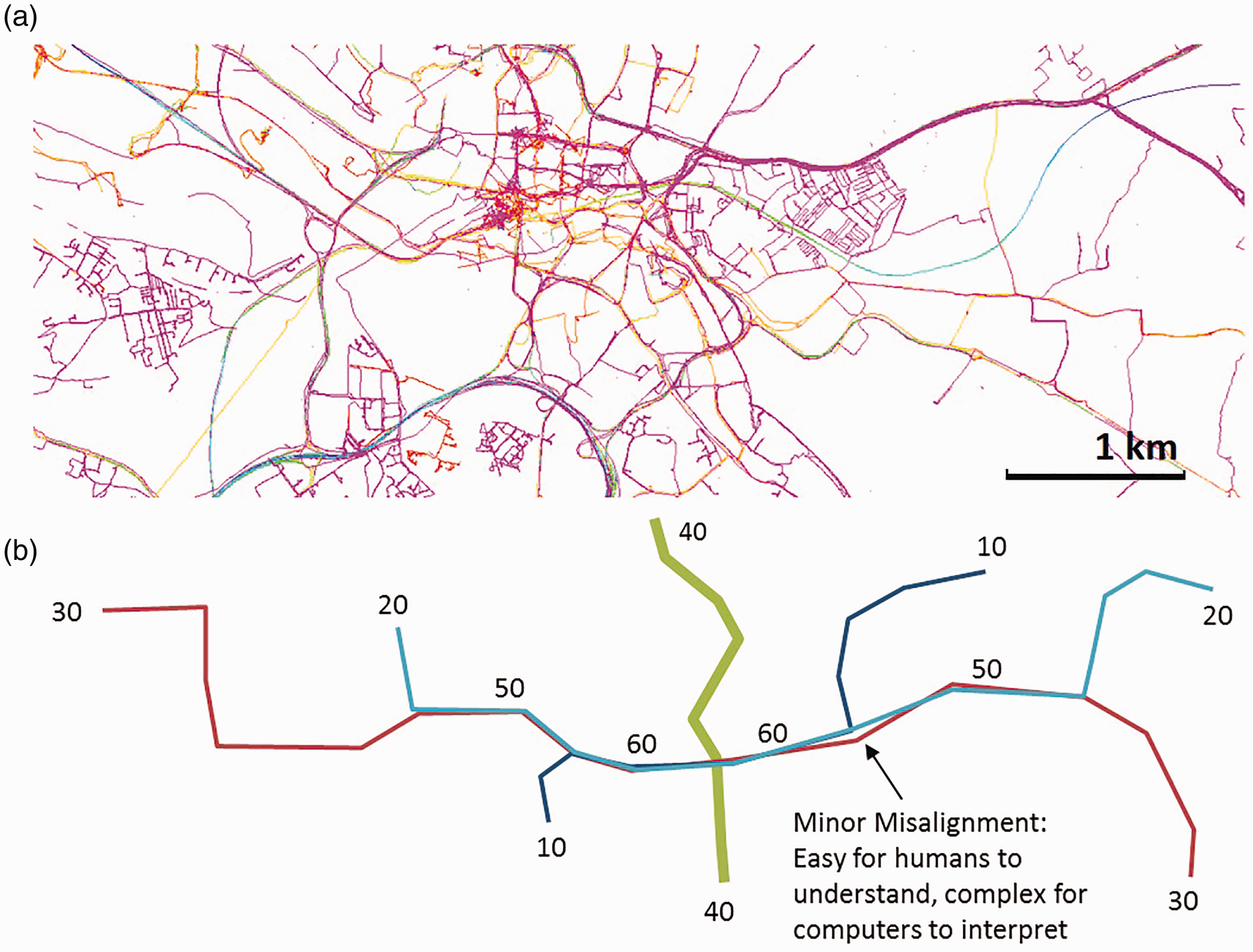
(a) Geographic route data for the city of Leeds, showing the complexity of the many overlapping lines and (b) schematic representation illustrating the effect of aggregation on total flow numbers.
While Figure 1(b) is a trivial example, calculating the aggregated flows for thousands of roads with tens of thousands of routes (Figure 1(a)) is complex, requiring a scalable and automated process.
This problem has been compounded by a shift in how route planning is being performed. Historically, a user wishing to perform mass routing would use local software to convert a GIS representation of the road network into an abstracted network graph. It is then possible during the process of finding the shortest paths between origins and destinations to count the number of times each edge of the graph is used. Then the graph is converted back to its geographical form and the aggregated flow maps emerge. This method remains the computationally most efficient method to produce aggregated flow maps. Yet the development and maintenance of route planners is complex and expensive especially if advanced features such as public transport timetables, multimodal travel, terrain, real-time traffic, and coverage of large geographical areas are required. Therefore, it is not unusual to use a third-party routing service either as locally installed software or remotely over the internet. These services often sacrifice direct access to the graph in favour of returning each route as linestring of latitude/longitude coordinates. This trade-off is sensible for many use-cases but creates a computation challenge for producing aggregated flow maps. This is because an edge in the graph representing a road segment between junctions is stored as a single ID number, while its geographical linestring partner might be hundreds of coordinate pairs. Thus, the task of identifying if two routes overlap goes from a simple search for shared IDs in two short lists of numbers, to a GIS task of performing thousands of spatial intersections.
Thus, there is value in methods that can aggregate routes in their linestring form when direct access to the graph is not possible. The challenge has been tackled by previous research, but never in a nationally scalable or easy-to-visualise way. Past solutions have included:
Simple sorting and filtering methods. Data complexity can be reduced by filtering out ‘less important’ values such as selecting the top 10 desire lines (straight lines between origin and destination) or only routes that pass through a specified area. These methods ignore aggregation effects, where many minor flows combine to exceed a singular major flow and become less effective as the size of the dataset or area of interest increases.
Overlaying semi-transparent lines to give darker lines in busier areas (Chen et al., 2015). This method is easy to achieve with GIS software and provides a visualisation of where flows are greater. However, as it is a purely visual effect, it cannot provide an exact account and is not machine-readable for further analysis.
Converting lines to a series of points and producing heat maps (Scheepens et al., 2016; Strava, 2014). This method is common with GPS traces where slight inaccuracies cause the traces to deviate from the road centreline. While this method provides a useful visualisation of high and low flow areas, and in a machine-readable format, it is only a relative figure rather than an exact count of flows. This method is also subject to bias if the point frequency is influenced by factors other than the flow. For example, different devices may record points at different rates, and a slow-moving vehicle would record more points per metre than a fast vehicle even if they recorded the same number of points per second.
Rasterisation of straight desire lines (Wood et al., 2010) and routes (Andrienko and Andrienko, 2010; Larsen et al., 2013). These methods produce results with a lower spatial resolution than the underlying data, for example Larsen et al. use a 300 metre grid. Thus, results are spread across multiple roads. If straight desire lines are used, then no account is made of the underlying geography of the road network, resulting in further inaccuracies such as high flow across a river where there is no bridge.
Edge bundling (Chen et al., 2015; Guo and Zhu, 2014; Thöny and Pajarola, 2015) is a family of techniques which groups together similar lines and aggregates their values. While visually effective with desire lines, it can allow routes to ‘jump’ to another nearby road or even create lines that do not correspond to the road network at all. Thus, it is best suited to large scale overviews where the exact detail of the road network is not relevant, such as migration flows.
While these methods do improve the visualisation and comprehension of OD data, none of the above methods can produce scale-independent counts of numbers of travellers which maintains fidelity with the underlying road network.
This paper outlines a reproducible and open-source method to create an ‘aggregated route network map’ capable of providing the total number of travellers on any road, from the accumulation of many smaller flows taking multiple routes. The method is both detailed enough to distinguish individual roads and junctions while being scale-independent, thus is comparable across regional or national datasets.
The results are presented as an isarithmic (lines of equal value) vector or raster map, where colour represents the number of travellers. The paper demonstrates how this method was applied to visualise four million cycling flows across the whole of England and Wales as part of the Propensity to Cycle Tool (PCT), before discussing the wider applicability and limitations of the method.
Example: PCT
To illustrate the applicability of the method, this paper will refer to a practical example of the PCT. The PCT (www.pct.bike) was developed to show where latent demand for cycling is greatest, to assist transport planning and prioritise where to build new cycle paths (Lovelace et al., 2017). The tool was developed in the R programming language (R Core Team, 2014), enabling the approach to handle, model, and visualise large geographical datasets using a web interface.
The PCT uses OD data from the 2011 Census to identify the commuter flows between Lower Super Output Areas (LSOAs). LSOAs were created by the Office for National Statistics for the publication of small area statistics and have approximately equal population, of 1000–3000 people (ONS, 2013). These census flow data contain around seven million OD pairs but as the focus of the PCT was on cycling, this was reduced to four million pairs. Plotted on a map without filtering resulted in a mess of potential flow that leads to most of the data being obscured (Bunch and Lloyd, 2006). Several of the visualisation methods outlined above were employed in the PCT and are demonstrated in Figure 2. The decision to use a web map allowed simple spatial filtering by zooming to the area of interest. Web maps allow more detail to be shown than static images while maintaining low barriers to entry in comparison to traditional GIS software.
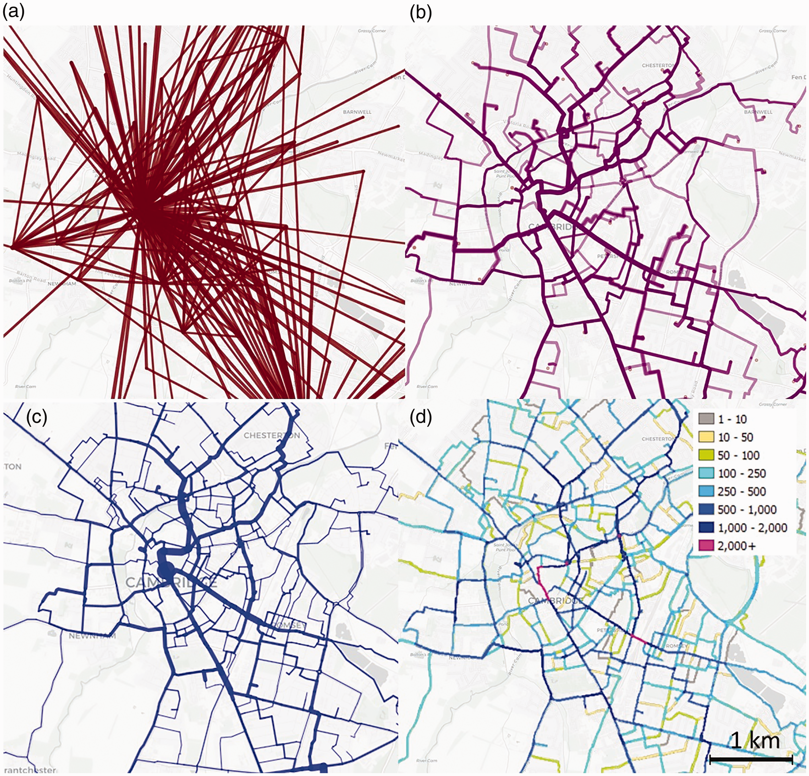
Examples of visualisation of OD data in the PCT and methods of representing number of cyclists: (a) desire lines with thickness proportional to flow, (b) routes with line thickness proportional to flow and using transparency to highlight overlapping routes, (c) aggregated routes into a vector route network, and (d) raster route network with colours representing flow. Base map and data from OpenStreetMap and OpenStreetMap Foundation.
Figure 2(a) shows simple desire lines filtered with an interactive slider. However, the resulting image bears no relation to the road network and is difficult to interpret in terms of where to intervene on the road network. To overcome this problem, the PCT visualised the routes between the OD pairs in the style of Chen et al. (Figure 2(b)). Again, filtering was used to aid comprehension, but this results in information being hidden. The final two figures show the results for the new method presented in this paper. Figure 2(c) shows a vector representation where the flow count is used to determine the width of the line, while Figure 2(d) shows a rasterisation of the results using colour to represent flow counts.
Data and methods
There are two main approaches to travel flow aggregation, using vector and raster data. These approaches are illustrated in Figure 2(c) and (d), which show the vector and raster approaches applied to the PCT in the city of Cambridge, UK (see http://www.pct.bike/m/?r=cambridgeshire and click on the Cycling Flows menu to select ‘clickable’ and ‘image’ layer options to see this in an interactive map). The vector approach required a new method to be developed, as outlined in the ‘Vector aggregation’ section. The rasterisation of vector data is well understood and can be done in R using the raster package (Hijmans et al., 2016) but tends to be slow (Lovelace and Ellison, 2019), leading to the use of GDAL, as described in the ‘Rasterisation’ section.
Vector aggregation
The first stage of the process was to create a vector route network from the individual routes. The code to perform this has been added to the stplanr R package (Lovelace and Ellison, 2019) as the overline function. A brief overview of the function is provided here and documentation, with links to the source code, can be found at https://docs.ropensci.org/stplanr/reference/overline.html. The function takes a geographic object containing linestrings and attributes and returns a geographic object. The result removes geographic overlap in the lines: segments of overlap in the input linestrings are converted into single features, with values being the sum of values in the overlapping lines.
Figure 3 illustrates the concept of vector flow aggregation: each of the five routes has a flow value, for illustrative purposes, these are 1, 2, 3, 4, and 5. In the top row of Figure 3, progressively more routes are added, from 2 to 3 and finally 5, in columns one, two, and three, respectively. The bottom row of Figure 3 shows the result of the overline function, where the sums of the flows have been calculated for each part of the road network. While this is a trivial example, it clearly illustrates that aggregated flows can quickly exceed the largest single flows by a substantial amount.
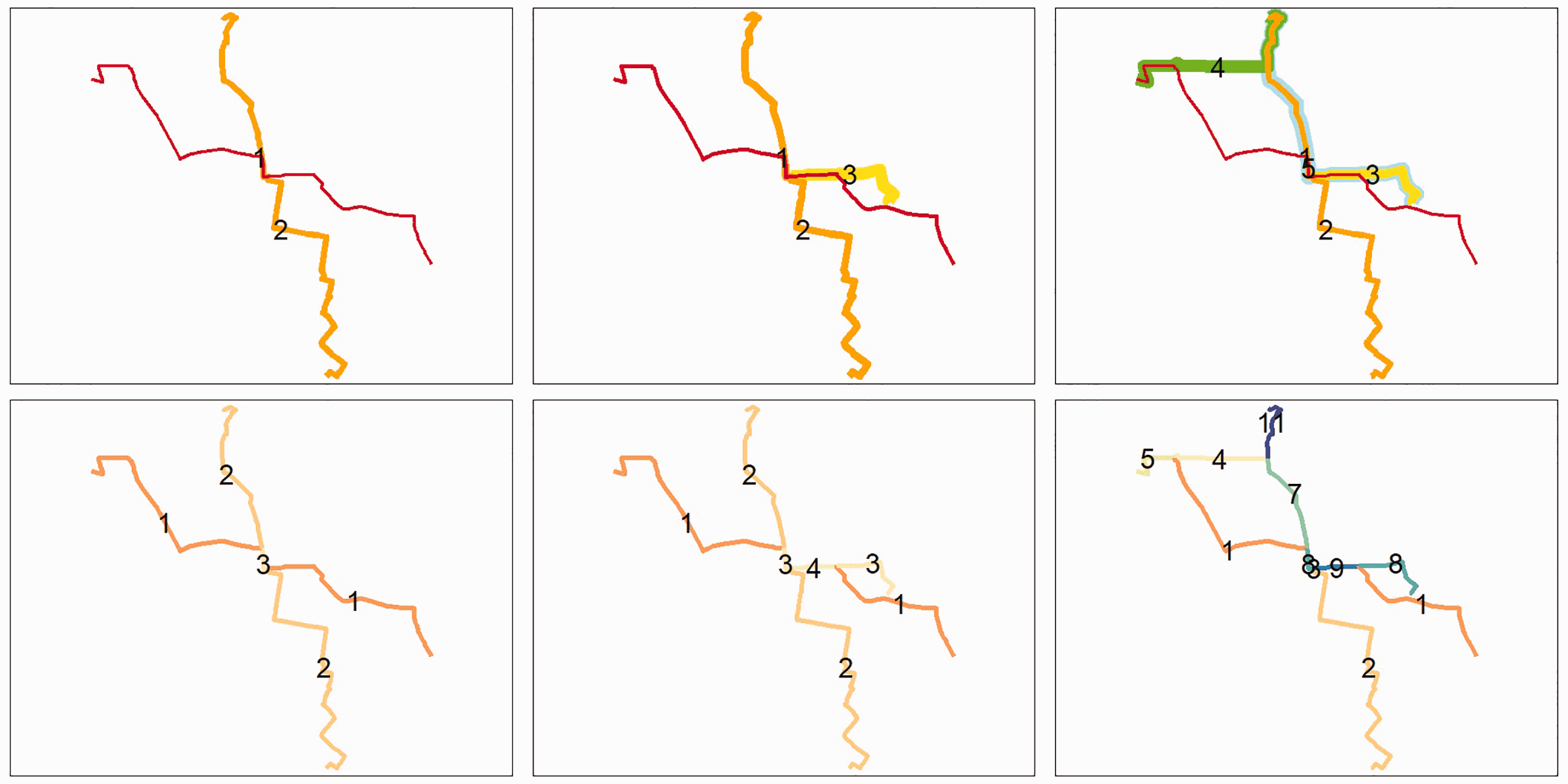
Examples of combining routes (top) into route networks (bottom). Examples of 2, 3, and 5 routes are shown.
The function takes as its first input an ‘sf data frame’ in which each route is represented by a linestring with attributes. This is the format used by the sf R package (Pebesma, 2018) which supports importing and exporting to a wide range of other common formats. A second input specifies which attributes should be aggregated by the function. The function starts by breaking all linestrings into straight segments which can easily be stored as a four-column matrix (x1, y1, x2, y2). The segments are then sorted such that the endpoint is up and to the right of the start point. This is done to identify A to B segments and B to A segments, which for this purpose should be considered identical. A simple check for duplicated rows within the matrix produces a matrix of unique segments. Attribute data are aggregated for each segment and touching segments with identical attribute data are recombined into linestrings. Finally, the results are returned to the user in the same ‘sf data frame’ format that was used for the input. For large datasets, an additional stage is included of breaking the dataset into regions, which was found to improve overall performance on the largest datasets, especially when covering a large area such as a country where most routes are not close to the vast majority of other routes.
The function has been optimised to maximise processing speed on large datasets. In particular, the use of matrices and duplication-checking rather than traditional GIS methods of spatial interaction provides significant performance improvements – some parts of the function support multithreading where it was found to be beneficial. Typical processing speed is around 300 routes per second on a modern desktop computer using a single thread. However, it should be noted that as the function is written in R, further performance gains could be expected by rewriting the function in another language such as C.
The resulting dataset is significantly smaller than the input dataset as it has removed a large amount of duplication. The exact amount of deduplication is dependent on how much the routes overlap. The results contain a mixture of roads and parts of roads, where a new linestring is begun each time the aggregated attribute values change. In practice, this usually means that linestrings extend from junction to junction, as these are the places where routes merge or split.
Limitations
The overline method contains several limitations that are worth discussing. First, it is memory intensive. This is due to the duplication of coordinates inherent in the method. Straight segments require a start and end coordinate. Thus, all the coordinates in each linestring are duplicated during the splitting process. Second, the method is most effective when using routed data rather than GPS traces which are more likely to have a minor deviation from the road. In these cases, snapping the GPS traces to a grid or road map may improve results. The final limitation is related to the second limitation. If routes do not terminate at the end of a segment, it is possible for the method to return two colinear lines of different lengths with different attribute values. As these errors are by their nature very short, they have a minimal effect on the overall result. However, if complete fidelity were essential, it would be necessary to search for and correct these minor errors.
Rasterisation
Rasterisation provides advantages and disadvantages in comparison to the vector aggregation method. First, for web map tools, making and publishing raster tiles is a simple and well-established method, for delivering large datasets in small chunks. In this case, a national map with road segment level detail can easily be zoomed and panned with the web browsers of a laptop or mobile device. Conversely, the national vector file is too large to be viewed in a browser, thus requiring either dedicated GIS software or for the file to be broken in parts. While vector tiles do make this possible, it is technically more difficult to set up than raster tiles. Second, the rasterisation addresses the previously raised issues of different length colinear segments, as rasters can be made to be the sum of all overlapping geometries. Third, by optionally decreasing the resolution of the raster, nearby values such as along parallel roads can be aggregated. From a transport planning perspective, it may be more important to focus on transport corridors rather than individual segments, and this can be tuned by altering the rasterisation resolution. Conversely, the downsides of rasterisation are the loss of interactivity and the significantly increased file size of the overall dataset.
To achieve the objective of an image with pixel values representing travel on the route network, two main strategies can be employed: ‘burning’ routes or using the route network. The value of each line can be ‘burned’ into the pixels of the raster that intersect with the lines; in the case of multiple lines intersecting the same pixel, the values are summed. However, the conversion of lines into pixels is not straightforward: even with ‘all touched’ option in GDAL’s ‘rasterise’ function set to TRUE, lines are only a single pixel wide in some places, making the results unattractive and the lines difficult to see at low zoom levels.
Using the vector route network data, created in the previous section, overcomes this problem. By increasing the output resolution of the raster in relation to the buffer size of the lines, it is possible to create lines that are multiple pixels wide and hence aesthetically more pleasing. A 10 metre buffer on each side of the line and a 10 metre pixel size ensured an average of 2 pixels width per road. Each of these pixels should have the same value, representing the total number of cyclists on the road, not the proportion that travels through that fraction of the width of the road. ‘FLAT’ was passed to the endCapStyle arguments of the sf function st_buffer() to prevent double-counting where route segments meet.
Further adjustment of the buffer size and rasterisation resolution can optimise the results for specific applications. One possible improvement would be to reduce the buffer and increase the resolution to provide different values on each side of the road, although this would increase the computational requirements of the process.
Tiling
The workflow outlined above resulted in a single large GeoTIFF for the whole of England and Wales with numbers of cyclists as pixel values. This file was suitable for use in desktop GIS software, but not in the PCT online. Therefore, it was necessary to convert pixel values, representing flow on the route network, into a series of tiles to be served online and consumed by the web mapping client-side library Leaflet. An additional challenge was to select an appropriate colour scheme. Both steps were performed using the gdal2tiles function, which produces a series of folders containing coloured PNG images (GDAL Development Team, 2016).
Gdal2tiles produced appropriate tiles for all zoom levels. However, when viewing the dataset at a regional or national level, the colours blend to a uniform grey, making it unclear where the highest level of cycling uptake was at the national level. A simple visual fix is to create an aggregated version of the raster at a lower resolution using the maximum value for each pixel to ensure the colours are still visible even at low zoom levels, then running gdal2tiles script on these lower resolution rasters. Each zoom level exists in a separate sub-folder on the tile server, making it easy to switch seamlessly between each version, by placing the tiles derived from the lower resolution national raster into the appropriate sub-folders. National rasters with 100, 50 metres, and the base 10 metre resolution were used as the input file for zoom levels of 5–8, 9–10, and 10–15, respectively. The difference is illustrated in Figure 4.
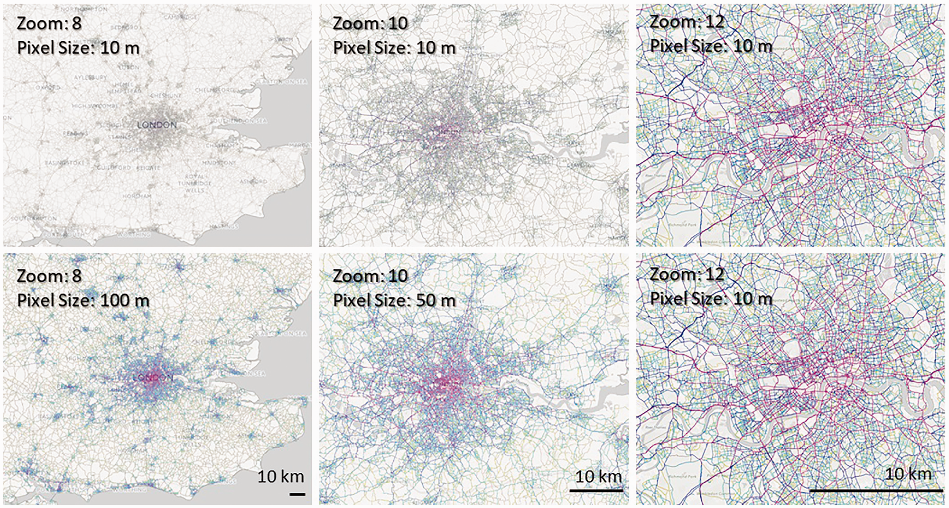
Single resolution tiling (top) and aggregated variable resolutions tiling (bottom) for different zoom levels. Base map and data from OpenStreetMap and OpenStreetMap Foundation.
Results and discussion
A sample of the final raster for central London is shown in Figure 5. The switch from visualising a number of cyclists with line widths to colours is immediately obvious and enhances the ease with which the most important potential arterial cycling routes can be identified, thus be prioritised for investment. By drawing attention to the pink routes, which have very high flow, and away from the marginal grey and yellow routes, the method helps to reduce the cognitive overload associated with a complex map (Bunch and Lloyd, 2006).
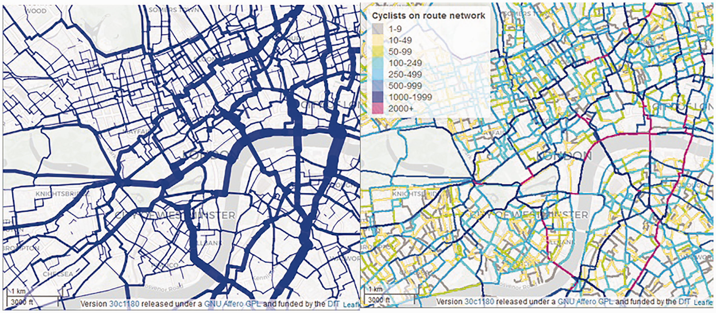
Final vector route network (left) with line width representing numbers of cyclists and raster route network (right) with colour representing the number of cyclists for central London. Base map and data from OpenStreetMap and OpenStreetMap Foundation.
Figure 5 also shows the high level of detail achieved by this method. Unlike many previous methods, a clear hierarchy of roads is apparent, and both the relative and absolute importance of each road and road segment can be clearly understood.
The benefits of aggregation are also apparent in Figure 5. A typical OD pair in central London would only have around 10 cyclists, yet at a key location such as bridges these small flows combine into several thousand cyclists. These values highlight that such routes may be insignificant individually but highly significant collectively.
Conclusions
This paper has presented an innovative approach for visualising large and geographically detailed transport data as an aggregated route network. The vector method is available as open-source code within the stplanr package, and the method for creating raster tiles is outlined in this paper. Regardless of the precise implementation, we have shown that route network maps add value to the data, by converting it into a form that is highly policy-relevant: a national raster map, which is visually appealing and informative at multiple zoom levels, to improve a national planning support system (Lovelace et al., 2017).
The method has been demonstrated using routing OD data for cycling. However, it would be equally applicable to other data sources, such as GPS or mobile phone data, or other modes of travel. This suggests that a promising future research direction could be to extend the method so it could also aggregate ‘messy’ route data in which the coordinates of overlapping segments do not match-up. Whether this would be best done through coordinate snapping (reducing the precision of coordinate values) or by the pre-processing of routes through a ‘map matching’ algorithm or service (Millard-Ball et al., 2019; Pereira et al., 2009) is an open question.
However, the present implementation is sufficient to process data to represent travel across a country in a reproducible workflow without requiring high-performance computing (large desktops with 128 GB RAM were sufficient) or expensive software, so perhaps a more interesting question is ‘how else can the method be used’. Future research using the method could include the estimation of multiple route networks used by different people to identify road safety interventions for the most vulnerable road users, such as the young or elderly. Furthermore, a ‘car traffic’ route network generated using the methods could help simulate and prioritise policies to tackle wider transport issues such as air pollution and congestion. A wealth of other questions could be tackled.
To summarise, the method presented in this paper provides a scalable answer to the question of ‘how to convert disparate geographical transport data into a policy-relevant summary form’. It has been deployed in a nationally scalable web application that is being used by local authorities to plan investment in cycleways for commuting and school transport (Goodman et al., 2019), demonstrating its utility. The research suggests future directions of technical and policy-facing work. A notable feature of the method is that it is open and reproducible, raising wider questions about how transport models should work (could all components of transport models be open-sourced?) and who can see the results. We hope that the method and future developments that build on it support the ‘democratisation’ of transport planning.
Footnotes
Acknowledgements
The authors would like to thank Nikolai Berkoff, Dr Anna Goodman, and Dr Petar Pirgov for their assistance in producing this paper.
Declaration of conflicting interests
The author(s) declared no potential conflicts of interest with respect to the research, authorship, and/or publication of this article.
Funding
The author(s) disclosed receipt of the following financial support for the research, authorship, and/or publication of this article: The authors would like to thank the Department for Transport (DfT) for funding the PCT (Grant: RM5019SO7766) and the Cycling Infrastructure Prioritisation Toolkit (CyIPT).
![]() ).
).
![]() ), and author of popular open source software packages (such as stplanr) and books (such as Geocomputation with R). He can be found on Twitter @robinlovelace.
), and author of popular open source software packages (such as stplanr) and books (such as Geocomputation with R). He can be found on Twitter @robinlovelace.