
Abstract
Planning for cycling is often made difficult by the lack of detailed information about when and where cycling takes place. Many have seen the arrival of new forms of data such as crowdsourced data as a potential saviour. One of the key challenges posed by these data forms is understanding how representative they are of the population. To address this challenge, a limited number of studies have compared crowdsourced cycling data to ground truth counts. In general, they have found a high correlation over the long run but with limited geographic coverage, and with counters placed on routes already known to be popular with cyclists. Little is known about the relationship between cyclists present in crowdsourced data and cyclists in manual counts over shorter periods of time and on non-arterial routes. We fill this gap by comparing multi-year crowdsourced data to manual cyclist counts from a cordon count in Scotland’s largest city, Glasgow. Using regression techniques, we estimate models that can be used to adjust the crowdsourced data to predict total cycling volumes. We find that the order of magnitude can be predicted but that the predictions lack the precision that may be required for some applications.
Keywords
Introduction
The increasing importance of achieving sustainable urban transport means that planners and policy makers need reliable information on modes of travel such as cycling. However, there has been a lack of detailed information about cyclists’ travel patterns. Data have traditionally come either in the form of counts or from surveys. Counts tend to be spatially and/or temporally sparse, and taken on popular routes, e.g. on cycling infrastructure. Malfunctioning counters can also lead to gaps in the data. Household surveys need to sample a large proportion of the population to capture even a small number of cyclists. Intercept surveys can capture more cyclists, but there are limits to the sorts of questions that can be asked. For example, people may be able to give an origin and destination for a trip but not a detailed account of the route they took. This can pose significant challenges when it comes to evaluating infrastructure, which requires detailed spatial and temporal data.
Increasingly, researchers and planners look to fill these gaps with crowdsourced data. Such data are already collected by activity-tracking smartphone apps such as Strava, which allows users to log their journeys using GPS. While crowdsourced mobility data and volunteered geographic information offer new opportunities for researchers to understand travel patterns, how these data can be used appropriately has not been fully explored. Despite this, such data have been used to study areas such as routing and navigation (Hendawi et al., 2013; Keler and Mazimpaka, 2016; Prandi et al., 2014), disaster management, wheelchair routing and health (Griffin and Jiao, 2015). Importantly, for our purposes, the data have also been used to understand cycling (Boss et al., 2018; Hong et al., 2019; McArthur and Hong, 2019; Sun et al., 2017).
This paper reports on research that increases our understanding of the limitations of these data and extends the analysis to account for changes over time and the ability to predict out-of-sample cycling numbers.
Background
Generalising from Strava
There are different extents to which the data may be generalisable in the strictest sense. For example, we may require the volunteers’ journeys to follow the same spatial and temporal distribution as cycling journeys generally. More loosely, does the sample of cyclists make similar use of the cycling network and respond to investments in cycling infrastructure in the same way as cyclists in general? We can still make use of these data even if unrepresentative, provided they have a consistent relationship with that of all users. In this case, calibration weights can be used to correct for known biases, in much the same way that household surveys use weights to adjust sample characteristics to known population characteristics.
The first question is whether the sample of people volunteering their information is representative of the population to which they belong. We suggest it is more pertinent to ask whether the journeys made by cyclists using the Strava app can be considered representative of cycling journeys in general. Aside from anecdotal reports that Strava is mostly used by competitive cyclists, there are good reasons to doubt the representativeness of Strava users. For example, men seem to be heavily overrepresented among Strava users (Boss et al., 2018; McArthur and Hong, 2019; Watkins et al., 2016). However, differences in the demographic composition of the sample compared to the population will not necessarily result in different spatial patterns of cycling.
Regarding spatio-temporal patterns of cycling, there is evidence of differences in behaviour. For example, we know that cyclists tend to avoid steep inclines, while Strava users seek out hills (Griffin and Jiao, 2015). This difference suggests that Strava cyclists choose different routes to other cyclists. Such differences may not manifest in every case, e.g. in a relatively flat city. Behaviour may also vary by trip purpose. For instance, Strava cyclists may be more like other cyclists when it comes to commuting. Seasonality and weather (Miranda-Moreno and Nosal, 2011) may also have differing effects on each group of cyclists. For certain research questions, Strava may give a good enough indication of cycling volume. A recent paper has explored Strava cyclists’ behaviour in relation to the road network using space syntax methods. While this approach does not tell us how this relates to the behaviour of cyclists in general, it might begin to give us data that we need to understand how Strava cyclists differ from cyclists in general (Orellana and Guerrero, 2019).
One defence is that while the sample may not be representative, it is larger than would otherwise be available. For example, Griffin and Jiao (2015) note that the following GPS studies have used relatively small samples: Broach et al. (2012) with 164 cyclists; Hudson et al. (2012) with 317 cyclists; Casello and Usyukov (2014) with over 400 cyclists; Hood et al. (2011) with 952 cyclists; and Menghini et al. (2010) with 2435 person weeks. Despite the larger sample sizes, Sullivan and Sentoff (2017) found that only 0.8% of non-motorised traffic in Vermont was represented by Strava users.
Previous studies on the generalisability of Strava data
To explore whether Strava cyclists give a good indication of where cyclists are cycling, several studies have compared flows recorded by Strava with ground-truth measures in the form of cycle counts. Results have been mixed. Perkins and Blake (2016) compared counts from 28 automatic counters located on the cycle network to counts derived from Strava in Perth, Australia. They noted a strong alignment between the counts, although believed that that Strava users were more likely to be recreational cyclists. A lack of detail on their methodology makes it hard to compare their results to other work.
The Colorado Department of Transportation (2018) compared data from 16 cycle counters to Strava using linear regression. The counters were mostly located on major shared-use trails and pavements. Counts were recorded hourly over the course of 2017. They analysed the locations separately and at different temporal aggregations. They achieved R2 values ranging from 0.815 to 0.997, indicating a strong linear association. It is unsurprising that such high correlations were achieved given that cycling follows strong trends by time of day and/or season. The authors do not analyse how well Strava counts predict variation between count locations.
Boss et al. (2018) utilised count data from 11 automatic counters on weekdays in May 2015 and May 2016. Counts were reported in 15-minute intervals between 06:00 and 20:00. They found correlations with Strava counts ranging from 0.76 to 0.96. These correlations refer to intra-site correlations over time and not across different locations.
Haworth (2016) used London Cycle Census data, a single-day survey of cycle trips in London taken at 164 locations over a four-week period in April/May 2013. They used linear regression models to predict cycle counts using Strava counts as their main independent variable and achieved an R2 value of 0.62 in a bivariate model. They considered variation between locations and over time in their regression models. Note that this seemed to result in lower R2 values than studies looking only at one count location over time. Adding variables describing the time and road type improved this to 0.67.
CDM Research (2018) looked at whether Strava can be used to rank how busy 27 different locations in Brisbane, Australia are, and found substantial differences compared to sensor data. They concluded that Strava cannot reliably be used to identify busy and quiet sites. As with previous studies, they found that Strava data were good at predicting temporal patterns.
Jestico et al. (2016) compared Strava counts to manual counts from 18 locations in Victoria, Canada, on 34 days in 2013. The count data were aggregated into hourly, AM/PM peaks and total peak time. In regressions, values of R2 ranged from 0.40 to 0.58, with higher levels of temporal aggregation giving more explanatory power. The paper reports a predictive accuracy of 62% and argues that this provides a level of accuracy that allows prediction of types of cyclists but also allows the mapping of spatial variation. They argue that their results ‘suggest that crowdsourced data may be a good proxy for estimating daily, categorical cycling volumes’ (Jestico et al., 2016: 94). Rather than using counts for predictions, the authors used three broad categories, limiting the possible applications of the predictions. While the model allows for examination and prediction of broad cycling patterns, it is unlikely to facilitate research into, for example, the impact of structural change in the network.
Conrow et al. (2018) examined spatial patterns of Strava and manual counts in Sydney, Australia. Counts took place on one day at 122 locations between 7:00 a.m. and 9:00 a.m. Locations were key intersections or on bicycle infrastructure. Strava counts from the whole of March were used to avoid data scarcity. They found a correlation of 0.79 between Strava and manual counts. Using differences in ranks and spatial clustering, they identified locations where there was low or high correspondence between the Strava counts and the manual counts, and the factors associated with these different locations. The factors that were associated with similarity were lower population density, commuting journeys and residential land use, while dissimilarity was associated with poorer cycling infrastructure and deprivation.
Weaknesses of previous approaches
There are some weaknesses in the analysis of Strava to date. First, counters tend to be on popular cycling routes but less is known about the correspondence between Strava counts and total counts in wider city networks. Another factor in previous comparisons is that many studies calculate correlations over time at specific locations. This seems to highlight Strava data’s ability to detect the strong temporal/seasonal patterns that are known to exist for cycle trips, but it says little about the ability to explain spatial variation in cycling using this data source.
Weaknesses in the data have also placed limitations on previous works. For example, much of the literature uses one year. This does not tell us how the correlation changes over time. Such information is important given that the popularity of apps changes over time and the number and types of cyclists using apps such as Strava may also change. A lack of data has also meant that most studies report goodness-of-fit measures for their models but fail to consider the potentially more relevant issue of model performance for out-of-sample prediction. Given that many academics and researchers are already using Strava data as a proxy for total cycling, it is important that we have a better understanding of the limitations of Strava.
McArthur and Hong (2019) note that much of the analysis of Strava data has been conducted by examining heat-maps of cycling activity. The paper suggests that this approach fails to account for demand, and it suggests a way of extracting such an estimate from the data itself. It shows how the method can be used to detect popular and unpopular routes, and what factors might influence cycling route choices. Hong et al. (2019) consider how Strava data can be put into an econometric framework to evaluate the effect of new infrastructure on cycling volumes. How to robustly estimate these effects is the paper’s main focus. While the paper uses Strava data, it mostly utilises the Strava trip counts at a small geographical level (output area) to measure cycling activity rather than the link counts used in our present study. Hong et al. (2019) do not consider what other factors might influence the strength of the relationship between counts of Strava cyclists and total counts. Our study considers how geography (used as a proxy for sociodemographic characteristics) and time period might influence the strength of the correlation. In addition, this study considers the issue of out-of-sample prediction. This is an important issue since part of the motivation for looking at the relationship between crowdsourced data and ground truth is to understand how to adjust crowdsourced data to increase its representativeness. This submission offers guidance on how this might be done.
Approach and research questions
In this paper, we contribute to the understanding of the relationship between trips logged on Strava and the total number of cycle-trips in a number of unique and important ways. First, we compare the number of cyclists entering and leaving a city centre at virtually all the possible entry points, providing a more comprehensive understanding of the relationship between Strava counts and manual cycling counts across a network, rather than at only popular points into a city. Secondly, we examine the relationship between Strava counts and manual counts from a cross-sectional perspective, to understand how Strava can appropriately be used to predict cycling numbers. Thirdly, for what we believe to be the first time, we include not only the count of the number of Strava cyclists to help predict flows of cyclists, but also the number of runners/pedestrians. We adopt this approach as an alternative way to deal with the data scarcity problem highlighted by Conrow et al. (2018). Fourthly, we attempt to correct for biases in the Strava data by using models of the relationship with cordon-count data to re-weight the Strava data. We test how successful the model is through an out-of-sample prediction.
We focus on two key research questions: RQ1: Do Strava users have similar patterns of use of the cycling network as cyclists in general across a comprehensive selection of city entry and exit points? RQ2: Can we use Strava data to predict cyclist numbers in subsequent years and how well do these models perform in making out-of-sample predictions?
Data and methods
We use Glasgow, Scotland, as our case study using data on cycle-flows from Strava and match them to manual count data covering 2013 to 2016. The first three years are used to estimate regression models which are used to predict 2016 to test performance.
Study city
Glasgow is a post-industrial city with a population just under 600,000, making it the largest city in Scotland. The city is one of the most deprived in the UK, containing 30% of the most deprived neighbourhoods (worst 15%) in Scotland. Only 1.4% of people made their journey to work or study by bicycle (2011 Census). This is comparable with other Scottish cities such as Aberdeen (1.69%) and Dundee (1.12%). However, it is behind the capital, Edinburgh, where 3.85% make the journey by bicycle. Glasgow City Council has ambitious plans “to create a vibrant Cycling City where cycling is accessible, safe and attractive to all” (Glasgow, 2015: 14). It has invested heavily in new cycling infrastructure, introducing three segregated cycle lanes: the South-City-Way, the West-City-Way and the South-West-City Way. It has committed to a large investment in cycling infrastructure in the centre, building 17 ‘avenues’ on existing streets (Glasgow City Council, 2019).
Manual cycle count data
One advantage of Glasgow is the layout of the city centre permits a cordon count that captures almost all pedestrian and bicycle traffic in and out of the centre. This contrasts with many bicycle counts, which take place at strategic points in the network. The setup in Glasgow means that counts happen on different links, i.e. some busy, some quiet. The cordon count has been carried out since 2007 on two consecutive days in September. The count is made at 38 points around the city centre from 6:00 a.m. to 8:00 p.m. (see online Supplemental material Figure 1(a)) and captures all the significant routes into and out of the city. The average number of cyclists per day per site from 2013 to 2015 was 216, with a median of 116. The corresponding Strava counts are 10 and 3, respectively.
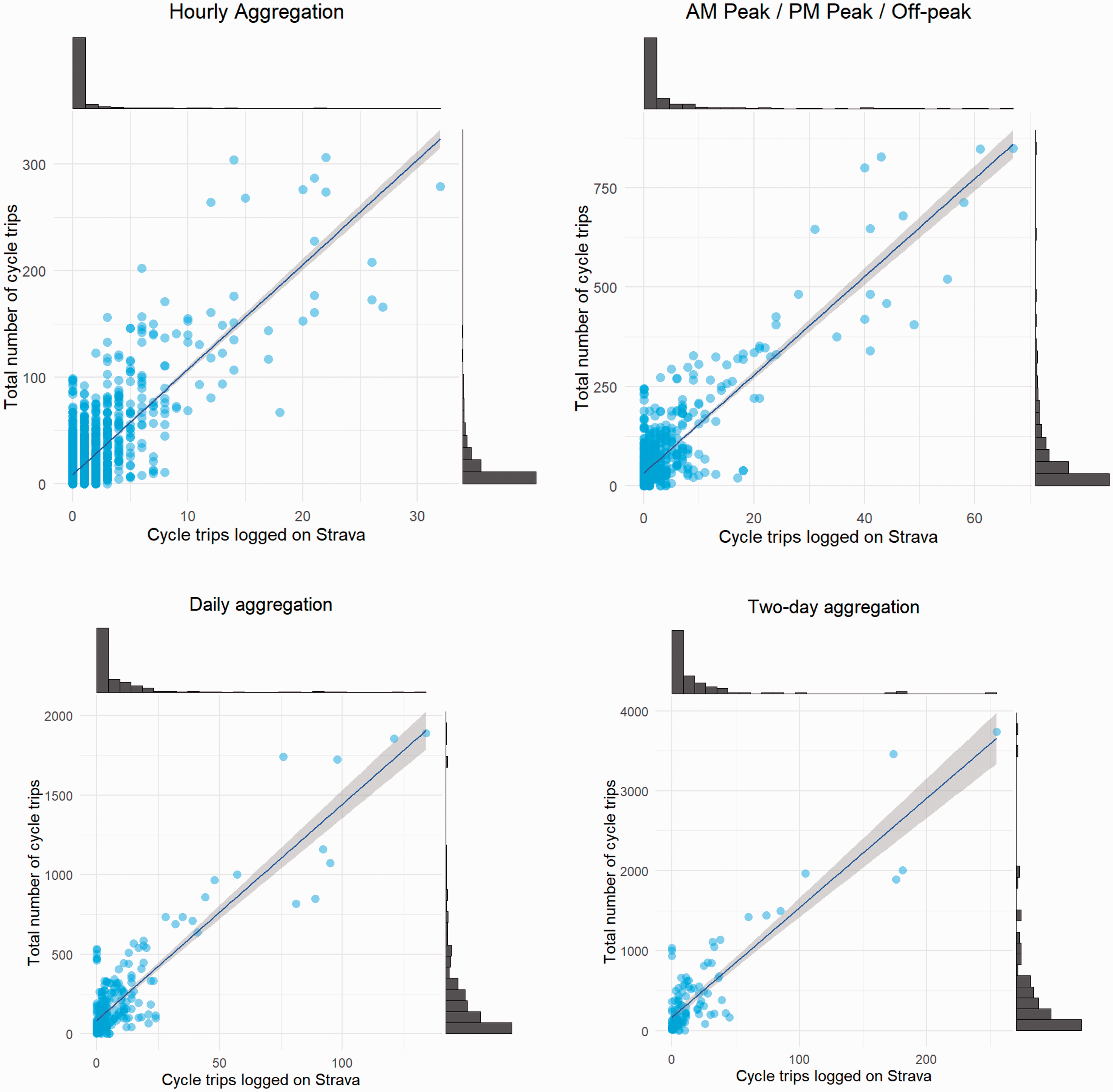
Relationship between cycle trips logged with Strava and the ground truth (cordon count).
Strava Metro
The Strava app allows users to track activities, including cycling. Users do this by selecting the activity, and then tapping ‘start’ and ‘stop’ to mark the start and end points. Their device uses GPS to track the users. Once an activity is complete, the user can opt to upload the data to Strava. Depending on the user’s privacy settings, their activities are recorded and added to the Strava Metro data set.
The data set gives information on activities undertaken by cyclists and runners/pedestrians. We use Strava Metro’s link data set in this study. These provide minute-by-minute, directional counts for each edge in the network. The links combine to make roads.
The Strava Metro data also provide aggregate information on the demographic composition of its users. The data suggest that there are differences between the people who use the app and the general cycling population. For example, 87% of users in Glasgow in 2015 were male. While men are known to be more likely to cycle than women, they are overrepresented. According to the 2015 Scottish Household Survey, only 73% of cyclists were male.
Creating the data set
To analyse the correspondence between the cordon-count and Strava data, the data sets had to be aligned so that they referred to a common time and location. The first step was to identify the links in the Strava Metro data that corresponded to where the cordon counts took place. The Strava Metro data comes matched to an OpenStreetMap basemap. We had maps and descriptions of where the cordon count took place. We imported the OpenStreetMap road data into a GIS and selected the appropriate links. This gave us a lookup table showing the link identification number corresponding to each cordon-count point.
As areas in Glasgow are very different in character and would be expected to have varying levels of cycling, we grouped the count locations into north, south, east and west. For instance, the west-end of Glasgow is one of the most affluent areas in the city, and we expect the level of cycling there to be higher than in other parts of the city. Previous research confirms this (McCartney et al., 2012). This geographic grouping information was added to the lookup table.
The link data from Strava Metro are provided in a comma-separated values file. Each row represents a road-link observed at a particular minute on a particular day. The lookup table was used to extract the relevant links. Before the Strava Metro and cordon-count data could be merged, they needed to be aggregated to a common time unit. The cordon count was provided in 30-minute intervals. We, therefore, aggregated the minute-by-minute Strava Metro data into the same 30-minute intervals. This then allowed the two data sets to be merged using the link identification number and the time period.
We experimented with a variety of aggregations to obtain a sense of how accurate the predictions are at different levels of aggregation. We settled on four different temporal aggregations: hourly; AM-peak/PM-peak/off-peak; daily; two-day. The reason for including the two-day time period was that it utilises all of the cordon-count data from each year.
Analysis
Comparing patterns of Strava counts to manual counts at city centre cordon points (RQ1)
Our analysis was split into three stages. We began by plotting the data for different temporal aggregations to examine the distribution of the counts and the strength of the association. We also calculated bivariate correlations as these are often reported in other studies to quantify the strength of the relationship.
In the second stage of the analysis, we restricted our attention to data aggregated to AM-peak/PM-Peak/off-peak. We estimated regression models to further explore the relationship between the total number of cyclists and the number of Strava cyclists on a road. We considered both a linear regression model and a negative binomial model. Most previous studies considered only linear models despite dealing with count data. Count data are usually modelled using Poisson or negative binomial models. However, when the mean count (a Poisson distribution) increases, the distribution approximates a normal distribution (Long, 1997), allowing researchers to use linear models. As the mean count is high (72 from our final data set), a linear model may outperform a count model, but we present both for comparison. It is worth noting that we tried different transformations (e.g. square root) for linear models due to the skewed distribution of our dependent variable, deciding to use the original scale because of the better performance in prediction.
We included several independent variables in our regression model. Most importantly, we included the number of Strava cyclists. We also included a count of the runners/pedestrians at each location. Dummy variables were included to capture the year the count took place and the time of day (AM-peak/PM-peak/off-peak)(McCartney et al., 2012). Dummy variables also were included to account for the location of the counters (north/south/east/west). We included the interaction of these spatial and temporal dummy variables with the Strava count. This allowed us to see whether the relationship between Strava cyclists and total cyclists varied over time or space.
Modelling and assessing the ability of Strava data to predict future counts of cyclists in the city centre cordon count (RQ2)
In the final section, we used a regression model estimated using data from 2013 to 2015 to predict the number of cyclists in 2016. We considered several measures of predictive performance. It is important to know how the models perform for out-of-sample prediction given that this is the sort of prediction that many planners would like to be able to make. However, this seems to be lacking in the literature. Analysis was carried out using R (R Core Team, 2018) with the MASS package (Venables and Ripley, 2002) being used for the negative binomial regression. The plots were constructed using ggplot2 (Wickham, 2009) and ggExtra (Attali and Baker, 2018).
Limitations
There are some weaknesses in the data that we have used in this research. We have discussed and acknowledged the likely biases in the Strava data earlier in this paper. The sample of Strava cyclists is small compared to the population of cyclists: they are liable to represent more active cyclists than the average urban cyclist; and the demographic will have a heavy age and gender bias with fewer females using the Strava app. These are well established in the literature with a good description in Lieske et al. (2019). It is very difficult to account for these biases as we do not have demographic data for either data set, but this research is not about accounting for this bias; rather, it examines if crowdsourced data can be used to understand cycling numbers despite these biases (Lieske et al., 2019).
There are some weaknesses in the cordon-count data. First, the data we are comparing the Strava data to were collected at one point in the year and are only over a two-day period. The Strava data we use are for the same time period and are essentially a subset of the cordon-count data. The paper only looks at a limited number of contextual variables in the prediction models. While we acknowledge these weaknesses, this paper sets out to test the limits of using crowdsourced data to make meaningful predictions. For most local authorities there are very limited data on cyclists, with Strava potentially offering estimates that would help planners make better informed decisions. This paper sets out the limits of these data in estimating cycling numbers and provides potential users of these types of data sets with an understanding of when they might reasonably use these data.
Comparing cycle counts from Strava and the cordon count (RQ1)
We begin by looking at bivariate relationships between Strava cyclists and the total number of cyclists at different levels of temporal aggregation. Next, we estimate regression models to further explore the relationship between these two cycle counts.
Associations between Strava and cordon-count data
We use four levels of temporal aggregation at each of the 38 count points:
At the hourly-level, which gives us 3192 data points (38 locations x 14 hours x 2 days x 3 years) By AM-peak/PM-peak/off-peak, which gives 684 data points (38 locations x 3 time periods x 2 days x 3 years) Daily, which gives 228 days (38 locations x 2 days x 3 years) And finally aggregated for the two-day period of the count, which gives 114 data points (38 locations x 3 years).
Correlations between the aggregated Strava counts and the corresponding cordon counts show relatively high correlations even at these low levels of aggregation, for instance: hourly 0.781; AM-peak/PM-peak/off-peak 0.861; One day 0.882; and two days 0.887.
As expected, higher levels of aggregation result in stronger correlations. The increase is monotonic; however, the greatest increase is from moving from hourly to peak/off-peak aggregation with three time-periods per day. Correlations are relatively high for all levels of aggregation, which confirms findings in the literature. Further insight can be gained by examining scatterplots of the data, as shown in Figure 1.
The four panes in Figure 1 show the relationship between the number of Strava trips logged (horizontal-axis) and the ground-truth data (vertical-axis) at the four levels of temporal aggregation considered. All four levels show a positive relationship, which was highlighted by the correlation coefficients. The number of Strava trips recorded is clearly useful in predicting where a low and high number of trips are taking place. This suggests that Strava cyclists do not seem to use significantly different points to enter/exit the city centre area compared to the general cycling population.
One striking feature is that many of the points have a low number of cycle trips. This can make prediction problematic. Only a small share of trips is logged on the app, so if only 10 trips take place at a location, then there is a low probability that any trips will be logged on Strava. In such cases, making accurate predictions is likely to be difficult. In order to better see this, it is helpful to restrict the range of values displayed on the horizontal axis of the figures. This is shown in Figure 2. This allows us to focus on what the relationship looks like at locations with lower volumes of cycle trips.
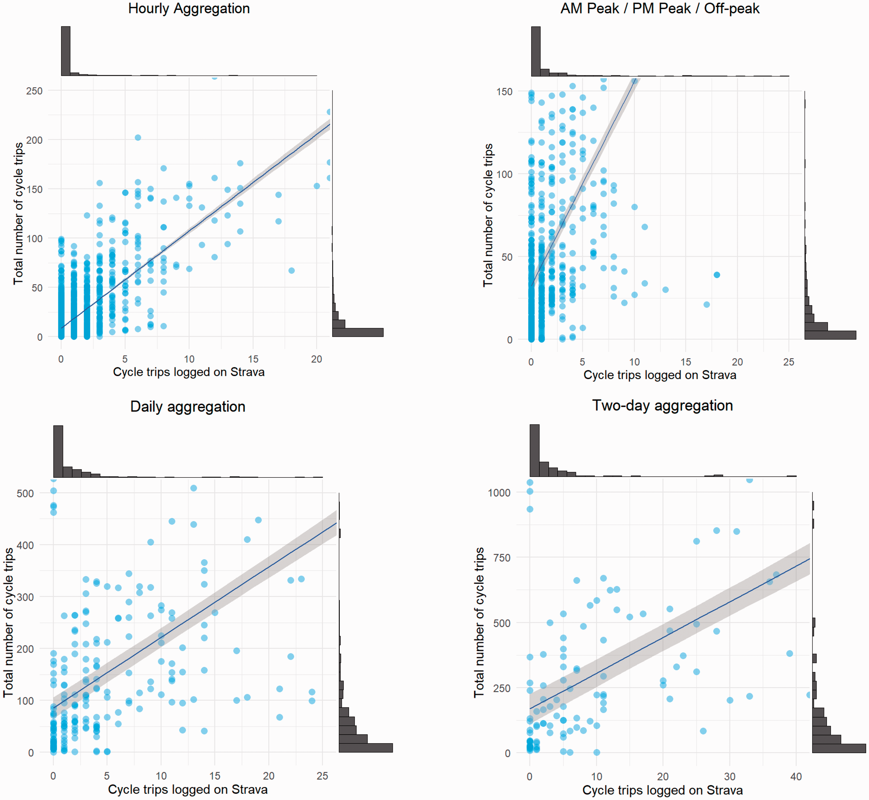
Relationship between cycle trips logged with Strava and the ground truth (cordon count) restricted to locations with a lower volume of cycle trips. The lines of best fit are fitted to the full data set and not only to the points shown.
Figure 2 illustrates some of the problems with predicting at a low level of aggregation at locations where there are a low number of cycle trips. For example, the hourly aggregation shows that there is an extremely weak relationship between the number of trips logged on Strava and the ground truth when the total number of trips is below 50. This is one of our motivations for including data on pedestrians/runners into our predictive models. In areas where few cycle trips are logged, there may be one or two running/pedestrian trips. If places popular with runners/pedestrians are also popular with cyclists, then this may help to predict total cycle flows. Increasing the level of aggregation helps to reduce the number of points with such a low number of cycle trips, which should also aid prediction.
Modelling the associations between Strava data and cordon-count data
In this section, we move beyond bivariate modelling and include the spatial and temporal control variables outlined previously. Six models are estimated and presented in Table 1, for 2013 to 2015 data, leaving 2016 data for out-of-sample testing. Models 1, 3 and 5 are estimated using a linear regression model while the others are estimated with a negative binomial model.
Exploratory regression models.
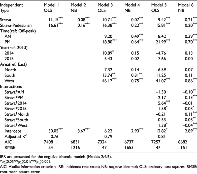
IRR are presented for the negative binomial models (Models 2/4/6).
*p≤0.05/**p≤0.01/***p≤0.001.
AIC: Akaike information criterion; IRR: incidence rate ratios; NB: negative binomial; OLS: ordinary least squares; RMSE: root mean square error.
The first two models in Table 1 are simple models where the number of cycle trips is modelled as a function of the corresponding number of cycle trips logged on Strava in addition to the number of running/pedestrian journeys logged. These models are estimates using linear regression (Model 1) and negative binomial regression (Model 2).
As expected, both models show a positive and statistically significant relationship between the total number of cycle trips and the number of Strava cycling trips. There is also a statistically significant relationship with the number of running/pedestrian trips. Model 1 suggests that for each additional cycle trip logged on the Strava app, there are an additional 11 cycle trips made. The magnitude of the coefficient attached to the runner/pedestrian count is higher than the cycle count’s coefficient. It is worth bearing in mind that relatively few pedestrian trips are logged on Strava. According to Model 2, additional cycle trips logged on Strava would result in an 8.3% increase in the total number of cycle trips made, while the corresponding figure for pedestrian trips is 17.4%. The Akaike information criterion (AIC) suggests that the negative binomial model is a better fit for the data. The root mean square error (RMSE), which is calculated based on the correspondence between the fitted and observed values on their original units, indicates a worse fit. The reason for this seems to be a substantial overprediction for some of the largest flows. For the purposes of making predictions, the RMSE is of more interest to us as accurate prediction of cycling numbers is what we are trying to achieve.
In Models 3 and 4, we add control variables that capture the time and location of the counts. The dummy variables to capture the AM/PM-peak both have positive coefficients. In the linear model, only the PM coefficient is statistically significant, whereas both are statistically significant in the negative binomial model. Cycle counts seem to be higher during peak times than we would expect given the number of trips logged on Strava. Counts are particularly underestimated during the PM-peak. This could suggest that people are less likely to log their commute on Strava than their leisure trips.
Model 3 suggests that there were a higher number of cycle trips made in 2014 compared to 2013, and that this effect is statistically significant. This effect is not significant in the negative binomial model (Model 4). There is still a suggestion that the number of trips was higher in 2014 than in other years. In 2014, Glasgow hosted the Commonwealth Games. During this event, cycling was heavily promoted. This may have had an impact on the data.
Both Models 3 and 4 indicate that there are a higher number of cycle trips in the south and west of the city compared to the east. If the Strava counts fully captured the variation in the cordon count, then no other variable should be statistically significant. Our statistically significant result on the geography variable suggests that the share of cyclists using the Strava app is lower in the west and south compared to the east of the city. This effect seems to be strongest in the west of the city.
In Models 5 and 6, we add a number of interaction terms, where the Strava cycling variable is multiplied by the time and location dummies. Many of the interactions are significant, indicating that the share of the total cycle trips on Strava varies according to the time of day and area of the city. Model 6 shows that cycling trips made by Strava users are positively associated with cordon counts, and there are more cycling trips during AM/PM-peak hours compared to off-peak hours. However, the negative interactions between Strava and time variables (AM/PM) imply that the share of total cycling trips logged on Strava is higher on AM/PM-peak hours compared to off-peak hours, representing fewer actual cycling trips (from cordon counts). All three interactions between Strava and area variables also show significant associations, implying that there is higher share of the total cycle trips made by Strava users in the west compared to the east (negative interaction) and vice-versa for the north and south (positive interactions).
Out-of-sample prediction of cycle trips (RQ2)
We wish to test whether knowledge of the number of trips logged on Strava links helps to predict the total number of cycling trips. To do this, we use the model calibrated on the data from 2013 to 2015 to estimate the number of cyclists we expect to see at each cordon-count location at the 2016 count. We assume that we only have the counts of Strava cycling and running/pedestrian trips, and the time period to make the prediction. This is necessary because the area variable is undefined for links that are outside of our original sample. We, therefore, estimate models utilising the following independent variables: Strava cycle trip count, Strava pedestrian count, time-period (AM-peak/PM-peak/off-peak) and the year.
We estimate models for prediction using linear regression and negative binomial regression (Table 2). Models 1 and 2, the simplest models, are potentially suitable for prediction as they rely only on knowing the number of trips logged on Strava. We estimate additional models using the independent variables mentioned above. The results of these models are consistent. For example, the levels of significance and magnitudes of coefficients for Strava and Strava Pedestrian are very similar compared to the model results in Table 1. In addition, Model 12 shows negative interactions between Strava and time variables (AM/PM), indicating that Strava counts represent fewer cycling trips from cordon-counts data during AM/PM-peak hours compared to off-peak hours. This is due to the higher share of total trips made by Strava users during AM/PM-peak hours compared to off-peak hours.
The most comprehensive negative binomial model fits the data best according to the Akaike Information Criterion.
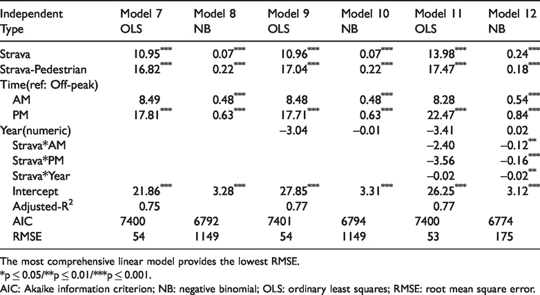
The most comprehensive linear model provides the lowest RMSE.
*p ≤ 0.05/**p ≤ 0.01/***p ≤ 0.001.
AIC: Akaike information criterion; NB: negative binomial; OLS: ordinary least squares; RMSE: root mean square error.
Numerous methods have been suggested to evaluate the predictive performance of a model, i.e. where we have a set of observed and predicted values. Sheiner and Beal (1981) note that a naïve approach to evaluating the performance of a predictor is to examine the correlation coefficient. Indeed, this is the approach often adopted when discussing the relationship between Strava cycling volume and total cycling volume. However, they highlight that a correlation coefficient measures the degree of association along the line-of-best-fit rather than the 45-degree line, i.e. the relevant line for prediction purposes.
In Table 3 we present several measures of predictive performance for our models. We also include Models 1 and 2, which are based solely on Strava counts for comparison. We present the correlation coefficient as it is commonly reported in other studies, despite the limitation mentioned above. We then show a measure of bias (the mean-error) along with three different but related measures of precision. The mean-error shows that the predictions made using Model 11 exhibit the least bias.
Prediction performance measures.
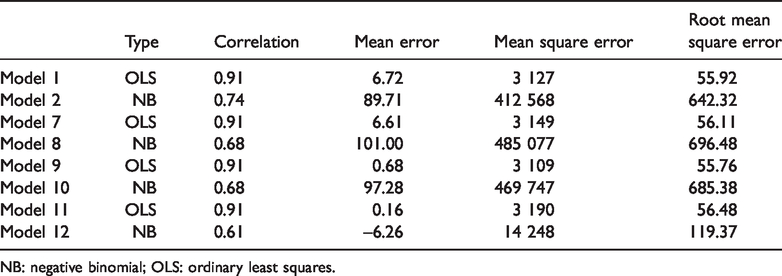
NB: negative binomial; OLS: ordinary least squares.
A common way to measure the precision of a prediction is to square the prediction errors to remove the sign. Taking the mean of these squared-errors gives the mean-square-error measures. Taking the square-root of this measure converts the units back into their original units. According to the RMSE, the predictions from Model 9 are the most precise, although one can see that it has a slightly higher level of bias than Model 11. The negative binomial models perform much worse than their corresponding linear models.
The comparison between the predictions from Model 9 (which has marginally lower RMSE than the other linear models) and the observed cycle counts is plotted and can be viewed in the online Supplemental material Figure 2(a). The plot also shows a 45-degree line along with a line of best fit. The gap between these two lines is relatively small, which is why the high measures of correlation correspond to low values of the RMSE. The model performs well at determining the order of magnitude of the actual cycling flows.
Discussion and conclusion
The lack of detailed cycling data has hampered the ability of planners to understand how much cycling happens and where it happens. New forms of data, such as crowdsourced data, have presented new opportunities. However, questions about the representativeness have also been raised. Our study contributes to the literature by attempting to understand when, where and how crowdsourced data from Strava could be used to represent the travel patterns of all cyclists.
People are already using Strava data as a proxy for total cycling in both academic and policy analysis. It is important that we develop a better understanding of these data. Studies have attempted to assess the ability of Strava cyclist numbers to indicate where cyclists, in general, cycle (Boss et al., 2018; Colorado Department of Transportation, 2018; Conrow et al., 2018; Haworth, 2016; Jestico et al., 2016; Perkins and Blake, 2016). There are weaknesses in the data used by these studies that limit our understanding of the appropriate use of Strava data. Much of the data are over one-year old, leaving gaps in what we know about changes over time. The studies that have attempted to predict cycling numbers have not tested the performance in out-of-sample prediction.
Our approach is unique and extends current work in this area. First, our comparisons are between Strava counts and total cyclists entering and leaving the city centre rather than isolated counters across the city. Second, we explore the value of modelling these data over short run periods rather than data collected over months and years at points with high flows of cyclists. Third, we examine whether out-of-sample prediction is possible with these types of data. To the best of our knowledge, this is the first study to use both crowdsourced cyclist and pedestrian data to predict the number of cyclists and then compare them to ground-truth data. Our results show that both forms of crowdsourced data have a positive and significant association with the number of cyclists. The time and location of the counts were also significant in explaining the variations in cycling. Our regression models show relatively high goodness-of-fit. This knowledge can be used to improve the extrapolation of Strava data.
We also consider data from multiple years and from a set of cycle counting locations that cover the vast majority of cycle traffic in and out of the city. This allows us to better understand how the relationship between Strava cycling and all cycling varies over time and space. Our results show that these relationships change over time. Caution is, therefore, advised in projecting too far into the future using crowdsourced data.
In the last part of our analysis, we use our regression models to make out-of-sample predictions of the number of cyclists. The regression models used for this are the sorts of models that would be applied by planners to estimate the number of cyclists at different locations in the city (outside of the cordon count) based on observations of crowdsourced data. Our linear models with different combinations of independent variables give a similar quality of prediction. The crowdsourced cycling and pedestrian data are able to account for a large proportion of the variation in cycling. The coefficients from these models can generally make good predictions of cycling numbers in the points in the cordon count where the numbers of cyclists are non-trivial. However, it is not within the cordon that we need to be able to predict as we already have these data, but rather it is outside of these points that predictions are useful. Currently, it is not possible to use these coefficients to make accurate predictions of cycling numbers in all streets across the city. To do this, we would need to have a much greater understanding of other influences – the weather, the incline, the time of day and year, etc. However, we believe that where Strava cycling counts are high, we would expect that predictions of the number of all cyclists would produce realistic estimates. Where numbers of Strava cyclists are low, predictions are likely to be inaccurate and not useful to planners. The overall conclusion is that the crowdsourced data can be used to predict the order of magnitude of cycling flows. However, while the mean-error is low, at least for some of our prediction models, the visualisation shows that there is a substantial spread of points around the 45-degree line of perfect prediction. This suggests that the crowdsourced data would not be appropriate where precision is required, e.g. in detecting small changes in the volume of cycling due to the ratio of signal to noise. However, the data would be appropriate to estimate which locations are popular with cyclists and which are not.
While our research outlines the current limitations of using Strava to predict cycling volumes, recent research has begun to point to ways in which we might begin to understand the biases that exist in Strava that make prediction difficult. To do this, we need to fully understand what factors affect Strava cyclists but also those that affect cyclists in general. A number of studies have looked at the factors that influence Strava cyclists (Watkins et al., 2016; McArthur and Hong, 2019; Boss et al., 2018; Griffin and Jiao 2015; Miranda-Moreno and Nosal, 2011; Orellana and Guerrero, 2019), but we also need to understand more about all cyclists and the different demographic groups that make up the cycling public. New research needs to fill this gap so we can more readily understand the relationship between the two groups.
Footnotes
Declaration of conflicting interests
The author(s) declared no potential conflicts of interest with respect to the research, authorship, and/or publication of this article.
Funding
The author(s) disclosed receipt of the following financial support for the research, authorship, and/or publication of this article: This research was supported by the Urban Big Data Centre at the University of Glasgow, which is funded by the UKs Economic and Social Research Centre Grant Ref: ES/L011921/1.
Supplemental material
Supplemental material for this article is available online.