
Abstract
Communities and crime research often invokes historical housing policies to explain vast disparities in crime. However, these assertions are rarely tested. Using lending security maps from the government-sponsored Home Owner’s Loan Corporation (HOLC), we examine the consequences for neighborhood crime of a notorious policy intervention in the housing market: the practice of “redlining” that discouraged investment in Black, non-White, and poor areas. The HOLC maps represent class and race biases embedded in the housing market and may have institutionalized the practice of redlining. Pairing data from the National Neighborhood Crime Study (Wave 2) with HOLC maps, we find neighborhoods with relatively poor HOLC grades inherited more violence and burglary some 70 years later. Furthermore, greater concentrations of contemporary neighborhood disadvantage, racial segregation, and housing instability largely explain these associations. Findings underscore the long shadow of historical interventions in the housing market for inequalities in the spatial distribution of crime today.
Confronted with stark disparities in the spatial distribution of crime, many structural explanations reference the historical de jure urban policies and de facto practices that provide the foundations for profound inequalities in community fortunes today (Peterson and Krivo 2010; Sampson and Wilson 1995). The housing market ranks among the most pertinent cases for this historical through line, with scholars linking contemporary racial and socioeconomic inequality in urban communities to the beliefs held and the actions taken by governmental and private housing authorities in the early twentieth century (Hirsch 1983; Jackson 1980, 1987; Logan and Molotch 1987; Massey and Denton 1993). A key assumption in communities and crime research is that historical interventions in the U.S. housing market set urban areas on distinct trajectories of segregation, investment, and development, thereby widening spatial divides in criminogenic conditions (Lyons, Vélez, and Krivo 2022). However, despite regularly invoking historically rooted inequalities in housing when explaining contemporary crime patterns for communities, explicit tests of the legacies of the housing market remain rare.
We focus on one of the most notorious federal interventions in housing and community investment: the practice of “redlining” institutionalized in New Deal housing programs that sought to encourage and stabilize home ownership among (mostly) White Americans (Massey and Denton 1993; Rothstein 2017). During the Great Depression of the late 1930s, the U.S. government-sponsored Home Owner’s Loan Corporation (HOLC) graded and mapped the creditworthiness of neighborhoods across many cities (Hillier 2003; Jackson 1980, 1987; Massey and Denton 1993). Relying on appraisals from HOLC staff, local realtors, and banking experts, the HOLC maps employed an A to D color-coded scheme. At the top of the hierarchy, areas graded A were shaded green and thus “greenlighted” for investment; at the bottom of the hierarchy, areas graded D were considered the greatest risks of default and shaded red (hence, “redlined”) to caution against investment. The HOLC based the grades on a variety of neighborhood conditions, including the quality and age of the housing stock, amenities, and proximity to industry. Yet race was among the most important determinants of lending risk, with all but six known Black neighborhoods receiving a D grade and redlined (Massey and Denton 1993:51; Winling and Michney 2021: 60). The color-coded taxonomy “put the federal government on record as judging that African Americans, simply because of their race, were poor risks” (Rothstein 2017:64) and exemplified the “discriminatory and segregationist views” of HOLC staff in defense of the color line (Fishback et al. 2022:7).
The HOLC maps provide a striking and detailed visual repository of historically intertwined class- and race-based prejudices in the housing market. Nonetheless, there is some debate about if and how the maps shaped investment decisions directly. One perspective contends that the HOLC mapping methodology led to the institutionalization of redlining in other private and public lending entities, such as the Federal Housing Administration (FHA) and Veteran Affairs. This institutionalization paved the way for the systematic denial of home financing to Black and other poor non-White areas during the twentieth century (Faber 2020; Jackson 1987; Massey and Denton 1993). An alternative perspective provides a more skeptical view, countering that the HOLC maps had limited independent influence on lending practices (Fishback et al. 2022; Hillier 2003). Despite their differences, both perspectives agree that the maps represent the most comprehensive available rendering of the political economy of the housing market in the late 1930s and of the idea, prevalent in the 1930s and beyond, that racial integration threatened the capital investment of White individuals. As such, they bestow an opportunity to assess an underexamined tenant of structural approaches to urban crime: that historically institutionalized classism and racism in the housing market undergird the dramatic disparities in crime and violence across neighborhoods in the United States (Lyons et al. 2022; Peterson and Krivo 2010; Sampson 2012).
Recent digitization of the HOLC maps has accelerated research linking the security grades to an array of contemporary urban outcomes, including residential segregation (Faber 2020) and gentrification (Gibbons 2023), the built environment (An, Orlando, and Rodnyansky 2019), inequality in long-term patterns of (dis)investment (Lynch et al. 2021), fatal police encounters (Mitchell and Chihaya 2022), and even tree canopy coverage and air pollution (Namin et al. 2020). The lion’s share of emerging work, however, centers on public health outcomes (Swope, Hernández, and Cushing 2022) such as the risk of preterm births (Krieger et al. 2020), breast cancer survival (Beyer et al. 2016), and COVID-19 risk (Li and Yuan 2022; Richardson et al. 2020).
Recently, a handful of important studies have examined the connections between the HOLC grades and neighborhood crime today. We extend this research in several ways by pairing HOLC maps harmonized to census tracts (Meier and Mitchell 2022) with the second wave of the National Neighborhood Crime Study (NNCS2; Krivo, Lyons, and Vélez 2022) to explore whether and how HOLC grades associate with neighborhood crime circa 2010. First, whereas almost all current studies focus specifically on homicide and/or firearm violence (Benns et al. 2020; Jacoby et al. 2018; Mehranbod et al. 2022; Poulson et al. 2021, 2023; Powell and Porter 2022; cf. Anders 2023, who also examines property crime), we examine both violence and property crimes. We explore a wider range of crimes, including among the most reliably reported forms of violence (homicides and robberies) and property crime (burglary), which allows us to assess whether the legacy of redlining extends beyond interpersonal violence to influence less serious but more common forms of property crime.
Second, we appraise the legacy of the maps across neighborhoods in multiple cities that range in size, sociodemographic characteristics, and region. With the exception of Mehranbod et al. (2022), previous work on redlining and crime focuses on single cities. A multicity analysis is important given variation across cities in how the HOLC created and implemented maps, which likely leads to heterogeneity in the impact of the maps on city investment and development (Crossney and Bartelt 2005; Mehranbod et al. 2022).
Third, we account for contemporary structural conditions that may represent some of the conduits through which HOLC maps influence neighborhood crime today. With the exceptions of Poulson et al. (2021) and Powell and Porter (2022), studies have devoted less attention to evaluating the pathways through which HOLC maps may shape neighborhood crime. Drawing from literature related to the HOLC, residential segregation, and communities and crime, we advance a conceptual model that posits the role of the maps in setting the stage for contemporary levels of neighborhoods’ violent and property crime. Specifically, we anticipate that (1) poorly graded neighborhoods have higher levels of crime today and (2) contemporary indicators of vulnerability in the political economy—namely, segregation, precarious housing conditions and investment patterns, and socioeconomic disadvantages—help explain this association.
Fourth, we consider an alternative perspective—that the HOLC maps had little direct influence on the subsequent structural development of neighborhoods and instead simply mirrored the inequality that existed when the maps were made (Fishback et al. 2022; Hillier 2003). This argument implies that any relationship between the HOLC grades and crime is spurious. We control for racial composition and socioeconomic conditions of census tracts in 1940 to gauge whether the association between HOLC maps and crime persists after accounting for some of the structural factors that ostensibly lead to the HOLC grades. To our knowledge, only Jacoby et al. (2018), Mehranbod et al. (2022), and Powell and Porter (2022) attempt to account for potential historical confounders of the relationship between HOLC grades and crime.
The Origins and Legacy of the HOLC Maps
Faced with the threat of the Great Depression, various New Deal programs attempted to protect and promote an American Dream of home ownership, albeit within tightly bounded racial and class lines (Rothstein 2017). The primary goal of the HOLC was to reduce foreclosures by providing affordable and standardized mortgages (Hillier 2003; Jackson 1980, 1987) that would stabilize housing values (Aaronson, Hartley, and Mazumder 2021). Between 1933 and 1936, the HOLC granted 1 million self-amortizing mortgages to homeowners who were in default or who had already lost their homes (Hillier 2003). In 1935, when the HOLC lending program was concluding, HOLC’s parent organization, the Federal Home Loan Bank Board, directed HOLC employees, local lenders, and real estate experts to rank areas within 239 cities to estimate real estate risk (Hillier 2003). Although the quality of the housing stock, amenities, and proximity to industry shaped the neighborhood grades, racial and ethnic composition featured prominently in the HOLC mapping rationale. In some cases, the presence of even one Black family earned neighborhoods the highest risk category (Winling and Michney 2021). In other areas, HOLC appraisers singled out Jewish and Mexican families as well (Mendez-Carbajo 2021). HOLC appraisal manuals and the notes taken on each neighborhood often used explicitly bigoted language to express a fundamental assertion underlying segregation and institutionalized racism in the housing market: that proximity of non-White, and especially Black, households threatened the value of White housing investment (Rothstein 2017).
Social scientists and historians provide conflicting accounts of the maps’ independent impact on actual lending practices, partly because of the overreliance on case studies with one or a small number of cities (Fishback et al. 2022; Hillier 2003; Jackson 1980; Michney and Winling 2020). Although interpretations of the historical record vary, we can categorize them into two broad perspectives. The first articulates an institutionalization hypothesis, which contends that the HOLC’s methodology for grading areas facilitated the adoption of similar appraisals in other private and public lending agencies (Aaronson, Hartley, and Mazumder 2021; Crossney and Bartelt 2005; Greer 2013; Woods 2012). Jackson (1980, 1987), credited as the first to associate HOLC grades with investment based on patterns in two areas (St. Louis city/county and Newark city/Essex county), concluded that the “damage caused by the HOLC came not through its own actions, but through the influence of its appraisal system on the financial decisions of other institutions” (Jackson 1980:430). Among these entities, scholars most often highlight the FHA and the GI Housing Bill, which together accounted for a much greater share of residential loans than the HOLC in the United States at the time. The FHA also constructed its own security maps that clearly guided pro-White/anti-Black lending decisions, and some scholars suggest the work of the HOLC influenced the FHA maps directly (Xu 2022). 1 Faber (2020) notes that the legacy of the HOLC maps would have been more limited had it not been for the FHA and GI Housing Bill instituting the practice of restricting lending to higher graded areas of cities. Widespread communication between housing agencies, realtors, and lenders federalized the logic of redlining represented by the HOLC maps. Massey and Denton (1993:52) claim the HOLC methodology spread beyond the public sphere to influence private lending entities as well: “[T]he HOLC not only channeled federal funds away from black neighborhoods but was also responsible for a much larger and more significant disinvestment in black areas by private institutions.”
The institutionalization perspective implies that the HOLC maps were an agent of segregation and that their methodology played an important role in setting areas of cities on varied trajectories of investment and development. Most research typically adopts this perspective, either explicitly or implicitly, when explaining how the HOLC maps might correlate with contemporary outcomes (Krieger et al. 2020; Mehranbod et al. 2022; Meier and Mitchell 2022).
An alternative perspective takes a more critical view of the maps’ legacy and begins with claims that the FHA was developing its own lending cartography before the HOLC published its security maps (Fishback et al. 2022). Likewise, Hillier (2003), using a single city (Philadelphia) as a case study, documents that the practice among lenders of avoiding certain areas of cities preceded the creation of the HOLC maps. Furthermore, some scholars now concede that the HOLC (1) did not make their maps widely available to the public (Hillier 2003), (2) made most of their loans before the publication of the maps, and (3) lent to more Black families than previously assumed, although always in ways that reinforced racial segregation (Michney and Winling 2020). Together, these arguments suggest that the HOLC maps and/or methodology had a less direct influence on the lending practices of other public or private agencies than commonly assumed. Based on their own assessment of the maps’ legacy in three cities, Fishback et al. (2022:1) conclude the maps had “little effect on the geographic distribution” of lending from either the HOLC or FHA. Instead, the maps reflected racial and class biases already in play in the 1930s.
Importantly, despite their differences, these two perspectives agree that the HOLC maps provide the most comprehensive and available documentation of the institutional biases underlying the housing market in the late 1930s. Thus, both perspectives imply the HOLC maps may correlate with contemporary patterns of inequality, although through somewhat different historical mechanisms. The institutionalization perspective implies an association between HOLC maps and the inequitable structural development of urban neighborhoods. By influencing the priorities of public and private lending agencies, HOLC maps set areas of cities on unequal paths of investment that likely contributed to subsequent disparities in urban outcomes (Aaronson, Faber, et al. 2021; Aaronson, Hartley, and Mazumder 2021). In contrast, the second perspective implies that any association between the HOLC maps and contemporary outcomes is spurious and contends that while the structural antecedents of the maps may have shaped differential investments across urban space over time, the maps themselves had little direct influence.
Conceptual Model: Linking HOLC Grades to Neighborhood Crime
A handful of recent single-city studies are among the first to find positive associations between HOLC grades and violence in Philadelphia (Jacoby et al. 2018), Louisville (Benns et al. 2020), Boston (Poulson et al. 2021, 2023), Los Angeles (Anders 2023), and Chicago (Powell and Porter 2022) at the census tract level. In one of two studies to explore pathways between HOLC grades and crime, Poulson et al. (2021) clarify that redlined areas have higher contemporary levels of disadvantage, housing insecurity, and residential segregation, which in turn yield higher concentrations of firearm violence in Boston communities. Powell and Porter (2022) find that contemporary levels of concentrated disadvantage mediate the association between HOLC grades and present-day homicide rates in Chicago neighborhoods. Mehranbod et al. (2022) move beyond these single-city analyses and explore relationships between HOLC grades and violence across zip codes in multiple cities. They find that redlined zip codes had higher incidences of firearm deaths than greenlined places. Importantly, these associations varied by city. This latter finding, coupled with the fact that most HOLC studies base their conclusions on one or a small number of cities, underscores the need for multicity analyses.
Building on this recent work, historical accounts of the HOLC and other federal housing programs, research on residential segregation and urban development, and the communities and crime literature, we present a conceptual model linking the HOLC grades to contemporary neighborhood crime (Figure 1). A premise of the framework is that the HOLC gradients both reflected and fueled the relative ranking of areas in the political economy of place (Logan and Molotch 1987). Accordingly, political and economic actors reward historically upgraded neighborhoods with amenities and resources because these areas facilitate the city’s agenda of growth and capital accumulation. In contrast, the agenda neglects and/or further handicaps downgraded neighborhoods, depleting them of the ability to demand resources within the growth machine (Logan and Molotch 1987). Our model assumes that the HOLC map grades (Figure 1, Panel 2) thus helped crystalize the logic that set neighborhoods on different courses of segregation and (dis)investment, contributing to divergent contemporary social and economic fortunes. These contemporary neighborhood conditions—namely, ethnoracial segregation, housing investment and stability, and the concentration of socioeconomic disadvantages (Figure 1, Panel 3)—help to explain variation in neighborhood violent and property crime (Figure 1, Panel 4). Although the model generally is consistent with the institutionalization perspective, we also acknowledge the socioeconomic and racial structural antecedents of the maps (Figure 1, Panel 1), which allows a partial test of the alternative spuriousness perspective. We elaborate on key aspects of the model in the following.

Conceptual framework linking Home Owner’s Loan Corporation (HOLC) grades to neighborhood crime.
Residential Segregation
Given the well-documented role of race in the construction of HOLC grades, many scholars assert that the maps deepened racial residential segregation in cities and neighborhoods over time. The racial implication of the HOLC methodology—that proximity to non-White and especially Black households depressed housing values—severely restricted where Black, Latino, and other non-White individuals could live (Rothstein 2017). At the city level, Faber (2020) documents that places where the HOLC mapped and appraised experienced more Black ghettoization and White flight to the suburbs, fueling segregation and the racialization of poverty during the twentieth century. At the neighborhood level, Aaronson, Hartley, and Mazumder (2021) employ boundary design and propensity score methods to isolate the causal influence of HOLC grades on racial segregation across numerous mapped cities, finding that the concentration of Black residents grew significantly in poorly graded areas from 1910 to 2010. Other research also documents that neighborhoods graded as less desirable have higher proportions of Black and Latino residents today (Meier and Mitchell 2022; Mitchell and Franco 2018; Rutan and Glass 2018). In contrast, higher graded neighborhoods have fewer Black and more White residents in the decades after the HOLC maps were drawn.
Housing Conditions, Investments, and Instability
We anticipate that historic HOLC grades created dependencies in the built environment and housing market that led to contemporary inequalities in housing conditions, investments, and instability. In a study of neighborhoods across 10 cities from 1930 to 2010, An et al. (2019) suggest that redlining “cemented” the built environment because poorly graded neighborhoods were more likely to have multifamily dwelling units than single-family housing. This in turn led to the reduction of rent and housing values, hindering neighborhood development patterns over time. Additionally, Aaronson, Hartley, and Mazumder (2021) provide compelling evidence that lower graded HOLC areas exhibit depressed homeownership rates today. Other studies link lower HOLC grades with decreased home mortgage lending (Lynch et al. 2021) and document that redlined areas have considerably higher levels of housing vacancy (Meier and Mitchell 2022; Rutan and Glass 2018). Although we are not aware of any investigations that trace HOLC scores to current foreclosure rates, the connection between HOLC and a variety of housing metrics such as value, ownership, and credit scores (Aaronson, Faber, et al. 2021) lends credence to this possibility as well.
Disadvantage
The HOLC and other lenders appraised poorly graded neighborhoods as having minimal value and charged individuals higher interest rates if and when they could get approved for loans in these areas (Mendez-Carbajo 2021). Predatory interest rates and outright rejection of mortgage applications meant fewer Black households were able to own or refurbish homes, denying Black families a key mechanism of wealth accumulation (Rothstein 2017). Aaronson, Faber, et al. (2021) find that individuals growing up in the 1970s and 1980s in historically lower graded HOLC areas had significantly lower household income and credit scores and higher rates of poverty during adulthood. Across 14 cities, White, Guikema, and Logan (2021) show that redlined areas have consistently higher levels of poverty and unemployment and lower high school graduation rates decades after maps were created (see also Rutan and Glass 2018). Similarly, Powell and Porter (2022) reveal that redlined tracts in Chicago are more disadvantaged today. These findings lead us to expect that poorly graded neighborhoods will have higher contemporary concentrations of socioeconomic disadvantages.
Neighborhood Crime
Decades of research connect these structural characteristics embedded in the political economy of place (Figure 1, Panel 3) to variation in neighborhood violence and property crime across cities (Figure 1, Panel 4) because these conditions either shape the ability of communities to control unwanted behavior (Sampson 2012) or facilitate cultural orientations and collective supports for crime (Duck 2015; Matsueda 2006; Rios 2011). Hence, we hypothesize that the contemporary structural antecedents of crime will help account for the association between HOLC maps and neighborhood violence and property crime decades later. We acknowledge that data limitations likely mean that our model omits other important contemporary and historical mediators between HOLC grading and crime. Importantly, we lack detailed information on how communities shifted in the intervening decades in response to housing policy and investment (Krieger et al. 2020). Nonetheless, our framework presents a preliminary assessment of the complicated ways that HOLC grading in the late 1930s may shape neighborhood crime more than 70 years later in multiple cities.
1940 Racial and Socioeconomic Conditions
Figure 1 (Panel 1) also highlights some of the community structures, namely, ethnoracial composition and socioeconomic conditions, that likely influenced the HOLC assessments when the maps were created (Crossney and Bartelt 2005). Here, we focus on the information provided by the 1940 census. Although the 1930 census measures social and economic conditions prior to the maps, the 1940 census captures temporally closer measurement because the HOLC created its maps in the latter half of the 1930s (between 1935 and 1940). More importantly, the 1940 census allows for a much more detailed assessment of socioeconomic and demographic conditions across a greater number of cities (for more information about variables and cities covered in the 1940 vs. 1930 censuses, see Appendix 2). Furthermore, we agree with Jacoby et al. (2018) and Mehranbod et al. (2022) that it is very unlikely the HOLC maps influenced structural conditions captured only a couple of years later in the 1940 census. Our conceptual model posits that conditions measured in the 1940 census help explain the HOLC grades and may associate directly with contemporary structural characteristics and even crime decades later. The model thus raises the possibility of spuriousness—that is, accounting for the structural antecedents of the HOLC scores (Figure 1, Panel 1) may substantially reduce or render insignificant any association between HOLC grades and subsequent neighborhood conditions (Figure 1, Panel 3) and/or crime (Figure 1, Panel 4). Following previous research (Jacoby et al. 2018; Mehranbod et al. 2022; Powell and Porter 2022), we attempt to assess partially an alternative perspective that any association between HOLC grades and contemporary neighborhood crime reflects the long-term consequences of segregation and socioeconomic inequality embedded in the maps rather than the structural fallout from redlining and differential investment.
Data and Sample
We compile information from three data sets: (1) the second wave of the National Neighborhood Crime Study (NNCS2; Krivo, Lyons, and Vélez 2022), (2) HOLC maps normalized to census tracts by Meier and Mitchell (2021), and (3) 1940 census data provided by the National Historical Geographic Information System (Manson et al. 2022). 2 The NNCS2 includes data on serious crimes known to the police and structural characteristics for census tracts 3 across 85 large cities circa 2010. To our knowledge, it is the only publicly available data set with crime and other data for neighborhoods in a representative set of medium to large U.S. cities. The breadth of coverage, including central cities and suburbs across all regions, makes the NNCS2 uniquely suited for assessing neighborhood inequality in crime.
We began by merging the NNCS2 with the HOLC grades provided by Meier and Mitchell (2021). Differences in missing data across the crime measures result in samples of 52 cities and 4,679 mapped tracts for violence and 53 cities with 4,753 tracts for burglary. We then merge these data with the 1940 census by overlaying shapefiles for 2010 and 1940 census tracts with ArcGIS Pro. 4 Because the 1940 data did not cover all cities, our final analytic samples include 3,795 census tracts across 27 cities for violence and 3,867 census tracts across 28 cities for burglary. For a list of the cities and the associated number of census tracts included in the following main analyses, see Appendix 1.
Dependent Variables
The NNCS2 includes four-year average counts (rounded to integers) for census tracts of violent (homicides and robberies) and property (burglaries) crimes between 2010 and 2013. 5 We use multiple-year counts to minimize the effect of annual fluctuations for small units. Homicide, robberies, and burglaries are among the most reliably reported forms of violent and property crime (Baumer and Lauritsen 2010).
HOLC Grades
The Mapping Inequality Project (Nelson et al. 2021) has digitized most HOLC maps for the nation. Because the HOLC grades do not correspond neatly to census tract boundaries, we use aerial interpolation data from Meier and Mitchell (2021), who normalized the maps from the Mapping Inequality Project to 2010 census boundaries for numerous cities. Meier and Mitchell (2021) first constructed a continuous HOLC score by assigning a numeric value corresponding to each HOLC risk category (A = 1, B = 2, C = 3, and D = 4). They then multiplied these values by the proportion of the census tract area covered by each category and summing (Richardson et al. 2020:16). As they explain, “[I]f 50% of the census tract’s graded area was classified ‘A’ and 50% was ‘B,’ the calculation would be ((1 × 0.50) + (0.50 × 2)) = 1.50” (Richardson et al. 2020:16). Ranging from 1.00 to 4.00, higher scores indicate more disadvantaged HOLC grading. Meier and Mitchell (2021) then rounded up the continuous score to the nearest integer to create four categorical variables that correspond to each grade; we use these intervals in our analyses. Meier and Mitchell (2021) provide HOLC scores only for 2010 tracts that had at least 20 percent of their area covered by the historic HOLC maps, reasoning that tracts not meeting this threshold were “not sufficiently impacted” by the maps (Richardson et al. 2020:16). Most of the 2010 census tracts excluded from Meier and Mitchell’s (2021) scoring did not exist in the 1930s, when the HOLC constructed the maps, or were industrial areas at the time with little residential population. We thus limit our main analyses to tracts that had at least 20 percent of their 2010 area mapped by the HOLC. However, we also report results from supplementary models that include tracts that were not mapped (or were “insufficiently” mapped) to assess the robustness of our findings.
Table 1 presents the distribution of the intervals for the HOLC grades. The HOLC redlined 35 percent of tracts, whereas 43 percent received yellow grades. About 5 percent of tracts were greenlined for investment, with 17 percent receiving the second most advantaged (blue) grade. 6
Summary Statistics for Tract and city-level Variables.
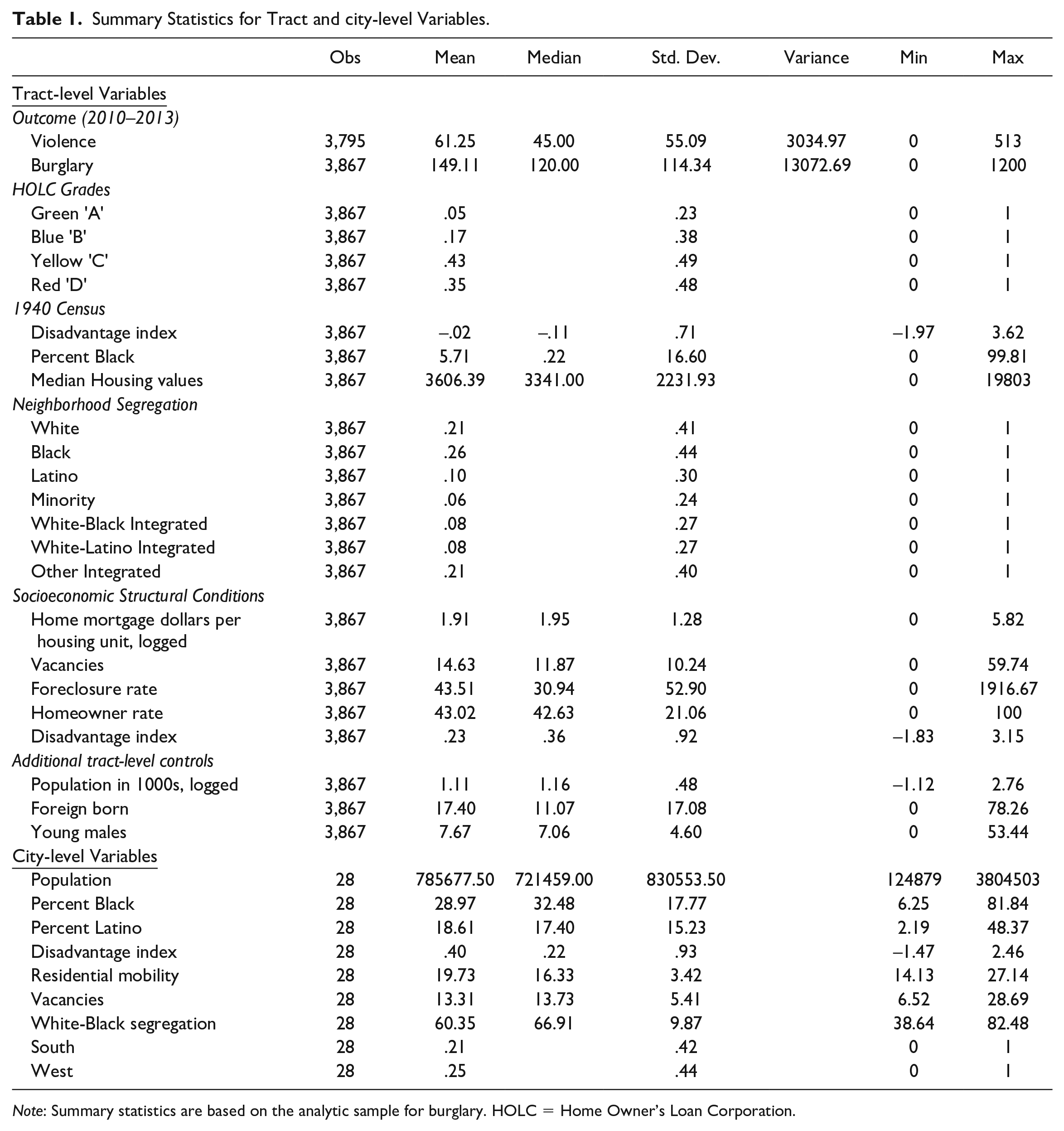
Note: Summary statistics are based on the analytic sample for burglary. HOLC = Home Owner’s Loan Corporation.
1940 Census Variables
We use 1940 data to account for some of the socioeconomic and demographic features of census tracts that shaped the HOLC designations. We follow Jacoby et al. (2018; see also Mehranbod et al. 2022) and construct three variables: (1) the percentage of the Black population, (2) median household values, and (3) concentrated disadvantage (a z-score index). The concentrated disadvantage index consists of the average z scores for percentage of the population 25 years and older without a high school certificate; percentage renters; percentage homes without a radio, mechanical refrigerator, or central heating; and percentage homes with more than one person per room (
Other Independent Variables and Controls
The NNCS2 provides all other independent variables circa 2010 for census tracts and cities. The NNCS2 collected sociodemographic variables from the American Community Survey (2008–2012), aggregated home mortgage information from publicly data available provided by the Federal Financial Institutions Examination Council, and proprietary data on foreclosures from RealtyTrac (see the NNCS2 cross-sectional codebook for more details). As we discussed in our conceptual model, we expect contemporary structural conditions, measured in the NNCS2 at the tract level, will help account for the association between historic HOLC grades and current-day neighborhood crime.
Neighborhood ethnoracial composition (segregation)
We classified neighborhoods into seven categories based on their ethnoracial compositions in 2010 (Lyons, Vélez, and Krivo2022). 7 hite, Black, and Latino neighborhoods have at least 70 percent of the population in the respective group, and minority areas have at least 70 percent of the population in two non-White groups with neither group alone reaching the 70 percent threshold. For White-Black multiethnic areas, White and Black residents are the only two groups that combined are at least 70 percent of the population with neither alone over the 70 percent cutoff. In White-Latino multiethnic neighborhoods, White and Latino residents are the only two groups that combined are at least 70 percent of the population with neither alone over the 70 percent cutoff. Other multiethnic areas include any other combination of ethnoracial groups.
Housing investments and instability
We include four indicators of housing conditions. We calculate a standardized level of mortgage lending by dividing the total dollars allocated for home mortgages by the number of housing units in a tract and logging for skewness. Foreclosure rates are the four-year (2010–2013) average numbers of foreclosures per 1,000 total housing units (Baumer, Wolff, and Arnio 2012). Foreclosures include only completed transactions in which the bank repossessed, sold, or auctioned a property within the year. 8 We standardize foreclosures relative to all housing units to reflect its prevalence compared to overall housing availability. We include the percentages of all housing units that are vacant as an additional measure of local housing instability. Finally, we measure the percentage of all housing units that are owner-occupied to capture homeownership.
Concentrated disadvantage
Disadvantage is an index of average z scores for joblessness, professional workers (reverse-coded), college graduates (reverse-coded), female-headed families, secondary-sector workers, and poverty (
Additional tract-level controls
We treat tract population (logged), the percentage of the population that is foreign-born, and the percentage of the population that is young and male as controls. Previous research associates these tract-level demographics with neighborhood crime (Krivo et al. 2021; Lyons, Krivo and Vélez 2022). We remain agnostic as to whether these controls will also help explain some of the relationship between HOLC grades and contemporary crime, yet we note that one study found that greenlined areas in Pittsburgh experienced much less population loss decades later than poorly graded neighborhoods (Rutan and Glass 2018).
City-level controls
Although we expect most of the conduits through which HOLC grades influence neighborhood crime to occur at the tract level, we also control for similar characteristics at the city level. Doing so also allows us to adjust for characteristics that may explain heterogeneity in cities’ experiences with the HOLC. Specifically, we adjust for city size, percentages Black and Latino of the city population, concentrated disadvantage (an index measured parallel to the contemporary tract level index,
Table 1 presents summary statistics for all variables.
Analytic Strategy
We estimate two-level random intercept models for tracts (Level 1) nested within cities (Level 2). To assess the appropriateness of a multilevel modeling strategy, we first estimated unconditional random intercept models that indicated substantial variation in both violence and burglary across cities (i.e., random intercept variance). Second, we calculated log-likelihood ratio tests comparing the random intercept model to a single-level negative binomial model. These tests indicate that the multilevel model outperforms the single-level model for both outcomes.
Because crimes are relatively rare events within census tracts, we estimate nonlinear negative binomial count models within the multilevel framework. These models account for overdispersion in which the variance of the dependent variable is considerably larger than the mean or median, as is the case with our count data (see Table 1). We specify that crime counts have variable exposure by tract population, which allows us to interpret the analyses as crime rates per tract population. As mentioned, we follow previous work using NNCS2 data and control for logged tract population as a substantive predictor on the right side of the equation as well, given that neighborhood population consistently associates with per capita violence and property crime (Lyons et al. 2022).
Our data do not meet strict requirements for formal mediation analyses over multiple decades. Instead, we assess the statistical significance of changes across models in the coefficients for the HOLC scores using a general framework for comparing marginal effects for nonlinear models developed by Mize, Doan, and Long (2019). The approach transforms parameter estimates into predicted margins and then uses seemingly unrelated estimations to combine the variance and covariance estimates across models with varying specifications. As Mize et al. (2019:152) explain, “marginal effects are a useful method for quantifying effects because they are in the natural metric of the dependent variable and they avoid identification problems when comparing regression coefficients” across models. Their framework thus provides an optimal assessment of the significance of changes in coefficients across nonlinear models in particular (Mize et al. 2019:156). Although not a formal assessment of mediation, the approach is equivalent to what mediation scholars refer to as a “differences in coefficient test” (MacKinnon et al. 2002:87–89), which is one strategy for assessing mediation informally (Mize et al. 2019:186). We estimated these tests using mecompare within Stata’s GSEM, following the example and code written by Mize et al. (2019). 9
We start with baseline models that control for only the HOLC grades. We then assess whether the coefficients for the HOLC grades change significantly once we control for 1940 conditions and contemporary tract- and city-level demographics. Subsequent models add in variables measuring racial residential segregation (ethnoracial composition), housing characteristics, and concentrated disadvantage separately to assess their contributions in explaining the relationship between HOLC grades and crime. The final model includes all covariates.
Results
Table 2 provides estimates for multilevel models predicting counts of neighborhood violence. The baseline Model 1 indicates a dose-response relationship between HOLC grades and violence. Neighborhoods graded B (blue), C (yellow), and D (red) have higher levels of violence relative to areas that were graded A (greenlined), and all other comparisons between grades are statistically significant. 10 However, the predicted gap between redlined and greenlined areas is the most striking, at about 57 violent crimes. Model 2 adjusts for 1940 conditions and other contemporary controls at the tract and city levels and provides little evidence that the relationship between HOLC grades and violence is spurious. Although adjusting for 1940 conditions (disadvantage, percentage Black population, and housing values) reduces the coefficients for the HOLC scores, tracts appraised blue, yellow, and red still have substantially higher levels of violence today than greenlined tracts. The dose-response relationship between HOLC grades and violence, however, breaks down net of controls. Specifically, the difference between redlined and yellowlined places is no longer significant once accounting for 1940 conditions. Of the 1940 historical controls, the index measuring concentrated disadvantage and median housing value both are positively associated with violence circa 2010. Additional tests reveal that the positive coefficient for median housing value is contingent on controlling for 1940 disadvantage; without accounting for disadvantage, the coefficient for median housing value is negative and significant. 11
Multi-level Negative Binomial Models for Violence with Tract Population as Exposure.

Notes: N = 3,795 tracts within 27 cities. 1 = estimates multiplied by 100; 2 = estimates multiplied by 1000. *** p <.001; ** p <. 01; * p < .05
Models 3, 4, and 5 assess separately the contribution of tract segregation, housing conditions, and concentrated disadvantage compared to Model 2. As expected, all measures in these separate groups predict violent crime. Furthermore, they also help explain why poorer graded tracts have more violence today. Compared to Model 2, controlling for ethnoracial composition in Model 3 reduces the gaps between green and blue or yellow areas by about 28 percent [(.5076 –.3654)/.5076] and 38 percent [(.7862–.4889)/.7862)], respectively, and the gap between greenlined and redlined areas by about 38 percent [(.7555–.4654)/.7555)]. As a block, contemporary housing conditions, including home mortgage dollars, vacancies, foreclosure rates, and the homeownership rate play an even more pronounced explanatory role in Model 4. Accounting for housing conditions reduces the gap between green and blue, green and yellow, and green and red tracts by 59 percent, 68 percent, and 68 percent, respectively, compared to Model 2. Adjusting for the concentrated disadvantage index yields similar size reductions in coefficients for HOLC grades in Model 5. For example, concentrated disadvantage alone accounts for a 55 percent reduction in the gap between greenlined and redlined tracts compared to Model 2. 12
Model 6 includes all covariates. Comparing this full model with the baseline (Model 1) indicates strong support for our general conceptual framework. We are able to explain about 67 percent of the difference in violence between the highest (green) and lowest (red) graded areas, 68 percent of the gap between green and yellowlined tracts, and 52 percent of the disparity in violence between the two highest graded tracts (green and blue). However, the criminogenic influence of the HOLC grades persists even net of the fuller set of controls, indicating that we are not able to specify completely the inheritance of the HOLC maps.
Do these patterns extend to more common forms of property crime? Table 3 provides results for neighborhood burglary. The baseline Model 1 shows a similar dose-response association between HOLC grades and burglary, although the disparities between grades are somewhat smaller for burglary than they are for violence. Tracts with historical B, C, and D scores have higher levels of burglary relative to areas with A scores, and all other comparisons between grades are statistically significant. The unadjusted predicted gap between redlined and greenlined areas is the most notable, with a difference of about 50 burglaries. After accounting for historical and contemporary controls in Model 2, the general dose-response relationship between HOLC grades and burglary persists, suggesting no support for the spuriousness perspective (in fact, the coefficients for the grades increase net of these controls compared to Model 1).
Multi-level Negative Binomial Models for Burglary with Tract Population as Exposure.

Notes: N = 3867 tracts within 28 cities. 1 = estimates multiplied by 100; 2 = estimates multiplied by 1000. *** p <.001; ** p <. 01; * p < .05
Model 3 indicates that contemporary neighborhood segregation accounts for a good portion of the association between HOLC grades and burglary today. Compared to Model 2, adjusting for ethnoracial neighborhood composition reduces the gap between greenlined and both yellowlined and redlined areas by 58 and 52 percent, respectively. The gap in property crime between green- and blue-shaded areas reduces by about 61 percent and is no longer statistically significant. These patterns are similar when we adjust for housing conditions in Model 4 or concentrated disadvantage in Model 5. Accounting for the concentrated disadvantage index alone explains between 64 percent and 72 percent of the disparities between the highest appraised greenlined tracts and other-graded areas compared to Model 2.
Again, comparing the full Model 6 with either Model 1 or 2 illustrates strong support for our conceptual framework. 13 Although the gaps between red and green, yellow and green, and red and blue shaded areas persist, accounting for indicators of our conceptual model reduces these disparities substantially. HOLC grades matter for levels of property crime more than 70 years later, and much of the reason is that the grades help distinguish the contemporary structural fortunes of neighborhoods that lead to higher levels of burglary.
Supplemental Analyses
Models provided in the online Supplemental Material indicate the robustness of our findings to various alternative samples and specifications. First, Tables S1A and S1B in the online Supplemental Material reveal similar patterns if we include a continuous measure of the HOLC grading rather than the categorical scale used here. Second, in Tables S2A and S2B in the online Supplemental Material, we compared graded tracts with those that were not assigned a grade by the HOLC. This robustness check helps adjust for the inconsistencies in which tracts were graded across cities. Previous research (Jacoby et al. 2018; Mehranbod et al. 2022) indicates that areas of cities that were not mapped have higher levels of firearm homicide than greenlined areas. We find similar patterns for violence and burglary: Historically unmapped tracts have more crimes today than those greenlined but less crime than redlined tracts. However, including unmapped tracts does little to alter the substantive patterns pertaining to the graded tracts that we report here.
Third, because many of the cities in the NNCS2 that were mapped by the HOLC are not covered in the 1940 census, we ran models without conditioning on the availability of 1940 data, displayed in Tables S3A and S3B in the online Supplemental Material. Doing so increases the sample of tracts and almost doubles the number of cities (4,652 accounting for disadvantage, tracts across 51 cities for violence and 4,727 tracts in 52 cities for burglary). However, the pattern of results is very similar: HOLC grades exhibit a strong dose-response association with crime in unadjusted models, and our contemporary structural controls account for sizeable proportions of the gap between redlined and greenlined areas for violence and burglary. Fourth, given the likely role that redlining played in widening racial gaps in homeownership, we explored a measure of Black-White inequality in homeownership (Tables S4A and S4B in the online Supplemental Material). This variable does not explain significantly more of the gap between graded areas and crime than the models reported in Tables 2 and 3.
Fifth, we assess our decision to control for 1940 rather than 1930 census measures. As shown in Appendix 2, using the 1930 instead of 1940 census severely restricts the number of cities and the breadth of socioeconomic measures available in our analyses. Nonetheless, comparing models for cities that have overlapping data for both 1930 and 1940 permits some assessment of the consequences of our analytic decisions. Only five and six cities (for violence and burglary, respectively) have enough data from both the 1930 and 1940 censuses to allow for comparative analyses. 14 For violence, the Akaike information criterion and Bayesian information criterion statistics suggest that models with 1930 variables may provide a marginally better fit than those using 1940 variables, as shown in Tables S5A and S5B in the online Supplemental Material. More importantly, the models tell a similar story regardless of the dependent variable: HOLC grades associate with neighborhood violence and burglary net of historical controls, and the contemporary characteristics of neighborhoods largely account for these associations. That the general pattern of results holds even for this much more restricted sample suggests that our decision to rely on 1940 versus 1930 data has little consequence for our substantive conclusions. We thus prefer to employ the 1940 census to maximize the number of cities and tracts in our main analyses (see also Jacoby et al. 2018; Mehranbod et al. 2022).
Finally, Tables S6A and S6B in the online Supplemental Material provide alternative tests Finally, Tables S6A and S6B in the online Supplemental Material provide alternative tests assessing (1) whether HOLC grades contribute to model fit net of all other controls and (2) whether HOLC grades contribute more to model fit than the 1940 census variables.
Discussion and Conclusions
The government-sponsored Home Owner’s Loan Corporation appraised the creditworthiness of neighborhoods across many cities in the 1930s. Their residential security maps render visible the prevailing political economic foundations of the housing market and their attendant racism and classism. The HOLC maps may have also institutionalized and diffused the practice of redlining that discouraged investment in Black, non-White, and poor areas. As such, they present an opportunity to assess common but rarely tested assertions in the communities and crime literature that tie contemporary inequality in the distribution of crime to historical interventions in the housing market (Lyons et al. 2022; Peterson and Krivo 2010; Sampson 2012). Although recent studies trace these maps to various present-day inequalities, few examined the consequences for neighborhood crime across multiple cities. Pairing data from the National Neighborhood Crime Study (Wave 2) with HOLC maps, we assessed the consequences of inheriting HOLC grades for neighborhood crime across at least 27 cities circa 2010. We find that neighborhoods with a relatively poor HOLC grading had more violence and burglary some 70 years later. Our results are robust to various sample sizes and model specifications. Overall, our study joins a growing list of others that suggest the enduring weight of redlining maps for contemporary urban fortunes.
Our findings provide tentative support for an institutionalization (rather than spuriousness) perspective, which posits that the HOLC maps and methodology altered neighborhood trajectories of investment and structural development. We advanced a conceptual framework in which historic redlining shapes contemporary neighborhood crime through subsequent racial residential segregation, homeownership, lending practices, and other socioeconomic dynamics. In support of institutionalization, our multilevel models generally align with these assertions: Contemporary levels of concentrated disadvantage, racial residential segregation, and housing conditions account for a large proportion of the association between historic HOLC grades and crime.
We are able to account for most of the disparity in violence and burglary between redlined and greenlined areas with our modeling framework. Nonetheless, gaps remain among the historic grades even in our most fully specified models. Future work should continue to refine the conceptual model by highlighting additional structural factors that may explain the residual influence of the HOLC grades on serious neighborhood crime. Toward that end, we need to map out comprehensively how communities shifted in the intervening decades in response to housing policy and investment that unfolded after the creation of the HOLC maps (Krieger et al. 2020). Tracing how neighborhood socioeconomic, demographic, and political conditions developed over time within and across the HOLC gradient is necessary for a fuller articulation of the institutionalization perspective. Although our study provides a foundation for future research, we lack information on the structural characteristics of neighborhoods in the decades between the HOLC maps and present-day crime. With detailed longitudinal data, research should be able to reveal whether and how and under what contexts the HOLC grades shifted the fortunes of U.S. neighborhoods over time in ways that influence the patterning of crime today. Such data would also permit fuller analyses of the mediation pathways that the institutionalization perspective hypothesizes. Although we employ methods to test the statistical significance of changes in the HOLC parameter estimates across models that are consistent with the idea of mediation, our data do not lend themselves to a full assessment of causal pathways and counterfactual mediation (VanderWeele 2016). A fuller test of the institutionalization perspective thus awaits more complete data and analyses.
We find that the associations between HOLC grades and violence and property crime are robust to controls for socioeconomic and racial demographic factors measured near the origin of the maps. At face value, this further buttresses the general claims of the institutionalization perspective and limits the plausibility of spuriousness. We caution, however, that we cannot provide a definitive test of spuriousness. Skeptics, for example, might question whether our models miss other important historical antecedents of the maps related to the political economy of place. Although the 1940 census provides more detail on the socioeconomic and demographic character of places than previous decennial census data, the HOLC based their maps on complex and dynamic appraisal methods that are hard to capture with “snapshots” of administrative data.
Studies based on a single or a small number of cities inform the bulk of our understanding of the HOLC appraisal maps and their implications for current levels of inequality. Yet the historical record suggests that the creation and implementation of HOLC maps varied by city. Following Mehranbod et al. (2022), we encourage future work to explore city-level variation in more detail. One particularly fruitful line of inquiry may be to examine cross-level interactions to explore the extent to which broader contemporary and historical city contexts shape the relationship between HOLC grades and crime. In part because political economic growth machine agendas developed differently across the urban landscape, a multilevel framework should provide a fuller and more complex understanding of the legacy of the HOLC map for neighborhood levels of crime across the country.
In conclusion, our study suggests that the historically intertwined racist and classist ideologies and practices underlining the political economy of the housing market cast a long shadow on inequalities in the spatial distribution of crime today. Crime as an enduring consequence of inheriting the HOLC grades highlights the role of institutionalized, government-sponsored housing policy interventions in making or breaking the well-being of neighborhoods. National Science Foundation grants (SES-1357207 and SES-1356252) partially funded this research.
Supplemental Material
sj-docx-1-srd-10.1177_23780231231197030 – Supplemental material for Inheriting the Grade: HOLC “Redlining” Maps and Contemporary Neighborhood Crime
Supplemental material, sj-docx-1-srd-10.1177_23780231231197030 for Inheriting the Grade: HOLC “Redlining” Maps and Contemporary Neighborhood Crime by Christopher J. Lyons, María B. Vélez and Xuanying Chen in Socius
Footnotes
Appendix
Cities and Measures Covered in the 1940 vs. 1930 Census.

| 1940 Census Availability | 1930 Census Availability | |||||||||||||||
|---|---|---|---|---|---|---|---|---|---|---|---|---|---|---|---|---|
| City name | % Black | Median HH value | Concentrated disadvantage | % Black | # Houses under certain value bracket | Concentrated disadvantage | ||||||||||
| NNCS2 Cities w/ HOLC maps | % Population age 25 over w/o high school certificate | % Renter occupied homes | % Homes w/o a radio | % Homes w/o mechanical refrigerator | % homes w/o central heating | % homes w/ > 1 person per room | % Population age 25 over w/o high school certificate | % Renter occupied homes | % Homes w/o a radio | % Homes w/o mechanical refrigerator | % homes w/o central heating | % homes w/ > 1 person per room | ||||
| AkronOH | √ | √ | √ | √ | √ | √ | √ | √ | ||||||||
| AuroraIL | ||||||||||||||||
| AustinTX | √ | √ | √ | √ | √ | √ | √ | √ | ||||||||
| BostonMA | √ | √ | √ | √ | √ | √ | √ | √ | √ | ~ | ~ | √ | √ | |||
| BuffaloNY | √ | √ | √ | √ | √ | √ | √ | √ | √ | ~ | ~ | √ | √ | |||
| CharlotteNC | ||||||||||||||||
| ChicagoIL | √ | √ | √ | √ | √ | √ | √ | √ | √ | ~ | ~ | √ | √ | |||
| ClevelandOH | √ | √ | √ | √ | √ | √ | √ | √ | ~ | ~ | ~ | √ | ~ | |||
| ColumbusOH | √ | √ | √ | √ | √ | √ | √ | √ | √ | ~ | ~ | √ | √ | |||
| DallasTX | √ | √ | √ | √ | √ | √ | √ | √ | ||||||||
| DaytonOH | √ | √ | √ | √ | √ | √ | √ | √ | ||||||||
| DenverCO | √ | √ | √ | √ | √ | √ | √ | √ | ||||||||
| DetroitMI | √ | √ | √ | √ | √ | √ | √ | √ | √ | |||||||
| EvansvilleIN | ||||||||||||||||
| Fort WayneIN | ||||||||||||||||
| Fort WorthTX | ||||||||||||||||
| HartfordCT | √ | √ | √ | √ | √ | √ | √ | √ | ||||||||
| HoustonTX | √ | √ | √ | √ | √ | √ | √ | √ | ||||||||
| JacksonvilleFL | ||||||||||||||||
| Kansas CityMO | √ | √ | √ | √ | √ | √ | √ | √ | ||||||||
| KnoxvilleTN | ||||||||||||||||
| LexingtonKY | ||||||||||||||||
| LincolnNE | ||||||||||||||||
| Long BeachCA | √ | √ | √ | √ | √ | √ | √ | √ | ||||||||
| Los AngelesCA | √ | √ | √ | √ | √ | √ | √ | √ | ||||||||
| LouisvilleKY | √ | √ | √ | √ | √ | √ | √ | √ | ||||||||
| MadisonWI | ||||||||||||||||
| MemphisTN | √ | √ | √ | √ | √ | √ | √ | √ | ||||||||
| MiamiFL | ||||||||||||||||
| MilwaukeeWI | √ | √ | √ | √ | √ | √ | √ | √ | ||||||||
| MinneapolisMN | ||||||||||||||||
| Newport NewsVA | ||||||||||||||||
| NorfolkVA | ||||||||||||||||
| OaklandCA | √ | √ | √ | √ | √ | √ | √ | √ | ||||||||
| Oklahoma CityOK | √ | √ | √ | √ | √ | √ | √ | √ | ||||||||
| PasadenaCA | √ | √ | √ | √ | √ | √ | √ | √ | ||||||||
| PhiladelphiaPA | √ | √ | √ | √ | √ | √ | √ | √ | ||||||||
| PhoenixAZ | ||||||||||||||||
| PittsburghPA | √ | √ | √ | √ | √ | √ | √ | √ | √ | ~ | ~ | √ | √ | |||
| PortlandOR | √ | √ | √ | √ | √ | √ | √ | √ | ||||||||
| RockfordIL | ||||||||||||||||
| San AntonioTX | ||||||||||||||||
| San DiegoCA | ||||||||||||||||
| SeattleWA | √ | √ | √ | √ | √ | √ | √ | √ | ||||||||
| St. LouisMO | √ | √ | √ | √ | √ | √ | √ | √ | √ | ~ | √ | √ | ||||
| St. PetersburgFL | ||||||||||||||||
| StamfordCT | ||||||||||||||||
| TampaFL | ||||||||||||||||
| ToledoOH | √ | √ | √ | √ | √ | √ | √ | √ | ||||||||
| TopekaKS | ||||||||||||||||
| WacoTX | ||||||||||||||||
| WaterburyCT | ||||||||||||||||
| # cities w/ available data | 28 | 28 | 28 | 28 | 28 | 28 | 28 | 28 | 7 | 0 | 0 | 7 | 6 | 0 | 0 | 0 |
Notes: √ means data is avaliable; ~ means exact measure is not avalible but a similar measure exists. Cleveland OH has two different 1930 census datasets from NHGIS.
One covers Cleveland city circa 1930 and the other covers suburban Cleveland (parts of which are included in Cleveland city circa 2010). We thus excluide Cleveland in the S5.
supplement as there is only one common measure between the two censuses. The NNCS2 provides burgalry but not violence data for Columbus OH.
Supplemental Material
Supplemental material for this article is available online.
Notes
Author Biographies
References
Supplementary Material
Please find the following supplemental material available below.
For Open Access articles published under a Creative Commons License, all supplemental material carries the same license as the article it is associated with.
For non-Open Access articles published, all supplemental material carries a non-exclusive license, and permission requests for re-use of supplemental material or any part of supplemental material shall be sent directly to the copyright owner as specified in the copyright notice associated with the article.