
Abstract
This visualization uses annual data from the Household, Income and Labour Dynamics in Australia (HILDA) Survey to illustrate the dynamics of underemployment for Australian men and women in their early careers (ages 25–34 years). Visualizing the dynamics of underemployment reveals that it is a persistent and gender-biased issue. Women are more likely to experience underemployment in their early careers compared with men. Additionally, women are more likely to become trapped in a cycle of underemployment and inactivity, leading to unfavorable long-term work experiences. This disparity highlights the need for policies that improve women’s human capital and productivity by addressing underemployment in their early careers.
Around the world, a substantial number of workers are affected by underemployment, meaning that they are either unemployed when they would like to work or are working part-time when they would prefer full-time jobs. This underuse of workers’ skills and experience has serious consequences for their working lives, including lower wages, slower career progress, decreased life satisfaction, poor mental health, and overall well-being (McKee-Ryan and Harvey 2011; Wilkins 2007). These impacts can also extend beyond the workers and harm the labor force paths of their families (Mooi-Reci, Liao, and Curry 2022). Despite its significant effects on working lives, both economically and socially, the variability and intensity of underemployment over the course of a worker’s career are not well understood. This raises questions about the nature of underemployment: is it just a temporary phase that improves with work experience, or does it tend to persist and become a long-term problem?
We use 20 years of annual data from the Household, Income, and Labour Dynamics in Australia (HILDA) Survey to examine the evolution of underemployment after full-time education is completed for both men and women between the ages of 25 and 34 years. This time frame was chosen specifically to showcase underemployment dynamics that occur during early careers. We use both a static (Sankey plot) and a dynamic (sequence index plot) approach to visualize these dynamics and demonstrate the advantages of these methods (see Supplemental Material).
Prevalence of Underemployment at the Start and End of Early Careers
We start by using a flow diagram, also known as a Sankey plot (Figure 1A), to illustrate the proportion of underemployment at the ages of 25 and 34 years among men (top) and women (bottom). The cross-sectional measures of underemployment at ages 25 and 34 are connected with flows that indicate the rate of movements among three states: (1) fully employed, (2) not fully employed (or underemployed), and (3) out of the workforce (or inactive). In Australia, early labor market careers are characterized by high rates of underemployment. That is, at the age of 25 and at the start of their employment careers, considerable proportions of men (22.5 percent) and women (19.4 percent) are working in jobs that do not match their desired paid work hours. However, although the proportion of underemployment among men almost halves (12.4 percent) over the 10 years, it remains remarkably constant for women (18 percent). This suggests that more men than women can escape underemployment during their early careers. The higher proportion of Australian women experiencing underemployment has been well documented (Australian Bureau of Statistics 2022). However, its persistence long after full-time education has been completed is an indication that Australian women are facing a mobility crisis that could have serious consequences for their future employment opportunities, lifetime earnings, and retirement savings.
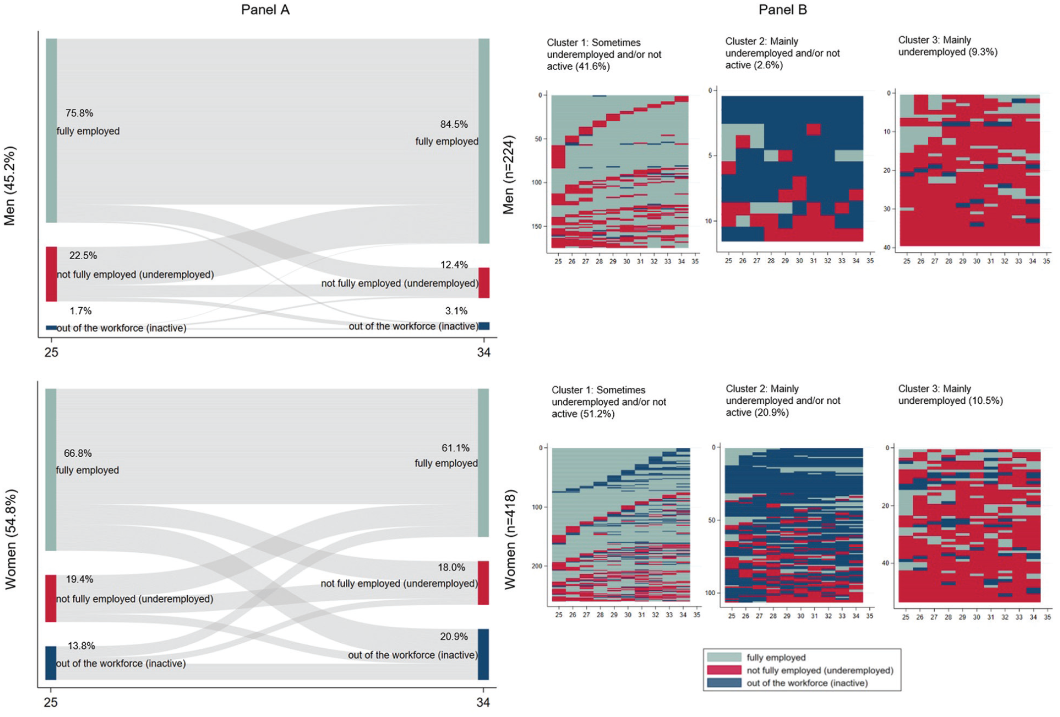
Underemployment dynamics in Australia. (A) Sankey plot for underemployment at the ages of 25 and 34 years. In (B), each line represents an individual’s employment status—employed, underemployed, or not employed—for each year between the ages of 25 and 34. Underemployment is defined as the positive difference between the preferred weekly working hours and the usual weekly working hours in the respondent’s main job (with usual working hours including both paid and unpaid overtime), resulting in three categories: 1 = fully employed, 2 = not fully employed (underemployed; includes unemployed, part-time, and full-time workers), and 3 = out of the workforce (inactive).
Dynamics and Endurance of Underemployment
The Sankey plot provides valuable information, but it obscures the variability and intensity (such as the number, duration, and sequence) of underemployment experienced during early careers. To reveal these dynamics, in Figure 1B a sequence index plot is used to visualize the most common underemployment patterns from ages 25 to 34 years among men (top) and women (bottom). The plot displays the three most typical underemployment trajectories, including those (1) sometimes underemployed and/or not active, (2) mainly underemployed and/or not active, and (3) mainly underemployed between the ages 25 and 34. On the x-axis, each line represents an individual’s employment status—employed, underemployed, or not employed—for each year between the ages of 25 and 34. The y-axis shows the count of individual sequences in each group. Strikingly, women dominate all three groups. Specifically, the first and largest group shows that a higher proportion of women (51.2 percent) compared with men (41.6 percent) experience underemployment at least once during their early careers. A significant number of women in this group experience mainly alternating spells of underemployment and inactivity, particularly in their 30s. The second most prevalent cluster uncovers a higher proportion of women (20.9 percent) than men (2.6 percent) who are underemployed and/or inactive between the ages of 25 and 34. This trajectory typifies an entrapment pattern that is more prevalent among women. These patterns may partly reflect discriminatory hiring practices that are linked to women’s expected childbearing and caregiving periods during these ages. Finally, the third cluster shows a considerable group of men (9.3 percent) and women (10.5 percent) who are mainly underemployed. Transitions to full employment are erratic and do not appear to last, which may reflect issues of path dependency and careers with limited growth opportunities. Not shown here is the group of workers who are continuously fully employed during the ages of 25 to 34. This group comprises 46.4 percent of men but only 17.4 percent of women, again highlighting a much larger gender disparity within this group than what the Sankey diagram suggests.
Conclusion
The results of the visualization show a clear gender divide in underemployment during the early career years. Women are more likely to experience underemployment and inactivity between the ages of 25 and 34 years. Furthermore, the underemployment experienced by women is of a more persistent and recurrent nature, which may partially explain why a significant number of Australian women leave employment after childbirth (OECD 2022). The loss of women’s human capital because of underemployment represents a significant drain of unique work experience, skills, and talents, particularly in the face of booming skills shortages. Our results suggest that policy makers should urgently develop policies that reduce underemployment during early careers and enhance women’s employment.
Supplemental Material
sj-docx-1-srd-10.1177_23780231231160640 – Supplemental material for Visualizing Underemployment Dynamics in Australia: Combining Sankey and Sequence Analysis Plots
Supplemental material, sj-docx-1-srd-10.1177_23780231231160640 for Visualizing Underemployment Dynamics in Australia: Combining Sankey and Sequence Analysis Plots by Sophia Fauser and Irma Mooi-Reci in Socius
Supplemental Material
sj-docx-2-srd-10.1177_23780231231160640 – Supplemental material for Visualizing Underemployment Dynamics in Australia: Combining Sankey and Sequence Analysis Plots
Supplemental material, sj-docx-2-srd-10.1177_23780231231160640 for Visualizing Underemployment Dynamics in Australia: Combining Sankey and Sequence Analysis Plots by Sophia Fauser and Irma Mooi-Reci in Socius
Footnotes
Authors’ Note
The authors’ names are alphabetically ordered.
Funding
The author(s) disclosed receipt of the following financial support for the research, authorship, and/or publication of this article: This visualization was supported by funding from the Australian Research Council (DP160101063) and the European Research Council under the Horizon 2020 research and innovation program (grant agreement 758491). It uses unit record data from the HILDA Survey. The HILDA Survey Project was initiated and is funded by the Australian Government Department of Social Services and is managed by the Melbourne Institute of Applied Economic and Social Research. The findings and views reported in this article, however, are those of the authors and should not be attributed to either the Department of Social Services or the Melbourne Institute.
Supplemental Material
Supplemental material for this article is available online.
Author Biographies
References
Supplementary Material
Please find the following supplemental material available below.
For Open Access articles published under a Creative Commons License, all supplemental material carries the same license as the article it is associated with.
For non-Open Access articles published, all supplemental material carries a non-exclusive license, and permission requests for re-use of supplemental material or any part of supplemental material shall be sent directly to the copyright owner as specified in the copyright notice associated with the article.