
Abstract
Background:
Patient satisfaction surveys ask patients specific questions about provider behavior such as whether they were satisfied with the provider’s instructions about medications or time spent with the patient. It’s unclear how responses to these surveys can help providers focus on specific behaviors to improve.
Methods:
In a primary care setting, we analyzed Press Ganey patient experience survey responses. We examined the 10 questions dealing with satisfaction specific to the care provider experience. We used the “Top Box” counts (counts of most favorable responses) and Top Box% (percentage of most favorable response) for categorical and continuous measures of patient satisfaction.
Results:
For 12 consecutive months, 652 providers of 1014 accumulated at least 300 total responses from patients for the 10 provider-related questions. Only 8 of the 652 providers had significant differences (P < .05) in Top Box% for the 10 questions. Correlation of responses between the questions were between 0.86 and 0.96. Analysis of variance showed that 87% of the total variation in the Top Box% of the 10 questions was between providers and only 13% within providers. Factor analysis found no independent factors within the 10 questions (ie, a one factor model was sufficient; P < .0001).
Conclusion:
Patient survey questions appear to ask about specific provider behaviors that contribute to patient experience. However, the responses to 10 different questions are highly correlated and may not give providers or management enough statistically significant information to focus patient experience improvement efforts for individual providers.
Introduction
Patient satisfaction is one of the “triple aims” of health-care quality. 1,2 Third-party vendors such as Press Ganey™ (www.pressganey.com) contract with health-care institutions to provide patient satisfaction data that health-care providers use for quality improvement. The patient surveys are designed to help institutions by breaking down satisfaction into separate domains in the health-care experience. For example, Press Ganey queries patients on their experience with their health-care provider, nursing staff, access, and moving through the patient visit. In addition, Press Ganey asks questions about such things at attention to patient safety and privacy and whether the patient would recommend the practice to others.
In Press Ganey’s surveys, several questions are focused solely on perceptions of the care provider. In a standard question package that is sent to health-care institution patients, 10 questions specifically pertain to the provider.
Patient satisfaction with providers has been studied in several contexts. Some articles have looked at how the Press Ganey scores correlate with online physician review websites and other specific outcome measures. 3 -7 There have also been studies on the psychometric properties of the Press Ganey survey. 8 Others have examined how patient satisfaction is associated with opioid prescriptions. 9 However, little has been published about how providers could use specific patient feedback from Press Ganey to help improve their interactions with patients.
We examined the Press Ganey provider satisfaction survey results to see whether providers and management could use responses to specific questions to help guide improvement in provider behavior. We wanted to know whether management could use Press Ganey survey results to focus on specific behaviors that needed improvement.
Methods
Setting
The study took place in the Mayo Clinic Health System (MCHS). The MCHS provides primary and secondary care for parts of Iowa, Wisconsin, and Minnesota in the United States. For this study, we used primary care providers in family medicine, internal medicine, and pediatrics.
Patient Satisfaction Data
Press Ganey has been conducting patient surveys for Mayo Clinic since 2015. Surveys contain 24 standard questions in 6 domains. Domains are care provider, nursing/staff, access, moving through the visit, personal concerns, and practice assessment. We focused on the care provider domain which is 10 questions (Table 1).
Question Content Summary for the 10 Items in the Press Ganey Care Provider Domain (With Permission of Press Ganey).

Measures
The Press Ganey survey uses a Likert-type scale of 5 responses: very poor, poor, fair, good, and very good. The percentage of responses answered “very good” is called the Top Box score. For example, a provider having 70 “very good” responses from a total 100 would have a Top Box score of 70. In this study, we used the Press Ganey “Top Box score” but will refer to this measure henceforth as the Top Box%. The Top Box% is used by Press Ganey and health-care institutions to make comparisons between locations, individual, and entire health-care institutions. 10 Press Ganey also calculates the overall care provider Top Box%. This is the percentage of the combined “very good” responses from all 10 care provider questions divided by the total responses. We use the overall care provider Top Box% for examining variation in patient satisfaction between providers.
Data Collection
We used Press Ganey patient satisfaction data from 2018 to 2019. We queried the Press Ganey database for patient survey responses for all primary care providers in the MCHS. We used 12 consecutive months of survey results starting with responses based on office visits in July 1, 2018.
In our analysis, we included only providers with 300 or more total responses to the 10 care provider questions. These inclusion criteria ensured that there would be a minimum sample size average of 30 responses per question for each provider included in the analysis.
Statistical Analysis
We used the continuous variable Top Box% for each of the 10 questions to examine correlation between Top Box% for the responses to the 10 care provider questions. For each provider, we had 10 Top Box% numbers between 0 and 100 that we examined for correlation in the entire provider group. For the 10 separate Top Box%, we had 45 pairs of responses to questions that we could examine for correlation.
For the categorical data (counts of “very good” responses to the questions), we set up 10 × 2 tables for each provider containing 2 rows of counts of “very good” responses and counts “other” for the combined counts of the other 4 Likert-type responses. The 10 columns of the 10 × 2 tables were for the counts for each of the 10 care provider questions. After generating hundreds of these 10 × 2 tables of counts (one 10 × 2 table for each provider), we performed the χ2 test for each provider using the null hypothesis that response proportions for all 10 questions were equal. This allowed us to evaluate whether there were statistically significant differences in responses across the 10 questions for each of several hundred providers. We also combined all the responses for all providers to make a single additional 10 × 2 table and used χ2 to look for differences in questions across the entire practice.
There was both variability within the providers (differences in the 10-question Top Box% for each provider) and variability in the Top Box% between providers. To compare the observed variability in the 10 question responses within providers to the variability observed between providers, we used analysis of variance (ANOVA; with Top Box% as the continuous variable). Factor analysis was used to look for independent factors within the 10 questions. JMP 14.3.0 was the statistical software used.
Results
There were 623 872 survey responses to the 10 questions concerning patient experience with 1014 care providers. Of the 1014 providers, there were 652 (64%) providers who had over 300 responses (average 30 per question), 504 (50%) who had over 500 responses, and 247 (24%) providers who had over 1000 responses. The 652 providers with totals of 300 or more responses to the 10 questions accounted for 577 819 (93%) of the total responses to the care provider questions.
Figure 1 shows the histogram of the question response counts for all 1014 providers. We excluded from further study 462 providers of the 1014 who did not meet the minimum criteria of 300 or more responses to the 10 care provider questions. The remainder of our analysis focuses on the 652 providers with more than 300 responses in 12 months. Of the 652 providers, there were 483 (74%) in family medicine, 131 (20%) in internal medicine, and 38 (6%) in pediatrics.
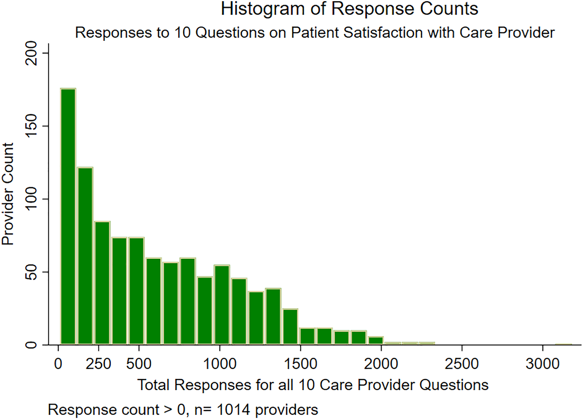
Histogram of Response Counts.
There was significant correlation between all 10 of the care provider questions. For the 652 providers attaining greater than 300 total responses, the correlation (r) between questions ranged from .86 to .96. The lowest correlation (r = .86; 95% confidence interval [CI] = 0.84-0.88) was between “friendliness of the care provider (CP)” and “instructions for follow up care.” The highest correlation (r = .965; 95% CI = 0.96-0.97) was between “confidence in the CP” and “likelihood of recommending the CP.”
Figure 2 shows the distribution of patient satisfaction with providers as measured by the combined 10-question Top Box%. The mean overall care provider Top Box% was 81 with a median of 82. Although we used the Top Box% as a continuous variable, it does have an upper limit of 100 and a lower limit of zero. With much of the distribution above 60, there is some ceiling effect. That is, variation at the upper Top Box% is limited by the ceiling of Top Box% at 100. For those close to the ceiling, say 95%, there are individuals who can have scores 10% below that but none who can be 10% above. In other words, if more of the individuals are near the Top Box% ceiling of 100, statistical outliers are limited to the lower scores. The upper 90 percentile for Overall Care Provider Top Box% was 91, and the lowest decile was 70. Thus, 80% of the providers had Top Box% between 70 and 91.

Histogram of Care Provider Overall Top Box%.
The ANOVA showed that 87% of the variability among the 6520 Top Box% scores (652 providers with 10 questions each) was between providers (r 2 = .87). Only 13% of the variability among the 6,520 Top Box% was within providers (within provider sum of squares 69 733 from total of 524 673). The estimated Top Box% standard deviation within providers was 3.4.
Figure 3 shows graphically the variation in Top Box% between and within providers. There are 6520 points in the graph; green represents individual question Top Box% for providers having 300 to 600 responses, and orange represents Top Box% for providers with 600 or more. The coalescing orange shows a large cluster of Top Box% from individual providers that also covers up more green points (Top Box% that are clustered in the same area). In this graph, the 652 individual providers are ordered along the x-axis by their Overall Care Provider Top Box% (their combined 10 question score). Each provider has 10 points vertically up from the x-axis, representing the Top Box% responses to each specific question. This is seen best in the lower left part of the graph, where there is a series of points going up from a single provider with an overall Top Box% of 35. Because providers may have numerically similar points that coalesce into a single point, not all providers have 10 visibly separated points on this graph.

All 10 Separate Question Top Box% by Provider.
Categorical analysis using χ2 examining each of the 652 provider 20 cell counts (10 questions dichotomously categorized with response counts of “very good” and other) showed that only 8 providers had statistically significant differences among the question responses (Table 2). With a null hypothesis of all 10 questions with equal proportions “very good,” there were only 8 of the 652 providers who had P < .05 for the null hypothesis. Thus, the 10 questions did not appear to reveal much statistically relevant differences to direct more than a handful of individual providers on specific areas to improve. Factor analysis also showed no independent factors contained within the 10 questions; that is, a one factor model was sufficient (P < .0001).
Top Box% for 8 Providers With Statistically Different Patient Responses (P < .05) for 10 Questions About Experience With Care Provider.a

a Greatest contributor to statistically unequal responses.
The entire sample aggregated together did show statistically significant differences across questions at P < .0001. For the entire sample comprising 10 questions with 577 819 responses, the 2 highest Top Box% were 86 (friendliness) and 85 (used clear language). The lowest 2 Top Box% were 79 (instructions for follow-up) and 80 (information about medications).
Discussion
The 10 different questions concerning patient satisfaction with the care provider appear to have face validity. However, for the MCHS practice, there was little evidence that the separate questions could help guide individual providers to focus on specific areas of improvement. As shown by the high correlation between responses to different questions, patient responses tracked together, although the questions attempted to address different aspects of the patient experience with the care provider. High correlation between the Press Ganey care provider questions has also been reported by Presson et al. 8
The high correlation between the different surveyed components of patient experience within providers resulted mostly in statistically insignificant variation for an individual provider. Because of this, we could rarely identify a specific behavior that was clearly an outlier for an individual provider. Although we identified 8 of 652 providers showing statistically unequal variation at P < .05 among the 10 question categories, a Bonferroni adjustment for the number of statistical tests performed would further decrease the number of providers with statistically relevant variation.
Of the 8 providers identified in Table 2, 3 providers had higher provider friendliness that drove the statistical difference between responses. Thus, some of the analysis identified a specific favorable behavior. In the other 5 providers with statistical differences among the responses, there were low Top Box% in areas that providers could focus on for improvement (Table 2).
Although our findings of strong correlations between survey questions about care providers are consistent with Presson et al, 8 further research is needed to determine whether this level of correlation extends across other health-care institutions and other patient populations. There are patient burdens of answering 10 questions when fewer questions could suffice. A reduced number of questions could potentially decrease question burdens on patients, increase survey completions, lower survey costs, and simplify interpretation for medical staff.
There are also potential patient satisfaction issues from a patient economic standpoint that are not included in the current 10-question survey. For example, the patient experience may be significantly affected by how a provider addresses the cost of health care. Even fully insured patients may have a significant cost of care associated with absentee days, travel to health care, various costs for care at home, and so on. Patients may be dissatisfied with a provider who does not address costs of care that are relevant to them. Provider questionnaires such as the Economic Awareness of Healthcare Professionals Questionnaire and others have been used to examine cost consciousness of health-care professionals. 11,12 However, little is known about how providers convey potentially important health-care cost considerations to patients. Recent studies examining the cost of care internationally show that in many nations there were significant “out-of-pocket” health-care costs. 13,14 Perhaps a patient survey question about how the provider addressed the “out of pocket” and total cost of care would offer additional important patient experience information not explicitly asked in the current question set.
The 10 questions did not provide much statistically significant information to focus individual providers on specific behaviors to improve, but there were statistically significant differences noted with the entire aggregated sample of 577 819 responses. These significant differences detected in the aggregated data could guide some systems-based quality improvement. For example, Epic electronic health-care record software has a feature called after visit summary (AVS) which, among other things, summarizes medication changes that occurred during a face-to-face visit and can be used to print out instructions for follow-up. Our system-wide 2 lowest Top Box% were for instructions for follow-up and information about medications. A system-wide use of the Epic AVS could potentially result in an improvement in those areas of patient experience.
A major limitation of this study is that the survey data came from only 1 health-care institution and only primary care providers. We also limited the study to 1 year of data collection. Larger numbers of responses may be needed to distinguish differences within providers. However, we had 247 providers with an average of over 100 responses to each question and still only found 8 that had differences at a P < .05 (no Bonferroni adjustment). There may also be a ceiling effect considering the Top Box% can range from 0 to 100, and almost all our providers scored above 60. This study was also restricted to the quantitative data (Likert category counts) supplied by Press Ganey. As part of their patient surveys, Press Ganey also collects a large number of free-text patient comments that could be evaluated to help identify specific favorable and unfavorable provider behaviors.
Conclusion
On an individual provider level, survey questions about patient experience with the care provider may not be able to identify specific provider behaviors that need improvement. Additional research will be needed to determine whether our results are generalizable to other medical practices.
Footnotes
Declaration of Conflicting Interests
The author(s) declared no potential conflicts of interest with respect to the research, authorship, and/or publication of this article.
Funding
The author(s) received no financial support for the research, authorship, and/or publication of this article.