
Abstract
Scholars have often suggested that racial integration is inherently unstable—a transition point in the racial transformation of neighborhoods and schools. While much empirical attention has been paid to documenting changes in segregation in public school districts, in this study we provide initial evidence focusing on the stability of segregation patterns. We calculate annual measures of district racial/ethnic segregation from the National Center for Education Statistics Common Core of Data from 1993 to 2015. Our findings suggest that despite relatively high and stable levels of segregation nationally, stability is the rule, rather than the exception, for the majority of public school districts. Using a taxonomy of severity and stability derived from previous scholarship, we find that most districts are “stably integrated,” with a minority “stably segregated” or exhibiting meaningful change. Our findings suggest that further attention to the characteristics and practices of “stably integrated” districts may be warranted.
While achieving racial/ethnic integration is a key equity objective, social scientists have often argued that integrated communities are inherently unstable (see Ellen et al., 2012). According to such perspectives, embodied by the influential Schelling’s (1971) model, racial/ethnic integration is too often a transition point along a path toward segregation. Developed to explain Black-White residential segregation, Schelling’s model contends that Whites tolerate living near Blacks until the Black population reaches a certain threshold or “tipping point,” after which Whites relocate to less diverse neighborhoods. As such, diverse neighborhoods are often those in the process of transitioning from White to Black and vice versa. Without significant and sustained intervention, diverse communities will disappear (Ellen et al., 2012).
The influence of this perspective is also evident in much of the scholarship on public school segregation. Indeed, several scholars have sought to identify tipping points for racial/ethnic change in schools (e.g., Caetano & Maheshri, 2017; Clotfelter, 1976). In other work, assumptions of instability are more implicit. A large body of work has focused on documenting changes in public school segregation since Brown (e.g., Orfield et al., 2003; Reardon & Owens, 2014; Stroub & Richards, 2013). Such work is rooted in concerns that the remedies of Brown were inadequate and the reductions in segregation it produced ephemeral. Consistent with this framing, scholars have found that school districts tend to regress toward segregation after being released from desegregation orders (Reardon et al., 2012). The past decades have also witnessed large-scale increases in racial/ethnic diversity and concomitant decreases in the share of public school students who are White. Viewed through the lens of Schelling’s model, this suggest that more districts may be approaching tipping points that will prompt Whites to leave diverse public school districts.
Despite these concerns, recent evidence from the residential literature suggests that contemporary White racial preferences are more complex than the Schelling model assumes and that stably integrated communities may be much more common than previously thought. For example, work by Ellen and colleagues (Ellen, 1998; Ellen et al., 2012; Xie & Zhou, 2012) suggests that over the past several decades, the percentage of stably integrated neighborhoods increased from less than 20% to more than 30%. Given the parallels between where families live and where children attend school, these findings suggest that stability in public school segregation may be more ubiquitous than previously believed.
While attention to trends in segregation is an important part of the overall project of ensuring that all students are afforded an equitable public education, in this study, we shift focus from change in segregation to stability in segregation. We seek to broaden existing narratives on school segregation by directly examining the extent to which public school districts have achieved and maintained stable levels of integration. Using a taxonomy of severity and stability derived from previous scholarship (Reardon & Yun, 2001), we find that most districts are “stably integrated,” with a minority “stably segregated” or exhibiting meaningful change toward segregation or integration.
Review of the Literature
Evidence on Tipping Points and Stability of Residential Segregation
Though there has been significant theoretical development of Schelling’s original model (Pancs & Vriend, 2007; Zhang, 2011), few studies have directly examined the relationship between tipping points and segregation. As Caetano and Maheshri (2017) have argued, this is largely attributable to the methodological challenges associated with estimating accurate tipping points with available data. Moreover, the evidence that does exist is equivocal. Consistent with Schelling’s model and the dominant paradigm in education, Whites often exhibit a strong preference toward homophily in schools: As the proportion of non-Whites at a campus increases, Whites become increasingly likely to move, or opt out of public schools in favor of private education (e.g., Caetano & Maheshri, 2017).
Recent evidence, however, suggests that White attitudes toward non-Whites have improved over the past decades, resulting in an increased willingness to live among non-Whites (e.g., Bobo et al., 2012). As a result of changing racial attitudes and complexity of Whites’ neighborhood preferences, recent scholarship suggests that White homophily and the impact of tipping points on segregation may have been overestimated (Bruch & Mare, 2006; Xie & Zhou, 2012). For instance, employing an agent-based modeling approach, Xie and Zhou (2012), find that the racial/ethnic attitudes of Whites exhibit significant heterogeneity. As such, over the long-term, the increasingly heterogeneous neighborhood preferences of Whites are associated with lower levels of residential segregation than would be expected with more homogenous racial/ethnic tolerance.
Consistent with this perspective, recent evidence suggests that stably integrated neighborhoods are more common than widely believed, and continue to proliferate (Ellen, 1998; Ellen et al., 2012). In an early study, Lee (1985) found that although most racially stable communities were predominantly White or Black, nearly 30% of racially mixed neighborhoods did experience stability between 1970 and 1980. Lee (1985) defined stable, racially mixed neighborhoods as those that have 10% to 89% Black residents and experience no more than a 5% change in Black residents over a 10-year period. Ellen (1997) found slightly higher prevalence of stably integrated communities from 1980 to 1990 using a slightly different threshold for measuring stable integration. Specifically, while 78% of communities with less than 10% Black residents and 83% of communities with more than 50% Black residents experienced stability, approximately half of racially mixed neighborhoods were stable—higher than would be expected given the narrative of integration as inherently unstable. In a subsequent analysis of data from 1990 to 2010, Ellen et al. (2012) found that the percentage of integrated metropolitan neighborhoods increased from less than 20% to more than 30%, and the proportion of newly integrated and stably integrated neighborhoods also increased.
Implications for Public Schools
The extant literature, therefore, suggests two competing perspectives regarding the link between residential segregation and racial/ethnic attitudes, particularly of Whites, which have differential implications for schools. Findings suggesting that White students tend to avoid schools with larger shares of non-White students are particularly concerning in the context of ongoing demographic shifts. Since Brown, public schools have become increasingly multiracial. Although White students remain the single largest racial group, they no longer constitute a majority, attributable largely attributable to the dramatic growth in the Hispanic/Latinx population (Frankenberg et al., 2019). Thus, many schools may be approaching the critical mass at which Schelling-type models would suggest that White families would exit from rapidly diversifying schools, prompting resegregation (Frankenberg et al., 2019; Fry, 2009; Orfield & Lee, 2006).
In the context of public schools, these concerns are further complicated by the ongoing legal retrenchment on issues of school desegregation. Over the past decades, many districts have been declared unitary, meaning they have been released from federal and state court-ordered desegregation requirements dating to the Civil Rights era. Troublingly, available evidence suggests that segregation tends to increase in districts after they are no longer subject to court oversight (Reardon et al., 2012). In addition to the steady decline in support for mandated desegregation over the past decades, the courts have also limited districts’ ability to voluntarily integrate by prohibiting the use of individual student race/ethnicity when assigning students to schools (Parents Involved in Community Schools v. Seattle School District No. 1, 2007).
On the other hand, research suggesting that homophilic attitudes of Whites are changing and heterogeneous suggest that the power of the Schelling model to predict tipping behavior and subsequent trends in segregation may be overstated. Indeed, moreover, recent work by Ellen and colleagues (Ellen, 1997, Ellen et al., 2012) suggests that there is much more potential for stable integration than is typically assumed. Given that most students still attend their neighborhood schools (e.g., Grady et al., 2010; National Center for Education Statistics, 2009), evidence on stable integration of neighborhoods suggests that we might also expect increases in stably integrated public schools.
Evidence on Trends in Public School Segregation
Over the past decades, a robust literature examining trends in school segregation has emerged. This largely descriptive work generally finds that racial/ethnic segregation in public schools remains high, particularly among Black and White students. Although segregation declined sharply in the decades after Brown, there is consensus that levels of segregation crept upward in the late 1980s and 1990s (Fiel, 2013; Iceland et al., 2002; Logan et al., 2004; Reardon et al., 2012; Stroub & Richards, 2013).
The nature of more recent segregation trends is more equivocal. Whether or not segregation is increasing or decreasing depends largely on how it is calculated. The two most commonly used classes of measures of segregation are isolation/exposure and unevenness, and researchers have long debated the merits and limitations of each (Massey & Denton, 1988; Reardon & Firebaugh, 2002). Isolation/exposure indices capture the average racial composition of schools for students of different racial/ethnic groups. Unevenness, however, captures how closely the racial/ethnic distribution of a school matches that of the district in which it is located (Massey & Denton, 1988). Measures of isolation and exposure are useful for providing insight into the racial composition of schools that students attend. However, measures of isolation/exposure are highly sensitive to changes in racial/ethnic composition and may increase as a result of changes in demographics even if students are evenly distributed across schools by race/ethnicity (Reardon & Owens, 2014). Measures of unevenness capture how evenly students are distributed by race/ethnicity independent of changes in the composition of students. However, they are somewhat less readily interpretable and may not comport with perceptions of segregation. For example, a district may have a relatively low level of unevenness even if all schools are 90% non-White, if the district itself is approximately 90% non-White.
Research using measures of isolation/exposure generally finds that school segregation has been increasing steadily over the past decades. Much of this literature comes from Orfield and colleagues (Frankenberg et al., 2019; Frankenberg & Lee, 2002; Orfield & Lee, 2007; Orfield et al., 2003; Orfield et al., 2014), who use measures of isolation/exposure to highlight worsening segregation trends, especially for Black students and schools in the South. Using measures of exposure, national trends show that since the late 1980s, non-White students are attending schools that are less and less White. In recent work, Frankenberg et al. (2019) highlight a decline in the percentage of schools that were “intensely segregated,” or 90% to 100% White. Over the same time period, however, the percentage of “intensely segregated” schools that enroll 90% to 100% non-White students more than tripled from 5.7% to 18%. Other studies have also highlighted the increasing isolation of non-White students (Frankenberg & Lee, 2002; Fry, 2009).
At the same time, however, White students’ exposure to non-Whites has increased, although the average White student still attends a school that is 69% White (Frankenberg et al., 2019). As discussed above, these trends in segregation are somewhat complicated by the fact that White students account for a much smaller share of public school children than they did a few decades ago. When Fiel (2013) examined changes in measures of isolation and exposure after accounting for demographic shifts, these relatively large increases in segregation were eliminated entirely.
In contrast, research using measures of unevenness generally finds that after increasing over the late 1990s, segregation declined modestly since the turn of the century. As a result, multiracial segregation was 10.7% lower and White/non-White segregation was 7.3% lower in 2009 than it was in 1993 (Fiel, 2013; Stroub & Richards, 2013). Moreover, declines in Black/White segregation were particularly pronounced—although Black students still experience higher levels of segregation than any other racial/ethnic group.
Work using measure of unevenness has also documented an important shift in the geographic scale of segregation. While school segregation in the Brown era was primarily within districts (i.e., between schools), more recent trends have been driven by relative increases in the share of segregation between districts. Indeed, evidence suggests that the observed growth in segregation in the 1990s was largely attributable to increases in between-district segregation (Reardon et al., 2000). By 2010, roughly 60% of all school segregation was due to district boundaries (Stroub & Richards, 2013).
The education literature’s focus on changes in segregation trends makes implicit the assumption that integration is inherently unstable: While desegregation was associated with declines in segregation after Brown, these gains have been short-lived. Moreover, without the continued specter of judicial intervention and with little federal appetite for aggressive civil rights enforcement, districts will continue to resegregate. However, recent work on residential segregation suggests that this body of work may neglect the possibility of “stably integrated” public schools.
Current Study
While integration is often viewed as a point of transition in areas undergoing racial change, the finding that a substantial and increasing and share of neighborhoods are stably integrated suggests that further research exploring the prevalence of stably integrated public school districts is also warranted. Toward that end, we seek to provide initial evidence on stability versus dynamism in public school districts, focusing on the prevalence and characteristics of districts that have maintained stable and low levels of segregation.
Method
We calculate annual measures of segregation from 1993 to 2015 using data from the National Center for Education Statistics (NCES) Common Core of Data (CCD) Public Elementary/Secondary School Universe Survey. To provide a more complete picture of the severity and stability of segregation and to provide consistency with the extant educational literature on segregation, we employ measures of both exposure/isolation and unevenness. Readers may refer to Reardon and Firebaugh (2002) for a detailed discussion of the strengths and limitations of different segregation indices. We further classify districts according to a taxonomy of segregation developed using thresholds of severity and meaningful change identified by previous scholarship (Orfield & Lee, 2006; Reardon & Yun, 2001).
We use campus-level racial/ethnic data from the NCES CCD to compute annual measures of segregation nationally and for public school districts. We focus on the district level for two reasons. First, districts are arguably the most policy-relevant unit of analysis for school segregation—districts were historically responsible for instituting de jure segregation and maintaining de facto segregation. During the desegregation era, districts were the entities generally subjected to desegregation orders and responsible for implementing court-ordered desegregation. Second, while recent research on public school segregation has focused on segregation among districts in metropolitan areas as well as other units of aggregation (e.g., Fiel, 2013; Stroub & Richards, 2013), most research on segregation has focused on districts (Fry, 2009; Reardon et al., 2012; Reardon & Yun, 2004; Frankenberg & Lee, 2002; Rivkin, 1994).
Measures of Segregation
Isolation/Exposure
Measures of isolation and exposure together capture the average racial/ethnic profile of schools experienced by students of a given racial/ethnic group. For example, White isolation captures the share of White students enrolled in schools attended by a typical White student. By contrast, White-Black, White-Hispanic, White-Asian, and White-Other exposure captures the share of Black, Hispanic, Asian, and Other race students enrolled in schools attended by a typical White student. We compute measures of isolation and exposure to all other racial/ethnic groups for the four racial/ethnic groups tracked consistently by NCES (i.e., Black, Asian/PI, Hispanic, and White). We calculate isolation at two geographic levels of analysis: nationally and for each public school district. Readers may refer to Massey and Denton (1988) for more information on procedures for calculating isolation and exposure.
For each focal racial/ethnic group, their isolation may range from 0 to 1, where 0 means that a typical student attends a school enrolling 0% of students of the same race/ethnicity and 1 means that a typical student attends a school enrolling 100% of students of the same race/ethnicity. Likewise, for each focal racial/ethnic group, their exposure to each other racial/ethnic group may also range from 0 to 1, where 0 means that a typical student attends a school enrolling 0% of the other racial/ethnic group and 1 means that a typical student attends a school enrolling 100% of students of the other racial/ethnic group.
To aid in interpreting the severity of isolation/exposure, we use categories offered by Orfield and Lee (2006): isolation between 0.5 and 0.9 is “high,” between 0.9 and 0.99 is “intense,” and greater than 0.99 is deemed “apartheid.” We further deem levels of isolation below 0.5 as “low to moderate.” There is no clear consensus in the prior education or sociological literature regarding how much change in isolation/exposure may be deemed practically meaningful, as have been offered for unevenness (discussed below). Thus, we focus on the magnitude of changes in isolation observed over the study period rather than their adherence to an objective standard.
Unevenness
Although scholars have developed several measures of unevenness, we elect to use the Theil index for the sake of comparability with much of the recent segregation literature (e.g., Fiel, 2013; Owens, 2018; Stroub & Richards, 2013). Readers may refer to Reardon et al. (2000) for a more detailed discussion of the procedures used to calculate the Theil index.
A key advantage of Theil’s index is that it may be used to quantify the segregation among any number of racial/ethnic groups, or between specific pairs of groups. Thus, it can measure multiracial segregation, as well as more traditional dual-group measures, such as segregation between White and Black students or between Black and Hispanic students. In this article, in addition to calculating overall levels of multiracial segregation, we also calculate three dual-group measures between White and non-White students (i.e., White-Asian, White-Black, and White-Hispanic). We opt to use White students as the reference group in our dual-group measures of segregation (e.g., Asian-White, Black-White, etc.) because it aligns our measures with the historic goal of desegregation policy: to increase the access of historically excluded students to the schools of White students.
Another advantage of Theil is its geographic decomposability. Geographic decomposition is useful for determining the extent to which different geographic units of analysis contribute to segregation. In the context of this study, this allows us to examine how segregation between and within districts contribute to trends in segregation nationally. Specifically, we decompose total unevenness into two unique components, one capturing the unevenness attributable to the segregation of students by race/ethnicity across district boundaries and the other capturing the unevenness attributable to the segregation of students across the schools within each district (for a similar analysis decomposing total segregation in the South into between and within-district components, see Reardon & Yun, 2001).
For any given racial/ethnic dimension, Theil’s index ranges from 0 to 1, where 0 reflects complete integration (i.e., students are evenly distributed across schools by race) and 1 reflects complete segregation (i.e., each school is monoracial). Following the procedures of Reardon and Yun (2001) and Stroub and Richards (2013), we calculate trends using population-weighted averages, which provide a better estimate of the unevenness to which a typical student is exposed.
To aid in interpreting the severity of unevenness, we use heuristics offered by Reardon and Yun (2001). Reardon and Yun deem Theil indices below 0.1 “low,” between 0.1 and 0.25 “moderate,” between 0.25 and 0.4 “high,” and 0.4 and above “extreme.” Reardon and Yun also identified metrics for assessing whether changes in Theil are meaningful. They suggest that changes in magnitude of 0.05 (positive or negative) over a decade span are practically meaningful. To provide a more conservative estimate of stability, we categorize districts as having meaningful change if their unevenness changed by 0.05 or more over the entire 23-year period, not just a single decade.
Based on Reardon and Yun’s (2001) heuristics for the severity of segregation and meaningfulness of change in segregation, we classify districts into one of six mutually exclusive categories: (1) stably integrated (initial segregation <0.1, change < |0.05|), (2) stably segregated (initial segregation >0.1, change < |0.05|), (3) integrated and integrating (initial segregation <0.1, change < −0.05), (4) integrated and segregating (initial segregation <0.1, change >0.05), (5) segregated and integrating (initial segregation >0.1, change < −0.05), (6) segregated and segregating (initial segregation >0.1, change >0.05).
Sample and Data
We calculate annual values of segregation nationally and for each public school district using school-level data from the NCES CCD. Although NCES CCD data have been collected since 1986–1987, response rates were problematic prior to 1993. As such, the study relies on annual data for a 23-year period between 1993–1994 and 2015–2016.
Our analyses include all public school districts in the United States, excluding districts in Puerto Rico and other U.S. territories, as well as those operated by the Department of Defense or the Bureau of Indian Affairs/Tribal Schools. Because the study is focused on stability of segregation over time, our sample of public school districts is restricted to those that existed for the entire study period. As such, we exclude new districts that may have been established since 1993 (often charter districts, as well as 54 “seceding” districts; Richards, 2020), or districts that were eliminated over the time period (often through consolidation of rural districts; Richards, 2020). However, the measurement of stability of segregation in a district over time requires the stable existence of that district over time.
The samples of districts used to calculate measures of isolation/exposure and unevenness differ in one key aspect. For measures of exposure/isolation, we include all schools in the district of all grade levels (e.g., elementary, middle, high). As such, the levels of isolation and exposure for each district refer to the typical racial/ethnic profile of schools attended by all students in the district. After application of the criteria above, the final sample of districts used in the calculation of isolation/exposure is 12,134. For measures of unevenness, however, we include only elementary schools, following the procedure of Logan (2004) and Stroub and Richards (2013). Restricting the sample to only elementary schools ensures that segregation values isolate segregation from cohort effects. For example, if a district has only one elementary school and one secondary school, it may have a high-segregation value; however, any segregation between these two schools is better conceptualized as a cohort effect reflecting the different demographic characteristics of older and younger students. Finally, because segregation as measured by unevenness is only mathematically possible in districts with more than one school, this reduces the final sample of districts used in the analysis of trends in unevenness to 5,226 after excluding districts with one elementary school.
Results
National Trends in Isolation/Exposure
Figure 1 reports the average racial/ethnic composition of the schools attended by students of different racial/ethnic groups from 1993 to 2015. Specifically, for each focal racial/ethnic group, the graph depicts: (1) the isolation of that racial/ethnic group, and (2) the exposure of the focal racial/ethnic group to each of the other racial/ethnic groups. Because measures of isolation/exposure are influenced by demographic changes, it is important to contextualize these changes in terms of changes in the racial/ethnic profile of public schools, notably large declines in the share of White students and increases in the share of Hispanic students (see Figure 2).

Average public school racial/ethnic composition nationally for Black, Asian, Hispanic, and White students from 1993 to 2015. For each racial/ethnic group, the graph depicts isolation of the focal group as well as exposure to the other four racial/ethnic groups (summing to 100%).

Racial/ethnic composition of U.S. public school students, 1993 to 2015.
Black
Figure 1 demonstrates that the racial isolation of Black students declined substantially over the study period, attributable largely to increases in exposure to Hispanic, Asian, and Other race students. While a typical Black student attended a school that was 59.9% Black in 1993, by 2015 they attended a school that was 47.6% Black. This means that, according to the categories of severity outlined by Orfield and Lee (2006), a typical Black student was exposed to a high level of isolation in 1993 but a moderate level in 2015.
Notably, while Black exposure to other non-White students increased over the study period, Black exposure to White students declined. On average, Black students attended schools that were 34.2% White in 1993 and 26.0% White in 2015. In considering this finding, it is helpful to note that the 8.2 percentage point decline in Black exposure to White students is substantially smaller in magnitude than the 17.1 percentage point decline in the share of White students in public schools overall (Figure 2). As such, changes in Black exposure to Whites are consistent with declines in the share of Whites enrolled in public schools.
Asian
The racial isolation of Asian students increased slightly over the study period, driven in part by decreases in exposure to White students. Indeed, while a typical Asian student attended a school that was 21.5% Asian in 1993, by 2015 they attended a school that was 23.3% Asian, both moderate levels of isolation according to Orfield and Lee’s (2006) categories of severity. Notably, Asian exposure to White students declined over the same period, from 48.5% in 1993 to 37.5% in 2015. Again, it is helpful to note that the 11 percentage point decline in Asian exposure to White students was smaller in magnitude than the 17.1 percentage point decline in the share of White students overall (Figure 2). As was the case for other racial/ethnic groups, Asian exposure to Hispanic and Other race students increased substantially over the study period, while Asian exposure to Black students was relatively steady.
Hispanic
As with Asian isolation, the racial isolation of Hispanic students increased slightly over the study period, due in part to decreases in exposure to White students. While a typical Hispanic student attended a school that was 51.9% Hispanic in 1993, by 2015 they attended a school that was 55.3% Hispanic. Again, it is useful to note that the share of Hispanic students in public schools overall increased by 13.2 percentage points (Figure 2). Notably, Hispanic exposure to White students declined from 30.8% in 1993 to 25.3% in 2015, in the context of a 17.1 percentage point decrease in the share of White students nationally. As was the case for all four racial/ethnic groups, Hispanic exposure to Other race students increased substantially over the study period, while Hispanic exposure to Black and Asian students held relatively steady.
White
White students—by far the most racially isolated of all racial/ethnic groups—became substantially less isolated over the study period. Conversely, White exposure to Hispanic, Asian, and Other race students increased substantially. In 1993, a typical White student attended a school that was 82.0% White—by 2015, they attended a school that was 69.9% White. This trend is consistent with the declining share of White students overall, but it is important to note that the overall percentage of White students is much lower than 70% (Figure 2). Despite a decline in isolation, the level of White isolation has remained high according to Orfield and Lee’s (2006) severity criterion.
While White exposure to other non-White students increased over the study period, White exposure to Black students remained relatively stable. On average, White students attended schools that were 8.6% Black in 1993 and 8.2% Black in 2015 (note that Black-White exposure and White-Black exposure are not symmetrical).
Severity and Stability of Racial/Ethnic Isolation in Public School Districts
The figures referenced above clearly illustrate that the racial/ethnic composition of schools attended by students of different racial/ethnic groups are highly dissimilar. They also illustrate substantial changes in the racial/ethnic composition of public schools over the study period. Consistent with prior work (e.g., Fiel, 2013), these trends in isolation generally comport with changes in the demographic profile of U.S. public school students. Importantly, however, these national trends in isolation may mask important variation in the severity and stability of segregation more locally. Below, we explore the extent to which individual districts differ in terms of their patterns of isolation.
Severity
Figure 3 highlights variability in severity of isolation in terms of categories of severity outlined by Orfield and Lee (2006). As of 2015, the vast majority of districts had low to moderate levels of Black, Asian, and Hispanic isolation, meaning that the typical non-White student attends a school with fewer than 50% same-race students. Indeed, a typical Black student attends a school that is less than 50% Black in 96% of districts. Likewise, a typical Hispanic student attends a school that is less than 50% Hispanic in 91% of districts. However, White students remain particularly likely to attend schools with high concentrations of White students. A typical White student attends a school that is less than 50% White in just 20% of districts.

Percentage of public schools by severity of racial/ethnic isolation, 1993 and 2015. Categories of isolation derived from Orfield & Lee (2006). Measures of isolation capture the share of students of a given race/ethnicity enrolled in schools attended by a typical student of the same race/ethnicity. For each focal racial/ethnic group, their isolation may range from 0 to 1, where 0 means that a typical student attends a school enrolling 0% of students of the same race/ethnicity and 1 means that a typical student attends a school enrolling 100% of students of the same race/ethnicity. Isolation between 0.5 and 0.9 is “high,” between 0.9 and 0.99 is “intense,” and greater than 0.99 is deemed “apartheid.” We further deem levels of isolation below 0.5 as “low to moderate.”
Stability
Figure 3 also demonstrates that the share of districts with low to moderate levels of isolation was virtually unchanged over the study period for Black and Asian isolation. Consistent with the increasing share of Hispanic students nationally, the share of districts in which a typical Hispanic student attended a nonmajority Hispanic school declined by 4.7 percentage points. Conversely, consistent with national declines in White isolation, the number of districts in which White students attended majority-minority schools more than doubled between 1993 and 2015.
At the other end of the spectrum, the share of Black students attending “apartheid” schools with more than 99% Black students decreased from 21 to 9 over the study period, a finding that may be attributable in part to the creation of a two or more race category in the NCES CCD data in 2008 (mandatory in 2010; Richards & Stroub, 2020). Likewise, the number of districts in which a typical White student attends a school with more than 99% White students declined precipitously—from 2,067 to 213—over the 23-year study period. Again, however, trends for Hispanic isolation were less encouraging, albeit consistent with the growth in the Hispanic population. Over the same period, the number of districts in which a typical Hispanic student attends a school that is at least 99% Hispanic doubled—from 12 to 24.
While useful in the context of prior research utilizing such categories, such categorical measures of severity may make small changes that cross the categorical thresholds appear larger than they are, or may mask large changes in isolation within thresholds. As such, we also explore variability in changes in isolation using continuous measures of change. The four panels in Figure 4 provide measures of change in Black, Asian, Hispanic, and White isolation between 1993 and 2015. The distributions of changes in Black and Asian isolation are highly leptokurtic—most changes are tightly clustered around zero. Indeed, 90% of all districts had changes in Black isolation that ranged from −3.6 percentage points to +3.9 percentage points. Likewise, 90% of all districts had changes in Asian isolation that ranged from −0.8 percentage points to +2.8 percentage points. Again, however, the distributions for Hispanic and White isolation reveal greater variability. The distribution of Hispanic isolation is positively skewed, with few districts experiencing declines in Hispanic isolation. Conversely, the distribution of White isolation is negatively skewed, with all but a handful of districts experiencing declines in White isolation.

Distribution of changes in Asian, Black, Hispanic, and White isolation of public school districts between 1993 and 2015.
Because changes in isolation may be driven by demographic changes in districts, we also compute measures of isolation after adjusting for demographic change, similar to Fiel (2013). Figure 5 reports residual measures of changes in isolation obtained via linear regression models controlling for initial levels of isolation and demographic changes. After controlling for demographic change, all four measures of racial/ethnic isolation are highly leptokurtic about zero, with medians that are slightly negative, demonstrating that nearly all of the changes in observed isolation are attributable to demographic changes.

Distribution of residual changes in Asian, Black, Hispanic, and White isolation of public school districts between 1993 and 2015, after adjusting for initial levels of isolation and district demographic change.
National Trends in Unevenness
Figure 6 reports the population-weighted level of multiracial, Black-White, Asian-White, and Hispanic-White unevenness nationally over the study period, as a function of segregation between and within districts. Overall, we find that each measure of total unevenness is extreme (i.e., above 0.4), using the heuristics of severity offered by Reardon and Yun (2001), with the exception of Asian-White segregation, which is just under 0.4. However, each dimension of total segregation declined over the study period, although the decline in Asian-White unevenness was negligible. As the figure demonstrates, consistent with prior research (Reardon et al., 2000; Stroub & Richards, 2013), the majority of segregation lies across district boundaries, with 26% to 30% of segregation attributable to schools within districts, depending on the measure of segregation.

Segregation within and between all U.S. public school districts calculating using the Theil index of unevenness for all students (i.e., multiracial), Asian and White students, Black and White students, and Hispanic and White students.
Across all four racial/ethnic dimensions, between-district segregation was relatively stable or declined over the study period. Indeed, multiracial and Hispanic-White segregation declined meaningfully over the study period—by 5.6 and 10.9 percentage points, respectively (15.8% and 23.4%). Changes in between-district segregation for Black-White and Hispanic-White segregation were negative but evinced a pattern of stability, declining by 1.9 and 0.3 percentage points, respectively (5.2% and 0.9%).
At the district level, consistent with prior research using similar metrics (e.g., Fiel, 2013; Stroub & Richards, 2013), unevenness was relatively stable but declining over the study period. Since peaking in the late 1990s (i.e., multiracial, Asian-White, and Black-White) and early 2000s (i.e., Hispanic-White), students became somewhat more evenly distributed by race. Declines in multiracial segregation were particularly pronounced, decreasing by 1.8 percentage points (13.6%) since 1993. Asian-White, Black-White, and Hispanic-White segregation also experienced modest declines of 5.6%, 6.1% and 7.4%, respectively.
Severity and Stability of Unevenness in Public School Districts
Below, we explore the extent to which districts vary in terms of the severity and stability of racial/ethnic segregation as measured via unevenness (see Figure 7).

Percentage of districts by severity of segregation, by stability of segregation, and by pattern of segregation (severity × stability). Segregation as calculated by Theil index with categories of severity and stability derived from Reardon and Yun (2001).
Severity
The top panel of Figure 7 reports variation in the severity of unevenness using Reardon and Yun’s (2001) heuristics. The majority of public school districts in 2015 had low levels of racial/ethnic segregation (i.e., below 0.1). Specifically, 84% of districts have levels of multiracial segregation below 0.1, while 83% of districts have low levels of Hispanic-White segregation. A slightly smaller share of districts have low levels of Asian-White and Black-White segregation (79% and 78%, respectively). Just 2.0% of districts had high to extreme levels of multiracial segregation. Districts were particularly likely to have high to extreme levels of Black-White segregation; however, less than 5% of districts had high to extreme Black-White segregation.
Stability
The middle panel of Figure 7 reports variation in the stability of unevenness over time. As the figure demonstrates, racial/ethnic unevenness was relatively stable over the study period. Most districts experienced nonmeaningful changes, as defined by Reardon and Yun (2001), of less than 0.05. Nearly three quarters of districts had stable levels of multiracial segregation over the 23-year study period ranging from −0.05 to +0.05. Districts were slightly more likely to have meaningful changes in the dual-group measures of unevenness; however, 61% to 65% of districts had stable levels of dual-group segregation.
Districts that did experience meaningful changes in segregation were significantly more likely to have meaningful decreases than meaningful increases across all four racial/ethnic dimensions. Specifically, 2.5 times as many districts experienced meaningful decreases in multiracial segregation as experienced meaningful increases in segregation as measured by unevenness. This asymmetry was particularly pronounced for multiracial and Hispanic-White segregation; however, districts were also 1.5 times as likely to experience meaningful decreases in Black-White and Asian-White segregation as they were to experience meaningful increases.
As with isolation, because categorical measures of severity may overemphasize small changes that cross severity thresholds or minimize large within-threshold changes, we also explore variability in changes in isolation using continuous measures of change. The four panels in Figure 8 provide measures of change in Black, Asian, Hispanic, and White unevenness between 1993 and 2015. Again, the distributions of changes in Black, Asian, Hispanic, and White unevenness are relatively leptokurtic and clustered around zero, although the median for each group is small and negative (consistent with the results from Figure 7).

Distribution of changes in Asian-White, Black-White, Hispanic-White, and multiracial unevenness, as measured by the Theil index, from 1993 to 2015.
Stability by Severity
Based on Reardon and Yun’s (2001) heuristics for severity and change in segregation, the bottom panel of Figure 7 classifies districts into one of the six categories enumerated above. Nearly two thirds of districts—66.2%—are stably integrated, while just 7.3% are stably segregated. This is also true of Asian-White, Black-White, and Hispanic-White segregation: 56.2%, 55.3%, and 55.0% of districts are stably integrated on these racial/ethnic dimensions, respectively. Of the remaining districts with meaningful changes in segregation, 18.9% are integrating and 7.6% are segregating, suggesting that integration is the dominant trend for nonstable districts. Notably, nearly one in five districts are nonstable but integrating in terms of White-Hispanic segregation. Just 1.6% of all districts are segregated and continuing to segregate in terms of multiracial segregation. It should be noted that the share of districts that are segregated and continuing to segregate is small but significantly higher for Black-White segregation: 3.4% of all public school districts are segregated and segregating in terms of Black-White unevenness.
Characteristics of “Stably Integrated” Districts
Our results suggest that stable integration, in terms of unevenness, is the dominant pattern for most public school districts. Moreover, of those districts that experienced meaningful changes in segregation, districts were more than twice as likely to experience decreases in unevenness as increases. However, it is unclear what factors are associated with stable segregation vis-a-vis other segregation patterns. Toward that end, Table 1 disaggregates the six segregation typologies by key covariates that have been linked to segregation trends: district enrollment, change in racial/ethnic diversity, desegregation order status, geographic region, and locality or urbanicity.
Characteristics of Districts Exhibiting Each of the Six Segregation Patterns
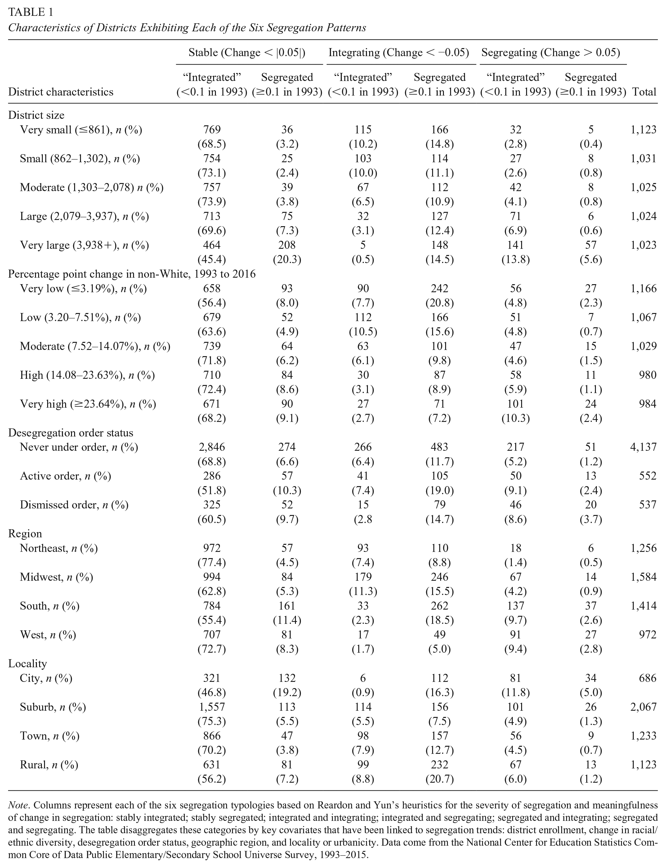
Note. Columns represent each of the six segregation typologies based on Reardon and Yun’s heuristics for the severity of segregation and meaningfulness of change in segregation: stably integrated; stably segregated; integrated and integrating; integrated and segregating; segregated and integrating; segregated and segregating. The table disaggregates these categories by key covariates that have been linked to segregation trends: district enrollment, change in racial/ethnic diversity, desegregation order status, geographic region, and locality or urbanicity. Data come from the National Center for Education Statistics Common Core of Data Public Elementary/Secondary School Universe Survey, 1993–2015.
District Enrollment
Table 1 demonstrates that very large districts, defined as those in the top quintile nationally, were less likely to be stably integrated than districts with fewer students. While 71.2% of districts with fewer than 3,938 elementary school students were stably integrated, just 45.4% of very large districts were classified as such. However, a much larger proportion of very large districts were stably segregated. Overall, nearly two thirds of all large urban districts were either stably segregated or stably integrated. For the roughly one third of very large districts that did experience change, they were more likely to segregate than smaller districts. For example, 13.8% of large urban districts were integrated but segregating as compared with 4.1% of districts with fewer than 3,938 elementary school students.
Because larger districts were less likely to be stably integrated, a smaller share of students than districts experienced stable integration. While two thirds of districts were stably integrated, just 44.7% of elementary students nationwide were enrolled in these districts. Conversely, a disproportionately large share of students were enrolled in districts engaging in meaningful change in segregation as compared with districts (32.4% of students vs. 26.5% of districts).
Change in Racial/Ethnic Diversity
Table 1 demonstrates that districts with moderate increases in racial/ethnic diversity were more likely to be stably integrated than districts with very low and very high growth in their non-White populations, defined as schools in the bottom and top quintile nationally. However, even among these districts with very low or very high growth in their non-White populations, a majority (56.5% and 68.2%, respectively) were stably integrated.
Notably, a large share of districts that experienced very low or low growth in their non-White populations were integrating (28.5% and 26.1%, respectively). In contrast, only 9.9% of districts experiencing very high growth in their non-White populations were integrating. These districts were more likely to be segregating, with 10.3% of districts that are integrated but segregating and 2.4% of districts segregated and segregating. These percentages are substantially higher than districts with less growth in non-White diversity.
Desegregation Order Status
Table 1 demonstrates that districts never under desegregation order were particularly likely to be stably integrated (68.8% vs. 56.1% of districts with active and dismissed orders). Conversely, districts with active or prior orders were particularly likely to be stably segregated (6.6% and 10.0%, respectively). Not surprisingly, given work by Reardon et al. (2012), which has found that districts tend to resegregate after unitary status declarations, districts previously under desegregation orders are particularly likely to be segregating. Indeed, 12.3% of districts previously under desegregation orders are integrated and segregating or segregated and segregating, as compared with 6.5% of districts never under desegregation order. Somewhat surprisingly, nearly as many districts under active orders (11.4%) are segregating as districts that have been declared unitary, possibly attributable to lack of enforcement of current orders. However, districts with active or prior desegregation orders are also particularly likely to be segregated but integrating, highlighting the greater variability in segregation in these districts.
Region
Table 1 demonstrates that districts in the Northeast are particularly likely to be stable, with over three quarters of districts classified as stably integrated. Conversely, just 55.4% of districts in the South were stably integrated. The finding that Southern districts exhibited less stable integration overall is consistent with the finding that districts under desegregation orders, most of which were concentrated in the South, tended to experience greater volatility in segregation. Indeed, of all four regions, the South had both the largest share of districts that were segregated but integrating (18.5%) and the largest share of districts that were integrated but segregating (9.7%). Notably, despite the prevalence of desegregation orders in the South, stable segregation was also particularly pronounced in the South, with 11.4% of Southern districts stably segregated.
Locality
Despite increasing attention to changes in racial/ethnic diversity in suburbs (e.g., Frankenberg & Orfield, 2012; Frey, 2011), Table 1 demonstrates that suburbs had the most stable patterns of integration, with 75.3% classified as stably integrated. Conversely, urban areas were particularly unlikely to be stably integrated: Just 46.8% of urban districts were stably integrated. Urban districts were particularly likely to be stably segregated (19.2%) or segregating. In addition, urban districts were particularly likely to be segregating. Indeed, 11.8% of urban districts were integrated and segregating, compared with 4.9% of suburban districts, and 5.0% of urban districts were segregated and segregating, compared with 1.3% of suburban districts. We also find that rural districts had less stable patterns of segregation: Just 56.2% were stably integrated, however, a relatively large (20.7%) were segregated but integrating.
Summary and Discussion
Recent reports have highlighted dramatic changes in segregation, suggesting that school districts are returning to levels of racial isolation not seen since Brown. Moreover, the sociological literature has often suggested that racial integration is inherently unstable (Ellen, 1997). According to this perspective, integrated neighborhoods or schools are ephemeral and at risk of regressing to a more segregated state. Recent work highlighting the heterogeneity of neighborhood preferences and the existence of stably integrated neighborhoods, however, calls this conventional wisdom into doubt (Ellen, 1997, 1998; Ellen et al., 2012; Xie & Zhou, 2012).
In this study, we interrogate this perspective, focusing on the extent to which districts have exhibited stability versus change in their segregation trajectories. We seek to understand the prevalence of stably integrated districts and the contextual factors associated with stability. Consistent with the residential literature (e.g., Ellen et al., 2012), our findings suggest that stability in the presence of relatively low segregation is the rule, rather than the exception, for most districts and the plurality of students. Thus, while segregation remains stably high nationally, it appears to be concentrated in a minority of districts.
The majority of districts have low to moderate Black, Asian, and Hispanic isolation. Moreover, levels of racial isolation for Asian and Black students were virtually unchanged between 1993 and 2015. For example, 90% of all districts had small changes in Black isolation that ranged from −3.6 percentage points to +3.9 percentage points even before adjusting for demographic changes. We document consistent increases in Hispanic isolation and decreases in White isolation. However, consistent with Fiel (2013), we find that these changes are entirely attributable to increases in the share of Hispanic students and decreases in the share of White students.
In terms of unevenness, we find that total national segregation declined over the study period for all racial/ethnic dimensions, although the decline in Asian-White unevenness was negligible. This was due to declining or stable levels of segregation between public school districts and within districts on average. At the district level, most school districts experienced nonmeaningful changes in segregation. Roughly three quarters of all districts had changes in multiracial segregation between −0.05 and +0.05. Moreover, most districts with stable segregation also exhibited low levels of segregation. Across all racial/ethnic dimensions, roughly two thirds of all districts were stably integrated. Along with stable integration being the most common segregation pattern, integration was the most common pattern of change. Indeed, districts were significantly more likely to have meaningful decreases in segregation than meaningful increases in segregation over the study period.
Such stably integrated districts are found across the country and hardly fit a single typology. For example, consider Torrance Unified School District (USD), a large and diverse urban district outside of Los Angeles that is 40% White, 34% Asian, 18% Hispanic, and 3% Black. Torrance USD has remained stably integrated on all four racial/ethnic dimensions studied since 1993, even though the share of non-White students has nearly doubled. By contrast, we also observe stable integration in suburban Columbia County Schools outside of the moderate-sized city of Augusta, Georgia. Columbia County Schools has maintained stable integration in the presence of a desegregation order, which has been in place since 1969. While the district is still predominantly White (71%), the share of non-White students has more than doubled since 1993.
While integration is the dominant pattern nationwide, we find systematic variation in segregation patterns across contexts. Very large districts are particularly unlikely to be stably integrated and more likely to be stably segregated. However, nearly half of large districts—such as Torrance USD—are still stably integrated. Partially consistent with the Schelling model, districts with very low and very high growth in racial/ethnic diversity tended to have more volatile segregation patterns, while districts with moderate demographic changes were more likely to be stably integrated. However, districts such as Torrance USD and Columbia County Schools maintained stable integration despite rapid growth in their non-White populations. In addition, despite the growing racial/ethnic diversity in the suburbs and emerging emphasis on suburban segregation (e.g., Frankenberg, 2012; Fry, 2009; Stroub & Richards, 2017), suburban districts, such as Columbia County Schools were particularly likely to be stably integrated, while urban and, to a lesser extent, rural districts were more volatile.
Interestingly, districts never under desegregation orders were particularly likely to be stably integrated, highlighting the prevalence of stable integration across districts even in the absence of federal or state oversight. Districts currently and formerly under desegregation orders were more likely to be stably segregated, had larger fluctuations in their levels of segregation, and were more likely to experience meaningful change. Likewise, the South is particularly unlikely to have stably integrated schools and particularly likely to have stably segregated schools, while stable integration is particularly common in the Northeast. It should be noted, however, that stable integration is still the dominant pattern for most districts in the South and for the majority ever subject to desegregation orders.
It should be emphasized that the finding that most districts have stable and low levels of segregation does not necessarily suggest that these districts have achieved true “integration.” While low levels of segregation are a necessary precondition for true integration, they are certainly insufficient. As such, it is entirely possible that many districts that are numerically classified as “stably integrated” may still exhibit other forms of segregation, including within-school academic tracking, segregation of school leaders and teachers, informal segregation of students’ friend networks, or inequalities in school resources. As such, our quantitative work is limited to understanding what Carter (2009) has termed “desegregated” schooling rather than truly “integrated” schooling.
It should also be noted that our analyses focus on segregation at the district and national levels. As discussed above, we opt to focus on the stability of district-level segregation because districts are arguably the most important unit of analysis for integration policy and to align with the bulk of the school segregation literature. However, there are a variety of ways to conceptualize and measure segregation. Indeed, recent research using geographically decomposable measures of segregation such as Theil have focused on metropolitan-level segregation and highlighted the increasing salience of segregation across district boundaries (Stroub & Richards, 2013) rather than within district boundaries. Further work may seek to investigate the stability versus dynamism of school segregation at alternative levels of aggregation (e.g., counties or states) to determine if trends in stability or instability vary at different geographic levels of analysis.
While there is much to learn from research focusing on areas with increasing and decreasing segregation, consistent with recent work suggesting that segregation might be more stable than is typically assumed (e.g., Bobo et al., 2012; Xie & Zhou, 2012), our findings suggest that there is also much to learn from districts that are stable. Our work suggests that the field may benefit from focusing on areas that have successfully maintained stable integration. For example, qualitative and case study evidence probing the contexts of stable segregation, such as districts like Torrance USD and Columbia County Schools, may yield insights about how leadership practices, student assignment policies, school choice markets, and community involvement have shaped stable integration. Such work may ultimately highlight the limitations of our quantitative approach, to the extent that districts deemed stably integrated by such measures mask worsening racial inequities in other domains. As such, further work may contribute to refinement and elaboration of our operationalizations of stasis and change in segregation.
Footnotes
Authors
MEREDITH P. RICHARDS is an associate professor of education policy and leadership in the Simmons School of Education and Human Development at Southern Methodist University.
KORI JAMES STROUB is a research scientist at the Houston Education Research Consortium at Rice University.
CAMILA CIGARROA KENNEDY is a junior research analyst at the Houston Education Research Consortium at Rice University.