
Abstract
The article analyzes the extent to which predictions based on the theory of evolutionary aesthetics are utilized by the advertising industry. The purpose of a comprehensive content analysis of print advertising is to determine whether the items indicated by evolutionists such as animals, flowers, certain types of landscapes, beautiful humans, and some colors are part of real advertising strategies. This article has shown that many evolutionary hypotheses (although not all of them) are supported by empirical data. Along with these hypotheses, some inferences from Bourdieu’s cultural capital theory were tested. It turned out that advertising uses both biological schemata and cultural patterns to make an image more likable.
Keywords
Introduction
Evolutionary aesthetics is a theoretical approach that assumes human aesthetic preferences are rooted in a process of evolution, and that they have adaptive functions (Appleton, 1996; Davies, 2012; Dissanayake, 1992; Humphrey, 1984; Thornhill, 1998, 2003; Thornhill & Fincher, 2014; Wilson, 1984, 1993). According to these theorists, the aesthetic pleasure of admiring certain landscapes and living organisms, as well as the reluctance toward dangerous situations (closed spaces, the presence of predators or parasites), known as “biological schemata” (Kroeber-Riel, 1988), in the past facilitated the survival of our ancestors. According to this perspective, “taste is an acquired preference for particular methods of satisfying inborn desires” (Appleton, 1996, p. 236), and beauty can be defined as “moving experience associated with information processing by aesthetic judgment adaptations when they perceive information of evolutionarily historical promise of high reproductive success” (Thornhill, 1998, p. 557). Denis Dutton (2009) summarizes this approach by saying that “art may seem largely cultural, but the art instinct that conditions it is not” (p. 206).
The existence of positive aesthetic schemata has been confirmed in numerous studies (e.g., Balling & Falk, 1982; Hartmann & Apaolaza-Ibañez, 2010). Experimental studies on consumer decisions also indicate that the presence of water sources, animals, and plants in a particular place in a shopping center arouses considerable interest, lengthens the time spent in that spot, and reduces walking speed (Buber, Ruso, Gadner, Atzwanger, & Gruber, 2007). Recent studies indicate that the aversive schemas are present even in 5-month-old children (Rakison & Derringer, 2008).
Evolutionary aesthetics, however, faces the difficult task of measuring what seems to be unmeasurable or difficult to measure using variables from the physical world. Yet, it does not mean that a scientist should give up all the efforts to analyze the phenomenon of taste. According to the representatives of this tradition, Aesthetic tastes are no more heterogeneous than the material substances that are found in the universe. These substances are, however, all subjects to many universally valid scientific laws, e.g. those of quantum mechanics and of the theory of chemical bonds. And their dissimilarities can, in fact, be deduced and explained with the help of these common laws. (Humphrey, 1984, p. 29)
The need for research on advertising from the perspective of evolutionary aesthetics was already signaled by Jay Appleton (1996), but no one has conducted it so far. In addition, in business-related literature there are suggestions that aesthetic preferences shaped by evolution may affect the assessment of ads and other marketing materials (Cary, 2000; Dennis & McCall, 2005; Kroeber-Riel, 1988; Percy, 1995; Saad, 2011).
Evolutionary perspective need not explain the entire complexity of human preferences (Dunham, 2011; Vyncke, 2011). The existence of an innate component of taste does not exclude that taste is affected by learning (Appleton, 1996). Proponents of evolutionary aesthetics usually agree that there are three layers of aesthetic response: biological laws, cultural rules (values, fashion, customs), and personal strategies (Bourassa, 1991). This article focuses only on the first, presumably the most general and most mysterious layer. The choice of the tested hypothesis does not preclude the need to conduct empirical research that would take into account other important issues such as symbols, decoding processes, as well as practices accompanying the consumption of visual materials (cf. Hennion, 2007; Scott, 1994). Such studies, however, are based on the assumption that “the taste for art is learned” (Willis, 1990, p. 2). These usually ignore biology-related explanations, which seems to be problematic from a scientific point of view.
The article analyzes the extent to which predictions based on the theory of evolutionary aesthetics are utilized by the advertising industry. The purpose of a comprehensive content analysis of print advertising was to determine whether the items suggested by evolutionists, such as animals, flowers, certain types of landscapes, beautiful humans, and some colors, are part of real advertising strategies. In the scientific literature, there are numerous articles suggesting that people evaluate design better when it uses nature-based symbolism (see, for example, Heerwagen & Gregory, 2008; Kellert, 2008; Mador, 2008). In the world of advertising, employing such a symbolism often causes that what used to be regarded as conformist and conventional becomes nonconformist and free (Jacyno, 2004), because humans instinctively link nature with something pristine, healthy, and fresh, which unlike the human creations cannot be fully controlled.
Usually, it is assumed that if evolutionary strategies are effective from the theoretical and academic point of view, the creators of advertising should utilize them. Some authors suggest that evolutionary strategies are adopted consciously (see, for example, Saad & Gill, 2000), and others that this is happening in a less conscious way (Appleton, 1996; Colarelli & Dettmann, 2003; Etcoff, 2000; Hartmann & Apaolaza-Ibañez, 2010). The assumption here is that strategists employed in advertising agencies are right about real human aesthetic preferences. By using inspirations, that stem from evolutionary aesthetics, they could be more successful in their work. This article shows, however, that the assumption pertaining to usage of evolutionary principles in everyday work in advertising industry is not entirely true in the Polish reality (where this business, after decades of communist rule, is not as developed as it is in the United States or other Western countries), although many evolutionary hypotheses have been confirmed by empirical data.
Method
The article is based on a content analysis of Polish magazines conducted from August 2012 to September 2013 (cf. Krippendorff, 2004). Advertisements are treated here as popular forms of art (Nava & Nava, 1992). All of the analyzed advertisements came from five different Polish magazines and can be grouped according to two criteria. Due to the gender of a typical reader, we can distinguish three groups of magazines: “masculine” (Komputer Świat, an IT magazine, henceforth KS; Newsweek Poland, henceforth NS), “feminine” (Twój Styl, a luxury women’s magazine, henceforth TS; Takie jest Życie, a cheap women’s magazine, henceforth TZ), “indeterminate” (Tele Tydzień, a television guide, henceforth TT). If, however, we adopt a reader’s level of education and wealth as a criterion, we should divide the magazines into those targeted at more educated and wealthier people (NS, TS, KS), and less educated and less wealthy people (TT, TZ). In the sample, there were 2,120 ads, which were then divided into image-based ads (51%) and text-based ads (49%). Image-based ads were considered those that consisted solely of an image, contained a dominant image, or combined images and text in similar proportions. In contrast, advertisements clearly dominated by text and those containing many elements (e.g., ringtone advertisements) were excluded from the analysis. Each image was analyzed using a recording sheet consisting of 51 categories. In the case of ads that contained images from nature, an additional recording sheet was used (7 categories). The text-based ads were analyzed using a few basic categories, and, like the others, software that counted the colors appearing in the ad. This application automatically counted pixels in 11 colors (dark green, cyan, black, red, purple, blue, beige, pink, gray, green, and yellow) based on a previously developed algorithm. 1 The additional, qualitative measurement of color was possible thanks to some categories of the basic recording sheet. The qualitative analysis took into account 14 colors, but the task of the coder was to point out 3 dominant colors.
The evolutionary hypotheses placed in Table 1 may be divided into two groups. The first (Hypotheses 1-4) includes those related to the presence of certain elements in advertising and absence of others. Hypotheses 1 to 3 are based on the “biophilia” theory introduced in 1984 by Edward O. Wilson, who defined it as an “innate tendency to focus on life and life-like processes” (p. 1; cf. Wilson, 1993, p. 31). According to the biophilia hypothesis, people should rate images of plants and animals, which can be a source of food, highly (Norman, 2005). Hypothesis 3 is rooted in Jay Appleton’s (1996) prospect-refuge theory, which states that a key criterion for assessing the landscape is the ability to find shelter or a good view. According to Appleton, the possibility to “see without being seen” is the most convenient situation because it allows one to avoid danger. It is in direct opposition to the “panoptic” prison described by Jeremy Bentham (1995) and Michel Foucault (1995), that is, a situation in which prisoners can be observed, but they do not know who is watching (only the guards are in a privileged position, which allows them to observe prisoners without being seen). Therefore, according to Appleton, the prospect and possibility of finding shelter makes an image more pleasant. In addition, the action of advertisements that took place in a natural environment should happen during a spring or summer day because nature is more benign then and it needs less controlling, making survival easier. Advertisements should also contain symbols of clouds, which are of human interest as a harbinger of changing weather (Thornhill, 2003). Furthermore, empirical studies have shown that elements such as a seashore, mountain stream, lake, or plants can increase the attractiveness of an image, pleasure and interest in it, as well as a sense of security, freedom, happiness, and relaxation in comparison with advertising depicting desert or urban conditions (Hartmann & Apaolaza-Ibañez, 2010).
Evolutionary Hypotheses.
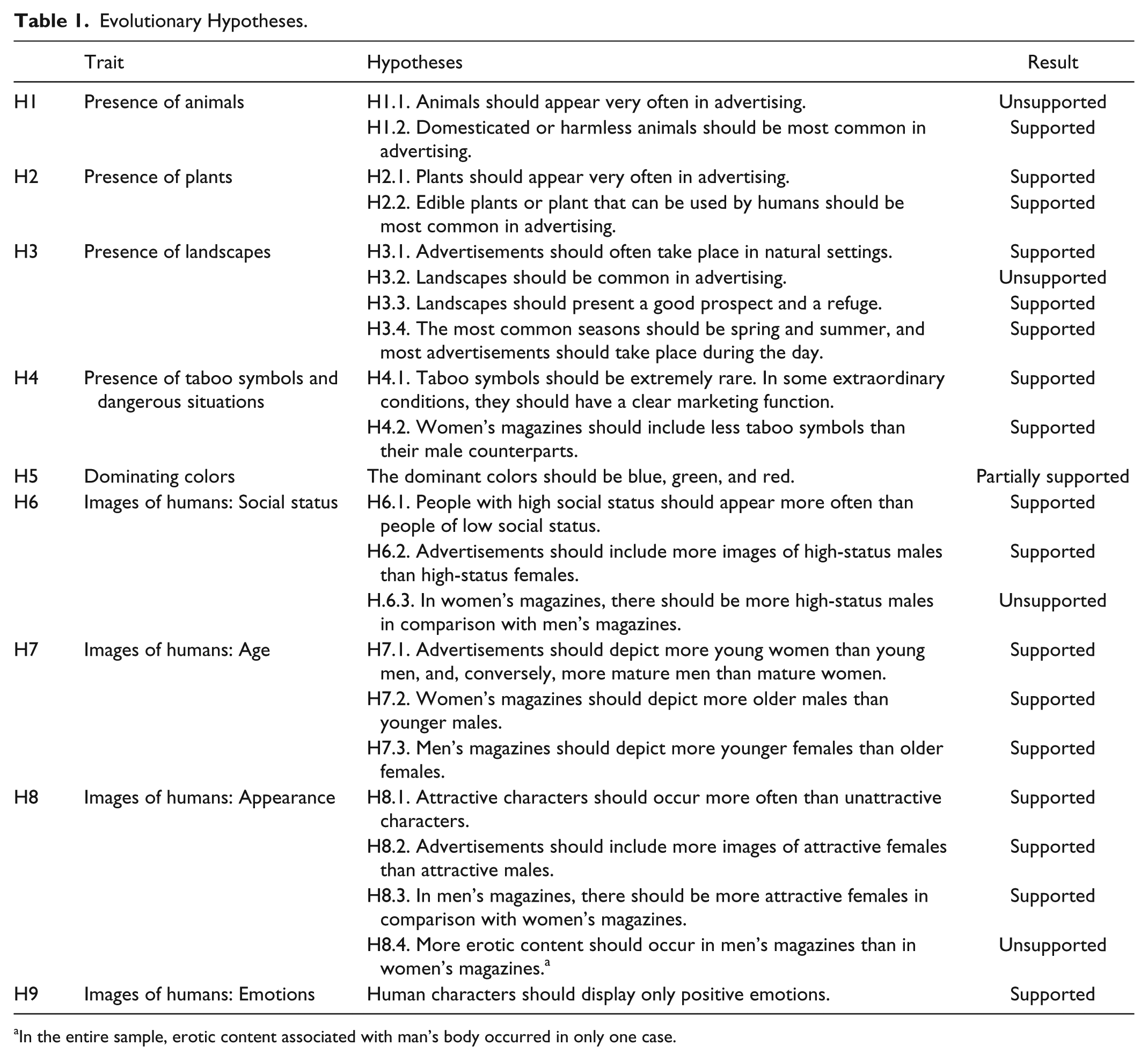
In the entire sample, erotic content associated with man’s body occurred in only one case.
The fourth hypothesis is based on the theory of biophobia. Evolutionists believe that some human fears (e.g., of snakes, spiders, heights, cramped conditions, blood) are natural adaptations, which defends humans from predators by eliciting very fast, automatic responses (see, for example, Rakison & Derringer, 2008; Ulrich, 1993). People should perceive images of predators as unpleasant, because “the evolved function of fear is to organize responses to danger” (Barrett, 2005, p. 215). This adaptation was described by Richard Dawkins and John Krebs (1979) as “life-dinner principle”: If the predation event is a success, the predator wins dinner, but the prey loses its life. Moreover, some research indicates that women have more negative attitude toward taboo symbols (see, for example, Coss, 1999; Sabri & Obermiller, 2012).
Judith Heerwagen and Gordon Orians (1993) in a speculative way argue that biophobic stimuli must be universal because—as they note—nightmares are not about threats such as poisoned water (contemporary) but are related to snakes, predators, and darkness. These stimuli normally cause a straightforward biophobic reaction, although it is also likely that they can be used to build tension in artistic and marketing practice (see Percy, 1995).
From the point of view of evolutionary theory, however, colors also play an important role as environmental signals (Hypothesis 5). As animals rarely distinguish colors, the human ability to distinguish them must serve an adaptive function (Humphrey, 1984). In the natural environment, blue and green signal water and vegetation, respectively, that play a very important role in survival (Hartmann & Apaolaza-Ibañez, 2010; Saad & Gill, 2000). Usually, such colors (which are similar due to their wavelengths) are associated with sedate mood states. They soothe, relax, and induce leisure and contemplation (Bellizzi, Crowley, & Hasty, 1983). In contrast, red is an indicator of ambivalence (some red fruits are edible, others are not; the palate of screaming opponent may be a sign of danger; in contrast, the female reproductive organs are also red, but bring about a different reaction), which, however, makes such items worthy of attention. A saying of the Ndembu tribe in Africa says explicitly “red acts both for good and ill” (Turner, 1966, p. 60). Humphrey (1984) notes in this context that “monkeys, confronted by a bright screen, become tense and panicky: the screen shouts at them ‘this is important,’ but without a framework for interpretation they are unable to assess what the import is” (p. 152). To sum up this thread, it is worth emphasizing that laboratory research on human color preferences usually allow for the establishment of a hierarchy of colors starting with blue and green (see Bellizzi et al., 1983; Berlyne, 1971; Humphrey, 1984; McManus, Jones, & Cottrell, 1980; cf. Wypijewski, 1997 2 ). Red is usually placed just after them.
However, it is possible to empirically verify hypotheses not related directly to biophilia (or biophobia). These are Hypotheses 6 to 9, mainly covering images of human beings. In terms of aesthetic categories, there are some advertising cues that can be understood as “fitness cues, that is, as those pieces of advertising information that (. . .) draw the attention of the consumer and are quickly and unconsciously judged to be either relevant or attractive from a fitness-promoting perspective” (Dunham, 2011, p. 267). Many studies on human attractiveness suggest that people pay attention to physical attractiveness and social status (see, for example, Buss, 1995; Dunham, 2011; Thornhill & Gangestad, 2008; Vyncke, 2011). Women, however, when assessing attractiveness, pay more attention to social status, and men to the appearance of women (Colarelli & Dettmann, 2003; Pawlowski & Koziel, 2002). Moreover, men prefer younger women because they are presumably more fertile, and women older men, because gaining a social status takes time (cf. Campos, Otta, & de Oliveira Siqueira, 2002; Colarelli & Dettmann, 2003). Human images depicting emotions should also contain almost exclusively positive ones, which indirectly show that the person has a positive attitude toward the world and other people (cf. Capella, 1993). Existing studies also show that sexual content makes advertising significantly more interesting and viewers more favorable to it (see, for example, Messaris, 1997; Severn, Belch, & Belch, 1990).
All of the hypotheses were also analyzed in the context of “cultural capital,” a very important concept in studies of art and media reception. Cultural capital is a complex sociological concept created by Pierre Bourdieu and his coworkers (see Bourdieu, 1984, 1986; Bourdieu & Passeron, 1977). In general, cultural capital is a derivative of the education and wealth of the family in which a child grew up. It is a kind of “expert knowledge” in the field of culture (cf. Bourdieu & Passeron, 1977), that is, people with high cultural capital (referred to in Anglo-Saxon literature as “highbrows”) are usually affluent and well educated. It was also checked if the analyzed patterns were related to the education and affluence of the average reader because it may be hypothesized that the volume of cultural and economic capital should be negatively correlated with the display of evolutionary preferences. This hypothesis is based on the assumption that taste of middle and higher social strata (which posses higher volume of cultural capital) is shaped by social fads, trends, and conventions, whereas the taste of lower social strata is more straightforward and reveals natural inclinations (see Bourdieu, 1984).
Results
Images of Animals and Plants
Among all image-based ads, 7.7% contained representations of animals. Many more contained plant motifs, which occurred in 23% of the images. In addition to the symbols connected with nature, the percentage of the ads containing cultural symbols (such as a panorama of a well-known city or a national symbol) was examined. Such symbols were found in 43.6% of the image-based advertisements. A comparison of the frequency of appearance of cultural symbols with animal- and plant-related symbolism leads to the rejection of Hypothesis 1.1 and the acceptance of Hypothesis 2.1. 3
Images of animals appeared in similar proportions in all the surveyed magazines, regardless of readers’ cultural capital and sex. Surprisingly, however, the presentation of ads with animals dominated in KS. But why do ads published in a computer magazine use animal images? It is probably because many advertisements from TT were targeted at children and/or teenagers (9.6% in this magazine, for the remaining magazines the mean was 4%). 4 In the entire sample, 17.3% of the ads targeted at children contained representations of animals compared with 7.1% of advertisements prepared for other audiences. According to the predictions of evolutionary theory, advertisements containing images of animals should be rated higher by children because they are more dependent on biological schemata (see Balling & Falk, 1982; Norman, 2005). This claim is consistent with the observation regarding the product categories that were advertised with images of animals. Among such ads, the most numerous were products related to media industry (15.3%), software and online services (11.8%), public service announcements (9.4%), financial services (8.2%), as well as advertisements of computers, food, clothing, and cultural offers (e.g., CDs, tickets; 4.7% each). Among these categories, only the advertising of financial services may not per se be targeted at children. Ads of this type usually used symbolism associated with animals, like an advertisement for Lion’s Bank, where the lion embodies one of brand’s values—individualism. In many cases, these ads also introduce specific context, such as emphasizing festive atmospheres and exotic tours that could be won by the customers.
From an evolutionary perspective, it is also important that the most popular pets were dogs, cats, pigs, horses and other domesticated animals as well as other animals harmless to humans such as ladybirds, storks, hedgehogs, butterflies, and bison. Predators, lions, and wolves appeared only one time each. These data support Hypothesis 1.2.
Plants and plant motifs were more common in women’s magazines (25.6% of all ads) and gender-neutral ones (31%) than men’s magazines (16.1%). Also gender-neutral (23.3%) and female ads (23.5%) contained more occurrences of plants and plant motifs than ads targeted at men (18.2%). As expected, plants appeared more often in magazines targeted at lowbrow audiences (28.3%) than highbrow (19.6%). All of the examined plants were either trees or edible fruits. Like animals, the plants presented in advertising were unambiguously human-friendly, which supports Hypothesis 2.2. They appeared mainly in ads of SMS-based services and drug advertising (14.5% and 14.3%).
Images of Landscapes
Among the image-based ads, 5 30.6% took place in urban areas, 28.9% in natural areas, 18.6% in the “public” part of home (kitchen, living room), 8.6% in the “intimate” part of home (bedroom, bathroom), and the remaining 13.3% in another closed room. Hypothesis 3.1 is therefore supported. Moreover, many more advertisements from magazines targeted at customers with lower cultural capital took place in natural areas (57.1% in TZ, 42.9% in TT) than in case of ads from magazines targeted at highbrows (23.9% in NS, 22.5% in KS, 21.7% in TS). 6
Ads based on landscapes (one subtype of ads taking place in natural settings) appeared, however, only in 7.4% of the analyzed advertisements, which requires a rejection of Hypothesis 3.2. The cultural capital of the audience and their gender does not differentiate the number of landscape-based ads. The ads that present natural landscape, however, more often are addressed to men (12.4%) than to women (3.2%). As predicted, such advertisements contained images of “accessible” nature, that is, nature that is easy to tame and makes survival possible. As many as 66.2% of the landscape representations (or other ads taking place in natural settings) 7 contained trees or shrubs, and a further 9.4% desert plants. Only 1% showed extremely harsh subarctic or polar climates. The remaining 23.4% of images did not show any vegetation. These exceptions were analyzed separately. It was found that these ads can be divided into two equal categories. The first presents uncharted mountains or other landscapes that evoke emotions and adventure. 8 This seems to be a deliberate strategy directed at a carefully selected group of adventurous people (cf. Joye, Poels, & Willems, 2011) because mountains, in fact, may seem dangerous, but attract people’s attention at the same time (Appleton, 1996). The second group consists of portrayals of women, children, or seniors, mainly on the beach. It is worth noticing the fact that “adventurous” landscapes contain masculine attributes such as off-road vehicles. These two types of landscape are understandable in context of Polish cultural norms indicating that “activity” is an attribute of men, whereas “passiveness” is characteristic for women (Stadnik & Wójtewicz, 2009). Gordon Waitt (1997) suggests that also in Western culture, flowery landscapes full of green are inherently feminine. What is interesting, however, is the fact that even “masculine” landscapes are not dangerous. Although they show that exploration requires effort and efficiency, but there are no elements that could directly indicate danger (e.g., frost, poor visibility, darkness). According to Waitt’s interpretation, the masculine conquest of nature is possible only when nature is feminized.
Moreover, nearly a third of the landscape ads contained sources of water (25%); 53.7% contained a representation of clouds. Some single examples also contained natural attractions, such as caves and canyons. The overwhelming majority of landscape-based ads took place during one of the favorable seasons: in summer (61.8%), spring (19%), or fall (14.4%). Winter was the least popular season (4.8%). In accordance with the evolutionary hypothesis, most of the advertising took place during the day (84.4%), at sunset (8.9%), or sunrise (5.7%). Ads happening at night were quite rare (1%).
The analysis of ads showed that their creators, consciously or not, designed them along the lines of Appleton’s prospect-refuge theory. In 62.8% of the advertisements, the prospect is good, and in the case of the next 31% it is neither good nor bad. Only 6.2% of landscapes do not meet the requirement of having a good prospect. In this case, advertising images contained a limited visibility range (i.e., a person placed in such an ad could not see all the details of a surrounding area, due to some obstacles). The refuge symbolism was presented in 81.6% of the landscape advertisements, and only 18.4% of the images did not contain any space that can be described as a refuge (i.e., tree, house; usually it was the case of absolutely open and flat spaces). The hypotheses on the specific components of landscapes must therefore be considered confirmed (Hypothesis 3.3 and 3.4).
Landscapes were mostly presented in drug ads (22.2% of all advertising containing landscapes) and car and accessories ads (11.3%). Both product categories suggest that these ads were directed to a much older audience than ads using images of animals. Landscapes seem to have different set of connotations, namely, that they are more serious than animals.
Controversial Content
This study also examined how often advertisements present controversial content inducing human aversion (e.g., spiders, closed spaces, funerals). As predicted by evolutionary Hypothesis 4.1, the percentage of such advertising was minimal (4% of all image-based advertisements). During the analysis, images of bacteria, dirt, skin diseases, mushroom cloud, industrial pollution, as well as a couple of night scenes were among those coded as controversial (taboo). According to the next evolutionary hypothesis (4.2), women should have more negative attitude toward taboo symbols. Indeed, ads containing such items appeared more frequently (5.6% of all ads) in magazines designed for men in relation to advertising intended for women (3.1%). Also it turns out that ads coded as addressed to men contain taboo symbolism more often (5.7%) than those addressed to women (2.5%).
Colors
The quantitative study showed that in all of the analyzed newspapers, the most popular colors were gray (35.6% of the colored surface of advertisements), white (29%), and black (17%). These colors most often served as a background, and thus they dominated considerably. Moreover, these “colors” are considered neutral (achromatic) because they have no hue. For those reasons, further analysis was focused on other colors. Among them, the most popular were beige (26.7% of the colored surface of advertisements), blue (20.9%), red (19.5%), yellow (12.5%), and green (12.4%). Pink and purple appeared considerably less frequently (5.4% and 2.6%, respectively). Beige, however, requires a more detailed discussion. The program marked quite a wide spectrum of colors, from garish oranges, browns, and gold to the proper shades of beige as being beige, making it a very broad category. Equally important, however, is the fact that all human faces and bodies appearing in commercials were coded as “beige.” So TS, TT, and TZ, which contained many images of humans, also contained more “beige” than KS and NS, where such images occurred less frequently (see Table 2). Excluding this color, most of the analyzed commercials consisted of the following colors: blue (28.6% of ads), red (26.6%), yellow (17%), green (16.9%), pink (7.4%), and purple (3.5%). As expected, blue and red were most popular. Red as the signal color seems to be well adapted to the requirements of advertising, primarily as attracting attention. However, not supported was the part of hypothesis concerning green, which occurred relatively infrequently (at least, as frequent as yellow, a nonevolutionary relevant color). The results, therefore, tend to support Humphrey’s (1984) hypothesis concerning a “color anarchy” in advertising (p. 148).
Advertisement Surface Occupied by Selected Colors (in %).

Note. TT = Tele Tydzień; TZ = Takie jest Życie; KS = Komputer Świat; NS = Newsweek Poland; TS = Twój Styl.
It was also found that blue appeared frequently in men’s magazines. In KS, this color occupies 5% of the ads’ surfaces, in NS it is 4.7%. In comparison, the sexually neutral TT contains 3.4% of blue pixels, whereas in women’s magazines it was even less (3% in TZ and 2.9% in TS). The presence of green did not form a consistent pattern, but, again, this “evolutionary” color occurred the least frequently in TS. It should be hypothesized that advertisements from some magazines were influenced more by cultural factors; hence, they were more independent from evolutionary-relevant elements and more conventionalized. In contrast, pink was underrepresented in KS, a magazine targeted at tech-savvy males, where only 0.6% of ad surface was pink, compared with an average of 1%. The most pink surfaces (1.3%) were found in TZ, the magazine addressed to poorly educated women. Therefore, female gender of the audience and low cultural capital favored the occurrence of bright colors. The recording sheet also contained questions about the color scheme of the advertisement. It turned out that ads placed in lowbrow magazines were more vivid (TT = 82.3%, TZ = 73.4%) than those in highbrow magazines (KS = 67%, TS = 61.5%, NS = 48.8%). This relationship seems reasonable in context of evolutionary theory, because highly saturated colors probably derive from mutual dependence between people and plants (Norman, 2005). Furthermore, in the women’s magazines, warm colors were more frequent than cold (45.1% compared with 25%), whereas in the men’s magazines, the difference was far less visible (33.7% and 25.8%). This effect, however, should be attributed to cultural rather than biological or individual schemata.
As already mentioned, the colors were also coded in a qualitative way. In this case, the coder was instructed to specify up to three dominant colors for an image. The results of this analysis are slightly different from those obtained in the computer-based measurement. In this case, the most common colors were blue (which dominated in 28.3% of advertisements), red (20.3%), and green 18.3%). 9 The qualitative analysis showed that blue and green appeared slightly more frequently in lowbrow than highbrow magazines (the difference was 5.3 and 1.5 percentage points, respectively). A significant difference was found, however, in case of red (27.8% in lowbrow magazines and 15.6% for highbrow). This observation is related to the fact that the lowbrow magazines are much more colorful than the other titles.
Images of Humans
Most of the image-based advertisements (65%, n = 697) presented humans. Nearly half of them (46.4%) showed a woman (or women), one third of the ads (35.1%) contained both the images of males and females, and the rest of the ads presented male characters (18.5%). It is clear how an audience’s gender and cultural capital affect the use of human images. At least one human appears in women’s magazines (76.1% of cases) much more often than in men’s (49%) and neutral TT (67.9%). Human images also appeared slightly more often in lowbrow magazines (71.2%) than in highbrow magazines (61.2%).
The gender of a typical advertisement character also varies across the groups of magazines. In the women’s magazines, we can see a clear majority of female characters (69.1 % compared with 21.8% ads with one man and one woman, and 9.1% advertising with a majority of male characters), and in men’s magazines, there is overrepresentation of male characters (46.1% of the advertising contains the representation of men, 24.4% one man and one woman, 29.5% female characters; n = 603). Moreover, in the neutral TT, all three categories appeared in similar proportions.
In the entire sample, as Hypothesis 7.1 predicted, there were more young women (37.3% of ads depicting women) than young men (17.8% of ads depicting men) but mature men (75.2%) occurred more often than mature women (53.1%). 10 As predicted by Evolutionary Hypothesis 7.3, in men’s magazines there are more young women than older women (see Table 3), despite the fact that mature women occur more often in women’s magazines. This clear overrepresentation of young women is paired with the almost total absence of seniors. According to the second hypothesis concerning age (Hypothesis 7.2), in women’s magazines men should be older than in men’s magazines (see Table 4). The data support this hypothesis, because in men’s magazines we have twice as many young men as in women’s magazines (and a comparable rate of mature men). Moreover, the highbrow magazines did not present seniors at all (KS, TS) or did so rarely (NS = 2.9%) in comparison with lowbrow magazines (TT = 16.8%, TZ = 28.6%). Hence, we see clearly that there is a relationship between gender and the presence of seniors, but the incidence of seniors is primarily affected by cultural capital.
Presence of Adult Female Characters (Excluding Kids and Teenagers; n = 324).

Presence of Adult Male Characters (Excluding Kids and Teenagers; n = 129).

In general, 74.8% of the analyzed ads contained an image of at least one physically attractive character (e.g., clear skin, athletic or slim body; see Dunham, 2011) compared with 11.6% ads depicting a character coded as unattractive. 11 This observation is consistent with Hypothesis 8.1. One may ask why people do care about attractiveness of other males or other females. The explanation was proposed by Colarelli and Dettmann (2003), who wrote that due to intrasex competition ads show attractive women beautified by cosmetics such as soaps, makeup, or hair products as a positive point of reference. In this case, images of women are addressed to women (as images of men are addressed to men), because people identify themselves with such images (cf. Vyncke, 2011).
The percentage of advertisements depicting only attractive men and women, however, was not equal (79.9% women and 46.2% men). 12 This is consisted with Hypothesis 8.2, which predicted gender differences. However, in men’s magazines, unattractive people appeared considerably less often than in women’s magazines (3.1% and 13.4%, respectively). The audience’s cultural capital also had an impact on the presentation of the characters, as only 2.2% of ads from highbrow magazines contained an image of an unattractive person, compared with 24.9% from lowbrow magazines.
All of the women presented in men’s magazines were attractive. 13 In comparison, in women’s magazines, 1 in 10 women (9.6%) was not physically attractive, confirming Hypothesis 8.3. Attractive men occurred here less often (30.3% ads) than in men’s (59.2%).
Social status based on the attributes owned by the characters (such as equipment or clothes) could be determined in 57.8% (n = 403) of the ads that depicted people. Among them, characters depicted in 44.8% had high status, in 37.7% medium status, and the remaining 17.5% low status, which is consistent with Hypothesis 6.1. Among all the ads depicting male characters, only 4.9% had low social status compared with 19.8% of women. These data support Hypothesis 6.2. Men with attributes of low social status, however, appeared more often in women’s (25% had a low social status) than men’s magazines (4.9%), contradicting Hypothesis 6.3. In addition, the status of the protagonists was very strongly related to the cultural capital of the audience: in highbrow magazines, only 3.1% characters had a low social status, and in lowbrow ones it was as much as 43.2%. This is consistent with the prediction assuming that ad characters resemble ad recipients (Schroeder, 2002).
Contrary to expectations (Hypothesis 8.4), however, advertisements with erotic content appeared in women’s than in men’s magazines (although the images of men in erotic contexts were extremely rare). These proportions were largely caused by the conventional representations of fashion popular among all the ads in TS (21.5% of the ads had erotic content) and dating services in TZ (19%). In the remaining magazines, erotic content was less popular (4.4% in NS, 8.5% in KS, and 11.9% in TT).
The emotions expressed by the protagonists were also examined. As predicted (Hypothesis 9), the most popular emotion was joy, which appeared in more than half of the ads (60.3%). Interestingly, next emotion, surprise, could be found in only 3.8% of the ads. All negative emotions occurred even less often. Fear appeared in 2% of the ads, anger and sadness in less than 1%. In addition, joy appeared slightly less frequently in highbrow (55.4%, compared with 67.1% of lowbrow). Models displaying no obvious emotions were particularly characteristic for magazines targeted at highbrow audiences (23%) compared with lowbrow (8%), and in women’s magazines (20.7%) compared with men’s magazines (13%). This is a consequence of the conventional presentation of fashion models, which in principle are expected to be emotionless. Because emotions are expressed differently in different cultures, their use is not recommended in international commercials (de Mooij, 2005), which dominate in highbrow magazines.
Discussion
This article was designed to answer the question of whether advertising in the contemporary Polish press is consistent with the schemata described in evolutionary aesthetics. The potential use of these mechanisms seemed to be profitable because “nature has, after all, been in the business of design for over a hundred million years” (Humphrey, 1984, p. 152).
The study showed that in the context of newspaper advertising, most of the evolutionary hypotheses were supported. The findings, however, should be treated with caution, because cultures cause differences in the aesthetics and rhetoric of local advertising (Johnson, 2009; de Mooij, 2005). Research in a country other than Poland would help test some of the theses that I have presented here.
Also, the selected material itself results in some limitations on the study. Although the print ads can be analyzed in a quantitative manner, the analysis is focused on the image itself and says nothing about its reception (cf. G. Rose, 2011). An experiment with human subjects would help to clarify some of the findings presented here, as well as to allow investigating hypotheses that were not possible to test on the basis of the analyzed newspaper ads (e.g., due to an insufficient number of representations of infants).
It also should be remembered that the presence of biological patterns does not exclude the impact of other types of determinants of aesthetic taste. The findings of this study concern only the most general of three layers that affect aesthetic taste. However, it turned out that in several important cases, the occurrence of various elements in advertising (such as natural scenery, bright colors, the image of humans in general, and seniors in particular as well as unattractive people and people of low social status) is related to cultural capital. It is likely that a successful advertising campaign must refer to biological schemata (e.g., presentation of animals, landscapes), culturally determined schemata (e.g., local traditions, myths, historical symbols, local values), and individually learned schemata (e.g., symbols operating in the minds of certain social groups such as football fans). Although the analyses of the symbols falling under the second category and third category described here are common in scientific literature, there is a deficiency of analyses at the first level. The article tried to close this gap.
Footnotes
Acknowledgements
The author would like to thank the anonymous reviewers for their valuable comments and suggestions to improve the initial version of the article.
Declaration of Conflicting Interests
The author(s) declared no potential conflicts of interest with respect to the research, authorship, and/or publication of this article.
Funding
The author(s) disclosed receipt of the following financial support for the research and/or authorship of this article: This work was supported by the National Science Centre [grant number: 2012/07/N/HS6/00469].