
Abstract
This research develops an innovative terror threat advisory system capable of visually communicating variations in the terrorism levels to policymakers or the public and forecasts future levels. Earlier attempts to create similar advisory systems by policymakers were either discontinued or lost their relevance due to a trust deficit in the system. We propose a novel approach for creating a color scheme and utilize it to develop an intuitive caterpillar diagram summarizing various stages of terrorism. It incorporates Global Terrorism Impact Scores for a nation or region using the Global Terrorism Database (GTD). Further, color transitions in the caterpillar diagram between consecutive periods mimic a Markovian process, thereby enabling us to develop the forecasting model. We successfully demonstrated the effectiveness of the proposed caterpillar diagram and forecasting model for India, Iraq, and their respective regions. The forecasting model suggests that the aggressive terrorism stage depicted by red color and transient stages of ascent (yellow) and descent (cyan) are the most probable in these nations and their regions. The proposed caterpillar diagram is an innovative visualization approach to identify terrorism patterns, from which a Markovian forecasting model is developed to aid policymakers. Our approach applies to any event-based database like GTD. Finally, the caterpillar diagram is a domain-independent framework that can visualize variations in any univariate data series, thereby assisting in system monitoring.
Keywords
Introduction
Visual communication is crucial for transmitting standardized information. Color is an intrinsic visual attribute that has cognitive significance in human experience (Puhalla, 2008; Varela et al., 1992). Almost every sector utilizes color codes to share pertinent information. The healthcare sector uses various color codes for different patient conditions in a hospital to facilitate quick action from the hospital staff (Megan Dix, 2018; Wikipedia, 2022). Similarly, air quality metrics utilize color codes to illustrate air pollutant levels and associated health concerns. The United States (U.S.) implemented a 500-point scale standardized color code by categorizing the Air Quality Index (AQI) values into different colors as per their levels of severity (U.S. Department of Agriculture, 2022). Further, the U.S. adopted a color-coded response for the large-scale cyber-attacks to standardize actions at all levels (Office of the Press Secretary, 2016).
Terrorism is a consistent threat that victimizes almost every nation. The definition of terrorism changes with political borders (Schmid, 2013). The difference in social, political, and legal opinions about terrorism results in non-standardized counterterrorism actions. Governments often implement public warning systems that provide information about security threats to the public and businesses (Bakshi and Pinker, 2018). This study proposes a novel color-coding scheme to visually analyze terrorism trends quickly and facilitate a certain degree of standardization in the counterterrorism responses across different nations. Security agencies of different nations had earlier attempted such color-coded terror advisory systems that got discontinued due to various reasons, like classified information sources, non-disclosure of the methodology behind the system, looming political bias to polarize the citizens, etc. (Shapiro and Cohen, 2007). We utilize an open-source, standardized, and actively maintained Global Terrorism Database (GTD) to develop and implement the proposed color-coding scheme.
Stochastic processes refer to those processes that evolve probabilistically (Hillier and Lieberman, 2010). This study also intends to model the terror state variations of any nation as a stochastic Markovian process. We demonstrate that the developed color-coding scheme can forecast a given country’s next step transition of a terror state.
Literature review
Every state accumulates intelligence to counter the terrorism threat on its soil. Such information repository requires analysis to identify actionable insights for different stakeholders like security agencies, policymakers, and citizens at some level. Multiple ongoing endeavors have attempted to address this need of government agencies and academia by developing different public warning systems. The warnings generated by these systems are a collective effort of intelligence agencies working at various levels. When alerts do not follow an actual attack, the stakeholders consider it a false alarm; a phenomenon often termed a “cry-wolf” in the literature (Bakshi and Pinker, 2018; Kolb and Conitzer, 2020). The literature is divided on the effects of the cry-wolf phenomenon on the perception of early warning systems. There is evidence to believe that people benefit from false warnings as it provides an opportunity to rehearse emergency procedures (Herring, 2003). We suggest those warning systems that update stakeholders based on fresh intelligence input to safeguard from some imminent threat can be classified as active warning systems. Conversely, a passive warning system works differently by communicating the threat perception based on historical events to provide an overview of threat level variations.
France was always a forerunner in countering this threat and refining its organizations, strategy, and operations (Gregory, 2003). In 1978 France established a detailed plan, known as Vigipirate, to safeguard its citizen, territory, and critical infrastructure from terrorism, first implemented in 1991 during the Iraq war (Petronella Soós, 2014; Schehr, 2008). The plan included a color scheme in 2003 that indicated the threat level using four colors, yellow, orange, red, and scarlet, in increasing severity. Later in 2014, simplifying this color schema resulted in two levels indicating vigilance and attack alert, which again got modified in 2016 to three levels showing vigilance, risk of attack, and attack emergency (Louis Gautier, 2016).
The U.S. introduced a color-coded advisory system in 2002 after the unfortunate and massive 9/11 attacks on its soil. This Homeland Security Advisory System (HSAS) aimed to increase response capability during a heightened security alert. This counterterrorism tool used five colors: green, blue, yellow, orange, and red. Figure 1 illustrates the HSAS along with relevant details corresponding to each color.
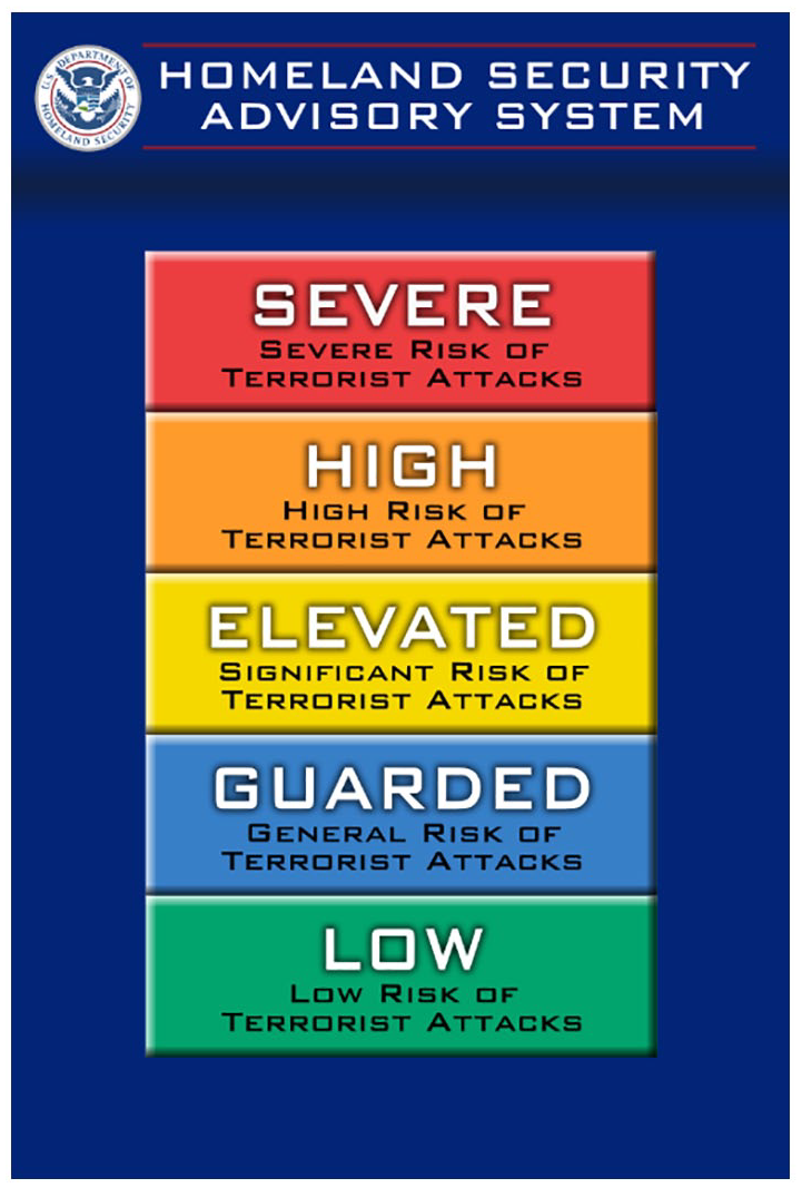
Homeland security advisory system (Pbroks13, 2008).
HSAS included threat advisories to state and local governments, information bulletins for threats regarding critical infrastructure, and a threat-based color-coded system to inform citizens and reduce the impact of an attack (Shapiro and Cohen, 2007). This advisory system failed to provide the procedural details about its alert levels and thus kept losing its credibility with time. We considered HSAS as an active threat advisory system. Typically, active warning systems have certain disadvantages that make them unreliable and lose mass acceptance. A theoretical model proposed by researchers demonstrated that each threat type has a threshold for the number of warnings. The public loses confidence and stops responding to these warnings when they exceed a threshold (Wenxuan Ding, 2006). Recent study by Bakshi and Pinker (2018) suggested that false alarms can lead to long stretches of sustained warnings or more attacks at lower warning levels. The Department of Homeland Security (DHS) maintained prolonged yellow and orange threat levels post the 9/11 terror attack. The warning fatigue coupled with miscommunications associated with these consistent threat levels became counter-productive within the public, resulting in a huge credibility loss about HSAS (Brigham, 2005). As a result, the DHS introduced the National Terrorism Advisory System (NTAS) after dropping the color-code system. The NTAS provides detailed advisory bulletins containing actionable information to instill confidence among the general public (Homeland Security, 2011).
The revisions by DHS allude that agencies depend on these early warning systems but cannot use them effectively and optimally (Bakshi and Pinker, 2018). These early warning systems face difficulty against strategic adversaries capable of delaying planned attacks based on the information provided to the public by these warning systems. A counter-intuitive study implemented an attacker-defender game-theoretic approach that suggested false alarms can improve outcomes relative to truthful reporting (Kolb and Conitzer, 2020). Although an active alert system like HSAS holds paramount importance for communicating the threat, we propose a passive alert system as it can mitigate the cry-wolf phenomenon while making it challenging for a strategic adversary to manipulate their actions to a certain extent. A passive color-coded alert system utilizes information from historical events faced by a region to determine threat levels.
Parallelly, the National Consortium for the Study of Terrorism and Responses to Terrorism (START), under the DHS, started to compile an open-source database of terrorist attacks and introduced it as the Global Terrorism Database (GTD) (LaFree and Dugan, 2007). This database stores terror events from 1970 onward and has four parts based on the data source, as illustrated in Figure 2. Other terror event databases, like ITERATE, also exist in the literature (Mickolus et al., 2016). Still, we chose the GTD for this study due to its active maintenance and the availability of detailed information about each incident using 135 attributes.
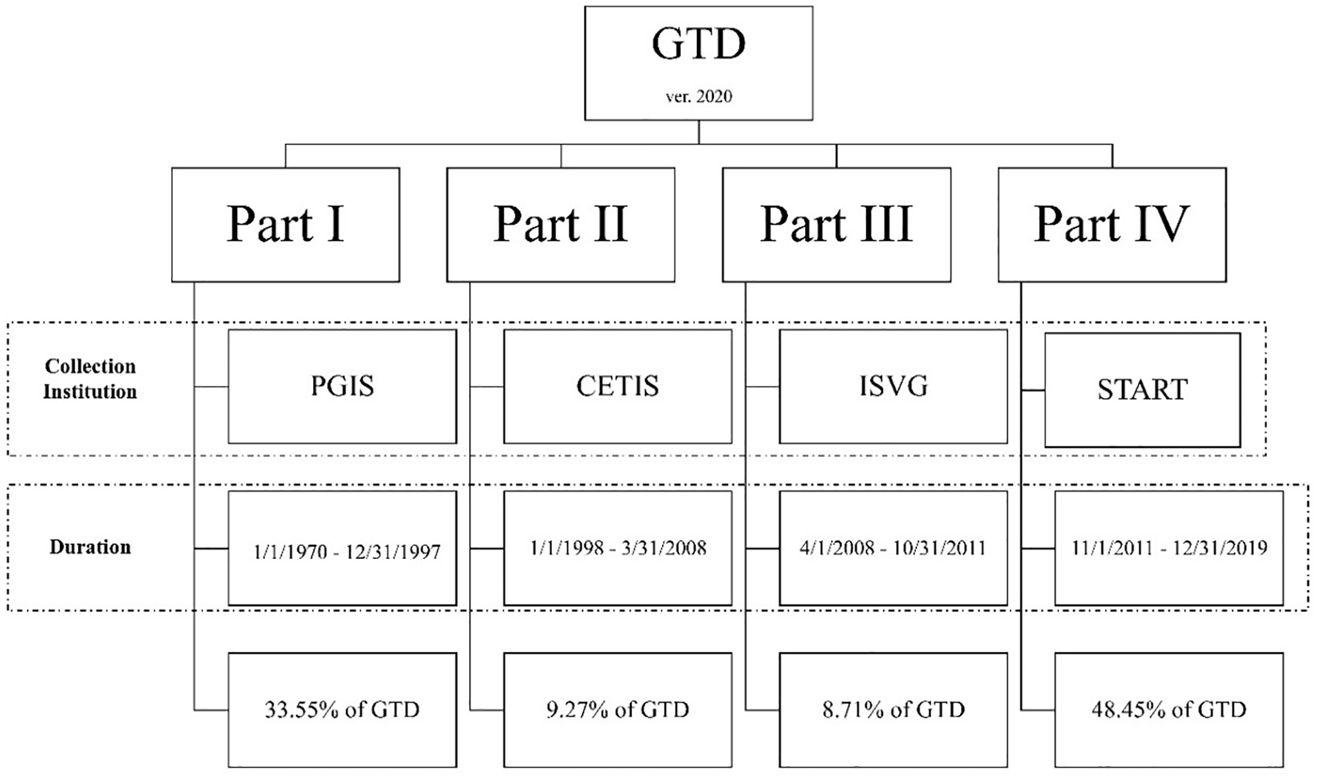
Constituent parts of the Global Terrorism Database (GTD) 2020.
A global database like GTD can facilitate the development of a passive threat advisory system for any nation worldwide. GTD 2020 classifies all countries into 12 distinct regions viz., North America (N.A.), Central America & Caribbean (CAC), South America (S.A.), East Asia (E.A.), Southeast Asia (SEA), South Asia (S.A.), Central Asia (C.A.), Western Europe (WE), Eastern Europe (E.E.), Middle East & North Africa (MENA), Sub-Saharan Africa (SSA) and Australasia & Oceania (A.O.) (START, 2021).
The Global Terrorism Index (GTI) is a ranking methodology to assess the status of terrorism in a nation (Hyslop and Morgan, 2014). It utilizes attributes from the GTD like the number killed (nkill), number wounded (nwound), and property damage (propextent) accrued to assign a GTI impact score (GTI-IS) for each incident, as shown in equation (1).
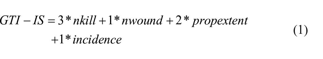
Equation (1). Evaluation of Global Terrorism Index Impact Score (GTI-IS) for a terror incident
GTI is a widely known terror ranking system, which the United Nations General Assembly (UNGA) recently cited to illustrate that terrorism-related casualties have declined since 2017 (United Nations, 2021). The GTI report 2020 identified the top 10 nations affected by terrorism: Afghanistan, Iraq, Nigeria, Syria, Somalia, Yemen, Pakistan, India, the Democratic Republic of the Congo, and the Philippines (Institute for Economics & Peace, 2020). This study proposes the GTI-IS as a fundamental metric to develop the proposed passive threat advisory system capable of providing alerts using color codes. Although the authors’ prior research into the methodology of GTI reported significant reservations, this study still utilizes the GTI as it provides a summary statistic for a terrorist attack that is useful for developing a passive alert system (Singh and Philip, 2021, 2022). The proposed threat advisory system can incorporate any future univariate terror summary statistic better than GTI-IS.
A stochastic process {Xt} follows a Markovian property if the conditional property of any future event Xt+1, given any past events {X0, X1, . . ., Xt-1} and the present state Xt, is independent of the past events and depends only upon the present state (Hillier and Lieberman, 2010). The conditional probabilities P{Xt +1=j | Xt = i} are known as transition probabilities. Considering M distinct states in a Markov chain, the (M, M) square matrix of transition probabilities is known as the state transition matrix. An n-step transition matrix collects all transition probabilities after n-steps in the chain by following equation (2) for each i, j, and n.
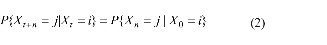
Equation (2). Conditional probabilities of n-step transitions
A Markov chain is irreducible if all chain states communicate with each other. A Markov state is aperiodic if unity is the greatest common divisor of all possible steps to return to the same state. If all states of a Markov chain are aperiodic, then the chain is known as an aperiodic chain (Hillier and Lieberman, 2010). An irreducible and aperiodic Markov chain has a unique stationary distribution. Recent research utilized absorbing Markov chains to model a public security scenario consisting of a terrorist determined to activate a bomb in a room and the security personnel simultaneously trying to prevent the activation and capture the perpetrator (Punceva and Marina, 2017). We created an innovative caterpillar diagram using a color-code scheme that incorporates Markov chain into threat advisory to forecast future terrorism threat levels.
Methodology
This research intends to develop a passive color-coding schema to enable a quick and easy overview of the magnitude and direction of the amount of terrorism in a particular nation. We utilized the complete GTD released in 2020 that reports events until 2019, amounting to 201,183 incidents. The GTI is an indexing system based on the GTD that ranks a nation based on the amount of terrorism it faced in the past 5 years. It calculates a numerical measure of each GTD incident using equation (1). Here, the GTI-IS statistic is computed for each incident and then aggregated for each nation in a year to compare the annual variations in terrorism.
The first step in developing the color-coding scheme is to quantify variations in terrorism. This study used aggregated terrorism scores of 3 consecutive years as a cohort along with an intuitive difference of differences (DoD) approach, as illustrated in Figure 3.
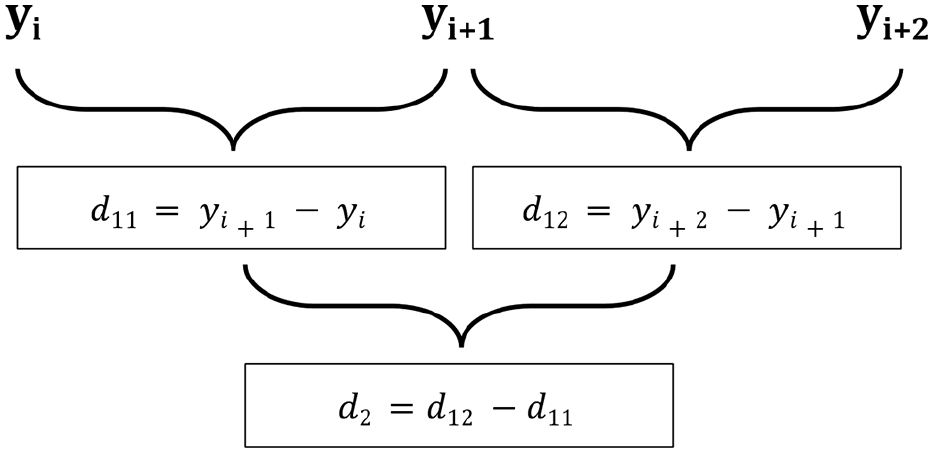
Difference of differences approach.
Figure 3 depicts the aggregate GTI-IS from 3 consecutive years viz., yi, yi+1, and yi+ 2 for the demonstration. The first difference, d11, is between the ith and (i + 1)th years. Similarly, d12 is the other first difference between (i + 1)th and (i + 2)th years in the 3-year cohort. The difference between d12 and d11 is the second difference, d2.
Thus, a 3-year cohort provides a set of three signed differences whose unique combinations of signs ascertain the specific level of terrorism for that cohort. Table 1 summarizes all possible sign combinations of the DoD approach and their associated colors and terrorism stages. Interestingly, the second difference column, d2, will not report a zero difference for any color except red and green. We consider the zero difference as a positive value for this study’s red and green colors.
Color Schema based on differences of difference (DoD) approach.
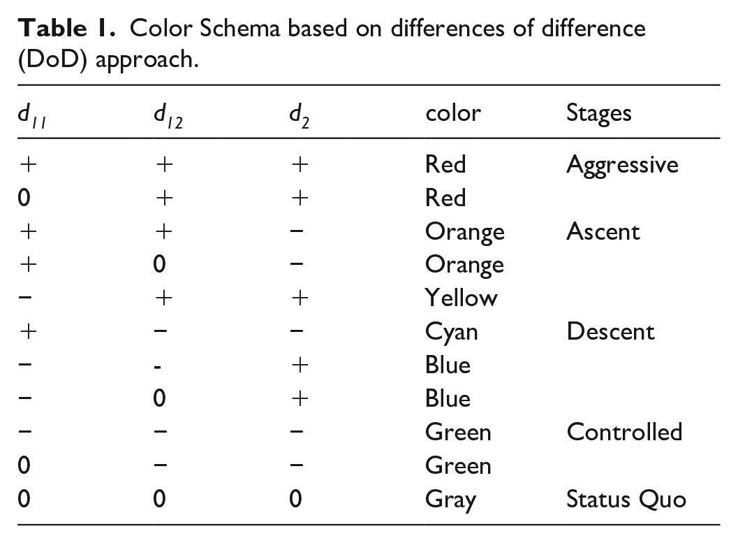
This study classifies terrorism into five broad categories, viz., (i) Aggressive, (ii) Ascent, (iii) Descent, (iv) Controlled, and (v) Status quo, as shown in Table 1. Here, a methodological design decision was taken to consider only 3 consecutive years to model the lingering psychological impact of terrorism during those 3 years. Moreover, durations of more than 3 years will exponentially increase the sign combinations in a single cohort. Such an increase in the distinct sign combinations will require more colors to represent trends, further complicating it for stakeholders.
Figure 4 illustrates both sign combinations indicative of the increasing magnitude of terrorism (Aggressive) in a 3-year cohort. The sign combination (+, +, +) from the DoD approach is the extreme variation of this stage, whereas the (0, +, +) combination denotes the relatively moderate situation where no change in the GTI-IS values between the first 2 years of the cohort. The proposed color scheme assigns the red color for either sign combination.
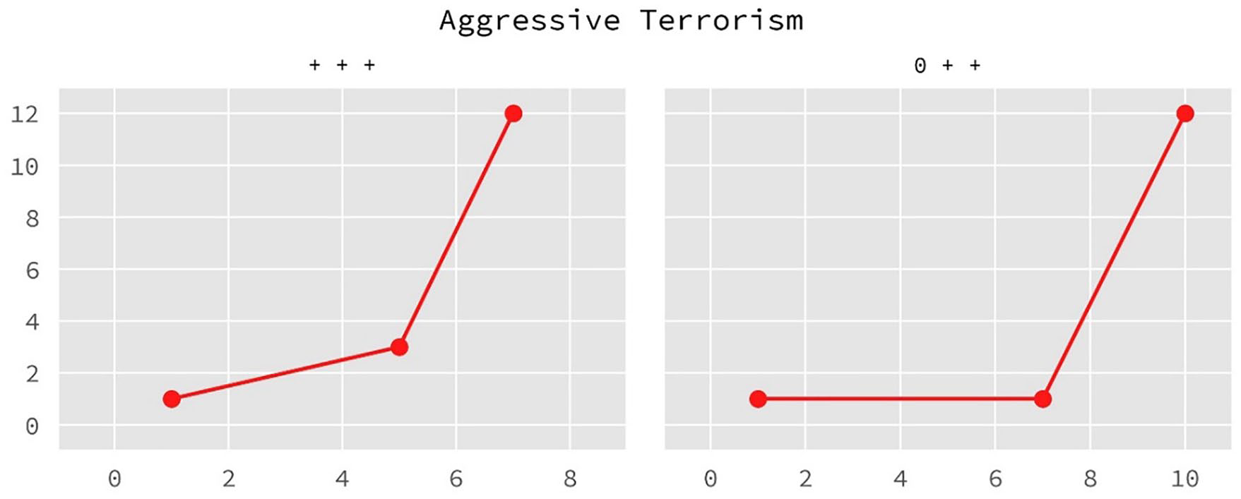
An illustrative example of the aggressive terrorism stage in a 3-year cohort.
The Ascent stage in terrorism contains three unique sign combinations depicted in Figure 5 along with their assigned color. The sign combination (−, +, +) is a transient state as the GTI-IS dropped in the first 2 years of the cohort but increased considerably during the second and third years resulting in a high second difference. The other two sign combinations represent a saturated, increasing trend because of a negative second difference (d2). Since the (−, +, +) sign combination is inherently different from the other two in the Ascent stage due to its positive second difference, a different color, yellow, gets assigned to it. In contrast, the other two combinations use orange color.
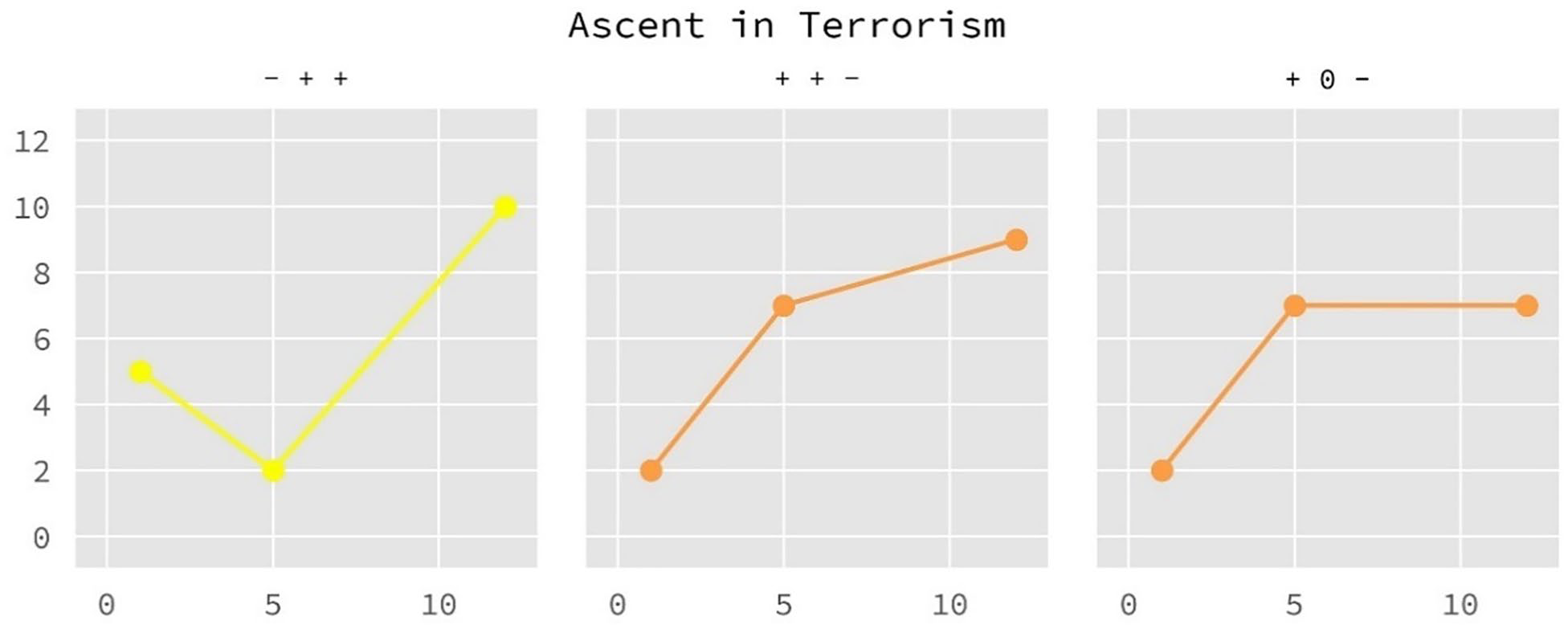
An illustrative example of the Ascent stage in terrorism.
Similarly, Figure 6 demonstrates the Descent stage of terrorism. The blue-colored curves represent a decreasing state of terrorism, but the second difference implies that the second part of the cohort records a slight or no decrease in the GTI-IS value. However, the cyan curve for the sign combination (+, −, −) is another transient phase that increases in the first part of the cohort and decreases in the other.
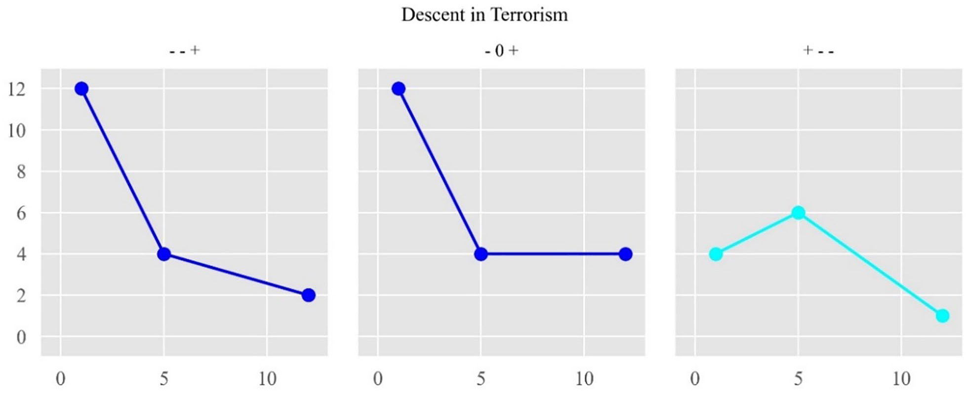
An illustrative example of the descent stage in terrorism.
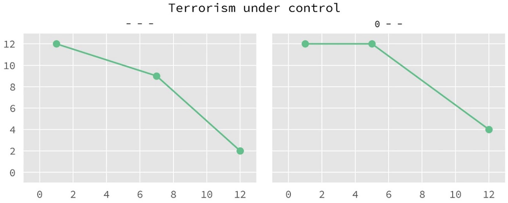
Figure 7 depicts the terrorism under control state where all constituent years of a cohort reported a decrease in the GTI-IS statistic. The color schema assigns a green color to this stage’s two possible sign combinations.
An illustrative example of the controlled stage of terrorism.
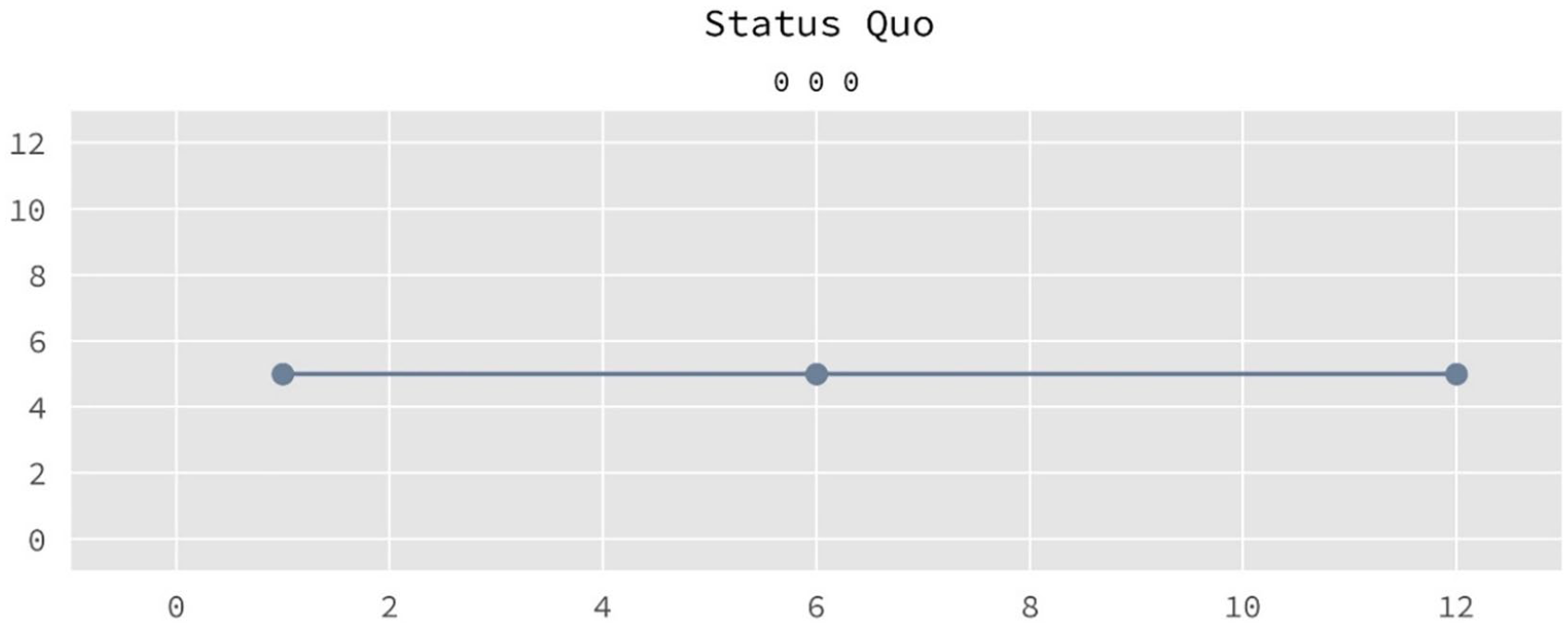
Finally, the steady values reported in 3 consecutive years indicate an interesting stage in the GTI-IS cohort study. The sign combination (0, 0, 0) is depicted with a gray color, as shown in Figure 8.
An illustrative example of the status quo terrorism stage.
Thus, the color schema provides a novel representation of the direction of terrorism magnitude using the GTI-IS statistic. Further, this schema forms the base to develop two separate applications for counterterrorism policymakers, viz., caterpillar diagram and Markovian forecasting, as illustrated in the flowchart depicted in Figure 9.
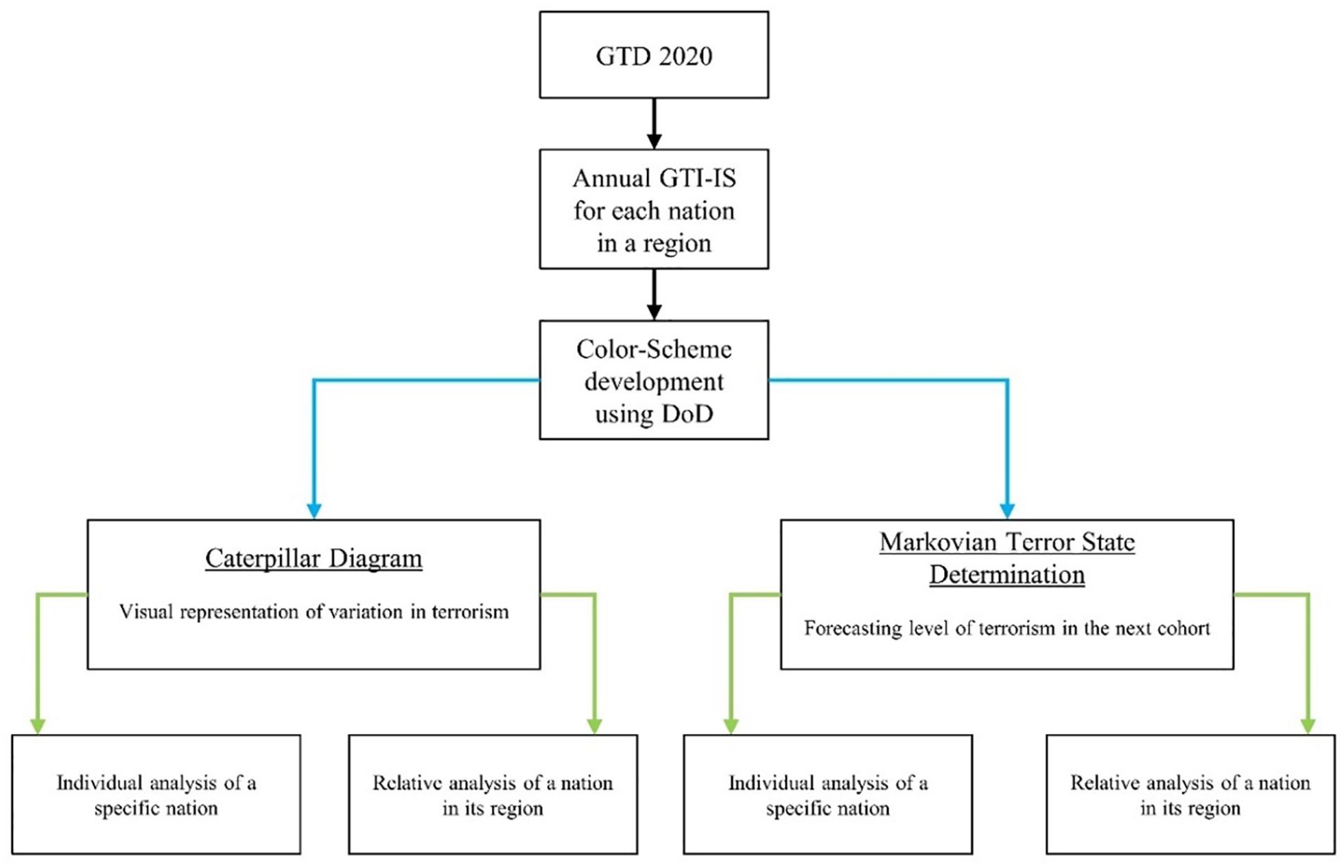
Overview of the complete process.
A caterpillar diagram simultaneously displays the changes in the magnitude and direction of terrorism attributed to a nation during a given period. A complete caterpillar diagram for a country consists of a series of circles with varying diameters equal to the number of cohorts possible from the data. There are 47 cohorts possible using 3 consecutive years in the GTD from 1970 to 2019. Figure 10 displays a sample caterpillar diagram of seven cohorts from 2011 to 2019 (part IV of the GTD). The color schema illustrates the direction of terrorism. Additionally, the circle’s radius is proportional to the magnitude of such variations.
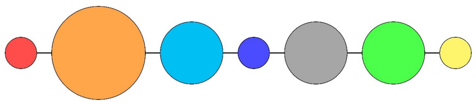
An illustrative example of a caterpillar diagram containing seven cohorts.
The state of terrorism in any nation can be studied individually or relatively, as shown in Figure 9. Many researchers consider terrorism as a transnational phenomenon (Shukla, 2006). However, countries belonging to a specific region tend to face similar types and patterns of terrorism. Depending on various factors, individual countries face different versions of terrorism due to internal and external conditions. Hence, combining a particular nation’s terrorism data with various regional patterns might be prudent to derive a realistic picture. Recently, authors identified significant variations in the impact caused by terrorist organizations capable of high-impact attacks, alluding to terrorism as a regional phenomenon (Singh et al., 2022).
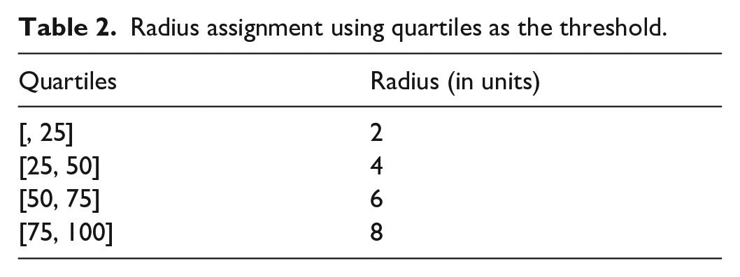
With this logic in mind, the radius of the caterpillar circles depends on the first differences, that is, d11, and d12, which is dependent only on the nation’s GTI-IS score. A Box and Whisker plot using the collection of unsigned d11 and d12 provides two sets of quartile boundaries. The quartile boundaries from the collection of d11 will facilitate determining the radius for the first part of the cohort. The other set of quartile boundaries from d12 will provide the radius for the second part of the cohort. Table 2 summarizes the radius assignment and the associated quartiles of the unsigned first differences. For example, if the first difference (d11 or d12) is greater than the first quartile but less than the median of the data, this method assigns a radius of four units. Since the diameter of a cohort represents the amount of variations, it is logical to use a larger radius for a higher quartile band. Therefore, users can specify any sequence of four proportional radii as suggested in Table 2 until and unless it communicates that a larger diameter points to a larger quartile band.
Radius assignment using quartiles as the threshold.
The final radius for the cohort is the average of the earlier two radii assigned using d11 and d12 for that particular cohort. Figure 11 depicts a flowchart of the complete cohort’s radius assignment procedure.
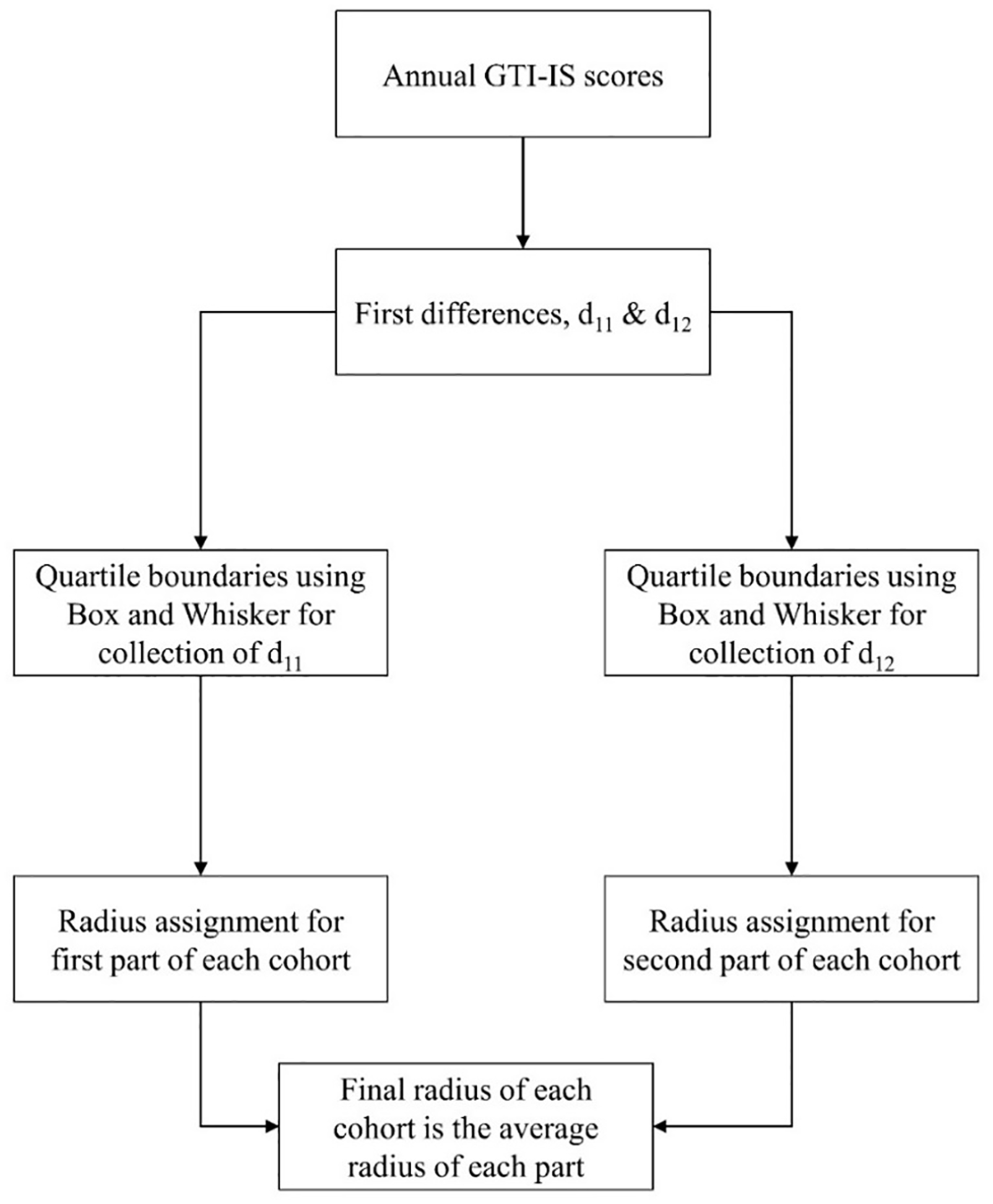
Overview of the cohort’s radius assignment procedure.
Figure 12 depicts a case where the radius assigned to the variation in the first difference, d11, is four units and two units for d12. The final radius assigned to the cohort is three units for developing the caterpillar diagram.
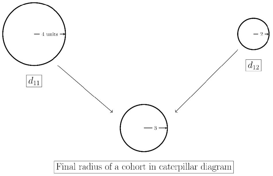
Size determination of a cohort in a caterpillar diagram.
Thus, a large, red-colored circle indicates an ascent in terrorism with a significant increase in magnitude from the previous cohort. Hence, a small red circle is better than a large red circle for a particular cohort. Conversely, a large green circle is more desirable from the counterterrorism perspective than a small green color circle for a particular cohort.
The individual analysis for a nation proposed in Figure 9 utilizes quartiles of the first differences associated with the respective nation only to generate the caterpillar diagram. This results in a small set of values for both first and second differences in shorter time periods. A richer set of values are only possible with data collected over long time horizons. Considering the first differences reported by all nations in a specific region, a larger number of values can provide different quartile boundaries for the cohort’s radius assignment. The larger collection of first differences allows for relative analysis of a nation, which can inherently provide a comparative viewpoint. Additionally, it can be cumbersome to comprehend numerous caterpillar diagrams based on individual nation analysis while simultaneously studying all the countries in a region.
Another critical analysis made possible by the proposed color scheme is the ability to forecast the probable state of terrorism in a region using the Markov chains. For this, we assume that the level of terrorism in a nation is only dependent on the immediate past cohort. Since other researchers (Hyslop and Morgan, 2014) proposed the 5-year lingering effect of terrorism, it is safe to consider the last 3 years’ timeframe as a baseline to model the next cohort.
Estimating the state transition matrix is critical for developing such a forecasting model. We considered the state space of the Markov chain as a collection of the cohort’s color. Therefore, a state transition from one cohort to another is simply a color change, equivalent to the level of terrorism reported by the nation. Table 3 reports all the possible inter-state transitions without violating the sign convention defined by the color-coding scheme. A value of one in the adjacency matrix in Table 3 indicates a feasible transition and zero vice-versa. For example, an orange to cyan state transition is feasible, but vice-versa is infeasible according to the sign conventions of the color-coding scheme. This transition diagram creates an irreducible and aperiodic Markov chain, resulting in a unique stationary transition matrix. Therefore, any nation that reports all feasible transitions of the transition matrix in Table 3 will have a unique stationary transition matrix that allows for forecasting the next state transition of terrorism levels for that nation.
Constraints in state transitions for a level of terrorism.
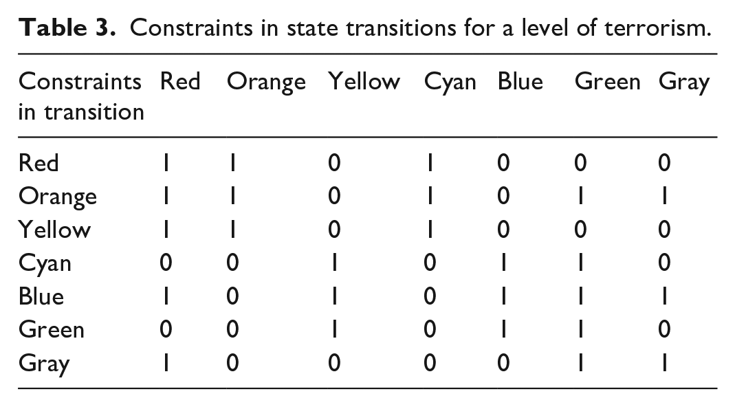
Figure 13 exhibit the transition diagram with all possible state transitions summarized in Table 3. A nation may or may not have all constituent transitions in its respective state transition matrix. Therefore, the Markov chain’s properties will differ from nation to nation. However, as soon as a nation reports all possible transitions, the resultant transition matrix will follow the properties of the transition diagram shown in Figure 13.
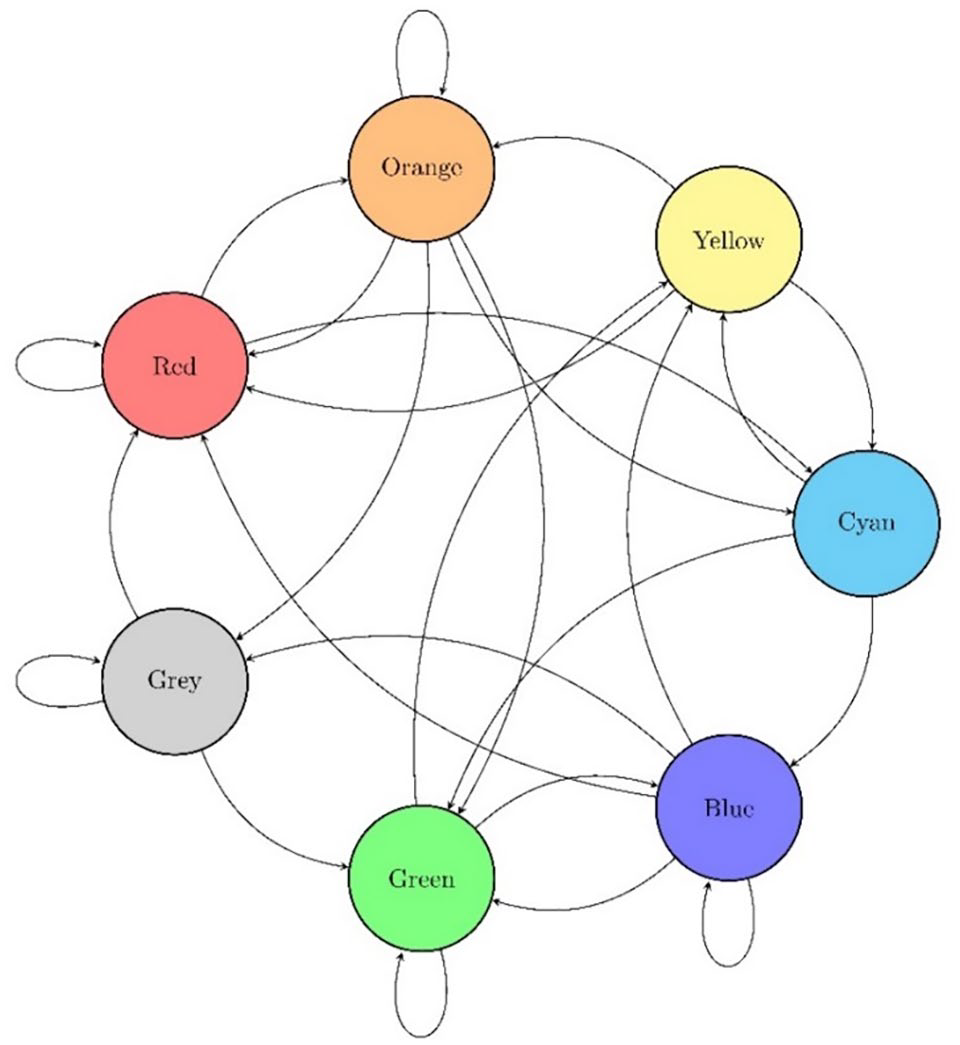
All possible state transitions based on color-schema.
This study extends the individual and relative analysis ideas to determine the terrorism status using Markov chains to aid the preparedness of policymakers and security forces. While the individual analysis of a nation considers only the state transitions of the concerned nation, the relative analysis considers transitions of all countries belonging to that region to develop the state transition diagram. A single country as a unit of analysis cannot provide a large number of cohorts resulting in a small number of state transitions, thereby hampering the effectiveness of the Markovian approach. However, all state transitions from countries within a region provide a broader picture of the future terrorism levels, which models terrorism as a regional phenomenon (Singh et al., 2022). We also rule out the possibility of considering a region as a single unit of analysis to create the stationary matrices due to the reduced number of values that may result in confounding effects.
Results
GTD 2020 reports 201,183 terror incidents globally. The GTI 2020 report ranks nations based on the quantum of terrorism using the data from GTD 2020 Figure 14 shows the distribution of countries in each region specified by the GTD. There are many countries in Sub-Saharan Africa, Eastern Europe, Western Europe, and MENA regions. For illustration, this study uses Iraq and India, ranked second and eighth according to the GTI report (Institute for Economics & Peace, 2020), to explain the complete framework implementation. India and Iraq are from two regions, South Asia and MENA, respectively, enabling the comparative analysis of terrorism in different regions.
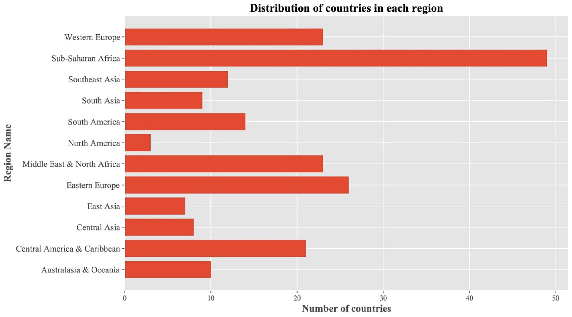
Distribution of the number of countries in each region as per GTD.
There exist 47 cohorts of GTD data from 1970 to 2019. However, for demonstration purposes, the caterpillar diagram has been created using part IV of GTD (START, 2021), that is., for the last 8 years, from 2011 to 2019. Since GTD does not contain any data for 1993, we exclude it from developing the color scheme and caterpillar diagram.
Iraq
Iraq reported 26,755 terror incidents from 1970 to 2019, accounting for 13.30% of terrorism events of GTD 2020 Figure 15 depicts the annual GTI-IS trend of Iraq, which clearly indicates a spike in terror incidents after 2000, with a peak around 2014.
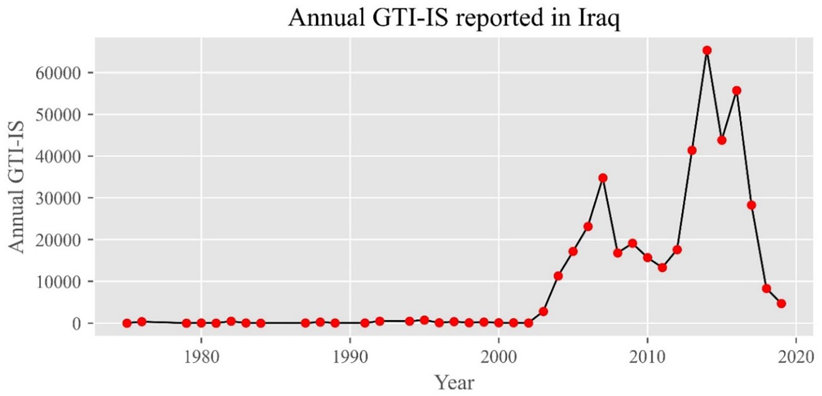
Annual GTI-IS trend in Iraq.
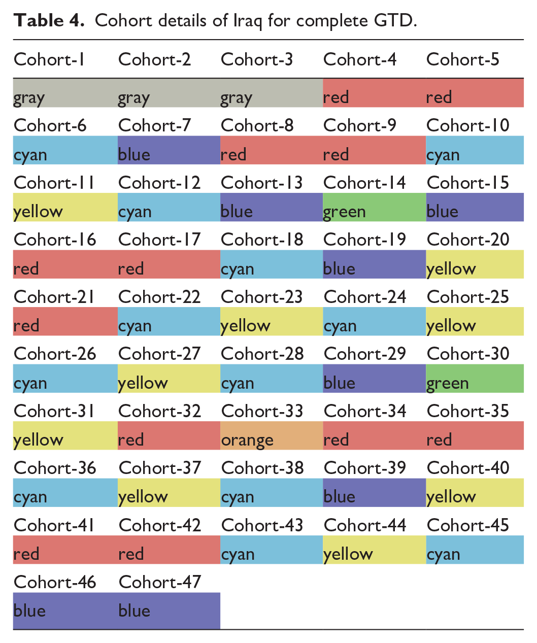
Table 4 reports all 47 cohorts from 1970 onward and their associated color codes using the GTI-IS scores for Iraq. The dominant colors are Cyan and Red, suggesting fluctuations between aggressive and descent stages of terrorism. Further, Cyan denotes a transient state, indicating that Iraq’s state of terrorism has changed multiple times. Finally, 25.53% of Red color cohorts support the belief in long-lasting, ongoing, and increasing conflicts within Iraq.
Cohort details of Iraq for complete GTD.
In addition to colors that denote the directional change in terrorism, the caterpillar diagram also depicts the magnitude of variations in a cohort using the circles’ diameters. This characteristic demarcates the analysis into two categories, viz. (i) individual nation-based and (ii) relative region-based caterpillar diagrams. The quartiles classification mechanism only considers the first differences, d11 and d12, for Iraq in the first case. However, the relative region-based analysis considers all first differences reported by constituent countries of the MENA region.
Table 5 compares different boundary values of quartiles for individual and relative analysis for Iraq. There are 23 countries in the MENA region, including Iraq, and each country reports 48 consecutive differences, d11. Therefore, the region-based relative analysis accumulates 1104 first difference, d11, resulting in a richer set. Similarly, there are 1081 first differences, d12, collected by 23 countries reporting 47 differences each.
Quartile classification boundaries for absolute and relative variations in terrorism using Iraq and MENA.
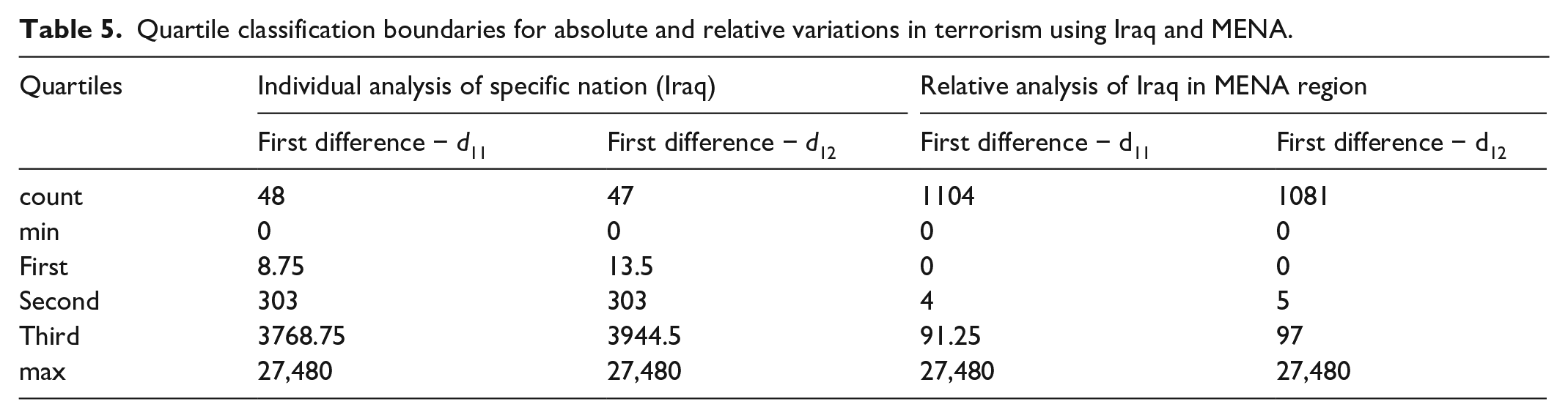
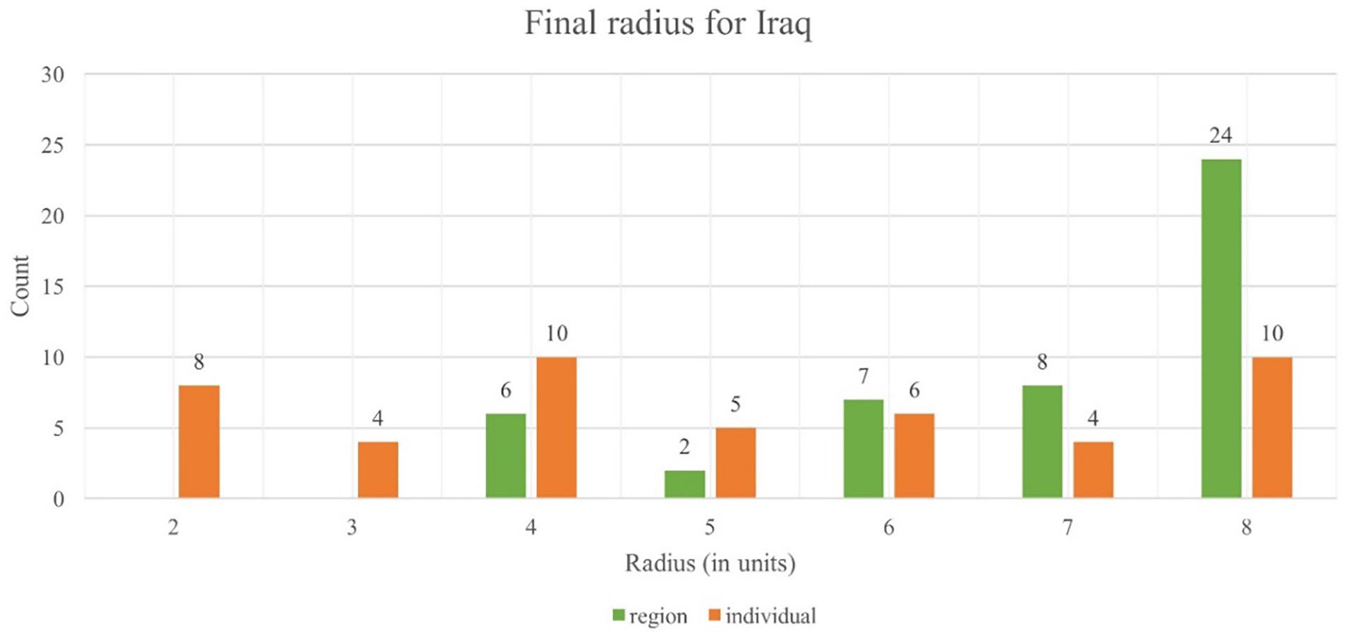
Table 5 forms the basis for the assignment of radius to each cohort using d11 and d12, eventually resulting in the final radius for a cohort, as illustrated in Figure 12. Further, Figure 16 compares the frequency of assignment of a particular radius in Iraq’s individual and relative analysis. Twenty-four cohorts fall into the largest possible radius during the relative analysis. However, the individual analysis demonstrated a relatively uniform assignment of radius. This frequency distribution of the circle radii for the MENA region suggests that Iraq witnessed considerable variations in the level of terrorism compared to other nations of the region.
Comparison of radius in absolute and relative analysis for Iraq.
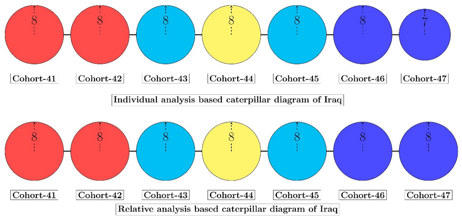
Figure 17 compares Iraq’s individual and relative caterpillar diagram for the GTD data from 2011 to 2019. The color codes remain the same in individual and relative analysis while the radius varies. However, the individual analysis reported a slightly smaller radius of seven units for cohort-47, while all other cohorts reported the maximum possible radius of eight units. It concludes that the magnitude of variation in terrorism is significant for Iraq, irrespective of the type of analysis, and simultaneously suggests that Iraq witnessed substantial variations in comparison to other countries of the region.
Caterpillar diagram of Iraq.
Figure 17 indicates that Iraq faced aggressively increasing terror conditions identified by the red color. Later, it transitioned to the descent stage in cohort-43 and switched back to the ascent stage again with yellow color in cohort-44. Further, cohort-45 again reported the transition to the descent stage through cyan color, which continued in cohort-46 and cohort-47, as indicated by the blue color.
The other application of the color scheme is to determine future terror states using the Markovian process. Figure 18 depicts Iraq’s transition diagram using individual analysis, which utilizes all its transitions until 2019. It is evident that all possible transitions have not occurred in this diagram. Further, most cohorts transitioned among the Red or Cyan states.
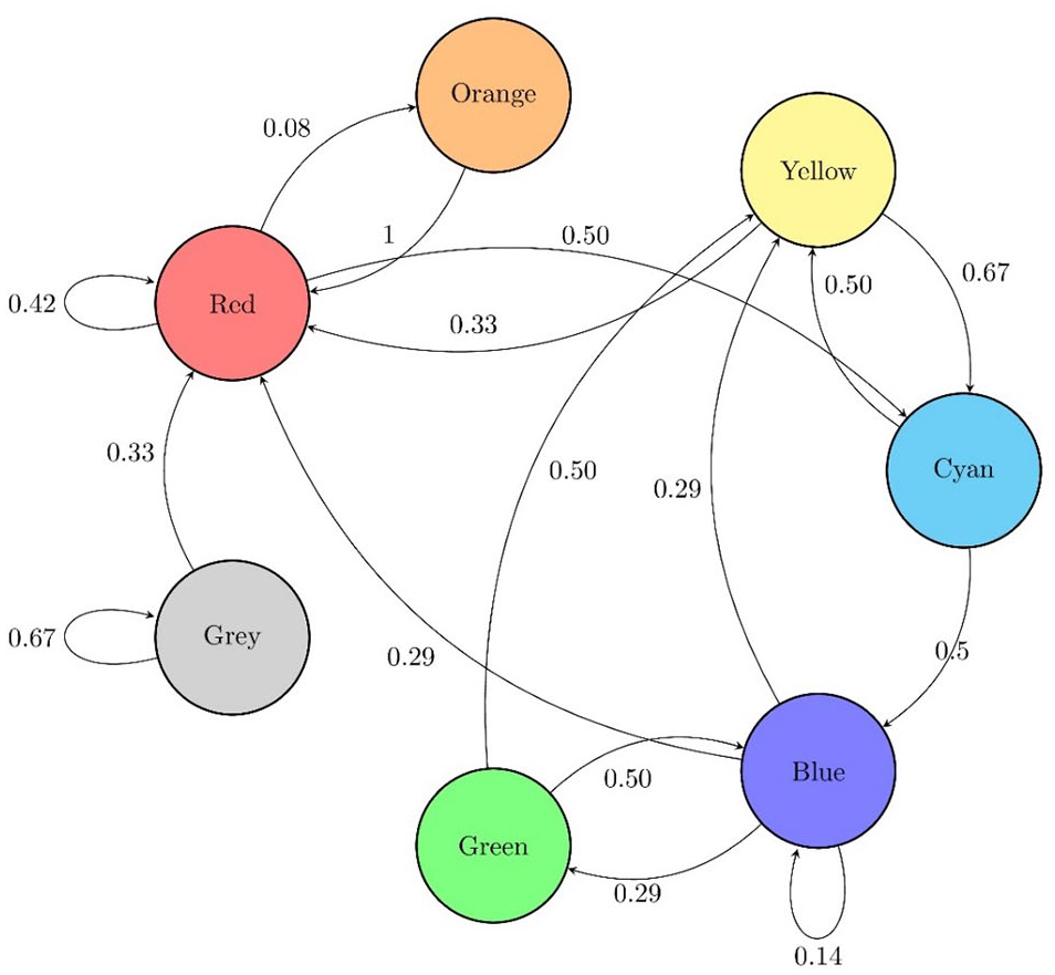
State transition diagram of Iraq based on individual analysis.
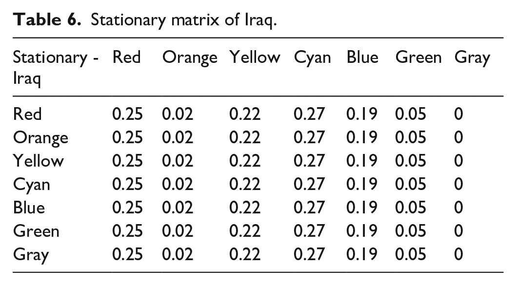
Table 6 provides the stationary transition matrix for Iraq using the available data, which can provide the next state transition probabilities required for forecasting. Further, Table 6 indicates that the Red and Cyan transitions report the highest probabilities.
Stationary matrix of Iraq.
Similarly, the relative analysis for Iraq in its region utilizes the state transitions of all countries within the MENA region. The region-based transition probability matrix provides a broader picture of terrorism by accumulating terror information from multiple countries. It is evident from Figure 19 that very few cohorts transitioned to either Orange or Green state. Additionally, the Gray state mostly transitioned to itself or the Red state but never returned to a green state in the MENA region.
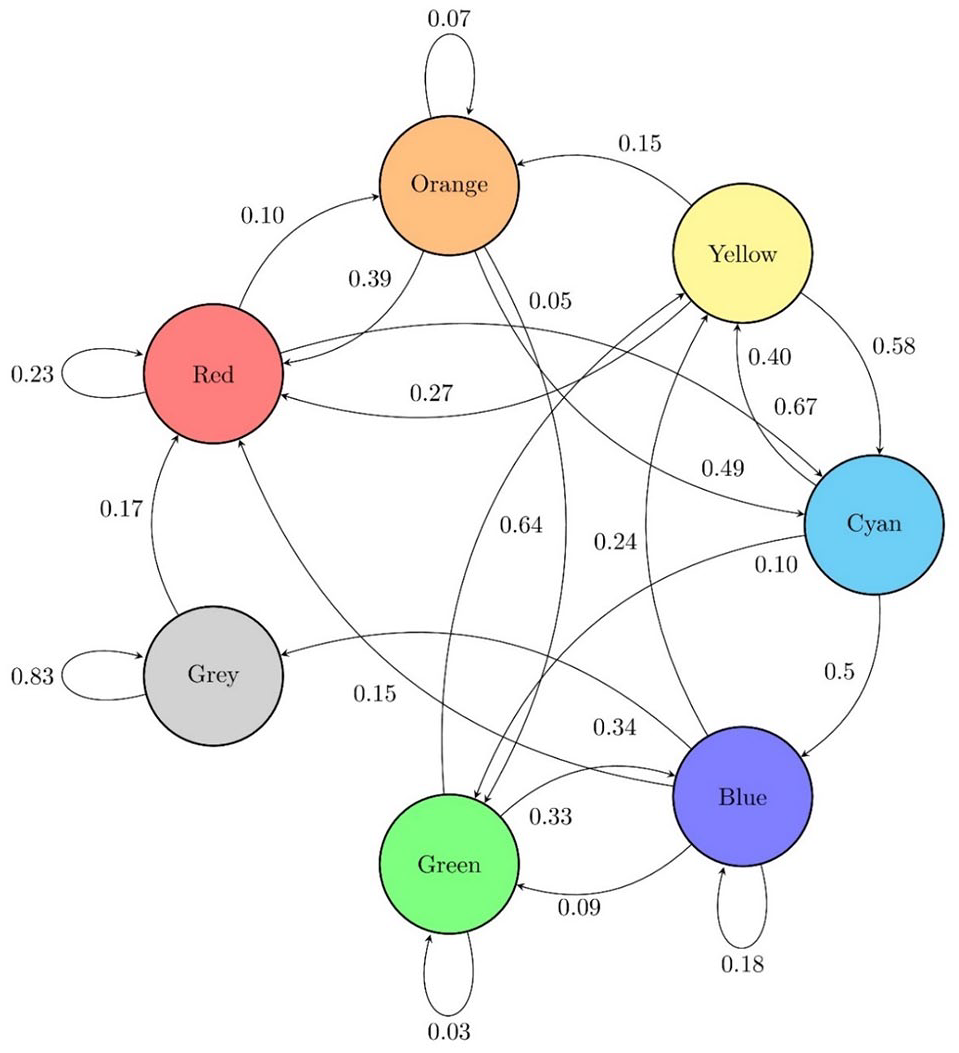
State transition diagram for MENA region.
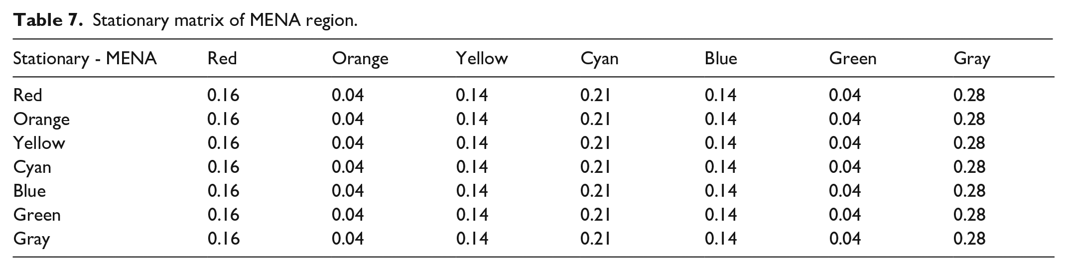
Table 7 summarizes the stationary transition probabilities for the MENA region. Since many countries reported either no terrorism or the same level of terrorism in all 3 years of a cohort, the gray color received the highest probability in the stationary transition matrix.
Stationary matrix of MENA region.
India
India reported 13,477 terror incidents, accounting for 6.69% of the terror incidents reported in the GTD 2020. Figure 20 graphs the annual GTI-IS trend in India. Unlike Iraq, India started to report terrorism in the early 80s. The GTI-IS score stayed below 5000 for the entire duration, roughly 10 times less than Iraq’s values. The terror status continues to change every decade in India, as demonstrated in Figure 20.
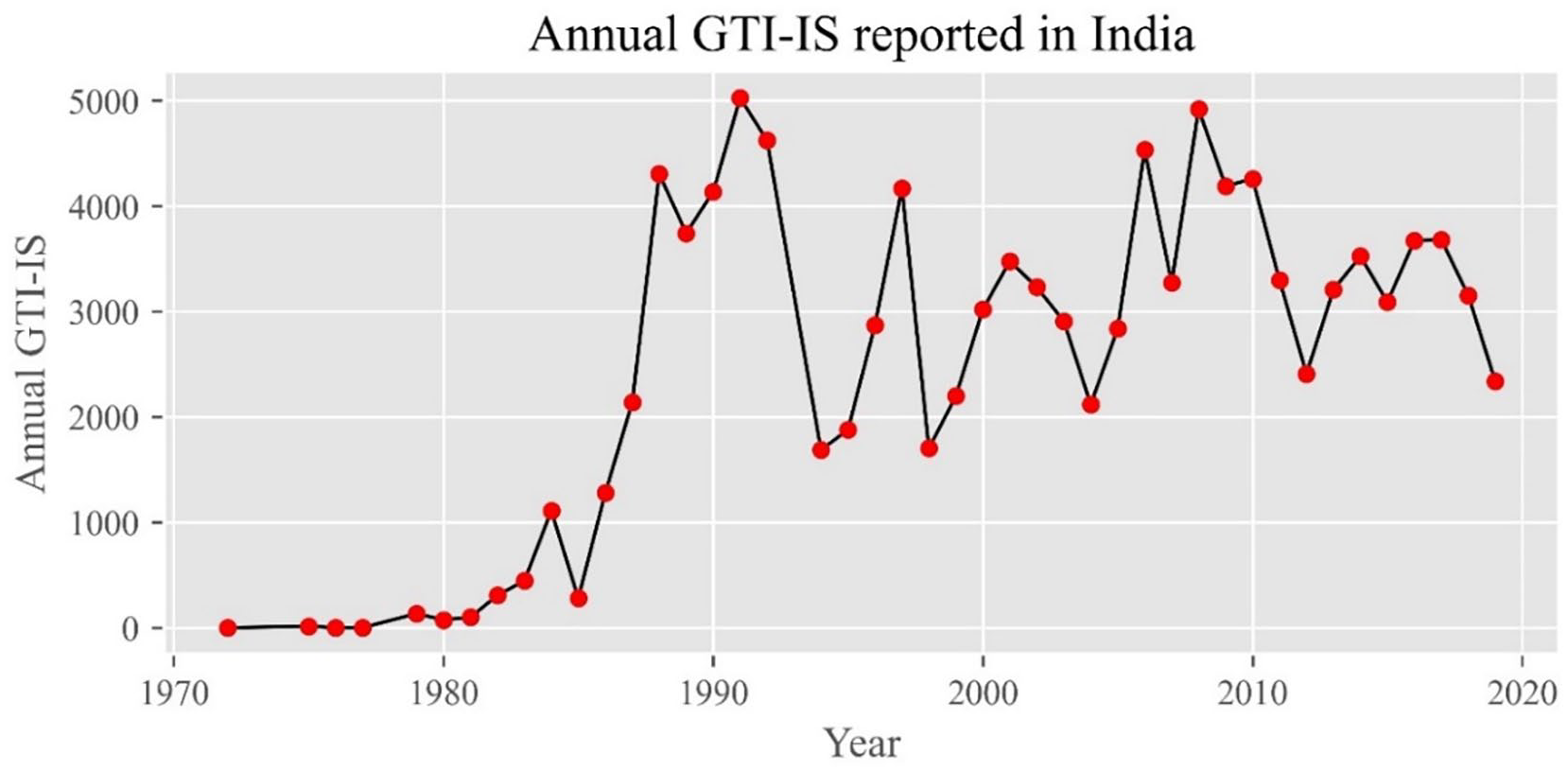
The trend of Annual GTI-IS for India.
Table 8 compares the color code in each cohort for India using the proposed scheme. Cyan and Yellow are the two persistent colors for India, suggesting many transient states within the data. The absence of Gray color in India indicates that terrorism never remained constant for 3 consecutive years.
Cohort details of India for complete GTD.
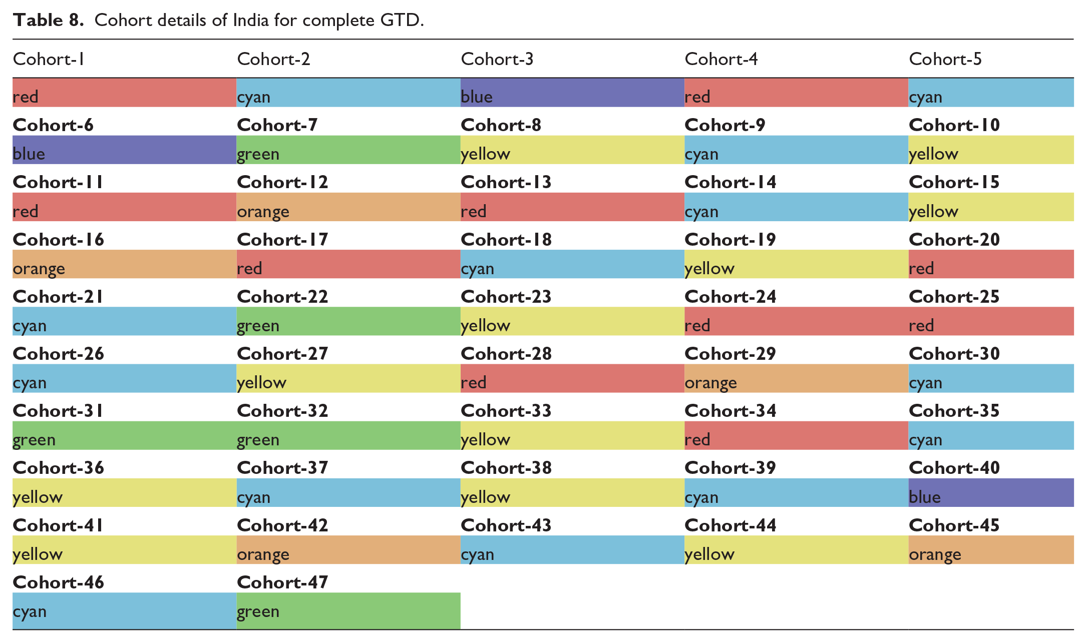
Table 9 compares the quartile boundaries for determining the radius of each cohort. There are nine countries in the South Asia region, and each country reported 48 first differences, d11, and 47 d12 values. Therefore, the relative analysis has 432 and 423 distinct non-negative first differences to determine the boundary values.
Quartile classification boundaries for individual and relative variations in terrorism using India and South Asia.
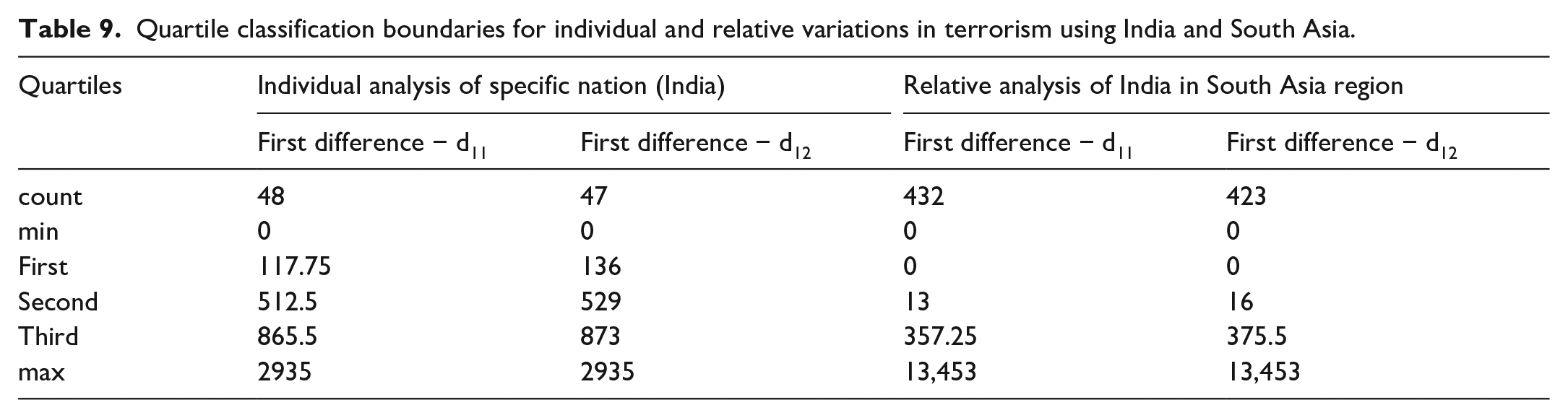
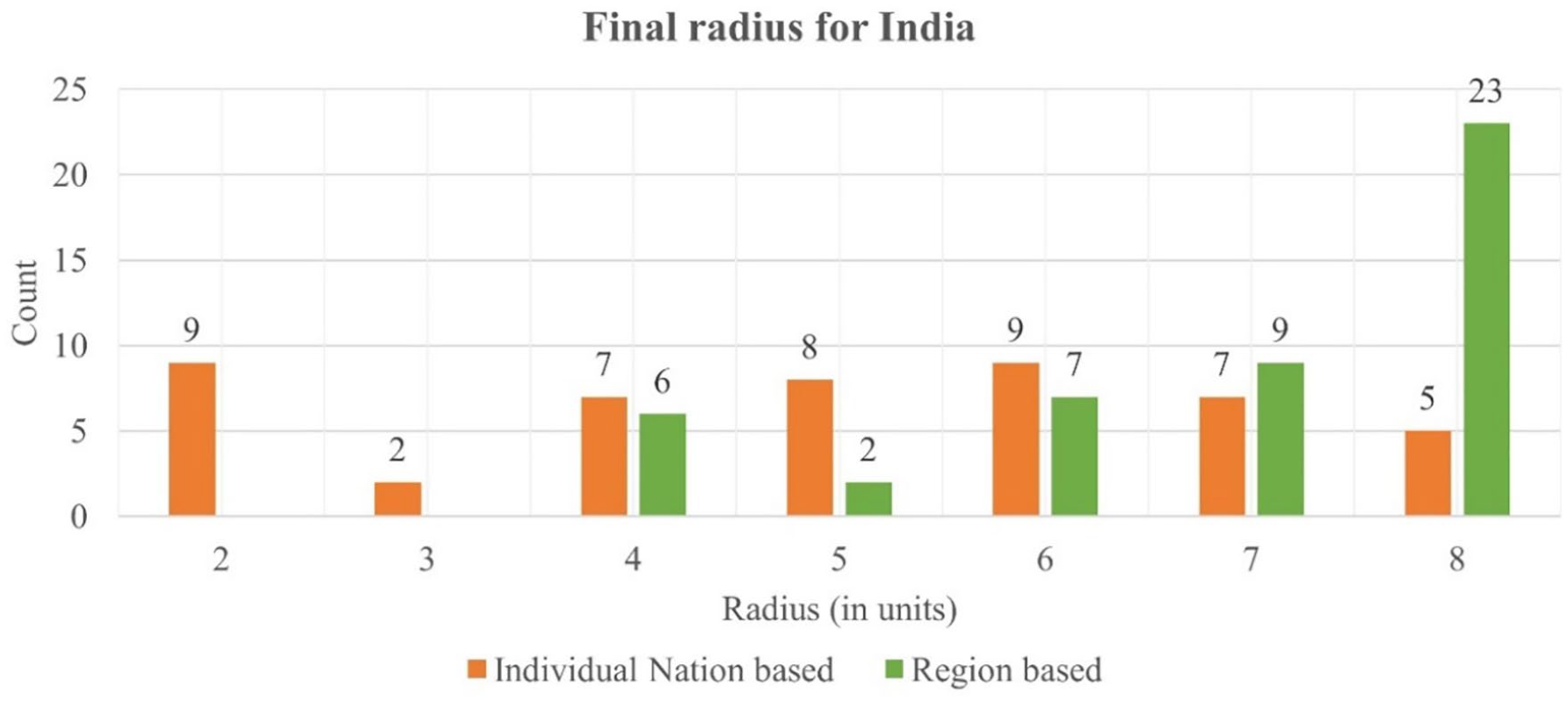
Figure 21 depicts the frequency distribution of various radii assigned to each cohort in India’s individual and region-based analysis. Comparing both Figures 16 and 21 suggests that the region-based analysis assigned a larger radius to both countries’ cohorts. The assignment of a large radii using region-based analysis implies that both countries reported more significant variations in the GTI-IS compared to other countries in their respective regions. Figure 21 also suggests that India has an almost uniform distribution of radius in individual analysis but a highly left-skewed distribution in the region-based analysis.
Comparison of final radius for cohorts in India using individual and relative analysis.
Figure 22 compares the final caterpillar diagram of India based on individual and relative analysis. The color schema based on individual nation analysis exhibits considerable variation in cohort-41, with a Yellow color indicating ascent in terrorism but ended on a positive note in cohort-47, with a Green color indicating descent. The relative analysis reported significant variations in radii assignments in all cohorts for the last 8 years, confirming that India witnessed more variations in terrorism than other countries in the South Asia region.
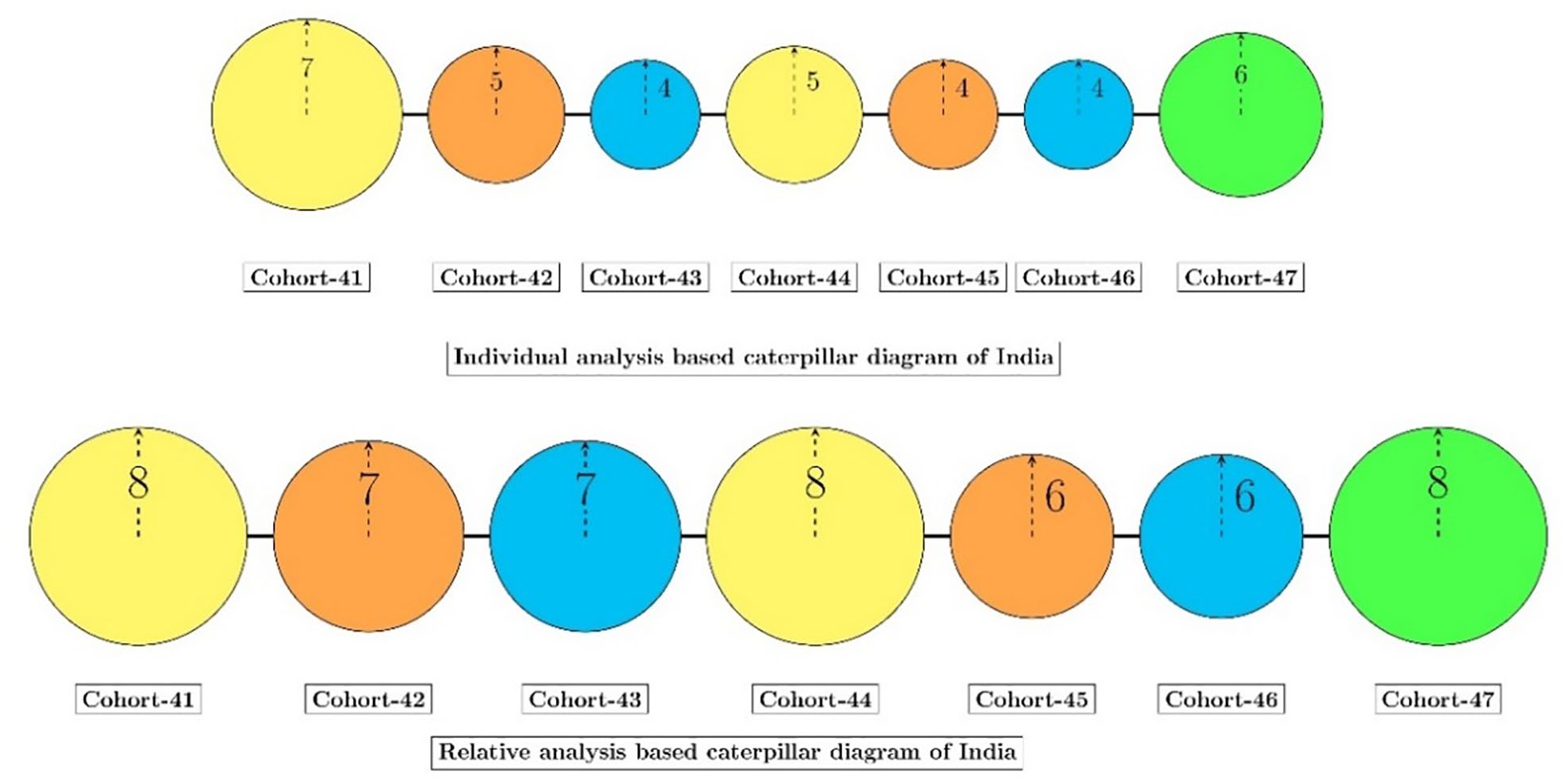
Caterpillar diagram of India.
Figure 23 depicts the transition probability matrix for India based on the GTD data from 1970 to 2019. Most cohorts transitioned among Yellow, Cyan, or Red colored states. It is important to note that the probability of transitioning from a cyan state to an ascent state of yellow is higher than to a descent stage of blue or green. Similarly, green tends to switch to an ascent stage of yellow more than blue or green.
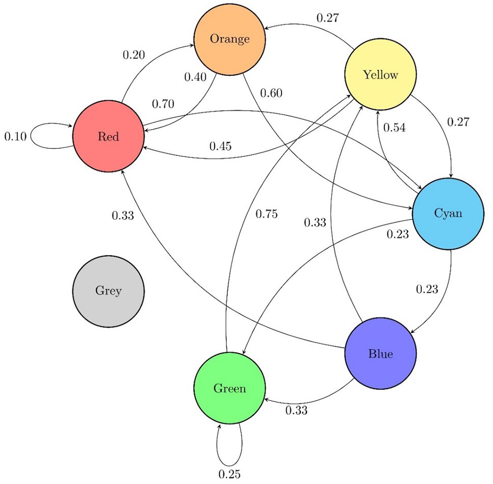
State transition diagram of India.
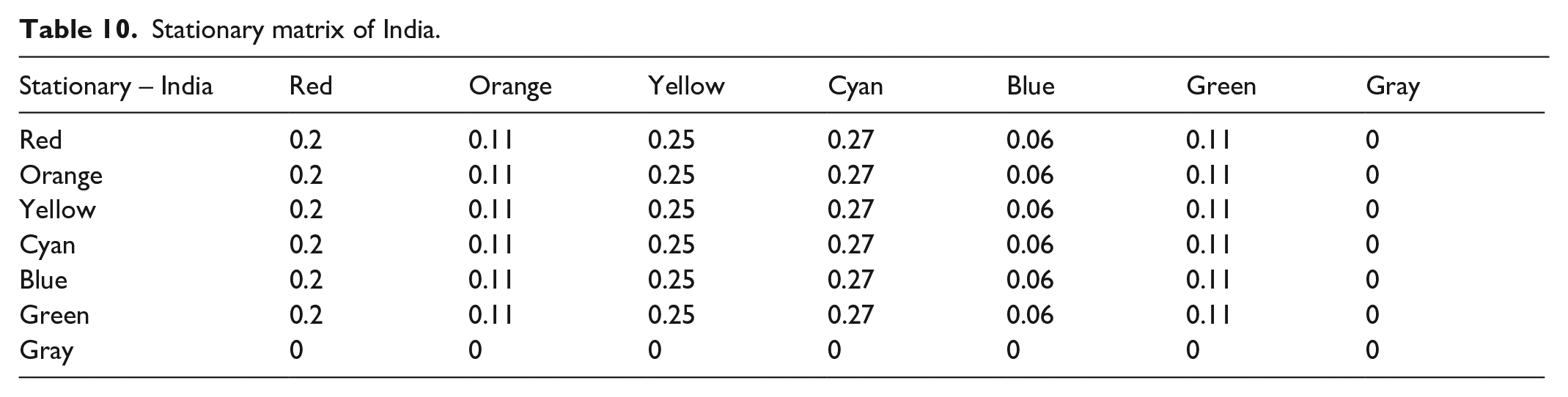
Table 10 compares the transition probabilities of the stationary matrix for India. Since no cohort ever achieved the Gray state, the stationary matrix reports zero chance for the Gray color. Except for transient states like Yellow or Cyan, Red also reported a high transition probability in the long run.
Stationary matrix of India.
Finally, the region-based relative analysis of India includes transitions of nine other countries in the South Asia region to create the transition probability diagram shown in Figure 24. This region exhibits large transition probabilities for transient states like Yellow and Cyan. Interestingly, the tendency of a cohort to remain in the Gray state is high, and it only transitions to an aggressive stage with red color.
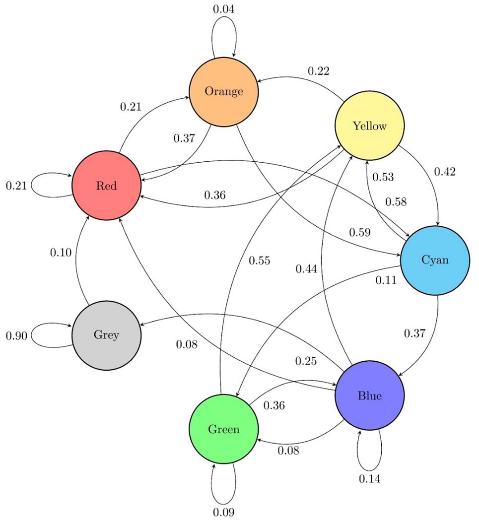
State transition diagram of South Asia.
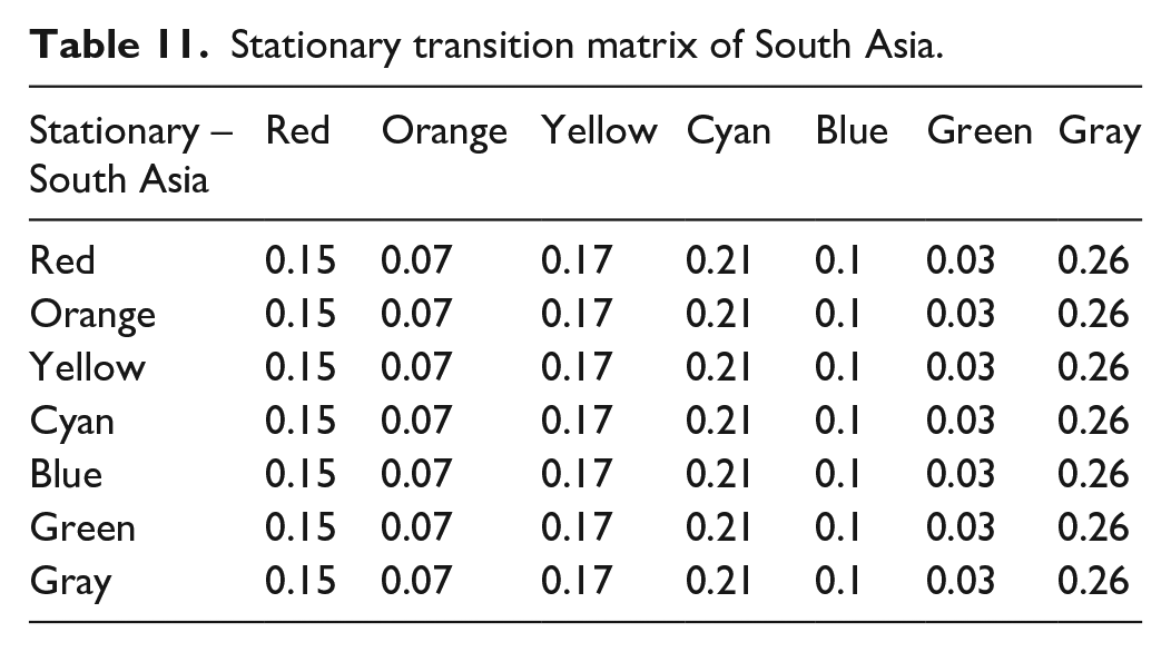
Table 11 summarizes the stationary transition matrix of the South Asia region. The highest probability for transition is associated with the Gray state from any other state. The transient states of Yellow and Cyan reported higher probabilities than other states. This reinforces the popular belief that countries in this region are witnessing a frequent rise and drop in the GTI-IS score.
Stationary transition matrix of South Asia.
Conclusion
This study successfully developed a novel threat advisory framework that efficiently communicates the past and current state of terrorism and suggests the most plausible future state of terrorism for any nation or region using a publicly available data source. Earlier attempts to develop threat advisories utilized classified information sources and undisclosed methodologies resulting in major trust deficits among policymakers and the public. Unlike previous warning systems like HSAS, the proposed framework acts as a passive threat advisory system. An active advisory system utilizes the latest intelligence from various sources to caution the stakeholders from an imminent threat. In contrast, the proposed passive advisory system can incorporate information about past events to summarize and assist in better regional policy modeling. This study demonstrated the framework by summarizing the GTI-IS annually. Still, it is possible to prepare the warning system based on different time horizons by aggregating GTI-IS semi-annually, quarterly, or monthly for a particular region.
The proposed color-coding scheme contains seven colors categorized into five stages of terrorism. It utilizes a univariate terrorism score (GTI-IS), a time series as input, and indicates the direction of terrorism using the assigned color. The absolute values of each cohort’s first differences facilitated the radius assignment in the caterpillar diagram. Thus, a caterpillar diagram can effectively communicate the magnitude and direction of terrorism in a nation or region.
This study further proposed stochastic modeling using Markov chains by considering that the terrorism in each cohort depends solely on the immediately preceding cohort. The forecasting capabilities realized through stochastic modeling can help policymakers to make decisions for a particular territory using the indication provided by the stationary transition matrix.
The proposed framework applies to any system that generates a univariate data series and requires automated monitoring, making it a domain-independent system. Any future implementation in a different domain should satisfy the stochastic assumption for using the Markovian process to achieve reliable insights. Additionally, the possibility of utilizing more than 3 consecutive years in a cohort can be explored for a different domain. At last, this passive threat advisory system is easily interpretable by law enforcement personnel or the public. The proposed system will remain relevant until the sanctity of the underlying terrorism data is maintained.
Footnotes
Declaration of conflicting interests
The author(s) declared no potential conflicts of interest with respect to the research, authorship, and/or publication of this article.
Funding
The author(s) received no financial support for the research, authorship, and/or publication of this article.