
Abstract
This study examines the properties of administrative areas compared to a new method of automated redistricting when measuring social differentiation and segregation. Using physical barriers, such as roads, railways, streams, areas of uninhabited nature, and the like as dividers of social space, this study explores alternative ways of thinking social belonging and social cohesion that are beyond standard measures of geography and utilize areas of smaller size and population count. The geographical data are linked to Danish register data of the total Danish population in 2015, N = 4,986,125 on key variables of income, months of completed education, and ethnicity. The overall findings in this study suggest that rethinking geography when localizing social enclaves and segregated communities yields better results than using the more illogical administrative areas. The visual inspection, entropy levels of homogeneity, and intraclass correlation suggest that smaller areas that are divided by physical objects serve as a better reservoir of social cohesion and therefore better measurement of social inequality.
Introduction
Numerous studies have investigated the formation and effect of neighborhoods on both individual and structural levels on a wide variety of measures (Damm and Schultz-Nielsen, 2008; Ministry for City, Habitation and Rural Districts, 2014; Galster, 1989, 2010; Grannis, 1998; Lee and Campbell, 1997; Logan et al., 2011; Massey and Denton, 1988; Sampson, 2008). The goals of these studies vary in both how they perceive neighborhoods and how they conceptualize space. Some focus especially on segregation and to explain segregation inside areas (Bower et al., 2014; Breetzke and Horn, 2006; DeSilva et al., 2012; Grannis, 1998; Johnson et al., 2004; Zingher and Thomas, 2014), while others seek to explain social outcomes as effected by the total amount of neighborhoods (Buck, 2001; Fone et al., 2007; Pattison and Robins, 2002; Pickett and Pearl, 2001; Veenstra et al., 2005).
What they all share is the neighborhood as an entity to contain the people of interest. This container can be any entity the researcher chooses and quite often the data limitations restrict research to a predefined set of administrative areas. Earlier studies in sociology, especially the work of the Chicago school (Park, 1928; Park and Burgess, 2007; Park et al., 1967), revolutionized the way we understand neighborhoods, but before the emergence of computers, the general and macro level statistical analyses were impossible. With the emergence of the first personal computer software designed for Geographical Information System (GIS) in 1986 (Clifford et al., 2010), it was still only a select few in sociology that worked with neighborhoods as a non-predefined entity. It was not before the end of the 1990s that access to Microsoft Windows–driven GIS-editing software became widely available but still mostly limited to geographical sciences (Clifford et al., 2010). With the evolution in computers and computational power, larger macro-models for GIS take less time and have become easier to utilize. This advancement has paved the way for a wide array of models and subdivisions of geography to contain social data.
Even with the advancements of GIS and geo-referenced data, a lot of research still uses administrative borders (parishes or municipalities) as their smallest unit of reference when trying to understand the inhabitants inside (Andersson and Malmberg, 2013; Åslund and Skans, 1985; Cunha et al., 2009; Fischer et al., 2004; Söderström and Uusitalo, 2010; Zingher and Thomas, 2014). Even when utilizing smaller areas, as Census Tracts in the United States, the usefulness or validity of the areas is very rarely questioned (Bower et al., 2014; Krieger et al., 2017a, 2017b). As Lee et al. (2008) notes, “Most studies implicitly assume that the tract constitutes an appropriately-sized spatial unit for capturing segregation.” This raises some very fundamental questions about the understanding of place and living: How do we know that the areas we use to contain the social aspects of its inhabitants make sense? What is the effect of using only pre-determined administrative areas as opposed to exploring the possibilities of GIS-coded data?
The overall concept of a neighborhood is more than just the size and the qualitative feeling of being in a neighborhood and a specific definition of how to capture neighborhoods can easily end up being wrong when considering what the goal of capturing neighborhoods is. “Capturing segregation,” as noted in the quote above, implies that the neighborhood in question has a very specific composition and that, to be segregated from other areas, it must be somewhat homogeneous before it truly captures the social differences between one area and the neighboring ones. Especially, the human ecology tradition with roots in the Chicago School has worked with understanding neighborhoods as something that creates some form of unity (Buttimer and Seamon, 1980; Gans, 1961; Hwang, 2015; McIntosh, 1986; Newton and Johnston, 1976; Taylor, 1997) which later spurred the concept of social efficacy in the work of Robert Sampson (2012). The concept of social efficacy is especially interesting when trying to understand local communities; proximity is only interesting if it brings on some form of social efficacy inside the neighborhood. This efficacy can either be in the form of social coherence or as an unspoken way to define the neighborhood as something uniform (Sampson, 2008, 2012; Sampson et al., 2002). In the center of efficacy is proximity; without closeness there can be very little dynamic social efficacy. This, Sampson notes, does not mean that there will be social efficacy solely based on proximity but that this is a factor that needs to be present.
This article presents a methodological approach to redistricting with special focus on homogeneity and measuring small-scale neighborhoods in comparison with administrative areas on key variables as income distribution, educational attainment, and ethnic composition. The goal is not to explain the root cause of the segregation or any direct causal link between settlement and segregation level but instead point out that level of measurement matters when it comes to geographical distribution.
The methodological understanding of neighborhoods
There are studies that utilize geographical information more refined than just the administrative areas. The point of proximity to define neighborhoods is becoming more common when trying to understand smaller areas of living (Damm and Schultz-Nielsen, 2008; Feld, 1981; Freisthler et al., 2016; Grannis, 1998; Jones and Huh, 2014; Jones and Pebley, 2014; Kwan, 2013; Lee and Campbell, 1997; Lee et al., 2008; Logan et al., 2011; Patterson and Farber, 2015). Many of the papers try to go further than to use general administrative areas, but because of either data limitations or problems in linking this to geography, they struggle to either propose a general model that can be utilized on a macro scale or produce areas that follow a specific logic.
They all follow the same criteria at a varying rate, which are proximity, small size, homogeneity, and geography. Proximity, here understood as people living close together, is often understood as a way of securing homogeneity; that the people living close to one another also share similar beliefs and socioeconomic status. The overall problem with proximity and thereby homogeneity is also inherent in the way we understand geography and social life; the center of an area can only appear once the area is present and not the other way around. The question then becomes, “A proximity to what?” This is also important to conceptualize the size of the area because proximity and homogeneity can only appear once the entity that holds these things does not suffer from the generalization of aggregation too severely.
Some of the newer methods that offer more detailed area definitions vary in how they prioritize the above criteria. Commonly used methods include nearest neighbors in different ways, small area statistics (like the Swedish Small Areas for Market Statistics (SAMS)) that are focused on market statistics, and Bayesian spatial models. These methods all offer improved use of space but do so at the cost of precision when it comes to understanding the neighborhood as a useful entity.
Studies that focus on nearest neighbors are becoming more and more frequent especially since the freeware program Equipop, which utilizes K-nearest neighbors, has grown in popularity (Andersson and Malmberg, 2013; Dawkins, 2006; Lee et al., 2008; Östh et al., 2015). One of the major advantages of the nearest neighbors’ approach is the inherent use of the population as a complete set of neighbors. As Equipop uses whatever clustering base one chooses to generate the neighbor connections, many other forms of overlapping neighborhood measurements, as health status in neighborhoods as a measure of “fuzzy” health in areas (Propper et al., 2007; Veldhuizen et al., 2013), socioeconomic status in voter behavior (Johnston et al., 2005; Macallister et al., 2001), distance to one another or to economic centers (Kryvobokov, 2013), or even moving patters to kinship (Clark, 2017).
This allows for more intricate connections between individuals when applying the data to the geography and does not require any hard borders since everyone are, in some sense, connected; the methods rely on fuzzy borders instead of firm. This is, though, also the main problem with the method. K-nearest neighbors do not abide by geographical borders or physical objects but instead rely on numbers of people. This could be improved if the researcher has complete individual level data connected to a specific coordinate but since almost all register data require some sort of anonymity, the concept of connecting each individual person to geography makes it impossible to uphold the discretion criteria. This type of method can often generate some very homogeneous areas but at the cost of the geographical sense of place.
The geographical sense of place is much more in focus when utilizing other generic geographical units like the SAMS in Sweden (Brydsten et al., 2017; Carlsson et al., 2017; Lagerlund et al., 2015; Merlo et al., 2013; Östh et al., 2014; Sundquist et al., 2016). These areas are constructed especially for homogeneity in smaller units since they are often purchased by commercial organizations to better focus their marketing at the correct demographic. The problem with these units is that they change in form and shape over time and that the small size is of less concern. This means that they are designed for encompassing very class-specific entities as income and education but can easily miss more subtle signs of segregation. This is, of course, to make the areas more attractive to companies, since areas only containing 100 persons might be too small of a focus group. The average unit of SAMS contains 1100 inhabitants with only a slightly lower median of 1062, where the new areas created in this article have a mean inhabitant count of 537 and a median of 249. The change over time and the still relatively large size of units makes the SAMS very attractive to companies but makes the use in demographical and sociological research much more limited.
The last method to be touched upon in this article is the Bayesian approach (Fiscella and Fremont, 2006; Johnelle Sparks et al., 2013; Law et al., 2015; Vinikoor et al., 2008). Many studies focusing on Bayesian methods use hotspot analysis to locate areas and then use already existing blocks or smaller areas to cluster and get a more homogeneous clustering. This method allows a very high amount of homogeneity as well as a direct way to control size and population count. This does, however, require a priori assumptions about the population distribution. As in the work by Johnelle Sparks et al. (2013), they model infant mortality rates with a priori distributions of means equal to the average risk of the neighboring counties and draw subsamples from this to predict racial and poverty segregation. This means that a Bayesian model can inherently account for a very high amount of homogeneity, but it is also a very specific model; it can account for specific social phenomena but changes with the subject at hand. Assumptions must change as the phenomena change.
This article proposes a new method to generate areas that are more grounded in the physical barriers and areas that are much smaller than the widely available administrative areas as well as utilize administrative data to fully understand the complexity of these areas.
Data
This article utilizes two different types of data: geo-referenced data and registers for the Danish population. The first segment of data, the geo-referenced data, consists of The National Square Grid and a large collection of topographical vector-based object maps that contain roads, streams, lakes, forests, and most other place-specific objects found in Denmark. The National Square Grid is a national system of vector grids constructed by The Danish Geodata Agency and Statistics Denmark that measure 100 m × 100 m and have unique identifications and spatial reference. This is, by itself, not very interesting but because The National Square Grid is linked to each person in the Danish registers, this makes it possible to place each person living in Denmark inside a square that is 100 m × 100 m. When considering redistricting, it is very valuable to have the smallest units of measurement as possible and being able to modulate areas in cells that are no larger than 100 m × 100 m makes for ideal clustering. One could argue that the most ideal form would be to keep the smallest unit of measurement and not cluster the square grid in any way but because Statistics Denmark operate with very strict confidentiality requirements that require at least 100 households per geographical unit and taking into consideration that, in 2017, less than 1% of the squares are inhabited by more than 100 households, this makes using only square grids impossible.
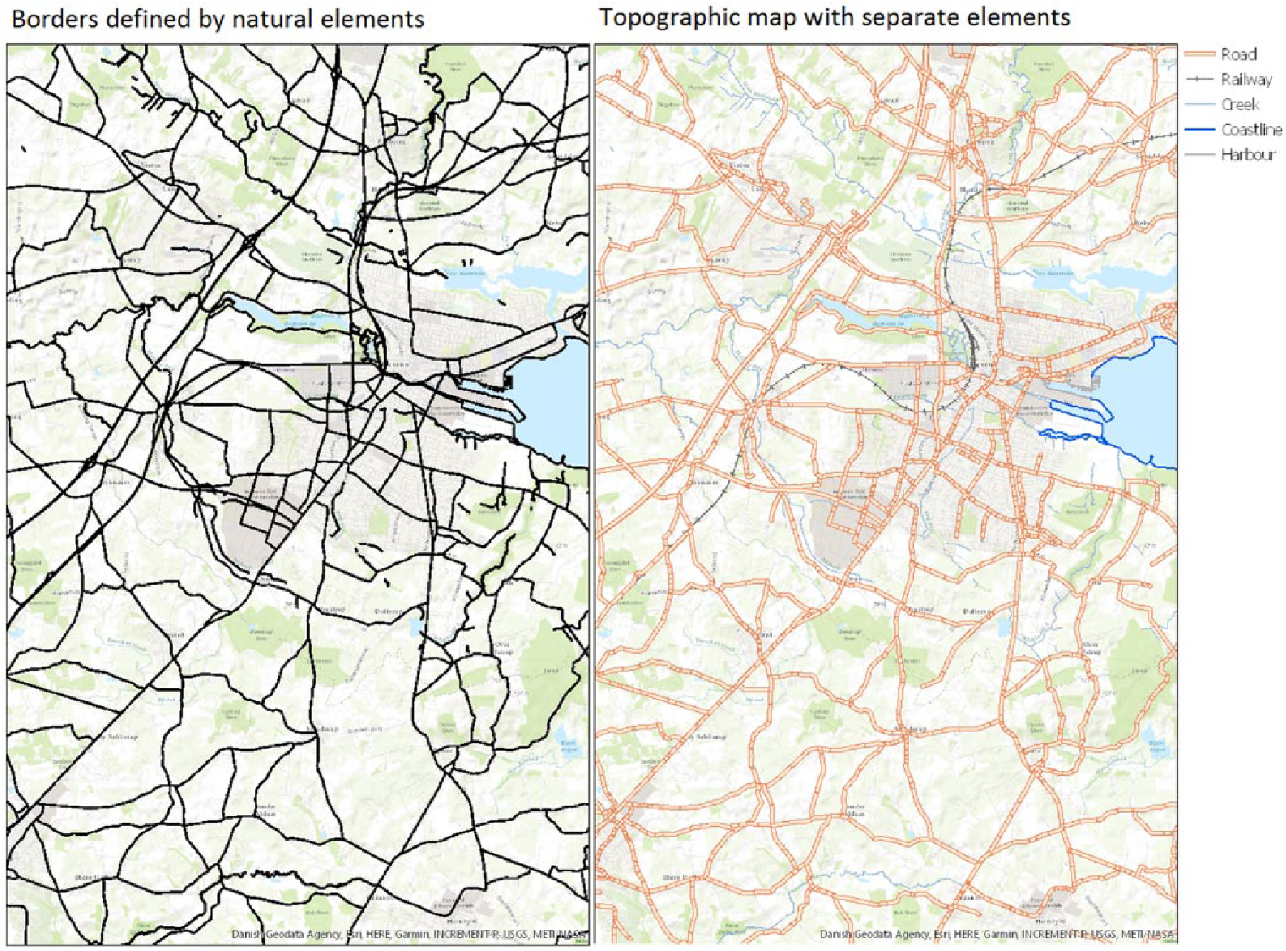
Another reason for not using only the 100 m × 100 m cells is of a theoretical perspective; what area do we interact with each other and how do we define the social barriers that consists of the feeling of “us” and “them”? A lot of research has pointed to some sort of cohesion inside areas and has tried to define what makes a neighborhood (Damm and Schultz-Nielsen, 2008; Deng, 2016; Freisthler et al., 2016; King et al., 1994). Scott L Feld even points to the fact that even though we live in specific areas, these are often divided by specific physical barriers like roads, railways, and other objects commonly found in both the urban and rural landscapes (Feld, 1981). By this logic, the square grid, by itself, will be as illogical as other administrative area divisions.
The other set of data consist of register data for the total of the Danish population over 18 years of age in 2015. The registers are a compilation of individual level information about education measured in full months of total education, primary school included, income measured as gross income per year, age, gender, and ethnicity. All data on interval level have been utilized when mapping but categorized into ordinal measures for the entropy measurement. Furthermore, the data consist of other geographical information like parish and municipality. All of this is linked to the square grid after the clustering has taken place.
Methodology
As stated in the introduction, most studies that investigate the effect of neighborhood or residential area use predefined and often administrative geographical units of measurement. The overall problem with administrative areas is, especially in a Danish context, that even the smallest areas of measurement, parishes, are very poor indicators of the types of people who live there. The Danish parishes are, in most cases, many hundreds of years old and have not been updated or redistricted, as new settlements have taken place. This perhaps makes sense in a religious perspective, since most parishes still belong to a specific church but when interested in sociodemographic areas and social segregation, this type of measurement is lacking. What this article proposes is another way of thinking place of living. These next sections will outline the process of setting up criteria for the automated redistricting algorithm and show how measurements of area homogeneity are set up.
Inductive automated redistricting—criteria
Considering the theoretical and practical foundation presented earlier, the algorithm to handle the automated redistricting is based on inductive reasoning. The overall criteria were as follows:
Are separated by physical barriers;
Are contained within a single polygon and not separated by other polygons;
Have at least 100 households present in the years 2000, 2005, 2010, and 2015.
The algorithm works in two steps; first step is to apply the barriers in question, which are highways, roads broader than 6 m, rivers and streams broader than 3 m, railways, lakes, forests, coastlines, and intakes. This is also the reason for labeling the algorithm as inductive. Since there can be no preconception about what areas should be formed, all areas are defined by the criteria and emerge solely because of physical barriers that are thought to create not only a visible barrier but also a social barrier that establishes a sense of “the people on the other side of the road” (Feld, 1981). Using this algorithm also implies that there can be no real preconception about how many inhabitants can be present in one polygon. Earlier research has applied a divider once the number of inhabitants has been reached but this goes beyond the logic of using physical barriers as the most important social divider in regard to neighborhoods (Damm and Schultz-Nielsen, 2008). This has shown to be a very small problem since more than 90% of the areas are smaller than 1000 inhabitants and less than 1% bigger are inhabited by more than 5000. From a purely methodological standpoint, it would be simple to divide those larger areas into smaller areas, but this would also result in a radical break with the barrier criteria. For this reason, areas are not manipulated if they contain more than 100 inhabitants.
After the initial first step, the square grid is applied. The square grid, in this case, contains not only information about square location but also number of households in each square. Since the smallest possible division of inhabitants is the square grid, the grids are dissolved into the areas where the largest part of the square is located. The borders of the areas are then formed after the squares so that the smooth borders are replaced with the borders of the squares in each area. By doing this, it is possible to calculate how the population is distributed into the first array of areas (Figure 1).
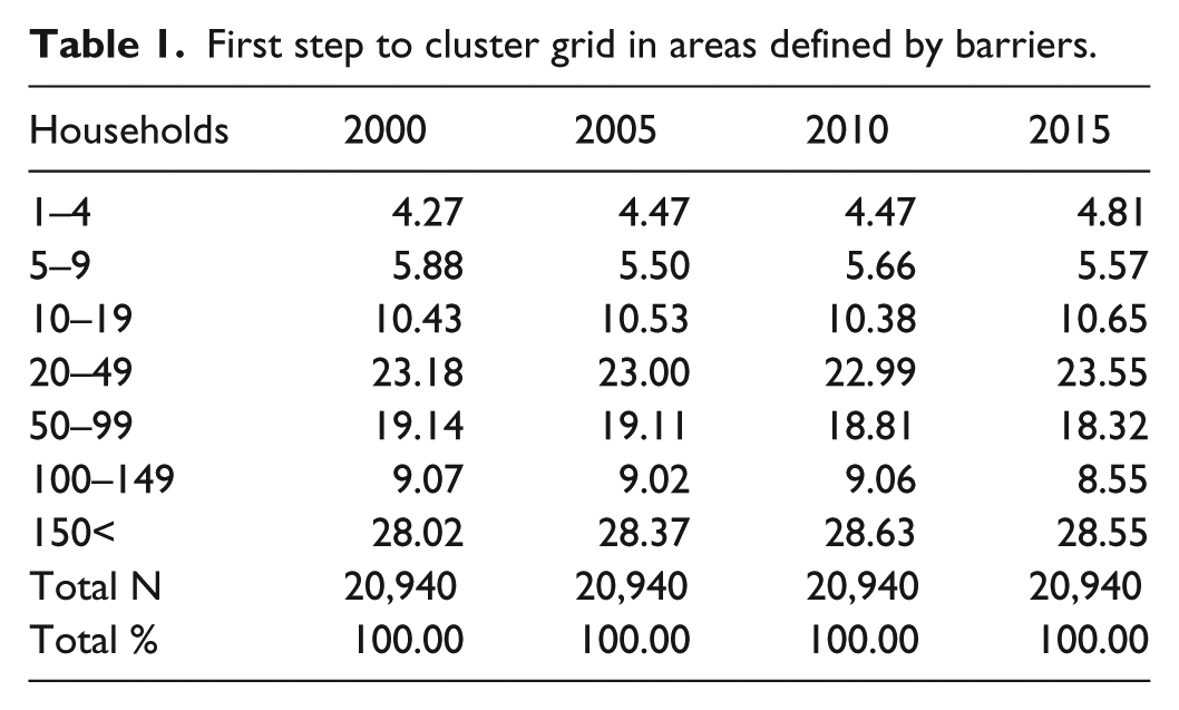
First implementation of algorithm.
As can be seen in Table 1, the total amount of new areas is 20,940, and of these areas, only 28% of the areas meet the minimum requirements of 100 households. What is also quite evident is that it is impossible to secure large enough areas by only using barriers. Furthermore, a valid point would also be that a neighborhood with only four residents would be very poor at capturing the neighborhood effects.
First step to cluster grid in areas defined by barriers.
To remain true to the criteria that all barriers must be kept as separators would mean that further clustering would stop at this point. This is, however, not possible because of the discretion criteria of Statistics Denmark so another algorithm performs the second clustering. The criteria set here are as follows (Figure 2):
All areas must be applicable for a clustering;
Areas must share borders;
Areas with the largest borders measured in percentage shared will be considered for clustering first;
Selection of areas to the clustering process is based on the least possible amount of merges;
Selection of areas to the clustering is second based on resulting in the smallest possible number of inhabitants in the merged areas if there are more than one way to obtain the least available merges;
Areas must be merged until 100 inhabitants are reached.
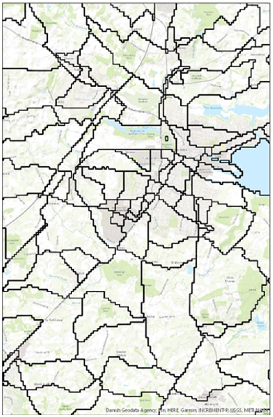
Final step of algorithm.
The main point in the above criteria is to make the algorithm work in a way that results in the least amount of area merges. The problem in selecting a specific point to start the selection process is that the final merge would vary extremely and would be different each time a different starting polygon was selected. This still holds true for this method in the way that a different polygon would result in a different merge. Because the algorithm initially calculates, how the merge would be if the least possible merges is the main criteria, and getting the least inhabitants in each area, the algorithm consequently creates the same merges if the process was to be repeated.
The reasoning behind the criteria that all areas must be applicable is twofold; first, it is to make sure that the algorithm has enough adjacent polygons to select for merges even if a specific area holds more than 100 households, but second it secures that if a large border is shared, the smaller area does not merge with a more marginal area because of restricted areas. But securing the largest shared borders does not help with the fact that neighboring areas that should not be merged end up being merged; since the only way to apply data to the model is to secure 100 inhabitants in each area, this criterion at least secures a proximity so that social interaction inside areas is more plausible than if they were divided by large areas.
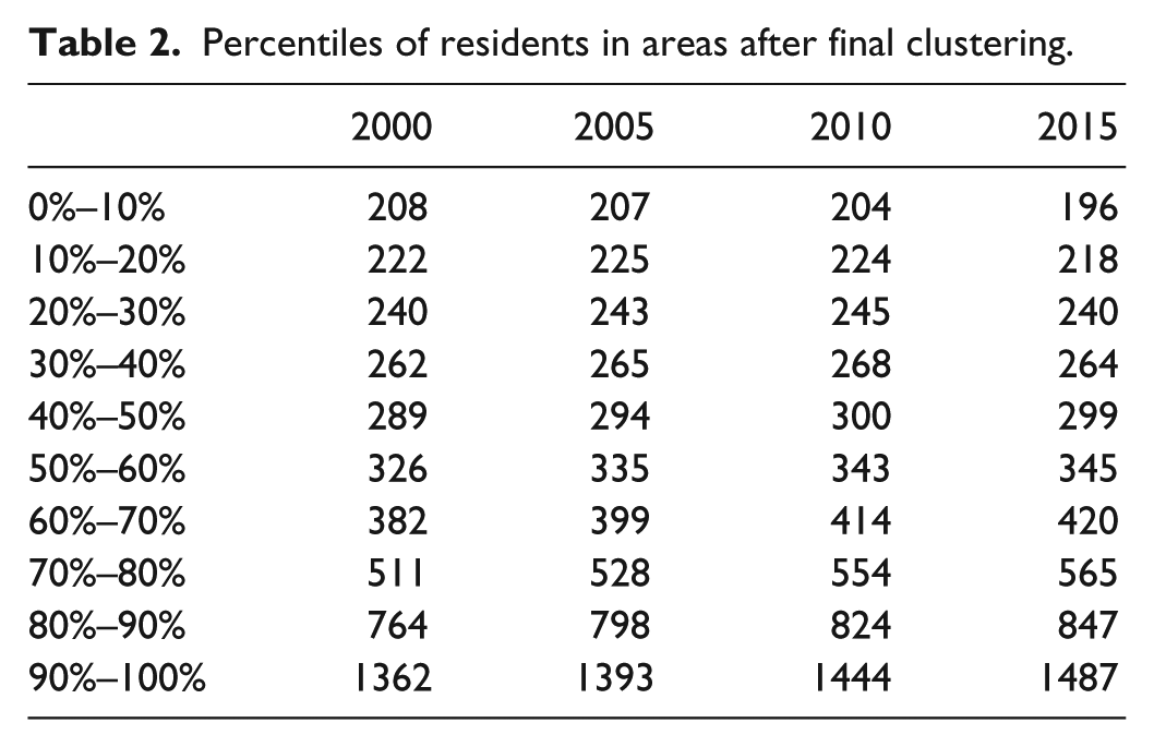
After applying the second step, all areas are above the discretion criteria. The only thing the algorithm does not solve is the problem with islands. There are in total eight islands inhabited that do not meet the minimum requirements for Statistics Denmark. Since the point of this algorithm is to utilize physical borders, these few islands have been removed. Later, research could consider implementing these in some form (Table 2).
Percentiles of residents in areas after final clustering.
Measurement of area homogeneity
Since one of the overall theoretical ideas presented in this article is based on the social classes’ physical settlement, it is of importance to measure the overall homogeneity of the inductive areas. The main problem with the standard measures of segregation is how to work around multiple categories. Many researchers are interested in minorities compared to majorities inside given areas (Barone, 2011; Charles and Bradley, 2009; Charles and Grusky, 1995; Damm and Schultz-Nielsen, 2008), but because the aim of this article does not only encompass diversity between groups without an inherent minority but it also needs to be able to compare many different categorical variables with a varying set of categories. To account for the categorical elements in the article, I have used Shannon’s entropy and this takes the form of
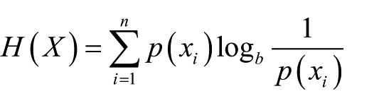
where
Scaling
One of the main issues about comparing different methods to secure area homogeneity is to understand how one method differs from others. Most of this article focus on the difference between this new proposed method of area division compared with administrative areas as parishes since this is the most widely used scale but one could argue that if one reduces N in areas, general data smoothness would ensue a greater homogeneity. As noted by Samardzic-Petrovic et al. (2016), scale matters when wanting to encompass subgroups in the population. To account for this and to fully investigate the physical barrier approach compared to similar approaches, I have applied a wide set of moderations and simulations.
As can be seen in Table 3, five different versions of algorithms have been run to test how much of the increased homogeneity is due to data smoothing and how much is due to the actual method.
Moderations to the zonation on different scalars.
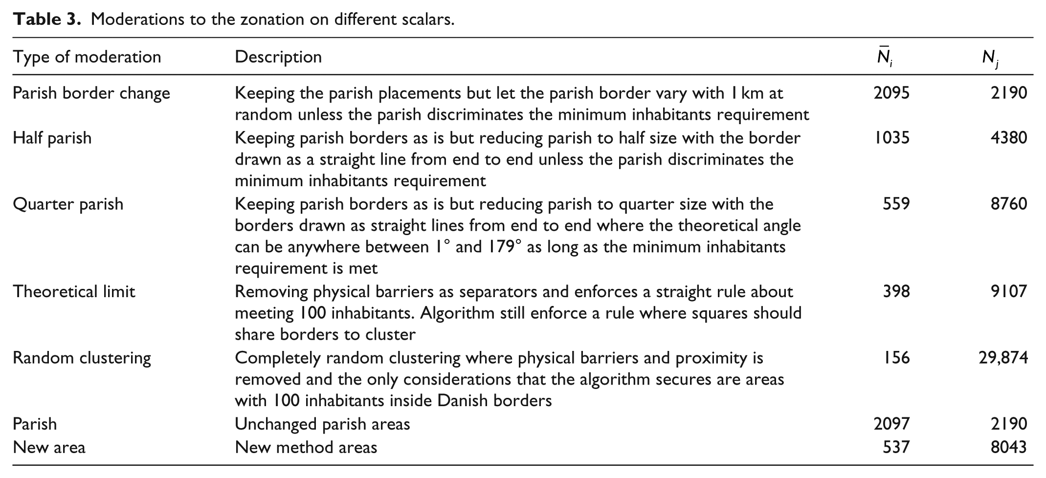
Each of the above methods is run as loops 100 times to compare differences in simple chance divisions. Because of the computational requirements to run these, and especially the last two, only 100 runs have been performed.
The first three types are based on parishes to investigate how much more homogeneity one can accomplish if one adjusts the parishes. They start with the parish as is and then a randomization is applied. The border change changes the circumference of the parishes dynamically so that no inhabitants fall into no man’s land—this also means that parishes are being shrunk or enlarged at random. The second moderation is dividing the parish into two equally large half-parishes—each run is a different division at random. Quarter parishes follow the same logic except that this allows for oblique divisions—each quarter does not need to be exactly 25% of the parish if all four parts have met the requirements for a number of inhabitants.
The last two moderators are more in line with the idea of the method proposed in this article; they still work with smaller areas, but they ignore physical barriers. The theoretical limit moderator abandons barriers and instead focuses on reaching 100 inhabitants with squares sharing borders—this results in very small areas with no more than a mean inhabitant count of 156. The last moderation is a test to see whether geography matters at all; is it possible to generate homogeneity by pure chance?
The concept of inductive neighborhoods in a Danish context applied
To better understand how these new areas work compared with the alternative parishes, a series of comparisons are made. The following section will try to show how smaller areas differ in understanding common socioeconomic and demographic trends in a geographical setting. The analysis will focus on educational attainment in months, yearly income, and ethnicity.
Educational attainment and the place we live
Education in a Danish setting has undergone an expansion during the past 70 years. Educational attainment has seen a massive upswing and many political goals have been set to see this trend continuing. One thing that is especially important to understand in the progress of the educational attainment goals is the geographical dispersion of educational segregation, to pinpoint what areas are attaining education, and more importantly, which ones that do not. Many policymakers inform themselves using maps showing mean educational attainment in areas, but most of the time, these maps only tell very little about the actual segregation in a geographical perspective because the attainment means are being aggregated to either municipality or regional level.
A simple visual comparison of the mean of education length in months in new areas compared to parishes shows a very interesting trend; even at parish level, the localized educational segregation is being masked by aggregation compared to the new areas (Figure 3).
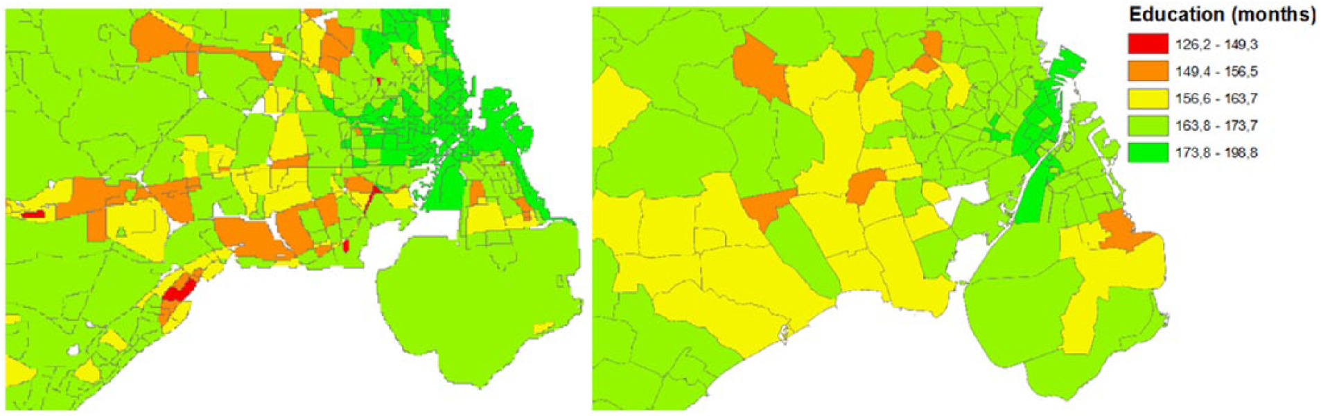
Smaller areas (left) and parishes (right) with average educational length in months.
Small pockets of very low educational attainment are showing inside parish level data, and in some very specific cases, the variation inside a parish is so big that the attainment compared to neighboring areas on the left figure misses three whole levels of education.
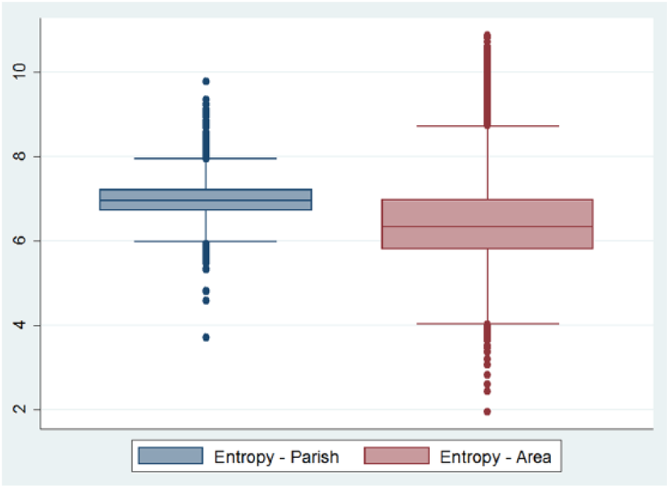
Further investigating the difference between the new areas and parishes on a national level, with educational attainment at a categorical level, reveals that there is general problem with masking localized problematic areas within parishes (Figure 4).
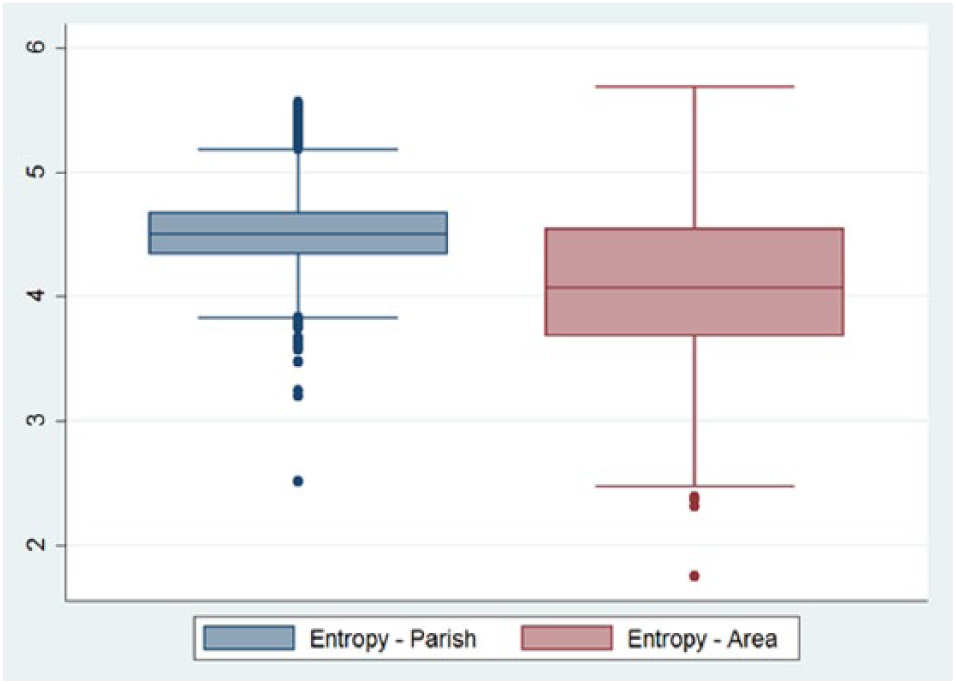
Entropy of educational groups in parishes and new areas.
Comparing entropy in the boxplot above shows that the median number educational categories present inside the same areas are close to 4, while the median categories inside parishes are 4.6. What is even more interesting is that from the 25th to the 75th percentile is generally much lower than that of the parishes. Unsurprisingly though, it is evident that the spread outside the 25th to the 75th percentile to the upper and lower adjacent values is larger for the new areas than for parishes, but since entropy is a measure of probabilities, it is expected that areas with only 100 residents are more sensitive to small changes in area composition than parishes are.
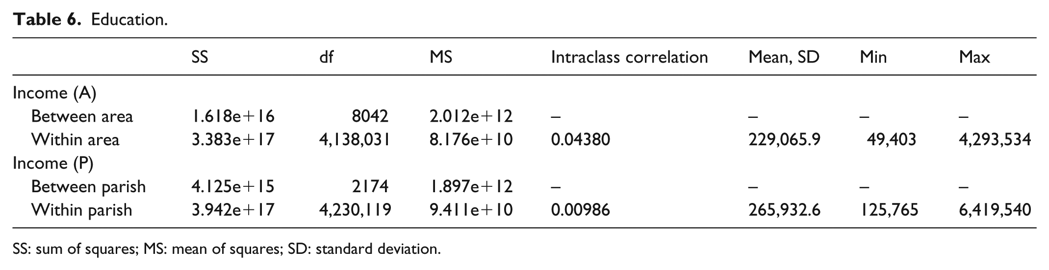
Another way of looking at the difference between parishes and new areas is the variation inside and between each aggregated measure. By utilizing an analysis of variance (ANOVA) on new areas and parishes, it is possible to fully grasp how the aggregation measures differ (Table 4).
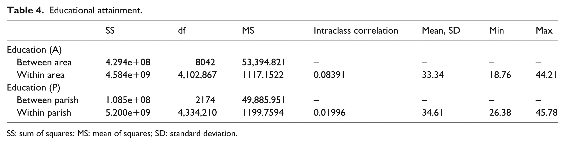
Educational attainment.
SS: sum of squares; MS: mean of squares; SD: standard deviation.
Much like Figure 4, it is evident that there is less variance on average inside areas than there are in parishes. The mean sum of squares within areas is 1177, while the same measure is 1199 in parishes, but what is even more interesting is how much they differ in their between variation, with areas having a mean square of sum of 53,394, while parishes only have 49,885. This indicates that areas differ more between them than parishes and that areas are more homogeneous. When considering homogeneity, it is also worth noting that the intraclass correlation is 4.2 times larger in areas compared to parishes.
Examples: ethnicity
One of the core concepts of residential segregation often centers on ethnicity and racial segregation. The goal of most of the research is to understand how segregated we are in our residential patters when it comes to race and to better understand how enclaves appear in closed geographical form. Research is often limited in the access to understand this segregation on national level because of data availability.
Figure 5 shows the percentage of first- and second-generation immigrants compared to the native population inside new areas (left) and parishes (right). As with education, the general racial compositions of the Capitol Area suffer from heterogeneity when only looking at data aggregated to parish level. Looking at the center of Copenhagen, a lot of areas emerge that are almost exclusively dominated by native Danes, whereas the southwest part of the map reveals enclaves that consist of areas that have more than 50% first- or second-generation immigrants (Figure 5).
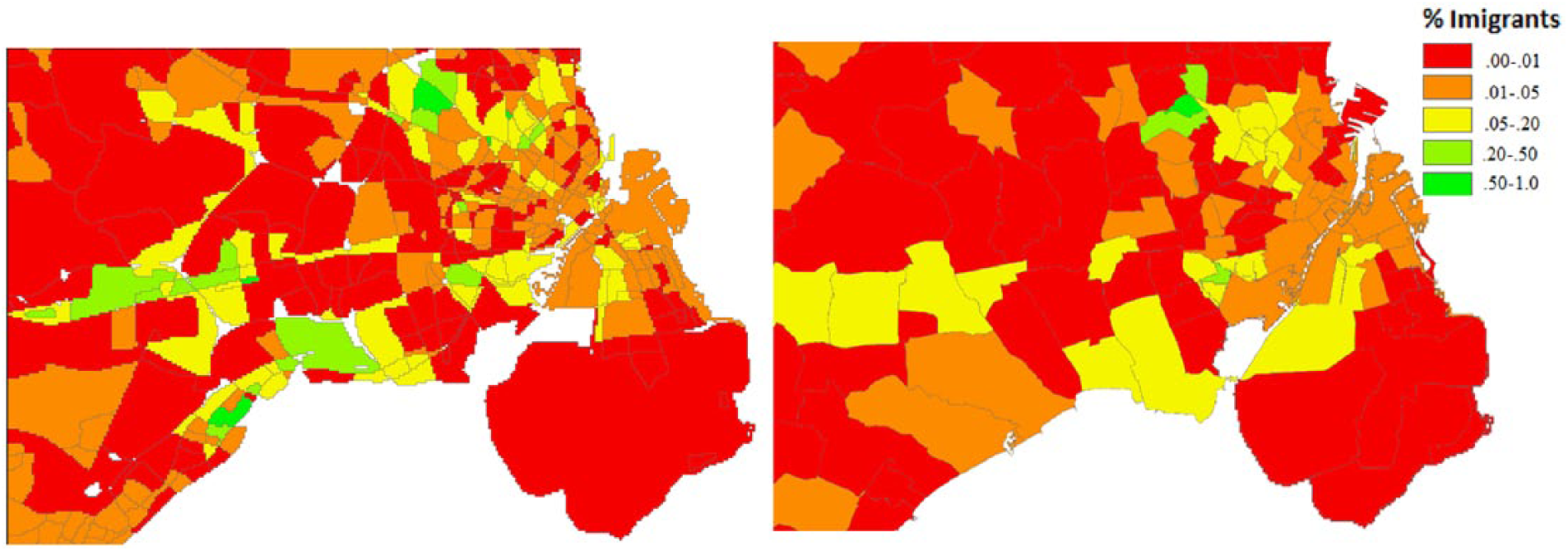
Smaller areas (left) and parishes (right) with percentage non-native residents.
Comparing this to the overall entropy on national level, as seen in Figure 6, these findings are consistent with the maps above. The median for new areas is 1.27, whereas the median for parishes is 1.34. This measure of entropy ranges from 1, where all residents inside a specific area are of either only native Danes or only immigrants, whereas an entropy of 2 is an equal part of both. Not surprisingly, this measure does not amount to many areas where the distribution is close to 2, since especially the Western areas of Denmark have a very low overall proportion of immigrants.
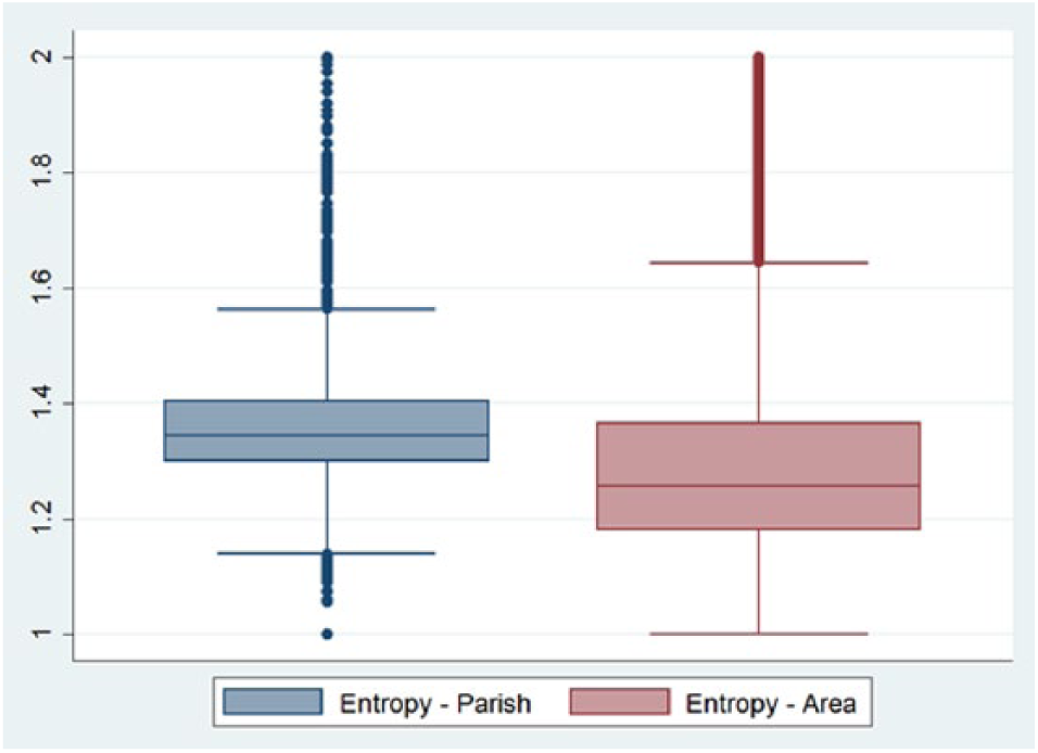
Entropy of ethnic heritage groups in parishes and new areas.
As with education, the 25th to the 75th percentile for areas is lower than that of the parish and the upper and lower adjacent values are bigger.
When investigating the mean sum of squares in Table 5, the pattern of more homogeneity within areas and more heterogeneity between areas than parishes can be seen. Likewise, the intraclass correlation is 2.6 times larger for the new areas than it is for parishes.
Migrant groups.
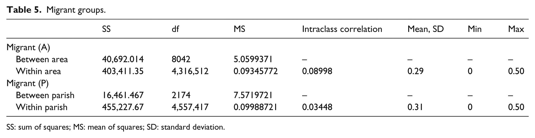
SS: sum of squares; MS: mean of squares; SD: standard deviation.
Examples: income
Income redistribution is a large part of the Danish welfare state and thus the understanding of where the wealth accumulates is important to understand how the redistribution should be performed. Looking at the map of the Capitol Area, a somewhat disturbing distribution appears when comparing new areas with parishes. Where both educational status and share of immigrants give some interesting insight into distribution and smaller enclaves, income distribution is a very different story.
Figure 7 shows income quintiles with red being low income and green being high income. What becomes very apparent is that the parishes on the right show almost no variation in the categories. Not a single parish consists of the highest income grouping when aggregating even though the wealthiest Danish areas are located just north of the capital, which is on the top of the map; we see only the second highest quintile range located there. Looking at the areas on the left, it is evident that there is a concentration of wealth just north of the Capitol.
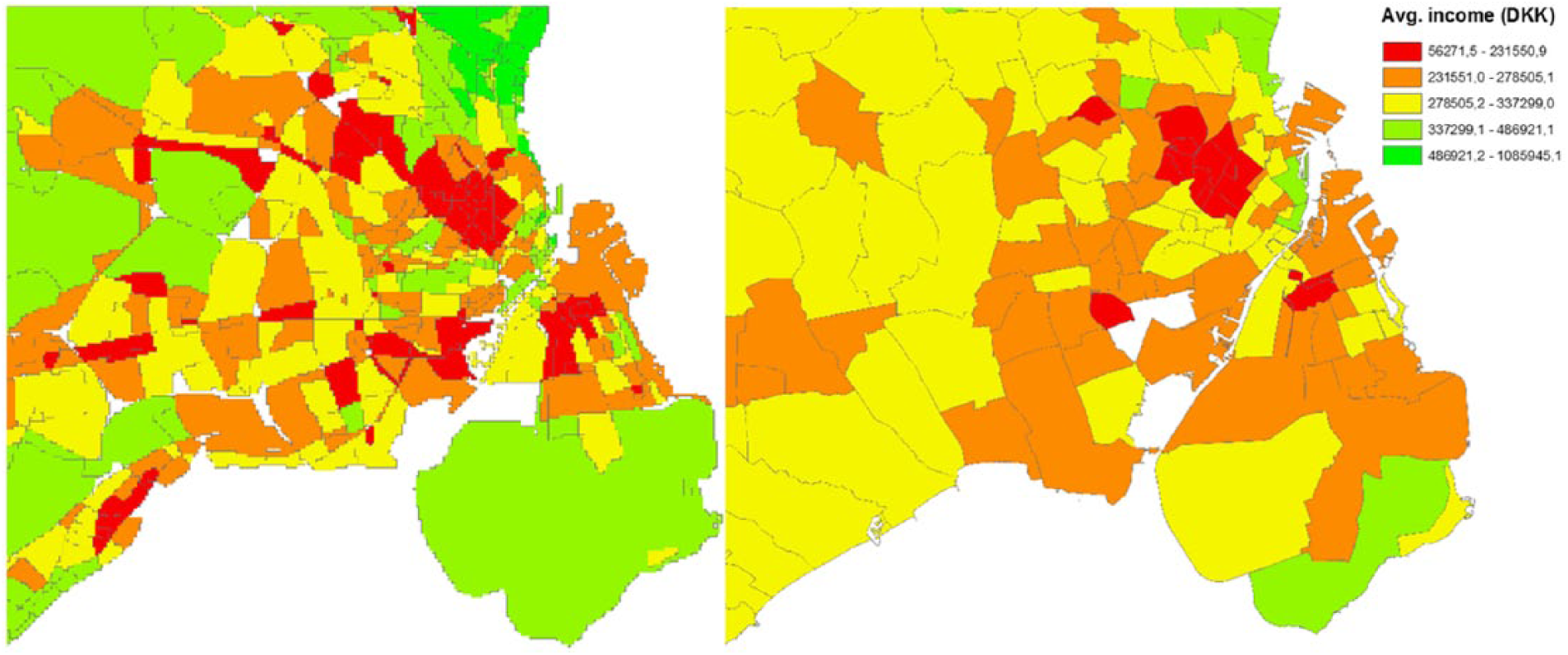
Smaller areas (left) and parishes (right) with average income.
The same, but not as extreme, goes for the most income deprived areas where only the center of Copenhagen is depicted as the lowest quintile, while this distribution is very different when considering the areas on the left. Much of especially the lower income areas are being obscured by aggregating data to parish level where many parishes to the west depict an average income level and not pointing out the more deprived areas that emerge on the left map.
Considering the entropy of both parishes and areas, where I categorized income in 12 groups, the same pattern is present. New areas hold a much lower median number of income groups, while the new areas have higher and lower adjacent values. This is further explained by the tendency where the between variation is larger for areas than for parishes and within variation is smaller for areas than for parishes, as explored in Table 6 with count data (Figure 8).
Education.
SS: sum of squares; MS: mean of squares; SD: standard deviation.
Entropy of income groups in parishes and new areas.
One thing to note in the above table is the relatively low intraclass correlation. Even though it is 4.5 times larger for smaller areas than it is for parishes, it is still only 0.04. This could be explained by the fact that income is the measurement with the largest overall range of values, and that since it is a true ratio variable, it simply has too much variation to further a better correlation. This is supported using the ordinal variable used in the entropy measurement as replacement, which yields an intraclass correlation of 0.12 instead, but retains its relative difference of 4.5 from parishes.
Exploring scalars—education as perspective
As described earlier, data smoothing could easily be responsible for most of the variation in homogeneity. Figure 9 introduces the moderations shown in Table 3 in simulated loops of 100 per type of moderation and ranks the runs from the best to the worst in terms of median entropy on education. To improve on readability, only five different distributions are shown for each moderations, 100 runs: the lowest median, the 25th percentile lowest median, the 50th percentile lowest median, the 75th lowest median, and the highest median entropy. As a reference, the original parish distribution and the new area distribution have been placed furthest to the right.
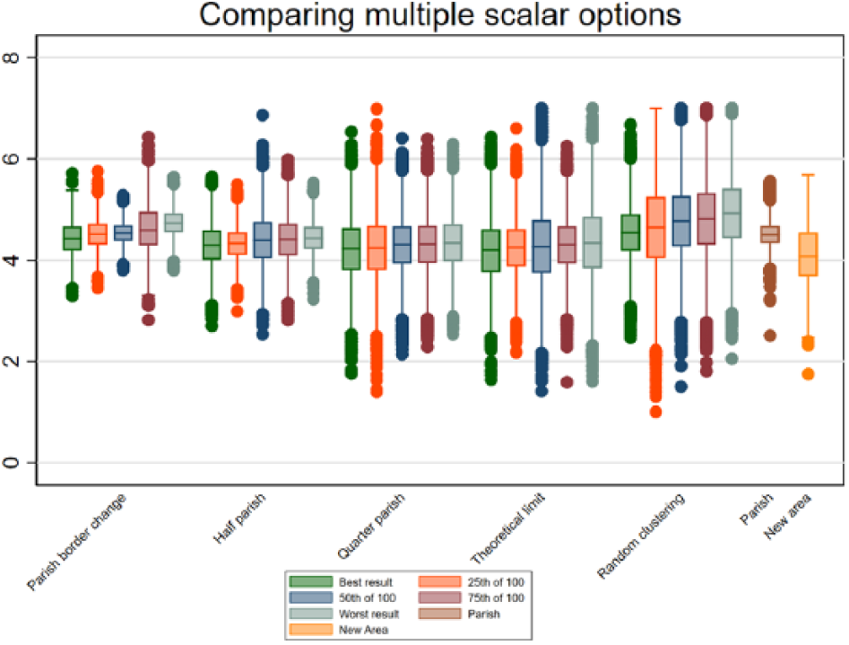
Loops of different moderation types from lowest to highest median in each moderation type.
The above figure has a few interesting differences. First, it is worth noting that the new areas are more homogeneous in their inhabitant base compared to all other moderators even though there is some evidence of data smoothing. Considering the differences between half and quarter parishes compared to the theoretical limit division, there seems to be a limit to homogeneity purely based on reducing number of inhabitants. The difference between quarter parishes and the theoretical limit is basically non-existing even though the average inhabitant count has been reduced from 559 to 398 which is effectively a lower N than the proposed new areas. The best run of the theoretical limit moderation is closing in on the new areas, but it has a very logical drawback; the standard deviation in entropy is much higher. A simple explanation could be that non-barrier clustering is unable to take into account the housing prices and general neighborhood characteristics that could be factors in homogeneity and personal preferences in respect to housing.
Not surprisingly, the homogeneity as well as the standard deviation is by far the worst when performing the random clustering moderation. This is the smallest inhabitant average but it fails to account for both the physical and the local policies that could affect homogeneity.
What this implies is twofold; yes, size matters but the logic behind the scaling does as well. People do seem to adhere to some sort of logic when deciding where to live and that logic does not seem to only apply if we rescale to very small areas. Physical proximity does increase homogeneity but it does seem that this proximity is based on physical environment as well.
Discussion
This article has shown that using other geographical divisions than administrative ones—even if they are relatively small—differs in the way we are able to perceive social and economic segregation and distribution. One discussion that is of utmost importance in this regard is, “Is this method better than many other methods designed to investigate non-administrative areas?”
This question is often not only the most pressing one but also the least interesting. How we define “better” changes in connection to what we want to understand and how we want to understand it. Most of the non-administrative areas are better at understanding local characteristics and inequality than administrative areas simply because they are smaller and therefore more likely to locate social enclaves. When it comes to the logic of non-administrative areas, the question to ask is no longer: “Are they better?” but instead “How are they different?” In this article, I propose a method to understand areas that differ from the commonly used methods and has both advantages and disadvantages. The main problem with this method is the border problem, where it becomes unclear whether people closer to the area border share increasingly more characteristics with people with adjacent areas. This is where especially K-nearest neighbors offer an advantage over the proposed method since the container presented here assumes that the area is uniform and that the border is the divider from one type of neighborhood to another. This could be considered not only a problem but also a strength in this method, since this hard division of neighborhoods allows for transferable and easy-to-understand area divisions. This is also necessary to investigate how streets and natural barriers act as social barriers which are of less importance with fuzzy borders. One thing that would improve the method proposed in this article would be the ability to test how the borders function; if people change drastically at the physical border or if the change is graduate. The data limitations of Statistics Denmark render this impossible to test, but it would greatly improve the certainty of the border hypothesis. Nevertheless, this method is grounded in the logic behind settlement and how people inhabit areas and offer a much more logical way of redistricting than many other methods that rely solely either on geography or on social characteristics.
This problem arises with Bayesian methods as well. The a priori assumptions change the areas and require decisions made from the research to constantly take into account how the changes occur. Bayesian methods also require very specific knowledge and discussion of the a priori assumptions, which makes the method complicated and requires a new model for each research question. If research is to offer informed answers especially regarding policy and action-based decisions, a general model for segregation and area division is more applicable. The method proposed here can be used without fear of breaking data discretion requirements and can be easily adjusted in types of borders and number of inhabitants with the only a priori assumption being what borders to use and how large the clusters should be.
It is worth discussing the assumption that is the center of this method; areas can only be divided by physical barriers. In some cases, it would be logical that areas are too large to contain only one neighborhood, or one enclave of inhabitants would benefit from a division. Even though only less than 10% of the areas consist of more than 1000 inhabitants, it could perhaps solve the outlier problem when looking at the various entropies. This is, however, a discussion between logical perception and methodological purity. To what extent should the borders function as separators? In the case of the most extreme cases in Figure 9, which is one of the largest areas when considering both size, 84.6 km2, and inhabitants, N = 14,509, one could argue that there might be something else than physical barriers to contain the social life. However, considering that the entropy of education in this area is 4.1, which is almost the median, it is difficult to pinpoint how to make this divide. Area size only correlates with educational entropy at 0.05, while the number of inhabitants correlates at 0.31. This indicates that most diversity measures would increase with number of people no matter the size of the place of interest. This, of course, is logical since the probability of a wider diversity increases with numbers, but it also complicates the logic of physical barriers in the case of heterogeneous areas (Figure 10).
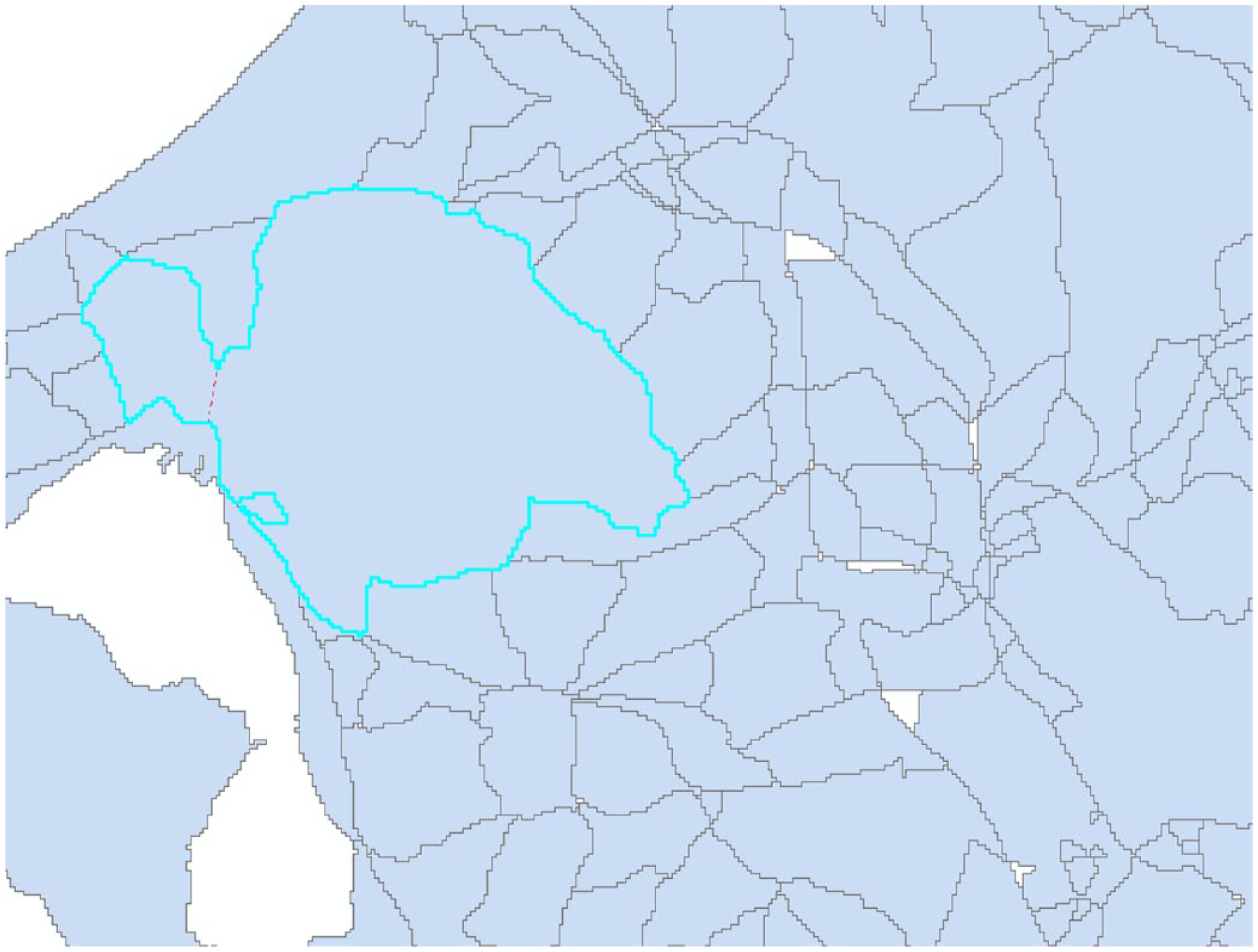
Extreme case of large area.
Further adjustment of the overall algorithm could include a softer version of non-barrier divisions that consider area size, inhabitant count, and standard deviation in specific measurements and automatically divide at the areas’ narrowest point. In the example above, this would only somewhat solve the problem, since this area would be divided where the red line is proposed.
Conclusion
The literature on area effects and neighborhoods has long been focused on the effects first and the areas second. This article proposes a new method as an alternative to not only the administrative areas but also the non-administrative methods of geographical division if the main goal is to achieve homogeneity. The main point is to create areas that have a simple logic in their creation and offer a much better model to locate microsocial enclaves in a wide variety of social measurements thus focusing on homogeneity. The main problem with many other methods of automated redistricting is that the formation process is very complicated and requires either massive computational power or many deductive decisions before the formation. This method offers a high level of control over area formation and a highly logical interpretation of data assigned to the areas.
Comparing entropy, within/between variation and intraclass correlations between the areas proposed in this article compared to administrative parishes show not only a much higher homogeneity but also a better overall between variation. From a purely descriptive angle, the maps generated for educational attainment, ethnicity, and income reveal some very interesting subgroups of the population that would otherwise have been overlooked—when focusing on not only the deprived but also the wealthy areas.
One thing to consider is the application of this methodology; when comparing the proposed methodology to variations of zonation, it is evident that this method offers homogeneity above all else. This is often a main premise when trying to understand a neighborhood and how the inhabitants choose where to relocate but is, of course, only a smaller part of the complete neighborhood constructing literature. As mentioned, arguing which method is “better” should always be seen in context with the problem at hand. Comparing most non-administrative methods to administrative would usually result in both higher homogeneity and smaller units of measurement simply because of the size, but as shown, even though size matters, it doesn’t encompass everything when aiming for homogeneity. Therefore, the discussion should center on usability and the goal of the models. This algorithm is designed to enhance usability and simplicity and at the same time securing small areas of high homogeneity.
Footnotes
Declaration of conflicting interests
The author(s) declared no potential conflicts of interest with respect to the research, authorship, and/or publication of this article.
Funding
The author(s) received no financial support for the research, authorship, and/or publication of this article.