
Abstract
All datasets emerge from and are enmeshed in power-laden semiotic systems. While emerging data ethics curriculum is supporting data science students in identifying data biases and their consequences, critical attention to the cultural histories and vested interests animating data semantics is needed to elucidate the assumptions and political commitments on which data rest, along with the externalities they produce. In this article, I introduce three modes of reading that can be engaged when studying datasets—a denotative reading (extrapolating the literal meaning of values in a dataset), a connotative reading (tracing the socio-political provenance of data semantics), and a deconstructive reading (seeking what gets Othered through data semantics and structure). I then outline how I have taught students to engage these methods when analyzing three datasets in Data and Society—a course designed to cultivate student competency in politically aware data analysis and interpretation. I show how combined, the reading strategies prompt students to grapple with the double binds of perceiving contemporary problems through systems of representation that are always situated, incomplete, and inflected with diverse politics. While I introduce these methods in the context of teaching, I argue that the methods are integral to any data practice in the conclusion.
Introduction
“Would everyone wearing a blue shirt please stand up?” I asked the students enrolled in Data and Society. A few darted up, while others paused, seemingly to contemplate what I meant and the repercussions of identifying themselves as blue shirt-wearing. One student wearing a blue and white striped shirt asked, “How much of the shirt should be blue?” I turned his question back to the class: “What do you think? What constitutes a blue shirt?” Someone shouted out, “The shirt should be mostly blue.” Another suggested, “It need only contain some blue.” The student in the blue and white striped shirt hovered a bit above their seat before reluctantly standing. One student wearing a denim jacket asked, “Does this count?” A chorus of “yeses” and “nos” echoed across the room. The student remained seated. I then counted the number of students standing. “We have 22 blue shirt-wearing students in the room,” I declared. With so much initial contention over what “counted” as a blue shirt, student skepticism was apparent.1
Categorical judgments of “what counts” underlie the values recorded in all datasets (Martin and Lynch, 2009). When toggling between datasets coded according to two predominant but competing definitions of what constitutes a “forest,” 6% of international forest area can disappear (NASA, 2015). Counts of homeless families change depending on whether the datasets include “doubled up” households, in which living arrangements are shared (Scott, 2011). These judgments become interlaced in data analysis as datasets become inputs for modeling. While emerging curriculum in data ethics has prudently cultivated student capacity to identify data bias and its consequences, investigating the cultural histories and vested interests animating data semantics is rarely a priority in data practice or in data literacy training (Gray et al., 2018). Without critical attention to the cultural rhetorics and political judgments enmeshed in datasets, one risk is that students will come to perceive datasets as essentially aperspectival structures for storing a priori truths and bias as an external force that contaminates them. To critically examine data bias, data analysts need skill in examining datasets as cultural artifacts that emerge from always already power-laden semiotic systems.
In this article, I demonstrate how humanistic modes of reading can be brought to bear on the study of datasets. Specifically, I introduce three modes of reading that can be engaged when studying datasets—a denotative reading (extrapolating the literal meaning of values in a dataset), a connotative reading (tracing the socio-political provenance of data semantics), and a deconstructive reading (seeking what gets Othered through data semantics and structure). I then outline how I have taught students to engage these methods when analyzing three datasets in Data and Society—a course designed to cultivate student competency in politically aware data analysis and interpretation. Critically reading the documentation for a dataset produced by the Eviction Lab, we learn how data aggregators face critical tradeoffs in standardizing local data semantics for national comparability. Studying the data definitions for the US Environmental Protection Agency’s (EPA’s) Toxic Release Inventory (TRI), we learn how the values reported in a dataset evolve as data semantics become the subject of political contention for diverse advocacy groups. Finally, examining the New York Police Department’s Stop, Question, and Frisk dataset, we learn how data can signify not only the people and issues documented in their formal definitions, but also reporting incentives and power. In each case, we grapple with the double binds of perceiving contemporary problems through systems of representation that are always situated, incomplete, and inflected with diverse politics. I introduce these strategies in the context of teaching, but, as I argue in the conclusion, the methods are integral to any data practice.
Reading datasets beyond the neutrality ideal
Heightened public attention to data misuse and discrimination has prompted many university educators to prioritize technology and data ethics in curriculum design (Bates et al., 2020; Fiesler et al., 2020; Metcalf et al., 2015). While some have called for integrating curriculum on ethical codes of conduct into data science programs (Saltz et al., 2018), others have argued for supporting environments where students can grapple with ethical and political dilemmas when writing code (Malazita and Resetar, 2019; Martin and Weltz, 1999; Peck, 2019). In this second vein, D’Ignazio and Klein (2020) cite individuals and institutions teaching data science in ways that critique power, honor context, and encourage collective meaning-making. Dumit (2018) characterizes how students can extrapolate layers of politics from analyzing even seemingly mundane datasets, like airline flight delays. Data and Society draws inspiration from these latter approaches.
Offered in a science and technology studies (STS) program, one directive for Data and Society’s curriculum was to introduce students to the context dependence of data, as well as the methods by which stakeholders define, classify, and count people and things in ways that advance specific interests. Another directive was to foster skill in quantitative reasoning, introduce liberal arts students to the language of data science (and STEM students to the language of STS), and foreground the ethical tradeoffs one faces when working with “real world” data.
Searching for example “real world” datasets, I was drawn to a number of US government datasets with rich cultural histories—datasets that have advanced activism and governance toward addressing inequity, but have also, in certain ways, been produced and referenced by individuals who oppose those aims. In devising the lectures and classroom activities, I discovered grey literature that critiqued motives of the data producers and narrated how changes in the data’s semantics over time coincided with political and cultural change in the US. Each dataset I encountered highlighted certain social issues while sidelining others.
When first confronting their socio-political histories, many students vilified the datasets as “biased” and suggested strategies for eradicating bias such as more strictly standardizing definitions, more randomly generating samples, or employing automated technologies for data collection. Students advocated on behalf of distancing human judgment from the data and thus tended to position responsible data work as in pursuit of a “neutrality ideal” (Harding, 1992)—an idealization of efforts to produce value-free data or return data distorted by the politics of special interest groups back to its original rawness. In doing so, students treated data as originally apolitical—something that becomes politicized through the encroachment of values and vested interests. Students adopted what Hoffmann (2019) refers to as the “‘bad actors’ frame”—seeking out the people or unconscious design decisions on whom to place blame for infecting the data with bias.
STS literature has critiqued the notion of the original pureness of data as a myth (boyd and Crawford, 2012; Gitelman, 2013; Jurgenson, 2014). Further, as Harding (1992: 568) points out, in treating politics as something that acts on science, without attention to the politics of scientific knowledge generation, the neutrality ideal “defends and legitimizes” exclusionary yet normalized scientific practices and institutions. When algorithmic systems are cast as fixing human decision-making biases, the rhetoric of neutrality can be mobilized to exonerate them from blame, exacerbating injustices that emerge as a result of exclusionary design decisions (Benjamin, 2019; Eubanks, 2018; Noble, 2018). In presenting technocratic fixes to bias, students tended to overlook how attempts at human effacement displaced the data’s interpretive dimensions. Such attempts crystallize the power of certain individuals to decide how standards will be defined, how to go about random sampling, and how automated technologies will be configured, while also rendering those individuals and their choices invisible.
To encourage students to attend to bias without exalting the neutrality ideal, I came to recognize the value of introducing skills taught in critical pedagogical traditions outside of STEM (such as ethnography, hermeneutics, and critical analysis) when analyzing the course’s datasets. This required reframing datasets as not merely instrumental artifacts tarnished by politics, but as always already iterating cultural artifacts privileging certain symbolic orders over others.2 A growing domain of scholarship is demonstrating how humanistic modes of reading can be brought to bear in the evaluation and critique of datasets. Brian Beaton (2016) articulates the promise of “data criticism”—involving the study of the history, form, genre, and aesthetics of datasets. Melanie Feinberg (2017) demonstrates how slow, interpretive readings of databases can deepen understanding of the decisions, structures, and modes of processing that mold the information presented to us through retrieval systems. To encourage students to grapple more deeply with questions of privilege and harm in relation to data bias, I introduced three dataset reading strategies in Data and Society, which I respectively refer to as a denotative reading, a connotative reading, and a deconstructive reading (Figure 1).

Outline of denotative, connotative, and deconstructive readings of datasets.
A denotative reading of a dataset is a literal reading—a reading for the data’s technical or precise meaning that aims to discern “what counts” according to data producers. Reading denotatively is a pursuit to stabilize the meaning of the values encoded in data by temporarily suspending interpretation of their figuration and rhetoric. It involves referencing definitions encoded in a dataset’s data dictionary, if one is available. Data dictionaries (when well crafted, which is notably a rarity for much government data) document descriptive metadata about a dataset. They characterize what each row in a dataset refers to and provide definitions for the column headers that describe something about each row. They also outline the allowable values for different variables in the dataset, indicating the boundaries of various categories. While cultural analysts know that formal meaning is rarely stable for long, a denotative reading is important because the rigidity of technical definitions can be powerful resources mobilized to police the boundaries of representational inclusion. A denotative reading is thus a strategically reductionist reading where an analyst momentarily assumes a neutral position, not pursuing a neutrality ideal, but instead accounting for the formal semantics that enforce what is understood to “count” in data. Denotative readings establish a baseline against which connotative and deconstructive readings can be engaged.
Reading a dataset connotatively involves reading the data for more than what is explicitly encoded in its variables, values, and their definitions. A connotative reading interprets the cultural grammar of a dataset by exploring the changes in its semantics over time, the varied interests of its creators and stakeholders, and the specificities of the cultural and geographic contexts of its production. In this sense, a connotative reading of a dataset can be supported through a number of other techniques proposed in data studies. For instance, Loukissas (2017) outlines a technique he refers to as a “local reading,” which involves disaggregating the heterogenous sources that comprise Big Data to examine the local values and norms that constitute it. Bates et al. (2016) detail “data journeys,” which trace the data provenance through various socio-material systems. While there are intersecting aims for engaging each of these methods, a distinct aim of a connotative reading is to situate data semantics historically and culturally in order to interpret how implied meanings are derived from data. In this sense, connotative readings advance efforts to document a “genealogy of datasets” (Denton et al., 2020). Sometimes, information pertinent to a connotative reading is written up in thoughtful data documentation. However, connotative readings of a dataset are often enriched by examining scientific articles or op-eds that cited the dataset, legislation regarding its contents, or formally documented standards or classification structures on which it depends. These types of texts were assigned as course reading in Data and Society, exposing students to media that archives the genealogy of a dataset’s cultural grammar.
Finally, a deconstructive reading of a dataset locates the absent meanings and unacknowledged tensions that are always already haunting data-based representations. The act of designating information as data produces insight, but also necessarily delimits it—“Other-ing” information that is considered external to standard definitions and data structures (Star and Bowker, 2007). Engaging a denotative reading, one meditates on what is rendered residual in the process of demarcating data. Activists engage in such deconstructive readings by critiquing standards that disavow localized experience (Ottinger, 2010), foregrounding missing data as data (Liboiron, 2015), and accounting for the semantic politics that move through data assemblages (Currie et al., 2016). Auditing data cleaning processes and deploying creative visualization practices can support a deconstructive reading of a dataset by illuminating what has been subordinated within it and the contradictions inherent in its structure.
While I have found analytic purchase to distinguishing between these three reading strategies in the context of a classroom, the divisions between the strategies are not as easily defined in practice. Thus, in Data and Society, we constantly jump between the reading strategies as we critique and analyze the course datasets. For example, engaging a deconstructive practice demands attending not only to meanings that are absent, but also meanings that are present, prompting us to read denotatively. Reading dataset semantics connotatively often reveals information pertinent to a deconstructive reading—informing how and why certain entities come to be rendered central within the data while others are rendered absent from the data. Combined, the reading strategies enmesh numerical representations in power-laden semiotic systems, helping elucidate the assumptions and political commitments on which data rest. In what follows, I demonstrate how we engage these reading strategies, alongside data science skills, in Data and Society. Each of the following datasets has been examined and critiqued in STS literature, and credit is due to a number of individuals (cited throughout) and organizations (such as the Anti-Eviction Mapping Project, the Environmental Data Governance Initiative, and the New York Civil Liberties Union) for the research and advocacy that has made it possible to read each dataset in more ways than one.
The Eviction Lab: Ethical and analytic tradeoffs in standardizing data definitions
Matthew Desmond’s (2016) bestselling book Evicted: Poverty and Profit in the American City was acclaimed for its moving depiction of poverty and homelessness in Milwaukee. Winner of prestigious awards, the book closes lamenting the dearth of national data documenting eviction. In 2016, Desmond launched the Eviction Lab at Princeton University with the goal of aggregating eviction data from county civil court systems across the US. Among reports and videos, the work resulted in a series of public spreadsheets listing the number of evictions and eviction filings in every census tract in the US. While the Eviction Lab has been lauded by a number of major news sources, local tenant rights organizations have also called attention to its shortcomings (Aiello et al., 2018). For this unit in Data and Society, we examine the meaning of the eviction rates reported in the Eviction Lab’s data—attending to how local meanings get distorted in the pursuit of summarizing data at a national scale.
To begin, we load a map summarizing the Eviction Lab’s data posted on their website.3 There is a red bubble on top of every state, the size of which indicates the magnitude of the state’s eviction rate (Figure 2). We pan to California and see that it had amongst the lowest eviction rates in the country in 2016 with a rate of 0.83%. “Eviction Rate” is underlined. We hover our cursors over this phrase and see its denotative meaning: “the number of evictions per 100 renter homes”. Next to the eviction rate reported in California for 2016, there is a small grey circle enclosing an exclamation point. When our cursors hover over this circle, we see: “This state’s estimated eviction/filing rate is too low. Please see our FAQ section to understand why.” Referencing the FAQ, we learn that most California eviction judgments are sealed and inaccessible to the public and that the state places restrictions on how many records the public can collect. The reported 0.83% eviction rate cannot account for the stringency of California’s data protection laws. A connotative reading is needed to recognize that there’s more to interpret in this value than what is encoded in its technical definition.
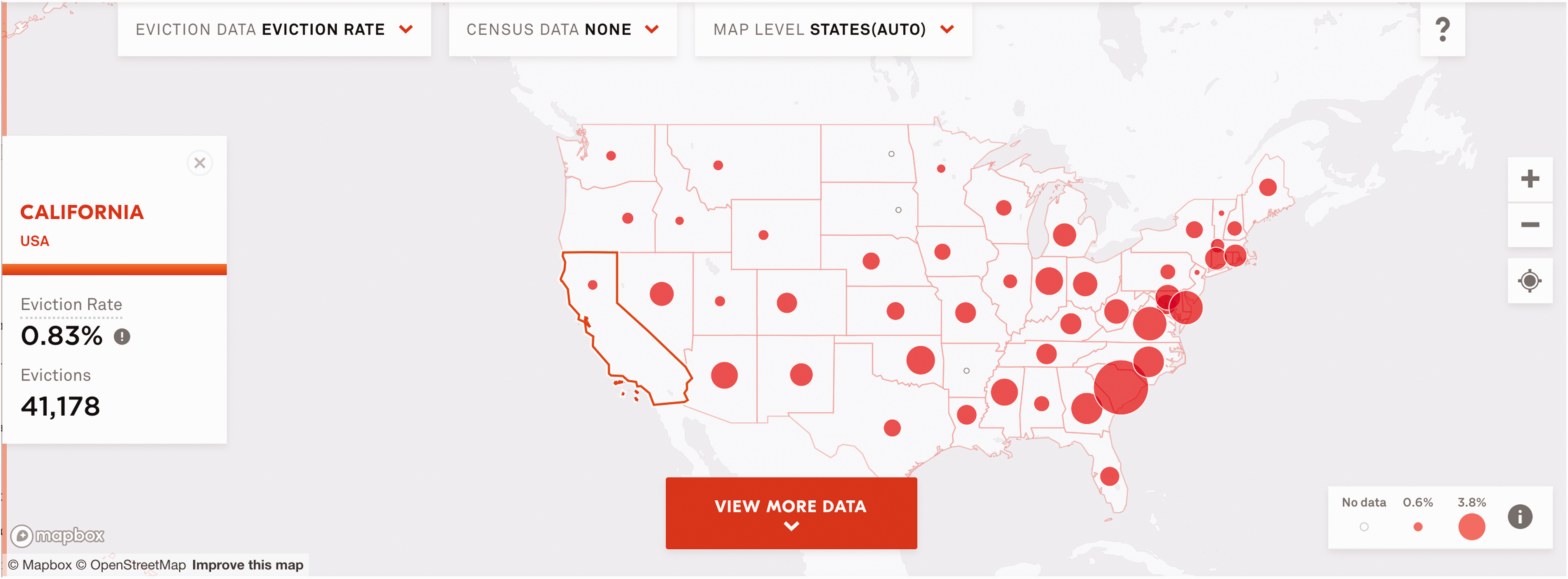
The Eviction Lab's map displaying eviction rates per state in 2016.
This exercise demonstrates broader issues regarding the Eviction Lab’s nationally reported dataset. Eviction is defined, regulated, and documented differently in different states. When comparing the data across states via a national map, we cannot see the array of tweaks and compromises that went into making the values comparable. Many such decisions are documented in the Eviction Lab’s Methodology Report—a 44-page document describing their processes for collecting and cleaning the data and estimating eviction rates in areas where there had been uncertainty (Eviction Lab, 2018). Throughout this unit, both collectively and in small groups, we study various sections of this report diligently. Students are instructed to focus on foregrounding what counts as an eviction and who has stakes in the data’s definitions. In doing so, they toggle between reading the dataset denotatively (extrapolating the literal meaning of its values) and connotatively (interpreting the culturally specific beliefs, commitments, decisions, and contexts shaping its values).
The Methodology Report indicates that this dataset only documents formal evictions and eviction filings, or those initiated by a landlord in a court system. It does not account for informal evictions where a landlord locks a tenant out of their building or buys them out of their lease. We also learn about the sourcing of the data from the Methodology Report. To start, the Eviction Lab called county clerks in all 50 states requesting access to bulk data regarding eviction cases. They were able to access these records from 13 states (Alabama, Connecticut, Hawaii, Iowa, Indiana, Minnesota, Missouri, Nebraska, New Jersey, Oregon, South Carolina, Pennsylvania, and Virginia). There were several reasons why this data may not have been available in bulk. As mentioned previously, tenants in California may block public access to eviction files, and Wisconsin’s dismissed eviction cases are destroyed after two years. Not all states have eviction records stored electronically, and many county clerk offices are understaffed.
The Eviction Lab also collected state-level aggregated counts of evictions for each county in the 27 states where available. To fill gaps in the bulk data, the Eviction Lab purchased eviction records from two private companies: LexisNexis Risk Solutions (LexisNexis) and American Information Research Services Inc. (AIRS). In addition to bulk record collection, these companies, to the extent possible, collected paper records in-person from county court systems and manually entered them into databases. The Eviction Lab emphasizes the underlying aims of their work in documenting their choice to use LexisNexis as their primary data source for 46 states:4 “Our primary objectives with our data and map were to promote comparability between areas over time, and to achieve geographic specificity when reporting. To this end, we used the most nationally comprehensive data source available, which is LexisNexis” (Eviction Lab, 2018).
At the front of the room, I query “LexisNexis Evictions” into a Web search. The first result is a link to the LexisNexis Legal NewsRoom, where we find a blog post titled, “Pay Up or Get Out: The Landlord’s Guide to the Perfect Eviction.” LexisNexis (one of the largest personal data brokers in the world) derives profit from aggregating consumer data from public sources and then predominantly markets that data to businesses seeking to screen consumers for risk—in this case, tenants for prior evictions before renting. This reveals the Eviction Lab’s data sourcing to be wrought with contradiction. While the Eviction Lab attempts to “understand—and fight—America’s eviction epidemic,” they rely on data from a company that profits from it. This also demonstrates the possibilities for re-appropriating data towards alternative ends.
Despite its scope, the LexisNexis data was not created for comparative research purposes, so it was not formatted to compare eviction rates across states and over time. The Eviction Lab team had to “clean” several areas of the data—standardizing how evictions, locations, and timeframes were recorded across municipalities nationally, as well as accounting for and removing data entry errors.
At this point, students break into small groups, each assigned with summarizing a decision the Eviction Lab made to standardize the data across geographies and time, along with nuances erased in the process. There’s a tedium to this activity. Consistent with the genre of much data documentation, the Methodology Report is a formal technical document, and while (to their great credit) the Eviction Lab team defines technical jargon in the report, the human consequences of cleaning decisions must be excavated from layers of technical abstraction. Students transition towards a deconstructive reading of the data as they begin to examine the meanings rendered absent in the cleaning process.
For example, the report indicates that in the LexisNexis data, some eviction cases are dated based on when an eviction gets filed, and some are dated based on when an eviction is judged or dismissed. When this happens, the Eviction Lab assigns each case a “date of record” based on its earliest recorded action. This is done to standardize eviction dates nationally in order to track changes in eviction rates over time. However, some eviction cases can take months from filing to reach a judgment (depending largely on diverse state procedures), so with this cleaning move, time as represented in the data is rendered out of joint. This can become significant when approaching this data with research questions regarding episodic eviction timelines (e.g. eviction rates following the 2008 financial crash).
The Methodology Report documents the data from the Eviction Lab’s own interpretive base—one intimate with the data’s production and processing, but still limited in reflecting on eviction in localized contexts. To enrich our deconstructive reading and develop an imagination for alternative ways this data could be formatted, we turn to an article published by local tenants’ rights experts and activists, which outlines ways the Eviction Lab “misses the mark” (Aiello et al., 2018). The article’s authors note that community-driven data collection efforts involve not only record retrieval from county courts, but also record retrieval from city rent boards, surveys with eviction clinics, and qualitative interviews with tenants. One such group, Tenants Together, reports eviction counts in California at over double the Eviction Lab’s counts. The authors note similar issues in Oregon, where the Eviction Lab’s calculation of eviction rate does not account for the fact that the state allows for no-cause evictions that do not require a court filing. In aggregating the data at a national level, the reported eviction rates oversimplify the complexity of US evictions. Navigating to maps produced by the Anti-Eviction Mapping Project, we see how the data tells a much more careful and complicated story of eviction. D’Ignazio and Klein (2020) characterize the messiness of the Anti-Eviction Mapping Project’s data visualizations as advancing collaborative, multi-modal, and anti-reductive modes of representation—positioning it within the history of tech development in San Francisco, unpacking it as an issue of racial injustice, and identifying communities at the forefront of resistance. Yet, there’s a tradeoff; while local maps do a better job of accounting for on-the-ground conditions and averting critical erasures, national abstractions often more effectively convey the importance of federal housing reform and showcase how race, class, and gender discrimination intersect with displacement risk as a systemic issue (versus an issue emerging solely from specific local policies or cultures).
Reading the Eviction Lab’s data denotatively, connotatively, and deconstructively highlights the culturally specific meanings subsumed within technical definitions, the diligent and discerning judgment behind a dataset’s composition, and the tradeoffs that data producers inevitably contend with as they seek to homogenize data for comparability. In standardizing data for national comparative analysis, local nuance is glossed over, producing certain forms of insight while simultaneously erasing issues specific to local contexts. Humanistic approaches to dataset analysis encourage students to unpack the ethical and representational judgment calls data analysts inevitably make when choosing data scale.
Toxic release inventory (TRI): Advocacy and data semantics
On the night of 4 December 1984, a methyl isocyanate gas leak from the Union Carbide Chemical plant in Bhopal, India, killed thousands of residents overnight; thousands more died later from continued exposure. One year later, a similar Union Carbide leak in West Virginia hospitalized over a hundred nearby residents. Following this string of events, the US EPA passed the Emergency Planning and Community Right-to-Know Act (EPCRA)—legislation designed to increase public knowledge about the extent of toxic releases in their communities. The Act mandates that regulated industrial facilities in the US annually report the amount of toxic chemicals released into the air, water, or soil and that the EPA aggregate these reports into a publicly accessible database called the TRI. Research indicates that, since it was first published in 1989, the TRI has been effective in addressing pollution—prompting activists to protest polluters, local governments to lower emission standards, and industries to set targets for reductions (Konar and Cohen, 1997; see Currie, 2016, for a discussion of the monitory implications of the TRI's openness).
To kick off this unit in Data and Society, we aggregate TRI data files spanning 1996 to 2010 from the EPA’s website. Referencing the TRI’s extensive data documentation denotatively, we learn that each row documents the total releases of a particular toxic chemical at a particular facility in a particular reporting year. Columns include information such as the location of the facility and its industry sector. First, we calculate the total releases of all chemicals from California TRI facilities, learning that California released 36,436,464 pounds of toxic chemicals in 2010. Then, we visualize the total releases of all chemicals at all facilities from 1996 to 2010 (Figure 3). We see total emissions rise dramatically in 1997 and begin to decline in 1999. Notably, the EPA advises against producing this kind of visualization in their documentation:

TRI total releases in pounds from 1996 to 2010.
Users of TRI information making year-to-year comparisons should be careful to consider only data that were reported under consistent requirements. Using comparable data will ensure that any changes in the data over time are driven by actual changes in toxic chemical use, release or management and do not simply reflect modifications in reporting requirements. (US EPA, 2015a)
The advisement calls into question how changes in reporting requirements can render the TRI values reported from one year to the next incomparable. In other words, we cannot really understand what the quantities of emissions reported in the TRI mean without asking some basic questions about the data’s definitions and their evolution: What is a TRI facility? What is a toxic chemical? What is a release?
According to the data dictionary, the EPA technically defines a TRI facility, in part, as a US industrial facility that has at least 10 full-time employees. This definition excludes a series of small polluters, such as local dry cleaners and print shops employing fewer than 10 people, from required TRI emissions reporting. It also defines a TRI facility as one that is classified in a designated set of Standard Industrial Classification (SIC) codes including mining, utilities, manufacturing, electronics, publishing, and hazardous waste, among others. With this in mind, we divide the first plot we created by each SIC code to show the total emissions reported by each industry sector in the US over time (Figure 4). We first note that, prior to 1998, there are no reported releases in seven industry sectors including the metal mining, coal mining, electric utilities, and hazardous waste treatment industries. Referencing the EPA’s data documentation helps us assess the connotative meaning of this plot: a 1997 policy change, made under the direction of President Bill Clinton, mandated that facilities in these sectors (which had previously been unregulated by the TRI) begin reporting emissions to the program.
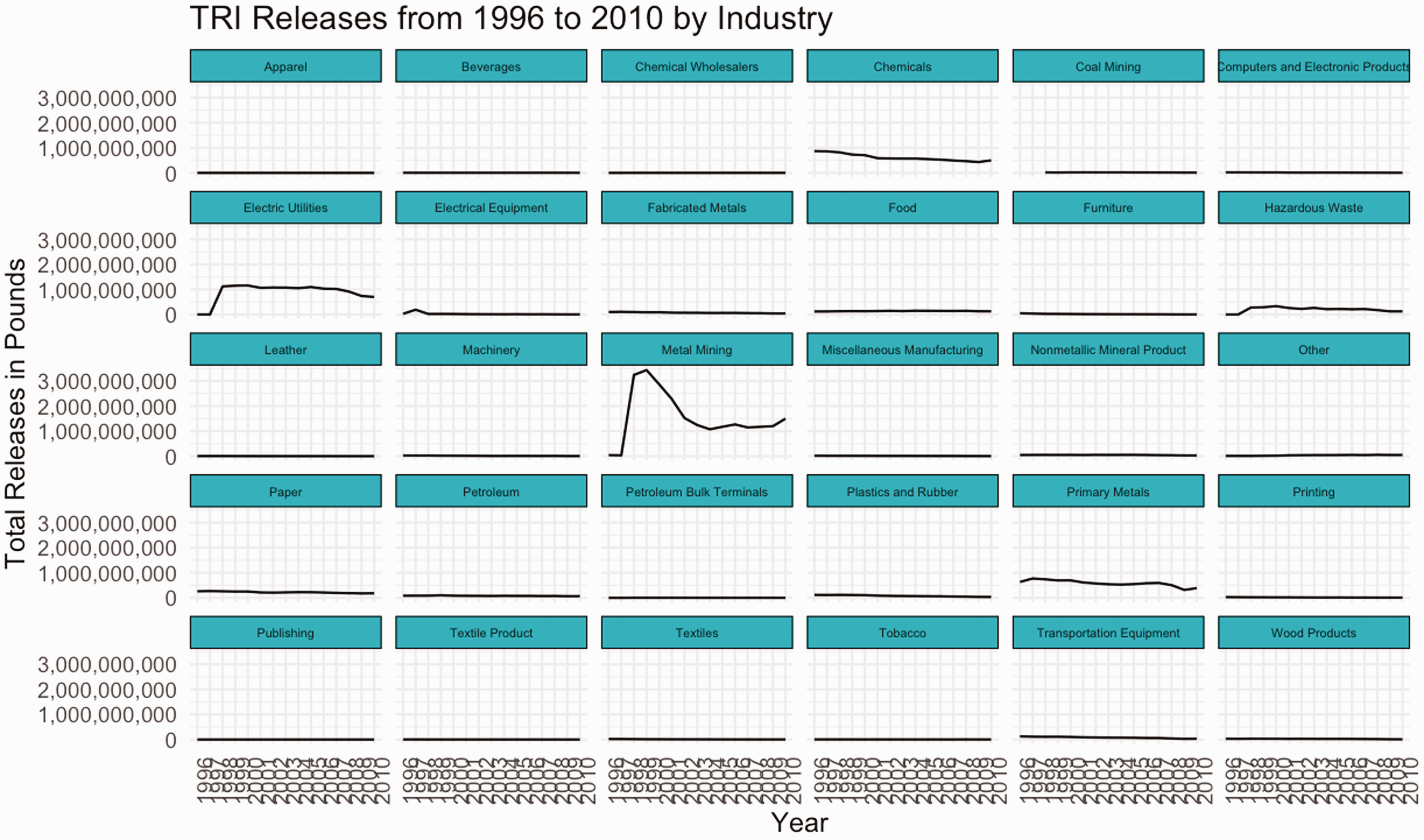
TRI releases from 1996 to 2010 by industry.
Engaging a deconstructive reading strategy, we look for what is missing in this classification system and note that the oil and gas extraction industry, which is currently exempt from a number of environmental monitoring regulations (Kron, 2014), does not appear on the plot, and as far as we can tell from the data documentation, has never been required to report emissions. Why is this the case? While a denotative reading of the dataset can tell us technically what the emissions metrics reported in a given year refer to, a connotative reading of the data semantics unravels a complex cultural history involving many stakeholders with varied interests in and capacities to shape definitions. The course “texts” that help us engage in this mode of reading include the EPA’s data collection documentation and data changelogs, environmental law articles, environmental advocacy blogs, and court proceedings.
In October 2012, a coalition of nine environmental organizations, in response to the expansion of hydraulic fracturing and its ensuing threats to human health, petitioned the EPA to add oil and gas industries to those required to report to the TRI. After more than two years, the organizations filed a lawsuit against the EPA for their “unreasonable delay” in responding to the petition (Environmental Integrity Project, 2015). The EPA finally responded in October 2015, granting the addition of natural gas processing facilities to the list of TRI reporting industries and denying the addition for all other oil and gas industry activities (US EPA, 2015b). While the EPA acknowledged that these other industries were likely to emit significant quantities of chemicals, they argued that individual oil and gas wells were unlikely to employ more than 10 individuals and thus fell outside the technical definition of an EPA facility. We are reminded at this point why denotative readings of a dataset, despite their limits, are essential; they showcase the socially dominant interpretations of data semantics that can be wielded to police the boundaries of “what counts”.
However, even in relying on their own definition of a “facility” to back their decision, ambiguities in the technical definition of a “facility” opened up new debates about whether and how oil and gas facilities should count. The EPCRA defines a facility as: … all buildings, equipment, structures, and other stationary items which are located on a single site or on contiguous or adjacent sites and which are owned or operated by the same person (or by any person which controls, is controlled by, or under common control with, such person). (McCarthy, 2015)
The EPA makes such definitional decisions in the wake of environmental activists pressuring them to increase regulation of the oil and gas industry, while associations advocating on behalf of the oil and gas industry cite the cost of data collection as placing undue burden on corporations. The proposed rule to add natural gas processing went out for comment in January 2017—just a few weeks before Donald Trump was inaugurated as president of the US (US EPA, 2017). In fall 2017, the Trump Administration moved the proposal to inactive.
Next, we return to the plot of emissions divided by industry sector (Figure 4) and see that, for 1998, there is a notable jump in the emissions reported in the metal mining industry, but emissions begin to decline again in 2000. To explore this decline, we filter to the rows representing facilities in the metal mining industry and, questioning the geopolitics of environmental reporting cultures, decide to plot the total releases over time divided by state (Figure 5).

TRI releases at metal mining facilities from 1996 to 2010.
Finding that emissions decline dramatically in Arizona from 2000 to 2003, we further filter to metal mining facilities in Arizona and, aiming to hone in on the source of the decline, calculate the standard deviation in emissions for each chemical released across these years. Engaging a denotative reading, we check the technical definitions of a TRI chemical and learn that TRI facilities are required to report emissions of chemicals only when they exceed a particular threshold for the reporting year. Further, facilities are only required to report on chemicals the EPA has deemed as causing chronic or acute human health effects or causing significant adverse environmental effects.5 Toggling to a connotative reading, we learn from other sources that the list changes frequently as environmental activists lobby to list chemicals and anti-regulation advocates lobby to de-list. Cycles of changes in reporting requirements can be traced through cycles of political changeover in the US.
Our calculations indicate emissions varied most significantly over these years for copper compounds. Indeed, at several copper mines, emissions of copper compounds reported in the tens of millions of pounds in 2001 drop to a couple thousand pounds in 2002 (Figure 6). What can explain this drop? Was there a significant fall in copper production? Did the facilities across the state employ new technologies to clean up emissions? Was there a change in the reporting requirements for copper?

TRI copper compound releases at Arizona Metal Mining Facilities from 1996 to 2010.
The data dictionary indicates that TRI data does not only report total releases, but also where those releases originate (e.g. air stacks, water, landfills, or surface impoundment). We choose to investigate the reported releases from each of these sources in both 2001 and 2002 at the Asarco LLC Mission Complex facility and find that the surface impoundment emissions fall from 22,638,511 pounds in 2001 to zero in 2002 and “other disposal” emissions fall from 67,193,920 pounds in 2001 to zero in 2002. We see the same vanishing surface impoundment emissions for all of the facilities run by Asarco in Arizona. We check the documentation for notes on surface impoundment, learning that, around this time, facilities began reporting surface impoundment emissions in new variables: “Resource Conservation and Recovery Act surface impoundment emissions” and “other surface impoundment emissions”. The EPA implemented this change to keep track of emissions from holding areas authorized to accept hazardous waste disposal. We check on this in our data and find that a few facilities in Arizona began reporting surface impoundment emissions in the “other surface impoundment emissions” variable beginning in 2003 (Figure 7). However, for several years, Asarco facilities did not report such emissions across either of the new variables. We search around for news stories regarding Asarco around this time, hoping to find context clues to scrutinize the connotative meaning of the data. Perhaps the facility closed or stopped producing copper. Nothing emerges in the search to explain the vanishing emissions.
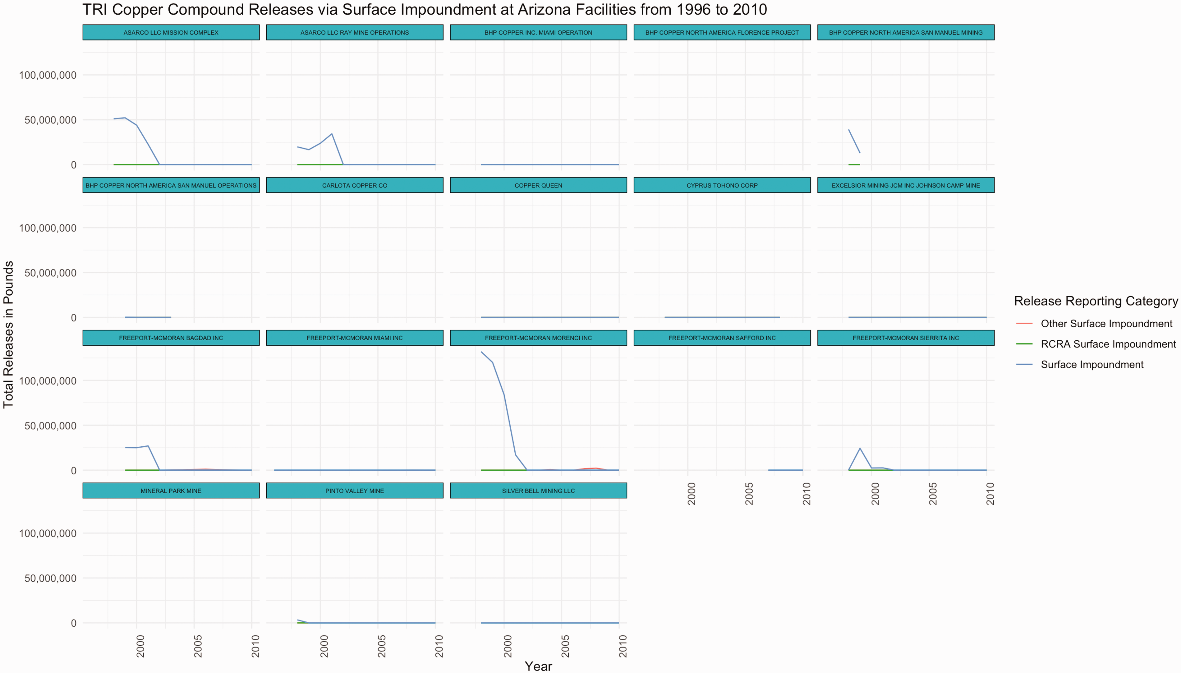
TRI copper compound releases via surface impoundment at Arizona metal mining facilities from 1996 to 2010.
Having hit our limits of interpretation, we email Ken Joiner, the representative at the EPA responsible for fielding questions about TRI data quality, and explain what we discovered. Two weeks later, we get a thorough response with four EPA representatives cc’d. Most notably, their email cites the following guidance from Barrick Goldstrike Mines, Inc. v. Whitman, judged in April 2003: Reporting on Toxic Chemicals in Waste Rock: Although ‘naturally occurring’ toxic chemicals in waste rock are not exempt from TRI reporting obligations, the Court determined that non-PBT chemicals present in the waste rock below concentrations of 1% (or 0.1% for OSHA carcinogens) are eligible for the de minimis exemption. Note, however, that concentrations of certain toxic chemicals in waste rock may be above de minimis levels for certain mining facilities. 62 Fed. Reg. 23834, 23858-59 (1 May 1997).6
What we see when we visualize TRI data is not only the state of emissions in the US, but also the state of the ongoing re-definitions of emissions, facilities, and chemicals (see Fortun, 2004, for how creative information designers have nonetheless visualized the data effectively). Vested interests in cutting industrial costs, as well as efforts to advance environmental justice, are interwoven through every value reported in the inventory. Definitional work is unavoidable in data production. Employing humanistic reading strategies encourages data analysts to interrogate who has the power to set definitions, who has the power to modify them, and what role they might play in advocating for better environmental data reporting.
NYC stop, question, and frisk: Power, performance metrics, and data signification
In 1968, the US Supreme Court case Terry v. Ohio ruled officers with “reasonable suspicion”7 that a suspect of a crime had been carrying a weapon were permitted to stop, question, and frisk the individual without obtaining a warrant. While the policing practice became standard in several US cities following this ruling, it is perhaps most infamous in New York City. Navigating to the New York Civil Liberties Union (NYCLU)’s website, we see how data about stops in NYC have been leveraged to foreground the injustices of the practice. The webpage begins: An analysis by the NYCLU revealed that innocent New Yorkers have been subjected to police stops and street interrogations more than 5 million times since 2002, and that Black and Latinx communities continue to be the overwhelming target of these tactics.8

NYCLU website displaying NYPD stop, question, and frisk data by demographics.
We then download the data file documenting stops in NYC in 2011 from the NYPD’s website.9 Referencing the data dictionary, we note how each row in the dataset documents information an officer is required to record for one stop, including characteristics about the individual stopped, the reason for the stop, whether force was used against the individual, whether a weapon was found on the individual, and whether the individual was arrested or issued a summons. We plot the number of individuals stopped in each 10-year age bracket (Figure 9). We see that, while the majority of stops occurred with individuals between the ages of 14 and 24, there are also a number of stops in which the individual was recorded as over 100 years old, along with several stops in which the individual was documented as an infant (Figure 10). The data dictionary defines age as “SUSPECT’S AGE”. Through this quick exercise, the limits of a denotative reading of the dataset become clear.

NYPD stops by age in 2011.

NYPD stops by age 100+ in 2011.
To help students grapple with the connotative meaning of the values reported by the NYCLU and in this dataset, I assign a series of news articles, press releases, and legal review articles documenting a few decades of policing strategy and civil liberty advocacy in NYC. The narrative begins in the late 1980s with Jack Maple, a lieutenant assigned to patrol subways, tracking locations of subway crimes by placing colored pins on paper maps of the city in an attempt to predict where crimes were likely to occur next (Smith, 2018). In 1994, the newly appointed NYPD Commissioner Bill Bratton appointed Maple as the chief anti-crime strategist, and it was in this role that Maple introduced CompStat—a citywide policing strategy that prioritized (1) accurate and timely intelligence, (2) rapid deployment, (3) effective tactics, and (4) relentless follow-up and assessment (Walsh and Vito, 2004). Under CompStat, twice a week, each of NYC’s 77 police precincts were required to report statistics on crimes in their neighborhoods. At the CompStat Unit, these statistics were compiled into a citywide database for analysis. Then, at weekly meetings held at Police Headquarters, the statistics were used as evidence to determine where officers would be deployed the following week. The strategy was based on a theory in criminology known as the “broken windows theory,” which suggests that visible signs of disorder in a community encourage crime in that community (Fagan and Davies, 2000). According to the theory, reductions in crime would follow from patrolling busy areas with visible signs of dilapidation and in which people engaged in “disorderly” activities. As “order” is a racialized concept, the theory perpetuated discriminatory policing.
Weekly CompStat meetings eventually became punitive and stressful with chiefs aggressively interrogating commanders about their success in reducing crime in their precincts. While this met the CompStat criteria of relentless follow-up and assessment and turned out to be effective in reducing reported crimes in NYC, guided by the “broken windows theory,” it also justified over-policing in lower income areas and communities of color (Skolnick and Caplovitz, 2001). Meanwhile, neighborhoods deemed to be “orderly” and with the resources and privilege to commit crimes behind closed doors received far less attention. In order to produce numerical evidence that they were addressing crime, proving effectiveness in policing became a numbers game, where officer performance was evaluated by quantitative indicators. This incentivized officers to underreport crime, inflate the numerical representations of their policing activity, and classify crimes to produce the most favorable statistics. Today, this phenomenon is commonly referred to as “juking the stats,” and was often portrayed on the HBO series The Wire.
Stop-and-frisk activity was not recorded in CompStat until the early 2000s, following the murder of Amadou Diallo—an innocent and unarmed Guinean man shot 41 times by ununiformed officers (Cooper, 1999). The public outcry following the shooting prompted NYC Council to pass legislation requiring the NYPD to submit a statistical summary of all stop-and-frisk activity (including a racial breakdown of those stopped) to the Council quarterly. Following the NYPD killing of Sean Bell in 2006, the NYCLU inquired City Council about the stop-and-frisk reports and learned that the NYPD stopped submitting them two years earlier. A series of legal struggles over access to the database ensued until a State Supreme Court ruling mandated that the data be made public in 2008 (Figure 11).

Timeline of NYCLU pursuit to obtain access to NYPD SQF database.
With public access to the stop-and-frisk database, activists were able to track the growth of the practice throughout the 2000s, along with how it was directed disproportionately towards Black and Latinx neighborhoods. By the early 2010s, the NYCLU compiled reports indicating a 700% increase in stops from 2002 to 2011. In less than 0.5% of the 650,000 stops recorded in 2011, a gun was found on the suspect. Scholars have argued that since these numbers are aggregated from UF-250 forms that officers are required to fill out whenever they conduct a stop, it is likely the total number of stops had been considerably underreported (White and Fradella, 2016: 89). While NYPD leadership denies setting stop quotas, several officers have since described that inflating stop numbers became a strategy for covering themselves in CompStat meetings by offering quantitative representations of officer activity and enforcement work.
In other words, while a denotative reading of the data suggests that stop-and-frisk numbers signify actual police enforcement activity, a connotative reading indicates how they also signify institutional incentives to meet officer performance metrics, along with failures to comply with recordkeeping mandates. Historically positioned as tools for justifying the over-surveillance of lower income neighborhoods of color, the numbers are wrapped up in institutional systems that exploit certain bodies and over-surveil certain communities, while erasing the crimes of others. In this sense, a connotative reading of the cultural context of this dataset informs how we will approach a deconstructive reading of the absences haunting stop counts.
Activists, legislators, and judges are well aware of these cultural influences shaping the data; however, they continue to leverage the dataset as a tool to address discriminatory policing. In 2013, when David Floyd and David Ourlicht argued before the US District Court that the NYPD had stopped them without reasonable suspicion, SQF data was cited to support the claims that the practice involved racial profiling, despite its acknowledged flaws: Because it is impossible to individually analyze each of those stops, plaintiffs’ case was based on the imperfect information contained in the NYPD’s database of forms (‘UF-250s’) that officers are required to prepare after each stop. The central flaws in this database all skew toward underestimating the number of unconstitutional stops that occur: the database is incomplete, in that officers do not prepare a UF-250 for every stop they make; it is one-sided, in that the UF250 only records the officer’s version of the story; the UF-250 permits the officer to merely check a series of boxes, rather than requiring the officer to explain the basis for her suspicion; and many of the boxes on the form are inherently subjective and vague (such as ‘furtive movements’). Nonetheless, the analysis of the UF-250 database reveals that at least 200,000 stops were made without reasonable suspicion.10
After discussing the history of stop-and-frisk data in relation to the CompStat program, we go on to replicate studies performed by the NYCLU, leveraging data we know to be incomplete, inconsistent, and “juked” to nevertheless demonstrate the ways in which the policy was practiced unconstitutionally in NYC. We plot the races of all individuals stopped in NYC in 2011, illustrating how disproportionately Black and Latinx individuals were stopped (Figure 12).

NYPD stops by race in 2011.
Following this, we plot the percentage of stops that resulted in a frisk by race (Figures 13 and 14), along with the percentage of stops in which an individual being frisked resulted in a weapon being found on the individual by race (Figures 15 and 16). We find that, while the percentages of weapons found were extremely low across all races, the percentage of white individuals found to be carrying a weapon was twice as high as any other race.
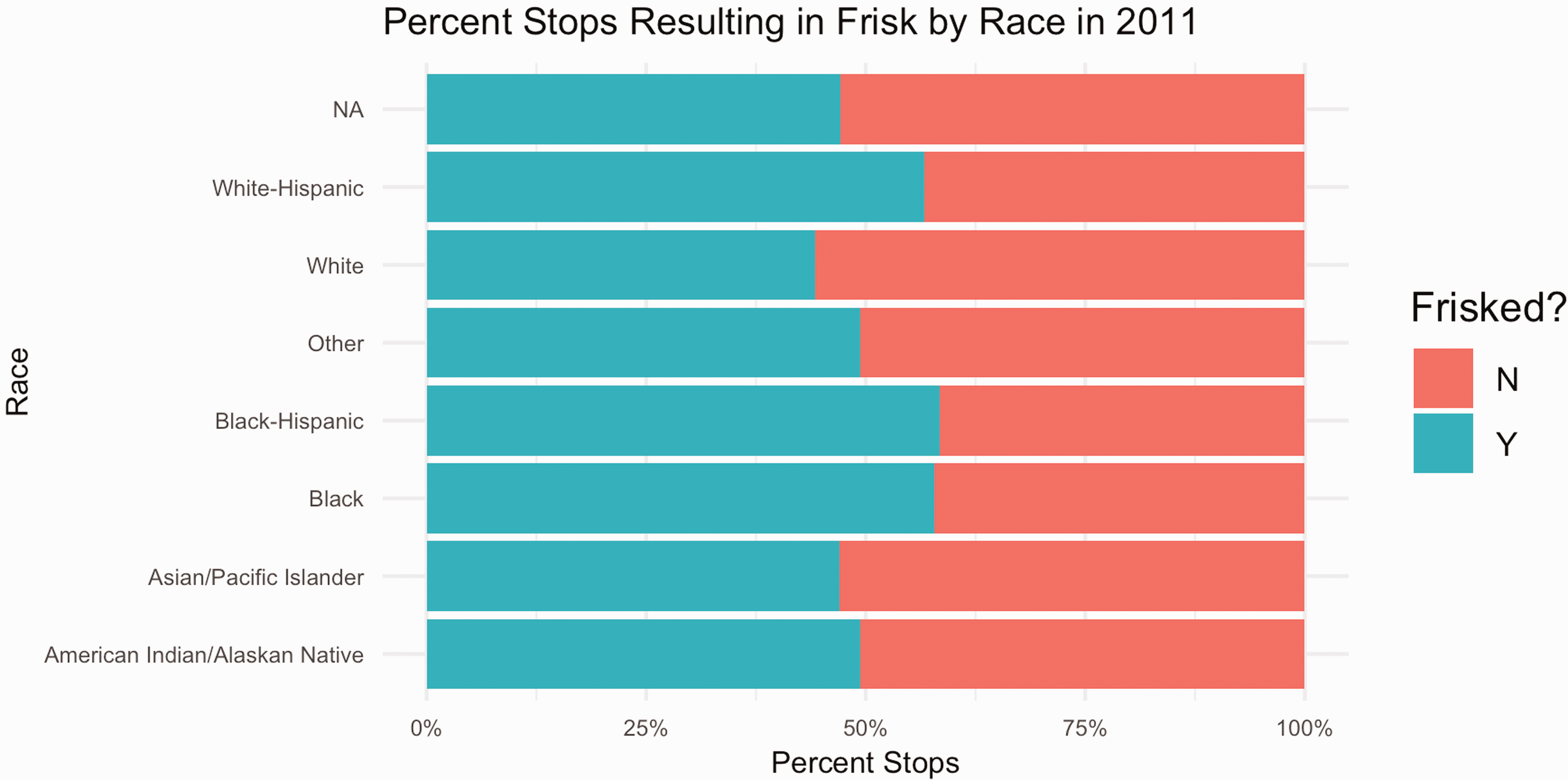
Percent NYPD stops resulting in a frisk by race in 2011.

NYPD stops resulting in a frisk by race in 2011.
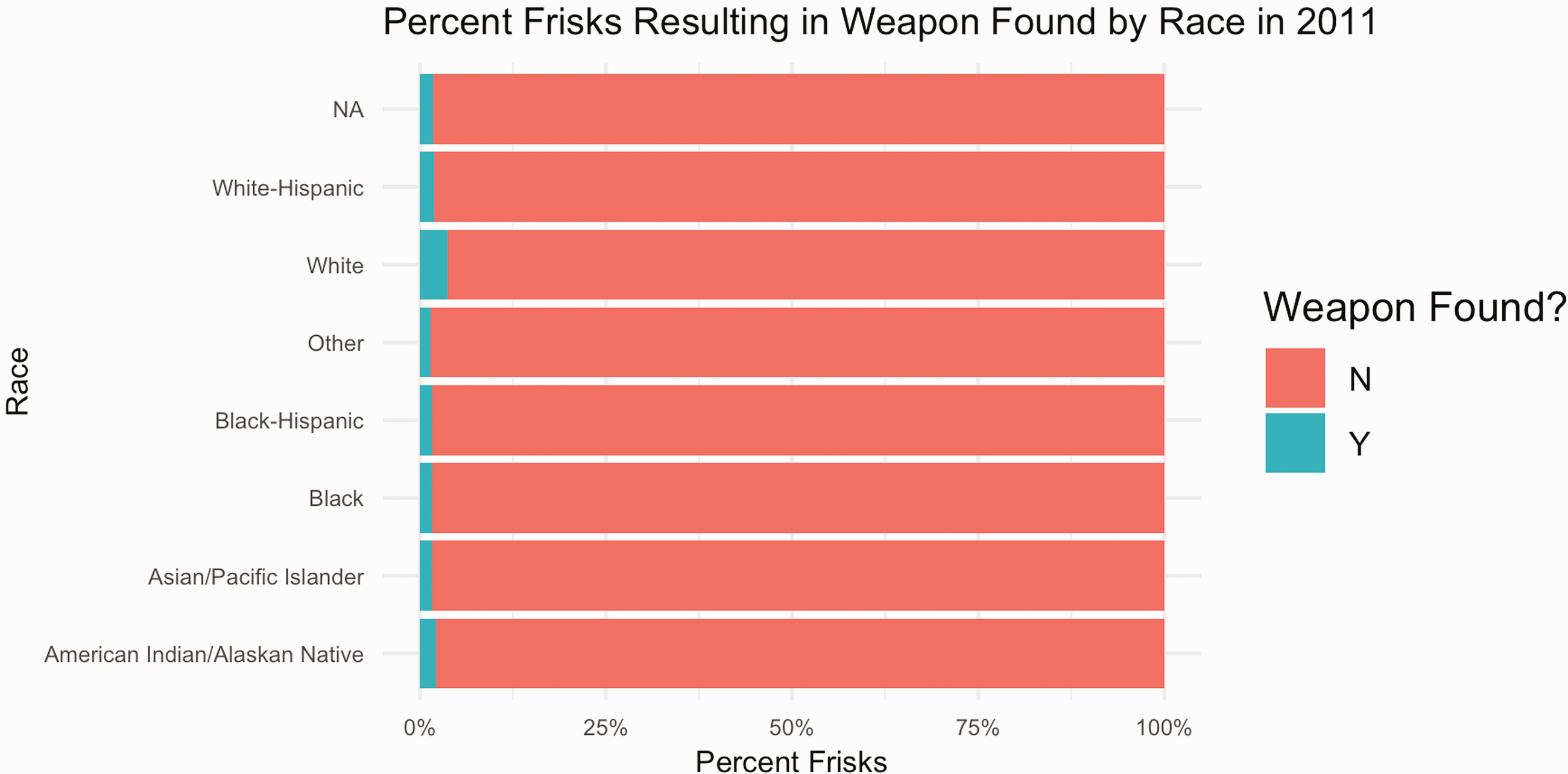
Percent NYPD frisks resulting in weapon found by race in 2011.
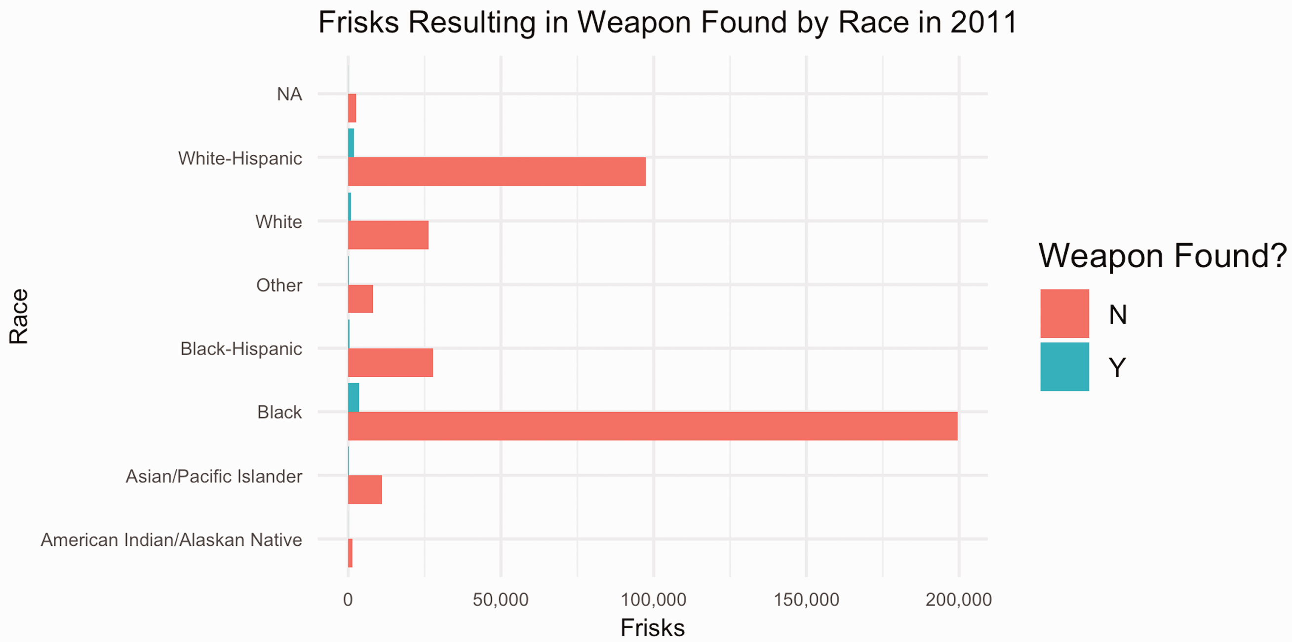
NYPD frisks resulting in weapon found by race in 2011.
While these calculations overwhelmingly narrate the discriminatory ways in which the stop-and-frisk program was practiced in NYC, a deconstructive reading demonstrates how they are still likely to underreport the total number of unconstitutional stops.
The material-semiotics of NYC’s stop-and-frisk data are interwoven through multi-scaled and multidimensional systems of power and force that have institutionally justified unjust policing practices while simultaneously becoming a tool for contesting them. Blame for any particular misrepresentations in the data both includes and extends beyond the decisions and actions of single individuals; rather, a cultural institution is implicated in who gets stopped, what gets counted as a stop, and how stops get counted. Yet, in recounting how the NYLCU fought tirelessly for access to a database they knew to be entwined in these hegemonies, we see how data bound in such systems can be re-appropriated and repurposed toward alternative ends. Examining this dataset prompts students to grapple with the complex systems from which data emerge, along with the role of metrics and other forms of quantitative reporting in provoking, sustaining, or transforming cultural orders.
Conclusion
An increasingly common adage in data science communities is “garbage in, garbage out”—shorthand for the notion that machine learning algorithms and data models will mirror the biases of the datasets fed into them. The maxim has advanced progressive work in data science communities—calling on analysts to attend to the lack of diversity and accountability in source datasets. Technocratic methods proposed for examining bias in datasets, such as statistical techniques for auditing randomness and class imbalance, tend to position bias as an external force that infects data—a flaw that can be measured, mitigated, and scrubbed from data. Certainly some audit studies have shown the value of such approaches—demonstrating how technical fixes to certain biased algorithms can indeed improve representational equity across sub-populations impacted by the data (c.f. Obermeyer et al., 2019). Further, calls for transparency in data science work have pushed analysts to document their data and its underlying definitions with more care, adding context by indicating through metadata what they mean when they refer to a number.
When such interventions are divorced from critical interpretation—from explicit inquiry into the interlacing of history, power, paradox, and the limits of language in the meaning we ascribe to data—we run the discursive risk of reinforcing the epistemological assumptions that have sustained a neutrality ideal: that data can be isolated from culture and politics and that ethical due diligence can be met by accounting for and eradicating the external biases that trespass that divide (Hoffmann, 2019). In such work, data semantics are often treated functionally not discursively, discounting the cultural rhetorics enmeshed in data definitions and the disproportionate power of certain institutions to set semantic standards (i.e. to enforce what counts and how). The readings presented in this article demonstrate the limitations of grappling with the representational politics of datasets when applying only a referential lens to data dictionaries and data documentation (see Gebru et al., 2020, for a more critical approach to data documentation).
The methods presented in this article offer an alternative and potentially complementary approach to examining bias, contributing to efforts to localize (Loukissas, 2017), critique (Beaton, 2016), and contest (Denton et al., 2020) datasets. These methods draw on frameworks from the humanities rather than STEM fields for data critique, prompting us to treat datasets as cultural artifacts refracting the social and political contexts of their production as opposed to value-neutral artifacts that become distorted through special interest politics. All three reading strategies do important political work that cannot be achieved through statistical approaches alone: denotative readings identify definitional boundaries that diverse stakeholders can leverage to police what counts in data; connotative readings highlight the cultural and political histories informing the scope, interpretation, and operationalization of data semantics, inviting us to identify opportunities for intervention in oppressive databased semiotic systems; deconstructive readings call attention to the people and problems Othered through data definitions, acknowledging that all semiotic systems produce externalities and that data analysts and critics have a moral obligation to account for them. In this sense, toggling between the three modes of reading while analyzing a diverse corpus of texts documenting datasets foregrounds the inescapable power dimensions interwoven through the data, while also acknowledging the fallibility of a neutrality ideal.
As with all close readings, engaging these strategies to analyze the politics of data representations has its limitations, relying on what has been documented in textual form to situate the data’s meaning. Still, I have found that in applying the strategies toward source data, students are better equipped to tackle some of the most pressing questions in data science research: Which individuals and institutions have the power to shape numeric representations? How do these individuals and groups wield this power and toward what ends? And, perhaps most importantly, how can others reclaim it?
Footnotes
Acknowledgments
I am grateful to Joe Dumit, Emily Merchant, Mike Fortun, Kim Fortun, and three anonymous reviewers for helping to hone the arguments and narratives presented in this article. I am also grateful to Nick Seaver and participants at the Genealogies of Data Junior Scholars Workshop (2021) for providing comments on the reading strategies presented in the article. Thanks are also due to the students enrolled in Data and Society (formerly called Introduction to Data Studies) at UC Davis in Winter 2019, Fall 2019, and Fall 2020.
Declaration of conflicting interests
The author(s) declared no potential conflicts of interest with respect to the research, authorship, and/or publication of this article.
Funding
The author(s) received no financial support for the research, authorship, and/or publication of this article.
Supplemental material
Notes
References
Supplementary Material
Please find the following supplemental material available below.
For Open Access articles published under a Creative Commons License, all supplemental material carries the same license as the article it is associated with.
For non-Open Access articles published, all supplemental material carries a non-exclusive license, and permission requests for re-use of supplemental material or any part of supplemental material shall be sent directly to the copyright owner as specified in the copyright notice associated with the article.