
Abstract
In this paper, we explore how the development and affordances of predictive analytics may impact how teachers and other educational actors think about and teach students and, more broadly, how society understands education. Our particular focus is on the data dashboards of learning support systems which are based on Machine Learning (ML). While previous research has focused on how these systems produce credible knowledge, we explore here how they also produce compelling, persuasive and convincing narratives. Our main argument is that particular kinds of stories are written by predictive analytics and written into their data dashboards. Based on a case study of a leading predictive analytics system, we explore how data dashboards imply causality between the ‘facts’ they are visualising. To do so, we analyse the stories they tell according to their spatial and temporal dimensions, characters and events, sequentiality as well as tellability. In the stories we identify, teachers are managers, students are at greater or lesser risk, and students’ sociality is reduced to machine-readable interactions. Overall, only data marked as individual behaviours becomes relevant to the system, rendering structural inequalities invisible. Reflecting on the implications of these systems, we suggest ways in which the uptake of these systems can interrupt such stories and reshape them in other directions.
Keywords
Introduction
Advances in and promises of Artificial Intelligence (AI) and in particular Machine Learning (ML), a sub-field of AI upon which new approaches to learning analytics are based, have encouraged the hopes and hype around educational technology (edtech) today. Since the beginning of the SARS-2-CoV pandemic, vast sums have been spent implementing new technologies in public and private education. Market reports claim that the education and learning analytics market will grow on average 30% per year over the next few years, reaching $34.7 billion by 2027 (Meticulous Research, 2021). Educational policies written or updated during the pandemic see Big Data and learning analytics as a priority for strategic action (e.g. European Commission, 2020: 23). Supranational organisations highlight learning analytics, Big Data and machine learning/AI in their hopes for how education can better deal with future global disruptions (OECD, 2020).
Within this nexus of heightened expectations, it is crucial to understand how these technologies play out on the ground. In this paper, we explore how the development and affordances of AI-powered predictive analytics systems may impact how teachers and educational organisations think about and teach students and, more broadly, how society understands education. Our particular focus is on the data dashboards of learning support systems based on ML. While previous research has focused on how these systems produce authoritative, objective and credible knowledge, we explore here how they also produce compelling, persuasive and convincing narratives. Our main argument is that particular kinds of stories are written by predictive analytics and into their data dashboards. In these stories, teachers are managers, students are at greater or lesser risk, and students’ sociality is reduced to machine-readable interactions. We suggest ways in which the use of these systems can interrupt such stories and reshape them in other directions.
By honing in on a leading predictive analytics product used in education, we analyse how its data visualisations narrate. As we analyse this system, our concern, alongside other critical studies of predictive analytics and education, is with the transformation of education and society which these technologies invite. In the following, we first situate our study in research on edtech, before outlining our approach to dashboards as central sites of storytelling. We then identify a specific framing of dashboards as tools for managerial decision-making that serves as a ‘preface’ to its users for the overall story. This preface characterises teachers as managers. We subsequently analyse two narratives within this framing, one about individualised risk, which focuses on getting individual students back on track, and one about sociality, which reduces students’ sociality to their in-tech social interactions. The final section discusses alternative community-based, collective practices, and reflects on the broader implications of how these data dashboard stories shape young people’s futures.
Predictive analytics in education
Supporters of predictive analytics describe it as ‘a hot button topic among educators in order to better serve students by becoming more data-informed’; a way of ‘adapting and personalizing the learning experience in a more efficient way’, i.e., ‘identify[ing] patterns of students’ learning deficits and customiz[ing] the academic experience so they are aligned to learn’ (Rowe, 2019). Public schools have implemented Early Warning Indicator and Intervention Systems (EWS) to ‘identify students who exhibit behavior or academic performance that puts them at risk of dropping out of school’ (U.S. Department of Education, 2016).
In practice, contemporary predictive tools draw on a range of statistical or computational methods, and different datasets, such as, (1) academic performance data, i.e., statistical methods for analysing course grades and standardised tests (e.g. Coleman et al., 2019), (2) academic and social data, i.e., statistical analysis of course grades, standardised tests, disciplinary data, attendance rates (e.g. Qazdar et al., 2019) or (3) academic, social and demographic data, i.e., including gendered/racialised identity markers, age and socioeconomic indicators like free school meals (e.g. Sorensen, 2019). More recently, and more controversially, computational tools have connected (4) academic performance data to the behavioural data stored on a student’s university card (with which they, for instance, buy lunch and snacks from the snack machine, which logs their entry and exit from the library, which tracks their physical movement across the campus, and which is also the keycard for their dorm room, see, e.g. Blue, 2018). A fifth approach uses (5) a range of real-time data on students’ interactions with their learning platforms for predictive models that are partly based on ML (see the case study below).
As with predictive systems in other domains, the predictions of such systems are often made available to users via interfaces in the form of visualisations that are arranged on data dashboards. These visualised data can be descriptive or contextual indicators, diagnostic, performance and target indicators or predictive and conditional indicators (Kitchin et al., 2015). Dashboards are used across many fields, from urban development (e.g. city dashboards in smart city contexts), health and fitness trackers to the educational domain. Williamson, for example, describes the functionality of the UK’s Office for Standards in Education (Ofsted) and their implementation of a dashboard presenting accounts of school data (e.g. exam results, progress, attendance): The data dashboards are promoted as an objective and data-led augmentation to the conventional school inspection by expert inspectors embodied in their various codes of evaluation and judgement. (Williamson, 2016: 130)
However, in line with research in critical data studies and STS, we take a critical view of this realist epistemology and assume that the data used to feed dashboards is never neutral and raw. Instead, data enters a recursive relationship with those producing, interpreting and acting upon it (e.g. Gitelman, 2013; Kitchin et al., 2015; Marres, 2017). Our point of departure is thus that dashboards do not merely represent reality but instead reconfigure practices, relations and priorities. Williamson (2016) points to the double function of dashboards: they render the underlying data and software protocols invisible while at the same time rendering visible only particular representations of that data. Hence, with Law (2004: 14), we understand dashboards as enacting ‘relations that make some things (representations, objects, apprehensions) present “in-here”, whilst making others absent “out-there”’.
Critical research on learning analytics, in particular ML-based approaches to predict learning outcomes, has pointed to a series of problems when such systems are utilised as educational policy instruments providing some form of ‘governing knowledge’ (Williamson, 2016). A major concern is the effect of these technologies on young people’s futures. Predictions based on limited, and often biased, data lead to decisions on young people’s lives, opening some pathways and closing others. Although there is limited research on the use of predictive systems in educational settings beyond studies of efficacy, available studies suggest that teachers and other users are changing their professional behaviour based on the data output. One user, for instance, who saw students marked in the system as at ‘high risk’ of dropping out of college, was reported as wondering whether they should advise these students to avoid college and choose other futures instead (Hartong and Förschler, 2019; see also Eubanks, 2018). Given the data sets used in predictive analytics, students from disadvantaged backgrounds are more likely to receive higher risk scores. When the introduction and expansion of these systems is seen as a ‘data frontier’ (see Beer, 2018), yet leads to systematic exclusions, this flags problematic historical notions of undiscovered territory, colonialism and subjugation (Prinsloo, 2020).
Underlying the use of data in educational governance is the assumption that predictions and prescriptions from analytics are neutral, consistent and objective (see Perrotta and Selwyn, 2020). This renders invisible the process of how data is ‘made’ from unequal social relations affected by centuries of inequality, to which critical data scholars have pointed (e.g. D’Ignazio and Klein, 2020: 55; Heuer et al., 2021; Scannell, 2019). Ethnographic research, for instance, has identified how data personnel at higher educational institutions sort student data into ‘attributes’ (e.g. race, class, gender) which students cannot change and ‘behaviours’ (e.g. time-on-task, studying on campus) which students can change (Whitman, 2020). Only data marked as behaviour becomes relevant to the system and is visualised in data dashboards. This renders structural inequalities invisible and students individually responsible for their own success or failure. In this way, analytics systems, as complex ‘knowledge infrastructures’ (Edwards and Fenwick, 2015), become ‘real-time intimate analytics’ by moving in very close to individual students’ lives to extract and aggregate cognitive and affective data (Williamson, 2019; see also McStay, 2020).
Thus, ‘knowledge-based technologies’ are embedded into anticipatory governance ‘to draw from the past to construct images of educational futures in order to steer the present’ (Webb et al., 2020: 285). This ‘deference to precedent’ (Barocas et al., 2013: 8), upon which predictive analytics from primary to higher education is based, can reduce student agency, strengthen systemic disadvantage and foreclose the anticipation of different, unusual, unexpected futures for students. Precisely the process of personalising learning pathways may ‘trap’ people in their past choices, rather than enabling education to challenge and extend students’ opportunities (Edwards, 2015). Considerations of ethics, including participatory approaches to co-designing predictive systems, have emerged, which are crucial to reflect on how knowledge is made by these systems and how the insights should be used with and for – rather than against – students (Corrin et al., 2019; Prinsloo and Slade, 2017).
Overall, this literature has explored how predictive analytics systems and their data visualisations produce, legitimise and circulate knowledge. While this is clearly very important, especially in policy fields, we suggest here that the storytelling aspect of data visualisations is also vital in discussing predictive analytics’ powerful hold over contemporary educational imaginaries. To do so, we investigate one particular way of visualising ML-based educational predictions: Dashboards. As we demonstrate below, these dashboards make learning analytics’ predictions seem compelling not only through their ability to establish facts but also through their persuasiveness as storytelling devices.
Method: Analysing data dashboards as storytelling devices
For many, data storytelling primarily refers to the writing of explicitly narrative texts to accompany data visualisations. Much of the work on data storytelling has been on data journalism since it has storytelling at its heart. However, not only do people tell stories with data, the data visualisations themselves also tell stories (Segel and Heer, 2010: 1140). In a minimal sense, ‘story’ and ‘narrative’ do not only refer to fiction, but to a mode of presentation in which a sequence of actions or events unfold over time, involving one or more characters, often involving change (see Genette, 1988; Le Guin, 1998). Thus, narrative can be found in many spaces which tell powerful stories although their primary goal may not be storytelling (Macgilchrist, 2021).
To analyse the data dashboard stories found in education, we combine two frameworks on storytelling. First, a distinction between what Barthes (1970) called ‘readerly’ and ‘writerly’ texts, and Segel and Heer (2010) refer to as ‘author-driven’ and ‘reader-driven’ stories. Adopting this model, author-driven data dashboards strongly suggest a narrative flow for readers to follow. The author positions the reader as a receiver-reader, hence ‘readerly’ (Barthes, 1970). There is little interactivity, and often visualisations are heavily annotated, guiding the readers on how to make meanings. In contrast, in more reader-driven dashboards, the readers do more interpretive work as they engage with the data visualisations. The author positions the reader as co-writer, expected to do more story discovery work, hence ‘writerly’ (Barthes, 1970). These visualisations have a less strongly prescribed order; they allow for more interpretation. The analysis below demonstrates how data dashboards can offer both author-driven and reader-driven data visualisations.
Second, we draw on Weber’s (2020) conceptual outline of how data ‘tells and shows’ stories in journalism. She identifies the central components in data visualisations in journalism as: (1) Spatial and temporal dimension: The world is situated in time and undergoes transformation. (2) Characters and events: Characters react (emotionally) to events; (some of) their actions should be purposeful (3) Sequentiality: A sequence of events is temporally structured with each event relating coherently to others, and making sense within the story world. (4) Tellability: The story gives an answer to: ‘What’s the point?’ It tells a meaningful story (Weber, 2020: 298). Building on Weber, we demonstrate in our analysis below that data dashboards tell narratives about heroes, danger and victims, they have their own temporality, and create and configure emotional responses.
To explore the stories provided by ML-based learning analytics, we analyse data dashboard storytelling through a case study approach, as used in, e.g., educational research (Bassey, 1999) or social studies of technology (Walsham, 1995; Yin, 2014). We analyse a particular system to gain an in-depth understanding of how dashboards may be examined as author- or reader-driven storytelling devices. The aim of case study research is ‘to obtain a rich, detailed insight into the “life” of that case and its complex relationships and processes’ (Oates, 2006, S. 141). For our case study, we performed a document analysis (Bowen, 2009) for a system developed by Desire2Learn (D2L) on a number of publicly available material, including promotional materials, online videos and written tutorials, public testimonials and a trial account (see Documentation material below).
Desire2Learn, a global software company, is a particularly interesting case because of Brightspace, its learning management system (LMS) that offers adaptive learning tools and predictive analytics for premium clients in primary, secondary and higher education. Brightspace can be integrated with, e.g., Microsoft Teams. Where more widely used LMS’ such as Moodle, Stud.IP, Blackboard or Canvas have mainly focused on course management and communication, they are now also developing or integrating more sophisticated data analytics tools. As one of the first-to-implement ML-based learning analytics in its LMS, D2L has been named the leader in next-generation teaching and learning among online platforms for higher education (Johal, 2015). D2L operates across a range of very different education systems such as the US, the UK and Germany.
The case: Brightspace
Desire2Learn’s CEO describes its Brightspace system ‘Performance Plus’ as ‘the next generation of artificial intelligence and machine learning to support and identify at-risk students’. He promotes the system as ‘able to intervene and get [students] on the right track with some virtual agents’, to ‘nudge faculty to use their judgment to determine whether the student is on or off the right track, and to provide different remediation or enrichment pathways to help students reach their full potential’. The company applies ‘a lot of the latest AI technologies to improve retention and outcomes for students’ (Kronk, 2019).
With these technologies, Brightspace integrates far more real-time data on how students are engaging with the learning system than early warning systems in education have ever done. This includes data about users but also detailed accounts of any of their interactions through log files. Data on, e.g., the tools used by users, the numbers of sessions in which they were active and their final grades flow towards the production of tables and graphs which ultimately populate the data dashboards (see Figure 1).

Data flow in D2L’s Brightspace system (Brightspace documentation).
Brightspace provides three dashboards: The Adoption Dashboard visualises students’ adoption of the system by visualising their interactions with the system based on login trends, course access counts and tool usage trends. The Assessment Quality Dashboard visualises data based on quiz and question statistics such as reliability, average grade, etc. The Engagement Dashboard includes predictive indicators. It presents two measurements: time in content distribution (the total time each user has spent on each course, i.e., the time students spend on any interaction within a specific course, module or assignment) and time in content effect on grades (total time each student has spent on each course content compared to their current final grade) (see Figures 2 and 3). These predictions mainly rely on student interactions with the system, e.g., the domains ‘course access’, ‘content access’, ‘social learning’ and ‘assessments’. Only the ‘preparedness’ domain uses input data (sociodemographic information) gathered from outside the system’s reach.

Engagement dashboard presenting time in content (left) and time in content vs. grade (right) as aggregate over a whole course (Brightspace Tutorials, 2019). 3
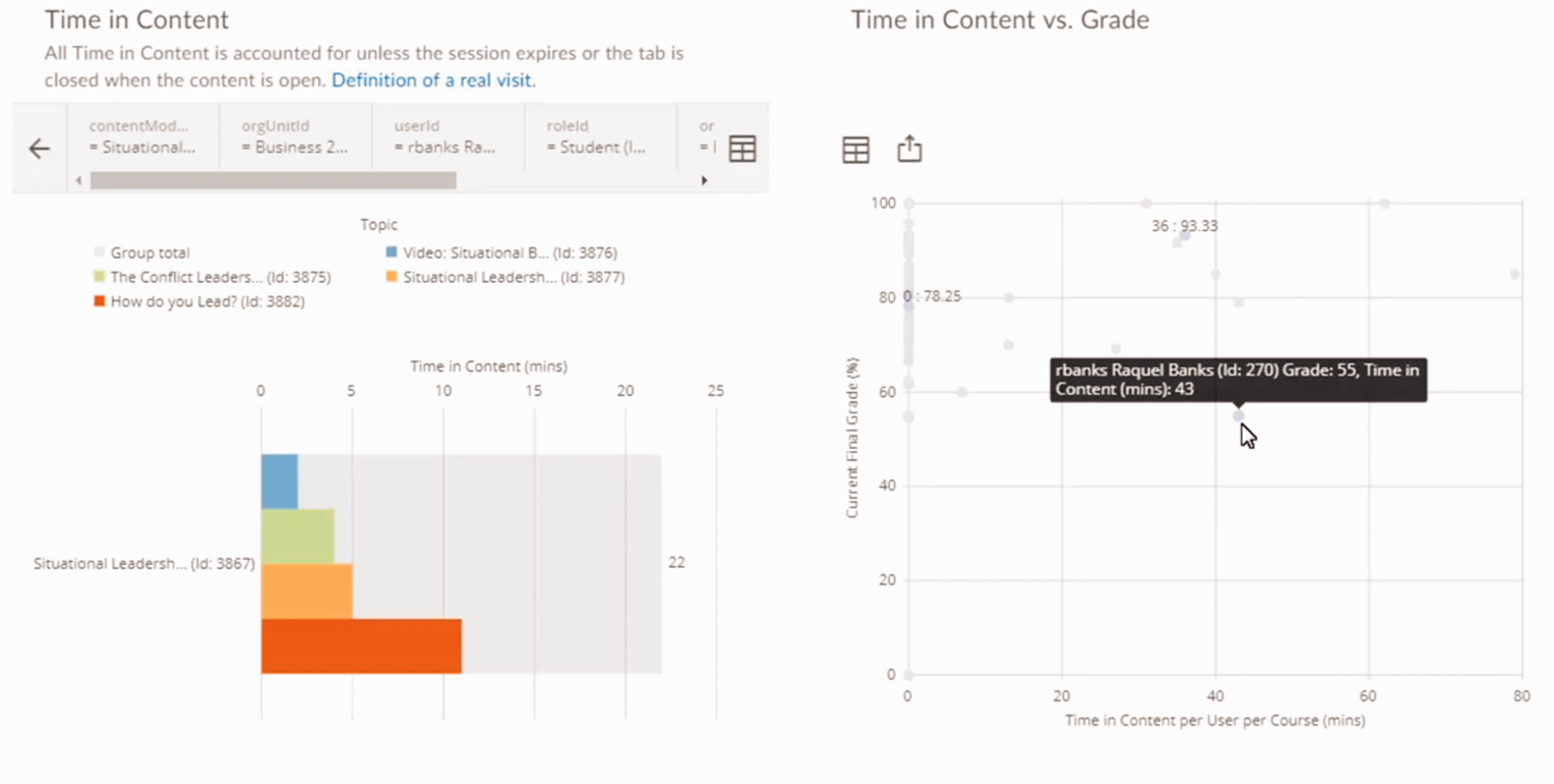
Engagement dashboard presenting time in content (left) and time in content vs. grade (right) as disaggregated information for a specific student (Brightspace Tutorials, 2019).
The goal of these dashboards is, according to Brightspace, to allow teachers and other institutional stakeholders such as school administrators ‘to identify individuals or groups who are succeeding or are at-risk’. These users can ‘drill down to an individual with details on their engagement’ in order to ‘intervene when necessary’ (Brightspace, 2020j). Students and parents have access to individual student records and anonymised aggregated data. The monitoring systems also aim to support teachers in assessing whether their interventions are successful: An upwards trend can indicate that interventions to improve a learner's success rates were successful, while a downwards trend can indicate a learner in need of intervention. (Brightspace, 2020i)
Analysis: Stories about managers, risk and sociality
In this section, we first draw on Segel and Heer’s (2010) author-driven/reader-driven distinction to suggest that the overall dashboard design operates like the ‘preface’ or ‘foreword’ to a story. It sets the scene and introduces the main characters. In our case, teaching is presented as a managerial task, with teachers introduced as managers. After analysing the preface of the dashboard story, we zoom in on more specific stories, drawing on Weber’s (2020) narrative constituents to analyse two particularly compelling stories: one about students at risk and one about students’ sociality.
Setting the scene: Teachers as managers
In accounts provided by D2L as well as by teachers using the system, parts of the task portfolio are framed as managerial. For example, D2L speaks of ‘managing groups of learners’ when promoting its dashboards. They allow teachers to ‘make data-driven decisions with built-in analytics’ (Brightspace, 2020a). In a recent interview, the CEO of D2L stated that ‘If you’re not building predictive engines, you’re not providing the right insights or data for folks to make decisions’ (Kronk, 2019). Teachers are cited as describing the use of D2L as making their job ‘much more manageable’ and enhancing their ‘capability to flexibly deliver things to students’ (Brightspace, 2020b). In the dashboard, ‘trend arrows’ are included that ‘indicate whether the predictions for each student are negative or positive compared to the previous week’. These aim to show instructors whether their interventions are working to improve the ‘learner’s success rates’ (Brightspace, 2020g). The prevalence of management vocabulary across the materials shapes an author-driven text, in which monitoring the progress of individual students, or an entire class, is framed as a management problem thus positioning the teacher in the role of manager.
More specifically, when a teacher starts up the system, the dashboard (as narrator) situates its story in a specific context and renders specific data and relations visible (makes them present ‘in-here’) while making other relations invisible (absent ‘out-there’). The teacher sees multiple visualisations about students’ in-tech interactions, success, risk, etc. and is invited to ‘dive in’ for a closer look at particular domains or at individual student data. This visualisation positions the teacher at the start of the story in the management role of overseeing a range of practices of those lower in the organisational hierarchy (in this case, students). This could be analysed in terms of subjectivation, with the teacher ‘interpellated’ as a manager. But, since the teacher is present on the screen, with their image and name in the top right corner, we include them here as ‘characters’ in the story. In this story, the primary role that teachers are given is as managers who oversee, design interventions, check the effects of their interventions, improve efficiency and effectiveness, etc. The multiple further roles of teachers (as carers, entertainers, justice activists, confidants, etc.) are rendered invisible, ‘out there’, and thus irrelevant to this understanding of successful education.
After setting the scene, and assigning teachers this key role, the narrative then opens up and allows its users to explore the data through interactive graphs and visualisations. It becomes a reader-driven story, akin to the children’s stories which invited us to select the next action and turn to page x. D2L aims to provide ‘data that makes sense’ to its users with the expectation that users (can) act upon this data. However, this reader-driven exploration then returns to the overall author-driven storyline that traces how data informs instructors’ decision-making. It is framed within the logic of the dashboard itself; the characters, their interactions, and the explanatory documentation can limit the room for further reader-driven exploration. What happens in a school or classroom becomes organised and coded by the dashboard’s story about teachers as managers. Ultimately, the dashboard continues with an author-driven framing of the most suitable actions that a teacher should follow when faced with particular kinds of data visualisations (see the next two stories about risk and sociality). This situating and setting up of the scene as a management narrative is thus related to a reconfiguring of professional judgement, where teachers’ decisions (on when and how to intervene) are coupled with predictions displayed in the dashboards.
After introducing the character of the teacher as a manager, we now move to two particularly compelling, more specific, narratives: (1) a narrative about risk and (2) a narrative about sociality. For this more in-depth analysis, we draw on Weber’s (2020) four dimensions of narrativity: their spatial and temporal dimension, main characters and events, sequentiality and tellability.
A narrative about risk: Getting students back on track
Within the managerial storyline presented above, Brightspace invites instructors to pay attention to one particular aspect: ‘risk’ (e.g. Brightspace, 2020h). This story is shown in the dashboard and aided by the marketing materials and the documentation for administrators and instructors. A ‘widget’ on the dashboard ‘displays at-risk students directly in an instructor’s workflow’ (Brightspace, 2020h). The website markets the tools with headings such as ‘predict at-risk students’, ‘identify the risk factors’ and ‘get students back on track’. The system can identify issues ‘as early as two weeks into a course’. The ‘simplified, interactive reports make risk patterns easier to see’, and a ‘success index’ shows students’ predicted grades. The default ‘risk categories’ are ‘at risk’ (red), ‘potential risk’ (amber/orange) and ‘successful’ (green). Instructors can compare ‘a struggling student’s content usage, grades, and social engagement’ ‘at-a-glance’ in order to ‘find the cause faster’, with ‘interactive win-loss charts’ that show ‘a student’s position relative to course expectations’. Overall, the documentation describes this as an ‘early intervention system’ which provides instructors with ‘actionable insights’ within their ‘regular workflows’. 1
An initial dashboard (Figure 4) introduces the key character in this story: an example student in Brightspace’s online marketing materials, ‘Alex Daniels’. We see a photo, unusually cut and with eyes looking up to the right, rather than at the camera. And we see three sets of charts, representing different kinds of information generated by the system.

The ‘risk quadrant’ (Brightspace, 2020c).
There are clear spatial dimensions in this visual story. This risk quadrant positions Alex ‘within the class based on their current success index and final calculated grade’ (Brightspace, 2020g). Users see Alex’s classmates, mostly marked as green circles in the top right quadrant labelled ‘on track/not at risk’. One classmate’s circle is slightly lower; its orange colour flags that student as potentially at risk. No students in Alex’s class are currently at risk of ‘withdrawal/dropout’ (bottom left quadrant), or at risk of ‘under-engagement’ (top left quadrant). But three students are at ‘academic performance risk’ and shown in the lower right quadrant. Two, one of whom is Alex, are marked as red, i.e., ‘at risk’. The documentation describes the risk quadrant as input for instructors to help get students ‘back on track’. It is important for teachers to identify students at risk before they fail or drop out. The colour and placement of the circles invite the instructor to take a closer look.
The sequentiality and temporality of Alex’s story is also shown at the top of the screen, in his ‘course timeline’. Each bar represents one week in the course. We see that he started out fairly strong, with the first week orange (potential risk) but then quickly recovering to green (successful) and remaining mostly green for the first six weeks. As the weeks progress, however, he falls to a percentage that has been set in the system as problematic. His timeline bar chart turns red (risk), and then hovers between red and orange for the next seven weeks. Alex’s instructor is invited to read this chart as providing ‘actionable insights’ with which to design an appropriate intervention for Alex.
The admin has configured the predictive model to set the percentages which determine the colour. The course timeline chart includes two horizontal dashed lines that ‘represent the grade range between the potential risk and successful categories’, e.g., if risk is set at 60% and successful is set at 80%, then in week one, Alex’s ‘success index’ was between 60% and 80% and thus coloured orange (Brightspace, 2020g, see also Figure 5). Brightspace calculates a single score based on a complex range of data about Alex’s interaction with the system, including time in content distribution (the total time each user has spent on each course) and time in content effect on grades. The dashboard indicates this as a percentage, given a clear colour in Alex’s success index.
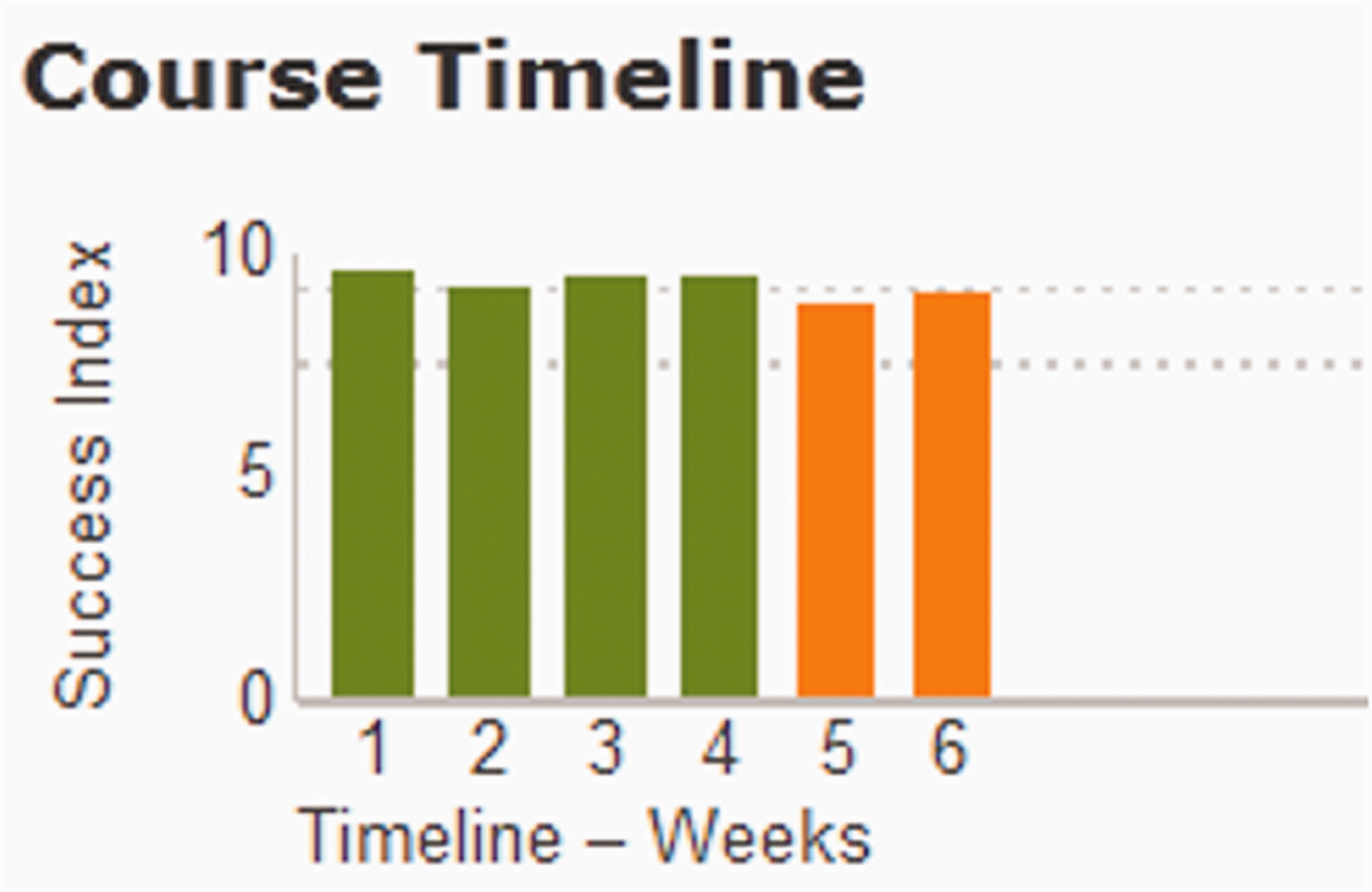
A course timeline chart (Brightspace, 2020g).
Alex’s risk is, in Weber’s (2020) words, infinitely ‘tellable’. We see a young man in trouble. He is beginning to struggle, as his success index decreases over the weeks. We also see him falling behind his classmates. The dashboard shows him as the most at risk in his class. The data dashboard story hints at the future: Will Alex be one of the many young people to drop out of high school? Does the red colour flag the danger of potential long-term disadvantage if Alex does not manage to improve his success index? Can the teacher intervene to help him out of this predicament? This specific story about Alex is embedded in wider discourses such as ‘no child left behind’ or ‘every student succeeds’ (see Klein, 2015). The danger and fear about the future is easily recognisable, as is the expectation that if someone – in stories there is often a hero, a saviour, someone who intervenes – can reach this student in time, he may get back ‘on track’ to success.
Overall, the risk narrative we have demonstrated here with ‘Alex’ raises (at least) two critical tendencies in the ongoing reconfiguration of public education. The first is the question of how predictive analytics imply causality. As Rettberg warns: Data visualizations prioritize correlation. Narrative, by contrast, is a form of representation that often emphasizes causal connections. Narratives organize events in time. Some also provide causal connections between events. (Rettberg, 2020: 42)
A second potentially critical development is the individualisation of risk in this dashboard story. It is consistently the individual student who is marked at-risk and who needs to get ‘back on track’. When instructors are told that looking at the dashboard helps them to find ‘the cause’ of a student’s increasing risk of dropping out (see above), the cause can only be the individual student’s individual interaction with the system. The dashboard story renders structural, historic or policy factors such as racism, sexism or economic discrimination as risk factors absent ‘out-there’. Similarly, when the interventions suggested by the dashboard are individual teacher interventions with individual students, there is no space (in this dashboard story) to consider structural, policy or community interventions.
Moving beyond individualised risk and academic performance, the system also foregrounds ‘social learning’. As the next section demonstrates, however, this is a particular story of sociality as in-tech interaction, with particular implications for students and society.
A narrative about sociality: Maximising in-tech interactions
A specific dimension of the risk narrative in the Brightspace Student Success System is sociality: it is risky, the system tells users, for a student to be insufficiently socially integrated and connected. Figure 6 introduces Meghan Aarons, a further example student in Brightspace’s online marketing materials. Her ‘win-loss chart’ on the left shows green for overall ‘success indices’, orange (but above 0) for ‘content access’, orange (and slightly below 0) for ‘social learning’, and green for ‘assessments’. In the ‘sociogram’ on the right, Meghan’s circle (lower right corner) is orange. The largest green circle is assigned to ‘Bobby Kr.’. Numerous lines connect Bobby to other students.

Sociogram: The ‘social learning predictive chart’ (Brightspace, 2020f).
The more frequently a student has posted or replied in Brightspace’s discussions tool over the period in question, the larger the circle attached to their name in the visualisation; the more peers they connect with through posting and replying, the more lines emanate from their circle to other circles. As above, green is ‘successful’; orange signals ‘potential risk’ and red flags that the student is ‘at risk’ in this category. The system refers to this domain as ‘social learning’. Teachers ‘can click this domain in the [learner’s individual] win-loss chart to see a detailed visualization of social learning for the learner’ (Brightspace, 2020d).
This particular dashboard shows Bobby as a well-connected student, engaging in multiple in-tech ‘communications’ with other students. Bobby has ‘established a connection’ with more of his co-students, where establishing a connection refers to the specific in-tech practice of replying to someone’s post in the system. Meghan is involved in far fewer post/reply interactions with others’ posts: she posts/replies less frequently and with a smaller number of classmates. Meghan and Bobby both become specific characters in the overall story of success and risk, with their other out-of-tech social interactions excluded from this story.
A good story shows progression within green or towards green; red alerts users to danger. Spatially, students are located as part of a network of peers, either in the centre or at the peripheries of ‘social interaction’. Meghan’s orange colour guides her instructor reading this data visualisation to become concerned about the sequence of events – the lack of in-tech social connections and communications – that have led the system to flag Meghan as a learner at ‘potential risk’.
For many researchers in learning analytics, ‘social interaction’ is an important element of learning to track and visualise (see Verbert et al., 2014). When, however, the data refers to student interactions through comments on discussion posts or chat messages between students, the term ‘social interaction’ refers primarily to in-tech interaction with other students. Other forms of social interaction are not available to the analytics models. Classic writing on the types of interaction through learning platforms distinguish between, e.g., ‘learner-content interaction’, ‘learner-instructor interaction’ and ‘learner-learner interaction’, and do not use the word ‘social’ at all (Moore, 1989). More recent publications have begun to use ‘learner interaction’ and ‘social interaction’ as synonyms (e.g. Hernández-Lara et al., 2019).
From the critical stance we take in this paper, three aspects of the social learning narrative point to ways in which the notion of ‘sociality’ is shifting as predictive tools, which from their design up define sociality as in-tech interactions, are used in classrooms.
First, those students are portrayed as ‘successful’ characters in the dashboard story who maximise their in-tech interactions with fellow students, i.e., posting and replying to available posts. These students’ names become centred in the sociogram, with multiple lines connecting them to other students’ circles. Since the discussions are flowing around the posts from these students, other students are rewarded by establishing in-tech connections with these centred students. Centred students thus become increasingly centred, and increasingly marked as successful. This process strongly echoes high-school memories or young adult novels in which marginalised students look in (wistfully) from the periphery at the popular students in the centre. Data literate students can, of course, easily game this system by, e.g., posting contentious comments to incite replies, or writing frequent simple replies to increase their ‘amount of communications’ without contributing much time to each post (see e.g. Hayes and Walsham, 2001 for similar processes when online social interaction becomes a platform for demonstrating professional expertise).
Second, students’ face-to-face interactions, communication and connections in the classroom are rendered invisible (absent ‘out-there’). The design of the Brightspace dashboard can only make in-tech communication visible (renders sociality as in-tech interaction; present ‘in-here’). Although the classroom teacher sees face-to-face classroom interactions alongside the dashboard visualisations, other stakeholders, e.g., school leaders or parents, see only the dashboard. Also, research on the use of data dashboards has shown, as we noted above, the power which visualisations such as these ‘win-loss charts’ hold over the interpretations and decisions made by those in charge, even when these people have access to further information outwith the dashboard (e.g. Eubanks, 2018; Hartong and Förschler, 2019). The dashboard story has been shown to take precedence over other possible (social) data and narratives.
Third, and more broadly, the redefinitions in the documentation for users are part of the ongoing redefinition of core concepts that have traditionally described sociality. These concepts, e.g., ‘friends’, ‘social interaction’ or, in our case, ‘social learning’ and ‘establishing a connection’, flag the myriad ways in which we navigate human relationships, e.g., in classrooms, on social media or through learning software. Whereas the shifting concepts of ‘friends’ or ‘liking’ have received much critical attention (e.g. Marres, 2017), our analysis of Brightspace demonstrates that these shifts are not limited to social media. It shows how similar transformations are also underway in key public institutions such as schools. In educational spaces there is far less attention to such changes, which unfold in the background. Yet schools are key spaces for making particular ways of understanding the world appear self-evident.
Overall, we do not mean to critique the use of ‘social learning’ here in the way that some critics have lamented that digital interactions are destroying face-to-face interactions ‘in the real world’ (e.g. Bajarin, 2012). Instead, we want to trace the subtle ways in which the narratives told by dashboards used in educational settings adopt and make commonsensical a conception of sociality as primarily ‘refracted through digital technologies’ (Elliott, 2019: 106). When sociality is redefined in this way as in-tech interaction, face-to-face social interactions are rendered less relevant to students’ futures.
Indeed, with this narrative, the dashboard becomes the author of a story about young people, reducing their social learning – and thus, in a sense, their sociality – to the view from the predictive analytics system, which explicitly foregrounds the social processes of centring and marginalising. The implications of this dashboard-authored narrative for students and society remind us that it is important to consider whose stories are told by educational technology and how they are being told.
Implications and uptake
If educational dashboards tell compelling stories about young people’s futures, these stories shape and reconfigure schools as socio-technical arrangements in particular ways. As noted above, the use of such systems has exploded as educators have sought ways to reach students during the emergency remote teaching accompanying the SARS-CoV-2 pandemic of 2020–2021. The need for a critical approach to the daily workings of these systems, for instance how data dashboard stories may change educational priorities, has thus become even more urgent.
The stories that the dashboards in this analysis render visible and compelling characterise teachers, their professional judgment, and students in very particular ways. As managers, for instance, the notion of teacher professionality shifts. Teachers become managerial data analysts, reading dashboards for insights. When ‘what gets counted counts’ (D’Ignazio and Klein, 2020: 97), and when an increasing amount of student activities are counted (within systems like these), it becomes an ever more time-intensive part of teaching to observe the counted, and to make decisions based on this data. If this detracts attention from the physical classroom space, then what matters in schooling changes. Further roles, e.g., teachers as care-givers, counsellors, motivators or activists, are rendered invisible in this system and irrelevant to its story of highs and lows, success and failure.
Risk, as narrated by these dashboards, becomes increasingly meaningful as a category to direct both teacher and student behaviour. However, importantly, since the dashboards are for instructors, the onus lies on instructors to provide interventions, remediate student behaviour and provide enrichment pathways. This narrative of risk conflicts with current discourses in education which prioritise student agency, student-centred learning or student-directed learning. The dashboard stories of predictive analytics prioritise teacher agency and teacher-directed learning. The implications of this difference between student-directed and teacher-directed learning are problematic not only for learning subject-related matter, but also for enacting agency within community and democratic public life (Stommel et al., 2020).
Perhaps the most impactful finding in this paper for us, as authors, is the reconfiguring of sociality within these narratives. What the story calls social is limited to features of the technology itself. ‘Social learning’ captures only those aspects of students’ sociality which are available to the machine. This understanding of sociality could, if used as the system and documentation recommend, strengthen some young people’s sense of centrality (popularity) and other students’ feelings of marginalisation and exclusion. The predictive system rewards specific social behaviour and technology-centred interaction. It marks as successful those students who post comments that drive peer engagement higher. The system also marks as successful those students who communicate with the largest number of peers. This potentially centres those students already in the centre. In a double move, as the system authors students’ sociality in this way, it empowers the already empowered, and strengthens systematic, society-wide raced, classed and gendered structures of marginalisation.
However, the question of uptake remains understudied (see also Williamson and Eynon, 2020). Importantly, data justice and feminist scholarship have shown that some users will invariably appropriate the system in ‘other’ ways (e.g. D’Ignazio and Klein, 2020; Draude et al., 2019). 2 To understand how predictive analytics is reconfiguring education, it is important to also highlight ambivalences, and trace how predictive tools are embedded into unexpected or unforeseen practices.
One example of reappropriating predictive analytics is through community engagement approaches in which predictive analytics are embedded in situated social relationships, holistic approaches to educational interventions and community authority. This approach acknowledges that most predictive analytics tools have been developed with the aim of reducing harm. Projects do aim to provide ‘actionable insights’ to educators to help them support students to succeed in formal education, especially those students who were not meeting the formal criteria for success, i.e., good grades. However, this approach also acknowledges the critical research on predictive analytics described above, and notes that the aim of reducing harm is often not achieved. As O’Shea suggests, we need to think ‘a little more radically about the possibilities of technology to reduce harm’ (2019: 57).
A socially situated, community approach to reducing harm in schools is found where insights from predictive models remain neither at the in-tech level, nor as input for individual instructors to develop interventions for individual students. Instead, the insights are built into a holistic approach. In the US, for instance, NPR reports on one school in which an analyst draws on attendance, behaviour and course performance data (the ABCs of prediction) to identify students to discuss at weekly team meetings: Today, there are three kids on the list. A projector beams one student's image on a screen, accompanied by a spreadsheet of his grades so far this year. His most recent report card shows a lot more D's and F's than in the first part of the year. “He came to me last week and he said, 'I'm hungry. I haven't had anything to eat all day,'” says one teacher. “I had a bag of chips and I gave them to him”. “If that happens again … we keep snacks in the office”, offers another. A third person points out something not everyone knows about this student: Turns out, he's spent more than a week this semester living in a car. The team then discusses some potential options, like strategies for helping the student manage his time and putting him in touch with homeless services. A sports coach volunteers to coordinate everything. (Mack, 2014)
Concluding thoughts
Powerful stories are being told about predictive analytics today by policy makers, scholars and the tech industry alike: Proponents state that predictive analytics ‘reinvents industries and runs the world’; it ‘combats risk, boosts sales, fortifies healthcare, optimizes social networks, toughens crime fighting, and wins elections’ (Siegel, 2016). In this paper, we have examined data dashboards as storytelling devices for predictive analytics. We argue, firstly and more generally, that dashboards should be considered as storytelling devices, beyond the current understanding of dashboards as establishing facts about reality. Secondly and more specifically, we illustrate how the stories told by dashboards for Machine-Learning-based learning analytics make predictions more persuasive and further contribute to the ways in which learning analytics configure and shape our (anticipation of our) futures. Through these stories, the correlations of learning analytics are framed as causal connections. This makes dashboards so effective. They turn what many perceive as contested predictions about students and schooling into compelling stories.
The specific importance of storytelling through ML-based learning analytics dashboards, compared to other types of more conventional dashboards, is their focus towards predicting futures. They promise to allow their readers to actively engage in shaping (circumventing or furthering) certain (un)desired futures. Importantly, those predictions are always only possible in relation to data available to the ML-based systems. Hence, through storytelling, only this data comes to matter that ML-based systems privilege (even though it cannot represent the social complexities in which teachers and students live, work and learn). This kind of arrangement can have detrimental effects on students, e.g., in relation to how they perceive themselves. It foregrounds a narrow understanding of individually measurable education. It thus provides a narrow understanding of possible interventions that will circumvent undesirable futures and enable desirable futures, as these data dashboards render structural inequalities invisible and students individually responsible.
However, alongside the narratives which reduce and disempower, we have also reflected on how uptake can challenge the predominant reading of such dashboards in order to empower community-based approaches. Although this uptake may retain the risk narrative, it embeds predictive analytics systems in practices which assume – and thereby enact – the agency of communities response-ably. By assuming communities’ ability to take decisions, rather than assigning decision-making to individual managers/experts, these practices remind us of the powerful ways data can be harnessed to challenge hierarchies, rethink norms and embed technical systems in social contexts. As educational and other fields are increasingly embracing predictive tools in the wake of the Covid-19 pandemic, it is crucial to examine these systems and their narratives, to highlight how the systems are harmful, and to consider if and how they are being used beyond the current limited and limiting system recommendations.
Footnotes
Acknowledgements
We would like to thank the DATAFIED team members Annekatrin Bock, Andreas Breiter, Vito Dabisch, Sigrid Hartong, Sieglinde Jornitz, Angelina Lange, Ben Mayer, Tjark Raabe, Jasmin Tröger and Irina Zakharova as well as Julie Lüpkes. A first version of this paper was presented at the PREGOV (PREdictive GOVernance) Workshop at the Helmut Schmidt University Hamburg in February 2020. A special thanks to Sigrid Hartong for the invitation. We also thank our three anonymous reviewers for their encouraging engagement with our manuscript as well as their constructive and thoughtful feedback.
Declaration of conflicting interests
The author(s) declared no potential conflicts of interest with respect to the research, authorship, and/or publication of this article.
Funding
The author(s) disclosed receipt of the following financial support for the research, authorship, and/or publication of this article: This work was conducted as part of the DATAFIED research project funded by the German Federal Ministry of Education and Research (project numbers 01JD1803A and 01JD1803B).