
Abstract
Measuring public perceptions of economic inequality is challenging. Even though the concept of unequal resources is intuitive, most mathematical summaries of inequality are not. Additionally, humans are better at thinking in terms of prototypical representations of different groups than in terms of statistical properties of distributions. As a result, asking respondents to estimate numeric indicators of unequal distributions results in high rates of missing and ad hoc responses. To circumvent this problem, this article proposes and characterizes two survey items about income differences that refer primarily to mental representations of social groups but that can still be used to explore respondents’ perceptions of economic inequality. The survey items ask respondents to estimate the income at which a household becomes rich and the income at which a household becomes poor. Three survey samples from two countries show that response patterns are plausible and exhibit expected correlates. These items sacrifice the existence of objectively correct numeric answers but gain insight into respondents’ subjective perceptions of the differences between the rich and the poor. Consequently, these items may improve our ability to study the correlates and determinants of lay perceptions of economic inequality.
Measuring perceptions of economic inequality is challenging. On the one hand, the idea that some have more than others is intuitive, and signs of economic differences are ubiquitous in everyday life. On the other hand, economic inequality is an abstract concept with numerous equally plausible but mathematically complex numerical representations (e.g., the Gini coefficient, the 90:10 income ratio, and the top 1% wealth share). Researchers studying how the public perceives inequality thus need to make consequential decisions regarding how to ask respondents about this concept.
One common approach is to select numeric representations of inequality and ask survey respondents what they think those numbers are. This approach, in effect, asks respondents to give their estimates of researchers’ preferred indicators of inequality. The results are used to evaluate how accurately people perceive economic inequality and how those perceptions are related to other variables of interest. However, this approach presumes more numeric ability and awareness than most respondents are able to offer (Heiserman and Simpson, 2021; Pedersen and Mutz, 2019; Phillips et al., 2020). As a consequence, analyses that rely on these items may be inaccurate (Chambers et al., 2014; Eriksson and Simpson, 2012).
This article proposes an alternative set of survey items on income inequality: asking people what incomes qualify a household as rich or poor. These items capture an intuitive, yet numerically expressed, sense of the differences between the rich and the poor. Specifically, the ratio of the two responses measures the perceived gap between the rich and the poor. This approach reverses the usual order of operations (first choose the benchmark and then measure perceptions). Instead, these items prioritize capturing an intuitive sense of inequality, making it the job of researchers to figure out which aspects of objective inequality affect perceived inequality.
This article describes the benefits and costs of these survey items, first theoretically and then empirically. Theoretically, these questions have the benefit of being intuitive to answer. A key cost is that they lack objectively correct responses: the items refer to “the rich” and “the poor,” but the social and cultural referents of these terms shift over time and space. Below, I argue that this ambiguity can be a feature and not just a bug. Turning to empirical validation, I use three survey samples from two countries to illustrate that responses are generally reasonable and have expected correlates. The concluding sections give suggestions for how these items could be integrated into research on perceptions of inequality.
Measuring perceptions of inequality
Selecting survey items requires satisfying two motivations. First, we want respondents to be able to answer our questions. Second, we want the questions to be informative for our research agendas. The complexity of economic inequality unfortunately makes these motivations difficult to reconcile. I propose that asking “At what level of income would you say that a household becomes [rich/poor]?” is a reasonable balancing act between the two motivations. Below, I address each motivation in turn.
Can people answer these survey questions?
The questions are designed with lessons from the literature in mind. In general, survey questions that are too difficult lead to high rates of don’t knows (Shoemaker et al., 2002), ad hoc responses (Sturgis and Smith, 2010), or wrong answers that exhibit significant test–retest variation even among respondents who report being sure of their estimates (Graham, 2023). In the case of economic inequality, several common questions exhibit related issues, such as high rates of logical fallacies (Heiserman and Simpson, 2021), anchoring effects (Pedersen and Mutz, 2019), and partition dependence (Bogard et al., 2022). These problems affect inequality estimates derived from questions about the incomes of different occupations (Jasso, 2000; Osberg and Smeeding, 2006; Trump, 2018, 2023), choices among visual representations of inequality (Bobzien, 2020; Chambers et al., 2014; Niehues, 2014), and estimated shares of wealth (Eriksson and Simpson, 2012; Norton, and Ariely, 2011) and incomes (Boudreau and MacKenzie, 2018). Even though the questions enumerated here have all been designed for simplicity, it nonetheless seems that we are not yet asking questions about this complex topic that respondents can intuitively answer.
One way to simplify inequality questions is to side-step numeric estimates, for example by asking whether inequality has increased or decreased (see for example Bartels, 2005). However, depending on the research question at hand, we may need items with numeric answers, as these are easier to compare across respondents and time.
Another way to simplify the questions is to focus on features of the social world that are mentally accessible (i.e., that come to mind easily). Many inequality measures refer to extensional attributes (such as averages over a distribution), which are difficult for human beings to represent mentally (Kahneman, 2003). Accessible features, instead, tend to be “prototypes,” such as mental representations of a typical member of a group. This insight has been applied to questions about inequality with promising results. Chambers et al., (2014) and Eriksson and Simpson (2012) argue that asking about average incomes gives better results than asking about the total income of specific deciles. This approach was applied large-scale in Pontusson et al. (2020), who ask respondents to estimate the incomes of average households at the 10th and 90th percentiles. Here, I go one step further and drop the reference to income deciles. Instead, I rely on the respondents’ prototypes of rich and poor households.
In sum, I expect these questions to be relatively easy to answer because they: • have a concrete and mentally accessible target: prototypical perception of rich/poor households; • have a concrete and mentally accessible benchmark: the respondent’s own household income; • do not require respondents to reason about distributions, including the concept of deciles; • reference income in culturally relevant units; • do not specify household size.
1
Are these survey questions useful for research?
The proposed items measure perceived inequality: the ratio between the two responses indicates how large the gap between the rich and the poor appears to the respondent. This ratio can be used to answer questions like: Do people in unequal places perceive more inequality? Does press coverage of billionaires increase the perceived gap between the rich and the poor? Does pre- or post-tax income inequality have a larger correlation with perceived inequality?
We can think about this way of setting up our research questions by observing, as Jachimowicz et al. (2022) do, that economic inequality has many features (including geography, social group, and resource type), and that this results in a manifold of specific inequalities that researchers may want to study. While researchers can and should specify which facet of inequality they study, it will not be feasible to examine public perceptions of each such facet. Partly, this is because of researchers’ resource constraints. Mainly, however, the limitation arises because these distinctions will be too obscure for most survey respondents. For example, researchers may want to ask questions such as: Are lay perceptions of inequality affected by the 90:10 income ratio at the county level? The top 1% income share nationally? The poverty rate among the respondent’s racial group? The respondent may not be able to accurately cite any of these statistics. In fact, they most likely will not be able to do so (Heiserman and Simpson, 2021). However, they almost certainly have qualitative impressions of the gap between the haves and the have-nots, and these impressions may be influenced by any of these measures of inequality. The items proposed here seek to capture those qualitative impressions, leaving it to researchers to figure out the objective measures of inequality that most influence these intuitive perceptions.
When interpreting answers to these questions, we need to remember that because the terms “rich” and “poor” are subjective, the items do not have objectively correct answers. Additionally, the connotations that people have with these terms will shift across social and political contexts. For example, it is likely that the Occupy Movement (whose slogan “we are the 99%” referred to the runaway incomes of the top 1% of earners) increased the share of the population who associate the term “the rich” with the top 1%. It is an unavoidable feature of these items that answers to them reflect politically salient class categories.
As a consequence, we cannot assume the answers refer to specific percentiles, and research questions that call for such specificity require different operationalization. However, capturing salient class divisions can be useful for projects that seek to understand which aspects of de facto economic differences are most salient to respondents. For example, these items allow us to evaluate whether most respondents think of the rich as the top 10%, the top 1%, or billionaires. The answers teach us about the contours of class politics, which is what many research questions about perceived inequality are ultimately about.
Data and results
The full wording of the proposed items is: • “At what level of income would you say that a household becomes rich? In other words, how much money does a family need to make [per year] for you to consider them rich?” • “At what level of income would you say that a household becomes poor? In other words, how little money does a family need to make [per year] for you to consider them poor?”
The items were fielded on three samples: one convenience sample from the United States (n = 614, Prolific opt-in panel) and two quota-based samples from the United States (n = 1000, YouGov opt-in panel with online and random digit dial recruitment, followed by quota sampling) and Germany (n = 3893, Respondi opt-in panel with online recruitment, followed by quota sampling). In the rest of the paper, I will refer to the quota-based samples as representative; demographic details are available in Online Appendix A.
The element in square brackets reflects cultural norms around discussing incomes; the wording above applies to the United States, while in Germany the question referenced net monthly incomes. See Fernández-Albertos and Kuo (2018) and Pontusson et al. (2020) for similar adjustments.
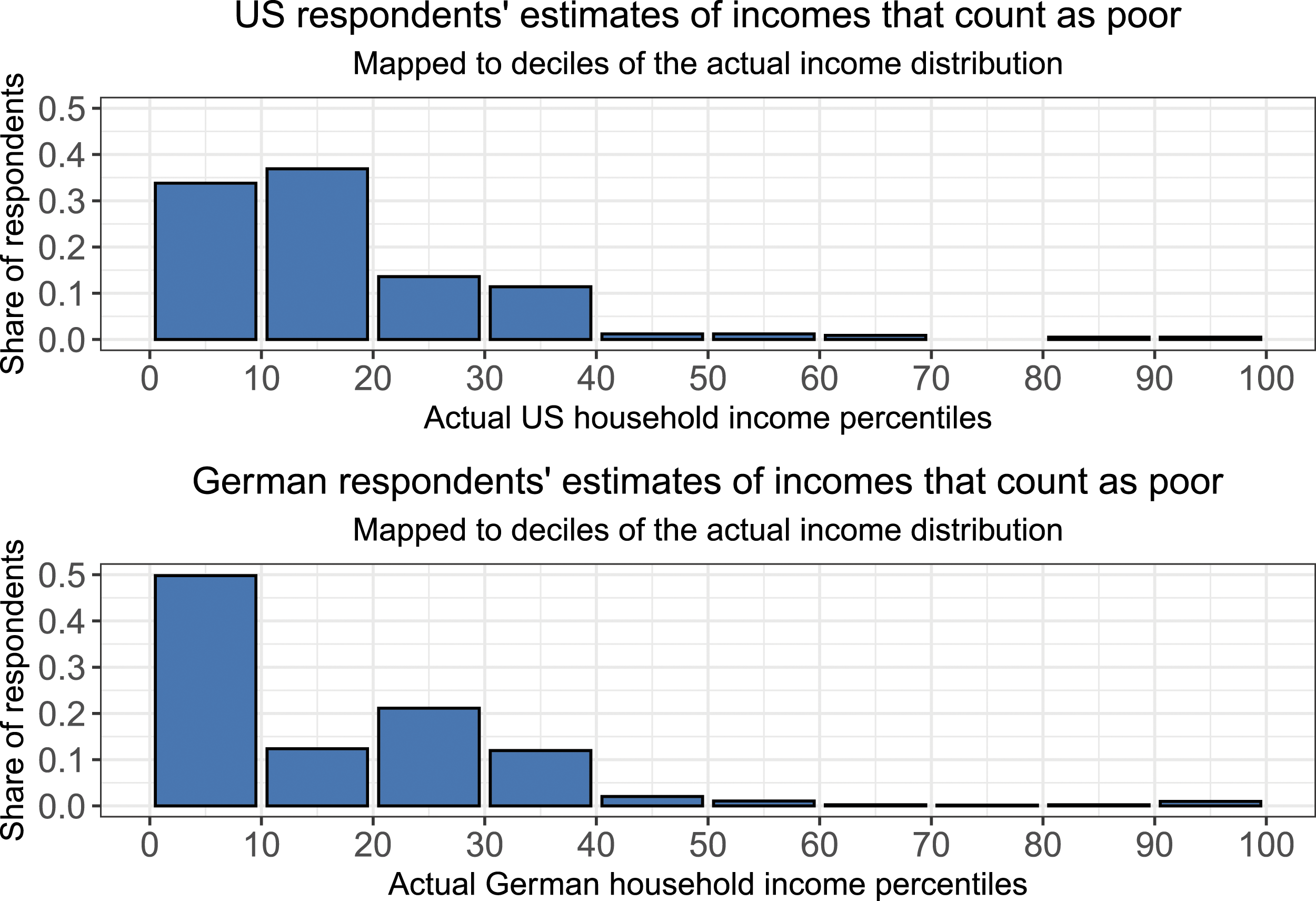
As discussed above, because “rich” and “poor” are subjective categories, responses cannot be evaluated against objectively correct answers. However, we can probe the plausibility of responses by comparing them to the actual income distribution. Figures 1 and 2 visualize the income that representative samples of Americans and Germans think makes a household rich or poor, respectively, plotted against deciles of the actual income distribution (LIS, 2018). Visualizations based on percentiles are available in Online Appendix B. Estimates of threshold for rich, United States and Germany. Estimates of threshold for poor, US and Germany.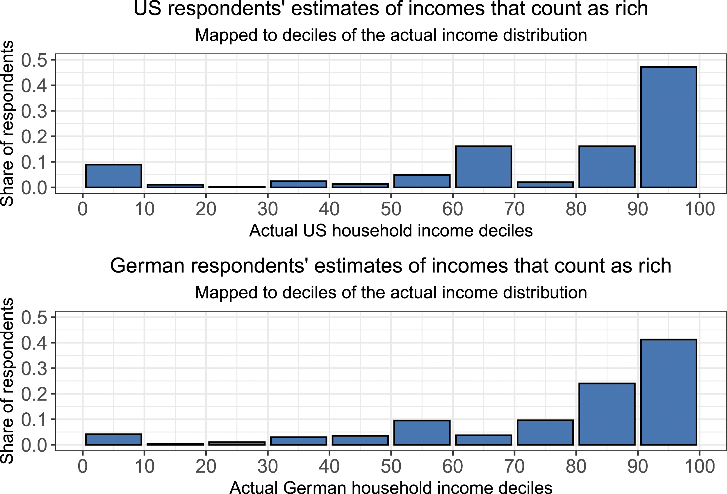
In both countries, the threshold for being rich most commonly falls in the top decile of the actual income distribution. In the United States, 20% of respondents think of households in the top 1% of the actual income distribution, and another 28% think of households in the top decile (but below the 1% cutoff). In total, 80% consider households in the top third of the income distribution rich. 2 Among German respondents, 10% think of households in the top 1% of the actual income distribution, and another 31% think of households in the top decile (but below the 1% cutoff). In total, 77% of Germans think of households in the top third of the income distribution as rich.
Looking at perceptions of poverty, the most common decile for the poverty threshold is the bottom decile in Germany, and the second from the bottom decile in the United States. 35% of Americans consider people at or below the 10th percentile poor, while another 36% place the threshold in the second decile of the income distribution. In total, 87% consider those in the bottom third of the income distribution poor. The corresponding numbers for Germany are 49%, 14%, and 85%.
We may consider some responses off the mark, either due to genuine but unusual perceptions or inattentive responding. 9% of American and 4% of German respondents give a threshold for rich in the bottom decile of the actual income distribution. 3% of both Americans and Germans give poverty thresholds above the actual median household income. Both samples were collected as part of a broader survey, which means that attention checks could not be used. However, the rates of implausible responses are similar to those that could be caused by inattentive responding (Aronow et al., 2020) or trolling (Lopez and Hillygus, 2018), issues that are not unique to these survey items.
Summary statistics: Respondent estimates of household income cutoffs for the rich and the poor.

Note: In accordance with cultural convention, US respondents estimate gross annual household incomes in USD; German respondents estimate net monthly household incomes in Euro. Data has been winsorized as described in main text.
For each sample, two means are displayed: the first is based on unadjusted data, and the second is based on data after winsorizing the estimates to the 99th percentile of the actual income distribution. As the table shows, winsorizing is required for mean estimates to be plausible. This is due to high top-end estimates affecting the mean, which is one of the issues identified in Heiserman and Simpson (2021) as also affecting other survey items about inequality. Qualitatively, winsorizing to the 99th percentile of the actual income distribution can be interpreted as collapsing into one category everyone whose response indicates that they only consider households in the top 1% of incomes rich. If the researcher is comfortable doing this, then analysis of means becomes more viable.
We can also explore the performance of these items by examining their correlates. For example, people tend to perceive themselves as closer to the average earner than they truly are (Fernández-Albertos and Kuo, 2018; Karadja et al., 2017). If the items capture this bias, then answers should vary according to the respondent’s own household income. This is in fact the case: respondents with above average incomes suggest higher thresholds both for being rich and being poor. See Online Appendix C for details.
In order to explore how sensitive responses are to mathematical complexity, the German sample answered two additional questions. After the income threshold items, they estimated the share of households that are rich and poor. The results indicate that illogical responses arise despite the responses being restricted to not be more than 100% in each category, as 6% of respondents gave answers that summed to more than 100%, and an additional 8% gave responses that summed to exactly 100%, implying that society is entirely composed of only the rich and the poor. Perhaps most concerning, the respondents’ education level was the main predictor both of whether a respondent gave a logically impossible response, and of how large a share of the population they saw as rich or poor. See Online Appendix D for details. While some of this may be due to the less advantaged seeing a more bifurcated society, it also suggests that questions that reference shares are more difficult to parse for those with fewer years of education. As a result, complicated survey items may systematically misrepresent the perspectives of the less advantaged.
Potential uses
The theory section suggested potential research uses for these items, building on the idea that by taking the ratio between the thresholds for rich and poor, we have a measure of perceived inequality. In this section, I empirically illustrate how research using these items might look.
First, we can ask how this measure of perceived inequality relates to objective inequality. For example, the median American respondent estimated a rich-to-poor gross annual income ratio of 8.8; the 90:10 ratio in the actual distribution is 11.3. The median German respondent estimated a rich-to-poor net monthly income ratio of 4.4; the 90:10 ratio in the actual distribution is 5.3. Alternatively, perhaps the most relevant inequality is not national but local. For example, according to the OECD (2014), the German Bundesland with the most equal distribution of disposable income is Saxony, while the most unequal is Hessen. The overall median rich-to-poor ratio estimate in the German sample is 4.4 (n = 3893), with the median estimate in Saxony at 4.2 (n = 305) and the median estimate in Hessen at 5 (n = 231).
Expanding on the observation that the subjective nature of the answers means they capture the most salient aspects of class boundaries, we can ask how perceptions of inequality are related to the shape of the income distribution. For example, runaway top end incomes could lead to the ultra-rich being a salient comparison point, resulting in higher estimates of what it takes to be rich. Suggestively, in the US where the marginal top 1% income earner makes 7.6 times more gross per year than the median household, 20% of respondents estimated a threshold for rich in the top 1% of the actual income distribution. In Germany, where the marginal top 1% income earner makes 4.4 times more net per month than the median household, 10% of respondents estimated the threshold for rich in the top 1% of the actual income distribution.
Finally, on a somewhat different note, the items are a way to probe who identifies as rich or poor. In the German sample, respondents were not restricted to categories when asked their household income, so their incomes can be compared to their stated thresholds. 10% of respondents have incomes at or above their self-stated threshold for being rich (the median income of these respondents was €3500). 20% of respondents have incomes at or below their self-stated threshold for poverty (the median income of these respondents was €900).
Discussion
In this article, I characterize and suggest potential uses for two survey questions about perceptions of economic inequality. The questions are designed to be intuitive to answer: most importantly, they do not require respondents to engage with distributions (percentiles, deciles, shares, etc.). Instead, the questions ask respondents to identify the income at which a household becomes rich and the income at which a household counts as poor. In samples collected in the United States and Germany, I show that the response patterns are generally reasonable reflections of reality. In the public’s eye, the threshold for a household to be rich is generally in the 80th–90th percentiles of the income distribution, while the threshold to be poor falls in the 10th–20th percentile.
These items reverse the more common approach of first identifying an objective measure of inequality and then asking respondents to guess what that quantity is. Instead, the questions are formulated to be easy to answer and intuitive to think about, giving respondents an opportunity to express their social perceptions. It is up to the researcher to establish whether people’s perceptions of differences between the rich and the poor are sensitive to specific aspects of inequality. As researchers, we can and should be precise about the definitions and measures of inequality that we study, but we can do this without expecting people to think about this concept the same way we do.
This approach has limitations. There are aspects of inequality these items do not capture, even implicitly, such as whether there are more rich people than poor people. Additionally, the responses do not have objectively true answers because the categories “rich” and “poor” are inherently subjective. As a result, the responses to these items do not have objectively correct responses and cannot be used to evaluate respondent accuracy. Instead, they capture salient aspects of class politics, which may shift over time and space—a property that needs to be kept in mind as the results are interpreted.
Overall, I suggest these questions are a useful tool for “meeting respondents where they are.” The questions are designed to be easy to understand, and respondents give generally reasonable responses to them. The items also have a range of potential applications. These questions may thus be a useful tool to add to the set of survey questions that we ask about inequality.
Supplemental Material
Supplemental Material - What does it take to be rich? Asking reasonable survey questions about income inequality
Supplemental Material for What does it take to be rich? Asking reasonable survey questions about income inequality by Kris-Stella Trump in Research & Politics.
Footnotes
Acknowledgments
The author thanks Kattalina Berriochoa, Scott Clifford, Nathalie Giger, Minyoung Kim, Taesim Kim, Ben Newman, Philipp Rehm, Ariel White, Amber Wichowsky, Vanessa Williamson, panel participants at the 2022 Midwest Political Science Association annual conference, and conference participants at Claremont Graduate University for useful feedback. Thank you also to Thomas Woehler and the team at the Politics of Inequality Cluster at the University of Konstanz.
Declaration of conflicting interests
The author(s) declared no potential conflicts of interest with respect to the research, authorship, and/or publication of this article.
Funding
The author(s) disclosed receipt of the following financial support for the research, authorship, and/or publication of this article: This work was in part financed by the Politics of Inequality Cluster at the Universität Konstanz (University of Konstanz), funded by the Deutsche Forschungsgemeinschaft (DFG – German Research Foundation) under Germany’s Excellence Strategy – EXC-2035/1 – 390681379.
Supplemental Material
Supplemental material for this article is available online.
Notes
References
Supplementary Material
Please find the following supplemental material available below.
For Open Access articles published under a Creative Commons License, all supplemental material carries the same license as the article it is associated with.
For non-Open Access articles published, all supplemental material carries a non-exclusive license, and permission requests for re-use of supplemental material or any part of supplemental material shall be sent directly to the copyright owner as specified in the copyright notice associated with the article.