
Abstract
Background:
The use of inpatient location for the depiction of glycemic control is an alternative approach to the traditional analysis of hospital-derived glucometric data. Our aim was to develop a method of spatial representation and to test for corresponding statistical variation in inpatient glucose control data.
Methods:
Point-of-care blood glucose data from inpatients with diabetes mellitus were extracted. Calculations included patient-day weighted means (PDWMs) and percentage of patient hospital days with hypoglycemia. Results were overlaid onto hospital floor plans, and room numbers were used as geolocators to generate cross-sectional (2-dimensional) and perspective (3-dimensional) views of the data. Linear mixed and mixed-effects logistic regression models were used to compare the location effect and to assess statistical variation in the data after adjusting for age, sex, and severity of illness.
Results:
Visual inspection of cross-sectional and perspective maps demonstrated variation in glucometric outcomes across areas within the hospital. Statistical analysis confirmed significant variation between some hospital wings and floors.
Conclusions:
Spatial depiction of glucometric data within the hospital could yield insights into hot spots of poor glycemic control. Future studies on how to operationalize this approach, and whether this method of analysis can drive changes in glycemic management practices, need to be conducted.
Introduction
Inpatient hyperglycemia is associated with adverse outcomes, including more wound infections, longer hospital stays, and higher mortality rates.1-4 The current recommendation, which suggests a blood glucose target range of 140 mg/dL to 180 mg/dL in the hospital, is believed to balance the risks of hyperglycemia against those of hypoglycemia. This guideline applies to both critically and noncritically ill inpatients.1-4
Traditionally, analysis and reporting of inpatient glucose data—also known as glucometrics—has been nonspatial. 5 Examples of nonspatial glucometric reporting include 2-dimensional graphic or tabular representation of patient-stay means, patient-day weighted means, and percentage of days with reported hypoglycemic episodes. Results are reported in aggregate at the institutional level or for specific subpopulations of patients (eg, intensive care patients and nonintensive care patients). Data can be compared between individual units and shown side-by-side in bar graphs, but otherwise the data are nonspatial. 4
The addition of location to the depiction of glycemic control is an alternative approach to the traditional representation of hospital-derived glucometric data. Spatial or geographic reporting of data is widespread in epidemiology, public health, and health care, and the applications are diverse.6-9 One of the earliest examples of geographic analysis in epidemiology was that of the 19th-century physician John Snow, who manually mapped cholera cases in London, England, in 1854 and identified the point source of the outbreak. 7 Other examples include maps showing diabetes data and obesity prevalence data in U.S. counties. 10 Current methods of examining the relationship between health data and the environment use geographic information systems (GISs), which are computer-based systems that collect, edit, integrate, analyze, and then visually depict spatially referenced data. 9 Latitude and longitude, or street address and zip code are typically used as geolocators.
A quick visual scanning of geographic-based glucometric data from hospitalized patients could yield insights into hot spots of poor glycemic control (either too high or too low). These “heat maps” could then provide clues about which areas of the hospital should be investigated to learn why glycemic control was not meeting guidelines in some areas but was doing so in others. Spatial analytic methods have been used to investigate infectious disease transmission within health care settings such as hospitals.11-13 However, a description of a methodology to evaluate spatial glucose data in the hospital is lacking. We recently modeled inpatient glycemic forecasting in progressively smaller locations within our hospital, but we did not use spatial analytic techniques. 14
Unlike in traditional GIS systems, geolocators such as latitude and longitude are not applicable within the hospital, and other locational information needs to be considered. This paper describes a method of geocoding to spatially depict inpatient glycemic observations and assessing whether visual interpretations were corroborated by statistical analyses.
Methods
Hospital Geographic Subdivisions
Our hospital is a 7-floor, 280-bed adult acute care academic teaching facility, with an additional 100-bed expansion in progress. There are 2 towers (east and west). Each tower is subdivided into floors, wings, pods, and rooms. Each floor has 2 wings, each wing has 3 pods, and each pod has 12 single-bed rooms (Figure 1). Only data from medical-surgical units were analyzed, so the following areas were excluded from the maps: (1) the sixth floor and the east wing of the fifth floor (which contain non–patient care areas), (2) the second floor (which has intensive care and surgical facilities), and (3) a pod in the west wing of the seventh floor (which is for ambulatory infusions and not inpatient care). Both cross-sectional (2-dimensional) and perspective (3-dimensional) maps were developed in Excel (Microsoft Corp) to coincide with the hospital floor layout. In the cross-sectional maps, data were assigned the following colors according to the quality of the results (the stratification method is described below): red (worst quality), yellow (moderate quality), and green (best quality). In the perspective maps, height was used to depict relative differences in glucometric results.
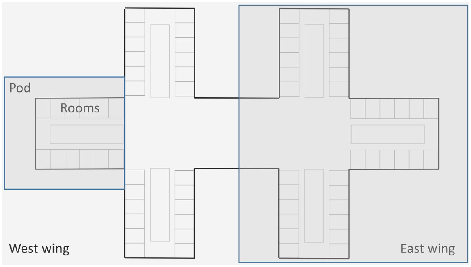
Hospital floor plan. Each hospital floor has 2 wings: east and west. Each standard wing has 3 adjacent pods, and each pod has 12 single-bed rooms (From Saulnier et al. 14 Used with permission of Mayo Foundation for Medical Education and Research).
Data Extraction
An existing point-of-care blood glucose (POC-BG) data set, which consisted of inpatients with diabetes mellitus from 2017, was used for this analysis. Patients in the intensive care unit were not included in the analysis. A total of 20 inpatient medical-surgical pods were eligible for analysis. Since each room was for only 1 patient, the glucose data could be linked to a specific patient, location, and time. Therefore, patient room numbers served as geolocators in the mapping exercises described below.
Demographic data included patient age, sex, and race/ethnicity. In addition, the weighted Medicare Severity Diagnosis Related Group (MS-DRG) was used as a measure of the complexity and resource intensiveness of cases. 15
Definition of Glucometrics
The glucometric measures analyzed and mapped were 2 of the commonly recommended parameters: patient-day weighted mean (PDWM) and percentage of patient hospital days with hypoglycemia. First, PDWMs were calculated as previously described.16,17 Briefly, an average POC-BG level was computed for each patient-day, and these patient-day averages were aggregated to the pod level to compute the patient-day–weighted mean and then averaged for the year. POC-BG was measured with the StatStrip glucose meter (Nova Biomedical Corp). From those data, the percentage of patient hospital days with hypoglycemia (ie, a day where at least 1 POC-BG value was <70 mg/dL) was calculated for each pod.
Generation of Cross-sectional Maps
After PDWM was stratified into tertiles, the values were superimposed on a 2-dimensional representation of the hospital by floor. Pods were then color coded according to tertiles for the values. Red was used to depict PDWM values in the highest tertile (ie, the highest values); yellow, for values in the middle tertile; and green, for values in the lowest tertile (ie, the lowest values).
The percentages of patient hospital days with hypoglycemia were mapped. There is no consensus as to what constitutes an acceptable percentage of days for hypoglycemia in the hospital, so data were once again divided into tertiles. Values in the highest tertile (the most days) were shown as red; those in the middle tertile, as yellow; and those in the lowest tertile, as green (the fewest days).
Perspective Depictions
In addition to the cross-sectional maps, the surface chart feature in Excel was used to generate 3-dimensional surface plots to depict glucometric data from a perspective view. The advantages of this topographic representation over a cross-sectional map are that the information is presented in a more compact format, the column heights allow both within-floor and between-floor comparisons of data, and the results are easily presentable in a monochromatic color scheme. This approach allowed vertical and side-by-side comparisons of data, in which the topographic height increases as the PDWM values increase. Similarly, the topographic height increases as the percentage of days with hypoglycemia increases. This method of depicting inpatient glucose is an alternate means of displaying similar information provided in the cross-sectional maps but with a bird’s-eye view.
Statistical Analyses
Descriptive statistics were used to summarize demographic and clinical characteristics as mean (SD) and median (interquartile range [IQR]) for continuous variables and number (percentage) for categorical variables. Excluded from the analyses were those areas not engaged in the care of hospitalized patients (shaded gray in the maps; see below). A linear mixed-model analysis with random intercept was used to compare PDWMs across areas, with patients nested within hospitalizations. The floor, the wing, and the interaction term between floor and wing were used as the fixed effect adjusted for patient sex, age at first hospitalization (for those with >1 encounter), and the MS-DRG for each hospitalization.
The frequency of days with hypoglycemia was low, so for statistical analysis, the binary outcome for hypoglycemia (yes/no) was used instead of the percentage of days with hypoglycemia. That is, days with hypoglycemia was defined as a binary variable indicating whether the patient did or did not have the event on a day during each hospitalization. Analysis included logistic regression with random intercept for hypoglycemia with patients nested within hospitalizations and adjusted as described above for PDWM. The analysis was conducted with SAS 9.4 software (SAS Institute Inc). All tests were 2-sided, and P values less than .05 were considered significant.
Results
Demographics
Among 2,344 unique patients, there were a total of 3,386 discharges in 2017, and 18,169 monitored patient-days. Mean (SD) age of the patients was 64 (14) years, 63% were women, 83% were white, mean MS-DRG of the hospitalizations was 3.0 (3.9), mean length of stay was 6.2 (7.2) days, and mean PDWM was 160 (50) mg/dL. Hypoglycemia was rare, with only 4% (799 of 18,169) of monitored patient-days with hypoglycemia.
Cross-sectional Mapping
A cross-sectional depiction of PDWM values is shown in Figure 2. While all pods had PDWM values within the target of 140 to 180 mg/dL, a more detailed analysis showed variation in PDWM values across the hospital. Glycemic control was tighter in some areas than in others. For instance, among the 20 pods, 9 (45%) had PDWM results in the lowest tertile (shown in green), 5 (25%) had PDWM results in the highest tertile (shown in red), and the other 6 (30%) had results in the second tertile (shown in yellow).
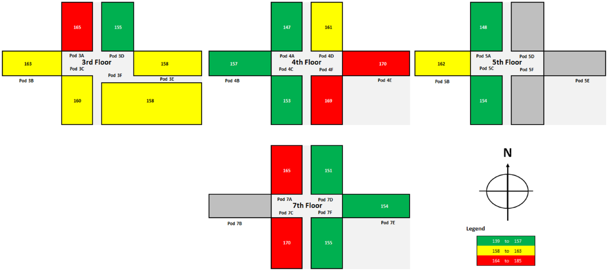
Cross-sectional, 2-dimensional mapping of patient-day weighted mean point-of-care blood glucose values. The pod number corresponds to the hospital floor. The pod letter is associated with a specific wing (A, B, and C indicate the west wing; D, E, and F, the east wing). Dark gray indicates the 4 areas that did not accommodate inpatients in 2017. N indicates north. The legend shows tertiles used to stratify the blood glucose values (in milligrams per deciliter).
Cross-sectional mapping of hypoglycemia data also showed variation across hospital areas (Figure 3). Among the 20 pods, hypoglycemia was detected in no more than 7% of hospital days in 5 pods (25%,shown in green), in 12% or more days in 9 pods (45%, shown in red), and in 8% to 10% of days in 6 pods (30%,shown in yellow).
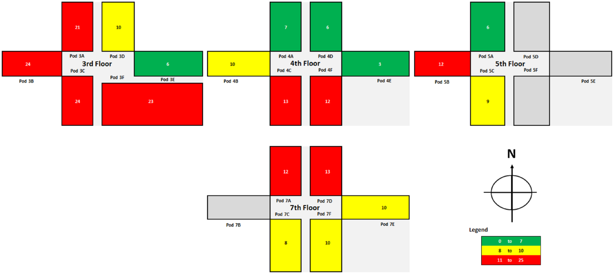
Cross-sectional, 2-dimensional mapping of percentage of patient hospital days with hypoglycemia. The pod number corresponds to the hospital floor. The pod letter is associated with a specific wing (A, B, and C indicate the west wing; D, E, and F, the east wing). Dark gray indicates the 4 areas that did not accommodate inpatients in 2017. N indicates north. The legend shows tertiles used to stratify the hospital days with hypoglycemia (in percentage of days).
Perspective Mapping
The perspective view is a topographic representation of the cross-sectional view. In the topographic view of PDWM (Figure 4, left panel), the column heights of the fourth and seventh floors show the pods with the highest values, which can be compared to heights for adjacent pods and for pods on other floors. Column heights pinpoint which pods had higher percentages of hospital days with hypoglycemia (Figure 4, right panel).
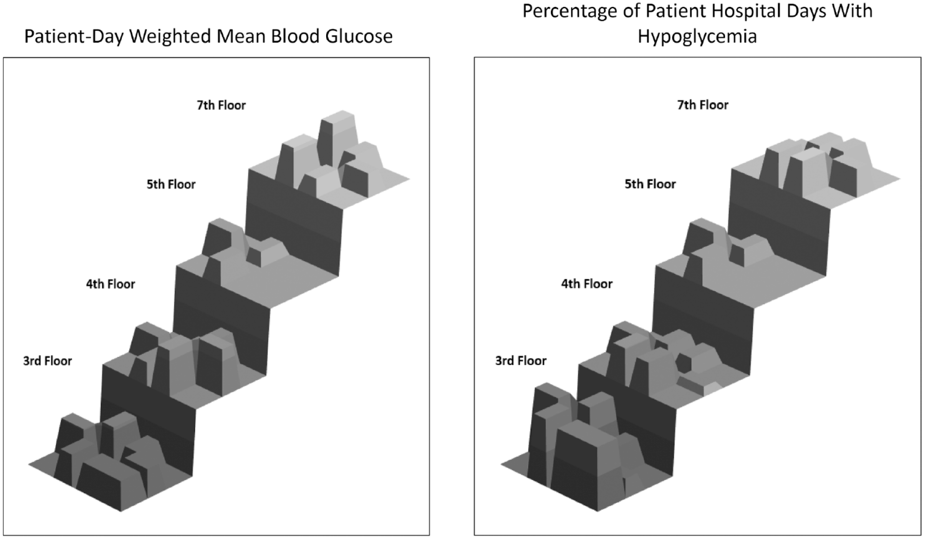
Perspective mapping (3-dimensional, normalized topographic view). Left, Patient-day weighted mean blood glucose values. Right, Percentage of patient hospital days with hypoglycemia.
Statistical Variation According to Hospital Location
Given the absence of data for the east wing of the fifth floor, statistical comparisons were made on data from only the third, fourth, and seventh floors. After adjusting for age, sex, and MS-DRG, significant variation in PDWM data was detected across different locations, with the interaction term between floor and wing being statistically significant (P < .001). PDWM also varied by sex and MS-DRG (both P < .01) but not by age (P = .11) (data not shown). Differences between east and west wings on the same floor were noted for both the seventh and the third floors but not the fourth floor (Table 1). Differences between corresponding west wings (but not east wings) on different floors were statistically significant (west wings on floors 3 vs 4 and west wings on floors 4 vs 7).
Patient-Day Weighted Mean Comparisons According to Hospital Wing and Floor.
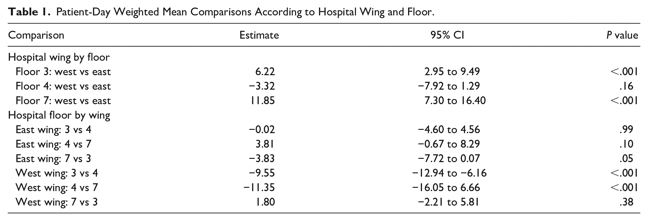
For all floors, the odds of hypoglycemia were not significantly different between east and west wings (all P > .05). In addition, the odds of hypoglycemia were not significantly different between floors on the same wing (east or west) (all P > .05) with the exception of floors 3 and 4 in the west wing, where the odds of hypoglycemia on 4 were significantly less than on 3 (odds ratio, 0.61; 95% CI, 0.44-0.86; P = .004) (data not shown).
Discussion
We have described a method of mapping glucose data onto the hospital floor plan. We showed that room number can be used as a geolocator because POC-BG values are associated with a unique patient, each patient is assigned a room, and every room has a specific location within the hospital. With this approach, we were able to examine 2 different ways of representing the data (cross-sectional maps and perspective maps) and use 2 commonly recommended glucometrics (the PDWM and the number of monitored hospital days with hypoglycemia).
The value of the cross-sectional view is that it may be quickly scanned to assess the high and low values across the hospital without needing to focus on actual numbers. For instance, in the cross-sectional views of PDWM, all results were in the recommended range of 140 to 180 mg/dL. However, further review of the map showed that some areas of the hospital outperformed others, and some pods underperformed. Our finding that adjacent pods did not necessarily perform equally suggests that practices in 1 pod may not have influenced those of adjacent pods. Visual differences in PDWM were confirmed statistically across some areas.
Another observation relates to the frequency of patient hospital days with hypoglycemia. With 1 exception, statistical differences were not detected across areas, most likely because days with hypoglycemia occurred infrequently. Nonetheless, visual differences were seen in the cross-sectional maps. In a cluster of pods on the third floor, for instance, hypoglycemia frequencies were in the highest tertile. Whether the higher frequency of hypoglycemia was due to overly aggressive management of glucose or some other reason is not known, but the pattern, if it persisted over time, could be further investigated to decrease the occurrence of hypoglycemia in those areas. Although the differences were not statistically significant, differences in frequency of hypoglycemia could translate into important negative clinical outcomes. Another possibility may be that percentage of days with hypoglycemia is not the most suitable metric for assessing differences across hospital areas. Instead, future analyses could explore an alternate and possibly better metric for assessment, such as percentage of patient glucose measurements that indicate hypoglycemia, which we have described previously.18-20
Nonetheless, the spatial representation of the data suggested that glucometric outcomes in adjacent pods were not necessarily the same. Given their proximity, it might be expected that glucometric data from adjacent pods would be similar. For instance, nursing personnel (who are the first responders for glucose-related issues) from adjacent pods may share ways of managing glucose control protocols with each other (eg, management of hypoglycemia). One cannot necessarily infer dependence between areas, however, and the geographic axiom that “everything is related to everything else, but near things are more related than distant” may not apply to inpatient glucose data.8,21 In addition, glucometric data may cluster differently than what is suggested by the hospital layout. Our statistical approach focused on comparisons at the level of the floor and wing; however, the most applicable approach to statistical evaluation of glycemic control in micropopulations (e.g., at the pod level) of inpatients with diabetes needs to be determined.8,22,23
Future studies could include statistical analyses adjusting for service type (eg, hospital internal medicine or orthopedics), but this would have to assume a stable service type rather than one where the patient changed care teams (eg, from intensive care to a medical-surgery team). Adjusting analyses based on an individual nurse or provider would be extremely challenging. Data on nurse rotations, shift changes, and changes of a provider over the course of the patient’s hospital stay would be difficult to extract.
Of particular interest for future geolocation studies would be an analysis of the use of basal-bolus insulin therapy as a process metric, which is the recommended approach to treatment of hyperglycemia in hospitalized patients who are not critically ill.1-4 While computer-based insulin order sets are present uniformly throughout the hospital, they may not be used consistently. However, mapping techniques can be applied and the distribution of basal-bolus insulin therapy can be evaluated and potentially correlated with glucometric outcomes by hospital area. Other possibilities could be mapping of patients with diabetes who have certain comorbidities, such as acute coronary syndrome or a hyperglycemic emergency (eg, diabetic ketoacidosis), or those undergoing specific procedures (eg, knee replacement surgery). Knowing where these patients were clustered could help focus educational initiatives on diabetes care to the appropriate location in the hospital.
The present analysis has some limitations. Because this analysis is a proof of concept, it is a snapshot of only a single year. An examination of changes over time would be of interest to determine any consistency in distribution patterns of data. A navigator can be built into the heat map dashboard to select separate time frames for analysis and to depict longitudinal changes. While the present analysis focused on 2 commonly recommended glucometric measures, others may be of interest and could be considered. In addition, alternative methods to stratify and classify the data other than using tertiles may lead to better geographic representation of the data. Generalizing this approach would require hospitals to be able to develop layouts of their facilities for superimposing glucometric data onto a map and potentially to have access to statistical expertise as well. Finally, the present analysis does not take into account the potential for patient migration during a hospital stay (ie, a patient moving to a room in a different pod). A common scenario is when a patient is transferred from an area of intensive care to a medical-surgical area. This has been previously investigated. 24 We accounted for that here by not including patients who were in the intensive care unit. However, developing a method to track patient pod changes during the same hospital stay would be important in future studies.
Conclusion
While additional work needs to be conducted on how to optimize inpatient glucometric spatial analytic techniques, the method outlined here demonstrates the feasibility of using spatial analysis as an alternative means to study glucose control in the hospital. Summarizing data at the level of the institution may not be informative of what is occurring in smaller, specific areas within the hospital where diabetes care is actually delivered. Future studies need to be conducted to learn how to operationalize this approach to analyzing glucometrics and whether it inspires changes in glycemic management practices.
Supplemental Material
sj-pdf-1-dst-10.1177_19322968211027230 – Supplemental material for Use of Cross-sectional and Perspective Mapping to Spatially and Statistically Represent Inpatient Glucose Control
Supplemental material, sj-pdf-1-dst-10.1177_19322968211027230 for Use of Cross-sectional and Perspective Mapping to Spatially and Statistically Represent Inpatient Glucose Control by George E. Saulnier, Janna C. Castro, Lanyu Mi and Curtiss B. Cook in Journal of Diabetes Science and Technology
Footnotes
Reprints
Curtiss B. Cook, MD, Division of Endocrinology, Mayo Clinic, 13400 E Shea Blvd, Scottsdale, AZ 85259 (Phone: 480-301-7092 Fax 480-301-8918 cook.curtiss@mayo.edu).
Publisher
To expedite proof approval, send proof via email to scipubs@mayo.edu.
©2021 Mayo Foundation for Medical Education and Research
Abbreviations
GIS, geographic information system; IQR, interquartile range; MS-DRG, Medicare Severity Diagnosis Related Group; PDWM, patient-day weighted mean; POC-BG, point-of-care blood glucose.
Declaration of Conflicting Interests
The author(s) declared no potential conflicts of interest with respect to the research, authorship, and/or publication of this article.
Funding
The author(s) received no financial support for the research, authorship, and/or publication of this article.
Supplemental Material
Supplemental material for this article is available online.
References
Supplementary Material
Please find the following supplemental material available below.
For Open Access articles published under a Creative Commons License, all supplemental material carries the same license as the article it is associated with.
For non-Open Access articles published, all supplemental material carries a non-exclusive license, and permission requests for re-use of supplemental material or any part of supplemental material shall be sent directly to the copyright owner as specified in the copyright notice associated with the article.